chapter 3 7 interpretation of graphs, tables and … · chapter 3 7 interpretation of graphs,...
TRANSCRIPT

CHAPTER 3 7INTERPRETATION OF GRAPHS, TABLES AND MAPS
Twenty-five of the assessment tasks presented students with completed graphs,tables or maps and asked them to extract and interpret particular information.
Thirteen of these tasks were completely or largely the same for year 4 andyear 8 students. Of these thirteen tasks, four tasks are link tasks (to be usedagain in 1999), and nine are released tasks (fully described here). Nine othertasks, including four link tasks, were attempted only by year 8 students. Theremaining three tasks, including two link tasks, were attempted only by year 4students.
The tasks were presented to students in two formats. Tasks which involvedmore complex instructions or required more extended responses were ad-ministered in the one-to-one interview format, with each student working in-dividually with a teacher and their interactions videotaped. The remainingtasks were presented in the stations format, where four students worked arounda series of task stations, supervised and assisted where appropriate by a teacher.
Presentation This Chapter presents the assessment results in the following order:
➢ released tasks attempted by year 4 and year 8 students
➢ link tasks attempted by year 4 and year 8 students, year 8
students only, and year 4 students only
➢ released tasks attempted only by year 8 students
➢ released tasks attempted only by year 4 students.
Each released task occupies one or more pages. The information providedincludes the graph, table or map to be interpreted, the task instructions andquestions, correct answers, and a table showing the percentages of studentsgetting each question or task component correct. Some tasks also include abrief commentary on interesting features of the results.
Each link task occupies one quarter of a page. A broad indication is given ofthe nature of the task, and a table is provided showing the percentages ofstudents getting each question or task component correct.
Results Averaged across all questions given to both year 4 and year 8 students,86 percent of year 8 students produced correct responses, compared to62 percent of year 4 students.
More than half of these questions were answered successfully by at least 90percent of year 8 students. This indicates that, on average, students have pro-gressed substantially between year 4 and year 8 in the skills assessed by thetasks.
Questions which required students to find and compare two items of informa-tion were particularly challenging for students at both levels, with low per-centages of the year 4 students succeeding with these questions.
It is reassuring to note that some of the larger performance differences be-tween year 4 and year 8 students occurred with questions involving formatsor techniques which are generally not taught until after year 4 (such as piegraphs or line graphs).

Approach: Level:
Resources:
8 NEMP Report 3: Graphs, Tables and Maps 1995
Questions/Instructions
STUDENT RESPONSES% answering correctlyYear 8 Year 4
What’s for Lunch
Station Year 8 & Year 4
Graph
1. What food did most children have?Fruit 99 90
2. How many children had biscuits for lunch?15 98 63
3. More children had sandwiches than cakes.How many more had sandwiches?
10 73 27
Question 3 required students to read the graph intwo different places and subtract one reading fromthe other. This proved too difficult for most year 4students.
Commentary
0
5
10
15
20
25
30
CakesBiscuitsChipsSandwichesFruit
Food
Num
ber o
f chi
ldr
en
Room 3 lunches
Chapter 3: Interpreting Graphs, Tables, Maps 9
Approach: Level:
Resources:
Questions/Instructions
STUDENT RESPONSES% answering correctlyYear 8 Year 4
Commentary
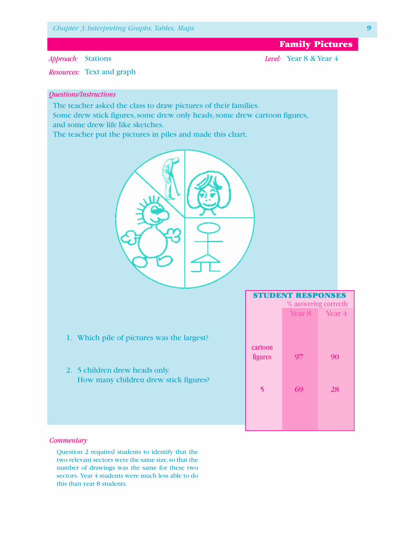
Family Pictures
Stations Year 8 & Year 4
Text and graph
The teacher asked the class to draw pictures of their families.Some drew stick figures, some drew only heads, some drew cartoon figures,and some drew life like sketches.The teacher put the pictures in piles and made this chart.
1. Which pile of pictures was the largest?cartoonfigures 97 90
2. 5 children drew heads only.How many children drew stick figures?
5 69 28
Question 2 required students to identify that thetwo relevant sectors were the same size, so that thenumber of drawings was the same for these twosectors. Year 4 students were much less able to dothis than year 8 students.

Approach: Level:
Resources:
10 NEMP Report 3: Graphs, Tables and Maps 1995
Questions/Instructions
STUDENT RESPONSES% answering correctlyYear 8 Year 4
Car Race
Station Year 8 & Year 4
Text and graphic
4 friends have a race with cars of different weights.They let the cars go at the top of a ramp and see how far they travel along the floor.The car that goes the longest distance is the winner.
1. Which car is the winner?Don’s 100 94
2. Which car is 3rd?Aki’s 95 83
3. What do you notice about the weight of eachcar and the distance each travelled?
the heavierthe further 72 35
This chart shows how far each car went.
Cars andweights
Cath's car(20g)
Don's car(75g)
Aki's car(25g)
Bo's car(50g)
0 20 40 60 80 100 12010 30 50 70 90 110
Start
Distance (cm)

Chapter 3: Interpreting Graphs, Tables, Maps 11
Approach: Level:
Resources:
Questions/Instructions
STUDENT RESPONSES% answering correctlyYear 8 Year 4
Kafte Bar
Station Year 8 & Year 4
Text and table
Kafte bars are made of chocolate.This information is on a Kafte bar wrapper.
1. How much fat is in a Kafte bar?11g 99 90
2. How much energy is in one Kafte bar?1100kJ 97 88
3. How much of the carbohydrate in a Kafte baris not sugar?
4g 65 12
Kafte Bar
Serving size 60g
Energy 1100kJ
Protein 3g
Fat 11g
Carbohydrate:Sugars 35g
Total 39g
Calcium 88mg
Vitamin E 2mg
Sodium 100mg
Potassium 150mg
Commentary
Question 3 required careful interpretation of thetable, reading two different numbers and subtract-ing one from the other. This proved too difficultfor most year 4 students.
��������������KafteKafte
���
���
®

12 NEMP Report 3: Graphs, Tables and Maps 1995

Chapter 3: Interpreting Graphs, Tables, Maps 13
Approach: Level:
Resources:
Questions/Instructions
Letter Rates
One to one interview Year 8 & Year 4
Domestic letter rate chart (shown)
Four letters addressed within New Zealand:
1: Susan Cross: E24 envelope (165x241mm)
2: Kala Tom: E12 envelope (114x162mm)
3: Paul Thompson: E31 envelope (229x324mm)
4: Sam Reed: E20 envelope (114x225mm)
By the time the year 4 assessments took place, thepostal rate for “medium” sized ordinary letters hadbeen reduced to 40¢. Students were marked cor-rect for Question 2 if they said the cost wouldbe 40¢.
The very poor results at both levels for Question 1suggests that the letter rate chart was difficult to
use for E24 envelopes. Perhaps the problem arosefrom the words used on the chart for envelope size:“medium” and “extra large.” Since the envelope inQuestion 3 was much larger than the envelope inQuestion 1, the students may have been unwillingto call both “extra large.” Perhaps New Zealand Postshould redesign its domestic letter rate chart!
STUDENT RESPONSES% answering correctlyYear 8 Year 4Questions presented orally.
1. How much will it cost to send this letter to Susan Cross by fastpost?
$1.20 25 24
2. How much will it cost to send this letter toKala Tom by ordinary post ?
45¢ 95 77
3. How much will it cost to send this letter toPaul Thompson by ordinary post?
80¢ 89 67
4. How much will it cost to send this letter toSam Reed by fastpost?
80¢ 90 73
Commentary

Approach: Level:
Resources:
14 NEMP Report 3: Graphs, Tables and Maps 1995
Questions/Instructions
STUDENT RESPONSES% answering correctlyYear 8 Year 4
What colour is it when the skin has been removed?
haspips
has astone
has nopips
deep red orange yellow white
raspberry plum orange grapefruit apricot lemon apple banana
sweet sweet sweet sour sweet sour sweet sweetor sour
haspips
has pips has astone
haspips
Fruit chart
Station Year 8 & Year 4
Flow chart
1. What is deep red and has a stone?plum 96 70
2. What is sour, has pips and is orange?grapefruit 91 53
3. Use the flow chart to describe an apricot.orange
has stonesweet 76 36
4. What fruit is described in the chartas being “sweet or sour”?
apple 90 49
Chapter 3: Interpreting Graphs, Tables, Maps 15
Approach: Level:
Resources:
Questions/Instructions
STUDENT RESPONSES% answering correctlyYear 8 Year 4
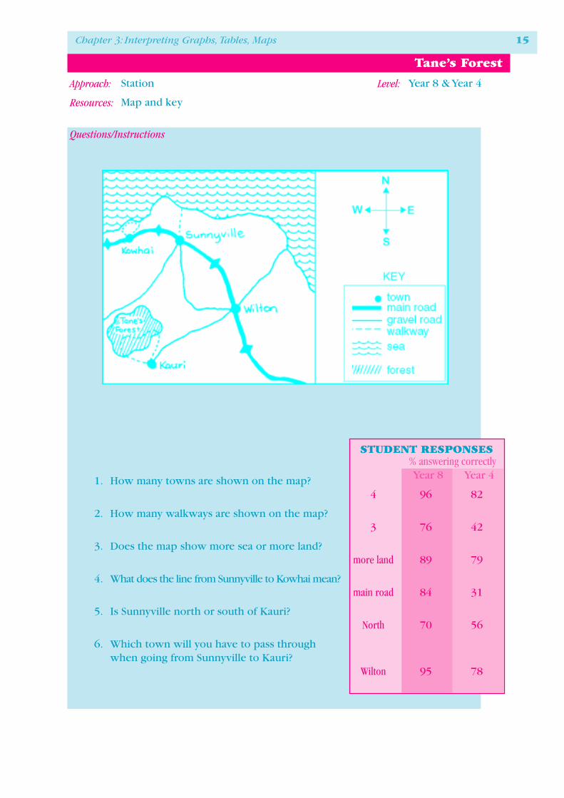
Tane’s Forest
Station Year 8 & Year 4
Map and key
1. How many towns are shown on the map?4 96 82
2. How many walkways are shown on the map?3 76 42
3. Does the map show more sea or more land?more land 89 79
4. What does the line from Sunnyville to Kowhai mean?main road 84 31
5. Is Sunnyville north or south of Kauri?North 70 56
6. Which town will you have to pass throughwhen going from Sunnyville to Kauri?
Wilton 95 78

16 NEMP Report 3: Graphs, Tables and Maps 1995
Christchurch Press 1995
Chapter 3: Interpreting Graphs, Tables, Maps 17
Approach: Level:
Resources:
Questions/Instructions
STUDENT RESPONSES% answering correctlyYear 8 Year 4
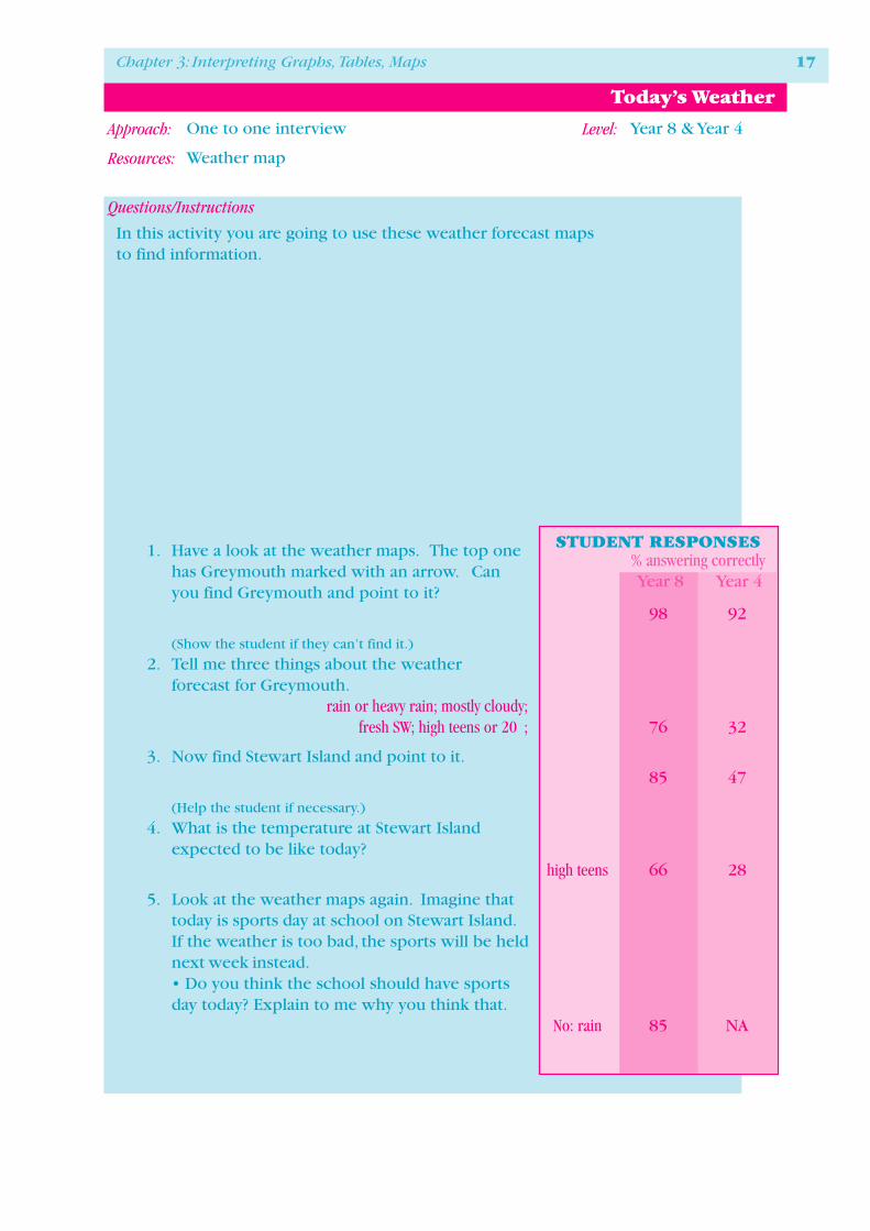
Today’s Weather
One to one interview Year 8 & Year 4
Weather map
1. Have a look at the weather maps. The top onehas Greymouth marked with an arrow. Canyou find Greymouth and point to it?
98 92
(Show the student if they can’t find it.)
2. Tell me three things about the weatherforecast for Greymouth.
rain or heavy rain; mostly cloudy;fresh SW; high teens or 20 ; 76 32
3. Now find Stewart Island and point to it.85 47
(Help the student if necessary.)
4. What is the temperature at Stewart Islandexpected to be like today?
high teens 66 28
5. Look at the weather maps again. Imagine thattoday is sports day at school on Stewart Island.If the weather is too bad, the sports will be heldnext week instead.• Do you think the school should have sportsday today? Explain to me why you think that.
No: rain 85 NA
In this activity you are going to use these weather forecast mapsto find information.

18 NEMP Report 3: Graphs, Tables and Maps 1995

Chapter 3: Interpreting Graphs, Tables, Maps 19
Approach: Level:
Resources:
Questions/Instructions
N
E
S
W
1
2
3 4
5
12
10 9
8
7
6X
XX
XReception
areaEntrance
North wing
West
wing
KEY
1�Waka — canoe� 8 �Pacific Ocean
2�Pataka — storehouse� 9�birds
3�pottery� 10�lizards
4�rocks and minerals� 11�gift shop
5�fossils� 12�cafeteria
6�dinosaurs� x�fire exit
7�Antarctica
Tangata Museum
11
East
wing
Museum Floor Plan
One to one interview Year 8 & Year 4
Floor plan and key
1. If you went to area 6 in the museum whatwould you see?
dinosaurs 98 77
2. What does the x-shape mean on the floor plan?fire exit 98 73
3. What are the names of the displays in theeast wing of the museum?
Pacific Oceanbirds
lizards 88 60
4. Imagine we are in the reception area and youare telling me the directions to get to thepottery display. Explain to me how I would getto the pottery display. Explain it withoutpointing to the plan.
via1,2 & 4or 1 & 4 53 21
STUDENT RESPONSES% answering correctlyYear 8 Year 4

20 NEMP Report 3: Graphs, Tables and Maps 1995
STUDENT RESPONSES% answering correctlyYear 8 Year 4
Question 1 92 77
Question 2 99 92
Question 3 97 83
Question 4 92 78
Link task 1
Approach: One to one interview
Resources: Pie graph
STUDENT RESPONSES% answering correctly
Year8 Year4
STUDENT RESPONSES% answering correctly
Year4
STUDENT RESPONSES% answering correctly
Year8 Year4
STUDENT RESPONSES% answering correctly
Year8 Year4
STUDENT RESPONSES% answering correctly
Year4
Link Tasks Year 4 only
Question 1 98 82
Question 2 96 80
Question 3 96 81
Question 1 89 59
Question 2 76 37
Question 3 89 56
Question 4 85 42
Question 1 98 92
Question 2 97 86
Question 3 44 25
Question 4 95 NA
Question 1 81
Question 2 36
Question 1 56
Question 2 72
Question 3 69
Question 4 69
Link task 2
Approach: Stations
Resources: Table and text
Link task 3
Approach: Stations
Resources: Line graph and text
Link task 4
Approach: One to one interview
Resources: Street map and index
Link task 5
Approach: Station
Resources: Pie graph
Link task 6
Approach: One to one interview
Resources: Timetable
Link Tasks Year 8 and Year 4

Chapter 3: Interpreting Graphs, Tables, Maps 21
STUDENT RESPONSES% answering correctly
Year8
Question 1a 65b 63
Question 2a 56b 54
Question 3 60
Question 4a 60b 51
Link task 7
Approach: Station
Resources: Road map and table
STUDENT RESPONSES% answering correctly
Year8
Question 1 44
Question 2 46
Question 3 78
Question 4 62
Link task 8
Approach: Station
Resources: Complex table
STUDENT RESPONSES% answering correctly
Year8
Question 1 99
Question 2a 85b 25
Question 3 77
Link task 9
Approach: Station
Resources: Composite bar graph
STUDENT RESPONSES% answering correctly
Year8
Question 1 79
Question 2 58
Link task 10
Approach: One to one interview
Resources: Complex table and text
Link Tasks Year 8 only

Approach: Level:
Resources:
22 NEMP Report 3: Graphs, Tables and Maps 1995
Questions/Instructions
STUDENTRESPONSES
% answeringcorrectlyYear 8
Weet-bix Breakfast
Station Year 8 only
Colour reproduction of end panel of cereal packet, with nutritional table.
Linda, Fay and Peter are havingWeet-bix for breakfast.
Linda is having 2 Weet-bixwith 1/2 cup of standard milk.
Fay is having 2 Weet-bixwith 125ml of So Good.
Peter is having 100g of Weet-bix without any milk.
1. How many calories (Cal) is Linda having?180 59
2. How many calories (Cal) is Peter having?335 66
3. How much carbohydrate-sugars is Lindahaving?
6.9g 44
4. How much carbohydrate-sugars is Fay having?3.2g 48
5. How much protein is Peter having?12.4g 73
6. How much protein is Fay having?8.0g 60

Chapter 3: Interpreting Graphs, Tables, Maps 23
Approach: Level:
Resources:
Questions/Instructions
Air timetable
One to one interview Year 8 only
Air New Zealand Business Week Timetable (excerpt shown)
Presented orally.I want you to use the Air New Zealand Business Week Timetable to answer somequestions. We will assume that all of the flights are on time.
STUDENTRESPONSES
% answeringcorrectlyYear 8
1. What time does the last flight from Christchurch toWellington depart?
9pm 85
What would be the best flight from Auckland toDunedin if you wanted to be in Dunedin by 1pm?2a What is the flight number?
415 91
2b What time does the flight depart from Auckland?8.30am 91
2c What time does the flight arrive in Dunedin?11.20am 90
3. If a friend is arriving at Invercargill from Aucklandon flight 527, what time will they arrive?
3.30pm 95
Approach: Level:
Resources:
24 NEMP Report 3: Graphs, Tables and Maps 1995
Questions/Instructions
Commentary
STUDENTRESPONSES
% answeringcorrectlyYear 8
Women in Parliament
Stations Year 8 only
Line graph
1. How many women were in parliament in 1975?4 97
2. When did the number of women in parliamentstart to increase most quickly?
1978or 1981 59
3. Write down one other important thing thegraph tells about women in parliament.
Eg 4x as many women in 1990 than 1978;very little change between 1960 and 1978 27
In Question 2, the most correct response was 1981.Only 24% of students chose that response. Visually,the correct response was 1978, chosen by 35% ofstudents. Both counted as correct in the above ta-ble.
Question 3 proved particularly demanding. Manyanswers were quite vague; others focused on de-tails that were much less important than the majortrends.
0
2
4
6
8
10
12
14
16
18
20
19901987198419811978197519721969196619631960
Year
Num
ber
Women in P arliament

Chapter 3: Interpreting Graphs, Tables, Maps 25
Approach: Level:
Resources:
Questions/Instructions
STUDENTRESPONSES
% answeringcorrectlyYear 8
Staying on at School
One to one interview Year 8 only
Graph
Presented orally.This graph shows the percentage of female and male studentswho stayed at school until Form 7.I want you to try to answer some questions by looking at the graph.
1. In 1993, did a higher percentage of female or a higherpercentage of male students stay at school for form 7?
femalehigher 70
2. Tell me 3 other things this graph shows.Eg large increase since 1983, 3 36
girls have overtaken boys 1 or 2 34
3. Draw on the graph what you think will happen in1998. Why do you think that will happen?
Marked for consistency between what wasdrawn and what was said 26
0
10
20
30
40
50
60
70
80
200319981993198819831978197319681963
Females
Males
%
Percentage of female and male students who stayed at school until form 7
Approach: Level:
Resources:
26 NEMP Report 3: Graphs, Tables and Maps 1995
Questions/Instructions
STUDENTRESPONSES
% answeringcorrectlyYear 8
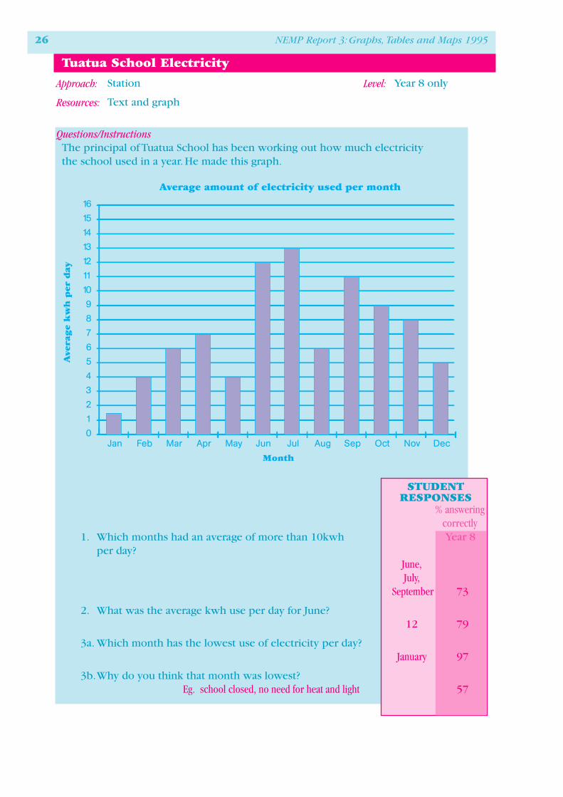
Tuatua School Electricity
Station Year 8 only
Text and graph
The principal of Tuatua School has been working out how much electricitythe school used in a year. He made this graph.
1. Which months had an average of more than 10kwhper day?
June,July,
September 73
2. What was the average kwh use per day for June?12 79
3a. Which month has the lowest use of electricity per day?January 97
3b.Why do you think that month was lowest?Eg. school closed, no need for heat and light 57
0
1
2
3
4
5
6
7
8
9
10
11
12
13
14
15
16
Ave
rage
kw
h p
er d
ay
DecNovOctSepAugJulJunMayAprMarFebJan
Month
Average amount of electricity used per month
Chapter 3: Interpreting Graphs, Tables, Maps 27
Approach: Level:
Resources:
Questions/Instructions
Commentary
STUDENTRESPONSES
% answeringcorrectlyYear 8
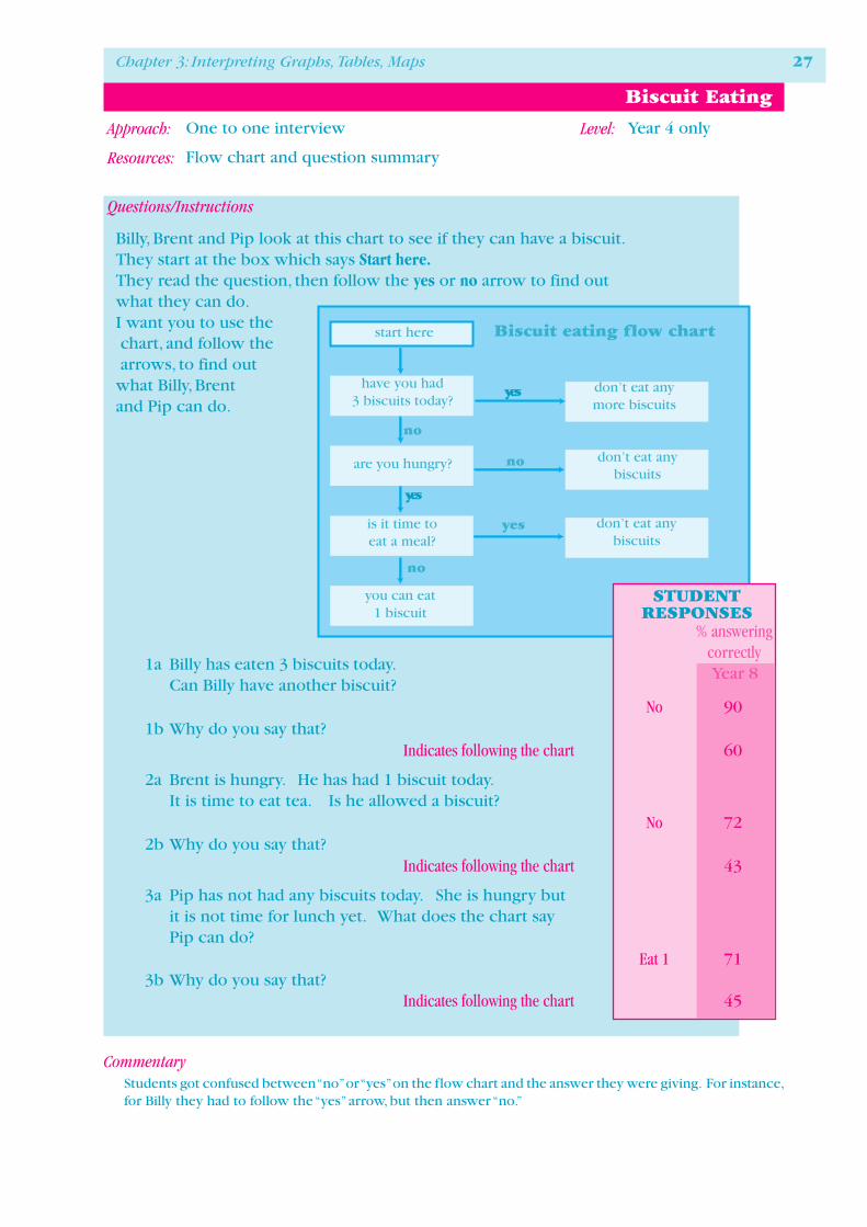
Biscuit Eating
One to one interview Year 4 only
Flow chart and question summary
Billy, Brent and Pip look at this chart to see if they can have a biscuit.They start at the box which says Start here.They read the question, then follow the yes or no arrow to find outwhat they can do.I want you to use the chart, and follow the arrows, to find outwhat Billy, Brentand Pip can do.
1a Billy has eaten 3 biscuits today.Can Billy have another biscuit?
No 901b Why do you say that?
Indicates following the chart 60
2a Brent is hungry. He has had 1 biscuit today.It is time to eat tea. Is he allowed a biscuit?
No 722b Why do you say that?
Indicates following the chart 43
3a Pip has not had any biscuits today. She is hungry butit is not time for lunch yet. What does the chart sayPip can do?
Eat 1 713b Why do you say that?
Indicates following the chart 45
start here
have you had3 biscuits today?
are you hungry?
is it time toeat a meal?
you can eat1 biscuit
don’t eat anymore biscuits
don’t eat anybiscuits
don’t eat anybiscuits
no
yes
no
yes
no
yes
Biscuit eating flow chart
Students got confused between “no” or “yes” on the flow chart and the answer they were giving. For instance,for Billy they had to follow the “yes” arrow, but then answer “no.”