clear print full review - cnib - seeing beyond vision loss · web viewthis assessment tool is valid...
TRANSCRIPT

An evidence-based review of the research on typeface legibility for readers with low vision.
April 2006
Lead author: Elizabeth Russell-Minda, M.A., VREBR Project Coordinator Co-authors: Jeffrey Jutai. Ph.D., C.Psych., VREBR Project Director
Graham Strong, O.D., M.Sc., VREBR InvestigatorCollaborators: Kent Campbell, Ph.D., Bloorview KidsRehab
Deborah Gold, Ph.D., CNIB ResearchLisa Pretty, CNIB CommunicationsLesley Wilmot, CNIB Communications
This report is a collaborative effort of the VREBR Project Team and CNIB Research.
Clear Print

Clear Print April 2006
VREBR Project Team and CNIB Research 2

Clear Print April 2006
Copyright Statement
This document is considered the property of the VREBR Project Team and CNIB Research. No part of this document shall be copied, quoted, or distributed without permission from the authors. Electronic distribution or saving to another file type (such as .rtf or .html, for example) is also prohibited.
Contact Information
Please address correspondence about this document to:
Dr. Jeff Jutai, National Director of Research, CNIB
University of Western Ontario,Dept. of Physical Medicine & RehabilitationParkwood Hospital SiteHobbins Building, Suite H-403801 Commissioners Rd. EastLondon, ON N6C 5J1(519) 685-4292 x42626E-mail: [email protected]
VREBR Project Team and CNIB Research 3

Clear Print April 2006
ContentsExecutive Summary 4
Key Points Summary 5Objective of this Review 6Key Areas of Focus 6
Inclusion and Exclusion Criteria 6
Reading and Low Vision 7Eye Conditions that Affect Reading Ability 7
Variables that Affect Text Legibility and Readability 8
Overview of Font Characteristics 11Research and Performance Measures 13Research Organizations 14
Guidelines and Standards 15International Guidelines and Standards 15
Search Process and Methodology 17Overview 17
Evaluating and Selecting the Evidence 17
Table of Individual Studies Selected for Review 19
Conclusions 22Choice of Typeface and Size 22
Serifs or Sans Serifs 23
Letter Spacing or Crowding 23
Letter Confusion 24
Psychophysics of Reading Experiments 24
References 25Appendix I—Studies and Publications Selected for Review 30Appendix II—Study Attributes Table 32Appendix III—Search Strategies 48Appendix IV—Guidelines and Standards 49Ranges of Reading Ability 49
VREBR Project Team and CNIB Research 4

Clear Print April 2006
Executive SummaryThe objectives outlined in this report were to review the existing research literature related to the legibility and readability of typefaces, to locate any standards or guidelines related to typeface design and legibility (international or national), and to address any French language typeface characteristics (accent marks, for example) for low vision readers of print copy. Although it was not the primary goal of this review, any literature related to the legibility of medication labelling was also considered. By using evidence-based models and methods, the literature was synthesized and assessed in order to formulate conclusions and make recommendations based on these analyses. A comprehensive literature search was conducted on multiple online databases, grey literature sources, and general Web searches. After a careful analysis of search results, abstracts were read and full-text articles were retrieved for further dissemination and assessment. The studies selected for review were grouped by their evidence level, based on a model developed by Sackett, et al† and other well-known centres for evidence-based practice. Since the studies selected for this review were primarily case series designs, we did not perform further rating with an instrument for assessing study quality‡, as had been done for the previous chapters of the Vision Rehabilitation Evidence-Based Review. This assessment tool is valid for randomized controlled trials and non-randomized controlled trials such as cohort and case control study designs.
This review highlights the fact that multiple variables can affect the reading performance of individuals with low vision. Certainly, the size and type of fonts used in large print materials are some of the most important considerations, however, after assessing the research included in this review, it is clear that other factors can play a role in determining the best conditions for legibility. The presence or absence of serifs, contrast of text to page, thickness of letters, interletter spacing, leading, and the medium on which text is printed (medication labels for example), can all affect the legibility of type. In addition, the role of typeface legibility plays an important part with respect to specific eye conditions. Individuals with age-related eye diseases were the most common type of participants within the research studies assessed in this review, and there were many studies conducted on the specific issues associated with reading and age-related macular degeneration.
Based on the evidence presented in this review, typeface legibility for readers with low vision is a verifiable and important consideration when developing printed materials. However, we also found several studies where the ultimate outcome for subjects regarding choice of font (both style and size) was based primarily on personal preference. Interestingly, custom designed fonts for large print materials and blindness or low vision conditions, such as Tiresias, were preferred by individuals with low vision over standard fonts such as Times Roman or Arial. With respect to international standards and guidelines on typeface legibility and design, the best evidence was to be found with individual low vision and blindness organizations, national library services’ recommendations, and other “grey” sources, such as documents published on the various Web sites. Our search for French language considerations, such as accent marks and low vision reading, produced nothing of significance.
In summary, we found that the overall body of research on low vision reading and typeface legibility characteristics is somewhat inconsistent, with an absence of controlled trials. Most of the literature included in this review consists of case series designs with small sample sizes. As with “typical” evidence-based reviews, it was difficult to assess the literature in this regard as there were no randomized controlled trials, and thus systematic analyses could not be made. Alternatively, this review may serve as a “revelation,” highlighting the need for further research on typeface legibility and its associated characteristics for individuals who hope to retain their ability to read printed materials.
† Canadian Task Force on the Periodic Health Examination: The periodic health examination. CMAJ. 1979;121:1193-1254.
‡ Downs S and Black N. The feasibility of creating a checklist for the assessment of the methodological quality both of randomised and non-randomised studies of health care interventions. J Epidemiol Comm H. 1998;52:377-384
VREBR Project Team and CNIB Research 5
Clear Print April 2006
Key Points Summary
Evidence base for typeface legibility and low vision: Although it is well-accepted and researched that typeface affects legibility, there is minimal evidence addressing how specific font characteristics contribute to legibility for readers with visual impairment.
There is a larger body of research evidence on reading and low vision, in general (not with typefaces specifically), using experimental, quantitative, and psychophysical methods of measuring reading performance. Evidence-based conclusions for typeface legibility and low vision:
Large print reading materials can be helpful for low vision conditions such as age-related macular degeneration, cataract, glaucoma, diabetic retinopathy, and any other condition where reading print is difficult, especially when central vision is affected.
Based on several studies, there is some indication that at very small character sizes, sans serif font types (e.g., Arial) can increase reading speed.
There is very little evidence that seriffed fonts (such as Times Roman) actually reduce legibility and hence, reading performance.
Font style or typeface family can affect reading speed, but this may also depend on individual preferences.
According to one study, they did not find increased legibility over and above standard fonts such as Times Roman, when compared with prototype software for adjustable fonts. All participants reading acuities improved with the adjustable font (total legibility gain 75%).
The results of one, unpublished scientific report, showed that low vision subjects found a customized sans serif large print font (Tiresias) more legible than the other standard typefaces (Arial and Times Roman).
Two studies (one published and one unpublished) on the legibility and preference of typeface style and size for medication labelling, found that subjects preferred sans serif fonts such as Arial (16-22-point depending on VA) and Adsans (16-point).
One study on patient literature for potential cataract patients, found that 65% of subjects found the Universe 14-pt. typeface to be the most legible, compared to Century Schoolbook, a seriffed font.
High contrast typeface improves reading performance and is generally preferred by most observers (black text on white background, or white text on a black background, for example).
Interletter spacing (“crowding”) is shown to impact reading speed. The more crowded the letter are, the slower the reading speed.
Reading with peripheral vision, rather than central vision, is slower. This may be attributed to “crowding” of letters in the visual field.
VREBR Project Team and CNIB Research 6

Clear Print April 2006
VREBR Project Team and CNIB Research 7

Clear Print April 2006
Objective of this ReviewKey Areas of FocusThis review includes a comprehensive search of the literature on typeface (font) legibility and characteristics for any form of vision loss that affects reading performance with printed copy. This review also includes a search of any international standards for font size, type, and characteristics for readers with low vision, when reading printed materials.
Inclusion and Exclusion CriteriaThe search and inclusion criteria for this review includes the following: controlled or uncontrolled; experimental or non-experimental; randomized or non-randomized; and published or unpublished research related to typeface legibility for readers with low vision, specifically when reading printed copy. The inclusion criteria for “low vision condition” includes any eye condition where reading printed copy causes some amount of difficulty. In addition, any literature related to the French language and typeface legibility research was considered. Since French is one of the official languages in Canada, it seemed particularly important to attempt to locate any low vision research related specifically to French language typeface legibility and specifically, the impact of diacritical marks (accents) on reading with low vision. The secondary inclusion criteria for this review include any international guidelines or standards that have been established for typeface legibility for the print disabled. Although extremely important to low vision users, any literature devoted to factors associated with online (the Web) font characteristics (accessible CSS styles, for example), computer interface characteristics, or accessibility issues, is excluded from this review.
VREBR Project Team and CNIB Research 8

Clear Print April 2006
Reading and Low VisionReading is critical to full participation in modern society. For the many individuals with impaired vision, reading presents a major challenge for many activities of daily living. Low vision can be functionally defined as the inability to read the newspaper or recognize faces, with the best refractive correction, at a normal reading distance of 40 cm.1 Many older people have difficulty reading standard text, including medical information, hospital forms, and medication labels, even with appropriate magnification and illumination. Successful rehabilitation primarily involves enhancement of whatever usable vision remains.2 The most direct method for enhancing vision is magnification, usually consisting of relatively portable and inexpensive hand-held or stand magnifiers, or electronic devices such as CCTVs and other electronic vision enhancement systems. Environmental modifications such as proper illumination and viewing distance are also important variables to consider when reading.
Due to problems associated with high levels of magnification, such as reduction in the size of the usable field, enhancing legibility by manipulating the typographic presentation can reduce or eliminate magnification requirements.Error: Reference source not found Some people who can read standard print may find it tiring and prefer to read large print whenever they can. Small characters printed with fine strokes, on patterned backgrounds are especially problematic and difficult to read. The majority of readers who use large print appear to be over retirement age,3 and age-related macular degeneration (AMD) is the leading cause of low vision in most developed countries. Non-electronic, large print reading materials typically consist of books, newspapers, and magazines.
Eye Conditions that Affect Reading AbilityIn terms of causing difficulties when reading print, the following low vision conditions are among the most prevalent. This should therefore be considered a selective listing, not representative of every possible low vision condition.
Age-Related Macular Degeneration Internationally, AMD is one of the leading causes of visual impairment. It is also the most common cause of losing the ability to read print, since it affects central or foveal vision, which is used for seeing detail. Magnifiers can be helpful in the early stages of AMD, and large print materials help prolong the ability to read. Since AMD is a degenerative disorder, it progressively affects the macular region of the retina, often resulting in an irreversible central scotoma. People with central scotoma must use peripheral vision to read, which has been shown to be a slow and inefficient process according to research in this area.Error: Reference source not found-7
CataractCataract is another common age-related eye condition where the lens of the eye becomes cloudy or opaque. If vision is blurred by cataracts, which can affect word recognition, reading performance will be degraded by reduced speed and fluency.8 With severe cataract, people can see light and detect colour contrast, but usually cannot read print. When cataracts reach an advanced stage and receive laser treatment, patients can usually begin to read large print. Reading materials with good contrast can help people with cataracts.
GlaucomaSince glaucoma is considered a “tunnel vision” condition, central vision is usually unaffected, allowing the person to continue to read print. However, peripheral vision is usually affected. As people with glaucoma age, they will usually require progressively larger print materials.
Diabetic RetinopathyDiabetic retinopathy (DR) is another major cause of vision loss for working-age adults. DR can often lead to patchy vision resulting in orientation difficulties. Some people with patchy vision have a fairly even sight loss across the visual field and may require print materials with good contrast and large print. Some individuals may lose peripheral sight first, and can continue to read standard sized text for longer periods.
VREBR Project Team and CNIB Research 9

Clear Print April 2006
Variables that Affect Text Legibility and ReadabilityThere are many factors that can add or detract to the legibility and readability of typefaces. The following variables can affect readers with low vision (explained in more detail below): contrast, colour, heaviness, point size, leading, letter spacing, and font family or style. The design of a typeface can significantly affect legibility and readability. For many applications the aesthetic appearance of the text is the basis on which a font is selected. However, there are occasions when legibility is the paramount consideration (for example, warning or danger notices).9
There are subtle differences in definitions of “legibility” and “readability.” “Legibility” is generally considered as a measure of the recognizability of the characters and how easily they can be read, based on the visual appearance in a given environment. Vernon (1931)10 found the following letters confusing: f & t, l & t, c & e, n & a, i & j, l & J. Burt (1974)11 found it necessary to distinguish between l 1 ! i and h & b, C & G, Q & O, J & F, R & Q. For numerals, Tinker (1928)12 found 3 5 8 2 to have low legibility. “Readability” as defined by McNally (1913)13 is the extent to which a given type size or form lends itself to being read with the absence of visual effort. It can also be thought of as subjective ease and comfort to read.Error: Reference source not found The following categories are the most common variables that affect both legibility and readability for individuals with varying forms of visual impairment.
ContrastMany individuals with low vision have contrast sensitivity deficits, and have difficulty visually with objects that are poorly contrasted with their surroundings.14 People with central vision loss, who use parafoveal vision for reading, are especially affected by issues related to contrast. General guidelines recommend that text should be printed with the highest possible amount of contrast. There is also good evidence that for many low vision readers (older or partially-sighted) that light (white or yellow) letters on a dark (black) background are more readable than dark letters on a light background. There is little difference in reading speed for white-on-black presented text versus black-on-white, for character sizes ranging from 0.006 to 12 degrees.Error: Reference source not found
Type ColourThe choice of text colour can affect low vision readers. Partial sight, aging and congenital colour deficits all produce changes in perception that reduce the visual effectiveness of certain colour combinations. Two colours that contrast sharply to someone with normal vision may be far less distinguishable to someone with a visual disorder.15 It is difficult to achieve very high contrasts with colour combinations other than black and white. Colour combinations that provide the maximum brightness contrast, such as black on white, and black on yellow give the best legibility results.16 It is generally recommended that coloured text be used for larger or highlighted text, such as headlines and titles.17
HeavinessThe heaviness of a font can have an effect on legibility since it distorts the space within the letters and makes them less legible.18 It is generally recommended that medium heaviness be used and light type should generally be avoided. For emphasis, bold fonts may be used, rather than italics or all-capitals. 19 Some studies have shown relationships between font heaviness and other characteristics and specific low vision conditions. Shaw noted that readers with cataract were aided by the increase in the weight of the print.20 Bold type has been shown to be beneficial for individuals with glaucoma.21 Shaw added that once point size is increased above threshold size, weight becomes a more important factor than point size. Another important factor to consider is the stroke width of text. Stroke thickness is especially important for low vision readers because thinly stroked letters result in poor contrast.
Point SizePoint terminology for specifying print size is the method used by printers to specify the size of metal block on which raised print was embossed. Each “point” unit is 1/72 inch or approximately 0.353 mm. A major problem with point terminology is that different font
VREBR Project Team and CNIB Research 10

Clear Print April 2006
styles with the same point size will have different letter heights and dimensions.22, 23 Perhaps the most accepted guideline for low vision reading materials is that type should be large, preferable at least 16 to 18 points. The relationship between readability and point size differs somewhat among typefaces and this should be taken into consideration when developing print materials. Research evidence has shown that low vision readers require larger print, although there is no consensus for optimum character size for large print publications. For normally sighted readers, characters subtending 0.3 degree (or 18 minutes) to 2 degrees are best.24 This corresponds to a type point size range of 9 to 14. The range of visual ability is highly variable from one individual to the next. Low vision and reading ability can range from near-normal to functional blindness. Each individual will have his or her own reading threshold. Since it would be impractical to create publications with varying point sizes, the use of low vision aids (magnification devices in particular) should be suggested for low vision readers.
Leading (Spacing between lines of text)Leading, or spacing between lines of text, should be at least 25 to 30 percent of the point size. This is because many people with partial sight have difficulty finding the beginning of the next line while reading.Error: Reference source not found Some research points to optimal leading ranges of 1 to 4 points with heavier typefaces requiring more leading.Error: Reference source not found Others have suggested that four point leading should be used when preparing materials for low vision readers. This corresponds to 5 to 8 minutes between the tops of an upper case letter and the bottom of the letters on the line above.25
Figure 1 Examples of leading§
Letter SpacingClosely packed small letters are much harder to read compared to the same letters presented in isolation.26 Reduced letter legibility in the presence of other letters or features has been termed the “crowding effect.”27 Research in this area has examined the effects of legibility on interletter spacing, letter size, letter contrast, stroke width, letter aspect ratio, presentation duration and retinal location. Individuals with compromised macular functions often use eccentric viewing and preferred retinal loci for reading, and close letter spacing, or letter “crowding” reduces their reading performance.28 Arditi suggests that where possible, spacing should be wide, and monospaced fonts, rather than proportionally spaced fonts appear to be more legible for those individuals with low vision.Error: Reference
source not found
Font Family and Style
§ Arditi A. Making Text Legible: Designing for People with Partial Sight. Lighthouse International 2000. See: http://www.lighthouse.org/print_leg.htm
VREBR Project Team and CNIB Research 11
Clear Print April 2006
While there is little reliable information on the comparative legibility of typefaces, there is some evidence that a Roman typeface, using upper and lower cases, is more readable than italics, oblique, or condensed text. Mansfield, et al (1996) found Courier to be slightly more legible than Times RomanError: Reference source not found, and others have argued the opposite.29 In general, there is disagreement in the research as to which type of font is the most legible for low vision readers. Standard serif and sans serif fonts (such as Arial or Times Roman) are generally considered to be the best fonts for legibility. There is some evidence that sans serif fonts are more legible when character size is small relative to the reader’s visual acuity.Error: Reference source not found
Other text and print publication considerations include margin space, paper finish, and distinctiveness. Extra-wide binding margins are helpful in bound material because it makes it easier to hold the volume flat. Spiral binding can be helpful as well. Many low vision aids, such as stand and video magnifiers, are easiest to use on a flat surface. Paper finish or texture can have an impact on low vision reading. Glossy surfaces can produce additional glare. Opaque or matte finish paper is recommended.Error: Reference source not found In addition, publications that look similar in design and layout can cause confusion regarding the ability to distinguish one publication from another. The use of distinctive colours, sizes and formats on the covers can be especially helpful to older individuals and those who are visually impaired.Error: Reference source not found
VREBR Project Team and CNIB Research 12

Clear Print April 2006
Overview of Font CharacteristicsSpacingThe two main types of font pitch are fixed-width and proportionally-spaced. In fixed-width fonts (such as Courier New), each character takes up the same amount of horizontal space, whereas in a proportionally-spaced font (such as Times or Arial), different letters take up different amounts of horizontal space.30
Fixed-width font (Courier New)Proportionally-spaced font (Times New Roman)
Proportionally-spaced fonts can pack in more characters into a line of text than fixed width fonts, and are thus preferred by typographers. However, there is little research on how these spacings affect reading and low vision. Arditi, et al 199031 and Beldie32 have investigated this issue. Beldie found variable pitch characters provide significantly better performance in reading speed and proofreading, but did not specify the type of character used in the experiment. Arditi, et al found that for small characters, the fixed-width pitch produced the fastest reading, with a modified variable width yielding better performance than variable width spacing, indicating crowding effects.
Letter Height (x-height and t-height)In addition to point size, the x-height and the t-height can be adjusted for large print materials and research has shown that letter height and point size influence legibility. The x-height is defined as the height of the letter “x” in any given font, and is the specific height of the lower case letters. The “t-height” is defined as the height to the bottom of the crossbar of the letter “t” in any given font (lower case). Refer to Figure 2 below. Depending on the font, t- and x-height may be different heights or the same.
Figure 2 Example of t-height and x-height (100 pt. APHont not shown to scale)**
SerifsSerifs are the fine lines that extend horizontally from the main strokes of a letter.33 According to the definition put forth by Merriam-Webster, serifs are "any of the short lines stemming from and at an angle to the upper and lower ends of the strokes of a letter." It has been a common conception that the purpose of serifs is to guide the reader’s eye horizontally while reading. However, the effectiveness of serifs in this regard remains somewhat controversial. Examples of serif fonts include: Times, Palatino, Garamond, Century Schoolbook, and Book Antiqua. Serif fonts are frequently used in newspapers and books where the space for print is tight.
The quick brown fox (Times)** Kitchel EJ. Large Print: Guidelines for Optimal Readability and APHont a font for low vision. Retrieved March 27, 2006 from http://www.aph.org/edresearch/lpguide.htm.
VREBR Project Team and CNIB Research 13

Clear Print April 2006
The quick brown fox (Palatino)The quick brown fox (Book Antiqua)
Sans-SerifsSans-serif fonts (from the French word sans, or “without”) are those fonts which have letters with straight lines and no curls or appendixes. Sans-serif fonts have been determined to be more readable than serif fonts, but again, these results are disputable. In these studies, researchers did not hold other font characteristics constant, such as stroke width, size, or ornamentation.34 Examples of sans-serif fonts include: Arial, Helvetica, Tahoma, Avant-Garde, Univers, Century Gothic, Verdana, and all other fonts characterized by clean letterforms.
The quick brown fox (Arial)The quick brown fox (Tahoma)The quick brown fox (Century Gothic)
Figure 3 Examples of serifs and sans serifs.††
Stroke WidthStroke width refers to the width of each component or stroke of a letter. A font may have a uniform stroke width in which all of each stroke is the same width, for example the font Arial. Or, a font may have a varying stroke width in which some portions of the stroke are thinner than others, as seen in the font Times New Roman.Error: Reference source not found Fonts may also have a generally wide stroke width, referred to as “bold,” or a thin stroke width, referred to as “light.” It has been shown (Yager, et al 1998)35 that letters with uniform stroke width appear to be more legible, as do letters that are bold (Krulee and Novy 1986).36
†† See: http://www.symplebyte.com/general_usage/fonts/serif_or_sans-serif.html
VREBR Project Team and CNIB Research 14
Clear Print April 2006
Research and Performance MeasuresLegibility and Readability of FontsThe legibility and readability of fonts has been studied by examining the individual characteristics of a font, or by studying differences among whole fonts. There are limitations to both approaches, in that they may lead to different conclusions. Research on specific font characteristics, such as stroke width or the use of serifs, requires manipulation of individual parameters while keeping others constant. While this approach allows direct assessment of the influences of specific font characteristics have on legibility, it often becomes impractical due to the requirement of constructing artificially created fonts. Alternatively, researching whole fonts, such as Times or Helvetica, which may be easily used in practical application, limits the generalizability with respect to specific characteristics. One can generalize results only to fonts closely resembling the chosen font.Error: Reference source not found
Reading AcuityOptotype-based acuity tests such as Jaeger and N-notation are discouraged because they are often flawed and poorly standardized.37 There is a good deal of evidence from psychophysical experiments that typography can significantly impact what is known as reading acuity—the minimum size of print that can be read both in normal and low vision (Tinker 196338 and Arditi 199639). Reading acuity and maximum reading distance are other commonly used measures of legibility. Results from some studies have shown that certain font characteristics such as stroke width (Arditi, et al 199540; Berger 194441, 42), aspect ratio (Arditi, et al 199543; Berger 194844; Soar 195545), inter-letter spacing (Arditi, et al 1995Error: Reference source not found; Arditi, et al 199746; Moriarty and Scheiner 198447; Whittaker, et al 198948), and the presence or absence of serifs (Arditi and Cho 200549), have some impact on text legibility.Error: Reference source not found
Reading Speed and Critical Print SizeA frequently used criterion for determining legibility is reading speed. The only published quantitative data comparing low vision reading speeds for different fonts seem to be those of Mansfield, et al (1996)Error: Reference source not found, who found reading speeds for different fonts to be 10% slower with Times New Roman than with Courier (for normal subjects, Times Roman had a speed advantage by 5%). Although the manipulation of font parameters may significantly affect reading acuity, the gains in reading speed for low vision are modest, at best.Error: Reference source not found Another common performance metric used in text legibility and reading research is “critical print size.” The critical print size is the smallest print size at which individuals can read with their maximum reading speed. This is an important measure as it indicates the minimum magnification required for effortless reading. The critical print size is most easily identified from a plot of the patient's reading speed at each print size.
Crowding and Peripheral VisionFor many people with low vision where the central retina is damaged, reading can be difficult. People with retinal disorders such as AMD, tend to read with their peripheral vision. However, studies have shown that reading in the peripheral visual field is slower than reading with central vision. One hypothesis for the slow reading speed is enhanced crowding in peripheral vision. Crowding refers to the decreased visibility of a visual target in the presence of nearby objects.50 Some studies have suggested that increased letter spacing and other controls of letter characteristics may reduce this “crowding effect.” On the basis of previous research, there is enough evidence to suggest that reading speed may benefit from increased letter spacing, and more so in peripheral than central vision.51
VREBR Project Team and CNIB Research 15

Clear Print April 2006
Rapid Serial Visual Presentation (RSVP)With Rapid Serial Visual Presentation (RSVP) reading, words are presented rapidly at a fixed location on a video display (not unlike cell phone text messaging). This type of reading reduces the amount of eye movement required and reading speed typically increases, up to 3-4 times faster than normal.52 In addition, RSVP facilitates reading on limited screen sizes such as displays used by low vision users who require large type. The RSVP reading technique is frequently implemented as an assessment method for studies on reading performance and the effects of typographical features on visually impaired observers. During RSVP, readers can read sans serif typefaces about 20% faster at very small sizes, but this advantage disappears at larger sizes.53
Research Organizations
Arlene R. Gordon Research Institute—Lighthouse InternationalThe Arlene R. Gordon Research Institute within Lighthouse International has produced experimental research, guidelines, and reports on text legibility and font characteristics. Dr. Aries Arditi, a senior fellow in vision science at the Institute, and colleagues, have produced some of the few, published studies on font characteristics and legibility for individuals with visual impairment.
American Printing House for the BlindThe American Printing House for the Blind promotes independence of blind and visually impaired persons by providing specialized materials, products, and services needed for education and life. The APH Research Department conducts ongoing product development activities in such areas as tactile graphics, Braille reading readiness, and low vision. Their in-house developed font, APHont was developed by a fontographer to the specifications of APH and contains characteristics that have been shown to enhance reading speed, literacy, comprehension, and usability for large print users.
Royal National Institute for the Blind (RNIB) and TiresiasRNIB manages research projects, works with external research partners and contributes to relevant research and evidence studies. The RNIB also offers guidelines for making text more legible and accessible for low vision users (see RNIB Web site). Through affiliations with RNIB, Dr. John Gill and colleagues have published scientific research on text legibility and have developed a customized font family called Tiresias. The Tiresias family of fonts has a number of applications and has been customized for large print, electronic displays (such as ATMs), television screens, and signs. It has been specifically designed for individuals with low vision.
University of Minnesota Low Vision Research LabA series of research studies on the psychophysics of reading54 were conducted at the Minnesota Laboratory for Low-Vision Research by Gordon E. Legge and colleagues. The Psychophysics of Reading series consists of nineteen published studies, and one unpublished study, related to psychophysical methods of measuring reading performance. Observers are required to read aloud individual lines of text that are scanned across a television monitor. The scanning rate is increased until the observer begins to make mistakes. Reading rate, in words per minute, is computed after correction for errors. At some scanning rates, the reading rate is maximal; the maximal reading rate can be measured as a function of any stimulus or observer variable.Error: Reference source not found Other studies in this series on low vision reading report on the effects of character size, character spacing and number of characters simultaneously present in the field, sample density, and contrast polarity.Error: Reference source not found This research lab is also responsible for the development of the MNREAD Acuity charts, which are continuous text reading acuity charts for normal and low vision. The charts are used to assess how reading performance depends on print size. Three measures of reading performance are easily obtained: Reading acuity the smallest print that can just be read, maximum reading speed the reading speed when performance is not limited by print size, and critical print size the smallest print that supports the maximum reading speed. The MNREAD Acuity Charts have a wide range of applications in testing normal and low vision: prescribing optical corrections for reading, or other near tasks in the eye clinic, in low vision assessment, prescribing magnifiers or other reading aids, applications in paediatrics and special
VREBR Project Team and CNIB Research 16

Clear Print April 2006
education, and research.55 Charts are currently being developed in Japanese, Italian, French, Spanish, Norwegian, Danish, Swedish and Portuguese.
Guidelines and StandardsInternational Guidelines and Standards During our search for international font legibility standards or guidelines for low vision readers, we located primarily online documents and grey literature (unpublished by journal standards, but published online). We could not locate any definitive international standards or guidelines on font size and type for reading with low vision. Perhaps the closest example of a “standard” in this regard, is a document published by the International Council of Ophthalmology, entitled Visual Standards: Aspects and Ranges of Vision Loss,56 which contains information and a chart on the ranges of visual acuity and reading ability. This chart outlines estimated ranges of reading ability and which types of low vision aids would benefit each range of vision loss. The ranges of reading ability closely match the visual acuity ranges, in general (Appendix IV—Guidelines and Standards).
We did find that most international library councils, printing houses and foundations for the blind and visually impaired (Canada, US, UK, and Australia), have guidelines and standards for large print materials. (See Appendix IV for a detailed listing of these organizations). In general, there was agreement between these organizations on standards for printed material in terms of acceptable font size and other text characteristics that increase legibility and accessibility. The International Federation of Library Associations and Institutions57 has published a report on guidelines for development for libraries for the blind.58 This purpose of the report is to provide guidelines, on an international level, to libraries and governments for developing library services for the print disabled. The report outlines suggestions for font size, type, and other considerations for large print materials.
Although we found no national standards or guidelines for text legibility in Canada, the Canadian Library Association has produced a report on their strategy for a national network for equitable library services for Canadians with print disabilities.59 The goal of this project is to ensure that more materials in alternative formats will be produced in a coordinated, efficient and cost effective manner. In addition, this project hopes to ensure that these materials are made available in the most accessible way possible. The report also calls for standards and guidelines to be established regarding a number of issues related to accessible library materials for low vision and blind readers. Canada’s largest bilingual library service for the blind and visually impaired is the Canadian National Institute for the Blind (CNIB). The CNIB produces accessible reading formats for this population, and typically produces between 2,000 and 2,500 audio and Braille titles a year. Other agencies in Canada, such as the Institut Nazareth et Louis Braille (INLB) in Quebec and the Montreal Association for the Blind also provide these types of materials. In addition, many provinces including British Columbia, Ontario, and Manitoba provide alternative format material through their post-secondary institutions.
In the United States, the Arlene R. Gordon Research Institute within Lighthouse International,60 has produced a significant body of vision, psychosocial, and evaluation research, and is composed of a multidisciplinary team of psychologists, sociologists, computer scientists, and social welfare researchers. The institute has published guidelines on effective contrast, text legibility, and effective design of print publications for the partially sighted. Error: Reference source not found, Error: Reference source
not found The American Printing House for the Blind’s (APH) research and development group, has also published guidelines on the optimal readability of large print.61
In the UK, Tiresias.org,62 a research unit of the Royal National Institute for the Blind (RNIB), devotes itself to aspects surrounding vision loss and text legibility. Their scientific research unit has produced a number of reports and guidelines on fonts and text legibility.63 Through the work of Dr. John Gill and associates, this organization is responsible for the development of fonts such as the Tiresias font family. These fonts were specifically researched and created for members of the low vision community, and are used for various applications such as large print reading materials (LPfont),
VREBR Project Team and CNIB Research 17

Clear Print April 2006
information labels (Infofont), control labels (ATMs, calculators, and telephones for example) (Keyfont), screen systems (PCfont), television titling (Screenfont), and sign systems (Signfont)
VREBR Project Team and CNIB Research 18

Clear Print April 2006
Guidelines and Standards for Medication LabellingThe legibility of medication labels for visually impaired populations is an important concern. In our search for medication labelling and typeface legibility standards in Canada and the United States, we located several sources outlining rules and regulations concerning standardized formats for health-related information and medication (non-prescription or over-the-counter—OTC) labelling. The U.S. Department of Health and Human Services, Food and Drug Administration report on OTC labelling requirements64 contains recommendations for medication labelling, and although these are guidelines for the general population, they could certainly be extrapolated to individuals with low vision. Based on consumer feedback, the report suggests using at least a 6-point type size for all OTC labelling and recommends the font style be “any clear, easy-to-read type style,” suggesting the use of Helvetica or Univers (sans serif fonts). With respect to the contrast of the labels and drug fact sheets, the agency recommends that type be “all black or one dark color, printed on a white or other light, neutral color, contrasting background.”
A Canadian Public Health Association publication entitled, “Good Medicine for Seniors: Guidelines for Plain Language and Good Design in Prescription Medication”65 outlines suggestions for legible and clear design for medication labelling. These guidelines are based in part, on a technical report published by the Nonprescription Drug Manufacturers Association of Canada.66 Both recommend the use of sans serif fonts for packaging (Helvetica, Arial, and Univers, for example) if the type size is smaller than 10 points. Other suggestions include the appropriate use of white space, leading, type alignment, line length, contrast, and emphasis. Their recommendation regarding contrast is in line with almost all other guidelines on contrast: dark lettering on a light surface; brightness and high contrast help readability and glossy or reflecting surfaces do not. When the type is small, leading should be adjusted so that the space between lines increases by about two points.
VREBR Project Team and CNIB Research 19

Clear Print April 2006
Search Process and MethodologyOverviewIn our search for the literature on font legibility for readers with low vision, all types of study designs were considered: prospective and retrospective; qualitative and quantitative; experimental and non-experimental; published and unpublished; and systematic or standard literature reviews. See also “Secondary Sources: Grey Literature” below. The search parameters were limited to the following criteria: English language, with no specific limits on subject age or year of publication. Although the focus of the search was limited to literature in English, we also considered studies related to French language type characteristics (diacritical marks—or “accents”), as this was applicable to specific populations with low vision in Canada. The search concluded in March 2006.
Keyword SelectionThe types of keywords used included MeSH, non-MeSH, and OVID database-specific headings, combined with single or multiple keywords, when searching the major online databases. When searching secondary or Web-based sources, specific keywords and standard search operators were used. For the standards and guidelines search, keywords included: guidelines for text legibility, readability, and/or font size, standards for text legibility and font size, large print, type or letter spacing, and high contrast text. Refer to Appendix III—Search Strategies, for additional keywords used in the search.
Primary Sources: Online DatabasesThe following major, online databases were searched for research studies: CINAHL, EBM Reviews (includes CDSR, ACP Journal Club, DARE, and CCTR‡‡), EMBASE, MEDLINE-OVID, and PubMed. A search for research studies as well as grey literature was conducted via the following secondary database sources: AgeLine, Arts and Humanities Index, Canadian Business and Current Affairs (CBCA) Business, Education, and Reference, Dissertation Abstracts Online, ERIC, IEEE Xplore, MLA International Bibliography, Public Affairs Information Service (PAIS) International, ProQuest Education, Psychology, and Research Library, PsychInfo, Sage Full-Text Collections: Communication Studies, Education, Psychology, Nursing & Health Sciences, SCOPUS, Social Sciences Abstracts, Web of Science, Web of Knowledge, and WorldCat.
Secondary Sources: “Grey” Literature, Organizations, and Web SearchingIn order to locate international or national standards and guidelines on text legibility, all potential sources of grey literature were searched. Grey literature typically consists of abstracts, unpublished studies, conference proceedings, graduate theses, books (or specific chapters), reports from governments, companies, societies or organizations, applications, editorials, and letters. We performed general keyword searches on the Web (via Google and Ask.com), grey literature databases, and organizations (primarily via Web sites) related to low vision and blindness, major optometric and ophthalmologic societies, and any other relevant organization or source. For a complete list of grey literature databases and sources, see Appendixes III and IV.
Evaluating and Selecting the Evidence
ResultsOur primary database literature search resulted in approximately 60 citations. In our secondary, expanded database search, we located and additional 58 references (including dissertations). In addition, a hand-search of studies based on references cited in well-known studies on font characteristics and text legibility experiments produced 65 citations. We therefore located a total of 183 references. We found no randomized controlled trials (RCTs) on font characteristics or text
‡‡ Evidence-Based Medicine (EBM) Reviews include: Cochrane Database of Systematic Reviews (CDSR), ACP Journal Club, Database of Abstracts of Reviews of Effectiveness (DARE), and Cochrane Controlled Trials Register (CCTR).
VREBR Project Team and CNIB Research 20

Clear Print April 2006
legibility for low vision readers of print copy. One study selected for review, randomly selected patients from a low vision clinic in Glasgow, in order to determine the best type size for medication labels.67 However, these subjects were not randomized to intervention groups, and aside from the random selection, it was essentially a case series design. In addition, we found no evidence regarding French language typeface characteristics or legibility, or diacritical marks (accents). However, it seems plausible that the findings on typeface legibility reviewed here can be generalized to visually impaired readers of French.
Individual Studies Selected for Review: MethodologyFrom the total number of references, abstracts were reviewed and articles were assessed according to the inclusion and exclusion criteria listed above. Full-text articles were then obtained and selected for review based on appropriateness to the inclusion criteria. All studies were then categorized by design: cohort, case control, case series, and grey literature, based primarily on the organizational model proposed by Sackett, et al.68 For this review, we added an extra level of evidence to include grey literature sources (not originally proposed by Sackett). For a list of studies and grey literature sources selected for this review, see Studies and Publications Selected for Review—Appendix I. All of the studies selected for review (17 total) contain research on some form of font legibility in relation to low vision reading. A good majority of the studies included subjects with normal vision and sample sizes were usually small. Two studies selected for review centered on font legibility issues related to medication labelling and the development of printed materials for patients with low vision. Since this is a potential concern for aging and low vision populations, we felt that it was worthy of consideration in a review on font legibility for the visually impaired.
Levels of Evidence
Level Description Total Reviewed
I Evidence based on well-designed, randomized, controlled trials; systematic reviews; or meta-analyses. 0
II Evidence based on well-designed cohort studies and their systematic reviews. 2
III Evidence based on well-designed case control studies and their systematic reviews. 0
IV Evidence based on well-designed case series, nonexperimental, descriptive studies. 13
VEvidence based on expert opinion without explicit critical appraisal, or based on physiology, bench research, or “first principles.”
0
VI Grey literature (published or unpublished): technical reports, guidelines, abstracts, dissertations, etc. 2
The 17 individual studies (published and unpublished) selected for this review are summarized on the following table, which includes the study source information, number of subjects, and results or findings. Studies are classified in order of their level of evidence. In order to present a more detailed picture of each study selected for review, a study attributes table was created, through the extraction of data (Appendix II). The authors of this review have attempted to ensure every possible level of transparency when formulating conclusions based on the current evidence.
VREBR Project Team and CNIB Research 21

Clear Print April 2006
Table of Individual Studies Selected for Review
Author, YearEvidence LevelCountry
No. of subjects Results or Findings
Mansfield JS, et al 1996CohortUSA
92
There are small, but significant advantages of Courier over Times in reading acuity, critical print size, and reading speed for subjects with low vision. For normal subjects, the differences are slighter, with an advantage in reading speed for Times. For print sizes close to the acuity limit, the choice of font could make a significant difference in reading performance (for both normal and low vision).
Moriarty SE and Scheiner EC 1984CohortUSA
260
The difference in mean words read between close-set type and mean words read set in regular type was significant for the close-set type effect. No difference in reading speed was found between the serif and sans serif typefaces. There was no significant effect on reading speed as a result of the interaction of letter spacing and typeface.
Arditi A & Cho J2005Case seriesUSA
4
In general, the presence or absence of serifs made no difference in reading speed, for all participants, both normally sighted and with low vision. There was an extremely small observed effect of serif size in experiment 1, which used an acuity criterion of legibility. However, due to this extremely small effect size, the authors conclude no difference in legibility between typefaces that differ only with the presence or absence of serifs.
Arditi A 2004Case seriesUSA
40
When using the prototype font adjustment software, visually impaired users produced a variety of distinct fonts, which resulted in enhanced legibility (legibility gain averaged 75%). This study did not demonstrate increases in legibility over and above standard fonts such as Times New Roman.
Arditi A, et al 1990Case seriesUSA
4
For small characters, fixed width (FW) produced the fastest reading, with modified variable width (MVW) yielding better performance than variable width (VW) spacing, indicating crowding effects. For medium and large characters (~0.25 to 6 deg height), performance was best with VW, slowest with MVW, and intermediate with FW spacing. RSVP of text show that higher text density and lower eye movement requirements of VW text is responsible for superiority at medium and large character sizes.
Chung S 2002Case seriesUSA
6Increased letter spacing beyond the standard size, which presumably decreases the adverse effect of crowding, does not lead to an increase in reading speed in central or peripheral vision. Subjects had normal vision.
VREBR Project Team and CNIB Research 22
Clear Print April 2006
Author, YearEvidence LevelCountry
No. of subjects Results or Findings
Chung S, et al 1998Case seriesUSA
6
Print size is not the limiting factor for maximum reading speed in peripheral vision. Subjects all had normal vision; the authors suggest extending findings regarding the effects of print size on reading speed to low vision population.
Drummond SR, et al 2004Case seriesScotland
180
Subjects with best-corrected VA lower or equal to 6/24 showed a significantly diminished ability to read the instructions on their eye drops bottles (p<0.001 for each comparison). Subjects preferred Arial font point sizes of 16 for the 6/24 group, 18 for 6/36, and 22 for 6/60.
Estey A, et al 1990Case seriesCanada
52
65% of patients admitted for cataract surgery found the Universe (sans serif) 14-point typeface the most legible, when reading samples of patient literature. Black print on a white background was the preferred colour/contrast choice.
Liu L and Arditi A 2001Case seriesUSA
4
Increased random guessing and lateral interactions between features of neighbouring letters can account for most of the acuity deterioration observed under narrow-spacing conditions. The font used was METAFONT, a font design language.
Liu L and Arditi A 2000Case seriesUSA
3
When information about the length of letter strings is uncertain, observers tend to underestimate the lengths of small, closely packed letter strings. Typically, the observers tend to omit one of the interior letters or combine two neighbouring letters under such conditions.
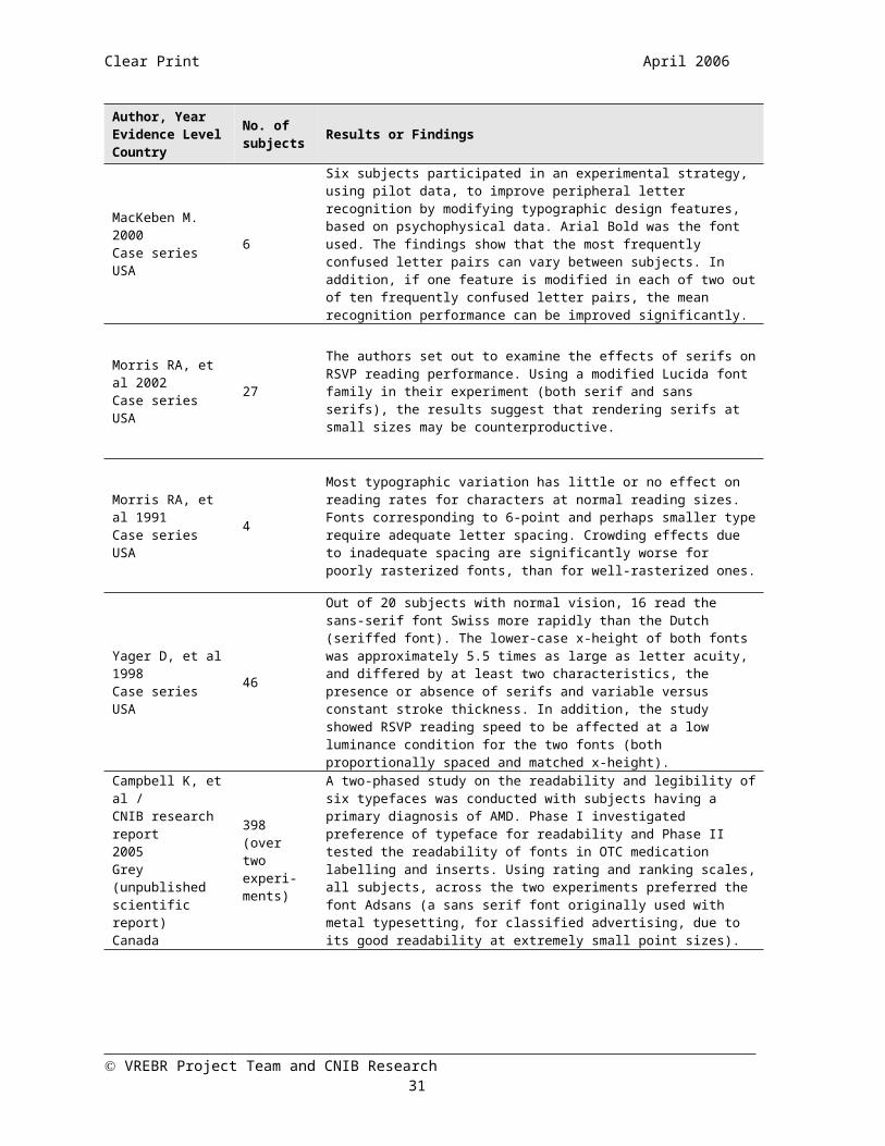
MacKeben M. 2000Case series USA
6
Six subjects participated in an experimental strategy, using pilot data, to improve peripheral letter recognition by modifying typographic design features, based on psychophysical data. Arial Bold was the font used. The findings show that the most frequently confused letter pairs can vary between subjects. In addition, if one feature is modified in each of two out of ten frequently confused letter pairs, the mean recognition performance can be improved significantly.
VREBR Project Team and CNIB Research 23

Clear Print April 2006
Author, YearEvidence LevelCountry
No. of subjects Results or Findings
Morris RA, et al 2002Case seriesUSA
27
The authors set out to examine the effects of serifs on RSVP reading performance. Using a modified Lucida font family in their experiment (both serif and sans serifs), the results suggest that rendering serifs at small sizes may be counterproductive.
Morris RA, et al 1991Case seriesUSA
4
Most typographic variation has little or no effect on reading rates for characters at normal reading sizes. Fonts corresponding to 6-point and perhaps smaller type require adequate letter spacing. Crowding effects due to inadequate spacing are significantly worse for poorly rasterized fonts, than for well-rasterized ones.
Yager D, et al 1998Case seriesUSA
46
Out of 20 subjects with normal vision, 16 read the sans-serif font Swiss more rapidly than the Dutch (seriffed font). The lower-case x-height of both fonts was approximately 5.5 times as large as letter acuity, and differed by at least two characteristics, the presence or absence of serifs and variable versus constant stroke thickness. In addition, the study showed RSVP reading speed to be affected at a low luminance condition for the two fonts (both proportionally spaced and matched x-height).
Campbell K, et al /CNIB research report 2005 Grey (unpublished scientific report)Canada
398 (over two experi-ments)
A two-phased study on the readability and legibility of six typefaces was conducted with subjects having a primary diagnosis of AMD. Phase I investigated preference of typeface for readability and Phase II tested the readability of fonts in OTC medication labelling and inserts. Using rating and ranking scales, all subjects, across the two experiments preferred the font Adsans (a sans serif font originally used with metal typesetting, for classified advertising, due to its good readability at extremely small point sizes).
Perera S 2001Grey (unpublished scientific report—5 experiments)England
308 (total over 5 experi-ments)
Five experiments were conducted to determine the legibility of fonts, specifically Tiresias, a new typeface for large print. Additional experiments included serif/sans serif legibility, space and weight, punctuation, and serif and space. Results were in favour of Tiresias, which was viewed as being more legible than Times or Arial. Subjects with poor reading vision preferred Tiresias more than individuals with fair or good reading vision.
VREBR Project Team and CNIB Research 24

Clear Print April 2006
ConclusionsIn summarizing our review of the research on typeface characteristics, we can clearly state that the choice of typeface and specific typographical features affect legibility for individuals with low vision conditions where reading is a challenge. It is a well-known and accepted fact that typeface affects legibility and readability (Tinker, 1963Error: Reference source not found; Mackeben 199969; Mansfield, et al 1996Error: Reference source not found; Roethlein, 191270; Whittaker, et al 1989Error:Reference source not found). However, it has only been within the last decade or so that computers are able to provide researchers with better control over the typeface design characteristics being used their research. Font modifications are at times necessary for experimental research and this is possible as a result of the development of computerized fonts. Yesterday’s typeface designers and printers had to go through an arduous process of changing letter features starting from drawings, producing metal type, combining them to form words, and then printing them on paper. Today’s designer can change any element of a typeface instantly using type design software, on a computer and then immediately use the modified font to test the efficacy of the modifications by goal-directed psychophysical experiments.71
Yet, even with the advent of advanced font technology and the manipulation of typeface characteristics, the amount of research in this area is limited. The following conclusions are based primarily on evidence from case series designs with small sample sizes, and an absence of separate controls (internal controls are present in some cases). It is therefore impossible to make strong evidence-based conclusions based on the existing research on font legibility and typographical features for low vision readers. However, there are consistent threads that run through many of the studies, in addition to solid, historical evidence supporting basic theories of typeface legibility. Although the sound, historical evidence from previous typographical research oftentimes does not take into account a visually impaired population, the main concepts and effects of this evidence can, for the most part, be generalized to readers with low vision.
Choice of Typeface and SizeIn one of the few quantitative studies on reading performance and font legibility for the visually impaired, Mansfield, et al (1996), found a small, but significant advantage of Courier over Times Roman in reading acuity, critical print size, and reading speed. However, gains in reading speed for subjects with low vision were modest. It is possible however that for print sizes close to the acuity limit the choice of font could make a significant difference in reading performance (for both normal and low vision). Arditi (2004) found that prototype font adjustment software (Font Tailor) used in their experiment produced enhanced legibility (gain averaged over 75%). The study did not demonstrate any advantage—or increases in legibility—over standard fonts such as Times New Roman. Yager, et al (1998) found that out of 20 subjects with normal vision, 16 subjects could read the Swiss, sans serif font, more rapidly than the seriffed Dutch typeface. In this study, the lower-case x-height of the fonts was approximately 5.5 times as large as letter acuity; the acuity reserve for Swiss was higher than for Dutch at the low luminance, which may have accounted for the difference in reading speeds.
In a series of experiments comparing the customized Tiresias large print typeface to other fonts such as Arial and Times Roman, Perera (2001, unpublished scientific report) found that in almost all of the trials that subjects preferred the large print typeface, Tiresias over Arial or Times. Subjects with poor reading vision preferred Tiresias more than individuals with good vision in experiments comparing legibility (serif and typeface), space and weight of typeface, and punctuation. In addition, Campbell, et al (2005, unpublished scientific report) reported that across a total of 398 participants, a 16-point sans serif font called “Adsans” was found to be more readable than Times Roman, indicating that familiarity with a popular font (Times Roman) did not correlate with preference for legibility or readability. Chung, et al (1998) measured the effect of print size on reading speed in normal peripheral vision. The results show that a larger print size was required to achieve maximum reading speed in peripheral than in central vision.
VREBR Project Team and CNIB Research 25

Clear Print April 2006
Drummond, et al (2004), Estey, et al (1990), and Campbell, et al (2005) all investigated the relationship between text size and printed health information (medication labelling and patient literature). Drummond observed that subjects with a best-corrected VA lower or equal to 6/24, showed a significantly diminished ability to read instructions on their eye drops bottles. Subjects in this study preferred Arial font with point sizes ranging from 16-22-pt, according to varying acuity levels. Estey, in a study on patient literature for potential cataract patients found that 65% of subjects found the Universe 14-pt. typeface to be the most legible, compared to a seriffed font, Century Schoolbook. These patients also preferred the high contrast reading materials, with black text and a white background. Campbell, et al showed that in comparing six different fonts in 7-point size on sample OTC medication inserts and labels, that the preferred typeface was the sans serif font (Adsans). These studies certainly lean in the direction of sans serif typefaces as being the most preferred fonts regarding the readability and legibility of printed medical information and drug labels. On the other hand, it is also evident that based on the results of the small sample of studies assessed in this review, more research on the size and choice of typeface for medication labelling and patient literature is needed. Based on the studies selected for this review, the choice of typeface has been shown to affect reading speed and performance. Furthermore, it has also been shown that in some cases, increased typeface legibility may have more to do with personal preference and individual comfort than other conditions.
Serifs or Sans SerifsBased on results from existing studies, the effects of the presence or absence of serifs on text legibility seem to be inconclusive. Arditi & Cho (2005) as well as Moriarty & Scheiner (1984) found no differences in reading speed when comparing sans serif to serif fonts. Arditi (2005), using nine different, lower-case, customized fonts, found an extremely small effect of serif size in one of the experiments. With very small letter sizes, close to the acuity limit, serifs may actually interfere, though very slightly, with legibility. However, there was no strong determination of a definite difference in legibility between serif and sans serif fonts. Morris, et al (2002) found that when comparing 4-pt. and 16-pt. Lucida fonts, serifs appeared to interfere only at very small sizes, and provided nothing toward a sentence-based word recognition, through RSVP reading. They concluded that serifs may slow RSVP reading at very small retinal sizes, and may be counterproductive. However, as stated above, both Yager, et al (1998) and Perera (2001) found both increased reading performance and preference for sans serif fonts (Swiss and Tiresias, respectively). Campbell, et al (2005) reported a preference for sans serif fonts, as determined by readability rating and ranking tasks.
Letter Spacing or CrowdingLetter spacing or “crowding” has been shown to affect reading speed. Indeed, closely packed small letters are much harder to read compared to the same letters presented in isolation.Error: Reference source not found Most of the knowledge on the “crowding effect” comes from letter identification experiments where the observer either knew which letter in the display was the target or knew how many letters they were supposed to report from a stimulus string.Error: Reference source not found
The effects of interletter spacing, stroke width, and letter aspect ratio on legibility have all been studied. Arditi, et al (1990) found that for small characters, a fixed width pitch produced the fastest reading. RSVP reading showed that higher text density and lower eye movement requirements of variable width text is responsible for superiority at medium and large character sizes. In an experiment conducted with normal vision subjects, Chung (2002) found that increased letter spacing beyond the standard size does not lead to an increase in reading speed in central or peripheral vision. Liu and Arditi (2000, 2001) observed under narrow-spacing conditions, that random guessing and lateral interactions between features of neighbouring letters accounts for most of the acuity deterioration. They also found that when information about the length of letter strings is uncertain, subjects tend to underestimate the lengths of small, closely packed letter strings. Typically, the subjects omitted one of the interior letters or combined two neighbouring letters under these conditions. Moriarty & Scheiner (1984) found that the difference in mean words read between close-set type and mean words read set in regular type was significant for the close-set type effect. However, they could not support their hypothesis that the interaction between letter spacing and typeface affects reading speed.
VREBR Project Team and CNIB Research 26
Clear Print April 2006
Letter ConfusionPeople with central vision loss must often rely on eccentric viewing strategies. One of the goals of low vision rehabilitation is to optimize the presentation of reading material for people with foveal vision loss. It has been hypothesized that by optimizing conditions for letter recognition reading performance with eccentric viewing may be enhanced. Some studies have sought to investigate this concept by studying letter recognition tasks and analyzing letter recognition errors—or “confusions.” MacKeben (2000) found that with six, normally sighted subjects, the most frequently confused letter pairs varied between individuals. If one feature is modified in each of two out of ten frequently confused letter pairs, the mean recognition performance could be improved significantly. Liu and Arditi (2000) found that subjects made more mistakes in judging the number of letters in the stimulus strings as interletter spacing decreased. Liu and Arditi (2001) showed that there were particular common letter confusions for both narrow and wide letter spacings, as well as confusions that were unique to either narrow or wide spacings. They conclude that the deterioration of legibility during narrow spacing conditions could be attributable to an increase in random errors and a set of letter confusions not observed under wide spacing conditions.
Psychophysics of Reading ExperimentsGordon Legge and colleagues conducted a series of experiments on the psychophysical factors that may or may not affect reading. The series of twenty studies included subjects with both visual impairment and normal vision and investigated a number of factors associated with reading and text characteristics. In this review, we decided to assess only those Psychophysics of Reading studies that directly confronted issues surrounding specific typefaces, legibility and characteristics associated with low vision. Many of the Psychophysics of Reading of studies investigated elements of typography and associated characteristics such as size, contrast, blur, crowding, and letter confusion, in conjunction with other main hypotheses, such as linking letter recognition to the visual span or page navigation with magnifiers. It is evident that many of these characteristics are important considerations for low vision conditions. Blur, for example plays an important role in several forms of low vision: cataract, keratoconus, and corneal scarring. Blur can limit reading performance and research72 on this subject shows that in order to be legible, bandwidths in the range of 1.5-3 cycles per character width are required.Error: Reference source not found In this series, a study on the effects of wavelength (text colours) showed that subjects with low vision, and in particular, degenerative diseases of the photoreceptors, showed a tendency to read better with blue, rather than red. Legge and Rubin (1986)73 found that the presence of central or peripheral field loss in not predictive of wavelength effects in reading. On the whole, they found that wavelength, only occasionally plays a role in reading performance.
In summary, it is clear from the research and this review, that the choice of typeface and its associated characteristics can all impact legibility and reading performance for individuals with various low vision conditions. In terms of which font style and typeface characteristics are the best for reading performance, some of this has been proved scientifically, while other aspects of text legibility appear to be dependent upon individual preferences. In other cases, it just seems to be an issue of “common sense.” For example, you wouldn’t intentionally reduce the space between letters to the point of illegibility on a marketing brochure, nor would you write your graduate thesis in a red with a 4-point font. Current guidelines on good design for printed materials for people with visual impairment are extremely beneficial, and there appears to be increasing enlightenment on the part of the non-visually impaired community and public and private organizations to keep pace with these developments. With the advent of the Internet and computer-related technologies, issues surrounding information accessibility are well developed and gaining momentum. It is perhaps, only a matter of time before standardized concepts on text legibility for the visually impaired are instituted on both a local and global scale.
VREBR Project Team and CNIB Research 27

Clear Print April 2006
References
VREBR Project Team and CNIB Research 28

Clear Print April 2006
Appendix I—Studies and Publications Selected for Review
1. Arditi A and Cho J. Serifs and font legibility. Vision Research 2005;45:2926-2933.
2. Arditi, A. Adjustable typography: An approach to enhancing low vision text accessibility. Ergonomics 2004;47(5):469–482.
3. Arditi A, Knoblauch K, & Grunwald I. Reading with fixed and variable character pitch. Journal of the Optical Society of America 1990;A (7):2011–2015.
4. Campbell K, et al. CNIB/OCAD typographic legibility research project—“Clear Print” report. May 2005. CNIB Research.
5. Chung ST. The effect of letter spacing on reading speed in central and peripheral vision. Invest Ophthalmol Vis Sci 2002; 43(4):1270-1276.
6. Chung STL, Mansfield JS, Legge GE. Psychophysics of reading. XVIII. The effect of print size on reading speed in normal peripheral vision. Vision Research 1998; 38(19):2949-2962.
7. Drummond SR, Drummond RS, Dutton GN. Visual acuity and the ability of the visually impaired to read medication instructions. Br J Ophthalmol 2004; 88(12):1541-1542.
8. Estey A, Jeremy P, Jones M. Developing printed materials for patients with visual deficiencies. J Ophthalmic Nurs Technol 1990; 9(6):247-249.
9. Liu, L., & Arditi, A. How crowding affects letter confusion. Optometry and Vision Science 2001; 78:50-55.
10. Liu, L., & Arditi, A. Apparent string shortening concomitant with letter crowding. Vision Research 2000;40:1059-1067.
11. MacKeben M. Enhancement of peripheral letter recognition by typographic features. Vis Impair Res 2000;2(2):95-103.
12. Mansfield JS, Legge GE, & Bane MC. Psychophysics of reading Xv: Font effects in normal and low vision. Investigative Ophthalmology and Visual Science 1996; 37(8):1492–1501.
13. Moriarty SE and Scheiner EC. A study of close-set text type. Journal of Applied Psychology 1984;69:700-702.
14. Morris R, Aquilante K, Yager D & Bigelow C. Serifs slow rsvp reading at very small sizes, but don’t matter at larger sizes. Society for Information Display International Symposium Digest of Technical Papers 2002;33(1):244-247. Retrieved March 31, 2006 from: http://www.cs.umb.edu/~ram/rsvp/publications/SerifsSubmittedV2.doc
15. Morris RA, Berry K, Hargreaves KA, Liarokapis D. How typeface variation and typographic scaling affect readability at small sizes. Society for Imaging Science and Technology, Portland: Proceedings of the 7th International Congress on Advances in Non-Impact Printing Technologies, 1991.
16. Perera S. An investigation into the legibility of large print typefaces. December 2001. RNIB Scientific Research Unit. Retrieved March 24, 2006 from http://www.tiresias.org/fonts/lpfont/report/index.htm
VREBR Project Team and CNIB Research 29

Clear Print April 2006
17. Yager, D., Aquilante, K., & Plass, R. High and low luminance letters, acuity reserve,and font effects on reading speed. Vision Research 1998;38:2527-2531.
VREBR Project Team and CNIB Research 30
Clear Print April 2006
Appendix II—Study Attributes TableThe following table contains data extracted from the studies selected for review and is listed alphabetically by first author’s last name.
Study Attributes
Study Study Design and Methods Fonts Used N Subject Characteristics Outcomes Measured, Evaluation
and Statistical Methods Results or Findings
Arditi A & Cho J2005USA
Case series
Three experiments using nine custom fonts, to determine the legibility of serifs and sans serif fonts (0%, 5%, and 10% cap height).
Nine customized, lower-case fonts varying in serif size (0%, 5%, and 10% cap height).
4
Normal vision (n=2) AMD (n=2)
No other characteristics reported.
Legibility of serif or sans serif fonts using size threshold measures (experiment 1), RSVP reading (experiment 2), and continuous reading on paper (experiment 3).
All text was presented on a computer monitor, with black text on white background.
ANOVA (for all analyses)
In experiments 2 and 3, the presence or absence of serifs made no difference in reading speed, for all participants, both normally sighted and low vision.
In experiment 1 a statistical effect of serif size was observed, although this difference was extremely small.
The authors conclude that with very small letter sizes, close to the acuity limit, serifs may actually interfere, though very slightly, with legibility.
Arditi A 2004USA
Case series
Adjustable typography using Font Tailor software prototype.
Customized font using FontTailor program (default cap height 38 mm, 162 point)
Times New Roman (initially set on monitor at 18 point size)
40 Various ocular pathologies, mainly AMD, cataract, glaucoma, and DR.
20/40 or worseDifficulty with reading
Font parameter adjustments (according to subject)
Parameters tested were letter spacing, stroke width, serif size, x-height, and aspect ratio.
Font Tailor program and 19-in. display monitor centered at eye height, viewed from a distance at which the default font (cap height 38mm, font size 162 point) could be read comfortably.
Text displayed in black letters on white background.
Reading acuity with Times New Roman—to compare with adjustments made to Font Tailor fonts.
Measurements made with Lighthouse/ETDRS chart.
Participants varied widely on in the font that produced the most legible text.
All participants reading acuities improved with the adjusted font.
Manipulation of inter-letter spacing had the largest impact on legibility (almost 20% smaller characters could be read than with the default font spacing).
Manipulation of the x-height and aspect ratio also resulted in substantial gains in legibility.
The smallest gain was seen for the manipulation of serif size.
The most significant gain from this experiment was the total legibility gain from all adjustments, averaged 75%.
VREBR Project Team and CNIB Research 31

Clear Print April 2006
Study Attributes
Study Study Design and Methods Fonts Used N Subject Characteristics Outcomes Measured, Evaluation
and Statistical Methods Results or Findings
Box and whisker plots showing upper, lower, and interquartile range of distributions.
For a broad range of visual acuities, the adjusted font and Times New Roman were almost identical for legibility.
Arditi A, Knoblauch K, & Grunwald I.1990USA
Case series
To determine the effect of pitch (variable and proportional spacing) on reading speeds at various character sizes. A control experiment was conducted using RSVP reading.
Times Roman Fixed-width
version of Times Roman (customized by the experimenters)
18 point
4 Authors served as subjects.All subjects had normal vision.One was colour defective.
Reading performance (rate and accuracy)
Testing blocked by character size, with the set of character sizes run in pseudo-random order. Within character size, the three text display conditions were pseudo-randomly permuted.
Text broken into lines consisting of the largest number of whole words that could fit into a 35 character line.
Experiment 1: Reading with free eye movements, variable width (VW), fixed width (FW), and modified variable width (MVW) characters.
Experiment 2: RSVP reading, identical to experiment 1.
Experiment 3: Eccentric reading without eye movement requirements.
Data was presented graphically, with error bars, showing reading rate as a function of character size. Each point on the graph represented the geometric mean of at least 6 measurements.
Measurement of RSVP reading rates with 2 deg eccentric viewing. As a fixation control, words were presented randomly either 2 deg above or below a fixation point to discourage eye movements to an unexpected word location.
VW pitch yielded better performance at medium and large character sizes.
FW pitch was superior for character sizes approaching the acuity limit.
Crowding effects were noted at the smallest sizes (character and word identification).
The control experiment with RSVP reading suggested that reduced eye movement requirements of variable pitch contribute to the superiority at medium and large character sizes.
For unscrambled text, the difference was greater than zero, indicating the original effect that FW text is read faster than MVW text.
At the character heights measured, FW text was read on average about 28% faster than MVW text.
For scrambled text, differences between reading speed were reduced to near zero.
VREBR Project Team and CNIB Research 32Appendix II—Study Attributes Table

Clear Print April 2006
Study Attributes
Study Study Design and Methods Fonts Used N Subject Characteristics Outcomes Measured, Evaluation
and Statistical Methods Results or Findings
Reading performance compared for MVW and FW text using scrambled text—to evaluate whether the added inter-word space of the MVW text influenced reading by interfering with comprehension [expressed through difference of logarithms of reading rates for FW and MVW text for scrambled and unscrambled text].
Campbell K, et al/CNIB research report 2005Canada
Grey (unpublished scientific report and study)
2-phased study to determine font legibility and user preference using six typefaces. Phase I included rating and ranking tasks for six fonts. Phase II tested font readability in OTC and prescription drug labels and inserts.
Phase I (all 16-point) and Phase II (all 7-point): Adsans Arial Clearview Lucida Times Roman Verdana
Phase I=241
Phase II=157
Phase I AMD (primary diagnosis, all
subjects) Secondary diagnoses:
myopia, presbyopia, cataracts, astigmatism, drusen, amblyopia.
Age range = 51-85.7 yrs. Mean age = 77.4 yrs. Female (71%) Participants were recruited
from Edmonton, Toronto, and St. John’s, Newfoundland
Phase II AMD (primary diagnosis, all
subjects) Secondary diagnoses:
myopia, presbyopia, cataracts, astigmatism, drusen, amblyopia.
Age range = 52.9-85.5 yrs. Mean age = 78 yrs. Female (70.1%) Participants were randomly
selected from CNIB databases with AMD.
Subjects were from the greater Toronto region.
Phase I Rating task: Font readability
scale from 1 (impossible to read) to 7 (very easy to read). Directions were written in 16-point font.
Each participant was randomly assigned a package containing six pages, each with a different typeface.
All fonts were in 16-point font and presented in random order.
6 passages of text from Robert Louis Stevenson’s Treasure Island.
Subjects were able to use magnifiers, if needed.
Ranking task: Subjects were asked to place samples of text in order from the easiest to the hardest to read.
Phase II Rating task: Font readability
scale from 1 (impossible to read) to 7 (very easy to read).
Packaging contained six mock-ups of instructional OTC drug inserts in six different fonts, at 7-
Phase I The typefaces differed significantly
in their readability (p<0.05). Adsans was the most readable
typeface. Results from a CNIB font
preference survey (using Adsans and Century Schoolbook) confirmed the results: out of 470 respondents, 94% preferred the Adsans font.
Phase II The typefaces differed significantly
(p<0.05) in readability. Adsans was the most readable
typeface for all participants. Most participants chose the CCTV
as the LVA of their choice (66%). A separate analysis was completed
to compare readability among the CCTV users and non-CCTV users: The CCTV users reported higher levels of readability in general and rated the readability of the font Verdana more readable than Arial and Lucida. Non-CCTV users found Lucida more readable than Verdana and Arial.
VREBR Project Team and CNIB Research 33Appendix II—Study Attributes Table

Clear Print April 2006
Study Attributes
Study Study Design and Methods Fonts Used N Subject Characteristics Outcomes Measured, Evaluation
and Statistical Methods Results or Findings
pt. size. Exact pairing of the insert and font, and order in which they were viewed was randomized.
Participants were allowed to use reading aids of their choice. A CCTV, lamp, and magnifiers were available.
Ranking task: Subjects were asked to rate each font, one at a time, using the seven-point rating scale.
Chung S 2002USA
Case series
To determine if reading speed could be increased with increased letter spacing, using psychophysical methods and RSVP reading. Also tested was whether letter spacing imposes limits on small or large size print.
Courier (fixed width font) presented at 0.8x or 1.5x the CPS
6 Normal vision
Psychophysical methods for determining reading speed.
RSVP reading High contrast text was displayed
black on white, on a computer monitor.
Three retinal eccentricities 0, 5, and 10 in the inferior visual field tested.
Two print sizes: 0.8 and 1.5 the CPS.
ANOVA (repeated measures) Geisser-Greenhouse adjusted
Reading speed was highest at the fovea, decreased with eccentricity, and was faster for the larger print size.
At all eccentricities, and for both print sizes, reading speed increased, up to a critical letter spacing, and either remained constant at the same reading speed or decreased slightly for larger letter spacings.
Increased letter spacing, beyond the standard size, does not lead to an increase in reading speed in central or peripheral vision.
Chung S, et al 1998USA
Case series
Measured the effect of print size on reading speed at different retinal eccentricities in normal peripheral vision.
Times Roman on computer monitor with eight print sizes
6 College-age with normal vision, all had corrected VA of 20/20 (range 20/13—20/20).
No prior experience with RSVP reading technique.
Reading speed at various eccentricities in normal peripheral vision, at eight print sizes (spanning ~0.7 log units).
RSVP reading utilized in experiment
“Scaling hypothesis”—reading speeds should remain invariant with eccentricity, as long as print is appropriately scaled in size.
Reading speed measured with single sentences extracted from nine novels. Sentences were chosen randomly for each trial.
By determining reading speeds as a function of print size at six different retinal eccentricities the results showed: Larger print size is required to
achieve maximum reading speed in peripheral than in central vision.
The rate of change in reading speed as a function of print size remains invariant in central and peripheral vision.
Even when print size is not the limiting factor, maximum reading speeds are still lower in peripheral
VREBR Project Team and CNIB Research 34Appendix II—Study Attributes Table

Clear Print April 2006
Study Attributes
Study Study Design and Methods Fonts Used N Subject Characteristics Outcomes Measured, Evaluation
and Statistical Methods Results or Findings
Words were in Times New Roman, proportionally spaced font, high contrast black letters on white background and displayed on computer screen.
Criterion reading speed was derived using psychometric methods.
Video-based eye tracking was used to ensure observers fixated properly, so text would be presented at the intended retinal eccentricity.
ANOVA (repeated measures) Cumulative Gaussian curve
(psychometric functions)
than in central vision.
Drummond SR, et al 2004Scotland
Case series (subjects randomly selected)
Reading medication instructions (labels)
Subjects were randomly selected from patients attending Tennent Institute of Ophthalmology, Glasgow.
Arial (16-22 point sizes) 180
Glaucoma (25%)AMD (19%)Retinal/macular pathology (11%)Cataract (11%)DR (12%)Unspecified (6%)Corneal (6%)Congenital condition (3%)Vascular event (3%)Optic neuropathy (2%)Uveitis (2%)
VA range: 6/9 – 6/60 (some ability to read medication bottles)
Mean age = 70 yrs.Age range = 23-100 yrs.
Male (43%)Female (57%)
Reading instructions on bottle of eye drop medication.
Subjects grouped by best-corrected VA (ranging from 6/9—6/60).
Near VA assessed using Snellen and near vision cards.
Subjects read the instructions on the side of the box and stated their preference of font size from a standard selection.
Statistical analysis performed with Kruskal-Wallis
Dunn’s test (to compare each group)
P value of <0.05 considered significant.
Subjects with best-corrected VA of lower than or equal to 6/24 showed a significantly diminished ability to read the instructions on their eye drops bottles (p<0.001 for each comparison).
Subjects preferred Arial font sizes. Point size preference was 16 for 6/24 group, 18 for 6/36 group, and 22 for 6/60 group.
VREBR Project Team and CNIB Research 35Appendix II—Study Attributes Table

Clear Print April 2006
Study Attributes
Study Study Design and Methods Fonts Used N Subject Characteristics Outcomes Measured, Evaluation
and Statistical Methods Results or Findings
Estey A, Jeremy P and Jones M 1990Canada
Case series
Font type, size, and colour regarding patient hospital literature, were all evaluated for preference by subjects admitted for cataract surgery at an in-patient ophthalmology unit.
Universe medium 12- point (sans serif)
Universe medium 14-point (sans serif)
Century Schoolbook 14-point (serif)
52
Patients who had been admitted for cataract surgery
Average age = 69.4 yrs. Female (27), Male (25)
Reading of patient hospital literature preference using comparisons of font, point size, serif/sans serif, and colour.
Colours used in experimental pamphlets: Pantone Colour system: PMS 349 Green, Process Blue, and Black.
No statistical analyses reported.
65% of the patients could read the 12-pt. typeface, 35% found it blurry.
65% preferred the Universe (sans serif) typeface.
33% preferred Century Schoolbook (serif).
2% had no preference. Black ink was preferred by 73% of
patients.
Liu L and Arditi A. 2001
Case series
An analysis of the types of acuity errors made using varying interletter spacing. Errors were analyzed using a “letter confusion matrix.”
METAFONT, font design language (fixed pitch font)
4
Author of this paper (n=1). Naïve volunteers from Lighthouse International (n=3)
All subjects had normal or corrected-to-normal vision.
Age range 20-40 yrs.
Five-letter word strings randomly drawn from the 26 uppercase letters of the English alphabet.
The overall height and width of the letters were five times the width of the strokes.
Compared letter confusions obtained at a wide (1.0 letter height) and narrow (0.1 letter height) interletter spacings.
Each interletter spacing condition tested with a total of 260 random five-letter strings broken into five balanced sessions.
Letter strings presented on computer monitor.
Statistical analyses: Letter confusion matrices Spearman’s rank correlation
(relative legibility)
Common letter confusions: statistically significant confusions that were common to both wide and narrow letter spacings, examples included FP, QG, GO, VY, IZ, and YT.
For narrow spacing, common confusions: FP, YT, VY, QG, GO, and IZ.
Unique confusions under narrow spacing confusions: UL, UJ, DC, RP, JL, and EB.
Letter confusions are qualitatively and quantitatively different under wide and narrow spacing conditions.
The deterioration of legibility during narrow spacing conditions could be attributed to an increase in random errors and occurrence of a set of letter confusions not observed under wide-spacing conditions.
VREBR Project Team and CNIB Research 36Appendix II—Study Attributes Table

Clear Print April 2006
Study Attributes
Study Study Design and Methods Fonts Used N Subject Characteristics Outcomes Measured, Evaluation
and Statistical Methods Results or Findings
Liu L and Arditi A. 2000
Case series
Participants were asked to identify letters in randomly presented four-letter and five-letter strings.
METAFONT, font design language (fixed pitch font)
3 All subjects had corrected-to-normal vision. Distance corrections worn during experiments.
Age= all participants in 20’s
Four interletter spacings used: 0.04, 0.08, 0.16, and 0.24 letter height.
Letters in the interior of each string were restricted to a set of five letters: A, J, L, N, U.
60 five-letter strings and 20 four-letter strings used.
The letter height range for all three participants was 1.0 and 1.44cm (45-65 pixels).
Letters presented at high contrast and on a computer monitor.
“Crowding effect”: The greatest errors of at least 30%
at the narrowest interletter spacing (0.04 times of the letter height).
When the spacing increased to 0.24 times of the letter height (the widest spacing), the subjects correctly identified most of the letters. The deterioration of legibility at narrower spacings indicates interaction between neighbouring letters, i.e. a “crowding effect.”
Errors in judging string length: As interletter spacing decreased,
observers made more mistakes in judging the number of letters in the stimulus strings.
Errors were categorized into three main types of errors: In-place errors—letters mistaken for other letters without disturbing neighbouring letters. Omission of interior letters—four out of five letters of a five-letter string were correctly identified but one of the letters was missing. Merger of neighbouring letters—sometimes, two neighbouring letters were read as one letter, which combined the strokes of the two stimulus letters, example: JJLUPJAUP, XJUALKANL, NNALTWALT, and QJAUCQJNC.
Conclusion: when information about the length of letter strings is uncertain, observers tend to underestimate the lengths of small, closely packed letter strings. Typically, the observers tend to omit one of the interior letters or
VREBR Project Team and CNIB Research 37Appendix II—Study Attributes Table
Clear Print April 2006
Study Attributes
Study Study Design and Methods Fonts Used N Subject Characteristics Outcomes Measured, Evaluation
and Statistical Methods Results or Findings
combine two neighbouring letters under such conditions.
MacKeben M. 2000USA
Case series (included pilot data)
Experimental strategy to improve peripheral letter recognition by modifying typographical design features based on psychophysical data.
Arial Bold 6
All had normal visionCorrectable refractive errors(20/50 or better)
Ages: 23, 24, 29, 52, 55, 58 yrs.
Psychophysical testing, data analysis of letter confusion matrices, letter modification of most frequently confused letter pairs using font design software.
Pilot data from previous experiment, and
10 single letters of Sloan (C, D, H, K, N, O, R, S, V, Z) set in Arial typeface, displayed at eccentricity of 8 on a computer monitor.
Target duration was adjusted individually (66-133 ms, all integral products of a single frame duration of 16.5 ms) to operate the task near threshold.
Letter height was 36 arcmin—well above the size threshold at this eccentricity and contrast.
Viewing binocular at 91 cm.
Data Analysis: Letter confusion matrices with d’
ratings. Paired t-tests
The confusion matrices for unmodified Arial Bold showed that OD and HN belonged to the three most frequently confused pairs for five out of six subjects.
HN was the top of three in the sixth subject.
No other letter pairs came close in the average number of confusions.
It was concluded that modifying one letter each out of these two pairs would affect the overall recognition rate the most.
The modifications consisted of doubling the width of the horizontal stem of the “H” to make it less confusable with “N” and adding serifs to the “D” to make it less likely to be confused with “O”.
The mean recognizability was, on average, improved by 18.7% by modifying features of just two letters in a set of 10.
The individual mean differences were statistically significant in a paired t-test (p<0.001).
Even with a small group of subjects, the author concludes that there were important interindividual differences, and no generalized assumptions should be made. This suggests that an individual assessment of problem letter pairs and individual tuning of typefaces might be necessary to secure good performance for each individual.
VREBR Project Team and CNIB Research 38Appendix II—Study Attributes Table
Clear Print April 2006
Study Attributes
Study Study Design and Methods Fonts Used N Subject Characteristics Outcomes Measured, Evaluation
and Statistical Methods Results or Findings
Mansfield JS, Legge GE, and Bane MC1996USA
Cohort
Reading acuity, maximum reading speed, and critical print size (CPS) were measured in 50 normal vision subjects and 42 low vision subjects. Data were collected using versions of MNREAD chart printed with Times (proportionally spaced) and Courier (fixed-width) fonts.
Times-Roman Courier-Bold 92
Subjects with normal vision (n=50) were undergraduate psychology students.
Subjects with low vision (n=42) diagnoses: Cataract, nystagmus,
corneal opacification, DR, glaucoma, optic neuritis (including ischemic and atrophy), progressive myopia, RP, ROP, AMD, detached retina, juvenile macular degeneration, Leber’s disease, and optic nerve deterioration.
Some subjects had central field loss.
Mean age and distance acuities (SD): Intact central vision:
4111.2 yrs., 0.870.52 logMAR (20/148).
Central vision loss: 6815.4 yrs., 0.850.35 logMAR (20/148).
Outcomes Measured: Reading acuity, maximum
reading speed, and CPS (the smallest print that can be read at the maximum reading speed).
Evaluation Methods: MNREAD Acuity Chart with a
series of 19 sentences printed at progressively smaller sizes.
Each Times-Roman sentence had 60 characters (including spaces between words).
Each Courier-Bold sentence had 56 characters.
Statistical or data analyses: Reading acuity was calculated in
a similar manner to the “letter-by-letter” method described by Ferris, et al§§
Algorithm for calculating CPS, which identifies the reading speed plateau.
Maximum reading speed was defined as the geometric mean of the reading speeds across the plateau. CPS was defined as the smallest print size included in the plateau.
Pairwise t-tests
Reading acuity scores obtained with Courier were better than those obtained with Times for both normal (mean difference, 0.05 logMAR, P < 0.001) and subjects with low vision (0.09 logMAR, P < 0.001).
CPS measured with Courier were smaller than those measured with Times (mean difference, 0.06 logMAR for normal subjects and subjects with low vision), P < 0.002).
Maximum reading speeds for normal subjects were 5% faster with Times than with Courier (P < 0.001), but for subjects with low vision, maximum reading speeds were 10% slower with Times than with Courier (P < 0.05).
For print smaller than the CPS, the reading speeds of normal subjects and subjects with low vision were substantially slower (by as much as 50%) for Times than for Courier.
Moriarty SE and Scheiner EC. 1984
Cohort
An investigation into the use of close-set type (interletter spacing) and font style: serif or sans
Times Roman (serif)
Helvetica (sans serif)
Both with 11-point type and 1-point
260
College students
Female (123), male (137)
No vision characteristics reported.
Four variations of copy style: serif with regular spacing, serif with close spacing, sans serif with regular spacing, and sans serif with close spacing.
Measures of performance included how many words were
The difference in mean words read between close-set type messages (370.19) and mean words read for messages set in regular type (331.81) was significant for the close-set main effect F(1,256)=7.966, p<.005
§§ Ferris FL, Kassoff A, Bresnick GH, Bailey IL. New visual acuity charts for clinical research. Am J Ophthalmol 1982;94:91-96.
VREBR Project Team and CNIB Research 39Appendix II—Study Attributes Table

Clear Print April 2006
Study Attributes
Study Study Design and Methods Fonts Used N Subject Characteristics Outcomes Measured, Evaluation
and Statistical Methods Results or Findings
serif. leading.
read in a given time period. For the close-set passages of
text, the amount of minus letterspacing was specified as ten units of minus spacing (on a 54-unit base), equivalent to 18% reduction in interletter spacing.
Controlled group testing situation where test messages were distributed randomly by rotation.
No explanation of statistical methods, but F and p values given.
(eta2=.026). This result supports the authors’ hypothesis indicating an advantage in reading speed resulting from the use of close-set type, for typefaces and letter space variations used in this study.
The difference in mean words read between messages set in serif typeface (352.31) and the mean words read for messages set in sans serif typeface (344.98) was not significant at the .05 level. This supports the hypothesis that there is no difference in the use of serif or sans serif typefaces in relation to reading speed.
With the third hypothesis—that the interaction of letter spacing and typeface does not affect reading speed was supported. The interaction of letter spacing and typeface is not significant.
Morris RA, et al 2002USA
Case series
To determine the effects of serifs on RSVP reading performance.
Lucida (serifs and sans serif versions;modified for the experiment)
27 No vision characteristics reported.
Subjects were all native English readers.
Subjects viewed a screen in a darkened room at 4m, resulting in retinal x-heights of approx. 12 arc-minutes and 48 arc-minutes of visual angle. This corresponds to 4-point and 16-point type at normal reading distance of 40cm.
Staircase method was used to estimate reading rates.
Custom software presented words serially on the display.
Subjects initiated the next presentation with a press of a mouse button.
Each subject repeated five trials at two sizes and for two fonts (serif and sans serif Lucida variants).
For the 4-point faces, the probability exceeds .95 that the advantage of sans over seriffed Lucida is between 1.16 and 1.24.
For the 16-point face the probability exceeds .95 that this ratio is between .98 and 1.02.
In summary, serifs interfere only at very small sizes and provide nothing toward sentence-based word recognition as revealed with RSVP reading.
Successful rendering of serifs at small retinal sizes may be counterproductive.
VREBR Project Team and CNIB Research 40Appendix II—Study Attributes Table

Clear Print April 2006
Study Attributes
Study Study Design and Methods Fonts Used N Subject Characteristics Outcomes Measured, Evaluation
and Statistical Methods Results or Findings
Number of words read correctly per unit time was the accepted measure of reading performance.
Sentences were artificially constructed, but meaningful English, unconnected to one another, approx same length.
Exponentiation resulting confidence intervals provided an estimate for the performance advantage of the task with serif or sans serif type.
Morris RA, et al 1991USA
Case series
How font quality might influence conclusions about typographic variables and readability. To test the hypothesis that previous conclusions drawn about fonts and reading performance may be irrelevant if the fonts are properly designed.
Experiment 1:Times PFW (Psuedo Fixed Width) and Times NSB (No Side Bearings), modified Macintosh Times fonts; 12 and 24-points.
Experiment 2: Poorly formed fonts based on Times.
Lucida Sans and Typewriter, 12 and 24 points.
Computer Modern Roman using Metafont, 6 and 12-point size.
4
Three of the authors served as subjects.
1 subject was naïve typographically and to the experiment’s purpose.
This study looked at fixed vs. variable width fonts, typographic v. linear scaling, and tight v. loose letter spacing.
Reading rate (computed as the product of the percentage of correctly read words and the rate of text presentation in words per minute).
Readability was measured using a “flash card” method.
All experiments conducted on a computer monitor.
Sentences were broken into 24-29 characters per line and text was from one million English words in the Brown Corpus of English.
For most subjects there was little significant difference between the crowded NSB font and the artificially spaced PFW font, suggesting that letter spacing alone cannot account for reading rate differences.
Loose letter spacing does not make fonts easier to read. Rather, shape or other font-quality factors do. The authors concluded that reasonable vs. poor letter spacing, not fixed-width vs. variable-width fonts, reduces crowding effects.
None of the subjects showed any preference for either of the two resolutions (Times or Lucida). For character heights down to .16 degrees and resolutions down to 8 pixel cap-heights, letter shape quality probably influences readability more than does resolution.
For .16 degree characters, all subjects showed a slight preference, ranging from 10-30% for the typographically spaced font (Computer Modern Roman).
VREBR Project Team and CNIB Research 41Appendix II—Study Attributes Table

Clear Print April 2006
Study Attributes
Study Study Design and Methods Fonts Used N Subject Characteristics Outcomes Measured, Evaluation
and Statistical Methods Results or Findings
Perera S 2001England
Grey (unpublished scientific report and study)
A series of five experiments: typeface legibility, serif legibility, space and weight of typeface, punctuation legibility. Exp 1-4 were within-subjects designs and the last was a mixed within/between subjects design.
Exp 1: Tiresias, Arial, and Times New Roman
Exp 2: Tiresias modified with serifs and sans serif
Exp 3: Tiresias, altered for varying spacing
Exp 4: punctuation
Exp 5: samples from text with different degrees of serifs.
308*** Exp 1: Subjects’ rating of their
vision: poor vision (125), fair vision (62), and good vision (21).
115 said they could not read ordinary print and 96 replied they could.
Mean age = 61.4 (SD 18.3) Female (137), male (79) Of 113 subjects, the mean
number of large print books read per week was 0.80 (SD 0.88), with the max being 3 and the min 0.
Exp 2: Self-rated measure of
vision: poor (13), fair (8), good vision (0).
Mean age = 56.45 (SD 20.34)
Female (15), male (5) Some could read ordinary
print and others could not.Exp 3: Self-rated vision: poor (23),
fair (3), and good (0). Mean age = 63.17 (SD
16.99) Female (16), male (10) Nearly all subjects could
not read ordinary print.Exp 4: Self-rated vision: poor (11),
fair (12), and good (8). Mean age = 68 (SD 21.36) Female (19), male (11). Of the majority of subjects
who could not read ordinary
Exp 1 (for all subjects—comparisons were also made for current and potential readers of large print): Questionnaire and samples of
continuous text in the three font styles, formatted as if in a large print book; black ink on white paper. No italics or all-caps were used.
The questionnaire was designed to request the subjective legibility rating and preferred readability of the typefaces.
Chi-square test of association and goodness-of-fit tests (frequency of differences between typefaces)
Wilcoxon test (to determine the differences in legibility of typefaces)
Exp 2: Questionnaire and sample of
continuous text replicated three times (Tiresias was altered to produce sans serif, semi-serif, and serif). Subjects were required to respond as to how legible they found the samples.
Chi-square (typeface preference)
Friedman test (legibility rating)Exp 3: Questionnaire and sample of
continuous text. Tiresias was altered using Fontographer 4.1 to produce three typefaces with difference spacing and three with different weights.
Exp 1: The greatest proportion of subjects
preferred Tiresias. Slightly more people preferred Arial to Times New Roman.
The majority of subjects preferred to read a large print book in Tiresias.
Subjects least preferred typeface was Times New Roman.
Exp 2: The same frequency was found for
both the sans serif and serif typefaces, but more subjects chose the semi-serif typeface.
The mean rating for the typefaces was lower for the semi-serif version.
Legibility rating between the degree of serif typefaces was not significant, even for subject that only had poor or fair vision ratings.
Exp 3: Enlarged spacing was preferred by
subjects, then normal spacing, and then condensed spacing.
From the weight results, legibility increased as the weight of the typeface increased. This was shown to be statistically significant. Subjects preferred the typeface with the darkest weight.
Exp 4: Subjects preferred rounded
punctuation shape. In terms of the size, the “medium” level was the most legible.
Exp 5: All subjects who read large print
*** This is the total over five experiments: 211 (exp 1), 25 (exp 2), 26 (exp 3), 31 (exp 4), and 15 (exp 5).
VREBR Project Team and CNIB Research 42Appendix II—Study Attributes Table

Clear Print April 2006
Study Attributes
Study Study Design and Methods Fonts Used N Subject Characteristics Outcomes Measured, Evaluation
and Statistical Methods Results or Findings
print, did read large print, but some did not.
Exp 5: Self-rated measures of
vision: poor (4), fair (7), and good (4).
Mean age = 77.27 (SD 8.19)
Female (12), male (3) Eleven out of 15 subjects
could not read ordinary print and nine of the subjects read large print books.
Two, two-page extracts taken from a popular author’s large print book, replicated with different spacing and weights.
Subjects were asked to rate the legibility and preference for what they would read in a large print book.
Friedman test Wilcoxon Chi-squareExp 4: A questionnaire written in 16pt
Verdana was produced to inquire about the preferred shape and size of punctuation marks. Common punctuation marks were altered.
Punctuation marks included: speech marks, semicolon, colon, comma, full stop, exclamation mark, question mark, apostrophe, and brackets.
Exp 5: Structured interviews, all
subjects followed the same procedure to the same worded questions.
Five extracts of text were taken from a popular author’s large print book.
One extract was replicated to produce three typeface samples with different degrees of serif: sans serif, semi-serif, and serif. There were also two spacing examples (normal and enlarged). Subjects were asked which ones they found most legible.
Chi-square
books did so by recognizing words not individual characters.
Although no significant difference in preference was found between degree of serif typefaces, analysis of reading speeds showed subjects read samples in a semi-serif typeface faster than either of the other samples.
Subjects preferred normal spacing to enlarged spacing, as reflected in reading speeds—which were significantly faster with a normally spaced typeface.
The interaction between the two main effects “degree of serif” and “spacing” was not significant.
VREBR Project Team and CNIB Research 43Appendix II—Study Attributes Table

Clear Print April 2006
Study Attributes
Study Study Design and Methods Fonts Used N Subject Characteristics Outcomes Measured, Evaluation
and Statistical Methods Results or Findings
Mixed, two-way analysis of variance (to analyze subjects’ reading speeds)
Mauchly’s Test of Sphericity Greenhouse-Geisser epsilon
Yager D, et al 1998
To determine if there is a reading speed difference between two fonts, for a fixed x-height, in two different luminance conditions.
Dutch (serif) Swiss (sans
serif) Both are
proportionally spaced and matched for x-height
46Normal vision (20/20); optometry and high school students
Reading performance Luminance (2 conditions) Single letter acuity measured at
low luminance Text displayed on a monitor
using RSVP method Text was selected from
standardized reading material with sixth to ninth grade difficulty’ presented in single sentences, 10-13 words in length.
Subjects read at a distance of 1m. At this distance lower-case x-height of fonts was 8mm, 27.5 arc-min, measured with ETDRS chart.
The Swiss letters were on average, 3.3% wider than Dutch.
One-up, one-down staircase procedure used.
At the high luminance, there was no significant difference between reading rates (Wilcoxon signed ranks P = 0.59, n=26).
By the Wilcoxon signed-ranks test, there is a significant advantage for the Swiss font, about 11.5% greater than for Dutch.
While the mean advantage was small, 16 out of 20 of the subjects read the sans serif font more rapidly at the low luminance.
Measurements for single letter acuity for both fonts at low luminance (on three subjects with 20/20 corrected vision) showed an advantage for the sans-serif, uniform stroke-width font, Swiss over Dutch.
RSVP reading speed is affected in a low luminance condition for two proportionally-spaced, x-height matched fonts. Out of 20 subjects, 16 read the sans-serif font Swiss more rapidly than the Dutch.
VREBR Project Team and CNIB Research 44Appendix II—Study Attributes Table
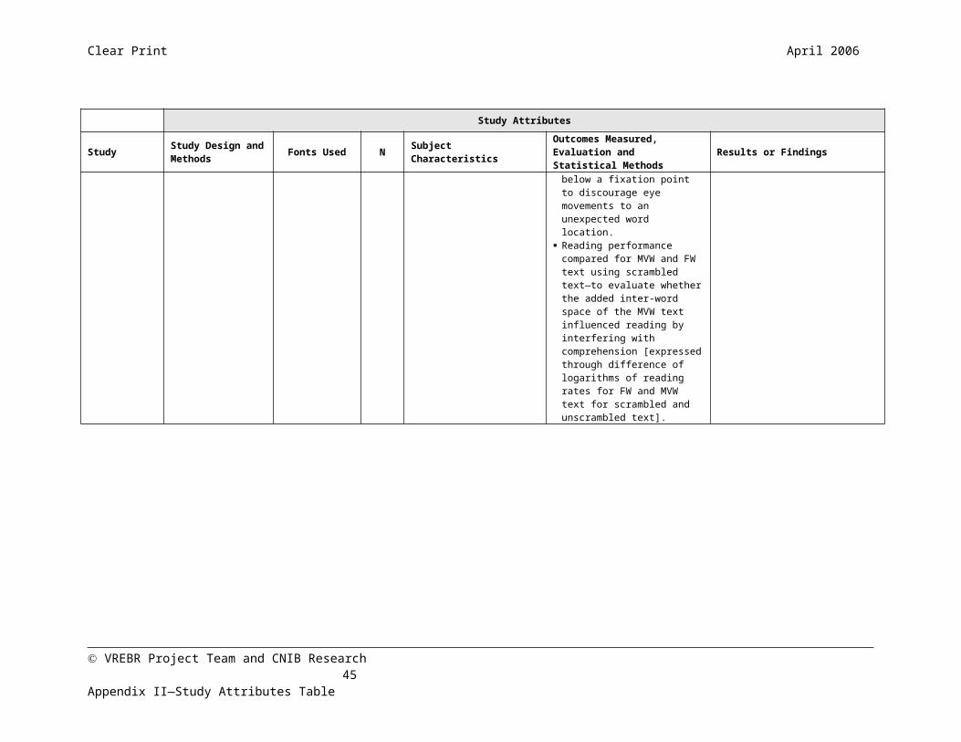
Clear Print April 2006
Appendix III—Search StrategiesDatabase SearchThe following strategy was used to search the primary group of databases CINAHL, EBM Reviews, EMBASE, MEDLINE-OVID, and PubMED, as well as the secondary online databases: AgeLine, Arts and Humanities Index, Canadian Business and Current Affairs (CBCA) Business, Education, and Reference, Dissertation Abstracts Online, ERIC, IEEE Xplore, MLA International Bibliography, Public Affairs Information Service (PAIS) International, ProQuest Education, Psychology, and Research Library, PsychInfo, Sage Full-Text Collections: Communication Studies, Education, Psychology, Nursing & Health Sciences, SCOPUS, Social Sciences Abstracts, Web of Science, Web of Knowledge, and WorldCat. Where applicable, subject headings (MeSH, non-MeSH, and OVID database-specific) and subheadings were used. Each major subject heading was exploded within the database (this is abbreviated as “exp”). There were no specific limits set on study design, language, or date.
#1 exp VISION DISORDERS#2 exp VISUALLY IMPAIRED PERSON$ (in EMBASE used ‘exp visual impairment’ and did not
use anything for CINAHL)#3 exp EYE DISEASES#4 or/ 1-3#5 ENLARGED TEXT #6 FONT #7 FONT COLOR (or COLOUR)#8 FONT FAMILY #9 FONT SIZE #10 FONT STYLE #11 HIGH CONTRAST TEXT #12 LARGE$ CHARACTER$ #13 LARGE PRINT #14 LEGIBILITY#15 LETTER SPACING #16 POINT SIZE #17 PRINT DISABLED #18 SERIFS #19 TEXT COLOR (or COLOUR) #20 TEXT CONTRAST#21 TYPE COLOR (or COLOUR)#22 TYPE SIZE#23 TYPE SPACING#24 TYPEFACE#25 TYPOGRAPHY
(#4 only combined with the keywords when a search had more than 100 results.)
Grey Literature and General Web SearchWe searched the following grey literature sources for any research and font legibility standards and guidelines: GrayLit Network, GreyNet (which has links to multiple, interdisciplinary grey literature sites). SIGLE (System for Information on Grey Literature) and EAGLE (European Association for Grey Literature Exploitation) were unavailable online at the time this report was written. The following keywords were used when performing online searches via Google or Ask.com: guidelines or standards for text legibility or readability, guidelines or standards for font or text size, international standards for font or text legibility, large print reading materials, large print for low vision, type spacing, high contrast text, guidelines or standards for print disabled, accessible designs for low vision reading, and accessible print materials.
VREBR Project Team and CNIB Research 45

Clear Print April 2006
Appendix IV—Guidelines and StandardsRanges of Reading Ability†††
Ranges of Vision Loss
Visual Acuity Statistical Estimates of Reading Ability
Decimal Letter count
Reads 1M at:
Ability Ranges Reading Ability Comments
Range of 1.6 110 160cm Has reserves Normal reading speed
††† Colenbrander A. Visual Standards—Aspects and Ranges of Vision Loss. Report prepared for the International council of Ophthalmology at the 29th International Congress of Ophthalmology. 2002. Sydney, Australia.1 Chung S, Mansfield JS, and Legge GE. Psychophysics of reading. XVIII. The effect of print size on reading speed in normal peripheral vision. Vision Research 1998;38:2949-2962.
2 Arditi A. Adjustable typography: an approach to enhancing low vision text accessibility. Ergonomics 2004;47(5):469-482.
8 Rumney NJ. Using visual thresholds to establish low vision performance. Ophthalmic Physiol Opt 1995;15(Suppl 1):S18-24.
9 Gill JS and Perera S. The Tiresias Family of Fonts. July 2003. Retrieved March 2006 from: http://www.tiresias.org/reports/marburg.htm.
30 Mansfield J, Legge G, and Bane M. Psychophysics of reading XV: Font effects in normal and low vision reading. Invest Ophthalmol Vis Sci 1996;37:1492-1501.
31 Arditi A, Knoblauch K, & Grunwald I. Reading with fixed and variable character pitch. Journal of the Optical Society of America 1990;A (7):2011–2015.
32 Beldie IP, Pastoor S and Schwarz E. Fixed versus variable letter width for televised text. Human Factors 1983;25:273-77.
33 Lannon JM (Ed.). Chapter 15: Designing pages and documents. Technical Communication (8th ed). pp.304-22. New York: Addison Wesley Longman, Inc. 2000.
34 Woods RJ, Davis K, Scharff L, et al. Effects of typeface and font size on legibility for children. American Journal of Psychological Research 2005;1(1):86-102.
52 Rubin GS and Turano K. Reading without saccadic eye movements. Vision Research 1992;32(5):895-902.
53 Morris R, Aquilante K, Yager D & Bigelow C. Serifs slow rsvp reading at very small sizes, but don’t matter at larger sizes. Society for Information Display International Symposium Digest of Technical Papers 2002;33(1):244-247. Retrieved April 10, 2006 from: http://www.cs.umb.edu/~ram/rsvp/publications/SerifsSubmittedV2.doc
15 Arditi A. Effective Colour Contrast. Lighthouse International. 1999. See http://www.lighthouse.org/color_contrast.htm
16 Eperjesi F, Fowler CW, Kempster AJ. Luminance and chromatic contrast effects on reading and object recognition in low vision: a review of the literature. Ophthalmic and Physiological Optics 1995;15(6):561-
VREBR Project Team and CNIB Research 46
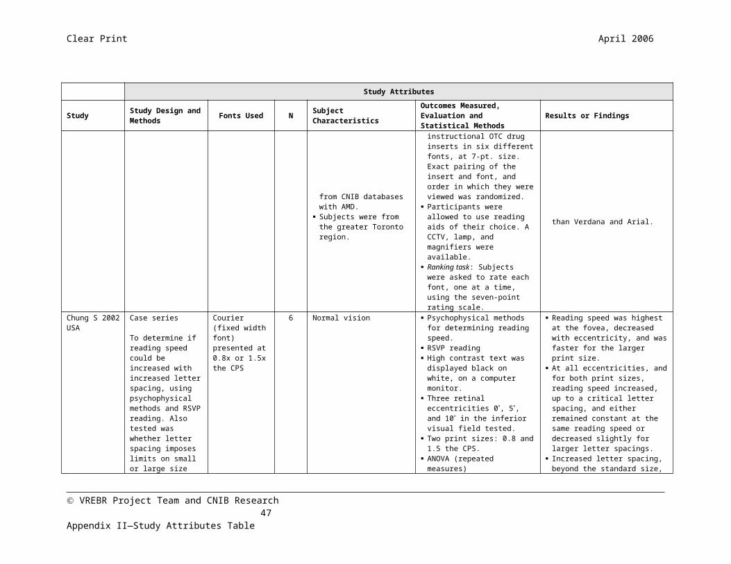
Clear Print April 2006
normal vision
(100 10)
Normal reading distance
Reserve capacity for small print
Since newsprint is generally read at around 40cm, this
range has an ample reserve.
1.25 105 125cm
1.0 100 100cm
0.8 95 80cm
Minimal impairment
0.63 90 63cmLost reserves
Normal reading speedReduced reading
distance
Individuals in this range have lost their reserve, but have no
or only minimal vision rehabilitation needs.0.5 85 50cm
Mild impairment
0.4 80 40cm(80 10) No reserve for small
(Driver’s license and other criteria usually fall within this
range)0.32 75 32cm
568.
17 Arditi A. Making Text Legible: Designing for People with Partial Sight. Lighthouse International. 2000. See: http://www.lighthouse.org/print_leg.htm
18 Turner NJ and Brown AR. Content and legibility of outpatient appointment letters. Journal of the Royal College of Physicians of London 1998;32(5):422-25.
19 Rehe RF. Typography: how to make it most legible. Indiana: Design Research International. 1974. pp.1-62.
20 Shaw A. Print for Partial Sight. London:The Library Association. 1969.
21 Sykes KC. Legibility of print for visually impaired children. Teacher of the Bind 1977;65(2):67-84.
22 Johnston AW. Making sense of the M, N and logMAR system of specifying visual acuity. Problems in Optom 1991;3:394-107.
23 Oduntan AO. An analysis of print sizes of South African newspapers in relation to prescription of reading devices for low vision patients S Afr Optom 2005;64(2):64-70.
24 Legge GE, Rubin GS, Pelli DG, Schleske MM. Psychophysics of reading-II. Low vision. Vis Res 1985;25 (2):253-66.
50 Cline D, Hofstetter HW, Griffin , JR (eds.) Dictionary of Visual Science. 4th ed. Boston MA:Butterworth-Heinemann; 1997:521.
51 Chung ST. The effect of letter spacing on reading speed in central and peripheral vision. Invest Ophthalmol Vis Sci 2002; 43(4):1270-1276.
56 Colenbrander A. Visual Standards—Aspects and Ranges of Vision Loss. Report prepared for the International council of Ophthalmology at the 29th International Congress of Ophthalmology. 2002. Sydney, Australia.
57 See: http://www.ifla.org/
58 Kavanagh R and Sköld B (eds.). Libraries for the Blind in the Information Age, Guidelines for Development. International Federation of Library Associations and Institutions. IFLA Professional Report, No. 86. 2005. See: http://www.ifla.org/VII/s31/pub/Profrep86.pdf
59 Canadian Library Association. Opening the Book: A Strategy for a National Network for Equitable Library Service for Canadians with Print Disabilities. September 2005. Ottawa. Retrieved on March 29,
VREBR Project Team and CNIB Research 47Appendix IV—Guidelines and Standards

Clear Print April 2006
Moderate visual impairment
0.25 70 25cm
Normal with aids Near-normal with appropriate reading aids
Reading at 25—12.5cm requires strong reading
glasses (4D-8D) or moderate power magnifiers. 0.2 65 20cm
0.16 60 16cm(60 10) Low power magnifiers
and large-print books.
(In the U.S. students qualify for special education
assistance)0.125 55 12.5cm
Severe visual impairment
0.1 50 10cm Restricted with aids
Slower than normal with reading aids
Reading at <10cm precludes binocular vision. The small field of strong magnifiers
slows reading. 0.08 45 8cm
0.063 40 6.3cm (40 10) High power magnifiers (restricted field)
Vision substitution skills may be an adjunct to
enhancement aids.0.05 35 5cm
2006 from: http://www.cla.ca/issues/nnels_final.htm 62 See: http://www.tiresias.org/index.htm
63 See: http://www.tiresias.org/reports/subject.htm
64 Over-the-Counter Human Drugs; Labeling Requirements. U.S. Department of Health and Human Services, Food and Drug Administration. Rockville, MD. January 4, 1999. See: http://www.fda.gov/cder/otc/label/cd9845.pdf
65 Canadian Public Health Association. Good Medicine for Seniors: Guidelines for Plain Language and Good Design for Seniors. 2002. See: http://www.nlhp.cpha.ca/Labels/seniors/english/cover.htm
66 Nonprescription Drug Manufacturers Association of Canada. NDMAC Technical Research Paper for Improving Label Comprehension. 2006. See: http://www.ndmac.ca/index.cfm?fuseaction=main.DspSubPage&PageID=9&SubPageID=756&fkMainPage=9
67 Drummond SR, Drummond RS, Dutton GN. Visual acuity and the ability of the visually impaired to read medication instructions. Br J Ophthalmol 2004; 88(12):1541-1542.
68 Canadian Task Force on the Periodic Health Examination: The periodic health examination. CMAJ. 1979;121:1193-1254.
3 Bell LJ. The Large Print Book and its User. Library Association. UK. 1980.
10 Vernon MD. The Experimental Study of Reading. UK: Cambridge University Press. 1931.
11 Burt C. A Psychological Study of Typography. UK: Bowker Publishing Company Ltd. 1974.
12 Tinker MA. The Relative Legibility of the Letter, the Digits and of Certain Mathematical Signs. Journal of General Psychology. 1928;July-Oct: 472-496.
13 McNally HJ. Readability of Certain Type Sizes and Forms in Sight Saving Classes. New York: College Press. 1913.
14 Rubin GS and Legge GE. Psychophysics of Reading-VI. The role of contrast in low vision. Vis Res 1988;29(1):79-91.
25 Prince JH. Printing for the Visually Handicapped. The Australian Journal of Optometry 1967. 164-177.
VREBR Project Team and CNIB Research 48Appendix IV—Guidelines and Standards

Clear Print April 2006
Profound visual impairment
0.04 30 4cm Marginal with aids Visual reading is limited. Use of non-visual skills
increases as rehabilitation needs shift gradually from
vision enhancement aids to vision substitution aids.
0.032 25 3.2cm
0.025 20 2.5cm(20 10)
Uses magnifiers for spot reading, but may prefer talking books for leisure.0.02 15 2cm
Near-blindness
Less 10 Less (Near-impossible)
No visual reading. In this range, individuals must rely primarily on vision
substitution skills. Any residual vision becomes an adjunct to the use of blind
skills.
5
Blindness 0.0 0 (0 – 10) Must relay on talking books, Braille, or other non-visual sources).
Organizations
The following resources and organizations have basic or expanded guidelines and standards for text legibility, large print materials, and reading with low vision.
26 Liu L and Arditi A. Apparent string shortening concomitant with letter crowding. Vis Res 2000;40:1059-1067.
27 Liu L and Arditi A. How crowding affects letter confusion. Optometry and Vision Science 2001;78:50-55.
28 Cummings RW, Whittaker SG, Watson GR, and Budd JM. Scanning characters and reading with a central scotoma. American Journal of Optometry and Physiological Optics 1985;62(12):833-43.
35 Yager, D., Aquilante, K., & Plass, R. High and low luminance letters, acuity reserve,and font effects on reading speed. Vision Research 1998;38:2527-2531.
36 Krulee GK and Novy F. Word processing and effects of variability in type fonts. Perceptual Motor Skills 1986;62:999-1010.
37 Ricci, F, Cedrone C, Cerulli L. Standardized measurement of visual acuity. Ophthalmic Epidemiology 1998;5(1):41-53.
38 Tinker M. Legibility of print. Ames Iowa: Iowa State University Press. 1963.
39 Arditi A. Typography, print legibility and low vision. In: B. Rosenthal and R. Cole (eds.), Remediation and Management of Low Vision. St. Louis, MO:Mosby. 1996.
40 Arditi A, Cagenello R and Jacobs B. Letter stroke width, spacing, and legibility. In: Noninvasive Assessment of the Visual System Technical Digest. Washington, DC: Optical Society of America. 1995.
41 Berger C. Stroke-width, form, and horizontal spacing of numerals as determinants of the threshold of recognition I. Journal of Applied Psychology 1944;28:208-231.
42 Berger C. Stroke-width, form and horizontal spacing of numerals as determinants of the threshold of recognition II. Journal of Applied Psychology 1944;28:336-346.
43 Arditi A, Cagenello R and Jacobs B. Effects of aspect ratio and spacing on legibility of small letters. Supplement to Investigative Ophthalmology and Visual Science 1995;36:671. 44 Berger C. Experiments on the legibility of symbols of different width and height. Acta Ophthalmologica 1948;26:423-434.
VREBR Project Team and CNIB Research 49Appendix IV—Guidelines and Standards

Clear Print April 2006
American Council of the Blindhttp://www.acb.org/http://www.acb.org/accessible-formats.html [A guide to making documents accessible to people who are blind or visually impaired]
American Printing House for the Blind (US)http://www.aph.org/
Arlene R. Gordon Research Institute (International)http://www.lighthouse.org/about/research/default.htm
CNIB (Canadian National Institute for the Blind)http://www.cnib.ca/eng/index.htm
Canadian Library Associationhttp://www.cla.ca/
Canadian Public Health Associationhttp://www.cpha.ca/english/index.htm
International Council of Ophthalmologyhttp://www.icoph.org/index.html
International Federation of Library Associations and Institutionshttp://www.ifla.org/
Lighthouse Internationalhttp://www.lighthouse.org/default.htm
Luc Devroye (Typograhy Research)http://cgm.cs.mcgill.ca/~luc/
National Association for the Visually Handicapped (NAVH, US)http://www.navh.org/
National Information Library Service (Australia)
45 Soar RS. Height-width proportion and stroke width in numerical visibility. Journal of Applied Psychology 1955;39:43-46.
54 For a complete list of the publications in this series, see: http://gandalf.psych.umn.edu/~legge/series.html
60 See: http://www.lighthouse.org/default.htm
61 See: http://www.aph.org//edresearch/lpguide.htm
71 MacKeben M. Enhancement of peripheral letter recognition by typographic features. Vis Impair Res 2000;2(2):95-103.
72 Ginsburg AP. (1978) Visual Information Processing Based on Spatial Filters Constrained by Biological Data. Vols. I and II, Ph.D. thesis, Cambridge University, in Aerospace Medical Research Laboratory Report AMRL-TR-78-129, Wright-Patterson AFB, OH.
73 Legge G and Rubin GS. Psychophysics of Reading IV—Wavelength effects in normal and low vision. 1986 J Opt Soc Am;3(1):40-51.
VREBR Project Team and CNIB Research 50Appendix IV—Guidelines and Standards

Clear Print April 2006
http://www.nils.org.au/ais/print/resources/lp_guidelines.htmlhttp://www.nils.org.au/ais/print/resources/readability.html
National Information Standards Organization (US)http://www.niso.org/
National Library for the Blind (UK) http://www.nlb-online.org/
National Library Service for the Blind (US)http://www.loc.gov/nls/
Nonprescription Drug Manufacturers Association of Canadahttp://www.ndmac.ca/index.cfm
Royal National Institute for the Blind (UK)http://www.rnib.org.uk/xpedio/groups/public/documents/code/InternetHome.hcsphttp://www.rnib.org.uk/xpedio/groups/public/documents/code/public_rnib003460.hcsp [Good Design link]http://www.rnib.org.uk/xpedio/groups/public/documents/PublicWebsite/public_seeitright.hcsp [Accessible Information link]
Royal New Zealand Foundation for the Blind http://www.rnzfb.org.nz/
Royal Society for the Blind (Australia)http://www.rsb.org.au/
Society for Environmental Graphic Designhttps://www.segd.org/index.html
Tiresias.org (fonts) (UK)
29 Hvistendahl JK and Kahl MR. Roman v. Sans Serif Body Type: Readability and Reader Preference. ANPA News Research Centre Study. American Newspaper Publishers Association News Research Bulletin. Jan 17, 1975 No. 2, pp1-11.
46 Arditi A, Liu L, and Lynn W. Legibility of outline and solid fonts with wide and narrow spacing. In: D. Yager (ed.) Trends in Optics and Photonics. Washington, DC: Optical Society of America. 1997.
47 Moriarty SE and Scheiner EC. A study of close-set text type. Journal of Applied Psychology 1984;69:700-702.
48 Whittaker S, Rohrkaste F and Higgins KE. Optimum letter spacing for word recognition in central and eccentric fields. Noninvasive Assessment of the Visual System, Technical Digest Series 7. Washington, DC:Optical Society of America, pp.56-59. 1989.
49 Arditi A and Cho J. Serifs and font legibility. Vision Research 2005;45:2926-2933.
55 See: http://vision.psych.umn.edu/~gellab/
69 Mackeben, M. (1999) Typefaces influence peripheral letter recognition and can be optimized for reading with eccentric viewing. Paper presented at the Vision 99, New York, NY.
70 Roethlein BE. The relative legibility of different faces of printing types. The American Journal of Psychology 1912; 23(1):1–36.
VREBR Project Team and CNIB Research 51Appendix IV—Guidelines and Standards
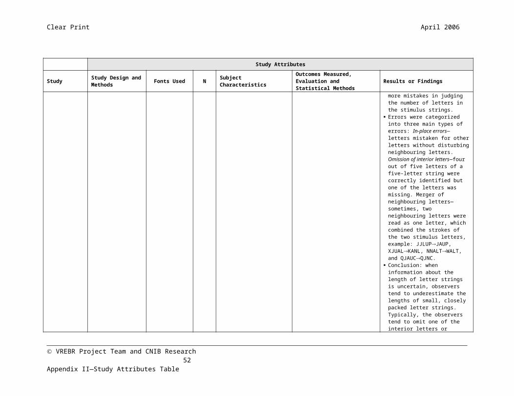
Clear Print April 2006
http://www.tiresias.org/
U.S. Food and Drug Administrationhttp://www.fda.gov/
U.S. Health and Human Serviceshttp://www.hhs.gov/
Vision Australiahttp://www.visionaustralia.org.au/
VREBR Project Team and CNIB Research 52Appendix IV—Guidelines and Standards