climate4you update april 2009 - klimatupplysningen.se filediagram showing arctic monthly surface air...
TRANSCRIPT

1
Climate4you update April 2009
www.climate4you.com
April 2009 global surface air temperature overview
April 2009 surface air temperature compared to the average for April 1998-2006. Green.yellow-red colours indicate areas with higher
temperature than the 1998-2006 average, while blue colours indicate lower than average temperatures. Data source: Goddard Institute
for Space Studies (GISS)

2
Lower troposphere temperature from satellites, updated to April 2009
Global monthly average lower troposphere temperature (thin line) since 1979 according to University of Alabama at Huntsville, USA.
The thick line is the simple running 37 month average.
Global monthly average lower troposphere temperature (thin line) since 1979 according to according to Remote Sensing Systems (RSS),
USA. The thick line is the simple running 37 month average.

3
Global surface air temperature, updated to April-March 2009
Global monthly average surface air temperature (thin line) since 1979 according to according to the Hadley Centre for Climate
Prediction and Research and the University of East Anglia's Climatic Research Unit (CRU), UK. The thick line is the simple running 37
month average.
Global monthly average surface air temperature (thin line) since 1979 according to according to the Goddard Institute for Space Studies
(GISS), at Columbia University, New York City, USA. The thick line is the simple running 37 month average.

4
Global monthly average surface air temperature since 1979 according to according to the National Climatic Data Center (NCDC), USA.
The thick line is the simple running 37 month average.

5
Global sea surface temperature, updated to April 2009
Global monthly average sea surface temperature since 1979 according to University of East Anglia's Climatic Research Unit (CRU), UK.
Base period: 1961-1990. The thick line is the simple running 37 month average.
Global monthly average sea surface temperature since 1979 according to the National Climatic Data Center (NCDC), USA. Base period:
1901-2000. The thick line is the simple running 37 month average.

6
Arctic and Antarctic lower troposphere temperature, updated to April 2009
Global monthly average lower troposphere temperature since 1979 for the North Pole and South Pole regions, based on satellite
observations (University of Alabama at Huntsville, USA). The thick line is the simple running 37 month average, nearly corresponding to
a running 3 yr average.

7
Arctic and Antarctic surface air temperature, updated to March 2009
Diagram showing Arctic monthly surface air temperature anomaly 70-90oN since January 2000, in relation to the WMO reference
“normal” period 1961-1990. The thin blue line shows the monthly temperature anomaly, while the thicker red line shows the running 13
month average. Data provided by the Hadley Centre for Climate Prediction and Research and the University of East Anglia's Climatic
Research Unit (CRU), UK.
Diagram showing Antarctic monthly surface air temperature anomaly 70-90oS since January 2000, in relation to the WMO reference
“normal” period 1961-1990. The thin blue line shows the monthly temperature anomaly, while the thicker red line shows the running 13
month average. Data provided by the Hadley Centre for Climate Prediction and Research and the University of East Anglia's Climatic
Research Unit (CRU), UK.
In general, the Arctic temperature record appears to be less variable than the contemporary Antarctic record, presumably at least partly
due to the higher number of meteorological stations north of 70oN, compared to the number of stations south of 70oS.

8
Diagram showing Arctic monthly surface air temperature anomaly 70-90oN since January 1957, in relation to the WMO reference
“normal” period 1961-1990. The year 1957 has been chosen as starting year, to ensure easy comparison with the maximum length of the
realistic Antarctic temperature record shown below. The thin blue line shows the monthly temperature anomaly, while the thicker red line
shows the running 13 month average. Data provided by the Hadley Centre for Climate Prediction and Research and the University of
East Anglia's Climatic Research Unit (CRU), UK.
Diagram showing Antarctic monthly surface air temperature anomaly 70-90oS since January 1957, in relation to the WMO reference
“normal” period 1961-1990. The year 1957 was an international geophysical year, and several meteorological stations were established
in the Antarctic because of this. Before 1957, the meteorological coverage of the Antarctic continent is poor. The thin blue line shows the
monthly temperature anomaly, while the thicker red line shows the running 13 month average. Data provided by the Hadley Centre for
Climate Prediction and Research and the University of East Anglia's Climatic Research Unit (CRU), UK.
In general, the Arctic temperature record appears to be less variable than the contemporary Antarctic record, presumably at least partly
due to the higher number of meteorological stations north of 70oN, compared to the number of stations south of 70oS.

9
Diagram showing Arctic monthly surface air temperature anomaly 70-90oN since January 1900, in relation to the WMO reference
“normal” period 1961-1990. The thin blue line shows the monthly temperature anomaly, while the thicker red line shows the running 13
month average. In general, the range of monthly temperature variations decreases throughout the first 30-50 years of the record,
reflecting the increasing number of meteorological stations north of 70oN over time. Especially the period from about 1930 saw the
establishment of many new Arctic meteorological stations, first in Russia and Siberia, and following the 2nd World War, also in North
America. Because of the relatively small number of stations before 1930, details in the early part of the Arctic temperature record should
not be over interpreted. The rapid Arctic warming around 1920 is, however, clearly visible, and is also documented by other sources of
information. The period since 2000 is warm, about as warm as the period 1930-1940. Data provided by the Hadley Centre for Climate
Prediction and Research and the University of East Anglia's Climatic Research Unit (CRU), UK.
10
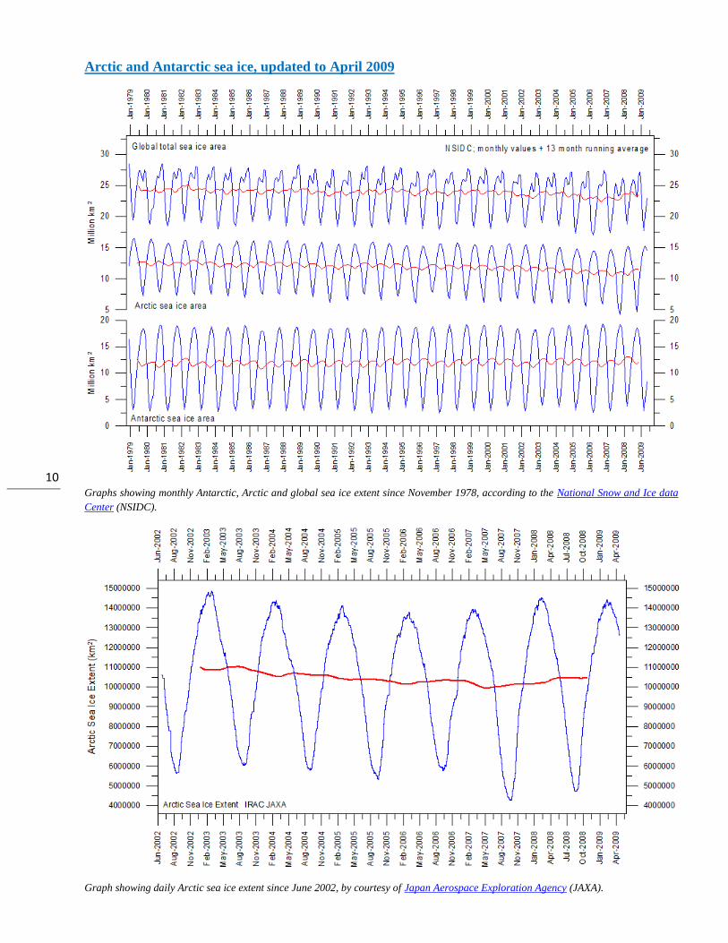
Arctic and Antarctic sea ice, updated to April 2009
Graphs showing monthly Antarctic, Arctic and global sea ice extent since November 1978, according to the National Snow and Ice data
Center (NSIDC).
Graph showing daily Arctic sea ice extent since June 2002, by courtesy of Japan Aerospace Exploration Agency (JAXA).

11
Global sea level, updated to April 2009
Globa lmonthly sea level since late 1992 according to the Colorado Center for Astrodynamics Research at University of Colorado at
Boulder, USA. The thick line is the simple running 37 observation average, nearly corresponding to a running 3 yr average.
Annual change of global sea level since late 1992 according to the Colorado Center for Astrodynamics Research at University of
Colorado at Boulder, USA. The thick line is the simple running 3 yr average.

12
Atmospheric CO2, updated to April 2009
Monthly amount of atmospheric CO2 (above) and annual growth rate (below; average last 12 months minus average preceding 12
months) of atmospheric CO2 since 1959, according to data provided by the Mauna Loa Observatory, Hawaii, USA. The thick line is the
simple running 37 observation average, nearly corresponding to a running 3 yr average.

13
Global surface air temperature and atmospheric CO2, updated to April 2009

14
Diagrams showing HadCRUT3, GISS, and NCDC monthly global surface air temperature estimates (blue) and the monthly atmospheric
CO2 content (red) according to the Mauna Loa Observatory, Hawaii. The Mauna Loa data series begins in March 1958, and 1958 has
therefore been chosen as starting year for the diagrams. Reconstructions of past atmospheric CO2 concentrations (before 1958) are not
incorporated in this diagram, as such past CO2 values are derived by other means (ice cores, stomata, or older measurements using
different methodology, and therefore are not directly comparable with modern atmospheric measurements. The dotted grey line indicates
the approximate linear temperature trend, and the boxes in the lower part of the diagram indicate the relation between atmospheric CO2
and global surface air temperature, negative or positive.
Most climate models assume the greenhouse gas carbon dioxide CO2 to influence significantly upon global temperature. Thus, it is
relevant to compare the different global temperature records with measurements of atmospheric CO2, as shown in the diagrams above.
Any comparison, however, should not be made on a monthly or annual basis, but for a longer time period, as other effects
(oceanographic, clouds, etc.) may well override the potential influence of CO2 on short time scales such as just a few years.
It is of cause equally inappropriate to present new meteorological record values, whether daily, monthly or annual, as support for the
hypothesis ascribing high importance of atmospheric CO2 for global temperatures. Any such short-period meteorological record value
may well be the result of other phenomena than atmospheric CO2.
What exactly defines the critical length of a relevant time period to consider for evaluating the alleged high importance of CO2 remains
elusive, and is still a topic for debate. The critical period length must, however, be inversely proportional to the importance of CO2 on the
global temperature, including feedback effects, such as assumed by most climate models.
In 1988, when IPCC was established, about 10 years of global temperature increase along with increase of atmospheric CO2 was
considered as sufficient by many scientists to conclude that CO2 is highly important for the global temperature. Adopting this approach as
to relevant time length, the varying relation (positive or negative) between global temperature and atmospheric CO2 has been indicated in
the lower panels of the three diagrams above.

15
Climate and history; one example among many
1788: James Hutton visits Siccar Point
James Hutton (left). Siccar Point on the Berwickshire coast, looking east on 17 June 2008 (right).
James Hutton (1726-1797) was born in Edinburgh on 3 June 1726. During his education he studied law, chemistry and eventually became
a Doctor of Medicine in 1749. He inherited two farms near Reston in Berwickshire east of Edinburgh, and set about making improvements, introducing farming practices from other parts of Britain.
By this, he became highly interested in both meteorology and geology, and became very found of studying what was exposed by digging
drainage channels on his properties. By this he noted that some types of solid bedrock apparently contained remnants of dead animals of
unknown age. Around 1760 his geological interest had grown considerably, and he was beginning to form his own opinion on many
geological issues. He was soon realizing that the Biblical age of Earth (6000 years old) was much to short a time range to explain his
observations on past environmental changes. From 1785 he began to publish his ideas for a wider audience, but was generally met with
refutations, as he had no really convincing geological evidence to support his ideas with. So the general opinion of planet Earth being about 6000 years old prevailed.
In 1788 James Hutton visited the Berwickshire coast with two friends, John Playfair and Sir James Hall (McKirdy et al. 2007) Between
Dunbar and Eyemouth they visited a small peninsula called Siccar Point (see photo above). Here they found a peculiar geological outcrop,
showing two geological units of sandstone and greywacke, but with the individual layers standing almost perpendicular to each other (see photo below). This was the very first example of what later was to be known as a geological unconformity.
Hutton and his friends immediately grasped the high significance of what they saw at Siccar Point. Hutton reasoned that both types of
rock must have been deposited on the bottom of an ocean, and that the almost 90o tilting visible (see photo below) required substantial
changes in the surface form of the planet. In between the deposition of the two units there must have been a period of unknown length,
where layers must have been eroded and tilted, leading to formation of the unconformity. This was clearly proof of a very dynamic planet.
This conclusion was in contradiction to the notion of a essentially stable environment in equilibrium since the days of creation, a
paradigm which in Europe had made scientific progress difficult. A further realization of equal importance was that the geometrical
relationship between the two sets of layers could not have formed in the seven days prescribed in the Bible for the formation of the Earth.
Indeed, any timescale measured in terms of human existence would be insufficient to accommodate the chain of events that Hutton and
his companions had deduced by analyzing the geological section at Siccar Point.
When Hutton put forward his revolutionary concept of deep time and an ever changing dynamic planet, this was not accepted overnight
by the scientific community. It was first after his death in 1797 that the concept of extensive time for the formation of the present surface
of the planet slowly gained acceptance, together with the understanding that the environment and landscapes always are changing,
sometimes slowly, sometimes rapid. Hutton’s legacy thereby was to free later generations of scientists from a mental straightjacket,
allowing them to think freely and thereby make science develop and blossom. The famous geologist Charles Lyell enthusiastically

16
embraced Hutton’s ideas and clearly presented them in his now classic book, Principles of Geology. It is interesting to note that Charles
Darwin read Lyell’s book while sailing on the Beagle expedition. Hutton's idea of an “abyss of time” thus provided Darwin with the extended timeframe he needed to make his developing ideas on biological evolution appear credible.
Hutton's unconformity at Siccar Point on 17 June 2008, looking NE. Both geological units consist of parallel sediment layers (Red
Sandstone and Greywacke) deposited almost horizontally in a water body. The significant change in orientation across the unconformity
signals that a major reorganization of what was up and down must have taken place during the time between the deposition of these two units.
Lateral drainage channel at Siccar Point, looking SW on 17 June 2008. The marked valley is dry today, but was presumably cut by meltwater flowing along the southern margin of a Weichselian glacier draining east along the Firth of Forth, eastern Scotland.

17
It was first much later when Alfred Wegener in 1912 proposed his theory of continental drift (Kontinentalverschiebung) that the
importance of the always ongoing geological processes for global climate began to dawn for geologists. It also took some time before the
significance of climate changes on sedimentary strata like those seen at Siccar Point began to be understood. Actually each layer seen in
the rocks at Siccar Point (see photo above) reflects some kind of environmental change, either on land or in the ocean, or within both. But
Hutton's observations at Siccar Point was the very starting point for realizing that planet Earth is a highly active planet, where different
processes never are in perfect equilibrium. Environmental change is always occurring.
Hutton’s observations and deductions at Siccar Point thus had profound effect for the subsequent scientific development, especially
within earth and biological science. Siccar point is arguably the most important geological site in the world (McKirdy et al. 2007).
The profound dynamic nature of planet Earth demonstrated by Hutton's unconformity at Siccar Point is emphasised by the
geomorphology in the near surroundings. In contrast to Hutton and his friends, who came to Siccar Point by boat, most visitors today will
come by car, to walk the final kilometre to the coastal site. The Siccar Point parking place is located in a peculiar dry valley (see photo
below). This is a relict meltwater channel, cut by meltwater running along the southern margin of a big glacier flowing east along the
Firth of Forth topographic depression about 22,000 years ago. This might well have been the same ice stream which was responsible for
another famous geological locality at Blackford Hill in southern Edinburgh, where peculiar scratches on bedrock were identified as as
being the result of glacier action by Jean Louis Agassiz in 1840, thereby giving the glacial hypothesis a significant momentum 52 years
after Hutton's visit at Siccar Point. Our scientific understanding of the dynamic nature of planet Earth made huge progress during this
short time span from 1788 to 1840, both with regard to geology and climate.
References
McKirdy, A., Gordon, J. and Crofts, R. 2007. Land of mountain and flood. The geology and landforms of Scotland. Birlinn Limited,
Edingburgh, Scotland, 324 pp.
All above diagrams with supplementary information (including links to data sources) are available on www.climate4you.com
Yours sincerely, Ole Humlum ([email protected])
22 May 2009.