cmsiii common user interface guide - uk-hk-clinical...
TRANSCRIPT


-- This is a Blank Page --

Revision HistoryRevision Number Description Chapter
AffectedDate
Version 2 Release 1 Initial version of this quarterly release -- 25-Mar-2010
I

Contents1 Introduction.....................................................................................................................................1
1.1 The Making of this Guide.............................................................................................................1
1.2 The Use of this Guide...................................................................................................................1
1.2.1 For Clinical User...................................................................................................................1
1.2.2 For Developers.....................................................................................................................2
1.3 Contact Information....................................................................................................................2
2 Governance and Methodology.........................................................................................................3
2.1 Principles for Review Guideline...................................................................................................3
2.2 Membership................................................................................................................................3
2.3 Methodology and Processes........................................................................................................5
2.3.1 Quarterly Release Upgrade..................................................................................................6
2.3.2 Monthly Usability Discussion...............................................................................................6
2.3.3 Ad-hoc Query and Special Request......................................................................................6
2.3.4 Request for Exemption........................................................................................................6
2.4 Other Cognitive Study Services....................................................................................................7
2.5 NAVI Usability Framework...........................................................................................................8
2.6 Development Roadmap...............................................................................................................8
2.7 Clinician Engagement...................................................................................................................9
3 Guide Overview..............................................................................................................................11
3.1 Summary of Guideline...............................................................................................................11
4 Guideline Details............................................................................................................................19
4.1 Consistent Navigation................................................................................................................20
4.1.1 Alert Message Dialog Box..................................................................................................20
4.1.2 Input Error Notifications....................................................................................................27
4.1.3 Progress Indicators............................................................................................................32
4.2 Accessibility Principles...............................................................................................................36
4.2.1 Checkbox Control...............................................................................................................36
4.2.2 Radio Button Control.........................................................................................................43
4.3 Visual Standards........................................................................................................................50
II

4.3.1 Buttons...............................................................................................................................50
4.3.2 Icons...................................................................................................................................54
4.3.3 Scroll..................................................................................................................................61
4.3.4 Tree Table..........................................................................................................................65
4.3.5 Visual Flow.........................................................................................................................71
4.3.6 Button Groups....................................................................................................................75
4.3.7 Dashboard..........................................................................................................................77
4.4 Information Display...................................................................................................................82
4.4.1 Date and Time Display.......................................................................................................82
Appendix 1: CMSIII Java Version UI Standard............................................................................................89
III

Cmsiii common user interface guide v2r1
1 Introduction1.1 The Making of this Guide
This guide is based on the background material from a various referencing sources:
a. Hong Kong Hospital Authority Common User Interface (CUI) Guide version 1.0b. Design Guidance published by NHS Common User Interface (CUI) Clinical Applications
and Patient Safety program c. Microsoft Windows User Experience (UX) Interaction Guidelinesd. Apple Mac OSX Human User Interface (HUI) Guidelinee. Various other existing research and guidance in the field of User Interface design
Usable Information Technology (useit) by Jakob Nielsen (http://www.useit.com/) UI Pattern Factory (http://uipatternfactory.com/) Quince UX Design Patterns (http://quince.infragistics.com/) PatternTap (http://patterntap.com/) TurboMilk (http://turbomilk.com/) Welie Patterns (http://www.welie.com/) Site Web Developers Ltd (http://www.swdl.co.uk/) Washington University Medical School
(http://thalamus.wustl.edu/course/basvis.html)
The guide aims to advocate the best practices and proven system User Interface (UI) design for safe and efficient Clinical Management System (CMS) and to support the relevant UI policies already published and to be published by the HA Information Technology Services (HA ITS) and other relevant parties. It highlights the principles and details of how to avoid system UI design fault and thus reducing potential misuse of CMS and misinterpretation of clinical information.
The guide has incorporated the previous version(s) of the CMS CUI guide. It aims to provide a single and most up-to-date source of reference for all readers to use in the future.
1.2 The Use of this Guide
1.2.1 For Clinical User
This guide serves to illustrate the best-evidenced UI design for Clinical Management System (CMS) and its associated healthcare IT systems. Rationale and justification are given for each guideline to be adopted. Usability principles and design principles and clinical relevancy are highlighted. The document
Introduction 1

v2r1 Cmsiii common user interface guide
aims to ensure consistent and safe UI design amongst all CMS modules and its associated healthcare IT systems.
1.2.2 For Developers
This guide is prepared by HA ITS Usability Team, validated and supported by the HA ITS UI Core Group (UICG) followed by the endorsement by HA ITS Architecture Focus Group (AFG) as an IT policy document. It serves as a standard and policy for guiding the UI design of HA’s CMS.
Each guideline is uniquely numbered (UI-ID Number) for easy reference. The usage and the description of each section and guideline are supplemented and illustrated with correct and incorrect examples. The level of conformance required was clearly indicated. Relevant source of evidence and references are provided if available and listed out in the appendix.
The last corporate-wide user interface guide for developer is the CMSIII Java Version UI Standard and is appended in Appendix 1 of this document. A coverage index is included to facilitate developers to discover the parts being refreshed with this release of this guide.
1.3 Contact Information
This contact information may find useful if there is any query or suggestion to the making of CMS III Common User Interface (CUI) guide:
HA ITS Usability TeamE-Mail : [email protected]
Subject Officers1. James TAN, Health Informatician
E-Mail : [email protected] : 2300 7322
2. William HO, Systems ManagerE-Mail : [email protected] : 2300 8558
2 Guideline Details

Cmsiii common user interface guide v2r1
2 Governance and Methodology2.1 Principles for Review Guideline
a. Each design guideline included in this document should have gone through intensive review and supported by valid reasons and justifications;
b. Safety, risk and existing clinical workflow/practices should be balanced and considered local adoption of such international guidelines;
c. Consistency at highest reasonable degree must be maintained within and among all applications in CMS;
d. The guidelines should serve the purpose of facilitating the software design in a standardized and efficient manner;
e. Multidisciplinary expert opinions should have been considered in the development of this guide, including User Interface Architecture Special Interest Group (UIASIG) and Clinical Operation Support Working Group (COSWG).
2.2 Membership
The creation of this UI Guide involves the following parties:
a. HA ITS Architecture Focus Group (AFG) Policy making body of IT application development policy Systems Managers of all application development teams under Clinical System Section (CS),
Clinical Departmental System Section (CD) and Informational System Section (IS)
b. HA ITS UI Core Group (UICG) Discussion and validation group for CMS III Common User Interface (CUI) Guide Application Developers of all application development teams under Clinical System Section
(CS), Clinical Departmental System Section (CD) and Informational System Section (IS) UICG membership as at 23-Mar-2010:
Section Team Name and Post TitleCS CS William HO K H, HAITS SM(CS)4
CS2 Amy CHOW, HAITS SA(CS2)4;Rice YEUNG, HAITS SA(CS2)8;
CS4 Tat Fai LAU, HAITS SA(CS4)5;
CS7 Helen PANG, HAITS SA(CS7)3;Herman SIN, HAITS SA(CS7)5;
Introduction 3

v2r1 Cmsiii common user interface guide
CS9 Johnny LAM, HAITS SA(CS9)1;
SA1 Rainey CHAN, HAITS CSA(SA1)2;
CD CD1 Stanley CHENG, HAITS SA(CD1)7;
CD2 Alex CHAN, HAITS CAP(CD2)2;
CD3 Patrick NG, HAITS SA(CD3)2;Mike NGAI, HAITS CSA(CD3)2
HI CS Wing Nam WONG Dr, HAITS SHI(C);
C3 James TAN, HAITS HI(C)3;John WONG, HAITS HIAI(C3)1;Po Yi KWAN, HAITS HIAI(C3)2;Dickson WU, HAITS Usability Designer(C3)1;Maggie CHING, HAITS PA(C3)1;
C4 Joyce Ka Yin CHAN Dr, HAITS HI(C)4;Libby LUI, HAITS HIAII(C4)1;
c. HA ITS Usability team Preparation team for CMS III Common User Interface (CUI) Guide Clinical, Technical and Design experts from Health Informatics Team and HA ITS Clinical Usability Advisers from Health Informatics Management level Usability Core Team membership as at 23-Mar-2010:
Section Team Name and Post TitleCS CS William HO K H, HAITS SM(CS)4
CS4 Tat Fai LAU, HAITS SA(CS4)5;
SA1 Rainey CHAN, HAITS CSA(SA1)2;
HI CS Wing Nam WONG Dr, HAITS SHI(C);
C3 James TAN, HAITS HI(C)3;John WONG, HAITS HIAI(C3)1;Po Yi KWAN, HAITS HIAI(C3)2;Dickson WU, HAITS Usability Designer(C3)1; Maggie CHING, HAITS PA(C3)1;
C4 Joyce Ka Yin CHAN Dr, HAITS HI(C)4;
4 Guideline Details

Cmsiii common user interface guide v2r1
Introduction 5

v2r1 Cmsiii common user interface guide
The diagram below shows the governance structure of Usability framework in HA ITS.
2.3 Methodology and Processes
The CUI development methodology will employ a cyclic approach, which include Quarterly UI Core Group (UICG) meetings and Monthly Usability Discussion Meeting (UDM). Quarterly UICG meeting targets to develop quarterly minor release upgrades, until a comprehensive major version has been well developed and confirmed by AFG. Monthly UDM refer to a smaller and more efficient structure which targets to collect comments / enquiries and provide feedbacks in a more timely manner.
6 Guideline Details

Cmsiii common user interface guide v2r1
2.3.1 Quarterly Release Upgrade
Before a well-established CMS III CUI Guide is made available, effort is expected from different stakeholders in the production of quarterly minor release.
1. The draft release will be prepared by Usability Core Team (HI and IT) on a quarterly basis2. The quarterly draft release will be discussed and validated by UI Core Group (UICG) during a
quarterly UICG meeting in February, May, August and November3. Upon confirmation by UICG, the quarterly draft release will be submitted to Architecture Focus
Group (AFG) and discussed during the AFG meeting in March, June, September and December.
Upon confirmation by AFG, the quarterly draft release will be officialized and made as an IT policy for all application developers to follow.
2.3.2 Monthly Usability Discussion
Apart from the quarterly release upgrade activity, a monthly Usability Discussion Meeting (UDM) is established to serve as a discussion platform for all usability / UI relevant matters:
1. Monthly UDM will be hosted by Usability Team (HI & IT)2. Project teams / application developers can raised UDM request for discussion3. Usability Team will give usability advices or recommendations as instance as possible, otherwise
will give feedback during the next UICG meeting4. The advices and recommendations will be incorporated in the next draft release of CUI guide
2.3.3 Ad-hoc Query and Special Request
In case there is an urgent usability / UI query (or incidence), email and telephony communication is always possible. Please refer to section 1.3 Contact Information.
2.3.4 Request for Exemption
As discussed in section 2.3.1, the quarterly draft release will be officialized and made as an IT policy upon confirmation by AFG. It will become an official policy for all application developers to follow. However, it is also important to allow flexibility at reasonable extent since that is crucial to the acceptance and adoption of any standards and policies.
With thorough understanding on the CUI standards and policies, project teams can perform internal assessment for the purpose of identifying the degree of compliance and the enhancement plan (for complying the standards and policies) for the responsible CMS modules, if necessary.
If project teams confirm that the CUI standards cannot be fulfilled, a Request For Exemption can be raised to UDM for discussion. Justification (can be technical or non-technical) must be supplied, and UDM may grant exemption to the specific projects. A report will be sent to AFG for information.
Introduction 7

v2r1 Cmsiii common user interface guide
There are chances that project teams have difficulties in analyzing the degree of compliance or producing a more usable design. The usability team is offering other types of usability services (as stated in section 2.4) for which project teams can consider.
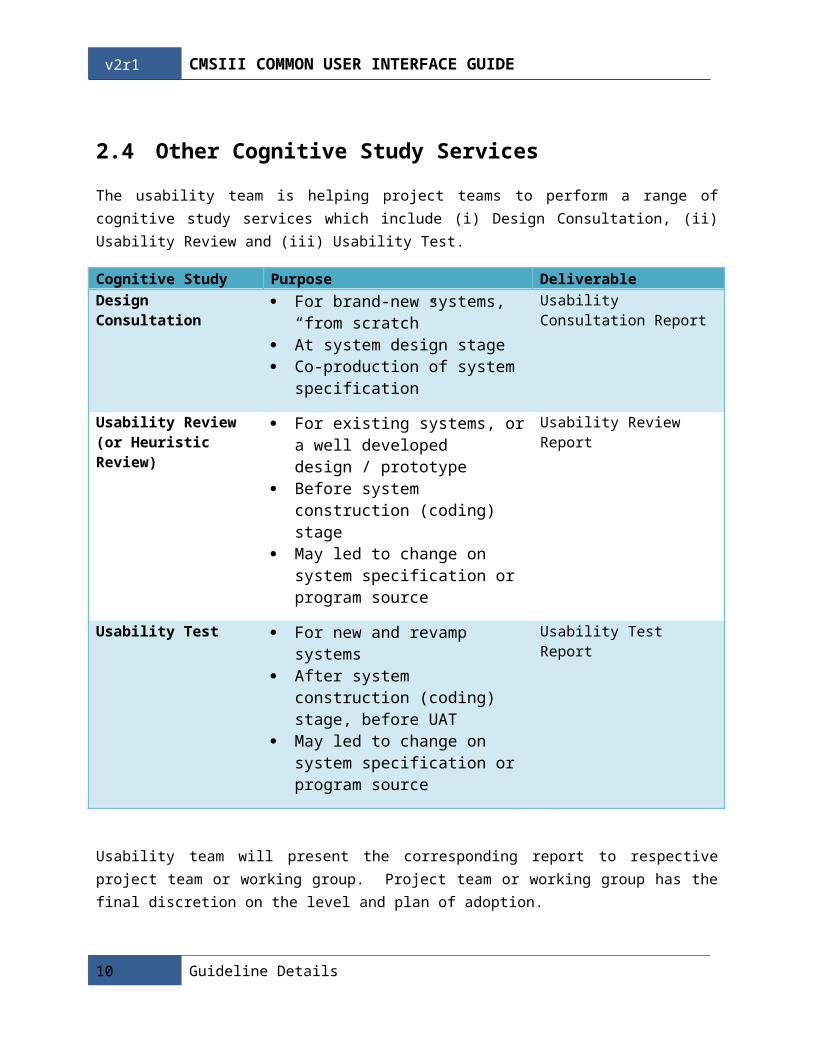
2.4 Other Cognitive Study Services
The usability team is helping project teams to perform a range of cognitive study services which include (i) Design Consultation, (ii) Usability Review and (iii) Usability Test.
Cognitive Study Purpose DeliverableDesign Consultation For brand-new systems, “from
scratch” At system design stage Co-production of system
specification
Usability Consultation Report
Usability Review (or Heuristic Review)
For existing systems, or a well developed design / prototype
Before system construction (coding) stage
May led to change on system specification or program source
Usability Review Report
Usability Test For new and revamp systems After system construction (coding)
stage, before UAT May led to change on system
specification or program source
Usability Test Report
Usability team will present the corresponding report to respective project team or working group. Project team or working group has the final discretion on the level and plan of adoption.
Please refer to section 1.3 Contact Information for discussion and arrangement of cognitive study by usability team.
8 Guideline Details

Cmsiii common user interface guide v2r1
2.5 NAVI Usability Framework
The Usability Team uses the NAVI framework to group usability elements into four categories as an attempt to organize areas of comments / recommendations.
Navigation
Involves the switching of functions, the use of menu or other screen navigational aids;
Accessibility
Involves the discovery of functionalities, trigger of commands and operations;
Visual
Involves the use of visual elements including colors, typography, icons, etc.;
Information
Involves the presentation of data, instructions and feedback to users;
Usability issues described in later sessions of this report would be grouped in one or more categories under the framework.
2.6 Development Roadmap
It takes effort and time to refresh all potentially useful UI components and completely incorporate them into the CMSIII CUI Guide. Phasing approach is thus adopted. The table below shows the roadmap for this on-going development journey.
Introduction 9
v2r1 Cmsiii common user interface guide
V2R1(Mar-2010)
V2R2(Jun-2010)
Later Releases
Navigation Alert Message Dialog Box
Input Error Notifications
Progress Indicators
Bread Crumb System Message
Dialog Box
Progress State
Accessibility Checkbox Control Radio Button Control
Tab Dropdown List
Menu Search
Visual Buttons Icons Scroll Tree Table Visual Flow Button Groups Dashboard
Shortcut Menu Bar Date Picker
Graph, List and Table
Button Drop Down
Information Date and Time Display
Tooltip Date and Time Input
Grammar / Term and Abbreviation
Others Layout Templates
2.7 Clinician Engagement
The proper involvement of clinicians is an indispensable part of designing and implementing any clinical systems. Without end-users involvement and specifying their goals and contexts in which they work, it is very hard to produce usable software.
There are several key characteristics for software development and we would like to take into consideration in order to have a Human Centered Design. Usability guideline adherence was therefore critical.
The overall development must comply with ISO 9241-210 with flexibility allows in the detail of the process. It provides guidance on achieving quality in use by incorporating user centered design activities throughout the life cycle of interactive computer-based systems
It describes user centered design as a multi-disciplinary activity, which incorporates human factors and ergonomics knowledge and techniques with the objective of enhancing effectiveness and productivity,
10 Guideline Details

Cmsiii common user interface guide v2r1
improving human working conditions, and counteracting the possible adverse effects of use on human health, safety and performance.
Four user centered design activities:
a. Understand and specify the context of use;b. Specify the user and organizational requirements;c. Produce design solutions;d. Evaluate designs against requirements.
Introduction 11

v2r1 Cmsiii common user interface guide
3 Guide OverviewDesign guidelines of the common user interface are grouped into the following categories for easy reference:
Consistent Navigation
Accessibility Principles
Visual Standards
Information Display
Details of the guide are further described in Section 4 Guideline Details. Section 3.1 shows a summary of all the rules described in this document.
3.1 Summary of Guideline
Alert Message Dialog BoxUI -ID Description ConformanceAMD-001 Consistent display modal error dialog boxes "visually centered" on
top of the owner window (means to bias vertical placement slightly towards the top of the monitor, instead of placing exactly in the middle).
Mandatory
AMD-002 Show the modal error dialog boxes in a layer on top of the window and disables the original window (Modal overlay).
Mandatory
AMD-003 When a dialog is redisplayed, displaying it in the same state as last accessed.
Recommended
AMD-004 Use a warning icon. MandatoryAMD-005 Remove redundant text. Look for it in titles, main instructions,
supplemental instructions, and commit buttons. Generally, leave full text in instructions and interactive controls, and remove any redundancy from the other places.
Mandatory
AMD-006 Don’t use phrasing that blames the user or implies user error. MandatoryAMD-007 Don't use the terms "warning", “alert” or "caution" in the text. When
used correctly, the warning icon sufficiently communicates that users must proceed with caution.
Mandatory
AMD-008 Use language that the target users understand and use. Avoid technical jargon.
Mandatory
AMD-009 Always provide a text description of the problem and solution. Don't depend just on the error code for this purpose.
Mandatory
12 Guideline Details

Cmsiii common user interface guide v2r1
AMD-010 The main instruction for a alert is based on its design pattern:
Pattern Main instructionAwareness Describe the condition or potential
problem.Imminent problem Describe what the user needs to do
now.Risky action confirmation
Ask a question to determine if the user wants to proceed.
Mandatory
AMD-011 Whenever possible, propose a practical, helpful solution so users can fix the problem. However, make sure the proposed solution is likely to solve the problem. Don't waste users' time by suggesting possible, but improbable, solutions.
Recommended
AMD-012 For alert message dialog boxes, the commit buttons are based on its design pattern:
Pattern Commit buttonsAwareness OKImminent problem
A command button for each option, such as:Yes/NoYes/No/Cancel[Do it]/Cancel[Do it]/[Don't do it][Do it]/[Don't do it]/CancelOr use OK if the action occurs outside the dialog box.
Risky action confirmation
Yes, No.
Recommended
AMD-013 Appropriate size of alert message dialog box is not bigger than 50% of the owner window.
Recommended
AMD-014 Provide message code in title bar for reference. MandatoryAMD-015 Provide a print message button that allows users to print out
message detail. Mandatory
AMD-016 Provide default action button. RecommendedAMD-017 If a default action button is provided, the safest action should be
defaulted.Mandatory
Input Error NotificationsUI -ID Description ConformanceIEN-BAL-001 Use balloons for non-critical, single-point user input problems
detected while in a text box or immediately after a text box loses focus.
Mandatory
IEN-BAL-002 Balloons go away when the problem is resolved, or after a timeout Mandatory
Introduction 13

v2r1 Cmsiii common user interface guide
(10 seconds).IEN-BAL-003 Use a warning icon. MandatoryIEN-BAL-004 Display balloons bellow their owner control. Automatically adjusts
balloon positions so that they are completely on screen.Recommended
IEN-BAL-005 Display only one balloon at a time. MandatoryIEN-BAL-006 Use title text that briefly summarizes the input problem or special
condition in clear, plain, concise, specific language.Mandatory
IEN-BAL-007 Use body text to state what the user can do to resolve the problem or revert the state.
Recommended
IEN-INV-001 Use inline validation for delayed error detection, usually errors found by clicking a commit button. (Don't use inline validation for settings that are immediately committed.)
Mandatory
IEN-INV-002 Inline validation can be multiple in-place errors at a time. Use warning icon and orange color text (RGB: R: 230 G: 100 B: 0, Hex: E66400), placing them directly next to the problem whenever possible.
Mandatory
IEN-INV-003 Don't clear incorrect input. Instead, leave it so that the user can see and correct the problem without starting over.
Mandatory
IEN-INV-004 Use a warning icon in the existing GRR /GCD form and error list panel.
Recommended
Progress IndicatorsUI -ID Description ConformancePIN-001 Provide progress indicator when performing a lengthy operation
(two seconds or longer). Mandatory
PIN-002 Use determinate progress bars for operations that require a bounded amount of time, even if that amount of time cannot be accurately predicted.
Mandatory
PIN-003 Don't put the percentage complete or any other text on a progress bar.
Mandatory
PIN-004 Use indeterminate progress indicators for operations that require an unbounded amount of time.
Mandatory
PIN-005 Don't combine indeterminate progress indicators with percent complete or time remaining estimates.
Mandatory
PIN-006 Provide a label that appears with the indicator, create a complete or partial sentence that briefly describes the process that is occurring.
Recommended
PIN-007 End the label with an ellipsis (...) to emphasize the ongoing nature of the processing.
Mandatory
PIN-008 Consistent display progress indicators "visually centered" on top of the owner window (means to bias vertical placement slightly towards the top of the monitor, instead of placing exactly in the middle).
Mandatory
PIN-009 Show the progress indicators in a layer on top of the owner window / field and disables the original owner window / field (Modal overlay).
Recommended
14 Guideline Details

Cmsiii common user interface guide v2r1
PIN-010 Appropriate size of progress indicator is not bigger than 10-30% of the owner window.
Recommended
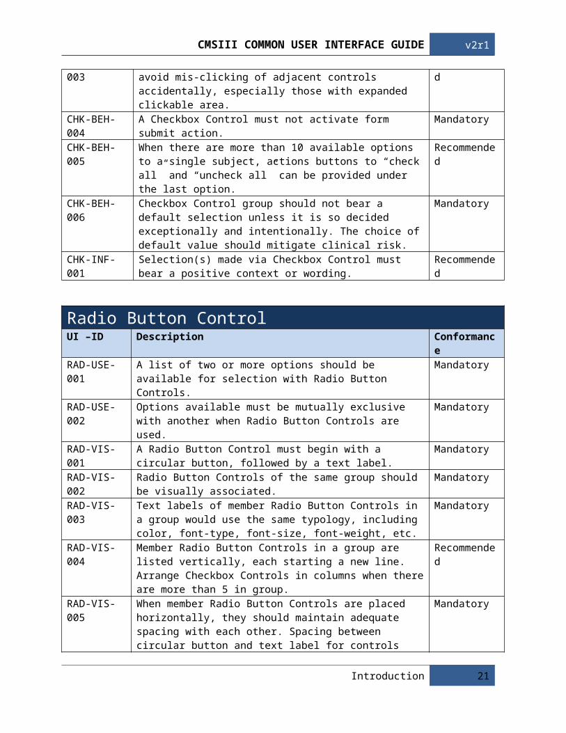
Checkbox ControlUI –ID Description ConformanceCHK-USE-001 A single Checkbox Control must be used for users to denote the
binary state of a subject.Mandatory
CHK-USE-002 Members Checkbox Controls of a group should operate independently and should not exhibit mutual-exclusivity.
Mandatory
CHK-USE-003 User can select any number of options for a Checkbox Control Group, including zero.
Mandatory
CHK-VIS-001 A Checkbox Control must begin with a checkbox, followed by a text label.
Mandatory
CHK-VIS-002 Checkbox Controls of the same group should be visually associated. MandatoryCHK-VIS-003 Text labels of member Checkbox Controls in a group would use the
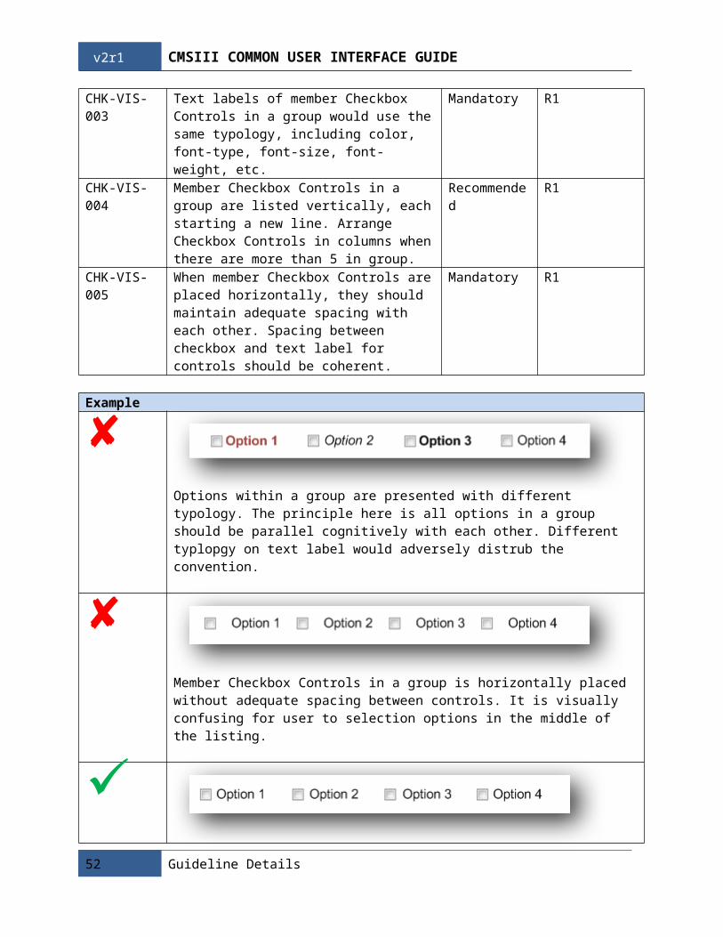
same typology, including color, font-type, font-size, font-weight, etc.Mandatory
CHK-VIS-004 Member Checkbox Controls in a group are listed vertically, each starting a new line. Arrange Checkbox Controls in columns when there are more than 5 in group.
Recommended
CHK-VIS-005 When member Checkbox Controls are placed horizontally, they should maintain adequate spacing with each other. Spacing between checkbox and text label for controls should be coherent.
Mandatory
CHK-BEH-001 A Checkbox Control can be checked / un-checked either by clicking on its checkbox or text label.
Mandatory
CHK-BEH-002 The text label of Checkbox Control should include reasonable expanded clickable area to facilitate mouse click response.
Recommended
CHK-BEH-003 Layout of buttons should be considered to avoid mis-clicking of adjacent controls accidentally, especially those with expanded clickable area.
Recommended
CHK-BEH-004 A Checkbox Control must not activate form submit action. MandatoryCHK-BEH-005 When there are more than 10 available options to a single subject,
actions buttons to “check all” and “uncheck all” can be provided under the last option.
Recommended
CHK-BEH-006 Checkbox Control group should not bear a default selection unless it is so decided exceptionally and intentionally. The choice of default value should mitigate clinical risk.
Mandatory
CHK-INF-001 Selection(s) made via Checkbox Control must bear a positive context or wording.
Recommended
Radio Button ControlUI –ID Description ConformanceRAD-USE-001 A list of two or more options should be available for selection with
Radio Button Controls.Mandatory
RAD-USE-002 Options available must be mutually exclusive with another when Radio Button Controls are used.
Mandatory
RAD-VIS-001 A Radio Button Control must begin with a circular button, followed Mandatory
Introduction 15

v2r1 Cmsiii common user interface guide
by a text label.RAD-VIS-002 Radio Button Controls of the same group should be visually
associated. Mandatory
RAD-VIS-003 Text labels of member Radio Button Controls in a group would use the same typology, including color, font-type, font-size, font-weight, etc.
Mandatory
RAD-VIS-004 Member Radio Button Controls in a group are listed vertically, each starting a new line. Arrange Checkbox Controls in columns when there are more than 5 in group.
Recommended
RAD-VIS-005 When member Radio Button Controls are placed horizontally, they should maintain adequate spacing with each other. Spacing between circular button and text label for controls should be coherent.
Mandatory
RAD-BEH-001 A Radio Button Control can be selected / deselected either by clicking on its checkbox or text label.
Mandatory
RAD-BEH-002 The text label of Radio Button Control should include reasonable expanded clickable area to facilitate mouse click response.
Recommended
RAD-BEH-003 Layout of buttons should be considered to avoid mis-clicking of adjacent controls accidentally, especially those with expanded clickable area.
Recommended
RAD-BEH-004 Radio Button Control should be resettable (un-select) by clicking on it again.
Mandatory
RAD-BEH-005 A Radio Button Control must not activate form submit action. MandatoryRAD-BEH-006 Radio Button Control group should not bear a default selection
unless it is so decided exceptionally and intentionally. The choice of default value should mitigate clinical risk.
Mandatory
RAD-POP-001 Radio Button Controls of a group should support comprehensive and distinct options.
Mandatory
RAD-POP-002 If it is impossible to predict all options and to provide a comprehensive list of options. An additional “Others” option can be added, supplemented by a textbox, to capture the out-of-bound input if necessary.
Mandatory
ButtonsUI -ID Description ConformanceBTN-001 Rounded corners of radius 15px. MandatoryBTN-002 Font must be Web-Safe. MandatoryBTN-003 6px padding on top and bottom, 12px on the sides. MandatoryBTN-004 Text label should not exceed 30 characters. MandatoryBTN-005 Refer to the CMS3 button library for general icons. Mandatory
IconsUI -ID Description ConformanceICN-001 Icons should not be used unless provided in the CMS3 icon library.
All other cases that needs an icon please go through the UI core Mandatory
16 Guideline Details

Cmsiii common user interface guide v2r1
group.ICN-002 Only use icons that are distinct and meaningful without confusion. MandatoryICN-003 Make sure there is enough space to allow icons. MandatoryICN-004 Consider supporting the icon with text. RecommendedICN-005 Icons do not need to be picture perfect or reflecting reality. Keep in
simple.Recommended
ICN-006 Icons should be consistent in style. MandatoryICN-007 Do not add color to an icon just to make the icon more colorful. Use
color accordingly.Recommended
ICN-008 For choosing and designing icons, seek the help of professional graphic designers.
Recommended
ICN-009 Use universal imagery that users will understand and recognize. RecommendedICN-010 Do not use copyrighted symbols in the icons. MandatoryICN-011 In actual usage, an icon should not be combined with another icon. Mandatory
ScrollUI -ID Description ConformanceSCL-001 Follow browser / OS specific scroller. Consider SCL-002 to SCL-009
only if the scroller is programmable.Recommended
SCL-002 Rounded corners of radius 15px for scroller and track. RecommendedSCL-003 Scroller should not go beyond scroll arrow button. MandatorySCL-004 No text on scrollbar. MandatorySCL-005 Scroll bars should not be next to, perpendicular, or over overlapping
each other.Mandatory
SCL-006 Never show a scroll bar when it’s not needed. MandatorySCL-007 Avoid Horizontal scrolling. RecommendedSCL-008 The “Endless Scrolling” method should be used for long lists or
tables.Recommended
SCL-009 “End of List/Table/Tree/Report” should be added at the end of a list, table, tree or report to let users know that they have reached the end. This will help users avoid missing of information off the screen.
Recommended
Tree TableUI -ID Description ConformanceTRE-001 Multiple attributes need to be shown in one view. MandatoryTRE-002 Items have parent-child relationships or share common attributes. MandatoryTRE-003 Add “jumper” buttons when tree reaches 2 times screen height. Recommended TRE-004 Empty categories should never be hidden by default. MandatoryTRE-005 Expandable categories should have “+” icon next to it. MandatoryTRE-006 A tree should be completely expanded by default. RecommendedTRE-007 Tree hierarchy less then 4 layers. MandatoryTRE-008 Design tree by someone with data structure experience. RecommendedTRE-009 Use a tree control that supports multiple columns. Recommended
Introduction 17

v2r1 Cmsiii common user interface guide
Visual FlowUI -ID Description ConformanceVSF-001 Visual flow should be from left to right, top to bottom. MandatoryVSF-002 Any indication such as arrows, or eyes on an image with a human
figure, should be pointed at the focus point.Mandatory
VSF-003 The program flow should follow western language text orientation. Mandatory
Button GroupsUI -ID Description ConformanceBGS-001 The number of commands should be small, usually no more than 4. RecommendedBGS-002 The buttons in the group should be related and possibly act on the
same object.Mandatory
BGS-003 There should be at least 30px of space between each buttons and should they should never be too crowded.
Recommended
DashboardUI -ID Description ConformanceDBD-001 Identify, reduce, effectively and quickly communicate insight into the
interests of the user.Mandatory
DBD-002 Users will be willing to regularly use the dashboard to view information.
Recommended
DBD-003 Only give information the users need. MandatoryDBD-004 Keep the dashboard 1 page only. RecommendedDBD-005 Users should be able to customize what they see on the dashboard. Recommended
Date and Time DisplayUI –ID Description ConformanceDTD-FRM-001 The date part of a date-time field should be displayed in the form of:
dd-MMM-yyyy
where:ddCalendar day of the month with leading zero;MMMEnglish abbreviation of month;PermitsJan, Feb, Mar, Apr, May, Jun, Jul, Aug, Sep, Oct, Nov, Dec;yyyyCalendar year shown in 4-digit;
Mandatory
18 Guideline Details

Cmsiii common user interface guide v2r1
Introduction 19

v2r1 Cmsiii common user interface guide
DTD-FRM-002 If the day of week is to be shown in addition, it should appear in form of ddd and appear in front of the general date part, followed by a single space. i.e.
ddd dd-MMM-yyyy
where:dddEnglish abbreviation of day of week;PermitsSun, Mon, Tue, Wed, Thu, Fri, Sat;
Mandatory
DTD-FRM-003 The time part of a date-time field should be displayed in the form of: HH:mm
where:HH24 hour time display with leading zero;mmMinute with leading zero;
Mandatory
DTD-FRM-004 If a time part requires precision down to its second, it should be displayed in the form of: HH:mm:ss
where:ssSecond with leading zero;
Mandatory
DTD-FRM-005 When shown together as a full date-time field, the date part should precede, followed by the time part separated by a single space or a line break. i.e.
dd-MMM-yyyy HH:mm
or
dd-MMM-yyyyHH:mm
Mandatory
DTD-VIS-001 Courier New, a fixed-width font, is to be used for the display of date and time field in table or list.
Mandatory
DTD-PAD-001 Excessive precision in time display should be avoided to match information context.
Mandatory
DTD-PAD-002 The level of details in date-time display should match information context.
Mandatory
20 Guideline Details
Cmsiii common user interface guide v2r1
4 Guideline DetailsIn this section, the design guidelines are being discussed in details by component. A typical detailed description of a component includes:
a. Guidance on UsageA general description about the usage and application of a component is given. Definitions and vocabulary of the component are given. The section also defines the intended scope of related guideline and where they should be applied.
b. Detail DescriptionIndividual design guidelines are listed in the section. Guidelines of the same domain area (for example, Usage, Appearance, Visuals, etc.) are further grouped together. Following the listing are screen-captures or online examples that demonstrates scenarios when the guideline is violated (bad example) and how usability can be improved when the guideline is followed (good example).
c. Principle and RationaleThe usability principle and rationale that contribute to the guide are elaborated. This section explains why the guideline given is important and the kind of improvement expected when it is implemented.
d. Reference / Further ReadingsA list of reference (literature, papers, website, etc.) is provided. These are the sources the Usability Team had gone through and located related materials which support or imply individual guideline listed in part b.
Introduction 21

v2r1 Cmsiii common user interface guide
4.1 Consistent Navigation
4.1.1 Alert Message Dialog Box
a. Guidance On Usage
22 Guideline Details

Cmsiii common user interface guide v2r1
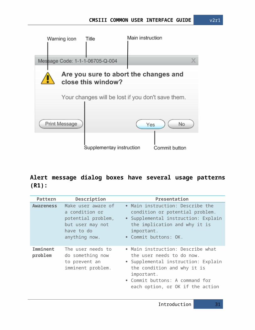
An alert message dialog box is a modal dialog box that appears when the system or an application needs to communicate information to the user. Alert provide messages CMSIII Common User InterfaceReference Guidelines about error conditions or warn users about notable or potentially hazardous situations or actions (R1, R2).
A typical alert message dialog box:
Alert message dialog box consist of a title bar (to provide a message code for reference), a warning icon (to make it clear to the user this is a alert message), a main instruction (to explain the user's objective with the dialog box, summary of the error or condition that summoned the alert), an optional supplemental instruction (to present options, consequence or ways to get out of it), and commit buttons (to indicate how the user wants to commit to the task) (R1, R2).
Alert message dialog boxes have several usage patterns (R1):
Pattern Description PresentationAwareness Make user aware of a
condition or potential problem, but user may not have to do anything now.
Main instruction: Describe the condition or potential problem.
Supplemental instruction: Explain the implication and why it is important.
Introduction 23

v2r1 Cmsiii common user interface guide
Commit buttons: OK.
Imminent problem
The user needs to do something now to prevent an imminent problem.
Main instruction: Describe what the user needs to do now.
Supplemental instruction: Explain the condition and why it is important.
Commit buttons: A command for each option, or OK if the action occurs outside the dialog box.
Risky action confirmation
Confirm that the user wants to proceed with an action that has some risk and can't be easily undone.
Main instruction: Ask a question to determine if the user wants to proceed.
Supplemental instruction: Explain any non-obvious reasons why the user might not want to proceed.
Commit buttons: Yes, No.
Alert message dialog box should be used when (R1):
Any undesirable results should be unexpected or unintended, and not easily corrected. The user is being alerted of a condition that might cause a problem in the future. The user interface (UI) is presenting an error or problem that has already occurred. The condition is the direct result of an action initiated by the user.
Summary:
Usage example Save changes alert Confirm amount of images upload in CID studio
Dialog box type Modal dialogPlacement Visually centered on top of the owner windowChoice YesCommit button Awareness: OK
Imminent problem: A command button for each option or OK if the action occurs outside the dialog box
Risky action confirmation: Yes, NoBody icon Warning icon
(Note: Guidelines related to Icons and Symbology, Buttons and Grammar are presented in separate articles.)
b. Detail Description
24 Guideline Details

Cmsiii common user interface guide v2r1
UI -ID Description Conformance Evidence / References
AMD-001 Consistent display modal error dialog boxes "visually centered" on top of the owner window (means to bias vertical placement slightly towards the top of the monitor, instead of placing exactly in the middle).
Mandatory R1, R2, R3
AMD-002 Show the modal error dialog boxes in a layer on top of the window and disables the original window (Modal overlay).
Mandatory R3
AMD-003 When a dialog is redisplayed, displaying it in the same state as last accessed.
Recommended R1
AMD-004 Use a warning icon. Mandatory R1AMD-005 Remove redundant text. Look for it in titles, main
instructions, supplemental instructions, and commit buttons. Generally, leave full text in instructions and interactive controls, and remove any redundancy from the other places.
Mandatory R1
AMD-006 Don’t use phrasing that blames the user or implies user error.
Mandatory R1, R2
AMD-007 Don't use the terms "warning", “alert” or "caution" in the text. When used correctly, the warning icon sufficiently communicates that users must proceed with caution.
Mandatory R1
AMD-008 Use language that the target users understand and use. Avoid technical jargon.
Mandatory R1
AMD-009 Always provide a text description of the problem and solution. Don't depend just on the error code for this purpose.
Mandatory R1
AMD-010 The main instruction for a alert is based on its design pattern: Pattern Main instructionAwareness Describe the condition or
potential problem.Imminent problem
Describe what the user needs to do now.
Risky action confirmation
Ask a question to determine if the user wants to proceed.
Mandatory R1
AMD-011 Whenever possible, propose a practical, helpful solution so users can fix the problem. However, make sure the proposed solution is likely to solve the problem. Don't waste users' time by suggesting possible, but improbable, solutions.
Recommended R1
AMD-012 For alert message dialog boxes, the commit buttons are based on its design pattern: Pattern Commit buttonsAwareness OKImminent A command button for each
Recommended R1
Introduction 25

v2r1 Cmsiii common user interface guide
problem option, such as:Yes/NoYes/No/Cancel[Do it]/Cancel[Do it]/[Don't do it][Do it]/[Don't do it]/CancelOr use OK if the action occurs outside the dialog box.
Risky action confirmation
Yes, No.
AMD-013 Appropriate size of alert message dialog box is not bigger than 50% of the owner window.
Recommended --
AMD-014 Provide message code in title bar for reference. Mandatory --AMD-015 Provide a print message button that allows users to print
out message detail. Mandatory --
AMD-016 Provide default action button. Recommended R1, R2AMD-017 If a default action button is provided, the safest action
should be defaulted.Mandatory R1, R2
Example
Put 45 percent of the space between the top of the monitor/owner and the window top, and 55 percent between the bottom of the monitor/owner and the window bottom
In this example, reporting a problem is displayed in a modal overlay and emphasized with the lightbox effect.
26 Guideline Details

Cmsiii common user interface guide v2r1
The incorrect example blames the user and make user feel like a criminal.
In this example, the term "warning" is unnecessary and the commit buttons is incorrectly centered.
Introduction 27

v2r1 Cmsiii common user interface guide
In this example, uses commit buttons that are specific responses to the main instruction, instead of generic labels such as Yes / No. Users should be able to understand more quickly, resulting in efficient decision making.
c. Principle and RationaleCharacteristics of good alert messages (R1):
Involve risk. Good warnings alert users of something significant. Have immediate relevance. Users typically aren't interested in problems they might have later as
long as they can do their work now. Lead to action. There is something users must do or be aware of as the result of the warning. Are not obvious. Don't display a alert message to state the obvious consequence of an action. Occur infrequently. Constant alert messages quickly become ineffective and annoying. Users are
more likely to focus on getting rid of the alert than fixing the underlying problem.
d. Reference
R1. Microsoft. (2009). Windows User Experience Interaction Guidelines. Retrieved from Windows Developer Center: http://download.microsoft.com/download/e/1/9/e191fd8c-bce8-4dba-a9d5-2d4e3f3ec1d3/ux%20guide.pdf
R2. Apple Inc. (2009). Apple Human Interface Guideline. Retrieved from Apple Developer Center: http://developer.apple.com/mac/library/documentation/UserExperience/Conceptual/AppleHIGuidelines/OSXHIGuidelines.pdf
R3. UI Pattern Factory “Overlay”:http://uipatternfactory.com/p=overlay/
28 Guideline Details

Cmsiii common user interface guide v2r1
4.1.2 Input Error Notifications
a. Guidance On UsageAn input error notification alerts users of a problem that has already occurred because of the invalid or missing data input. Input error notifications can be presented using inline validation or balloons (R1).
Input error notifications have several usage patterns:
1. Inline Validation For multiple and delayed error detection, usually errors found by clicking a commit button
(R1).
2. Balloons For non-critical, single-point user input problems detected while in a text box or
immediately after a text box loses focus (R1). Balloons don't require available screen space or the dynamic layout that is required to
display inline validation (R1).
Input error notifications usage:
Input error notifications should be used when the application is presenting a problem that has already occurred because of one or more input fields is syntactically invalid or missing (R1). For example, if users enter an invalid date format in the date input field, you can use a balloon to lets users know what the correct date format is.
Summary:
Usage example GCRS requesting Endoscopy / OT record creating Appointment booking
Dialog box type Balloons: ModelessPlacement Directly next to the problemChoice NoCommit button NoneBody icon Warning icon
Introduction 29

v2r1 Cmsiii common user interface guide
Note: Guidelines related to Icons and Symbology, Buttons and Grammar are presented in separate articles.
b. Detail Description
Balloons
UI -ID Description Conformance Evidence / References
IEN-BAL-001 Use balloons for non-critical, single-point user input problems detected while in a text box or immediately after a text box loses focus.
Mandatory R1
IEN-BAL-002 Balloons go away when the problem is resolved, or after a timeout (10 seconds).
Mandatory R1
IEN-BAL-003 Use a warning icon. Mandatory R1IEN-BAL-004 Display balloons bellow their owner control.
Automatically adjusts balloon positions so that they are completely on screen.
Recommended R1
IEN-BAL-005 Display only one balloon at a time. Mandatory R1IEN-BAL-006 Use title text that briefly summarizes the input
problem or special condition in clear, plain, concise, specific language.
Mandatory R1
IEN-BAL-007 Use body text to state what the user can do to resolve the problem or revert the state.
Recommended R1
Example
In this example, a balloon indicates an input problem while still in the control.
In the incorrect example, the balloon is awkwardly displayed above its owner control.
30 Guideline Details
Cmsiii common user interface guide v2r1
In this example, two problems are incorrectly presented at the same time.
Inline Validation Errors
UI -ID Description Conformance Evidence / References
IEN -INV-001 Use inline validation for delayed error detection, usually errors found by clicking a commit button. (Don't use inline validation for settings that are immediately committed.)
Mandatory R1
IEN-INV-002 Inline validation can be multiple in-place errors at a time. Use warning icon and orange color text (RGB: R: 230 G: 100 B:0, Hex: E66400), placing them directly next to the problem whenever possible.
Mandatory R1
IEN-INV-003 Don't clear incorrect input. Instead, leave it so that the user can see and correct the problem without starting over.
Mandatory R1
IEN-INV-004 Use a warning icon in the existing GRR /GCD form and error list panel.
Recommended --
Example
In this example, an inline validation is used for an error found by clicking the commit button.
Introduction 31

v2r1 Cmsiii common user interface guide
In this example, a warning icon is used in the existing GCD form error list pane.
c. Principle And RationalePutting input error notifications in modal dialog boxes has the benefit of demanding the user's immediate attention and acknowledgement. However, this is also their primary drawback if that attention isn't necessary.
Modal dialogs are a great choice when the user must acknowledge the problem immediately before continuing, but often a poor choice otherwise. Generally, you should prefer to use the lightest weight presentation that does the job well.
The characteristics of good input error notifications (R1):
A problem. States that a problem occurred. A location. Indicate where the error occurred. A solution. Provides a solution so that users can fix the problem.
d. Reference
R1. Microsoft. (2009). Windows User Experience Interaction Guidelines. Retrieved from Windows Developer Center: http://download.microsoft.com/download/e/1/9/e191fd8c-bce8-4dba-a9d5-2d4e3f3ec1d3/ux%20guide.pdf
R2. Apple Inc. (2009). Apple Human Interface Guideline. Retrieved from Apple Developer Center: http://developer.apple.com/mac/library/documentation/UserExperience/Conceptual/AppleHIGuidelines/OSXHIGuidelines.pdf
32 Guideline Details

Cmsiii common user interface guide v2r1
R3. UI Pattern Factory “Overlay”:http://uipatternfactory.com/p=overlay/
Introduction 33

v2r1 Cmsiii common user interface guide
4.1.3 Progress Indicators
a. Guidance On UsageProgress indicators inform users about the status of lengthy operations. A progress indicator may either show an approximate percentage of completion (determinate), or indicate that an operation is ongoing (indeterminate) (R1, R2).
Progress indicators have several usage patterns:
1. Determinate Progress Indicators
Indicate an operation’s progress by filling from left to right and filling completely when the operation is complete (R1).
Because this feedback is modal, users cannot perform other tasks in the window (or its parent if displayed in a modal dialog box) until the operation is complete (R1).
2. Indeterminate Progress Indicators
Indicate an operation is in progress by showing an animation that continuously cycles (R1, R2).
Used only for operations whose overall progress cannot be determined, so there is no notion of completeness (R1, R2).
Because this feedback is modal, users cannot perform other tasks in the window (or its parent if displayed in a modal dialog box) until the operation is complete (R1).
Progress indicators usage:
Operations that take two seconds or longer to complete to be lengthy and you want the user to
34 Guideline Details

Cmsiii common user interface guide v2r1
understand that the system is doing something and he needs to wait (R1, R2). For example, if your application attempts to download a patient laboratory result, you have no way to accurately determine how long it will take, so you can use an indeterminate progress indicator to lets users know that processing is ongoing.
Summary:
Usage example Application launching Record generating Result downloading Data saving or uploading
Dialog box type Modal dialogPlacement Visually centered on top of the owner windowChoice NoCommit button NoneBody icon None
b. Detail Description
UI -ID Description Conformance Evidence / References
PIN-001 Provide progress indicator when performing a lengthy operation (two seconds or longer).
Mandatory R1, R2
PIN-002 Use determinate progress bars for operations that require a bounded amount of time, even if that amount of time cannot be accurately predicted.
Mandatory R1
PIN-003 Don't put the percentage complete or any other text on a progress bar.
Mandatory R1
PIN-004 Use indeterminate progress indicators for operations that require an unbounded amount of time.
Mandatory R1, R2
PIN-005 Don't combine indeterminate progress indicators with percent complete or time remaining estimates.
Mandatory R1
PIN-006 Provide a label that appears with the indicator, create a complete or partial sentence that briefly describes the process that is occurring.
Recommended R1, R2
PIN-007 End the label with an ellipsis (...) to emphasize the ongoing nature of the processing.
Mandatory R2
PIN-008 Consistent display progress indicators "visually centered" on top of the owner window (means to bias vertical placement slightly towards the top of the monitor, instead of placing exactly in the middle).
Mandatory R1, R2, R3
Introduction 35

v2r1 Cmsiii common user interface guide
PIN-009 Show the progress indicators in a layer on top of the owner window / field and disables the original owner window / field (Modal overlay).
Recommended R3
PIN-010 Appropriate size of progress indicator is not bigger than 10-30% of the owner window.
Recommended --
Example
Don't put the percentage complete or any other text on a progress bar. Such text isn't accessible and isn't compatible with using themes.
Don't combine indeterminate progress indicator with percent complete.
Put 45 percent of the space between the top of the monitor/owner and the window top, and 55 percent between the bottom of the monitor/owner and the window bottom
In this example, reporting a problem is displayed in a modal overlay and emphasized with the lightbox
36 Guideline Details

Cmsiii common user interface guide v2r1
effect.
c. Principle And Rationale
Always let the user know what is happening in your application by using appropriate progress indicators at an appropriate time. The user should never have to guess about the status of the system. When the user performs an action, provide feedback to indicate that the system has received the input and is operating on it.
Usability studies have shown that users are aware of response times of over one second. Consequently, you should consider operations that take two seconds or longer to complete to be lengthy and in need of some type of progress feedback (R1).
d. Reference
R1. Microsoft. (2009). Windows User Experience Interaction Guidelines. Retrieved from Windows Developer Center: http://download.microsoft.com/download/e/1/9/e191fd8c-bce8-4dba-a9d5-2d4e3f3ec1d3/ux%20guide.pdf
R2. Apple Inc. (2009). Apple Human Interface Guideline. Retrieved from Apple Developer Center: http://developer.apple.com/mac/library/documentation/UserExperience/Conceptual/AppleHIGuidelines/OSXHIGuidelines.pdf
R3. UI Pattern Factory “Overlay”:http://uipatternfactory.com/p=overlay/
Introduction 37

v2r1 Cmsiii common user interface guide
4.2 Accessibility Principles
4.2.1 Checkbox Control
a. Guidance On Usage
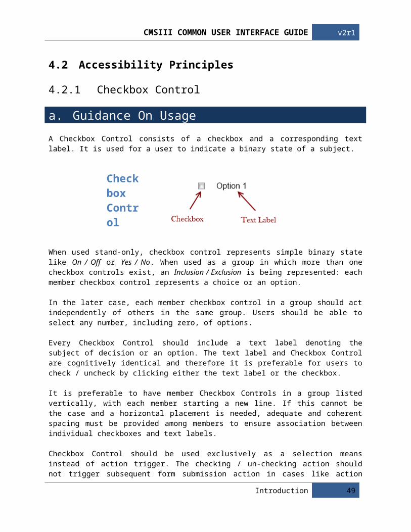
A Checkbox Control consists of a checkbox and a corresponding text label. It is used for a user to indicate a binary state of a subject.
Checkbox Control
When used stand-only, checkbox control represents simple binary state like On / Off or Yes / No. When used as a group in which more than one checkbox controls exist, an Inclusion / Exclusion is being represented: each member checkbox control represents a choice or an option.
In the later case, each member checkbox control in a group should act independently of others in the same group. Users should be able to select any number, including zero, of options.
Every Checkbox Control should include a text label denoting the subject of decision or an option. The text label and Checkbox Control are cognitively identical and therefore it is preferable for users to check / uncheck by clicking either the text label or the checkbox.
It is preferable to have member Checkbox Controls in a group listed vertically, with each member starting a new line. If this cannot be the case and a horizontal placement is needed, adequate and coherent spacing must be provided among members to ensure association between individual checkboxes and text labels.
Checkbox Control should be used exclusively as a selection means instead of action trigger. The checking / un-checking action should not trigger subsequent form submission action in cases like action button, hyper-link, icon, etc.
As a platform convention, a tick is being shown in a Checkbox Control to denote a selection. Tick bears a positive meaning and thus the subject should also be written in a positive sentence so as to avoid the logical burden of “confirming the negative” or double negative.
38 Guideline Details

Cmsiii common user interface guide v2r1
b. Detail Description
Usage
UI –ID Description Conformance Evidence / References
CHK-USE-001 A single Checkbox Control must be used for users to denote the binary state of a subject.
Mandatory R1, R2
CHK-USE-002 Members Checkbox Controls of a group should operate independently and should not exhibit mutual-exclusivity.
Mandatory R1
CHK-USE-003 User can select any number of options for a Checkbox Control Group, including zero.
Mandatory R1, R2
Example
Multiple Checkbox Controls used in group to represent binary states of a single subject, which are mutually exclusive in nature. Radio Button Control is more suitable in this case.
A single Checkbox Control is used for user to denote the binary state of a single subject.
Mutually exclusive selection of options in a gorup is implemented with Checkbox Controls. Radio Button Control is more suitable in this case.
Introduction 39
v2r1 Cmsiii common user interface guide
User is allowed to select any number of options (including zero) and each member Checkbox Control operates its state independently.
Visual
UI –ID Description Conformance Evidence / References
CHK-VIS-001 A Checkbox Control must begin with a checkbox, followed by a text label.
Mandatory R1
CHK-VIS-002 Checkbox Controls of the same group should be visually associated.
Mandatory R1
CHK-VIS-003 Text labels of member Checkbox Controls in a group would use the same typology, including color, font-type, font-size, font-weight, etc.
Mandatory R1
CHK-VIS-004 Member Checkbox Controls in a group are listed vertically, each starting a new line. Arrange Checkbox Controls in columns when there are more than 5 in group.
Recommended R1
CHK-VIS-005 When member Checkbox Controls are placed horizontally, they should maintain adequate spacing with each other. Spacing between checkbox and text label for controls should be coherent.
Mandatory R1
Example
Options within a group are presented with different typology. The principle here is all options in a group should be parallel cognitively with each other. Different typlopgy on text label would adversely distrub the convention.
40 Guideline Details

Cmsiii common user interface guide v2r1
Member Checkbox Controls in a group is horizontally placed without adequate spacing between controls. It is visually confusing for user to selection options in the middle of the listing.
Member Checkbox Controls in a group is horizontally placed but each control maintains adequate and identical spacing with another. The spacing between checkbox and text label is different with that between controls, and gives clear visual sense about which checkbox a text label is referring.
Placing options vertically with each option starting a new line is the best way to avoid user confusion about checkbox-text label association.
A long vertical list may deassociate the later options and the original subject. When there is more than 5 options available, options should be arranged in columns with a left-to-right and top-to-bottom flow.
Introduction 41

v2r1 Cmsiii common user interface guide
Two options are available per subject. However, there lacks visual separation about which options are available to which subject. Subject 2 would easily be overlooked by users and its two options seem belong to subject 1.
Options available to a subject is visually confined within a group. The visual separation used could be background color, table border, or a separator. The separation should be done with quiet and low saturation colors, so as to avoid injection of visual noise.
Behavior
UI –ID Description Conformance Evidence / References
CHK-BEH-001 A Checkbox Control can be checked / un-checked either by clicking on its checkbox or text label.
Mandatory R1, R2
CHK-BEH-002 The text label of Checkbox Control should include reasonable expanded clickable area to facilitate mouse click response.
Recommended R1
CHK-BEH-003 Layout of buttons should be considered to avoid mis-clicking of adjacent controls accidentally, especially those with expanded clickable area.
Recommended R1
CHK-BEH-004 A Checkbox Control must not activate form submit action.
Mandatory R1, R3
CHK-BEH-005 When there are more than 10 available options to a single subject, actions buttons to “check all” and “uncheck all” can be provided under the last option.
Recommended R1, R3
CHK-BEH-006 Checkbox Control group should not bear a default selection unless it is so decided exceptionally and intentionally. The choice of default value should mitigate clinical risk.
Mandatory --
42 Guideline Details

Cmsiii common user interface guide v2r1
Example
View online sample at:
http://hopmsv01/PWA/UsabilityMaster/CMSIII%20UI%20Guideline%20Revamp/Project%20Documents/Sample/CheckboxControlBehavior.html
Information
UI –ID Description Conformance Evidence / References
CHK-INF-001 Selection(s) made via Checkbox Control must bear a positive context or wording.
Recommended R3
Example
Checkbox Control is used to confirm a negative statement. This is equivalent to “saying Yes to a No”.
Selections are used for exclusion, a negative subject cognitively.
Checkbox Control is used to confirm a positive statement.
Introduction 43

v2r1 Cmsiii common user interface guide
c. Principle And Rationale
Rules above outlines the usage of checkbox control, its visual appearance, behavior and the information it represents. Compliance to these rules can enhance users' ability to predict what the control would do and how they would operate it.
The ultimate goal is to equip or educate a user cognitively so that they can comprehend combinations of controls (for example, in a form) without consciously thinking about the characteristics of individual control type.
d. Reference
R1. Jakob Nielsen’s Alertbox. (2004). Checkboxes vs. Radio Buttons: http://www.useit.com/alertbox/20040927.html
R2. Usability.gov. (2004). Research-Based Web Design & Usability Guidelines: http://usability.gov
R3. KDE4 Human Interface Guidelines:http://techbase.kde.org/Projects/Usability/HIG
44 Guideline Details

Cmsiii common user interface guide v2r1
4.2.2 Radio Button Control
a. Guidance On UsageA Radio Button Control is a small circular button that has a solid dot inside it when selected. It is accompanied with a text level to denote its meaning.
Radio Button Control
Radio Button Control is used when there is a list of two or more options that are mutually exclusive with each other in regard of a subject, i.e. clicking a non-selected radio button will deselect whatever other button was previously selected in the list. Radio Button Control should not appear stand-alone to represent a single selection.
User must select one and only one choice from the options given for a mandatory field. In this case a default selection on the most popular / likely option should be given. On the other hand, when Radio Button Controls are used for an optional field, which user can skip without providing a selection, no default selection should be made and user should be able to reset a selection by clicking on the selected option again. Notice that the mutual exclusivity among options is always enforced in both cases.
Radio Button Control is similar with single-line drop-down box as both permit the selection of exactly one option. However, Radio Button Control is generally more preferable since it is easier to work with fewer mouse-click and shorter mouse-trail.
Every Radio Button Control should include a text label denoting the option. The text label and circular button are cognitively identical and therefore it is preferable for users to select by clicking either the text label or the circular button.
It is preferable to have member Radio Button Controls in a group listed vertically, with each member starting a new line. If this cannot be the case and a horizontal placement is needed, adequate and coherent spacing must be provided among members to ensure association between individual checkboxes and text labels.
Radio Button Control should be used exclusively as a selection means instead of action trigger. The change of selection should not trigger subsequent form submission action in cases like action button, hyper-link, icon, etc.
Introduction 45

v2r1 Cmsiii common user interface guide
b. Detail Description
Usage
UI –ID Description Conformance Evidence / References
RAD-USE-001 A list of two or more options should be available for selection with Radio Button Controls.
Mandatory R1, R2
RAD-USE-002 Options available must be mutually exclusive with another when Radio Button Controls are used.
Mandatory R1, R2
Example
A stand-alone Radio Button Control is used to denote a single option. A Checkbox should be used in this case.
Using Radio Button Controls to enable user to choose exactly one option from a list: each option is mutually exclusive with another.
Using composite option like “All Above” with Radio Button Controls to faciliate groupwise selection is not appropiate. A lot of additonal options will be necessary to present all possible combinations.
46 Guideline Details

Cmsiii common user interface guide v2r1
Radio Button Control is sutiable to ask question with one-and-only one possible answer.
Visual
UI –ID Description Conformance Evidence / References
RAD-VIS-001 A Radio Button Control must begin with a circular button, followed by a text label.
Mandatory R1
RAD-VIS-002 Radio Button Controls of the same group should be visually associated.
Mandatory R1
RAD-VIS-003 Text labels of member Radio Button Controls in a group would use the same typology, including color, font-type, font-size, font-weight, etc.
Mandatory R1
RAD-VIS-004 Member Radio Button Controls in a group are listed vertically, each starting a new line. Arrange Checkbox Controls in columns when there are more than 5 in group.
Recommended R1, R3
RAD-VIS-005 When member Radio Button Controls are placed horizontally, they should maintain adequate spacing with each other. Spacing between circular button and text label for controls should be coherent.
Mandatory R1, R3
Example
Options within a group are presented with different typology. The principle here is all options in a group should be parallel cognitively with each other. Different typlopgy on text label would adversely distrub the convention.
Introduction 47

v2r1 Cmsiii common user interface guide
Member Checkbox Controls in a group is horizontally placed without adequate spacing between controls. It is visually confusing for user to selection options in the middle of the listing.
Member Radio Button Controls in a group is horizontally placed but each control maintains adequate and identical spacing with another. The spacing between circular button and text label is different with that between controls, and gives clear visual sense about which circular button a text label is referring.
Placing options vertically with each option starting a new line is the best way to avoid user confusion about circular button-text label association.
A long vertical list may deassociate the later options and the original subject. When there is more than 5 options available, options should be arranged in columns with a left-to-right and top-to-bottom flow.
48 Guideline Details
Cmsiii common user interface guide v2r1
Two options are available per subject. However, there lacks visual separation about which options are available to which subject. Subject 2 would easily be overlooked by users and its two options seem belong to subject 1. It is even more confusing that there seems two, instead of one, selected options for subject 1.
Options available to a subject is visually confined within a group. The visual separation used could be background color, table border, or a separator. The separation should be done with quiet and low saturation colors, so as to avoid injection of visual noise.
Behavior
UI –ID Description Conformance Evidence / References
RAD-BEH-001 A Radio Button Control can be selected / deselected either by clicking on its checkbox or text label.
Mandatory R1
RAD-BEH-002 The text label of Radio Button Control should include reasonable expanded clickable area to facilitate mouse click response.
Recommended R1
RAD-BEH-003 Layout of buttons should be considered to avoid mis-clicking of adjacent controls accidentally, especially those with expanded clickable area.
Recommended R1, R3
RAD-BEH-004 Radio Button Control should be resettable (un-select) by clicking on it again.
Recommended --
RAD-BEH-005 A Radio Button Control must not activate form submit action.
Mandatory R1, R3
RAD-BEH-006 Radio Button Control group should not bear a default selection unless it is so decided exceptionally and intentionally. The choice of default value should mitigate clinical risk.
Mandatory --
Introduction 49

v2r1 Cmsiii common user interface guide
Example
View online sample at:
http://hopmsv01/PWA/UsabilityMaster/CMSIII%20UI%20Guideline%20Revamp/Project%20Documents/Sample/RadioButtonControlBehavior.html
Provision of Options
UI –ID Description Conformance Evidence / References
RAD-POP-001 Radio Button Controls of a group should support comprehensive and distinct options.
Mandatory R1
RAD-POP-002 If it is impossible to predict all options and to provide a comprehensive list of options. An additional “Others” option can be added, supplemented by a textbox, to capture the out-of-bound input if necessary.
Mandatory R1
Example
A comprehensive list of options is not being provided to users. Users with a different answer might be forced to provide an inaccurate answer.
Apart from the most popular answers, an addition “Others” option is provided and users are allowed to key-in the right answer in the supplementary textbox.
50 Guideline Details

Cmsiii common user interface guide v2r1
c. Principle And Rationale
Rules above outlines the usage of radio button control, its visual appearance, behavior and the information it represents. Compliance to these rules can enhance users' ability to predict what the control would do and how they would operate it.
The ultimate goal is to equip or educate a user cognitively so that they can comprehend combinations of controls (for example, in a form) without consciously thinking about the characteristics of individual control type.
d. Reference
R1. Jakob Nielsen’s Alertbox. (2004). Checkboxes vs. Radio Buttons: http://www.useit.com/alertbox/20040927.html
R2. Usability.gov. (2004). Research-Based Web Design & Usability Guidelines: http://usability.gov
R3. KDE4 Human Interface Guidelines:http://techbase.kde.org/Projects/Usability/HIG
Introduction 51
v2r1 Cmsiii common user interface guide
4.3 Visual Standards
4.3.1 Buttons
a. Guidance On Usage
Buttons will always have a corner radius of 15px, and have the same height (22px), but the width will vary depending on how long the text label is. The text will always be in the exact middle using Myriad Pro 11pt, with a 6px padding on the top/bottom and 12px on the side, no matter how long the text label is the same principles apply. Keep the text labels as simple and intuitive as possible; no text label should exceed 30 characters including spaces.
b. Detail Description
UI -ID Description Conformance Evidence / References
BTN-001 Rounded corners of radius 15px. Mandatory R1BTN-002 Font must be Web-Safe. Mandatory R2BTN-003 6px padding on top and bottom, 12px on the sides. Mandatory R1BTN-004 Text label should not exceed 30 characters. Mandatory R2BTN-005 Refer to the CMS3 button library for general icons. Mandatory --
Example
52 Guideline Details

Cmsiii common user interface guide v2r1
c. Principle And RationaleUsing corner treatments is an easy way to make your UI look and feel more interesting to users. Because rectangular elements are by default expected to have sharp, right-angle corners, it is more noticeable when they don’t. Similarly, using corner treatments shows an attention to detail that most will appreciate.
Curves and rounded edges in buttons are also often perceived as more elegant, smooth, and comfortable. Using unusual angles on corners can provide a more techie, edgy, or energetic feel. They’re sharp like right-angles, but because they’re non-standard, they still add that element of visual interest and detail.
Using some combination of curves and angles can lead to an interesting theme as well.
d. Color And StatusAll buttons will have 4 statuses; enables, hovered, pressed and disabled.
Introduction 53

v2r1 Cmsiii common user interface guide
54 Guideline Details

Cmsiii common user interface guide v2r1
e. Reference / Further Readings
R1. Quince UI Pattern Explorer : Corner Treatment: http://quince.infragistics.com/Patterns/Corner%20Treatments.html
R2. Jenifer Tidwell ,(2005),Designing Interfaces: Patterns of Effective Interaction Design: http://quince.infragistics.com/Patterns/Corner%20Treatments.html http://patterntap.com/tap/collection/buttons
Introduction 55

v2r1 Cmsiii common user interface guide
4.3.2 Icons
a. Guidance On Usage
General:The first thing to do is determine if illustrating choices is both appropriate and supportable, which means that the icon can provide meaningful illustrations for most, if not all, of your options. If the list is open-ended or crowd-generated, be sure that there is sufficient motivation and ability to provide illustrations for new options; otherwise, it might end up with a list of all the same (default) illustrations (or none at all for many of them).
Sometimes, creating a simple thumbnail image of the item is sufficient; however, this can be problematic if either the larger version is so large that the thumbnail is too distorted to be understandable or if the large versions differ by small details (and so the scaled miniaturizations would not be distinct enough from each other to add value). A good alternative in these cases is to be selective in choosing less-scaled thumbnails of parts of the larger item.
If the options are not visual to begin with, it might be better to use a text only button (please refer to buttons). Sometimes there are ready-made illustrations you can reuse (for instance, copy and paste are well known and widely available); you should generally prefer these due to familiarity.
If you are making a new illustration, you should strongly consider supporting it with text. Research done by the Microsoft Office team found that even for their broadly disseminated icons, users still would mistake them (such as the Reply button); their conclusion was to add/keep text labels with the icons for the more important options. Once an illustration becomes well known enough and/or your own user testing shows the icon is well recognized, it can be considered leaving off the accompanying.
In creating illustrations, it’s important to remember that icons should not be picture-perfect or reflect reality exactly, if the design is modeled off of something real. In fact, it can actually help to reduce the number of visual elements to the essentials and even exaggerate the aspects that would aid recognition. That’s really the key—to create illustrations that will aid recognition and disambiguation.
Once the illustrations are done, depending on the tool used to display the list, it may be appropriate to display them with the text on any side—try different placements for what works best. Consider overlaying text on the choices if obscuring part of the illustration would still result in enhanced disambiguation and recognition.
Toolbar Icons:Toolbar icons are much smaller and unambiguous icons that are usually located in a toolbar For example the editing tools in an image manipulation tool (CID in CMS) are all represented with toolbar icons. To accommodate different modules in the CMS, slightly different styles and appearances can be used for toolbar icons Other than that, they follow the same general icon guidelines.
56 Guideline Details

Cmsiii common user interface guide v2r1
b. Detail Description
UI -ID Description Conformance Evidence / References
ICN-001 Icons should not be used unless provided in the CMS3 icon library. All other cases that needs an icon please go through the UI core group.
Mandatory --
ICN-002 Only use icons that are distinct and meaningful without confusion.
Mandatory R2, R4
ICN-003 Make sure there is enough space to allow icons. Mandatory R1, R3ICN-004 Consider supporting the icon with text. Recommended R4ICN-005 Icons do not need to be picture perfect or reflecting
reality. Keep in simple.Recommended R1
ICN-006 Icons should be consistent in style. Mandatory R1, R4ICN-007 Do not add color to an icon just to make the icon more
colorful. Use color accordingly.Recommended R1
ICN-008 For choosing and designing icons, seek the help of professional graphic designers.
Recommended R1, R2, R4
ICN-009 Use universal imagery that users will understand and recognize.
Recommended R1, R4
ICN-010 Do not use copyrighted symbols in the icons. Mandatory R4ICN-011 In actual usage, an icon should not be combined with
another icon.Mandatory R1, R4
Example
Repetitive redundant element. If this application deals only with database, the “database” icon can be removed.
Introduction 57

v2r1 Cmsiii common user interface guide
Icons looking alike will easily confuse users. Especially when displayed in a smaller size.
Too many elements in one icon makes it hard to decipher, especially in a small size.
58 Guideline Details

Cmsiii common user interface guide v2r1
Almost every icon here has a tick, which is redundant. Also a tick should be green, not red.
There’s no unity in this icon set. Some are facing the left, some are facing the right, some have a hard outline, some have a soft outline.
Introduction 59

v2r1 Cmsiii common user interface guide
Perspective and gradients are not necessary for icons of such small size.
Another example of counter-productive details. The drop shadows in a small icons makes it look dirty, the address book icon looks especially bad.
National or social characteristics should be taken into account. In some cultures, this icon looks like a filter funnel, while in another culture this is a martini glass.
60 Guideline Details
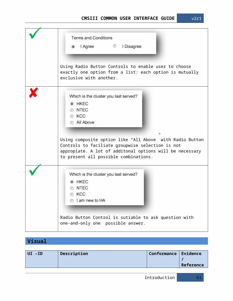
Cmsiii common user interface guide v2r1
Avoid overly original metaphors. While users know exactly what a recycle bin does, a paper shredder in the OS/2 Warp case is excessively original. Another problem is there is no 1 well-known type of shredder that every user will know. They might mistake it as a printer. Moreover, there is a big problem on how to display a “full” and “empty” state with such metaphor.
Avoid having real interface elements in an icon. Users might misinterpret this icon as 2 radio buttons rather than 1 icon.
The “previous” and “back” button looks like a button with a text label, but in fact it is 1 icon. This is somewhat misleading to the users.
Using actually text in an icon design is not preferable. In a case of an application icon, the text is repeated in the icon and the label. Text also becomes very hard to read when the icon becomes small.
Introduction 61

v2r1 Cmsiii common user interface guide
c. Principles and RationaleOften plain text is enough, and sometimes an option cannot be illustrated. But for those times when it can be illustrated, using icons can help to bring out the differences between items in the list and thus help users more quickly identify the option that they want. In fact, sometimes an illustration is far more appropriate than text--e.g., when the choice in question is visual to begin with. Icons were developed for just this purpose.
Also, a lesser reason to illustrate is simple to break up the monotony of a list and add visual interest. Illustrations should not be used just for this reason; however, it can be that extra touch.
d. Reference / Further Reading
R1. Denis Kortunov,(2008), 10 Mistakes in Icon Designhttp://turbomilk.com/blog/cookbook/criticism/10_mistakes_in_icon_design/
R2. Jakob Nielsen, (1995), Icon Usabilityhttp://www.useit.com/papers/sun/icons.html
R3. Martjin van Welie, (2008) Icon Menuhttp://www.welie.com/patterns/showPattern.php?patternID=image-menu
R4. Apple Computers, (2009), MacOSX Human Interface Guidelines
62 Guideline Details

Cmsiii common user interface guide v2r1
4.3.3 Scroll
a. Guidance On UsageThe most common scrolling is vertical scrolling (scrolling up and down). This is a normal practice and in nowadays has no usability concerns due to its consistent use and implementation across all major applications such as word processors, operating system, web browsers, etc.
The scroller and the scroll track will always have a corner radius of 15px, the width and length will vary depending on the size of the window its controlling. The 2 ends of the scroll track act as the scroll arrow button; they should always be in a square proportion and the scroller cannot go beyond this square boundary. In any case there should be no text on any part of the scroll bar, and it should always be by itself and never be next to, perpendicular to or overlapping another scroll bar. If there is no need to scroll or the existing window is enough to display all the information, try to avoid having a scroll bar. No matter how long the scroll bar is, the same principles apply.
b. Detail Description
UI -ID Description Conformance Evidence / References
SCL-001 Follow browser / OS specific scroller. Consider SCL-002 to SCL-009 only if the scroller is programmable.
Recommended --
SCL-002 Rounded corners of radius 15px for scroller and track. Recommended R5SCL-003 Scroller should not go beyond scroll arrow button. Mandatory R2SCL-004 No text on scrollbar. Mandatory R2SCL-005 Scroll bars should not be next to, perpendicular, or over
overlapping each other.Mandatory R1,R2
SCL-006 Never show a scroll bar when it’s not needed. Mandatory R1,R2SCL-007 Avoid Horizontal scrolling. Recommended R1,R2,R3SCL-008 The “Endless Scrolling” method should be used for long
lists or tables.Recommended R4
SCL-009 “End of List/Table/Tree/Report” should be added at the end of a list, table, tree or report to let users know that they have reached the end. This will help users avoid missing of information off the screen.
Recommended R1, R4
Introduction 63

v2r1 Cmsiii common user interface guide
Example
c. Principle And Rationale
Back in the digital-ice-age, when web pages and computer documents were new, Yes, scrollbars were a usability concern. However, it’s consistent use and implementation across word processors, operating systems, and web browsers have alleviated this concern.
Nowadays, scrolling is used by millions of people worldwide and they are indispensable. The most commonly used case is web browsing. Why do we need scroll bars? Browsers are a means of displaying a page that has a (URL) or website address, which you as the visitor will type into your search.
By now users should notice that more often than not the web page that is brought up on screen is too big for viewing the whole page on your window. That is why, without realizing, scroll bars are automatically shown by browsers so that you are able to scroll down the page to view the entire contents of each web page.
64 Guideline Details

Cmsiii common user interface guide v2r1
d. Color And StatusAll scroll bars will have 4 statuses; enabled, hovered, pressed and disabled. The scroller should not be displayed when the scroll bar is disabled.
Introduction 65

v2r1 Cmsiii common user interface guide
e. Reference / Further Reading
R1. SWDL, (2008), Why do we user vertical scrolling?http://www.swdl.co.uk/why-do-we-use-vertical-scrolling.html
R2. Jakob Nielsen’s Alertbox, (2005), Scrolling and Scrollbarshttp://www.useit.com/alertbox/20050711.html
R3. Jakob Nielsen’s Alertbox, (1997), Changes in Web Usability Since 1994http://www.useit.com/alertbox/9712a.html
R4. Johannes Hocksell, (2008), Endless Scrollinghttp://uipatternfactory.com/p=endless-scrolling/
R5. Quince UI Pattern Explorer : Corner Treatmenthttp://quince.infragistics.com/Patterns/Corner%20Treatments.html
66 Guideline Details

Cmsiii common user interface guide v2r1
Introduction 67

v2r1 Cmsiii common user interface guide
4.3.4 Tree Table
a. Guidance On UsageA tree-like format shows hierarchical relationship to help users browse through information that is related hierarchically. Within the CMS it can have virtually unlimited items or categories as long as they are clearly separated into no more than 4 layers. When the tree reaches the length of 2 times the screen height, it is strongly recommended to add “jumper” buttons to help the user quickly navigate to certain important items or categories on the tree without having to scroll and look for them.
When a category or item is empty, it will be grayed and become not clickable. To avoid the misunderstanding of the item being missing, these “empty” items or categories should always be displayed. In some cases the user has the option to hide empty items or categories, but they are never hidden by default.
Item or category names should be kept as short as possible. If it happens to be longer than the width of the tree and cannot be completely displayed, a “...” should be put at the end to indicate that the name is long and that the user can adjust the width of the tree if they wish to see the complete name.
Expandable categories should always have the “+” icon next to it to indicate that there are sub-categories available. Like-wise, a “-” icon should also be displayed after an expanded category for the user to collapse it back.
By default, a directory tree should be completely expanded unless custom user preferences are applied. Therefore there should always be a “Collapse All” /“Expand all” button available. “Collapse All” means the 3rd and 4th layer will be collapsed, and the 1st and 2nd layer will always be displayed.
b. Detail Description
UI -ID Description Conformance Evidence / References
TRE-001 Multiple attributes need to be shown in one view. Mandatory R1TRE-002 Items have parent-child relationships or share common
attributes.Mandatory R1, R3
TRE-003 Add “jumper” buttons when tree reaches 2 times screen height.
Recommended R2
TRE-004 Empty categories should never be hidden by default. Mandatory R1TRE-005 Expandable categories should have “+” icon next to it. Mandatory R1, R3TRE-006 A tree should be completely expanded by default. Recommended R1TRE-007 Tree hierarchy less then 4 layers. Mandatory R1TRE-008 Design tree by someone with data structure experience. Recommended R1TRE-009 Use a tree control that supports multiple columns. Recommended R1
68 Guideline Details

Cmsiii common user interface guide v2r1
Example
Introduction 69

v2r1 Cmsiii common user interface guide
70 Guideline Details

Cmsiii common user interface guide v2r1
Introduction 71

v2r1 Cmsiii common user interface guide
c. Principle And RationaleA table is a good, well-established way to show a list of items with multiple attributes shown in one view. A tree is a natural way to explore hierarchical information and is also a fairly established way to do this. Most email applications and RSS readers nowadays use this approach, so users of those will readily be able to use this; however, due to its visual complexity and minimal affordances, it could be problematic for inexperienced users.
d. Color And Status
The 1st and 2nd layer will be in a buttom form, while the 3rd and 4th layer will be in a link form. Once the pointer is hovered on any layer, the hand cursor will replace the pointer to show that it is clickable.
72 Guideline Details

Cmsiii common user interface guide v2r1
e. Reference / Further Readings
R1. Quince UI Pattern Explorer : Tree Tablehttp://quince.infragistics.com/#/Search$filter=T&text=tree/ViewPattern$pattern=Tree-Table
R2. Jenifer Tidwell ,(2005),Designing Interfaces: Patterns of Effective Interaction Designhttp://time-tripper.com/uipatterns/Jump_to_Item
R3. Jenifer Tidwell ,(2005),Designing Interfaces: Patterns of Effective Interaction Designhttp://time-tripper.com/uipatterns/Tree-Table
Introduction 73

v2r1 Cmsiii common user interface guide
4.3.5 Visual Flow
a. Guidance On UsageIt is very important for the user’s eyes to be correctly carried through the program. This means they will be able to pick up all the important elements, while not being distracted by anything unusual. Some basic flow elements include arrows or numbers but there is a lot of other ways to achieve a good visual flow. For example text orientation, image orientation, color usage, etc.
b. Detail Description
UI -ID Description Conformance Evidence / References
VSF-001 Visual flow should be from left to right, top to bottom. Mandatory R2, R4, R5VSF-002 Any indication such as arrows, or eyes on an image with a
human figure, should be pointed at the focus point.Mandatory R2, R3, R4
VSF-003 The program flow should follow western language text orientation.
Mandatory R1, R2, R3, R4
Example
74 Guideline Details

Cmsiii common user interface guide v2r1
Introduction 75

v2r1 Cmsiii common user interface guide
76 Guideline Details

Cmsiii common user interface guide v2r1
c. Principle And Rationale
Since the majority of the CMS is in English, we have to follow some principles of the Western language. The user always assumes that text should be read from left to right. If there is a line on the screen without text, it is assumed that the user’s eyes will move from left to right, top to bottom.
d. Reference / Further Reading
R1. Jakob Nielsen’s Alertbox, (1994), My foreword to Mullet and Sano’s Book on Visual Design http://www.useit.com/books/mullet_sano_foreword.html
R2. Jakob Nielsen (2009), Eyetracking Researchhttp://www.useit.com/eyetracking/
R3. Quince UI Pattern Explorer : Visual Frameworkhttp://quince.infragistics.com/#/Search$filter=V&text=visual/ViewPattern$pattern=Visual+Framework
R4. Neuroscience Tutorial, (1997), Basic Visual Pathwayshttp://thalamus.wustl.edu/course/basvis.html
R5. Kevin Mullet, (1994), Designing Visual Interfaces : Communication Oriented Techniques
Introduction 77

v2r1 Cmsiii common user interface guide
4.3.6 Button Groups
a. Guidance On UsageWhen it is required to show small number of related commands, the button should be grouped together and similarly aligned and styled.
b. Detail Description
UI -ID Description Conformance Evidence / References
BGS-001 The number of commands should be small, usually no more than 4.
Recommended R1, R2
BGS-002 The buttons in the group should be related and possibly act on the same object.
Mandatory R1, R2
BGS-003 There should be at least 30px of space between each buttons and they should never be too crowded.
Recommended R2
Example
Buttons that are related or similar in function should be placed in small groups.
78 Guideline Details

Cmsiii common user interface guide v2r1
Buttons below should not be placed in 1 big group, but rather separate according to their functions.
c. Principle And RationalePutting related buttons in a visual grouping uses the innate human mechanisms of association by proximity.
Ensuring they’re related and possibly act on the same or similar objects helps to reduce any possible confusion.
Because buttons tend to be strong visual elements, a group of them is stronger and is likely to stand out more than individually placed buttons, which helps users to find them.
If you have more than a few buttons, the value of the grouping is reduced as the display will get cluttered and be harder for users to figure out what they want to do.
d. Reference / Further Readings
R1. Quince UI Pattern Explorer : Button Grouphttp://quince.infragistics.com/#/Search$filter=B&text=button+group/ViewPattern$pattern=Button+Groups
R2. Apple Computers, (2009), MacOSX Human Interface Guidelines
Introduction 79

v2r1 Cmsiii common user interface guide
4.3.7 Dashboard
a. Guidance On UsageDashboard is a view that has high-level indicators that provide immediate insight into the current state of the things that a person is interested in. It is recommended when the user needs a high-level, quickly-consumable overview of the current state of a large set of information that usually needs to be tailored to them.
b. Detail Description
UI -ID Description Conformance Evidence / References
DBD-001 Identify, reduce, effectively and quickly communicate insight into the interests of the user.
Mandatory R1
DBD-002 Users will be willing to regularly use the dashboard to view information.
Recommended R1, R2
DBD-003 Only give information the users need. Mandatory R1DBD-004 Keep the dashboard 1 page only. Recommended R1, R3DBD-005 Users should be able to customize what they see on
the dashboard.Recommended R2
Example
All panels should follow the same format. Make different panels obvious for different information.
80 Guideline Details

Cmsiii common user interface guide v2r1
The new ePR concept also uses the dashboard method to display large numbers of information. Each panel has to be clearly labeled to avoid confusion. Each panel has no more than 10 entries to avoid making the screen too busy.
Overly populated panels with too much information on screen results in user confusion or frustration.
Introduction 81

v2r1 Cmsiii common user interface guide
c. Principle And Rationale
Dashboards, as their name implies, should contain elements that can be readily, quickly, and effectively consumed while a user’s primary focus is on other responsibilities. As such, you really need to be able to distill the information into what are often called Key Performance Indicators (KPIs). If you can’t do that, the dashboard will quickly become unusable because it will require too much parsing by the humans reading them.
Dashboards have become very common, but before investing in them, it should be ensured that they will actually be used because the work to create an effective dashboard can require a lot of effort. Sometimes there are not enough KPIs to make the dashboard informational enough.
Before starting to design the actual dashboard interface, it is required to determine what KPIs and other high-level information that a given user or role would actually need and use. It’s best to get as much of this known before starting to design because the different elements may be related or not related in ways that would affect the dashboard design.
You really need to try to fit all of the elements into one screen (or more if users will have multiple monitors to use with the dashboard). The key consideration here is that the user should be able to glance over the dashboard without having to interact with it in order to glean the information needed. Also, having all elements visible together can help users discover patterns and connections between the various data that the software is not designed to (or is incapable of) detecting.
To keep the dashboard focused, you can think in terms of showing only things that are always interesting to the users or things that are only momentarily interesting but important. It’s easy for dashboards to become overpopulated and hard to use, so the best thing is to keep them focused.
The next thing is to think in terms of what is most important and what elements are related. Related elements should usually be visually close to each other to imply that connectedness; make the connections clearer using grouping mechanisms.
Put the most important elements or group of elements at the top and left. (Note: This may be conditioned based on native language reading direction, so if you have right-to-left readers, you might want to try a location matching the reading direction.) Front-and-center is also an important location, depending on if the layout emphasizes a central object.
Use size, isolation, color, orientation, and even highlighting marks to imply relative importance. Size is an obvious one—bigger objects occupy more space and demand more attention, as a rule. Isolation, i.e., creating space around an object, is another way to draw attention to it. Other things like color, orientation, and highlighting marks (arrows, borders, lines, etc.) can also be used to make particular elements stand out, but be careful not to overuse these as doing so can cause so much noise that they cancel each other out and even make the dashboard as a whole more difficult to consume due to distractions they create. It’s probably best to resort to these as a last option and use them sparingly.
While stereotypical dashboards like to use big, beautiful, fancy metaphorical elements like radial gauges and linear meters, it is often more useful to err on the side of being plain, particularly for dashboards with lots of indicators. The choice of a visual to communicate an indicator should be driven by its ability
82 Guideline Details

Cmsiii common user interface guide v2r1
to better communicate its value or its importance—aesthetics and metaphors should take a back seat here unless they actually help make the information more consumable or notable.
The information you display should be actionable if applicable, i.e., if the software can drive users to take action with software to act on data, provide that facility with links or other commands. Similarly, if the information is supported by deeper information to which the system can provide access, providing drill-downs are very helpful to empower users to better understand the indicators.
How to Display Data The best way to display data will always depend on the kind of information, the nature of the message, and the needs and preferences of the users. A single dashboard usually displays a variety of data and requires different artifacts to display it.
For quantitative information, text is always more precise than graphics. Text organized into tables is a very good medium for looking up information. Graphs don’t support looking for individual values as efficiently and precisely. However, if you want to get the bigger picture, or to compare multiple measures, text is not enough. Graphs strength is letting users visualize numbers by giving a shape to numeric values.
Once decisions are made regarding the use text or graphics for each measure, select the display media to use for each one. These display medias can be used:
Graphs: bullet graphs, bar graphs, stacked bar graphs, line graphs, a combination of bar and line graphs, sparklines, box plots, scatter plots, Treemap;
Gauges: to show simple measures and compare them with predefined values; Icons: to indicate alerts, up/down, and on/off ; Text: labels and numbers; Organizers: tables, spatial maps, and small multiples; Images: photos, illustrations, and diagrams, which are occasionally of use; Drawing objects: which can represent hierarchy or flow.
Ease of Use Organizing the dashboard information in such a way it does not result in a cluttered mess is one of the most challenging aspects of dashboard’s visual design.
Information should be organized to support its meaning and use. Create groups according to business functions, entities and use. All items in the same logical group should be put together. Delineate the groups using the least visible means.
Support meaningful comparisons and discourage meaningless comparisons.
As in most UI design tasks, maintain consistency, label things appropriately, select the right colors, and make it aesthetically pleasing.
Design the dashboard as a portal so users can easily drill down to the additional information they need to support their actions.
Introduction 83

v2r1 Cmsiii common user interface guide
d. Reference / Further Reading
R1. Janne Lammi,(2009),Information Dashboardhttp://uipatternfactory.com/p=information-dashboard/
R2. Quince UI Pattern Explorer : Dashboardhttp://quince.infragistics.com/#/Search$text=dashboard/ViewPattern$pattern=Dashboard
R3. Dashboards by examplehttp://www.enterprise-dashboard.com/
84 Guideline Details

Cmsiii common user interface guide v2r1
4.4 Information Display
4.4.1 Date and Time Display
a. Guidance On Usage
Date and Time display is often critical for clinical usage and settings. It is a relatively complex data type considering that it is comprised of:
Multiple Data Partsday, month, year, hour, second
Variable Precisionup to day, up to hour, up to second
Different PresentationYear 10 or 2010, 09 Mar or 3/9, 3:45 pm or 15:45
On the other hand, cultural / regional conventions (locales) also pose strong influence. Date and Time display thus require special attention and guidance to avoid confusion and to ensure patient safety.
The rules specified in this guideline aim to eliminate user confusion among data parts when interpreting a date-time field, i.e. rule out the possibility of mis-interruption. This is to be achieved by establishing a cognitive reading pattern which is natural to users and complies with regional conventions. Moreover, rules are included to ensure a clear display with efficient use of screen area and adequate precision of information.
b. Detail Description
Format
UI –ID Description Conformance Evidence / References
DTD-FRM-001 The date part of a date-time field should be displayed in the form of: dd-MMM-yyyy
where:dd Calendar day of the month with leading zero;MMM English abbreviation of month; Permits
Jan, Feb, Mar, Apr, May, Jun, Jul, Aug, Sep, Oct, Nov, Dec;
Mandatory R1
Introduction 85
v2r1 Cmsiii common user interface guide
yyyy Calendar year shown in 4-digit;
DTD-FRM-002 If the day of week is to be shown in addition, it should appear in form of ddd and appear in front of the general date part, followed by a single space. i.e.
ddd dd-MMM-yyyy
where:ddd English abbreviation of day of week; Permits
Sun, Mon, Tue, Wed, Thu, Fri, Sat;
Mandatory R1
DTD-FRM-003 The time part of a date-time field should be displayed in the form of: HH:mm
where:HH 24 hour time display with leading zero;mm Minute with leading zero;
Mandatory R2
DTD-FRM-004 If a time part requires precision down to its second, it should be displayed in the form of: HH:mm:ss
where:ss Second with leading zero;
Mandatory R2
DTD-FRM-005 When shown together as a full date-time field, the date part should precede, followed by the time part separated by a single space or a line break. i.e.
dd-MMM-yyyy HH:mm
or
dd-MMM-yyyyHH:mm
Mandatory R1, R2
86 Guideline Details
Cmsiii common user interface guide v2r1
Example
11/9/10 9/11/10 11-9-10 9-11-2010 9/11/2010 11/09/2010 2010-09-11 2010.09.11 11st Sep 2010 11 September 2010 11-September-2010 11 Sep 2010 11-Sep-10 11-SEP-2010
Various representations of the same date with different date part order, separator, and abbreviation. None of the above complies with the designated format dd-MMM-yyyy and permitted month abbreviation.
11-Sep-2010 09-Nov-2010
The designated representations which align with dd-MMM-yyyy with correct abbreviation.
11-Sep-2010(Sat) 11-Sep-2010[Sat] 11-Sep-2010,Sat Sa 11-Sep-2010 SAT 11-Sep-2010 Saturday 11-Sep-2010 11-Sep-2010, Saturday
Various representations of the same date including the day of week. None of the above complies with the designated format ddd dd-MMM-yyyy and permitted month abbreviation.
Sat 11-Sep-2010 Tue 09-Nov-2010
The designated representations which align with ddd dd-MMM-yyyy with correct abbreviation.
Introduction 87

v2r1 Cmsiii common user interface guide
7:35 am 7:35 AM 7:35 A.M. AM 7:35 0:01 am 12:01 pm 7:03:59 pm AM 0:30:01
Various representations of time. None of the above complies with the designated format HH:mm or HH:mm:ss.
07:35 00:01 12:01 19:03:59 00:30:01
The designated representation which aligns with HH:mm or HH:mm:ss.
07:35 11-Sep-2010 11-Sep-2010,07:35 11-Sep
-2010 07:35 Sat
11-Sep-2010 07:35:01 Sat
11-Sep-2010 07:35
None of the above complies with the specification when date and time part are being shown together.
11-Sep-2010 07:35 Sat 11-Sep-2010 07:35 Sat 11-Sep-2010 07:35:01 11-Sep-2010
07:35 Sat 11-Sep-2010
07:35:01
These lines comply in regard of the order between date and time part, format and abbreviation.
88 Guideline Details

Cmsiii common user interface guide v2r1
Visual
UI –ID Description Conformance Evidence / References
DTD-VIS-001 Courier New, a fixed-width font, is to be used for the display of date and time field in table or list.
Mandatory R1, R2
Example
Datetime Description22-Jan-1991 12:35 Text 101-Mar-1992 13:59 Text 201-Jul-1999 05:00 Text 325-Feb-2002 09:09 Text 410-Apr-2010 22:48 Text 5
Date and time values being shown with a variable-width font in a table. The separator (hyphen), and date / time parts would not align and the lines would be difficult to read and compare.
Datetime Description22-Jan-1991 12:35 Text 101-Mar-1992 13:59 Text 201-Jul-1999 05:00 Text 325-Feb-2002 09:09 Text 410-Apr-2010 22:48 Text 5
Date and time values being shown with a fixed-width font in a table. The separator (hyphen), and date / time parts would be visually aligned, which faciliates reading and comparison.
Precision and Details
UI –ID Description Conformance Evidence / References
DTD-PAD-001 Excessive precision in time display should be avoided to match information context.
Mandatory R1, R2
DTD-PAD-002 The level of details in date-time display should match information context.
Mandatory R1, R2
Example
Introduction 89

v2r1 Cmsiii common user interface guide
Last Login: 10-Jan-2009 12:23:03
Next Appointment: 20-Mar-2010 15:30:00
Showing the time down to second is not necessary. It would inject noise and waste valuable screen area.
Last Login: 10-Jan-2009 12:23
Next Appointment: 20-Mar-2010 15:30
The precision of time part is appropriately decreased down to minutes. Noise is being kept away from users to avoid possible confusion.
Previous AppointmentsTue 22-Jan-2009 12:15Mon 01-Mar-2009 12:30Fri 01-Jun-2009 16:00Thu 16-Sep-2009 09:00Tue 12-Jan-2010 10:15
Appointment Date: 08-Mar-2010 09:00
Display of date and time field do not match with information context in these cases. Little attention would be paid to the exact time and day of week for previous appointments in a patient record system. On the other hand, the day of week would be an useful information to include on an appointment slip being distributed to patients.
90 Guideline Details

Cmsiii common user interface guide v2r1
Previous Appointments22-Jan-200901-Mar-200901-Jun-200916-Sep-200912-Jan-2010
Appointment Date: Mon 08-Mar-2010 09:00
The previous examples corrected with information context being considered.
c. Principle And RationaleUnambiguous date display enhances patient safety and application usability by eliminating confusion between day, month and year elements. Displaying unambiguous dates is a core element in ensuring effective patient care. It is vital that healthcare professionals correctly interpret dates relating to patient demographics, clinical episodes and planned treatments, among others.
Healthcare professionals have been brought up and educated in a wide variety of locales, and hence are used to seeing dates in a wide variety of formats. The proportion of healthcare professionals to whom this applies is increasing. Considering the mixed workforce using clinical systems displaying dates, there is a patient-safety concern, and therefore a pressing need, for the unambiguous display of dates.
d. Reference
R1. Microsoft Health Common User Interface. (2010). Date Input and Display: http://mscui.com/DesignGuide/DateDisplay.aspx
R2. Microsoft Health Common User Interface. (2010). Time Input and Display: http://mscui.com/DesignGuide/TimeDisplay.aspx
Introduction 91

v2r1 Cmsiii common user interface guide
Appendix 1: CMSIII Java Version UI Standard
The last corporate-wide user interface guide for developer is the CMSIII Java Version UI Standard. Since its release it has been referred by our developers in their development of CMS II Revamped or CMS III modules. This document is considered to be the antecedent, or the version 1, of the CMSIII CUI Guide.
Version 2 of the CUI Guide (the document) extends and refreshes the previous version by additional of usability theories, principles and research findings. This new version of CUI guide is undergoing quarterly upgrade and has not yet covered all areas described in the previous version. The table below shows the mapping of correlated section in the two versions.
Category CMSIII Java Version UI Standard (Version 1)
CMSIII CUI Guide(Version 2 Release 1)
Navigation 2.1.2.3 Interaction with user – indicating processing
4.1.3 Progress Indicators
Accessibility 2.1.3.5 Radio Button 4.2.2 Radio Button Control2.1.3.6 Check Box 4.2.1 Checkbox Control
Visual 2.1.3.1 Command Buttons 4.3.1 Buttons4.3.6 Button Groups
2.1.3.9 Tree 4.3.4 Tree TableInformation 2.1.2.1 Data Time Format 4.4.1 Date and Time Display
Developers are advised to continue to follow the information specified in version 1 should the area has not yet been refreshed. On the other hand, a roadmap of the development of CMSIII CUI Guide Version 2 can be found section 2.6.
The original CMSIII Java Version UI Standard is attached for reference.
92 Appendix 1: CMSIII Java Version UI Standard

Cmsiii common user interface guide v2r1
Appendix 1: CMSIII Java Version UI Standard 93

v2r1 Cmsiii common user interface guide
94 Appendix 1: CMSIII Java Version UI Standard

Cmsiii common user interface guide v2r1
Appendix 1: CMSIII Java Version UI Standard 95

v2r1 Cmsiii common user interface guide
96 Appendix 1: CMSIII Java Version UI Standard

Cmsiii common user interface guide v2r1
Appendix 1: CMSIII Java Version UI Standard 97

v2r1 Cmsiii common user interface guide
98 Appendix 1: CMSIII Java Version UI Standard

Cmsiii common user interface guide v2r1
Appendix 1: CMSIII Java Version UI Standard 99

v2r1 Cmsiii common user interface guide
100 Appendix 1: CMSIII Java Version UI Standard

Cmsiii common user interface guide v2r1
Appendix 1: CMSIII Java Version UI Standard 101
