coffee ave presentation 1st part
TRANSCRIPT

Coffee AvenueVisual Merchandising Arts Elective
3AD-4

Design Concept: “Mindscape”
-wooden theme
-mindscape = The landscape of thoughts, a reification of the
domain of imaginary entities, memories, feelings, ideas, fears or
any other object in the mind, seen together as making up
metaphoric features: forests, jungles, deserts, rivers, valleys,
cloudy mountains, etc.
-A representation of such a scene or area, as in a work of art.
- the careful trimming/shaping of ideas, memories, or other
mental objects
-coffee avenue= it can serve as a place where people go to
unwind, to relax and to mindscape.
-it can serve as a place for people to study and gain
knowledge/wisdom, to generate ideas and to use their
imagination.

-coffee = keeps you awake, alert, relaxed
-symbol of comfort, hanging out with friends
-owl = symbol of wisdom, knowledge, intelligence,
wealth
-keen observation, teaches discretion when sharing,
share only when it is for the highest good of all.
-practice diligent discernment at all circumstances
-symbolizes the need of quiet observation of all that is
around you, all that your desires encompass.
-meditate in the stillness of the night
Store Narrative: Coffee Avenue
Designing a store to fit its’ brand image is quite a
handful task that needs research, planning, and time. For 3AD-
4’s Visual Merchandising Arts final, their design and time
management skills were put to test with redesigning Coffee
Avenue, a coffee shop located in UST Carpark. The store
makeover was headed by three divisions namely the Project
Managing team, Production team, and the Design team, which
were headed by Gabriel Bernal, Nicole Almero, and Ezra See.
The design challenge for the store was to give it better lighting,
menu placement, and a story. This was answered by the design
team through the theme “mindscape”.
The design was materialized through the canvassing of
materials and scouting for carpenters by the production and
project managing team before the first week of production
(November 29). However production was ceased on the said
week due to the bar exams held inside the university causing a
delay in construction. The following week (December 6)
brought a greater amount of work to catch up with the lost time.
Carpenters and people from the various teams came in to help
start the project. The graphic wall with the owl logo was
removed, and repainted with gray along with the other walls, a
color that is reminiscent of a cement finish. The shelves were
being made during this time in a separate area along with the
bar tables. The graphics for the store which included decals,
shelf materials, owl painting, menu and merchandise were also
made during the week.

The third week (December 13) was full of installations
and finishing touches. The lights, shelves, bar tables, owl
painting, were installed. The decals were attached to the
windows and doors. The background of the signage was also
repainted in a darker color to match the existing colors in the
store. The new menu and side menu were hanged, and the
round logo and the wooden owl logo were mounted.
The store makeover will have a ribbon-cutting
ceremony on December 15th followed by an evaluation
document presentation by the 3AD-4 VMA class.

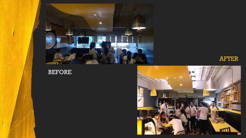
BEFORE

AFTER

BEFORE
AFTER

BEFORE
AFTER

BEFORE
AFTER

BEFORE
AFTER

BEFORE
AFTER

BEFORE
AFTER

BEFORE
AFTER

BEFORE
AFTER
BEFORE
AFTER

BEFORE
AFTER

BEFORE
AFTER

BEFORE
AFTER

BEFORE
AFTER

BEFORE
AFTER

BEFORE
AFTER