color mixing and color theory. primary colors primary are the three colors that cannot be mixed, but...
TRANSCRIPT
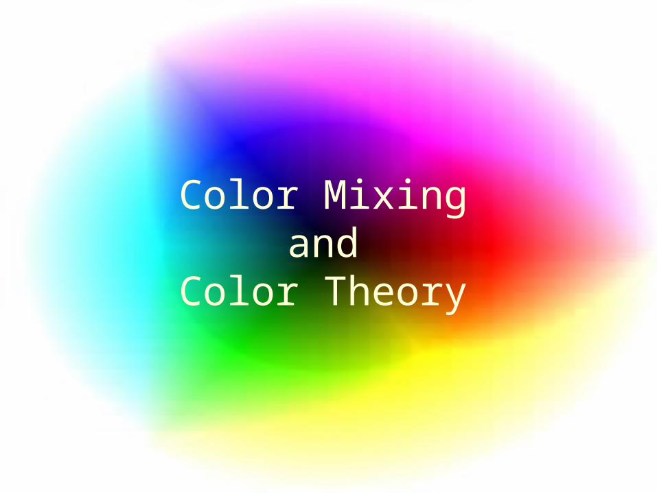
Color Mixingand
Color Theory
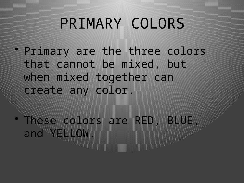
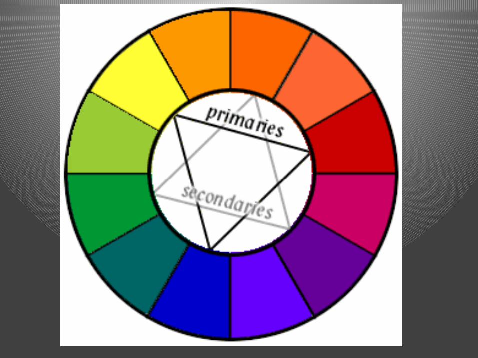
PRIMARY COLORS
• Primary are the three colors that cannot be mixed, but when mixed together can create any color.
• These colors are RED, BLUE, and YELLOW.
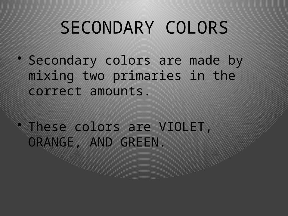
SECONDARY COLORS
• Secondary colors are made by mixing two primaries in the correct amounts.
• These colors are VIOLET, ORANGE, AND GREEN.
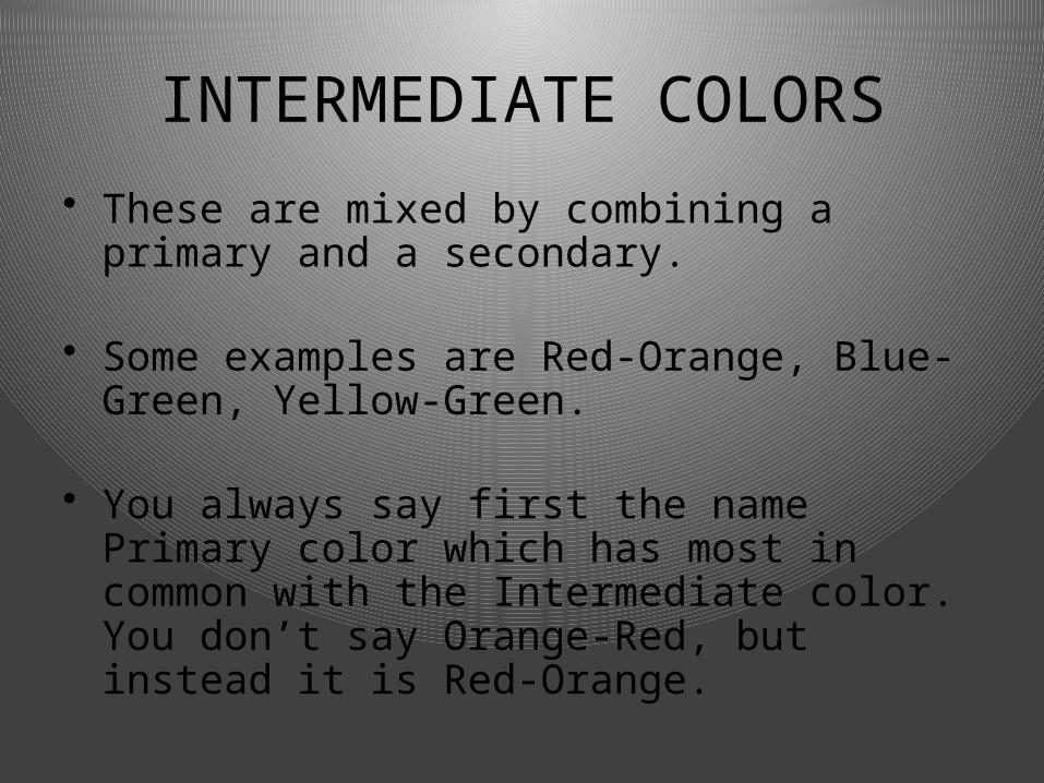
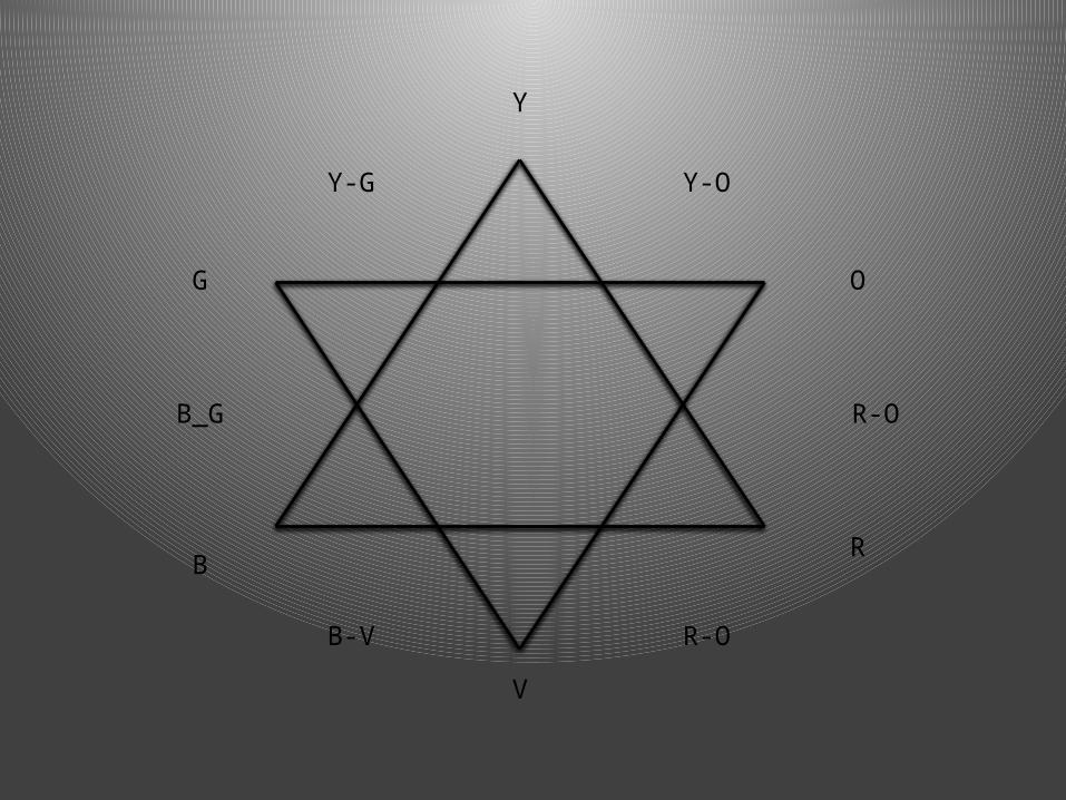
INTERMEDIATE COLORS
• These are mixed by combining a primary and a secondary.
• Some examples are Red-Orange, Blue-Green, Yellow-Green.
• You always say first the name Primary color which has most in common with the Intermediate color. You don’t say Orange-Red, but instead it is Red-Orange.
Y
V
RB
OG
R-OB-V
B_G R-O
Y-OY-G
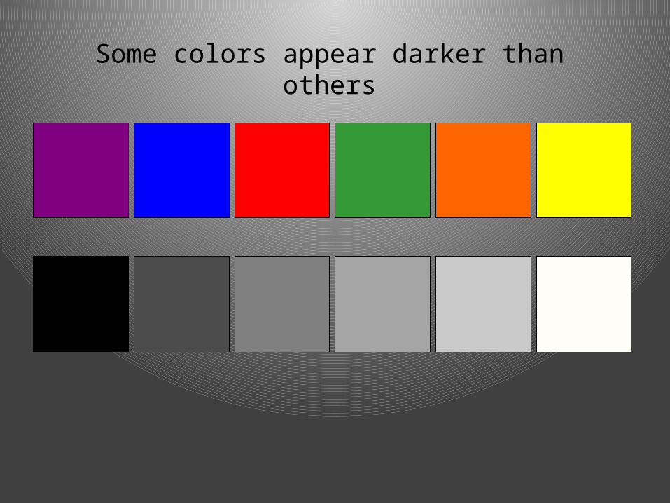
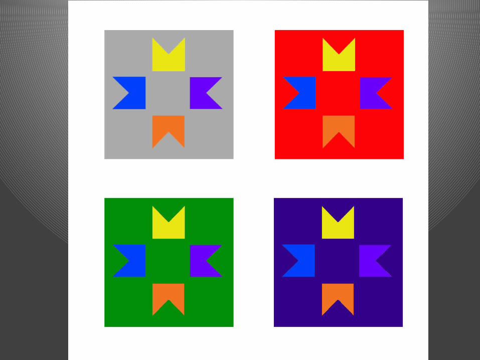
Some colors appear darker than others
COLOR THEORY
How we use our mixed colors
Definitions
• Medium- Pl. Media. The material used to create art, i.e.. paint, graphite, clay, crayons, metal, pen and ink, and a number of alternative materials.
• Contrast- Refers to a difference in value, color, texture, shape, form, space, or line (these are the 7 Elements of Art).
• Composition- The arrangement of the elements of art in an artwork.
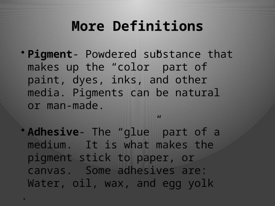
• Pigment- Powdered substance that makes up the “color” part of paint, dyes, inks, and other media. Pigments can be natural or man-made.
• Adhesive- The “glue” part of a medium. It is what makes the pigment stick to paper, or canvas. Some adhesives are: Water, oil, wax, and egg yolk
.
More Definitions
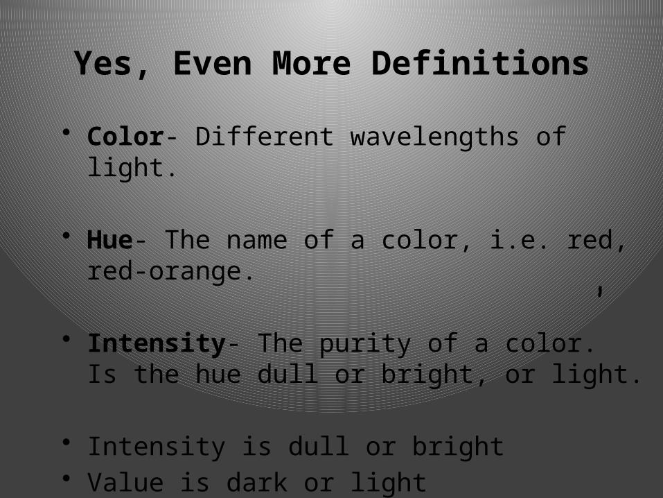
• Color- Different wavelengths of light.
• Hue- The name of a color, i.e. red, red-orange.
• Intensity- The purity of a color. Is the hue dull or bright, or light.
• Intensity is dull or bright• Value is dark or light
Yes, Even More Definitions
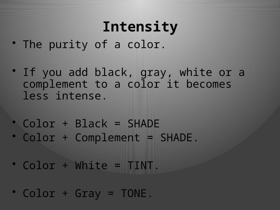
Intensity• The purity of a color.
• If you add black, gray, white or a complement to a color it becomes less intense.
• Color + Black = SHADE• Color + Complement = SHADE.
• Color + White = TINT.
• Color + Gray = TONE.

Tint and Tone
Using white to get TINTS
Using gray to get TONES
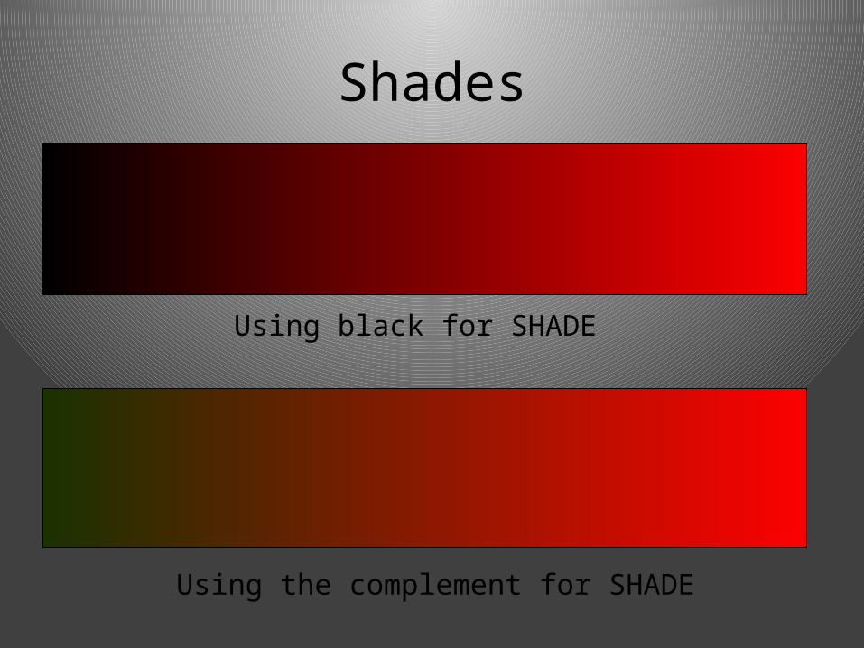
Shades
Using black for SHADE
Using the complement for SHADE
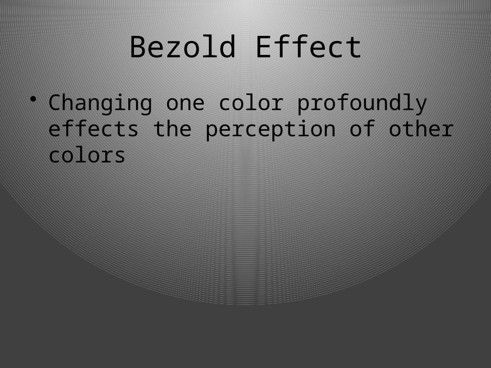
Bezold Effect
• Changing one color profoundly effects the perception of other colors
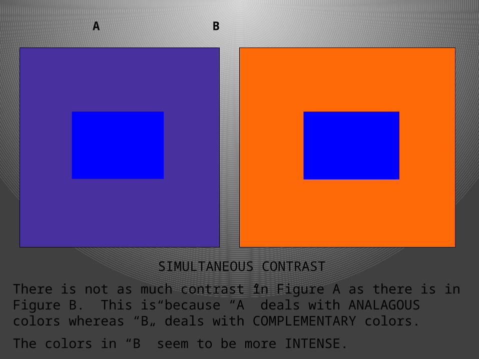
A B
SIMULTANEOUS CONTRAST
There is not as much contrast in Figure A as there is in Figure B. This is because “A” deals with ANALAGOUS colors whereas “B” deals with COMPLEMENTARY colors.
The colors in “B” seem to be more INTENSE.
Color Harmonies
• Complementary• Triadic• Split-Complementary• Temperature (warm, Cool, Neutral)• Analogous• Monochromatic
• Connor attempts selling tacos to Monica.
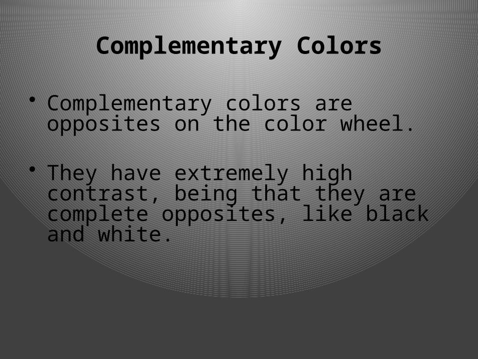
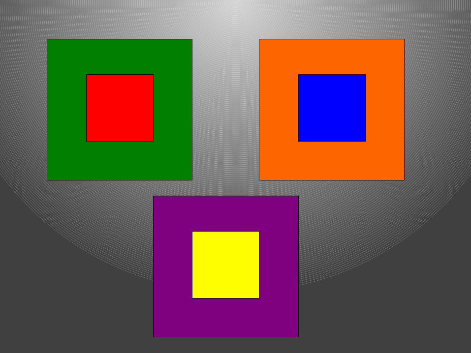
Complementary Colors
• Complementary colors are opposites on the color wheel.
• They have extremely high contrast, being that they are complete opposites, like black and white.
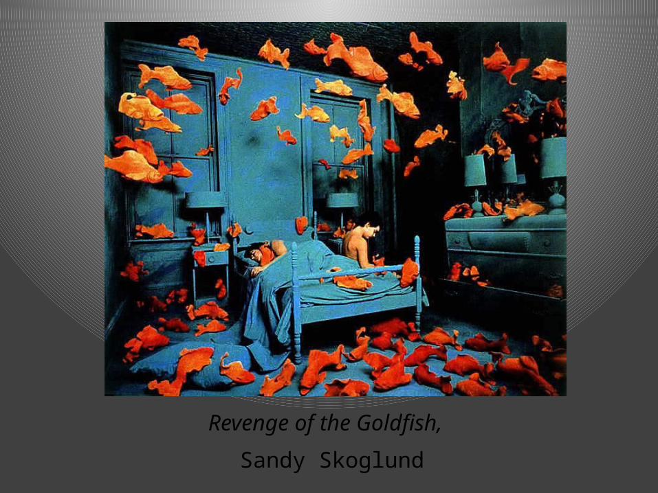
Revenge of the Goldfish,
Sandy Skoglund
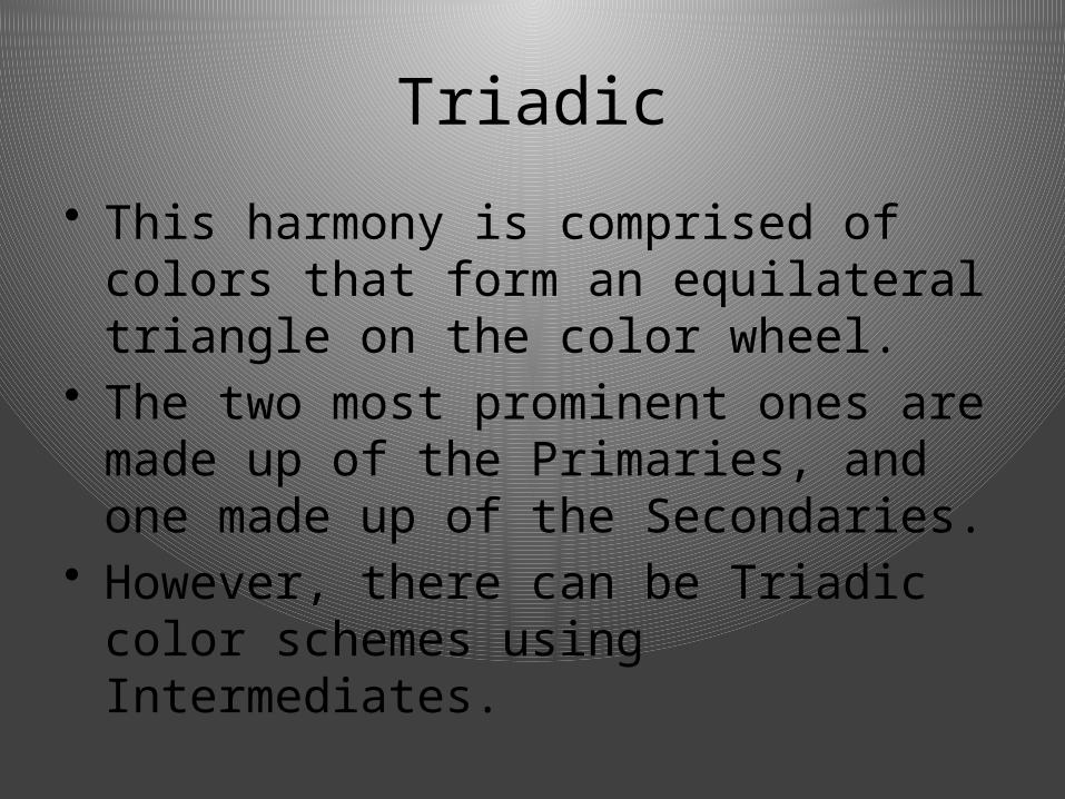
Triadic
• This harmony is comprised of colors that form an equilateral triangle on the color wheel.
• The two most prominent ones are made up of the Primaries, and one made up of the Secondaries.
• However, there can be Triadic color schemes using Intermediates.
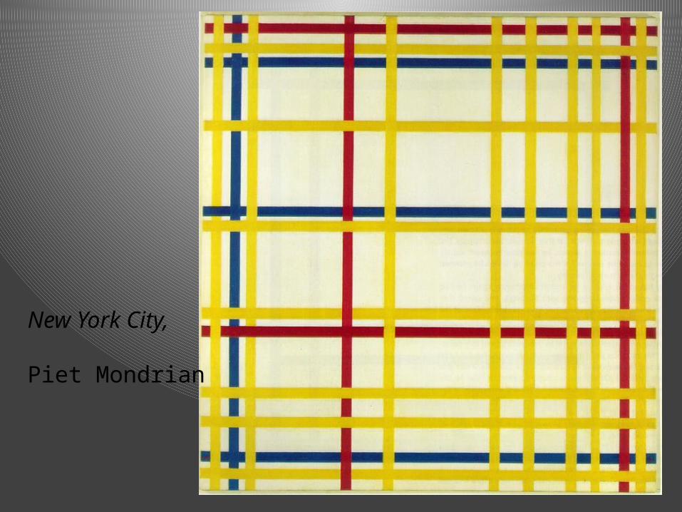
New York City,
Piet Mondrian
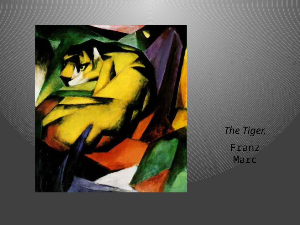
The Tiger,
Franz Marc
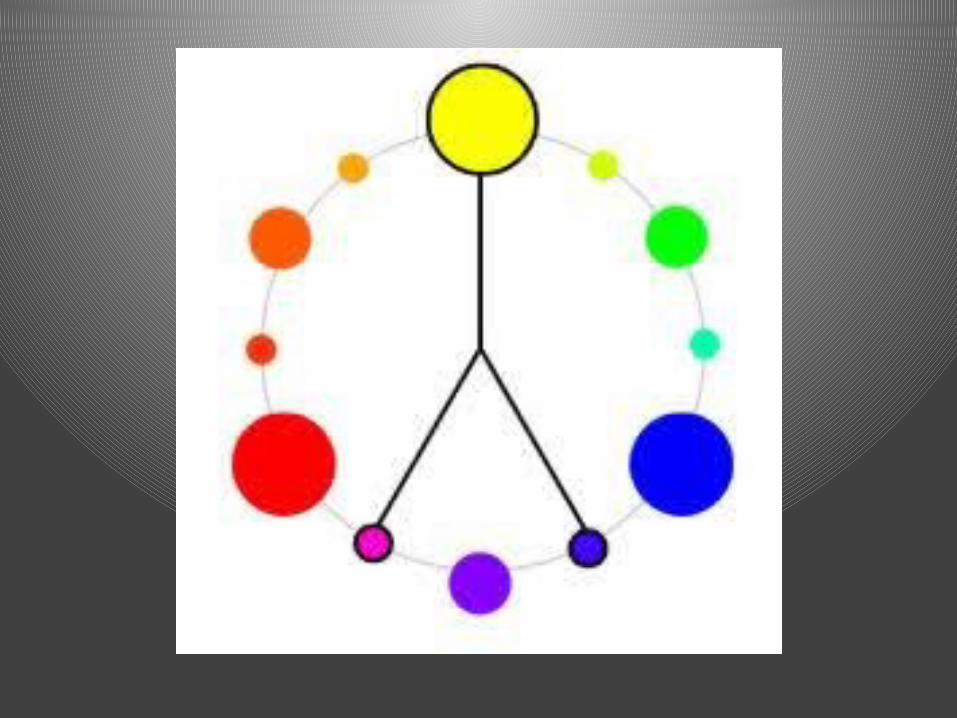
Split-Complementary
• To find a Split-Complementary color harmony you must first choose a hue.
• Then, find its complement.• The two hues adjacent to the complement
of the initial hue as well as the initial hue make up a Split-Complementary color harmony.
• i.e. Red, Blue-Green, and Yellow-Green
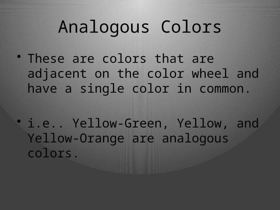
Analogous Colors
• These are colors that are adjacent on the color wheel and have a single color in common.
• i.e.. Yellow-Green, Yellow, and Yellow-Orange are analogous colors.
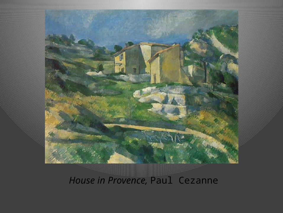
House in Provence, Paul Cezanne
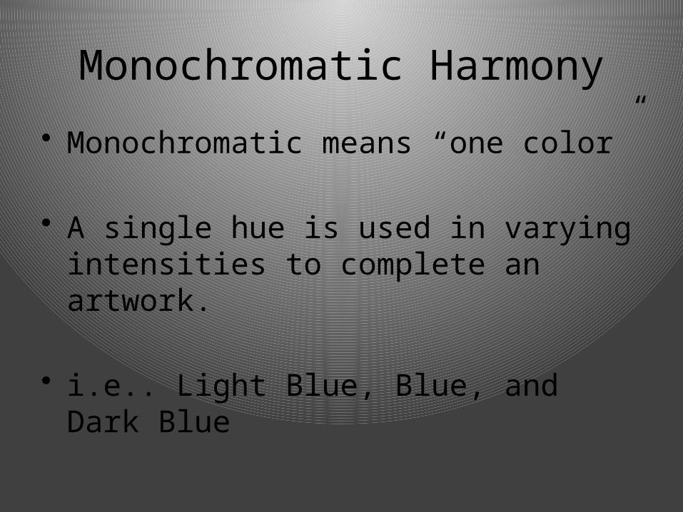
Monochromatic Harmony
• Monochromatic means “one color”
• A single hue is used in varying intensities to complete an artwork.
• i.e.. Light Blue, Blue, and Dark Blue
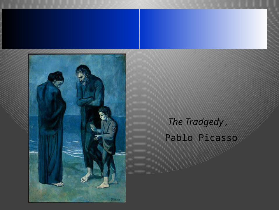
The Tradgedy,
Pablo Picasso
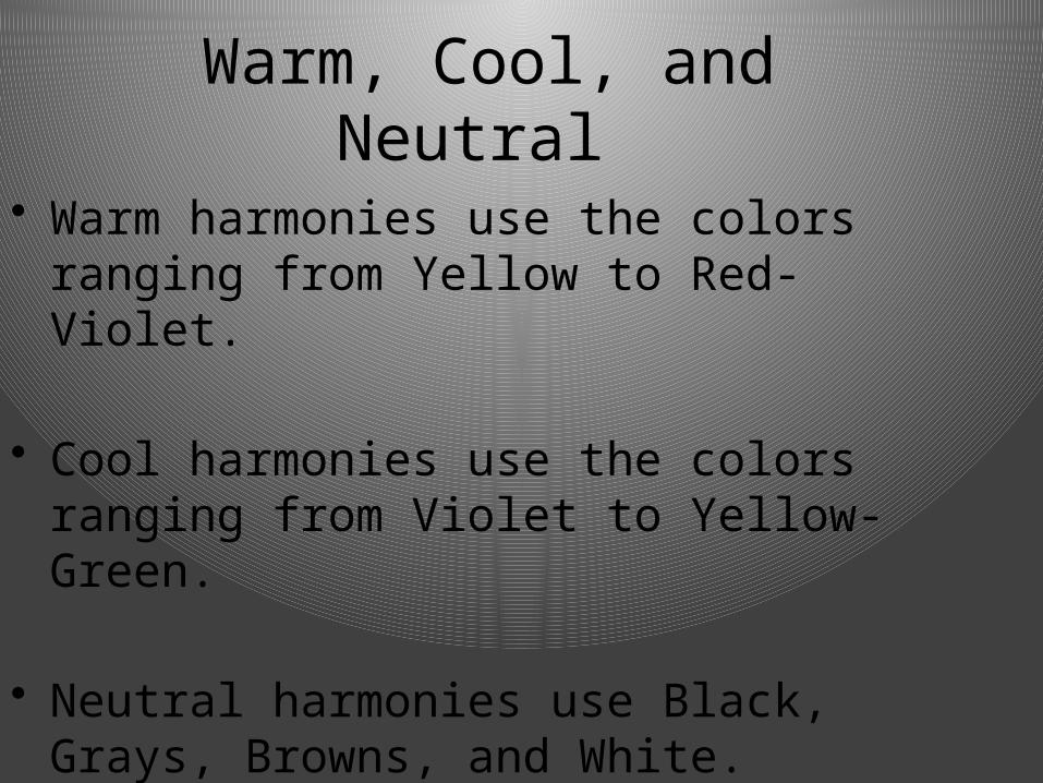
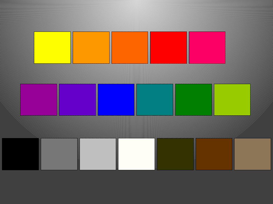
Warm, Cool, and Neutral
• Warm harmonies use the colors ranging from Yellow to Red-Violet.
• Cool harmonies use the colors ranging from Violet to Yellow-Green.
• Neutral harmonies use Black, Grays, Browns, and White.
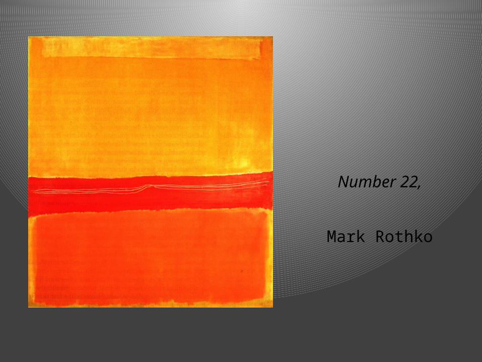
Number 22,
Mark Rothko