color palette | overview - ciee...color palette | color comparison of the three color palettes ....
TRANSCRIPT

2019 Brand Guidelines1
COLOR PALETTE REFRESHOur goal is to create a new color palette for use across print and web. We want the colors to be welcoming, expressive and embody the three
aspirations of the brand identity:HUMANISTIC, INCLUSIVE & STUDENT FOCUSED
Color Palette | Overview
ORIGINAL COLOR PALETTE
NEW COLOR PALETTE
PRIMARY COLORS
SECONDARY COLORS
ACCENT COLORS
GRAYSCALE
White Pantone 428 C Pantone 430 C Pantone 432 C Black
Pantone 2685 C Pantone 7728 C Pantone 347 CPantone 186 C Pantone 2603 C
Pantone 367 C Pantone 7702 C Pantone 302 CPantone 1225 C
Pantone Bright Orange C Pantone 300 C
PRIMARY COLORS
SECONDARY COLORS
ACCENT COLORS
GRAYSCALE
Pantone Cool Gray 10 C
Pantone 364 C
Pantone 631 C
Pantone Cool Gray 1 C
Pantone 222 C
Pantone 121 C
Pantone 158 C
Pantone Cool Gray 4 C
Pantone 302 C
Pantone 577 C
Pantone Process Blue C
CURRENT COLOR PALETTEPRIMARY COLORS
Pantone 5025 C Pantone 210 C Pantone 500 C Pantone 485 C Pantone 1805 C
Pantone 151 C Pantone 716 C Pantone 174 CPantone 130 C
Pantone 113 C Pantone 109 C Pantone 129 CPantone 1205 C
Pantone 1375 C Pantone 072 C
Pantone 110 C
Pantone 275 C Pantone 2985 C Pantone Process Cyan C Pantone 640 C Pantone 3145 C
Pantone 300 C Pantone 287 CPantone 277 C Pantone 652 C
Pantone 233 C Pantone 2415 C Pantone 665 CPantone 215 C Pantone 261 C
Pantone 382 C Pantone 375 C Pantone 360 C Pantone 369 C Pantone 618 C
Pantone 563 C Pantone 3288 C Pantone 330 CPantone 629 C Pantone 3252 C
OTHER COLORS
2019 Brand Guidelines2
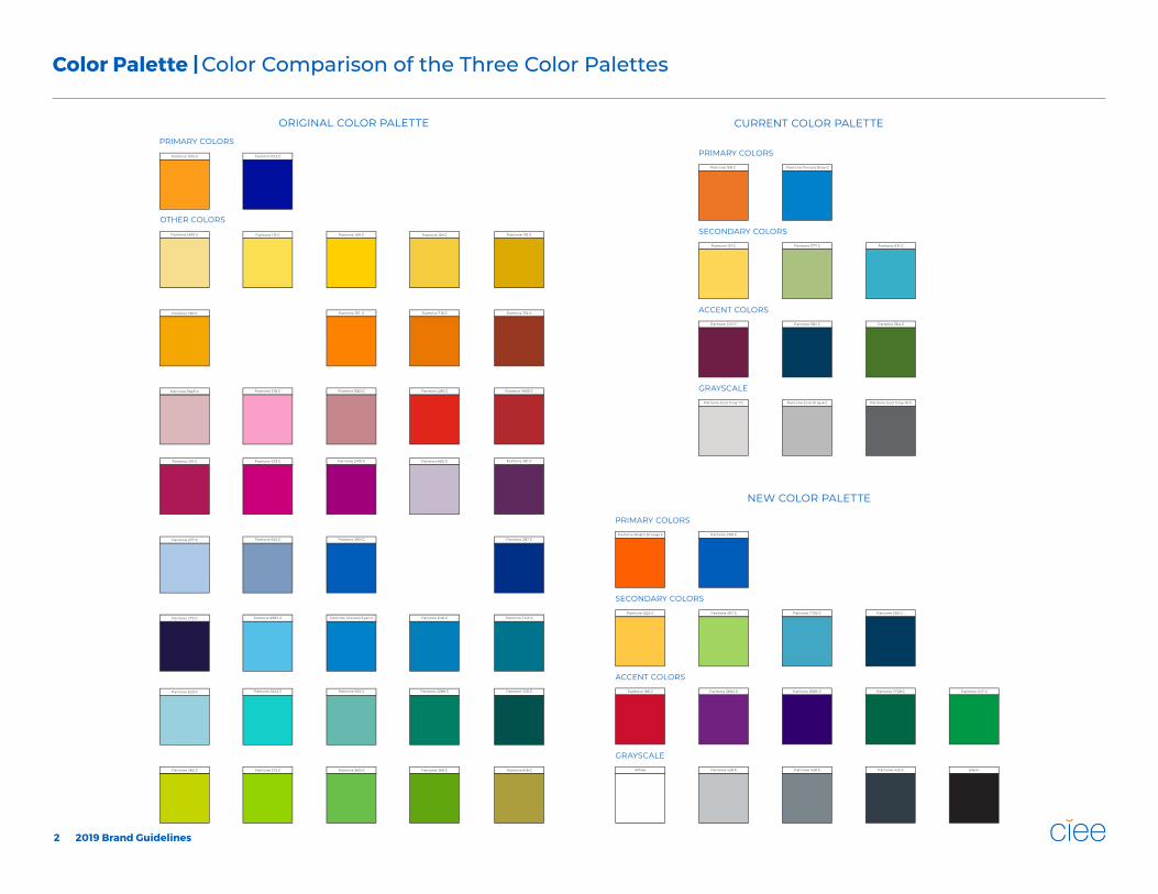
Color Palette | Color Comparison of the Three Color Palettes

ORIGINAL COLOR PALETTE
WORK & TRAVEL USA
CURRENT COLOR PALETTE
WORK & TRAVEL USA
NEW COLOR PALETTE
WORK & TRAVEL USA
Pantone 1375 C
Pantone 158 C
Pantone Bright Orange C
Pantone 072 C
Pantone Process Blue C
Pantone 300 C
2019 Brand Guidelines3
Color Palette | Color Comparison of the CIEE logo

2019 Brand Guidelines4
Color Palette | New Colors
All the colors in the palette have been updated with brighter and bolder versions of the original and current colors. There are some additions to complement the overall palette. We want the new colors to appeal to a broader audience with a mix of hip and conservative color options.
CIEE ORANGEPANTONE BRIGHT ORANGE CC: 0 M: 77 Y: 100 K: 0R: 255 G: 95 B: 0 (FF5F00)
CIEE BLUEPANTONE 300 CC: 100 M: 62 Y: 7 K: 0R: 0 G: 92 B: 185 (005CB9)
PRIMARY COLORS
BRIGHT SUN YELLOWPANTONE 1225 CC: 0 M: 22 Y: 84 K: 0R:255 G: 200 B: 68 (FFC844)
SPRING GREENPANTONE 367 CC: 41 M: 0 Y: 82 K: 0R: 162 G: 212 B: 94 (A2D45E)
RIO BLUEPANTONE 7702 CC: 69 M: 17 Y: 16 K: 0R: 66 G: 167 B: 198 (42A7C6)
PRUSSIAN BLUEPANTONE 302 CC: 100 M: 74 Y: 40 K: 33R: 0 G: 58 B: 93 (003A5D)
SECONDARY COLORS
BARN REDPANTONE 186 CC: 12 M: 100 Y: 91 K: 3R: 206 G: 14 B: 45 (CE0E2D)
PROVENCE PURPLEPANTONE 2603 CC: 68 M: 100 Y: 11 K: 2R: 114 G: 34 B: 130 (722282)
ROYAL PURPLEPANTONE 2685 CC: 93 M: 100 Y: 18 K: 21R: 49 G: 0 B: 111 (31006F)
PINE GREENPANTONE 7728 CC: 96 M: 34 Y: 84 K: 26R: 0 G: 102 B: 70 (006646)
TRINITY GREENPANTONE 347 CC: 97 M: 11 Y: 100 K: 1R: 0 G: 152 B: 69 (009845)
ACCENT COLORS
WHITEWHITEC: 0 M: 0 Y: 0 K: 0R: 255 G: 255 B: 255 (FFFFFF)
PEWTER GRAYPANTONE 428 CC: 24 M: 17 Y: 16 K: 0R: 193 G: 197 B: 200 (EAEAEA)
BATH IRON GRAYPANTONE 430 CC: 55 M: 41 Y: 38 K: 5R: 123 G: 134 B: 140 (636466)
WEB GRAYPANTONE 432 CC: 79 M: 64 Y: 52 K: 44R: 50 G: 62 B: 72 (2C2C2C)
BLACKPANTONE BLACK 6 CC: 82 M: 71 Y: 59 K: 75R: 16 G: 24 B: 32 (101820)
GRAYSCALE

2019 Brand Guidelines5
Color Palette | Primary Color Usage
By using the primary colors for nonstudent focused marketing material, the colors will be more approachable to the nonstudent audience. The primary colors help express a serious mood and reinforce the brand.
The primary colors are to be used as accent points in layouts to draw attention to a header, text, background color or an infographic. Marketing material for a nonstudent audience should focus use of the primary colors with a mix of accent and grayscale to balance the design. If seconday colors are used, they should be used sparingly.

2019 Brand Guidelines6
Color Palette | Primary Color Usage
In this example the primary colors are used for headers and infographic sections. No secondary colors are used. The rest of the layout is completed using grayscale for infographic sections and text.

2019 Brand Guidelines7
Color Palette | Primary Color Usage
In this example the primary colors are used for headers and text. No secondary colors are used. The rest of the layout is completed using an accent color and grayscale for an infographic section and text.

2019 Brand Guidelines8
Color Palette | Secondary Color Usage
By using the secondary colors for student focused marketing material, the colors will be more approachable to the student audience. The secondary colors help express a calm and playful mood.
The secondary colors are to be used as accent points in layouts to draw attention to a header, text, background color or an infographic. Marketing material for a student audience should focus use of the secondary colors with a mix of accent and grayscale to balance the design. If primary colors are used, they should be used sparingly.

2019 Brand Guidelines9
Color Palette | Secondary Color Usage
In this example the primary colors are not used. The secondary colors are used in a background color, a header, text and infographics. The rest of the layout is completed using accent colors and grayscale for infographic sections, sub header and text.

2019 Brand Guidelines10
Color Palette | Secondary Color Usage
In this example the primary colors are not used. The secondary colors are used in the infographics. The rest of the layout is completed using accent colors and grayscale for a header, infographic sections, background color and text.