colour as idea: the conceptual basis for using colour in ... · generative idea that is the concept...
TRANSCRIPT

Colour: Design & Creativity (2) (2008): 3, 1–9 http://www.colour-journal.org/2008/2/3/
© 2008 Authors. Journal compilation © 2008 Society of Dyers and Colourists 1
Col
our:
Des
ign
& C
reat
ivit
y
Colour as Idea: The Conceptual Basis for Using Colour in
Architecture and Urban Design
Galen Minah
College of Architecture and Urban Planning, Department of Architecture, University of Washington, Seattle, Washington, USAEmail: [email protected]
In schools of architecture and urban design, particularly in the United States, colour is rarely a subject of serious inquiry in the design studio. Colour often appears in the fi nal phase of the design process, and the reasoning for colour choices is almost never questioned. Colour is considered secondary to building form and structure, refl ecting attitudes held by many design professionals since the Renaissance. Critics in architectural reviews often refer to colour decisions as ‘diffi cult’ to discuss rationally, representing personal views that are inconsequential. The methodology presented here is an attempt to make colour consequential as an integral part of the three phases of a design process: the conceptual phase, the schematic/form-making phase and the design development phase. When this is achieved, colour decisions become part of the generative conceptual ideas of a project, and these can infl uence all phases of the design process. Colour can clarify and defi ne space, form and structure. In the design development phase, the fi nal colour decisions are focused and specifi c. The role of colour in design can serve as a complement to the traditional visual elements of line, structure, form and detail. This design methodology specifi es how colour is used in the three phases: colour dynamics in the conceptual phase, colour tectonics in the schematic/form-making phase and colour imagery in the design development phase. Using colour as a means for recording the experience of a pedestrian view of the city is an additional emphasis in urban design. This is accomplished with experience maps, and using colour to represent the life of the street through street activity diagrams.
Introduction
Aristotle, in his Poetics, established the rationale used in the ‘disegno versus colore’ debate
during the Renaissance. This rationale argued that colour is secondary to pure line drawing.
Charles-Edouard Jeanneret, the architect known as Le Corbusier, infl uenced attitudes toward
colour in architecture that are still held today. In a series of newspaper articles, written in 1911
and later published in Le Voyage d’Orient, 1965, Le Corbusier describes a trip to the Orient in
which nearly every entry becomes a poem to the ecstatic experience of colour. In the 1920s his
views change. Chromatic colour is separated from ‘whiteness’, which he considers synonymous
with order, purity, truth, and architecture. This attitude, combined with similar views from
contemporaries such as Adolf Loos, who associated white with the colour of heaven, and Theo
van Doesburg, who considered white the spiritual colour of the times, established white as a
symbol of the Modern movement in architecture. In 1920 Le Corbusier wrote Purism with
Amedee Ozenfant. In these writings he compared architecture to painting, and the importance
of colour was recognised. White retained its dominance, but the existence of other colours
was considered secondary but ordered by a set of rules or ‘scales’, which he used in his own
architecture until the time of his death in 1965 [1]. These colour rules were never as infl uential
as his beliefs surrounding the concept of ‘whiteness’ as a symbol for modern architecture.
Except for some experimentation with colour and form in the DeStijl movement (1920s),

Colour: Design & Creativity (2) (2008): 3, 1–9 Minah
2 © 2008 Authors. Journal compilation © 2008 Society of Dyers and Colourists
and with colour imagery in the Post-modern movement (1980s), many of the attitudes that
subordinate the role of chromatic colour in architecture still hold today. The belief that the
status of colour in architecture and environmental design can be elevated to a primary role is
the challenge. The methodology presented here addresses this issue.
Architectural Design
There are many methodologies that are utilised in an architectural design process. Most
include a conceptual phase, a schematic/form-making phase and a design development phase.
Central to the conceptual phase are two components:
1. A formative idea or concept, and
2. A diagram that becomes an abstraction of the idea in drawing.
The role of the diagram is to translate idea into form using drawing language belonging to the
vocabulary of architecture. Methodologies by Louis Kahn, architect, and Douglas Graf, design
theorist, illustrate this. Kahn would ask the question, ‘what does the building want to be?’ The
answer was always given as a metaphor, which became the generative concept. He referred to
the diagram as a ‘form drawing’. These were quickly drawn shapes and images that represented
the concept and defi ned the ‘inseparable parts’. The parts were categorised as ‘servant’ or
‘served’ spaces and each was drawn in a manner that suggested their structural nature. The
metaphor for the design of the Repertory Theater in Fort Wayne, Indiana, was a violin inside
a violin case. The ‘violin’ was the theatre, which had precise acoustical requirements, and the
‘case’ was the protective outer shell of the building surrounding the theatre, but having no
contact with the ‘violin’. The spaces in between the two were for the functional requirements
of circulation, ticket offi ce, lobby, etc.
Douglas Graf, Ohio State University, teaches a branch of architectural theory called formal
analysis. Formal analysis is a reductive process, which ‘loosens’ a building into constituent
parts and their relationships to one another. In the diagram, these components are reduced
to simple points, lines, planes or volumes. The diagram includes both the confi guration of the
components as well as organisational strategies. Important to the diagrams are fi gure/ground
juxtapositions which are shown as notations of centre and perimeter [2].
In formal analysis, the Villa Farnese at Caprarola, can be diagrammed as a point in space,
and Piazza del Campo, Siena, as a void surrounded by lines forming a perimeter. Both are
fi gure or centre (Figures 1 and 2).
Figure 1 Villa Farnese, Caprarola, Italy; fi gure as point in space

Minah Colour: Design & Creativity (2) (2008): 3, 1–9
© 2008 Authors. Journal compilation © 2008 Society of Dyers and Colourists 3
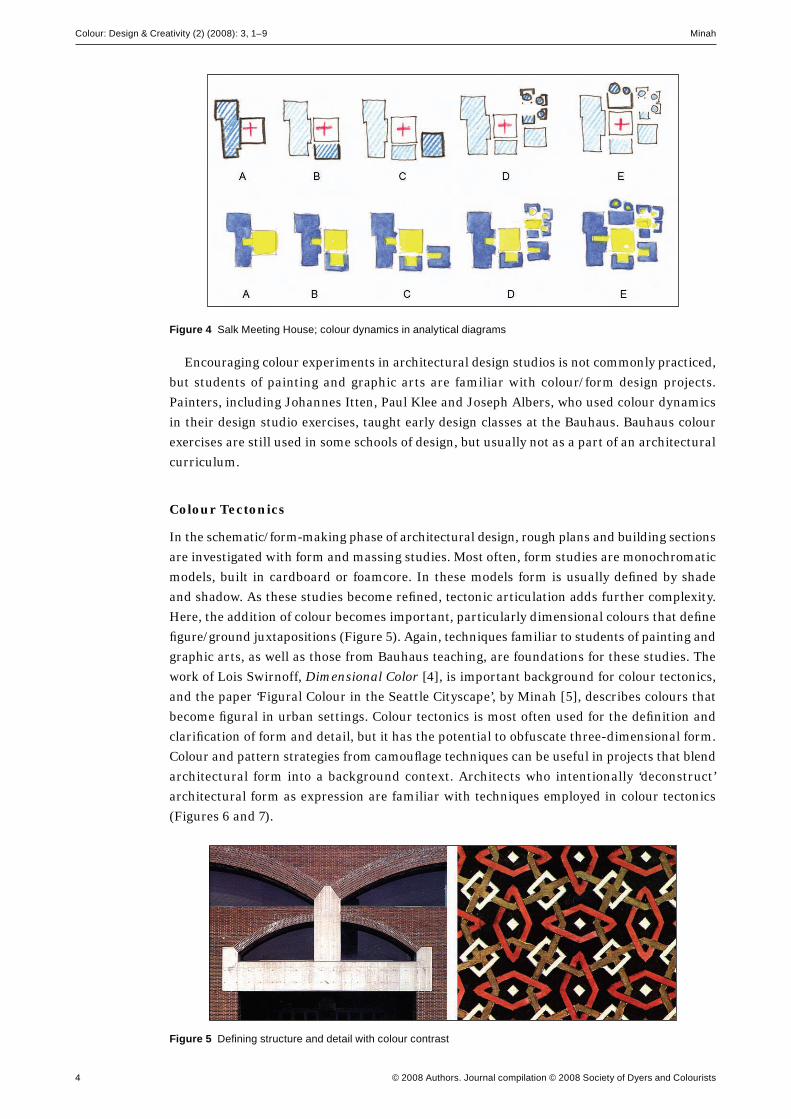
Graf’s analytical drawings of Louis Kahn’s Meeting House at the biological laboratories at the
Salk Institute in La Jolla, California, show a central space as fi gural (Figure 3). The perimeter
consists of a series of connected buildings, each with their own centres and perimeters [3]. As
in the Repertory Theater, there is a hierarchy in the components that represent organisational
strategies in the diagram.
Figure 2 Piazza del Campo, Siena, Italy; fi gure as void
Figure 3 Salk Meeting House; plan and analytical diagrams showing an organisational strategy
The addition of colour to these design drawings can both clarify and serve as ‘interpreter’
for the concept. Colour can become a component or ‘partner’ in the form drawings, and has
the capacity to enhance the concept. Three roles that colour can play in the design process are
defi ned here:
1. Colour dynamics
2. Colour tectonics, and
3. Colour imagery.
Colour Dynamics
In the conceptual phase of the design process, line diagrams are used to represent an abstract
relationship of the essential parts of a building. These parts can be described metaphorically
or formally. The relationship and juxtaposition of these parts to one another creates the
generative idea that is the concept and point of departure for the design. These drawings are
usually monochromatic. If one assigns colour to the parts in these diagrams representing, in
the designers’ eyes, the character of the part, then colour contrasts or juxtapositions between
the parts will represent the dynamic relationship of the parts. Red/blue contrasts may be
active/passive, saturated hues may be dominant, and muted hues subordinate. These new
juxtapositions can represent events in the experience of architecture, i.e. hierarchy, opposition,
separation, connection, transition and assimilation. The colour choices in the conceptual phase,
although abstract and diagrammatic, will begin to infl uence choices in lighting, materials, and
surfaces that continue throughout the design process (Figure 4).
Colour: Design & Creativity (2) (2008): 3, 1–9 Minah
4 © 2008 Authors. Journal compilation © 2008 Society of Dyers and Colourists
Encouraging colour experiments in architectural design studios is not commonly practiced,
but students of painting and graphic arts are familiar with colour/form design projects.
Painters, including Johannes Itten, Paul Klee and Joseph Albers, who used colour dynamics
in their design studio exercises, taught early design classes at the Bauhaus. Bauhaus colour
exercises are still used in some schools of design, but usually not as a part of an architectural
curriculum.
Colour Tectonics
In the schematic/form-making phase of architectural design, rough plans and building sections
are investigated with form and massing studies. Most often, form studies are monochromatic
models, built in cardboard or foamcore. In these models form is usually defi ned by shade
and shadow. As these studies become refi ned, tectonic articulation adds further complexity.
Here, the addition of colour becomes important, particularly dimensional colours that defi ne
fi gure/ground juxtapositions (Figure 5). Again, techniques familiar to students of painting and
graphic arts, as well as those from Bauhaus teaching, are foundations for these studies. The
work of Lois Swirnoff, Dimensional Color [4], is important background for colour tectonics,
and the paper ‘Figural Colour in the Seattle Cityscape’, by Minah [5], describes colours that
become fi gural in urban settings. Colour tectonics is most often used for the defi nition and
clarifi cation of form and detail, but it has the potential to obfuscate three-dimensional form.
Colour and pattern strategies from camoufl age techniques can be useful in projects that blend
architectural form into a background context. Architects who intentionally ‘deconstruct’
architectural form as expression are familiar with techniques employed in colour tectonics
(Figures 6 and 7).
Figure 4 Salk Meeting House; colour dynamics in analytical diagrams
Figure 5 Defi ning structure and detail with colour contrast

Minah Colour: Design & Creativity (2) (2008): 3, 1–9
© 2008 Authors. Journal compilation © 2008 Society of Dyers and Colourists 5
Colour Imagery
Colour imagery is the subject where most attention to colour in architectural design has been
placed. These are the colours one experiences perceptually in architecture, which convey
materiality, physical context, cultural context, symbolism and emotional response, as well
as imagery related to conceptual goals and form defi nition. There is a body of research in the
areas of colour and culture, colour symbolism and the emotional response to colour that serves
as a foundation for colour decisions in the design development phase of this methodology. The
work of Jean-Philippe Lenclos in designing with contextual colours from nature, and Bente
Lange’s colour methodologies applied to historic urban contexts, are valuable resources to
architecture and urban design in design development. In this phase, the student is building
upon colour decisions from the concept and schematic/form-making phases, and the colour
choices here are focused and specifi c. The goal throughout is to make the colour choices an
evolving development through all phases of the design process. The fi nal colour imagery will
be based on knowledge from the fi eld of colour, and integral with the architectural form, and
the conceptual beginnings of the design.
Design of the City
The design of the city, like architecture, begins with a conceptual point of departure. There are
many methodologies used in this process. Most urban design focuses upon changes in existing
cities, i.e. intervention, renewal, expansion, design of infrastructure, densifi cation, etc. The
comprehension of the city form and its conceptual beginning are primary to this work. The
fi rst step in the design process is the representation of the urban fabric diagrammatically. As
in the previous example of the diagram of Kahn’s Meeting House at the Salk Institute, the city
can be represented as a complex series of interrelated parts that form the constituent elements.
Figure 6 Colour used to deconstruct form
Figure 7 Light/dark contrast obscuring form

Colour: Design & Creativity (2) (2008): 3, 1–9 Minah
6 © 2008 Authors. Journal compilation © 2008 Society of Dyers and Colourists
These parts, in turn, can be vicinities or neighbourhoods at one scale, and details of public/
private interactions at another. The components that make up paths, edges, districts, nodes,
and landmarks [6] are translated in the diagram as lines, perimeter, centre and fi gure. The
intrinsic sense of wholeness, or city as object is ever present, and therefore pieces of the city
can be referenced as the relationship of the part to the whole. This part-whole paradigm with
its implied hierarchical set of relationships suggests foreground/background juxtapositions
and, like the architectural design methodologies, will use some of the visual means described
above for representing these components graphically. A challenge in urban design is to
represent graphically not only the physical form of the city, but the experiential qualities as
well. Two drawing examples of particular interest to this study represent the experience of a
city as well as its physical form:
1. The Nolli map of Rome [7] uses fi gure/ground drawings to show the public and private
realms of 16th century Rome
2. Louis Kahn’s traffi c plan for mid-town Philadelphia, Pennsylvania, uses movement symbols
as the primary component [8]; arrows represent the direction and volume of traffi c, and the
system of streets is analogous to waterways and harbours.
Colour and Urban Design
Colour is used more frequently in urban design drawings than in
architectural design. The primary use of colour in urban design
is to categorise and clarify large amounts of visual information.
Comprehensive plans and land use maps of cities use standard
coded colours to represent the use patterns of a city. Digital
technology has provided the easy access to city maps, plans
and aerial photography of cities. These can be layered and
manipulated with endless combination of colours, and some
very comprehensive representations of urban form have resulted
(Figure 8). Of interest is the use of colour to represent quantitative
census data visually in city plans. Each data type (e.g. population,
income) has a specifi c colour. When two or more data types are
layered in transparent colours, additional colours will emerge as
clusters of new information [9].
City and Experience
Most representations of the city contain information showing physical form and/or quantitative
data. The city, unlike most architecture, is diffi cult to experience as form in its entirety. One
experiences the city as fragments over time. How one forms a mental image of the city when
experienced over time from an eye-level perspective is of interest to urban designers. Kevin
Lynch used the term ‘place legibility’ in an investigation of ways people attempt to navigate and
interpret the physical form and structure of the city [6]. Amos Rapaport defi ned ‘environmental
cognition’ as that which is based upon multiple experiences with repetitive pieces of the city
that are logged in a memory bank, and are then compared to new visual experiences [10]. This
cognition aids in forming ‘mental maps’ of the city.
Addressing these issues, the experience map is a record of the colour one experiences as
a pedestrian in a city. This is plan view of the city showing individual building footprints.
In these building footprints, the colour and elevation patterns are recorded within a cone of
Figure 8 Land use map, King County, Washington

Minah Colour: Design & Creativity (2) (2008): 3, 1–9
© 2008 Authors. Journal compilation © 2008 Society of Dyers and Colourists 7
vision from the opposite side of the street at eye level. The relative heights of buildings are
represented by the thickness of lines outlining the buildings (Figure 9). Colour, elevation
pattern and building heights are determined to be factors that contribute to visual harmony
or lack thereof in an urban environment [11].
Figure 9 Rome and Seattle experience maps; building elevation, colour, pattern and heights shown in a plan view
Streets
Streets also play an important role in this urban fabric. In formal analytical terms a city street
is a centre between two perimeter walls, and experienced as a volume, or room, defi ned by
these walls. Streets are the largest public realms in the city. Streets also form the personality of
a district within the city: its energy, its movement and the kind of public life generated there.
Two maps in the Virgin City Guide for New York City, illustrating the experience of street
life are relevant:
1. ‘Top Shopping Zones’ showing districts in colour, streets as voids, and bands of red (R) along
the blocks in varying intensity where shopping occurs
2. ‘Night Time Hot Spots’ shows streets in light violet (RB), blocks in darker RB (night
imagery), and areas of nightlife in circles of YR in a range of sizes depending upon the
activity [12].
A third map, the Touring Club Italiano Roma map differentiates
streets as white voids and traffi c arterials as continuous yellow
lines [13].
Art and City Form
Mondrian’s ‘Broadway Boogie Woogie’ stands out as an example
of movement and energy in an abstraction of a city map that
represents the Broadway district of New York City. The streets are
yellow with red and blue squares appearing in a broken rhythm
(Figure 10). Larger blocks in red and blue become fi gural nodes,
and the totality is an energetic moving stream [14]. Paul Klee in his
Bauhaus teachings developed a vocabulary of lines and patterns to
show many types of movement [15].
Figure 10 Broadway Boogie Woogie, showing street energy and rhythm (P Mondrian)

Colour: Design & Creativity (2) (2008): 3, 1–9 Minah
8 © 2008 Authors. Journal compilation © 2008 Society of Dyers and Colourists
Colour and the Street Experience
A purpose in this study is to fi nd a way of representing the multiple experiences of the street
in drawing. One proposal shows information that will include pedestrian and traffi c volumes,
and identifi cation of activities that give life to the street (i.e. retail stores, restaurants and food
venues, bars, music venues and theatres) (Figure 11). This drawing shows traffi c arterials in
yellow in varying degrees of chromaticness indicating volume and intensity. Lines in orange,
parallel to the street, show vehicular movement. Line width indicates volume. Pedestrian
movement is shown in dashes parallel and on the periphery of the street in darker analogous
colours. Volume is shown by the quantity of dashes. In the sidewalk space in plan, in front of
every building is a rectangle of colour coded to activities that give life to the street. Red is used
for retail shops, blue for bars and music venues, and black for theatres. This colour plan would
be shown for all streets in the city. The street activity diagram is the terminology used for
these drawings, which can be combined with the experience map (Figure 12).
Figure 11 Rome and Seattle street activity diagrams representing movement and public activities
Figure 12 Rome and Seattle experience maps with street activity diagrams
Conclusion
The goal of these studies is to show how colour becomes a component and partner in all phases
of the design process in both architectural and urban design. Colour dynamics, colour tectonics
and colour imagery describe roles colour can play in the three phases of a design process. In
urban design colour can represent experience in drawings of the city, and these aid in the

Minah Colour: Design & Creativity (2) (2008): 3, 1–9
© 2008 Authors. Journal compilation © 2008 Society of Dyers and Colourists 9
Figure 13 Colour constellations in an abstract expressionist painting: Blue Poles (after Jackson Pollock, 1952)
process of cognitive mapping. A future study is to represent an entire city with an experience
map showing colour, elevation pattern and building heights from a pedestrian view, and a
representation of the life of the street with street activity diagrams. Colour and pattern will
comprise the visual vocabulary. The repetition of elements in this map will form constellations
or clusters of information recalled from experience and memory that become meaningful from
many points of view. One might read these maps like an abstract expressionist painting in
which colour patterns emerge from the complexity of the total colour fi eld (Figure 13). These
repetitive patterns represent simultaneous experiences seen holistically.
The experience map is like the 18th century garden carpets of Kurdistan that represent both
real space and the imagery and experience of the garden. These maps have the potential to
represent not only real physical space, but the experience of place as well.
References
1. D Batchelor, Chromophobia (London: Reakton Books, 2000) 21–49.
2. D Graf, Perspecta: Yale Architectural J., (22) (Cambridge, MA: MIT Press, 1986) 43–45.
3. I D Graf, Perspecta: Yale Architectural J., (22) (Cambridge, MA: MIT Press, 1986) 59.
4. L Swirnoff, Dimensional Color (Boston: Birkhauser, 1989).
5. G Minah, Proc. AIC Colour 97 (Kyoto: Colour Association of Japan, 1997) 883–888.
6. K Lynch, The Image of the City (Cambridge, MA: MIT Press, 1960).
7. G Nolli, Rome 1748: The Pianta Grande di Roma (J H Aronson, Highmount, NY, 1984).
8. L Kahn, Perspecta: Yale Architectural J., (2) (Cambridge, MA: MIT Press, 1953) 10–27.
9. J Passonneau and R Wurman, Urban Atlas: 20 American Cities (Cambridge, MA: MIT Press, 1966).
10. A Rapoport in Human Aspects of Urban Form (New York: Pergamon Press, 1977) 113–115.
11. G Minah, Proc. 10th AIC Congress, Ed. J Nieves and J Hernandez-Andres (Granada: Grafocas Ajabra SA, 2005) 401–404.
12. New York, Ed. N Peck (London: Virgin Publishing, 1999) 98, 116.
13. Roma: Piante di Citta, Ed. M Ausenda (Milan: Touring Club Italiano, 1997).
14. V Pitts Rembert, Piet Mondrian in the USA (Dulles, VA: Parkstone Press, 2002).
15. P Klee, Notebooks, Ed. J Spiller (New York: Overlook Press, 1999).
This article is a revised and expanded version of a presentation given at the International
Colour Association (AIC) Congress at Johannesburg, South Africa, October 2006.