colour basics why are different colours used in design? why is colour important?
TRANSCRIPT


Colour Basics
• Why are different colours used in design?
• Why is colour important?

PRIMARY COLOURSThree
YELLOWREDBLUE

SECONDARY COLOURSThree
OrangeGreenViolet
To get a secondary colour, two primary colours are mixed in equal quantities

TERTIARY COLOURSWhere a Primary colour and a SECONDARY colour are mixed in equal quantities.
There are 12 Tertiary colours

Colours in Harmony

Colours in Contrast

Warm Cool

Warm & Cool colours

Advancing Receding

The Effect or Moods colours give Red
Warm
Exciting
Passionate
Dangerous
Angry

The Effect or Moods colours give
Warm
Happy
Sunny
Cheerful
Full of Energy
Orange
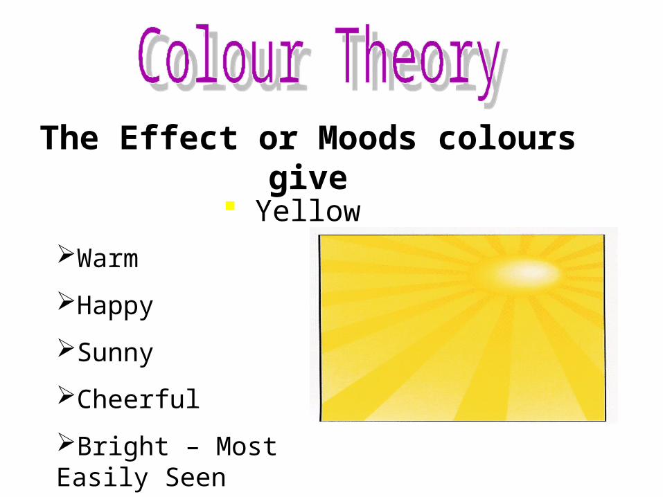
The Effect or Moods colours give
YellowWarm
Happy
Sunny
Cheerful
Bright – Most Easily Seen

The Effect or Moods colours give Green
Cool
Restful
Natural
Calm
Fresh

The Effect or Moods colours give Blue
Cool
Conservative
Sophisticated
Formal
Elegant

The Effect or Moods colours give
Purple
Rich
Regal
Pompous
Luxurious

The Effect or Moods colours give
White
Hygienic
Clean
Pure
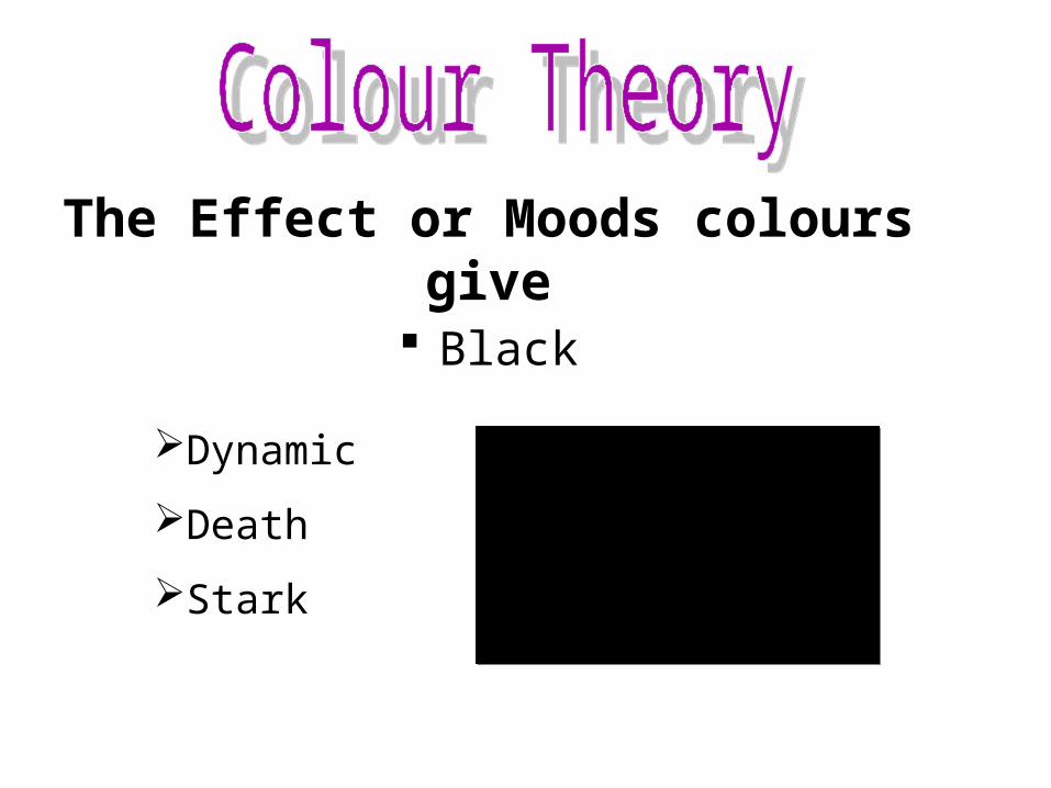
The Effect or Moods colours give
Black
Dynamic
Death
Stark
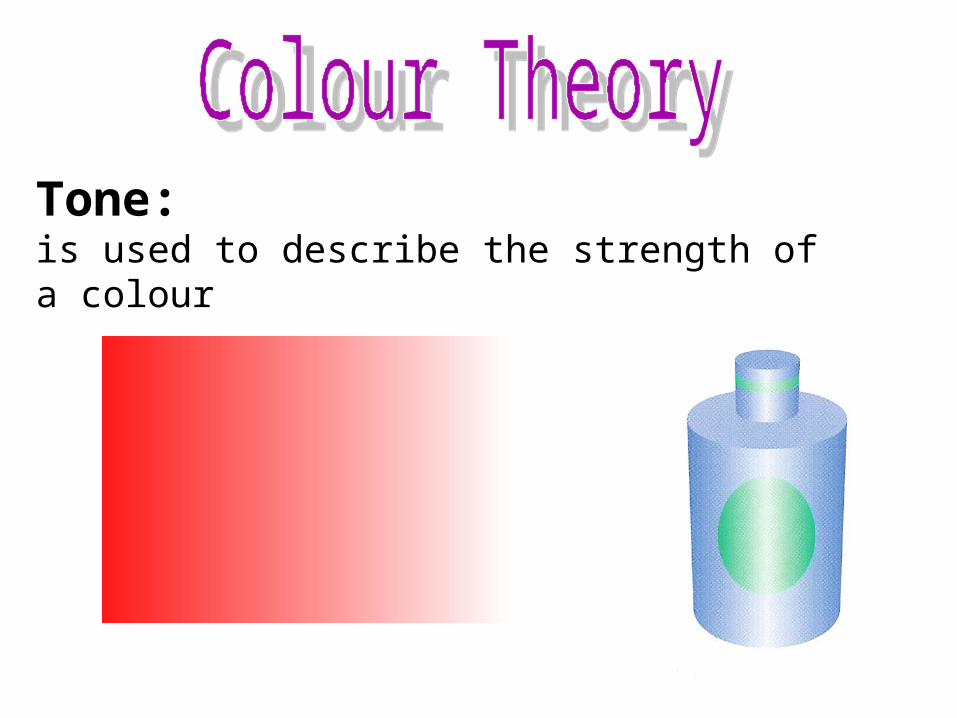
Tone:is used to describe the strength of a colour

Tint ShadeAdd black or grey to add a shade
Dark shades make objects appear heavy
Add white to make a tint
Pale pastel colours give the impression of softness

Designer’s Colour wheel.