colour palettes
TRANSCRIPT
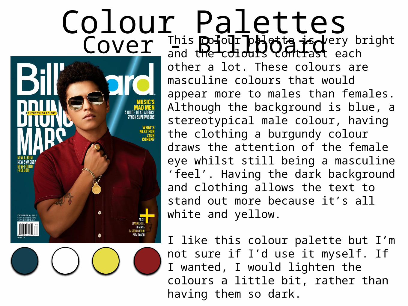
Colour PalettesCover - BillboardThis colour palette is very bright and the colours contrast each other a lot. These colours are masculine colours that would appear more to males than females. Although the background is blue, a stereotypical male colour, having the clothing a burgundy colour draws the attention of the female eye whilst still being a masculine ‘feel’. Having the dark background and clothing allows the text to stand out more because it’s all white and yellow.
I like this colour palette but I’m not sure if I’d use it myself. If I wanted, I would lighten the colours a little bit, rather than having them so dark.
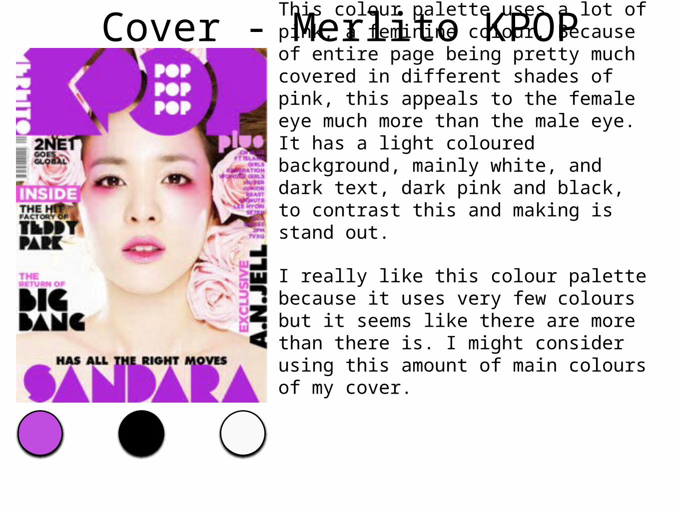
Cover - Merlito KPOPThis colour palette uses a lot of pink, a feminine colour. Because of entire page being pretty much covered in different shades of pink, this appeals to the female eye much more than the male eye. It has a light coloured background, mainly white, and dark text, dark pink and black, to contrast this and making is stand out.
I really like this colour palette because it uses very few colours but it seems like there are more than there is. I might consider using this amount of main colours of my cover.
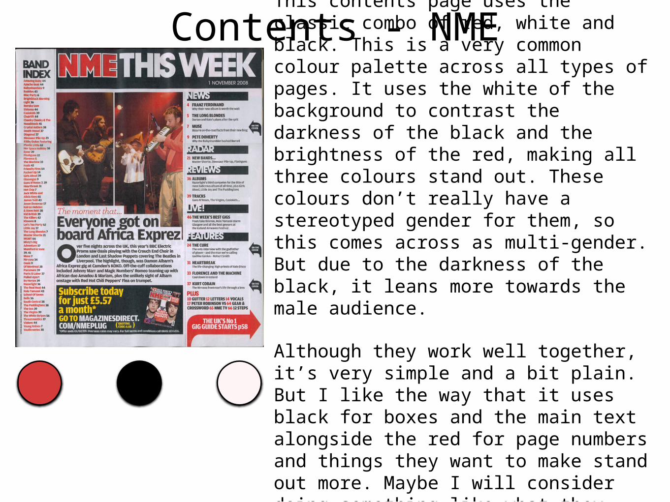
Contents - NMEThis contents page uses the classic combo of red, white and black. This is a very common colour palette across all types of pages. It uses the white of the background to contrast the darkness of the black and the brightness of the red, making all three colours stand out. These colours don’t really have a stereotyped gender for them, so this comes across as multi-gender. But due to the darkness of the black, it leans more towards the male audience.
Although they work well together, it’s very simple and a bit plain. But I like the way that it uses black for boxes and the main text alongside the red for page numbers and things they want to make stand out more. Maybe I will consider doing something like what they have done with the red but with a different colour.
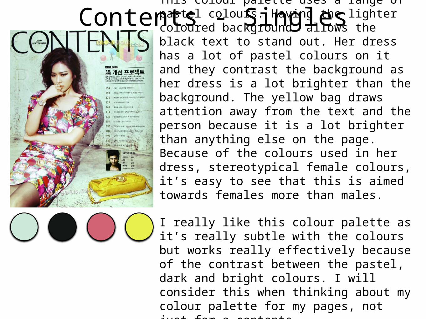
Contents - SinglesThis colour palette uses a range of pastel colours. Having the lighter coloured background allows the black text to stand out. Her dress has a lot of pastel colours on it and they contrast the background as her dress is a lot brighter than the background. The yellow bag draws attention away from the text and the person because it is a lot brighter than anything else on the page. Because of the colours used in her dress, stereotypical female colours, it’s easy to see that this is aimed towards females more than males.
I really like this colour palette as it’s really subtle with the colours but works really effectively because of the contrast between the pastel, dark and bright colours. I will consider this when thinking about my colour palette for my pages, not just for a contents.
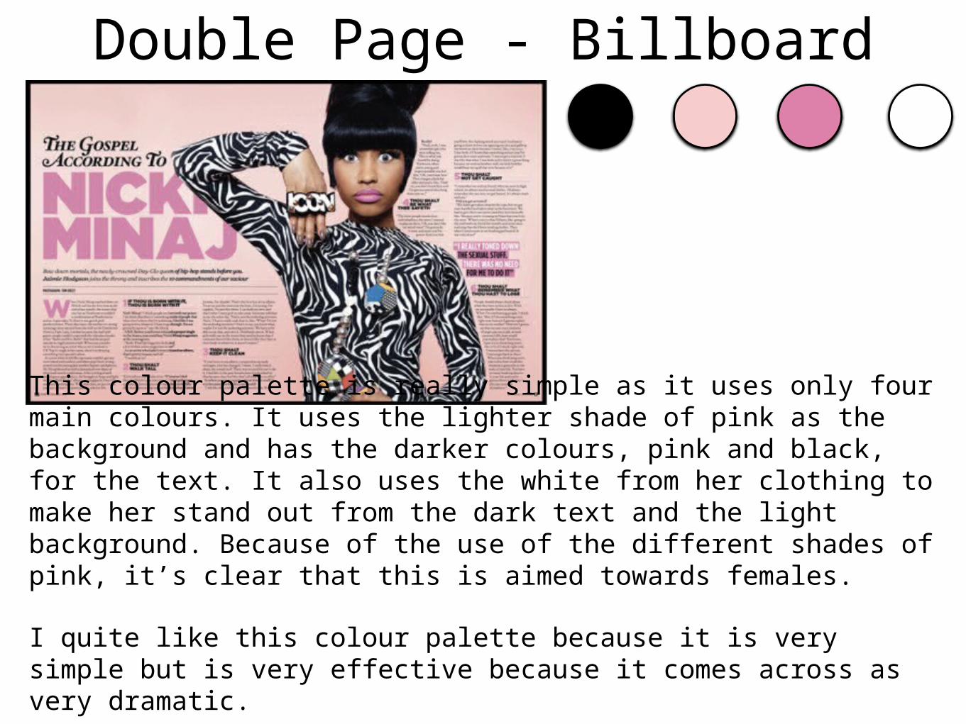
Double Page - Billboard
This colour palette is really simple as it uses only four main colours. It uses the lighter shade of pink as the background and has the darker colours, pink and black, for the text. It also uses the white from her clothing to make her stand out from the dark text and the light background. Because of the use of the different shades of pink, it’s clear that this is aimed towards females.
I quite like this colour palette because it is very simple but is very effective because it comes across as very dramatic.
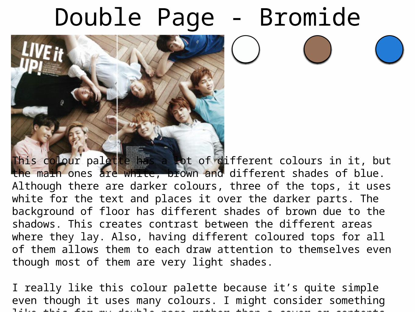
Double Page - Bromide
This colour palette has a lot of different colours in it, but the main ones are white, brown and different shades of blue. Although there are darker colours, three of the tops, it uses white for the text and places it over the darker parts. The background of floor has different shades of brown due to the shadows. This creates contrast between the different areas where they lay. Also, having different coloured tops for all of them allows them to each draw attention to themselves even though most of them are very light shades.
I really like this colour palette because it’s quite simple even though it uses many colours. I might consider something like this for my double page rather than a cover or contents because it would be too busy for either of those.
Overall AnaylsisAfter looking at the covers, contents and double pages, I have found few things that I like, what things ‘work’ and common things I have spotted.
I have found the common notion that the background will always contrast either the text, subject person or both. I saw that either a dark background is used with light text/images or a light background with dark text/images. Although I have found exceptions, I found that they didn’t work as well as they maybe should have. But the Bromide double page example shows a way to use light colours for both the background, text and most the images. I also found that most pages will use bright colours. This is causes the audience to notice them most whilst they are on the shelve. Although they stand out a lot more, I’m not sure I like them as much as pastel colours. But I do like the Merlito KPOP cover, which uses a lot of bright colours.
Being a female, I prefer more feminine colours to masculine colours. Because of this, I prefer colour palettes like the Merlito KPOP cover over colour palettes like the NME contents page. I also like more pastel colours, but I know that they don’t work well on the cover, maybe I will consider using pastel colours for the contents or double page. But I like the Bromide double page colour palette and the way it is used and I want to do something like this for my double page. A colour palette like the Bromide double page appeals to both the female and male audience, which I’m thinking of using as my target audience.