colour theory explained - s3-us-west-2.amazonaws.comtheory... · the colour wheel the center of the...
TRANSCRIPT
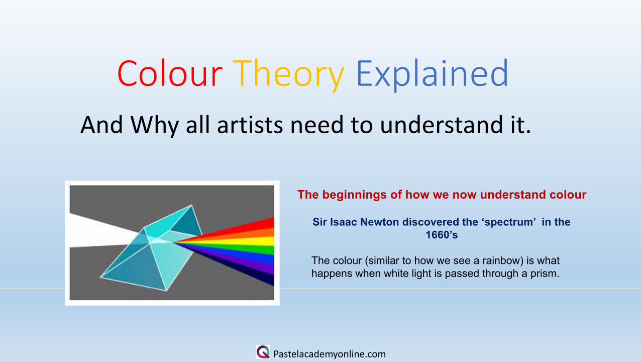
Colour Theory ExplainedAnd Why all artists need to understand it.
Pastelacademyonline.com
The beginnings of how we now understand colour
Sir Isaac Newton discovered the ‘spectrum’ in the 1660’s
The colour (similar to how we see a rainbow) is what happens when white light is passed through a prism.

The Colour Wheel
The center of the wheel = red, yellowand blue. These are called the primaries.
The adjoining long triangles = green,orange and purple – these are the
secondary colours (made up of mixingtwo primaries together).
On the outer circle – you see theprimaries and the secondaries, and thecolours in between are called tertiarycolours.
Pastelacademyonline.com

3
Pastelacademyonline.com

Complimentary ColourThere are 3 primaries – red yellow and blue
The compliment of any one of those 3 colours is thecolour made up of mixing the other two primaries.
So the compliment of yellow is the colour made upby mixing red and blue -- orange.
The compliment of red is the colour made up bymixing blue and yellow = green
The compliment of purple is the colour that is Notused when mixing purple (red and blue) - yellow.
With this knowledge you will make better paintings.
Pastelacademyonline.com

Pastelacademyonline.com
Analogous Colours
Those colours located closetogether on a colour wheel.
Any four colours around thewheel will make ananalogous palette. Paintings worked with ananalogous palette tend tobe more harmonious andrestful.

Pastelacademyonline.com
Warm and Cool Colours
The simple wheel in this image (made upof primary and secondary colours) shows
How the colours on the wheel can be seenAs warm and cool colours.
Warm colours are those that are bright andWarm – red orange and yellow – they appearto advance towards us. On this wheel the yellow
Green would be just in the warm half.
Cool colours – green blue and purple – areused in painting to give distance, as they
seem to recede.

Pastelacademyonline.com
The colour wheel can be divided intoranges that are visually active or passive. Active colours will appear to advancewhen placed against passive hues. Passivecolours appear to recede when positionedagainst active hues.
Most often warm, saturated, light value huesare "active" and visually advance. (eg reds andyellows)
Cool, low saturated, dark value hues are"passive" and visually recede. (eg blues andpurples)

Pastelacademyonline.com
So to Re Cap• The primary colours are the ones
that cannot be made from mixingother colours together.
• Secondary colours are made bymixing two primaries together.
• Warm colours seen to advance
• Cool colours seem to recede.
•••
The complimentary of red is =The complimentary of blue is =The complimentary of yellow is=

Pastelacademyonline.com
Bluebells at Alston HallThis painting – full of the soft greens and blues of the bluebell woods inSummer in completed in the analogous colour scheme – not the oppositesOn the colour wheel but a selection of 4 colour which site side by side onThe wheel. The overall effect of such a colour scheme can be much quieterAnd softer that paintings completed in opposite complimentaries.
Autumn Skidaw – pastel sketch
This sketch used two core colour theories:
Complimentary colour – on the orange/blue theme butmainly on the yellow /purple theme.
It also illustrates the cool colours receding and the warmones seeming to advance – colour temperature.

Pastelacademyonline.com
Bobbie 16 x 20”Golden Retriever
A hint of complimentary colour balance – gold and purple. Note the overlays of cool lilac over the gold background which echo the gold in the coat – the shadows on the coat being cooled down with a purple grey.
The background technique – by blending two complimentary colours together, they nullify the vibrancy of the other – and a more subtle colour is produced
Perla – Spanish Mastin 24 x 19”
Complimentary colour does not always look bold and dramatic. Perla’s lovely Brindle coat had a hint of gold/orange – so the white fur when in shadow benefitted from a touch of blue grey. The background was graduated using the blue grey at the top to show off her head.

Pastelacademyonline.com
Tarifa – 19 x 24 “This one is interesting re colour theory. The background is built with a succession of layers and no blending with anything other than the pastel. Lilac and gold layers with a sharp blue door frame which in itself is complimentary to his face.
But the main colour balance is in the robe which is built again from layers of lilac/purple and gold/cream
Sol e Sombre 19 x 24”I had fun with this portrait. It is built around the idea of using the gold /purple colour palette. Her clothing and the background being totally tones of gold and yellow.

Pastelacademyonline.com
This is a good description of how some pastel manufacturers make their expended range of colour eg Rembrandt. The start with one base colour and add white in varied amounts so they eventually get to a light tint of the original colour. They make the shades by doing the same with black to the same base colour.

Colour Theory Test Sheets
Pastelacademyonline.com
1.