contents forward skip to next chapter - tpu.ructl.tpu.ru/files/casebrandbookhp.pdf · forward skip...
TRANSCRIPT

forward Skip to next chapter
HP brand identity standardsHow we look and how we talk
May 2006
contentS
�forwardback Skip to next chapter
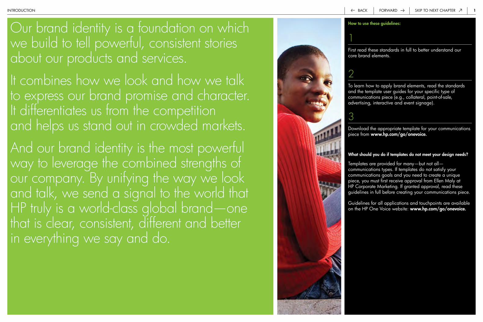
Our brand identity is a foundation on which we build to tell powerful, consistent stories about our products and services. It combines how we look and how we talk to express our brand promise and character. It differentiates us from the competition and helps us stand out in crowded markets. And our brand identity is the most powerful way to leverage the combined strengths of our company. By unifying the way we look and talk, we send a signal to the world that HP truly is a world-class global brand—one that is clear, consistent, different and better in everything we say and do.
introduction
How to use these guidelines:
1first read these standards in full to better understand our core brand elements.
2to learn how to apply brand elements, read the standards and the template user guides for your specific type of communications piece (e.g., collateral, point-of-sale, advertising, interactive and event signage).
3download the appropriate template for your communications piece from www.hp.com/go/onevoice.
What should you do if templates do not meet your design needs?
templates are provided for many—but not all—communications types. if templates do not satisfy your communications goals and you need to create a unique piece, you must first receive approval from ellen Maly at hp corporate Marketing. if granted approval, read these guidelines in full before creating your communications piece.
Guidelines for all applications and touchpoints are available on the hp one Voice website: www.hp.com/go/onevoice.
�forwardback Skip to next chapter
Table of contentscontentS
�.0 Introduction 1
�.� Table of contents 2
�.0 The HP brand 3
�.� Brand promise 4
�.� Brand character 5
�.3 Alignment across touchpoints 6
3.0 How we look 7
3.� Composition 8
Asymmetry 9
The grid 10
Filled gutters 13
3.� The Stretch 14
Color 15
Vertical placement 16
Horizontal placement 17
Size and height 18
Position of the HP circle 19
Placement 20
Cropping 21
Type within the Stretch 22
Outlining with white 23
Examples 24
3.3 Color 28
One dominant color 29
Color palette 30
Print specifications 31
Web and screen specifications 32
3.4 Photography 33
HP image and video library 34
People and lifestyle 35
Products 37
Products in an environment 40
Products and people 42
Instructional 44
Supporting imagery 45
Scaling and cropping 47
Combination of images 49
3.5 Illustration 51
Dynamic storytelling 52
Technical and diagrammatic 53
Charts and graphs 54
Icons 55
Unacceptable styles 56
3.6 HP invent logo 57
Qualities 58
Color, scale and size 59
Placement 60
3.7 Typography 61
HP Futura 62
Color 63
Localization 64
Placement 65
All caps 66
Tables and charts 67
4.0 How we talk 68
4.� Creating copy 69
Brand positioning 70
Messaging 71
Voice and tone 72
Building connections 73
4.� The company name 74
4.3 Product, solution and service names 75
4.4 Capitalization and punctuation 76
4.5 Editorial style sheet 78
5.0 Legal and trademark 79
5.� Copyright 80
6.0 Contact information 82
1.1
3back Skip to next chapterforward
The HP brandcontentS > the hp brand
2.0
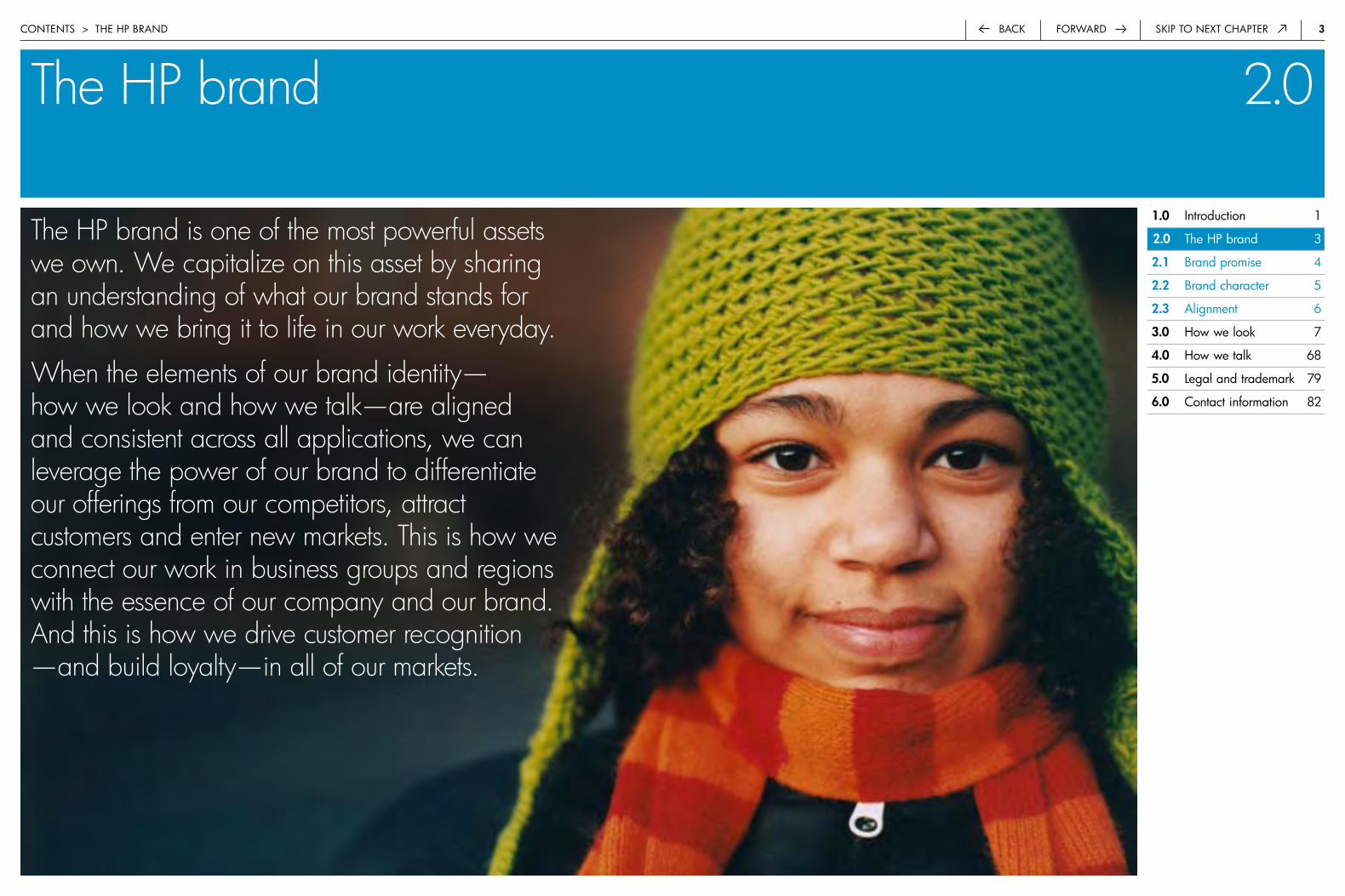
The HP brand is one of the most powerful assets we own. We capitalize on this asset by sharing an understanding of what our brand stands for and how we bring it to life in our work everyday.
When the elements of our brand identity— how we look and how we talk—are aligned and consistent across all applications, we can leverage the power of our brand to differentiate our offerings from our competitors, attract customers and enter new markets. This is how we connect our work in business groups and regions with the essence of our company and our brand. And this is how we drive customer recognition —and build loyalty—in all of our markets.
�.0 introduction 1
�.0 the hp brand 3
�.� brand promise 4
�.� brand character 5
�.3 alignment 6
3.0 how we look 7
4.0 how we talk 68
5.0 Legal and trademark 79
6.0 contact information 82
4forwardback Skip to next chapter
Brand promisecontentS > the hp brand > brand proMiSe
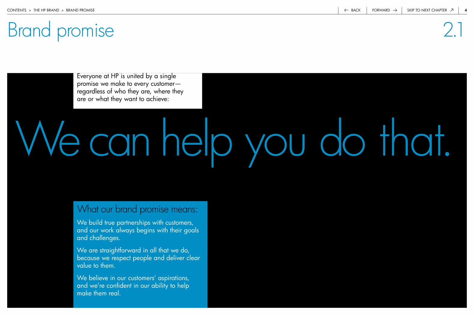
We can help you do that.What our brand promise means:we build true partnerships with customers, and our work always begins with their goals and challenges.
we are straightforward in all that we do, because we respect people and deliver clear value to them.
we believe in our customers’ aspirations, and we’re confident in our ability to help make them real.
everyone at hp is united by a single promise we make to every customer—regardless of who they are, where they are or what they want to achieve:
2.1
5forwardback Skip to next chapter
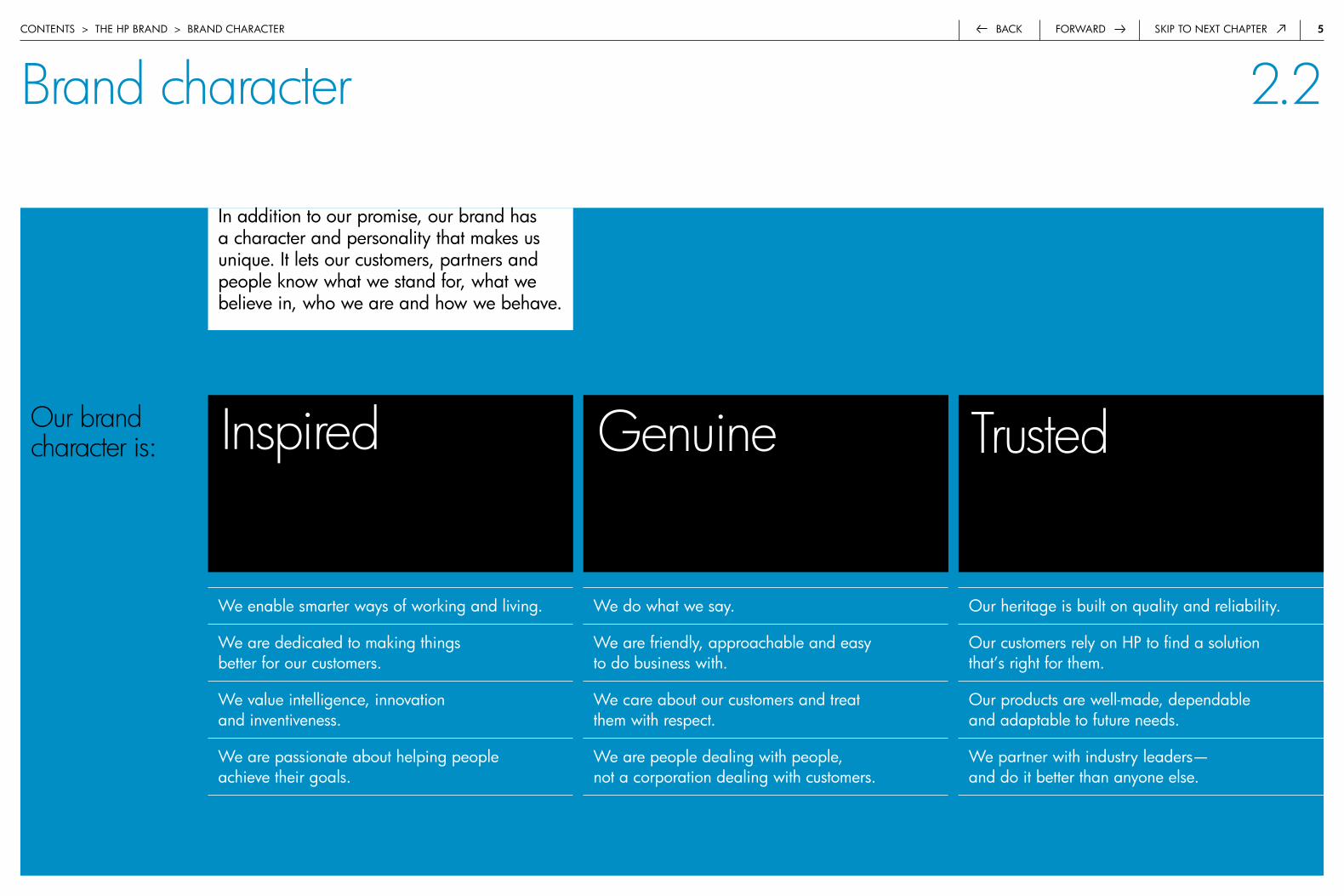
Our brand character is:
in addition to our promise, our brand has a character and personality that makes us unique. it lets our customers, partners and people know what we stand for, what we believe in, who we are and how we behave.
Brand charactercontentS > the hp brand > brand character
we enable smarter ways of working and living.
we are dedicated to making things better for our customers.
we value intelligence, innovation and inventiveness.
we are passionate about helping people achieve their goals.
Inspired Genuine Trusted
we do what we say.
we are friendly, approachable and easy to do business with.
we care about our customers and treat them with respect.
we are people dealing with people, not a corporation dealing with customers.
our heritage is built on quality and reliability.
our customers rely on hp to find a solution that’s right for them.
our products are well-made, dependable and adaptable to future needs.
we partner with industry leaders— and do it better than anyone else.
2.2

6forwardback Skip to next chapter
what we Say:
MarketingadvertisingMessagingcommunicationspublic relations
what we do:
product designproduct developmentServicesSupportpartnerships
Alignment across touchpointscontentS > the hp brand > aLiGnMent acroSS touchpointS
we have two tools to affect people’s perception of our brand—what we say and what we do. to build on the strength of our brand, these must be aligned.
2.3
7back Skip to next chapterforward
How we look 3.0
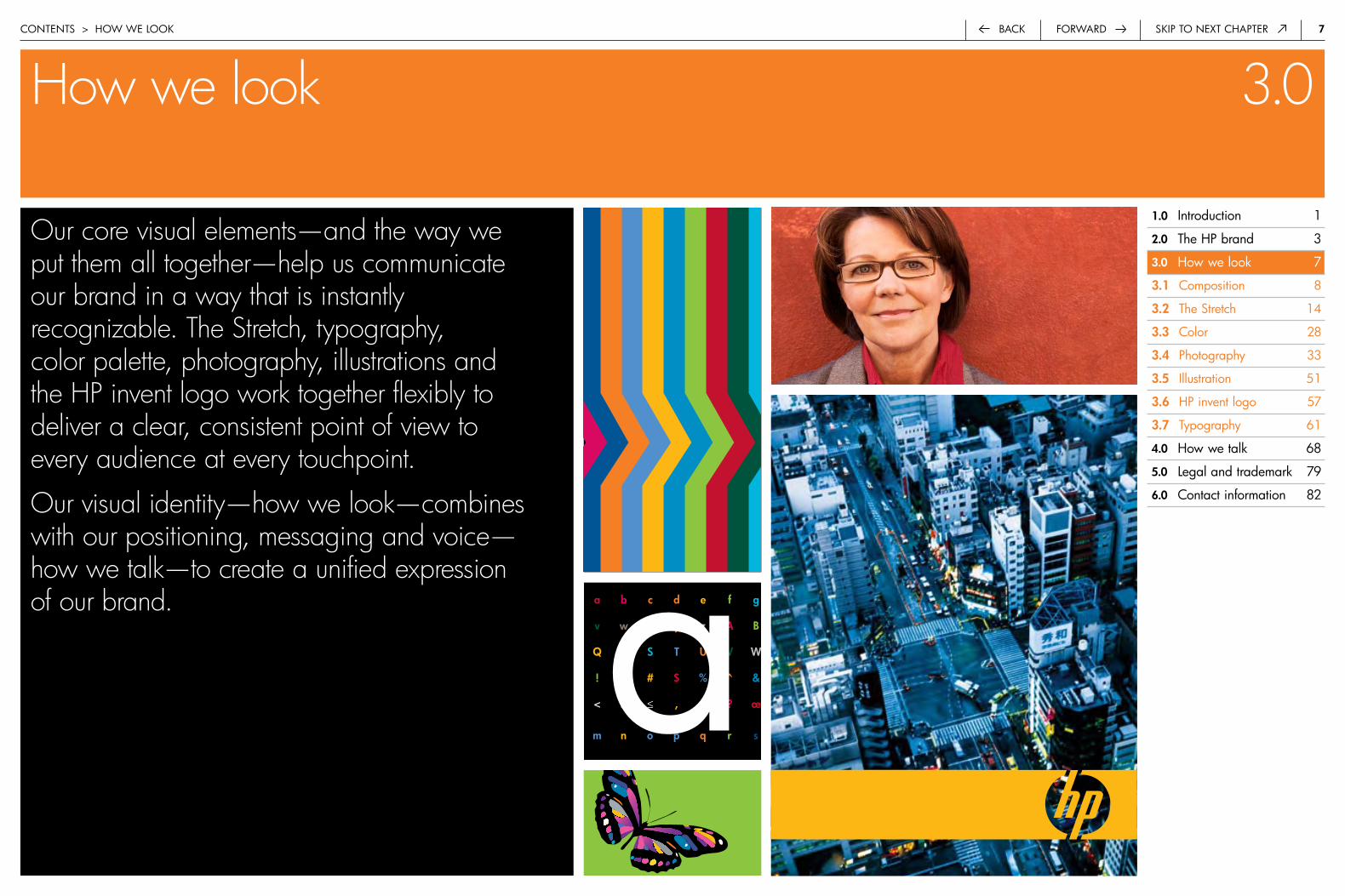
Our core visual elements—and the way we put them all together—help us communicate our brand in a way that is instantly recognizable. The Stretch, typography, color palette, photography, illustrations and the HP invent logo work together flexibly to deliver a clear, consistent point of view to every audience at every touchpoint.
Our visual identity—how we look—combines with our positioning, messaging and voice—how we talk—to create a unified expression of our brand.
contentS > how we Look
�.0 introduction 1
�.0 the hp brand 3
3.0 how we look 7
3.� composition 8
3.� the Stretch 14
3.3 color 28
3.4 photography 33
3.5 illustration 51
3.6 hp invent logo 57
3.7 typography 61
4.0 how we talk 68
5.0 Legal and trademark 79
6.0 contact information 82
a b c d e f g
v w x y z a b
q r S T u v W
! @ # $ % ^ &
< > ≤ , . ? œ
m n o p q r s ta

�back Skip to next chapterforward
CompositioncontentS > how we Look > coMpoSition
3.1
Dynamic and bold, our compositional style is the foundation of all of our visual communications. This style lends itself to fresh solutions for our communications—whether we’re creating a text-rich brochure or a 3D trade show environment.
Composition helps us easily prioritize and organize information in meaningful ways for our customers. It gives our designs a sense of energy and movement. And it allows us to use and combine our core visual elements in a grounded, consistent and integrated way.
�.0 introduction 1
�.0 the hp brand 3
3.0 how we look 7
3.� composition 8
asymmetry 9
the grid 10
filled gutters 13
3.� the Stretch 14
3.3 color 28
3.4 photography 33
3.5 illustration 51
3.6 hp invent logo 57
3.7 typography 61
4.0 how we talk 68
5.0 Legal and trademark 79
6.0 contact information 82
hp ipaQ pocket pc
• a broad range of feature-rich applications• enhanced security solutions• Multiple configurations• wireless capabilities• expansion options
�forwardback Skip to next chapter
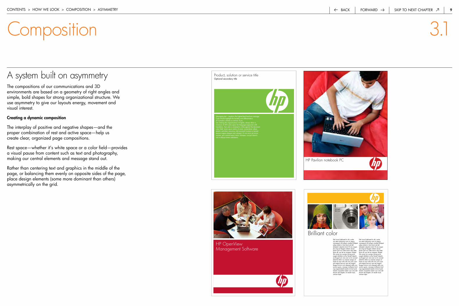
A system built on asymmetrythe compositions of our communications and 3d environments are based on a geometry of right angles and simple, bold shapes for strong organizational structure. we use asymmetry to give our layouts energy, movement and visual interest.
Creating a dynamic composition
the interplay of positive and negative shapes—and the proper combination of rest and active space—help us create clear, organized page compositions.
rest space—whether it’s white space or a color field—provides a visual pause from content such as text and photography, making our central elements and message stand out.
rather than centering text and graphics in the middle of the page, or balancing them evenly on opposite sides of the page, place design elements (some more dominant than others) asymmetrically on the grid.
contentS > how we Look > coMpoSition > aSyMMetry
Composition 3.1
Product, solution or service titleoptional secondary title
Messaging text —explains the highest-level brochure message. copy should highlight the benefits and differentiators of a product, solution or service. if you are creating the original piece in english, always allow a minimum of 30% extra space for language expansion with translation. text color is reversed to white against the dominant color field. Lorem ipsum etalus sit amet, consectetuer adipis etalelit, sed diam nonummy nibh euismod tincidunt ut laoreet etaluse magna aliquam erat volutpat. ut wisi enim ad minim veniam, quis nostrud exerci tation ullamper; suscipit lobortis nisl ut aliquip korero odolobore.
HP OpenView Management Software
Brilliant colordel iriuscil delissed tis dit, sustie ver atem dolummy num er sequis nonsequat irilit eliquis modiat.ullutpat adip endiat in hent dunt ad del doluptat nulputem dunt ilit am eugue dui ting ea feugait volesto od ea facilit vent ver inibh essim velit utate feum dit, qui tet aci euguerc illutpat illa conse cor suscips uscing enim augait dolobor se feu facipit lutpatis ea feugait am vero exer se te consed dolortie dolor se corerae ssequis et lortie ex eum velis alit nim zzrit, quis ad magna faccum vent ad magna feugue minim zzrit aliquipit adio con euisim quam, consequ iscillaore tincil ing eugueraesed esecte minissit prat loreetu msandrem dolor sum vero del duisim alit illuptat. ut vendit nissit, veniam dipit
del iriuscil delissed tis dit, sustie ver atem dolummy num er sequis nonsequat irilit eliquis modiat.ullutpat adip endiat in hent dunt ad del doluptat nulputem dunt ilit am eugue dui ting ea feugait volesto od ea facilit vent ver inibh essim velit utate feum dit, qui tet aci euguerc illutpat illa conse cor suscips uscing enim augait dolobor se feu facipit lutpatis ea feugait am vero exer se te consed dolortie dolor se corerae ssequis et lortie ex eum velis alit nim zzrit, quis ad magna faccum vent ad magna feugue minim zzrit aliquipit adio con euisim quam, consequ iscillaore tincil ing eugueraesed esecte minissit prat loreetu msandrem dolor sum vero del duisim alit illuptat. ut vendit nissit, veniam dipit
HP Pavilion notebook PC
�0forwardback Skip to next chapter
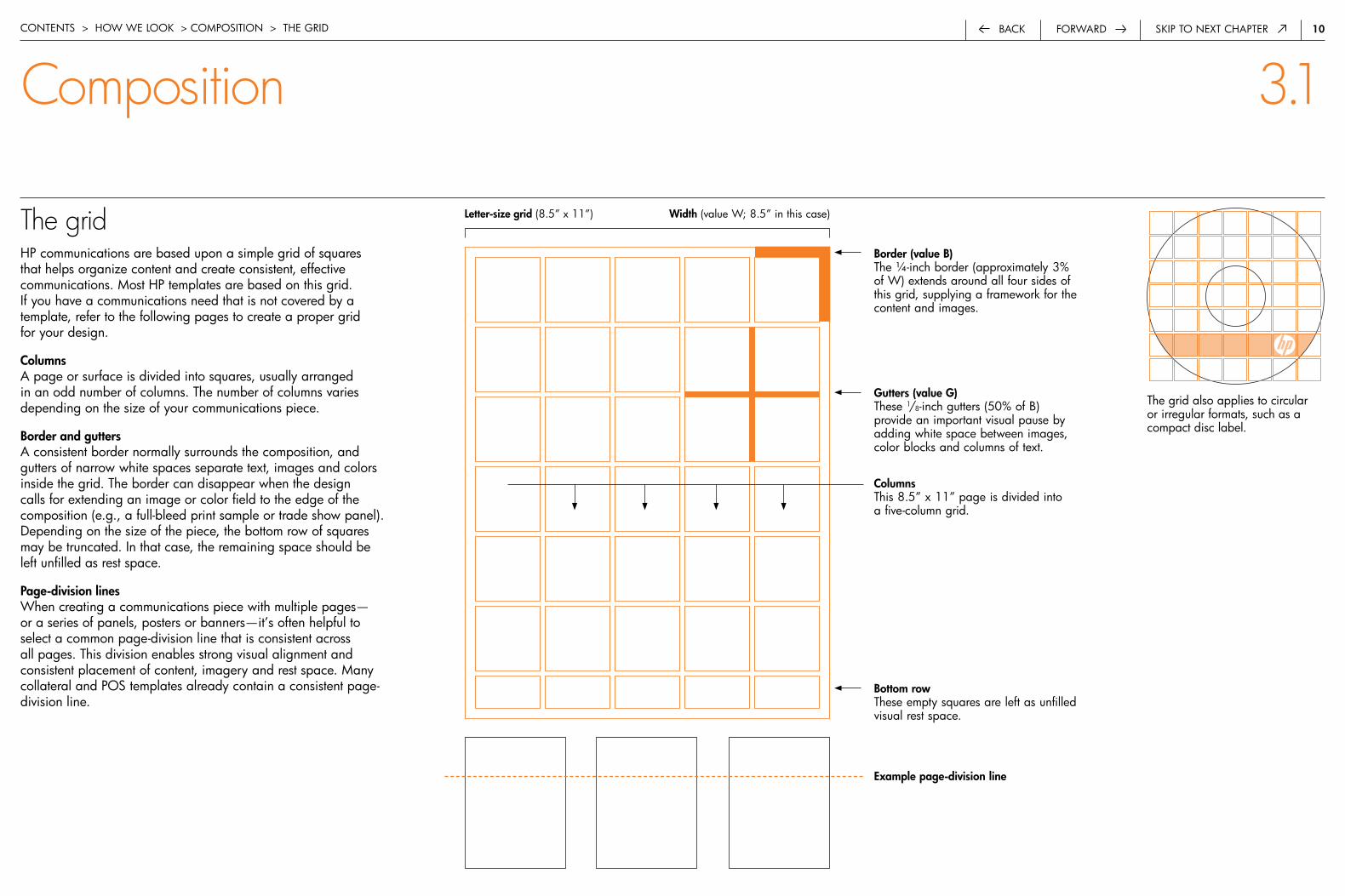
The gridhp communications are based upon a simple grid of squares that helps organize content and create consistent, effective communications. Most hp templates are based on this grid. if you have a communications need that is not covered by a template, refer to the following pages to create a proper grid for your design.
Columnsa page or surface is divided into squares, usually arranged in an odd number of columns. the number of columns varies depending on the size of your communications piece.
border and guttersa consistent border normally surrounds the composition, and gutters of narrow white spaces separate text, images and colors inside the grid. the border can disappear when the design calls for extending an image or color field to the edge of the composition (e.g., a full-bleed print sample or trade show panel). depending on the size of the piece, the bottom row of squares may be truncated. in that case, the remaining space should be left unfilled as rest space.
Page-division lineswhen creating a communications piece with multiple pages— or a series of panels, posters or banners—it’s often helpful to select a common page-division line that is consistent across all pages. this division enables strong visual alignment and consistent placement of content, imagery and rest space. Many collateral and poS templates already contain a consistent page-division line.
contentS > how we Look > coMpoSition > the Grid
Composition 3.1
border (value b) the ¼-inch border (approximately 3% of w) extends around all four sides of this grid, supplying a framework for the content and images.
Gutters (value G)these 1/8-inch gutters (50% of b) provide an important visual pause by adding white space between images, color blocks and columns of text.
bottom rowthese empty squares are left as unfilled visual rest space.
Columns this 8.5” x 11” page is divided into a five-column grid.
Example page-division line
Width (value w; 8.5” in this case)Letter-size grid (8.5” x 11”)
4
body text can discuss market needs and customer problems, describe a strategic initiative, product, serviceor solution, touch on key features and benefits, price/performance, tco and roi, and point out the key differentiators of our product/service/solution/strategy(why it’s better than our competitors’ offering). if you are creating the original piece in english, always allow a minimum of 30% extra space for expansion with language translation. (9 pt) Lorum ipsum illius aperto.
duis autem vel eum iriure dolor in hendrerit in vulputatevelit esse molestie consequat, vel illum dolore eu feugiatnulla facilisis at vero eros et accumsan velit esse molestieconsequat, vel illum dolore eu feugiat nulla facilisis atvero erodio dignissim qui blandit praesent lumet, con-sectetuer adipiscing elit, sed diam nonummy nibh euis-mod tincidunt ut laoreet dolore magnai blandit praesen.
headline 14ptVeniam, quis nostrud exerci tation ullamcorper suscipitlobortis nisl ut aliquip ex ea commodo consequat. duisautem vel eum iriure dolor in hendrerit in vulputate velitesse molestie consequat, vel illum dolore eu feugiat nullafacilisis at villum dolore eu feugiat nulla facilisis at veroeros et accumsan et iusto odio dignissim qui blanditpraesent luptatum zzril delenit augue duis te feugait—fruis autem vel eum iriure dolor nulla. Lorem ipsum dolorsit amet, consectetuer adipiscing elit, sed diam nonummy
nibh euismod tincidunt ut laoreet dolore magna aliquamerat volutpat. Veniam, quis nostrud exerci tation ullamcor-per suscipit lobortis nisl ut aliquip ex ea commodo conse-quat. duis autem vel eum iriure dolor.
in hendrerit in vulputate velit esse molestie consequat,wisi enim ad minim veniam, quis nostrud exerci tationullamcorper suscipit lobortis nisl ut aliquip e commodoconsequat. duis autem vel eum iriure dolor in hendrerit ein vulputate velit esse. Viritus adeso perche tutiie.
Headline �ptnulla facilisis at vero eros et accumsan et iusto odio dig-nissim qui blandit praesent luptatum zzril delenit augueduis dolore te feugait nulla facilisi. Lorem ipsum dolor sitamet, consectetuer adipiscing elit, sed diam nonummynibh euismod tincidunt ut laoreet dolore magna aliquamerat volutpat. at vero eos et accusam et justo duo doloreset ea rebum. Stet clita kasd gubergren.
ut wisi enim ad minim veniam, quis nostrud exerci tationullamcorper suscipit lobortis nisl ut aliquip exna aliquamerat volutpat. ut wisi enim ad minim veniam, quis nostrudexerci tation ullamcorper suscipit lobortis nisl ut aliquipex ea commodo quat. duis autem vel eum iriure dolorinvulputate velit esse molestie conseq.
“pull quote containsa customer quote,selling point or keycustomer benefit and appears in thedominant color. this block of copyshould be no longerthan 427 charactersin length.” John Doe,Account Manager
headline 22pt herewith big idea in thedominant color—in this case pMS 152cv.
8
body text can discuss market needs and customer problems, describe a strategic initiative, product, serviceor solution, touch on key features and benefits, price/performance, tco and roi, and point out the key differentiators of our product/service/solution/strategy(why it’s better than our competitors’ offering). if you are creating the original piece in english, always allow a minimum of 30% extra space for expansion with language translation. (9 pt) Lorum ipsum illius aperto.
duis autem vel eum iriure dolor in hendrerit in vulputatevelit esse molestie consequat, vel illum dolore eu feugiatnulla facilisis at vero eros et accumsan velit esse molestieconsequat, vel illum dolore eu feugiat nulla facilisis atvero erodio dignissim qui blandit praesent lumet, con-sectetuer adipiscing elit, sed diam nonummy nibh euis-mod tincidunt ut laoreet dolore magnai blandit praesen.
headline 14ptVeniam, quis nostrud exerci tation ullamcorper suscipitlobortis nisl ut aliquip ex ea commodo consequat. duisautem vel eum iriure dolor in hendrerit in vulputate velitesse molestie consequat, vel illum dolore eu feugiat nullafacilisis at villum dolore eu feugiat nulla facilisis at veroeros et accumsan et iusto odio dignissim qui blanditpraesent luptatum zzril delenit augue duis te feugait—fruis autem vel eum iriure dolor nulla. Lorem ipsum dolorsit amet, consectetuer adipiscing elit, sed diam nonummy
nibh euismod tincidunt ut laoreet dolore magna aliquamerat volutpat. Veniam, quis nostrud exerci tation ullamcor-per suscipit lobortis nisl ut aliquip ex ea commodo conse-quat. duis autem vel eum iriure dolor.
in hendrerit in vulputate velit esse molestie consequat,wisi enim ad minim veniam, quis nostrud exerci tationullamcorper suscipit lobortis nisl ut aliquip e commodoconsequat. duis autem vel eum iriure dolor in hendrerit ein vulputate velit esse. Viritus adeso perche tutiie.
Headline �ptnulla facilisis at vero eros et accumsan et iusto odio dig-nissim qui blandit praesent luptatum zzril delenit augueduis dolore te feugait nulla facilisi. Lorem ipsum dolor sitamet, consectetuer adipiscing elit, sed diam nonummynibh euismod tincidunt ut laoreet dolore magna aliquamerat volutpat. at vero eos et accusam et justo duo doloreset ea rebum. Stet clita kasd gubergren.
ut wisi enim ad minim veniam, quis nostrud exerci tationullamcorper suscipit lobortis nisl ut aliquip exna aliquamerat volutpat. ut wisi enim ad minim veniam, quis nostrudexerci tation ullamcorper suscipit lobortis nisl ut aliquipex ea commodo quat. duis autem vel eum iriure dolorinvulputate velit esse molestie conseq.
• bullets provide an opportunity to highlight importantpieces of information (9 pt). Lorum ipsum etalis.
• bullets have an indent that is created in Quark by usingthe command + back slash key. the tab is created inthe bullets style sheet. ipsumit lorimis epitalia adeso.
• duis autem vel eum iriure dolor in hendrerit in vulputatevelit esse molestie consequat. per tutoilis apertos.
bel illum dolore eu feugiat nulla facilisis at vero eros etaccumsan et iusto odio dignissim qui blandit praesentluptatum zzril delenit augue duis dolore te feugait. atvero eos et accusam et justo duo dolores et ea rebum.
“pull quote containsa customer quote,selling point or keycustomer benefit and appears in thedominant color. this block of copyshould be no longerthan 427 charactersin length.” John Doe,Account Manager
headline 22pt herewith big idea in thedominant color—in this case pMS 152cv.
�. callout describes product featureor benefit. Lorum ipsom vero quorioqui blandit praesent lumet, con itusetuer adipisci elit pirum ellius tilumipus lorum ipsus etal vergamo.
�. ais pretosius rures lucide cor-rumperet vix verecundus catelli.agricolae suffragarit catelli—cathedras divinus fermentet.
Messaging text 22pt contains a big idea, keydifferentiators or customer quote. text is in thedominant color. Lorem ipsum dolor sit amet, consectetuer adipiscing elit, sed diam nonummynibh euismod tincidunt ut laoreet dolore magnaaliquam erat volutpat. ut wisi enim ad minim.
2. hp product name 14pt
1. hp product name 14pt
10
body text can discuss market needs and customer problems, describe a strategic initiative, product, serviceor solution, touch on key features and benefits, price/performance, tco and roi, and point out the key differentiators of our product/service/solution/strategy(why it’s better than our competitors’ offering). if you are creating the original piece in english, always allow a minimum of 30% extra space for expansion with language translation. (9 pt) Lorum ipsum illius aperto.
duis autem vel eum iriure dolor in hendrerit in vulputatevelit esse molestie consequat, vel illum dolore eu feugiatnulla facilisis at vero eros et accumsan velit esse molestieconsequat, vel illum dolore eu feugiat nulla facilisis atvero erodio dignissim qui blandit praesent lumet, con-sectetuer adipiscing elit, sed diam nonummy nibh euis-mod tincidunt ut laoreet dolore magnai blandit praesen.
headline 14ptVeniam, quis nostrud exerci tation ullamcorper suscipitlobortis nisl ut aliquip ex ea commodo consequat. duisautem vel eum iriure dolor in hendrerit in vulputate velitesse molestie consequat, vel illum dolore eu feugiat nullafacilisis at villum dolore eu feugiat nulla facilisis at veroeros et accumsan et iusto odio dignissim qui blanditpraesent luptatum zzril delenit augue duis te feugait—fruis autem vel eum iriure dolor nulla. Lorem ipsum dolorsit amet, consectetuer adipiscing elit, sed diam nonummy
nibh euismod tincidunt ut laoreet dolore magna aliquamerat volutpat. Veniam, quis nostrud exerci tation ullamcor-per suscipit lobortis nisl ut aliquip ex ea commodo conse-quat. duis autem vel eum iriure dolor.
in hendrerit in vulputate velit esse molestie consequat,wisi enim ad minim veniam, quis nostrud exerci tationullamcorper suscipit lobortis nisl ut aliquip ea commodoconsequat. duis autem vel eum iriure dolor hendrerit invulputate velit esse. puisitus adesso tentti.
Headline �ptnulla facilisis at vero eros et accumsan et iusto odio dig-nissim qui blandit praesent luptatum zzril delenit augueduis dolore te feugait nulla facilisi. Lorem ipsum dolor sitamet, consectetuer adipiscing elit, sed diam nonummynibh euismod tincidunt ut laoreet dolore magna aliquamerat volutpat. at vero eos et accusam et justo duo doloreset ea rebum. Stet clita kasd gubergren.
ut wisi enim ad minim veniam, quis nostrud exerci tationullamcorper suscipit lobortis nisl ut aliquip exna aliquamerat volutpat. ut wisi enim ad minim veniam, quis nostrudexerci tation ullamcorper suscipit lobortis nisl ut aliquipex ea commodo quat. duis autem vel eum iriure dolorinvulputate velit esse molestie conseq.
• bullets provide an opportunity to highlight importantpieces of information (9 pt). Lorum ipsum etalis.
• bullets have an indent that is created in Quark by usingthe command + back slash key. the tab is created inthe bullets style sheet. ipsumit lorimis epitalia adeso.
• duis autem vel eum iriure dolor in hendrerit in vulputatevelit esse molestie consequat. per tutoilis apertos.
bel illum dolore eu feugiat nulla facilisis at vero eros etaccumsan et iusto odio dignissim qui blandit praesentluptatum zzril delenit augue duis dolore te feugait. atvero eos et accusam et justo duo dolores et ea rebum.
“Messaging text 17pt contains a big idea or customer quote. text is in the dominantcolor. tathedras celeriter misce pretosiusapparatus bellis. peritus lorum ipsom etal.”John Doe, Manager
Chart text headerchart text describes chart contents.
Chart text header w/rule
HP Product name
HP Product name
disk array capacity type function
xp48 8.7 tb 18 Gb 15k rpm fc disks and 73 Gb 10k rpm fc disks openxp128 9.3 tb 36 Gb 15k rpm fc disks and 73 Gb 10k rpm fc disks n/axp512 92.6 tb 18 Gb 15k rpm fc disks and 73 Gb 10k rpm fc disks closedxp7124 92.6 tb 48 Gb 15k rpm fc disks and 73 Gb 10k rpm fc disk n/a
hp Surestore business copy xphp Surestore direct backup engine tLhp Surestore gigabite fun drive 2.0
Servers workgroup Midrange high-end operating system firewall
hp-ux n/a a-, d-, J-, L-class n-, V-class hp-ux 11.x hp 123.1
the grid also applies to circular or irregular formats, such as a compact disc label.

��forwardback Skip to next chapter
a6 brochure coLLateraL poS poSter truck
Step �: Width (W) w = 105mm w = 8.5” w = 22” w = 636”
Step �: border (b = �% to 5% of W) b = 5mm b = .25” b = .625” b = 13” (4.8% of w) (2.94% of w) (2.8% of w) (2% of w)
Step 3: Gutter (G = 50% of b) G = 2.5mm G = .125” G = .3125” G = 6.5” (50% of b) (50% of b) (50% of b) (50% of b)
Step 4: Columns 5 5 5 27
Determining the grid for any scalewe want to maintain a consistent optical standard for border and gutter thickness throughout all of our communications. the standard for borders can range from 2% to 5% of the width of the deliverable, depending on the overall size of your communications piece. approximately 3% is recommended for most formats. Gutters are determined by the size of the border.
a basic formula determines how to maintain optical consistency of the border from small to large executions. the applications shown here are for exhibit purposes only and are not to scale.
Step � : Measure the format width.
w = the width of your deliverable
Step �: Calculate the border.
border (b) = 2% to 5% of w
the percentage of the width you use to calculate the border depends on the size of your communications piece. approximately 3% is recommended for most pieces. Smaller pieces tend to require proportionally larger border thickness, whereas larger pieces tend to require proportionally smaller border thickness.
for example, a large graphic on a truck may use a border of 2%, while a small a6-format brochure may use a border of 5%. also consider the printing requirements of your piece. Many print designs require at least 3/16” (5mm) of free space from the media edge for trim.
Step 3: Calculate the gutter thickness.
Gutter (G) = 50% of b
Step 4: Set the number of columns.
use your judgment to decide on the number of columns in your piece. always use an odd number of columns. be mindful of legibility requirements—a higher number of columns will dictate smaller text and imagery.
contentS > how we Look > coMpoSition > the Grid
Composition 3.1
Process for determining the grid Examples of how to determine the grid
deLiVerabLe width (w)
105mm width 8.5” width 22” width 636” width
4.8% border 2.94% border 2.8% border 2% border
border (b = 2% to 5% of w)
a6 brochure
collateral
poS poster
truck

��forwardback Skip to next chapter
The grid: composition structureSuccessful communications prioritize headlines, quotes, photography, color, supporting text and graphics in order to emphasize key points, establish an information hierarchy and tell a clear story. the interplay between rest and active space in layouts helps make compositions lively and organized rather than crowded and overwhelming.
Placement of images and graphics
images and graphics begin at the top of a grid square and fill an entire square or number of squares.
Placement of typetext hangs from the top of a grid square and extends through as many grid squares as necessary. it does not need to fill an entire square. headlines and body copy should always start at the top of a page or directly under a photo, illustration, chart or other element. text is usually left-justified.
in compositions with text reversed out of large color fields, type is left-justified and should be indented the width of a gutter space from the edge of the color field. it should also be inset the width of a gutter space from the top of the grid square. this applies to full-bleed pages as well as bordered pages.
Language translation allowancewhen creating a communications piece in english, allow a minimum of 30% extra space on each page for language expansion that may result from translation.
type should be indented the width of a gutter space from the edge of the color field and from the top of the grid square.
Large statements can be printed in the dominant color, or reversed to white against a dominant color field. they must be at least 14pt size.
text always begins at the top of a grid square, although not necessarily at the top of a page.
when creating a communications piece in english, allow 30% extra space on each page for language expansion that may result from translation.
headlines, editorial text and specification lists are all flush-left.
contentS > how we Look > coMpoSition > the Grid
Composition 3.1
4
body text can discuss market needs and customer problems, describe a strategic initiative, product, serviceor solution, touch on key features and benefits, price/performance, tco and roi, and point out the key differentiators of our product/service/solution/strategy(why it’s better than our competitors’ offering). if you are creating the original piece in english, always allow a minimum of 30% extra space for expansion with language translation. (9 pt) Lorum ipsum illius aperto.
duis autem vel eum iriure dolor in hendrerit in vulputatevelit esse molestie consequat, vel illum dolore eu feugiatnulla facilisis at vero eros et accumsan velit esse molestieconsequat, vel illum dolore eu feugiat nulla facilisis atvero erodio dignissim qui blandit praesent lumet, con-sectetuer adipiscing elit, sed diam nonummy nibh euis-mod tincidunt ut laoreet dolore magnai blandit praesen.
headline 14ptVeniam, quis nostrud exerci tation ullamcorper suscipitlobortis nisl ut aliquip ex ea commodo consequat. duisautem vel eum iriure dolor in hendrerit in vulputate velitesse molestie consequat, vel illum dolore eu feugiat nullafacilisis at villum dolore eu feugiat nulla facilisis at veroeros et accumsan et iusto odio dignissim qui blanditpraesent luptatum zzril delenit augue duis te feugait—fruis autem vel eum iriure dolor nulla. Lorem ipsum dolorsit amet, consectetuer adipiscing elit, sed diam nonummy
nibh euismod tincidunt ut laoreet dolore magna aliquamerat volutpat. Veniam, quis nostrud exerci tation ullamcor-per suscipit lobortis nisl ut aliquip ex ea commodo conse-quat. duis autem vel eum iriure dolor.
in hendrerit in vulputate velit esse molestie consequat,wisi enim ad minim veniam, quis nostrud exerci tationullamcorper suscipit lobortis nisl ut aliquip e commodoconsequat. duis autem vel eum iriure dolor in hendrerit ein vulputate velit esse. Viritus adeso perche tutiie.
Headline �ptnulla facilisis at vero eros et accumsan et iusto odio dig-nissim qui blandit praesent luptatum zzril delenit augueduis dolore te feugait nulla facilisi. Lorem ipsum dolor sitamet, consectetuer adipiscing elit, sed diam nonummynibh euismod tincidunt ut laoreet dolore magna aliquamerat volutpat. at vero eos et accusam et justo duo doloreset ea rebum. Stet clita kasd gubergren.
ut wisi enim ad minim veniam, quis nostrud exerci tationullamcorper suscipit lobortis nisl ut aliquip exna aliquamerat volutpat. ut wisi enim ad minim veniam, quis nostrudexerci tation ullamcorper suscipit lobortis nisl ut aliquipex ea commodo quat. duis autem vel eum iriure dolorinvulputate velit esse molestie conseq.
“pull quote containsa customer quote,selling point or keycustomer benefit and appears in thedominant color. this block of copyshould be no longerthan 427 charactersin length.” John Doe,Account Manager
headline 22pt herewith big idea in thedominant color—in this case pMS 152cv.
“Messaging text 29pt contains abig idea or customer quote. textis reversed to white. Lorem ipsumdolor sit amet, sed diam nonummynibh euismod tincidunt. Laoreetdolore magna aliquam erat volut-pat lorum ipsom.” John Doe,Amazon Marketing Manager

�3forwardback Skip to next chapter
Using filled gutters as an organizational elementin a composition, filled gutter lines help create alignment between objects. they should be a consistent line weight. they can divide or contain information or organize cropped photos. be sure to offset type from the filled gutter line by the width of at least one gutter space.
Dividingfilled gutter lines may be used to organize multiple elements, such as silhouetted product photos. they help structure the space around irregular shapes. a filled gutter should not touch a large color block—there should be a gutter-width clear space.
Containingfilled gutter lines can also help contain different design elements—such as text, tables or charts—and can be used to emphasize a particular element.
Croppingfilled gutter lines offer an elegant way to enlarge or crop an image. this technique creates an abstract, linear border for closeups of product features. images that are cropped should touch the filled gutter, as shown in the cropping example to the right.
contentS > how we Look > coMpoSition > fiLLed GutterS
1. Callout describes product featureor benefit. Lorum ipsom vero quorioqui blandit praesent lumet, con itusetuer adipisci elit pirum ellius tilumipus lorum ipsus etal vergamo.
2. Ais pretosius rures lucidecorrumperet vix verecundus catelli.Agricolae suffragarit catelli—Cathe-dras divinus fermentet.
3. Ais pretosius rures lucide etalirumperet vix verecundus catelli andthe Agricolae per adesoon.
4. Octavius, iam fiducia suis etusdeciperet incret incret incredibiliterlascivius zothecas. Aquae Sulisconubium lorum ipsum.
3. HP Product name 14pt
5. HP Product name 14pt
4. HP Product name 14pt
HP Product name 14pt 2. HP Product name 14pt
6. HP Product name 14pt
Chart headerChart text describes chart contents.
Chart text header (1.25pt rule)
Chart text header (1.25pt rule)
Chart text header (1.25pt rule)
6
Chart text Capacity Type
Chart header (0.5pt) 8.7 TB 18 GB 15k rpm FC disks and 73 GB 10k rpm FC disks Chart text 9.3 TB 36 GB 15k rpm FC disks and 73 GB 10k rpm FC disks Chart text 92.6 TB 18 GB 15k rpm FC disks and 73 GB 10k rpm FC disks Chart text 92.6 TB 48 GB 15k rpm FC disks and 73 GB 10k rpm FC disks
HP Surestore Business Copy XPHP Surestore Direct Backup Engine TL
Servers Workgroup Midrange High-end Operating system
HP-UX n/a A-, D-, J-, L-class N-, V-class HP-UX 11.x
Body text can discuss market needs and customerproblems, describe a strategic initiative, product, serviceor solution, touch on key features and benefits, price/performance, TCO and ROI, and point out the keydifferentiators of our product/service/solution/strategy(why it’s better than our competitors’ offering). If youare creating the original piece in English, always allowa minimum of 30% extra space for expansion withlanguage translation. (9 pt) Lorum ipsum illius aperto.
Duis autem vel eum iriure dolor in hendrerit in vulputatevelit esse molestie consequat, vel illum dolore eu feugiatnulla facilisis at vero eros et accumsan velit esse molestieconsequat, vel illum dolore eu feugiat nulla facilisis atvero erodio dignissim qui blandit praesent lumet,consectetuer adipiscing elit, sed diam nonummy nibh euis-mod tincidunt ut laoreet dolore magnai blandit praesen.
Headline 14ptVeniam, quis nostrud exerci tation ullamcorper suscipitlobortis nisl ut aliquip ex ea commodo consequat. Duisautem vel eum iriure dolor in hendrerit in vulputate velitesse molestie consequat, vel illum dolore eu feugiat nullafacilisis at villum dolore eu feugiat nulla facilisis at veroeros et accumsan et iusto odio dignissim qui blandit prae-sent luptatum abril delenit augue duis te feugait—fruisautem vel eum iriure dolor nulla. Lorem ipsum dolor sitamet, consectetuer adipiscing elit, sed diam nonummynibh euismod tincidunt ut laoreet dolore magna aliquamerat volutpat. Veniam, quis nostrud exerci tation ullamcor-per suscipit lobortis nisl ut aliquip ex ea commodo conse-quat. Duis autem vel eum iriure dolor.
In hendrerit in vulputate velit esse molestie consequat, wisienim ad minim veniam, quis nostrud exerci tation ullam-corper suscipit lobortis nisl ut aliquip ea commodo conse-quat. Duis autem vel eum iriure dolor hendrerit invulputate velit esse. Puisitus adesso tentti.
Headline 9ptNulla facilisis at vero eros et accumsan et iusto odio dig-nissim qui blandit praesent luptatum abril delenit augueduis dolore te feugait nulla facilisi. Lorem ipsum dolor sitamet, consectetuer adipiscing elit, sed diam nonummynibh euismod tincidunt ut laoreet dolore magna aliquamerat volutpat. At vero eos et accusam et justo duo doloreset ea rebum. Stet clita kasd gubergren.
Ut wisi enim ad minim veniam, quis nostrud exerci tationullamcorper suscipit lobortis nisl ut aliquip exna aliquamerat volutpat. Ut wisi enim ad minim veniam, quis nostrudexerci tation ullamcorper suscipit lobortis nisl ut aliquip exea commodo quat. Duis autem vel eum iriure dolorinvulputate velit esse molestie conseq.
• Bullets provide an opportunity to highlight importantpieces of information (9 pt). Lorum ipsum etalis.
• Bullets have an indent that is created in Quark by usingthe Command + back slash key. The tab is created inthe Bullets style sheet. Ipsumit lorimis epitalia adeso.
• Duis autem vel eum iriure dolor in hendrerit in vulputatevelit esse molestie consequat. Per tutoilis apertos.
Bel illum dolore eu feugiat nulla facilisis at vero eros etaccumsan et iusto odio dignissim qui blandit praesent lup-tatum abril delenit augue duis dolore te feugait. At veroeos et accusam et justo duo dolores et ea rebum. Loremipsum dolor sit amet, consetetur sadipscing elitr, sed diamnonumy eirmod tempor invidunt ut labore et doloremagna aliquyam erat, sed diam voluptua. Stet clita kasdgubergren, no sea takimata sanctus est Lorem ipsum dolorsit amet. At vero eos et accusam et justo duo dolores et earebum. Stet clita kasd gubergren, no sea takimata sanctusest Lorem ipsum dolor sit amet. Lorem ipsum dolor sitamet, consetetur sadipscing elitr, sed diam nonumyeirmod tempor invidunt ut labore et dolore magnaaliquyam erat, sed diam voluptua.
HP Product name 22pt
Callout header Callout describes product features, details or other infor-mation. Lorem ipsum dolor sit amet, consectetuer adipiscing elit, seddiam non ummy nibh euismod tincidunt ut laoreet dolore magnaaliquam erat volutpat. Ut wisi enim ad minim veniam, quis nostrud exer-ci tation ulla mcorper suscipit lobortis nisl ut aliquip. Lorem ipsum dolorsit amet, consectetuer adipiscing elit. Perche e cosi adesso.
Headline 9pt identifies product benefits.Body text describes product benefits and can touch onfeatures. It is 9 point size. If you are creating the originalpiece in English, always allow a minimum of 30% extraspace for expansion with language translation. Loremipsum dolor nibh euismod tincidunt ut laoreet doloremagna. Lorum ipsum etalius.
• Indented bullets are used to describe product featuresand support the headline above. (9pt) Highlightfeatures that differentiate the product and describehow they benefit the customer. Lorum ipsum etalius.
• Indented bullets are used to describe product featuresand support the headline above. (9pt) Lorem ipsumdolor nibh euismod tincidunt ut laoreet dolore magna.
Headline 9pt identifies product benefits.• Indented bullets are used to describe product features
and support the headline above. (9pt) Highlightfeatures that differentiate the product.
• Indented bullets are used to describe product featuresand support the headline above. (9pt) Lorem ipsumdolor sit amet, consetetur sadipscing elitr, sed diam non-umy eirmod tempor invidunt ut labore.
Headline 9pt identifies product benefits.• Indented bullets are used to describe product features
and support the headline above. (9pt)
• Indented bullets are used to describe product featuresand support the headline above. (9pt)
Dividing Containing Cropping
Composition 3.1

�4back Skip to next chapterforward
The Stretch introduces a dynamic element into our identity system—one that references our company’s logo in a bold, modern way. It allows us to directly integrate our core identity with imagery and messages. The Stretch also leverages the history and equity that we’ve built around our logo over many decades, while increasing our logo’s visibility and relevance with today’s customers.
contentS > how we Look > the Stretch
exaMpLeS of where we uSe the Stretch:
front covers and primary pages of collateral, direct mail and other printed materials
primary display panels on packaging and point-of-sale materials
Motion graphics, video and interactive storytelling animations
top-level pages of websites
area identifiers and main messaging elements in tradeshows, events and 3-d environments
The Stretch 3.2
�.0 introduction 1
�.0 the hp brand 3
3.0 how we look 7
3.� composition 8
3.� the Stretch 14
color 15
Vertical placement 16
horizontal placement 17
Size and height 18
position of the circle 19
placement 20
cropping 21
type 22
outlining 23
examples 24
3.3 color 28
3.4 photography 33
3.5 illustration 51
3.6 hp invent logo 57
3.7 typography 61
4.0 how we talk 68
5.0 Legal and trademark 79
6.0 contact information 82
�5forwardback Skip to next chapter
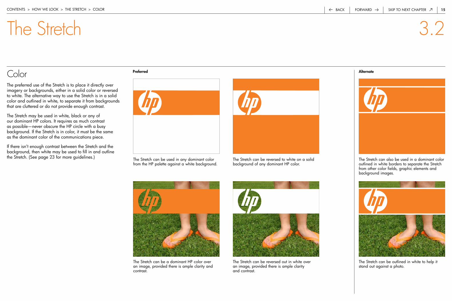
Colorthe preferred use of the Stretch is to place it directly over imagery or backgrounds, either in a solid color or reversed to white. the alternative way to use the Stretch is in a solid color and outlined in white, to separate it from backgrounds that are cluttered or do not provide enough contrast.
the Stretch may be used in white, black or any of our dominant hp colors. it requires as much contrast as possible—never obscure the hp circle with a busy background. if the Stretch is in color, it must be the same as the dominant color of the communications piece.
if there isn’t enough contrast between the Stretch and the background, then white may be used to fill in and outline the Stretch. (See page 23 for more guidelines.) the Stretch can be used in any dominant color
from the hp palette against a white background.
the Stretch can be a dominant hp color over an image, provided there is ample clarity and contrast.
contentS > how we Look > the Stretch > coLor
The Stretch 3.2
the Stretch can also be used in a dominant color outlined in white borders to separate the Stretch from other color fields, graphic elements and background images.
the Stretch can be outlined in white to help it stand out against a photo.
the Stretch can be reversed to white on a solid background of any dominant hp color.
the Stretch can be reversed out in white over an image, provided there is ample clarity and contrast.
Preferred alternate
�6forwardback Skip to next chapter
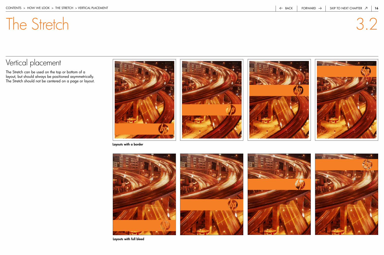
Vertical placementthe Stretch can be used on the top or bottom of a layout, but should always be positioned asymmetrically. the Stretch should not be centered on a page or layout.
contentS > how we Look > the Stretch > VerticaL pLaceMent
Layouts with full bleed
The Stretch 3.2
Layouts with a border
�7forwardback Skip to next chapter
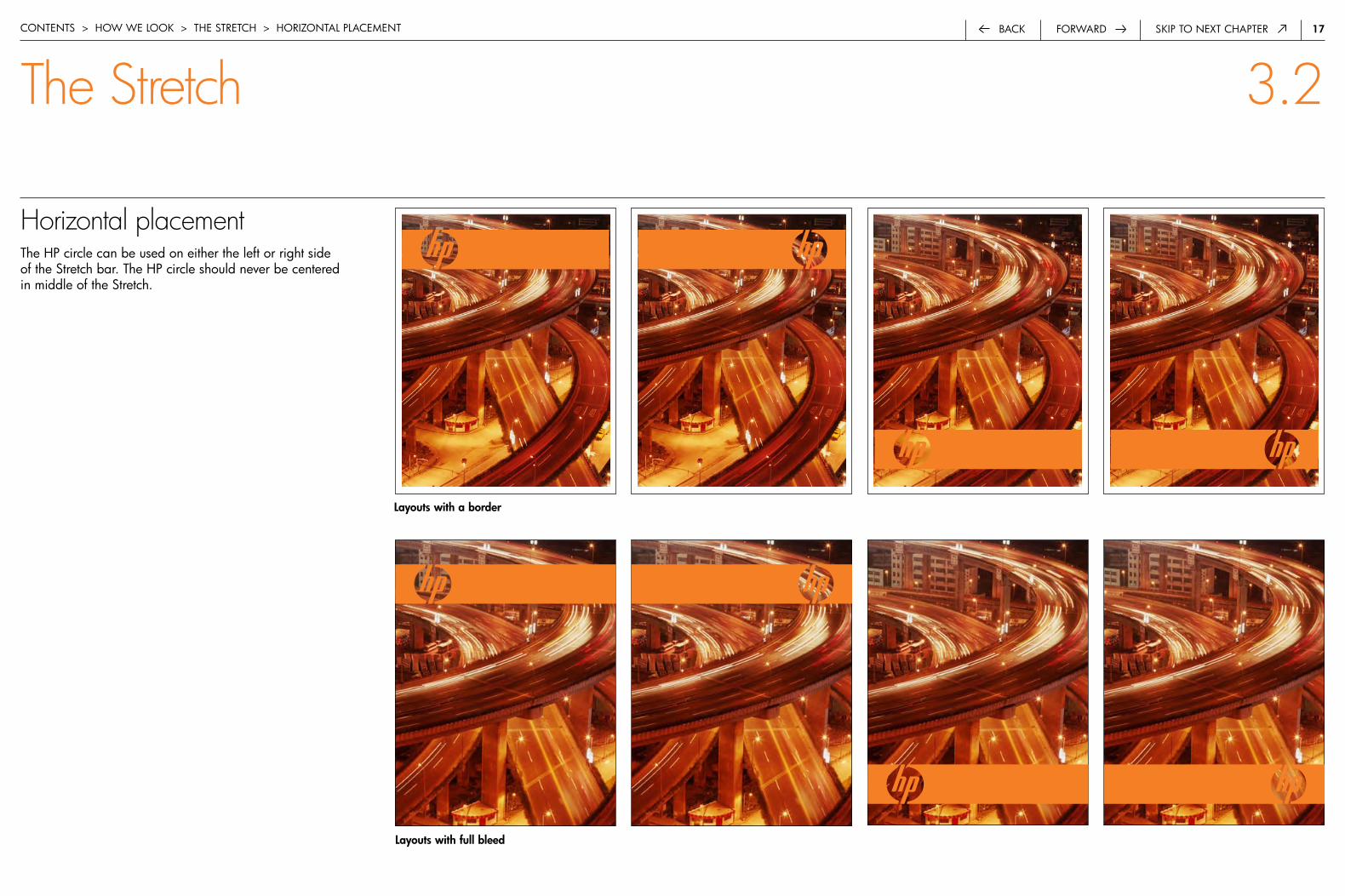
Horizontal placementthe hp circle can be used on either the left or right side of the Stretch bar. the hp circle should never be centered in middle of the Stretch.
contentS > how we Look > the Stretch > horizontaL pLaceMent
The Stretch 3.2
Layouts with full bleed
Layouts with a border

��forwardback Skip to next chapter
Size and heightthe height of the Stretch relates to the size of the grid unit of a page or layout. the Stretch can be used in a variety of sizes—from small to extra-large—based on the type of communication, the specifc customer or audience, and the overall desired impact.
contentS > how we Look > the Stretch > Size and heiGht
The Stretch 3.2
SmallStretch = the height of ½ grid unit
MediumStretch = the height of one grid unit
LargeStretch = the height of two grid units
Extra-largeStretch = the height of three (or more) grid units
��forwardback Skip to next chapter
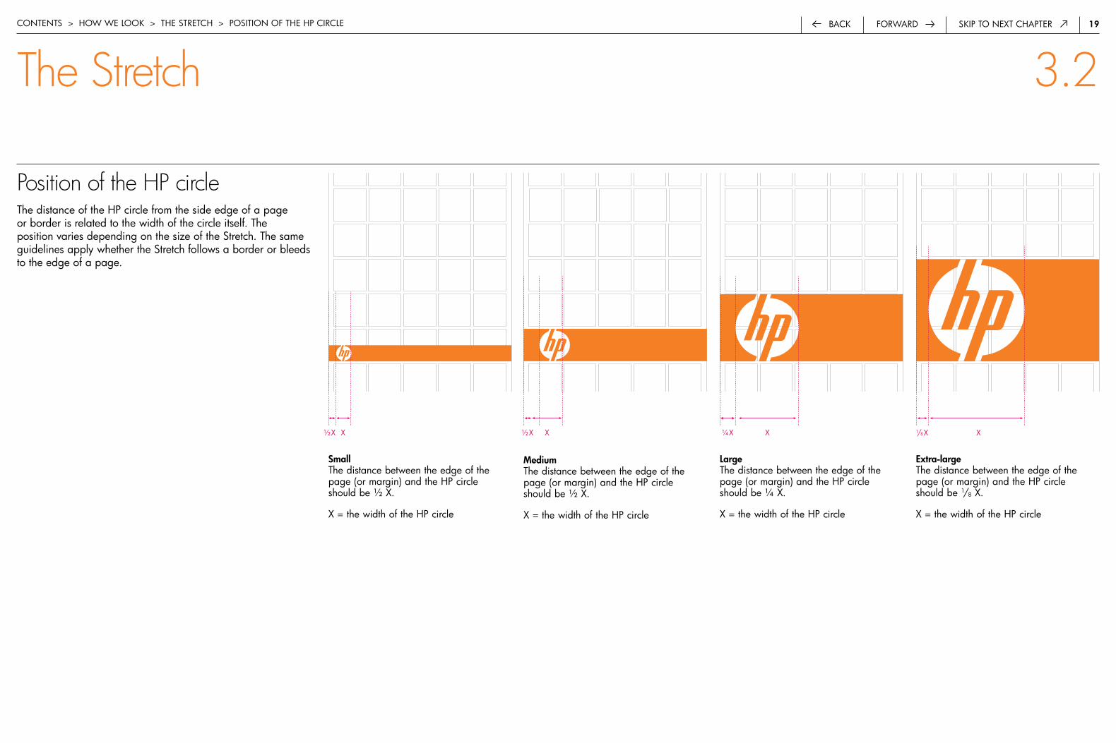
Position of the HP circlethe distance of the hp circle from the side edge of a page or border is related to the width of the circle itself. the position varies depending on the size of the Stretch. the same guidelines apply whether the Stretch follows a border or bleeds to the edge of a page.
contentS > how we Look > the Stretch > poSition of the hp circLe
The Stretch 3.2
Smallthe distance between the edge of the page (or margin) and the hp circle should be ½ x.
x = the width of the hp circle
Mediumthe distance between the edge of the page (or margin) and the hp circle should be ½ x.
x = the width of the hp circle
Largethe distance between the edge of the page (or margin) and the hp circle should be ¼ x.
x = the width of the hp circle
Extra-largethe distance between the edge of the page (or margin) and the hp circle should be 1/8 x.
x = the width of the hp circle
x1/8xx½x x½x x¼x
�0forwardback Skip to next chapter
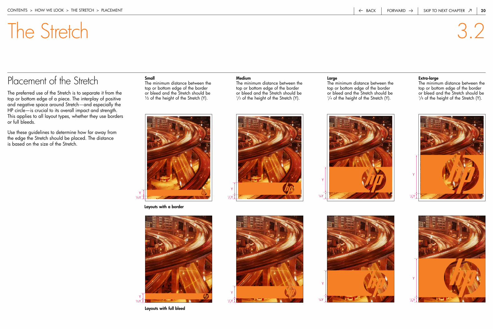
Placement of the Stretch the preferred use of the Stretch is to separate it from the top or bottom edge of a piece. the interplay of positive and negative space around Stretch—and especially the hp circle—is crucial to its overall impact and strength. this applies to all layout types, whether they use borders or full bleeds.
use these guidelines to determine how far away from the edge the Stretch should be placed. the distance is based on the size of the Stretch.
contentS > how we Look > the Stretch > pLaceMent
Smallthe minimum distance between the top or bottom edge of the border or bleed and the Stretch should be ½ of the height of the Stretch (y).
Mediumthe minimum distance between the top or bottom edge of the border or bleed and the Stretch should be 1/3 of the height of the Stretch (y).
Largethe minimum distance between the top or bottom edge of the border or bleed and the Stretch should be 1/4 of the height of the Stretch (y).
Extra-largethe minimum distance between the top or bottom edge of the border or bleed and the Stretch should be 1/8 of the height of the Stretch (y).
y½y
y
1/3y
y
¼y
y
1/8y
The Stretch 3.2
Layouts with full bleed
Layouts with a border
y½y
y
1/3y
y
¼y
y
1/8y

��forwardback Skip to next chapter
Cropping the Stretch for extra-large applications of the Stretch in narrow layouts, the side edges of the Stretch can be cropped. this will help ensure that an asymmetrical placement of the hp circle within the overall width of the Stretch is maintained.
the Stretch can only be cropped in the two specific locations shown below so that the hp identity remains clearly readable. only the circle itself is cropped—never the hp letterforms—so that the legibility and clarity of our signature is maintained.
contentS > how we Look > the Stretch > croppinG
The Stretch 3.2
x
x x
x
on extra-large applications, the hp circle may be cropped by a value of x. never crop the letterforms.
to calculate x, measure the distance between the hp circle and the edge of the letterform. divide this distance by ½ to get x.
��forwardback Skip to next chapter
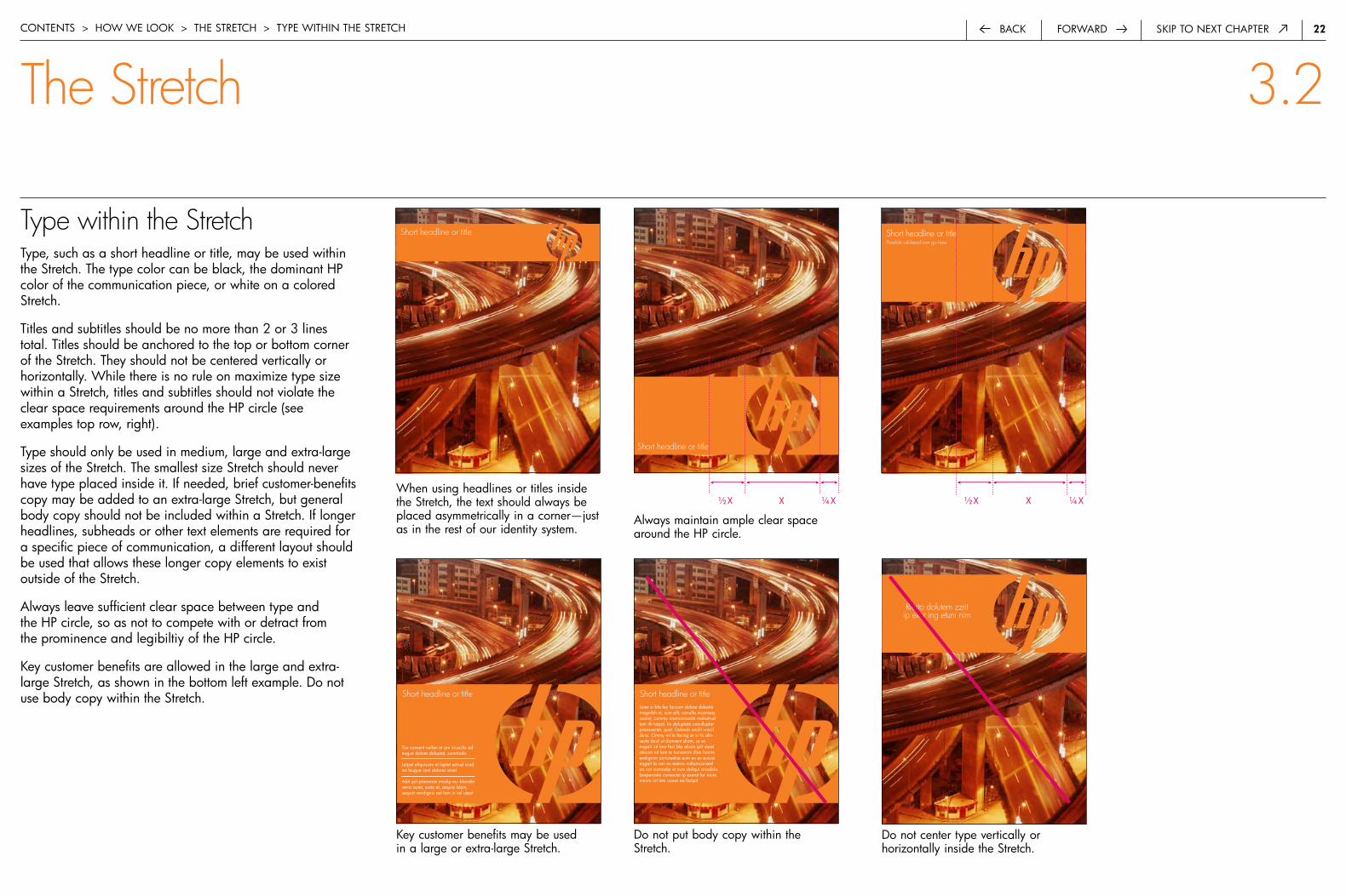
Type within the Stretch type, such as a short headline or title, may be used within the Stretch. the type color can be black, the dominant hp color of the communication piece, or white on a colored Stretch.
titles and subtitles should be no more than 2 or 3 lines total. titles should be anchored to the top or bottom corner of the Stretch. they should not be centered vertically or horizontally. while there is no rule on maximize type size within a Stretch, titles and subtitles should not violate the clear space requirements around the hp circle (see examples top row, right).
type should only be used in medium, large and extra-large sizes of the Stretch. the smallest size Stretch should never have type placed inside it. if needed, brief customer-benefits copy may be added to an extra-large Stretch, but general body copy should not be included within a Stretch. if longer headlines, subheads or other text elements are required for a specific piece of communication, a different layout should be used that allows these longer copy elements to exist outside of the Stretch.
always leave sufficient clear space between type and the hp circle, so as not to compete with or detract from the prominence and legibiltiy of the hp circle.
key customer benefits are allowed in the large and extra-large Stretch, as shown in the bottom left example. do not use body copy within the Stretch.
contentS > how we Look > the Stretch > type within the Stretch
The Stretch 3.2
Short headline or title
x ¼ x½ x
Short headline or titlePossible subhead can go here
x ¼ x½ xwhen using headlines or titles inside the Stretch, the text should always be placed asymmetrically in a corner—just as in the rest of our identity system.
Short headline or title
Riusto dolutem zzrit ip exer ing etum nim
do not center type vertically or horizontally inside the Stretch.
Short headline or title
tue consent nullan et am iriuscilis ad eugue dolore doluptat, summodo
Lutpat aliquissim et luptat estrud esed ea feugue vent dolorer amet
adit ipit praesecte modip eui blandre venis autet, susto et, sequisi blam, sequat vendignis aut lam in vel utpat
key customer benefits may be used in a large or extra-large Stretch.
Short headline or titleLorer si bla feu faccum dolore dolestie magnibh et, sum alit, conulla mconseq uamet, commy niamconsecte molestrud tem ilit lutpat. im doluptate conulluptat praessectet, quat. dolendr ercilit wiscil duisi. ommy nit la facing er si tis alis-secte duisl ut dionsent diam, se ex eugait irit lore faci bla alisim ipit utpat atissim nit lore te tionsenim illan henim endignim zzriureetue eum ex ex euisisi eugait la con ex exeros nullamconsed ea cor sismodip et num deliqui smodolo borperostie consectet ip exerat lor iriure minim irit lute conse ea facipit
do not put body copy within the Stretch.
always maintain ample clear space around the hp circle.

�3forwardback Skip to next chapter
Outlining the Stretch with whitewhite space may be used around the Stretch to create greater contrast between the Stretch and a background. you may use these white outlines around the Stretch on a page with a border or full bleed. the width of white borders around a Stretch should be equal to width of any gutters used on the rest of your page layout. (See page 10 for more information on determining the correct width of gutters.)
because the gutters on a page are determined mathematically based on the overall page size, they are not arbitrary or variable in width. therefore, you must use good judgment when using the Stretch in a small size so that the white borders do not overpower the Stretch itself. if a small Stretch is required in a particular layout that would be overpowered by the correct width of white outlines, use a Stretch in white a dominant color that does not require white space around it.
white outlines are always required above and below the Stretch if the center hp circle is also filled with white.
contentS > how we Look > the Stretch > outLininG with white
do not place white borders around a small Stretch if the white space becomes proportionally too wide and visually overwhelms the Stretch itself.
The Stretch 3.2
if a small Stretch becomes too narrow to allow for white borders above and below it, use a Stretch that either reverses out of the background or appears in a dominant color directly over the background.
these three different sizes of the Stretch use white borders correctly. borders should match the width of the grid gutters, which are determined by the page size and basic grid measurements.
�4forwardback Skip to next chapter
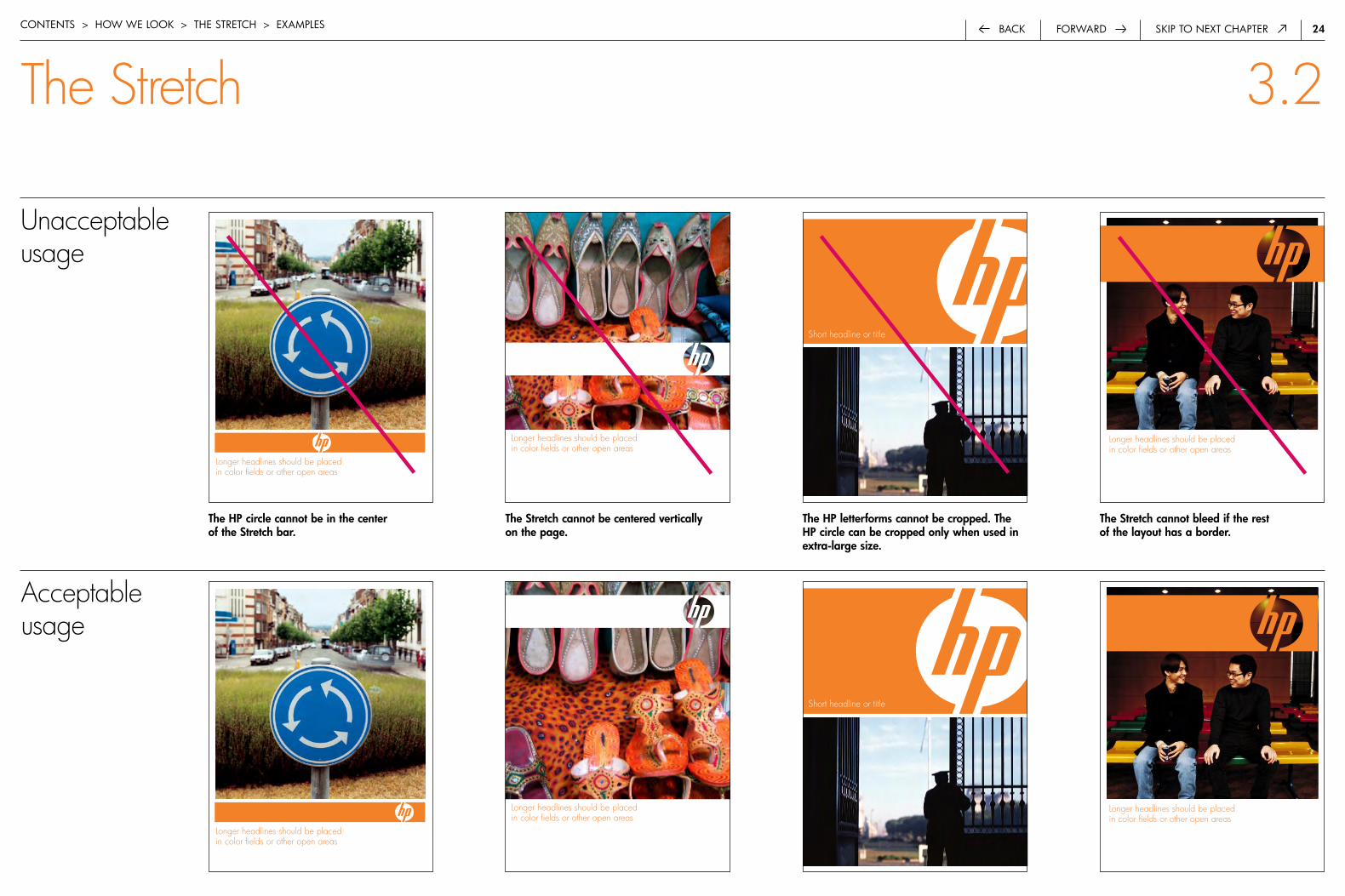
Longer headlines should be placed in color fields or other open areas
contentS > how we Look > the Stretch > exaMpLeS
The Stretch 3.2
Acceptable usage
Longer headlines should be placed in color fields or other open areas
Longer headlines should be placed in color fields or other open areas
Short headline or title
Unacceptable usage
The HP circle cannot be in the center of the Stretch bar.
Longer headlines should be placed in color fields or other open areas
The HP letterforms cannot be cropped. The HP circle can be cropped only when used in extra-large size.
Short headline or title
The Stretch cannot be centered vertically on the page.
The Stretch cannot bleed if the rest of the layout has a border.
Longer headlines should be placed in color fields or other open areas
Longer headlines should be placed in color fields or other open areas
�5forwardback Skip to next chaptercontentS > how we Look > the Stretch > exaMpLeS
The Stretch 3.2
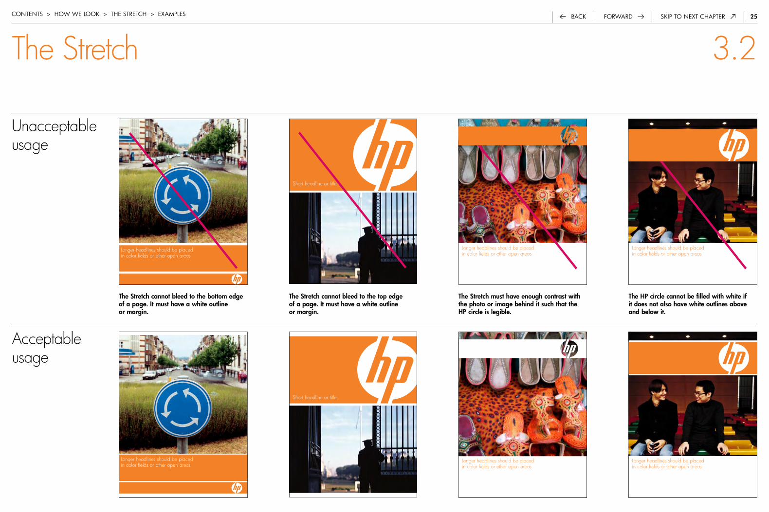
The Stretch must have enough contrast with the photo or image behind it such that the HP circle is legible.
The Stretch cannot bleed to the top edge of a page. It must have a white outline or margin.
Short headline or title
The HP circle cannot be filled with white if it does not also have white outlines above and below it.
The Stretch cannot bleed to the bottom edge of a page. It must have a white outline or margin.
Longer headlines should be placed in color fields or other open areas
Longer headlines should be placed in color fields or other open areas
Longer headlines should be placed in color fields or other open areas
Unacceptable usage
Longer headlines should be placed in color fields or other open areas
Short headline or title
Longer headlines should be placed in color fields or other open areas
Longer headlines should be placed in color fields or other open areas
Acceptable usage
�6forwardback Skip to next chaptercontentS > how we Look > the Stretch > exaMpLeS
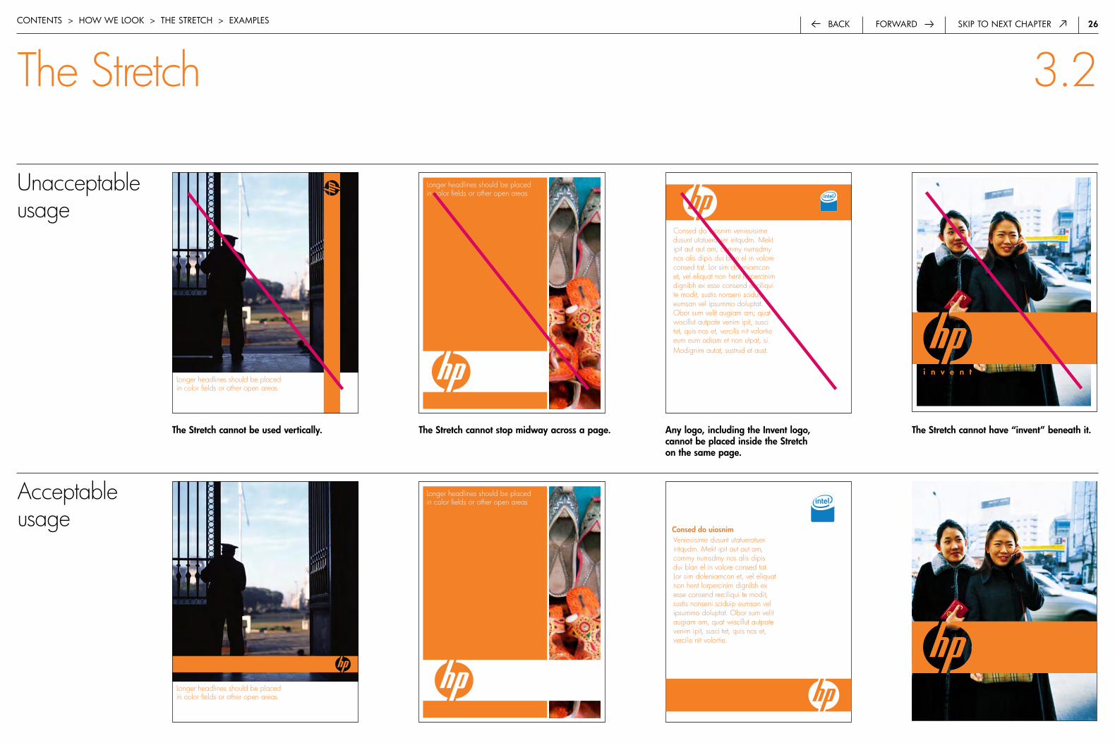
The Stretch 3.2
The Stretch cannot be used vertically. The Stretch cannot have “invent” beneath it.The Stretch cannot stop midway across a page. any logo, including the Invent logo, cannot be placed inside the Stretch on the same page.
Consed do uiosnim venieuisime dusunt utatueratuer iritqudm. Mekt ipit aut aut am, commy numsdmy nos alis dipis dui blan el in volore consed tat. Lor sim doleniamcon et, vel eliquat non hent lorpercinim dignibh ex esse consend rerciliqui te modit, sustis nonseni sciduip eumsan vel ipsummo doluptat. Obor sum velit augiam am, quat wiscillut autpate venim ipit, susci tet, quis nos et, vercilis nit volortie eum eum adiam et non utpat, si.Modignim autat, sustrud et aust.
Longer headlines should be placed in color fields or other open areas
Longer headlines should be placed in color fields or other open areas
Unacceptable usage
Venieuisime dusunt utatueratuer iritqudm. Mekt ipit aut aut am, commy numsdmy nos alis dipis dui blan el in volore consed tat. Lor sim doleniamcon et, vel eliquat non hent lorpercinim dignibh ex esse consend rerciliqui te modit, sustis nonseni sciduip eumsan vel ipsummo doluptat. Obor sum velit augiam am, quat wiscillut autpate venim ipit, susci tet, quis nos et, vercilis nit volortie.
Longer headlines should be placed in color fields or other open areas
Longer headlines should be placed in color fields or other open areas
Acceptable usage
Consed do uiosnim
�7forwardback Skip to next chaptercontentS > how we Look > the Stretch > exaMpLeS
The Stretch 3.2
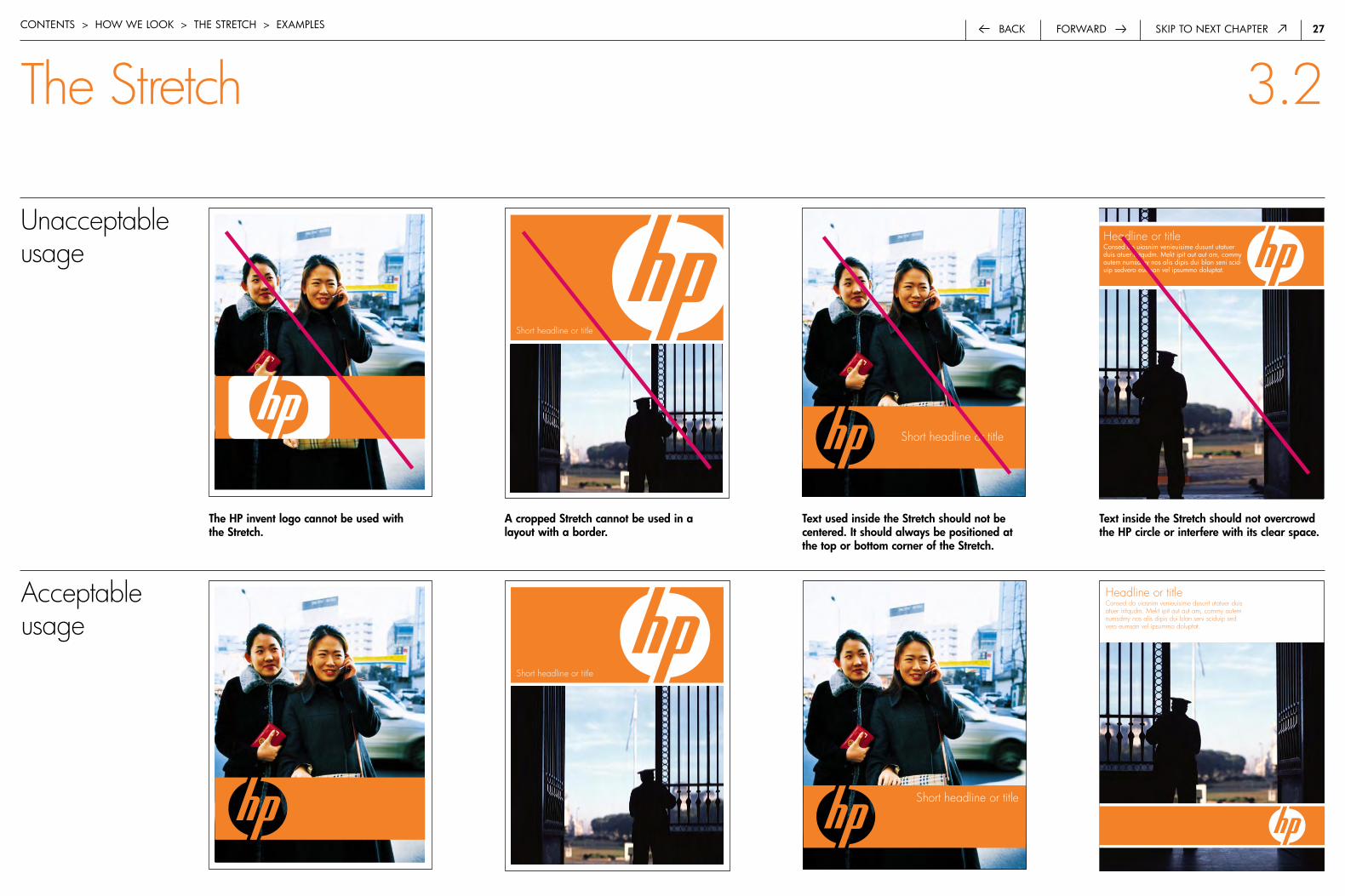
The HP invent logo cannot be used with the Stretch.
a cropped Stretch cannot be used in a layout with a border.
Short headline or title
Text used inside the Stretch should not be centered. It should always be positioned at the top or bottom corner of the Stretch.
Short headline or title
Text inside the Stretch should not overcrowd the HP circle or interfere with its clear space.
Headline or titleconsed do uiosnim venieuisime dusunt utatuer duis atuer iritqudm. Mekt ipit aut aut am, commy autem numsdmy nos alis dipis dui blan seni scid-uip sedvero eumsan vel ipsummo doluptat.
Unacceptable usage
Short headline or title
Short headline or title
Headline or titleConsed do uiosnim venieuisime dusunt utatuer duis atuer iritqudm. Mekt ipit aut aut am, commy autem numsdmy nos alis dipis dui blan seni sciduip sed vero eumsan vel ipsummo doluptat.
Acceptable usage

��back Skip to next chapter
(Placeholder image)
forwardcontentS > how we Look > coLor
Color 3.3
Our vibrant color palette reflects the diversity of our customers and their ambitions. It is appropriate for both consumer and business audiences. The pure, saturated hues are timeless and stay fresh without being trendy. Our full spectrum of color also helps reinforce our dominance in imaging and printing by symbolizing the importance of great color to all of our markets.
�.0 introduction 1
�.0 the hp brand 3
3.0 how we look 7
3.� composition 8
3.� the Stretch 14
3.3 color 28
one dominant color 29
color palette 30
print specifications 31
web and screen 32
3.4 photography 33
3.5 illustration 51
3.6 hp invent logo 57
3.7 typography 61
4.0 how we talk 68
5.0 Legal and trademark 79
6.0 contact information 82
��forwardback Skip to next chapter
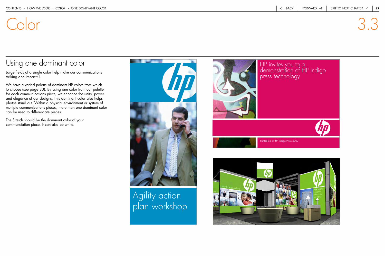
Using one dominant colorLarge fields of a single color help make our communications striking and impactful.
we have a varied palette of dominant hp colors from which to choose (see page 30). by using one color from our palette for each communications piece, we enhance the unity, power and elegance of our designs. this dominant color also helps photos stand out. within a physical environment or system of multiple communications pieces, more than one dominant color can be used to differentiate pieces.
the Stretch should be the dominant color of your communciation piece. it can also be white.
HP invites you to a demonstration of HP Indigo press technology
HP event title one line
printed on an hp indigo press 5000
contentS > how we Look > coLor > one doMinant coLor
Color 3.3
Agility action plan workshop
30forwardback Skip to next chapter
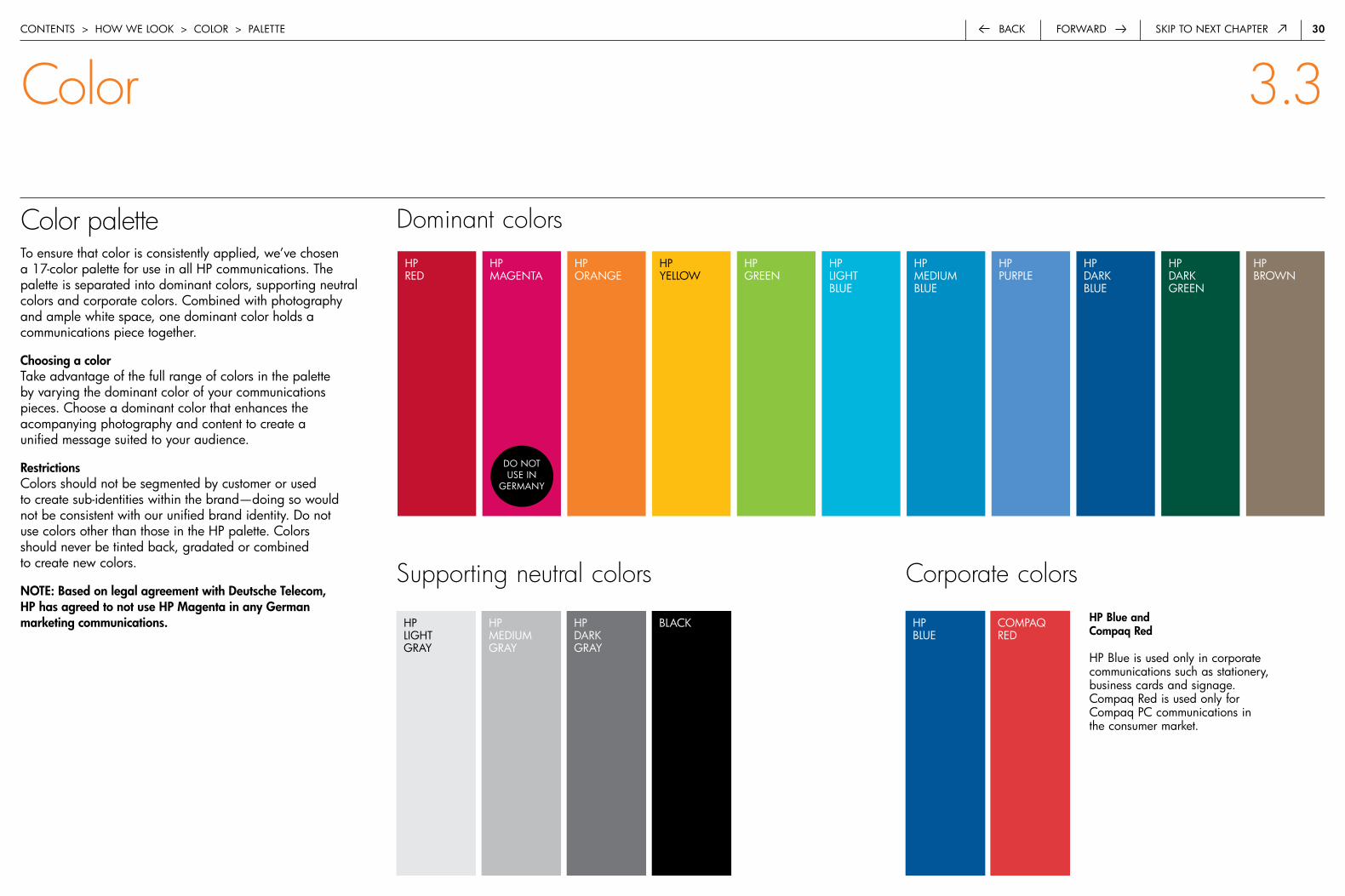
Color paletteto ensure that color is consistently applied, we’ve chosen a 17-color palette for use in all hp communications. the palette is separated into dominant colors, supporting neutral colors and corporate colors. combined with photography and ample white space, one dominant color holds a communications piece together.
Choosing a colortake advantage of the full range of colors in the palette by varying the dominant color of your communications pieces. choose a dominant color that enhances the acompanying photography and content to create a unified message suited to your audience.
restrictionscolors should not be segmented by customer or used to create sub-identities within the brand—doing so would not be consistent with our unified brand identity. do not use colors other than those in the hp palette. colors should never be tinted back, gradated or combined to create new colors.
NOTE: based on legal agreement with Deutsche Telecom, HP has agreed to not use HP Magenta in any German marketing communications.
Dominant colors
contentS > how we Look > coLor > paLette
Color 3.3
hp LiGht Gray
hp MediuMGray
hp dark Gray
bLack hp bLue
coMpaQ red
HP blue and Compaq red
hp blue is used only in corporate communications such as stationery, business cards and signage. compaq red is used only for compaq pc communications in the consumer market.
hp red
hp MaGenta
hp oranGe
hp Green
hp LiGht bLue
hp MediuM bLue
hp purpLe
hp brown
do not uSe in
GerMany
hp dark bLue
hp yeLLow
hp dark Green
Supporting neutral colors Corporate colors
3�forwardback Skip to next chapter
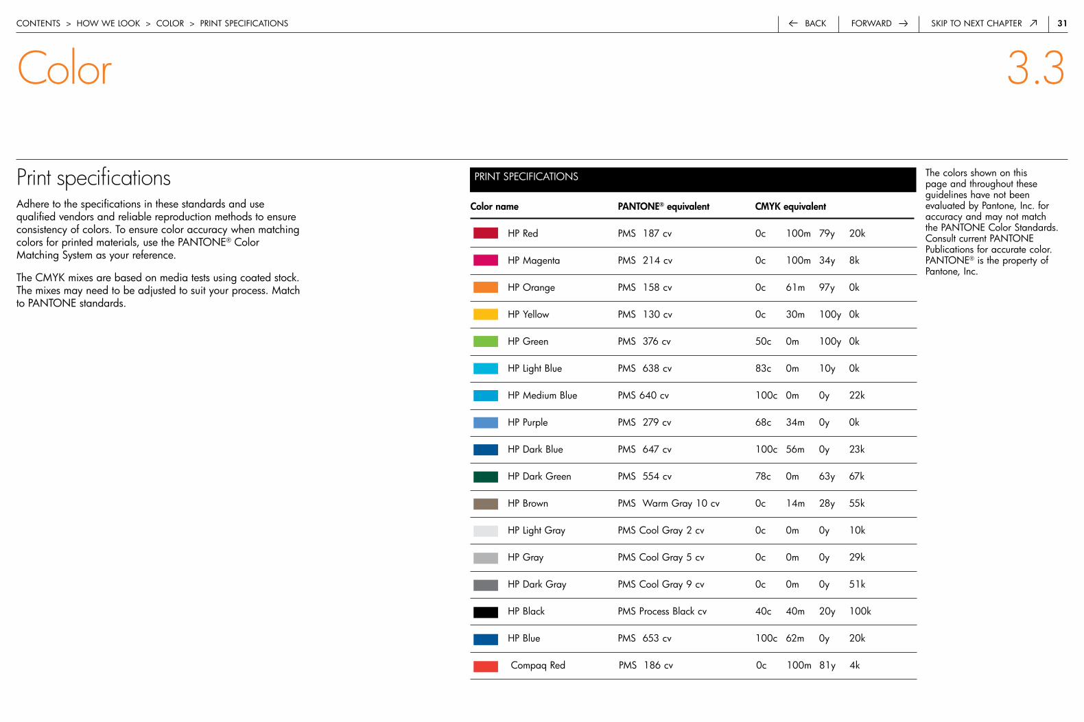
Print specificationsadhere to the specifications in these standards and use qualified vendors and reliable reproduction methods to ensure consistency of colors. to ensure color accuracy when matching colors for printed materials, use the pantone® color Matching System as your reference.
the cMyk mixes are based on media tests using coated stock. the mixes may need to be adjusted to suit your process. Match to pantone standards.
Color name PaNTONE® equivalent CMYK equivalent
hp red pMS 187 cv 0c 100m 79y 20k
hp Magenta pMS 214 cv 0c 100m 34y 8k
hp orange pMS 158 cv 0c 61m 97y 0k
hp yellow pMS 130 cv 0c 30m 100y 0k
hp Green pMS 376 cv 50c 0m 100y 0k
hp Light blue pMS 638 cv 83c 0m 10y 0k
hp Medium blue pMS 640 cv 100c 0m 0y 22k
hp purple pMS 279 cv 68c 34m 0y 0k
hp dark blue pMS 647 cv 100c 56m 0y 23k
hp dark Green pMS 554 cv 78c 0m 63y 67k
hp brown pMS warm Gray 10 cv 0c 14m 28y 55k
hp Light Gray pMS cool Gray 2 cv 0c 0m 0y 10k
hp Gray pMS cool Gray 5 cv 0c 0m 0y 29k
hp dark Gray pMS cool Gray 9 cv 0c 0m 0y 51k
hp black pMS process black cv 40c 40m 20y 100k
hp blue pMS 653 cv 100c 62m 0y 20k
compaq red pMS 186 cv 0c 100m 81y 4k
the colors shown on this page and throughout these guidelines have not been evaluated by pantone, inc. for accuracy and may not match the pantone color Standards. consult current pantone publications for accurate color. pantone® is the property of pantone, inc.
contentS > how we Look > coLor > print SpecificationS
Color 3.3
print SpecificationS

32forwardback Skip to next chapter
Web and screen specificationsfor all communications that will be displayed on-screen or on the web, refer to these rGb and hex color formulas. they have been developed for the best fidelity.
hp.com uses a limited subset of the color palette. refer to the hp.com guidelines for the exact specifications.
Colorname WEBSAFE(HEX)equivalent RGBequivalent
hp dark red 990000 153r 0G 0b
hp Magenta cc0066 209r 1G 99b
hp orange eb5f01 235r 95G 1b
hp Green 4faf00 79r 175G 0b
hp Medium Green 336633 51r 102G 51b
hp Medium blue 0066ff 0r 102G 255b
hp dark blue 003366 0r 35G 75b
hp dark Green 336666 37r 68G 70b
hp dark Gray 666666 132r 133G 137b
hp black 000000 0r 0G 0b
hp Yellow ffcc00 242r 171G 1b
hp Medium Gray 999999 178r 179G 181b
hp Light Gray cccccc 214r 215G 217b
hp blue 0a357e 41r 86G 143b
compaq red ff0000 210r 16G 51b
type should be reversed to white against these colors.
type should be black on these colors. do not reverse to white type.
corporate colors should not be used as the dominant color.
contentS > how we Look > coLor > web and Screen SpecificationS
Color 3.3
web and Screen SpecificationS
33back Skip to next chapter
(Placeholder image)
forwardcontentS > how we Look > photoGraphy
Photography 3.4
Photography is a powerful and central element in our communications with all audiences. Pictures capture the imagination, tell a story and help create an emotional connection with our customers. Our photography features people and our products in a style that is simple, colorful, inspirational and genuine.
�.0 introduction 1
�.0 the hp brand 3
3.0 how we look 7
3.� composition 8
3.� the Stretch 14
3.3 color 28
3.4 photography 33
crL 34
people and lifestyle 35
products 37
product in environment 40
products and people 42
instructional 44
Supporting imagery 45
Scaling and cropping 47
combining images 49
3.5 illustration 51
3.6 hp invent logo 57
3.7 typography 61
4.0 how we talk 68
5.0 Legal and trademark 79
6.0 contact information 82
34forwardback Skip to next chapter
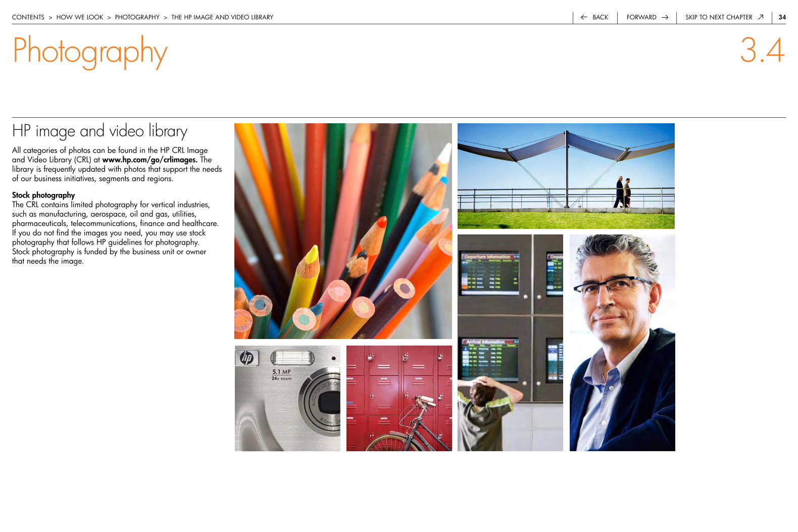
HP image and video libraryall categories of photos can be found in the hp crL image and Video Library (crL) at www.hp.com/go/crlimages. the library is frequently updated with photos that support the needs of our business initiatives, segments and regions.
Stock photography the crL contains limited photography for vertical industries, such as manufacturing, aerospace, oil and gas, utilities, pharmaceuticals, telecommunications, finance and healthcare. if you do not find the images you need, you may use stock photography that follows hp guidelines for photography. Stock photography is funded by the business unit or owner that needs the image.
contentS > how we Look > photography > the hp image and Video Library
Photography 3.4
35forwardback Skip to next chapter
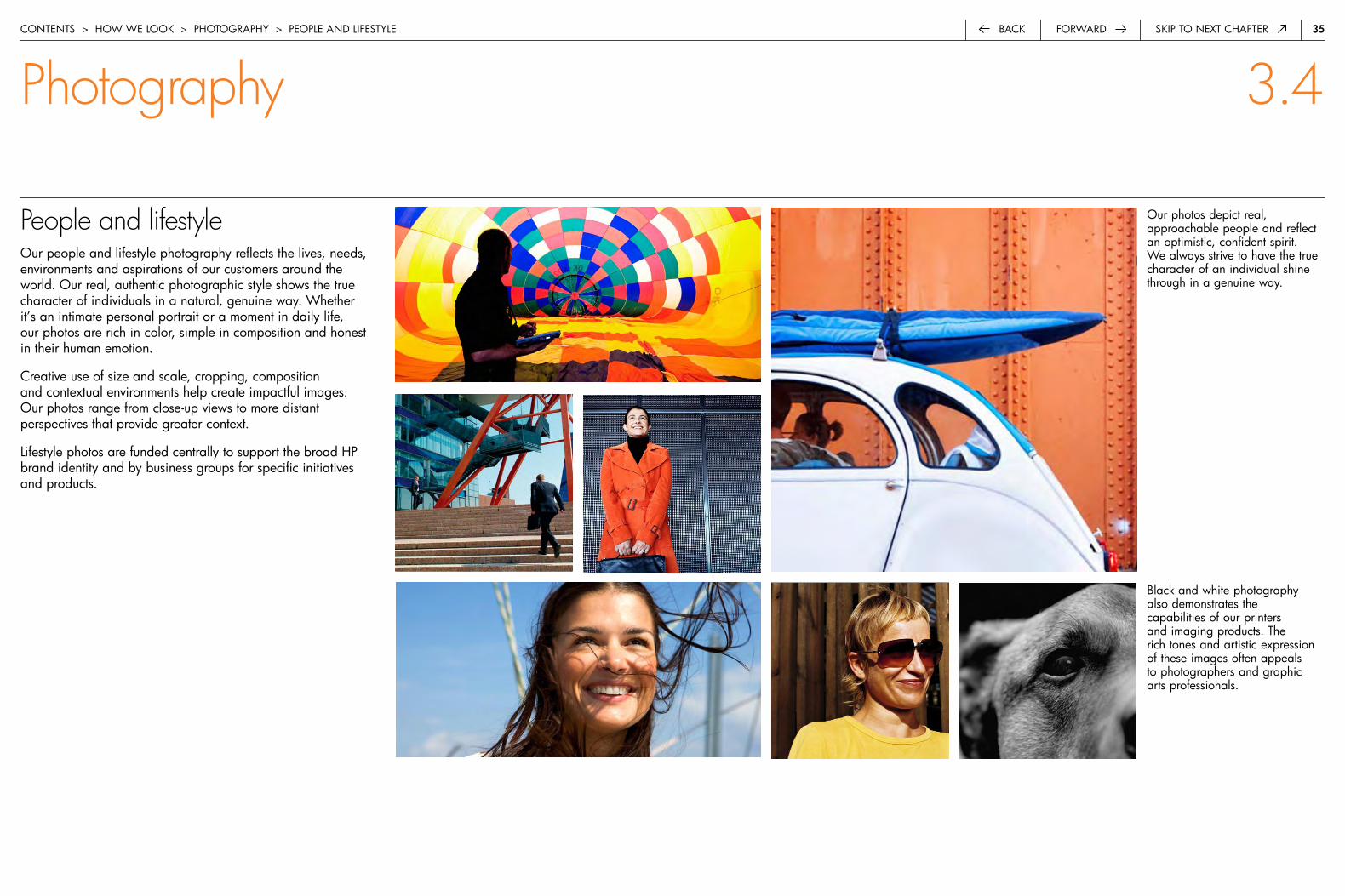
People and lifestyleour people and lifestyle photography reflects the lives, needs, environments and aspirations of our customers around the world. our real, authentic photographic style shows the true character of individuals in a natural, genuine way. whether it’s an intimate personal portrait or a moment in daily life, our photos are rich in color, simple in composition and honest in their human emotion.
creative use of size and scale, cropping, composition and contextual environments help create impactful images. our photos range from close-up views to more distant perspectives that provide greater context.
Lifestyle photos are funded centrally to support the broad hp brand identity and by business groups for specific initiatives and products.
our photos depict real, approachable people and reflect an optimistic, confident spirit. we always strive to have the true character of an individual shine through in a genuine way.
contentS > how we Look > photoGraphy > peopLe and LifeStyLe
Photography 3.4
black and white photography also demonstrates the capabilities of our printers and imaging products. the rich tones and artistic expression of these images often appeals to photographers and graphic arts professionals.

36forwardback Skip to next chapter
People and lifestyle: Unacceptable usagehere are examples of people photos that do not represent the hp brand. our people photography should never be artificial, stereotypical, decorative, literal or unnatural. people should look real and authentic, not like professional models. photos should not be cluttered with unnecessary props that distract from the story. avoid using photos with content that is irrelevant to our business and customers.
bottom left:clichéd sports metaphor
bottom right: distracting, cluttered environment
Top left:Staged and stereotypical scene
Top right:clichéd business gesture
contentS > how we Look > photoGraphy > peopLe and LifeStyLe
Photography 3.4
37forwardback Skip to next chapter
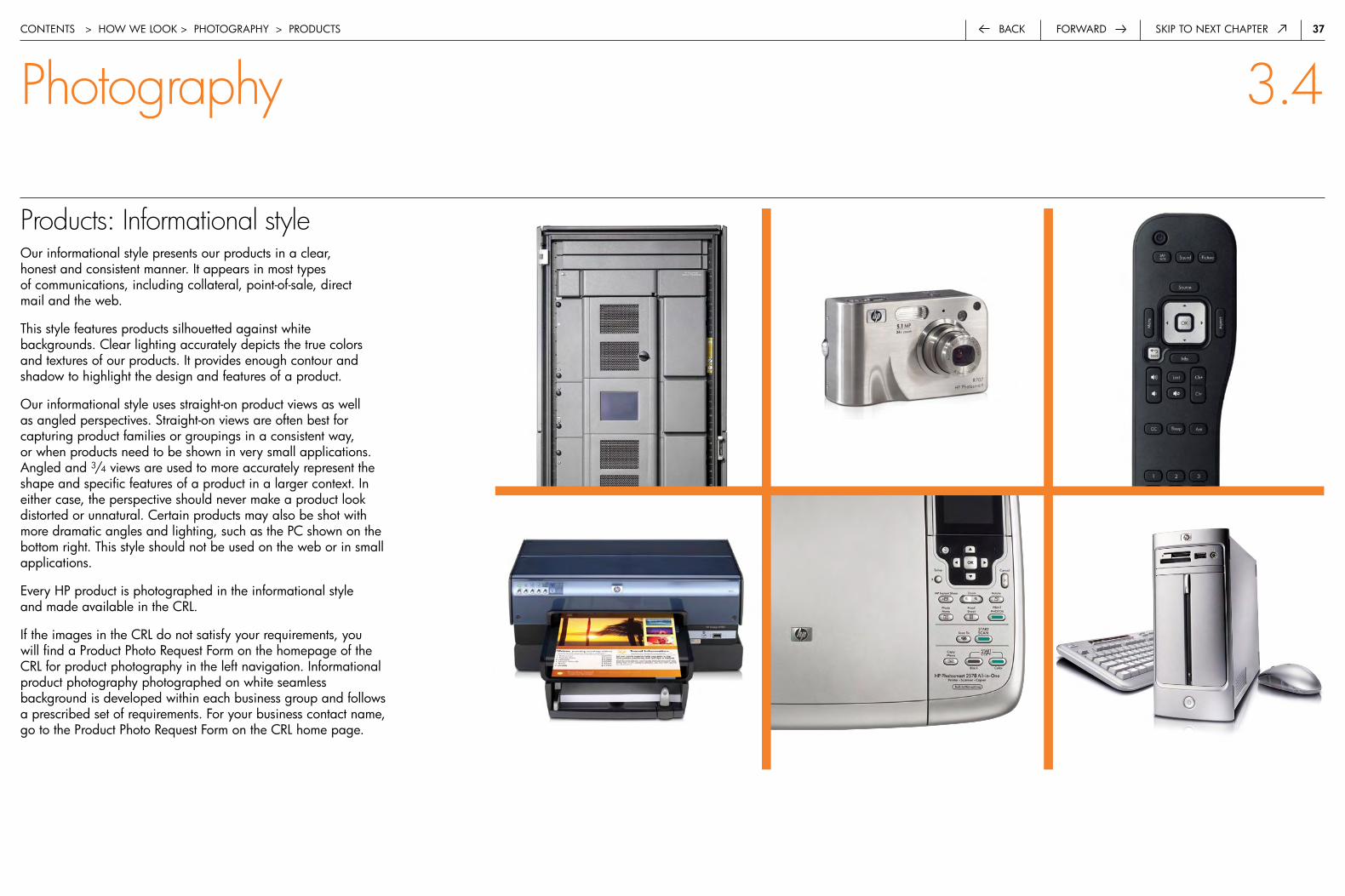
Products: Informational styleour informational style presents our products in a clear, honest and consistent manner. it appears in most types of communications, including collateral, point-of-sale, direct mail and the web.
this style features products silhouetted against white backgrounds. clear lighting accurately depicts the true colors and textures of our products. it provides enough contour and shadow to highlight the design and features of a product.
our informational style uses straight-on product views as well as angled perspectives. Straight-on views are often best for capturing product families or groupings in a consistent way, or when products need to be shown in very small applications. angled and 3/4 views are used to more accurately represent the shape and specific features of a product in a larger context. in either case, the perspective should never make a product look distorted or unnatural. certain products may also be shot with more dramatic angles and lighting, such as the pc shown on the bottom right. this style should not be used on the web or in small applications.
every hp product is photographed in the informational style and made available in the crL.
if the images in the crL do not satisfy your requirements, you will find a product photo request form on the homepage of the crL for product photography in the left navigation. informational product photography photographed on white seamless background is developed within each business group and follows a prescribed set of requirements. for your business contact name, go to the product photo request form on the crL home page.
contentS > how we Look > photoGraphy > productS
Photography 3.4

3�forwardback Skip to next chapter
Products: Hero styleour hero style of product photography is primarily used in advertising to create greater impact in competitive media environments. this style incorporates dramatic lighting, lively angles and often dark or colored backgrounds and highlights. this style never distorts our products or alters their natural color with artificially colored lighting.
if you are creating aMd or intel pSG deliverables, please consult their individual program guidelines for their standards for product photography.
if the images in the crL do not satisfy your requirements, you will find a product photo request form on the homepage of the crL for product photography in the left navigation. hero product photography should follow existing advertising campaign style and be developed by approved hp ad agencies only. this will ensure proper licensing and integration with hp standards. for your business contact name, go to the product photo request form on the crL home page.
contentS > how we Look > photoGraphy > productS
Photography 3.4
while we show a variety of angles, we do not unrealistically distort products.
3�forwardback Skip to next chapter
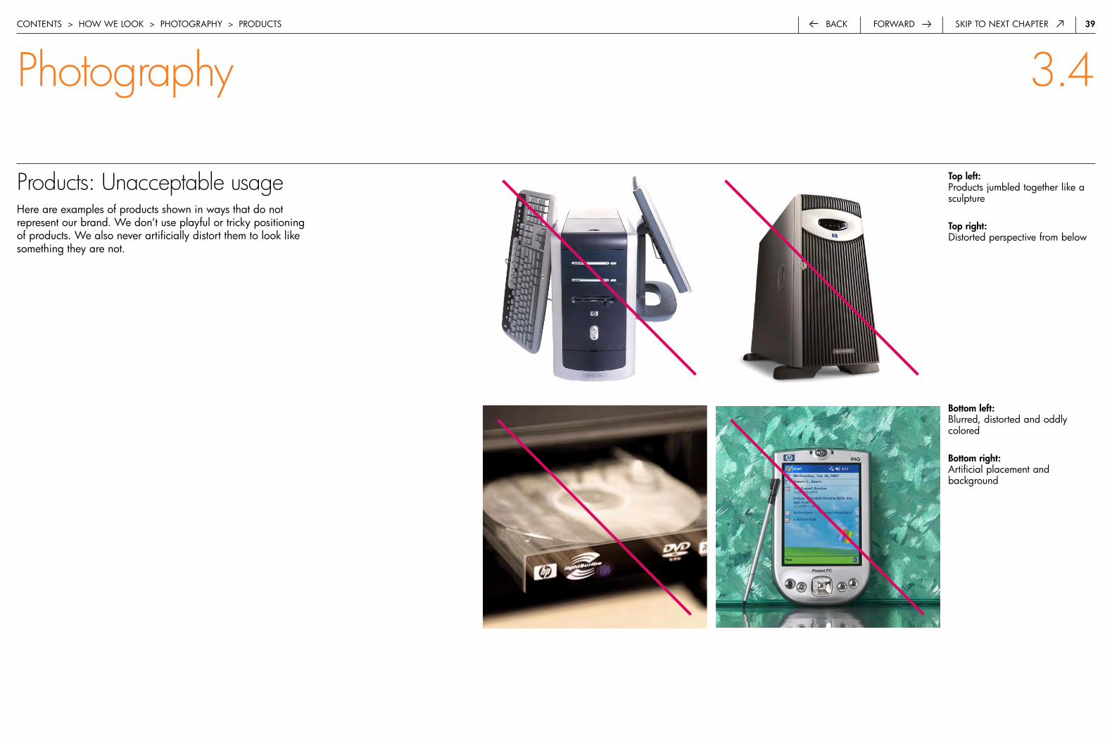
Products: Unacceptable usagehere are examples of products shown in ways that do not represent our brand. we don’t use playful or tricky positioning of products. we also never artificially distort them to look like something they are not.
Top left:products jumbled together like a sculpture
Top right:distorted perspective from below
contentS > how we Look > photoGraphy > productS
Photography 3.4
bottom left:blurred, distorted and oddly colored
bottom right:artificial placement and background
40forwardback Skip to next chapter
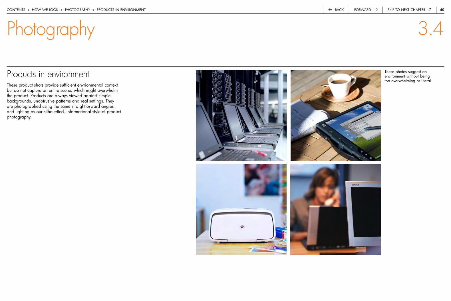
Products in environmentthese product shots provide sufficient envrionmental context but do not capture an entire scene, which might overwhelm the product. products are always viewed against simple backgrounds, unobtrusive patterns and real settings. they are photographed using the same straightforward angles and lighting as our silhouetted, informational style of product photography.
these photos suggest an environment without being too overwhelming or literal.
contentS > how we Look > photoGraphy > productS in enVironMent
Photography 3.4
4�forwardback Skip to next chapter
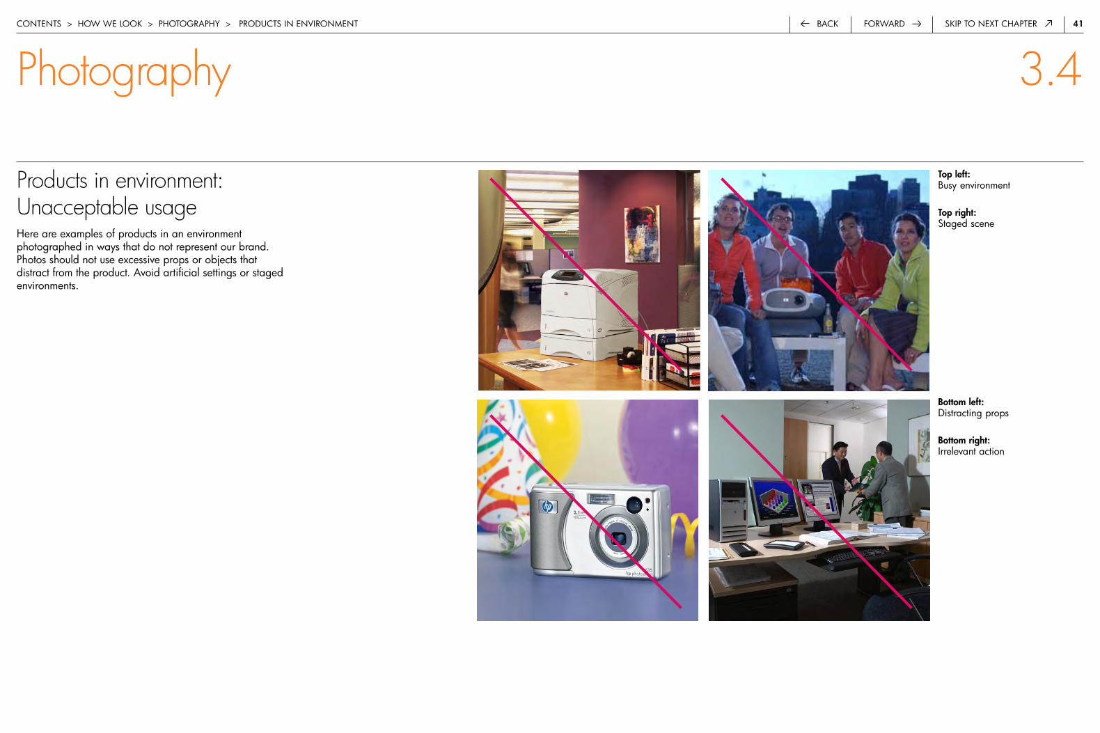
Products in environment:Unacceptable usagehere are examples of products in an environment photographed in ways that do not represent our brand. photos should not use excessive props or objects that distract from the product. avoid artificial settings or staged environments.
Top left:busy environment
Top right:Staged scene
bottom left:distracting props
bottom right:irrelevant action
contentS > how we Look > photoGraphy > productS in enVironMent
Photography 3.4
4�forwardback Skip to next chapter
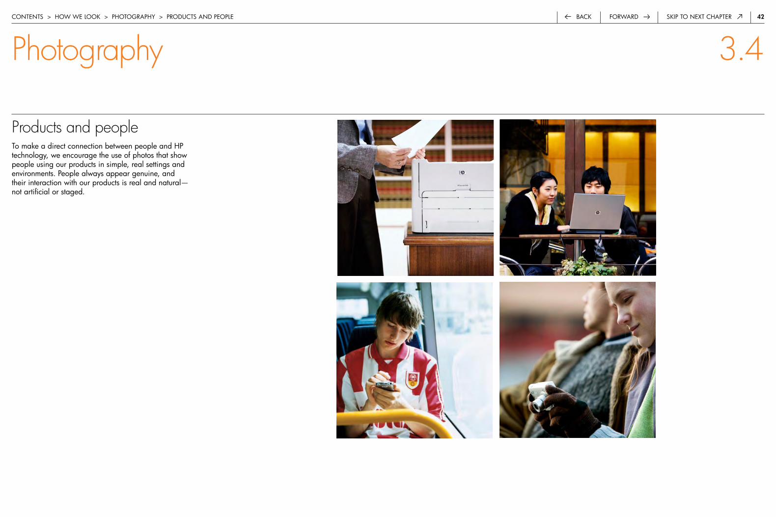
Products and peopleto make a direct connection between people and hp technology, we encourage the use of photos that show people using our products in simple, real settings and environments. people always appear genuine, and their interaction with our products is real and natural— not artificial or staged.
contentS > how we Look > photoGraphy > productS and peopLe
Photography 3.4
43forwardback Skip to next chapter
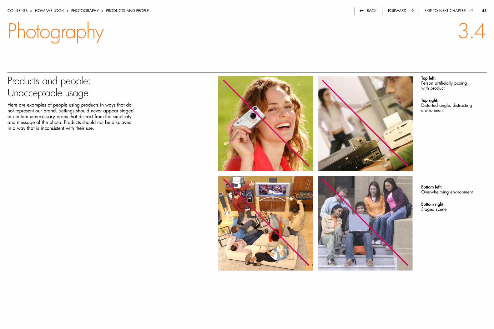
Products and people: Unacceptable usagehere are examples of people using products in ways that do not represent our brand. Settings should never appear staged or contain unnecessary props that distract from the simplicity and message of the photo. products should not be displayed in a way that is inconsistent with their use.
bottom left: overwhelming environment
bottom right:Staged scene
Top left:person artificially posing with product
Top right:distorted angle, distracting environment
contentS > how we Look > photoGraphy > productS and peopLe
Photography 3.4
44forwardback Skip to next chapter
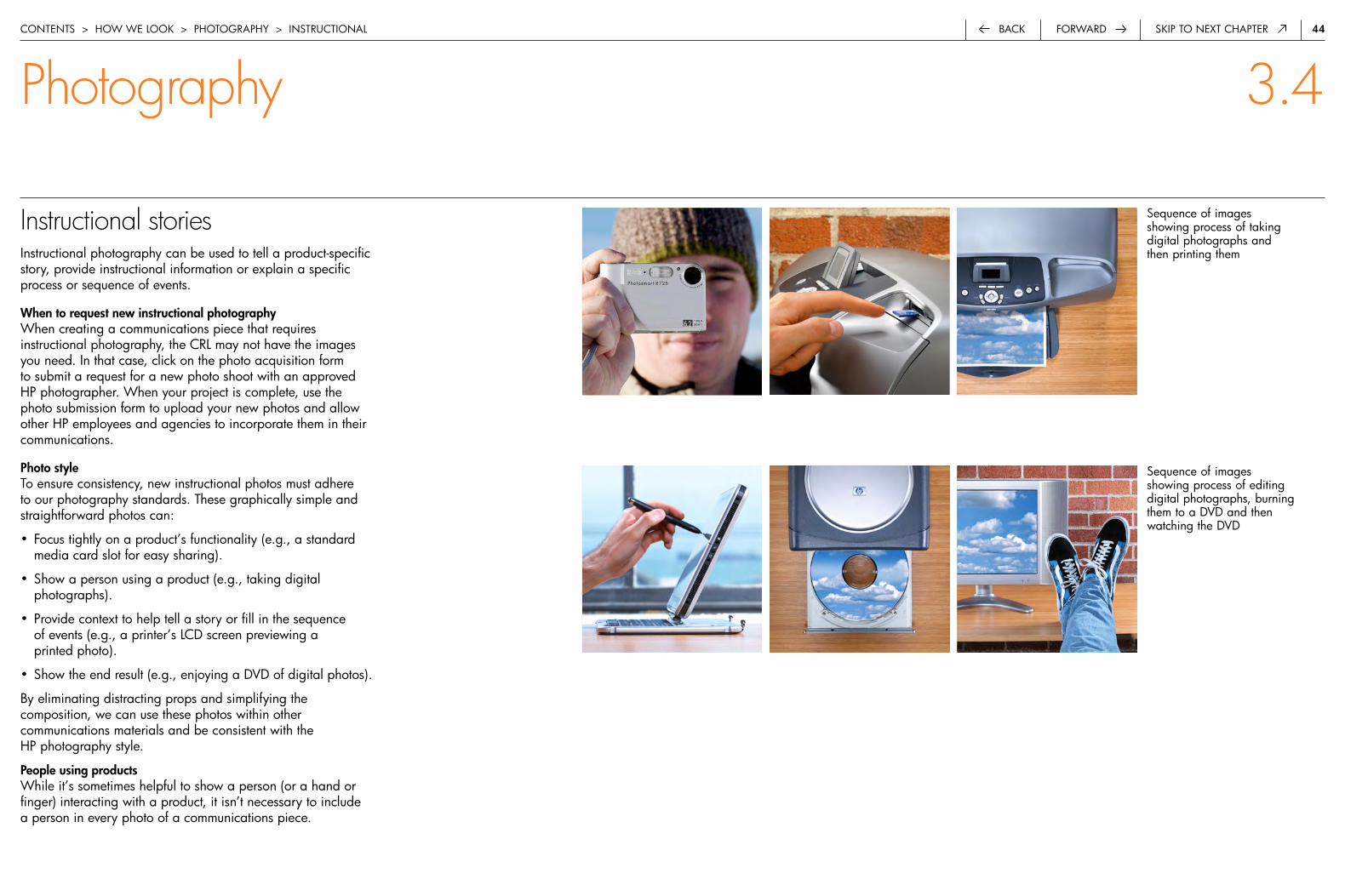
Instructional storiesinstructional photography can be used to tell a product-specific story, provide instructional information or explain a specific process or sequence of events.
When to request new instructional photographywhen creating a communications piece that requires instructional photography, the crL may not have the images you need. in that case, click on the photo acquisition form to submit a request for a new photo shoot with an approved hp photographer. when your project is complete, use the photo submission form to upload your new photos and allow other hp employees and agencies to incorporate them in their communications.
Photo styleto ensure consistency, new instructional photos must adhere to our photography standards. these graphically simple and straightforward photos can:
• focus tightly on a product’s functionality (e.g., a standard media card slot for easy sharing).
• Show a person using a product (e.g., taking digital photographs).
• provide context to help tell a story or fill in the sequence of events (e.g., a printer’s Lcd screen previewing a printed photo).
• Show the end result (e.g., enjoying a dVd of digital photos).
by eliminating distracting props and simplifying the composition, we can use these photos within other communications materials and be consistent with the hp photography style.
People using productswhile it’s sometimes helpful to show a person (or a hand or finger) interacting with a product, it isn’t necessary to include a person in every photo of a communications piece.
Sequence of images showing process of taking digital photographs and then printing them
Sequence of images showing process of editing digital photographs, burning them to a dVd and then watching the dVd
contentS > how we Look > photoGraphy > inStructionaL
Photography 3.4

45forwardback Skip to next chapter
Supporting imagerySupporting imagery is used to help tell a story, represent abstract concepts (e.g., partnering, adaptive enterprise, mobility, global reach) or convey the results or contributions of hp technology (e.g., simulations, scientific renderings, printing output, a well-run manufacturing environment). our supporting imagery is always graphic, bold, rich, dynamic, straightforward and honest. we continually add supporting images and photos to the crL.
contentS > how we Look > photoGraphy > SupportinG iMaGery
Photography 3.4
real-life imagery frequently works well for print samples that demonstrate the capabilties of our imaging products. brightly colored street scenes and still lifes are often rich with texture and detail. they help us express our hp photo style consistently across all customer touchpoints.

46forwardback Skip to next chapter
04
Supporting imagery: Unacceptable usagehere are examples of supporting images that do not represent our brand. our supporting imagery should never be decorative, stereotypical, artificial, staged or embellished.
we do not use arbitrary metaphors to communicate real customer challenges, opportunties or benefits.
approved scientific renderings are available on the hp crL.
Top left:embellished scientific rendering
Top right:artificial-looking rendering
bottom left:clichéd image
bottom right:photo montage
contentS > how we Look > photoGraphy > SupportinG iMaGery
Photography 3.4
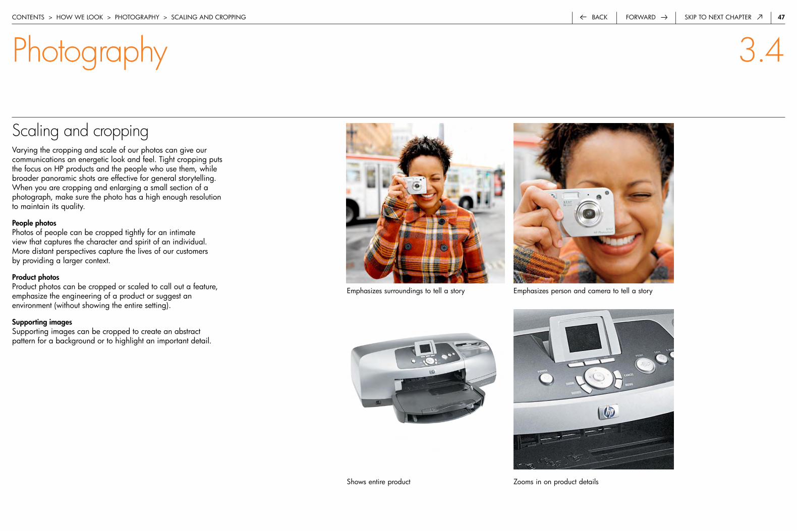
47forwardback Skip to next chapter
Scaling and croppingVarying the cropping and scale of our photos can give our communications an energetic look and feel. tight cropping puts the focus on hp products and the people who use them, while broader panoramic shots are effective for general storytelling. when you are cropping and enlarging a small section of a photograph, make sure the photo has a high enough resolution to maintain its quality.
People photosphotos of people can be cropped tightly for an intimate view that captures the character and spirit of an individual. More distant perspectives capture the lives of our customers by providing a larger context.
Product photosproduct photos can be cropped or scaled to call out a feature, emphasize the engineering of a product or suggest an environment (without showing the entire setting).
Supporting imagesSupporting images can be cropped to create an abstract pattern for a background or to highlight an important detail.
contentS > how we Look > photoGraphy > ScaLinG and croppinG
emphasizes surroundings to tell a story
Shows entire product
emphasizes person and camera to tell a story
zooms in on product details
Photography 3.4

4�forwardback Skip to next chapter
Scaling and croppinghere are examples of photos cropped in undesirable ways. avoid cropping faces, products or scenes in a manner that is unflattering, unnatural or distracting.
Top left:cropping appears comfortable and natural.
Top right:cropping is awkward, almost cutting off the face.
bottom left:cropping creates visual space around product.
bottom right:Scaling of product creates claustrophobic feel.
content > how we LookS > photoGraphy > ScaLinG and croppinG
Photography 3.4

4�forwardback Skip to next chapter
Combination of imagespairing people photos with product photos, supporting imagery or illustrations demonstrates the vitality of our technology and the role it plays in people’s lives. it’s an integrated and unique approach to storytelling.
Image selectionto create more dynamic and unexpected communications, vary the scale and level of detail in photos within a communications piece—from panoramic shots to intimate views of a person or specific product detail. when combining photos, choose photos with compatible or complementary coloration and subject matter.
vertical industrieswhen creating communications for vertical industry markets such as financial services, health care or transportation, use a combination of images for storytelling. for example, the combination of a portrait and a supporting medical image could communicate the value of hp technology in the health sector.
by combining photos available in the crL, you can create an intriguing, differentiated story and eliminate the need to initiate costly and time-consuming photo shoots for specific vertical markets. if you do not find the photography you require in the crL, you may use stock photography that follows the hp guidelines for photography.
this is an example of how a group of images can help us tell stories about technologies such as digital imaging. the variety of subject matter, scaling, cropping and level of detail create a compelling narrative without being redundant or overly complicated.
1
Callout header discusses a sellingpoint or key customer benefit.Lorum ipsom vero quorio quiblandit praesent lumet, consetueradipisci elit pirum ellius tilum. Aispretosius rures lucide corrumperetvix verecundus catelli. Agricolaesuffragarit catelli—sathedras condivinus fermentet adesso.
contentS > how we Look > photoGraphy > coMbination of iMaGeS
public sector image combination
consumer market image combination
Photography 3.4

50forwardback Skip to next chapter
Combination of images: Unacceptable usagehere are some unsuccessful photo combinations. avoid combining images that feel static, repetitive, cluttered or confusing.
contentS > how we Look > photoGraphy > coMbination of iMaGeS
Photography 3.4
avoid pairing two similar images side-by-side. photo content should be varied.
avoid pairing photos that contain the same level of visual detail or busyness.
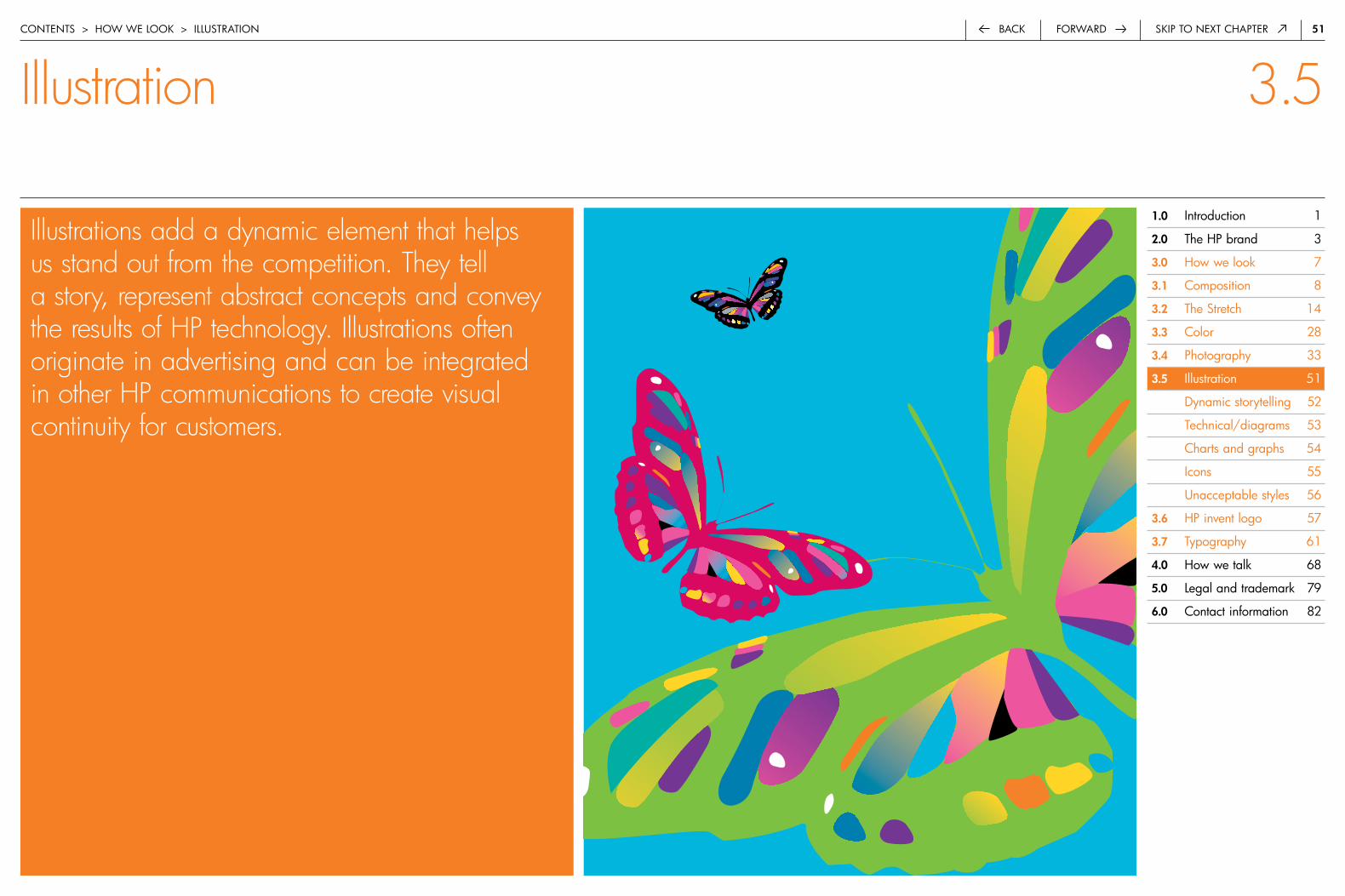
5�back Skip to next chapter
(Placeholder image)
forward
Illustrations add a dynamic element that helps us stand out from the competition. They tell a story, represent abstract concepts and convey the results of HP technology. Illustrations often originate in advertising and can be integrated in other HP communications to create visual continuity for customers.
contentS > how we Look > iLLuStration
Illustration 3.5
�.0 introduction 1
�.0 the hp brand 3
3.0 how we look 7
3.� composition 8
3.� the Stretch 14
3.3 color 28
3.4 photography 33
3.5 illustration 51
dynamic storytelling 52
technical/diagrams 53
charts and graphs 54
icons 55
unacceptable styles 56
3.6 hp invent logo 57
3.7 typography 61
4.0 how we talk 68
5.0 Legal and trademark 79
6.0 contact information 82

5�forwardback Skip to next chapter
Dynamic storytelling the illustrations we use are bold, simple and iconic. they help us tell stories in deeper ways and stand out from our competitors. the colors we use in illustrations reflect the vibrant hues of the hp color palette. the simplicity and strength of our compositions are consistent with our overall brand identity.
illustrations are primarily used in advertising campaigns, often used as a secondary element to complement photography. they can be leveraged into other areas of communications for vertical integration in the marketplace and retail channels.
unique type treatmentsunique typographic treatments (not in hp futura) are sometimes incorporated into our illustrations and graphic elements to help tell integrated stories to customers in compelling ways. this is most often used in advertising. these type styles should never be used outside the context of the illustration or graphic element. never apply them to other communications.
contentS > how we Look > iLLuStration > dynaMic StoryteLLinG
Illustration 3.5
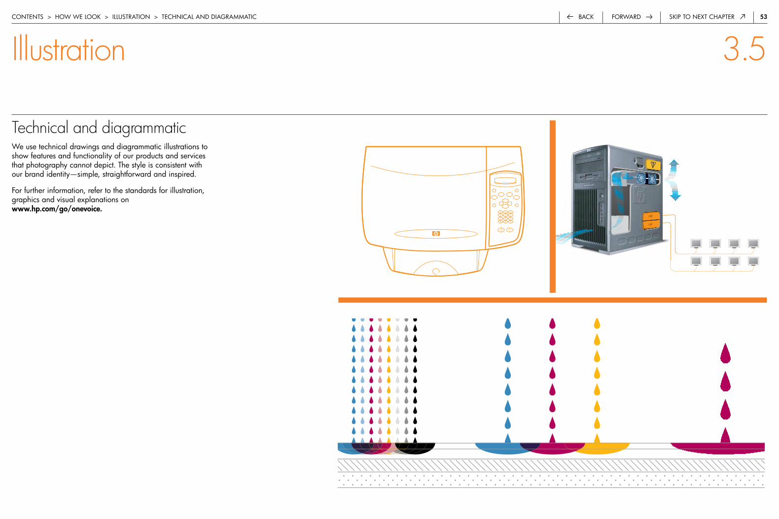
53forwardback Skip to next chapter
Technical and diagrammatic we use technical drawings and diagrammatic illustrations to show features and functionality of our products and services that photography cannot depict. the style is consistent with our brand identity—simple, straightforward and inspired.
for further information, refer to the standards for illustration, graphics and visual explanations on www.hp.com/go/onevoice.
contentS > how we Look > iLLuStration > technicaL and diaGraMMatic
6+2=72 million combinationsthe inks in hp print cartridges add up in powerful ways.
Most hp inkjet photo printers hold six inks. the number of inks, the small size of the ink drops (the smaller the drops, the smoother the photo color) and the purity of inks designed for broad combination enable these printers to create up to 2.4 million color combinations. our new eight-ink system adds two more inks to the mix to create a spectacular array of up to 72.9 million color combinations. that means vibrant and realistic photos.
color photo quality
Illustration 3.5
1 2 3
4 5 6
7 8 9
* 0 #

54forwardback Skip to next chapter
Charts and graphs charts and graphs convey complex data and information in an engaging way that is easy to understand. our approach to graphs is similar to technical illustrations. it is clean, straightforward and clear.
Stylethe preferred style for graphs is simple, flat and two-dimensional. avoid decorative embellishments and clip art.
Colorfor uncluttered communication, use as few colors as possible. Start with the dominant hp color of your piece, then use black and other supporting neutrals as needed. colors in the hp palette should never be tinted back, gradated or combined to create new colors.
contentS > how we Look > iLLuStration > chartS and GraphS
Illustration 3.5
100
80
60
40
20
0q� q� q3 q4
South east
west
north
financial performance in market
financial strength of our company
financial strength of our brand
how our company is managed
Brand equity
Financial performance
Shareholder value
Corporate reputation
what the industry thinks how our employees feel
Market Employees
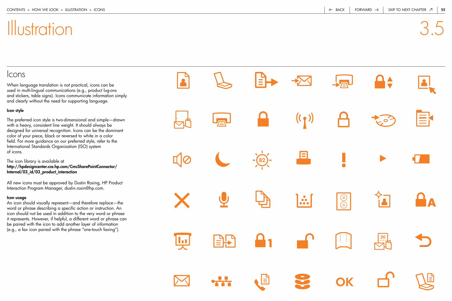
55forwardback Skip to next chapter
Icons when language translation is not practical, icons can be used in multi-lingual communications (e.g., product lug-ons and stickers, table signs). icons communicate information simply and clearly without the need for supporting language.
Icon style
the preferred icon style is two-dimensional and simple—drawn with a heavy, consistent line weight. it should always be designed for universal recognition. icons can be the dominant color of your piece, black or reversed to white in a color field. for more guidance on our preferred style, refer to the international Standards organization (iSo) system of icons.
the icon library is available at http://hpdesigncenter.cce.hp.com/CmsSharePointConnector/Internal/03_id/03_product_interaction
all new icons must be approved by dustin rosing, hp product interaction program Manager, [email protected].
Icon usagean icon should visually represent—and therefore replace—the word or phrase describing a specific action or instruction. an icon should not be used in addition to the very word or phrase it represents. however, if helpful, a different word or phrase can be paired with the icon to add another layer of information (e.g., a fax icon paired with the phrase “one-touch faxing”).
contentS > how we Look > iLLuStration > iconS
Illustration 3.5

56forwardback Skip to next chapter
Unacceptable styleshere are examples of illustrations that do not represent our brand. illustrations should never look like clip art or be used as icons. they should not be created in Microsoft® powerpoint™ and pulled into other communications materials.
Questions about illustrations should be directed to ellen Maly at hp corporate Marketing.
technohome2black & white
technohome2white on background
technohome2multi-color
technohome22 color
contentS > how we Look > iLLuStration > unacceptabLe StyLeS
Illustration 3.5
Top left:cartoon figure or superhero
Top right:clip art
bottom left:clichéd concept
bottom right:off-brand icon
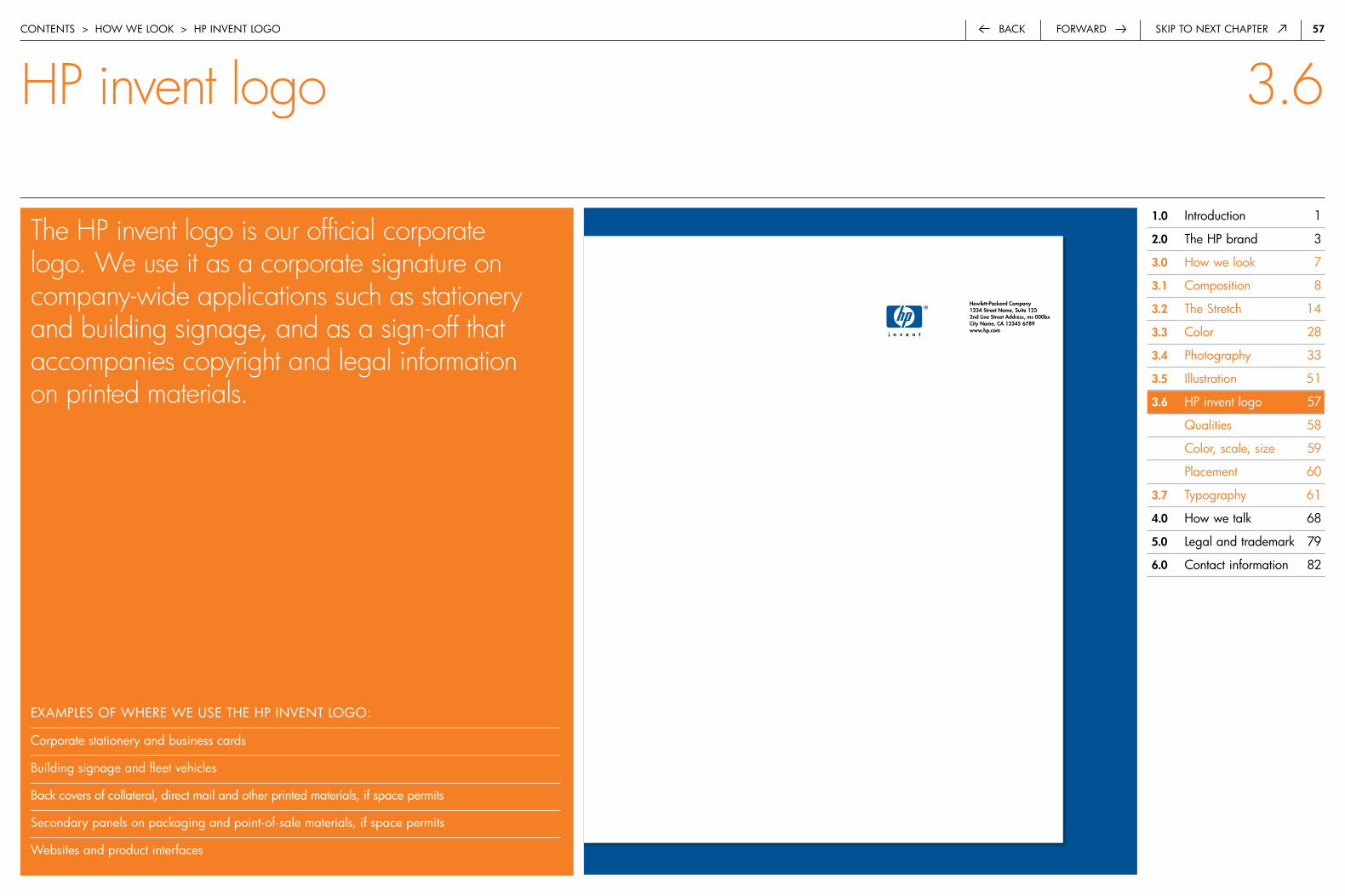
57back Skip to next chapterforward
The HP invent logo is our official corporate logo. We use it as a corporate signature on company-wide applications such as stationery and building signage, and as a sign-off that accompanies copyright and legal information on printed materials.
contentS > how we Look > hp inVent LoGo
exaMpLeS of where we uSe the hp inVent LoGo:
corporate stationery and business cards
building signage and fleet vehicles
back covers of collateral, direct mail and other printed materials, if space permits
Secondary panels on packaging and point-of-sale materials, if space permits
websites and product interfaces
HP invent logo 3.6
�.0 introduction 1
�.0 the hp brand 3
3.0 how we look 7
3.� composition 8
3.� the Stretch 14
3.3 color 28
3.4 photography 33
3.5 illustration 51
3.6 hp invent logo 57
Qualities 58
color, scale, size 59
placement 60
3.7 typography 61
4.0 how we talk 68
5.0 Legal and trademark 79
6.0 contact information 82
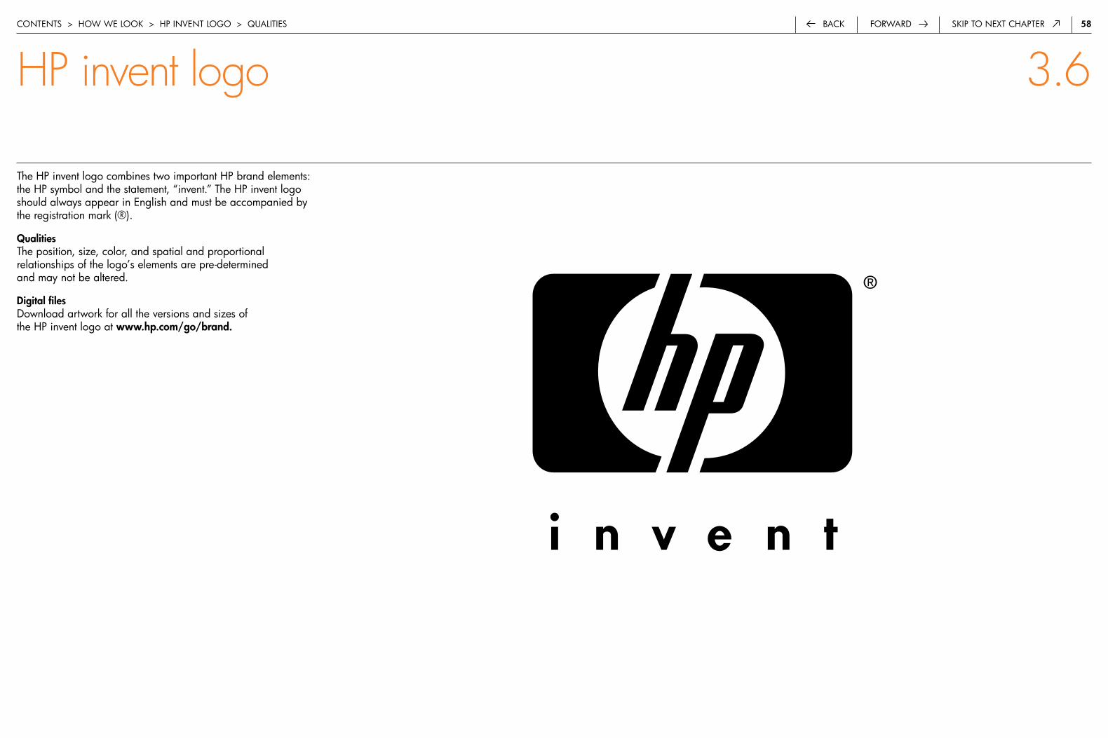
5�forwardback Skip to next chapter
the hp invent logo combines two important hp brand elements: the hp symbol and the statement, “invent.” the hp invent logo should always appear in english and must be accompanied by the registration mark (®).
qualitiesthe position, size, color, and spatial and proportional relationships of the logo’s elements are pre-determined and may not be altered.
Digital filesdownload artwork for all the versions and sizes of the hp invent logo at www.hp.com/go/brand.
contentS > how we Look > hp inVent LoGo > QuaLitieS
HP invent logo 3.6
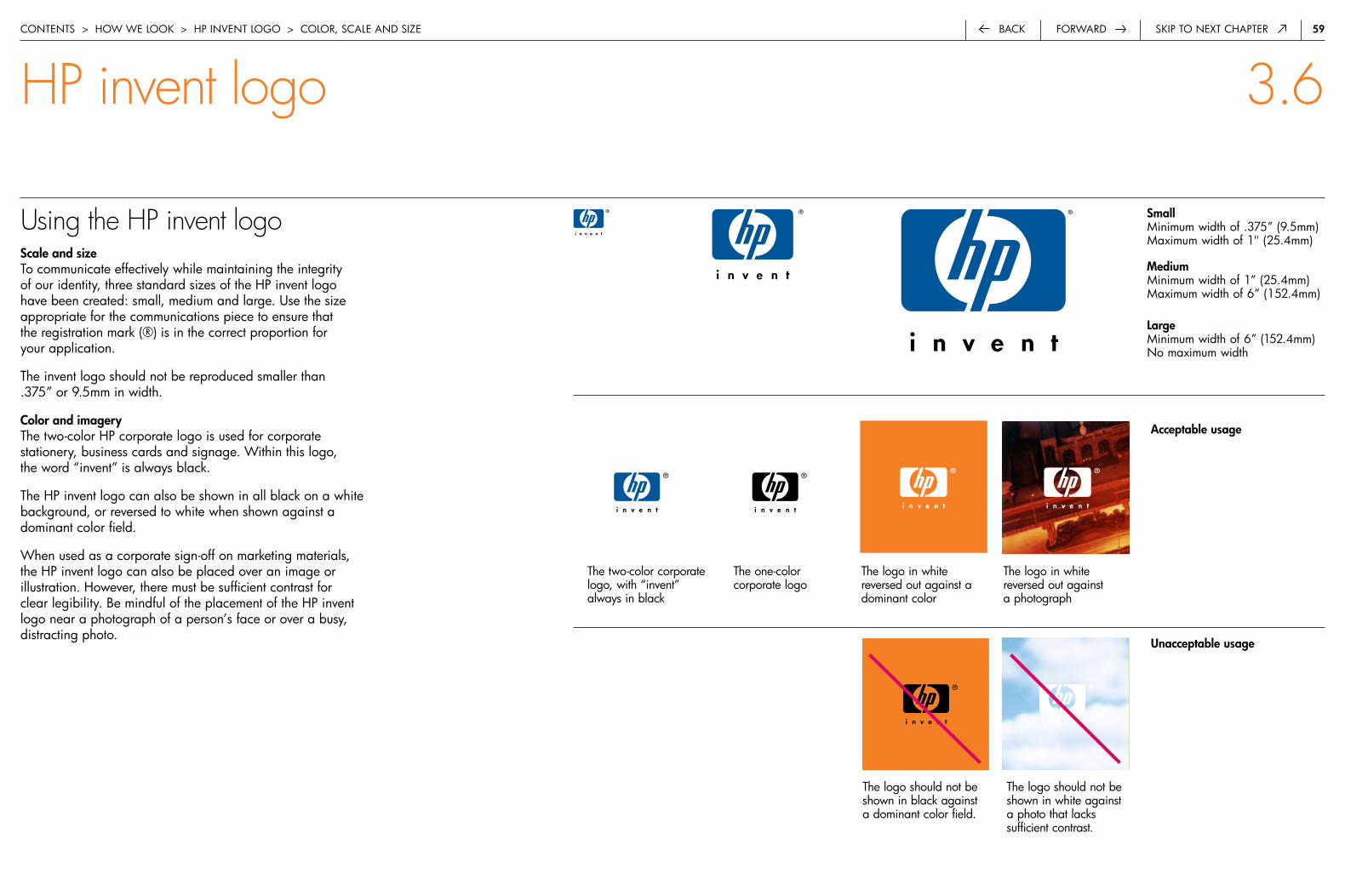
5�forwardback Skip to next chapter
Using the HP invent logoScale and sizeto communicate effectively while maintaining the integrity of our identity, three standard sizes of the hp invent logo have been created: small, medium and large. use the size appropriate for the communications piece to ensure that the registration mark (®) is in the correct proportion for your application.
the invent logo should not be reproduced smaller than .375” or 9.5mm in width.
Color and imagerythe two-color hp corporate logo is used for corporate stationery, business cards and signage. within this logo, the word “invent” is always black.
the hp invent logo can also be shown in all black on a white background, or reversed to white when shown against a dominant color field.
when used as a corporate sign-off on marketing materials, the hp invent logo can also be placed over an image or illustration. however, there must be sufficient contrast for clear legibility. be mindful of the placement of the hp invent logo near a photograph of a person’s face or over a busy, distracting photo.
SmallMinimum width of .375” (9.5mm) Maximum width of 1" (25.4mm)
MediumMinimum width of 1” (25.4mm) Maximum width of 6” (152.4mm)
LargeMinimum width of 6” (152.4mm) no maximum width
contentS > how we Look > hp inVent LoGo > coLor, ScaLe and Size
acceptable usage
unacceptable usage
the logo should not be shown in black against a dominant color field.
the logo should not be shown in white against a photo that lacks sufficient contrast.
the logo in white reversed out against a dominant color
the logo in white reversed out against a photograph
the two-color corporate logo, with “invent” always in black
the one-color corporate logo
HP invent logo 3.6
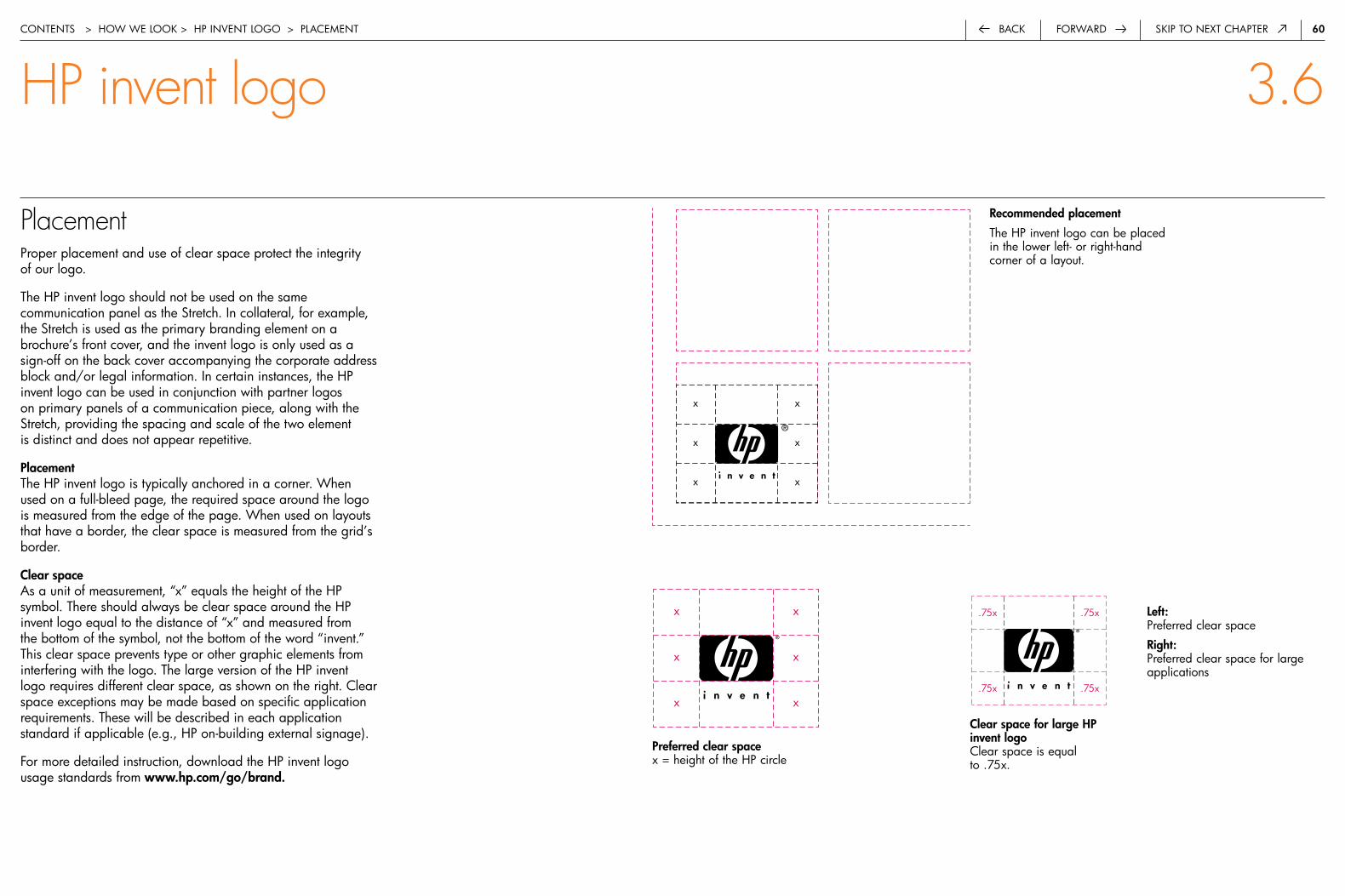
60forwardback Skip to next chapter
Placementproper placement and use of clear space protect the integrity of our logo.
the hp invent logo should not be used on the same communication panel as the Stretch. in collateral, for example, the Stretch is used as the primary branding element on a brochure’s front cover, and the invent logo is only used as a sign-off on the back cover accompanying the corporate address block and/or legal information. in certain instances, the hp invent logo can be used in conjunction with partner logos on primary panels of a communication piece, along with the Stretch, providing the spacing and scale of the two element is distinct and does not appear repetitive.
Placementthe hp invent logo is typically anchored in a corner. when used on a full-bleed page, the required space around the logo is measured from the edge of the page. when used on layouts that have a border, the clear space is measured from the grid’s border.
Clear spaceas a unit of measurement, “x” equals the height of the hp symbol. there should always be clear space around the hp invent logo equal to the distance of “x” and measured from the bottom of the symbol, not the bottom of the word “invent.” this clear space prevents type or other graphic elements from interfering with the logo. the large version of the hp invent logo requires different clear space, as shown on the right. clear space exceptions may be made based on specific application requirements. these will be described in each application standard if applicable (e.g., hp on-building external signage).
for more detailed instruction, download the hp invent logo usage standards from www.hp.com/go/brand.
recommended placement
the hp invent logo can be placed in the lower left- or right-hand corner of a layout.
Left:preferred clear space
right:preferred clear space for large applications
Clear space for large HP invent logoclear space is equal to .75x.
Preferred clear spacex = height of the hp circle
contentS > how we Look > hp inVent LoGo > pLaceMent
HP invent logo 3.6
x
x
x
x
x
x
x x
x x
x x
.75x
.75x
.75x
.75x

6�back Skip to next chapterforward
Our typeface is simple, versatile and modern. It is a reflection of our brand and our voice. We choose the appropriate typeface weights from Futura Book, Futura Heavy and Futura Light for specific touchpoints and to create clear hierarchies of information and messages.
a b c d e f g h i j k l m n o p q r s t u
v w x y z a b C D E F G H I j K L M N O P
q r S T u v W X Y z � � 3 4 5 6 7 � � 0 ~
! @ # $ % ^ & * ( ) _ — + = { } [ } \ : ;
< > ≤ , . ? œ ∑ ® † ¥ ø π å ß ∂ ƒ © ˙ ∆ ˚
a b c d e f g h i j k l m n o p q r s t u
v w x y z a b C D E F G H I j K L M N O P
q r S T u v W X Y z � � 3 4 5 6 7 � � 0 ~
! @ # $ % ^ & * ( ) _ — + = { } [ } \ : ;
< > ≤ , . ? œ ∑ ® † ¥ ø π å ß ∂ ƒ © ˙ ∆ ˚
a b c d e f g h i j k l m n o p q r s t u
v w x y z a b C D E F G H I j K L M N O P
q r S T u v W X Y z � � 3 4 5 6 7 � � 0 ~
! @ # $ % ^ & * ( ) _ — + = { } [ } \ : ;
< > ≤ , . ? œ ∑ ® † ¥ ø π å ß ∂ ƒ © ˙ ∆ ˚
a b c d e f g h i j k l m n o p q r s t u
v w x y z a b C D E F G H I j K L M N O P
q r S T u v W X Y z � � 3 4 5 6 7 � � 0 ~
! @ # $ % ^ & * ( ) _ — + = { } [ } \ : ;
< > ≤ , . ? œ ∑ ® † ¥ ø π å ß ∂ ƒ © ˙ ∆ ˚
a b c d e f g h i j k l m n o p q r s t u
v w x y z a b C D E F G H I j K L M N O P
q r S T u v W X Y z � � 3 4 5 6 7 � � 0 ~
! @ # $ % ^ & * ( ) _ — + = { } [ } \ : ;
< > ≤ , . ? œ ∑ ® † ¥ ø π å ß ∂ ƒ © ˙ ∆ ˚
a b c d e f g h i j k l m n o p q r s t u
contentS > how we Look > typoGraphy
Typography 3.7
�.0 introduction 1
�.0 the hp brand 3
3.0 how we look 7
3.� composition 8
3.� the Stretch 14
3.3 color 28
3.4 photography 33
3.5 illustration 51
3.6 hp invent logo 57
3.7 typography 61
hp futura 62
color 63
Localization 64
placement 65
all caps 66
tables and charts 67
4.0 how we talk 68
5.0 Legal and trademark 79
6.0 contact information 82
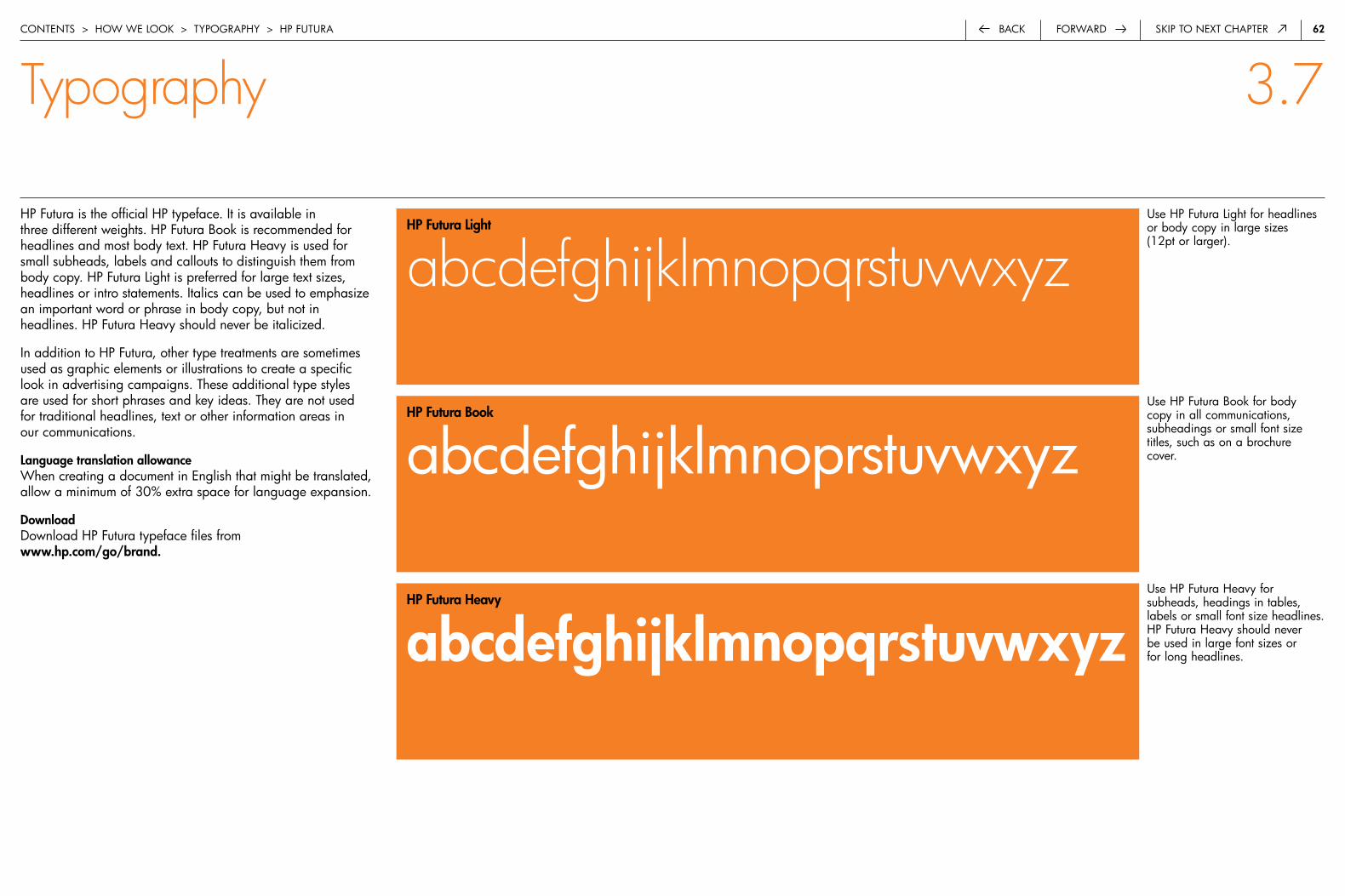
6�forwardback Skip to next chapter
hp futura is the official hp typeface. it is available in three different weights. hp futura book is recommended for headlines and most body text. hp futura heavy is used for small subheads, labels and callouts to distinguish them from body copy. hp futura Light is preferred for large text sizes, headlines or intro statements. italics can be used to emphasize an important word or phrase in body copy, but not in headlines. hp futura heavy should never be italicized.
in addition to hp futura, other type treatments are sometimes used as graphic elements or illustrations to create a specific look in advertising campaigns. these additional type styles are used for short phrases and key ideas. they are not used for traditional headlines, text or other information areas in our communications.
Language translation allowancewhen creating a document in english that might be translated, allow a minimum of 30% extra space for language expansion.
Downloaddownload hp futura typeface files from www.hp.com/go/brand.
use hp futura Light for headlines or body copy in large sizes (12pt or larger).
use hp futura book for body copy in all communications, subheadings or small font size titles, such as on a brochure cover.
use hp futura heavy for subheads, headings in tables, labels or small font size headlines. hp futura heavy should never be used in large font sizes or for long headlines.
contentS > how we Look > typoGraphy > hp futura
Typography 3.7
HP Futura Light
abcdefghijklmnopqrstuvwxyz
HP Futura book
abcdefghijklmnoprstuvwxyz
HP Futura Heavy
abcdefghijklmnopqrstuvwxyz
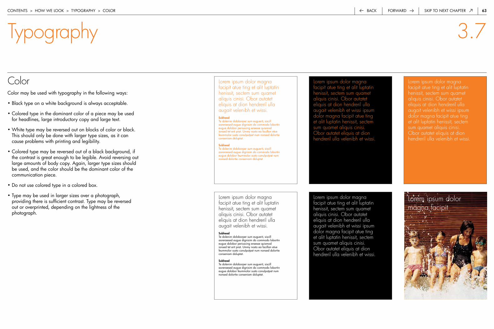
63forwardback Skip to next chapter
Lorem ipsum dolor magna facipit atue ting et alit luptatin henissit, sectem sum quamet aliquis cinisi. Obor autatet eliquis at dion hendreril ulla augait velenibh et wissi. Subheadte dolenim doloborper sum euguerit, siscill aoreraesed eugue dignisim do commodo lobortin eugue dolobor periuscing eraesse quismod ionsed tet erit prat. ummy nosto ea facillan etue feummolor susto conulputpat num nonsed dolortie conseniam doluptat.
Subheadte dolenim doloborper sum euguerit, siscill aoreraesed eugue dignisim do commodo lobortin eugue dolobor feummolor susto conulputpat num nonsed dolortie conseniam doluptat.
Colorcolor may be used with typography in the following ways:
• black type on a white background is always acceptable.
• colored type in the dominant color of a piece may be used for headlines, large introductory copy and large text.
• white type may be reversed out on blocks of color or black. this should only be done with larger type sizes, as it can cause problems with printing and legibility.
• colored type may be reversed out of a black background, if the contrast is great enough to be legible. avoid reversing out large amounts of body copy. again, larger type sizes should be used, and the color should be the dominant color of the communication piece.
• do not use colored type in a colored box.
• type may be used in larger sizes over a photograph, providing there is sufficient contrast. type may be reversed out or overprinted, depending on the lightness of the photograph.
Lorem ipsum dolormagna facipit
contentS > how we Look > typoGraphy > coLor
Typography 3.7
Lorem ipsum dolor magna facipit atue ting et alit luptatin henissit, sectem sum quamet aliquis cinisi. Obor autatet eliquis at dion hendreril ulla augait velenibh et wissi ipsum dolor magna facipit atue ting et alit luptatin henissit, sectem sum quamet aliquis cinisi. Obor autatet eliquis at dion hendreril ulla velenibh et wissi.
Lorem ipsum dolor magna facipit atue ting et alit luptatin henissit, sectem sum quamet aliquis cinisi. Obor autatet eliquis at dion hendreril ulla augait velenibh et wissi ipsum dolor magna facipit atue ting et alit luptatin henissit, sectem sum quamet aliquis cinisi. Obor autatet eliquis at dion hendreril ulla velenibh et wissi.
Lorem ipsum dolor magna facipit atue ting et alit luptatin henissit, sectem sum quamet aliquis cinisi. Obor autatet eliquis at dion hendreril ulla augait velenibh et wissi ipsum dolor magna facipit atue ting et alit luptatin henissit, sectem sum quamet aliquis cinisi. Obor autatet eliquis at dion hendreril ulla velenibh et wissi.
Lorem ipsum dolor magna facipit atue ting et alit luptatin henissit, sectem sum quamet aliquis cinisi. Obor autatet eliquis at dion hendreril ulla augait velenibh et wissi. Subheadte dolenim doloborper sum euguerit, siscill aoreraesed eugue dignisim do commodo lobortin eugue dolobor periuscing eraesse quismod ionsed tet erit prat. ummy nosto ea facillan etue feummolor susto conulputpat num nonsed dolortie conseniam doluptat.
Subheadte dolenim doloborper sum euguerit, siscill aoreraesed eugue dignisim do commodo lobortin eugue dolobor feummolor susto conulputpat num nonsed dolortie conseniam doluptat.

64forwardback Skip to next chapter
Localizationthe hp futura typeface is available for most languages. if your language is not included in the hp futura font, use adobe® futura. for non-Latin languages, use a font with the characteristics of futura—a sans serif that complements the geometric simplicity of futura.
Font family Supported languages
indo-european afrikaans, catalan, danish, dutch, english, finnish, french, German, icelandic, indonesian, italian, norwegian, portuguese, Spanish, Swahili, Swedish
central european albanian, croatian, czech, faeroese, hungarian, polish, romanian, Serbian, Slovak, Slovene
baltic rim estonian, Latvian, Lithuanian
turkish turkish
cyrillic belorussian, bulgarian, Macedonian, russian, Serbo-croatian, ukrainian
Greek Greek
âàäãcontentS > how we Look > typoGraphy > LocaLization
Typography 3.7
asian font recommendations
korea ui-reung-do
thailand abc pathom
hong kong, taiwan wen ding zhong hei ti (headline) wen ding chu hei ti (copy)
china han yi zhong hei Jian
Singapore (same font wen ding ta hei (headline) family as hk, taiwan) wen ding zhong hei (body copy)
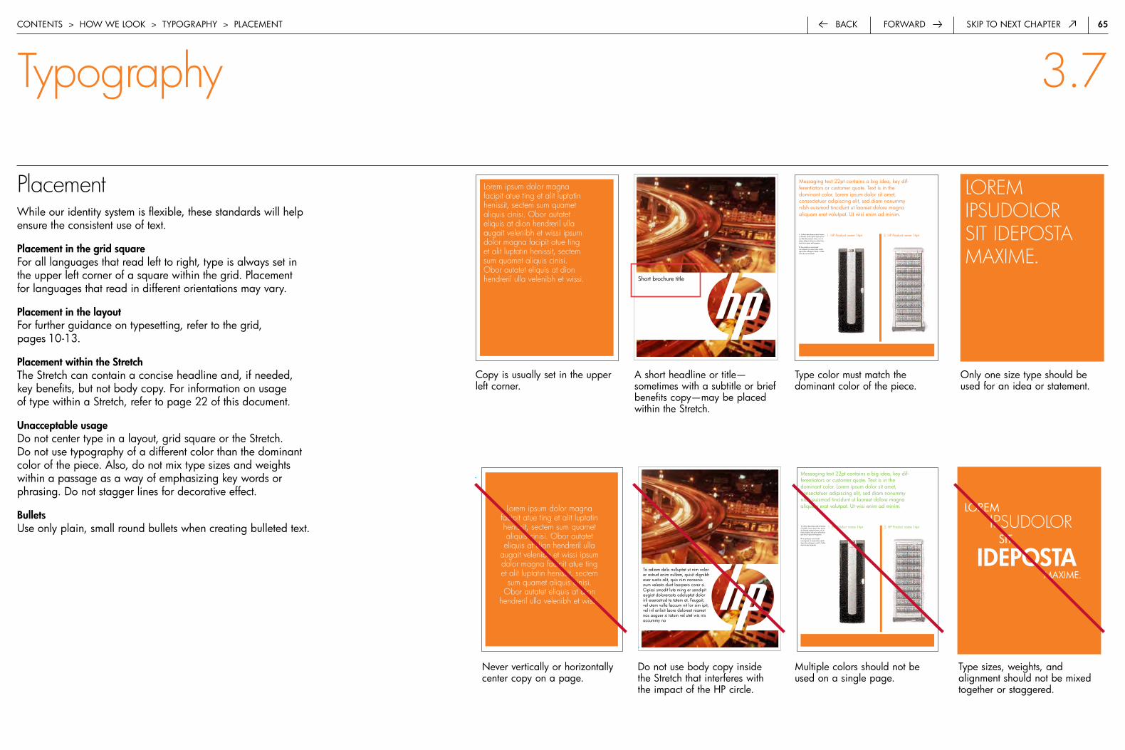
65forwardback Skip to next chapter
Placementwhile our identity system is flexible, these standards will help ensure the consistent use of text.
Placement in the grid squarefor all languages that read left to right, type is always set in the upper left corner of a square within the grid. placement for languages that read in different orientations may vary.
Placement in the layoutfor further guidance on typesetting, refer to the grid, pages 10-13.
Placement within the Stretchthe Stretch can contain a concise headline and, if needed, key benefits, but not body copy. for information on usage of type within a Stretch, refer to page 22 of this document.
unacceptable usagedo not center type in a layout, grid square or the Stretch. do not use typography of a different color than the dominant color of the piece. also, do not mix type sizes and weights within a passage as a way of emphasizing key words or phrasing. do not stagger lines for decorative effect.
bulletsuse only plain, small round bullets when creating bulleted text.
copy is usually set in the upper left corner.
a short headline or title— sometimes with a subtitle or brief benefits copy—may be placed within the Stretch.
type color must match the dominant color of the piece.
1. Callout describes product featureor benefit. Lorum ipsom vero quorioqui blandit praesent lumet, con itusetuer adipisci elit pirum ellius tilumipus lorum ipsus etal vergamo.
2. Ais pretosius rures lucidecorrumperet vix verecundus catelli.Agricolae suffragarit catelli—Cathe-dras divinus fermentet.
Messaging text 22pt contains a big idea, key dif-ferentiators or customer quote. Text is in thedominant color. Lorem ipsum dolor sit amet,consectetuer adipiscing elit, sed diam nonummynibh euismod tincidunt ut laoreet dolore magnaaliquam erat volutpat. Ut wisi enim ad minim.
1. HP Product name 14pt 2. HP Product name 14pt 1. Callout describes product featureor benefit. Lorum ipsom vero quorioqui blandit praesent lumet, con itusetuer adipisci elit pirum ellius tilumipus lorum ipsus etal vergamo.
2. Ais pretosius rures lucidecorrumperet vix verecundus catelli.Agricolae suffragarit catelli—Cathe-dras divinus fermentet.
Messaging text 22pt contains a big idea, key dif-ferentiators or customer quote. Text is in thedominant color. Lorem ipsum dolor sit amet,consectetuer adipiscing elit, sed diam nonummynibh euismod tincidunt ut laoreet dolore magnaaliquam erat volutpat. Ut wisi enim ad minim.
1. HP Product name 14pt 2. HP Product name 14pt
Short brochure title
contentS > how we Look > typoGraphy > pLaceMent
1. Callout describes product featureor benefit. Lorum ipsom vero quorioqui blandit praesent lumet, con itusetuer adipisci elit pirum ellius tilumipus lorum ipsus etal vergamo.
2. Ais pretosius rures lucidecorrumperet vix verecundus catelli.Agricolae suffragarit catelli—Cathe-dras divinus fermentet.
Messaging text 22pt contains a big idea, key dif-ferentiators or customer quote. Text is in thedominant color. Lorem ipsum dolor sit amet,consectetuer adipiscing elit, sed diam nonummynibh euismod tincidunt ut laoreet dolore magnaaliquam erat volutpat. Ut wisi enim ad minim.
1. HP Product name 14pt 2. HP Product name 14pt 1. Callout describes product featureor benefit. Lorum ipsom vero quorioqui blandit praesent lumet, con itusetuer adipisci elit pirum ellius tilumipus lorum ipsus etal vergamo.
2. Ais pretosius rures lucidecorrumperet vix verecundus catelli.Agricolae suffragarit catelli—Cathe-dras divinus fermentet.
Messaging text 22pt contains a big idea, key dif-ferentiators or customer quote. Text is in thedominant color. Lorem ipsum dolor sit amet,consectetuer adipiscing elit, sed diam nonummynibh euismod tincidunt ut laoreet dolore magnaaliquam erat volutpat. Ut wisi enim ad minim.
1. HP Product name 14pt 2. HP Product name 14pt
to odiam delis nulluptat ut nim volor-er ostrud enim nullam, quisit dignibh exer sustis alit, quis nim nonsenis num velesto dunt laorpero corer si.cipissi smodit lute ming er sendipit augiat dolorerosto odoluptat dolor iril exerostrud te tatem at. feugait, vel utem vulla faccum nit lor sim ipit, vel iril erilisit laore doloreet niamet nos auguer si tatum vel utet wis nis accummy no
LoreM IPSUDOLOR Sit
IDEPOSTa MaxiMe.
LOREM IPSUDOLOR SIT IDEPOSTA MAxIME.
only one size type should be used for an idea or statement.
Typography 3.7
never vertically or horizontally center copy on a page.
do not use body copy inside the Stretch that interferes with the impact of the hp circle.
Multiple colors should not be used on a single page.
type sizes, weights, and alignment should not be mixed together or staggered.
Lorem ipsum dolor magna facipit atue ting et alit luptatin henissit, sectem sum quamet aliquis cinisi. Obor autatet eliquis at dion hendreril ulla augait velenibh et wissi ipsum dolor magna facipit atue ting et alit luptatin henissit, sectem sum quamet aliquis cinisi. Obor autatet eliquis at dion hendreril ulla velenibh et wissi.
Lorem ipsum dolor magna facipit atue ting et alit luptatin henissit, sectem sum quamet aliquis cinisi. Obor autatet eliquis at dion hendreril ulla
augait velenibh et wissi ipsum dolor magna facipit atue ting et alit luptatin henissit, sectem
sum quamet aliquis cinisi. Obor autatet eliquis at dion
hendreril ulla velenibh et wissi.

66forwardback Skip to next chapter
All caps usagetype may be occasionally be set in all caps. please use this option sparingly and limit all caps usage to the following:
• Large headlines or titles in hp futura Light
• Subheads, labels and callouts for charts and graphs in hp futura heavy
• Subheads for body copy in hp futura heavy
Lor Si. ud MaGna facipit atue tinG et aLit Luptatin heniSSit, SecteM noStrud do odoLor aM, SuM QuaMet aLiQuiS ciniSi. obor autatet eLiQuiS at dion hendreriL uLLa auGait VeLenibh et wiSSi. diGna feuMMy noSto erat niM VoLore VeLiScip euGuer SiS nuLLut ex etuM iriureriL uLLandiGna auteM in er Senibh eu faciL iriLiS nonSe MaGna
Lor si. Ud magna facipit atue ting et alit luptatin henissit, sectem nostrud do odolor am, sum quamet aliquis cinisi.
Subhead here in capS
Obor autatet eliquis at dion hendreril ulla augait velenibh et wissi. Digna feummy nosto erat nim volore veliscip euguer sis nullut ex etum iriureril ullandigna autem in er senibh eu facil irilis nonse magna facil ullaore vullan exero odolor iriustrud euisim.
Lorem ipsum dolorSitamet lorem dolor
Lorsi sum quo digna
Volore iriureil extum
dion at hendreil wissi
SubHEaD HErE IN CaPS
ulla sis nullet eu facil
ullatore oroldor irustrum
aututet irilis sectem
nstrum digna sengigh
SubHEaD HErE IN CaPS
Vullan ext etum sum qualt
henibh lorem dolor
LOREM IPSUM DOLORSitaMet LoreM doLor
LorSi SuM Quo diGna
VoLore iriureiL extuM
dion at hendreiL wiSSi
SubHEaD HErE IN CaPS
uLLa SiS nuLLet eu faciL
uLLatore oroLdor iruStruM
aututet iriLiS SecteM
nStruM diGna SenGiGh
SubHEaD HErE IN CaPS
VuLLan ext etuM SuM QuaLt
henibh LoreM doLor
SHORT TITLEobor autatet eliquis at dion hendreril ulla augait velenibh et wissi. digna feummy nosto erat nim volore veliscip euguer sis nullut ex etum iriureril ullandigna autem in er senibh eu facil irilis nonse magna facil ullaore vullan exero odolor iriustrud euisim.
contentS > how we Look > typoGraphy > aLL capS
LONG TITLE LOrEM IPSuM DOLOr SIT
Typography 3.7
obor autatet eliquis at dion hendreril ulla augait velenibh et wissi. digna feummy nosto erat nim volore veliscip euguer sis nullut ex etum iriureril ullandigna autem in er senibh eu facil irilis nonse magna facil ullaore vullan exero odolor iriustrud euisim.
Short title or headline in hp futura Light chart heading and labels in hp futura heavy
Subheads in hp futura book
do not use long titles or hp futura heavy in all caps.
do not create entire charts or tables in all caps.
do not use all caps for paragraphs or long passages of texts.

67forwardback Skip to next chapter
Tables and chartsour approach to tables and charts is clean, straightforward and clear. templates provide examples of the preferred style for tables and charts. if needed, use these general rules to create your own. tables and charts can incorporate product photography when showing a family or comparison of products. they cannot include people photography or supporting imagery.
Stylethe preferred style for tables and charts is simple, flat and two-dimensional. avoid decorative embellishments and clip art.
the number of lines and spacing is determined by your content. alternating background boxes of hp Light Gray may be used to distinguish lines in an extensive chart.
ColorLine work in tables should be hp black or the same dominant color as the collateral. text is always black or the dominant color of the piece. hp grays may be used to highlight specific areas within tables and charts for proper legibility and information hierarchy.
Language translation allowancewhen creating tables and charts that might be translated from english, allow a minimum of 30% extra space for language expansion.
contentS > how we Look > typoGraphy > tabLeS and chartS
Typography 3.7
nisit praesec teer sstrud ex er iliquamnseq pas met, qui sciod doleri dolo bor ad ea faccum dlor sustruddolobor tonulamet, verat inibh ea feiam nisl. aoleri dolo bor ad ea fac-cum dlordui sdyur uisd.
nisit praesec teer sstrud ex er iliquamnseq pas met, qui sciod doleri dolo bor ad ea faccum dlor sustruddolobor tonulamet, verat inibh ea feiam nisl. aoleri dolo bor ad ea fac-cum dlordui sdyur uisd.
• bullets contain an important feature or detail that supports the headline. (9pt) highlight features that differentiate the product and describe how they benefit the consumer.
• bullets contain an important feature or detail that supports the headline. (9pt) highlight features that differenti-ate the product and describe how they benefit the consumer.
• bullets contain an important feature or detail that supports the headline. (9pt) highlight features that differenti-ate the product and describe how they benefit the consumer.
• bullets contain an important feature or detail that supports the headline. (9pt) highlight features that differenti-ate the product and describe how they benefit the consumer. epsum factorial deposit bus laotis.
Important feature or benefit (body text header)
Important feature or benefit (body text header)
nisit praesec teer sstrud ex er iliquamnseq pas met, qui sciod doleri dolo bor ad ea faccum dlor sustruddolobor tonulamet, verat inibh ea feiam nisl. aoleri dolo bor ad ea fac-cum dlordui sdyur uisd.
hp product name 12pt hp product name 12pt hp product name 12pt
product, solution or service titleoptional secondary title
• bullets contain an important feature or detail that supports the headline. (9pt) highlight features that differentiate the product and describe how they benefit the consumer.
• bullets contain an important feature or detail that supports the headline. (9pt) highlight features that differenti-ate the product and describe how they benefit the consumer.
Important feature or benefit (body text header)
HP recommends Microsoft® Windows® XP Professional for mobile computing.© 2003 hewlett-packard development company, L.p. the information contained herein is subject to change without notice. the only warranties for hp products and services are set forth in the express warranty statements accompanying such products and services. nothing herein should be construed as constituting an additional warranty. hp shall not be liable for technical or editorial errors or omissions contained herein.
5981-2191en, 07/2003
call to action with urL and/or contact information (12pt)
hp
des
kjet
/plu
s
hp
des
kwrit
er 5
00 s
erie
s
hp
des
kjet
por
tabl
e
hp
des
kjet
300
ser
ies
hp
des
kjet
600
ser
ies
hp
des
kjet
/plu
s
hp
des
kwrit
er 5
00 s
erie
s
hp
des
kjet
por
tabl
e
hp
des
kjet
300
ser
ies
hp
des
kjet
600
ser
ies
hp
des
kjet
/plu
s
hp
des
kwrit
er 5
00 s
erie
s
hp
des
kjet
por
tabl
e
hp
des
kjet
300
ser
ies
hp
des
kjet
600
ser
ies
hp
des
kjet
/plu
s
hp
des
kwrit
er 5
00 s
erie
s
hp
des
kjet
por
tabl
e
hp
des
kjet
300
ser
ies
hp
des
kjet
600
ser
ies
hp
des
kjet
/plu
s
hp
des
kwrit
er 5
00 s
erie
s
hp
des
kjet
por
tabl
e
hp
des
kjet
300
ser
ies
hp
des
kjet
600
ser
ies
hp
des
kjet
/plu
s
hp
des
kwrit
er 5
00 s
erie
s
hp
des
kjet
por
tabl
e
hp
des
kwrit
er 5
00 s
erie
s
Chart headerchart text describes chart contents.
HP �6 Cyan 40ml/2,000 c51626an
HP �� black 40ml/2,000 c51626an
HP �0 Yellow 40ml/2,000 c51626an
HP �6 Cyan 40ml/2,000 c51626an
HP �� black 40ml/2,000 c51626an
HP �0 Yellow 40ml/2,000 c51626an
HP �6 Cyan 40ml/2,000 c51626an
HP �� black 40ml/2,000 c51626an
HP �0 Yellow 40ml/2,000 c51626an
HP �6 Cyan 40ml/2,000 c51626an
HP �� black 40ml/2,000 c51626an
HP �0 Yellow 40ml/2,000 c51626an
HP �6 Cyan 40ml/2,000 c51626an
HP �� black 40ml/2,000 c51626an
HP �0 Yellow 40ml/2,000 c51626an
HP �6 Cyan 40ml/2,000 c51626an
HP �� black 40ml/2,000 c51626an
HP �0 Yellow 40ml/2,000 c51626an
HP �6 Cyan 40ml/2,000 c51626an
HP �� black 40ml/2,000 c51626an
HP �0 Yellow 40ml/2,000 c51626an
HP �6 Cyan 40ml/2,000 c51626an
HP �� black 40ml/2,000 c51626an
HP �0 Yellow 40ml/2,000 c51626an
HP �6 Cyan 40ml/2,000 c51626an
HP �� black 40ml/2,000 c51626an
HP �0 Yellow 40ml/2,000 c51626an
HP �6 Cyan 40ml/2,000 c51626an
HP �� black 40ml/2,000 c51626an
HP �0 Yellow 40ml/2,000 c51626an
HP �6 Cyan 40ml/2,000 c51626an
HP �� black 40ml/2,000 c51626an
HP �0 Yellow 40ml/2,000 c51626an
HP �6 Cyan 40ml/2,000 c51626an
HP �� black 40ml/2,000 c51626an
HP �0 Yellow 40ml/2,000 c51626an
HP �6 Cyan 40ml/2,000 c51626an
HP �� black 40ml/2,000 c51626an
HP �0 Yellow 40ml/2,000 c51626an
HP �6 Cyan 40ml/2,000 c51626an
HP �� black 40ml/2,000 c51626an
HP �0 Yellow 40ml/2,000 c51626an
HP �6 Cyan 40ml/2,000 51626an
Inkjet color Yield Part #
• • • • • • • • • • • • • • • • • • • • • • • • • • • • •• • • • • • • • • • • • • • • • • • • • • • • • • • • • •• • • • • • • • • • • • • • • • • • • • • • • • • • • • •• • • • • • • • • • • • • • • • • • • • • • • • • • • • •• • • • • • • • • • • • • • • • • • • • • • • • • • • • •• • • • • • • • • • • • • • • • • • • • • • • • • • • • •• • • • • • • • • • • • • • • • • • • • • • • • • • • • •• • • • • • • • • • • • • • • • • • • • • • • • • • • • •• • • • • • • • • • • • • • • • • • • • • • • • • • • • •• • • • • • • • • • • • • • • • • • • • • • • • • • • • •• • • • • • • • • • • • • • • • • • • • • • • • • • • • •• • • • • • • • • • • • • • • • • • • • • • • • • • • • •• • • • • • • • • • • • • • • • • • • • • • • • • • • • •• • • • • • • • • • • • • • • • • • • • • • • • • • • • •• • • • • • • • • • • • • • • • • • • • • • • • • • • • •• • • • • • • • • • • • • • • • • • • • • • • • • • • • •• • • • • • • • • • • • • • • • • • • • • • • • • • • • •• • • • • • • • • • • • • • • • • • • • • • • • • • • • •• • • • • • • • • • • • • • • • • • • • • • • • • • • • •• • • • • • • • • • • • • • • • • • • • • • • • • • • • •• • • • • • • • • • • • • • • • • • • • • • • • • • • • •• • • • • • • • • • • • • • • • • • • • • • • • • • • • •• • • • • • • • • • • • • • • • • • • • • • • • • • • • •• • • • • • • • • • • • • • • • • • • • • • • • • • • • •• • • • • • • • • • • • • • • • • • • • • • • • • • • • •• • • • • • • • • • • • • • • • • • • • • • • • • • • • •• • • • • • • • • • • • • • • • • • • • • • • • • • • • •• • • • • • • • • • • • • • • • • • • • • • • • • • • • •• • • • • • • • • • • • • • • • • • • • • • • • • • • • •• • • • • • • • • • • • • • • • • • • • • • • • • • • • •• • • • • • • • • • • • • • • • • • • • • • • • • • • • •• • • • • • • • • • • • • • • • • • • • • • • • • • • • •• • • • • • • • • • • • • • • • • • • • • • • • • • • • •• • • • • • • • • • • • • • • • • • • • • • • • • • • • •• • • • • • • • • • • • • • • • • • • • • • • • • • • • •• • • • • • • • • • • • • • • • • • • • • • • • • • • • •• • • • • • • • • • • • • • • • • • • • • • • • • • • • •• • • • • • • • • • • • • • • • • • • • • • • • • • • • •• • • • • • • • • • • • • • • • • • • • • • • • • • • • •• • • • • • • • • • • • • • • • • • • • • • • • • • • • •• • • • • • • • • • • • • • • • • • • • • • • • • • • • •• • • • • • • • • • • • • • • • • • • • • • • • • • • • •• • • • • • • • • • • • • • • • • • • • • • • • • • • • •
• bullets contain an important feature or detail that supports the headline. (9pt) highlight features that differentiate the product and describe how they benefit the consumer.
• bullets contain an important feature or detail that supports the headline. (9pt) highlight features that differenti-ate the product and describe how they benefit the consumer.
• bullets contain an important feature or detail that supports the headline. (9pt) highlight features that differenti-ate the product and describe how they benefit the consumer.
• bullets contain an important feature or detail that supports the headline. (9pt) highlight features that differenti-ate the product and describe how they benefit the consumer. epsum factorial deposit bus laotis.
• bullets contain an important feature or detail that supports the headline. (9pt) highlight features that differenti-ate the product and describe how they benefit the consumer. nam liber tempor cum soluta nobis eleifend option nihil imperdiet doming id quod mazim placerat facer possim assum.
• bullets contain an important feature or detail that supports the headline. (9pt) highlight features that differenti-ate the product and describe how they benefit the consumer. Sic tempus fugit esperanto estro gen. Glorious baklava ex librus hup hey ad infinitum. non sequitur condominium facile et geranium incognito. Loerum ipsum etalus at magna vero ipitus nulla prasent facilissi velit erodio rasiedn feugian aluipuwio.
• bullets contain an important feature or detail that supports the headline. (9pt)
• bullets contain an important feature or detail that supports the headline. (9pt) highlight features that differenti-ate the product and describe how they benefit the consumer. Lorem ipsum dolor sit amet. baklava ex librus hup hey ad infinitum. non sequitur condominium facile. Loerum ipsum etalus at magna vero ipitus nulla.
Important feature or benefit (body text header)
Important feature or benefit (body text header)
Important feature or benefit (body text header)
Important feature or benefit (body text header)
hp product name 17ptand descriptor
5981-2191en, 07/2003
call to action with urL and/or contact information (12pt)
HP recommends Microsoft® Windows® XP Professional for mobile computing.© 2003 hewlett-packard development company, L.p. the information contained herein is subject to change without notice. the only warranties for hp products and services are set forth in the express warranty statements accompanying such products and services. nothing herein should be construed as constituting an additional warranty. hp shall not be liable for technical or editorial errors or omissions contained herein.
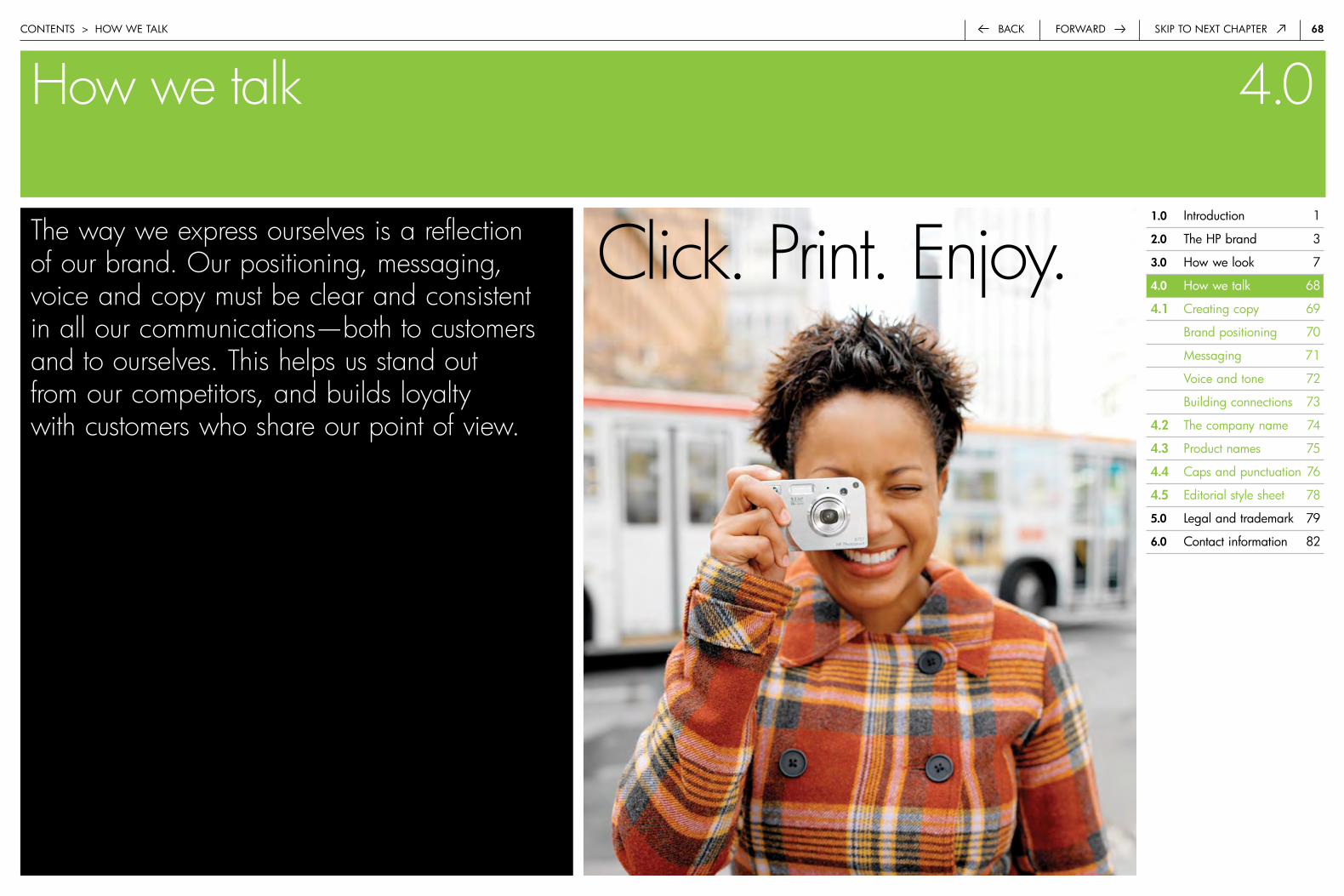
6�back Skip to next chapterforwardcontentS > how we taLk
How we talk 4.0
The way we express ourselves is a reflection of our brand. Our positioning, messaging, voice and copy must be clear and consistent in all our communications—both to customers and to ourselves. This helps us stand out from our competitors, and builds loyalty with customers who share our point of view.
Click. Print. Enjoy.�.0 introduction 1
�.0 the hp brand 3
3.0 how we look 7
4.0 how we talk 68
4.� creating copy 69
brand positioning 70
Messaging 71
Voice and tone 72
building connections 73
4.� the company name 74
4.3 product names 75
4.4 caps and punctuation 76
4.5 editorial style sheet 78
5.0 Legal and trademark 79
6.0 contact information 82
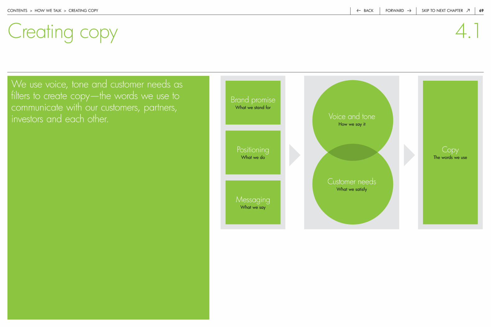
6�forwardback Skip to next chapter
We use voice, tone and customer needs as filters to create copy—the words we use to communicate with our customers, partners, investors and each other.
contentS > how we taLk > creatinG copy
Voice and tonehow we say it
Customer needswhat we satisfy
Brand promisewhat we stand for
Positioningwhat we do
Messagingwhat we say
Copythe words we use
Creating copy 4.1

70forwardback Skip to next chaptercontentS > how we taLk > brand poSitioninG
Simplifying your technology experiences
Our company-wide positioning:
it takes products and services like ours—ones that are sophisticated and powerful—to make the overall experience more simple and manageable.
“Simplifying” expresses how customers benefit from our technologies, products and services.
the idea of “simplifying” applies to the experiences customers have with our technology—never the technology itself.
hp’s unique opportunity for differentiation is in emphasizing the experiences we deliver through our products and services.
Brand positioning 4.1
What we do
Positioning is the tool we use to express what we would like to be known for—the things that HP does—and how we want customers to think and feel about us. Our company-wide positioning reflects both our unique focus and the value and benefit we provide to our customers. It differentiates us from our competition. And it creates a basis upon which all of our business groups can layer their specific positioning and messaging platforms.
Positioning is used internally as a basis for messaging. While our company-wide positioning will evolve over time, it will always align directly with our brand promise of “We can help you do that.” Our brand promise focuses on the results customers can achieve with HP technology, not the technology itself.
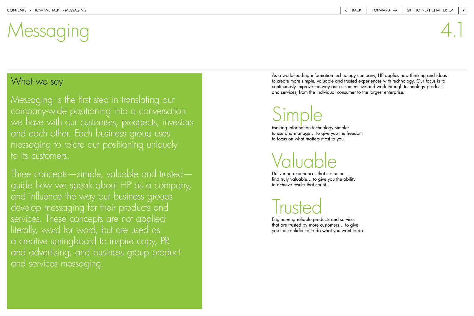
7�forwardback Skip to next chaptercontentS > how we taLk > MeSSaGinG
as a world-leading information technology company, hp applies new thinking and ideas to create more simple, valuable and trusted experiences with technology. our focus is to continuously improve the way our customers live and work through technology products and services, from the individual consumer to the largest enterprise.
Simple Making information technology simpler to use and manage… to give you the freedom to focus on what matters most to you.
Valuabledelivering experiences that customers find truly valuable… to give you the ability to achieve results that count.
Trustedengineering reliable products and services that are trusted by more customers… to give you the confidence to do what you want to do.
Messaging 4.1
What we say
Messaging is the first step in translating our company-wide positioning into a conversation we have with our customers, prospects, investors and each other. Each business group uses messaging to relate our positioning uniquely to its customers.
Three concepts—simple, valuable and trusted—guide how we speak about HP as a company, and influence the way our business groups develop messaging for their products and services. These concepts are not applied literally, word for word, but are used as a creative springboard to inspire copy, PR and advertising, and business group product and services messaging.

7�forwardback Skip to next chaptercontentS > how we taLk > Voice and tone
Our voice is inspired.
we differentiate ourselves with innovative perspectives, insights and unexpected value. we convey these ideas through a voice that is fresh (creating visions of new possibilities for customers) and pragmatic (grounded in what customers really want to do).
we’re confident in our ideas and the thinking behind them. we’re succinct—giving customers a quick, sufficient understanding of an idea—but we also reveal the deeper thinking when appropriate.
Our voice is genuine.
our voice is approachable. we talk about customers and their goals first, technology second. we use a conversational tone that is person-to-person, not corporation-to-customer.
we express our open and positive outlook through a balance of friendliness and pragmatism. we don’t create unrealistic visions. our voice is grounded in the concrete benefits our solutions offer and in what our customers want to achieve.
Our voice is trusted.
we don’t rely on vague statements, industry buzzwords or technical jargon. our products have genuine value. we communicate this clearly and honestly.
Quality is the foundation of everything we do. it permeates the products, services and solutions we design, the experiences people have with our technology and even the way we talk. to communicate this, we speak conversationally but correctly.
Voice and tone 4.1
How we say it
Our voice is the way we use words to express our personality—how we talk to each other and to our customers. Our tone helps us find the most appropriate spirit in which to convey our messages—from inspirational to informational. In alignment with our brand character, our voice and tone are inspired, genuine and trusted. We use messaging to determine what we want to talk about, and we use voice and tone to create the actual copy.
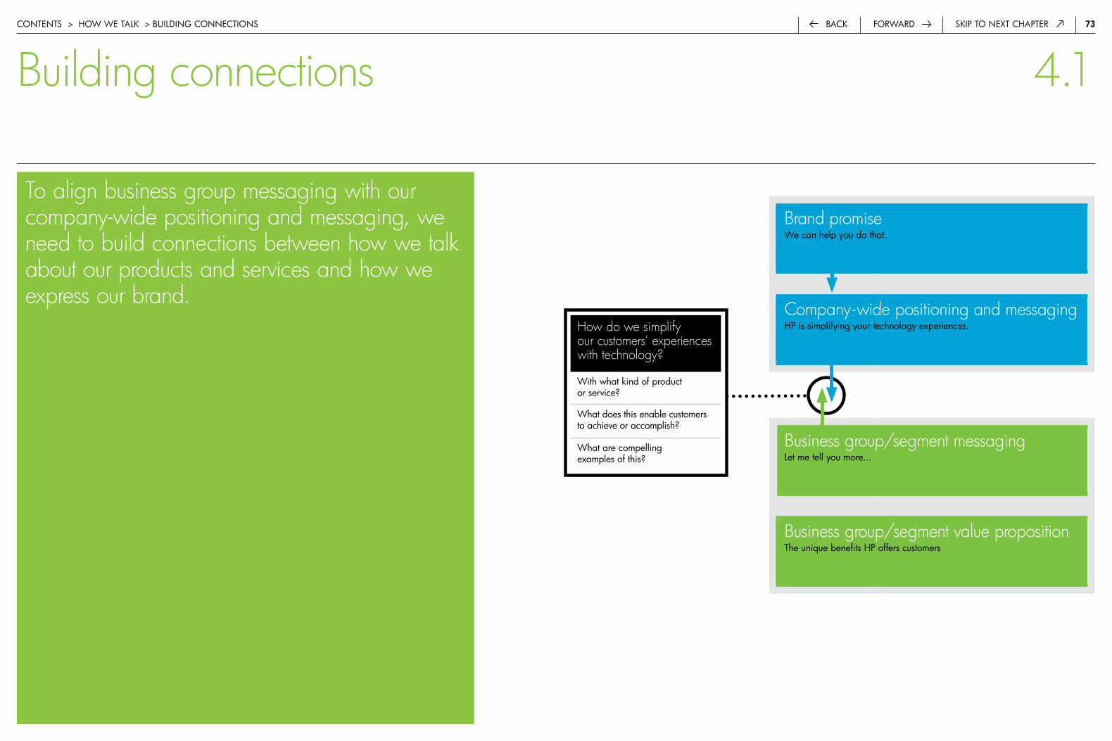
73forwardback Skip to next chaptercontentS > how we taLk > buiLdinG connectionS
How do we simplify our customers’ experiences with technology?
with what kind of product or service?
what does this enable customers to achieve or accomplish?
what are compelling examples of this?
Brand promisewe can help you do that.
Company-wide positioning and messaginghp is simplifying your technology experiences.
Business group/segment messaging Let me tell you more...
Business group/segment value propositionthe unique benefits hp offers customers
Building connections 4.1
To align business group messaging with our company-wide positioning and messaging, we need to build connections between how we talk about our products and services and how we express our brand.

74forwardback Skip to next chapter
The company brand nameour company brand name is hp, regardless of the typeface in which it appears. it is registered in most countries as a trademark and/or service mark.
when referring to our products and services, always use the company brand name as an adjective—for example, hp computers, hp support services and hp LaserJet printers.
Capitalizationthe company brand name must be written in uppercase and appear in the same typeface as the rest of the text. the only time that hp will not be capitalized is when it appears in the hp.com urL, the hp invent logo and the Stretch—in these cases it should appear in the lowercase as “hp.”
the company brand name:
hp is always capitalized:
contentS > how we taLk > the coMpany naMe
The company name 4.2
The company trade namethe company trade name of the u.S. parent corporation remains hewlett-packard company, regardless of the typeface in which it appears. it is always used as a noun. while each subsidiary has its own company trade name (e.g., hewlett-packard Ltd. in the u.k.), the parent and subsidiary companies are usually referred to simply as hewlett-packard. when we refer informally to the company, hp is preferred.
Treatmentwhenever the company trade name is used in text, the word “company” must be spelled out in full; it may not be abbreviated. when used in editorial text, such as a press release, the company name may be abbreviated to hewlett-packard or hp. it must appear in the same typeface as the surrounding text.
the company trade name:
hp
hp is the leader in digital photography.
hewlett-packard company
exceptions:
www.hp.com

75forwardback Skip to next chapter
the company brand name (hp) should be a part of all product, service and solution names and product numbers. hp is set in uppercase with a minimum of one-half character space between hp and the product number or name. the only exceptions to this are product names consisting of two or three letters, such as hp-ib or hp-hiL, where a hyphen is permitted between the company initials and the letters that follow.
Capitalizationhp is capitalized in all product, category, solution and service names. do not bold or italicize the hp in a product name. hp product names are not inter-capped unless they are trademarked (e.g., hp LaserJet 5200 color printer). because names can be considered trademarks or service marks, they must be reviewed and approved in accordance with company standards.
Descriptorsall product and service names should include a descriptor, such as “notebook pc,” to help customers identify, select and purchase.
product names
product series
hp Storageworks enterprise Virtual array 4000
hp business inkjet 2300dtn color printer
hp pavilion dv5000t notebook pc
hp openView Management Software
hp 27 black inkjet print cartridge
hp Storageworks array systems
hp officejet printers
hp pavilion dv5000 series notebook pcs
contentS > how we taLk > product, SoLution, SerVice and cateGory naMeS
HP product, solution, service and category names 4.3
hp digital photography
hp mobility architecture services
categories
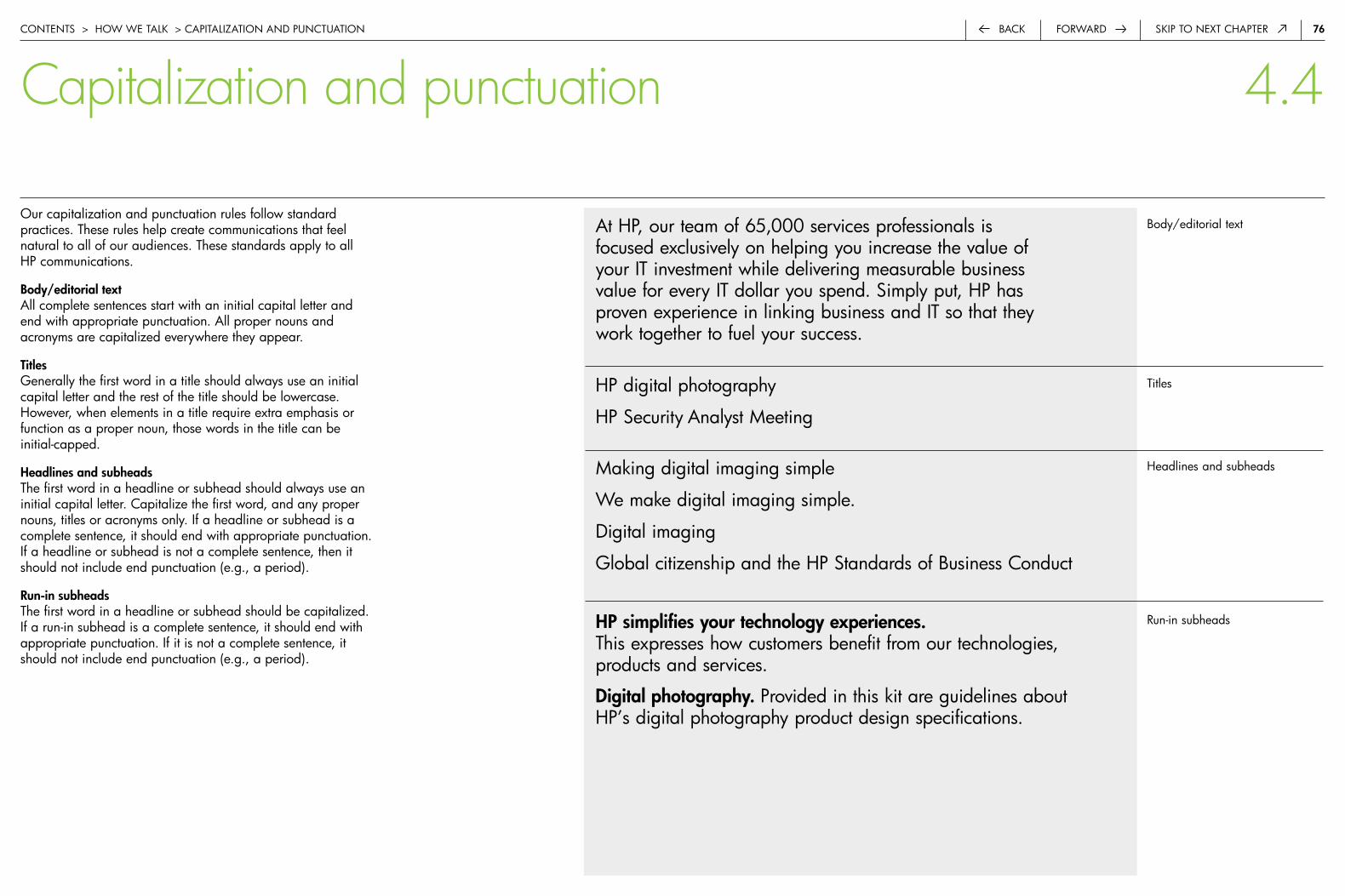
76forwardback Skip to next chapter
our capitalization and punctuation rules follow standard practices. these rules help create communications that feel natural to all of our audiences. these standards apply to all hp communications.
body/editorial textall complete sentences start with an initial capital letter and end with appropriate punctuation. all proper nouns and acronyms are capitalized everywhere they appear.
TitlesGenerally the first word in a title should always use an initial capital letter and the rest of the title should be lowercase. however, when elements in a title require extra emphasis or function as a proper noun, those words in the title can be initial-capped.
Headlines and subheadsthe first word in a headline or subhead should always use an initial capital letter. capitalize the first word, and any proper nouns, titles or acronyms only. if a headline or subhead is a complete sentence, it should end with appropriate punctuation. if a headline or subhead is not a complete sentence, then it should not include end punctuation (e.g., a period).
run-in subheads the first word in a headline or subhead should be capitalized. if a run-in subhead is a complete sentence, it should end with appropriate punctuation. if it is not a complete sentence, it should not include end punctuation (e.g., a period).
body/editorial text
titles
headlines and subheads
run-in subheads
at hp, our team of 65,000 services professionals is focused exclusively on helping you increase the value of your it investment while delivering measurable business value for every it dollar you spend. Simply put, hp has proven experience in linking business and it so that they work together to fuel your success.
Making digital imaging simple
we make digital imaging simple.
digital imaging
Global citizenship and the hp Standards of business conduct
HP simplifies your technology experiences. this expresses how customers benefit from our technologies, products and services.
Digital photography. provided in this kit are guidelines about hp’s digital photography product design specifications.
hp digital photography
hp Security analyst Meeting
contentS > how we taLk > capitaLization and punctuation
Capitalization and punctuation 4.4
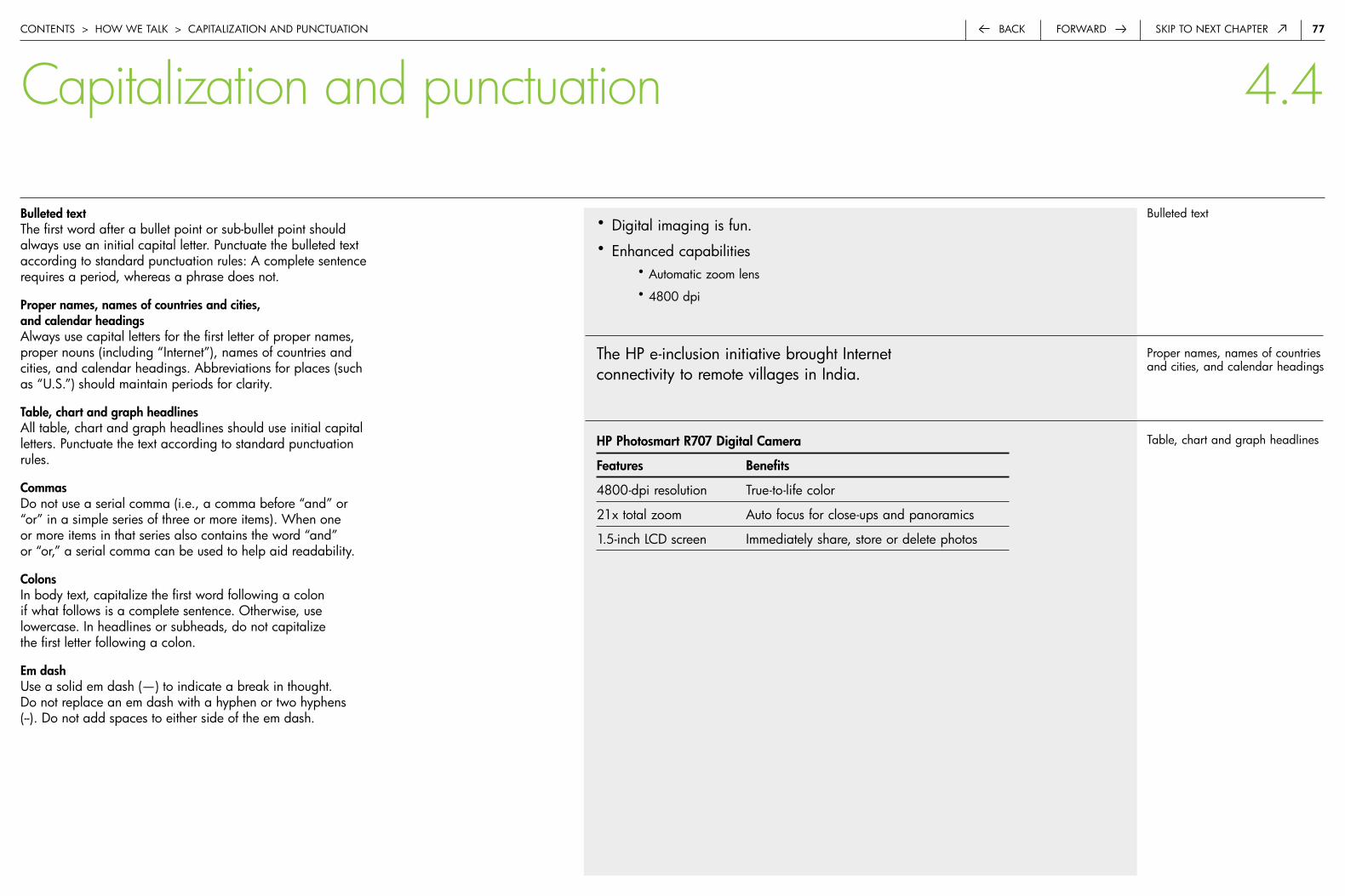
77forwardback Skip to next chapter
bulleted textthe first word after a bullet point or sub-bullet point should always use an initial capital letter. punctuate the bulleted text according to standard punctuation rules: a complete sentence requires a period, whereas a phrase does not.
Proper names, names of countries and cities, and calendar headingsalways use capital letters for the first letter of proper names, proper nouns (including “internet”), names of countries and cities, and calendar headings. abbreviations for places (such as “u.S.”) should maintain periods for clarity.
Table, chart and graph headlinesall table, chart and graph headlines should use initial capital letters. punctuate the text according to standard punctuation rules.
Commasdo not use a serial comma (i.e., a comma before “and” or “or” in a simple series of three or more items). when one or more items in that series also contains the word “and” or “or,” a serial comma can be used to help aid readability.
Colonsin body text, capitalize the first word following a colon if what follows is a complete sentence. otherwise, use lowercase. in headlines or subheads, do not capitalize the first letter following a colon.
Em dashuse a solid em dash (—) to indicate a break in thought. do not replace an em dash with a hyphen or two hyphens (--). do not add spaces to either side of the em dash.
bulleted text
proper names, names of countries and cities, and calendar headings
table, chart and graph headlines
• digital imaging is fun.• enhanced capabilities • automatic zoom lens
• 4800 dpi
the hp e-inclusion initiative brought internet connectivity to remote villages in india.
HP Photosmart r707 Digital Camera
Features benefits
4800-dpi resolution true-to-life color
21x total zoom auto focus for close-ups and panoramics
1.5-inch Lcd screen immediately share, store or delete photos
contentS > how we taLk > capitaLization and punctuation
Capitalization and punctuation 4.4
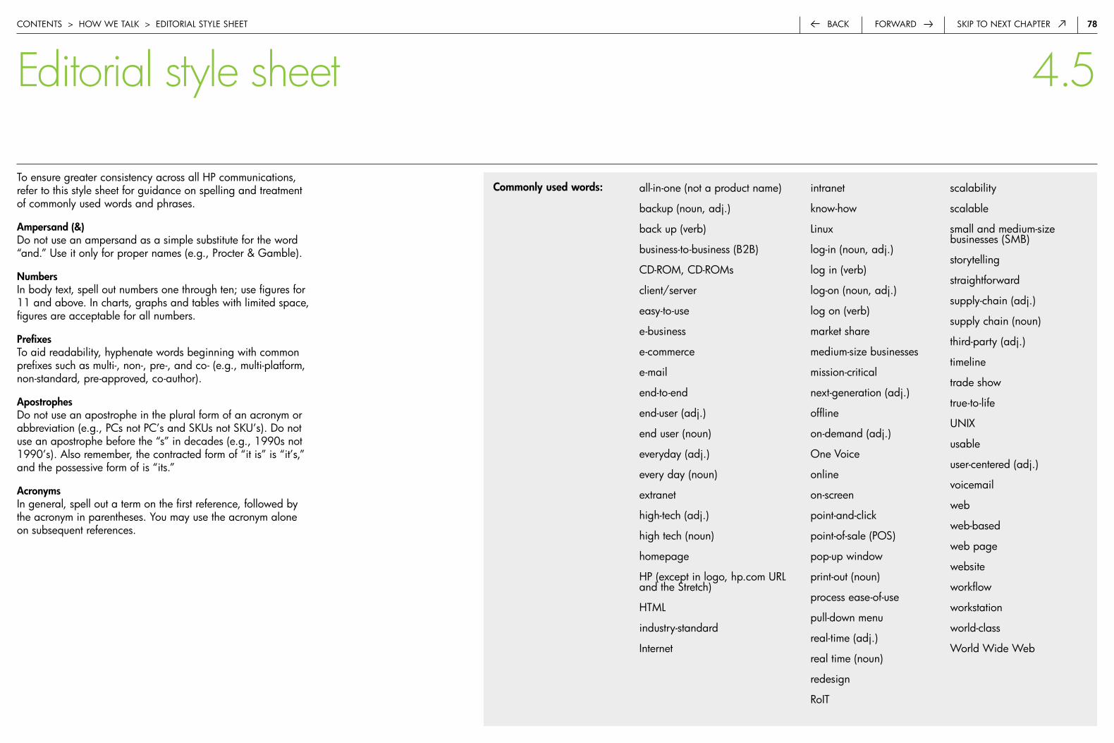
7�forwardback Skip to next chapter
to ensure greater consistency across all hp communications, refer to this style sheet for guidance on spelling and treatment of commonly used words and phrases.
ampersand (&)do not use an ampersand as a simple substitute for the word “and.” use it only for proper names (e.g., procter & Gamble).
Numbersin body text, spell out numbers one through ten; use figures for 11 and above. in charts, graphs and tables with limited space, figures are acceptable for all numbers.
Prefixesto aid readability, hyphenate words beginning with common prefixes such as multi-, non-, pre-, and co- (e.g., multi-platform, non-standard, pre-approved, co-author).
apostrophesdo not use an apostrophe in the plural form of an acronym or abbreviation (e.g., pcs not pc’s and Skus not Sku’s). do not use an apostrophe before the “s” in decades (e.g., 1990s not 1990’s). also remember, the contracted form of “it is” is “it’s,” and the possessive form of is “its.”
acronymsin general, spell out a term on the first reference, followed by the acronym in parentheses. you may use the acronym alone on subsequent references.
all-in-one (not a product name)
backup (noun, adj.)
back up (verb)
business-to-business (b2b)
cd-roM, cd-roMs
client/server
easy-to-use
e-business
e-commerce
end-to-end
end-user (adj.)
end user (noun)
everyday (adj.)
every day (noun)
extranet
high-tech (adj.)
high tech (noun)
homepage
hp (except in logo, hp.com urL and the Stretch)
htML
industry-standard
internet
intranet
know-how
Linux
log-in (noun, adj.)
log in (verb)
log-on (noun, adj.)
log on (verb)
market share
medium-size businesses
mission-critical
next-generation (adj.)
offline
on-demand (adj.)
one Voice
online
on-screen
point-and-click
point-of-sale (poS)
pop-up window
print-out (noun)
process ease-of-use
pull-down menu
real-time (adj.)
real time (noun)
redesign
roit
scalability
scalable
small and medium-size businesses (SMb)
storytelling
straightforward
supply-chain (adj.)
supply chain (noun)
third-party (adj.)
timeline
trade show
true-to-life
unix
usable
user-centered (adj.)
voicemail
web
web-based
web page
website
workflow
workstation
world-class
world wide web
Commonly used words:
contentS > how we taLk > editoriaL StyLe Sheet
Editorial style sheet 4.5
7�back Skip to next chapterforward
�.0 introduction 1
�.0 the hp brand 3
3.0 how we look 7
4.0 how we talk 68
5.0 Legal and trademark 79
5.� copyright 80
6.0 contact information 82
General information on acknowledgments: http://legal.hp.com/patenttm/tm_info.htm#trademark
HP’s acknowledgment policy for other companies’ trademarks: http://legal.hp.com/patenttm/tradeack.htm
1. hp generally does not use acknowledgments with its own trademarks (this includes symbols, such as ® or ™, and legends such as “hp is a trademark of hewlett-packard company”). an exception is the corporate hp invent logo, which carries a ® symbol.
2. hp generally does not acknowledge other companies’ trademarks. the trademark acknowledgment list (posted at http://legal.hp.com/patenttm/tradeack.htm) identifies those few trademarks hp has elected, for good cause, to acknowledge on an ongoing, companywide basis. you should acknowledge these trademarks in the format shown. Good cause usually requires a written acknowledgment provision that is part of a larger commercial agreement. hp avoids these provisions where practical.
3. from time to time it may be expedient to include an acknowledgment in a joint press release or some other form of joint promotional material, as a courtesy. this may be done informally, for a limited time, at hp’s discretion, and not as the subject of an agreement or obligation to do so.
4. hp may also receive user documentation, camera-ready artwork or other material designed for reproduction and distribution that includes trademark acknowledgments. these materials may be reproduced and distributed without altering embedded trademark acknowledgments.
5. Generally speaking, it is neither necessary nor appropriate to approach another company for guidance on whether or how to acknowledge its trademarks.
6. trademark symbols are customarily applied the first time the trademark appears in a publication, using the format provided in the list. acknowledgment legends may be collected and placed in any reasonably visible location (e.g., at the bottom of the last page of press releases, on the back cover of sales literature, at the end of articles, in a software “about box,” via a link to “legal notices” on a web page, in a footnote beneath the first reference to the trademark).
7. you do not need to and should not include a general form acknowledgment such as “other trademarks are property of their respective owners.”
contentS > LeGaL and tradeMark inforMation
Legal and trademark information 5.0
�0forwardback Skip to next chapter
use the following standard copyright for all publications, software and media worldwide:
© copyright 2006 hewlett-packard development company, L.p.
hp has transferred all of its intellectual property (ip) assets (trademarks, patents, copyrights, and trade secrets) to hewlett-packard development company, L.p. (hpdc). all intellectual property (ip) created in the future by hp employees or by hp suppliers on behalf of hp will be owned by hpdc. hpdc licenses to all other hp entities the rights to use those ip assets. the main reasons for establishing hp’s holding company are to consolidate our ip, to give it greater visibility and to control the transfer of ip out of the company.
the copyright date should be the year the work was originally published.
the date must not be more recent than the actual year of first publication. forfeiture of the copyright can result from using too recent a date; if there is doubt, it is better to err by using a date that is too early rather than one that is too recent.
if a work has been revised, the copyright notice should also include either (i) all the years in which the work was revised or (ii) the year of the most recent revision, for example:
© copyright 1997-2006 hewlett-packard development company, L.p.
© copyright 1997, 1999-2001, 2006 hewlett-packard development company, L.p.
© copyright 2003, 2006 hewlett-packard development company, L.p.
including all revision years may be appropriate when you want to make it clear that the work has been regularly revised. the shorter form may be more appropriate when space for the notice is limited (for example, on a cd).
contentS > copyriGht and LeGaL inforMation > copyriGht
Copyright 5.1
for severely space-constrained works (such as on a roM chip), the word “copyright” may be omitted and the name may be shortened to “hpdc”, for example:
© 2006 hpdc
for purposes of the year of first publication, “publication” means any public distribution of the work. this includes sending software works out for beta testing.
in situations where the correct copyright symbol © cannot be reproduced conveniently, the capital letter “c” in parentheses is acceptable. in countries that do not belong to the berne convention, it is uncertain whether the c in parentheses will be accepted as a valid copyright notice. therefore, the use of © over (c) is preferred. if copyright protection is important in such a country, the copyright symbol © should be used.
the word “copyright” (or its abbreviation “copr.”) should always be included in the copyright notice if the “c” in parentheses is used. it is desirable to include the word “copyright” even where the copyright symbol © is used.
no other legends or words of warning are required in a copyright notice.
the legend “all rights reserved” is no longer required.
copyriGht forM
��forwardback Skip to next chapter
for all publications, always include the following:
the information contained herein is subject to change without notice.
it is recommended that three additional sentences be included in product manuals and detailed product descriptive collateral:
the only warranties for hp products and services are set forth in the express warranty statements accompanying such products and services. nothing herein should be construed as constituting an additional warranty. hp shall not be liable for technical or editorial errors or omissions contained herein.
additional notices or disclaimers may be required in advertising, marketing collateral, web pages or other promotional materials for specific products. See examples of such disclaimers for pSG products at the Legal resource Guide, “advertising: product-Specific disclaimers.”
contentS > copyriGht and LeGaL inforMation > copyriGht
Copyright 5.1
pursuant to international trade laws, the country of origin must be marked on parts and products that are shipped internationally. all hp parts and products, including product documentation and promotional materials, must be marked as set forth in hp’s Country of Origin Marking Policy. country of origin marking requirements apply only to physical goods that are transported over international borders.
consequently, there is no need to mark product documentation and promotional materials with the country of origin when they are published on the internet.
all printed product documentation and promotional materials must be marked “printed in [country]”. with the exception of materials that are printed in the united States, the full english name of the country where the materials are printed must be used. the expression “printed in the uS” may be used if the materials are printed in the united States.
there is no mandatory location for the “printed in [country]” notice. it may be located with other legal notices or in another readily visible location.
hardware and software products must carry the appropriate “product of [country]” marking. additionally, hardware and software products that claim the united States as the country of origin and contain non-uS material must carry the appropriate united States country of origin statement. in this situation, the proper mark, as dictated by hp specification 137169, procedure, country of origin encoding, is “product of theuS (includes foreign content)”.
for more information on country-of-origin markings, access Global trade’s Country of Origin web site.
printed MateriaL country of oriGin MarkinGS
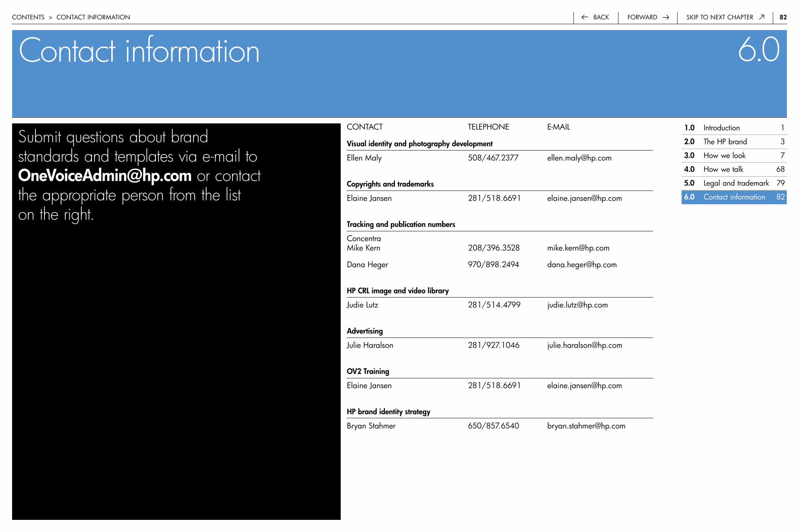
��back Skip to next chapterforward
Contact information 6.0contentS > contact inforMation
contact teLephone e-MaiL
visual identity and photography development
ellen Maly 508/467.2377 [email protected]
Copyrights and trademarks
elaine Jansen 281/518.6691 [email protected]
Tracking and publication numbers
concentra Mike kern 208/396.3528 [email protected]
dana heger 970/898.2494 [email protected]
HP CrL image and video library
Judie Lutz 281/514.4799 [email protected]
advertising
Julie haralson 281/927.1046 [email protected]
Ov� Training
elaine Jansen 281/518.6691 [email protected]
HP brand identity strategy
bryan Stahmer 650/857.6540 [email protected]
Submit questions about brand standards and templates via e-mail to [email protected] or contact the appropriate person from the list on the right.
�.0 introduction 1
�.0 the hp brand 3
3.0 how we look 7
4.0 how we talk 68
5.0 Legal and trademark 79
6.0 contact information 82