contents page
TRANSCRIPT

3 Contents PagesBy Emma Beveridge

TypographyThe style fonts used a normal basic ‘everyday font’. This font has been used because the style of font isn’t really important. As it says Q CONTENTS with the Q in red and contents in capitals.
LayoutThe layout is ordered. The main image(of Adele) has been placed on the right side and takes a quarter of the page up. The contents and numbers are on the right side, whereas the images with captions are on the left side.
LanguageThe type of language used on the contents page is very formal, because Q music magazine is presented as a formal. Even though its about music.
ColourThe effect the colours have are that on the contents its very black and white with a odd few red parts. Red is again shown on the contents because that is one indication that we know its Q magazine.
Camera WorkThe shot types and angles within Q music magazine’s contents page is a mid shot because its just Adele’s head, as she takes up over a quarter of the page.
Mise-En-SceneThe props, costumes and settings that have been used is the costumes of Adele her hair seems to have been tied up with minimal make-up to show her ‘natural side’. As when she's in the recording studio and singing. Its one of the places she feels natural and enjoys her time recording and singing.
Mode of addressThe magazine speaks to the audience because Adele is one the contents page. Which shows she is an influence of music to her fans, also to keep portraying her shows that she means business. Once in the media music industry you have to work to stay there.
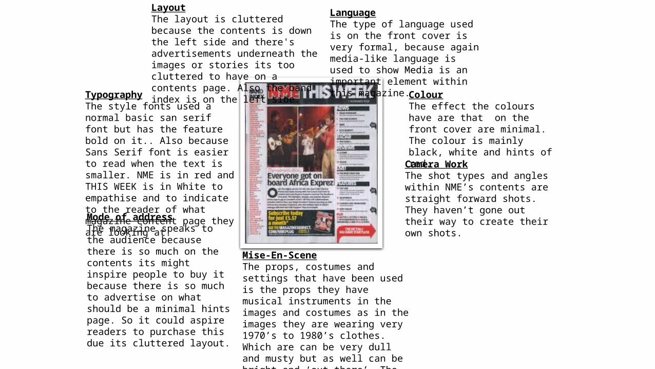
TypographyThe style fonts used a normal basic san serif font but has the feature bold on it.. Also because Sans Serif font is easier to read when the text is smaller. NME is in red and THIS WEEK is in White to empathise and to indicate to the reader of what magazine content page they are looking at.
LayoutThe layout is cluttered because the contents is down the left side and there's advertisements underneath the images or stories its too cluttered to have on a contents page. Also the band index is on the left side.
LanguageThe type of language used is on the front cover is very formal, because again media-like language is used to show Media is an important element within this magazine.
ColourThe effect the colours have are that on the front cover are minimal. The colour is mainly black, white and hints of red.
Camera WorkThe shot types and angles within NME’s contents are straight forward shots. They haven’t gone out their way to create their own shots.
Mise-En-SceneThe props, costumes and settings that have been used is the props they have musical instruments in the images and costumes as in the images they are wearing very 1970’s to 1980’s clothes. Which are can be very dull and musty but as well can be bright and ‘out there’. The setting of the contents page is very dull co-operating to the image of 1970’s to 1980’s.
Mode of addressThe magazine speaks to the audience because there is so much on the contents its might inspire people to buy it because there is so much to advertise on what should be a minimal hints page. So it could aspire readers to purchase this due its cluttered layout.

TypographyThe style fonts used is a pink bold font which used for typical girls, as pink connotes girls. The typography , there really isn’t much apart from the title ‘CONTENTS’.
LayoutThe layout is ordered and a bit cluttered because they have the contents going down on the left and the rest of the space is filled with images.
LanguageThe type of language used is on the front cover is very informal because its targeted at teenaged females so that element of slangs need to be present somehow.
ColourThe effect the colours have are very high because the colours give the magazine its purpose and gives it a place in a teenagers heart, if you like. Its sends messages to them saying ‘this is your magazine’.
Camera WorkThe shot types and angles within Smash Hits are standard just like NME as they are just hints and tips to what this magazine entails. It also gives the reader the sense of excitement to read the contents and then read the whole story.Mise-En-Scene
The props, costumes and settings that have been used is the props because its layout has been made to be a notebook, or along the lines of a teenagers diary or noticeboard to make it more girlie and personal. costumes are very standard because of the content of the images. The setting of the contents page is that its set to have been in a teenagers diary or notebook on everything they need to do or have done, mainly personal diary.
Mode of addressThe magazine speaks to the audience because teenagers would love this magazine. The front cover is pink and so is the contents page. Its all about the girls. It’s a girlfied magazine specifically for girls to read and talk about.