contents page analysis
TRANSCRIPT

Contents page given a title specific to the magazine that readers will understand. Chris Brown’s hood placement fits in place of where the ‘A’ in ‘the A-side’ should be, this draws attention to the main image and cover story without obscuring the title too much.
Quote from the artist in the cover story and main image to give the audience a sense of what the article is going to be about, enticing them to read on and buy the magazine.
All the features inside the magazine along the side of the page as to not steal any attention from the main image in the centre of the page.
Page numbers in bold along with sub-headings revealing what that specific page is about with information underneath giving a more in-depth description with key words in bold as well; all the important information stands out and will attract the reader’s eye, letting them know which pages they will want to turn to depending on what they’re interested in.
Date of issue following the same colour scheme as the rest of the magazine with the masthead/logo of the magazine made apparent in the corner to show which magazine it is from and create a connection between the front cover and contents page.
Main image takes up the majority of the page to draw attention to Chris Brown as he is what the cover story is about.
Colour scheme of the image connects with the title and background; title is black and background gets lighter as it goes down the page, Chris Brown’s shirt is black and his trousers and shoes are light, following the trend.
Caption of picture saying who the photographer following the colour scheme of the magazine.
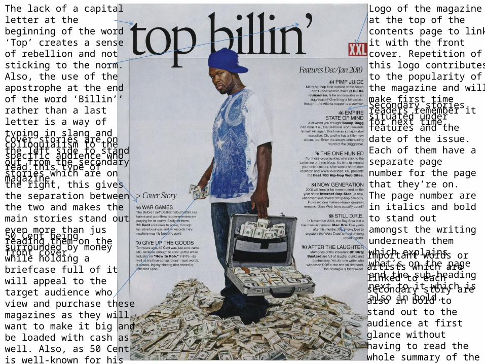
The lack of a capital letter at the beginning of the word ‘Top’ creates a sense of rebellion and not sticking to the norm. Also, the use of the apostrophe at the end of the word ‘Billin’’ rather than a last letter is a way of typing in slang and colloquialism to the specific audience who read this type of magazine.
Cover stories are on the left side to stand out from the secondary stories which are on the right, this gives the separation between the two and makes the main stories stand out even more than jus reading them on the front cover.
50 Cent being surrounded by money while holding a briefcase full of it will appeal to the target audience who view and purchase these magazines as they will want to make it big and be loaded with cash as well. Also, as 50 Cent is well-known for his music and is the artist in the cover story he is in the central position of the page taking up the most amount of space.
Logo of the magazine at the top of the contents page to link it with the front cover. Repetition of this logo contributes to the popularity of the magazine and will make first time readers remember it for next time.
Secondary stories situated under features and the date of the issue. Each of them have a separate page number for the page that they’re on. The page number are in italics and bold to stand out amongst the writing underneath them which explains what’s on the page and the sub-heading next to it which is also in bold.
Important words or artists which are linked to each secondary story are also in bold to stand out to the audience at first glance without having to read the whole summary of the article, this lets them know what page they might like to turn to if they like that artist.

Title on contents page doesn’t have capital letters and creates flow as there aren’t capital letters in the middle of a word; this is in the middle part of the magazine so should not need a capital letter. The apostrophe at the end of ‘Doin’’ appeals to the audience of the magazine as it is slang, which they will use in their day-to-day speech.
Caption for the cover story is inside the orange brackets which is a similar colour scheme to B.O.B’s clothing (orange, black and white), this gives the subtle connection between the two and lets the reader know that the main image on the page is to do with the cover story.
Main image is between the top and bottom black lines, this gives the magazine more of a clean and precise feeling, adding to the professionalism of it.
Copy on the contents page is all one colour (black), the only colours come from the coloured brackets and the main image –which has been done to link these two things together- and the logo of the magazine, this gives them the most attraction from the eye of the reader and makes them the first thing they say when they open up the magazine.
Secondary stories are each numbered and are in a list, the page number is in bold and the description of each page is in normal font, the key words on each page are in italics and are underlined to stand out to the reader. The difference in fonts gives a clear distinction between them.
Date of issue and logo are at the bottom of the page rather than the top – the magazine switches it up each issue to keep it fresh.

The only colours on the page come from the dash in ‘the A-side’, the coloured brackets surrounding the word ‘features’, the block that highlights the cover story on the page, the shape at the bottom of the page drawing attention to the caption of who photographed the main image, and the logo –all of which are the same colour to give an even sense of attraction throughout the page.
The secondary stories are all located on the left side of the page, this allows the main image to occupy everywhere else on the page and be the focal point of the whole contents page.
The page number of the cover story is larger than the rest to draw the most attention. The other page numbers are also bigger than the sub-headings and the key words in the description below are in bold to stand out.
Issue date is clearly at the top of the page so it is noticeable and follows the colour scheme of the whole magazine to keep the flow.
The main image which is linked to the cover story takes up the most space on the age, this is the first thing the audience will see when they open the magazine and the facial expressions on each of the artists in the image appear that they want to be seen as they are famous. Soulja Boy’s watch and chains reveal this too.
Floating quote linked with the main story is located on top Soulja Boy as he is the one who said it, he mentions 50 Cent in the quote and this shows the link between them in the main image, this makes the reader want to read on to find out more.
Use of the word ‘exclusively’ to show that it can only be found in this magazine.
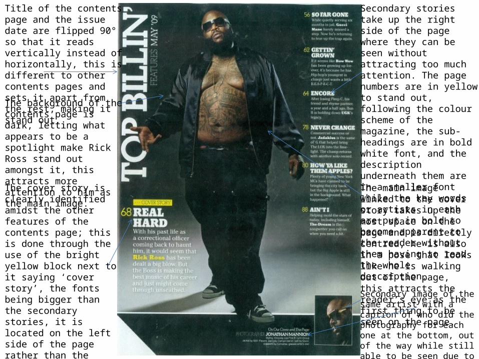
Title of the contents page and the issue date are flipped 90° so that it reads vertically instead of horizontally, this is different to other contents pages and sets it apart from the rest, making it stand out.
The background of the contents page is dark, letting what appears to be a spotlight make Rick Ross stand out amongst it, this attracts more attention to him as the main image.
The cover story is clearly identified amidst the other features of the contents page; this is done through the use of the bright yellow block next to it saying ‘cover story’, the fonts being bigger than the secondary stories, it is located on the left side of the page rather than the right side where the other ones are, and the words ‘Rick Ross’ are highlighted In yellow font to link it with the image of him in the centre of the page.
Secondary stories take up the right side of the page where they can be seen without attracting too much attention. The page numbers are in yellow to stand out, following the colour scheme of the magazine, the sub-headings are in bold white font, and the description underneath them are in a smaller font while the key words or artists in each are put in bold to become apparent to the reader without them having to read the whole description.The main image linked to the cover story takes up the most space on the page and is directly centred, he is also in a pose that looks like he is walking out of the page, this attracts the reader’s eye as the first thing to be seen on the page.
Secondary image of the same artist with a caption of who did the photography for each one at the bottom, out of the way while still able to be seen due to it standing out among the black block behind it.