corporate guidelines - cla guidelines.pdfcontents cla corporate guidelines introduction to cla 3...
TRANSCRIPT
WWW.CLA.ORG.UK
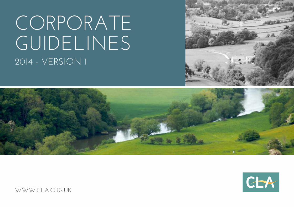
CORPORATE GUIDELINES2014 - VERSION 1
1
CLA CORPORATE GUIDELINESCONTENTS
INTRODUCTION TO CLA3 Introduction
4 Welcome to the CLA
5 What is a Brand?
6 Values and Personality
7 Using the CLA Brand Key
8 Brand Key
9 Brand Language
10 The CLA Tone of Voice
OUR LOOK12 Our Logo
13 Using our Logo
14 Use of Logo on Specified Colours
15 Incorrect Logo Usage
16 Colour Variations
17 Primary Colour Palette
18 Secondary Colour Palette
19 CLA Sub-brand Logos
20 CLA Cymru
21 CLA Game Fair
22 External Publications - Print Fonts/Paper
23 Internal Documents - Print Fonts
24 Photography
25 CLA Crest
DESIGN IN PRACTICE27 Corporate Stationery
28 Use of Secondary Colour Palette
29 Display Stands
30 Promotional Exhibition Stand
31 Charts and Diagrams
32 PowerPoint® Template
ONLINE34 Web Safe Fonts
35 Web Colour Palette
36 Enews Formats
INTRODUCTION TO CLA
2
3
CLA CORPORATE GUIDELINES
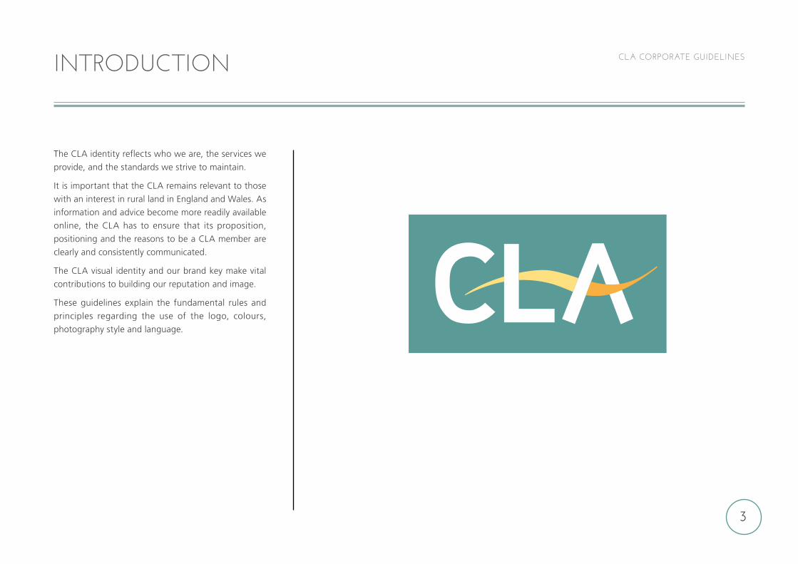
The CLA identity reflects who we are, the services we
provide, and the standards we strive to maintain.
It is important that the CLA remains relevant to those
with an interest in rural land in England and Wales. As
information and advice become more readily available
online, the CLA has to ensure that its proposition,
positioning and the reasons to be a CLA member are
clearly and consistently communicated.
The CLA visual identity and our brand key make vital
contributions to building our reputation and image.
These guidelines explain the fundamental rules and
principles regarding the use of the logo, colours,
photography style and language.
INTRODUCTION
4
CLA CORPORATE GUIDELINESWELCOME TO THE CLA
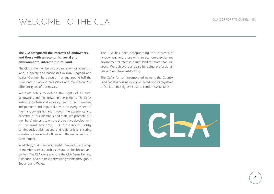
The CLA safeguards the interests of landowners, and those with an economic, social and environmental interest in rural land.
The CLA is the membership organisation for owners of
land, property and businesses in rural England and
Wales. Our members own or manage around half the
rural land in England and Wales and more than 250
different types of businesses.
We exist solely to defend the rights of all rural
landowners and their private property rights. The CLA’s
in-house professional advisory team offers members
independent and impartial advice on every aspect of
their landownership, and through the experience and
expertise of our members and staff, we promote our
members’ interests to ensure the positive development
of the rural economy. CLA professionals lobby
continuously at EU, national and regional level ensuring
a visible presence and influence in the media and with
Government.
In addition, CLA members benefit from access to a range
of member services such as insurance, healthcare and
utilities. The CLA owns and runs the CLA Game Fair and
runs social and business networking events throughout
England and Wales.
The CLA has been safeguarding the interests of
landowners, and those with an economic, social and
environmental interest in rural land for more than 100
years. We achieve our goals by being professional,
relevant and forward-looking.
The CLA’s formal, incorporated name is the Country
Land and Business Association Limited, and its registered
office is at 16 Belgrave Square, London SW1X 8PQ.
5
CLA CORPORATE GUIDELINESWHAT IS A BRAND?
A typical misconception is that a “new brand” means
a new name, or logo, or a new look and feel for an
existing company name. Many people think that brand
begins and ends there, that once a company name or
logo has been tweaked and it has been added to their
letterhead, email signature and website – that’s it – they
have a new brand.
Brand is much more than a name or logo: Brand is everything, and everything is brand.
Brand is our strategy – as a lobbying organisation,
our brand is our goals and the progress we are making
towards them.
Brand is our calls to action – are they inspiring or
insignificant? Are they consistent with a strategy that
makes sense?
Brand is our customer service – the way we react to
both existing and prospective members, to government
officials and to the general public.
Brand is the way we speak – do we write copy specific
to our different target audiences? Is it full of jargon?
Brand is the whole array of our communication tools – paying attention to the details is important,
whether in print (policy reports, press releases, member
letters, promotional literature, contracts), online
communications (website, emails) or three dimensional
items (display stands, banners).
Brand is us – the way each employee represents the
CLA affects the brand.
Brand is our facilities – are our offices clean and
uncluttered? Is our signage consistent with our visual
standards?
Brand is our logo and visuals too – our logo and
visual representation can have a great impact on a
prospective member, but these alone cannot make our
brand great.
6
CLA CORPORATE GUIDELINESVALUES AND PERSONALITY
The CLA is the membership organisation for owners of
land, property and businesses in rural England and
Wales. We offer our members independent and impartial
advice. We also use our expertise and experience on
rural matters to promote our members’ interests and
to influence government at all levels.
The CLA’s expertise is available to members in person,
on its website, and through its digital and printed
communications. The nature of the CLA’s work and
the relationship it has with its members is characterised
by being:
approachable and trustworthy
professional and knowledgeable
influential and forward-thinking
It is important that the CLA presents what it wants
to say in an accessible, uncomplicated way that is
understood by each of the many different audiences
it deals with – members, prospective members,
Government and opinion-formers, media partners,
corporate partners and sponsors, staff and the
general public.
7
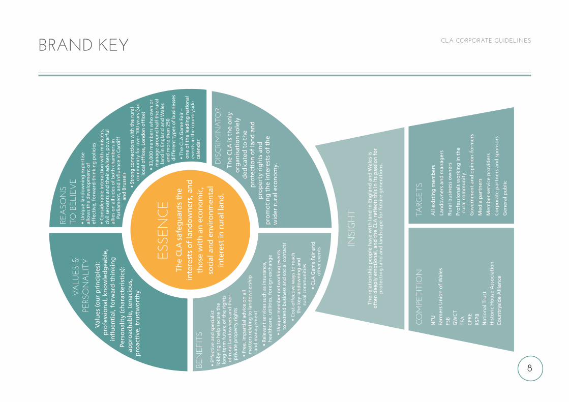
CLA CORPORATE GUIDELINESUSING THE CLA BRAND KEY
The CLA Brand Key summarises CLA characteristics
developed and agreed by the CLA as the foundation
for its market position and brand.
Referral to the Brand Key will improve communications
with CLA’s various stakeholders, and help the
development of relevant services for our members.
Understanding and using the Brand Key will ensure a
more consistent approach in the way we present the
CLA to internal and external audiences.
EssenceOur essence describes who we are and what we have
to offer.
Values and personalityOur brand values are what we stand for, they are what
we hold important and should influence all our activities.
Our brand personality is our character, the way in which
we behave and come across to others.
BenefitsThe differentiating functional and emotional benefits
for becoming a CLA member.
Reasons to believeWho we are – our brand essence – can be substantiated
by facts about the association which prove our authority.
Discriminator It is beneficial to be familiar with the single, most
compelling statement that sums up how the CLA is
distinguished from its competitors.
InsightIt is important to remember what we know about those
with whom we communicate most.
CompetitionIt is critical to think about the CLA’s competitors, those
organisations which may be seen as providing some of
the services offered by the CLA.
TargetsOur target audiences are the groups that should either
benefit from membership (existing and prospective
members), provide benefits to members, or be a focus
for the CLA’s lobbying work.
8
CLA CORPORATE GUIDELINESBRAND KEYRE
ASO
NS
TO B
ELIE
VE
• U
niq
ue
lan
do
wn
ing
exp
erti
se
allo
ws
the
dev
elo
pm
ent
of
effe
ctiv
e, f
orw
ard
-th
inki
ng
po
licie
s
• C
on
sid
erab
le in
tera
ctio
n w
ith
min
iste
rs,
civi
l ser
van
ts a
nd
th
eir
advi
sers
, po
wer
ful
allie
s o
n a
ll si
des
of
bo
th c
ham
ber
s in
Pa
rlia
men
t, a
nd
infl
uen
ce in
Car
dif
f
and
Bru
ssel
s
• St
ron
g c
on
nec
tio
ns
wit
h t
he
rura
l co
mm
un
ity
for
ove
r 10
0 ye
ars
(six
lo
cal o
ffic
es, L
on
do
n o
ffic
e)
• 33
,000
mem
ber
s w
ho
ow
n o
r m
anag
e ar
ou
nd
hal
f th
e ru
ral
lan
d in
En
gla
nd
an
d W
ales
an
d m
ore
th
an 2
50
dif
fere
nt
typ
es o
f b
usi
nes
ses
• Th
e C
LA G
ame
Fair
–
on
e o
f th
e le
adin
g n
atio
nal
ev
ents
in t
he
cou
ntr
ysid
e ca
len
dar
BEN
EFIT
S•
Effe
ctiv
e an
d s
pec
ialis
t lo
bb
yin
g t
o h
elp
sec
ure
th
e lo
ng
-ter
m f
utu
re o
f th
e ri
gh
ts
of
rura
l lan
do
wn
ers
and
th
eir
pri
vate
pro
per
ty r
igh
ts
• Fr
ee, i
mp
arti
al a
dvi
ce o
n a
ll m
atte
rs r
elat
ing
to
lan
do
wn
ersh
ip
and
man
agem
ent
• R
elev
ant
serv
ices
su
ch a
s in
sura
nce
, h
ealt
hca
re, u
tilit
ies,
fo
reig
n e
xch
ang
e
• U
niq
ue
mem
ber
net
wo
rkin
g e
ven
ts
to e
xten
d b
usi
nes
s an
d s
oci
al c
on
tact
s
• C
ost
-eff
ecti
ve w
ays
to r
each
th
e ke
y la
nd
ow
nin
g a
nd
ru
ral c
om
mu
nit
ies
• C
LA G
ame
Fair
an
d
oth
er e
ven
ts
COM
PETI
TIO
NTA
RGE
TS
V
ALU
ES &
PE
RSO
NA
LITY
Val
ues
(ou
r p
rin
cip
les)
: p
rofe
ssio
nal
, kn
ow
led
gea
ble
, in
flu
enti
al, f
orw
ard
-th
inki
ng
Pers
on
alit
y (c
har
acte
rist
ics)
: ap
pro
ach
able
, ten
acio
us,
p
roac
tive
, tru
stw
ort
hy
ESSE
NC
ETh
e C
LA s
afeg
uar
ds
the
inte
rest
s o
f la
nd
ow
ner
s, a
nd
th
ose
wit
h a
n e
con
om
ic,
soci
al a
nd
en
viro
nm
enta
l in
tere
st in
ru
ral l
and
.
NFU
Farm
ers
Un
ion
of
Wal
esFS
BG
WC
TTF
AC
PRE
RSP
BN
atio
nal
Tru
stH
isto
ric
Ho
use
Ass
oci
atio
nC
ou
ntr
ysid
e A
llian
ce
All
exis
tin
g m
emb
ers
Lan
do
wn
ers
and
man
ager
s
Ru
ral b
usi
nes
s o
wn
ers
Pro
fess
ion
als
wo
rkin
g in
th
e
ru
ral c
om
mu
nit
y
Go
vern
men
t an
d o
pin
ion
-fo
rmer
s
Med
ia p
artn
ers
Mem
ber
ser
vice
pro
vid
ers
Co
rpo
rate
par
tner
s an
d s
po
nso
rs
Gen
eral
pu
blic
DIS
CRI
MIN
ATO
RTh
e C
LA is
th
e o
nly
o
rgan
isat
ion
so
lely
d
edic
ated
to
th
e p
rote
ctio
n o
f la
nd
an
d
pro
per
ty r
igh
ts a
nd
p
rom
oti
ng
th
e in
tere
sts
of
the
w
ider
ru
ral e
con
om
y.
INSI
GH
T
The
rela
tio
nsh
ip p
eop
le h
ave
wit
h la
nd
in E
ng
lan
d a
nd
Wal
es is
o
ften
dee
ply
em
oti
on
al, a
nd
th
e C
LA r
efle
cts
this
in it
s p
assi
on
fo
r p
rote
ctin
g la
nd
an
d la
nd
scap
e fo
r fu
ture
gen
erat
ion
s.
9
CLA CORPORATE GUIDELINES
Much of our work requires tackling complex legal
matters and working on subjects where there is often
a political or social bias. We should use our knowledge
and expertise to communicate complex issues in a simple
and straightforward way. Unless necessary, we must
avoid jargon and terms that require specialist knowledge
to understand.
Taking time to edit copy is vital. Ask yourself if the same
information can be given more succinctly? Is there jargon
that can be removed? Making complex subjects easy
to understand takes time, but it is important to the way
we engage with existing and prospective members,
Government and opinion-formers, media partners,
corporate partners and sponsors, staff and the general
public. It also reflects our personality of being
approachable and trustworthy.
The CLAThe CLA is the name of our organisation. Within text
we are referred to as the CLA (not The CLA). All our
communications should reflect the essence of what the
CLA does.
The CLA safeguards the interests of landowners, and those with an economic, social and environmental interest in rural land.
BRAND LANGUAGE
10
CLA CORPORATE GUIDELINES
The written word is as important to a brand as any other
element. Our communications must be knowledgeable
and authoritative.
When communicating with members of the CLA the
information we provide must also be to their benefit,
and when dealing with legislators our material must be
convincing. When producing materials for the CLA, you
should follow our communications principles to ensure
that your work is:
Clear and professional: demonstrating pride
and authority in what we do.
Straightforward: avoiding gimmicks and
over-complicated design or wording.
Modern: portraying the CLA in a way that is
contemporary and up to date.
Accessible: understood by the target audience.
Honest: avoiding misleading information
or false promises.
THE CLA TONE OF VOICE
OUR LOOK
11
12
CLA CORPORATE GUIDELINES
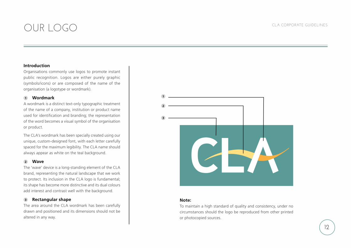
IntroductionOrganisations commonly use logos to promote instant
public recognition. Logos are either purely graphic
(symbols/icons) or are composed of the name of the
organisation (a logotype or wordmark).
1 WordmarkA wordmark is a distinct text-only typographic treatment
of the name of a company, institution or product name
used for identification and branding; the representation
of the word becomes a visual symbol of the organisation
or product.
The CLA’s wordmark has been specially created using our
unique, custom-designed font, with each letter carefully
spaced for the maximum legibility. The CLA name should
always appear as white on the teal background.
2 WaveThe ‘wave’ device is a long-standing element of the CLA
brand, representing the natural landscape that we work
to protect. Its inclusion in the CLA logo is fundamental;
its shape has become more distinctive and its dual colours
add interest and contrast well with the background.
3 Rectangular shapeThe area around the CLA wordmark has been carefully
drawn and positioned and its dimensions should not be
altered in any way.
OUR LOGO
1
2
3
Note: To maintain a high standard of quality and consistency, under no
circumstances should the logo be reproduced from other printed
or photocopied sources.
13
CLA CORPORATE GUIDELINES
2
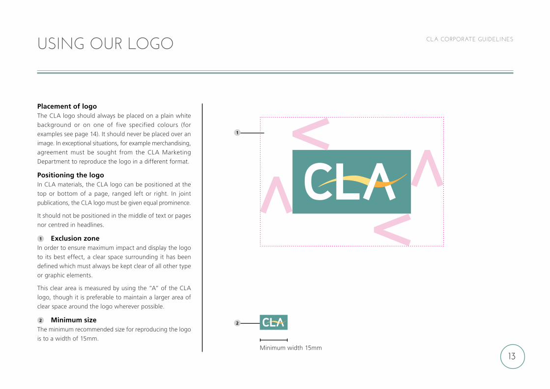
Placement of logoThe CLA logo should always be placed on a plain white
background or on one of five specified colours (for
examples see page 14). It should never be placed over an
image. In exceptional situations, for example merchandising,
agreement must be sought from the CLA Marketing
Department to reproduce the logo in a different format.
Positioning the logoIn CLA materials, the CLA logo can be positioned at the
top or bottom of a page, ranged left or right. In joint
publications, the CLA logo must be given equal prominence.
It should not be positioned in the middle of text or pages
nor centred in headlines.
1 Exclusion zoneIn order to ensure maximum impact and display the logo
to its best effect, a clear space surrounding it has been
defined which must always be kept clear of all other type
or graphic elements.
This clear area is measured by using the “A” of the CLA
logo, though it is preferable to maintain a larger area of
clear space around the logo wherever possible.
2 Minimum sizeThe minimum recommended size for reproducing the logo
is to a width of 15mm.
USING OUR LOGO
Minimum width 15mm
1
14
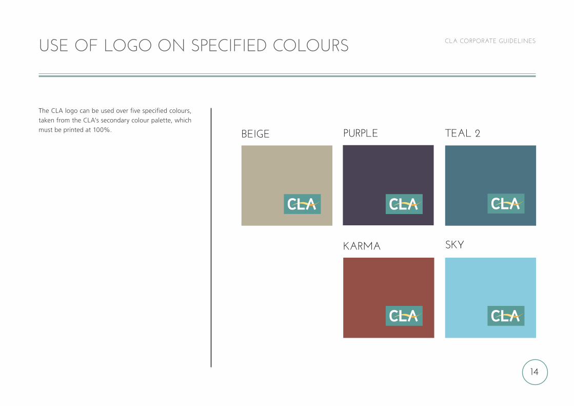
CLA CORPORATE GUIDELINESUSE OF LOGO ON SPECIFIED COLOURS
TEAL 2
KARMA SKY
BEIGE PURPLE
The CLA logo can be used over five specified colours,
taken from the CLA’s secondary colour palette, which
must be printed at 100%.
15
CLA CORPORATE GUIDELINES
6
1
2
3
4
5
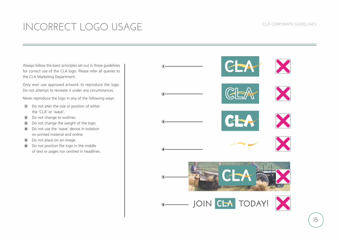
Always follow the basic principles set out in these guidelines
for correct use of the CLA logo. Please refer all queries to
the CLA Marketing Department.
Only ever use approved artwork to reproduce the logo.
Do not attempt to recreate it under any circumstances.
Never reproduce the logo in any of the following ways:
1 Do not alter the size or position of either
the ‘CLA’ or ‘wave’.2 Do not change to outlines.3 Do not change the weight of the logo.4 Do not use the ‘wave’ device in isolation
on printed material and online.5 Do not place on an image.6 Do not position the logo in the middle
of text or pages nor centred in headlines.
INCORRECT LOGO USAGE
JOIN TODAY!
16
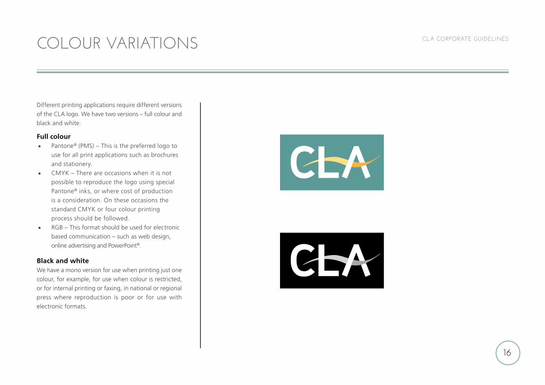
CLA CORPORATE GUIDELINESCOLOUR VARIATIONS
Different printing applications require different versions
of the CLA logo. We have two versions – full colour and
black and white.
Full colour Pantone® (PMS) – This is the preferred logo to
use for all print applications such as brochures
and stationery.
CMYK – There are occasions when it is not
possible to reproduce the logo using special
Pantone® inks, or where cost of production
is a consideration. On these occasions the
standard CMYK or four colour printing
process should be followed.
RGB – This format should be used for electronic
based communication – such as web design,
online advertising and PowerPoint®.
Black and whiteWe have a mono version for use when printing just one
colour, for example, for use when colour is restricted,
or for internal printing or faxing, in national or regional
press where reproduction is poor or for use with
electronic formats.
17
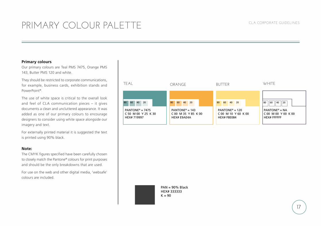
CLA CORPORATE GUIDELINESPRIMARY COLOUR PALETTE
PAN = 90% BlackHEX# 333333K = 90
TEAL ORANGE BUTTER WHITE
PANTONE® = 7475C 50 M 00 Y 25 K 30HEX# 719997
PANTONE® = 143C 00 M 35 Y 85 K 00HEX# E9AE4A
PANTONE® = 120C 00 M 10 Y 60 K 00HEX# F8E084
PANTONE® = NAC 00 M 00 Y 00 K 00HEX# FFFFFF
80 60 40 20 80 60 40 20 80 60 40 20 80 60 40 20
Primary coloursOur primary colours are Teal PMS 7475, Orange PMS
143, Butter PMS 120 and white.
They should be restricted to corporate communications,
for example, business cards, exhibition stands and
PowerPoint®.
The use of white space is critical to the overall look
and feel of CLA communication pieces – it gives
documents a clean and uncluttered appearance. It was
added as one of our primary colours to encourage
designers to consider using white space alongside our
imagery and text.
For externally printed material it is suggested the text
is printed using 90% black.
Note:The CMYK figures specified have been carefully chosen
to closely match the Pantone® colours for print purposes
and should be the only breakdowns that are used.
For use on the web and other digital media, ‘websafe’
colours are included.
18
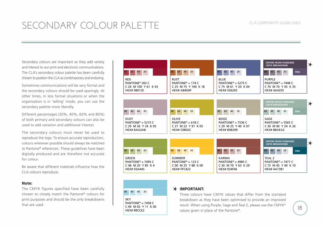
CLA CORPORATE GUIDELINES
REDPANTONE® 202 CC 26 M 100 Y 61 K 43 HEX# 98012E
DUST PANTONE® = 5215 CC 29 M 36 Y 24 K 05HEX# BAA3AB
GREEN PANTONE® = 7495 CC 48 M 20 Y 85 K 4HEX# 93A445
SKY PANTONE® = 7458 CC 49 M 03 Y 11 K 00HEX# 89CCE2
RUSTPANTONE® = 174 CC 25 M 75 Y 100 K 18HEX# A84D0F
OLIVE PANTONE® = 618 CC 27 M 22 Y 91 K 05HEX# C0B02C
SUMMER PANTONE® = 123 CC 00 M 25 Y 88 K 00HEX# FFC423
BLUEPANTONE® = 5275 CC 75 M 61 Y 20 K 04HEX# 556293
BEIGE PANTONE® = 7536 CC 29 M 25 Y 40 K 07HEX# B9B299
KARMA PANTONE® = 4985 CC 30 M 70 Y 63 K 29HEX# 934F46
PURPLE PANTONE® = 7448 CC 70 M 70 Y 45 K 35HEX# 4A4355
SAGE PANTONE® = 5565 CC 30 M 00 Y 24 K 26HEX# 8BAEA2
TEAL 2 PANTONE® = 7477 CC 75 M 45 Y 40 K 10HEX# 4A7381
80 60 40 20
80 60 40 20
80 60 40 20
80 60 40 20
80 60 40 20
80 60 40 20
80 60 40 20
80 60 40 20
80 60 40 20
80 60 40 20
80 60 40 20
80 60 40 20
80 60 40 20
DIFFERS FROM STANDARD CMYK BREAKDOWN
DIFFERS FROM STANDARD CMYK BREAKDOWN
DIFFERS FROM STANDARD CMYK BREAKDOWN
PMS
PMS
PMS
IMPORTANT:Three colours have CMYK values that differ from the standard
breakdown as they have been optimised to provide an improved
result. When using Purple, Sage and Teal 2, please use the CMYK*
values given in place of the Pantone®.
SECONDARY COLOUR PALETTE
Secondary colours are important as they add variety
and interest to our print and electronic communications.
The CLA’s secondary colour palette has been carefully
chosen to position the CLA as contemporary and enduring.
Sometimes communications will be very formal and
the secondary colours should be used sparingly. At
other times, in less formal situations or when the
organisation is in ‘selling’ mode, you can use the
secondary palette more liberally.
Different percentages (20%, 40%, 60% and 80%)
of both primary and secondary colours can also be
used to add variation and additional interest.
The secondary colours must never be used to
reproduce the logo. To ensure accurate reproduction,
colours wherever possible should always be matched
to Pantone® references. These guidelines have been
digitally produced and are therefore not accurate
for colour.
Be aware that different materials influence how the
CLA colours reproduce.
Note:The CMYK figures specified have been carefully
chosen to closely match the Pantone® colours for
print purposes and should be the only breakdowns
that are used.
19
CLA CORPORATE GUIDELINES
INSURANCEINSURANCE
For general CLA communications, the CLA ‘parent’
logo should be used.
Sub-brands within the CLA have their own version of
the CLA logo, for example, CLA Wales, CLA Game Fair,
CLA London Branch, CLA Member Services and CLA
Charitable Trust. Where appropriate these can be used
in place of the CLA ‘parent’ logo, always maintain the
exclusion zone.
Under no circumstances should you create a logo for
a sub-brand. Should you think you require one, please
contact the CLA Marketing Department.
Logos for CLA London Branch, CLA member service
partners and CLA Charitable Trust are shown here.
Our logos for CLA Wales (CLA Cymru) and the CLA
Game Fair are dealt with separately.
Note:CLA sub-brand logos are supplied as artworks
and should never be altered, distorted or recreated
in any way.
CLA SUB-BRAND LOGOS
FOREIGN EXCHANGE
HEALTHCARE
UTILITIES
CHARITABLETRUST
UTILITIES
CHARITABLETRUST
HEALTHCARE
FOREIGN EXCHANGE
Minimum
height 10mm
20
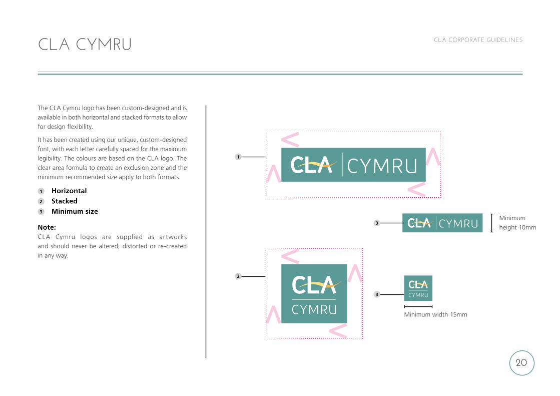
CLA CORPORATE GUIDELINESCLA CYMRU
The CLA Cymru logo has been custom-designed and is
available in both horizontal and stacked formats to allow
for design flexibility.
It has been created using our unique, custom-designed
font, with each letter carefully spaced for the maximum
legibility. The colours are based on the CLA logo. The
clear area formula to create an exclusion zone and the
minimum recommended size apply to both formats.
1 Horizontal 2 Stacked3 Minimum size
Note:CLA Cymru logos are supplied as artworks
and should never be altered, distorted or re-created
in any way.
2
3
3
Minimum width 15mm
1
Minimum
height 10mm
21
CLA CORPORATE GUIDELINESCLA GAME FAIR
1
2
3
4
4
4
Minimum
width 15mm
Minimum
width 15mm
Minimum
height 10mm
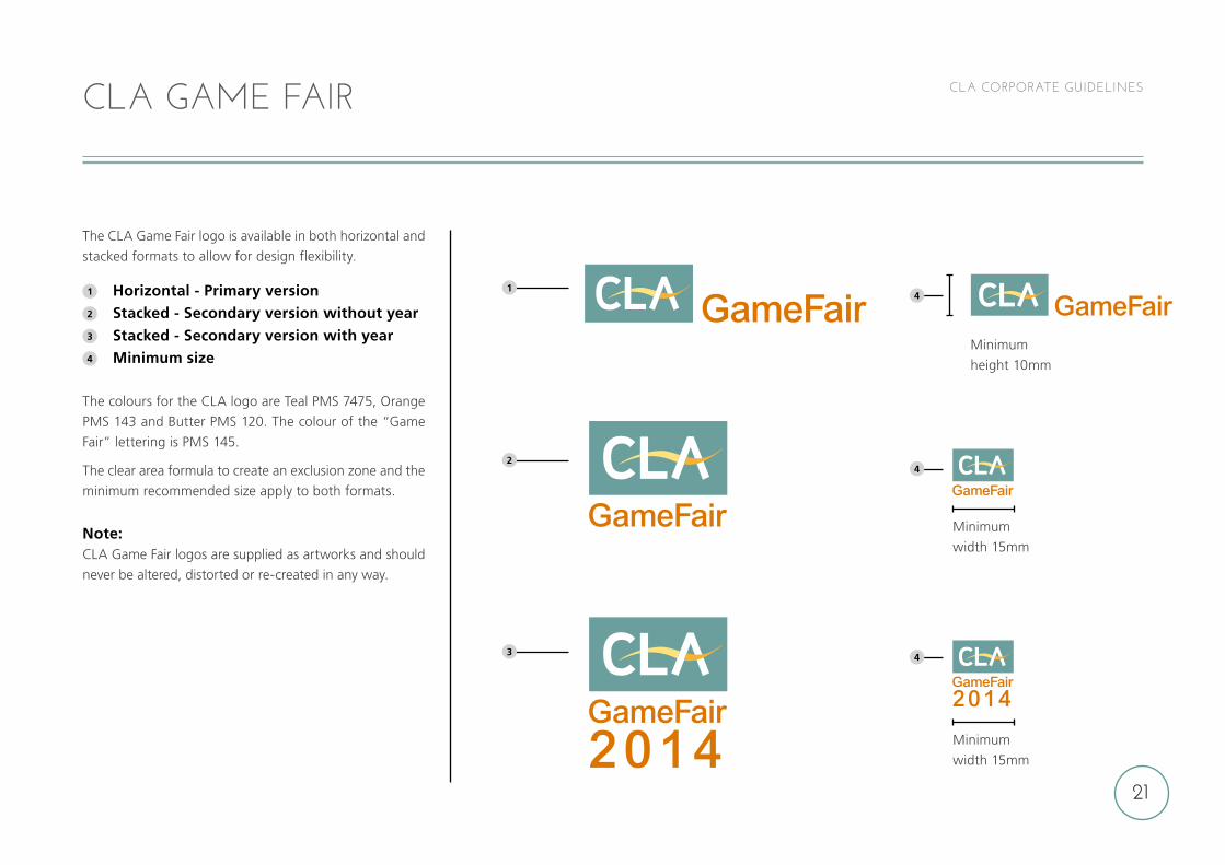
The CLA Game Fair logo is available in both horizontal and
stacked formats to allow for design flexibility.
1 Horizontal - Primary version2 Stacked - Secondary version without year3 Stacked - Secondary version with year4 Minimum size
The colours for the CLA logo are Teal PMS 7475, Orange
PMS 143 and Butter PMS 120. The colour of the “Game
Fair” lettering is PMS 145.
The clear area formula to create an exclusion zone and the
minimum recommended size apply to both formats.
Note:CLA Game Fair logos are supplied as artworks and should
never be altered, distorted or re-created in any way.
22
CLA CORPORATE GUIDELINESEXTERNAL PUBLICATIONS - PRINT FONTS/PAPER
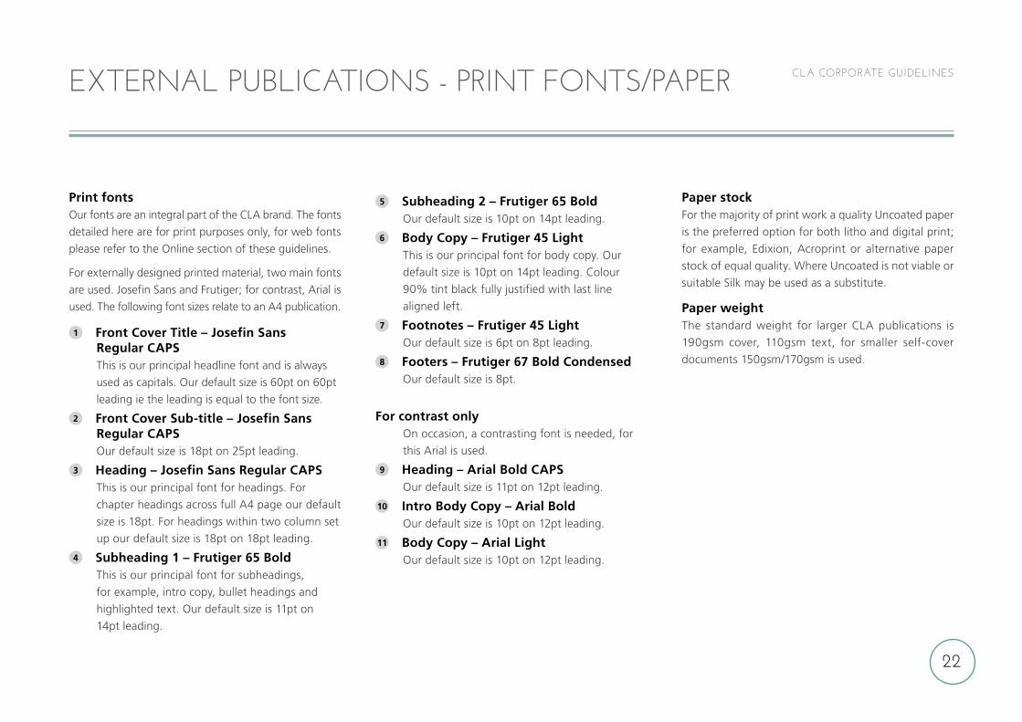
Print fontsOur fonts are an integral part of the CLA brand. The fonts
detailed here are for print purposes only, for web fonts
please refer to the Online section of these guidelines.
For externally designed printed material, two main fonts
are used. Josefin Sans and Frutiger; for contrast, Arial is
used. The following font sizes relate to an A4 publication.
1 Front Cover Title – Josefin Sans Regular CAPS This is our principal headline font and is always
used as capitals. Our default size is 60pt on 60pt
leading ie the leading is equal to the font size.
2 Front Cover Sub-title – Josefin Sans Regular CAPS Our default size is 18pt on 25pt leading.
3 Heading – Josefin Sans Regular CAPS This is our principal font for headings. For
chapter headings across full A4 page our default
size is 18pt. For headings within two column set
up our default size is 18pt on 18pt leading.
4 Subheading 1 – Frutiger 65 Bold This is our principal font for subheadings,
for example, intro copy, bullet headings and
highlighted text. Our default size is 11pt on
14pt leading.
5 Subheading 2 – Frutiger 65 Bold Our default size is 10pt on 14pt leading.
6 Body Copy – Frutiger 45 Light This is our principal font for body copy. Our
default size is 10pt on 14pt leading. Colour
90% tint black fully justified with last line
aligned left.
7 Footnotes – Frutiger 45 Light Our default size is 6pt on 8pt leading.
8 Footers – Frutiger 67 Bold Condensed Our default size is 8pt.
For contrast only On occasion, a contrasting font is needed, for
this Arial is used.
9 Heading – Arial Bold CAPS Our default size is 11pt on 12pt leading.
10 Intro Body Copy – Arial Bold Our default size is 10pt on 12pt leading.
11 Body Copy – Arial Light Our default size is 10pt on 12pt leading.
Paper stockFor the majority of print work a quality Uncoated paper
is the preferred option for both litho and digital print;
for example, Edixion, Acroprint or alternative paper
stock of equal quality. Where Uncoated is not viable or
suitable Silk may be used as a substitute.
Paper weightThe standard weight for larger CLA publications is
190gsm cover, 110gsm text, for smaller self-cover
documents 150gsm/170gsm is used.
23
INTERNAL DOCUMENTS - PRINT FONTS
Arial is the default font for all in-house design work
when restrictive font sets are available, such as when
using Microsoft® Word, PowerPoint® and other internally
produced documents.
Recommended font sizes and spacing Title – Arial Bold at 18pt
(maximum 22pt, two lines).
Heading 1 – Arial Bold at 14pt.
Heading 2 – Arial Bold at 12pt.
Heading 3 – Arial Bold at 11pt.
Body copy – Arial 11pt.
Points to note Single line spacing, with spacing before and
after set at 0pt.
For clarity Headings should be set using either
sentence case or upper and lower characters (ie
not capitals letters); always range to the left,
never justify, centre or range the type to the
right.
Body copy should be set out in one column with
text left aligned.
Use the Bold format sparingly, for headings or
titles or to increase the emphasis of a word.
The use of italics is not encouraged and should
only be used where additional emphasis is
required, or when necessary, for example, a
legal case name.
The use of underlining is not encouraged as the
modern convention is that underlining
represents a link to a website.
Never ‘play’ with the font, stretching, colouring
or unnecessarily enlarging or shrinking the size.
Ensure your document is adequately spaced, for
example, use two hard returns between
sections.
CLA CORPORATE GUIDELINES
24
CLA CORPORATE GUIDELINES
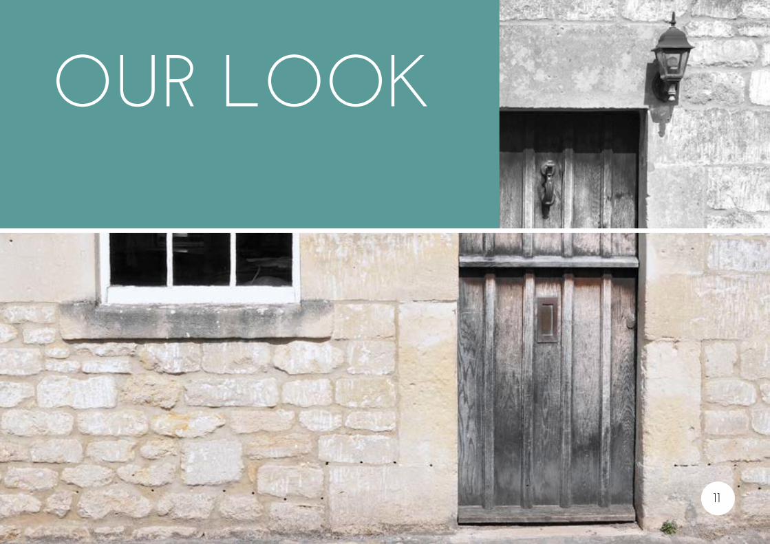
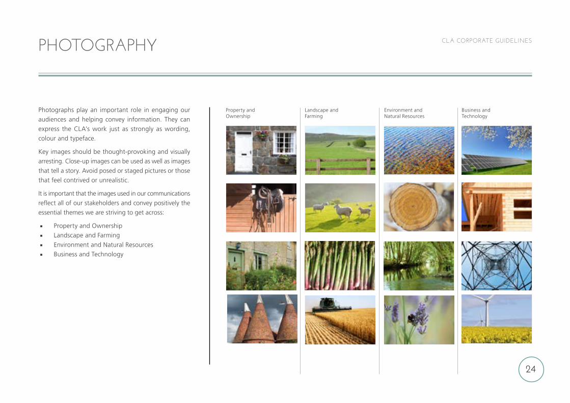
Photographs play an important role in engaging our
audiences and helping convey information. They can
express the CLA’s work just as strongly as wording,
colour and typeface.
Key images should be thought-provoking and visually
arresting. Close-up images can be used as well as images
that tell a story. Avoid posed or staged pictures or those
that feel contrived or unrealistic.
It is important that the images used in our communications
reflect all of our stakeholders and convey positively the
essential themes we are striving to get across:
Property and Ownership
Landscape and Farming
Environment and Natural Resources
Business and Technology
PHOTOGRAPHY
Property and Ownership
Landscape and Farming
Environment and Natural Resources
Business and Technology
25
CLA CORPORATE GUIDELINES
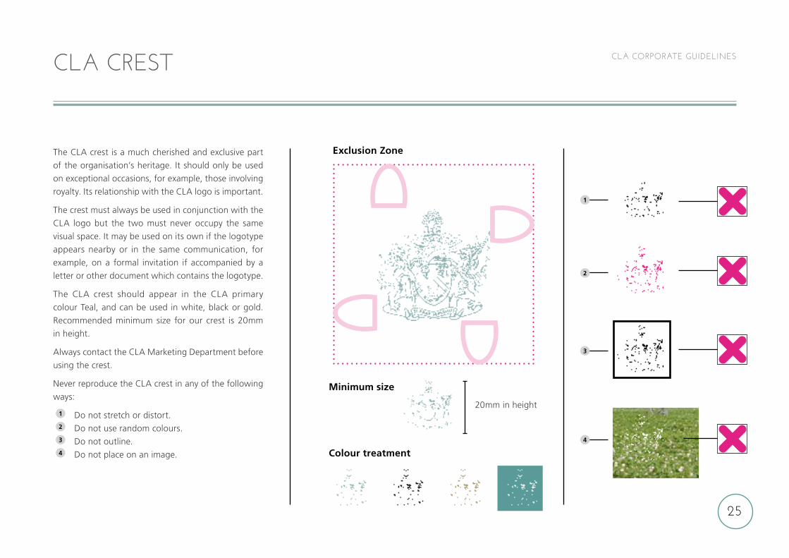
The CLA crest is a much cherished and exclusive part
of the organisation’s heritage. It should only be used
on exceptional occasions, for example, those involving
royalty. Its relationship with the CLA logo is important.
The crest must always be used in conjunction with the
CLA logo but the two must never occupy the same
visual space. It may be used on its own if the logotype
appears nearby or in the same communication, for
example, on a formal invitation if accompanied by a
letter or other document which contains the logotype.
The CLA crest should appear in the CLA primary
colour Teal, and can be used in white, black or gold.
Recommended minimum size for our crest is 20mm
in height.
Always contact the CLA Marketing Department before
using the crest.
Never reproduce the CLA crest in any of the following
ways:
1 Do not stretch or distort.2 Do not use random colours.3 Do not outline.4 Do not place on an image.
CLA CREST
20mm in height
Exclusion Zone
Minimum size
Colour treatment
1
2
3
4
DESIGN IN PRACTICE
26
27
CLA CORPORATE GUIDELINES
COUNTRY LAND AND BUSINESS ASSOCIATION LIMITED. REGISTERED IN ENGLAND AND WALES NO: 6131587. REGISTERED OFFICE: 16 BELGRAVE SQUARE, LONDON SW1X 8PQ.
CORPORATE STATIONERY
WITH COMPLIMENTS
. WWW.CLA.ORG.UK
HenRy ROBInsOnPResIDenT
16 Belgrave Square, London SW1X 8PQ
Tel: 020 7460 7929
MOB: 07973 688240
FAX: 020 7235 4696
eMAIl: [email protected]
TWITTeR: @CLAtweetsWWW.CLA.ORG.UK
2014 Business cards LND HR_Layout 1 06/12/2013 10:29 Page 27
Registered office: 16 Belgrave Square, London SW1X 8PQ
2014 Business cards LND HR_Layout 1 06/12/2013 10:29 Page 28
28
CLA CORPORATE GUIDELINES
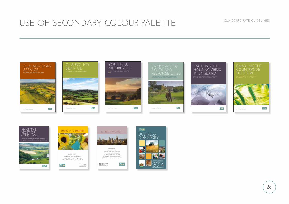
IF YOU ARE A LANDOWNER YOU SHOULD BE A MEMBER OF THE CLA. JOIN THE ORGANISATION THAT PROTECTS YOUR LAND.
MAKE THE MOST OF YOUR LAND
TACKLING THE HOUSING CRISIS IN ENGLANDCLA POLICY ON SECURING AND INCREASING HOUSING SUPPLY IN ENGLAND 2013-2018
LANDOWNINGRIGHTS ANDRESPONSIBILITIESWhether you oWn a single acre or 10,000,MeMbership of the cla is essential for you.
WWW.CLA.ORG.UKWWW.cla.org.uK
Enabling thEcountrysidE to thrivECLA MANIFESTO FOR THE EUROPEAN PARLIAMENT ELECTIONS 2014
USE OF SECONDARY COLOUR PALETTE
CLA AdvisORyseRviCeProviding the suPPort you need2014
WWW.CLA.ORG.UK
CLA POLICYSERVICEINFLUENCING DECISION-MAKERS
WWW.CLA.ORG.UK
Policy doc2014NS_Layout 1 11/02/2014 14:23 Page 3
Business directory
2014Your source for rural products and services provided by CLA members
www.clabusinessdirectory.co.uk
Spring into Summer
Henry Robinson
President of the CLA
invites you to the CLA’s Summer Party
on Wednesday 4 June 2014, 6pm - 8pm
at CLA, 16 Belgrave Square, London SW1X 8PQ
RSVP by Friday 23 MayCarol Brown
CLA, 16 Belgrave Square London SW1X 8PQ
Dinner invitation
Henry Robinson
President of the CLA
invites you to the CLA’s Media Dinner
at the Oxford Farming Conference
at 7.30pm, Tuesday, 7 January 2014
at The Private Dining Room, Malmaison,
3 Oxford Castle, New Road, Oxford OX1 1ND
RSVP by 20 December 2013TEL: 020 7460 7936EMAIL: [email protected]
yOUR CLAmembeRshipMaking valuable connections2014
WWW.CLA.ORG.UK
Members Services 2014NS_Layout 1 14/02/2014 14:01 Page 3
29
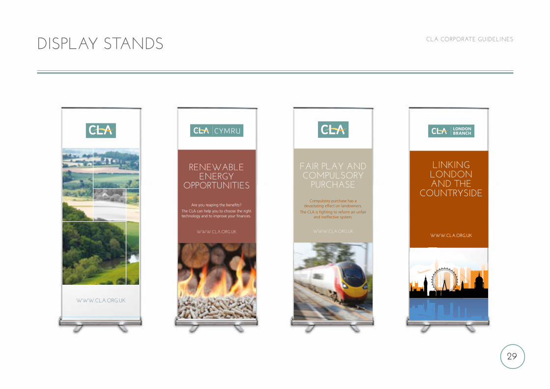
CLA CORPORATE GUIDELINES
www.cla.org.uk
Fair play anDcompulsory
purchase
Compulsory purchase has adevastating effect on landowners.
The CLA is fighting to reform an unfairand ineffective system.
www.cla.org.ukwww.cla.org.uk
This area is non-visable within cartridge
linking london and the
countryside
London branch drops 2014D_Layout 1 05/02/2014 09:58 Page 1
renewaBleenergy
opporTuniTies
Are you reaping the benefits?
The CLA can help you to choose the righttechnology and to improve your finances.
www.cla.org.uk
DISPLAY STANDS
30
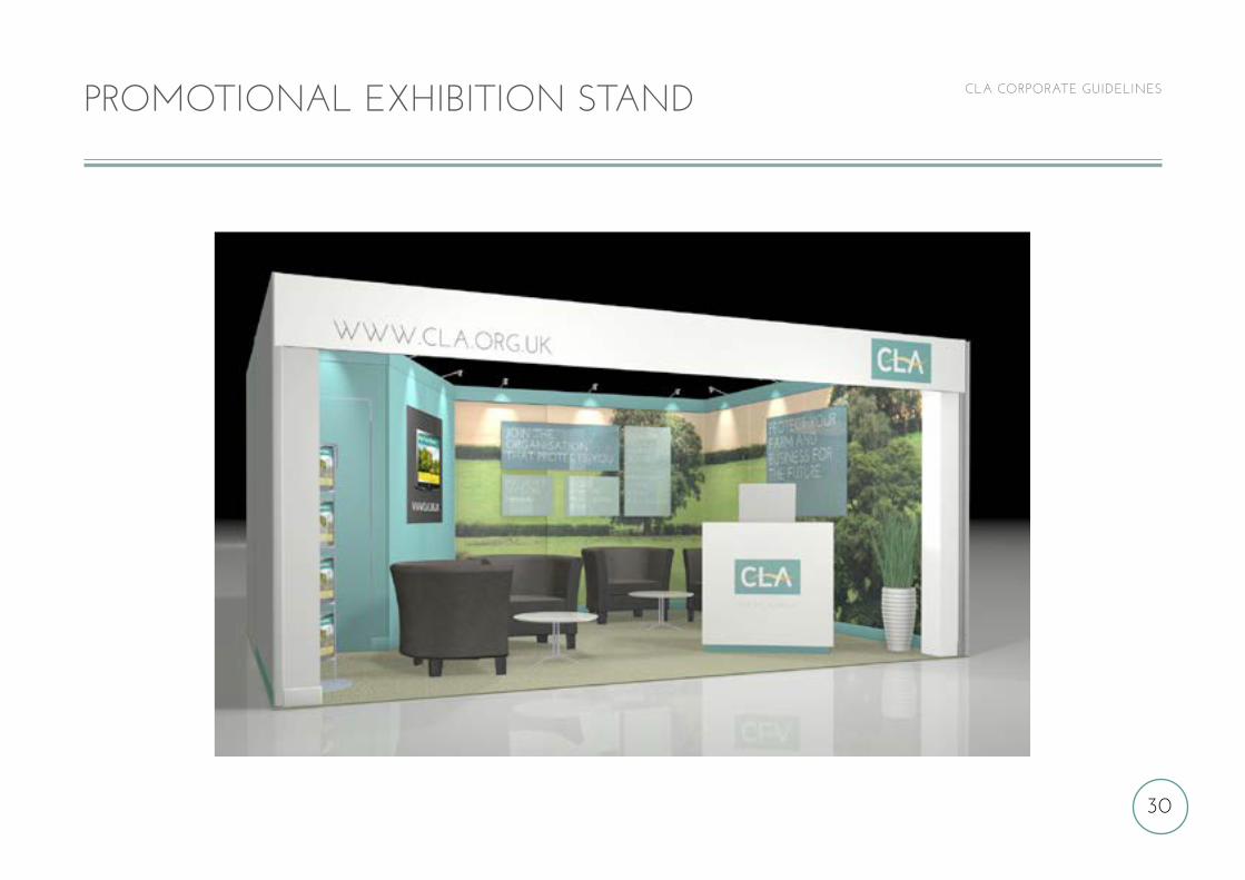
CLA CORPORATE GUIDELINESPROMOTIONAL EXHIBITION STAND
Design: [email protected] All Rights Reserved
Date: 7/01/2014
Client: CLA
Event: LAMMA 2014
31
CLA CORPORATE GUIDELINES
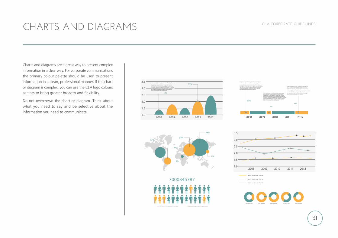
Charts and diagrams are a great way to present complex
information in a clear way. For corporate communications
the primary colour palette should be used to present
information in a clean, professional manner. If the chart
or diagram is complex, you can use the CLA logo colours
as tints to bring greater breadth and flexibility.
Do not overcrowd the chart or diagram. Think about
what you need to say and be selective about the
information you need to communicate.
CHARTS AND DIAGRAMS
32
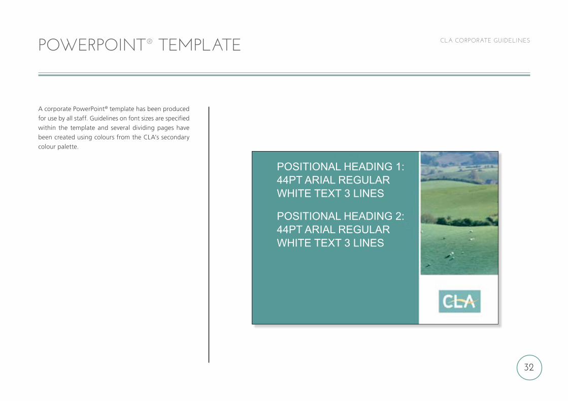
CLA CORPORATE GUIDELINESPOWERPOINT® TEMPLATE
A corporate PowerPoint® template has been produced
for use by all staff. Guidelines on font sizes are specified
within the template and several dividing pages have
been created using colours from the CLA’s secondary
colour palette.
POSITIONAL HEADING 1: 44PT ARIAL REGULAR WHITE TEXT 3 LINES
POSITIONAL HEADING 2: 44PT ARIAL REGULAR WHITE TEXT 3 LINES

ONLINE
33
34
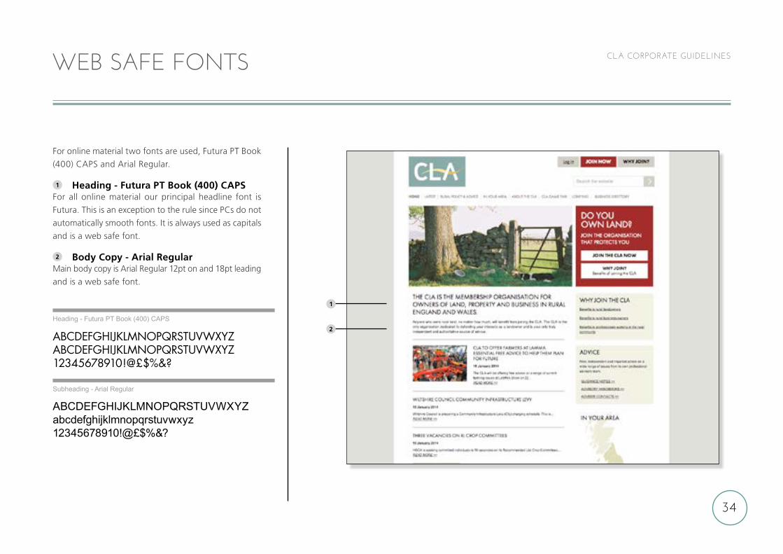
CLA CORPORATE GUIDELINESWEB SAFE FONTS
For online material two fonts are used, Futura PT Book
(400) CAPS and Arial Regular.
1 Heading - Futura PT Book (400) CAPSFor all online material our principal headline font is
Futura. This is an exception to the rule since PCs do not
automatically smooth fonts. It is always used as capitals
and is a web safe font.
2 Body Copy - Arial RegularMain body copy is Arial Regular 12pt on and 18pt leading
and is a web safe font.
ABCDEFGHIJKLMNOPQRSTUVWXYZABCDEFGHIJKLMNOPQRSTUVWXYZ12345678910!@£$%&?
ABCDEFGHIJKLMNOPQRSTUVWXYZabcdefghijklmnopqrstuvwxyz12345678910!@£$%&?
Heading - Futura PT Book (400) CAPS
Subheading - Arial Regular
1
2
35
CLA CORPORATE GUIDELINES
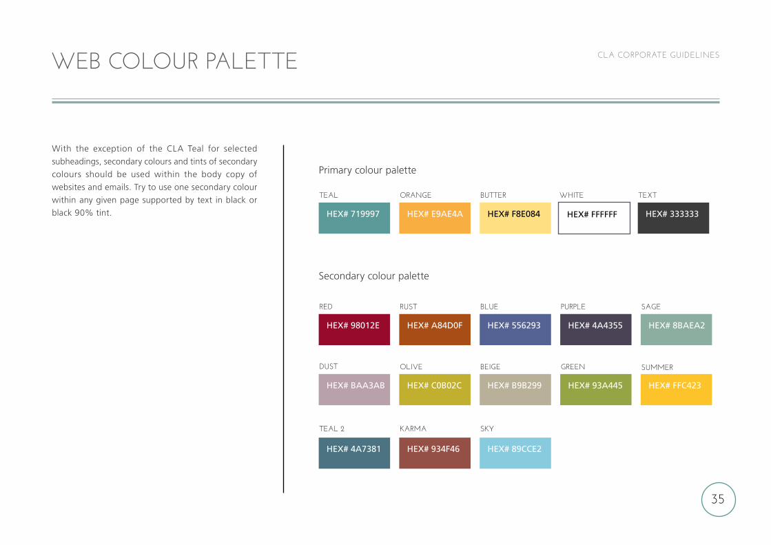
With the exception of the CLA Teal for selected
subheadings, secondary colours and tints of secondary
colours should be used within the body copy of
websites and emails. Try to use one secondary colour
within any given page supported by text in black or
black 90% tint.
WEB COLOUR PALETTE
TEAL 2
HEX# 4A7381
KARMA
HEX# 934F46
SKY
HEX# 89CCE2
RED
TEAL
DUST
HEX# 98012E
HEX# 719997
HEX# BAA3AB
RUST
ORANGE WHITE TEXT
OLIVE
HEX# A84D0F
HEX# E9AE4A HEX# FFFFFF HEX# 333333
HEX# C0B02C
BLUE
BUTTER
BEIGE
HEX# 556293
HEX# F8E084
HEX# B9B299
PURPLE
GREEN
HEX# 4A4355
HEX# 93A445
SAGE
SUMMER
HEX# 8BAEA2
HEX# FFC423
Secondary colour palette
Primary colour palette
36
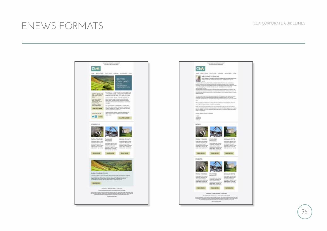
CLA CORPORATE GUIDELINESENEWS FORMATS
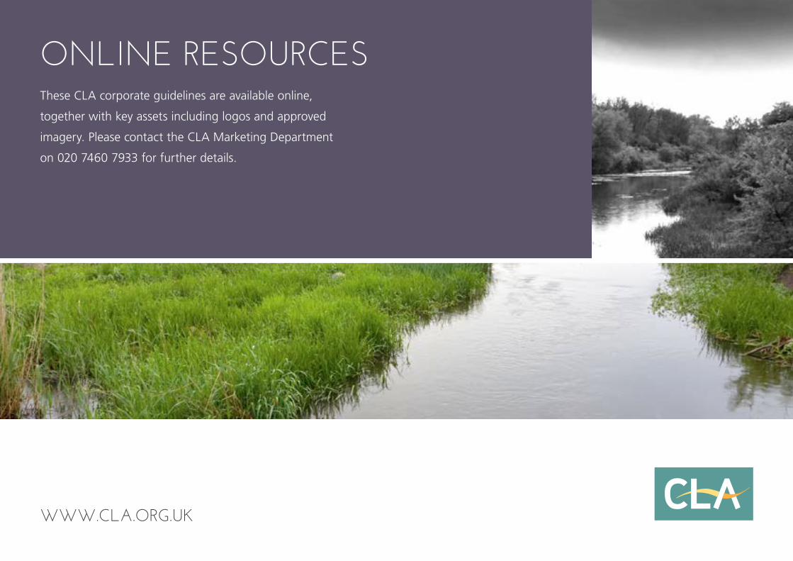
These CLA corporate guidelines are available online,
together with key assets including logos and approved
imagery. Please contact the CLA Marketing Department
on 020 7460 7933 for further details.
ONLINE RESOURCES
WWW.CLA.ORG.UK