correctionkey=nl-c;ca-c name class date 10.1 scatter plots...
TRANSCRIPT
© H
oug
hton
Mif
flin
Har
cour
t Pub
lishi
ng
Com
pan
y
Name Class Date
Resource Locker
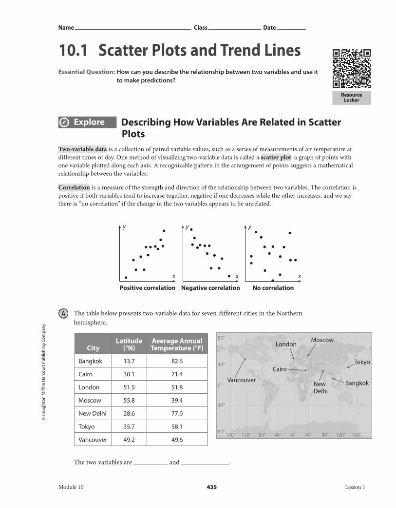
Explore Describing How Variables Are Related in Scatter Plots
Two-variable data is a collection of paired variable values, such as a series of measurements of air temperature at different times of day. One method of visualizing two-variable data is called a scatter plot: a graph of points with one variable plotted along each axis. A recognizable pattern in the arrangement of points suggests a mathematical relationship between the variables.
Correlation is a measure of the strength and direction of the relationship between two variables. The correlation is positive if both variables tend to increase together, negative if one decreases while the other increases, and we say there is “no correlation” if the change in the two variables appears to be unrelated.
A The table below presents two-variable data for seven different cities in the Northern hemisphere.
CityLatitude
(°N)Average Annual Temperature (°F)
Bangkok 13.7 82.6
Cairo 30.1 71.4
London 51.5 51.8
Moscow 55.8 39.4
New Delhi 28.6 77.0
Tokyo 35.7 58.1
Vancouver 49.2 49.6
The two variables are and .
y
x
y
x
y
x
Positive correlation Negative correlation No correlation
40°
80°
160° 160°120° 120°80° 80°40° 40°0°80°
40°
0°
Cairo
NewDelhi
Bangkok
Tokyo
London
Vancouver
Moscow
Module 10 435 Lesson 1
10.1 Scatter Plots and Trend LinesEssential Question: How can you describe the relationship between two variables and use it
to make predictions?
DO NOT EDIT--Changes must be made through “File info” CorrectionKey=NL-C;CA-C
© H
oug
hton Mifflin H
arcourt Publishin
g Com
pany
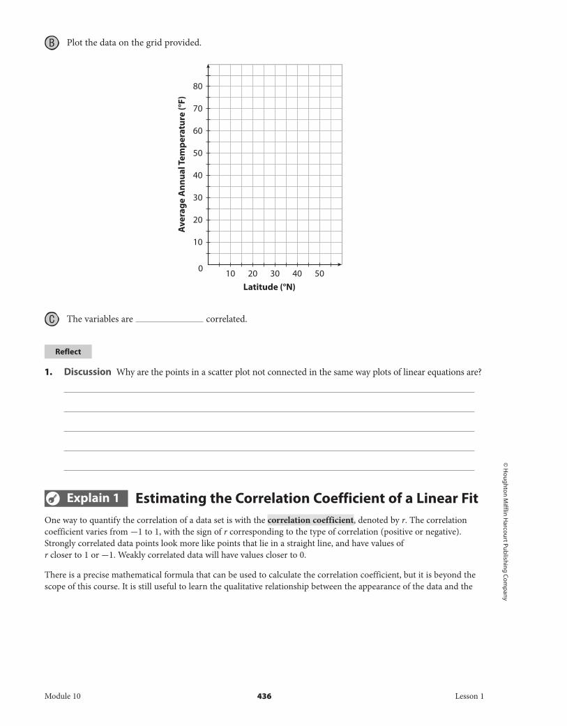
B Plot the data on the grid provided.
C The variables are correlated.
Reflect
1. Discussion Why are the points in a scatter plot not connected in the same way plots of linear equations are?
Explain 1 Estimating the Correlation Coefficient of a Linear FitOne way to quantify the correlation of a data set is with the correlation coefficient, denoted by r. The correlation coefficient varies from -1 to 1, with the sign of r corresponding to the type of correlation (positive or negative). Strongly correlated data points look more like points that lie in a straight line, and have values of r closer to 1 or -1. Weakly correlated data will have values closer to 0.
There is a precise mathematical formula that can be used to calculate the correlation coefficient, but it is beyond the scope of this course. It is still useful to learn the qualitative relationship between the appearance of the data and the
Ave
rage
Ann
ual T
empe
ratu
re (°
F)
Latitude (°N)
20
30
40
50
60
70
80
0
10
10 20 30 40 50
Module 10 436 Lesson 1
DO NOT EDIT--Changes must be made through “File info” CorrectionKey=NL-C;CA-C

© H
oug
hton
Mif
flin
Har
cour
t Pub
lishi
ng
Com
pan
y
value of r. The chart below shows examples of strong correlations, with r close to -1 and 1, and weak correlations with r close to 0.5. If there is no visible correlation, it means r is closer to 0.
Example 1 Use a scatter plot to estimate the value of r. Indicate whether r is closer to -1, - 0.5, 0, 0.5, or 1.
A Estimate the r-value for the relationship between city latitude and average temperature using the scatter plot you made previously.
This is strongly correlated and has a negative slope, so r is close to -1.
B
This data represents the football scores from one week with winning score plotted versus losing score.
r is close to .
Strong negative correlation; points lie close to a line with
negative slope. r is close to -1.
Weak negative correlation; points loosely follow a line with
negative slope. r is between 0 and -1.
Strong positive correlation; points lie close to a line with positive slope. r is close to 1.
Weak positive correlation; points loosely follow a line with
positive slope. r is between 0 and 1.
10
10
20
30
40
50
20 30 40 500
Losing Score
Win
ning
Sco
re
Winning vs Losing Scores
Module 10 437 Lesson 1
DO NOT EDIT--Changes must be made through “File info”CorrectionKey=NL-C;CA-C

© H
oug
hton Mifflin H
arcourt Publishin
g Com
pany
Your Turn
2. 3.
Explain 2 Fitting Linear Functions to DataA line of fit is a line through a set of two-variable data that illustrates the correlation. When there is a strong correlation between the two variables in a set of two-variable data, you can use a line of fit as the basis to construct a linear model for the data.
There are many ways to come up with a line of fit. This lesson addresses a visual method: Using a straight edge, draw the line that the data points appear to be clustered around. It is not important that any of the data points actually touch the line; instead the line should be drawn as straight as possible and should go through the middle of the scattered points.
Once a line of fit has been drawn onto the scatter plot, you can choose two points on the line to write an equation for the line.
Example 2 Determine a line of fit for the data, and write the equation of the line.
A Go back to the scatter plot of city temperatures and latitudes and add a line of fit.
Ave
rage
ann
ual t
empe
ratu
re (°
F)
Latitude (°N)
40
50
60
70
80
90
0
30
10 20 30 40 50 60
Module 10 438 Lesson 1
DO NOT EDIT--Changes must be made through “File info”CorrectionKey=NL-C;CA-C

© H
oug
hton
Mif
flin
Har
cour
t Pub
lishi
ng
Com
pan
y
A line of fit has been added to the graph. The points (10, 95) and (60, 40) appear to be on the line.
m = 40 - 95 _ 60 - 10 = -1.1
y = mx + b
95 = -1.1 (10) + b
106 = b
The model is given by the equation
y = -1.1x + 106
B The boiling point of water is lower at higher elevations because of the lower atmospheric pressure. The boiling point of water in some different cities is given in the table.
City Altitude (feet) Boiling Point (°F)
Chicago 597 210
Denver 5300 201
Kathmandu 4600 205
Madrid 2188 207
Miami 6 210
A line of fit may go through points ( , ) and ( , ) . m = _ b =
The equation is of this line of fit is y = x + .
Reflect
4. In the model from Example 2A, what do the slope and y-intercept of the model represent?
1000
200
202
204
206
208
210
212
2000 3000 4000 5000 60000
Altitude (ft.)
Boili
ng p
oint
of w
ater
(°F)
Module 10 439 Lesson 1
DO NOT EDIT--Changes must be made through “File info” CorrectionKey=NL-C;CA-C
© H
oug
hton Mifflin H
arcourt Publishin
g Com
pany
Your Turn
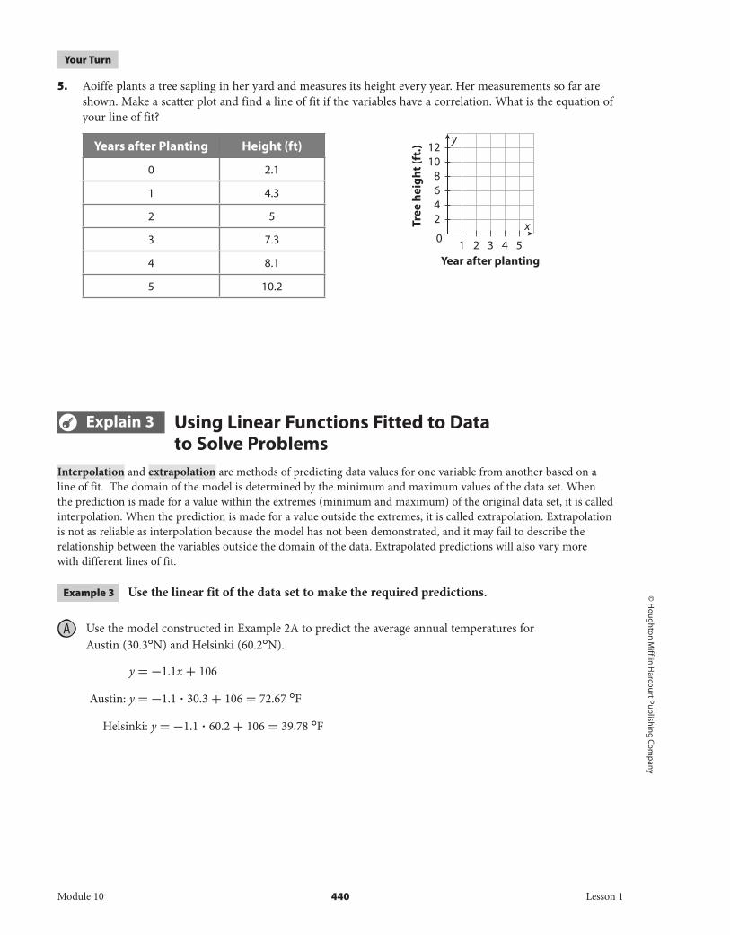
5. Aoiffe plants a tree sapling in her yard and measures its height every year. Her measurements so far are shown. Make a scatter plot and find a line of fit if the variables have a correlation. What is the equation of your line of fit?
Years after Planting Height (ft)
0 2.1
1 4.3
2 5
3 7.3
4 8.1
5 10.2
Explain 3 Using Linear Functions Fitted to Data to Solve Problems
Interpolation and extrapolation are methods of predicting data values for one variable from another based on a line of fit. The domain of the model is determined by the minimum and maximum values of the data set. When the prediction is made for a value within the extremes (minimum and maximum) of the original data set, it is called interpolation. When the prediction is made for a value outside the extremes, it is called extrapolation. Extrapolation is not as reliable as interpolation because the model has not been demonstrated, and it may fail to describe the relationship between the variables outside the domain of the data. Extrapolated predictions will also vary more with different lines of fit.
Example 3 Use the linear fit of the data set to make the required predictions.
A Use the model constructed in Example 2A to predict the average annual temperatures for Austin (30.3°N) and Helsinki (60.2°N).
y = -1.1x + 106
Austin: y = -1.1 ∙ 30.3 + 106 = 72.67 °F
Helsinki: y = -1.1 ∙ 60.2 + 106 = 39.78 °F
y
xTree
hei
ght (
ft.)
Year after planting
0
2468
1012
1 2 3 4 5
Module 10 440 Lesson 1
DO NOT EDIT--Changes must be made through “File info”CorrectionKey=NL-C;CA-C

© H
oug
hton
Mif
flin
Har
cour
t Pub
lishi
ng
Com
pan
y • I
mag
e C
red
its:
©A
nna-
Mar
i Wes
t/Sh
utte
rsto
ck
B Use the model of city altitudes and water boiling points to predict the boiling point of water in Mexico City (altitude = 7943 feet) and in Fargo, North Dakota (altitude = 3000 feet)
Mexico City: y = ∙ 7943 + = 197.74
Fargo: y = ∙ 3000 + = 205.99
Reflect
6. Discussion Which prediction made in Example 3B would you expect to be more reliable? Why?
Your Turn
7. Use the model constructed in YourTurn 5 to predict how tall Aoiffe’s tree will be 10 years after she planted it.
Explain 4 Distinguishing Between Correlation and CausationA common error when interpreting paired data is to observe a correlation and conclude that causation has been demonstrated. Causation means that a change in the one variable results directly from changing the other variable. In that case, it is reasonable to expect the data to show correlation. However, the reverse is not true: observing a correlation between variables does not necessarily mean that the change to one variable caused the change in the other. They may both have a common cause related to a variable not included in the data set or even observed (sometimes called lurking variables), or the causation may be the reverse of the conclusion.
Example 4 Read the description of the experiments, identify the two variables and describe whether changing either variable is likely, doubtful, or unclear to cause a change in the other variable.
A The manager of an ice cream shop studies its monthly sales figures and notices a positive correlation between the average air temperature and how much ice cream they sell on any given day.
The two variables are ice cream sales and average air temperatures.
It is likely that warmer air temperatures cause an increase in ice cream sales.
It is doubtful that increased ice cream sales cause an increase in air temperatures.
Module 10 441 Lesson 1
DO NOT EDIT--Changes must be made through “File info”CorrectionKey=NL-C;CA-C

© H
oug
hton Mifflin H
arcourt Publishin
g Com
pany
B A traffic official in a major metropolitan area notices that the more profitable toll bridges into the city are those with the slowest average crossing speeds.
The variables are and .
It is [likely | doubtful | unclear] that increased profit causes slower crossing speed.
It is [likely | doubtful | unclear] that slower crossing speeds cause an increase in profits.
Reflect
8. Explain your reasoning for your answers in Example 4B and suggest a more likely explanation for the observed correlation.
Your Turn
9. HDL cholesterol is considered the “good” cholesterol as it removes harmful bad cholesterol from where it doesn’t belong. A group of researchers are studying the connection between the number of minutes of exercise a person performs weekly and the person’s HDL cholesterol count. The researchers surveyed the amount of physical activity each person did each week for 10 weeks and collected a blood sample from 67 adults. After analyzing the data, the researchers found that people who exercised more per week had higher HDL cholesterol counts. Identify the variables in this situation and determine whether it describes a positive or negative correlation. Explain whether the correlation is a result of causation.
Elaborate
10. Why is extrapolating from measured data likely to result in a less accurate prediction than interpolating?
11. What will the effect be on the correlation coefficient if additional data is collected that is farther from the line of fit? What will the effect be if the newer data lies along the line of fit? Explain your reasoning.
12. Essential Question Check-In How does a scatter plot help you make predictions from two-variable data?
Module 10 442 Lesson 1
DO NOT EDIT--Changes must be made through “File info” CorrectionKey=NL-C;CA-C
© H
oug
hton
Mif
flin
Har
cour
t Pub
lishi
ng
Com
pan
y
• Online Homework• Hints and Help• Extra Practice
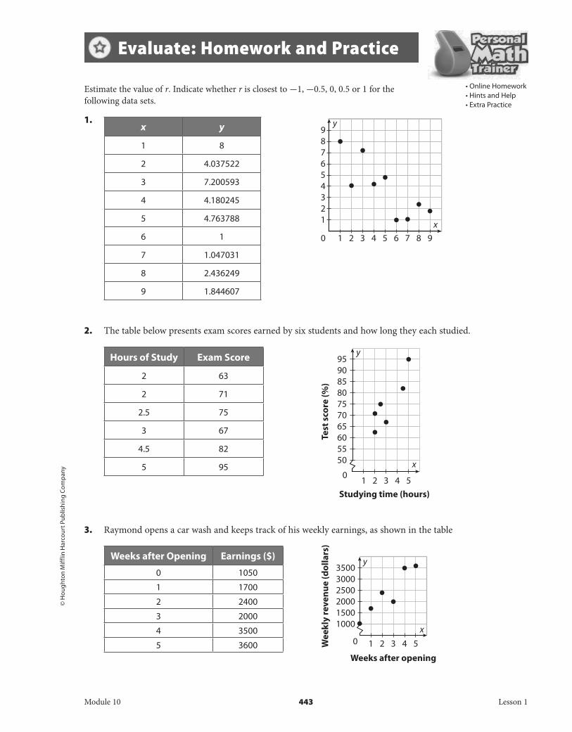
Estimate the value of r. Indicate whether r is closest to -1, -0.5, 0, 0.5 or 1 for the following data sets.
1.
1.
1.
1.
1.
1.
1.
2. The table below presents exam scores earned by six students and how long they each studied.
3. Raymond opens a car wash and keeps track of his weekly earnings, as shown in the table
x y
1 8
2 4.037522
3 7.200593
4 4.180245
5 4.763788
6 1
7 1.047031
8 2.436249
9 1.844607
Hours of Study Exam Score
2 63
2 71
2.5 75
3 67
4.5 82
5 95
Weeks after Opening Earnings ($)
0 1050
1 1700
2 2400
3 2000
4 3500
5 3600
Evaluate: Homework and Practice
Test
sco
re (%
)
Studying time (hours)
556065707580859095
0
50
1 2 3 4 5
y
x
1
100015002000250030003500
2 3 4 5
x
y
0
Weeks after opening
Wee
kly
reve
nue
(dol
lars
)
y
x0 2 31
23
5
7
9
1
4
6
8
4 5 7 96 8
Module 10 443 Lesson 1
DO NOT EDIT--Changes must be made through “File info”CorrectionKey=NL-C;CA-C

© H
oug
hton Mifflin H
arcourt Publishin
g Com
pany
4. Rafael is training for a race by running a mile each day. He tracks his progress by timing each trial run.
Determine a line of fit for the data, and write the equation of your line.
5.
6.
1.
1.
1.
1.
1.
1.
Trial Run Time (min)
1 8.2
2 8.1
3 7.5
4 7.8
5 7.4
6 7.5
7 7.1
8 7.1
x y
1 7.15
2 8.00
3 4.81
4 7.14
5 3.56
6 2.12
7 1.00
8 3.76
9 1.42
Studying Time (Hours) Test Score (%)
2 63
2 71
2.5 75
3 67
4.5 82
5 95
1
7.07.27.47.67.88.08.2
2 3 4 5 6 7
x
y
0
Training run
Run
tim
e (m
in)
x
1
1.002.003.004.005.006.007.008.009.00
2 3 4 5 6 7 8 9
y
0
1
50556065707580859095
2 3 4 5
x
y
0
Studying time (hours)
Test
sco
re (%
)
Module 10 444 Lesson 1
DO NOT EDIT--Changes must be made through “File info” CorrectionKey=NL-C;CA-C

© H
oug
hton
Mif
flin
Har
cour
t Pub
lishi
ng
Com
pan
y
7.
8.
Use the linear models found in problems 5–8 for 9–12, respectively, to make predictions, and classify each prediction as an interpolation or an extrapolation.
9. Find y when x = 4.5. 10. What grade might you expect after studying for 4 hours?
11. How much money might Raymond hope to earn 8 weeks after opening if the trend continues?
12. What mile time does Rafael expect for his next run?
Weeks After Opening Weekly Revenue (dollars)
0 1050
1 1700
2 2400
3 2000
4 3500
5 3600
1
100015002000250030003500
2 3 4 5
x
y
0
Weeks after opening
Wee
kly
reve
nue
(dol
lars
)
Training Run
Run Time (min)
1 8.2
2 8.1
3 7.5
4 7.8
5 7.4
6 7.5
7 7.1
8 7.1
1
7.07.27.47.67.88.08.2
2 3 4 5 6 7
x
y
0
Training run
Run
tim
e (m
in)
Module 10 445 Lesson 1
DO NOT EDIT--Changes must be made through “File info” CorrectionKey=NL-C;CA-C

© H
oug
hton Mifflin H
arcourt Publishin
g Com
pany
Read each description. Identify the variables in each situation and determine whether it describes a positive or negative correlation. Explain whether the correlation is a result of causation.
13. A group of biologists is studying the population of wolves and the population of deer in a particular region. The biologists compared the populations each month for 2 years. After analyzing the data, the biologists found that as the population of wolves increases, the population of deer decreases.
14. Researchers at an auto insurance company are studying the ages of its policyholders and the number of accidents per 100 policyholders. The researchers compared each year of age from 16 to 65. After analyzing the data, the researchers found that as age increases, the number of accidents per 100 policyholders decreases.
15. Educational researchers are investigating the relationship between the number of musical instruments a student plays and a student’s grade in math. The researchers conducted a survey asking 110 students the number of musical instruments they play and went to the registrar’s office to find the same 110 students’ grades in math. The researchers found that students who play a greater number of musical instruments tend to have a greater average grade in math.
16. Researchers are studying the relationship between the median salary of a police officer in a city and the number of violent crimes per 1000 people. The researchers collected the police officers’ median salary and the number of violent crimes per 1000 people in 84 cities. After analyzing the data, researchers found that a city with a greater police officers’ median salary tends to have a greater number of violent crimes per 1000 people.
Module 10 446 Lesson 1
DO NOT EDIT--Changes must be made through “File info” CorrectionKey=NL-C;CA-C

© H
oug
hton
Mif
flin
Har
cour
t Pub
lishi
ng
Com
pan
y
17. The owner of a ski resort is studying the relationship between the amount of snowfall in centimeters during the season and the number of visitors per season. The owner collected information about the amount of snowfall and the number of visitors for the past 30 seasons. After analyzing the data, the owner determined that seasons that have more snowfall tend to have more visitors.
18. Government researchers are studying the relationship between the price of gasoline and the number of miles driven in a month. The researchers documented the monthly average price of gasoline and the number of miles driven for the last 36 months. The researchers found that the months with a higher average price of gasoline tend to have more miles driven.
19. Interpret the Answer Each time Lorelai fills up her gas tank, she writes down the amount of gas it took to refill her tank, and the number of miles she drove between fill-ups. She makes a scatter plot of the data with miles driven on the y-axis and gallons of gas on the x-axis, and observes a very strong correlation. The slope is 35 and the y-intercept is 0.83. Do these numbers make sense, and what do they mean (besides being the slope and intercept of the line)?
20. Multi-Step The owner of a maple syrup farm is studying the average winter temperature in Fahrenheit and the number of gallons of maple syrup produced. The relationship between the temperature and the number of gallons of maple syrup produced for the past 8 years is shown in the table.
a. Make a scatter plot of the data and draw a line of fit that passes as close as possible to the plotted points.
Temperature (°F) Number of gallons of maple syrup
24 154
26 128
25 141
22 168
28 104
21 170
24 144
22 160
20
100
120
140
160
180
22 24 26 280
Temperature (°F)
Map
le s
yrup
(gal
)
Module 10 447 Lesson 1
DO NOT EDIT--Changes must be made through “File info” CorrectionKey=NL-C;CA-C

© H
oug
hton Mifflin H
arcourt Publishin
g Com
pany • Im
age C
redits:
Liquid
library/Jup
iterimag
es/Getty Im
ages
b. Find the equation of this line of fit.
c. Identify the slope and y-intercept for the line of fit and interpret it in the context of the problem.
21. The table below shows the number of boats in a marina during the years 2007 to 2014.
Years Since 2000 7 8 9 10 11 12 13 14
Number of Boats 26 25 27 27 39 38 40 39
a. Make a scatterplot by using the data in the table as the coordinates of points on the graph. Use the calendar year as the x-value and the number of boats as the y-value.
b. Use the pattern of the points to determine whether there is a positive correlation, negative correlation, or no correlation between the number of boats in the marina and the year. What is the trend?
22. Multiple Response Which of the following usually have a positive correlation? Select all that apply.
a. the number of cars on an expressway and the cars’ average speed
b. the number of dogs in a house and the amount of dog food needed
c. the outside temperature and the amount of heating oil used
d. the weight of a car and the number of miles per gallon
e. the amount of time studying and the grade on a science exam
51015202530354045
6 8 10 12 140
Years since 2000
Num
ber o
f boa
ts
Module 10 448 Lesson 1
DO NOT EDIT--Changes must be made through “File info” CorrectionKey=NL-C;CA-C

© H
oug
hton
Mif
flin
Har
cour
t Pub
lishi
ng
Com
pan
y
H.O.T. Focus on Higher Order Thinking
23. Justify Reasoning Does causation always imply linear correlation? Explain.
24. Explain the Error Olivia notices that if she picks a very large scale for her y-axis, her data appear to lie more along a straight line than if she zooms the scale all the way in. She concludes that she can use this to increase her correlation coefficient and make a more convincing case that there is a correlation between the variables she is studying. Is she correct?
25. What if? If you combined two data sets, each with r values close to 1, into a single data set, would you expect the new data set to have an r value between the original two values?
A 10-team high school hockey league completed its 20-game season. A team in this league earns 2 points for a win, 1 point for a tie, and 0 points for a loss. One of the team’s coaches compares the number of goals each team scored with the number of points each team earned during the season as shown in the table.
a. Plot the points on the scatter plot, and use the scatterplot to describe the correlation and estimate the correlation coefficient. If the correlation coefficient is estimated as -1 or 1, draw a line of fit by hand and then find an equation for the line by choosing two points that are close to the line. Identify and interpret the slope and y-intercept of the line in context of the situation.
b. Use the line of fit to predict how many points a team would have if it scored 35 goals, 54 goals, and 70 goals during the season.
Lesson Performance Task
Goals Scored Points46 15
48 11
49 17
51 20
57 18
58 21
59 25
60 23
62 27
64 24
Module 10 449 Lesson 1
DO NOT EDIT--Changes must be made through “File info” CorrectionKey=NL-C;CA-C

© H
oug
hton Mifflin H
arcourt Publishin
g Com
pany
c. Use the results to justify whether the coach should only be concerned with the number of goals his or her team scores.
Module 10 450 Lesson 1
DO NOT EDIT--Changes must be made through “File info” CorrectionKey=NL-C;CA-C

Name Class Date
Resource Locker
© H
oug
hton
Mif
flin
Har
cour
t Pub
lishi
ng
Com
pan
y • I
mag
e C
red
its:
©
bik
erid
erlo
nd
on/S
hutt
erst
ock
Explore 1 Plotting and Analyzing Residuals For any set of data, different lines of fit can be created. Some of these lines will fit the data better than others. One way to determine how well the line fits the data is by using residuals. A residual is the signed vertical distance between a data point and a line of fit.
After calculating residuals, a residual plot can be drawn. A residual plot is a graph of points whose x-coordinates are the variables of the independent variable and whose y-coordinates are the corresponding residuals.
Looking at the distribution of residuals can help you determine how well a line of fit describes the data. The plots below illustrate how the residuals may be distributed for three different data sets and lines of fit.
The table lists the median age of females living in the United States, based on the results of the United States Census over the past few decades. Follow the steps listed to complete the task.
A Use the table to create a table of paired values for x and y. Let x represent the time in years after 1970 and y represent the median age of females.
Year Median Age of Females
1970 29.2
1980 31.3
1990 34.0
2000 36.5
2010 38.2
x
y
FPO
Distribution ofresiduals about thex-axis is random andtight. The line fitsthe data very well.
Distribution of residualsabout the x-axis israndom but loose. Theline fits the data, butthe model is weak.
Distribution ofresiduals about thex-axis is not random.The line does not fit the data well.
Module 10 451 Lesson 2
10.2 Fitting a Linear Model to DataEssential Question: How can you use the linear regression function on a graphing calculator
to find the line of best fit for a two-variable data set?
DO NOT EDIT--Changes must be made through "File info" CorrectionKey=NL-B;CA-B

© H
oug
hton Mifflin H
arcourt Publishin
g Com
pany
B Use residuals to calculate the quality of fit for the line y = 0.25x + 29, where y is median age and x is years since 1970.
xActual
yPredicted y
based on y = 0.25x + 29
ResidualSubtract Predicted from
Actual to Find the Residual.
0 29.2
10 31.3
20 34.0
30 36.5
40 38.2
C Plot the residuals.
D Evaluate the quality of fit to the data for the line y = 0.25x + 29.
Reflect
1. Discussion When comparing two lines of fit for a single data set, how does the residual size show which line is the best model?
2. Discussion What would the residual plot look like if a line of fit is not a good model for a data set?
Residu
als 0.8
0.4
-0.4-0.8
0
x-values10 30 50
Module 10 452 Lesson 2
DO NOT EDIT--Changes must be made through "File info" CorrectionKey=NL-B;CA-B

© H
oug
hton
Mif
flin
Har
cour
t Pub
lishi
ng
Com
pan
y
Explore 2 Analyzing Squared ResidualsWhen different people fit lines to the same data set, they are likely to choose slightly different lines. Another way to compare the quality of a line of fit is by squaring residuals. In this model, the closer the sum of the squared residuals is to 0, the better the line fits the data.
In the previous section, a line of data was fit for the median age of females over time. After performing this task, two students came up with slightly different results. Student A came up with the equation y = 0.25x + 29.0 while Student B came up with the equation y = 0.25x + 28.8, where x is the time in years since 1970 and y is the median age of females in both cases.
A Complete each table below.
y = 0.25x + 29.0
x y (Actual) y (Predicted) Residual Square of Residual
0 29.2
10 31.3
20 34.0
30 36.5
40 38.2
y = 0.25x + 28.8
x y (Actual) y (Predicted) Residual Square of Residual
0 29.2
10 31.3
20 34.0
30 36.5
40 38.2
B Find the sum of squared residuals for each line of fit.
y = 0.25x + 29.0 :
y = 0.25x + 28.8 :
C Which line has the smaller sum of squared residuals?
Reflect
3. How does squaring a residual affect the residual’s value?
4. Are the sums of residuals or the sum of the squares of residuals a better measure of quality of fit?
Module 10 453 Lesson 2
DO NOT EDIT--Changes must be made through "File info" CorrectionKey=NL-B;CA-B
© H
oug
hton Mifflin H
arcourt Publishin
g Com
pany
Explain 1 Assessing the Fit of Linear Functions from Residuals The quality of a line of fit can be evaluated by finding the sum of the squared residuals. The closer the sum of the squared residuals is to 0, the better the line fits the data.
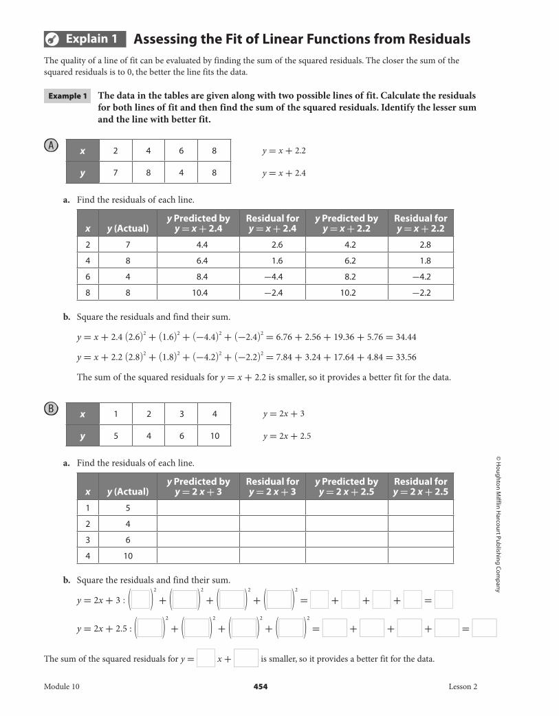
Example 1 The data in the tables are given along with two possible lines of fit. Calculate the residuals for both lines of fit and then find the sum of the squared residuals. Identify the lesser sum and the line with better fit.
A
x 2 4 6 8
y 7 8 4 8
a. Find the residuals of each line.
x y (Actual)y Predicted by
y = x + 2.4Residual for y = x + 2.4
y Predicted by y = x + 2.2
Residual for y = x + 2.2
2 7 4.4 2.6 4.2 2.8
4 8 6.4 1.6 6.2 1.8
6 4 8.4 -4.4 8.2 -4.2
8 8 10.4 -2.4 10.2 -2.2
b. Square the residuals and find their sum.
y = x + 2.4 (2.6) 2 + (1.6) 2 + (-4.4) 2 + (-2.4) 2 = 6.76 + 2.56 + 19.36 + 5.76 = 34.44
y = x + 2.2 (2.8) 2 + (1.8) 2 + (-4.2) 2 + (-2.2) 2 = 7.84 + 3.24 + 17.64 + 4.84 = 33.56
The sum of the squared residuals for y = x + 2.2 is smaller, so it provides a better fit for the data.
B
x 1 2 3 4
y 5 4 6 10
a. Find the residuals of each line.
x y (Actual)y Predicted by
y = 2 x + 3Residual for y = 2 x + 3
y Predicted by y = 2 x + 2.5
Residual for y = 2 x + 2.5
1 5
2 4
3 6
4 10
b. Square the residuals and find their sum.
y = 2x + 3 : ( ) 2 + ( ) 2 + ( ) 2 + ( ) 2 = + + + =
y = 2x + 2.5 : ( ) 2 + ( ) 2 + ( ) 2 + ( ) 2 = + + + =
The sum of the squared residuals for y = x + is smaller, so it provides a better fit for the data.
y = x + 2.2
y = x + 2.4
y = 2x + 3
y = 2x + 2.5
Module 10 454 Lesson 2
DO NOT EDIT--Changes must be made through "File info"CorrectionKey=NL-B;CA-B

© H
oug
hton
Mif
flin
Har
cour
t Pub
lishi
ng
Com
pan
y
Reflect
5. How do negative signs on residuals affect the sum of squared residuals?
6. Why do small values for residuals mean that a line of best fit has a tight fit to the data?
Your Turn
7. The data in the table are given along with two possible lines of fit. Calculate the residuals for both lines of fit and then find the sum of the squared residuals. Identify the lesser sum and the line with better fit.
x 1 2 3 4
y 4 7 8 6
y = x + 4
y = x + 4.2
x y (Actual)y Predicted by
y = x + 4Residual for
y = x + 4y Predicted by
y = x + 4.2Residual for y = x + 4.2
Module 10 455 Lesson 2
DO NOT EDIT--Changes must be made through "File info" CorrectionKey=NL-B;CA-B

© H
oug
hton Mifflin H
arcourt Publishin
g Com
pany
Explain 2 Performing Linear RegressionThe least-squares line for a data set is the line of fit for which the sum of the squared residuals is as small as possible. Therefore the least-squares line is a line of best fit. A line of best fit is the line that comes closest to all of the points in the data set, using a given process. Linear regression is a method for finding the least-squares line.
Example 2 Given latitudes and average temperatures in degrees Celsius for several cities, use your calculator to find an equation for the line of best fit. Then interpret the correlation coefficient and use the line of best fit to estimate the average temperature of another city using the given latitude.
A City Latitude Average Temperature
(°C)
Barrow, Alaska 71.2°N -12.7
Yakutsk, Russia 62.1°N -10.1
London, England 51.3°N 10.4
Chicago, Illinois 41.9°N 10.3
San Francisco, California 37.5°N 13.8
Yuma, Arizona 32.7°N 22.8
Tindouf, Algeria 27.7°N 22.8
Dakar, Senegal 14.0°N 24.5
Mangalore, India 12.5°N 27.1
Estimate the average temperature in Vancouver, Canada at 49.1°N.
Enter the data into data lists on your calculator. Enter the latitudes in column L1 and the average temperatures in column L2.
Create a scatter plot of the data.
Use the Linear Regression feature to find the equation for the line of best fit using the lists of data you entered. Be sure to have the calculator also display values for the correlation coefficient r and r 2 .
The correlation coefficient is about -0.95, which is very strong. This indicates a strong correlation, so we can rely on the line of fit for estimating average temperatures for other locations within the same range of latitudes.
Module 10 456 Lesson 2
DO NOT EDIT--Changes must be made through "File info"CorrectionKey=NL-B;CA-B
© H
oug
hton
Mif
flin
Har
cour
t Pub
lishi
ng
Com
pan
y
The equation for the line of best fit is y ≈ -0.693x + 39.11.
Graph the line of best fit with the data points in the scatter plot.
Use the TRACE function to find the approximate average temperature in degrees Celsius for a latitude of 49.1°N.
The average temperature in Vancouver should be around 5°C.
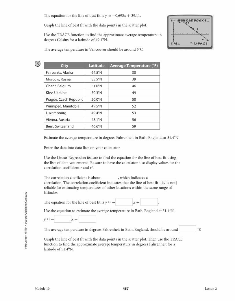
B
City Latitude Average Temperature (°F)
Fairbanks, Alaska 64.5°N 30
Moscow, Russia 55.5°N 39
Ghent, Belgium 51.0°N 46
Kiev, Ukraine 50.3°N 49
Prague, Czech Republic 50.0°N 50
Winnipeg, Manitobia 49.5°N 52
Luxembourg 49.4°N 53
Vienna, Austria 48.1°N 56
Bern, Switzerland 46.6°N 59
Estimate the average temperature in degrees Fahrenheit in Bath, England, at 51.4°N.
Enter the data into data lists on your calculator.
Use the Linear Regression feature to find the equation for the line of best fit using the lists of data you entered. Be sure to have the calculator also display values for the correlation coefficient r and r 2 .
The correlation coefficient is about , which indicates a correlation. The correlation coefficient indicates that the line of best fit [is/ is not] reliable for estimating temperatures of other locations within the same range of latitudes.
The equation for the line of best fit is y ≈ - x + .
Use the equation to estimate the average temperature in Bath, England at 51.4°N.
y ≈ - x +
The average temperature in degrees Fahrenheit in Bath, England, should be around °F.
Graph the line of best fit with the data points in the scatter plot. Then use the TRACE function to find the approximate average temperature in degrees Fahrenheit for a latitude of 51.4°N.
Module 10 457 Lesson 2
DO NOT EDIT--Changes must be made through "File info"CorrectionKey=NL-B;CA-B

© H
oug
hton Mifflin H
arcourt Publishin
g Com
pany
Reflect
8. Interpret the slope of the line of best fit in terms of the context for Example 2A.
9. Interpret the y-intercept of the line of best fit in terms of the context for Example 2A.
Your Turn
10. Use the given data and your calculator to find an equation for the line of best fit. Then interpret the correlation coefficient and use the line of best fit to estimate the average temperature of another city using the given latitude.
City Latitude Average Temperature (°F)
Anchorage, United States 61.1°N 18
Dublin, Ireland 53.2°N 29
Zurich, Switzerland 47.2°N 34
Florence, Italy 43.5°N 37
Trenton, New Jersey 40.1°N
Algiers, Algeria 36.5°N 46
El Paso, Texas 31.5°N 49
Dubai, UAE 25.2°N 56
Manila, Philippines 14.4°N 61
Elaborate
11. What type of line does linear regression analysis make?
12. Why are squared residuals better than residuals?
13. Essential Question Check-In What four keys are needed on a graphing calculator to perform a linear regression?
Module 10 458 Lesson 2
DO NOT EDIT--Changes must be made through "File info" CorrectionKey=NL-B;CA-B

© H
oug
hton
Mif
flin
Har
cour
t Pub
lishi
ng
Com
pan
y
• Online Homework• Hints and Help• Extra Practice
Evaluate: Homework and Practice
The data in the tables below are shown along with two possible lines of fit. Calculate the residuals for both lines of fit and then find the sum of the squared residuals. Identify the lesser sum and the line with better fit.
1. x 2 4 6 8
y 1 3 5 7
2. x 1 2 3 4
y 1 7 3 5
3. x 2 4 6 8
y 2 8 4 6
4. x 1 2 3 4
y 2 1 4 3
5. x 2 4 6 8
y 1 5 4 3
y = x + 5
y = x + 4.9
y = 2x + 1
y = 2x + 1.1
y = 3x + 4
y = 3x + 4.1
y = x + 1
y = x + 0.9
y = 3x + 1.2
y = 3x + 1
Module 10 459 Lesson 2
DO NOT EDIT--Changes must be made through "File info"CorrectionKey=NL-B;CA-B

© H
oug
hton Mifflin H
arcourt Publishin
g Com
pany
6. x 1 2 3 4
y 4 1 3 2
7. x 2 4 6 8
y 3 6 4 5
8. x 1 2 3 4
y 5 3 6 4
9. x 2 4 6 8
y 1 5 7 3
10. x 1 2 3 4
y 2 5 4 3
y = x + 5
y = x + 5.3
y = 2x + 1
y = 2x + 1.4
y = x + 2
y = x + 2.2
y = x + 3
y = x + 2.6
y = x + 1.5
y = x + 1.7
Module 10 460 Lesson 2
DO NOT EDIT--Changes must be made through "File info" CorrectionKey=NL-B;CA-B

© H
oug
hton
Mif
flin
Har
cour
t Pub
lishi
ng
Com
pan
y
11. x 1 2 3 4
y 2 9 7 12
12. x 1 3 5 7
y 2 6 8 13
13. x 1 2 3 4
y 7 5 11 8
14. x 1 2 3 4
y 4 11 5 15
y = 2x + 3.1
y = 2x + 3.5
y = 1.6x + 4
y = 1.8x + 4
y = x + 5
y = 1.3x + 5
y = 2x + 3
y = 2.4x + 3
Module 10 461 Lesson 2
DO NOT EDIT--Changes must be made through "File info" CorrectionKey=NL-B;CA-B

© H
oug
hton Mifflin H
arcourt Publishin
g Com
pany
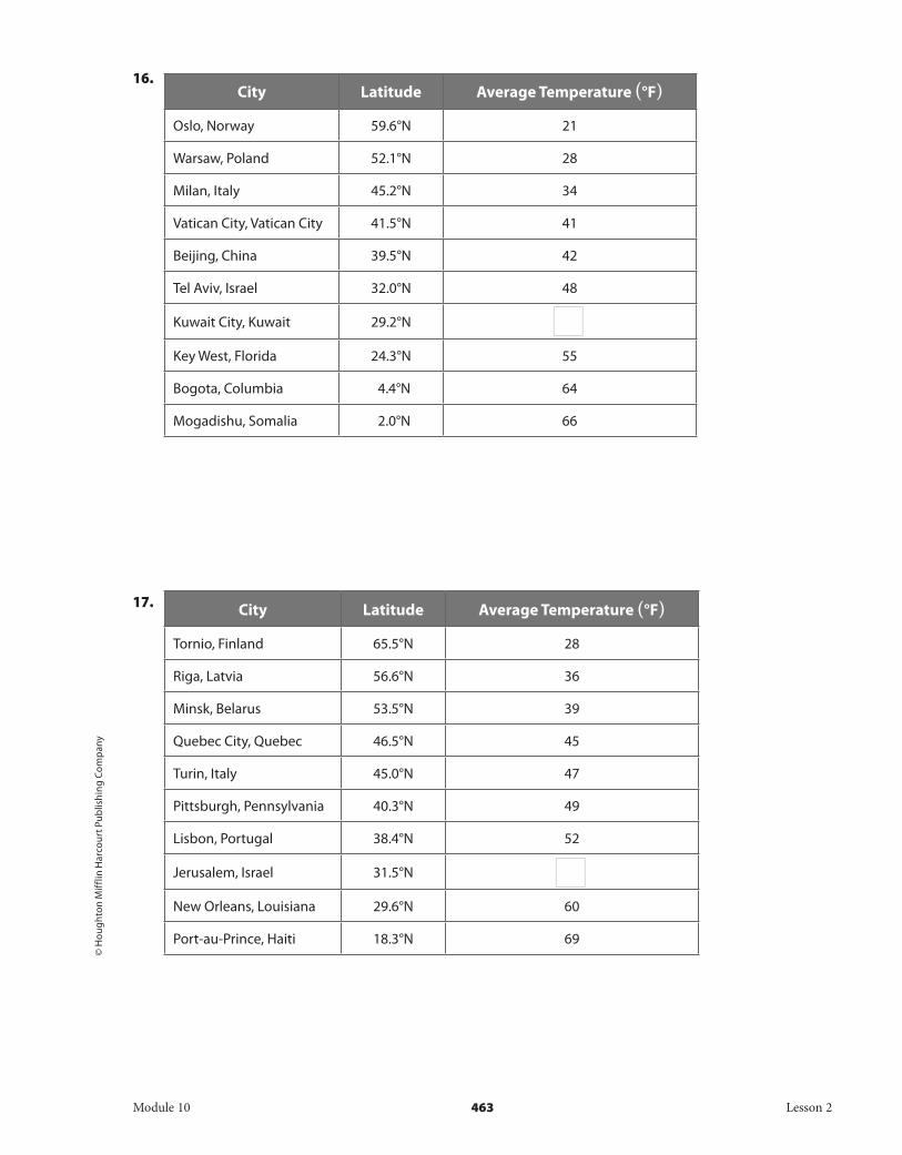
Use the given data and your calculator to find an equation for the line of best fit. Then interpret the correlation coefficient and use the line of best fit to estimate the average temperature of another city using the given latitude.
15. City Latitude Average Temperature (°F)
Calgary, Alberta 51.0°N 24
Munich, Germany 48.1°N 26
Marseille, France 43.2°N 29
St. Louis, Missouri 38.4°N 34
Seoul, South Korea 37.3°N 36
Tokyo, Japan 35.4°N 38
New Delhi, India 28.4°N 43
Honululu, Hawaii 21.2°N 52
Bangkok, Thailand 14.2°N 58
Panama City, Panama 8.6°N
40°
80°
160° 160°120° 120°80° 80°40° 40°0°80°
40°
0° NewDelhi
MunichMarseille
Bangkok
Tokyo
SeoulCalgary
St Louis
PanamaCityHonolulu
Module 10 462 Lesson 2
DO NOT EDIT--Changes must be made through "File info" CorrectionKey=NL-B;CA-B
© H
oug
hton
Mif
flin
Har
cour
t Pub
lishi
ng
Com
pan
y
16. City Latitude Average Temperature (°F)
Oslo, Norway 59.6°N 21
Warsaw, Poland 52.1°N 28
Milan, Italy 45.2°N 34
Vatican City, Vatican City 41.5°N 41
Beijing, China 39.5°N 42
Tel Aviv, Israel 32.0°N 48
Kuwait City, Kuwait 29.2°N
Key West, Florida 24.3°N 55
Bogota, Columbia 4.4°N 64
Mogadishu, Somalia 2.0°N 66
17. City Latitude Average Temperature (°F)
Tornio, Finland 65.5°N 28
Riga, Latvia 56.6°N 36
Minsk, Belarus 53.5°N 39
Quebec City, Quebec 46.5°N 45
Turin, Italy 45.0°N 47
Pittsburgh, Pennsylvania 40.3°N 49
Lisbon, Portugal 38.4°N 52
Jerusalem, Israel 31.5°N
New Orleans, Louisiana 29.6°N 60
Port-au-Prince, Haiti 18.3°N 69
Module 10 463 Lesson 2
DO NOT EDIT--Changes must be made through "File info" CorrectionKey=NL-B;CA-B

© H
oug
hton Mifflin H
arcourt Publishin
g Com
pany • Im
age C
redits: ©
Martin
Allin
ger/Shuttersto
ck
18. City Latitude (°N) Average Temperature (°F)
Juneau, Alaska 58.2 15
Amsterdam, Netherlands 52.2 24
Salzburg, Austria 47.5 36
Belgrade, Serbia 44.5 38
Philadelphia, Pennsylvania 39.6 41
Tehran, Iran 35.4 44
Nassau, Bahamas 25.0 52
Mecca, Saudi Arabia 21.3 56
Dakar, Senegal 14.4
Georgetown, Guyana 6.5 65
Demographics Each table lists the median age of people living in the United States, based on the results of the United States Census over the past few decades. Use residuals to calculate the quality of fit for the line y = 0.5x + 20, where y is median age and x is years since 1970.
19. Year Median age of men
1970 25.3
1980 26.8
1990 29.1
2000 31.4
2010 35.6
Module 10 464 Lesson 2
DO NOT EDIT--Changes must be made through "File info" CorrectionKey=NL-B;CA-B

© H
oug
hton
Mif
flin
Har
cour
t Pub
lishi
ng
Com
pan
y
20. Year Median Age of
Texans
1970 27.1
1980 29.3
1990 31.1
2000 33.8
2010 37.6
21. State the residuals based on the actual y and predicted y values.
a. Actual: 23, Predicted: 21
b. Actual: 25.6, Predicted: 23.3
c. Actual: 24.8, Predicted: 27.4
d. Actual: 34.9, Predicted: 31.3
H.O.T. Focus on Higher Order Thinking
22. Critical Thinking The residual plot of an equation has x-values that are close to the x-axis from x = 0 to x = 10, but has values that are far from the axis from x = 10 to x = 30. Is this a strong or weak relationship?
23. Communicate Mathematical Ideas In a squared residual plot, the residuals form a horizontal line at y = 6. What does this mean?
24. Interpret the Answer Explain one situation other than those in this section where squared residuals are useful.
Module 10 465 Lesson 2
DO NOT EDIT--Changes must be made through "File info" CorrectionKey=NL-B;CA-B

© H
oug
hton Mifflin H
arcourt Publishin
g Com
pany
Lesson Performance Task
The table shows the latitudes and average temperatures for the 10 largest cities in the Southern Hemisphere.
City Latitude (°S) Average Temperature (°F)
Sao Paulo, Brazil 23.9 69
Buenos Aires, Argentina 34.8 64
Rio de Janeiro, Brazil 22.8 76
Jakarta, Indonesia 6.3 81
Lodja, DRC 3.5 73
Lima, Peru 12.0 68
Santiago de Chile, Chile 33.2 58
Sydney, Australia 33.4 64
Melbourne, Australia 37.7 58
Johannesburg, South Africa 26.1 61
a. Use a graphing calculator to find a line of best fit for this data set. What is the equation for the best-fit line? Interpret the meaning of the slope of this line.
b. The city of Piggs Peak, Swaziland, is at latitude 26.0°S. Use the equation of your best-fit line to predict the average temperature in Piggs Peak. The actual average temperature for Piggs Peak is 65.3 °F. How might you account for the difference in predicted and actual values?
c. Assume that you graphed the latitude and average temperature for 10 cities in the Northern Hemisphere. Predict how the line of best fit for that data set might compare with the best-fit line for the Southern Hemisphere cities.
Module 10 466 Lesson 2
DO NOT EDIT--Changes must be made through "File info" CorrectionKey=NL-B;CA-B