counting the beans
TRANSCRIPT

Counting the Beans Data for De"cisions
June 2001
Counting the Beans Data for Decisions
Prepared by
Goforth Consulting
A guide to efficient, evidence-based literacy services planning
June 2001
Table of Contents
INTRODUCTION ............................................................................................................. 1
THE BASIC MODEL - STRUCTURE: information requirements ............................ 1
THE BASIC MODEL - PROCESS: gathering, analyzing and presenting information for planning .................................................................................................. 2
The Information Cycle in Planning ................................................................................. 3
GATHERING INFORMATION ABOUT THE COMMUNITY ................................ .4 ANALYZING DATA: what information matches what questions? ............................. 8
PRESENTING INFORMATION: pictures, words and numbers .............................. 10
APPENDIX ..................................................................................... ~ ................................ 13
Gathering information ................................................................................................... 13
Analyzing information ...................................................................... , ............................ 14
Summarizing data . ..................................................................................................... 15
Finding Links among Data ........................................................................................ 16
1. Links between attributes in one matrix ......................................................... 16
2. Links between matrices of the same attributes . ............................................ 18
3. Links between matrices with different attributes ......................................... 20
Presenting information ........................................................................................ , ......... 22
Pie charts - the Parts of a Whole .. ............................................................................ 23
Bar Graphs - Comparisons among Peers ........... ...................................................... 23
Comparing Several Attributes at Once ................ ...................... '" ............................. 25
Line Graphs - Trends over Time ............................................................................... 27
Other Formats ........................................................................................................... 28
Unambiguous Presentation of data: avoiding distractions .......... ............................. 28
A Summary and an Example ..... ................................................................................. 30

Introduction The need for literacy services in a community may change a little or a lot. Either way, the LBS agencies that provide the services, with the support of Network staff, must monitor the need for services, the coverage they provide and the quality of their programs. Based on the picture that emerges, they have to plan revisions to their programs that will improve the service.
The role of the Network staff is to support the planning process. The purpose of this Guide is to provide support to Network staff who are charged with providing background infonnation and leading the literacy services planning (LSP) process.
The annual planning process is only one of many tasks in the Networks' portfolio. Therefore time dedicated to the planning process has to be used as efficiently as possible. The Guide has been developed with this in mind.
The Guide is organized around
1) a simple model of the infonnation needed for literacy services planning, and
2) a process for delivering that information to LSP participants.
As it turns out, focusing on the factors that really will improve service means that the amount of infonnation needed goes down. We will look at how to turn a service question into a planning decision based on relevant data. This means getting the right infonnation, interpreting it and presenting it clearly to the LSP participants.
The Appendix catalogues the most useful data methods for gathering, interpreting and presenting quantitative information.
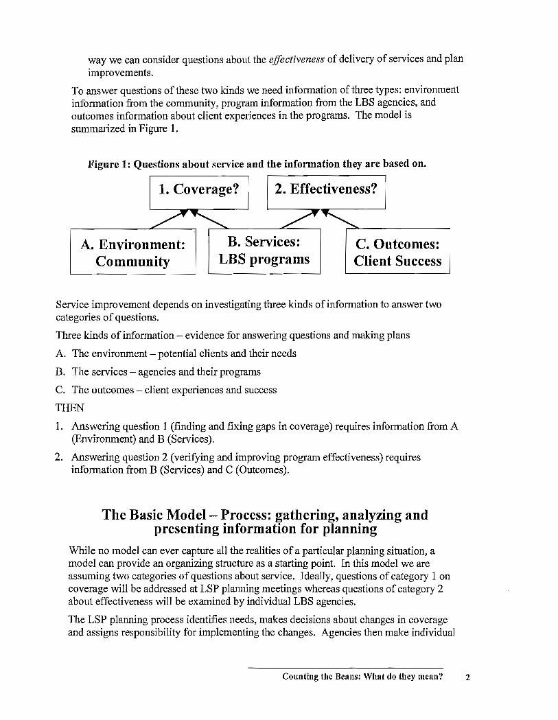
The Basic Model- Structure: information requirements Literacy services planning is about service improvement. To plan we need to know what changes in service are required. The questions that must be asked fall into two categories: coverage and effectiveness.
1. Coverage questions. By coverage, we mean the fit between the community and the programs LBS agencies provide. From the community we need to know who the potential clients are, and we need to know enough about the environment to have an idea about what is in store for clients when they have upgraded their skills and leave the program. From LBS agencies we need information about program content, enrollment capacities and support services. By putting together community and agency infonnation, we can examine questions of coverage and make plans to fill in gaps.
2. Effectiveness questions. Effectiveness refers to the success of programs in preparing clients for the world that awaits them. Again we need information from agencies about programs but now it is the data on contact hours, client goals and progress. We will match it up with information about client experiences: are clients staying in programs? Are they advancing? Are they better prepared once they leave? In this
Counting the Beans: What do they mean? 1
way we can consider questions about the effectiveness of delivery of services and plan improvements.
To answer questions of these two kinds we need information of three types: environment information from the community, program information from the LBS agencies, and outcomes information about client experiences in the programs. The model is summarized in Figure 1.
Figure 1: Questions about service and the information they are based on.
1. Coverage? 2. Effectiveness?
A. Environment: B. Services: C. Outcomes: Community LBS programs Client Success
Service improvement depends on investigating three kinds of information to answer two categories of questions.
Three kinds of information - evidence for answering questions and making plans
A. The environment - potential clients and their needs
B. The services - agencies and their programs
C. The outcomes - client experiences and success
THEN
1. Answering question 1 (fmding and fixing gaps in coverage) requires information from A (Environment) and B (Services).
2. Answering question 2 (verifying and improving program effectiveness) requires information from B (Services) and C (Outcomes).
The Basic Model- Process: gathering, analyzing and presenting information for planning
While no model can ever capture all the realities of a particular planning situation, a model can provide an organizing structure as a starting point. In this model we are assuming two categories of questions about service. Ideally, questions of category 1 on coverage will be addressed at LSP planning meetings whereas questions of category 2 about effectiveness will be examined by individual LBS agencies.
The LSP planning process identifies needs, makes decisions about changes in coverage and assigns responsibility for implementing the changes. Agencies then make individual
Counting the Beans: What do they mean? 2
plans, based on their analysis of effectiveness and including any responsibilities they have brought away from the LSP table.
The role of the Network staff in the annual planning process is different for each question category. For coverage questions, the Network takes the lead. Conversely, for the LBS agency planning process, the Network plays a secondary role.
The treatment of information for planning always has the same goal: to present a situation that requires a planning decision in a way that makes the factors evident and focuses the decision-making. The LSP committee should convene with a set of well-defined coverage issues to discuss and plan for. Within a particular agency, the information environment for planning should be equally supportive.
The Network gathers and interprets information and presents it to the LSP committee in a format that identifies the issues, frames the questions and supports the decision-making and planning process. How close the actual planning process can be to the ideal depends on individual situations. Many factors are out of the control of the Networks and agencies. Thus it becomes important to know where to focus limited resources to create the best possible information environment for planning.
The Information Cycle in Planning
Where does the planning process begin? Sometimes, the planning is reactive: there is an ongoing problem that can't be handled within the current conditions and something has to be done so the situation does not persist into the next budget year. The planning begins with the questions and proceeds to gathering information to clarify the problem.
Sometimes the planning is proactive: to confirm quality of service or to anticipate future needs, a formal process is put in place that accesses information sources to identify changes as early as possible. The planning begins with the information.
Networks should be alert to issues that require reactive planning and, to the extent possible, should monitor indicators of proactive planning needs.
However the process begins, the preparation of information for planning involves three distinct aspects:
• Information Gathering - what information do you need; what information do you have; what information can you get with resources available?
• Analyzing Information - asking the questions and looking for the answers: summarizing data, connecting data, interpreting the information, with minimal resources.
• Presenting information - summaries, tables, graphs and descriptions to highlight issues and possible answers, with minimal resources.
Counting the Beans: What do they mean? 3
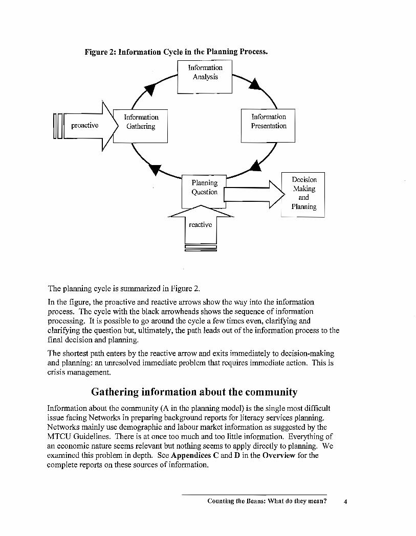
Figure 2: Information Cycle in the Planning Process.
~ ~ prooctive
Information Analysis
reactive
The planning cycle is summarized in Figure 2.
Information Presentation
Decision Making
and Planning
In the figure, the proactive and reactive arrows show the way into the information process. The cycle with the black arrowheads shows the sequence of information processing. It is possible to go around the cycle a few times even, clarifying and clarifying the question but, ultimately, the path leads out of the information process to the final decision and planning.
The shortest path enters by the reactive arrow and exits immediately to decision-making and planning: an unresolved immediate problem that requires immediate action. This is crisis management.
Gathering information about the community
Information about the community (A in the planning model) is the single most difficult issue facing Networks in preparing background reports for literacy services planning. Networks mainly use demographic and labour market information as suggested by the MTCU Guidelines. There is at once too much and too little information. Everything of an economic nature seems relevant but nothing seems to apply directly to planning. We examined this problem in depth. See Appendices C and D in the Overview for the complete reports on these sources of information.
Counting the Beans: What do they mean? 4

In short, the infonnation from national and provincial sources either is too general to infonn local planning, or, if it is broken down to local areas, is not statistically reliable.
Gathering local infonnation is possible; however, larger scale surveying and polling are expensive and difficult operations. Gathering data directly though interviews and focus groups might be useful for a very specific planning requirement but the data should not be applied to broader planning. For example, data gathered from a small number of employers might provide a focus for developing work-related activities for clients, but an LBS agency would not want to base its entire curriculum on these data.
As another example, data may be available from surveys conducted by HRDC or Local Training and Adjustment Boards for example. You still need to be cautious before adopting this kind of infonnation as a basis for planning. Why are you considering it? If you are starting a reactive planning process in response to an identified concern, does this infonnation apply? If you are seeking infonnation that could inspire proactive planning, is this source going to help you monitor the services needed in your area?
We offer the table below as a way you might organize your infonnation gathering, both the infonnation you seek out and the reports that come unsolicited across your desk. Is the infonnation applicable? (Think of the planning cycle.) Is it worth your time? Decide how important it is and estimate what resources it will take. Be suspicious especially of infonnation that you did not request. We are inundated with infonnation and it is easy to spend time on interesting but marginal infonnationjust because it is there. 1 Finally, you have to decide ifthe infonnation is going to be worth the effort. Is it applicable to your situation? And is it vatic!? This is a difficult call but a few ofthe basic questions you should ask are listed in Figure 3.
Information Relevance: Availability Priority: Applicability Item and Purpose Relative to or Resources Importance for and Validity Source Planning Needed to Planning
Gather
1 This is sometimes called 'searching around the lamppost' after the old joke about the gentleman looking for his car keys in the well-lit entrance of the bar he had just left because it was too dark in the parking lot where he'd dropped them.
Counting the Beans: What do they mean? 5
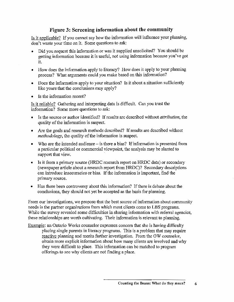
Figure 3: Screening information about the community Is it applicable? If you cannot say how the information will influence your planning, don't waste your time on it. Some questions to ask:
• Did you request this information or was it supplied unsolicited? You should be getting information because it is useful, not using information because you've got it.
• How does the information apply to literacy? How does it apply to your planning process? What arguments could you make based on this information?
• Does the information apply to your situation? Is it about a situation sufficiently like yours that the conclusions may apply?
• Is the information recent?
Is it reliable? Gathering and interpreting data is difficult. Can you trust the information? Some more questions to ask:
• Is the source or author identified? If results are described without attribution, the quality of the information is suspect.
• Are the goals and research methods described? If results are described without methodology, the quality of the information is suspect.
• Who are the intended audience - is there a bias? If information is presented from a particular political or commercial viewpoint, the analysis may be slanted to support that view.
• Is it from a primary source (HRDC research report on HRDC data) or secondary (newspaper article about a research report from HRDC)? Secondary descriptions can introduce inaccuracies or bias. If the information is important, find the pnmary source.
• Has there been controversy about this information? If there is debate about the conclusions, they should not yet be accepted as the basis for planning.
From our investigations, we propose that the best source of information about community needs is the partner organizations from which most clients come to LBS programs. While the survey revealed some difficulties in sharing information with referral agencies, these relationships are worth cultivating. Their information is relevant to planning.
Example: an Ontario Works counselor expresses concern that she is having difficulty placing single parents in literacy programs. This is a problem that may require reactive planning and merits further investigation. From the OW counselor, obtain more explicit information about how many clients are involved and why they were difficult to place. This information can be matched to program offerings to see why clients are not finding a place.
Counting the Beans: What do they mean? 6
Example: Ontario Works counselors are not trained in literacy testing although they are responsible for sending clients to literacy programs. Now a standardized test is to be administered. TIlls is an opportunity for proactive planning. Can the Networks and agencies help OW with the implementation of the new test? Can information about the needs of OW clients be gathered to bring to program planning? Notice that a two-step plan seems to be implied here: first get involved with the administration ofthe test to improve the placement process, and second, start gathering information about the OW client profile to match against the program offerings.
Example: a new report, Moving Right Along: a Report on Learner Referral and Transition, from another literacy Network, identifies referral among LBS agencies as a concern in that Network area. Very few referrals were being made between agencies and even those were not very successful. The report offers a set of practical strategies for improving inter-agency referral and transition.
TIlls report is timely and certainly the population it reports on is similar to those in other Network areas. The information in it is likely to be relevant and could be a trigger to some proactive planning. The first step is to gather some information from the local LBS agencies about referrals to see if the same situation applies. How many referrals are being made between agencies? How successful are the transitions? The Report should provide some guidance on what information to collect.
In each case, notice that we try to get quantitative information. How many clients could not be placed? How many clients are showing up in testing as needing literacy training? How many clients are being referred between LBS agencies? While anecdotal stories are engaging they are poor descriptors of general situations. Numbers provide a more objective and representative summary.
Basic data about program offerings (B in the planning model) are the easiest to obtain. For coverage questions, the descriptions of programs and services is the basic requirement. When the OW counselor informs you that she had difficulty placing single parents because daycare could not be arranged, you need to be able to identify the cause. Is there daycare at an agency offering the level the client needed? You may need to make another trip around the planning cycle to find information about the hours of service of the daycare or the length of the waiting list for enrollment.
LBS agencies report on a regular basis to the Ministry and this is the most available information for evaluating quality of service.
Client progress (C in the planning model) is not as well tracked. Obtaining follow-up information after clients leave is time-consuming and incomplete. Even reasons for client-initiated departures from programs are difficult to monitor. Progress within
2 Project READ Literacy Network, Waterloo-Wellington, 2001.
Counting the Beans: What do they mean? 7
programs is more attainable but may require agencies to track additional data about students. This extra work should be clearly linked to a specific planning requirement.
Quantitative information gathering is discussed in the Appendix.
Analyzing Data: what information matches what questions? To examine coverage, we need to match the services required in the community to the services provided by the LBS agencies. The first measure is just that: is there a match, yes or no? Some Networks described a grid format they use to cross-reference required and provided services. An example of a grid used in one Network is shown in Figure 4 on page 11. Such a grid is sufficient to answer some questions about service. As experience with a grid accumulates, service factors can be added to reflect the individual features of an LSP area.
In particular, the grid is a basis for further examination of coverage. It is much easier to state a question clearly when it can be put in a context such as the grid provides. The next level of coverage question concerns capacity. How many clients needed level II placements (according to last year's agencies' data) and how many level II places were available (according to agencies' capacity)?
The grid can also support an examination of the fit between needs and services. To continue the example about placement of single parents, their profiles can be described in terms of the features of the grid. Are their unique combinations of needs covered by any agency?
Some questions may require more detailed analysis of data. For these, there are some standard and straightforward calculations that can reveal a lot of information if used appropriately. These methods - averages, ranges, percentages, rates - are described in the Appendix.
To introduce these calculations, let us consider the LBS Program Statistical Report that LBS agencies must download to the Ministry through the Information Management System. Suppose that we want to answer some questions about service based on reports of LBS agencies in a particular Network. Suppose the Network includes 10 agencies.
Example: "How many learners did the agencies serve in the past year?"
could be answered by listing the ten enrolment figures from the reports, but a summary would be more useful. The summary statistic to use will depend on the emphasis needed. The most common summary statistics are sum, average and range.
The ten agencies served 1678 clients. Enrollments ranged in sizeJrom 38 to 421. Average enrollment was 112.
Example: "How important a/actor are Ontario Works clients in the LBS agencies?"
In the Report, the Sources of Income table lists the six categories of income support including Ontario works. The actual numbers of Ontario Works clients
Counting the Beans: What do they mean? 8
are available but just listing them or summarizing them could be misleading. A figure of 31 would make OW a very important factor in a small agency but less important in a large one. A better way to express the importance is a fraction: the number of OW clients over the total number of clients. The ten percentages can then be compared because they each express the relative importance of the OW numbers. These percentages can be summarized as above, so the answer to the question might be:
OW clients represent between 18% and 35% of the clients in the LBS agencies in this area.
Example: "How much time does it take to develop a training plan with a client?"
No individual infonnation is available of course but the average time spent to develop a plan can be calculated from table 4 Services Delivered in the Report. The number of contact hours dedicated to training plan development is tabulated and so is the number of clients served. The average is just the number of hours divided by the number of clients. By adding up all the all the agencies' hours and dividing by all the agencies' clients, the answer to the question could be:
In this Network area, it takes about 1.7 hours on average to develop a training plan with a client.
Example: "How has the contribution o/volunteers to the programs this year held up compared to last year?"
Year-over-year comparisons are a common fonn of analysis. Sometimes, the simple difference between corresponding figures is enough but, as with other data, these actual differences are not readily comparable. What we usually want to capture is the size of the difference relative to the actual quantities.
The total numbers of volunteers and volunteer hours are listed in table 8A of the Report. By comparing the figures for two years the question can be answered.
While the number of volunteers declined by 11%, their average time volunteering grew 28% from 46 to 59 hours per person. As a result, the number of volunteer hours actually increased by 14%.
In the Appendix, the analysis of quantitative data is discussed in greater detail.
The next section describes presentation of infonnation. Usually the goal of presentation is to convey information to someone else but it is also a good idea to present it to yourself. Seeing data in a graph can reveal patterns you would not notice in a list of figures or a summary statistic.
Counting the Beans: What do they mean? 9
Presenting Information: pictures, words and numbers If data gathering and analysis are successful, the result is information that is important for planning. This information will not influence decision-making unless the committee members can appreciate - quickly - what has taken a considerable time to collect and interpret. The information must be presented so the implications are clear. Unfortunately, as the last stage in the information processing cycle, presentation is often vulnerable to neglect.
In the Appendix, we discuss graphical formats of presentation in detail but these are not the only choices. If you do not have the resources to represent information graphically, you can still write verbal descriptions of your findings or reproduce numeric information in tables.
Each format has its strengths and weaknesses.
• Verbal descriptions: expressive for complex ideas but clumsy for large amounts of information
• Graphical charts: quick to understand and effective as a focus for discussion
• Numeric tables: precise and detailed but difficult to interpret quickly
We recommend a simple strategy that works for presenting most information:
Prepare a graphical display that captures in a visual pattern the
information you want the viewers to understand. Introduce the
display with a short verbal description that identifies and explains
the pattern and initiates discussion ofthe implications for planning.
Keep the numeric data on hand for reference if required.
Counting the Beans: What do they mean? 10

~~;~~. ~~~~ Provider J.¥i'.:fu &~
~,~'~"
0 • • • • 0 Training & Education
0 0 • 0 • 0 Employment
• • • • • • Part time
• •• • • • 0 Full lune
• • • • • • Native
0 • 0 0 O· 0 0 Franncophone
Figure 4: An example of a grid for organizing coverage information
Counting the Beans: What do they mean? 11

Counting the Beans: What do they mean? 12
Appendix In this appendix, we look at the particular issues surrounding quantitative data, that is, infonnation that is based on categorizing and counting. The organization is the same: gathering, analyzing and presenting infonnation
When quantitative infonnation is applied to a topic to guide planning, the main problem is not too little infonnation but too much. At every stage, from gathering to analyzing to applying the infonnation, it has to be reduced. This is what 'statistics' is all about: extracting interpretations from large amounts of numeric data.
The LBS Statistical and Financial Reportfor Delivery a/Services (the Report) that LBS agencies submit regularly to the MTCU is a familiar example of a report of quantitative infonnation. It is a report that requires a lot of gathering, very little analysis and minimal presentation. Throughout this section we will use extended examples from this Report to illustrate ideas about quantitative infonnatiQn. In the Gathering Infonnation section, the Report stands up well as a reliable source. In the next two sections, Analyzing Infonnation and Presenting Infonnation, we'll see some examples of how some meaningful interpretations of data from the Report could provide useful input for planning.
Gathering information
When you look at a report that is based on quantitative infonnation, the first question to ask concerning the reliability ofthe results is "How was the data gathered?"
In the Report, the figures in the tables are based on actual exhaustive counting of students, volunteers, hours, etc. Except for the inevitable minor errors that creep in to any tabulation, these numbers are exact.
This is the ideal situation but cannot always be achieved. The census of Canada attempts to count every Canadian and produce this kind of exact data but it is so expensive and time consmning that the census is only carried out once every five years with a limited number of questions.
The most common way around the difficulty of gathering complete infonnation is to do a survey. In a survey, data are gathered about part of a group and then results are presumed to apply to the whole group. This presumption is not completely reliable of course. For example, the Report lists the total number oflearners in Levels 1 through 5. That total is based on actual counts ofleamers in Levell, 2, 3,4 and 5. If, instead, we only 'surveyed' Level 3, found 10 learners and claimed the total number ofleamers at all levels was 5 times 10 = 50, how reliable would that figure be?
Counting the Beans: What do they mean? 13
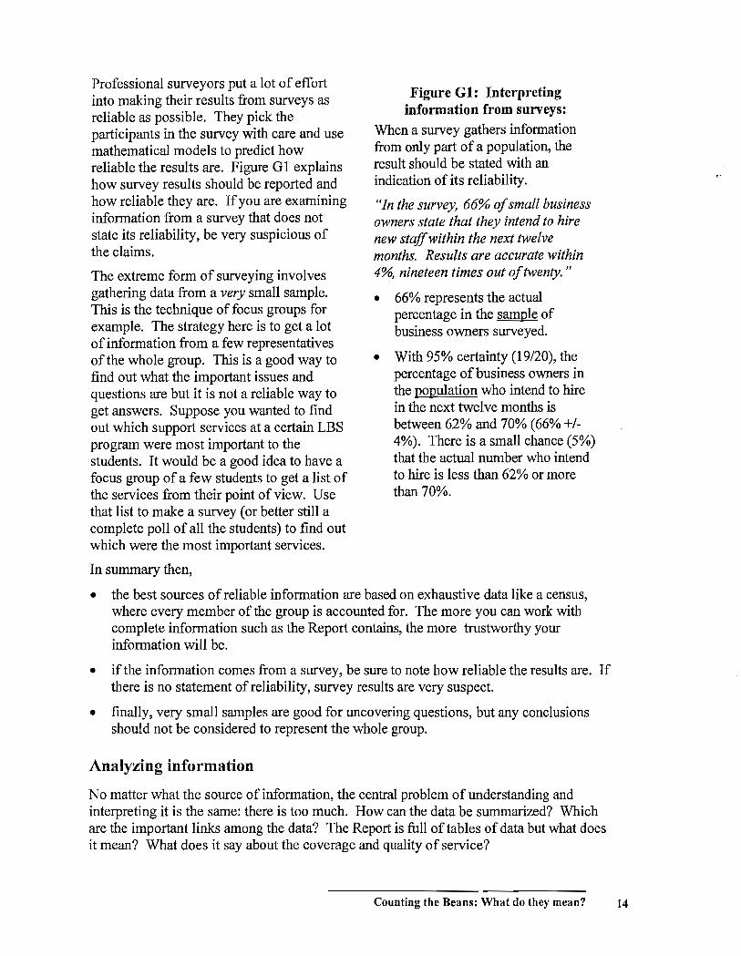
Professional surveyors put a lot of effort into making their results from surveys as reliable as possible. They pick the participants in the survey with care and use mathematical models to predict how reliable the results are. Figure G 1 explains how survey results should be reported and how reliable they are. If you are examining information from a survey that does not state its reliability, be very suspicious of the claims.
The extreme form of surveying involves gathering data from a very small sample. This is the technique of focus groups for example. The strategy here is to get a lot of information from a few representatives of the whole group. This is a good way to find out what the important issues and questions are but it is not a reliable way to get answers. Suppose you wanted to find out which support services at a certain LBS program were most important to the students. It would be a good idea to have a focus group of a few students to get a list of the services from their point of view. Use that list to make a survey (or better still a complete poll of all the students) to find out which were the most important services.
In summary then,
Figure G 1: Interpreting information from sunreys:
When a survey gathers information from only part of a population, the result should be stated with an indication of its reliability.
"In the survey, 66% of small business owners state that they intend to hire new staffwithin the next twelve months. Results are accurate within 4%, nineteen times out of twenty. "
• 66% represents the actual percentage in the sample of business owners surveyed.
• With 95% certainty (19/20), the percentage of business owners in the popUlation who intend to hire in the next twelve months is between 62% and 70% (66% +/-4%). There is a small chance (5%) that the actual number who intend to hire is less than 62% or more than 70%.
• the best sources of reliable information are based on exhaustive data like a census, where every member of the group is accounted for. The more you can work with complete information such as the Report contains, the more trustworthy your information will be.
• if the information comes from a survey, be sure to note how reliable the results are. If there is no statement of reliability, survey results are very suspect.
• finally, very small samples are good for uncovering questions, but any conclusions should not be considered to represent the whole group.
Analyzing information
No matter what the source ofinforrnation, the central problem of understanding and interpreting it is the same: there is too much. How can the data be summarized? Which are the important links among the data? The Report is full of tables of data but what does it mean? What does it say about the coverage and quality of service?
Counting the Beans: What do they mean? 14
There are really two aspects to analysis of data. First we have to consider the arithmetic of what summaries and links are. After that we need to consider how to examine those summaries and links to see ifthey tell us anything important. That in fact involves putting the information in a format where the implications are noticeable. That means 'presenting' the information and it is just as important to present it properly to yourself as to your LBS agencies at the LSP committee meeting.
Here we look at summarizing data and then at finding links among the data. In the next section, we consider presentation.
Summarizing data.
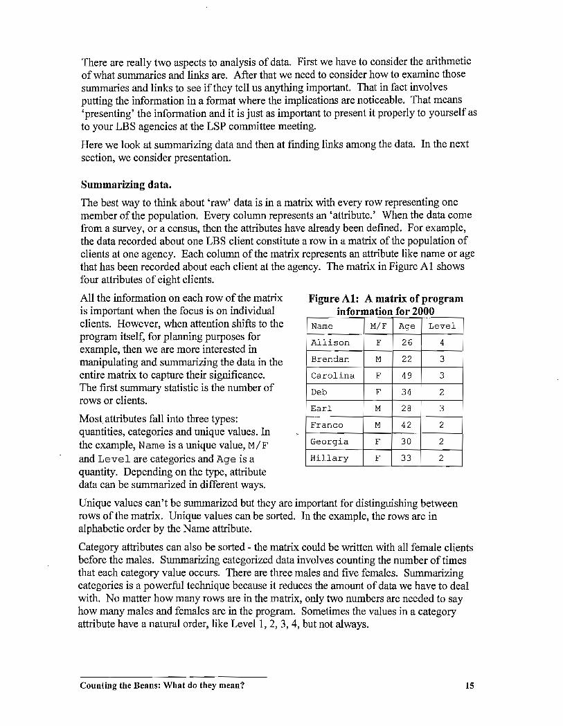
The best way to think about 'raw' data is in a matrix with every row representing one member of the population. Every column represents an 'attribute.' When the data corne from a survey, or a census, then the attributes have already been defined. For example, the data recorded about one LBS client constitute a row in a matrix of the population of clients at one agency. Each column ofthe matrix represents an attribute like name or age that has been recorded about each client at the agency. The matrix in Figure Al shows four attributes of eight clients.
All the information on each row of the matrix is important when the focus is on individual clients. However, when attention shifts to the program itself, for planning purposes for example, then we are more interested in manipulating and summarizing the data in the entire matrix to capture their significance. The first summary statistic is the number of rows or clients.
Most attributes fall into three types: quantities, categories and unique values. In the example, Name is a unique value, M/F
and Level are categories and Age is a quantity. Depending on the type, attribute data can be summarized in different ways.
Figure A1: A matrix of program information for 2000
Name M/F Age Level
Allison F 26 4
Brendan M 22 3
Carolina F 49 3
Deb F 34 2
Earl M 28 3
Franco M 42 2
Georgia F 30 2
Hillary F 33 2
Unique values can't be summarized but they are important for distinguishing between rows of the matrix. Unique values can be sorted. In the example, the rows are in alphabetic order by the Name attribute.
Category attributes can also be sorted - the matrix could be written with all female clients before the males. Summarizing categorized data involves counting the number of times that each category value occurs. There are three males and five females. Summarizing categories is a powerful technique because it reduces the amount of data we have to deal with. No matter how many rows are in the matrix, only two numbers are needed to say how many males and females are in the program. Sometimes the values in a category attribute have a natural order, like Levell, 2, 3, 4, but not always.
Counting the Beans: What do they mean? 15
Quantitative data, like Age, can also be sorted and they can be summarized in many ways. For example, the average of the Age data is 33; the range is 22 to 49. Quantitative data can also be grouped and treated like a category attribute. Ages 20-29: 3; 30-39: 3; 40-49: 2.
In the Report, the raw data on clients in a program must be reported by attribute categories. The same data are summarized by age group, by gender, by LBS level, etc. In the Report, that's as far as the analysis goes.
Summarizing data can sometimes produce important information but usually it is only by identifying connections between data that patterns emerge.
Finding Links among Data.
We will look at three kinds of links among data in this section. Sometimes comparing attributes can reveal information. Are more women than men staying in programs to Level 4? Sometimes a comparison between programs is valuable. Are all programs spending about the same amount oftime on goal-setting with clients? Sometimes bringing diverse data together is useful. Is it worth spending a lot oftime doing followup with clients who have left programs before completion?
Here we examine different ways to link data together.
1. Within one matrix of data it is possible to find links between attributes.
2. When the same data matrix format is used repeatedly, it is possible to find links between complete sets of data, for example comparing figures between six-month and year-end reports.
3. Finally, we consider linking matrices of data that are not in the same format.
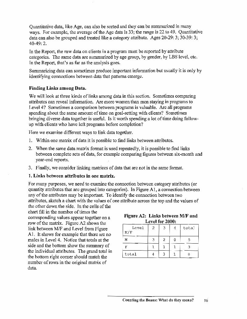
1. Links between attributes in one matrix.
For many purposes, we need to examine the connection between category attributes (or quantity attributes that are grouped into categories). In Figure AI, a connection between any of the attributes may be important. To identify the connection between two attributes, sketch a chart with the values of one attribute across the top and the values of the other down the side. In the cells of the chart fill in the number oftimes the corresponding values appear together on a row ofthe matrix. Figure A2 shows the link between MIF and Level from Figure AI. It shows for example that there are no males in Level 4. Notice that totals at the side and the bottom show the summary of the individual attributes. The grand total in the bottom right comer should match the number of rows in the original matrix of data.
Figure A2: Links between MIF and Level for 2000:
Level 2 3 4 total M/F
M 3 2 0 5
F 1 1 1 3
total 4 3 1 8
Counting the Beans: What do they mean? 16

In the Report, the link between the attribute of New or Carry-over Learner and many of the other attributes has to be reported. Presumably, the purpose is to identify any trends in population demographics.
Quantitative attributes lend themselves to another kind of analysis. Consider the table in Figure A3 that is based on a table from the Report.) This data matrix shows three quantitative attributes of five different services. Two extra columns have been added for new attributes that will be computed by linking other attributes together. For example, it may be useful to know approximately how much time is spent providing services to each client. The 'hours per client values are calculated by dividing the contact hours by # of clients. Agency staff spent, on average, 4.1 hours with each client working on training plans.
19ure . on ac ours III orma Ion or . F' A3 C t th . f t' f 2000 Services Contact # of Budget tlourl' %of~
delivered hours clients Contact per hrs
c.lWttt-( acttu;W diff)
Total training 2350 2300 102% (50) Info & referral 51 152 45 0.3 113% (6)
Assessment 47 36 60 1.3 78% (-13)
Training plan 128 31 90 1f.1 1lf2% (38) Follow-up 16 72 45 0.2 36% (-39)
Total 2592 2540 102% (52)
The final column relates the actual contact hours to budgeted hours. It is calculated by dividing actual by budget hours. If the figure were 100%, then the agency's actual hours would exactly match the budgeted hours. However, for follow-up, 16/45 = 36% showing that the actual hours were quite different from the budgeted hours. Notice that this comparison column could also be calculated by subtracting (in parentheses) instead of dividing, to show the actual discrepancy in hours between budget and actual. Why would you choose one calculation or the other? Using the percentage is better for focussing on the individual row of the matrix (This agency didn't spend much time on follow-up!) but the actual subtracted difference is better for determining how much each service contributes to the overall totals. (Doing training plans contributed less to the small overrun of budgeted hours than training did.)
Looking at the per~of~ figures, the agency planners noticed that three figures were far from 100% indicating a large discrepancy between budget and actual contact hours.
3 Notice that this data is being treated here as a matrix of 'raw' data but it is really a summary of even more raw data from the program's records.
Counting the Beans: What do they mean? 17
• 78% for referral was low but the average time per client of 0.3 hr (20 minutes) was approximately right so they decided there was no problem.
• 142% for training plans indicated they were spending too much time on this activity but the staff felt that 4.1 hours per client to set up training plans and keep them current was not excessive so they decided to budget more hours in the coming year.
• 36% for follow-up said the staff were spending less time than planned on this activity. Looking at the 0.2 hours or 12 minutes per client, the staff decided they were not spending enough time on tracking down clients after they left the program. (Checking their data on follow-up, they found that most had not been interviewed if a first phone call did not make contact.) Their plan for the next year was to spend more time on follow-up to bring the average to 0.5 hours per client. (They would watch the data on client success three and six months after leaving the program to see if the extra time was producing better information.)
2. Links between matrices of the same attributes.
Comparisons between sets of data with the same attributes are very common. A yearover-year comparison of the annual reports on an agency is one example; comparing the information from two agencies is another example. Often many matrices of data are compared, not just two.
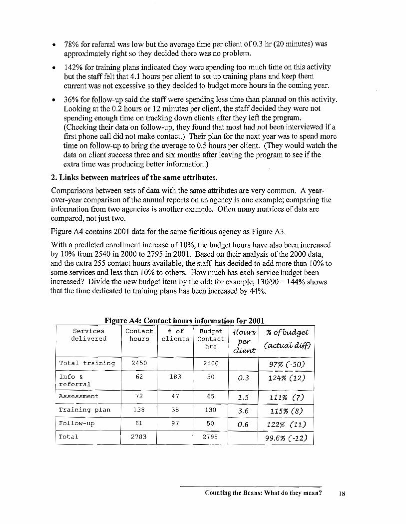
Figure A4 contains 2001 data for the same fictitious agency as Figure A3.
With a predicted enrollment increase of 10%, the budget hours have also been increased by 10% from 2540 in 2000 to 2795 in 2001. Based on their analysis of the 2000 data, and the extra 255 contact hours available, the staff has decided to add more than 10% to some services and less than 10% to others. How much has each service budget been increased? Divide the new budget item by the old; for example, 130190 = 144% shows that the time dedicated to training plans has been increased by 44%.
F' 19ore A4 C : ontac th ours m ormation or . £ f 2001 Services Contact # of Budget tlour~ %of~
delivered hours clients Contact per hrs (~d1ff) cUe,nt:
Total training 2450 2500 97% (-50)
Info & 62 183 50 0.3 124-% (12) referral
Assessment 72 47 65 1.5 111% (7)
Training plan 138 38 130 3.6 115% (8)
Follow-up 61 97 50 0.6 122% (11)
Total 2783 2795 99.6% (-12)
Counting the Beans: What do they mean? 18

Now, with the report of2000 available, the staff want an idea of how well they have fixed the problems that showed up in last year's data. A simple matching of the numbers tells a lot. The training plan time has come in much closer to the budgeted time but still over, at 115% compared to the 142% of 2000. Since the average time per client has also fallen from 4.1 hours to 3.6, it appears that even more time will have to be allotted to training plans next year. The second identified problem with follow-up has been successfully addressed - the average time per client has risen to 0.6 hours from 0.1 and the actual hours are now 122% of the budget rather than 36%. Was the time well spent? Only the data on student tracking can answer that.
In general, the data of Figures A3 and A4 say that F' AS C 2001 t 2000 igure . omparmg 0 . this program has improved its performance. The actual contact hours are closer to budgeted hours and the two identified problem areas show improvement.
Another question we might ask: did the predicted 10% increase in service delivery actually occur? This information will help in deciding what level of activity to predict for the
Serv~
cl.elivereOv
iO'tcWty~
Info-Er ve,fervci[,
A~
iv~pla.w
Follow-up
iO'tcW
contttct" 'houv:y
104% 122%
153%
108% 381%
107%
#of Budfjet-~ co-nt-ctct" hv:y
109% 120% 111%
131% 108% 123% 144%
135% 111%
110%
next year. Dividing each of the tabulated values in Figure A4 by the corresponding value in Figure A3, gives an indication of the year-over-year change. (This is exactly what was done above for the change in training plan budget.) Figure AS shows the result.
The number of clients served has in fact increased by 20% or more. The contact hours have increased 7% in total but the increase is not even. The follow-up increase of 281 % shows that the staff have put a lot more effort in to tracing former clients.
Notice that comparing data across time for one agency is easier than comparing data between agencies. In comparisons between agencies, the differences - like size - have to be taken into account or the data tell us nothing. The next example deals with this problem.
When more than two matrices of similar data are compared, we can start to look for patterns or trends in corresponding values. For example, suppose there are seven other agencies in the particular LSP area where the agency in Figure A4 is located and you now want to compare the efforts of this agency in doing follow-up with all the others. As a first step, how does the time spent on follow-up compare?
The basic method is to make a new data matrix with an attribute or attributes that can be compared and enter a row in the matrix for each agency. Figure A6 shows such a table with the agency in Figure A4 (agency A) on the first row. Now which ofthese attributes is most useful for comparison? The problem with all the attributes taken directly from the LBS program report (contact hours, number of clients, budget contact hours) is that
Counting the Beans: What do they mean? 19

these numbers refer to the service provided to all the clients in the program. They would only be meaningful for comparison if all the programs were the same size which they obviously are not. Knowing that agency A from Figure A4 followed up 97 clients while agency B followed up 305 doesn't say anything except that agency B followed up more clients. The attribute, Hours per Client, that we
F' l~re A6 C : omparmg 0 ow-up a tS agencies 2001
A~ C01'\ftlct #of 'B~ tf.0tA.¥"~ per hour~ cUe.nty hr~ cUen:t
A (F4rA5) 61 97 50 0.6
'B 375 305 300 1.2
C 152 227 150 0.7
V 36 4-3 60 0.8
E 19 57 40 0.3
F 55 58 50 0.9
G 122 254 170 0.5
tf. 12 19 20 0.6
added to the matrices of Figures A3 and A4, is independent of the size of the program and hence can be compared from agency to agency to learn something about level of service. The 0.6 hours per client that agency A spent on follow-up is similar to the time spent at other agencies. It is well within the range of 0.3 to 1.2 so we can conclude that agency A seems to be dedicating a reasonable amount of resources to follow-up. Of course, we do not know how successfully agency A or any of the other agencies used the time spent in follow-up.
3. Links between matrices with different attributes.
Investigating a particular question usually means fmding relevant data in a variety of sources. Combining data must be done carefully - the data have to 'fit.' Let us continue the example of the agency that has dedicated more resources to follow-up. We know that they succeeded in increasing hours per client from 0.2 to 0.6 but was it worthwhile? There is another table in the LBS report that is relevant: Follow-up Status at Three and Six Months after Exit.
Figure A7: Follow-up Three & Six Months after Exit 2000
# LBS # LBS # OBS # OBS
3 Mos. 6 Mos. 3 Mos. 6 Mos.
Employed (OW) 4 1 0 0
Employed(EI) 2 2 0 0
Employed (oth) 2 0 0 0
Other LBS 1 1 0 0
Training & Ed 9 6 0 0
Volunteer 0 1 0 0
Not employed 7 2 0 0
Lost Contact 24 10 0 0
Total 49 23 0 0 followed up
Counting the Beans: What do they mean? 20
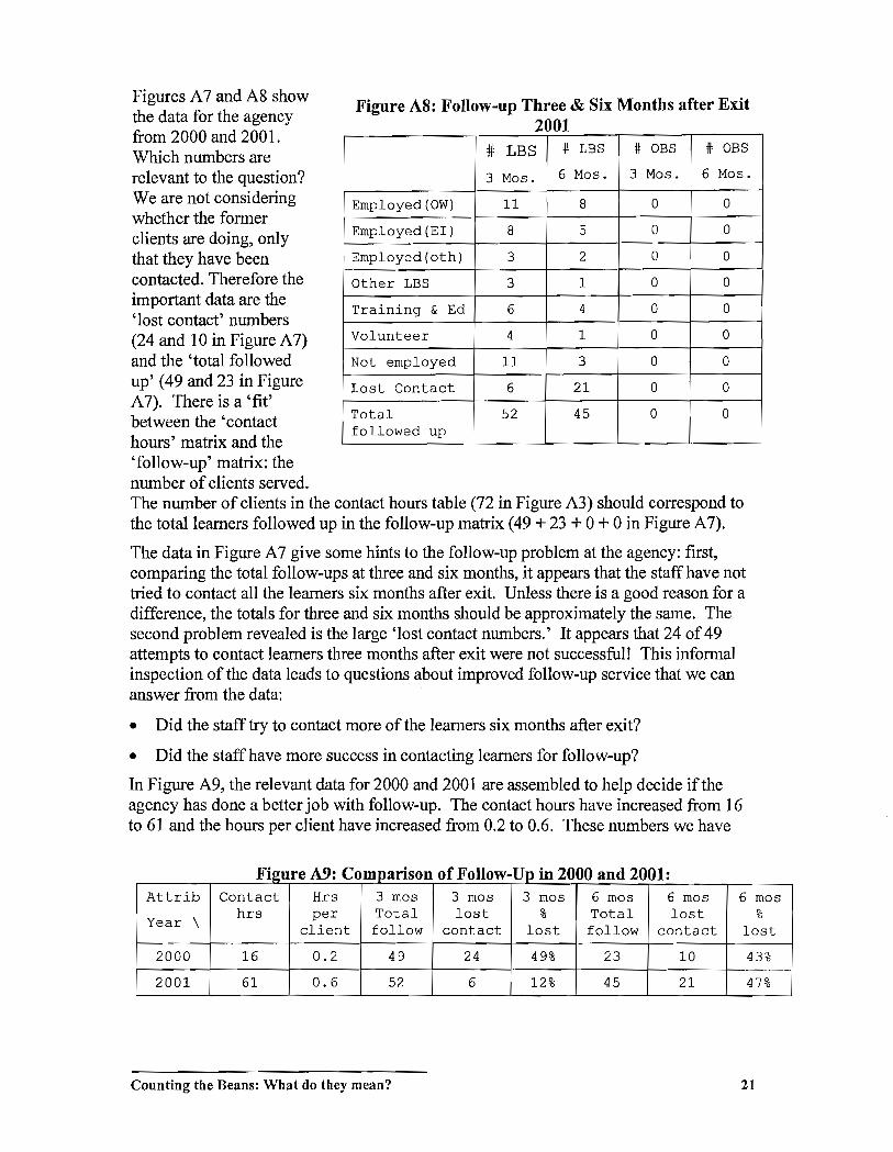
Figures A 7 and A8 show the data for the agency from 2000 and 2001. Which numbers are relevant to the question? We are not considering whether the former clients are doing, only that they have been contacted. Therefore the important data are the 'lost contact' numbers (24 and 10 in Figure A 7) and the 'total followed up' (49 and 23 in Figure A 7). There is a 'fit' between the 'contact hours' matrix and the 'follow-up' matrix: the number of clients served.
Figure AS: Follow-up Three & Six Months after Exit 2001
# LBS # LBS # OBS # OBS
3 Mos. 6 Mos. 3 Mos. 6 Mos.
Employed (OW) 11 8 0 0
Employed (EI) 8 5 0 0
Employed(oth) 3 2 0 0
Other LBS 3 1 0 0
Training & Ed 6 4 0 0
Volunteer 4 1 0 0
Not employed 11 3 0 0
Lost Contact 6 21 0 0
Total 52 45 0 0 followed up
The number of clients in the contact hours table (72 in Figure A3) should correspond to the total learners followed up in the follow-up matrix (49 + 23 + 0 + 0 in Figure A7).
The data in Figure A 7 give some hints to the follow-up problem at the agency: first, comparing the total follow-ups at three and six months, it appears that the staff have not tried to contact all the learners six months after exit. Unless there is a good reason for a difference, the totals for three and six months should be approximately the same. The second problem revealed is the large 'lost contact numbers.' It appears that 24 of 49 attempts to contact learners three months after exit were not successful! This informal inspection of the data leads to questions about improved follow-up service that we can answer from the data:
• Did the staff try to contact more of the learners six months after exit?
• Did the staffhave more success in contacting learners for follow-up?
In Figure A9, the relevant data for 2000 and 2001 are assembled to help decide if the agency has done a better job with follow-up. The contact hours have increased from 16 to 61 and the hours per client have increased from 0.2 to 0.6. These numbers we have
F' A9 C fF II U' 2000 d 2001 19ure : ompanson 0 0 ow- 'P ill an . . Attrib Contact Hrs 3 mas 3 mas 3 mas 6 mas 6 mas 6 mas
\ hrs per Total lost % Total lost %
Year client follow contact lost follow contact lost
2000 16 0.2 49 24 49% 23 10 43%
2001 61 0.6 52 6 12% 45 21 47%
Counting the Beans: What do they mean? 21
already discussed and they show that the agency has put more effort into follow-up. In three-month follow-up, the total contacted has stayed about the same but the number of lost contacts has been reduced. The percentages, 49% and 12%, show how much better the contact process has been. Looking at the six-month figures, we see that the number has increased from 23 to 45 so the staff has tried to contact almost as many learners six months after exit as three. This also indicates success. The final column shows the lost contact percentages after six months. The number hasn't changed much from 43% to 47% so it appears a problem remains. How could we continue to investigate this? The next question might be "Are all agencies having the same difficulty contacting LBS program clients after six months?"
Presenting information
Data are of no use in planning unless we can extract information from them. In the previous section, we looked at several arithmetic manipulations that summarize and compare data to uncover something important. Nonetheless, the extraction of meaning depends on interpretation: making an inference from the numbers about the real world situation.
Reading numbers and thinking about their significance is a poor way to make inferences from data because the form in which the numbers are written does not help in the interpretation of their meaning. The digit '7' is no bigger than the digit '4' although it represents a larger quantity. We have to read both digits as symbols and mentally attach meaning to each before we can interpret which is the larger quantity.
If quantitative information is represented in a visual format such as a line graph or bar chart, then we can draw 011 our well-developed visual sense to help in understanding. Similarities, contrasts, anomalies and patterns in the data are easier to spot and we can go more directly to interpreting the significance of the information. Just by looking, it is
obvious that' 7' is bigger than '4'.
Presenting data visually is helpful for conveying information to others and it is also a powerful strategy for examining data to look for meaningful information - good presentation is a means of data analysis.
However, visual presentation has to be done with some care. Most important, the presentation must be honest - it has to represent the information correctly. Second, the presentation should highlight the features of the data that are meaningful- the patterns that mean something in the real world. Third, the format of the presentation should help, not hinder, the interpretation of the data.
In a visual presentation of data, there are many ways to represent quantity but the most common and most easily interpreted is length or distance. In a bar chart it is the actual length of the bars that represents the quantities; in a line graph it is the distance between points on the graph that implies quantities. In a pie chart, quantity is represented by angle size.
Counting the Beans: What do they mean? 22

In this section we look at some basic rules for good presentation of data, focussing on the three most common forms: pie charts, bar charts and line graphs.
Pie charts - the Parts of a Whole
The metaphor of a pie is exactly right for this chart. It is ideally used when the data to be represented are, in some sense, parts of a larger whole. For example, a pie chart can be used to show how the enrollment in an LSP area is distributed among LBS programs. The data for number of clients in Figure A6 are displayed in a pie chart in Figure Plea).
Pie charts work best with a relatively small number of data (roughly ten or fewer) when we want to think about the data as fractions of the whole. Sometimes, it is useful to put
(a) Figure P1: Clients Tracked by Agency
(b)
Nl.lITDer ci clients Number of clients
H A (Rgure 5) , , f
"'7"'Ij~~.':':~;;"'-.: .. ; . .,.-' .... -
• c
H 0
8
the sections of the pie in order by size as in Figure PI(b). In Figure PI(b) we can see readily that about three quarters of the clients tracked were in three programs, B, C and G. This display also highlights the extreme values in the data by putting them side by side (H and B).
Pie charts are not successful when a lot of data must be displayed or when precise comparisons of values are needed. It is almost never a good idea to display more than one attribute on a pie chart.
Bar Graphs - Comparisons among Peers
When data do not constitute parts of a whole but are still comparable quantities, a bar chart can be used. For example, the hours per client measures from Figure A6 can be displayed as in Figure P2(a). Again, putting the data in order by size is sometimes useful as in Figure P2(b). This ordering makes it obvious where the hourly rate of agency A fits relative to the other agencies.
Counting the Beans: What do they mean? 23
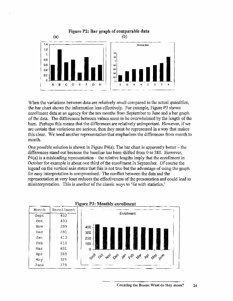
Figure P2: Bar graph of comparable data (a) (b)
1.4 i-I:uslHdErt
1.2
1 1.4
12 0.8
0.6 08
0.4 06
0.2 04
Q2
0
A B C D E F G H E G A H C D F B
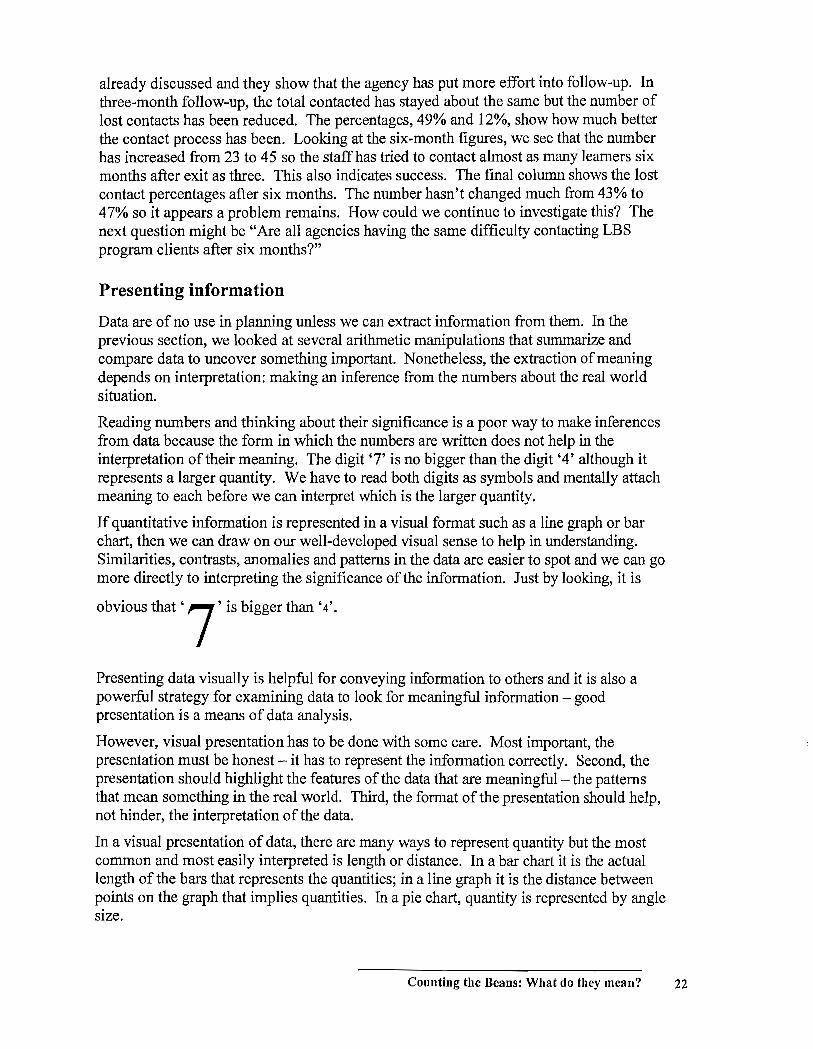
When the variations between data are relatively small compared to the actual quantities, the bar chart shows the information less effectively. For example, Figure P3 shows enrollment data at an agency for the ten months from September to June and a bar graph of the data. The differences between values seem to be overwhelmed by the length of the bars. Perhaps this means that the differences are relatively unimportant. However, if we are certain that variations are serious, then they must be represented in a way that makes this clear. We need another representation that emphasizes the differences from month to month.
One possible solution is shown in Figure P4(a). The bar chart is apparently better - the differences stand out because the baseline has been shifted from 0 to 380. However, P4(a) is a misleading representation - the relative lengths imply that the enrollment in October for example is about one third of the enrollment in September. Of course the legend on the vertical axis states that this is not true but the advantage of using the graph for easy interpretation is compromised. The conflict between the data and the representation at very least reduces the effectiveness ofthe presentation and could lead to misinterpretation. This is another of the classic ways to 'lie with statistics.'
Month Enrollment
Sept
Oct
Nov
Dec
Jan
Feb
Mar
Apr
May
452
403
399
391
413
410
401
389
385
June 379
Fi ure P3: Monthl enrollment
400
300
200
100
o
Enrollment
00'Y.' oC;- ~o~ <:lJ ':J~~ «.& ~~ ~'Y.<' ~re\ ':J~~0
Counting the Beans: What do they mean? 24
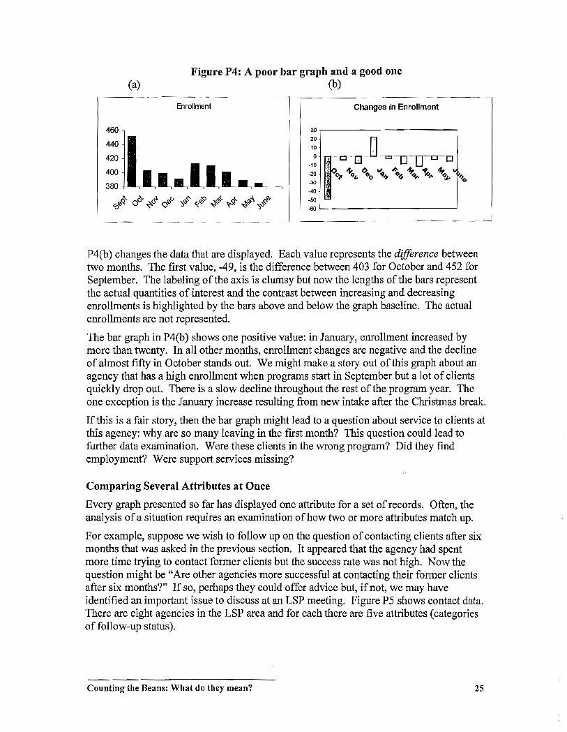
Figure P4: A poor bar graph and a good one (a) (b)
Enrollrrent Changes in Enrollment
460 30
20 -t " o-O-~O~DO~D 440 10
420 0
-10 400 -20 ; ~(>.v..t-~"l~"!
~? -30
__ (\.. 0,. $(\ ~~ $~ ~.... 10.... ~ $
380 -40
~ u- ,.!, CJ ':l~~ «.~ ~~ ~~ ~~ ':lV~0 -50 ci:~ 0 ~o <::Ji -00
P4(b) changes the data that are displayed. Each value represents the difference between two months. The first value, -49, is the difference between 403 for October and 452 for September. The labeling of the axis is clumsy but now the lengths of the bars represent the actual quantities of interest and the contrast between increasing and decreasing enrollments is highlighted by the bars above and below the graph baseline. The actual enrollments are not represented.
The bar graph in P4(b) shows one positive value: in January, enrollment increased by more than twenty. In all other months, enrollment changes are negative and the decline of almost fifty in October stands out. We might make a story out ofthis graph about an agency that has a high enrollment when programs start in September but a lot of clients quickly drop out. There is a slow decline throughout the rest of the program year. The one exception is the January increase resulting from new intake after the Christmas break.
If this is a fair story, then the bar graph might lead to a question about service to clients at this agency: why are so many leaving in the first month? This question could lead to further data examination. Were these clients in the wrong program? Did they find employment? Were support services missing?
Comparing Several Attributes at Once
Every graph presented so far has displayed one attribute for a set of records. Often, the analysis of a situation requires an examination of how two or more attributes match up.
For example, suppose we wish to follow up on the question of contacting clients after six months that was asked in the previous section. It appeared that the agency had spent more time trying to contact former clients but the success rate was not high. Now the question might be "Are other agencies more successful at contacting their former clients after six months?" If so, perhaps they could offer advice but, if not, we may have identified an important issue to discuss at an LSP meeting. Figure P5 shows contact data. There are eight agencies in the LSP area and for each there are five attributes (categories of follow-up status).
Counting the Beans: What do they mean? 25
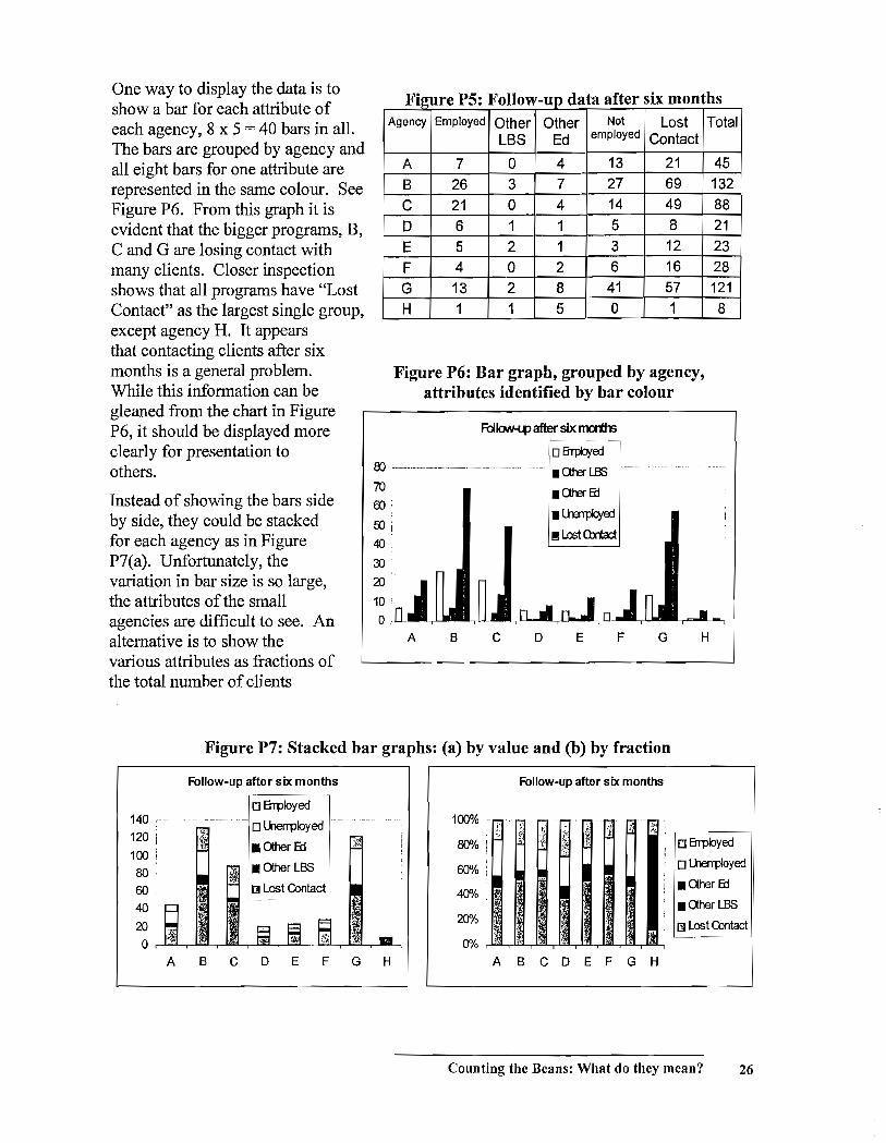
One way to display the data is to show a bar for each attribute of each agency, 8 x 5 = 40 bars in all. The bars are grouped by agency and all eight bars for one attribute are represented in the same colour. See Figure P6. From this graph it is evident that the bigger programs, B, C and G are losing contact with many clients. Closer inspection shows that all programs have "Lost Contact" as the largest single group, except agency H. It appears that contacting clients after six months is a general problem. While this information can be gleaned from the chart in Figure P6, it should be displayed more clearly for presentation to others.
Instead of showing the bars side by side, they could be stacked for each agency as in Figure P7(a). Unfortunately, the variation in bar size is so large, the attributes of the small agencies are difficult to see. An alternative is to show the various attributes as fractions of the total number of clients
F' 19ure PS F II f d : o ow-up ata a ter SIX mon th S
Agency Employed Other Other Not Lost Total LBS Ed employed Contact
A 7 0 4 13 21 45 B 26 3 7 27 69 132 C 21 0 4 14 49 88 D 6 1 1 5 8 21 E 5 2 1 3 12 23 F 4 0 2 6 16 28 G 13 2 8 41 57 121 H 1 1 5 0 1 8
Figure P6: Bar graph, grouped by agency, attributes identified by bar colour
FoI\oN-l.tJ after six m:rths
o8TJ:b!ed 00 -------------------------------- .aterl13S ------------ -----
70 00,
OOi
40
3J
aJ
o A B c
!!ILostO:md
D E F G H
Figure P7: Stacked bar graphs: (a) by value and (b) by fraction
Follow-up after six months Follow-up after six months
o Errployecf 140 ,---- -... - .. ------~. o U1errployecf 100% -- .-_. --
/ ;.: ,~; Ii I~
;:, :1 " 120 $t fi' :].j !t' I
~ • Other 6::l ~, 80% I :;" ,- ~ o Errployed
I ,
100 I
80 7>'l • Other LBS 60% ! o lherrpfoyed
60 ~ Lost Contact 40% • Other Ed
40 • Other LBS
20 20% rnLostContact
~ 0 0% ..
'" ; ~
A B C D E F G H A B C D E F G H
Counting the Beans: What do they mean? 26
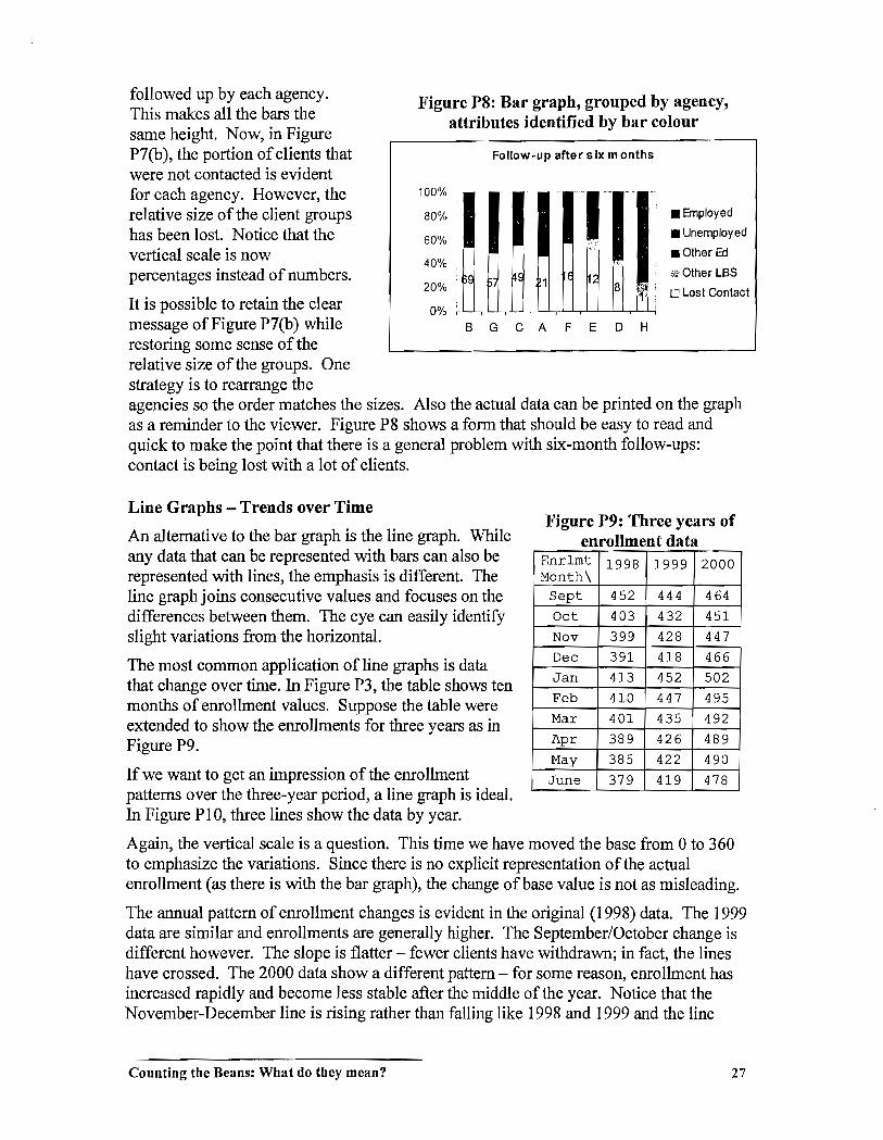
followed up by each agency.
This makes all the bars the same height. Now, in Figure
P7 (b), the portion of clients that
were not contacted is evident for each agency. However, the
relative size of the client groups
has been lost. Notice that the
vertical scale is now percentages instead of numbers.
It is possible to retain the clear
message of Figure P7(b) while
restoring some sense of the
relative size of the groups. One
strategy is to rearrange the
Figure P8: Bar graph, grouped by agency,
attributes identified by bar colour
Follow-up after six months
100% ;'1-1-80% '
60%
40% ~. 20% I~ 8 ,l'jg;
t'I'I' 0%' -,--l--'--r-l--'-r-'--L-,--J--J'--r-'--'---r-'---'-,--'--'-il
fl .8nployed
• Unemployed
• Other Ed
,(?Other LBS
o Lost Contact
B G C A F E o H
agencies so the order matches the sizes. Also the actual data can be printed on the graph
as a reminder to the viewer. Figure P8 shows a form that should be easy to read and
quick to make the point that there is a general problem with six-month follow-ups:
contact is being lost with a lot of clients.
Line Graphs - Trends over Time
An alternative to the bar graph is the line graph. While
any data that can be represented with bars can also be
represented with lines, the emphasis is different. The
line graph joins consecutive values and focuses on the
differences between them. The eye can easily identify
slight variations from the horizontal.
The most common application of line graphs is data
that change over time. In Figure P3, the table shows ten
months of enrollment values. Suppose the table were
extended to show the enrollments for three years as in
Figure P9.
If we want to get an impression of the enrollment
patterns over the three-year period, a line graph is ideal.
In Figure PI0, three lines show the data by year.
Figure P9: Three years of enrollment data
Enr1mt 1998 1999 2000 Month\
Sept 452 444 464
Oct 403 432 451
Nov 399 428 447
Dec 391 418 466
Jan 413 452 502
Feb 410 447 495
Mar 401 435 492
Apr 389 426 489
May 385 422 490
June 379 419 478
Again, the vertical scale is a question. This time we have moved the base from 0 to 360
to emphasize the variations. Since there is no explicit representation of the actual
enrollment (as there is with the bar graph), the change of base value is not as misleading.
The annual pattern of enrollment changes is evident in the original (1998) data. The 1999
data are similar and enrollments are generally higher. The September/October change is
different however. The slope is flatter - fewer clients have withdrawn; in fact, the lines
have crossed. The 2000 data show a different pattern - for some reason, enrollment has
increased rapidly and become less stable after the middle of the year. Notice that the
November-December line is rising rather than falling like 1998 and 1999 and the line
Counting the Beans: What do they mean? 27
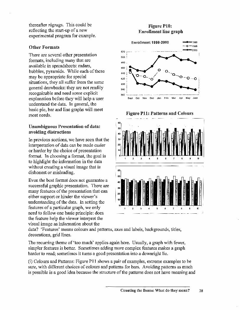
thereafter zigzags. This could be reflecting the start-up of a new experimental program for example.
Other Formats
There are several other presentation formats, including many that are available in spreadsheets: radars, bubbles, pyramids. While each of these may be appropriate for special situations, they all suffer from the same general drawbacks: they are not readily recognizable and need some explicit explanation before they will help a user understand the data. In general, the basic pie, bar and line graphs will meet most needs.
Unambiguous Presentation of data: avoiding distractions
In previous sections, we have seen that the interpretation of data can be made easier or harder by the choice of presentation format. In choosing a format, the goal is' to highlight the information in the data without creating a visual image that is dishonest or misleading.
Even the best format does not guarantee a successful graphic presentation. There are many features of the presentation that can either support or hinder the viewer's understanding of the data. In setting the
aD
9D
3D
10
Figure PIO: Enrollment line graph
Enrollment 1998-2000 -1998
".--0 '''''1999
520 ,--- -
500 :
480 :
, 420 ,
400 i i
380 ! I
.. _ ... __ .. __ ._._._ .. _. __ .. _._._ ... -2000
360 '--.---.-.-.---.-----.----.-.---.--------~
Sept Oct Nov Dec Jan Feb Mar Apr May June
Figure PH: Patterns and Colours
2 tJ
features of a particular graph, we only 6 tJ
need to follow one basic principle: does the feature help the viewer interpret the visual image as information about the data? 'Features' means colours and patterns, axes and labels, backgrounds, titles, decorations, grid lines.
The recurring theme of 'too much' applies again here. Usually, a graph with fewer, simpler features is better. Sometimes adding more complex features makes a graph harder to read; sometimes it turns a good presentation into a downright lie.
(i) Colours and Patterns: Figure PII shows a pair of examples, extreme examples to be sure, with different choices of colours and patterns for bars. A voiding patterns as much is possible is a good idea because the structure of the patterns does not have meaning and
Counting the Beans: What do they mean? 28
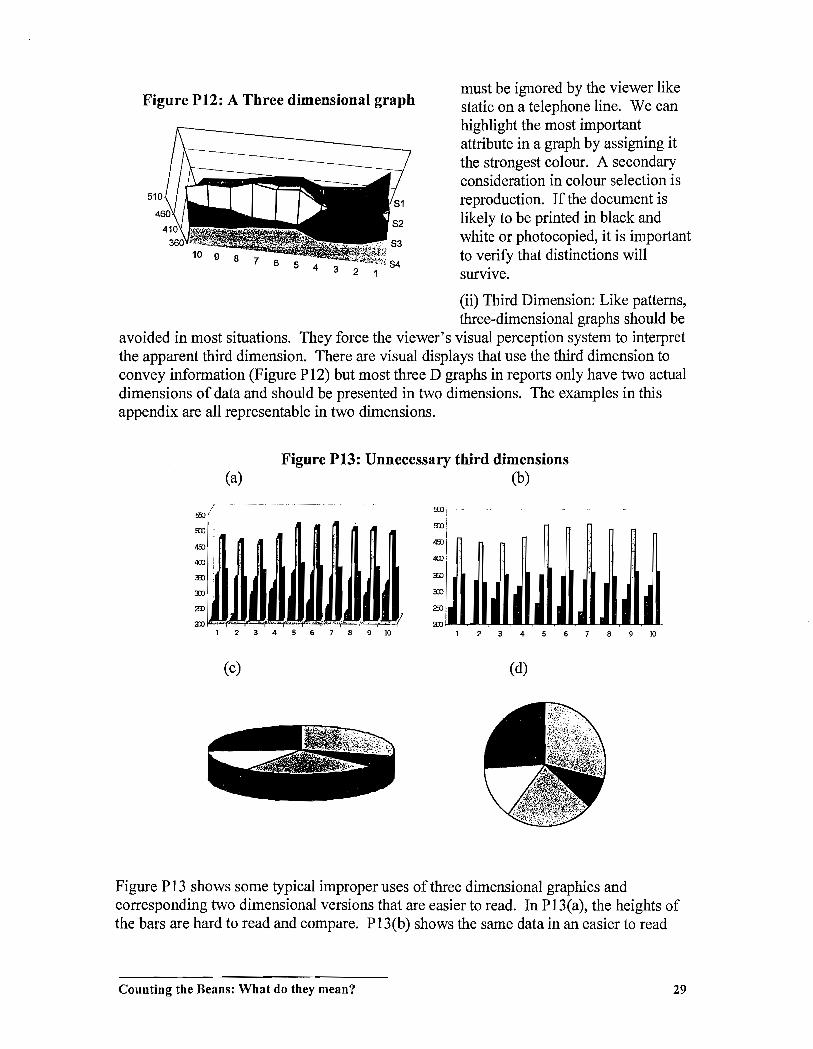
Figure P12: A Three dimensional graph
5 4 3 2 1
must be ignored by the viewer like static on a telephone line. We can highlight the most important attribute in a graph by assigning it the strongest colour. A secondary consideration in colour selection is reproduction. If the document is likely to be printed in black and white or photocopied, it is important to verify that distinctions will survive.
(ii) Third Dimension: Like patterns, three-dimensional graphs should be
avoided in most situations. They force the viewer's visual perception system to interpret the apparent third dimension. There are visual displays that use the third dimension to convey information (Figure P 12) but most three D graphs in reports only have two actual dimensions of data and should be presented in two dimensions. The examples in this appendix are all representable in two dimensions.
Figure P13: Unnecessary third dimensions (a) (b)
!Hl, ,
I , ,. i
,
i I I I I I I I I 1 234 5 6 7 B 9 ill 4 10
(c) (d)
Figure P 13 shows some typical improper uses of three dimensional graphics and corresponding two dimensional versions that are easier to read. In P 13(a), the heights of the bars are hard to read and compare. P13(b) shows the same data in an easier to read
Counting the Beans: What do they mean? 29

two dimensional version. The pie chart in P13(c) is more than hard to read; it
misinfonns. The area of the value at the 'front' of the graph is over-emphasized because
it is at the front and because the thickness of the pie adds to the area of the slice
representing that value. Figure P13(d) is a fairer representation of the data.
A Summary and an Example
A graph represents data but to be understood, the data must be supported by other
features. The length of a bar portrays a data value but that length can't be understood
without the axis and numeric scale. The support features should be sufficient to interpret
the data features but they should not be so numerous and complex as to dominate the
data. Their size, colour, completeness and frequency should be secondary to the data
features.
Figure P 14 shows a final example.
The graph has been created for a
literacy services planning meeting
where a new initiative to funders will
be discussed. For each funder, a lead
LBS agency must be selected. It seems logical that an agency selected
to initiate contact with a funder
should have a significant enrollment
of students from the funder. The
choices for lead agency to EI (Agency
A) and to OW (Agency C) seem
obvious, even in P14(a), a 'raw' chart
exactly as it was generated by a
spreadsheet program (Excel).
However, we want to present the
infonnation in a fonnat that will
infonn discussion on who should take
the lead with WSIB. P14(b) shows the
same data in an improved fonnat.
• The LB S agencies have been
sorted according to the number of
WSIB clients because we are
predicting that this will be the
most contentious decision. WSIB
data have been placed first for
each agency and the black colour
makes these data stand out on the
graph compared to the grays for
the other funders.
• A complete title is essential.
Figure P14: Support Features: essential and unobtrusive
(a)
160
120
100
so
40
20
o
(b)
150
100
Agency Agency Agency Agency Agency Agency Agency
ABC 0 E F G
E D
Oient EnroIlrrent by Funcler
G C
L.BS~
A B
DB
o other
F
• A legend mayor may not be necessary. One is provided here to identify funders.
Counting the Beans: What do they mean? 30

• Scales and labels on the axes mayor may not be necessary. Here scale has been set to steps of 50 on the vertical axis. The 100 line then makes it clear that C and A are obvious choices for lead agencies and the 50 line will help in determining the lead agency with WSIB.
• Support features should be in pale shades so the data dominate. Note that axes are pale. The data bars for the' other' category are just outlined because this category is not really part of the discussion. The data are there in case the argument is made that Agency B is so 'big' it should be taking a lead role somewhere.
• Borders are seldom necessary. Here a border has been retained around the legend because it has been superimposed on the graph space.
Now go back to the first graphs of this section, most of the Figures from PI to PIO, and look at them with a critical eye. Are there features that could be added, removed or changed to increase the effectiveness?
Counting the Beans: What do they mean? 31