covid-19 mortality in rich and poor countries
TRANSCRIPT

Policy Research Working Paper 9260
COVID-19 Mortality in Rich and Poor Countries
A Tale of Two Pandemics?
Philip SchellekensDiego Sourrouille
Economics and Private Sector Development International Finance Corporation & Equitable Growth, Finance and Institutions World BankMay 2020
Pub
lic D
iscl
osur
e A
utho
rized
Pub
lic D
iscl
osur
e A
utho
rized
Pub
lic D
iscl
osur
e A
utho
rized
Pub
lic D
iscl
osur
e A
utho
rized

Produced by the Research Support Team
Abstract
The Policy Research Working Paper Series disseminates the findings of work in progress to encourage the exchange of ideas about development issues. An objective of the series is to get the findings out quickly, even if the presentations are less than fully polished. The papers carry the names of the authors and should be cited accordingly. The findings, interpretations, and conclusions expressed in this paper are entirely those of the authors. They do not necessarily represent the views of the International Bank for Reconstruction and Development/World Bank and its affiliated organizations, or those of the Executive Directors of the World Bank or the governments they represent.
Policy Research Working Paper 9260
COVID-19 can be described as a heat-seeking missile speeding toward the most vulnerable in society. That met-aphor applies not just to the vulnerable in the rich world; the vulnerable in the rest of the world are not more immune. Yet, despite the extensive spread of the virus, the mortality toll remains highly concentrated in high-income coun-tries. Developing countries represent 85 percent of the global population, but only 21 percent of the pandemic’s death toll. This unusual inequality creates the impression that the world is subjected to two different pandemics in terms of their impact. This paper documents the observed
inequality with a new indicator that expresses severity rel-ative to pre-pandemic patterns. It argues that the excessive skew towards rich countries is inconsistent with demogra-phy. Simulations based on reasonable ranges for infectivity and fatality suggest that the developing country share in global fatalities could rise by a factor of three (from 21 to 69 percent). Environmental and host-specific factors will influ-ence these results but are unlikely to overturn them. While data quality has a role in explaining ‘excess inequality’, the more compelling explanation is that the pandemic has yet to run its course through the age distributions of the world.
This paper is a joint product of the Economics and Private Sector Development Department at the International Finance Corporation and the Equitable Growth, Finance and Institutions Practice Group at the World Bank. It is part of a larger effort by the World Bank Group to provide open access to its research and make a contribution to development policy discussions around the world. Policy Research Working Papers are also posted on the Web at http://www.worldbank.org/prwp. The authors may be contacted at [email protected] and [email protected].

COVID-19 Mortality in Rich and Poor Countries:
A Tale of Two Pandemics? *
Philip Schellekens1
Diego Sourrouille2
May 2020
Keywords: Pandemic; Demography; Health; Mortality.
JEL: I10, J0
* We would like to thank for helpful comments and inputs Syud Amer Ahmed, Pablo Cafiero, Marcio Cruz, Carl Dahlman, Indermit Gill, Huade Huo, Matthew Jones, Fabrice Lockefeer, Andrew Mason, Bryce Quillin, Juan V. Sourrouille, Alfred Watkins, Juan Wisnivesky and Shahid Yusuf. The findings, interpretations, conclusions and any remaining errors are entirely those of the authors. They do not necessarily represent the views of the World Bank Group, its Executive Directors or the governments they represent. 1 Senior Economic Advisor to the Office of the CEO, International Finance Corporation. Correspondence: [email protected]. This work is inspired by the Global Monitoring Report on demography and development, which I managed when previously at the World Bank. 2 Financial Analyst, World Bank. Correspondence: [email protected].

2
Contents
1. INTRODUCTION ........................................................................................................................... 3
2. CONTEXT AND ADDED VALUE .................................................................................................... 4
3. THE SEVERITY OF THE PANDEMIC .............................................................................................. 6
A New Indicator of Relative Severity .................................................................................................................... 6
Comparisons across Countries.............................................................................................................................. 7
Progression over Time ....................................................................................................................................... 10
4. THE STARK DICHOTOMY BETWEEN RICH AND POOR COUNTRIES .......................................... 14
A World with Two Pandemics? ........................................................................................................................... 14
Demography Contradicts the Excess Inequality between Rich and Poor Countries ............................................. 15
The Share of the Developing World Could Be Three Times Larger ....................................................................... 17
Comorbidities and Environmental Factors May Present Further Upside Risk ...................................................... 19
5. COVID, QUO VADIS? ................................................................................................................. 21
Perspective 1: Unreal ......................................................................................................................................... 21
Perspective 2: Unrealized ................................................................................................................................... 22
6. REFERENCES .............................................................................................................................. 25
ANNEX. THE PROGRESSION OF SEVERITY: FULL SAMPLE ................................................................ 29
3
1. Introduction
Views about the severity of the coronavirus (COVID-19) pandemic have evolved considerably since the outbreak in Wuhan, China. While initially thought to remain confined to China, the virus spread soon afterwards to the rest of the region and the world. In a matter of a few weeks, more than 5.5 million people in 213 countries and territories became infected (Worldometer, 2020). A local outbreak became a full-scale pandemic, entire countries were locked down and the world collectively came to face the prospect of the worst economic downturn since the Great Depression (IMF, 2020).
Despite the rapid and extensive spread of the virus, the reported death toll remains surprisingly concentrated in just a few geographies. As of May 23—the cut-off point for this paper—the global death toll amounted to some 340,000 people. The vast majority of the fatalities reported thus far is in the high-income countries (HICs). Just five of them are responsible for 65 percent of the global total. Together, the HICs represent 79 percent of all deaths.
That leaves 21 percent to the developing world, which is nevertheless much more populous. Upper-middle income countries (UMICs) claim 18 percent of the global total toll, but their share in the global population is just over a third. The contrast is even starker for the poorer developing countries. Lower-middle income countries (LMICs) and low-income countries (LICs) claim just 3 percent of the death toll; yet they represent almost half of the world’s population.
The unequal distribution of the impact of the pandemic in favor of the developing world is highly unusual and has the appearance of the world dealing two different pandemics, with the metaphor alluding to the differential impact. As recently noted by Cash and Patel (2020), “for the first time in the post-war history of epidemics, there is a reversal of which countries are most heavily affected by a disease pandemic.” Some have conjectured that this feature of inequality is here to stay: indeed, “the low Covid-19 death toll raises hopes Africa may be spared the worst” (Pilling, 2020).
Against this backdrop, the paper attempts to shed light on three interrelated questions:
• How unequally severe has the pandemic been so far across countries and over time? • What explains the observed contrast between rich and poor countries? • What does the future hold for the developing world?
The first part of the paper documents the unequal distribution and progression of the COVID-19 mortality burden across countries through the lens of a new indicator of ‘relative severity.’ This indicator expresses the severity of the mortality toll relative to pre-pandemic patterns, both in terms of all-cause mortality and the top causes of death specific to individual countries. This part of the analysis will bring out the sheer inequality in the mortality toll at the individual country level.
The second part questions the observed inequality between rich and poor countries. It conducts a thought experiment which suggests that the low developing-country share in total deaths is entirely unexpected. Its first step is to simulate the distribution of COVID-19 mortality across World Bank income classifications by applying a reasonable range of epidemiological patterns of infectivity and fatality to the world’s age distributions. The second step is to consider how relative to this baseline host-specific factors other than age (e.g. comorbidities) and environmental factors (e.g. temperature, density, healthy systems, distancing policies) are likely to affect the baseline.

4
The analysis suggests that, purely on account of demography, the share of HICs could reach 31 percent, which is almost three times lower than the present estimate. Conversely, the share of UMICs could more than double to 39 percent, whereas that of LMICs and LICs could rise, respectively, to 27 percent (by a factor of 9) and 4 percent (by a factor of 22). These estimates are subject to the influence of other factors, but these in our view do not offer a convincing explanation of the stark discrepancies between rich and poor countries. In fact, collectively, they may well serve the raise the share of the developing world relative to the baseline.
The third part of the paper speculates on the likely path going forward. It concludes that the observed disconnect between the reported and estimated data entails a grim prediction for the future mortality toll of COVID-19 in the developing world. It entertains the possibility that the current skew towards HICs may be partly the result of inequality in data quality but deems that the first-order reason for the present dichotomy between rich and poor countries is because the pandemic has not yet run its full course through the age distributions of the different parts of the world. Whether this grim prediction will be realized will depend importantly on measures governments and individuals will undertake to mitigate and slow the pace of infection.
It is true that the generally younger age distributions of the developing world will offer a measure of protection against the virus as younger people are exponentially less vulnerable keeping all else constant. But we should not forget that the developing world, as a whole, counts in absolute terms many more people in the vulnerable age cohorts than the HICs combined: its 60+ population is 2.4 times larger and the 70+ population 1.8 times. The fact that these vulnerable groups in developing countries represent a smaller share in their own populations compared to HICs should not diminish our focus on mitigating the impact of pandemic in the developing world.
2. Context and Added Value
We briefly describe the two main contributions in this paper, how they build on the emerging literature and add value to it. Clearly, many different efforts have been made thus far to track to the mortality burden of the COVID-19 pandemic.3 Past efforts have ranged from monitoring absolute deaths, in some cases corrected for delay in registration, tracking cause-specific crude mortality rates, normalized by population size, and calculating excess death ratios, which relate current to expected all-cause deaths to pick up deviations from past patterns and correct for data quality.
The first part of the paper adds to this literature by introducing an indicator of ‘relative severity.’ The relative severity ratio expresses COVID-19 mortality relative to the pre-pandemic mortality profile of individual countries. We compare COVID-19 deaths to all-cause deaths before the pandemic as well as the top-cause-specific deaths for each country. The expression of mortality in relative terms speaks to the fact that countries may have adapted to specific patterns of mortality and that deviations from such patterns may indicate pressure points, particularly on health systems. Comparisons with previous patterns give a country-specific flavor of the severity of the COVID-19 pandemic, which could be used to corroborate realities on the ground.
3 See Aron and Muellbauer, 2020; Burn-Murdoch and others, 2020; Ciminelli and Garcia-Mandicó, 2020; EuroMOMO, 2020; The Economist, 2020c; Wu and others, 2020.

5
The indicator allows us to track the severity of the pandemic across countries and over time in ways that complement previous efforts. Like the crude mortality rate, it provides a relative expression of mortality, which helps dimension severity. Unlike the crude mortality rate, it normalizes for past mortality patterns, which provides a sense of proportion relative to what was common. Unlike the excess death ratio, the indicator is globally comprehensive, as it does not rely on ‘nowcasting’ total deaths in the numerator, which typically is not possible for poorer countries due to lack of data. However, where such data are available, the relative severity ratio can incorporate adjusted COVID-19 mortality data based on excess deaths.
The second part of the paper questions the observed inequality in the mortality toll between rich and poor countries. Since COVID-19 exhibits a strong age gradient in the risk of death, our analysis zooms in on the interaction between epidemiological parameters of infectivity and fatality and demographic patterns of age structure. Specifically, we simulate what the global distribution of the death toll from COVID-19 would look like if plausible assumptions of infection prevalence and age-stratified fatality are applied to age distributions of World Bank income groups.
This approach builds on the literature in a number of ways. The strong age gradient of COVID-19 has been well established in many studies.4 What has been examined less is the interaction of age-stratified fatality ratios with population-level demographic structure. A seminal contribution in the context of COVID-19 was made by Dowd and others (2020), who apply common patterns of infectivity and fatality to the country-level age-distributions. This paper extends the approach to the global level.
Following Verity and others (2020), we impose uniform attack rates across age groups and apply age-stratified infection fatality ratios corrected for censoring and ascertainment biases due to lack of testing and other distortions that affect measurement. The simulations are subjected to robustness checks by utilizing other epidemiological parameters.5 This procedure allows us to produce a baseline of the expected mortality toll on account of variation in demographic structure. We use the baseline as a backdrop to examine how other factors may influence the results.
4 Baud and others, 2020; Begley, 2020, Belligoni, 2020; Courage, 2020; Dylan, 2020; Huang and others, 2020; Mahase, 2020; Onder and others, 2020; Richardson and others, 2020, Soneji and others, 2020; Wu and McGoogan, 2020. 5 Istituto Superiore di Sanità, 2020; Korean Ministry of Health and Welfare, 2020; Spanish Ministry of Health, 2020.
6
3. The Severity of the Pandemic
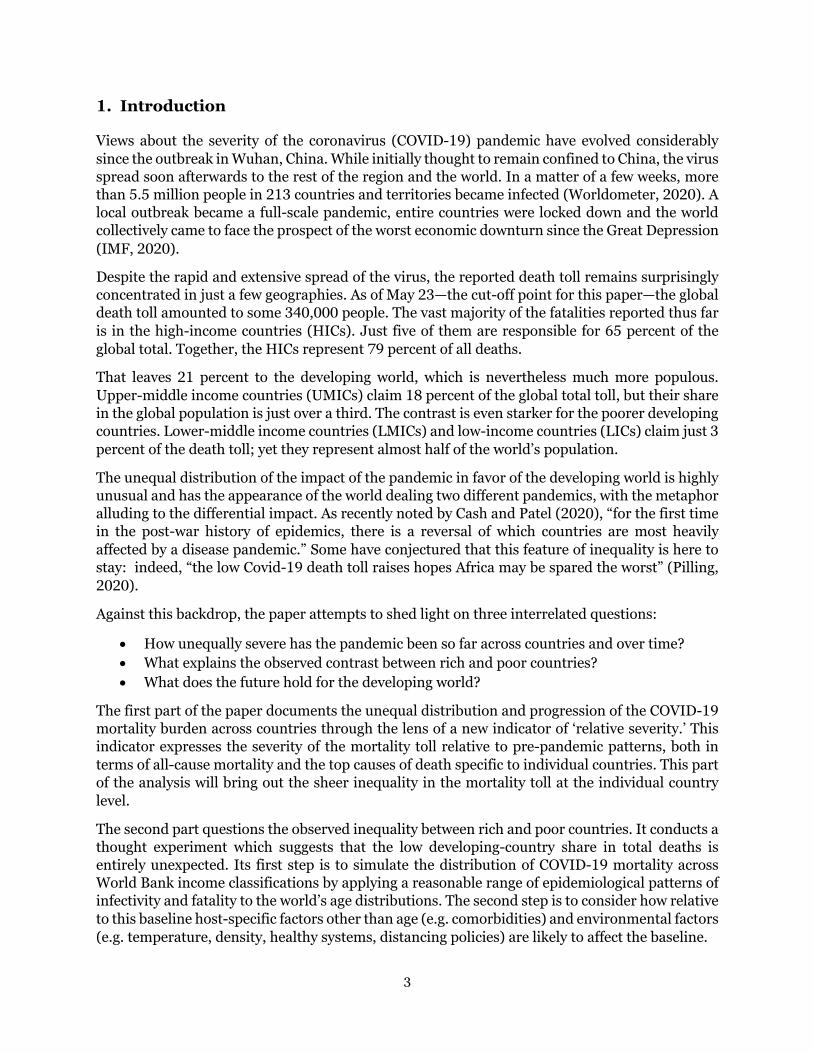
While the virus has spread rapidly and extensively, the reported death toll remains surprisingly concentrated in just a few geographies. As of May 23, the cut-off date for all data in this paper, the death toll has risen to about 340,000 people. That is roughly 2.2 times the number of deaths that we would expect to occur on an average day prior to the pandemic. As Figure 1 shows, five countries—the United States, Italy, the United Kingdom, Spain and France—account the bulk of the global death toll. While they only represent 7.5 percent of the world’s population, these five countries claim 65 percent of the total number of fatalities. The widening distance in the figure between the world and the top five also implies that the death toll in the rest of the world is now growing more quickly.
Figure 1. COVID-19 Death Toll: World and Top Five Countries
Source: Johns Hopkins University.
A New Indicator of Relative Severity
In what follows, we will examine the unequal distribution and progression of the pandemic through the lens of the ‘relative severity ratio’. This indicator is defined as the ratio of (1) the total deaths attributed to COVID-19 over a given period to (2) the expected total deaths from all causes under the counterfactual assumption that the pandemic had not taken place over a base period of the same length. Depending on the length of the period, we consider two such indicators: a cumulative and a daily ratio. The daily ratio uses a single day as the basis for the period. The cumulative ratio uses the ‘outbreak-to-date’ (OTD) period, which is taken to be the country-specific length of time between the occurrence of the first death and the cut-off date for the calculation of the indicator.
As noted earlier, different efforts have been made thus far to track the mortality burden of the COVID-19 pandemic. The ‘relative severity ratio’ adds to these efforts by explicitly relating COVID-19 mortality to the pre-pandemic mortality profile of individual countries. This is achieved not only with reference to all-cause deaths (the denominator of the indicator) but also
World
Top 5: US, UK, Italy, Spain, France
Top 4: US, UK, Italy, Spain
Top 3: US, UK, Italy
Top 2: US, UK
Top 1: US
0
100
200
300
Mar 1 Apr 1 May 1
Num
ber o
f COV
ID−1
9 de
aths
(tho
usan
ds)

7
through easy comparison with cause-specific proportionate mortality rates of the most common causes of disease within a particular country.
Why compare with pre-pandemic mortality patterns? The expression of mortality in relative terms speaks to the fact that countries may have adapted to their specific patterns of mortality. Deviations from this pattern may create pressure points, such as for example on the health system. Comparisons with previous patterns give a country-specific flavor of the severity of the COVID-19 pandemic, which could be used to corroborate realities on the ground. This relative expression complements other approaches – it does not substitute for them. A key advantage, particularly compared to the excess death ratio, is that the relative severity ratio is more readily available in countries where high-frequency data on mortality are not easily obtained in an accurate manner.
As for the COVID-19 data, we rely on the numbers reported daily by the Coronavirus Resource Center at Johns Hopkins University. We treat the reported data as it is presented. This sets the stage for the discussion in the next sections, which will touch upon data quality and other factors. It should be noted here, however, that the indicator of relative severity can be adjusted to take into account data quality issues. For example, if the estimate of COVID-19 deaths in the numerator were refined on the basis of excess death calculations, one would obtain a close relative of the excess death ratio.
The data on past mortality patterns is based on the WHO’s 2016 Global Health Estimates, which give us comprehensive information about all-cause mortality as well as the distribution of mortality across specific causes of death (WHO 2018a; 2018b; 2020a). We calculate the top causes of death for each country from the 123 disease families that can be derived from the latest International Classification of Diseases (ICD-10; WHO, 2016a). The main attraction of this data set is that it provides globally comprehensive and comparable data: we have data for 160 countries.
Comparisons across Countries
Figure 2 puts a dimension on the unequal distribution of the pandemic’s impact through the lens of country-specific mortality profiles. The cumulative relative severity ratio is displayed as the hollow dot, whereas the proportionate mortality rates of the country-specific top three causes of death are shown by the stacked bars.
The results confirm the highly unequal distribution of the mortality burden. Here are some key take-aways:
• Countries that exceed the first cause of death: o Belgium and Spain: highest severity of the death toll in the world, exceeding their
first, second and third causes of death in the base year. o United Kingdom, Ireland, Ecuador + Belgium and Spain: exceeding their first and
second most common causes of death. o Sweden, Italy, France, Netherlands + United Kingdom, Ireland, Ecuador, Belgium
and Spain: exceeding their first cause of death.

8
Figure 2. The Distribution of Severity: Cumulative Severity of COVID-19 and Proportionate Mortality from Top Causes
Source: Johns Hopkins University; World Health Organization. Note: The cumulative severity ratio is the ratio of COVID-19 deaths to all-cause deaths in 2016 base year averaged over the country-specific length of the pandemic thus far. Proportionate mortality ratio is proportion of cause-specific deaths to all-cause deaths in. Cut-off date for all data is May 23.
0
20
40
60Be
lgiu
mSp
ain
Unite
d Ki
ngdo
mIre
land
Swed
en Italy
Fran
ceEc
uado
rNe
ther
land
sUn
ited
Stat
esLu
xem
bour
gSw
itzer
land
Cana
daPe
ruKu
wait
Unite
d Ar
ab E
mira
tes
Braz
ilIra
nPa
nam
aPo
rtuga
lM
exico
Denm
ark
Turk
eyG
erm
any
Aust
riaDo
min
ican
Rep
Antig
ua a
nd B
arbu
daCh
ileIs
rael
Qat
arFi
nlan
dNo
rth M
aced
onia
Baha
mas
, The
Norw
ayM
oldo
vaSl
oven
iaHo
ndur
asIc
elan
dRo
man
iaEs
toni
aBa
hrai
nBo
livia
Om
anBo
snia
and
Her
zego
vina
Saud
i Ara
bia
Hung
ary
Arm
enia
Czec
h Re
publ
icBa
rbad
osAl
geria
Colo
mbi
aM
alta
Pola
ndSe
rbia
Cypr
usRu
ssia
n Fe
dera
tion
Djib
outi
Equa
toria
l Gui
nea
Croa
tiaBe
laru
s
Ratio
s (p
erce
nt)
Cumulative severity ratio: COVID−19 Proportionate mortality ratios: Top cause Second cause Third cause

9
Figure 3. Cumulative Severity against Length of Outbreak and Population Size
A. Length of Outbreak
B. Population Size
Source: Johns Hopkins University; World Health Organization
• Countries that exceed the second or third causes of death: o United States, Luxembourg, Switzerland, Canada, Kuwait, Brazil + Sweden, Italy,
France, Netherlands, United Kingdom, Ireland, Ecuador, Belgium and Spain: exceeding the second cause of death
o Peru, United Arab Emirates, Islamic Republic of Iran, Panama, Mexico + United States, Luxembourg, Switzerland, Canada, Kuwait, Brazil, Sweden, Italy, France, Netherlands, United Kingdom, Ireland, Ecuador, Belgium and Spain exceeding the third cause of death.
• Identification of causes of death:
o Virtually all countries are HICs, for which the typical top causes of deaths are: ischaemic heart disease, stroke and Alzheimer’s disease along with other dementias.
o Only five developing countries stand out. All are UMICs: Ecuador, Brazil, Peru, Islamic Republic of Iran, and Mexico. For Ecuador, the top three causes are ischaemic heart disease, diabetes and stroke; or Brazil: ischaemic heart disease, stroke and lower respiratory infections; for Peru: lower respiratory infections, ischaemic heart disease and stroke; for Islamic Republic of Iran: ischaemic heart disease, stroke and road injury; for Mexico: ischaemic heart disease, diabetes mellitus, stroke.
The severity of the mortality burden has so far been poorly correlated with the length of the outbreak (Figure 3.A). China, the Philippines and Japan started the period (over which the pandemic manifested itself locally) earlier than others, but their measures of cumulative severity were in fact lower than most countries that came later. Among second-wave countries, there is a large discrepancy between the few that top the chart and the vast majority of other countries with much lower cumulative severity ratios.
BEL
ESPGBR
IRLSWE ITA
FRAECUNLD USALUX CHE
CANPER IRNPHLKOR
IRQAUS
JPN CHNTHA0
10
20
30
40
0 50 100
Days passed since first death
Cum
ulativ
e se
verit
y rat
io (p
erce
nt)
BEL
ESP
GBRIRLSWE
ITAUSA
BRAMEX
RUS PAK IDNBGDJPN NGAETH0
10
20
30
40
0 1 2 3 4
Share in global population (percent)
Cum
ulat
ive s
ever
ity ra
tio (p
erce
nt)

10
Figure 4. The Global Progression of Severity: Daily Severity from COVID-19 and Proportionate Mortality by Top Cause
Source: Johns Hopkins University; World Health Organization. Note: The daily severity ratio is the daily equivalent of the cumulative ratio. Horizontal line shows nth cause of death above or around the maximum daily severity ratio. Cut-off date for all data is May 23.
The pandemic’s severity seems to be lower in countries with large populations (Figure 3.B). The data are choppy, but larger countries tend to have lower numbers. Among the 12 with 100+ million people, China and India (not shown in the figure for presentational reasons) have severity ratios of 0.01 and 0.02 percent whereas others in this category are well below 1 percent except for the United States (15 percent), Brazil (9 percent) and Mexico (6 percent). The low numbers in large countries may reflect a strong regional concentration of the pandemic at the subnational level—compare the severity of the pandemic for China as whole versus the province of Hubei (Fenz and Kharas, 2020). Among countries with smaller populations, the severity ratios appear to be much more spread out.
Progression over Time
To examine the progression of severity over time, we switch from cumulative to daily measures. The daily numbers are calculated by comparing COVID-related deaths and baseline deaths for all or top causes with respect to the period of one single day. The discrete daily data shows significant noise, but they allow us to examine patterns related to the speed and sustained strength of the progression of the pandemic at the country level. The raw data also allows us to detect sudden adjustments due to the statistical methods and other one-off country-specific factors.
The global numbers in Figure 4 illustrate the steady rise in daily severity, followed by a significant tapering in recent weeks. Around end-March, COVID-related deaths exceeded the total number of daily deaths from Alzheimer’s – the top fifth cause of death globally. The daily additions continued to rise through the middle of April when they started to exceed the global third cause of death, which is chronic obstructive pulmonary disease.
3
5
0
1
2
3
4
5
6
Mar 1 Apr 1 May 1
Dai
ly s
ever
ity ra
tio (p
erce
nt)

11
We illustrate next the progression of the pandemic with a number of country cases. As discussed more fully in Annex 1, we construct a sample of 48 countries, which have a population size of more than 10 million and have registered at least 100 COVID-19 deaths. In what follows, we show results for a subset of 30 countries (for full results see the Annex).
We characterize the progression of the pandemic in three ways:
• Path: intensifying versus weakening severity: The pandemic is considered to be intensifying if we detect a systematic pattern of rising daily death rates. This implies that the daily increments to the COVID-19 death toll exceed the all-cause deaths we would expect to occur on a daily basis.
• Peak: high, medium, lower and low levels of severity. Peak severity refers to the peak of the daily severity ratio observed over the full course of the pandemic. The peak helps dimension the dynamic path of the pandemic; it also helps organize countries into groups with comparable ranges of variation in the daily severity ratio.
• Comparisons with top causes of death: We also compare the progression of the pandemic with the nearest top causes of death for each country. As in the global figure, we show the proportionate mortality ratio for the nth cause of death that is just above the peak daily severity ratio (or just below in case the peak exceeds the first cause of death). For cases where peak severity remains under the, we can say that COVID-19 has not exceeded, on a daily basis, the nth cause of death. For many countries with high peak severity, the peak exceeds the first cause of death on a daily basis. For a few countries, the peak even surpasses all-cause deaths for a number of days.
Figure 5 applies these concepts to a selection of countries where we observe a recent increase in the daily severity ratios. There are no countries in the high bracket (unless one were to include Ecuador—see appendix—which shows no clear pattern due to the volatility in the data). The countries with peak severity at medium levels are all Latin American: Brazil, Chile, Mexico and Peru. Severity for these countries is above the first cause of death. A steep progression of the pandemic is also observed in countries that started off from a lower base, such as Bolivia, Colombia, the Russian Federation and Saudi Arabia. Interestingly, we see similar patterns for several countries with low peak severity and in many causes large populations: Bangladesh, Arab Republic of Egypt, India, Iraq, Nigeria, Pakistan, Sudan and South Africa.
Figure 6 shows the results for a selection of countries where the pandemic appears to have recently weakened. Steep declines are observed in the high cases, where the containment measures have successfully brought down the severity of the pandemic: Belgium, Spain, the United Kingdom and Italy. Similar but less dramatic patterns are seen in the next tier of countries: Germany, Islamic Republic of Iran, Turkey and the United States. The above countries have exceeded at one point their cause-1 ratios. The acute phase in China occurred earlier and stayed below cause 18, until a more recent adjustment. Weakening severity is also observed in Algeria, Czech Republic and Greece, all from a lower base than the countries in the upper rows. A similar conclusion applies to Australia, Republic of Korea, Morocco and Malaysia, who managed to keep the peak at low levels and are seeing a sustained decline in the recent numbers.

12
Figure 5. Country Cases: Intensifying Severity (Rows Ranked by Medium, Lower and Low Peak Severity)
Source: Johns Hopkins University; World Health Organization. Note: The daily severity ratio is the daily equivalent of the cumulative severity ratio. Horizontal line shows nth cause of death above or around the maximum daily severity ratio. Cut-off date for all data is May 23.
1 11 1
Brazil Chile Mexico Peru
Mar 1 Apr 1 May 1 Mar 1 Apr 1 May 1 Mar 1 Apr 1 May 1 Mar 1 Apr 1 May 10
10
20
30
40
50
Dai
ly s
ever
ity ra
tio (p
erce
nt)
2
3
4
5
Bolivia Colombia Russian Federation Saudi Arabia
Mar 1 Apr 1 May 1 Mar 1 Apr 1 May 1 Mar 1 Apr 1 May 1 Mar 1 Apr 1 May 10.0
2.5
5.0
7.5
10.0
Dai
ly s
ever
ity ra
tio (p
erce
nt)
20
13
20
16
Bangladesh Egypt, Arab Rep. India Iraq
Mar 1 Apr 1 May 1 Mar 1 Apr 1 May 1 Mar 1 Apr 1 May 1 Mar 1 Apr 1 May 10.0
0.5
1.0
1.5
2.0
2.5
Dai
ly s
ever
ity ra
tio (p
erce
nt)
20
13 11 12
Nigeria Pakistan Sudan South Africa
Mar 1 Apr 1 May 1 Mar 1 Apr 1 May 1 Mar 1 Apr 1 May 1 Mar 1 Apr 1 May 10.0
0.5
1.0
1.5
2.0
2.5
Dai
ly s
ever
ity ra
tio (p
erce
nt)

13
Figure 6. Country Cases: Weakening Severity (Rows Ranked by High, Medium, Lower and Low Peak Severity)
Source: Johns Hopkins University; World Health Organization. Note: The daily severity ratio is the daily equivalent of the cumulative severity ratio. Horizontal line shows nth cause of death above or around the maximum daily severity ratio. Cut-off date for all data is May 23.
1 1 1 1
Belgium Spain United Kingdom Italy
Mar 1 Apr 1 May 1 Mar 1 Apr 1 May 1 Mar 1 Apr 1 May 1 Mar 1 Apr 1 May 10
50
100
150
Dai
ly s
ever
ity ra
tio (p
erce
nt)
11
11
Germany Iran, Islamic Rep. Turkey United States
Mar 1 Apr 1 May 1 Mar 1 Apr 1 May 1 Mar 1 Apr 1 May 1 Mar 1 Apr 1 May 10
10
20
30
40
50
Dai
ly s
ever
ity ra
tio (p
erce
nt)
5
18
China
Feb 1Mar 1 Apr 1May 10.0
2.5
5.0
7.5
10.0
Dai
ly s
ever
ity ra
tio (p
erce
nt)
2
3
7
Czech Republic Algeria Greece
Mar 1 Apr 1 May 1 Mar 1 Apr 1 May 1 Mar 1 Apr 1 May 1
12
20
911
Australia Korea, Rep. Morocco Malaysia
Mar 1 Apr 1 May 1 Mar 1 Apr 1 May 1 Mar 1 Apr 1 May 1 Mar 1 Apr 1 May 10.0
0.5
1.0
1.5
2.0
2.5
Dai
ly s
ever
ity ra
tio (p
erce
nt)

14
4. The Stark Dichotomy between Rich and Poor Countries
What explains the contrast between the mortality burdens of rich and poor countries? Whereas the previous discussion focused on the inequality between individual countries, this section will highlight how these inequalities manifest themselves at a more aggregated level of the country groupings of the World Bank income classification. This section argues that the inequality we currently observe between rich and poor countries is excessive. We arrive at this conclusion through a demographic lens and discuss whether other factors are likely to sway the conclusion in a different direction.
A World with Two Pandemics?
It is useful to first summarize the results of the previous section through the lens of the income classification of the World Bank (Figure 7). The figure clearly illustrates the unequal distribution of the mortality burden across income categories. The current epicenters identified in the figure are mainly HICs, even though several UMICs are emerging with Ecuador, Peru and Brazil taking the lead. Across income categories, the pattern is clear: the severity of the pandemic’s impact appears to drop for countries at lower per capita income levels.6
Figure 7. The Distribution of Relative Severity across Countries by Income Classification
Source: Johns Hopkins University; World Health Organization.
6 The variation in Figure 7 is not explained by developing countries facing high all-cause mortality to begin with. Crude mortality rates are in fact lower in developing countries than in HICs. As of 2016, 874 per 100,000 people died in HICs, compared to 730, 734 and 812 for UMICs, LMICs and LICs (WHO, 2018b). This contrasts with the monotonous decline one would see in the corresponding age-adjusted mortality rates using a standard population (Ahmad and others, 2001).
Belgium
Spain
IrelandUnited Kingdom
Italy
NetherlandsFrance
Sweden
LuxembourgSwitzerland
United States
CanadaPortugal Iran
Ecuador
Turkey
PeruBrazil
Dominican Rep
MoldovaHondurasBolivia Liberia
0
10
20
30
40
Highincome
countries
Upper−middleincome
countries
Lower−middleincome
countries
Lowincome
countries
Cum
ulat
ive s
ever
ity ra
tio (p
erce
nt)

15
Table 2. Distribution by Income Classification: COVID-19 Deaths, All-Cause Deaths and Total Population (percent)
Balanced group (160 countries)
Unbalanced group (all countries)
Share in COVID-19 deaths
Share in expected deaths from all causes
Share in population
Share in expected deaths from all causes
Share in population
HICs 78.9 18.1 15.7 18.6 16.2
UMICs 17.8 34.5 36.0 32.7 34.1
LMICs 3.1 38.9 40.1 38.3 39.7
LICs 0.2 8.5 8.1 10.6 10.0
Source: Johns Hopkins University; World Health Organization; World Population Prospects. Note: COVID-19 data for 160 countries (balanced group) and world (unbalanced group).
The starkly differential impact creates the impression of rich and poor countries being subjected to ‘two pandemics’. HICs currently claim 79 percent of recorded deaths globally due to COVID-19 (Table 2). This leaves 21 percent for the developing world, which comprises 85 percent of the global population. Some 18 percent of the global death toll is claimed by UMICs, whereas just 3.1 and 0.2 percent, respectively, by LMICs and LICs. In other words, the two poorest groups of countries collectively represent almost half of the global population but account for only 3.3 percent of global deaths that have COVID-19 as the underlying cause. These large differences almost come across as if the world is affected by ‘two pandemics’.
Demography Contradicts the Excess Inequality between Rich and Poor Countries
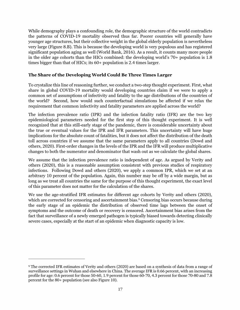
One natural way to interpret the seeming dichotomy between rich and poor countries would be to attribute it to differences in demographic structure (Figure 8). The strong age gradient in COVID-19 fatalities has been well established by now.7 Hence, the demographic diversity we witness around the world will matter greatly (World Bank, 2016). The world could be split up into roughly two groups: pre- and early-dividend countries, which continue to have high fertility rates and a still-rapidly increasing working-age share in their total populations, and late- and post-dividend countries, which are aging at rapid speed or have aged already very considerably.8 This typology of demographic diversity carries over in large part to the income classification given the tight two-way connections between demography and development. As Figure 8.A illustrates, younger age cohorts are much more significant in the age distributions of LICs and LMICs than in those of UMICs and HICs.
7 See Baud and others, 2020; Begley, 2020, Belligoni, 2020; Courage, 2020; Dylan, 2020; Huang and others, 2020; Mahase, 2020; Onder and others, 2020; Richardson and others, 2020, Soneji and others, 2020; Wu and McGoogan, 2020. 8 See World Bank (2016) for a detailed discussion of the demographic typology.

16
Figure 8. The Global Age Distribution by Income Classification
A. All Cohorts
B. 60+ Cohorts
Source: World Population Prospects.
Lower−middle incomecountries
Low incomecountries
High incomecountries
Upper−middle incomecountries
0 10 20 30 40 50 60 70 80+ 0 10 20 30 40 50 60 70 80+
0
200
400
600
0
200
400
600
Age cohorts
Popu
latio
n (m
illion
s)
0
100
200
300
400
Highincome
countries
Upper−middleincome
countries
Lower−middleincome
countries
Lowincome
countries
Popu
latio
n (m
illion
s)
Age cohorts
80+
70−80
60−70
17
While demography plays a confounding role, the demographic structure of the world contradicts the patterns of COVID-19 mortality observed thus far. Poorer countries will generally have younger age structures, but their collective weight in the global elderly population is nevertheless very large (Figure 8.B). This is because the developing world is very populous and has registered significant population aging as well (World Bank, 2016). As a result, it counts many more people in the older age cohorts than the HICs combined: the developing world’s 70+ population is 1.8 times bigger than that of HICs; its 60+ population is 2.4 times larger.
The Share of the Developing World Could Be Three Times Larger
To crystalize this line of reasoning further, we conduct a two-step thought experiment. First, what share in global COVID-19 mortality would developing countries claim if we were to apply a common set of assumptions of infectivity and fatality to the age distributions of the countries of the world? Second, how would such counterfactual simulations be affected if we relax the requirement that common infectivity and fatality parameters are applied across the world?
The infection prevalence ratio (IPR) and the infection fatality ratio (IFR) are the two key epidemiological parameters needed for the first step of this thought experiment. It is well recognized that at this still-early stage of the pandemic, there is considerable uncertainty about the true or eventual values for the IPR and IFR parameters. This uncertainty will have huge implications for the absolute count of fatalities, but it does not affect the distribution of the death toll across countries if we assume that the same parameters apply to all countries (Dowd and others, 2020). First-order changes in the levels of the IPR and the IFR will produce multiplicative changes to both the numerator and denominator that wash out as we calculate the global shares.
We assume that the infection prevalence ratio is independent of age. As argued by Verity and others (2020), this is a reasonable assumption consistent with previous studies of respiratory infections. Following Dowd and others (2020), we apply a common IPR, which we set at an arbitrary 10 percent of the population. Again, this number may be off by a wide margin, but as long as we treat all countries the same for the purpose of this thought experiment, the exact level of this parameter does not matter for the calculation of the shares.
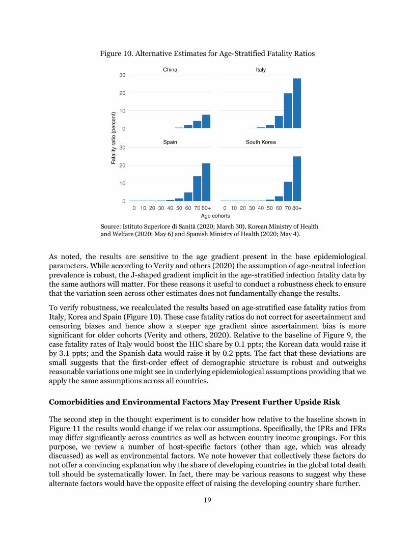
We use the age-stratified IFR estimates for different age cohorts by Verity and others (2020), which are corrected for censoring and ascertainment bias.9 Censoring bias occurs because during the early stage of an epidemic the distribution of observed time lags between the onset of symptoms and the outcome of death or recovery is censored. Ascertainment bias arises from the fact that surveillance of a newly emerged pathogen is typically biased towards detecting clinically severe cases, especially at the start of an epidemic when diagnostic capacity is low.
9 The corrected IFR estimates of Verity and others (2020) are based on a synthesis of data from a range of surveillance settings in Wuhan and elsewhere in China. The average IFR is 0.66 percent, with an increasing profile for age: 0.6 percent for those 50-60, 1.9 percent for those 60-70, 4.3 percent for those 70-80 and 7.8 percent for the 80+ population (see also Figure 10).

18
Figure 9. The Share in Global Death Toll: Current versus Simulated
Source: Johns Hopkins University; World Health Organization; World Population Prospects; Verity and others (2020); Dowd and others (2020).
Figure 9 shows the counterfactual distribution of COVID-19 fatalities based on the above assumptions. The results indicate that demography does not explain the heavy concentration of COVID-19 fatalities in HICs. In fact, demography contradicts it
• The share of HICs in the global death toll drops by a factor of 2.6 (from 79 to 31 percent). This is mainly the result of the developing world seeing its death toll rise despite also being influenced by the fact that other HICs that have not yet seen an increase in the death toll may raise the overall HIC tally.
• The share of UMICs falls by a factor of 2 (from 18 to 39 percent). Note that the share in the death toll rises above that of HICs. This is mainly the result of UMICs counting over 400 million 60+ people (of which China makes up 250 million), which is larger than the 300 million residing in HICs.
• The share of LMICs rises by a factor of 9 (from 3 to 27 percent). This group of countries has 281 million 60+ people, which is similar to the HICs combined. Of the 281 million, India claims exactly half. The 70+ cohorts are over 100 million. As in UMICs, they are highly underrepresented in the share of global COVID deaths relative to what their age distribution would suggest.
• The share of LICs rises by a factor of 22 (from 0.2 to 3.9 percent). LICs are less populous as a group and their age distributions are heavily tilted towards the younger cohorts. While the simulations suggest that the death toll would rise significantly based on demography alone, the increase is from a very low base and in absolute terms the contribution to the global death toll remains limited.
30.7
38.8
26.6
3.9
69.378.9
17.8
3.1 0.2
21.1
0
20
40
60
Highincome
countries
Upper−middleincome
countries
Lower−middleincome
countries
Lowincome
countries
Entiredeveloping
world
Shar
e in
glo
bal d
eath
toll
(per
cent
) Reported share
Simulated share
19
Figure 10. Alternative Estimates for Age-Stratified Fatality Ratios
Source: Istituto Superiore di Sanità (2020; March 30), Korean Ministry of Health and Welfare (2020; May 6) and Spanish Ministry of Health (2020; May 4).
As noted, the results are sensitive to the age gradient present in the base epidemiological parameters. While according to Verity and others (2020) the assumption of age-neutral infection prevalence is robust, the J-shaped gradient implicit in the age-stratified infection fatality data by the same authors will matter. For these reasons it useful to conduct a robustness check to ensure that the variation seen across other estimates does not fundamentally change the results.
To verify robustness, we recalculated the results based on age-stratified case fatality ratios from Italy, Korea and Spain (Figure 10). These case fatality ratios do not correct for ascertainment and censoring biases and hence show a steeper age gradient since ascertainment bias is more significant for older cohorts (Verity and others, 2020). Relative to the baseline of Figure 9, the case fatality rates of Italy would boost the HIC share by 0.1 ppts; the Korean data would raise it by 3.1 ppts; and the Spanish data would raise it by 0.2 ppts. The fact that these deviations are small suggests that the first-order effect of demographic structure is robust and outweighs reasonable variations one might see in underlying epidemiological assumptions providing that we apply the same assumptions across all countries.
Comorbidities and Environmental Factors May Present Further Upside Risk
The second step in the thought experiment is to consider how relative to the baseline shown in Figure 11 the results would change if we relax our assumptions. Specifically, the IPRs and IFRs may differ significantly across countries as well as between country income groupings. For this purpose, we review a number of host-specific factors (other than age, which was already discussed) as well as environmental factors. We note however that collectively these factors do not offer a convincing explanation why the share of developing countries in the global total death toll should be systematically lower. In fact, there may be various reasons to suggest why these alternate factors would have the opposite effect of raising the developing country share further.
Spain South Korea
China Italy
0 10 20 30 40 50 60 70 80+ 0 10 20 30 40 50 60 70 80+
0
10
20
30
0
10
20
30
Age cohorts
Fata
lity
ratio
(per
cent
)

20
Comorbidities have been identified as significantly raising the COVID-19 fatality, but they are unlikely to solve the puzzle of the low developing-country share. A global meta-analysis of the role of prevalence of comorbidities highlights the importance of hypertension (21 percent), diabetes (10 percent), cardiovascular disease (8 percent) and respiratory system disease (1 percent) in severely infected patients (Yang and others, 2020). These comorbidities should play an important role in the developing world, too. For example, of the 1.1 billion people with hypertension, two-thirds live in developing countries (WHO, 2019). Over the last decade, the number of cases and prevalence of diabetes has risen most quickly in the developing world (WHO, 2016b). Limited access to quality health care in developing countries would also mean that many ailments would be left untreated or undertreated, heightening vulnerability.
There are environmental factors extrinsic to hosts such as population density and informality, which will complicate physical distancing, raise the population-level infection rate and steepen the curve. Informal and self-employment will pose one challenge; urban density another one (La Porta and Shleifer, 2014). The latest estimates suggest that respectively 65 and 27 percent of urban populations in LICs and MICs live in slums. Flattening the curve will therefore be more difficult in many developing countries, meaning that pre-existing health capacity constraints will become more binding and result in greater case fatality.
Some have argued that the Bacille Calmette-Guérin (BCG) vaccine as well as weather and climate patterns explain why developing countries have low mortality rates so far. Yet, there is currently no evidence that would support such conclusions.
• While there is experimental evidence from both animal and human studies that the BCG vaccine has non-specific effects on the immune system, these effects have not been well characterized and their clinical relevance is unknown (WHO, 2020b). The WHO concludes that there is no evidence to support to claim that BCG can protect against COVID-19.
• There is currently also no conclusive evidence that either weather (short term variations in meteorological conditions) or climate (long-term averages) have a strong influence on transmission (WHO, 2020c). The SARS-CoV-2 virus which causes COVID-19 disease has been transmitted in all regions of the world, from cold and dry, to hot and humid climates.
The developing world of course exhibits enormous variety. For example, urbanization and urban density will vary considerably across developing countries. The transmission of the disease may be slowed by urban-rural dynamics, particularly in countries where rural areas are disconnected from the possible urban epicenters where the pandemic would be expected to spread more swiftly. The urban-rural disconnect could explain why the pandemic is spreading more slowly in countries that are less urbanized. This would certainly be consistent with the rapid deterioration that is noted in Latin America, which is highly urbanized compared to other developing regions.

21
5. COVID, Quo Vadis?
The previous section has posited that the world’s demographic structure is inconsistent with the observed skew in the mortality burden towards HICs. This section will discuss the implications of this finding for the future direction of the pandemic. It will note that while to some degree the contrast between rich and poor countries is simply ‘unreal’, for the most part it will likely be temporary as the full progression of the pandemic is yet ‘unrealized.’
Perspective 1: Unreal
Overshadowing the discussion so far is the specter of poor data quality in dimensions such as accuracy, completeness, consistence, timeliness and validity. The need for adequate measurement and reporting cannot be emphasized enough. Where testing has been limited or untimely, data quality will suffer. Where vital statistics were poorly reported prior the pandemic, the problems will be even worse.
Figure 11. Data Outliers: Countries with Extremely Low Observations of COVID-19 Fatalities by Population Size
Source: Johns Hopkins University; World Population Prospects. Note: Population is 2020 estimate. Sample restricted to population over 20 million and fatalities under 100.
Some countries with large populations report remarkably few fatalities. Figure 11 shows some outliers of countries with a population of more than 20 million and where fatalities are reported below 100. As of May 23, Mozambique, Uganda and Vietnam for example reported zero fatalities even though their populations count 31, 45 and 97 million people, respectively. Ethiopia reported only 5 fatalities among its 115 million people. While the younger population structure of these countries is expected to considerably lower the death toll, the reported numbers are well below what the demography-based simulations would suggest.
Niger
Burkina Faso
Côte d'Ivoire
Ghana
Kenya
Thailand
Congo, Dem. Rep.
Sri Lanka
Uzbekistan
Venezuela
Tanzania
AngolaNepal
Madagascar
Ethiopia
Mozambique
Uganda Vietnam0
20
40
60
30 60 90
Population (millions)
Num
ber o
f COV
ID−1
9 de
aths

22
By providing examples of outlier countries, we do not imply the data are wrong or misreported in specific countries. While country circumstances will differ, we do consider that inequality in data quality has a significant role to play in the aggregate. The recording of vital statistics was already prior to the pandemic subject to considerable variation in data quality, where WHO (2018a) contains a detailed description of the various challenges. We believe that the pandemic accentuates these pre-existing challenges. As a result, the tally of the developing world is likely significantly underestimated by a margin that will far exceed that of the HICs.
Data quality concerns are not the preserve of the developing world. Indeed, we observe that the HICs themselves are grappling with considerable data quality challenges. Total deaths may be measured with more precision than infections—a reasonable assumption, especially in HICs that have better registration methods for vital statistics. Yet, there is a growing realization that COVID-19 fatalities are being misattributed to other causes of death (The Economist, 2020b). By some estimates, reported death rates in selected countries could be underestimated by 60 percent, which would of course imply a significant increase in the already considerable severity of the mortality burden in those countries (Burn-Murdoch and others, 2020).
Perhaps for this reason it is unsurprising that Belgium—the country with the highest severity ratio in the world—has reported such a high death toll. Belgium has corrective measures to aggressively include deaths occurring in elderly-care homes based on symptoms shown and contacts made even if there was not a confirmed infection (Bloomberg, 2020). As a result, excess all-cause deaths closely match COVID-19 deaths, which inspires confidence in the quality of the data. While this may help explain why Belgium has the highest level of severity globally, it at the same time raises suspicion on the data of many other countries.
Perspective 2: Unrealized
While data quality may play a significant role, the vast discrepancies cannot be reasonably explained by data quality alone. The on-the-ground realities of many developing countries do not indicate acute health emergencies. The main reason for the excessive inequality must be different.
Gieseke (2020) argues that eventually everyone will be exposed to the coronavirus and most people will get infected. He notes that the real pandemic is the one that happens below the surface and spreads like wildfire between countries and almost always from younger people with no or weak symptoms to other people who will also have mild symptoms. While suppressive containment policies will be important to flatten the curve and decrease fatalities that way, they may result in flare-ups once restrictions are lifted. Our hopes are pinned on the development of effective drugs, but these take time to be developed and their effectiveness is not guaranteed.
This harrowing outlook will hopefully not materialize but we must consider that the most plausible explanation is that the pandemic still has to run its course through the age distributions of the world. This conclusion is certainly borne out in recent developments which show that the excessive concentration of the pandemic is de-compacting as the world’s epicenters are increasingly shifting from high-income countries to other locations in developing regions.

23
Figure 12. The Share in Global Death Toll: Changes over the Last Three Weeks
Source: Johns Hopkins University
Figure 13. Change in Cumulative Severity: Share of Countries where Severity
Is Weakening versus Intensifying over Last Three Weeks
Source: Johns Hopkins University. Note: Comparison is between April 30 and May 23. If the cumulative severity ratio has risen over that period, pandemic is described as intensifying (and vice versa). Sample of 145 countries. This excludes 15 countries which reported 0 fatalities throughout the two periods used to cumulate severity; for these countries the severity ratio thus remained unchanged at 0.
78.9
17.8
3.1 0.2
21.1
86.0
11.91.9 0.1
14.0
0
20
40
60
80
Highincome
countries
Upper−middleincome
countries
Lower−middleincome
countries
Lowincome
countries
Entiredeveloping
world
Shar
e in
glo
bal d
eath
toll
(per
cent
) April 30
May 23
27%
73%
62%
38%
48%
52%
83%
17%
60%
40%
0%
25%
50%
75%
100%
Highincome
countries
Upper−middleincome
countries
Lower−middleincome
countries
Lowincome
countries
Entiredeveloping
world
Shar
e of
cou
ntrie
s ac
cord
ing
to c
hang
ing
seve
rity
Weakening severity Intensifying severity

24
Consider the period of the last three weeks (April 30 through May 23):
• During this period, the share of high-income countries in global deaths fell by 7 percentage points (Figure 12). The corresponding increase in the share of the developing world was particularly pronounced for UMICs, where new epicenters have emerged.
• Over the same period, three quarters of HICs saw the severity of the pandemic (cumulative concept since the pandemic’s beginning) weakening, whereas two thirds of developing countries saw it intensifying (Figure 13). Interestingly, the LMICs stood out above the developing-country average: the pandemic is intensifying in 83% of them through the lens of this indicator. This group of countries could represent the locus of the epicenters of the future.
The starkly differential impact for rich and poor countries creates an impression of ‘two pandemics.’ Our analysis suggests that mortality patterns will likely continue to rebalance, which will reduce the excess inequality that is currently observed. This would suggest a need for enhanced monitoring of the conditions in developing countries as they enter more acute stages of the health emergency. COVID-19 has been described as a heat-seeking missile speeding toward the most vulnerable in society. That metaphor applies not just to the rich world; the vulnerable in the rest of the world are not more immune. They may actually be easier targets if indeed soon the ‘two pandemics’ may turn out to be one.

25
6. References
Ahmad, O. and others (2001). “Age Standardization of Rates: A New WHO Standard,” World Health Organization.
Aron, J. and J. Muellbauer (2020). “Measuring Excess Mortality: The Case of England during the Covid-19 Pandemic,” INET Oxford COVID-19 Research, Economics Department, Oxford University. https://www.inet.ox.ac.uk/news/inet-oxford-covid-19-blog/
Baud, D. and others (2020). “Real Estimates of Mortality Following COVID-19 Infection,” The Lancet. March 12.
Begley S. (2020). “What Explains Covid-19 Lethality for the Elderly? Scientists Look to “Twilight” of the Immune System,” STAT. March 30. https://www.statnews.com/2020/03/30/what-explains-coronavirus-lethality-for-elderly/
Belligoni, S. (2020). “5 Reasons the Coronavirus Hit Italy So Hard,” The Conversation. March 26. https://theconversation.com/5-reasons-the-coronavirus-hit-italy-so-hard-134636
Bloomberg (2020). “Why the World’s Highest Virus Death Rate Is in Europe’s Capital,” April 25. https://www.bloomberg.com/news/articles/2020-04-25/why-the-world-s-highest-virus-death-rate-is-in-europe-s-capital
Burn-Murdoch, J., V. Romei and C. Giles (2020). “Global Coronavirus Death Toll Could Be 60% Higher Than Reported,” Financial Times. April 26. https://on.ft.com/2VF4Bfi
Cash, R. and V. Patel (2020). “The Art of Medicine. Has COVID-19 Subverted Global Health,” The Lancet. May 5. https://www.thelancet.com/action/showPdf?pii=S0140-6736%2820%2931089-8
Ciminelli, S. and S. Garcia-Mandicó (2020). “Mitigation Policies and Emergency Care Management in Europe’s Ground Zero for COVID-19,” mimeo. May. Accessed online May 19: https://drive.google.com/file/d/1P1ob4Ug6WlZ3OnaJBebtVQsirWrb8IL-/view
Courage, K. (2020). “The Stark Differences in Countries’ Coronavirus Death Rates, Explained,” VOX, April 22. https://www.vox.com/2020/4/1/21203198/coronavirus-deaths-us-italy-china-south-korea
Dowd, J. and others (2020). “Demographic Science Aids in Understanding the Spread and Fatality Rates of COVID-19,” Proceedings of the National Academy of Sciences. April. https://www.pnas.org/content/early/2020/04/15/2004911117
Dylan, S. (2020). “The COVID-19 Risks for Different Age Groups, Explained,” Vox. March 23. https://www.vox.com/2020/3/23/21190033/coronavirus-covid-19-deaths-by-age
The Economist (2020a). “Why a Study Showing That Covid-19 Is Everywhere Is Good News,” April 11.
The Economist (2020b). “Deaths from Cardiac Arrests Have Surged in New York City,” April 13.
The Economist (2020c). “Tracking Covid-19 Excess Deaths across Countries,” April 16.

26
Elvery, J. (2020). “Getting to Accuracy: Measuring Covid-19 by Mortality Rates and Percentage Changes,” Federal Reserve Bank of Cleveland. April 8.
EuroMOMO (2020). “Pooled Number of Deaths by Age Group,” EuroMOMO. https://www.euromomo.eu/graphs-and-maps/
Fenz, K. and H. Kharas. (2020). “A Mortality Perspective on COVID-19: Time, Location, and Age,” Brookings. March 23. https://www.brookings.edu/blog/future-development/2020/03/23/a-mortality-perspective-on-covid-19-time-location-and-age/
Giesecke, Johan (2020). “The Invisible Pandemic,” The Lancet. May 5. https://doi.org/10.1016/S0140-6736(20)31035-7
Global Health Data (2018). “Baby ‘Boom’ and ‘Bust’”: Nations’ Rate of Childbirth Vary Significantly,” Global Health Data. November 2018.
Huang C. and others (2020). “Clinical Features of Patients Infected with 2019 Novel Coronavirus in Wuhan, China,” The Lancet, January 24.
International Monetary Fund (2020). “World Economic Outlook,” International Monetary Fund. April. https://www.imf.org/en/Publications/WEO/Issues/2020/04/14/weo-april-2020
Istituto Superiore di Sanità (2020). “Age-Specific Mortality Rates COVID-19", National Report. https://www.epicentro.iss.it/coronavirus/bollettino/Bollettino-sorveglianza-integrata-COVID-19_30-marzo-2020.pdf
Johns Hopkins University and Medicine (2020). “COVID-19 Dashboard,” Coronavirus Resource Center. Center for Systems Science and Engineering. https://coronavirus.jhu.edu/map.html
Korean Ministry of Health and Welfare (2020). “COVID-19 Update,” May 6.
La Porta, R. and A. Shleifer (2014). “Informality and Development,” Journal of Economic Perspectives—Volume 28, Number 3—Summer 2014—Pages 109–126.
Mahase, E. (2020). “Covid-19: Death Rate Is 0.66% and Increases with Age, Study Estimates,” The BMJ, April 1st.
Onder, G., Rezza, G. and S. Brusaferro (2020). “Case-Fatality Rate and Characteristics of Patients Dying in Relation to COVID-19 in Italy,” March 23. JAMA. doi:10.1001/jama.2020.4683
Pilling, D. (2020). “Covid-19 Death Toll Raises Hopes Africa May Be Spared Worst,” April 28. https://on.ft.com/3aI2qvu
Richardson, S., Hirsch, J. and M. Narasimhan. (2020). “Presenting Characteristics, Comorbidities, and Outcomes Among 5700 Patients Hospitalized With COVID-19 In The New York City Area,” JAMA Network. April 22. https://jamanetwork.com/journals/jama/fullarticle/2765184
Rosenwald, M. (2020). “History’s Deadliest Pandemics, from Ancient Rome to Modern America,” The Washington Post. April 7. https://www.washingtonpost.com/graphics/2020/local/retropolis/coronavirus-deadliest-pandemics/

27
Roser, M. and others (2020). “Coronavirus Pandemic: Our World in Data,” Updated daily. https://ourworldindata.org/coronavirus
Schellekens, P. and D. Sourrouille (2020). “The Unreal Dichotomy in COVID-19 Mortality between High-Income and Developing Countries,” The Brookings Institution: Future Development. May 5 https://www.brookings.edu/blog/future-development/2020/05/05/the-unreal-dichotomy-in-covid-19-mortality-between-high-income-and-developing-countries/
Soneji S. and others (2020). “Population-Level Mortality Rates from Novel Coronavirus (COVID-19) in South Korea,” Medrxiv.
Spanish Ministry of Health (2020). “Informe nº 28. Situación de COVID-19 en España a 4 de Mayo de 2020,” May 4.
Subbaraman, N. (2020). “Why Daily Death Tolls Have Become Unusually Important in Understanding the Coronavirus Pandemic,” Nature. April 9. https://www.nature.com/articles/d41586-020-01008-1
Verity, R. and others (2020). “Estimates of the Severity of Coronavirus Disease 2019: A Model-Based Analysis,” The Lancet Infectious Diseases 2020. March 30.
World Bank (2016) “Global Monitoring Report 2015/2016 Development Goals in An Era of Demographic Change,” World Bank.
World Health Organization (2016a). “ICD-10 International Statistical Classification of Diseases and Related Health Problems. Fifth Edition,” World Health Organization.
World Health Organization (2016b). “Global Report on Diabetes,” World Health Organization.
World Health Organization (2018a). “WHO Methods and Data Sources for Country Level Causes of Death 2000-2016,” World Health Organization. March.
World Health Organization (2018b). “Global Health Estimates 2016: Deaths by Cause, Age, Sex, by Country and by Region, 2000-2016,” World Health Organization.
World Health Organization (2019). “Hypertension: Fact Sheet,” September.
World Health Organization (2020a). “International Guidelines for Certification and Classification (Coding) of COVID as a Cause of Death,” April.
World Health Organization (2020b). “Bacille Calmette-Guérin (BCG) Vaccination and COVID-19. Scientific Brief,” April 12. https://www.who.int/news-room/commentaries/detail/bacille-calmette-gu%C3%A9rin-(bcg)-vaccination-and-covid-19
World Health Organization (2020c). “Climate Change and COVID-19,” Q&A. April 22. https://www.who.int/news-room/q-a-detail/q-a-on-climate-change-and-covid-19
Worldometer (2020). “Coronavirus Countries Where COVID-19 Has Spread,” Worldometer. Updated daily. Accessed May 27.
Wu, Z. and J. McGoogan (2020). “Characteristics of and Important Lessons from the Coronavirus Disease 2019 (COVID-19) Outbreak in China Summary of a Report of 72 314 Cases From the

28
Chinese Center for Disease Control and Prevention,” JAMA. February 24. JAMA. 2020;323(13):1239-1242. doi:10.1001/jama.2020.2648
Wu, J. and others (2020a). “Estimating Clinical Severity Of COVID-19 From the Transmission Dyanmics In Wuhann, China,” Nature Medicine. March
Wu, J. and others (2020b). “46,000 Missing Deaths: Tracking the True Toll of the Coronavirus Outbreak,” The New York Times. April 30. https://www.nytimes.com/interactive/2020/04/21/world/coronavirus-missing-deaths.html
Yang, J. and others (2020). “Prevalence of Comorbidities and Its Effects in Patients Infected With SARS-Cov-2: A Systematic Review and Meta-Analysis,” International Journal of Infectious Diseases. March.

29
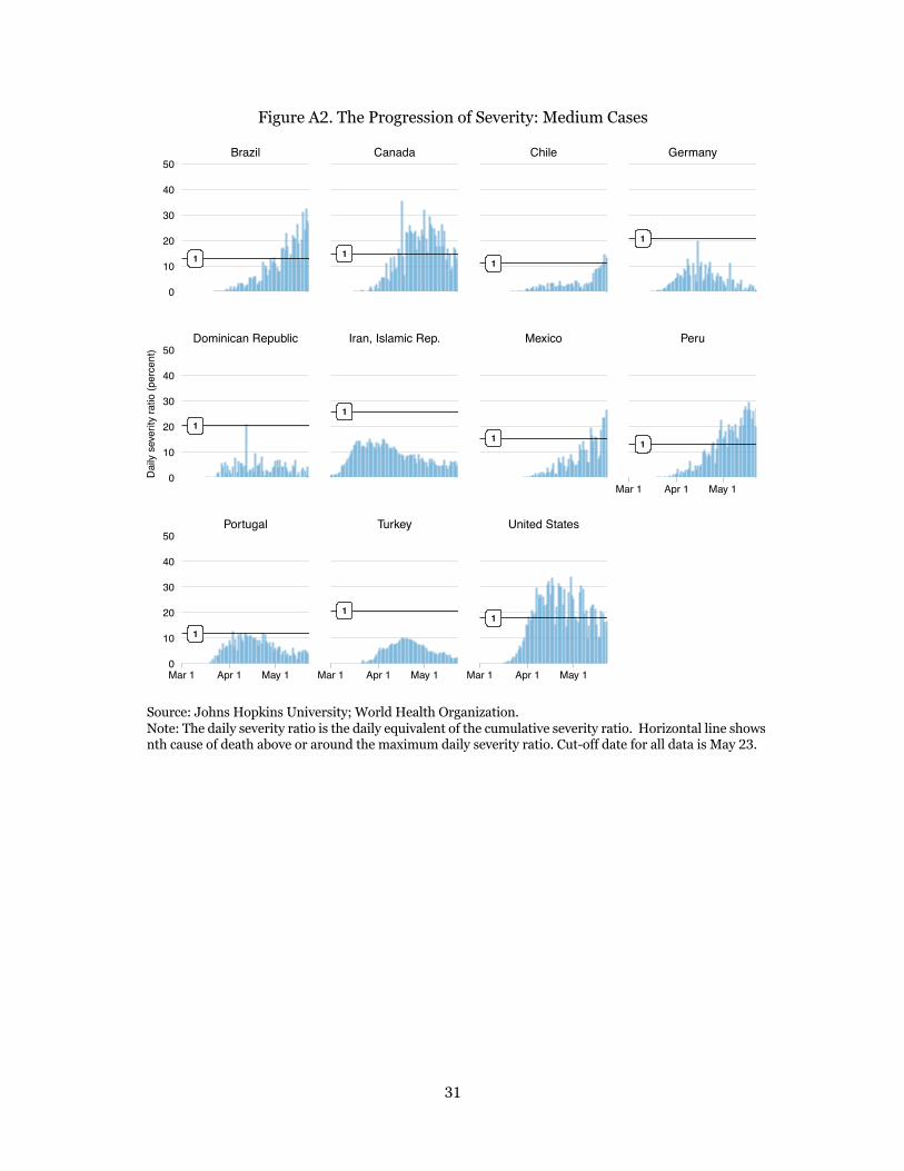
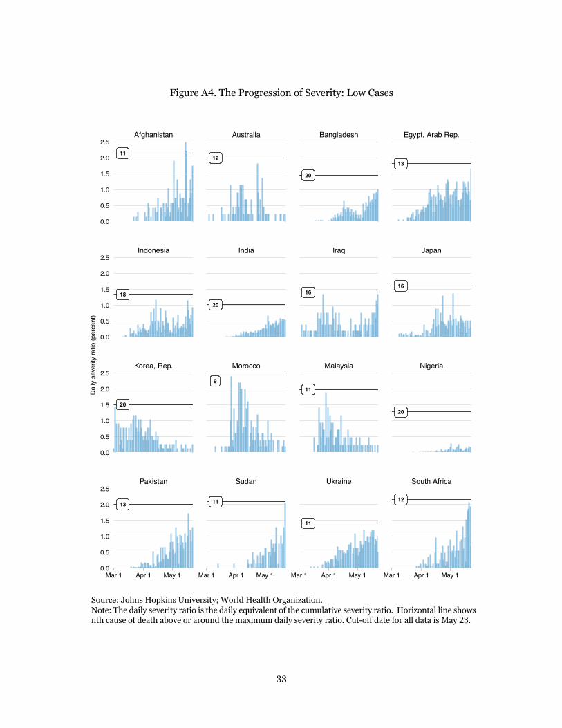
Annex. The Progression of Severity: Full Sample
To focus on just a few countries, this paper restricted the sample from a total of 160 countries to just 48, which will be discussed below. As shown in Table A1, our dataset includes 160 countries (including 15 that report zero COVID-19 deaths). We focus on countries with over 10 million inhabitants and at least 100 COVID-19 fatalities. The population restriction removes a large number of small HICs, whereas the fatality restriction removes many poorer countries.
Table A1. Sample Selection by Population Size and Minimum COVID-19 Fatalities
Number of countries
Total Population >
10 million + COVID-19 deaths >100
Total 160 82 48
High income 52 19 19
Upper-middle-income 48 48 16
Lower-middle-income 36 36 12
Low income 24 24 1
Source: Johns Hopkins University; World Health Organization; World Population Prospects.
Having obtained 48 countries, we then split the sample up into four groups that proxy the level of severity: high, medium, lower and low. The summary metric used to divide the sample is the peak daily severity ratio observed over the course of the pandemic thus far. The peak daily severity ratio not only dimensions the extent of the health emergency of each country; it also helps us organize the sample in buckets with similar ranges for the daily severity ratios. The high group comprises 8 countries with peak severity above 50 percent; medium refers to 11 countries with peak severity between 50 and 10 percent; lower refers to 13 countries with the ratio between 10 and 2.5 percent; and low refers to 16 countries with peak severity below 2.5 percent.
In what follows, we illustrate the progression of the pandemic for the full set of 48 countries. We organize the discussion according to the four groups defined by the peak severity ratio (the high, medium, lower and low cases). This complements the main text, which organizes the illustrations of the 30-country subset by the criterion of the change in the cumulative severity ratio (indicating intensifying or weakening severity).

30
Figure A1. The Progression of Severity: High Cases
Source: Johns Hopkins University; World Health Organization. Note: The daily severity ratio is the daily equivalent of the cumulative severity ratio. Horizontal line shows nth cause of death above or around the maximum daily severity ratio. Cut-off date for all data is May 23.
1
1
1
1
1
1
1
1
United Kingdom Italy Netherlands Sweden
Belgium Ecuador Spain France
Mar 1 Apr 1 May 1 Mar 1 Apr 1 May 1 Mar 1 Apr 1 May 1 Mar 1 Apr 1 May 1
0
50
100
150
0
50
100
150
Dai
ly s
ever
ity ra
tio (p
erce
nt)
31
Figure A2. The Progression of Severity: Medium Cases
Source: Johns Hopkins University; World Health Organization. Note: The daily severity ratio is the daily equivalent of the cumulative severity ratio. Horizontal line shows nth cause of death above or around the maximum daily severity ratio. Cut-off date for all data is May 23.
1
1
1
1
1
1
1
1
1
1
1
Portugal Turkey United States
Dominican Republic Iran, Islamic Rep. Mexico Peru
Brazil Canada Chile Germany
Mar 1 Apr 1 May 1 Mar 1 Apr 1 May 1 Mar 1 Apr 1 May 1
Mar 1 Apr 1 May 1
0
10
20
30
40
50
0
10
20
30
40
50
0
10
20
30
40
50
Dai
ly s
ever
ity ra
tio (p
erce
nt)

32
Figure A3. The Progression of Severity: Lower Cases
Source: Johns Hopkins University; World Health Organization. Note: The daily severity ratio is the daily equivalent of the cumulative severity ratio. Horizontal line shows nth cause of death above or around the maximum daily severity ratio. Cut-off date for all data is May 23.
11
3
7
5
2
2
6
5
18
3
3
3
7
4
Saudi Arabia
Philippines Poland Romania Russian Federation
Colombia Czech Republic Algeria Greece
Argentina Bolivia China Cameroon
Apr 1 May 1
Apr 1 May 1 Apr 1 May 1 Apr 1 May 1
0.0
2.5
5.0
7.5
10.0
0.0
2.5
5.0
7.5
10.0
0.0
2.5
5.0
7.5
10.0
0.0
2.5
5.0
7.5
10.0
Dai
ly s
ever
ity ra
tio (p
erce
nt)
33
Figure A4. The Progression of Severity: Low Cases
Source: Johns Hopkins University; World Health Organization. Note: The daily severity ratio is the daily equivalent of the cumulative severity ratio. Horizontal line shows nth cause of death above or around the maximum daily severity ratio. Cut-off date for all data is May 23.
11
18
20
13
12
20
9
11
20
16
11
11
13
16
20
12
Pakistan Sudan Ukraine South Africa
Korea, Rep. Morocco Malaysia Nigeria
Indonesia India Iraq Japan
Afghanistan Australia Bangladesh Egypt, Arab Rep.
Mar 1 Apr 1 May 1 Mar 1 Apr 1 May 1 Mar 1 Apr 1 May 1 Mar 1 Apr 1 May 1
0.0
0.5
1.0
1.5
2.0
2.5
0.0
0.5
1.0
1.5
2.0
2.5
0.0
0.5
1.0
1.5
2.0
2.5
0.0
0.5
1.0
1.5
2.0
2.5
Dai
ly s
ever
ity ra
tio (p
erce
nt)