creating effective figures and tables
TRANSCRIPT

Creating effective figures and tables
Karl W BromanBiostatistics & Medical InformaticsUniversity of Wisconsin – Madison
kbroman.org
github.com/kbroman
@kwbroman

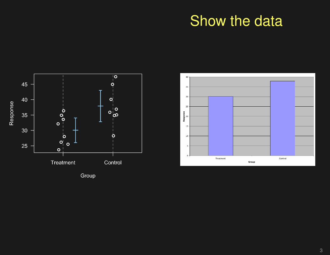
Displaying data well
• Be accurate and clear.
• Let the data speak.– Show as much information as possible, taking care not to obscure
the message.
• Science not sales.– Avoid unnecessary frills (esp. gratuitous 3d).
• In tables, every digit should be meaningful. Don’t dropending 0’s.
2

Show the data
3
Show the data
3

Show the data
3

Show the data
3

Show the data
3

Show the data
3

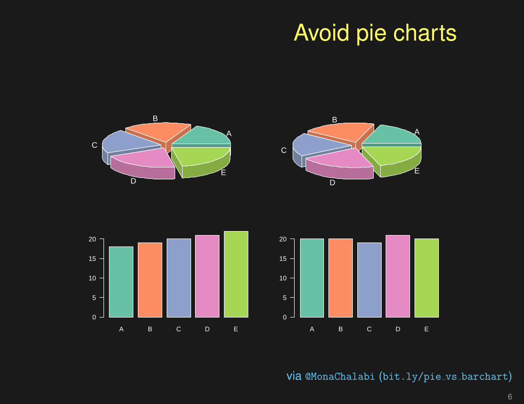
Avoid pie charts
4

Avoid pie charts
4

Avoid pie charts
4

Avoid pie charts
A
B
C
D
E
A
B
C
D
E
via @MonaChalabi (bit.ly/pie vs barchart)
5

Avoid pie charts
A
B
C
DE
A
B
C
D
E
via @MonaChalabi (bit.ly/pie vs barchart)
6
Avoid pie charts
A
B
C
DE
A
B
C
D
E
A B C D E
0
5
10
15
20
A B C D E
0
5
10
15
20
via @MonaChalabi (bit.ly/pie vs barchart)
6

Avoid pie charts
A
B
C
D
E
A
B
C
D
E
A B C D E
0
5
10
15
20
A B C D E
0
5
10
15
20
via @MonaChalabi (bit.ly/pie vs barchart)
6

Consider logs
7

Consider logs
7

Consider logs
7

Consider logs
8

Consider logs
8

Consider logs
8

Consider logs
8
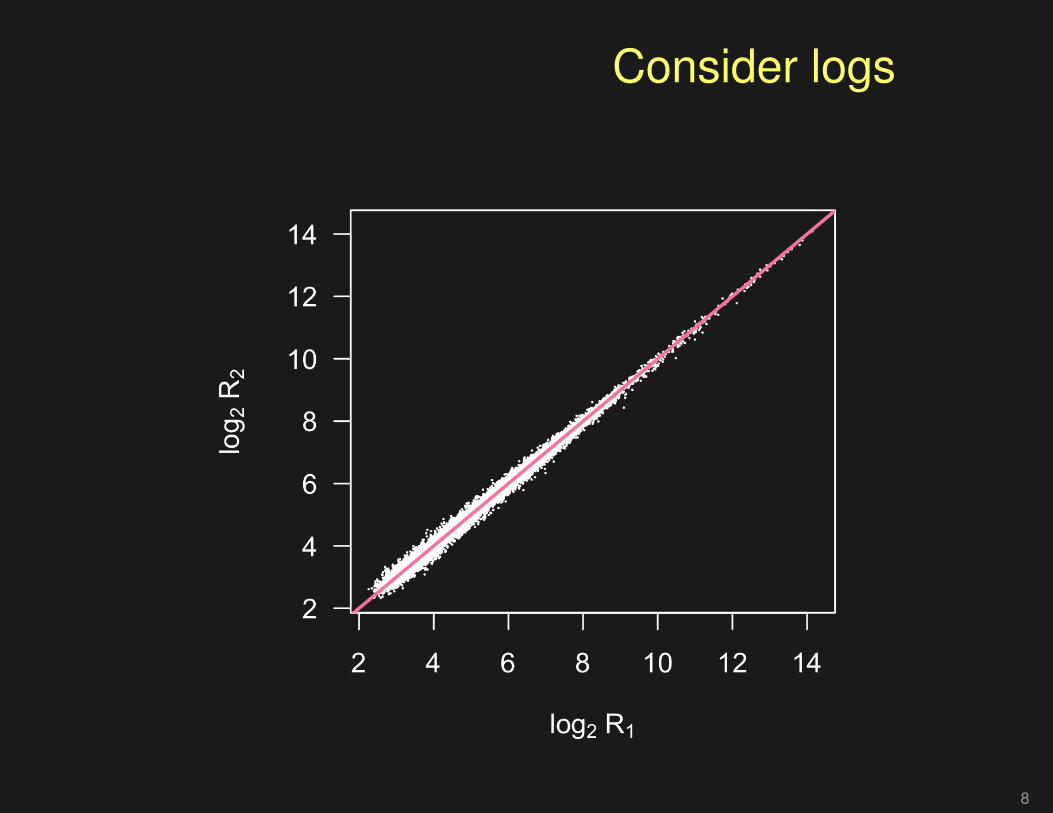
Consider logs
8

Take differences
9

Ease comparisons(things to be compared should be adjacent)
10
12
14
16
18
Phe
noty
pe
Female Male Female Male Female Male
AA AB BB
10
12
14
16
18
Phe
noty
pe
AA AB BB AA AB BB
Female Male
10

Ease comparisons(add a bit of color)
10
12
14
16
18
Phe
noty
pe
Female Male Female Male Female Male
AA AB BB
10
12
14
16
18
Phe
noty
pe
AA AB BB AA AB BB
Female Male
11

Which comparison is easiest?
A B
0
50
100
150
A B
0
50
100
150
0
100
200
300
400
AB
0
100
200
300
400
A
B
0
100
200
300
400
A
B
B
A
12

Don’t distort the quantities(value ∝ radius)
Wheat (17 Gbp)
Arabidopsis (0.145 Gbp)
Human (3.2 Gbp)
13

Don’t distort the quantities(value ∝ area)
Wheat (17 Gbp)
Arabidopsis (0.145 Gbp)
Human (3.2 Gbp)
14

Don’t use areas at all(value ∝ length)
Gen
ome
size
(G
bp)
0
5
10
15
Arabidopsis Human Wheat
15

Encoding data
Quantities
• Position
• Length
• Angle
• Area
• Luminance (light/dark)
• Chroma (amount of color)
Categories
• Shape
• Hue (which color)
• Texture
• Width
16

Ease comparisons(align things vertically)
Women
Height (in)
55 60 65 70 75
Men
Height (in)
55 60 65 70 75
Men
Height (in)
55 60 65 70 75
17
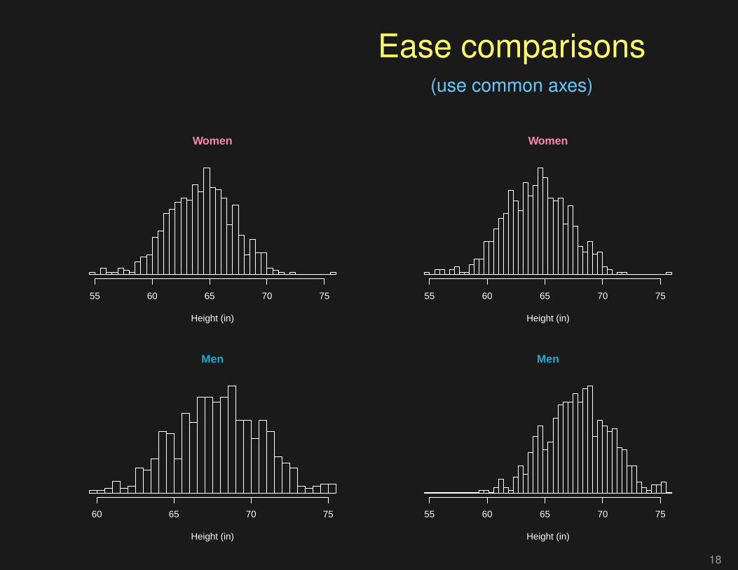
Ease comparisons(use common axes)
Women
Height (in)
55 60 65 70 75
Men
Height (in)
60 65 70 75
Women
Height (in)
55 60 65 70 75
Men
Height (in)
55 60 65 70 75
18

Use labels not legends
●●● ●●
●
●
●●
●
●●
●●
●
●●
● ●●
●
●
●
●
●●
●
●●●●
●
●
● ●● ●
●
●●
●●
●
●
●
●
●●●●
●
● ●
●
●
●
●
●
●
●
●
●
●
●
●
●
●
●
●
●
●
●
●
●
●
● ●
●
●
●
●
●
●
●
●
●
●
●●●
●
●
●
●
●
●
●●
●
●
●
●
●
●
●
●
●
●●
●
●
●
●
●
●
●
●
●
●
●
●
● ●
●
●
●●●
●
●
●
●
●
●
●
●
●
●●
●
●
●
●
●
●
●
●
●
●
●
1 2 3 4 5 6 7
0.0
0.5
1.0
1.5
2.0
2.5
Petal length (cm)
Pet
al w
idth
(cm
)
●
●
●
setosaversicolorvirginica
●●● ●●
●
●
●●
●
●●
●●
●
●●
● ●●
●
●
●
●
●●
●
●●●●
●
●
● ●● ●
●
●●
●●
●
●
●
●
●●●●
●
● ●
●
●
●
●
●
●
●
●
●
●
●
●
●
●
●
●
●
●
●
●
●
●
● ●
●
●
●
●
●
●
●
●
●
●
●●●
●
●
●
●
●
●
●●
●
●
●
●
●
●
●
●
●
●●
●
●
●
●
●
●
●
●
●
●
●
●
● ●
●
●
●●●
●
●
●
●
●
●
●
●
●
●●
●
●
●
●
●
●
●
●
●
●
●
1 2 3 4 5 6 7
0.0
0.5
1.0
1.5
2.0
2.5
Petal length (cm)
Pet
al w
idth
(cm
)
setosa
versicolor
virginica
19

Don’t sort alphabetically
0 5 10 15
Health care spending (% GDP)
United StatesUnited Kingdom
TurkeySwitzerland
SwedenSpain
Russian FederationPoland
NorwayNetherlands
MexicoKorea, Rep.
JapanItaly
IndonesiaIndia
GermanyFranceChina
CanadaBrazil
BelgiumAustria
AustraliaArgentina ●
●
●
●
●
●
●
●
●
●
●
●
●
●
●
●
●
●
●
●
●
●
●
●
●
0 5 10 15
Health care spending (% GDP)
IndonesiaIndia
ChinaMexico
Russian FederationTurkeyPoland
Korea, Rep.Argentina
BrazilAustraliaNorway
JapanUnited Kingdom
SwedenSpain
ItalyBelgiumAustria
SwitzerlandGermany
CanadaFrance
NetherlandsUnited States ●
●
●
●
●
●
●
●
●
●
●
●
●
●
●
●
●
●
●
●
●
●
●
●
●
20

Must you include 0?
Method
Det
ectio
n ra
te (
%)
0
20
40
60
80
100
120
A B C
96.5% 98.1% 99.2%
95
96
97
98
99
100
Method
Det
ectio
n ra
te (
%)
A B C
21

A bad table
22

Fewer digits
23

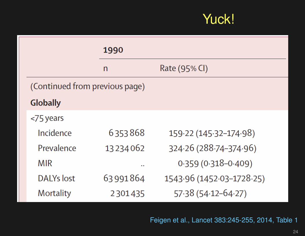
Yuck!
Articles
www.thelancet.com Vol 383 January 18, 2014 249
low-income and middle-income countries), and 28% of DALYs lost (46% in high-income countries and 23% in low-income and middle-income countries) were in people aged 75 years and older (table 1).
Globally, in 2010, the mortality-to-incidence ratio was 0·35 (0·32 in high-income countries and 0·36 in low-income and middle-income countries; table 1). Although overall we noted no signifi cant change in age-standardised incidence of stroke between 1990 and 2010 (table 1), the direction of changes was diff erent between countries by income level (a 12% [95% CI 6%–17%] statistically signifi cant decrease in high-income coun tries, and a 12% [–3 to 22] non-signifi cant increase in low-income and middle-income countries). Further more, there was a signifi cant 25% reduction in mortality rate (37% [31–41] in high-income countries and 20% [15–30] in low-income and middle-income countries), DALYs lost (36% [30–40] and 22% [18–32], respectively), and mortality-to-incidence ratio (23% [14–29] and 27% [14–38]). Stroke prevalence increased signifi cantly by 27% (19–43) in high-income countries only; the 8·5% (–13 to 34) increase in low-income and middle-income countries was not signifi cant. Globally, for 1990–2010, we noted a 25% (13–33) signifi cant increase in stroke incidence in people aged 20–64 years, mostly attributable to an 18% (10–25) signifi cant increase in low-income and middle-income countries.
In the past two decades globally, noticeable increases took place in the absolute numbers of people with
incident stroke (a 68% increase), stroke survivors (84%), stroke-related deaths (26%), and DALYs lost (12%; table 1). The most striking increases in the number of stroke survivors (113%), DALYs lost (31%), and stroke-related deaths (36%) were in people aged 75 years and older (table 1). Presently, age-standardised rates of stroke incidence in low-income and middle-income countries exceed those in high-income countries by 23% (24% in people younger than 75 years and 21% in people aged 75 years and older), but the number of people younger than 75 years with incident stroke in low-income and middle-income countries is more than three times that in high-income countries (table 1). Similarly, the number of DALYs lost in people younger than 75 years in low-income and middle-income countries exceeded those lost in high-income countries by almost fi ve times (table 1), whereas in people aged 75 years and older, DALYs lost in low-income and middle-income countries exceeded those lost in high-income countries by less than two times (table 1). Conversely, the number of stroke survivors aged 75 years and older in high-income countries exceeded the number in low-income and middle-income countries by 40% (table 1), whereas there were almost 30% more survivors younger than 75 years in low-income and middle-income countries than in high-income countries (table 1). Age-standardised rates of stroke mortality in people aged 75 years and older in low-income and middle-income countries exceeded
1990 2005 2010 p value
n Rate (95% CI) n Rate (95% CI) n Rate (95% CI)
(Continued from previous page)
Globally
<75 years
Incidence 6 353 868 159·22 (145·32–174·98) 9 288 048 167·45 (150·96–187·11) 10 469 624 168·75 (152·43–187·09) 0·208
Prevalence 13 234 062 324·26 (288·74–374·96) 20 187 246 358·58 (317·58–412·79) 23 052 804 366·93 (328·04–420·66) 0·086
MIR .. 0·359 (0·318–0·409) .. 0·293 (0·249–0·332) .. 0·254 (0·212–0·287) <0·001
DALYs lost 63 991 864 1543·96 (1452·03–1728·25) 74 855 520 1326·17 (1172·08–1388·74) 73 293 552 1163·448 (1011·43–1232·19) <0·001
Mortality 2 301 435 57·38 (54·12–64·27) 2 734 251 49·16 (43·60–51·55) 2 668 499 42·89 (37·65–45·81) <0·001
≥75 years
Incidence 3 725 067 3173·50 (2932·14–3422·23) 5 446 077 3082·97 (2819·52–3372·55) 6 424 911 3113·00 (2850·95–3403·57) 0·361
Prevalence 4 681 276 3974·37 (3609·66–4441·23) 8 308 337 4700·18 (4239·37–5256·84) 9 972 153 4835·38 (4382·63–5433·92) 0·005
MIR .. 0·634 (0·575–0·709) .. 0·543 (0·476–0·607) .. 0·500 (0·439–0·560) <0·001
DALYs 22 018 520 18665·35 (17 464·55–20 408·51) 27 096 178 15 300·36 (13 987·78–16 317·62) 28 938 754 14 053·63 (12 761·98–15 088·12) <0·001
Mortality 2 359 013 2033·21 (1888·78–2233·65) 2 950 719 1678·65 (1528·60–1807·22) 3 205 682 1545·29 (1412·76–1685·12) <0·001
All ages
Incidence 10 078 935 250·55 (229·70–273·25) 14 734 124 255·79 (232·10–283·88) 16 894 536 257·96 (234·40–284·11) 0·335
Prevalence 17 915 338 434·86 (389·45–496·84) 28 495 582 490·13 (436·60–557·52) 33 024 958 502·32 (451·26–572·18) 0·047
MIR .. 0·461 (0·415–0·518) .. 0·386 (0·336–0·432) .. 0·348 (0·299–0·390) <0·001
DALYs lost 86 010 384 2062·74 (1949·53–2280·29) 101 951 696 1749·59 (1568·67–1830·82) 102 232 304 1554·02 (1373·94–1642·26) <0·001
Mortality 4 660 449 117·25 (111·51–129·68) 5 684 970 98·53 (89·02–103·86) 5 874 182 88·41 (79·84–94·41) <0·001
*p value for the diff erence in age-adjusted rates between 1990 and 2010 only.
Table 1:· Age-adjusted annual incidence and mortality rates (per 100 000 person-years), disability-adjusted life-years (DALYs) lost, prevalence (per 100 000 people), and mortality-to-incidence ratio (MIR) by age groups in high-income and low-income and middle-income countries, and globally in 1990, 2005, and 2010
Feigen et al., Lancet 383:245-255, 2014, Table 1
24
Yuck!
Feigen et al., Lancet 383:245-255, 2014, Table 1
24

What was wrong with that?
• Way too many digits.
• Numbers aren’t aligned.
• Numbers to be compared aren’t anywhere near each other.
• The interesting comparisons are horizontal rather than vertical.
• It would be much better as a multi-panel figure.
25

One last example
fivethirtyeight.com/datalab/which-state-has-the-worst-drivers
26

An alternativeTotal crashes
0 5 10 15 20 25
●
●
●
●
●
●
●
●
●
●
●
●
●
●
●
●
●
●
●
●
●
●
●
●
●
●
●
●
●
●
●
●
●
●
●
●
●
●
●
●
●
●
●
●
●
●
●
●
●
●
●
District of ColumbiaMassachusetts
MinnesotaWashingtonConnecticut
Rhode IslandNew Jersey
UtahNew Hampshire
CaliforniaNew YorkMaryland
VirginiaIllinois
OregonColoradoVermont
WisconsinMichigan
OhioIndianaNevada
NebraskaMaineIdaho
GeorgiaIowa
MissouriDelaware
North CarolinaWyoming
HawaiiMississippi
KansasFloridaAlaska
PennsylvaniaNew Mexico
ArizonaAlabama
South DakotaTexas
TennesseeOklahomaLouisianaKentuckyMontana
ArkansasWest VirginiaNorth Dakota
South Carolina
Non−distracted
0 5 10 15 20 25
●
●
●
●
●
●
●
●
●
●
●
●
●
●
●
●
●
●
●
●
●
●
●
●
●
●
●
●
●
●
●
●
●
●
●
●
●
●
●
●
●
●
●
●
●
●
●
●
●
●
●
Speeding
0 5 10 15 20 25
●
●
●
●
●
●
●
●
●
●
●
●
●
●
●
●
●
●
●
●
●
●
●
●
●
●
●
●
●
●
●
●
●
●
●
●
●
●
●
●
●
●
●
●
●
●
●
●
●
●
●
Alcohol
0 5 10 15 20 25
●
●
●
●
●
●
●
●
●
●
●
●
●
●
●
●
●
●
●
●
●
●
●
●
●
●
●
●
●
●
●
●
●
●
●
●
●
●
●
●
●
●
●
●
●
●
●
●
●
●
●
Ave ins premium
Dollars
0 500 1000 1500
●
●
●
●
●
●
●
●
●
●
●
●
●
●
●
●
●
●
●
●
●
●
●
●
●
●
●
●
●
●
●
●
●
●
●
●
●
●
●
●
●
●
●
●
●
●
●
●
●
●
●
Ave ins losses
Dollars
0 50 100 150 200
●
●
●
●
●
●
●
●
●
●
●
●
●
●
●
●
●
●
●
●
●
●
●
●
●
●
●
●
●
●
●
●
●
●
●
●
●
●
●
●
●
●
●
●
●
●
●
●
●
●
●
Crashes per billion miles
27

Scatterplots
Non−distracted
Total crashes
Non
−di
stra
cted
cra
shes
0 5 10 15 20 250
5
10
15
20
25
●
●●
●
● ●
●
●
●
●
● ●
●●
●
●
●
●
●
●
●
●
●
●
●
●
●
●●
●●
●
●
●
●
●
●
●
●
●
●
●
●
●
●
●
●
●
●
●
●
Speeding
Total crashes
Spe
edin
g cr
ashe
s0 5 10 15 20 25
0
2
4
6
8
10
●●
●
●●
●●
●
●
●
●
●
●
●
●
●
●
●
●
●
●
●
●
●●
●
●
●
●
●
●
●●
●
●
●
●
●
●
●
●
●
●
●
●
●
●
●
●
●
●
Alcohol
Total crashes
Alc
ohol
cra
shes
0 5 10 15 20 250
2
4
6
8
10
●
●
●
●
●●●
●
●
●
●
●
●● ●●
●
●
●
●●
●
●
●
●●
●
●●
●●
●
●
●
●
●
●
●
●
●
●
●
●
●
●
●
●●
●
●
●
Ave Ins Premium
Total crashes
Ave
Ins
Pre
miu
m
0 5 10 15 20 25500
750
1000
1250
1500
●
●
●
●●
●
●
●
●
●
●●
●
●
●
●
●
●
●
●
●●
●
●
●
●●
●
●
●
●
●
●
● ●●
●
●
●
●
●
●
●
●
●
●
●
●
●
●
●
Ave Ins Loss
Total crashes
Ave
Ins
Loss
0 5 10 15 20 2550
75
100
125
150
175
200
●
●
●
●
●
●
●
●
●
●●
●
●
●
●●
●●
●
●
●
●
●
●
●
●
●
●
●
●
●
●
●
●
●
●
●
●
●●
●
●
●●
● ●
●
●
●
●
●
Premium vs Loss
Ave Ins Premium
Ave
Ins
Loss
500 750 1000 1250 150050
75
100
125
150
175
200
●
●
●
●
●
●
●
●
●
●●
●
●
●
●●
●●
●
●
●
●
●
●
●
●
●
●
●
●
●
●
●
●
●
●
●
●
●●
●
●
● ●
●●
●
●
●
●
●
28

Summary I
• Show the data
• Avoid chart junk
• Consider taking logs and/or differences
• Put the things to be compared next to each other
• Use color to set things apart, but consider color blind folks
• Use position rather than angle or area to represent quantities
29

Summary II
• Align things vertically to ease comparisons
• Use common axis limits to ease comparisons
• Use labels rather than legends
• Sort on meaningful variables (not alphabetically)
• Must 0 be included in the axis limits?
• Use scatterplots to explore relationships
30

Inspirations
• Hadley Wickham (slides at http://courses.had.co.nz)
• Naomi Robbins (Creating more effective graphs)
• Howard Wainer
• Andrew Gelman
• Dan Carr
• Edward Tufte
31

Further reading
• ER Tufte (1983) The visual display of quantitative information. Graphics Press.
• ER Tufte (1990) Envisioning information. Graphics Press.
• ER Tufte (1997) Visual explanations. Graphics Press.
• A Gelman, C Pasarica, R Dodhia (2002) Let’s practice what we preach: Turningtables into graphs. The American Statistician 56:121-130
• NB Robbins (2004) Creating more effective graphs. Wiley
• Nature Methods columns: http://bang.clearscience.info/?p=546
32

The top ten worst graphs
With apologizes to the authors, we provide the following listof the top ten worst graphs in the scientific literature.
As these examples indicate, good scientists can makemistakes.
bit.ly/TopTenWorstGraphs
33

10
Broman et al., Am J Hum Genet 63:861-869, 1998, Fig. 1

9
Cotter et al., J Clin Epidemiol 57:1086-1095, 2004, Fig 2

8
Jorgenson et al., Am J Hum Genet 76:276-290, 2005, Fig 2

7
Kim et al., Nutr Res Prac 6:120-125, 2012 Fig 1

6
Cawley et al., Cell 116:499-509, 2004, Fig 1

5
Hummer et al., J Virol 75:7774-7777, 2001, Fig 4

4
Epstein and Satten, Am J Hum Genet 73:1316-1329, 2003, Fig 1

3
Mykland et al., J Am Stat Asso 90:233-241, 1995, Fig 1

2
Wittke-Thompson et al., Am J Hum Genet 76:967-986, Fig 1

1
Roeder, Stat Sci 9:222-278, 1994, Fig 4