creative color schemes
TRANSCRIPT

beautiful
attractive
impressive
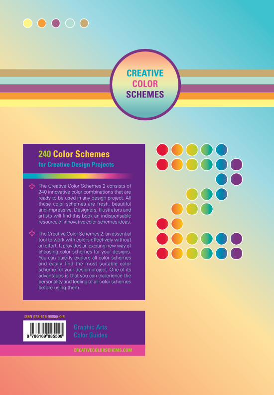
240 Color Schemes for Creative Design Projects
eBook
CREATIVE COLOR S C H E M E S
THAWATCHAI SRISUTHEP
CreativeColorSchemes.com
Graphic design, publication, brochures, posters, packaging, websites
With CMYK | RGB | HEX color values

WWW.CREATIVECOLORSCHEMES.COM
CREATIVE COLOR S C H E M E S
Best view in Adobe Reader with Page Display settings:
Two Page View Show Cover Page in Two Page View
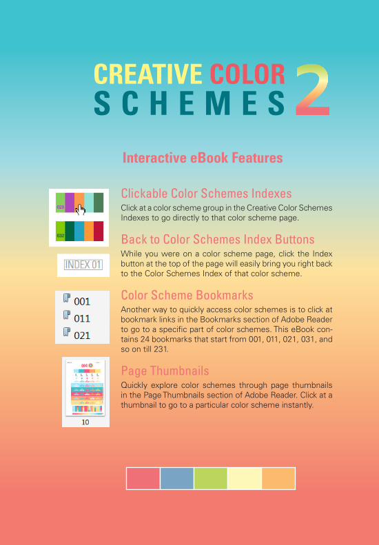
Clickable Color Schemes IndexesClick at a color scheme group in the Creative Color Schemes Indexes to go directly to that color scheme page.
Back to Color Schemes Index ButtonsWhile you were on a color scheme page, click the Index button at the top of the page will easily bring you right back to the Color Schemes Index of that color scheme.
Color Scheme BookmarksAnother way to quickly access color schemes is to click at bookmark links in the Bookmarks section of Adobe Reader to go to a specific part of color schemes. This eBook con-tains 24 bookmarks that start from 001, 011, 021, 031, and so on till 231.
Page ThumbnailsQuickly explore color schemes through page thumbnails in the Page Thumbnails section of Adobe Reader. Click at a thumbnail to go to a particular color scheme instantly.
Interactive eBook Features
CREATIVE COLOR S C H E M E S

2
Publisher’s Cataloging-in-Publication DataSrisuthep, Thawatchai
Creative Color Schemes 2 / Thawatchai Srisuthep
p. cm.
ISBN 978-616-90855-0-8
1. Computer graphic 2. Color and color usage I.Title.
006.6
First Edition
Print in Thailand
Publisher The Creative Guide
134/118 Nonthaburi Rd., Muang, Nonthaburi
11000 Thailand
Tel. 08 1918 2300 Fax. 0 2967 0440
E-mail: [email protected]: www.creativecolorschemes.com
THAWATCHAI SRISUTHEPcolorist
Copyright © 2011 All Rights Reserve by Thawatchai Srisuthep
All rights reserved. No part of this publication may be reproduced or distributed in any form or by any electronic or mechanical means, including information storage and retrieval system without written permission from the publisher, except by a reviewer, who may quote a brief part in a review.
Fair Use: In order to provide for a seamless reading experience, this eBook does not contain digital rights management (DRM). Therefore, no password is required to open this eBook, nor is this eBook tied to reading on a particular device or limited to a fixed number of eBook devices.
However, you are permitted to install this eBook on any number of devices capable of reading this eBook, if each device is under the control of the original Buyer of this eBook, and if access to this eBook is limited to the original Buyer. This expressly precludes placing this eBook on any public or private network where multiple parties are able to access it. You are not permitted to share, loan, sell, or give this eBook to any third party.

3
The Creative Color Schemes 2 follows its predecessor The Creative Color Schemes launched in 2009. The Creative Color Schemes 2 consists of 240 innovative color combinations that are ready to be used in any design project. All these color schemes are fresh, beautiful and impressive. Designers, Illustrators and artists will find this book an indispensable resource of innovative color schemes ideas.
In this book, a color scheme consists of 5 colors instead of 15 colors in the previous book. This compact color scheme will make it more straightforward and easier to use than before. Moreover, many design projects typically use only 3-5 colors in their designs.
The Creative Color Schemes 2, an essential tool to work with colors effectively without an effort. It provides an exciting new way off choosing color schemes for your designs. You can quickly explore all color schemes and easily find the most suitable color scheme for your design project. One of its advantages is that you can experience the personality and feeling of all color schemes before using them.
Thanking for purchasing a copy of The Creative Color Schemes 2. I hope it becomes a valued addition to your creative design resources. Now, let’s enjoy choosing the perfect color scheme for your works.
Thawatchai Srisuthep
Search “Creative Color Schemes” in the Search field of Facebook and click “Like” button on top of the page
Become a Fan of The Creative Color Schemes on Facebook
Get connect to the Creative Color Schemes on Facebook for news, update and special promotion.

4003002 004001
The Creative Color Schemes 2 contains 240 color combinations that are ready to use in any design projects. All these color schemes are designed with a balance of harmony, contrast, continuation, variation and the feeling of colors. Without worrying about color theory, you can easily explore ideas of color combinations from all these color schemes. With 240 stunning color schemes at hand, you can choose your desired color schemes in a minute. Stop wasting your time on randomly choosing one color at a time and hoping that they will go well together.
All these ready to use color schemes will help you work with colors easily. You will clearly see the effect of color combina-tions before applying them to your works. So you can feel confident that the color schemes you use will really give you the desired color effect. The most important thing is that you do not need to risk your time and resources with the colors you see on the screen. You can get the right colors in print at the very first time.
An impressive color scheme will increase the color impact of your design, making it more attractive. Moreover, a color scheme that suits your content will help conveying the message to the audi-ence. You will see plenty of examples on how to use colors together. They show the contrast between colors when they are used together, including color char-acters on color backgrounds. The color usage illustration will help you see all the color interaction among colors in a theme before applying them to your projects.
All these color schemes in this book are specially designed for print media. If you apply the CMYK values to your art work, the output colors will look close to the colors in this book. Because this book was printed with the same CMYK values using 4 color inks of Cyan, Magenta, Yellow, and Black by standard offset printing. So the final colors should look similar to what you see on this book. Nevertheless, we cannot guarantee the perfect match of colors because variations may occurs by many factors such as ink quality, printing process, and paper type.
Therefore, all the color schemes in this book are designed mainly for use in print media. The RGB and HEX values come from converting CMYK values to the RGB and HEX values in the printing environment to ensure color consistency.
When using the RGB and HEX values in digital media, the colors you see on the screen may look slightly different from colors in the book, especially blue, green, magenta and violet. That’s because the different in color gamut between process printing and on-screen display. In addition, colors on screen normally look brighter than colors printed on paper.
Creative Color Schemes OrderingAll of 240 color schemes in this
book are ordering by similarity of color schemes. Each color scheme is identified by number of 001 to 240. Many color schemes are grouped by similarity of hues and tones as you can see from the index. These color schemes are arranged from light to dark and from vivid to dull colors. Normally, the color scheme on the right side of pages is darker or more saturated than the one on the left side.
240 Stunning Color Schemes at the Ready
Creative Color Schemes for Print Media

5
More Information about these eBooks, please visit CreativeColorSchemes.com
Extra Version eBooksAs companions to The Creative Color Schemes 2, these eBooks offer more
variations on the color schemes.
Compares the different of color scheme 026 in CMYKand RGB version
CMYK
RGB
3
The Creative Color Scheme 2, RGB Version
The RGB version of the Creative Color Schemes 2 is specially designed for on-screen display with its full lightness and luminosity. With the completely new optimized RGB and HEX values, many colors are now brighter and clearer than before. Light and vivid colors appear even more refreshing and shining than ever.
The RGB version eBooks are suitable for any design of PowerPoint, website, animation and all kinds of digital media.
The Creative Color Scheme 2, Glow in the Dark Edition
Simply turn background color to black thus creating a new dramatic look of the creative color schemes. In this edition, the entire color schemes are glowing in the dark beautifully, providing unprecedented experience and inspiration. Moreover, colors in soft and light shades can easily be seen in the dark. Exploring the Creative Color Schemes in the dark mode will definitely expand your color combination ideas.
We can roughly divide all color schemes into 2 parts. The first part consists of color schemes that are bright and vibrant. Meanwhile, color schemes in the second part are more into grayish and dark tones. They are all fascinating color schemes with their own personality and feeling.
To avoid limiting each designer’s personal meaning of our color schemes, we decided not to name each color scheme. This opens the opportunity for designers to freely imagine the person-ality and feeling of all color schemes by themselves.

6
Evaluate the 3-Color Combinations
Recommendations in Using the Creative Color Schemes
Explore the Color Applications
Once you have selected a desired color scheme, the next thing is to evaluate color usage illustration in the Color Applications part. You will clearly see how colors are interacting with one another in a theme and discover how well each color goes together. Please notice the color contrast and only use the color combinations that give enough contrast. Do not use colors that are too similar or crash with each other.
Examples in the Color Characters on Color Backgrounds part show legibility of colors when they are used together. We should only use a combination of colors that have enough contrast and easy to read.
In the 3-Color Combinations part at the bottom of a page, there are 15 groups of 3-Color Combinations. All of these combinations are organized so that a color in a theme is connecting to the other four colors. Before choosing a group of colors to work on, you can clearly see the interaction of all colors in a color scheme. Therefore, you will know exactly which colors are good together versus the ones that are not.
This section will help you quickly select a group of three colors for your design. Moreover, they will ensure how colors will appear in your work right before using them.
Start at the Color Scheme PalettesTo find out which color scheme suits your project, first explore all
the color schemes by looking at the Color Scheme Palettes, Color Dots and Color Circles at the upper part of the page. The 5-Color Scheme Palettes on the center are best representing the character and feeling of a particular color scheme.
You can begin your search by quickly scanning the color index. Then go to your target color scheme for all the details. These are some recommendations while you look at a particular color scheme.

7
The Color Gradient Strip at the bottom of each page shows the gradient of all colors in that color scheme. It is easy to see how a color gradually changes to another color. Try to use a color gradient in a background of your work, and you will see how beautiful it is.
Extended Color PalettesIf all five colors in a color scheme are not enough for your project, you
can look for other colors from nearby color schemes, especially the one on the other side of the page. Since all color schemes are organized by similarity of hues and tones, neighboring color palettes that are still in the same tone usually go together.
In addition to five colors in a color scheme, there are white, black and gray colors that you can add to your palettes. Therefore, do not forget to try adding white, black and some shades of gray to your design wherever they are needed.
Try the Color Gradient Stripe
Please note that in each color scheme, some colors are too similar to use together. These colors are especially dark colors with the same intensity as well as light colors with the same intensity. So please do not put these colors next to each other because it is difficult to differentiate them.
Using Color ValuesIn order to use the color schemes, simply put the desired color values
in your design program. Create color palettes for all colors that you plan to use. First, use CMYK values for Cyan, Magenta, Yellow, and Black inks for print media. Second, use RGB values for Red, Green and Blue colors for on-screen media like PowerPoint and animation. And last, for web design, use Hexadecimal value that start with “#” sign in the target area on a webpage.
Apply CMYK values to create color swatches
for your design
4 4

8
Color Palette
Color scheme in five rectangles that clearly expresses nature and feeling of the color scheme. The order of colors is carefully organized for the best effect of that color scheme.
4
color
color
color
color
color
color
color
color
color
color
color
color
color
color
color
color
color
color
color
color
color
color
color
color
color
color
color
color
color
color
5
Color Values in CMYK, RGB and HEX
Color Scheme
Circle
Color Dots
Color Circles
Color Scheme Number
The area that shows how to use color on characters against several color backgrounds in various ways
Color background stripes, start from white and then follow by them colors in sequence.
Shows character colors, dot colors, and stroke colors on various background colors in a theme
In the same column, both colors of character and dot stroke are the same as the circle color on top of their column. Meanwhile, colors of dots are all five colors of a scheme.
In the position where column color and background color are the same, the color of character and dot stroke as well as a dot on the sidebar are changed to white instead
In this area, there are 15 groups of 3-Color Combinations. All these combinations are organized so that a color in a theme is connecting to the other four colors. In this area, you can clearly see the interaction of all colors in a color scheme. This will help you quickly select a group of three colors for your design.
In each column, the first two colors are fixed and organized in sequence. For example, the first column has color 1 and color 2 as main colors, the second column has color 2 and color 3 as main colors, and so on. Meanwhile, the third column in each group has one of the remaining colors in the theme.
3-Color Combinations
Color ApplicationsText Color
Stroke Color
Background Color
Vertical Color Dots
Color Gradient StripeThis stripe shows the gradient of colors in the scheme. The order of color gradient is determined by continuity of colors.
color
color
color
Please spot color interaction in each position and only select a group of colors that work well together. Only use a combination of colors that has enough contrast and easy to read. Do not use colors that are too similar or crash with each other.
This chart demonstrates how to use all colors in the scheme together in a form of character colors on various background colors as well as dot fills and dot strokes on various background colors
As an illustration on the next page, the red circle signs mark a few pairs of color combinations that do not provide enough contrast and thus not suitable to use.
Five vertical color dots show theme colors on several background colors
The identification number of a color scheme, colored by one of colors in that color scheme
Color Scheme in five Dots
Color scheme in five circles, all theme colors are ordered from inside to outside
Color of these circles represent the core color of characters and stroke of color dots in its column below
3
33
3
6
6
6
6
4
4
44
A row of color dots may locate on the left or the right side of the illustration
3
4
4
4Color values in CMYK (Cyan, Magenta, Yellow, and Black) for graphic design and print media, RGB (Red, Green and Blue) values for on-screen media, and HEX (Hexadecimal) values for web design.
3
6

9
1 2 3
4
5
2 3 4
5
1
3 4 5
1
2
4 5 1
2
3
5 1 2
3
4
color
color
color
color
color
color
color
color
color
color
color
color
color
color
color
color
color
color
color
color
color
color
color
color
color
color
color
color
color
color
color
008
6 6 6 6 66 6 6 6 6
6 66 6 6
R255G104B106#FF686A
R149G170B193#95AAC1
R185G208B90#B9D05A
R225G247B183#E1F7B7
R241G179B100#F1B364
C0M70Y40K0
C40M10Y0K20
C30M0Y80K0
C0M0Y35K0
C0M30Y65K0

10
039038 040
001
011
019
027
005
015
023
033
031
009
003
013
021
029
007
017
025
035
002
012
020
028
006
016
024
034
032
010
004
014
022
030
008
018
026
036
037
CREATIVE COLOR SCHEMES INDEX

11
041
045
057
073
049
061
077
067
053
065
071
043
047
059
075
051
063
079
069
055
042
046
058
074
050
062
078
068
054
066
072
044
048
060
076
052
064
080
070
056
CREATIVE COLOR SCHEMES INDEX

12
085
091
105
081
087
101
107
111
115
093
097
083
089
103
109
113
117
095
099
086
092
106
082
088
102
108
112
116
094
098
084
090
104
110
114
118
096
100
CREATIVE COLOR SCHEMES INDEX

13
119
129
137
143
149
155
123
133
141
147
153
127
121
131
139
145
151
157
125
135
120
130
138
144
150
156
124
134
142
148
154
128
122
132
140
146
152
158
126
136
CREATIVE COLOR SCHEMES INDEX

14
159
167
173
163
171
177
181
185
189
193
197
201
161
169
175
165
179
183
187
191
195
199
160
168
174
164
172
178
182
186
190
194
198
202
162
170
176
166
180
184
188
192
196
200
CREATIVE COLOR SCHEMES INDEX

15
203
207
219
211
223
227
237
231
235
215
205
209
221
213
225
229
239
233
217
204
208
220
212
224
228
238
232
236
216
206
210
222
214
226
230
240
234
218
CREATIVE COLOR SCHEMES INDEX

60
INDEX 02
C40M0Y0K0
C80M10Y0K0
C0M90Y0K0
C45M0Y100K0
C0M10Y90K0
R157G213B242#9DD5F2
R0G163B218#00A3DA
R222G65B125#DE417D
R152G193B55#98C137
R251G214B51#FBD633
color
color
color
color
color
color
color
color
color
color
color
color
color
color
color
color
color
color
color
color
color
color
color
color
color
color
color
color
color
color
045

61
INDEX 02
color
color
color
color
color
color
color
color
color
color
color
color
color
color
color
color
color
color
color
color
color
color
color
color
color
046
color colorcolor color color
C0M0Y100K0
C40M0Y100K5
C0M100Y10K0
C0M15Y100K0
C100M0Y10K0
R255G236B0#FFEC00
R156G189B49#9CBD31
R219G14B100#DB0E64
R248G203B0#F8CB00
R0G160B208#00A0D0

62
R0G176B213#00B0D5
R186G206B42#BACE2A
R236G156B30#EC9C1E
R220G23B111#DC176F
R255G236B0#FFEC00
INDEX 02
color
color
color
color
color
color
color
color
color
color
color
color
color
color
color
color
color
color
color
color
color
color
color
color
color
color
color
color
color
color
047
C80M0Y10K0
C30M0Y100K0
C0M40Y100K0
C0M100Y0K0
C0M0Y100K0

63
R243G234B104#F3EA68
R163G197B52#A3C534
R231G136B36#E78824
R221G62B114#DD3E72
R0G120B185#0078B9
INDEX 02
color
color
color
color
color
color
color
color
color
color
color
color
color
color
color
color
color
color
color
color
color
color
color
color
color
048
color colorcolor color color
C5M0Y70K0
C40M0Y100K0
C0M50Y100K0
C0M90Y10K0
C100M35Y0K0

C100M40Y20K0
C0M40Y100K0
C80M0Y20K0
C5M100Y0K0
C0M5Y100K0
64
R0G112B153#007099
R0G174B196#00AEC4
R211G27B111#D31B6F
R236G156B30#EC9C1E
R254G223B0#FEDF00
INDEX 02
color
color
color
color
color
color
color
color
color
color
color
color
color
color
color
color
color
color
color
color
color
color
color
color
color
049
color colorcolor color color

65
C0M40Y100K0
C50M100Y0K0
C0M95Y0K0
C0M10Y90K0
C100M30Y30K0
R236G156B30#EC9C1E
R140G35B112#8C2370
R221G49B118#DD3176
R251G214B51#FBD633
R0G123B152#007B98
INDEX 02
color
color
color
color
color
color
color
color
color
color
color
color
color
color
color
color
color
color
color
color
color
color
color
color
color
color
color
color
color
color
050

66
C100M0Y10K5
C55M20Y0K50
C0M15Y100K0
C0M60Y50K0
C15M100Y20K0
R0G154B200#009AC8
R71G102B129#476681
R248G203B0#F8CB00
R228G122B102#E47A66
R192G24B95#C0185F
INDEX 02
color
color
color
color
color
color
color
color
color
color
color
color
color
color
color
color
color
color
color
color
color
color
color
color
color
color
color
color
color
color
051

67
INDEX 02
C20M100Y0K10
C65M0Y10K20
C100M0Y20K40
C0M25Y90K0
C0M50Y100K0
R170G29B102#AA1D66
R68G159B181#449FB5
R0G111B134#006F86
R243G185B53#F3B935
R231G136B36#E78824
color
color
color
color
color
color
color
color
color
color
color
color
color
color
color
color
color
color
color
color
color
color
color
color
color
color
color
color
color
color
052

68
R214G74B126#D64A7E
R99G35B103#632367
R10G159B185#0A9FB9
R167G194B45#A7C22D
R248G204B52#F8CC34
INDEX 02
C0M85Y0K5
C70M100Y0K10
C80M10Y20K0
C35M0Y100K5
C0M15Y90K0
color
color
color
color
color
color
color
color
color
color
color
color
color
color
color
color
color
color
color
color
color
color
color
color
color
color
color
color
color
color
053

69
R244G148B18#F4B812
R0G141B177#008DB1
R122G53B108#7A356C
R206G19B53#CE1335
R163G197B52#A3C534
INDEX 02
color
color
color
color
color
color
color
color
color
color
color
color
color
color
color
color
color
color
color
color
color
color
color
color
color
054
color colorcolor color color
C0M25Y100K0
C100M0Y15K15
C50M90Y0K15
C0M100Y80K5
C40M0Y100K0

70
INDEX 02
color
color
color
color
color
color
color
color
color
color
color
color
color
color
color
color
color
color
color
color
color
color
color
color
color
055
color colorcolor color color
C40M100Y0K20
C0M100Y0K0
C80M20Y0K0
C0M15Y100K0
C0M30Y100K20
R129G30B92#811E5C
R220G23B111#DC176F
R28G150B206#1C96CE
R248G203B0#F8CB00
R197G147B16#C59310

C80M100Y0K0
C100M0Y0K0
C0M100Y20K0
C0M20Y100K0
C60M15Y100K0
71
R92G40B112#5C2870
R0G162B227#00A2E3
R218G14B93#DA0E5D
R246G193B11#F6C10B
R116G157B63#749D3F
INDEX 02
color
color
color
color
color
color
color
color
color
color
color
color
color
color
color
color
color
color
color
color
color
color
color
color
color
color
color
color
color
color
056

creative COLOR schemes46 47FOR PRINT : COLOR TONE
EARTHTONE Color Combinations
EARTHTONE
ลักษณะ k ชุดสี Earthtones หรือ Natural ไดมาจากธรรมชาติที่เราคุนเคยกัน
ดี นั่นคือ สีน้ำาตาลของพื้นดิน สีเขียวของใบไม สีน้ำาเงินบนทองฟา รวมถึงสีแดงและสม
ของดวงอาทิตยที่กำาลังตกดิน สรางบรรยากาศอบอุน ติดดิน ใกลชิดธรรมชาติยิ่งขึ้น
ความรูสึก 9 อบอุน ปลอดภัย ติดดิน หนักแนน แข็งแรง มั่นคง ทนทาน
สื่อถึง v ธรรมชาติ ชนบท สิ่งแวดลอม การผจญภัย ความเป็นมิตร ความจริง
พบไดใน 5 พื้นดิน ป่าไม ภูเขา ทองฟา ทะเล ตนไม เฟอรนิเจอร โซฟา โต็ะ เกาอี้
พรม รองเทา รานกาแฟ
เอิรทโทน
EARTHTONE EARTHTONE EARTHTONE
EARTHTONE EARTHTONE EARTHTONE
EARTHTONE EARTHTONE EARTHTONE
EARTHTONE EARTHTONE EARTHTONE
EARTHTONE EARTHTONE EARTHTONE
hue
contrast
seperation
warm
soft
clear
tone similar
gradation
cool
hard
grayish
C M Y K
30 50 60 80
20 30 40 50
10 15 30 30
20 70 90 70
15 50 90 50
5 20 40 20
10 80 100 50
0 55 100 10
0 5 50 5
55 25 85 70
50 5 80 25
25 0 40 5
55 30 20 50
30 15 10 30
20 10 10 10
creative COLOR schemes166 167FOR PRINT : IN TREND
INSPIRE Color Combinations
INSPIRE
ลักษณะ k ชุดสีแหงแรงบันดาลใจ ประกอบดวยสีสดใสในโทนออนๆ
ของสีชมพู ฟา เขียว และเหลือง รวมกับสีเทา ไดเปนชุดสีที่มีแรงจูงใจสูง
ความรูสึก 9 สะอาด สดชื่น สดใส ไรเดียงสา จูงใจ มุงมั่น สรางสรรค
สื่อถึง v แรงบันดาลใจ กำาลังใจ ความหวัง
พบไดใน 5 งานออกแบบสมัยใหม
INSPIRE INSPIRE INSPIRE
INSPIRE INSPIRE INSPIRE
INSPIRE INSPIRE INSPIRE
INSPIRE INSPIRE INSPIRE
INSPIRE INSPIRE INSPIRE
C M Y K
5 90 0 0
5 55 0 0
0 20 5 0
85 5 0 0
60 0 5 0
35 0 5 0
55 0 95 0
35 0 60 0
20 0 35 0
0 30 95 0
0 20 90 0
0 10 50 0
55 30 15 50
25 10 10 20
10 3 3 3
hue
contrast
seperation
warm
soft
clear
tone similar
gradation
cool
hard
grayish
แรงดลใจ
(Volume 1)
75 Color Schemes for Print75 Color Schemes for the Web
More Information, please visit CreativeColorSchemes.com
CREATIVE COLOR
SCHEMES
ISBN 978-616-90855-0-8
CREATIVECOLORSCHEMS.COM
9 786169 085508
CREATIVE COLOR
SCHEMES
Graphic ArtsColor Guides
240 Color Schemes for Creative Design Projects
The Creative Color Schemes 2 consists of 240 innovative color combinations that are ready to be used in any design project. All these color schemes are fresh, beautiful and impressive. Designers, Illustrators and artists will find this book an indispensable resource of innovative color schemes ideas.
The Creative Color Schemes 2, an essential tool to work with colors effectively without an effort. It provides an exciting new way of choosing color schemes for your designs. You can quickly explore all color schemes and easily find the most suitable color scheme for your design project. One of its advantages is that you can experience the personality and feeling of all color schemes before using them.