creative networks - beer label
DESCRIPTION
Beer label created the Creative Networks eventsTRANSCRIPT
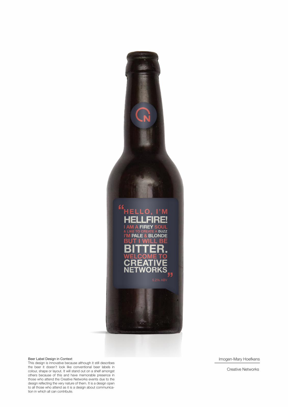
Beer Label Design in ContextThis design is innovative because although it still describes the beer it doesn’t look like conventional beer labels in colour, shape or layout. It will stand out on a shelf amongst others because of this and have memorable presence in those who attend the Creative Networks events due to the design reflecting the very nature of them. It is a design open to all those who attend as it is a design about communica-tion in which all can contribute.
Imogen-Mary Hoefkens
Creative Networks
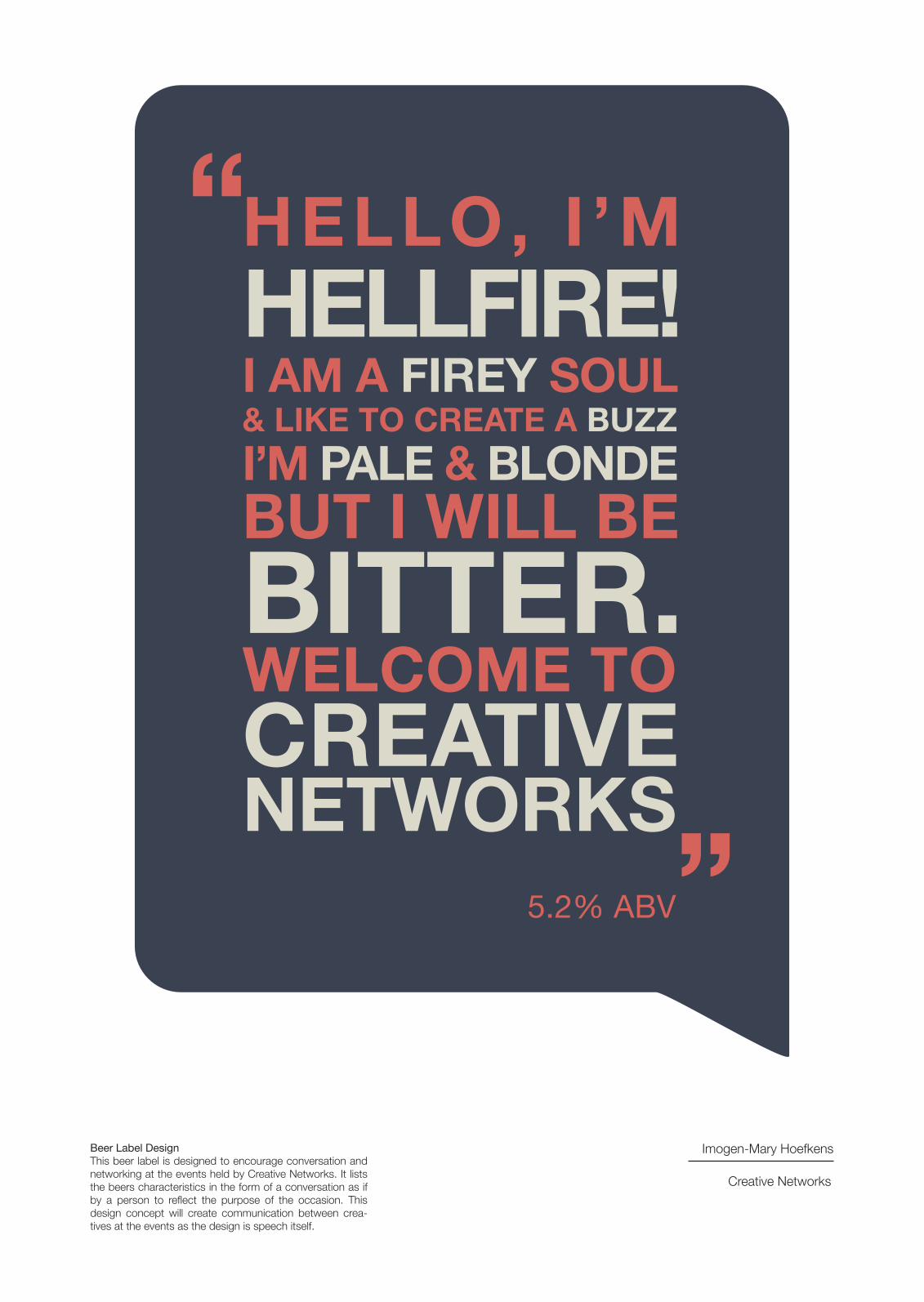
HELLO, I ’MHELLFIRE!I AM A FIREY SOUL& LIKE TO CREATE A BUZZI’M PALE & BLONDEBUT I WILL BE BITTER.WELCOME TOCREATIVENETWORKS
“
“
5.2% ABV
Beer Label DesignThis beer label is designed to encourage conversation and networking at the events held by Creative Networks. It lists the beers characteristics in the form of a conversation as if by a person to reflect the purpose of the occasion. This design concept will create communication between crea-tives at the events as the design is speech itself.
Imogen-Mary Hoefkens
Creative Networks
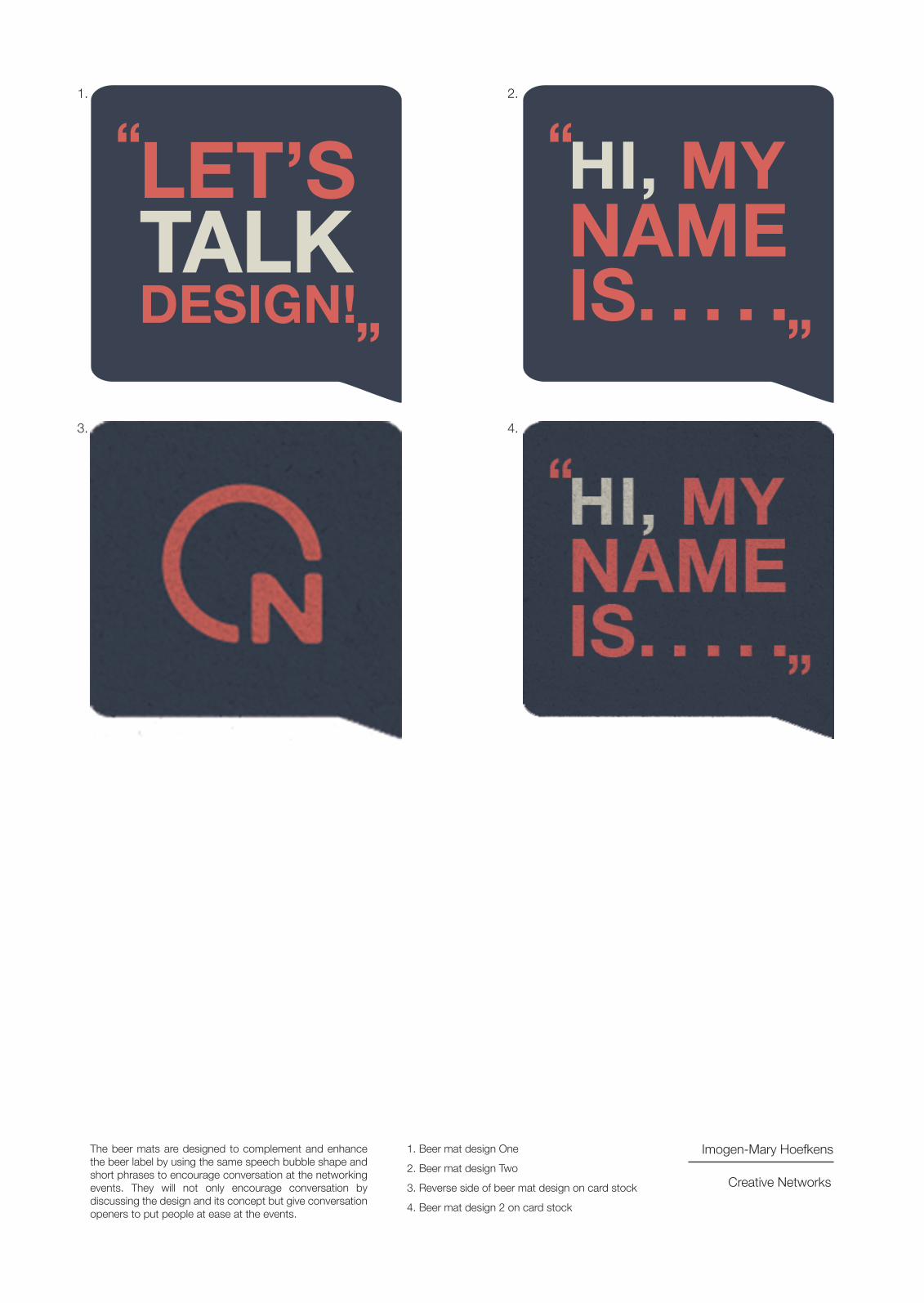
LET’STALKDESIGN!
“
“
HI, MYNAMEIS. . . . .
“
“
1. 2.
3. 4.
The beer mats are designed to complement and enhance the beer label by using the same speech bubble shape and short phrases to encourage conversation at the networking events. They will not only encourage conversation by discussing the design and its concept but give conversation openers to put people at ease at the events.
1. Beer mat design One
2. Beer mat design Two
3. Reverse side of beer mat design on card stock
4. Beer mat design 2 on card stock
Imogen-Mary Hoefkens
Creative Networks

Beer mat designs in context.The colour scheme is the same as the Creative Networks logo and therefore creates a connection with the beverage and the event forming a union as the beer bottle bottom fits perfectly within the logo. This colour scheme will stand out in its environment and instead of being an item to prevent stains and one that would be covered up, it will be part of the event instigating involvement.
Beer Bottle in Context on the Shelf
Imogen-Mary Hoefkens
Creative Networks