crucial tips for creating a responsive website
TRANSCRIPT

12/1/2016 Crucial Tips For Creating A Responsive Website
https://blog.designveloper.com/2016/11/02/responsivewebsitetips/ 1/7
Crucial Tips For Creating A ResponsiveWebsite
As I mentioned earlier, it’s the age of mobile devices nowadays. In fact, there are 6.8 billion people on
the planet, 4 billion of them use a mobile phone and only 3.5 billion of them use a toothbrush. How
ridiculous it is! That’s why if your website doesn’t read well on those devices, it is possible to lose out
on a huge chunk of potential customers. This is where responsive design can come into the picture
and save your day nicely.
W E B S I T E D E S I G N ( H T T P S : / / B L O G . D E S I G N V E L O P E R . C O M / C A T E G O R Y / W E B S I T E -D E S I G N / )
B y V a n D o ( h t t p s : // b l o g . d e s i g n v e l o p e r . c o m / a u t h o r / v a n d o / ) o n N o v e m b e r 2 , 2 0 1 6
12/1/2016 Crucial Tips For Creating A Responsive Website
https://blog.designveloper.com/2016/11/02/responsivewebsitetips/ 2/7
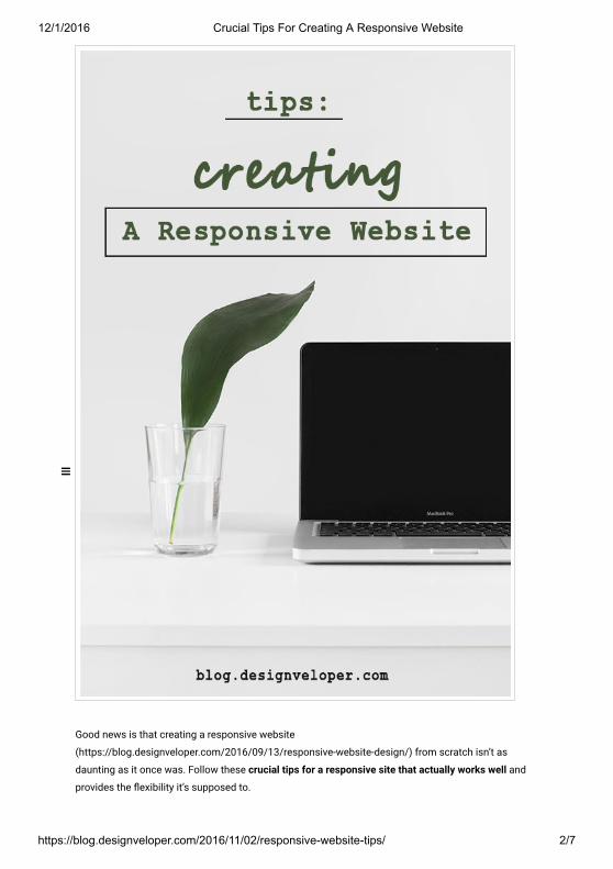
Good news is that creating a responsive website
(https://blog.designveloper.com/2016/09/13/responsive-website-design/) from scratch isn’t as
daunting as it once was. Follow these crucial tips for a responsive site that actually works well and
provides the ៹�exibility it’s supposed to.
12/1/2016 Crucial Tips For Creating A Responsive Website
https://blog.designveloper.com/2016/11/02/responsivewebsitetips/ 3/7
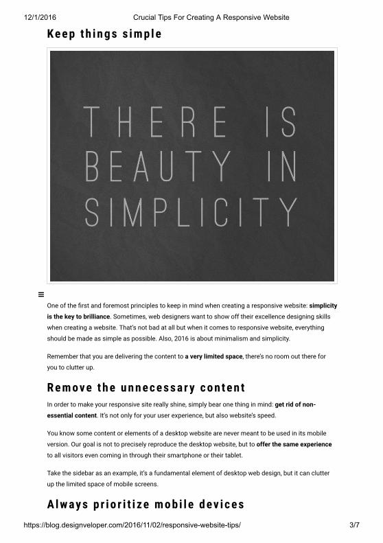
Ke e p t h i n g s s i m p l e
One of the ퟷ�rst and foremost principles to keep in mind when creating a responsive website: simplicity
is the key to brilliance. Sometimes, web designers want to show off their excellence designing skills
when creating a website. That’s not bad at all but when it comes to responsive website, everything
should be made as simple as possible. Also, 2016 is about minimalism and simplicity.
Remember that you are delivering the content to a very limited space, there’s no room out there for
you to clutter up.
R e m ove t h e u n n e c e s s a r y c o n t e n tIn order to make your responsive site really shine, simply bear one thing in mind: get rid of non-
essential content. It’s not only for your user experience, but also website’s speed.
You know some content or elements of a desktop website are never meant to be used in its mobile
version. Our goal is not to precisely reproduce the desktop website, but to offer the same experience
to all visitors even coming in through their smartphone or their tablet.
Take the sidebar as an example, it’s a fundamental element of desktop web design, but it can clutter
up the limited space of mobile screens.
A l w ay s p r i o r i t i ze m o b i l e d ev i c e s

12/1/2016 Crucial Tips For Creating A Responsive Website
https://blog.designveloper.com/2016/11/02/responsivewebsitetips/ 4/7
Because mobile is becoming more relevant than desktop, you should always focus on the way visitors
interact with your website by using their mobile phones ퟷ�rst. Then build out your design for larger
screen size. This will ensure the best possible user experience across all platforms.
M a ke yo u r i m a g e s ៹� e x i b l eEveryone already knew that one of the drawbacks of responsive design is slow loading time. But not
all of them know the main reason behind a slow site is non-optimized images. So don’t let those
images drag your responsiveness down.
You can make your images ៹�exible in a variety of ways, but one of the easiest methods is using this
little handy tool: Adaptive Image (http://www.adaptive-images.com/)
One more thing, be sure to use GIF, JPEG or PNG-8 formats to limit ퟷ�le sizes and help speed up the
website.
M a ke f r i e n d w i t h M e d i a Q u e r i e sFor those who haven’t been acquainted with media queries yet, they are a feature of CSS3 that allow
content to respond to different condition on a particular device. Media queries check for a device’s
resolution, height, width, and orientation. Media queries come in really handy when creating a
responsive website. They are extremely simple to use as well.
M a ke yo u r w e b s i t e re a d a b l e

12/1/2016 Crucial Tips For Creating A Responsive Website
https://blog.designveloper.com/2016/11/02/responsivewebsitetips/ 5/7
Nothing is more frustrating than zoom in and out, up and down, right and left to read content. So,
make sure your website legible. Visitors always want convenience, not a challenge. Your text should
be large enough and comfortable to read from a smaller screen. I highly recommend a text size of
16px, 1 em or 12 pt.
F i n a l t h o u g h tThese mentioned above are just some of the more important ones you can try out. And hopefully by
now you already had some ideas of how you can use these tips for your stunning responsive website.
Now, your turn! What design tips have you been embracing so far? Please let me know in the
comments below.