dashboard design guidance for water quality surveillance and
TRANSCRIPT

Dashboard Design GuidanceFor Water Quality Surveillance and Response Systems
Office of Water (MC 140) EPA 817-B-15-007 November 2015

i
Disclaimer The Water Security Division of the Office of Ground Water and Drinking Water has reviewed and approved this document for publication. This document does not impose legally binding requirements on any party. The information in this document is intended solely to recommend or suggest and does not imply any requirements. Neither the United States Government nor any of its employees, contractors or their employees make any warranty, expressed or implied, or assumes any legal liability or responsibility for any third party’s use of any information, product or process discussed in this document, or represents that its use by such party would not infringe on privately owned rights. Mention of trade names or commercial products does not constitute endorsement or recommendation for use.
Questions concerning this document should be addressed to [email protected] or the following contact:
Steve Allgeier EPA Water Security Division 26 West Martin Luther King Drive Mail Code 140 Cincinnati, OH 45268 (513) [email protected]

ii
Acknowledgements The document was developed by the EPA Water Security Division, with additional support provided under EPA contract EP-C-15-012.
• Adam Haas, Computer Sciences Corporation• Raja Kadiyala, Ph.D., CH2M• Christopher Macintosh, CH2M
Peer review of this document was provided by the following individuals: • James Alair, New York City Department of Environmental Protection• Biju George, P.E., DC Water• Rita Kopansky, Philadelphia Water• Yeongho Lee, Ph.D., Greater Cincinnati Water Works

iii
Table of Contents LIST OF FIGURES ........................................................................................................................................................ IV LIST OF TABLES ........................................................................................................................................................... V ABBREVIATIONS .......................................................................................................................................................... VI SECTION 1: INTRODUCTION .......................................................................................................................................... 1 SECTION 2: FEATURES AND FUNCTIONS OF A DASHBOARD ........................................................................................ 3
2.1 OVERVIEW OF USEFUL FEATURES AND FUNCTIONS ............................................................................................. 3 2.1.1 Navigation through Different Data Representations ................................................................................... 3 2.1.2 Geospatial Presentation .............................................................................................................................. 8 2.1.3 Alert Management ..................................................................................................................................... 13
2.2 EXAMPLE DASHBOARD USE CASES .................................................................................................................... 14 2.2.1 CCS Alert Investigation ............................................................................................................................. 14 2.2.2 PHS Alert Investigation ............................................................................................................................. 17 2.2.3 Analyzing Residual Chlorine to Manage Operations ................................................................................ 19
2.3 DASHBOARD CONCEPTUAL ARCHITECTURE ....................................................................................................... 21 2.3.1 Source Data Systems ................................................................................................................................. 22 2.3.2 Analytical Infrastructure ........................................................................................................................... 23 2.3.3 Presentation .............................................................................................................................................. 24
SECTION 3: DASHBOARD REQUIREMENTS ................................................................................................................. 25 3.1 FUNCTIONAL REQUIREMENTS ............................................................................................................................ 26 3.2 TECHNICAL REQUIREMENTS ............................................................................................................................... 29
SECTION 4: DASHBOARD SOLUTION SELECTION ....................................................................................................... 31 SECTION 5: DASHBOARD MAINTENANCE ................................................................................................................... 32 RESOURCES ................................................................................................................................................................. 35 GLOSSARY ................................................................................................................................................................... 37

iv
List of Figures FIGURE 1-1. A DASHBOARD AS A CENTRAL ELEMENT OF AN SRS ................................................................................ 2 FIGURE 2-1. EXAMPLE OF A SINGLE PARAMETER TIME-SERIES PLOT ........................................................................... 4 FIGURE 2-2. EXAMPLE OF A GAUGE DISPLAY ................................................................................................................ 6 FIGURE 2-3. EXAMPLE OF A BOX-AND-WHISKER PLOT ................................................................................................. 7 FIGURE 2-4. BASEMAP AND TOOLBAR IN A GEOSPATIAL DISPLAY ................................................................................ 8 FIGURE 2-5. EXAMPLE OF THEMATIC MAPPING ........................................................................................................... 10 FIGURE 2-6. MAP LAYER EXAMPLES ........................................................................................................................... 11 FIGURE 2-7. EXAMPLE OF A COMBINED LAYER VIEW ................................................................................................. 12 FIGURE 2-8. EXAMPLE OF A COMPLEX LAYER VIEW WITH ANNOTATIONS .................................................................. 13 FIGURE 2-9. EXAMPLE OF AN ALERT MANAGEMENT TOOLBOX DISPLAY ................................................................... 14 FIGURE 2-10. USING A DASHBOARD TO INVESTIGATE A CCS ALERT .......................................................................... 16 FIGURE 2-11. USING A DASHBOARD TO INVESTIGATE A PHS ALERT .......................................................................... 18 FIGURE 2-12. USING A DASHBOARD TO ANALYZE CHLORINE RESIDUAL DATA .......................................................... 20 FIGURE 2-13. CONCEPTUAL DASHBOARD ARCHITECTURE .......................................................................................... 22 FIGURE 3-1. PROCESS TO DEFINE EXPECTED USES AND DEVELOP FUNCTIONAL REQUIREMENTS FOR A DASHBOARD 26 FIGURE 3-2. EXAMPLE COMPONENT-LEVEL INFORMATION FLOW DIAGRAM FOR CCS ............................................... 27 FIGURE 5-1. EXAMPLE CHANGE MANAGEMENT PROCESS ........................................................................................... 32
v
List of Tables TABLE 2-1. SYMBOLOGY USED IN EXAMPLES ............................................................................................................. 10 TABLE 2-2. EXAMPLE SOURCE DATA SYSTEMS ........................................................................................................... 23 TABLE 3-1. EXAMPLES OF EXPECTED USES OF A DASHBOARD .................................................................................... 28 TABLE 3-2. EXAMPLES OF DASHBOARD FUNCTIONAL REQUIREMENTS ....................................................................... 29 TABLE 3-3. EXAMPLES OF DASHBOARD TECHNICAL REQUIREMENTS ......................................................................... 29

vi
Abbreviations ADS Anomaly Detection System CCS Customer Complaint Surveillance Cond Conductivity DOC Dissolved Organic Carbon EPA United States Environmental Protection Agency ESM Enhanced Security Monitoring ETL Extract-Transform-Load GIS Geographic Information System IT Information Technology LIMS Laboratory Information Management System NH4 Ammonia NO3 Nitrate OWQM Online Water Quality Monitoring PHS Public Health Surveillance S&A Sampling and Analysis SCADA Supervisory Control and Data Acquisition SCR System Change Request SRS Water Quality Surveillance and Response System Temp Temperature TOC Total Organic Carbon Turb Turbidity

Dashboard Design Guidance
1
Section 1: Introduction A Water Quality Surveillance and Response System (SRS) is a system that employs one or more surveillance components to monitor and manage distribution system water quality in real time. An overview of the components of an SRS can be found in the Water Quality Surveillance and Response System Primer (EPA, 2015a). An SRS utilizes a variety of data analysis techniques to detect water quality anomalies and generate alerts. The essence of an SRS is the integration of data from disparate sources to generate new information that provides insight into distribution system water quality to support system operations and informs the response to validated water quality incidents.
A dashboard is an information management system that supports the access to and visualization of information created from the data produced by sources including the SRS components. Figure 1-1 illustrates the manner in which a dashboard can serve as a central information resource for an SRS and support decision-making during response to possible contamination incidents. A dashboard also provides a comprehensive view of system conditions to support distribution system monitoring and management. In the context of this document, a dashboard is limited to the functions supporting data access, data visualization, and alert management. This guidance does not address anomaly detection algorithms.
Because a dashboard is an element of the overall SRS information management system, the development process discussed here is consistent with the general principles of information management system development presented in Section 4 of Guidance for Developing Integrated Water Quality Surveillance and Response Systems (EPA, 2015b) (referred to throughout this document as “SRS Integration Guidance”) with specialized considerations relating to a dashboard. A dashboard differs from other information management system elements in the following ways:
• A dashboard is required to interface with the other parts of the information management system,in particular the sources of the datastreams utilized by the dashboard.
• It is likely that a dashboard will require some custom elements to ensure that it meets therequirements established by a utility; however, significant elements of the system may be offthe shelf.
• The design and configuration of the sophisticated human-machine interface used in manydashboards requires significant interaction between users and developers to meet therequirements.
This document was written for utility managers and information technology (IT) personnel who are engaged in the process of designing a dashboard to support an SRS. The purpose of this document is to assist the target audience in understanding the benefits of a dashboard and the level of involvement necessary to achieve the utility’s goals and objectives for the project. As the subsequent dashboard development effort would generally be undertaken by a dedicated IT development team or consultant, the understanding gained through this guidance will help the utility to become an informed buyer when creating bid documents and entering into the required contracts for such a project.

Dashboard Design Guidance
2
Figure 1-1. A Dashboard as a Central Element of an SRS
The remaining sections of this document cover the following topics: • Section 2 provides examples of the features and functions that can be incorporated into a
dashboard, as well as examples of a dashboard architecture.• Section 3 describes a systematic process for developing dashboard requirements.• Section 4 presents considerations for the selection of a dashboard solution.• Section 5 discusses ongoing maintenance of a dashboard.• Resources presents a comprehensive list of documents, tools, and other resources cited in this
document, including a summary and link to each resource.• Glossary presents definitions of terms used in this document, which are indicated by bold italic
font at first use in the body of the document.

3
Dashboard Design Guidance
Section 2: Features and Functions of a Dashboard Dashboards can be designed with features and functionality that can improve the efficiency with which utility personnel access and utilize information. Dashboards offer a variety of views for individual SRS components, including both spatial and temporal representations of component data. Additionally, dashboards can display data from multiple components in an aggregate view, allowing users to investigate correlations among the components within a spatial or temporal context.
The manner in which data is displayed on a dashboard depends on both functional requirements and the attributes of the data, which can vary by component. For example, Online Water Quality Monitoring (OWQM) may produce data at two-minute intervals, providing great detail about multiple parameters at monitoring locations, while Sampling and Analysis (S&A) may produce data for given locations every three weeks, and Customer Complaint Surveillance (CCS) produces data for customer complaints that randomly occur in both time and space.
This section provides examples of how a dashboard can present a variety of data in a form and context that yields actionable information. Common applications of a dashboard are illustrated through case studies from real utilities to demonstrate the manner in which a dashboard can enhance the implementation of utility procedures and processes. Finally, this section provides a description of the high-level conceptual architecture and data sources that are generally necessary to build a dashboard.
2.1 Overview of Useful Features and Functions The specific features built into a dashboard should be guided by a clear and complete set of requirements, as discussed in Section 3. Features and functions that are commonly found in a dashboard are listed below and described in the subsections that follow.
• Navigation through different data representations• Geospatial presentation of data and information• Alert management, including investigation tracking and information sharing
2.1.1 Navigation through Different Data Representations A valuable feature of a dashboard is the ability to view the large quantity of data produced by an SRS in an intuitive way such that users can obtain information from the data quickly and easily. Each datastream can be viewed using different visualization tools such as charts and tables. The method selected by a user depends on the type of information to be extracted from the raw data. The dashboard provides an interface to enable quick navigation between different representations of the same data. This approach allows a user to quickly understand current conditions in the context of historical or statistical trends, providing a user with the information to readily consider the broader impact of those conditions on utility goals for system operations and water quality.
Tabular representation of data is effective for smaller data sets and individual data points such as a list of alerts or the results of recent grab samples. However, tabular representations become more difficult to use effectively with larger data sets. For example, it would be difficult for a user to grasp meaningful trends in time-series data through a tabular view. Thus, graphic representation of data is an important feature of a dashboard. Three methods that have been found to be useful for viewing SRS data are time-series plots, gauge displays, and box-and-whisker plots. Examples of each are presented in the following sections.

Dashboard Design Guidance
4
Time-Series Plots A time-series plot displays the data values plotted against a time scale, which is useful for understanding data trends over a wide range of time scales as shown in Figure 2-1. The time scale can be varied to present the data values over different periods of time. Short time periods can be useful for investigating dramatic changes in a parameter, while longer time periods (such as days, weeks, or months) can reveal gradual trends that may be indicative of periodic operational changes or seasonal trends. The time period displayed is limited only by the number of data points available.
Figure 2-1. Example of a Single Parameter Time-Series Plot Over Different Time Periods

Dashboard Design Guidance
5
Patterns can be readily identified using a time-series plot, such as the example shown in Figure 2-1 where chlorine residual values are displayed over a month, week, and day. The plot makes it apparent that chlorine residual was initially within established control limits, but suddenly increased for a 12-hour period before returning to concentrations within the control limits. Multiple parameters can also be viewed on the same plot, allowing users to identify the relationships among parameters.
Time-series plots can also be useful as a diagnostic tool for monitoring equipment. For example, in an OWQM application, constant or flat-lined data could indicate that the sensor electronics or the communications system is not functioning correctly. If the data is erratic, it might indicate a malfunctioning sensor or that the sensor has run out of a reagent.
Gauge Displays While time-series plots are useful for observing trends in data, they are not particularly effective for viewing current values from multiple datastreams. Figure 2-2 shows a gauge display that is effective for monitoring current conditions of multiple parameters. This type of display is often presented as the default display on a control room screen because current conditions are usually of most interest in a control room.
The example shown in Figure 2-2 uses colored regions to indicate whether the individual parameters are within normal operating range (green), in warning status (amber), or have exceeded a control limit (red). Each of the gauges in this plot represents values for a specific parameter at an OWQM location. The longer pointer (the minute hand) displays the current value, while the shorter pointer (the hour hand) displays the hourly average for each parameter. This visualization method enables a user to easily ascertain if the values are changing. If the hour and minute hands are overlapping (as is the case for DOC, Free NH4, NO3, and Temp), it indicates that the values have been fairly constant over the last hour. If the current value is less than the hourly average value (as is the case for Cond, TOC, and Turb), it indicates that value for the parameter has trended downward over the past hour. If the current value is more than the hourly average value (as is the case for Chlorine), it indicates that value for the parameter has trended upward over the past hour.

Dashboard Design Guidance
6
Figure 2-2. Example of a Gauge Display

Dashboard Design Guidance
7
Box-and-Whisker Plots Another visualization tool is the box-and-whisker plot. This type of plot provides insight into the statistical characteristics of a dataset by displaying markers for a number of key statistical elements as show in Figure 2-3. The horizontal line, labelled as item 1, represents the mean. The top and bottom of the box, labelled as item 2, represents the inter-quartile range (as delineated by the 25th and 75th percentile). The whiskers, labelled as item 3, represent the lower and upper extent of the statistically meaningful range. An additional feature shown in Figure 2-3 is the data cloud of values, labelled as item 4. The red points in this cloud represent an occurrence of specific value, thus the density of the cloud at a specific value correlates to the frequency at which that value occurred. The data cloud provides a visualization of the clustering of data. Any data points outside of the whiskers are considered outliers, labelled as item 5 in the figure.
An application of a box-and-whisker plot is the evaluation of monthly variability in monitored parameters. The box-and-whisker plot in Figure 2-3 provides a visualization of the data across multiple months for a single chlorine sensor and allows for direct interpretation of the relative distribution of chlorine data from month to month. Figure 2-3 could be used to set the proper control limits for a parameter. For example, the monthly minimum and maximum for the interquartile range over the five-month period displayed is approximately 0.6 to 1.1 mg/L. These values were used to establish the control limits displayed in Figure 2-1. The excursion above the control limit shown in Figure 2-1 is equivalent to values above the box (Item 4) of Figure 2-3.
Figure 2-3. Example of a Box-and-Whisker Plot Representing Monthly Chlorine Data
Figures 2-1, 2-2, and 2-3 are all visualizations of time-series data, but they provide different representations of the data: a time-series plot is useful for understanding temporal trends in the data, the gauge display for effectively displaying current values, and box-and-whisker plots for understanding the

8
Dashboard Design Guidance
statistical characteristics of a dataset. By having all of these data representations available in a dashboard, the user can select the one best suited to fulfill the current need.
2.1.2 Geospatial Presentation While the data representations presented in Section 2.1.1 facilitate effective analysis of time-series data, geospatial presentation allows users to view SRS information in a spatial context relative to distribution system infrastructure, neighborhoods, and other spatially referenced data. A system that processes and displays geospatial data is referred to as a Geographic Information System (GIS). Geospatial presentation of data takes advantage of spatial attributes assigned to each SRS datastream. For example, each OWQM station is located at a specific, physical location in the system, and CCS alerts correspond to calls received from specific addresses. The ability to view, search, and analyze data based on spatial attributes provides users with an interactive and intuitive data interface.
As GIS interfaces present information in a geospatial context, they are built using grouped sets of geospatial data referred to as layers. The common underlying layer is referred to as a basemap, which is usually a map that contains non-utility features such as streets, highways, and jurisdictional boundaries. Additional information is displayed in layers overlying the basemap. This additional information may be static information such as distribution system assets and features (e.g., utility facilities, hydrants, distribution mains, and pressure zone boundaries) or it may be dynamic information such as time-series data from the SRS components or the location of incidents such as main breaks and maintenance activities. This aggregated spatial display of data is a particularly valuable feature of a dashboard as it provides a spatial context to interpret SRS data and investigate causal relationships among the data points. An example of a basic geospatial presentation is shown in Figure 2-4.
Figure 2-4. Basemap and Toolbar in a Geospatial Display

Dashboard Design Guidance
9
GIS applications generally have a set of tools that, in this example, are depicted by the row of icons in the toolbar at the top of Figure 2-4, and defined in the table to the right of the figure. Features may differ with the particular GIS software implemented, but the following basic functions should be available in most GIS packages: • Pan and zoom to enable users to scroll across the map and zoom in or out to specific areas• Layer control to allow users to select the layers to display and to set display attributes, such as
transparency, for each layer (see below for a more detailed description of layers)• Distance measurement between points or along a path• The ability to identify or view GIS attribute data of a specific feature on the screen (for example,
street address, parcel ID, work order number, or political boundary)• The ability to search by GIS attribute data• The ability to add annotations and sketches as a new layer• Bookmarking of views to enable them to be retrieved later• The ability to display detailed data by clicking on the related icon on the display
The value of a geospatial display is its ability to represent complex data in an intuitive, visually oriented manner. Symbology and thematic mapping are methods commonly used to represent data in a geospatial display, as discussed in the following section.
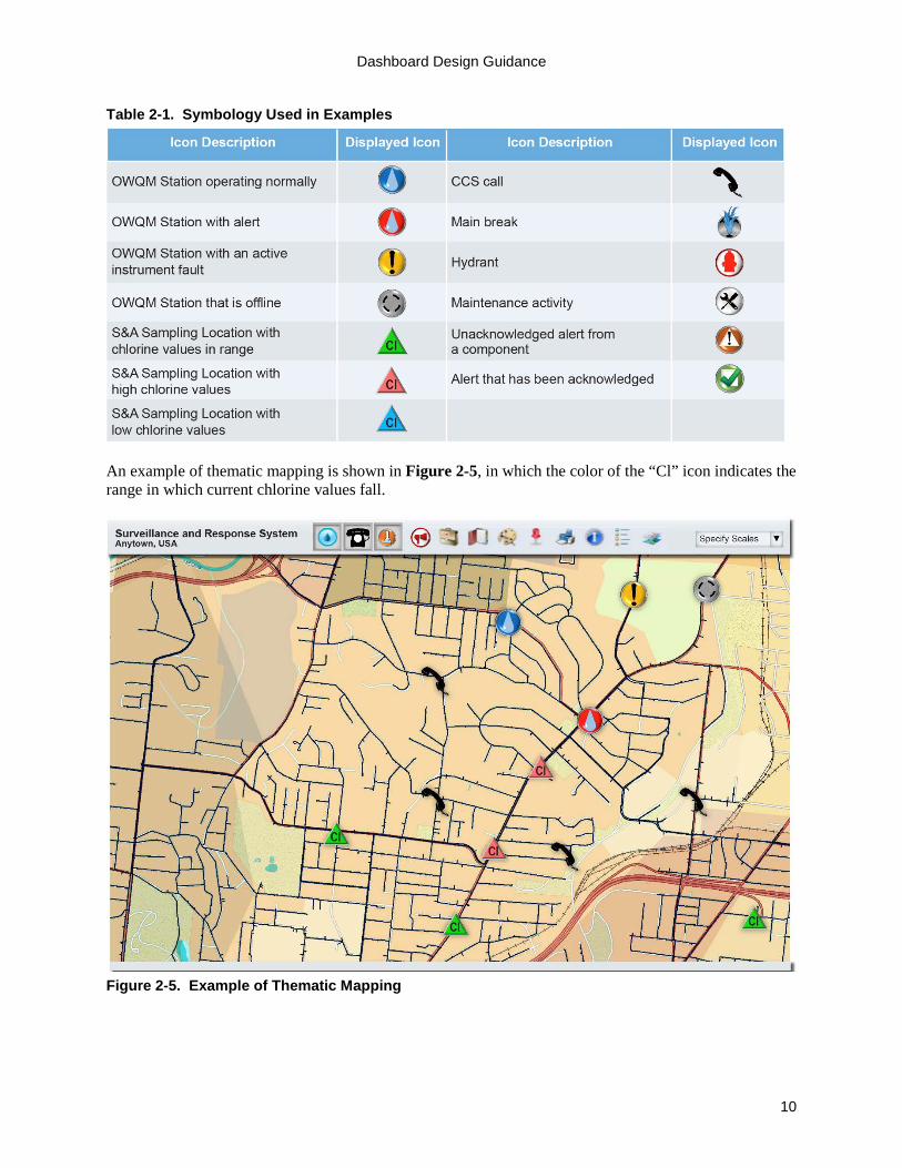
Symbology and Thematic Mapping Symbology is a method of graphically depicting features in a layer using icons selected to represent each feature. Table 2-1 provides examples of icons that have been successfully used in real systems as part of the Water Security Initiative pilots (EPA, 2015c). The icons in this table will be used in the examples throughout this document.
GIS layers utilize symbols to convey additional details about the data represented in the layer. A water distribution layer could include map symbols to denote the location of pipes, meters, valves, and flow restrictors. A layer can also include symbols or icons that change depending on the status of the element represented by the icon to convey additional information. Referred to as thematic mapping, this visualization can be as simple as icons that change depending on the current value of the parameter represented by the icon. An example of thematic mapping is the use of different colors for an OWQM station icon that indicate the current status of the station (e.g., blue = normal, yellow = equipment fault, red = alert, grey = off-line). A more complex example for S&A is use of color gradation of icons to indicate the value of a parameter at each monitored location (e.g., blue = low values, green = values in range, and red = high values) with the predefined parameter of interest labelled within the icon. By plotting color gradation icons from all sampling locations on a map, one can quickly identify areas of the distribution system where the parameter value is out of range.
Dashboard Design Guidance
10
Table 2-1. Symbology Used in Examples
An example of thematic mapping is shown in Figure 2-5, in which the color of the “Cl” icon indicates the range in which current chlorine values fall.
Figure 2-5. Example of Thematic Mapping

Dashboard Design Guidance
11
Map Layers A fundamental feature of geospatial presentation is layered viewing of data with respect to location. The layered view allows a user to see the information needed while removing unnecessary layers that can cause clutter. Figure 2-6 shows common layers that can be included in an SRS dashboard such as utility GIS data and SRS component information.
Figure 2-6. Map Layer Examples

Dashboard Design Guidance
12
The combined view that would be presented in the GIS if all the layers in Figure 2-6 were included is shown in Figure 2-7, which presents customer complaint locations referenced to the utility’s pipes, hydrants, and OWQM stations. Overlaying different types of information in this manner can help to identify causal relationships. For example, a spatial clustering of dirty water complaints and elevated turbidity readings downstream of a pipe break may establish the cause of the complaints.
Figure 2-7. Example of a Combined Layer View

Dashboard Design Guidance
13
Figure 2-8 is an example of a multi-layered view that could be used to conduct a detailed investigation of an alert. It shows the street basemap, pressure zones (shown in background colors with partial transparency), distribution pipes (shown in blue), and CCS calls (telephone handset) layers displayed.
Figure 2-8. Example of a Complex Layer View with Annotations
2.1.3 Alert Management At the most basic level, alert management functions determine the alerts that are displayed on a dashboard and the method by which they are conveyed to users. Common methods of providing alert notifications include display on the dashboard screen (such as flashing icons), audible alarms, and notifications via email, text message, or automated telephone call to users away from the dashboard. Dashboards are also typically designed to display a list of recent alerts that can be sorted and filtered by a user.
The key functions that a dashboard can provide to support alert management are: • Access to all available information required to support an alert investigation• Guidance for the alert investigation process• Documentation of alert investigation activities and findings• Information-sharing during the alert investigation
A dashboard screenshot demonstrating an example of an alert management toolbox is shown in Figure 2-9. A list of the most recent alerts with high-level details is shown at the
HELPFUL HINT A dashboard could be designed to include electronic checklists that track implementation of alert investigation procedures and record the results.

Dashboard Design Guidance
14
top of the screen. When an item in this alert list is selected, the bottom half of the dialogue box is populated, allowing the current status of the alert investigation to be displayed. Notes documenting the investigation can be entered in the “Add Comment” area. Any information entered using this tool would be available to other dashboard users.
Figure 2-9. Example of an Alert Management Toolbox Display
2.2 Example Dashboard Use Cases To illustrate how the features of a dashboard work as a system, this section provides three real-world examples from utilities that have implemented dashboards. The examples pertain only to the operation of the dashboard as a visualization tool and assume that all analytics associated with each component, in particular those associated with the generation of alerts using an anomaly detection system (ADS), are part of the individual component.
These examples indicate how a dashboard with data visualization, geospatial display, and alert management capabilities can support:
• Investigation of a CCS alert• Investigation of a Public Health Surveillance (PHS) alert• Routine analysis of OWQM data to manage operations
2.2.1 CCS Alert Investigation This example commences with utility staff receiving an alert notification triggered by a high number of customer complaints about dirty water in the same pressure zone. The ensuing investigation is guided by an alert investigation procedure developed for the CCS component (EPA, 2015d). The primary steps of the CCS alert investigation process that will be illustrated in this example are:
• Evaluate complaints for similar problem descriptions and spatial clustering.• Review distribution system operations data for possible causes of the complaints.• Review recent or open distribution system work orders for possible causes of the complaints.

Dashboard Design Guidance
15
• Review recent online and grab water quality data for unusual conditions that could be related to the complaints.
Note that other activities may be included in the investigation, such as contacting other departments, though this example focuses solely on use of the dashboard. The manner in which the dashboard is used to support this investigation process is illustrated in Figure 2-10, which references the numbered items listed below:
• Item 1: The CCS alert is received as a text or email, or shown on the dashboard display. The alert indicates multiple “dirty water” complaints in the north pressure zone.
• Item 2: The Alert Management Toolbox is used to display the list of current alerts. A utility user acknowledges the alert and adds a note indicating that nearby maintenance activity will be reviewed as a potential cause of the alert.
• Item 3: The CCS layer is activated to display the area related to the CCS calls along with a layer showing pressure zones. Details of the CCS calls, including house address and complaint type, are shown in the tabular view at the bottom of the screen. The GIS display shows that all recent complaints are in a cluster within the same pressure zone.
• Item 4: Additional layers are opened to display pipe breaks, locations of fire hydrants, and other work orders in the same pressure zone to investigate potential causes of the complaints. There is an open work order to flush a line in the vicinity of the complaint.
• Item 5: The OWQM layer is opened and a time-series plot is displayed for recent turbidity data from an OWQM station located in the pressure zone associated with the CCS alert. The time-series plot from the OWQM station, which is downstream of the complaints, shows two minor spikes in turbidity, but nothing that would be considered noticeable to a consumer.
• Item 6: The S&A layer is activated to display grab sample data, in this case for the last 12 months. The layer is used to look for nearby sampling locations that were sampled for turbidity on the day of the CCS alert. While no sample results were available from that day, the timescale of the plot was extended to investigate seasonal trends in turbidity. No seasonal trends in turbidity were identified. With no corroborating data from OWQM and S&A to indicate a more widespread problem, normal investigation procedures were followed to take grab samples at the impacted residences.

Dashboard Design Guidance
16
Figure 2-10. Using a Dashboard to Investigate a CCS Alert

Dashboard Design Guidance
17
2.2.2 PHS Alert Investigation This example begins with an operator receiving a PHS alert notification triggered by a high number of cases reporting neurological and rash symptoms located in the same zip code. The ensuing investigation is guided by an alert investigation procedure developed for the PHS component (EPA, 2015e). A key consideration for investigating PHS alerts is the delay between a customer’s exposure to contaminated drinking water and the onset of symptoms and subsequent healthcare seeking behavior that provides the raw data needed to generate a PHS alert. For this reason, it is important to overlay data from the other SRS components for time periods preceding the PHS alert by up to two weeks.
The primary steps in this PHS alert investigation are the following: • Use the dashboard to acknowledge the alert and view the details of the alert, including location of
the underlying cases.• View the dashboard to determine whether the cases are spatially clustered.• Review OWQM time-series plots and CCS dirty water complaints for the previous week in the
area of the cluster (overlay of time-shifted data).• Annotate the alert and document the investigation.
The process for using a dashboard in this example is illustrated in Figure 2-11 with example screens corresponding to the numbered items listed below to demonstrate the information provided through the dashboard.
• Item 1: The PHS alert is received as a text or email, or displayed on the dashboard. The alertindicates that there were multiple “rash” cases reported from the same zip code.
• Item 2: The Alert Management Toolbox displays the list of current alerts. Four PHS alerts areshown as having been received in the previous 30 hours, with two for rash and two forneurological symptoms (neuro). The utility user acknowledges the alert, and adds a note thatCCS alerts from the previous week will be reviewed. The reason for checking CCS alerts for theprevious week is that water quality issues that cause an illness will typically precede symptoms ofthe illness by hours to several days.
• Item 3: The PHS layer is displayed, showing the highlighted zip code containing the casesassociated with the PHS alert. Detailed case counts associated with the alert are shown in thetabular view at the bottom of the screen.
• Item 4: The OWQM layer is activated, and a time-series plot of turbidity data is displayed froman OWQM station in the zip code in which the PHS alert was generated. Due to the delaybetween a potential water quality anomaly and symptom onset, the investigator views OWQMdata for the two weeks prior to the PHS alert. The time-series plot shows that turbidity has beenlow and within acceptable levels for this two week period.
• Item 5: The CCS layer is activated, displaying related dirty water calls for this same area duringthe week prior to the PHS alert. There is a cluster of CCS calls within the zip code of the PHScases, which could indicate a potential water quality issue related to the PHS alert. Furtherinvestigation will be undertaken to determine whether a water quality incident may have causedthe underlying cases that triggered the PHS alert.

Dashboard Design Guidance
18
Figure 2-11. Using a Dashboard to Investigate a PHS Alert

Dashboard Design Guidance
19
2.2.3 Analyzing Residual Chlorine to Manage Operations Utilities may implement procedures for routine review of SRS data, such as weekly review of chlorine residual trends, to manage water quality in storage tanks and remote areas of the distribution system. The primary steps to perform this weekly review of chlorine residual trends are the following:
• Review weekly time-series plots for each OWQM station and identify locations with chlorineresidual concentrations outside of control limits.
• Display other component data, operational data, and work orders for the same geographic areaand time period to investigate causal relationships (e.g., display CCS data to identify areasreporting water quality concerns).
The process for using a dashboard in this example is illustrated in Figure 2-12. Example screens correspond to the numbered items listed below to demonstrate the information provided by the dashboard:
• Item 1: Time-series plots are displayed for chlorine levels at each of the OWQM stations, withone of the time-series plots showing the chlorine level trending upwards.
• Item 2: Time-series plots are displayed for the other parameters at the OWQM station with noother parameters showing a deviation from the baseline.
• Item 3: OWQM stations upstream and downstream of the station with the high chlorine levels arelocated on the map.
• Item 4: Time-series plots for chlorine are displayed for upstream and downstream OWQMstations showing that chlorine levels are within normal range.
• Item 5: Layers are activated to display distribution system work orders and main breaks in thearea to investigate whether these activities might have caused the elevated chlorine levels at theone OWQM station. This step of the investigation reveals that there a main break repaired anddisinfected with high levels of chlorine on the same day as the chlorine residuals began to rise.
• Item 6: Both the OWQM layer and the CCS layer are displayed together indicating that the tasteand odor complaints are likely related to the short period of elevated chlorine residual levelsresulting from the repair. Crews were sent out to perform hydrant flushing in the impacted areaand operating procedures were reviewed to evaluate how to avoid this type of incident in thefuture.

Dashboard Design Guidance
20
Figure 2-12. Using a Dashboard to Analyze Chlorine Residual Data

Dashboard Design Guidance
21
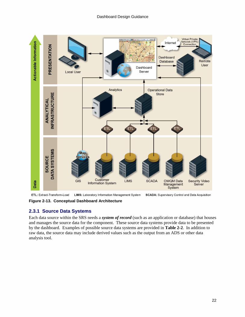
2.3 Dashboard Conceptual Architecture To achieve the functionality described previously, the dashboard will need to interface with the other parts of the SRS information management system, in particular the source data systems utilized by the dashboard. The dashboard conceptual architecture describes the high-level functional elements required to meet the requirements and the ways in which these various elements must be integrated to achieve a functional system. The conceptual dashboard architecture illustrated in Figure 2-13 is modeled after a standard architecture that extracts basic data from multiple source data systems, transforms the source data into a format that can be more readily displayed and understood, and consolidates the data into a single repository. A conceptual architecture does not represent all of the physical elements necessary to build the system, but does identify the major elements of the system. A conceptual SRS dashboard architecture generally includes the following three tiers: source data systems, analytical infrastructure, and presentation. Figure 2-13 shows how these tiers relate and the type of source data systems that may be available to support an SRS dashboard. These tiers are discussed in further detail in the following subsections.
Dashboard Design Guidance
22
Figure 2-13. Conceptual Dashboard Architecture
2.3.1 Source Data Systems Each data source within the SRS needs a system of record (such as an application or database) that houses and manages the source data for the component. These source data systems provide data to be presented by the dashboard. Examples of possible source data systems are provided in Table 2-2. In addition to raw data, the source data may include derived values such as the output from an ADS or other data analysis tool.

Dashboard Design Guidance
23
Table 2-2. Example Source Data Systems Source Data System Data Provided to the Dashboard GIS Map services that provide geospatial context such as jurisdictional boundaries,
street addresses, roads, utility assets, etc. for SRS information (OWQM data, CCS calls, PHS cases, facilities with Enhanced Security Monitoring [ESM])
Customer Information System
Basic customer information as well as records of customer contact with the utility to report issues such as water quality concerns (complaint type, location, and time)
Laboratory Information Management System (LIMS)
Results from laboratory analyses, including those from routine grab samples collected for chlorine analysis and from samples collected in response to customer water quality complaints
Supervisory Control and Data Acquisition (SCADA) System
Distribution system operating conditions, tank and pump status, pressure and flow readings, and security alerts
OWQM Data Management System
Water quality (WQ) parameter values generated by online sensors, alerts generated by ADS or other data analytics, and instrument faults
Security Video Server Video feed from utility facilities equipped with video cameras
Identification of the source data systems for the SRS components and ancillary data systems that will be included in the dashboard is necessary to define the conceptual architecture. The IT design team will base this decision on the requirements developed for the dashboard as described in Section 3. A dashboard could be designed to display data from a single component, multiple components, or all components along with the ancillary data systems. The decision about those source data systems to include in the dashboard will be informed by insight gained during review of the requirements and an inventory of existing software and systems.
2.3.2 Analytical Infrastructure A dashboard architecture typically includes analytical infrastructure, which serves as the interface between the source data systems and the presentation tier. Without this tier, the dashboard would need to retrieve data directly from a source data system in response to every user request, and the resulting traffic could impair the performance of the source data systems or result in data transfer delays.
The analytical infrastructure includes an intermediate repository known as the operational data store, which provides a short-term repository that stores only recent data that would frequently be displayed on the dashboard. The operational data store allows for the data to be extracted once from the source data system and then transformed into a format that allows for efficient display before it is loaded into the operational data store through a process termed Extract-Transform-Load (ETL).
The ETL converts source data into a more efficient data store for use within the dashboard. This is achieved by extracting the necessary data from the source data systems, transforming the data into a format that is more closely aligned to the intended display or report structure, and loading the data into the operational data store for use by the dashboard. The efficiency gained in performing the transformation once during the ETL, as opposed to doing it on-
HELPFUL HINT Other processes may also occur at this level including data analysis or anomaly detection that references multiple source data systems. For example, the CCS ADS typically leverages both the GIS and Customer Information System source data systems to generate and display alerts. The Customer Information System is used to track the number of water quality complaints, and the ADS determines whether an established threshold is exceeded. The GIS is used to geolocate the customer calls for display on a map layer and, in advanced data analysis systems, is used to incorporate spatial clustering into the detection algorithm.

Dashboard Design Guidance
24
the-fly for every user interaction, improves the performance of the dashboard. Data validation and data quality checks are also performed during the ETL. The dashboard displays this transformed data within the presentation tier. Some data does not require transformation or temporary storage in the operational data store and thus bypasses this process in the analytical infrastructure tier. In the example architecture shown in Figure 2-13, both GIS and the security video server data bypass this tier. The data in both of these systems does not require transformation prior to display in the presentation tier. In the case of GIS, the map services are designed to provide other systems with GIS data on demand and the dashboard is just another system that can connect to the GIS resource. In the case of security video, the large video files are provided to the presentation tier on demand, and software running on the client-side browser allows the video to play without transformation. 2.3.3 Presentation The presentation tier provides the interface to the user. The results from the analytical infrastructure are made available to the presentation tier where they are combined with the GIS map services to provide geospatial context. This creates the display layers described earlier in this section, which can be manipulated by the user through an interface. On-screen interactions with the dashboard may include requests for different data presentations and user input to the alert management toolbox. This tier includes user access through devices such as work stations and mobile devices. The dashboard may generate some data for alert management and may require some configuration information to be stored in a database that can be accessed by the dashboard as needed. This dashboard database also allows users to access data created through interactions with the dashboard, such as alert investigation records. As the presentation tier is the interface with the user, this is where most of the dashboard requirements identified by end users will be observed. See Section 3 for further discussion of requirements.

Dashboard Design Guidance
25
Section 3: Dashboard Requirements Each utility is unique with respect to the information management systems that support utility operations and management. This is due in part to differences in the number and capability of utility personnel, the organizational structure of the utility, and the size of the utility in terms of production or population served. Furthermore, a utility will establish unique design goals and performance objectives for its SRS. These collective factors influence the manner in which the dashboard is utilized by utility personnel and thus, impact the requirements for the dashboard. This section references Section 4.2 of the SRS Integration Guidance (EPA, 2015b), which describes a methodical, end-user driven process for developing requirements and selecting an SRS information management system. The SRS Integration Guidance also describes the Information Management Requirements Development Tool (EPA, 2015f), which is a software tool used to develop and rate requirements for SRS information management systems such as a dashboard.
PREREQUISITES TO DEVELOPING DASHBOARD REQUIREMENTS
Prior to beginning the process described in this section, the following should be assembled: • Initial information flow diagrams• Inventory of existing software • List of any planned IT projects • Copies of IT policies• Budgetary and schedule constraints
While the overall process of developing information management requirements for a dashboard is generally the same as it is for other systems, there are considerations unique to a dashboard:
• A dashboard relies on data and information from a variety of source data systems, many of whichmay already exist.
• A dashboard is intended to present information in an intuitive manner to assist users inmonitoring the current status of distribution system water quality and quickly detecting potentialwater quality incidents.
• A dashboard must support a variety of needs and applications from different users whilepresenting information in a consistent manner for all users.
This section provides guidance on the development of requirements, concentrating on the aspects of this process that are unique to a dashboard as compared to other information management systems. The following two categories of requirements need to be developed for an SRS dashboard:
• Functional requirements define key features and attributes of the system that are visible to theend user. Examples of functional requirements include the manner in which data can beaccessed, types of tables and plots that can be produced through the user interface, the means bywhich component alerts are transmitted to investigators, and the ability to generate customreports. Functional requirements are primarily developed by the component teams.
• Technical requirements are system attributes and design features that are often not readilyapparent to the end user, but are essential to meeting functional requirements and other designconstraints. Examples include attributes such as system availability, information security andprivacy, backup and recovery, data storage needs, and integration requirements. Technicalrequirements are generally developed by IT personnel or derived from IT standards.
Documentation of requirements is important and can be achieved through a variety of methods. The Information Management Requirements Development Tool (EPA, 2015f) can be used to document the functional requirements for each component and the technical requirements for the system, consolidate requirements, and rate the relative importance of each. The final set of requirements will be used to develop design documentation and bid documents as appropriate. The process of developing and

Dashboard Design Guidance
26
documenting functional and technical requirements is described in more detail in the following subsections.
3.1 Functional Requirements A dashboard can serve as the primary system for visualizing data generated by the SRS. For this reason, it is important to involve potential users in the development of functional requirements. Development and documentation of requirements for such a visually oriented system can be challenging because there are many possible ways to achieve the same user experience, and a written description can therefore be interpreted in multiple ways. The methods that have been found to be successful during development of functional requirements for the Water Security Initiative pilots have centered around the use of workshops involving end users and a set of draft screen mockups (such as those provided in Section 2 of this document) as a starting point (EPA, 2015c).
As part of the development of functional requirements, it is recommended that the IT design team engage component teams and other stakeholders at the beginning of the process and provide them with relevant documentation for review. This group should then define expected uses of the dashboard before developing the requirements. These steps are depicted in Figure 3-1 and elaborated below.
Figure 3-1. Process to Define Expected Uses and Develop Functional Requirements for a Dashboard
Engage Component Teams and Stakeholders The first step is to engage component teams and other stakeholders in the process of developing the dashboard requirements. This group can be engaged informally through individual discussions or through a more formal kick-off meeting. The goal during this initial interaction is to introduce the process for developing functional requirements to the group, including describing the purpose and vision for the dashboard, defining the participant roles, and establishing milestones for the process. Participants should understand their responsibilities, as well as the concepts, terminology, and tools that will be used throughout the effort. The fundamentals of the overall SRS project should be reiterated, such as the design goals and performance objectives for the SRS.
WHO TO ENGAGE In addition to the component teams, the following stakeholders may be involved in the requirements development process: • Distribution system operators• Engineers• IT representatives (e.g., server and
network administrators)• Software administrators (e.g., for
SCADA, customer information, and GIS)

Dashboard Design Guidance
27
Review Relevant Documentation An important resource that feeds the development of functional requirements is the set of information flow diagrams developed as part of the preliminary component designs as described in Section 4.2 of the SRS Integration Guidance (EPA, 2015b). The information flow diagrams provide the component teams with insight into the source data systems that would need to be accessed during SRS operations and show the ways in which data flows from the source data systems through data processing steps (such as an ADS) to the end user. Used in the context of dashboard design, these diagrams can be used to identify existing source data systems and conceptualize how the dashboard would relate to these existing systems. See Figure 3-2 for an example of a component-level information flow diagram for CCS.
Figure 3-2. Example Component-Level Information Flow Diagram for CCS
Define Expected Uses of the System The next step in developing dashboard requirements is to define, at a high level, the expected uses of the dashboard, such as the examples listed in Table 3-1 and the more detailed examples provided in Section 2.2. Expected uses should be established for each component that is planned for inclusion in the dashboard. The Information Management Requirements Development Tool (EPA, 2015f) can be used to develop and document the expected uses of a dashboard.

Dashboard Design Guidance
28
Table 3-1. Examples of Expected Uses of a Dashboard Title Description
Respond to customer water quality complaints
The dashboard is used to review supplemental information related to customer water quality complaints, and thus respond more effectively to customer concerns. Example steps include: • Review recent distribution system work activities to assess whether or not
they may have impacted water quality.• Overlay recent water quality data on a GIS layer showing the location of
customer complaints.• Document the results of testing and analysis performed in response to
customer complaints.• Document the resolution of customer complaints.
Investigate a PHS alert The dashboard provides the ability to display a PHS alert, underlying public health data, and data from other components. Example steps include: • Display the zip codes containing PHS cases associated with an alert.• Display utility data, such as customer calls and water quality data, in the zip
codes that contain PHS cases.• Display utility data for different time periods preceding a PHS alert during
which exposure to contaminated water may have occurred.• Document findings of an alert investigation.
Regular review of WQ data The dashboard is used to conduct regular (daily, weekly, etc.) reviews of specific WQ parameters to support regulatory compliance, process control, and distribution system optimization. Example steps include: • Reviewing chlorine residual on a daily basis to identify areas with low
residual, allowing for timely and effective corrective action.• Compare OWQM data with results from grab samples collected in the same
area of the system during the same time period to evaluate therepresentativeness of grab sampling locations.
• Overlay recent distribution system work activities on a GIS layer toinvestigate potential causes of unusual water quality
Develop Dashboard Functional Requirements The expected uses of the system can serve as the basis for developing functional requirements according to the process described in Section 4.2 of the SRS Integration Guidance (EPA, 2015b). Table 3-2 provides examples of functional requirements for a dashboard.

Dashboard Design Guidance
29
Table 3-2. Examples of Dashboard Functional Requirements Title Description
Mouse over and drill down When users mouse over an icon on the map, a pop-up box appears that displays the detailed data associated with the icon (e.g., values, time-stamps, location, instrument status, or other attributes of interest). A hyperlink is available in the pop-up that opens the detailed data history in the user interface (e.g., time-series plots for WQ parameters).
Animation of time- stamped data
Users are able to generate an animation of data over time by selecting a start and end time, display interval, and parameter to display. For example, the map could be configured to display an animation of customer water quality calls that occurred within the display interval. The animation time will increment from the start time to the end time by the display interval. The user can also specify an update time that defines how often the animation is refreshed to the next display interval.
Display of overlays Multiple overlays can be displayed at the same time. Overlays that may be displayed concurrently include: • Pressure zones• Customer complaints• OWQM station location and status• Utility assets such as hydrants and water tanks
Presentation of CCS call data
Details of customer calls can be displayed in tabular form, including the precise location and classification of the complaint.
Presentation of OWQM data WQ data can be displayed as a time-series plot within a user-specified time period ranging from one hour to one month.
Presentation of S&A data The latest S&A result from each sampling location will be displayed on a thematically mapped layer. The text on the symbol will indicate the parameter and the color of the symbol will represent the value of the most recent result.
Generation of OWQM station reports
Reports can be manually generated for any time period, and a selected station can display box-and-whisker plots for the parameters at the station and statistics on station equipment diagnostics.
3.2 Technical Requirements Technical requirements are derived from the functional requirements as described above. Generally, development of technical requirements is the responsibility of IT personnel who consider the technical aspects of dashboard design that are necessary to meet the functional requirements. Technical requirements will also be informed by IT policies. Examples of technical requirements are provided in Table 3-3.
Table 3-3. Examples of Dashboard Technical Requirements Title Description
Authentication All users must be authenticated through user-specific credentials before accessing the dashboard.
Auto logout Dashboard login sessions will expire after 30 minutes of inactivity. Encryption All interactions with the dashboard will be encrypted via Secure Socket Layer. Map service utilization The dashboard will be able to read and display map services provided by the
utility’s GIS using a configurable list of map services. Upload size The dashboard will be able to upload compatible files with a size up to 4 MB. Operational data store size The operational data store will provide ready access to the last 90 days of data for
all source data systems used in the dashboard.

Dashboard Design Guidance
30
A clear and complete set of technical and functional requirements is a critical prerequisite to selecting a dashboard solution. Section 4 provides guidance on selecting a dashboard solution to meet a utility’s specific requirements.

Dashboard Design Guidance
31
Section 4: Dashboard Solution Selection Section 4.3 of the SRS Integration Guidance (EPA, 2015b) describes a general approach to the selection of an information management system, including dashboards. While selection of a dashboard solution follows this same approach, there are a few additional items to consider for a dashboard:
• A dashboard will usually draw data from existing data sources. As these data sources were likelydeveloped without an expectation of real-time integration into a system such as a dashboard, theywill usually require new or modified interfaces. Particular considerations may include thephysical and functional locations of the source data systems and the manner in which they will beconnected to the dashboard.
• While there are off-the-shelf software packages for presentation and display, customization willusually be required to integrate and display the specific data sources used in the SRS.
• If building a custom solution, development of a dashboard may be undertaken by an IT teaminternal to the utility or by a consultant IT team. Both options will require interaction withcomponent teams and stakeholders to ensure that the solution is acceptable to end users.
• A dashboard should display information in a consistent manner, even when handling disparatedata from a variety of source data systems.
The physical implementation of a dashboard, which includes the actual equipment and physical interconnections necessary to transmit information between devices, will be more complex than the conceptual architecture described in Section 2.3. For example, a source data system may be represented as a single server in the conceptual architecture, but may actually consist of several pieces of hardware. The physical system will be influenced by the technical requirements and the existing IT infrastructure with which the dashboard is interfacing. These complexities are important to consider when evaluating alternate dashboard solutions because the cost of integrating a dashboard with the existing systems can have a considerable impact on the total cost.
A dashboard will usually consist of some off-the-shelf software, such as a GIS package, with custom developed software to integrate data sources and present the data. Thus implementation of a dashboard will likely involve selection of both custom and off-the-shelf elements. Selection of the final dashboard solution may involve consideration of many factors, such as functionality, cost, security, and adherence to IT security policies. The Framework for Comparing Alternatives (EPA, 2015g) presents a systematic process for conducting this comparative analysis.
Because an SRS dashboard interfaces with many other elements of a utility’s IT system, it should be included in the utility’s IT master plan. Section 4.4 of the SRS Integration Guidance (EPA, 2015b) provides additional guidance for incorporating SRS information systems into an IT master plan.
HELPFUL HINT Those responsible for maintenance of the system should be engaged early in the design process as this will facilitate their understanding of the design and implications for system maintenance requirements.

Dashboard Design Guidance
32
Section 5: Dashboard Maintenance Many maintenance requirements for an SRS dashboard will be similar to those for other information management systems. However, there are maintenance considerations that are unique to a dashboard:
• A dashboard interfaces with multiple information management systems, and any changes to thesesystems will likely impact the dashboard.
• A dashboard is the primary user interface for accessing SRS information. Thus, the appearanceof the dashboard display should not be inadvertently altered as a result of other systemmodifications.
• Any changes to the dashboard or systems that interface with the dashboard can have cascadingeffects through the architecture; therefore, after a change to any of these systems is made, testingshould be conducted to ensure that dashboard functionality is unaffected.
Maintenance of a dashboard may involve changes to hardware and software to provide new functionality or to maintain existing functionality when other parts of the system are modified. Changes are usually required for the following reasons:
• Major software updates and operating system upgrades• Recoding to incorporate new datastreams or components• Recoding of the dashboard presentation tier when other tiers (e.g., source data systems) of the
dashboard architecture are upgraded or replaced• Recoding to add new functionality identified through additional user requirements• Changes to algorithms used by the dashboard to improve performance
A backup and recovery plan should be developed to support the maintenance of the dashboard. When migrating a new software version to the production environment it is important to ensure there is a backup of the last working version available to allow for a system rollback if issues arise with the new version.
Dashboard maintenance involves implementation of changes to hardware and software, so change management is an important consideration. A change management process includes thorough documentation of planned changes to the dashboard and collateral changes to other systems. This ensures that changes are performed as required, and their impact on other parts of the system, as well as system users, is understood.
An example change management approach is shown in Figure 5-1 and a description of each step in the process is provided below.
Figure 5-1. Example Change Management Process

Dashboard Design Guidance
33
Submit System Change Request The submission of the system change request (SCR) is the first step in the change management process. The SCR identifies the requested modifications to the system and includes items such as a detailed description of the desired change, the person or group requesting the change, the date of submission, and a time frame for the change to be completed.
Impact Analysis The submitted SCR must be reviewed and analyzed to better understand the potential impact on other systems, tiers, or modules within the dashboard architecture. Consideration should also be given to the impact of the change on system documentation, training requirements, and user experience. The impact analysis allows IT personnel to estimate the resources needed (for example, staff, budget, and infrastructure) to implement the SCR. The benefits of the SCR should also be analyzed to determine if it justifies the cost. Depending on the complexity of the SCR, additional detail may need to be developed to assist in the analysis.
Review Change With the SCR defined and the impact analyzed, the request should be reviewed to determine whether the change should be implemented and, if so, when it should be implemented. The group reviewing the SCR would normally have representation by IT personnel as well as users, such as component leads. The review process may identify the need for additional information or further analysis before making the final decision whether to implement the change.
Implement Change Implementation of the SCR includes the following steps:
• Design: creation of documents to define the necessary changes to the system, which may includerequirements, use cases, database schema revisions, or screen mock-ups.
• Development: implementation of changes in software code or system configuration.• Testing and validation: quality assurance steps to make sure that the changes meet the SCR and
do not impact other functionality.• Documentation: potential updates to documentation such as architecture diagrams, system
operations and maintenance manuals, user manuals, frequently asked questions, and trainingresources.
• Deployment: migration of the tested changes to the production environment.
These steps should closely follow the same steps utilized in designing and developing the original dashboard. Once the change has been designed and developed, it must be tested. It is recommended that a test environment, separate from but representative of the production system, be used for this purpose. This strategy will help to ensure that the altered system operates as intended without introducing problems to other parts of the system. The test environment may need to include all the tiers in the architecture and the ancillary systems.
Post-Implementation Review The post-implementation review provides an opportunity to measure the success of the change and close out the change management process. Post-implementation review may reveal that modifications are needed to achieve acceptable performance or that end users require additional training. The post-implementation review is the final quality assurance checkpoint in the change management process.

Dashboard Design Guidance
34
To ensure that dashboard maintenance is effective and coordinated with interdependent data management systems, an IT operations and maintenance plan should be developed and integrated with the utility’s other IT operations and maintenance plans. An example IT operations and maintenance plan can be found in Appendix B of the SRS Integration Guidance (EPA, 2015b).
Maintenance is an ongoing activity to provide functional and robust system performance throughout the useful life of the dashboard. Adequate internal or external support for maintenance should be provided to ensure that the dashboard continues to perform as required. Funding will be required for these maintenance activities, and it is suggested that utility managers incorporate these costs into the annual operating budget.

Dashboard Design Guidance
35
Resources Water Quality Surveillance and Response System Primer (EPA, 2015a)
http://www.epa.gov/waterqualitysurveillance/water-quality-surveillance-and-response-system-fact-sheet-and-primer This document provides an overview of Water Quality Surveillance and Response Systems, and serves as a foundation for the application of technical guidance and products used to implement an SRS. EPA 817-B-15-002, May 2015.
Guidance for Developing Integrated Water Quality Surveillance and Response Systems (EPA, 2015b)
http://www.epa.gov/waterqualitysurveillance/surveillance-and-response-system-resources This document provides guidance for applying system engineering principles to the design and implementation of an SRS to ensure that the SRS functions as an integrated whole and is designed to effectively perform its intended function. Section 4 provides guidance on developing information management system requirements, selecting an information management system, and IT master planning. Appendix B provides an example outline for an IT operations and maintenance plan. EPA 817-B-15-006, October 2015.
Summary of Implementation Approaches and Lessons Learned from the Water Security Initiative Contamination Warning System Pilots (EPA, 2015c)
http://www.epa.gov/waterqualitysurveillance/water-quality-surveillance-and-response-system-case-studies This report summarizes implementation approaches and lessons learned from the five Contamination Warning System Pilots deployed under EPA’s Water Security Initiative. It presents information for each of the surveillance and response components, as well as the integrated system, in a manner useful to those implementing similar systems. EPA 817-R-15-002, October 2015.
Customer Complaint Surveillance Primer (EPA, 2015d) http://www.epa.gov/waterqualitysurveillance/learn-about-water-quality-surveillance-and-response-system-components This document provides an overview of the Customer Complaint Surveillance component of an SRS. This component monitors water quality complaint data stored in call or work management systems to identify abnormally high volumes or spatial clustering of complaints that may be indicative of drinking water contamination. EPA 817-B-15-002C, May 2015.
Public Health Surveillance Primer (EPA, 2015e) http://www.epa.gov/waterqualitysurveillance/learn-about-water-quality-surveillance-and-response-system-components This document provides an overview of the Public Health Surveillance component of an SRS. The PHS component involves the analysis of public health data to identify disease or illness in the population that might be attributable to contaminated drinking water. EPA 817-B-15-002D, May 2015.

Dashboard Design Guidance
36
Information Management Requirements Development Tool (EPA, 2015f) http://www.epa.gov/waterqualitysurveillance/surveillance-and-response-system-resources This tool is intended to help users develop the requirements of an SRS information management system, thereby preparing them to select and implement an information management solution. Specifically, this tool (1) assists SRS component teams with development of component functional requirements, (2) assists IT personnel with development of technical requirements, and (3) allows the IT design team to efficiently consolidate and review all requirements. EPA 817-B-15-004, October 2015.
Framework for Comparing Alternatives for Water Quality Surveillance and Response Systems (EPA, 2015g)
http://www.epa.gov/waterqualitysurveillance/surveillance-and-response-system-resources This document provides guidance for selecting the most appropriate SRS design for a utility from a set of viable alternatives. It guides the user through an objective, stepwise analysis for ranking multiple alternatives and describes, in general terms, the types of information necessary to compare the alternatives. EPA 817-B-15-003, June 2015.

Dashboard Design Guidance
37
Glossary alert. An indication from an SRS surveillance component that an anomaly has been detected in a datastream monitored by that component. Alerts may be visual or audible, and may initiate automatic notifications such as pager, text, or email messages.
ancillary. A system or data source that is not one of the defined SRS components. Examples may include work order management systems, GIS sources, or notification systems.
anomaly. A deviation from an established baseline in a monitored datastream. Detection of an anomaly by an SRS surveillance component generates an alert.
anomaly detection system (ADS). A data analysis tool designed to detect deviations from an established baseline. An ADS may take a variety of forms, ranging from complex computer algorithms to a simple set of heuristics that are manually implemented.
architecture. Architecture is the fundamental organization of a system embodied in its components, their relationships to each other and to the environment, and the principles guiding its design and evolution.
component. One of the primary functional areas of an SRS. There are four surveillance components: Online Water Quality Monitoring, Enhanced Security Monitoring, Customer Complaint Surveillance, and Public Health Surveillance. There are two response components: Consequence Management and Sampling and Analysis.
component team. A designated group of individuals responsible for design and implementation of an SRS component.
Consequence Management (CM). One of the response components of an SRS. This component encompasses actions taken to plan for and respond to possible drinking water contamination incidents to minimize the response and recovery timeframe, and ultimately minimize consequences to a utility and the public.
Customer Complaint Surveillance (CCS). One of the surveillance components of an SRS. CCS monitors water quality complaint data in call or work management systems and identifies abnormally high volumes or spatial clustering of complaints that may be indicative of a contamination incident.
dashboard. A visually-oriented user interface that integrates data from multiple SRS components to provide a holistic view of distribution system water quality. The integrated display of information in a dashboard allows for more efficient and effective management of distribution system water quality and the timely investigation of water quality incidents.
data analysis. The process of analyzing data to support routine system operation, rapid identification of water quality anomalies, and generation of alert notifications.
datastream. A time series of values for a unique parameter or set of parameters. Examples of SRS datastreams include chlorine residual values, water quality complaint counts, and number of emergency department cases.
design goal. The specific benefits to be realized through deployment of an SRS and each of its components. A fundamental design goal of an SRS is detecting and responding to distribution system

Dashboard Design Guidance
38
contamination incidents. Additional design goals for an SRS are established by a utility and often include benefits to routine utility operations.
Enhanced Security Monitoring (ESM). One of the surveillance components of an SRS. ESM includes the equipment and procedures used to detect and respond to security breaches at distribution system facilities that are vulnerable to contamination.
Extract-Transform-Load (ETL). The process of pulling data out of a source system (extract), converting the data into a format that is more closely aligned to the end display or use of the data (transform), and placing the revised data into another data repository (load).
functional requirement. A type of information management requirement that defines key features and attributes of an information management system that are visible to the end user. Examples of functional requirements include the manner in which data is accessed, types of tables and plots that can be produced through the user interface, the manner in which component alerts are transmitted to investigators, and the ability to generate custom reports.
geographic information system (GIS). Hardware and software used to store, manage, and display geographically referenced information. Typical information layers used by water utilities include utility infrastructure, hydrants, service lines, streets, and hydraulic zones. A GIS can also be used to display information generated by an SRS.
information management system. The combination of hardware, software, tools, and processes that collectively support an SRS and provides users with information needed to monitor real-time system conditions. The system allows users to efficiently identify, investigate, and respond to water quality incidents.
information technology (IT). Hardware, software, and data networks that store, manage, and process information.
IT design team. Personnel responsible for selecting, designing, and implementing the SRS information management system.
monitoring station. A configuration of one or more water quality sensors and associated support systems, such as plumbing, electric, and communications, that is deployed to monitor water quality in real time at a specific location in a drinking water distribution system.
Online Water Quality Monitoring (OWQM). One of the surveillance components of an SRS. OWQM utilizes data collected from monitoring stations that are deployed at strategic locations in a distribution system. Monitored parameters can include common water quality parameters (e.g., chlorine residual, pH, specific conductance, and turbidity) and advanced parameters (e.g., total organic carbon and UV-Vis spectral data). Data from distribution system monitoring locations is transferred to a central location and analyzed for water quality anomalies.
operational data store. An intermediate repository within the analytical infrastructure for short-term storage of recent data that would be frequently displayed on the dashboard or needed by an anomaly detection algorithm.
performance objectives. Measurable indicators of how well an SRS or its components meet established design goals.

Dashboard Design Guidance
39
Public Health Surveillance (PHS). One of the surveillance components of an SRS. PHS involves the analysis of public health datastreams to identify public health incidents and the investigation of such incidents to determine whether they may be due to drinking water contamination.
real-time. A mode of operation in which data describing the current state of a system is available in sufficient time for analysis and subsequent use to support assessment, control, and decision functions related to the monitored system.
Sampling and Analysis (S&A). One of the response components of an SRS. S&A is activated during Consequence Management to help confirm or rule out possible water contamination through field and laboratory analyses of water samples. In addition to laboratory analyses, S&A includes all the activities associated with site characterization. S&A continues to be active throughout remediation and recovery if contamination is confirmed.
system of record. The application or database that houses and manages the source data to provide the definitive data that will be utilized by the dashboard.
technical requirement. A type of information management requirement that defines system attributes and design features that are often not readily apparent to the end user but are essential to meeting functional requirements or other design constraints. Examples include attributes such as system availability, information security and privacy, back-up and recovery, data storage needs, and integration requirements.
water quality incident. An incident that results in an undesirable change in water quality (e.g., low residual disinfectant, rusty water, taste and odor, etc.). Contamination incidents are a subset of water quality incidents.
Water Quality Surveillance and Response System (SRS). A system that employs one or more surveillance components to monitor and manage distribution system water quality in real time. An SRS utilizes a variety of data analysis techniques to detect water quality anomalies and generate alerts. Procedures guide the investigation of alerts and the response to validated water quality incidents that might impact operations, public health, or utility infrastructure.