data view plus app user guide - kwizcomcatalog.kwizcom.com/sites/pc/product documentation... ·...
TRANSCRIPT

KWizCom Corporation
Data View Plus App
User Guide

Copyright © 2005-2019 KWizCom Corp. All rights reserved. www.kwizcom.com | Page 2 of 48
Copyright © 2005-2019 KWizCom Corporation. All rights reserved.
Company Headquarters
KWizCom
95 Mural Street, Suite 600
Richmond Hill, ON
L4B 3G2 Canada
E-mail: [email protected]
Web site: http://www.kwizcom.com
Sales
E-mail: [email protected] Telephone: +1-905-370-0333

Copyright © 2005-2019 KWizCom Corp. All rights reserved. www.kwizcom.com | Page 3 of 48
CONTENTS
Contents ........................................................................................................................................................................ 3
introduction ................................................................................................................................................................... 5
General ...................................................................................................................................................................... 5
Product Overview .......................................................................................................................................................... 6
Key Features .............................................................................................................................................................. 6
Installation ..................................................................................................................................................................... 8
Software Requirements ............................................................................................................................................. 8
Server Requirements ............................................................................................................................................. 8
Client Requirements .............................................................................................................................................. 8
Installation Procedure ............................................................................................................................................... 8
Administration Guide .................................................................................................................................................... 9
Adding the Data View Plus web part to your page .................................................................................................... 9
Data View Plus web part Data Source configuration ............................................................................................... 10
SharePoint List Data source settings ................................................................................................................... 11
Excel file Data source settings ............................................................................................................................. 12
SharePoint List Aggregator Data source settings................................................................................................. 14
SharePoint Search Data source settings .............................................................................................................. 17
Graph API Data source settings ........................................................................................................................... 20
Item types settings .............................................................................................................................................. 24
Customizing the Data View Plus UI .......................................................................................................................... 27
Web part UI structure .......................................................................................................................................... 27
Available controls ................................................................................................................................................ 29
Configuring Controls ............................................................................................................................................ 35
Advanced Customizations........................................................................................................................................ 37

Copyright © 2005-2019 KWizCom Corp. All rights reserved. www.kwizcom.com | Page 4 of 48
Using the Formula Editor ..................................................................................................................................... 37
Global Actions and Item Actions .......................................................................................................................... 42
Data View Plus Custom Control ............................................................................................................................... 47

Copyright © 2005-2019 KWizCom Corp. All rights reserved. www.kwizcom.com | Page 5 of 48
INTRODUCTION
GENERAL
This document provides all the information needed to install, evaluate and deploy this KWizCom
product:
▪ Product Overview
▪ Installation Guide
▪ Administration Guide

Copyright © 2005-2019 KWizCom Corp. All rights reserved. www.kwizcom.com | Page 6 of 48
PRODUCT OVERVIEW
Data View Plus app is part of KWizCom Data View Toolset for SharePoint Online
KWizCom's Data View Plus is a SharePoint client-side web part, utilizing the new SharePoint Framework
(SPFx).
This web part is a super-flexible “swiss-knife” for data retrieval and display purposes.
It allows you to:
a) Connect to various data sources
b) Assemble your web part UI parts, just like in a “Lego” game, using many available display
controls.
c) Optional: Further configure and customize the result display using standard html, css and
knockout code
This web part is a super-set of all KWizCom Data View Toolset web parts, thus includes the functionality
of the following web parts:
• List View Plus web part
• List Aggregator web part
• Picture Gallery web part
• Org. Chart web part
• Calendar Plus web part
As such, it includes all the display controls that are available with the above web parts. In addition, the
Data View Plus web part enables adding custom templates using html and knockout, to implement any
custom UX by connecting to the available data sources.
KEY FEATURES
Feature Data View Plus App
Connect to the following data sources:
SharePoint List/Library
SharePoint aggregation
√

Copyright © 2005-2019 KWizCom Corp. All rights reserved. www.kwizcom.com | Page 7 of 48
SharePoint Search API
Excel file
MS Graph API
Various configurable display controls:
Table, List, Tabs, Groups, Paging, Configurable Filters, Org. Charts, Persona card, conditional formatting
√
Customizable item-actions √
Customizable global (multi-item) actions √
Deeper customizations available by using knockout √
Export to CSV √
Custom templates Implement your own exact required display using html, css and knockout together with Data View Plus available data sources.
√

Copyright © 2005-2019 KWizCom Corp. All rights reserved. www.kwizcom.com | Page 8 of 48
INSTALLATION
SOFTWARE REQUIREMENTS
SERVER REQUIREMENTS
▪ SharePoint online (Office 365)
▪ SPFx v1.5 or later
CLIENT REQUIREMENTS
▪ Windows 7+
▪ Microsoft Internet Explorer 9+, Mozilla Firefox (Latest version), Google Chrome (Latest version).
INSTALLATION PROCEDURE
Please refer to installation instruction on KWizCom’s website:
http://www.kwizcom.com/sharepoint-apps/data-view-plus/download/

Copyright © 2005-2019 KWizCom Corp. All rights reserved. www.kwizcom.com | Page 9 of 48
ADMINISTRATION GUIDE
ADDING THE DATA VIEW PLUS WEB PART TO YOUR PAGE
Data View Plus app is part of KWizCom Data View Tools. After you install the package according to
installation instructions, you will see the following web parts in the gallery:
Click to add the Data View Plus web part to your page.

Copyright © 2005-2019 KWizCom Corp. All rights reserved. www.kwizcom.com | Page 10 of 48
DATA VIEW PLUS WEB PART DATA SOURCE CONFIGURATION
To configure the web, edit the web part settings:
You will see the web part’s toolpane:
After you connect the Data View Plus to a data source, the matching default controls will be displayed,
and additional properties will appear, depending on your selected data source.
The following sections cover each of the available data sources’ settings and all available display
controls.
Property Description
Data source type Select to which of the data types you wish to connect the web part.
According to the selected type, the relevant properties will appear.
Custom CSS file You can override various styles by providing your own CSS file url.
Keep persistent cache for
The web part caches requests that take longer than others to enhance the web part performance.

Copyright © 2005-2019 KWizCom Corp. All rights reserved. www.kwizcom.com | Page 11 of 48
SHAREPOINT LIST DATA SOURCE SETTINGS
The SharePoint List data source enables you to connect to a single SharePoint list/library. It includes the
following properties:
Property Description
SharePoint site url Site where the list/library that you wish to display Is located.
SharePoint list Select the list/library that you want to display.
List view Select the view that you want to display.
Maximum number of items
This property allows you to limit the number of items returned from the data source.
“Select data type” section
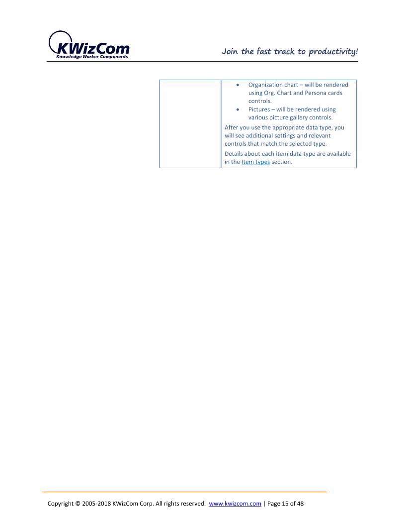
In this section you should select the displayed items data type. This affects what controls will be available to display the data and what additional properties are required.
Items data type Select the type of data:
• Generic items – will be rendered using table/list controls (regular grid display)
• Calendar – will be rendered using Calendar controls.
• Organization chart – will be rendered using Org. Chart and Persona cards controls.
• Pictures – will be rendered using various picture gallery controls.
Details about each item data type are available in the Item types section.

Copyright © 2005-2018 KWizCom Corp. All rights reserved. www.kwizcom.com | Page 12 of 48
EXCEL FILE DATA SOURCE SETTINGS
The Excel file datasource enables you to connect to a MS Excel file located in a SharePoint library*. It
includes the following properties:
Property Description
Enter Excel file url Type the url of an excel file stored in your SharePoint.
Excel Object Select the excel sheet.
Enter Sheet Range Type the cell range that define the data you wish to display
Configure column info
For each of the datasource columns, you can configure additional properties that affect the way it will be displayed by the web part.
These properties include:
- Displayed title if you want it to be different than the original column name
- Include in table view check this property to make this column visible in the Table control
- Field data type Select the data type to have the column data rendered in the proper way. Example: link, image.
“Select data type” section
In this section you should select the displayed items data type. This affects what controls will be available to display the data and what additional properties are required.
Items data type Select the type of data:
• Generic items – will be rendered using table/list controls (regular grid display)
• Calendar – will be rendered using Calendar controls.
• Organization chart – will be rendered using Org. Chart and Persona cards controls.
• Pictures – will be rendered using various picture gallery controls.

Copyright © 2005-2018 KWizCom Corp. All rights reserved. www.kwizcom.com | Page 13 of 48
* IMPORTANT:
Connecting to an Excel file is done by using the built-in Excel services.
If Excel services are not available or return no results (may happen with large files), the MS Graph API is used
instead. In that case the “site assets” library is not supported by Microsoft Graph, so make sure to store your excel
file in another library.
After you use the appropriate data type, you will see additional settings and relevant controls that match the selected type.
Details about each item data type are available in the Item types section.

Copyright © 2005-2018 KWizCom Corp. All rights reserved. www.kwizcom.com | Page 14 of 48
SHAREPOINT LIST AGGREGATOR DATA SOURCE SETTINGS
The SharePoint List Aggregator datasource enables you to aggregate items/documents from multiple
lists/libraries and from multiple sites and site collections. It includes the following properties:
Property Description
“Select list view used as query definition” section
This section includes properties that define a list view which is used as a query to aggregate list/library items from multiple datasources.
SharePoint site url Type the url of the SharePoint site where the list view that you want to use as the query definition is located
SharePoint list Select the list that includes the view that will be used as the query definition for the aggregation.
List view Select the view that will be used as the query definition for the aggregation.
Maximum number of items
Limit the number of items to get from the data source. If you do not specify a number, the selected view item limit will be used.
Maximum number of items per list
Limit the number of items per list in data source.
New Item Url Provide the url for new item. By default populated with new item url from chosen list
“Manage data sources” section
This section enables adding/updating multiple aggregation data sources on which the selected query (list view) will be executed.
Add data source Open the “Configure data source” popup, See details in the next page.
“Select data type” section
In this section you should select the displayed items data type. This affects what controls will be available to display the data and what additional properties are required.
Items data type Select the type of data:
• Generic items – will be rendered using table/list controls (regular grid display)
• Calendar – will be rendered using Calendar controls.
Copyright © 2005-2018 KWizCom Corp. All rights reserved. www.kwizcom.com | Page 15 of 48
• Organization chart – will be rendered using Org. Chart and Persona cards controls.
• Pictures – will be rendered using various picture gallery controls.
After you use the appropriate data type, you will see additional settings and relevant controls that match the selected type.
Details about each item data type are available in the Item types section.
Copyright © 2005-2018 KWizCom Corp. All rights reserved. www.kwizcom.com | Page 16 of 48
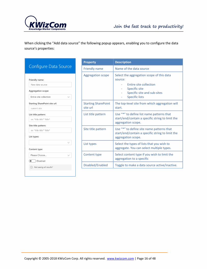
When clicking the “Add data source” the following popup appears, enabling you to configure the data
source’s properties:
Property Description
Friendly name Name of the data source
Aggregation scope Select the aggregation scope of this data source:
- Entire site collection - Specific site - Specific site and sub-sites - Specific lists
Starting SharePoint site url
The top-level site from which aggregation will start.
List title pattern Use “*” to define list name patterns that start/end/contain a specific string to limit the aggregation scope.
Site title pattern Use “*” to define site name patterns that start/end/contain a specific string to limit the aggregation scope.
List types Select the types of lists that you wish to aggregate. You can select multiple types.
Content type Select content type if you wish to limit the aggregation to a specific
Disabled/Enabled Toggle to make a data source active/inactive.

Copyright © 2005-2018 KWizCom Corp. All rights reserved. www.kwizcom.com | Page 17 of 48
SHAREPOINT SEARCH DATA SOURCE SETTINGS
The SharePoint Search data source enables you to use the SharePoint Search service to aggregate data
across your entire tenant.
The advantage of the SharePoint Search data source comparing to the List Aggregator data source is that
it is faster and query multiple site collections and web application in a single request.
The downside of the SharePoint Search comparing to List Aggregator data source is that it requires your
SP admin to properly configure the Search service and configure all relevant list columns as managed
properties, so there’s some overhead before you can use this data source.
It includes the following properties:
Property Description
“Search settings” section
Query Text SharePoint search query. Please make sure columns are mapped correctly before you use them.
Learn more about query syntax
List types Select the types of lists that you wish to aggregate. You can select multiple types.
Content type Select content type if you wish to limit the aggregation to a specific
Search documents and list items only
Check to limit the aggregation to list items and documents only, other types will not be searched (such as people for example).
Trim similar results Check to use SharePoint Search’s ability to trim similar results.
Select columns Type internal name of columns that you want to be retrieved, separated by comma.
Search results source
Select one of the available SharePoint Search result sources.
Maximum number of items
Limit the number of items to get from the search. If you do not specify a number, the search default item limit will be used.

Copyright © 2005-2018 KWizCom Corp. All rights reserved. www.kwizcom.com | Page 18 of 48
When clicking the “Add data source” the following popup appears, enabling you to configure the data
source’s properties:
Property Description
“Limit search scopes (optional)” section
Add search scope Click the button to add a new search scope.
While the SharePoint Search data source runs your query against a select SharePoint Search results source, you can further limit the scope of search by creating search scope/s. Each search scope is limited to a site collection and provides additional fitering properties, identical to the ones described for the “List Aggregator” data source in previous section.

Copyright © 2005-2018 KWizCom Corp. All rights reserved. www.kwizcom.com | Page 19 of 48
Property Description
Configure column info
Select the columns that you wish to be displayed. For each of the datasource columns, you can configure additional properties that affect the way it will be displayed by the web part.
These properties include:
• Displayed title if you want it to be different than the original column name
• Include in table view check this property to make this column visible in the Table control
• Field data type Select the data type to have the column data rendered in the proper way. Example: link, image.
• Order of display in various controls
“Select data type” section
In this section you should select the displayed items data type. This affects what controls will be available to display the data and what additional properties are required.
Items data type Select the type of data:
• Generic items – will be rendered using table/list controls (regular grid display)
• Calendar – will be rendered using Calendar controls.
• Organization chart – will be rendered using Org. Chart and Persona cards controls.
• Pictures – will be rendered using various picture gallery controls.
After you use the appropriate data type, you will see additional settings and relevant controls that match the selected type.
Details about each item data type are available in the Item types section.

Copyright © 2005-2018 KWizCom Corp. All rights reserved. www.kwizcom.com | Page 20 of 48
GRAPH API DATA SOURCE SETTINGS
The Graph API datasource enables you to connect via the MS Graph API to many Microsoft Online
resources:
So for example you can get your recent files from OneDrive, display your Outlook meetings and tasks, or
display organization hierarchy based on Azure AD.

Copyright © 2005-2018 KWizCom Corp. All rights reserved. www.kwizcom.com | Page 21 of 48
The MS Graph API datasource includes the following properties:
Property Description
Load graph example Click button to load one of the available presets:
When selecting any of these examples, it will load the other properties with the selected example settings and display the appropriate controls.
Example: “AD org chart users” will set the web part to get all users from Azure AD and will display by default an Org. Chart control to display them.
Graph Path This is the path sent to Graph API.
For more information about Graph API path syntax and options, checkout the Graph API explorer:
https://developer.microsoft.com/en-us/graph/graph-explorer
Select columns Type the column names from the retrieved source.
For more information about Graph API $select statement syntax and options, checkout the Graph API documentation:
https://developer.microsoft.com/en-us/graph/docs/concepts/query_parameters#select-parameter

Copyright © 2005-2018 KWizCom Corp. All rights reserved. www.kwizcom.com | Page 22 of 48
Property Description
Filter statement A call to MS Graph API can include a filter statement, enabling you to define a query to limit the number of returned items.
For more information about Graph API $filter statement syntax and options, checkout the Graph API documentation:
https://developer.microsoft.com/en-us/graph/docs/concepts/query_parameters#filter-parameter
Advanced filter function
Since the graph API has very limited $filter support, you can provide an optional advanced filter function that returns true for items to keep.
For example: 'return item.userType === null'.
Note: this filter is slower than using the $filter parameter.
Maximum number of items
Limit the number of items to get from the data source.
Microsoft Graph Expanded Properties
You can add additional properties for each item by providing a custom property request.
For example, you can add a user's photo as an expanded property.
For more information about Graph API $expand statement syntax and options, checkout the Graph API documentation:
https://developer.microsoft.com/en-us/graph/docs/concepts/query_parameters#expand-parameter

Copyright © 2005-2018 KWizCom Corp. All rights reserved. www.kwizcom.com | Page 23 of 48
Property Description
Configure column info
Select the columns that you wish to be displayed. For each of the datasource columns, you can configure additional properties that affect the way it will be displayed by the web part.
These properties include:
• Displayed title if you want it to be different than the original column name
• Include in table view check this property to make this column visible in the Table control
• Field data type Select the data type to have the column data rendered in the proper way. Example: link, image.
• Order of display in various controls
“Select data type” section
In this section you should select the displayed items data type. This affects what controls will be available to display the data and what additional properties are required.
Items data type Select the type of data:
• Generic items – will be rendered using table/list controls (regular grid display)
• Calendar – will be rendered using Calendar controls.
• Organization chart – will be rendered using Org. Chart and Persona cards controls.
• Pictures – will be rendered using various picture gallery controls.
After you use the appropriate data type, you will see additional settings and relevant controls that match the selected type.
Details about each item data type are available in the Item types section.

Copyright © 2005-2018 KWizCom Corp. All rights reserved. www.kwizcom.com | Page 24 of 48
ITEM TYPES SETTINGS
When you configure a datasource, you also select what is the data type of the retrieved items:
The available data type are:
- Generic items
A generic item that requires no field mappings. Can be used in generic display controls such as
Table or List.
- Calendar
This data type includes data information that is best displayed in calendar control.
- Organization chart
A person in a hierarchy with a manager relation. Can be used in organizational chart and
Persona controls.
- Pictures
Either a picture in a library or an item that has a link to a picture. Can be used in picture viewer
controls such as a gallery.
When selecting a data type, it may display additional properties which are relevant only to the selected
data type. The following data types require configuring additional properties:

Copyright © 2005-2018 KWizCom Corp. All rights reserved. www.kwizcom.com | Page 25 of 48
Organization chart data type additional properties
The Organization chart data type requires you to map data source columns to columns which are required by an
organization chart data type:
Property Description
Name Name that will be displayed for each employee in the org. chart
Position Employee’s position/role
Manager Column that identifies the employee’s manager
Picture Column holding the employee’s picture
Phone columns Select one or more columns that hold phone numbers
Email columns Select one or more columns that hold email addresses

Copyright © 2005-2018 KWizCom Corp. All rights reserved. www.kwizcom.com | Page 26 of 48
Pictures data type additional properties
The Organization chart data type requires you to map data source columns to columns which are required by an
organization chart data type:
Property Description
Url column Column in the source list that holds the picture url.

Copyright © 2005-2018 KWizCom Corp. All rights reserved. www.kwizcom.com | Page 27 of 48
CUSTOMIZING THE DATA VIEW PLUS UI
WEB PART UI STRUCTURE
When you switch the page to edit mode, you will be able to see how the web part is structured:
The List View Plus UI is made of the following parts:
• Web part header
This part is always displayed at the top of the web part and displays several levels of headers:
title, sub-title, small title and description. These properties are displayed at the top part, and are
optional (you can leave them empty or part of them).
• main content
This is the container object of the entire web part, including various controls.
• Controls
These are the parts that compose the UI of the List View Plus UI.
Each control has its own properties and can optionally contain another control that will be
displayed after it.
Copyright © 2005-2018 KWizCom Corp. All rights reserved. www.kwizcom.com | Page 28 of 48
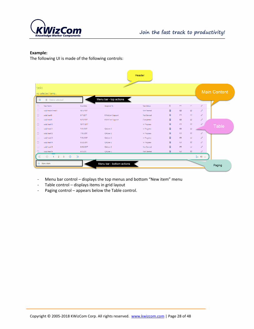
Example: The following UI is made of the following controls:
- Menu bar control – displays the top menus and bottom “New item” menu - Table control – displays items in grid layout - Paging control – appears below the Table control.

Copyright © 2005-2018 KWizCom Corp. All rights reserved. www.kwizcom.com | Page 29 of 48
AVAILABLE CONTROLS
The web part includes the following controls:
Control Description
Web part header Displays the top part of the web part which includes several headers/sub headers.
Example:
IMPORTANT: this is a static control, unlike other controls it is always displayed at the top part of the web part, it cannot be removed.
Configuring this control is done by editing the 1st control that appears in the web part UI.
Menu bar Displays top/bottom menu bar with configurable menus
Example:
Groups A collapsible group control that groups your items by a specific column. You can also add custom buttons to the group.
Example: in this template we used Group control to group aggregated tasks by their status column.
Tabs A Tabs control that groups your items based on a column, and displays them in separate tabs.
Example: in this template we used Tabs control to divide the aggregated tasks to tabs by “Assigned To” column.

Copyright © 2005-2018 KWizCom Corp. All rights reserved. www.kwizcom.com | Page 30 of 48
Paging A paging control that splits your items into several pages, useful when you have large list of items. You can select how many items per page or change the display of the paging control in the control configuration settings.
Example:
Table A grid control that shows all columns from your data source. You can add up to 4 item actions, and control the item click behavior.
Example:
List An inbox-style responsive list control that always looks great. You can display up to 4 labels, add up to 4 custom item actions, and control the item-click behavior.

Copyright © 2005-2018 KWizCom Corp. All rights reserved. www.kwizcom.com | Page 31 of 48
Example:
Filter Dynamic filter control, enabling you to filter the connected list by various columns. In addition, end-user can add additional columns to the filter control by drag&drop the required column to the filter control area.
Organization chart 3 org. charts displaying hierarchy
Each of the org. chart controls has its own unique configurable properties.
Persona cards When displaying org. chart data, displays employees in persona cards

Copyright © 2005-2018 KWizCom Corp. All rights reserved. www.kwizcom.com | Page 32 of 48
Calendar The calendar control displays aggregated events from various data sources in a great-looking Calendar display (Month/week/day/agenda etc.)
Conditional formatting This control enables you to configure conditional formatting rules based on column values. These rules apply to various controls that display content: table, list, org. chart and calendar.
Camera slideshow A pictures control displaying them as running slideshow
Photopile Displays pictures as pile of pictures that you can move around

Copyright © 2005-2018 KWizCom Corp. All rights reserved. www.kwizcom.com | Page 33 of 48
Gallery Displays pictures in a gallery display
Custom control “back door” for developers – enables you to create a custom control using html, css and knockout.
The following picture shows and example of how you can use these controls:

Copyright © 2005-2018 KWizCom Corp. All rights reserved. www.kwizcom.com | Page 34 of 48
In this example you can see that the main content of the web part includes the Menu bar control, Paging
control and Table control.
You can fully customize this UI, by using these and other controls and configure each of these controls
properties, to make it match your exact requirements. See details in the next section.
Copyright © 2005-2018 KWizCom Corp. All rights reserved. www.kwizcom.com | Page 35 of 48
CONFIGURING CONTROLS
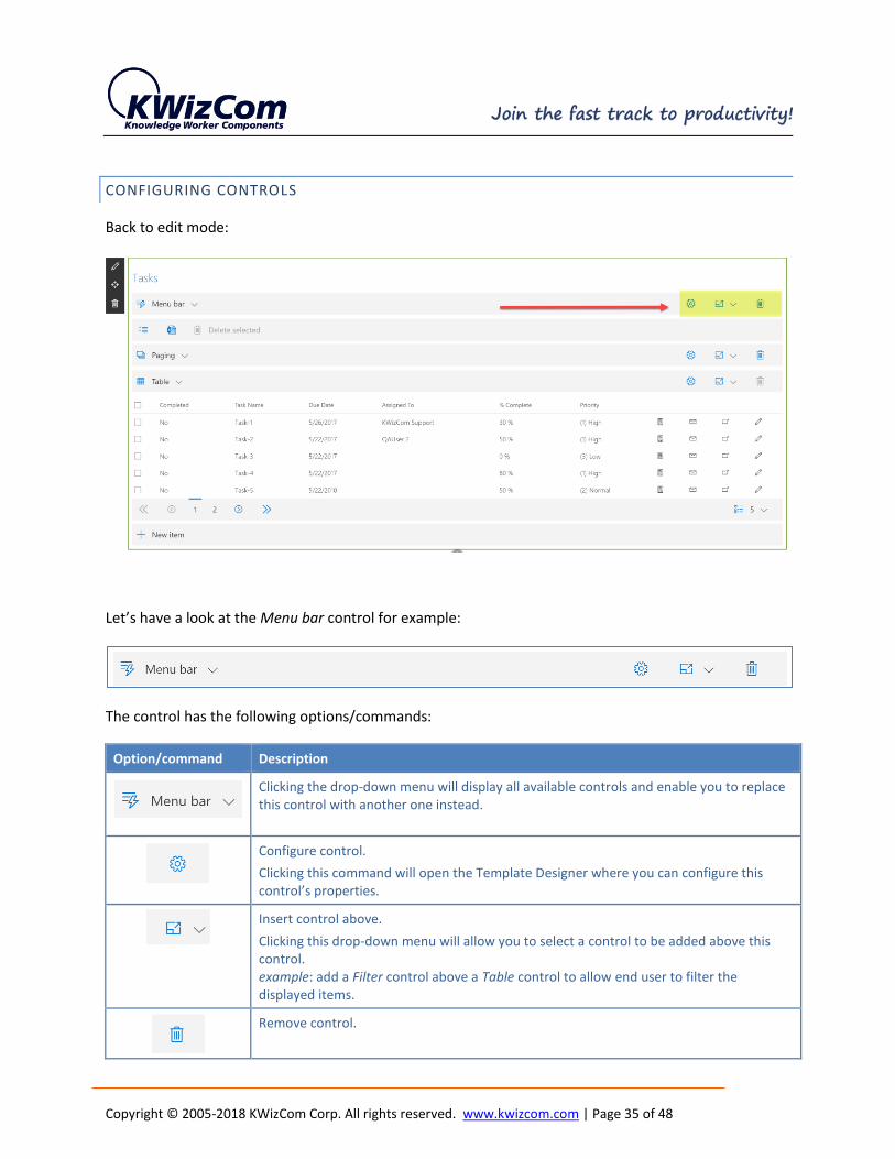
Back to edit mode:
Let’s have a look at the Menu bar control for example:
The control has the following options/commands:
Option/command Description
Clicking the drop-down menu will display all available controls and enable you to replace this control with another one instead.
Configure control.
Clicking this command will open the Template Designer where you can configure this control’s properties.
Insert control above.
Clicking this drop-down menu will allow you to select a control to be added above this control. example: add a Filter control above a Table control to allow end user to filter the displayed items.
Remove control.

Copyright © 2005-2018 KWizCom Corp. All rights reserved. www.kwizcom.com | Page 36 of 48
As mentioned above, to configure a control you click the control’s command*.
This will open the control designer on the right side, enabling you to update the control’s properties.
Changes you make are reflected immediately in the displayed web part.
* COMMENT:
To configure the web part’s Header, you need to configure the top-most control, you will see the header
properties appearing just before the edited control’s properties.
Example:
The Paging control has the following settings, which are self-explanatory:

Copyright © 2005-2018 KWizCom Corp. All rights reserved. www.kwizcom.com | Page 37 of 48
ADVANCED CUSTOMIZATIONS
USING THE FORMULA EDITOR
With the control designer, you can also include formulas and code snippets using knockout. This is done by using
the formula editor.
This enables adding advanced functionality to the web part.
Adding custom formulas and creating custom actions requires knowledge of knockout.
Click here to learn more about knockout.
When a property allows you to include a formula or script, you will see “edit formula...” link below the field, such
as in the following screenshot:
Formulas enable you to display dynamic content in various places in your web part instead of hardcoded captions.
Clicking this link will open the formula editor popup:

Copyright © 2005-2018 KWizCom Corp. All rights reserved. www.kwizcom.com | Page 38 of 48
Using the formula editor, you can type static text or insert a knockout formula.
Since not all of us are developers, you can add formulas by using snippets available in the popup menu bar. When
selecting a snippet, the matching knockout code will appear in the formula.
The editor includes 3 menus:
menu Description
Component snippets Includes a growing collection of scenario-based snippets such as:
- Datasource title display the data source’s title. This can be the title of the displayed list for example.
- Selected items count this will dynamically display the number of items checked (selected) by the user in the web part.
These snippets can be used in any of the web part header properties and in global menus (see details about global menus in the next section)
Item columns Enables adding the value of item’s selected columns/s from the data source. example: get the “Due Date” field’s value of the selected item.
These snippets can be used only in the context of an item, which is available in List and control displayed properties and in List and Table controls’ item actions. (see details about item actions in the next section)
Item snippets Includes a growing collection of examples of item’s data you can retrieve such as:
- Edit item url returns the url of the “edit item” link
- Display item url

Copyright © 2005-2018 KWizCom Corp. All rights reserved. www.kwizcom.com | Page 39 of 48
Returns the url of the “view item” link
These snippets can be used only in the context of an item, which is available in List and control displayed properties and in List and Table controls’ item actions. (see details about item actions in the next section)
Example 1:
In the following web part UI, you can see at the top part a caption showing the number of selected items:
This is implemented using the “Description” property which was updated with the formula editor, by simply
selecting the “Selected items count” component snippet:

Copyright © 2005-2018 KWizCom Corp. All rights reserved. www.kwizcom.com | Page 40 of 48
The result script is the following, which you can of course customize according to your needs:
{text:SelectedCount() === 0 ? 'no selected items...' : SelectedCount() === 1 ? 'one item selected' :
SelectedCount() + ' items selected'}
Example 2:
In the following Data View Plus web part “List” control, you can see the highlighted small text on the right part of
each item, showing the item’s last modified column value:
Opening the formula editor for the List control’s and clicking the “Small” property’s “edit formula…” link:
you will see the following formula:

Copyright © 2005-2018 KWizCom Corp. All rights reserved. www.kwizcom.com | Page 41 of 48
This formula displays the item’s “Modified” column value.

Copyright © 2005-2018 KWizCom Corp. All rights reserved. www.kwizcom.com | Page 42 of 48
GLOBAL ACTIONS AND ITEM ACTIONS
Data View Plus web part enables you also to configure global and item-level actions that will be available as part of
your tailored UX.
Global actions
Global actions are available in the Menu control and appear at the top and bottom parts of the web part UI:
In the screenshot above we can see 4 global actions (3 at the top menu and 1 at the bottom menu) that appear by
default when adding the Menu control:
Global action Description
Toggle selected items (select all/deselect all)
Export current view to CSV file
Delete selected items
Open’s the New Item form for the connected list in a new window.
These actions are called “global” actions because they work in q global context and not in a selected item’s
context. This means that you can use such actions to perform various actins on multiple items such as: expoer
items, delete selected items etc.

Copyright © 2005-2018 KWizCom Corp. All rights reserved. www.kwizcom.com | Page 43 of 48
Updating/adding global actions is done by editing the Menu control, you will see the following “Top actions” and
“Bottom actions” sections:
As you can see, each action has an icon and name, can be deleted ( ) and edited ( ).
To add a new global action click the link, and the following Script Editor popup will open:
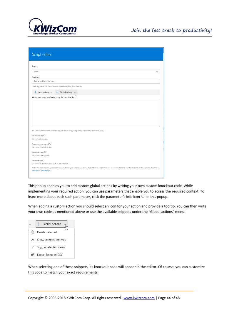
Copyright © 2005-2018 KWizCom Corp. All rights reserved. www.kwizcom.com | Page 44 of 48
This popup enables you to add custom global actions by writing your own custom knockout code. While
implementing your required action, you can use parameters that enable you to access the required context. To
learn more about each such parameter, click the parameter’s info icon in this popup.
When adding a custom action you should select an icon for your action and provide a tooltip. You can then write
your own code as mentioned above or use the available snippets under the “Global actions” menu:
When selecting one of these snippets, its knockout code will appear in the editor. Of course, you can customize
this code to match your exact requirements.

Copyright © 2005-2018 KWizCom Corp. All rights reserved. www.kwizcom.com | Page 45 of 48
Item actions
Item actions are available in the Table, List and Persona Card controls:
Table control:
List control:
Persona card control:

Copyright © 2005-2018 KWizCom Corp. All rights reserved. www.kwizcom.com | Page 46 of 48
These are actions that operate in the context of an item, enabling the user to trigger various item actions such as:
view item, edit item, email item properties etc.
In List and Table control you can have up to 4 item actions, in Persona card control there is no limit to the number
of item actions (it will just will not look great if you have more than 5-6 of item actions in a card)
Like global actions, you can create your own custom item actions using the script editor and knockout code. When
adding/editing an item action you will see several ready-to-use snippets such as: Call phone, Edit item, Email item,
Show city in map and others.
To add/edit an item action edit the relevant control (Table, List, Persona card), and then Click Add/Edit link below
Item actions section (below example snapshot for List control):
To replace any of the default actions click the icon to edit it, the script editor will open. You can select any of
the existing item action snippets or type your own custom knockout code.
To remove an item-action edit the action, delete the action’s icon by clicking the “X” icon as displayed below:

Copyright © 2005-2018 KWizCom Corp. All rights reserved. www.kwizcom.com | Page 47 of 48
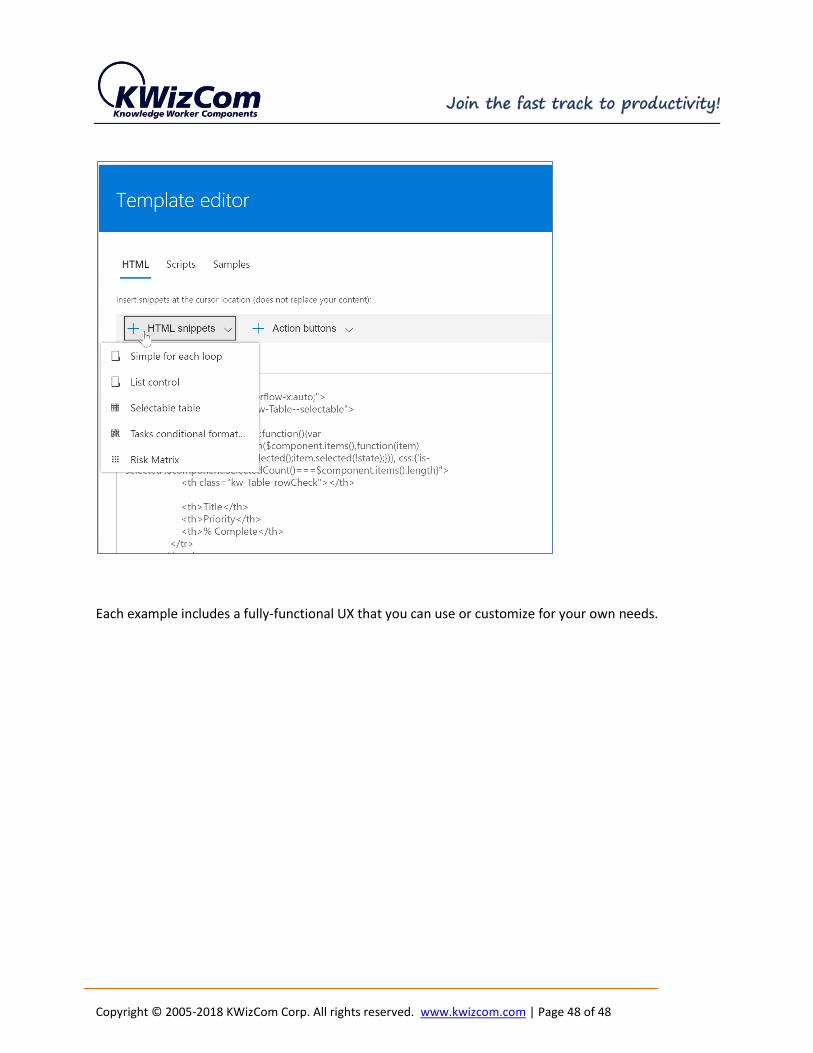
DATA VIEW PLUS CUSTOM CONTROL
In addition to all available display controls, Data View Plus web part includes a special control called
“custom control”.
This control gives you Absolute Control over the displayed UI by enabling you to provide your own html,
css and javascript code to implement whatever UI you want, using the available data sources.
So you get a connectivity to lists, data aggregation, Graph API and Excel files to retrieve the exact data
you want, and now you can create a 100% tailored UX with that data.
Of course, like in global and item actions, we prepared some ready-to-use examples for you:
When you configure the custom control and open the template editor, you will see some html snippets:
Copyright © 2005-2018 KWizCom Corp. All rights reserved. www.kwizcom.com | Page 48 of 48
Each example includes a fully-functional UX that you can use or customize for your own needs.