data visualisation: the path to understandability · pdf filedata visualisation: the path to...
TRANSCRIPT

DATA VISUALISATION: THE PATH TO UNDERSTANDABILITYOlof Schybergson CEO, Fjord [email protected]
Paul Kahn Managing Director, Kahn+Associates [email protected]

www.fjordnet.com
2
CONTENTS
A Fjord Report examining current thinking, future developments, and how organisations can harness the power of effective data visualisation
Above: An application for building deployment plans for software projects (top) and aligning projects and events to a single calendar (bottom) by Kahn+Associates. Managers in an international corporation are able to see the projects that will affect their division during specific time periods.
WHY DATA VISUALISATION MATTERSHow service design is being influenced by new paradigms in data and information display
Understanding data visualisation – the context
Information as a commodity
Data and information overload
Big data sets – but small screens
The rules of successful data visualisation apply to consumer and corporate products alike
WHAT ARE THE KEYS TO SUCCESSFUL DATA VISUALISATION?The tools and techniques that make a difference
Information dashboards
Actionable information
The social factor
Real-time information
Dynamic information
THE WAY AHEADWhat the future holds – and how to plan for it
www.fjordnet.com
3
methods of distinguishing the data they deliver to fill our insatiable need for ‘understandability’.
However, at present there are only a limited number of genuinely useful and effective tools that help users to understand and deal with the huge quantities of information that wash over them every day. Why?
The solution is not a matter of graphic style or taste. Pretty, handsomely designed information is still useless if it’s not understood. We need data visualisation to help us see patterns and trends, differences and distances – this is how our minds transform data into information. Interface and service designers are now starting to understand the crucial importance of this aspect of user experience.
Successful businesses will build understandability into their growing information flow by:• choosing the story they need to tell, • identifying the dimensions they need to com-
municate,• making use of the appropriate data visualisation
techniques for each dimension.
Data and information are everywhere. More than ever, we are constantly connected to a world in which anything from news stories, TV and video content, financial transactions, search results, and email, Skype, Twitter and Facebook messages crowd the screens before our eyes on a growing range of devices.
Yet the more data we have glowing on our screens the more puzzling it becomes. The enormity of this information flow contributes to a numbing barrage of complexity.
In the corporate world, things are no different: for a recent IBM survey of 1500 global leaders – people at the top of the information chain – complexity was cited as the most significant issue facing managers and executives today.
To benefit from this huge growth of data, organisations today need to find ways to make their data content more understandable, and therefore more valuable than the rest. As the new world of ubiquitous connectivity takes shape, businesses that want to thrive will have to find new patterns and
INTRODUCTION
Fjord believes that struggle towards understandability should be actively shaped by service design practice, user insight, and interface design. The way in which these disciplines interconnect is a crucial part of the puzzle.
This Fjord Report explores our current thinking in this sector. We look at opportunities and threats for innovative organisations ready to embrace data visualisation techniques, and offer our thoughts on the impact of future developments across the service design community.
Pretty, handsomely designed information is still useless if it’s not understood
www.fjordnet.com
4
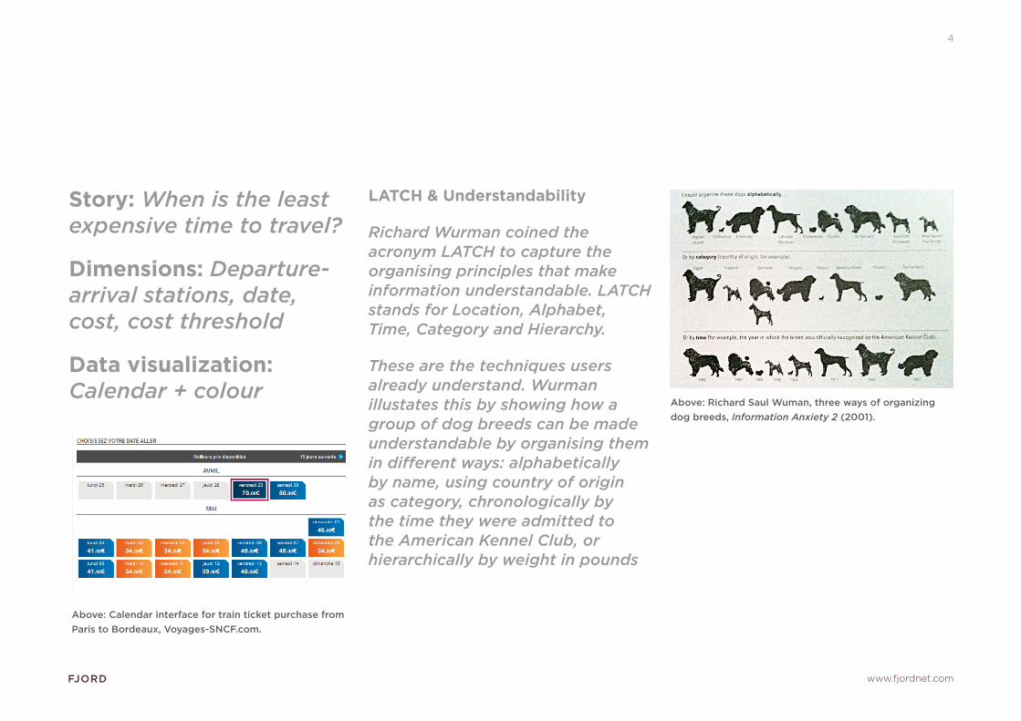
LATCH & Understandability
Richard Wurman coined the acronym LATCH to capture the organising principles that make information understandable. LATCH stands for Location, Alphabet, Time, Category and Hierarchy.
These are the techniques users already understand. Wurman illustates this by showing how a group of dog breeds can be made understandable by organising them in different ways: alphabetically by name, using country of origin as category, chronologically by the time they were admitted to the American Kennel Club, or hierarchically by weight in pounds
Story: When is the least expensive time to travel?
Dimensions: Departure-arrival stations, date, cost, cost threshold
Data visualization: Calendar + colour
Above: Calendar interface for train ticket purchase from Paris to Bordeaux, Voyages-SNCF.com.
Above: Richard Saul Wuman, three ways of organizing dog breeds, Information Anxiety 2 (2001).

www.fjordnet.com
5
UNDERSTANDING AND DATA VISUALISATION – THE CONTEXT
Simple examples of data visualisations include showing time over distance, or produce type by cost, or temperature and rainfall over time. But showing restaurants by a mixture of attributes simultaneously, such as type of food, cost, location and impact on your social life, is more challenging.
The two-fold goal of data visualisation is to allow the viewer to:• understand information rapidly, • understand connections and relationships best
conveyed through visualmeans.
Attaining this double goal of rapid visual understandability is not limited to turning text and numbers into charts.
In the broad sense we present here, data visualisation is the path to understandability – the right story told by using the right visualisation techniques for the right dimensions. The choice
of what is ‘right’ should be built upon user insight combined with flexible user interface concepts and a mastery of visual communication.
Increasingly businesses are working with sets of information that include user interactions such as contributions, visits, or transactions. In these cases we can now quantify and cluster interactions to make visible items that attract common focus. Our systems can create list of the items most users like, posts most commented, stories most emailed, and so on. We can apply user insight studies to map out the relevant attributes of the book, the hotel, the restaurant, the movie for our target audiences. How should we combine these presentations with the new social dimensions and real-time location that mobility affords?
WHY DATA VISUALISATION MATTERS
How service design is being influenced by new paradigms in data and information display

www.fjordnet.com
6
At the same time social networks and real-time location data are adding to complexity, the general public’s growing familiarity with interactive systems has opened up new opportunities for data visualisation in storytelling. The static information graphic in journalism, science and finance, used to explain complex information since the nineteenth century is giving way to interactive graphics that give the reader control of what he wants to explore. Information that was once presented in an entire atlas is now accessible in a single Flash application on a web page or a mobile app. Pioneering efforts by The New York Times in the United States and The Guardian in the UK have invited readers to explore the complex information behind the national budget or immigration policy. Their growing success demonstrates the public’s ability and desire to gain a greater understanding by interacting with information.
This expanding focus on multi-dimensional information and data visualisation will be a key attribute for those companies and organisations that are most agile in the emerging world of convergent devices, interfaces, and services.
Immigration Explorer by Matthew Bloch and Robert Gebeloff for the New York Times gives the reader access to 110 years of immigration statistics for the United States at the county level. Through interaction, we can see (clockwise, starting on the top left) the immigrant
concentrations in major cities, the predominant origin in each county, the variety of origins around San Francisco Bay, and the distribution of immigrants born in El Salvador.

www.fjordnet.com
7
The great strength of digital information – its interoperability across applications, its ‘searchability’ and accessibility across media – leads to the commoditisation of data.
Today, data that a business once controlled can easily be syndicated, aggregated, replicated and recontextualised. A successful business will need to add unique value to their data to maintain control of their market position.
In print news and magazine layout, a headline serves as the index into the story: the attractor, or tip of the iceberg. Traditional news media uses this deep form of data visualisation in the context of two constraints: single choice and fixed page frame. The audience can flip the page or change the channel, but the page/screen size remain the same. Size, position and proportion are critical elements of this vocabulary.
But the headline has become a commodity. Today we see the once-brand-loyal customers of a newspaper, magazine or TV channel increasingly turning to the wave of information aggregation tools that
promise to personalise, filter and socialise the user’s experience by grabbing headlines from everywhere.
Examples of this trend on the web, tablet and mobile phone include techmeme.com, google reader, Flipboard, Pulse, Flud, and Taptu, all of which capitalize on the narrowing distinction between media-driven and user-driven content and the openness of the Internet media field – where the cost of entry is low.
As these aggregators gain popularity, media brands may feel that they have to make their content available as feeds to retain their audience. Reduced to a commodity, the content owner loses control over layout, fonts, use of images, and placement.
There is a real opportunity for brands to use great data visualisation in the fight against this challenge to their value proposition. Data visualisation techniques are the critical ingredient that empowers the audience to view content in many different ways, with just the right amount of depth and context. This kind of information experience, alive and dynamic, is something impossible to hack into pieces
INFORMATION AS A COMMODITY
and simply aggregate. The recent Sky News tablet application illustrates this approach, giving the user a wealth of data visualisation tools. The view can see stories in a timeline, by topic, live or pre-recorded, in windows or full-screen, or contextualised with a variety of unique graphic and editorial content.
Investing in effective data visualisation is a commoditisation remedy for content creators and owners.

www.fjordnet.com
8
FIGHTING INFORMATION AS A COMMODITY: A CHECKLIST OF APPROACHES
Establish harmonious patterns in which to present the data
Balance image and text for best visibility and attraction
Apply best use of digital typography and contrast
Offer choices of further information to reinforce user control
Left: The Sky News app for the iPad gives the user control of how to view and enjoy the readering experience while maintaining the unique style and quality of the brand.
Above: the Taptu news aggregation application.

www.fjordnet.com
9
How do users take in and genuinely understand a large amount of information, at a glance?
User insight studies are the best way to address information overload. When we understand what the user is doing, we can find the balance between addition and distraction.
An example is the icon badging system (a white number in a red circle) found within the Apple iPhone user interface. This is a strong signal that calls the user’s attention to an application – however if the user is not instantly aware of what the application badge is referring to the helpful addition becomes an annoying distraction. We have seen this type of badge used to indicate a confusing variety of causes: from unread articles to software updates to appointment reminders.
This kind of attractor-action integration can be a valuable differentiator in financial applications. Users may have an application that gives them ‘at a glance’ information about the purchases made using a credit card. If the display calls the user’s attention
to the card being used to purchase something in a foreign country, the application could supply a set of actions to take, with the user’s location and identity embedded in the action.
User insight studies can help a business identify what a user needs to see ‘at a glance’. For an organisation to master data overload, it must also apply design thinking. Data visualisations must actively empower users throughout their course of action.
DATA AND INFORMATION OVERLOAD

www.fjordnet.com
10
Pixel resolution continues to increase on mobile screens, but the physical size of mobile phones will remain constrained. How will this affect data visualisation?
The current state of the art in data visualisation is focused on the big display space: the map we can draw based on data, or the dots we can position to create patterns. But the smaller screen real estate of mobile devices constrains one of the traditional strengths of data visualisation: synthesising large amounts of information into a single image we can scan with our eyes.
Although we can present less in a single image on the mobile screen, we can balance this weakness by introducing powerful factors such as location and interaction. The mobile screen gives us an even greater opportunity to create a tighter relationship between the image and the action. The mobile device belongs to me as a single user.
It can know exactly where I am, as well as where I’ve been and where I’m going. These simple facts create a powerful ongoing dialogue between the user and the data.
‘Understandable on the go’ is only a part of the target. For users to reap maximum benefit from mobile services that have been architected around solid data visualisation principles, we will need to reframe this to emphasise the more sophisticated notion of ‘understandable where you are’.
Data visualisation can then do a better job of making large data sets understandable and actionable on small screens and on the go – for both professionals and consumers.
THE EFFECTIVENESS OF THE OVI MAPS USER INTERFACE
Adjust the amount and type of data displayed to the view
Make it easy to move in and out, right and left
Adjusting the data displayed to the context
BIG DATA SETS – BUT SMALL SCREENS

www.fjordnet.com
11
Good data visualisation tools can benefit end consumers across a range of areas, and also corporate users in more targeted solutions. Corporate users also take their expectations from the consumer world with them to the workplace.
Just as social networks have changed people’s expectations of what they expect from professional communities of practice, Personal news feeds have changed the standard of immediacy and self-expression within intranet environments. We are also seeing that exposure to slick tablet and mobile consumer devices increases frustration for employees when they return to face the less user-centred applications in their daily corporate life.
The corporate application market is a continuous fluctuation between individual solutions that solve specific needs and enterprise-wide consolidation to control costs. To maintain employee productivity and reduce frustration, successful companies must value usability as well as security, and innovation as well as standard enterprise solutions.
BLURRING THE BOUNDARY BETWEEN HOME AND OFFICE
“95% of today’s workers are using technology they purchase themselves for work.”
“Younger iWorkers are not demanding change – they are driving it through consensus usage motivated by mobility and interconnectedness. While iWorkers are intimately familiar with technology, they have little understanding of the security risks, management issues, and policy and governance implications that arise from mass introduction of consumer devices and applications into the workplace.” Source: IDC Network Management Services: A Cost-Effective Approach to Complexity
Due to this pressure from innovative consumer applications, the potential for change in the digital touchpoints for internal corporate communication is enormous. Mobile- and tablet-based enterprise applications are growing rapidly. Innovation in data visualisation tools is an important leverage point here.
THE RULES OF SUCCESSFUL DATA VISUALISATION APPLY TO CONSUMER AND CORPORATE PRODUCTS ALIKE

www.fjordnet.com
12
WHAT ARE THE KEYS TO SUCCESSFUL DATA VISUALISATION?
The tools and techniques that make a difference DASHBOARDS
Dashboards take a set of data and represent it in a ‘meta-layer’, transforming the individual bits in patterns, trends and shifts.
The key to creating successful dashboards is identifying meaningful thresholds. These thresholds become the central relationship between the data and the user.
The user needs to be aware of the current state and trend. This display should lead to both detail (a view of everything happening right now) and actions (what the user can do about it).
Above: To develop this manager dashboard, Kahn+Associates reduced large numeric tables describing each job to a minimum number of meaningful thresholds represented as colour and fill. The indicators appear both as numbers and directional trends. Each element is linked to further detail.

www.fjordnet.com
13
ACTIONABLE INFORMATION
Since digital is interactive by nature, we expect data visualisation solutions to be actionable.User insight studies, strong interaction design skills and rapid prototyping are needed to create a tight connection between data visualisation and user action. The key to making this connection useful is the embodiment of context in the action vector. What users touch is what they want to do.
To take an example, the central heating thermostat in a home (analogue or digital) is a good model for actionable information. The temperature value is both the information (the room is 18 degrees) and the action vector (make the room 20 degrees). So for the user, changing the value on the thermostat is the action of changing the temperature in the room. The temperature change action and location are both embodied in the control.
Or a dashboard could inform the user he or she has five purchase requests waiting for approval. The embodiment of context will be a vector to display detail necessary to reach a decision with a vector to the decision action.
It feels cold..

www.fjordnet.com
14
THE SOCIAL FACTOR
Increasingly, users’ opinions and their consumption habits help shape the world. Representing popularity and the viral transmission of information, and enabling easy sharing, will be key to effective data visualisation.
Additionally, organisations will increasingly need to understand how to use popularity and transaction patterns to visualize information. We see more and more services being designed to integrate with users’ existing social networking preferences. For example, Dopplr now filters information by what people in the user’s Facebook social network ‘like’. The greatest risk we face is understandability becoming compromised. The act of ‘friending’ (adding people to a network) is ambiguous. We do this today in order to establish a communication channel – receive and send messages – not to build these kinds of filters. For example, Dopplr now filters travel recommendations by what people in the user’s Facebook social network ‘like’. Another way of looking at it would be to note that mobile phone users do not expect the telephone numbers they store to affect recommendations
for the television programmes they should watch. Yet social network applications increasingly invite users to ‘share’ this information. The results often defy understandability. In addition, using social connections as an information filter requires a critical mass of data to make the statistical association between items significant. Amazon faced this problem when they first introduced the
‘people who bought this also bought...’ functionality into their e-commerce stream. When companies understand how to use popularity and transaction patterns to visualize information, the social factor becomes a compelling information filter – when harnessed to a critical mass of opinions and consumption habits in the service of understandability.
Above: The LinkedIn map clusters the user’s professional network into clusters and then allows him to display in that graph the connections between individuals.
The map is drawn from the network data itself. The only user action is to ‘share’ this data with the application.

www.fjordnet.com
15
REAL TIME
Digital is inherently a real-time environment. It’s natural that users expect digital solutions to exist fully in the moment and to represent the here and now.
Organisations will need to differentiate and add value to their services by adding real-time information, leveraging their data network and technology.
And real-time data has unique importance in certain contexts. For example, the real-time dimension of data for travel information gives mobile apps a tremendous advantage over other channels for providing services during journeys. But it also introduces new challenges to travel service providers such as airlines, and train and mass transit operators for managing the user experience and customer relationship.
The operator’s service must adjust to the fact that travellers increasingly have access to more real-time information and more opportunities to share that information with others.
Real-time visualisation provides tremendous new opportunities for services not only in travel but also in the financial, telecom and energy markets. Users are already managing their personal finances, telecom usage and energy utilities, often with weeks or months between the action and the accounting.
Companies must recognise how the enormous growth of Wi-Fi and 3G network access give their customers ubiquitous access to real-time information. To be effective in the user’s liquid web-tablet-mobile environment, where the differences between home, workplace and travel are dissolving, delivery must be reliable and consistent across all channels everywhere.
Right: The SpotCycle iPhone app provides geolocated real-time data on the number of bikes and spaces on public bicycle stands in dozens of cities in Europe and North America. Very useful when looking for a bike or a place to drop one off, and a good example of real-time
data usage.

www.fjordnet.com
16
DYNAMIC
The most successful data visualisation solutions will make services feel dynamic and alive, with motion and transitions as a core part of the user experience.
Dynamic data visualisation has two parts: reactivity and motion.
Reactivitygives the user controls to shape, filter, zoom, expand and annotate the visualisation. Today’s users are accustomed to manipulating massive amounts of data – searching billions of web pages, millions of documents, thousands of flight offers – in a few seconds. They expect the system to find everything and shape the response to their personal combination of attributes. Show the movie options tonight, starting from this time (local cinema schedule). Add the distance from the user’s location (user location). Filter by the user’s cinema chain subscription card (user subscription).
Motion is the choreography of transitions. Bar charts can build progressively. Flight maps can trace over time the arcs between cities. Roman candles of data points can erupt from one zone and settling
like pebbles on the surface of surrounding zones. Hans Rosling, the founder of Gapminder, has set the examples of how motion in data visualisation can be used to enhance the understandability of statistical data. Anyone who has viewed his “200 Countries, 200 Years, 4 Minutes” video will see motion’s cognitive power.
As in every other part of data visualisation, motion must add to the information value. A transition such as a smooth zoom can provide a critical understanding link between two visualisation states. Differences in types of motion and speed can reinforce our understanding of differences in the data the motions represent or connect.
Above: Hans Rosling animating income by life expentancy in 200 countries over 200 years in the BBC documentary Joy of Stats.

www.fjordnet.com
17
THE WAY AHEAD
What the future holds – and how to plan for it
WHY WE NEED TO MAKE ‘BORN-DIGITAL’ INFORMATION MORE UNDERSTANDABLE
Our banking, credit card transactions, and entertainment choices are all digitised.
Our reading, our music, our photos and our videos are all digitised. Experimental systems have mined the great mass of tags, relationships or plays on Flickr, Facebook or LastFM to produce startling and suggestive data visualisations.
Decades have passed since express mail services opened their package tracking data to customers, and airports exposed arrival and departure information to passengers on the web.
Our expectation concerning the type of information we share and how we get it is evolving rapidly. As sharing increases, the need for appropriate data visualisation becomes more critical every day.
Consumers now expect to be able to visualise energy usage, travel plans, sports activities and diets. They make purchase decisions after comparing the ‘on time’ record of competing airline or after viewing the energy impact of an appliance for the home.
The businesses that allow users to visualise these needs intuitively and comprehensively will be the ones that command their attention and loyalty.
Above: LastHistory by Frederik Seiffert is an example of personal data visualisation tools. It creates interactive visualisations of music listening histories for users of Last.fm.
www.fjordnet.com
18
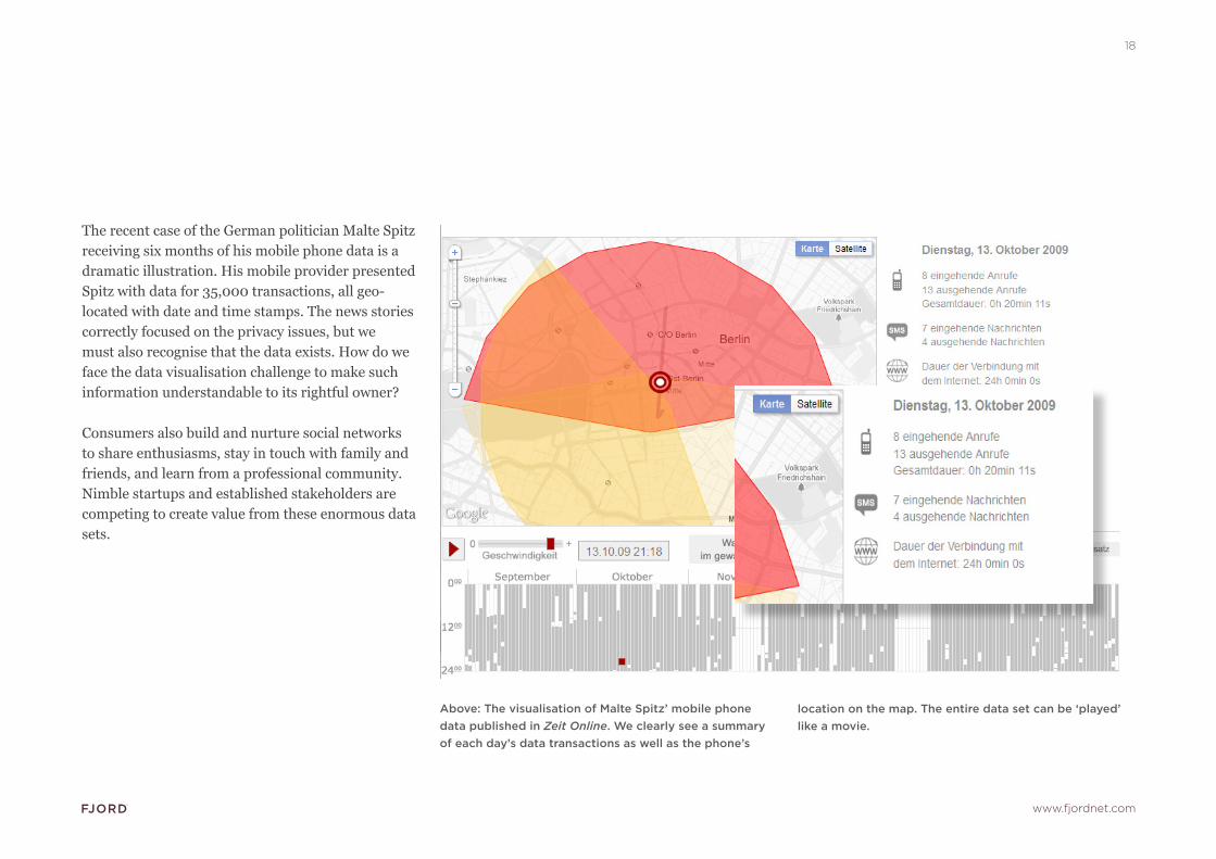
Above: The visualisation of Malte Spitz’ mobile phone data published in Zeit Online. We clearly see a summary of each day’s data transactions as well as the phone’s
The recent case of the German politician Malte Spitz receiving six months of his mobile phone data is a dramatic illustration. His mobile provider presented Spitz with data for 35,000 transactions, all geo-located with date and time stamps. The news stories correctly focused on the privacy issues, but we must also recognise that the data exists. How do we face the data visualisation challenge to make such information understandable to its rightful owner?
Consumers also build and nurture social networks to share enthusiasms, stay in touch with family and friends, and learn from a professional community. Nimble startups and established stakeholders are competing to create value from these enormous data sets.
location on the map. The entire data set can be ‘played’ like a movie.

www.fjordnet.com
19
Evolving devices:
When Apple’s iPhone was first introduced in 2007, some customers received printed bills that ran to hundreds of pages – a highly inappropriate ‘visualisation’ of itemised details for a one-month period. [see “300 Page iPhone Bill” in Wikipedia]
It was a dramatic example of a common challenge: adjusting touchpoints to changes in customer behaviour. The mobile phone that was once used for voice alone still based itself on a billing touchpoint that had not evolved when customers began to use the device for everything from digital messaging to background retrieval of email and more.
Above: The Memolane chronological aggregation of contributions to Flickr, Twitter, Facebook and Tripit.
Memolane, a recent Danish-American startup, is a good example of this. Their service combines a simple concept – alignment of the comments, messages, photos, videos, and trips you have recorded in social media along a common attribute: time.
The setup is simple, the interaction is elegant and the result is directly understandable.

www.fjordnet.com
20
DATA VISUALISATION CHECKLIST FOR KEEPING INFORMATION RELEVANT AND MANAGEABLE
Develop a strong understanding of user expectations and how users interact with their information across different platforms
Set the amount of data relevant to context and size of screen
Align contextual information with relevant interaction behaviors
Create fluid and simple navigation paradigms
PLANNING FOR THE FUTURE
User insight studies, service design thinking and creative interaction prototypes will lead to new business processes that require the best in data visualisation skills, to establish meaningful and profitable relationships with users.
As computing power and large data sets become shared and homogeneous, the most powerful differentiator within these new services will be data visualisation that integrates the information a user apprehends within their experience, emotions and social context.
Successful data visualisation will be informed by innovation in service design practice, user insight study and interface design. Fjord believes this kind of approach, combined with an overall commitment to ‘elegant simplicity’, is what will define the services and experiences that can build deep and lasting bonds with users in the age of information commoditisation.

www.fjordnet.com
21
SOME ONLINE RESOURCES
information aesthetics. Where form follows data, designed and maintained by Andrew Vande Moereinfosthetics.com
Visual ComplexityDesigned and maintained by Manuel Limawww.visualcomplexity.com
Data visualization: Looking back, going forwardMichael Friendly, York Universitywww.DataVis.ca
Journalism in the Age of DataGeoff McGhee, Stanford Universitydatajournalism.stanford.edu
Flowing Data edited by Nathan Yau, UCLA flowingdata.com
ABOUT FJORD
Fjord works with visionary clients to design world-class digital services, solve problems and find opportunities through holistic service design thinking.
Areas of expertise clients can draw on when working with Fjord include user insight and understanding, cross platform User Experience and business design & planning.
Fjord has worked on flagship projects providing strategic direction and design for major brands including: BBC, Telefonica, Nokia, Thomson Reuters, BBVA, Foursquare, MySpace and Yahoo!
Fjord has offices in London, New York, Berlin, Madrid, Helsinki, and Stockholm.
More information: www.fjordnet.com
@Fjord