data visualization - 5 tips for presenting data analyses
TRANSCRIPT

NICOLA SANDOLI
TIBCO ANALYTICS SALES @sandolinic
Five Tips for Presenting Data Analyses

© Copyright 2000-2014 TIBCO Software Inc.
Stories are everywhere: how do we tell them?
@sandolinic


What is the right skill set for building good data visualizations?
The ability to ask good questions is really what we start with.
Amanda Cox
The right skill set
Seems like the right person is a unicorn, someone who knows some design, some programming and some statistics?

© Copyright 2000-2016 TIBCO Software Inc.
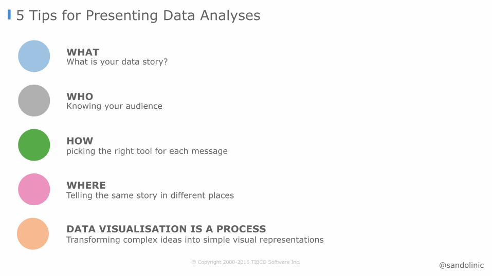
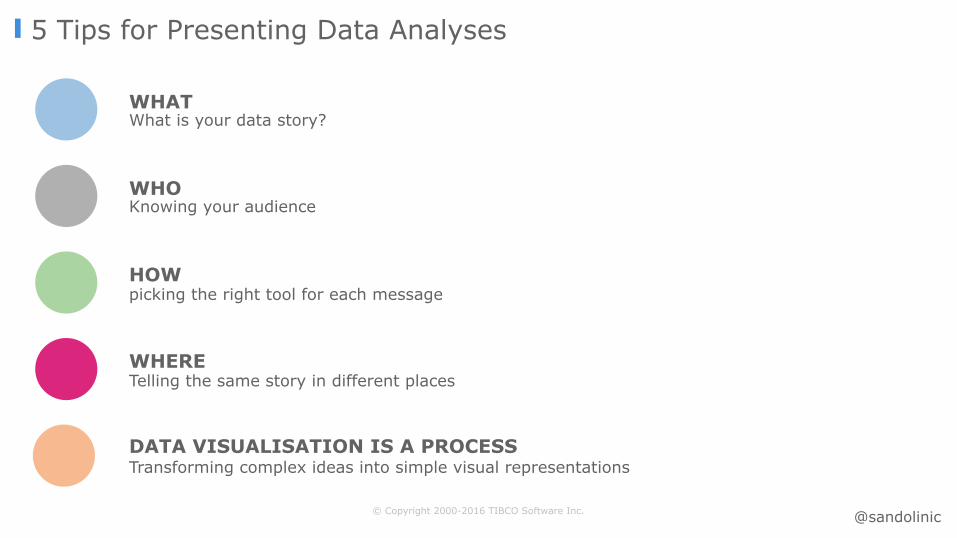
5 Tips for Presenting Data Analyses
WHATWhat is your data story?
WHOKnowing your audience
HOWpicking the right tool for each message
Transforming complex ideas into simple visual representationsDATA VISUALISATION IS A PROCESS
WHERETelling the same story in different places
@sandolinic

© Copyright 2000-2016 TIBCO Software Inc.
5 Tips for Presenting Data Analyses
WHATWhat is your data story?
WHOKnowing your audience
HOWpicking the right tool for each message
Transforming complex ideas into simple visual representationsDATA VISUALISATION IS A PROCESS
WHERETelling the same story in different places
@sandolinic

«Data Visualization is a language. It’s meant to convey an opinion, an argument.»
Kim Rees – Founding Partner, Periscope

#DataViz Resources
Alberto Cairo
David McCanless
Stephen Few
Edward Tufte
Juacques Bertin
William Cleveland
@sandolinic
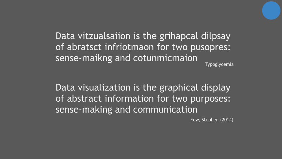
Data visualization is the graphical display of abstract information for two purposes: sense-making and communication
Few, Stephen (2014)
Data vitzualsaiion is the grihapcal dilpsay of abratsct infriotmaon for two pusopres: sense-maikng and cotunmicmaion
Typoglycemia

© Copyright 2000-2016 TIBCO Software Inc.
5 Tips for Presenting Data Analyses
WHATWhat is your data story?
WHOKnowing your audience
HOWpicking the right tool for each message
Transforming complex ideas into simple visual representationsDATA VISUALISATION IS A PROCESS
WHERETelling the same story in different places
@sandolinic

Knowing your audience
How to communicate using Graphs and Tables?
200 Countries, 200 Years, 4 Minutes
Hans Rosling
New insights on poverty
@sandolinic

Inside P&G’s Digital Revolution – Real-Time Review
@sandolinic

Why Data Visualization
© Copyright 2000-2016 TIBCO Software Inc.
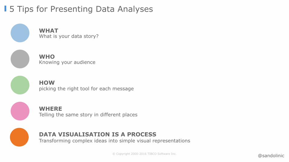
5 Tips for Presenting Data Analyses
WHATWhat is your data story?
WHOKnowing your audience
HOWpicking the right tool for each message
Transforming complex ideas into simple visual representationsDATA VISUALISATION IS A PROCESS
WHERETelling the same story in different places
@sandolinic

Should Data Visualizations Be Beautiful?
© Copyright 2000-2014 TIBCO Software Inc.
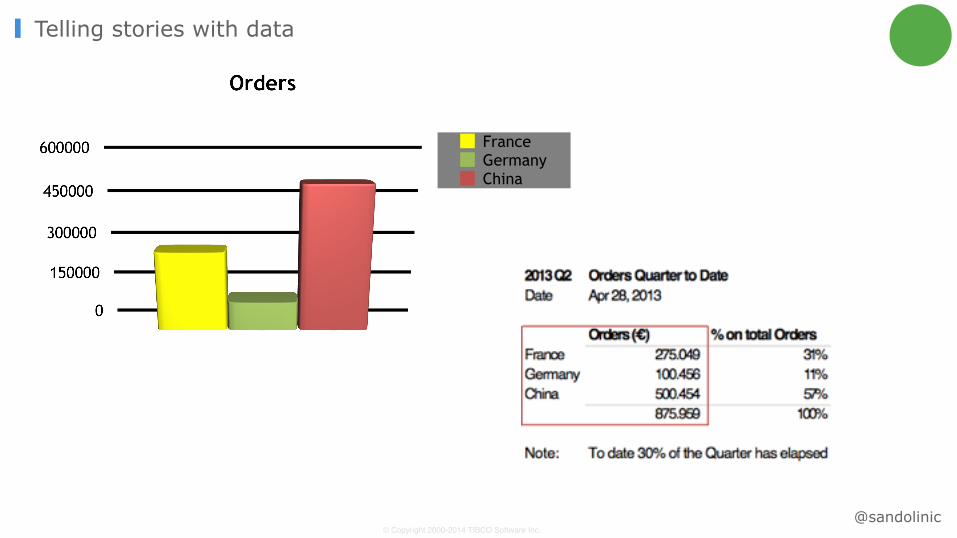
Telling stories with data
FranceGermanyChina
@sandolinic

Pre-attentive attributes
@sandolinic

@sandolinic

Telling complex stories with data
@sandolinic
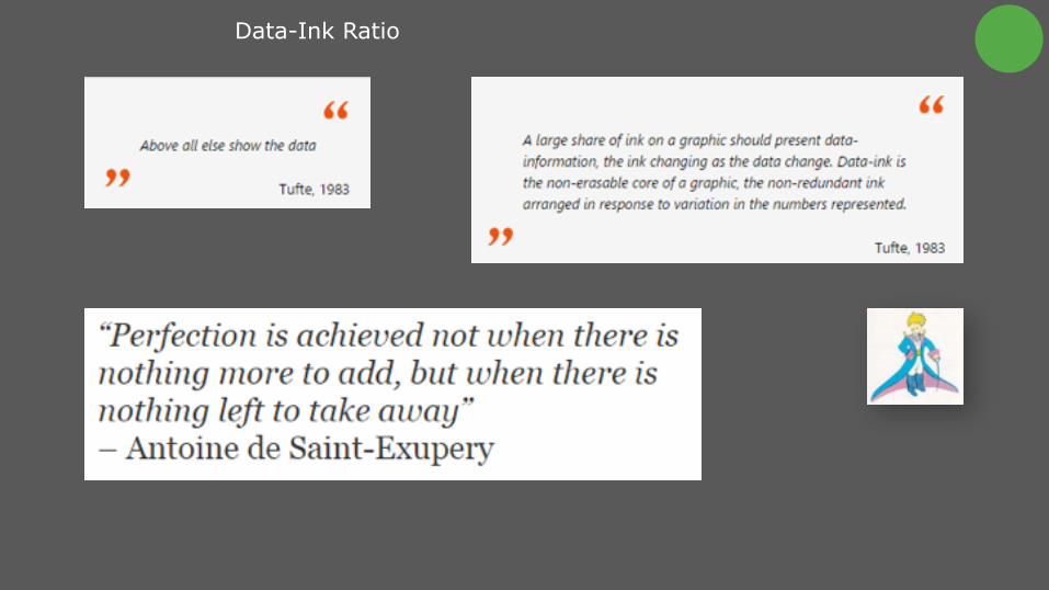
Data-Ink Ratio
© Copyright 2000-2016 TIBCO Software Inc.
5 Tips for Presenting Data Analyses
WHATWhat is your data story?
WHOKnowing your audience
HOWpicking the right tool for each message
Transforming complex ideas into simple visual representationsDATA VISUALISATION IS A PROCESS
WHERETelling the same story in different places
@sandolinic
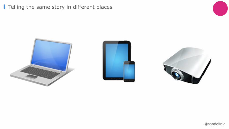
Telling the same story in different places
@sandolinic

Color should be used meaningfully
• Use natural colours • Use intense colours only when
you wish to draw attention to specific data.
• Use the same colour, except when colour differences are needed to indicate differences in the data or encode a dimension
• Use a single, neutral background colour (if needed at all)
• KEEP IT SIMPLE AND CONSISTENT
Not only for deco ☺
@sandolinic

@sandolinic
© Copyright 2000-2016 TIBCO Software Inc.
5 Tips for Presenting Data Analyses
WHATWhat is your data story?
WHOKnowing your audience
HOWpicking the right tool for each message
Transforming complex ideas into simple visual representationsDATA VISUALISATION IS A PROCESS
WHERETelling the same story in different places
@sandolinic

© Copyright 2000-2014 TIBCO Software Inc.
Marketshare
Company ACompany B
Marketshare
Company ACompany B
Data Story 1. - Pie Chart
@sandolinic

© Copyright 2000-2014 TIBCO Software Inc.
Answer in 3 seconds: Which city has more «scuole comunali»?Why pie chart series doesn’t work
+ information - space
• Link color - number - legend • Look for the highest number among
the darker slices
… what if I would like to know the which is the second one?
Data Story 1. - Pie Chart
@sandolinic

http://spotfire.tibco.com/demos
DEMO GALLERY

NICOLA SANDOLI
TIBCO ANALYTICS SALES @sandolinic
Five Tips for Presenting Data Analyses