data visualization of graph-based threat detection system by
TRANSCRIPT

Data Visualization of Graph-Based
Threat Detection System
by
Ilnaz Nikseresht
A Report Submitted in Partial Fulfillment of the
Requirements for the Degree of
Master of Engineering
In the department of Electrical and Computer Engineering
©Ilnaz Nikseresht,2021
University of Victoria
All rights reserved. This report may not be reproduced in whole or in part, by photocopy or other means, without the permission of the author.

Supervisory Committee
Data Visualization of Graph-Based Threat Detection System
by
Ilnaz Nikseresht
University of Victoria, 2021
Supervisory Committee
Dr. Amirali Baniasadi, Department of Electrical and Computer Engineering Supervisor
Dr. Issa Traore, Department of Electrical and Computer Engineering Departmental Member
i

Table of Contents
Supervisory Committee .............................................................................................................................. i
Table of Contents ....................................................................................................................................... ii
List of Tables .............................................................................................................................................. iii
List of Figures............................................................................................................................................. iv
Acronyms ................................................................................................................................................... v
Acknowledgments ...................................................................................................................................... vi
Dedication ...................................................................................................................................................vii
Abstract ....................................................................................................................................................... 1
Chapter 1 : Introduction............................................................................................................................... 2
1.1 Context.............................................................................................................................................. 2
1.2 Project Objectives..............................................................................................................................2
1.3 Report Outline................................................................................................................................... 3
Chapter 2 : Background.............................................................................................................................. 4
2.1 On Security Visualization................................................................................................................. 4
2.2 On the AEN Graph Model. ............................................................................................................ 7
2.2.1 Overview of AEN Graph Model......................................................................................... 7
2.2.2 Graph Definition..................................................................................................................8
2.2.3 System Architecture ...........................................................................................................9
Chapter 3 : Proposed Visualization Model ................................................................................................11
3.1 Element Type Layer............................................................................................................... 12
3.2 Node Age Layer................................................................................................................... 14
3.3 Probability of compromise Layer........................................................................................ 16
3.4 Threat Horizon Layer............................................................................................................ 17
ii

Chapter 4 : Performance Evaluation .......................................................................................................... 21
4.1 Evaluation Environment and Metrics.......................................................................................21
4.2 Evaluation Results....................................................................................................................21
Chapter 5 : Conclusion ................................................................................................................................28
References ...................................................................................................................................................30
iii
List of Figures
Figure 2.1 : AEN system’s architecture.......................................................................................................10
Figure 3.1 : Initial graph construction phase.............................................................................................. 11
Figure 3.2 : Node View Tab.........................................................................................................................12
Figure 3.3 : Hide Labels checkpoint in Node View Tab..............................................................................13
Figure 3.4 : Malicious property....................................................................................................................14
Figure 3.5 : Node Age visualization layer’s example..................................................................................15
Figure 3.6 : Node Age visualization layer on top of node’s type (i.e, HOST).............................................16
Figure 3.7 : Probability of being compromised...........................................................................................17
Figure 3.8 : Probability of being compromised and Node (Host) layers working together.........................17
Figure 3.9 : Threat Horizon layer at a glance..............................................................................................18
Figure 3.10 : Threat Horizon layer with the compatibility..........................................................................19
Figure 3.11 : Threat Horizon layer with the compatibility and node age layers.........................................20
Figure 4.1 : Response time of the different sizes of snort alert file without visualization layers...............22
Figure 4.2 : Response time of the different sizes of snort alert file with visualization layers.....................22
Figure 4.3 : Response time of the different sizes of Netflow file without visualization layers...................23
Figure 4.4 : Response time of the different sizes of Netflow file with visualization layers........................23
Figure 4.5 : CPU Utilization of the different sizes of snort alert file without visualization layers.............24
Figure 4.6 : CPU Utilization of the different sizes of snort alert file with visualization layers..................25
Figure 4.7 : CPU Utilization of the different sizes of netflow file without visualization layers.................25
Figure 4.8 : CPU Utilization of the different sizes of netflow file with visualization layers.......................26
Figure 4.9 : Different layers processing time of snort alert (4 KB) ............................................................27
Figure 4.10 : Average processing time of snort alert (15KB)......................................................................27
iv

Acronyms
AEN: Activity and Event network graph
AV: Anti-virus
BGP: Border Gateway Protocol
CPU: Central Processing Unit
TCP: Transmission Control protocol
IDS: Intrusion detection system
IP: Internet Protocol
IPS: Intrusion Prevention System
ISOT: Information Security and Object Technology Research lab, at the University of Victoria
Netflow: Network flow
PCAP: Packet Capture
v

Acknowledgments
I would like to thank my supervisor, Dr. Amirali Baniasadi, for his constant
guidance, support and motivation for my project and throughout my program.
I would like to thank Dr. Issa Traore for offering interesting courses and giving me
the chance to be a part of this project.
I would also like to thank Mr. Paulo Quinan, for his continuous support and
assistance all through my project.
vi

Dedication
Dedicated to my husband and my parents for their support, motivation and
guidance.
vii

Abstract
The Activity and Event Network Model (AEN) is a new security knowledge graph that leverages
large dynamic uncertain graph theory to capture and analyze stealthy and long-term attack
patterns. Because the graph is expected to become extremely large over time, it can be very
challenging for security analysts to navigate it and identify meaningful information. This report
presents different visualization layers deployed to improve the graph model’s presentation. The
main goal is to build an enhanced visualization system that can more simply and effectively
overlay different visualization layers, namely edge/node type, node property, node age, node’s
probability of being compromised, and the threat horizon layer. Therefore, with the help of the
developed layers, the network security analysts can identify suspicious network security events
and activities as soon as possible.
1

Chapter 1 : Introduction 1.1 Context In the network security domain, analysts deal daily with network packets and security events and
alerts generated through a various data sources such as firewalls, intrusion detection systems
(IDS), intrusion prevention systems (IPS), system logs, etc. With an exponential increase in the
amount and diversity of security data, there is a growing demand for visualization tools to help
with analyzing the data and gaining insight into it. Visualization tools help avoid having to spend
excessive hours on raw data analysis and allow the security analysts to distinguish unusual
patterns and trends in even the most intricate data sources. This will let analysts identify the
existing and novel network attacks in the minimum required period. Knowing that the
visualization requires data from single or multiple sources, either one or many of the below data
sources can be input into the system. Network traces, security events (IDS, IPS, Firewalls, AV),
network events (switch, router, or server data), or application logs are some instances of the data
sources [1]. It is needless to say that, with an increase in the incorporation of data sources to be
fed to the visualization system and their features, the network security analyst's ability to gain
insight into irregular traffic trends and events also improves.
1.2 Project ObjectivesThe AEN graph model elements and graph construction algorithms are documented in a separate
report [17]. This report details different visualization layers added to the AEN system to depict
network nodes/edges, including their type, property, age, probability of being compromised, and
the threat horizon. The principal challenge in the presentation of AEN model is how to deploy
distinct visualization layers, and how to depict different aspects of the network activities while
maintaining the interaction of layers with each other. The project’s goal is to build an improved
visualization system that can more simply and effectively overlay those different visualization
layers. In practice, the graph would start with no colors but there would be options for the analyst
to add visualization layers. For instance, the "element type" layer would allow the analyst to
view the elements in different colors according to their types, the "element age" layer would
2

somehow help distinguish between older and newer elements while the "probability" layer would
highlight elements more likely to be true according to its probability. Each layer would be
independent from the other such that the analyst could select any combination of them as desired
and with that view different things at the same time. There would be several layers and each one
of them would have to be designed to work together with the others. Some layers could be
mutually exclusive as well, where selecting one would prevent another one from being selected
and vice-versa.
1.3 Report OutlineThe remaining chapters in this report are structured as follows. Chapter 2 gives an overview of
existing security visualization models and give a summary of key features of the AEN system
architecture. Chapter 3 outlines the proposed model to address previously stated limitations.
Chapter 4 depicts the experimental evaluation of the proposed scheme. Chapter 5 makes
concluding remarks.
3

Chapter 2 : Background 2.1 On Security Visualization Shiravi et al. [1] have reviewed network security visualization practices by classifying them into
five classes, host/server monitoring, internal/external monitoring, port activity, attack
patterns, and routing behavior.
The first visualization class in this study is host/server monitoring which mainly exhibits the
nodes in the network as hosts or servers and tries to identify possible correlation among them
with the aim of detecting the malicious nodes. One of the earlier works that was done on small-
sized networks in this class was authored by Erbacher et al. [2],[3] where they placed the
monitored server in the middle of the visualization layer, and the rest of the hosts are around five
concentric circles where each node's ring defines a distinct IP address from that of its monitored
server. There are various visual characteristics available in this model such as the immobile
position of hosts in the graph, or the number of connected hosts to the monitored server that can
be extracted from rods spreading from its border. In [4], Takada and Koike developed a model
called Tudumi. Tudumi is a 3D visualization model to observe and examine the user performance
on a server, achieved by the utilization of multilayered concentric disks in a small-sized network.
To highlight various access techniques such as file transfer or terminal service, this model uses
different-sized dashed lines. A model developed by Lakkaraju et al, called NVisionIP [5]-[6],
focuses on large networks presented in a grid of 256 by 256, where each of the cells displays the
hosts' associations. The horizontal axis of the network represents the network subnets, and the
vertical axis of the network represents the subnet hosts. There is a magnifier that enables the
analyst to access the nodes of interest in the network. To detect the hidden malware in the
network, Fink et al. [7] developed a model which illustrates the correlations between network
traffic and host processes.
Visualizations of the internal/external monitoring class are related to the communication of
internal hosts and external IPs. Like the previous class, this visualization class also comprises
representing internal hosts and communicating external IPs. Because the art of displaying
internal hosts in a non-occluding and meaningful way is by itself a sensitive action, adding the
4

burden of representing hundreds and thousands of external IPs is a significant process for
systems of this class. VISUAL [8] is a security visualization system developed to permit the
analyst to observe the interaction patterns between an internal network regarding external
sources. The internal network is a grid, where each cell represents one of the internal hosts.
On the other hand, external sources are depicted out of the internal grid, with the square
dimension indicating the activity level. Various filtering tools are employed to refine internal or
external hosts, pointing to a less cluttered presentation. Numerous accurate knowledge
concerning a host can also be disclosed upon user request.
To depict the network traffic among all internal and external hosts of the network,
VizFlowConnect [9] employs parallel axes to display the current relations among network nodes
in the network, which is achieved by designing three parallel axes. While most left is responsible
for nodes originating network transfer to the internal network, the center is responsible for
presenting the internal hosts, and the right one is responsible for depicting the destination nodes
of internal traffic. Each axis includes points that present an IP address and links between the
points which depict the network connections.
The port activity visualization class has been designed to highlight the viruses, trojans, worms,
and zero-day exploits activities. The developers of this visualization class believe that with the
scaling techniques implemented due to the amount of traffic and extended range of possible port
numbers and IP addresses, the malicious actors can be located. Abdullah et al. [10] designed a
port-based sketch of activities in the network based on the given services. It is discussed that by
assigning popular ports to principal services, the chances of exposing them to attacks rise.
Therefore, they are grouped in bins of 100's, whereas the registered ports are grouped in bins of
1000's, and the rest of the private/dynamic ports are assigned in a single bin. This system
provides the ability for the user to view more precise aspects of the irregular activities in the
network by depicting the data over time. Potential Doom, a system proposed by Lau [11],
involves the rotating cube, which attempts to visualize the coarse trends in large-scale networks,
namely port and IP data in a 3D cube, with each axis of three-dimensional representation as a
component of a TCP connection. The X-axis represents the destination IP addresses, Y-axis
represents the port numbers, and Z-axis represents the source IP addresses. The system is suitable
5

for single attacks and can only be employed for the discovery of port scans. In [12], McPherson
et al. presents ProtVis which uses a 256x256 grid of various colors to reflect the network
activities on grid cells. The port's position on the grid is decided by separating the port number
into an (X, Y) position, where X highlights the port number's high byte and Y highlights the port
number's low byte. Through time, each point's changes are depicted using a distinct color, where
black indicates no change, blue indicates small change, red indicates larger change, and white
indicates the most variations. In addition, the system provides a magnifier to support more
specific data regarding specific ports. One of the challenges the system faces regarding
identifying malicious nodes is when irregular activity is discovered between ports with high and
legitimate activities.
The attack patterns visualization class targets both detection and presentation of attacks in
different steps. This type of visualization is of prime importance, because various attacks behave
differently and many of them are implemented in multi-steps, including reconnaissance,
scanning, gaining access, maintaining access, clearing tracks, and installing back doors for future
access. Because the high number of alerts generated daily by the intrusion detection systems is at
times overwhelming for the security analysts, they constitute one of the well-known sources of
data for this class. Girardin [13] proposed an unsupervised machine learning system developed
with detecting the network's irregular and intrusive actions in mind. The system depicts network
state and deviations from natural behavior by using front ground and background colors, size,
and relevant positioning on a map. In this way, similar events are grouped, and the map is also
arranged in the same way. Nyarko et al. [14] developed NIVA, a newtork IDS visual analyzer. It
utilizes data from multiple intrusion detectors and uses links and colors to manifest attacks. The
system includes a GUI window and a 3D rendering window which consists of glyphs connected
by links. The position of each glyph depends on its IP address, meaning that closer glyphs favor
closer IP addresses. Also, the color of the links depicts the attack severity, where yellow is
moderate and red is the most critical. The authors have employed gravitational theory,
electromagnetics, and fluid dynamics to calculate the position of nodes in the network. Although
the system can present large networks, it has limitations when rendering alert data of a month.
The principal aim of the routing behavior visualization class is to recognize the development
6

of the BGP routing protocol over time. By considering Internet traffic disruptions due to router
misconfigurations or malicious attacks, this goal is satisfied. The disadvantages of BGP,
including distributed nature and shortage of validity confirmation of announcements, increases
its vulnerability towards security attacks. Colitti et al. developed BGPLay [15], a system which
permits ISPs to observe the reachability of a specific prefix from the viewpoint of a given edge
router while including animation to specify routing adjustments. Wong et al. [16] developed the
TAMP system to visualize the BGP irregularities by employing statistical techniques to perform
BGP data aggregation. They proposed animation techniques to depict the routing behavior
variations over time to assist the network administrators in identifying any abnormal patterns.
The principal objective of the AEN system is to assist network analysts in detecting any security
irregular patterns or malicious nodes. The system functions by utilizing the raw data from
various network nodes and external repositories to discover the current node-to-node
relationships and extract unusual ones. Multiple data sources such as network packets, system
logs, and intrusion detection alerts are processed to generate the graph.
2.2 On the AEN Graph Model
2.2.1 Overview of the AEN Graph Model The AEN Graph is a new security knowledge graph model developed at the Information Security
and Object Technology (ISOT) Lab to capture and analyze stealthy and long term attack trends
and patterns. To capture the inherent uncertainty and dynamic nature of network environments
and attack occurrences, AEN consists of a dynamic uncertain directed multigraph model. The
graph engine is developed using emerging graph database technologies because one of the
requirements of the model is the need to load the entire graph in memory for malicious patterns
detection and analysis. The graph model is updated continuously and maintained over time, with
most of the historical information being preserved by necessity and leveraged in long-term attack
detection. As a result, over time the graph is expected to become extremely large in size.
The main concern in the graph construction is the method employed to mine different data
features responsible for nodes identification, their relationships, and attributes. The mining
7

method can be implemented by 1) direct connection to the data source or 2) from the available
data gathered from various tools and services, or 3) by data mining into aggregates, or 4) from
the previously known attacks by security experts, or 5) from log analysis performed on the
known network applications and service calls to or from the mentioned applications and data
sources such as hypervisor logs, syslog, and IDS alerts. Another input category is attack
fingerprints, which are not automatically generated by the system and developed by security
experts from past attacks. Even without this type of data, the system can leverage attack
signatures indirectly through its IDS alerts. However, these fingerprints provide an additional
layer of information to the model in the form of a database of well-known attacks that can help
the identification by better incorporation into the model.
2.2.2 Graph Definition
To understand how the graph is constructed, we must analyze the features mentioned above to
determine distinguishable characteristics. To begin with, it is worth considering how each
feature can be used to model the network. As a sample, IP address-domain names relationship
can be considered. Graph nodes represent the features, and the edges represent their
relationships. However, features such as protocol and port are better utilized as relationships’
descriptors and therefore are employed to characterize attributes of either nodes or edges.
Generally, the AEN model’s nodes are interpreted by any feature for which valuable
relationships can be formed, and the edges are constructed based on those relationships and
their direction. The rest of the features can be utilized to describe attributes of either nodes or
edges. It is important to note that the model is confident in identifying or in the correctness of
the extracted information from the features. For instance, when related TCP handshake packets
between two nodes are received, the model is confident that the hosts are communicating and
in which direction. However, it is worth noting that the IDS alerts and graph operations such
as pruning, chaining, decaying, and clustering are inherently imperfect. That adds a layer of
uncertainty to the nodes, their relationships, and their respective attributes. Ultimately, as there
are continuous changes in the system and a constant demand to track the network entities and
their relationships, the model requires to maintain the information on the periods in which
8

each element has existed to identify the vital chronological relationships. In summary, below
are the characteristics of the graph model. 1) Processing times/latencies are negligible. 2)
Through time, nodes, edges, and their attributes vary and have a lifetime. 3) Nodes have their
attributes and are labeled. 4) Nodes can have various relationships at the same time.
Consequently, nodes can have various edges connecting them. 5)Relationships have a source
and a destination. Therefore edges are directed. 6) Relationships have their properties. Thus
edges are labeled. 7) Both relationships and nodes can be uncertain. Thus nodes, edges, and
their attributes are weighted by probabilities of existence.
2.2.3 System Architecture
Figure 2.1 depicts the architecture of the AEN graph engine. Multiple adapters are required to
provide suitable patterns of inputs that can be fed to the model. Adapters are generally
responsible for parsing data for the sake of feature extraction from raw data and designating the
probability to features. Feature extraction gives the ability to the system to perform the graph
construction and discover irregular relations. While in cases such as network packet data, the
adapter has to deal with only one data format (pcap), there are different intrusion detection
systems with distinct formats that require a separate adapter to parse each one of them. The graph
engine then uses the output of adapters to perform required operations on the data. The main
attributes of the graph engine include derivation, clustering, aggregation, feature selection, and
pruning [17]. Spatial and temporal analysis is employed by derivation to derive graphs based on
the probability criteria. Clustering is used to derive meaningful relations from raw data such as
security attack patterns from intrusion detection system alerts. Aggregation of the data collected
directly from the sources is the responsibility of the aggregation module. Feature selection sifts
the data to identify useful information required by the model. Finally, pruning performs the
cleaning of data which has become useless, including obsolete nodes, edges, and labels.
9

10
Fig. 2.1 AEN system’s architecture

Chapter 3 : Proposed Visualization Model To address the visualization challenges discussed in the previous chapter, many layers have been
developed. The implementation is performed via Javascript programming language, and with the
help of vis.js library. As previously mentioned, by feeding the raw data collected from the
network logs to the system, the graph is constructed. Figure 3.1 depicts the system before the
implementation of any visualization layer where all nodes are represented as grey ovals and all
edges as grey arrows without any labels in the zoom-out view versus with the labels in the zoom-
in view.
11Fig. 3.1: Initial graph construction phase

To integrate different visualization layers to the model, a distinct tab named node view, depicted
in Figure 3.2, is designed in order to provide the capability of viewing the network elements
based on the type of nodes, type of edges, property, node age, probability of compromise and
threat horizon. In addition, a distinct layer is designed to show or hide the labels.
3.1 Element Type Layer The initial visualization layer developed provides the ability to filter network elements based on
their types. As shown in Figure 3.2, there exists a checkbox named ‘Show/Hide Labels’ that
enables the end-user to view the network nodes with or without the labels. Besides, when the
user selects not to include the label in the graph, all the nodes would be depicted as same-sized
circles shown in Figure 3.3.
12
Fig. 3.2: Node View Tab

This layer functionality consists of the different node/edge types and the node properties. The
node type category includes HOST, DOMAIN, ALERT, IP, ORGANIZATION, and LOCATION
that provide the relative information. Upon selecting each type, the nodes belonging to that
specific category are colored while the rest of the nodes are grey. In addition to node types,
different types of edges have been added to this layer, including AUTH_ATTEMPT, TRIGGER,
USED, IP_LOCATED_AT, PART_OF, RESOLVED_TO, CONTROLS, LOCATED_AT, OWNS,
SESSION, ALERT_TRG_BY_HOST. Upon selection of edges, the user would again observe
them in color and the rest of the network elements in grey. Thanks to different layers operating
together, selecting different types of nodes and edges is possible. It gives users a better
understanding of network elements. Another function of this layer is its ability to demonstrate the
malicious nodes in red color. When the list of the nodes with the malicious property set to true is
fetched from the backend, a comparison is performed to get the list of malicious nodes and apply
another function to show them in red color. Figure 3.4 is an example of a malicious node
highlighted in red when selecting the malicious property checkbox. In conclusion, this layer
13
Fig. 3.3: Hide Labels checkpoint in Node View Tab

provides the ability to show/hide all the labels and all or some of the network elements based on
their node type or edge type, or node property in color.
3.2 Node Age Layer
One of the key characteristics of the AEN model is its dynamic nature. Nodes and edges are
added continuously as more data arrive. Timestamps are associated with the graph elements to
convey their age. The functionality provided by this layer mainly concerns the age of each node
in the network. It was uncertain how far in time each specific node has been added to the graph
or updated in the graph (for instance two days ago or three days ago). The visualization of this
layer has been implemented with the aid of the opacity feature. Opacity can have a value
between zero and one that means if the node is added or updated more recently, say two days
ago, it is of higher opacity than the nodes added or updated four days ago. When the related
node and age data come from the backend of the system to the frontend, the required properties
are extracted, the timestamp, in this case. The node's age is computed based on the timestamp.
14
Fig. 3.4: Malicious property

It is noteworthy that the age limit is ten days and the nodes which are added/updated before that
time are shown with the same opacity. The opacity is calculated based on below formula.
Opacity = (1-(age/10))
Figure 3.5 represents an overview of the network elements when this layer is selected. As part
of this layer’s functionality, it is possible to choose it together with other layers such as the
node’s type layer to merge the opacity with the nodes/edges colors.
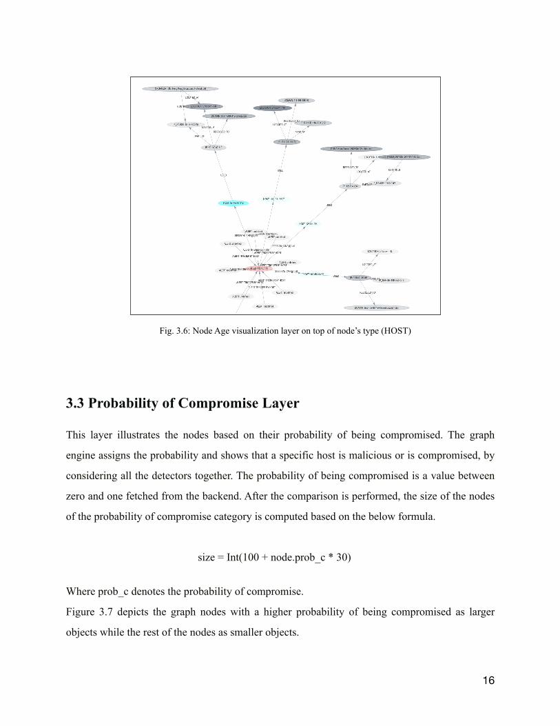
Figure 3.6 depicts a part of the network where the node age layer and node type (i.e HOST) are
both selected.
15
Fig. 3.5: Node Age visualization layer’s example
3.3 Probability of Compromise Layer
This layer illustrates the nodes based on their probability of being compromised. The graph
engine assigns the probability and shows that a specific host is malicious or is compromised, by
considering all the detectors together. The probability of being compromised is a value between
zero and one fetched from the backend. After the comparison is performed, the size of the nodes
of the probability of compromise category is computed based on the below formula.
size = Int(100 + node.prob_c * 30)
Where prob_c denotes the probability of compromise.
Figure 3.7 depicts the graph nodes with a higher probability of being compromised as larger
objects while the rest of the nodes as smaller objects.
16
Fig. 3.6: Node Age visualization layer on top of node’s type (HOST)

As previously stated, to have a specific layer be functional with other layers is one of the vital
goals of this project. Hence, the probability layer is also functional with the 'node type' layer, and
when selected, it depicts the malicious nodes in colored circles. The color represents the node
type. Figure 3.8 illustrates the graph when probability and Nodes (Hosts) are selected together.
17Fig. 3.8: Probability of being compromised and Node (Host) layers working together
Fig. 3.7: Probability of being compromised

3.4 Threat Horizon Layer Threat Horizon is defined as the set of all possible nodes with which a node `u` could have
exchanged data. As a result, the data exchange ultimately affected them, directly or indirectly. In
practice, if node `u` is malicious or compromised, the set of nodes which `u` could have been in
contact with are also compromised, or at least been targeted. More formally, two underlying
concepts must be defined [17]: (1) Journey, which is a "time-respecting walk" through a path
over time, that is, a walk through a path between 2 nodes `u` and `v` over time such that each
edge is traversed in chronological order and such that each edge existed at the point in time it
was traversed; (2) reachability of 2 nodes `u` and `v`, which is defined as the existence of a
Journey between nodes `u` and `v`.Then we can define the Threat Horizon of node `u`, `TH_u`
in short, as the set of all nodes in a graph `G` reachable from `u`. Figure 3.9 depicts the threat
horizon, and the node clicked to show the threat horizon is called the focal point. The hosts that
become orange upon selecting the focal point are the nodes that had direct or indirect
communication with it. If the focal point is malicious (which is not necessarily the case), then
there is a chance that the focal point host could have compromised the hosts inside the threat
horizon.
18
Fig. 3.9 : Threat Horizon layer at a glance

Since the threat horizon layer uses orange color to distinguish the nodes that have been in direct
or indirect contact with the focal points, it is not compatible with the node type layer and only
compatible with the probability and node age layers. Therefore, upon selecting the threat
horizon layer, all the node types and edge types are disabled. Figure 3.10 presents the threat
horizon and probability layers selected together.
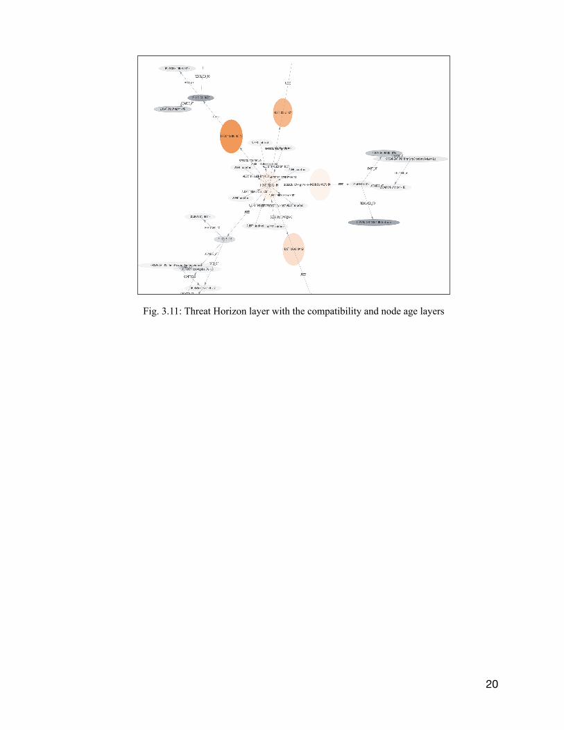
In addition, figure 3.11 shows the functionality of the probability, threat horizon, and node age
layers altogether.
19
Fig. 3.10: Threat Horizon layer with the compatibility
20
Fig. 3.11: Threat Horizon layer with the compatibility and node age layers

Chapter 4 : Performance Evaluation
4.1 Evaluation Environment and Metrics
The response time and CPU utilization are used to evaluate the performance of AEN graph
visualization layers. We have used different sizes of snort alert and the netflow files to determine
the size of the graph. Snort is one of the IDS used among the data sources. Net flows are
aggregate packets, also part of the data sources. The evaluation was run on a Dell 2.6 GHz Core
i7 (6 cores) and 16GB of memory. The response time and the CPU utilization are studied to
measure the scalability of the developed layers. Each file is input into the system five times, and
the average output values are computed for the response time and CPU utilization. The response
time is the time duration over which the graph is loaded to the system, and the time the graph
appears on the canvas. The average response time is measured in terms of seconds. The CPU
utilization indicates a computer's processing resources or the volume of work handled by a CPU.
The actual CPU utilization differs based on the amount and type of managed computing tasks.
Specific tasks require heavy CPU time, while others require less because of non-CPU resource
requirements. CPU Utilization is measured in terms of the unit MegaHertz.
4.2 Evaluation Results
Figures 4.1 and 4.3 depict the response time of different sized snort alert and net flow log files
fed to the system before the activation of visualization layers. As observed in the graph, the
response time increased as the file size enlarged. In other words, when the size of the network is
of size tens or hundreds of nodes, the performance is much more acceptable than when the size
of the network is of thousands of nodes which can be interpreted due to the limitations of the
hardware on which the experiment is conducted. If larger log files are used, the system hangs and
becomes unresponsive. To handle larger capacity, more computation power would be required,
like by using powerful server machines on the cloud. The same experiment was again conducted
with the visualization layers to be able to compare the performance before and after the
visualization layers activation. As shown in Figures 4.2 and 4.4, the response time has changed
21

in terms of 2 milliseconds to 12 seconds depending on the file sizes compared to before, which
can be interpreted as the hardware limitations.
22
Fig. 4.1: Response time of the different sizes of snort alert file without visualization layers
Fig. 4.2: Response time of the different sizes of snort alert file with visualization layers

23
Fig. 4.3: Response time of the different sizes of Netflow file without visualization layers
Fig. 4.4: Response time of the different sizes of Netflow file with visualization layers

Furthermore, the same experiment has been run on networks of different sizes to measure the
CPU utilization of the system. As expected, the system utilization increases with the size of the
network. For the files less than 100 KB, the CPU utilization is acceptable, but as the size of files
grows to 194 KB that contains hundreds of nodes, the system utilization also increases to the
more than 100%. As mentioned before, the system on which the experiment is conducted is a
multicore computer where the CPU performs significantly better than a single-core CPU of the
same speed. Multiple cores not only allow PCs to run multiple processes simultaneously with
greater ease and increasing the performance when multitasking but also provide the possibility to
have more than 100% utilization depending on the number of cores available on the system.
Again, as mentioned above, it is recommended to use computers with higher configuration
capabilities to be able to load higher data rates and fully utilize the features provided by the AEN
system model. In addition, Figures 4.6 and 4.8 depict the average CPU utilization after the
activation of visualization layers and as expected the CPU utilization increased from 8% to 20%
in different input file sizes.
24
Fig. 4.5: CPU Utilization of the different sizes of snort alert file without visualization layers

25
Fig. 4.7: CPU Utilization of the different sizes of netflow file without visualization layers
Fig. 4.6: CPU Utilization of the different sizes of snort alert file with visualization layers

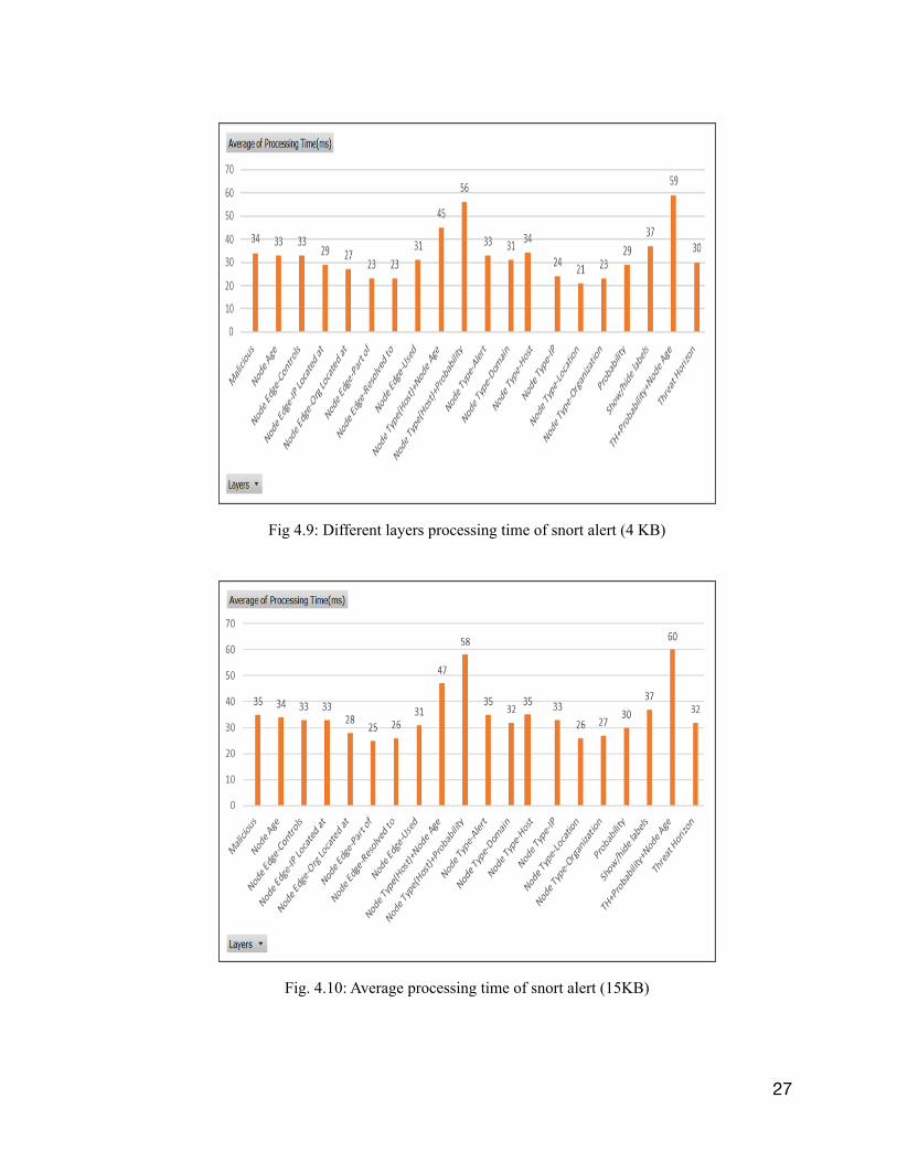
In the next step, the processing time of the developed layers is measured. The experiment is
repeated five times per performance index, and the average is depicted in figures 4.9 and 4.10.
The Y-axis represents the average processing time and the X-axis represents different
visualization layers. Different layers have almost the same processing time in terms of ms, and
the difference between the processing time of same layers of two different file sizes is in terms
of 1~3 ms which is negligible and the processing time will go up to 1 sec when many layers are
selected at once. Therefore, it is recommended to use more powerful systems when security
analysts use the AEN graph model for larger data files.
26
Fig. 4.8: CPU Utilization of the different sizes of netflow file with visualization layers
27
Fig 4.9: Different layers processing time of snort alert (4 KB)
Fig. 4.10: Average processing time of snort alert (15KB)

Chapter 5 : Conclusion With an exponential increase in the amount and diversity of security data, there is a growing
demand for visualization tools to help analyze the data and gain insight into it. Visualization
tools help avoid spending excessive hours on raw data analysis and allow the security analysts to
distinguish unusual patterns and trends in even the most intricate data sources. In this project,
many visualization layers were developed to enable the security analysts to have a high-level
view of the ongoing network activities. Different visualization layers include the following.
Show/Hide Labels checkbox allows the end-user to view the network nodes with or without the
labels in addition to all the nodes in same-sized circles when the user selects not to include the
label in the graph. In the element type layer, the functionality is defined by depicting the specific
node/edge types and the node properties in distinct colors upon selecting each checkbox in this
layer. The element type and show/hide labels can be chosen together. Node age layer depicts the
age of each node (i.e., how far in time each specific node has been added/updated in the network)
with different opacity levels. Node age layer can be selected along with the element type layer
and the show/hide labels checkbox. Probability of Compromise Layer employs the graph engine
to assign the likelihood and show if a specific host is malicious or compromised by enlarging the
node. The threat horizon layer lets us see all the nodes that had direct or indirect communication
with the focal point, which may or may not be malicious in orange color. The threat horizon layer
functions with the probability of compromise and node age layers. Before implementing the
visualization layers, the AEN graph model did not explicitly represent the nodes/edges that might
be of interest to the security analysts. With the help of visualization layers, analysts can view the
elements of interest in different colors/shapes than the rest of the nodes in the network. It enables
the analysts to save time by not investigating raw data, especially as the AEN graph model is
designed to be continually growing. In the performance evaluation section, the visualization
layers' performance has been measured in terms of processing time. It has been observed that
different layers are being loaded in a matter of ms. This time grows as the size of the files gets
bigger, which is expected, and since the processing time difference for the same layers of
different file sizes is 1~3 ms, it can be ignored.
28

Although different visualization layers have been developed, there are still many features that
can be added to the system to enhance the system's performance, such as attack progression
visualization. The goal of this feature is to make it easier for an analyst to view how an attack
progressed through time. In practice, that means that once an alert is generated, either via the
IDS or via one of our detectors, the system should identify and highlight an attack path by using
data from the alert, fingerprint, threat horizon, etc. and then, by using the graph timeline feature,
correlate the attack path with the graph elements in previous and future points in time and
display the attack progression from the first element to its current form. The progression here can
be understood as a series of subgraphs/attack paths that show the attack as it progresses through
time.
29

References [1] Hadi Shiravi, Ali Shiravi, and Ali A. Ghorbani, “A Survey of Visualization Systems for Network Security”, IEEE TRANSACTIONS ON VISUALIZATION AND COMPUTER GRAPHICS, VOL. 18, NO. 8, AUGUST 2012 [2] R. Erbacher, K. Walker, and D. Frincke, “Intrusion and Misuse Detection in Large-Scale Systems,” IEEE Computer Graphics and Applications, vol. 22, no. 1, pp. 38-48, Jan./Feb. 2002. [3] R. Erbacher, “Intrusion Behavior Detection through Visualiza- tion,” Proc. IEEE Int’l Conf. Systems, Man and Cybernetics, pp. 2507-2513, 2003. [4] T. Takada and H. Koike, “Tudumi: Information Visualization System for Monitoring and Auditing Computer Logs,” Proc. Sixth Int’l Conf. Information Visualisation, pp. 570-576, 2002. [5] K. Lakkaraju, W. Yurcik, and A. Lee, “NVisionIP: Netflow Visualizations of System State for Security Situational Aware- ness,” Proc. ACM Workshop Visualization and Data Mining for Computer Security, vol. 29, pp. 65-72, 2004. [6] K. Lakkaraju, R. Bearavolu, A. Slagell, W. Yurcik, and S. North, “Closing-the-Loop in Nvisionip: Integrating Discovery and Search in Security Visualizations,” Proc. IEEE Workshop Visualization for Computer Security (VizSEC ’05), pp. 75-82, 2005. [7] G. Fink, P. Muessig, and C. North, “Visual Correlation of Host Processes and Network Traffic,” Proc. IEEE Workshop Visualization for Computer Security (VizSEC 05), pp. 11-19, 2005. [8] R. Ball, G.A. Fink, and C. North, “Home-Centric Visualization of Network Traffic for Security Administration,” Proc. ACM Work- shop Visualization and Data Mining for Computer Security, pp. 55-64, 2004. [9] X. Yin, W. Yurcik, M. Treaster, Y. Li, and K. Lakkaraju, “Visflowconnect: Netflow Visualizations of Link Relationships for Security Situational Awareness,” Proc. ACM Workshop Visua- lization and Data Mining for Computer Security, pp. 26-34, 2004. [10] K. Abdullah, C. Lee, G. Conti, and J. Copeland, “Visualizing Network Data for Intrusion Detection,” Proc. Sixth Ann. IEEE SMC Information Assurance Workshop (IAW ’05), pp. 100-108, 2005. [11] S. Lau, “The Spinning Cube of Potential Doom,” Comm. the ACM, vol. 47, no. 6, pp. 25-26, 2004. [12] J. McPherson, K. Ma, P. Krystosk, T. Bartoletti, and M. Christensen, “PortVis: A Tool for Port-Based Detection of Security Events,” Proc. the ACM Workshop Visualization and Data Mining for Computer Security, pp. 73-81, 2004. [13] L. Girardin, “An Eye on Network Intruder-Administrator Shoot- outs,” Proc. First Conf. Workshop Intrusion Detection and Network Monitoring, vol. 1, pp. 3-13, 1999. [14] K. Nyarko, T. Capers, C. Scott, and K. Ladeji-Osias, “Network Intrusion Visualization with niva, an Intrusion Detection Visual Analyzer with Haptic Integration,” Proc. 10th Symp. Haptic Interfaces for Virtual Environment and Teleoperator Systems (HAPTICS ’02), pp. 277 -284, 2002.
30

[15] L. Colitti, G. Di Battista, F. Mariani, M. Patrignani, and M. Pizzonia, “Visualizing Interdomain Routing with BGPlay,” J. Graph Algorithms and Applications, vol. 9, pp. 117-148, 2005. [16] T. Wong, V. Jacobson, and C. Alaettinoglu, “Internet Routing Anomaly Detection and Visualization,” Proc. Int’l Conf. Dependable Systems and Networks (DSN ’05), pp. 172-181, 2005. [17] Issa Traore, Paulo Gustavo Quinan, Waleed Yousef, “The Activity and Event Network (AEN) Model: Graph Elements and Construction”, Technical report, ISOT lab, ECE Department, University of Victoria, January 2020.
31