data visualization short v1.1
DESCRIPTION
Survey administered to network security professionals examining their knowledge and uses of data visualizations.TRANSCRIPT

1© Copyright 2011 EMC Corporation. All rights reserved.
Data Visualization and the Security Professional
A study of data visualization knowledge and practices
By Adam WinklerJanuary 26, 2012
2© Copyright 2011 EMC Corporation. All rights reserved.
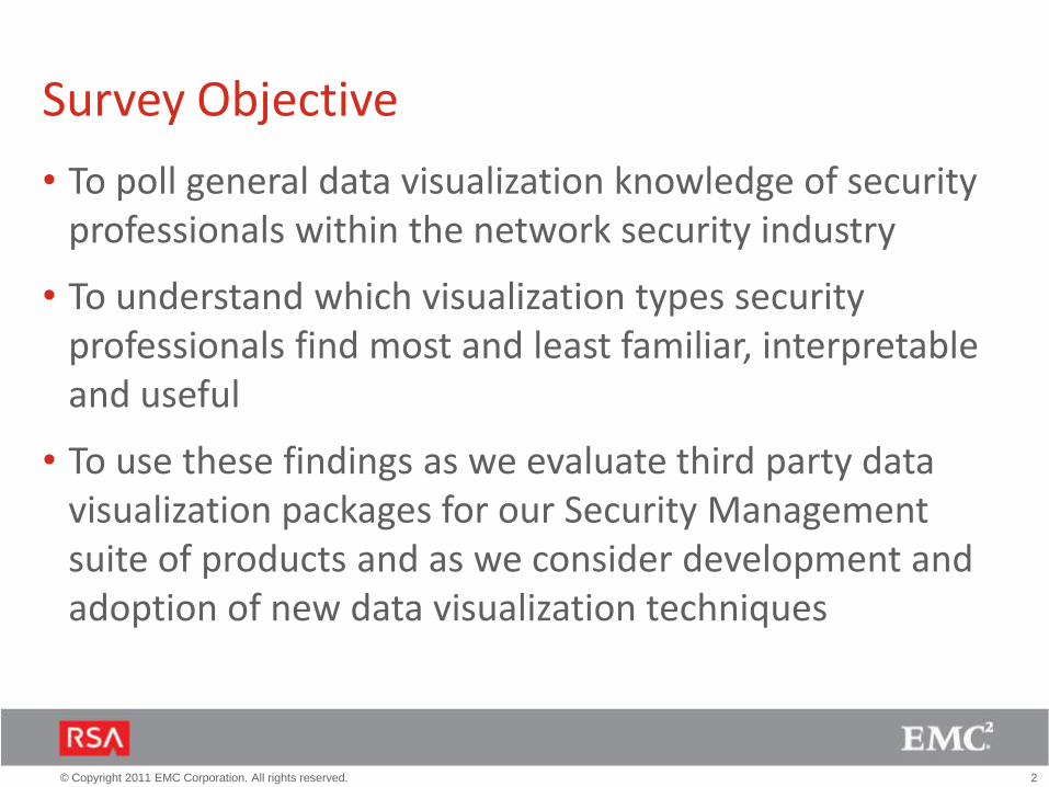
Survey Objective
• To poll general data visualization knowledge of security professionals within the network security industry
• To understand which visualization types security professionals find most and least familiar, interpretable and useful
• To use these findings as we evaluate third party data visualization packages for our Security Management suite of products and as we consider development and adoption of new data visualization techniques

3© Copyright 2011 EMC Corporation. All rights reserved.
Participants
• Total participants: 65 (51 Security Professionals)(Participants were allowed to check off multiple roles)
ROLE COUNT PERCENT
Security Analyst 23 35%
Security Engineer 17 26%
Security Architect 13 20%
Network Analyst 4 7%
SOC Manager 1 1%
DBA/Device owner 1 1%
Product Administrator 4 6%
Other (Security Related) 11 17%
Non-Security (gen public) 14 21%
4© Copyright 2011 EMC Corporation. All rights reserved.
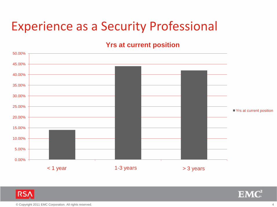
Experience as a Security Professional
0.00%
5.00%
10.00%
15.00%
20.00%
25.00%
30.00%
35.00%
40.00%
45.00%
50.00%
< 1 year 1-3 years > 3 years
Yrs at current position
Yrs at current position
< 1 year< 1 year 1-3 years > 3 years
5© Copyright 2011 EMC Corporation. All rights reserved.
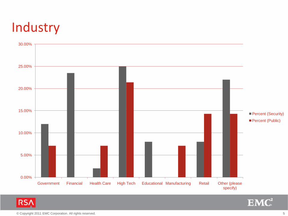
Industry
0.00%
5.00%
10.00%
15.00%
20.00%
25.00%
30.00%
Government Financial Health Care High Tech Educational Manufacturing Retail Other (please specify)
Percent (Security)
Percent (Public)

6© Copyright 2011 EMC Corporation. All rights reserved.
Company Size
0.00% 5.00% 10.00% 15.00% 20.00% 25.00% 30.00% 35.00% 40.00% 45.00%
<500 employees
500-2000 employees
2001-10,000 employees
> 10,000 employees
Percent
Percent

7© Copyright 2011 EMC Corporation. All rights reserved.
When interacting with data during your daily activities, what is most important to you?
80% of security professionals prefer to view summary information first, then drill into the details
Comments“Let me insert the information I need, then let me get details what did you find (logs, video, files, users and etc)...”“Show me *selected* information, then let me get to the details”“ Post processed visualization of data using filters that artificially exaggerate or minimize based on anomalous patterns”
0 20 40 60 80 100
Public (Percent)
Security (Percent)
Lots of detail. Show me all the information right away and let me filter it down
Summary information. Show me high level information right away, then let me get to the
details
Other

8© Copyright 2011 EMC Corporation. All rights reserved.
How do you prefer data to be presented?
75% of security professionals prefer to see a combination of charts and graphs in their data display
Comments“I like any visualization that filters large volumes of unimportant information and makes interesting anomalies or patterns obvious “
0% 10% 20% 30% 40% 50% 60% 70% 80%
Other
I prefer tables over charts and graphs
I prefer charts and graphs over tables
I prefer a combination of tables, charts and graphs
Security (Percent)
Public (Percent)
I prefer a combination of tables, charts and graphs
I prefer charts and graphs over tables
I prefer tables over charts and graphs
Other
9© Copyright 2011 EMC Corporation. All rights reserved.
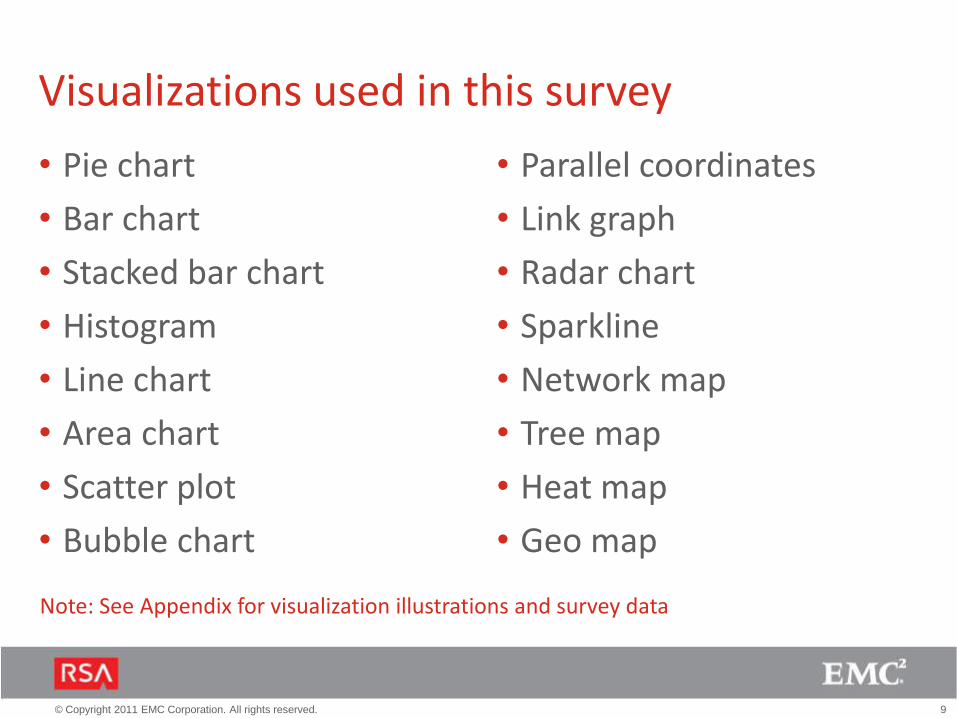
Visualizations used in this survey
• Pie chart
• Bar chart
• Stacked bar chart
• Histogram
• Line chart
• Area chart
• Scatter plot
• Bubble chart
• Parallel coordinates
• Link graph
• Radar chart
• Sparkline
• Network map
• Tree map
• Heat map
• Geo map
Note: See Appendix for visualization illustrations and survey data

10© Copyright 2011 EMC Corporation. All rights reserved.
Our Findings (Security Profs only)Viz Type Familiarity (%) Interpretation (%) Usefulness (%)
Pie chart 100 96 85
Bar chart 100 92 94
Stacked bar 96 90 82
Histogram 96 92 87
Line chart 100 96 98
Area chart 98 92 75
Scatter plot 81 72 79
Bubble chart 73 80 65
Parallel coordinate 51 72 64
Link graph 83 94 91
Radar chart 81 76 53
Sparkline 62 88 72
Network map 83 86 83
Tree map 51 56 60
Heat map 68 77 80
Geo map 98 93 84
80% +
60%-79%
< 60%
11© Copyright 2011 EMC Corporation. All rights reserved.
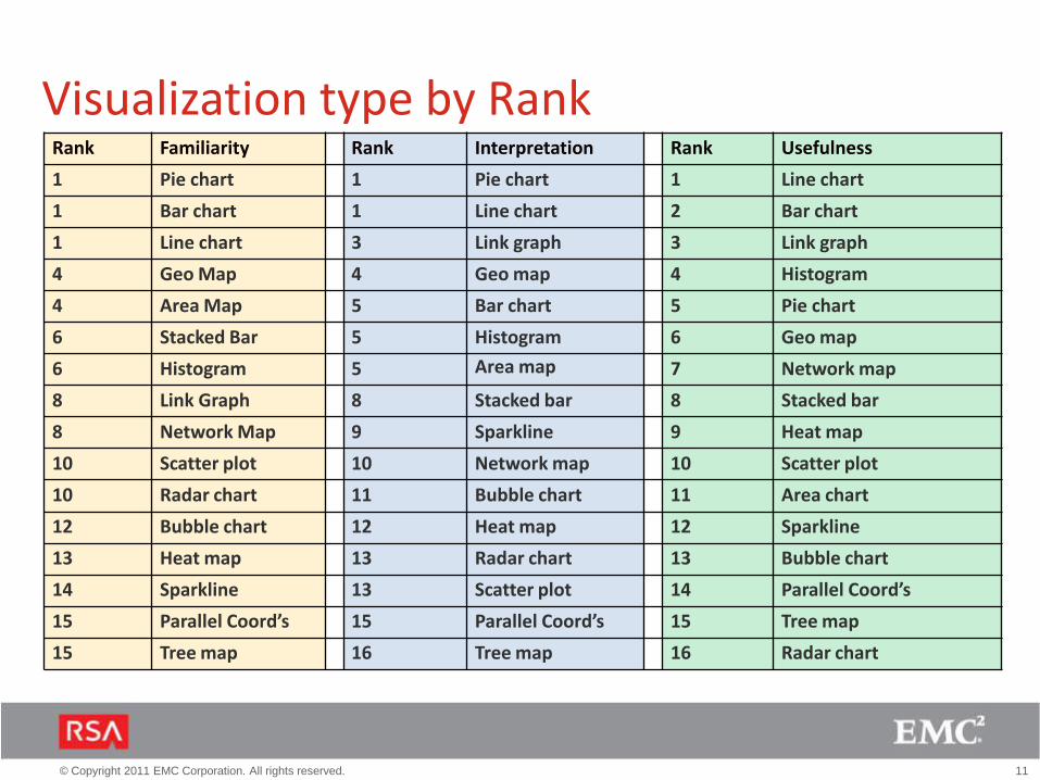
Visualization type by RankRank Familiarity Rank Interpretation Rank Usefulness
1 Pie chart 1 Pie chart 1 Line chart
1 Bar chart 1 Line chart 2 Bar chart
1 Line chart 3 Link graph 3 Link graph
4 Geo Map 4 Geo map 4 Histogram
4 Area Map 5 Bar chart 5 Pie chart
6 Stacked Bar 5 Histogram 6 Geo map
6 Histogram 5 Area map 7 Network map
8 Link Graph 8 Stacked bar 8 Stacked bar
8 Network Map 9 Sparkline 9 Heat map
10 Scatter plot 10 Network map 10 Scatter plot
10 Radar chart 11 Bubble chart 11 Area chart
12 Bubble chart 12 Heat map 12 Sparkline
13 Heat map 13 Radar chart 13 Bubble chart
14 Sparkline 13 Scatter plot 14 Parallel Coord’s
15 Parallel Coord’s 15 Parallel Coord’s 15 Tree map
15 Tree map 16 Tree map 16 Radar chart

12© Copyright 2011 EMC Corporation. All rights reserved.
SummaryAmong security professionals familiar with these visualizations:
• Pie charts, bar charts, line charts are most familiar types of visualizations
• Parallel coordinates, tree maps and sparklines are the least familiar types of visualizations
• Line charts are most useful, followed by bar charts, link graphs and histograms
• Bubble charts, parallel coordinates, tree maps and radar charts are least useful
• Radar charts are the most over-rated, followed by area charts, and pie charts*
• Parallel coordinates are the most under-rated, followed by heat maps and link graph*
* Based upon disparity between familiarity and usefulness
13© Copyright 2011 EMC Corporation. All rights reserved.
Appendix

14© Copyright 2011 EMC Corporation. All rights reserved.
Visualizations: Pie Chart (1 of 2)
How familiar are you with a pie chart?
0% 10% 20% 30% 40% 50% 60%
I use/have used it all the time in my day to day operations
I use/have used it on occasion in my day to day operations
I’ve seen it but I don’t use it
I’ve never seen or used it before
0% 50% 100%
Very comfortable. I easily understand the data.
Somewhat comfortable. I need to spend some time understanding …
Not comfortable. I don’t understand the data.
I've never seen or used it before
How comfortable are you interpreting a pie
chart?
0% 10% 20% 30% 40% 50% 60%
Very useful
Somewhat useful
Not useful
I've never seen or used it before
How useful is a pie chart?

15© Copyright 2011 EMC Corporation. All rights reserved.
Visualizations: Pie Chart (2 of 2)
For what purposes do you currently use a pie
chart?
0% 10% 20% 30% 40%
Daily/weekly reports that I …
Daily/weekly reports that I …
Device monitoring
Incoming alerts
Incident investigation
Network monitoring
Real-time event monitoring
I don't use it
Other (please specify)
Security (%)
“Likes”• I can share this with my team for better understanding
• Good for a general overview
• Display relative proportions of multiple classes of data
• Visually simpler than other types of graphs
• Easy to present high level overview of data providing
there are not too many areas
“Dislikes”• Less details then other charts
• I prefer count or sum to percents (usually used in pie
charts)
• Rapid overall view
• Not enough detailed
• The more data points you have, the less effective a pie
chart is
• Little context usually, too high level, inability to drill into
more meaningful information

16© Copyright 2011 EMC Corporation. All rights reserved.
Visualizations: Bar Chart (1 of 2)
How familiar are you with a bar chart?
How comfortable are you interpreting a bar
chart?
How useful is a bar chart?
0% 10% 20% 30% 40% 50% 60% 70% 80%
I use/have used it all the time in my day to day operations
I use/have used it on occasion in my day to day operations
I’ve seen it but I don’t use it
I’ve never seen or used it before
0% 10%20%30%40%50%60%70%80%90%
Very comfortable. I easily understand the data.
Somewhat comfortable. I need to spend some time understanding the data.
Not comfortable. I don’t understand the data.
I've never seen or used it before
0% 20% 40% 60% 80%
Very useful
Somewhat useful
Not useful
I've never seen or used it before

17© Copyright 2011 EMC Corporation. All rights reserved.
Visualizations: Bar Chart (2 of 2)
For what purposes do you currently use a bar
chart?
“Likes”• Good for high-level data overview
• Can quickly identify where problems lie
• it gives the details so easy ..
• Can display more info than pie chart while still being
clear
“Dislikes”• Not usable for huge amounts of data
• If one value is much bigger then the others the chart
becomes uninformative
• . They only show data 'as a total', you can't know the
behavior of such data like an histogram.
• Once there are two things being shown per bar with
different colors, it starts to get confusing though
0% 10% 20% 30% 40% 50% 60%
Daily/weekly reports that I …
Daily/weekly reports that I …
Device monitoring
Incoming alerts
Incident investigation
Network monitoring
Real-time event monitoring
I don't use it
Other (please specify)
Security (%)
Security (%)
18© Copyright 2011 EMC Corporation. All rights reserved.
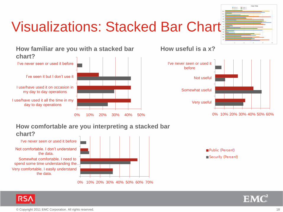
Visualizations: Stacked Bar Chart
How familiar are you with a stacked bar
chart?
How comfortable are you interpreting a stacked bar
chart?
How useful is a x?
0% 10% 20% 30% 40% 50%
I use/have used it all the time in my day to day operations
I use/have used it on occasion in my day to day operations
I’ve seen it but I don’t use it
I’ve never seen or used it before
0% 10% 20% 30% 40% 50% 60% 70%
Very comfortable. I easily understand the data.
Somewhat comfortable. I need to spend some time understanding the …
Not comfortable. I don’t understand the data.
I've never seen or used it before
0% 10% 20% 30% 40% 50% 60%
Very useful
Somewhat useful
Not useful
I've never seen or used it before

19© Copyright 2011 EMC Corporation. All rights reserved.
0% 10% 20% 30% 40% 50%
Daily/weekly reports that I …
Daily/weekly reports that I …
Device monitoring
Incoming alerts
Incident investigation
Network monitoring
Real-time event monitoring
I don't use it
Other (please specify)
Security (%)
Security (%)
Visualizations: Stacked Bar Chart For what purposes do you currently use a stacked bar
chart?
“Likes” “Dislikes”• The stacked bar chart is the lowest level of useful
visualization in any security context
• I don't love these.
• They can be confusing for those unfamiliar with their
use. They also make comparing some mid-column
values difficult.
• Only values next to axis can be compared easily

20© Copyright 2011 EMC Corporation. All rights reserved.
0% 20% 40% 60% 80%
Very useful
Somewhat useful
Not useful
I've never seen or used it before
0% 10%20%30%40%50%60%70%80%
Very comfortable. I easily understand the data.
Somewhat comfortable. I need to spend some time understanding …
Not comfortable. I don’t understand the data.
I've never seen or used it before
0% 10% 20% 30% 40% 50%
I use/have used it all the time in my day to day operations
I use/have used it on occasion in my day to day operations
I’ve seen it but I don’t use it
I’ve never seen or used it before
Visualizations: Histogram (1 of 2)
How familiar are you with a histogram?
How comfortable are you interpreting a
histogram?
How useful is a histogram?

21© Copyright 2011 EMC Corporation. All rights reserved.
0% 10% 20% 30% 40% 50%
Daily/weekly reports that I …
Daily/weekly reports that I …
Device monitoring
Incoming alerts
Incident investigation
Network monitoring
Real-time event monitoring
I don't use it
Other (please specify)
Security (%)
Security (%)
Visualizations: Histogram(2 of 2)
For what purposes do you currently use a x?
“Likes”• Useful to see the picture for a period of time
• Useful for showing trends when dealing with a large
amount of data
• It's very useful in determining what data has reached a
peak in a given time
• best diagram ever, all the information available in one
graph.
“Dislikes”• Does not allow comparisons very easily
• Useful for one variable only
22© Copyright 2011 EMC Corporation. All rights reserved.
0% 20% 40% 60% 80% 100%
Very useful
Somewhat useful
Not useful
I've never seen or used it before
0% 20% 40% 60% 80% 100%
Very comfortable. I easily understand the data.
Somewhat comfortable. I need to spend some time understanding …
Not comfortable. I don’t understand the data.
I've never seen or used it before
0% 20% 40% 60% 80% 100%
I use/have used it all the time in my day to day operations
I use/have used it on occasion in my day to day operations
I’ve seen it but I don’t use it
I’ve never seen or used it before
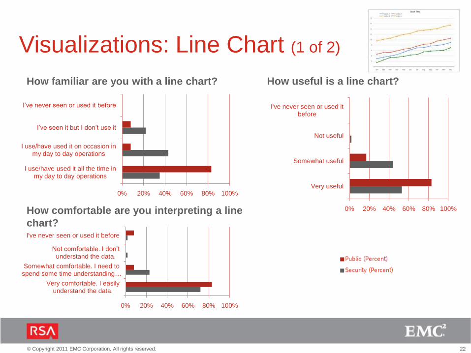
Visualizations: Line Chart (1 of 2)
How familiar are you with a line chart?
How comfortable are you interpreting a line
chart?
How useful is a line chart?
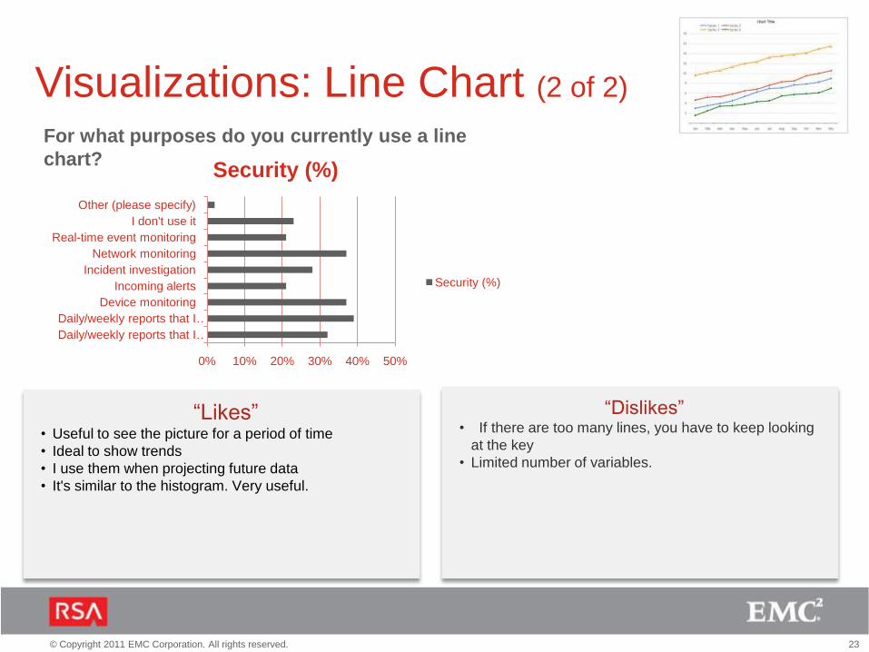
23© Copyright 2011 EMC Corporation. All rights reserved.
0% 10% 20% 30% 40% 50%
Daily/weekly reports that I …
Daily/weekly reports that I …
Device monitoring
Incoming alerts
Incident investigation
Network monitoring
Real-time event monitoring
I don't use it
Other (please specify)
Security (%)
Security (%)
Visualizations: Line Chart (2 of 2)
For what purposes do you currently use a line
chart?
“Likes”• Useful to see the picture for a period of time
• Ideal to show trends
• I use them when projecting future data
• It's similar to the histogram. Very useful.
“Dislikes”• If there are too many lines, you have to keep looking
at the key
• Limited number of variables.

24© Copyright 2011 EMC Corporation. All rights reserved.
0% 10% 20% 30% 40% 50% 60%
Very useful
Somewhat useful
Not useful
I've never seen or used it before
0% 20% 40% 60% 80%
Very comfortable. I easily understand the data.
Somewhat comfortable. I need to spend some time understanding …
Not comfortable. I don’t understand the data.
I've never seen or used it before
0% 10% 20% 30% 40% 50% 60%
I use/have used it all the time in my day to day operations
I use/have used it on occasion in my day to day operations
I’ve seen it but I don’t use it
I’ve never seen or used it before
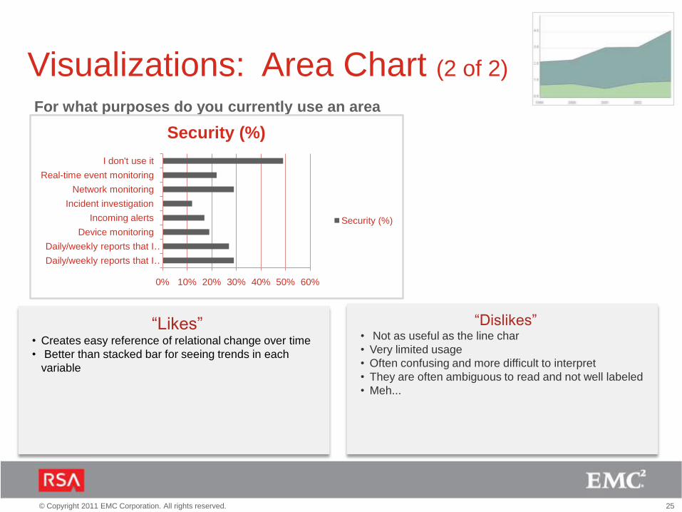
Visualizations: Area Chart (1 of 2)
How familiar are you with an area
chart?
How comfortable are you interpreting an area
chart?
How useful is an area chart?
25© Copyright 2011 EMC Corporation. All rights reserved.
Visualizations: Area Chart (2 of 2)
For what purposes do you currently use an area
chart?
“Likes”• Creates easy reference of relational change over time
• Better than stacked bar for seeing trends in each
variable
“Dislikes”• Not as useful as the line char
• Very limited usage
• Often confusing and more difficult to interpret
• They are often ambiguous to read and not well labeled
• Meh...
0% 10% 20% 30% 40% 50% 60%
Daily/weekly reports that I …
Daily/weekly reports that I …
Device monitoring
Incoming alerts
Incident investigation
Network monitoring
Real-time event monitoring
I don't use it
Security (%)
Security (%)
26© Copyright 2011 EMC Corporation. All rights reserved.
0% 20% 40% 60% 80% 100%
Very useful
Somewhat useful
Not useful
I've never seen or used it before
0% 10% 20% 30% 40% 50% 60% 70%
Very comfortable. I easily understand the data.
Somewhat comfortable. I need to spend some time understanding …
Not comfortable. I don’t understand the data.
I've never seen or used it before
0% 10% 20% 30% 40% 50% 60%
I use/have used it all the time in my day to day operations
I use/have used it on occasion in my day to day operations
I’ve seen it but I don’t use it
I’ve never seen or used it before
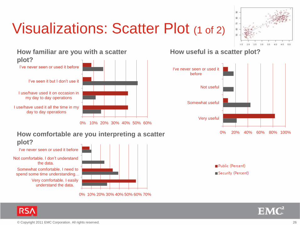
Visualizations: Scatter Plot (1 of 2)
How familiar are you with a scatter
plot?
How comfortable are you interpreting a scatter
plot?
How useful is a scatter plot?

27© Copyright 2011 EMC Corporation. All rights reserved.
0% 20% 40% 60% 80%
Daily/weekly reports that I …
Daily/weekly reports that I …
Device monitoring
Incoming alerts
Incident investigation
Network monitoring
Real-time event monitoring
I don't use it
Other (please specify)
Security (%)
Security (%)
Visualizations: Scatter Plot (2 of 2)
For what purposes do you currently use a scatter
plot?
“Likes”• Can see the distribution of events here
• A lot of information - mostly overview can be displayed
• Does show a lot of information, but users generally like
it less. Great to show trends.
• Great to spot outliers
“Dislikes”• can be difficult for people to interpret
• Results may not be clear
• Very limited usage
• Almost always a bad idea
• At first glance it looks confusing, maybe easier to
understand with less clusters
“Finally we get into truly useful
visualization, were we can see
patterns emerging from the data. This
is where security visualization
lies, being able to easily perceive and
explore patterns in the data.”

28© Copyright 2011 EMC Corporation. All rights reserved.
0% 20% 40% 60% 80%
Very useful
Somewhat useful
Not useful
I've never seen or used it before
0% 10% 20% 30% 40% 50% 60%
Very comfortable. I easily understand the data.
Somewhat comfortable. I need to spend some time understanding …
Not comfortable. I don’t understand the data.
I've never seen or used it before
0% 10% 20% 30% 40% 50% 60%
I use/have used it all the time in my day to day operations
I use/have used it on occasion in my day to day operations
I’ve seen it but I don’t use it
I’ve never seen or used it before
Visualizations: Bubble Chart (1 of 2)
How familiar are you with a bubble
chart?
How comfortable are you interpreting a bubble
chart?
How useful is a bubble chart?

29© Copyright 2011 EMC Corporation. All rights reserved.
Visualizations: Bubble Chart (2 of 2)
For what purposes do you currently use a bubble
chart?
“Likes”• Great for spotting outliers
• I like the very high density of information
• Fantastic graph type, if done well.
“Dislikes”• Not much better than a scatter chart
• can get cluttered
0% 20% 40% 60% 80%
Daily/weekly reports that I …
Daily/weekly reports that I …
Device monitoring
Incoming alerts
Incident investigation
Network monitoring
Real-time event monitoring
I don't use it
Other (please specify)
Security (%)
Security (%)

30© Copyright 2011 EMC Corporation. All rights reserved.
0% 10% 20% 30% 40% 50%
Very useful
Somewhat useful
Not useful
I've never seen or used it before
0% 10% 20% 30% 40% 50% 60%
I use/have used it all the time in my day to day operations
I use/have used it on occasion in my day to day operations
I’ve seen it but I don’t use it
I’ve never seen or used it before
Visualization: Parallel Coordinates
How familiar are you with a parallel
coord’s?
How comfortable are you interpreting parallel
coord’s?
How useful are parallel coord’s?
0% 10% 20% 30% 40% 50% 60%
Very comfortable. I easily understand the data.
Somewhat comfortable. I need to spend some time understanding …
Not comfortable. I don’t understand the data.
I've never seen or used it before

31© Copyright 2011 EMC Corporation. All rights reserved.
0% 20% 40% 60% 80%
Daily/weekly reports that I …
Daily/weekly reports that I …
Device monitoring
Incoming alerts
Incident investigation
Network monitoring
Real-time event monitoring
I don't use it
Other (please specify)
Security (%)
Security (%)
Visualization: Parallel CoordinatesFor what purposes do you currently use parallel coord’s?
“Likes”• Can see a high level overview on loads of different data
• Useful to demonstrate ranking on different elements.
• Looks like an interesting way to display data. could be
good for showing access to sensitive data
“Dislikes”• Can be somewhat complicated
• A bit more complex for users that are less familiar with
it.
• Looks confusing, I would need someone to explain it
• This one seems like it would be a lot of work. Like it's
showing something complicated
• That would take some detailed explanation to grasp the
meaning
“…the relationships between
disparate pieces of data become
clear, new information is
contexted out of the data, and the
visualization serves an actual
purpose, instead of being a
hindrance.”

32© Copyright 2011 EMC Corporation. All rights reserved.
0% 20% 40% 60% 80%
Very useful
Somewhat useful
Not useful
I've never seen or used it before
0% 10%20%30%40%50%60%70%80%
Very comfortable. I easily understand the data.
Somewhat comfortable. I need to spend some time understanding …
Not comfortable. I don’t understand the data.
I've never seen or used it before
0% 10% 20% 30% 40% 50% 60%
I use/have used it all the time in my day to day operations
I use/have used it on occasion in my day to day operations
I’ve seen it but I don’t use it
I’ve never seen or used it before
Visualizations: Link Graph (1 of 2)
How familiar are you with a link graph?
How comfortable are you interpreting a link
graph?
How useful is a link graph?

33© Copyright 2011 EMC Corporation. All rights reserved.
0% 10% 20% 30% 40% 50% 60%
Daily/weekly reports that I …
Daily/weekly reports that I …
Device monitoring
Incoming alerts
Incident investigation
Network monitoring
Real-time event monitoring
I don't use it
Other
Security (%)
Security (%)
Visualizations: Link Graph (2 of 2)
For what purposes do you currently use a link
graph?
“Likes”• Great for workflows and network mapping
• good for showing relationships between entities
“Dislikes”• the Parallel Coordinates are much better
• can get very cluttered
34© Copyright 2011 EMC Corporation. All rights reserved.
0% 10% 20% 30% 40% 50%
Very useful
Somewhat useful
Not useful
I've never seen or used it before
0% 10% 20% 30% 40% 50% 60%
Very comfortable. I easily understand the data.
Somewhat comfortable. I need to spend some time understanding …
Not comfortable. I don’t understand the data.
I've never seen or used it before
0% 10% 20% 30% 40% 50% 60%
I use/have used it all the time in my day to day operations
I use/have used it on occasion in my day to day operations
I’ve seen it but I don’t use it
I’ve never seen or used it before
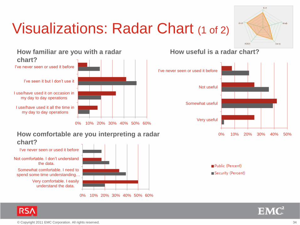
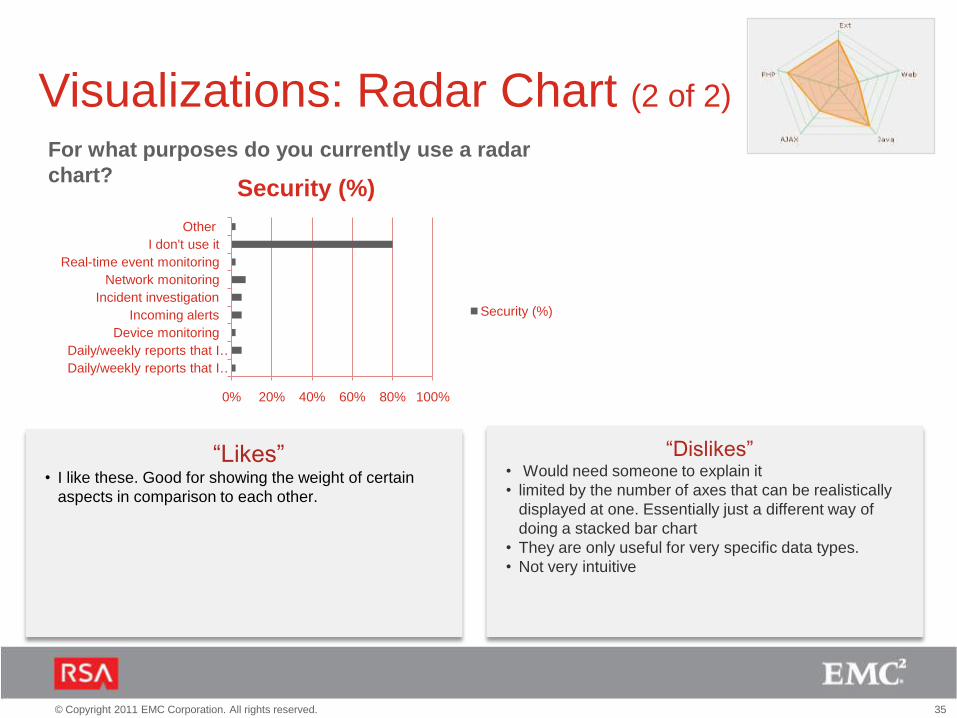
Visualizations: Radar Chart (1 of 2)
How familiar are you with a radar
chart?
How comfortable are you interpreting a radar
chart?
How useful is a radar chart?
35© Copyright 2011 EMC Corporation. All rights reserved.
0% 20% 40% 60% 80% 100%
Daily/weekly reports that I …
Daily/weekly reports that I …
Device monitoring
Incoming alerts
Incident investigation
Network monitoring
Real-time event monitoring
I don't use it
Other
Security (%)
Security (%)
Visualizations: Radar Chart (2 of 2)
For what purposes do you currently use a radar
chart?
“Likes”• I like these. Good for showing the weight of certain
aspects in comparison to each other.
“Dislikes”• Would need someone to explain it
• limited by the number of axes that can be realistically
displayed at one. Essentially just a different way of
doing a stacked bar chart
• They are only useful for very specific data types.
• Not very intuitive

36© Copyright 2011 EMC Corporation. All rights reserved.
0% 10% 20% 30% 40% 50%
Very useful
Somewhat useful
Not useful
I've never seen or used it before
0% 10% 20% 30% 40% 50%
Very comfortable. I easily understand the data.
Somewhat comfortable. I need to spend some time understanding …
Not comfortable. I don’t understand the data.
I've never seen or used it before
0% 10% 20% 30% 40% 50%
I use/have used it all the time in my day to day operations
I use/have used it on occasion in my day to day operations
I’ve seen it but I don’t use it
I’ve never seen or used it before
Visualizations: Spark Line (1 of 2)
How familiar are you with a spark line?
How comfortable are you interpreting a spark
line?
How useful is a spark line?

37© Copyright 2011 EMC Corporation. All rights reserved.
0% 20% 40% 60% 80% 100%
Daily/weekly reports that I …
Daily/weekly reports that I …
Device monitoring
Incoming alerts
Incident investigation
Network monitoring
Real-time event monitoring
I don't use it
Security (%)
Security (%)
Visualizations: Spark line (2 of 2)
For what purposes do you currently use a spark line?
“Likes”• Trend data reduced to its simplest form
• Great for overviews when not much detail is required.
“Dislikes”• Looks like 4 bar charts to me

38© Copyright 2011 EMC Corporation. All rights reserved.
0% 10% 20% 30% 40% 50% 60% 70%
Very useful
Somewhat useful
Not useful
I've never seen or used it before
0% 10% 20% 30% 40% 50% 60% 70%
Very comfortable. I easily understand the data.
Somewhat comfortable. I need to spend some time understanding …
Not comfortable. I don’t understand the data.
I've never seen or used it before
0% 10% 20% 30% 40% 50%
I use/have used it all the time in my day to day operations
I use/have used it on occasion in my day to day operations
I’ve seen it but I don’t use it
I’ve never seen or used it before
Visualizations: Network Map (1 of 2)
How familiar are you with a network
map?
How comfortable are you interpreting a network
map?
How useful is a network map?

39© Copyright 2011 EMC Corporation. All rights reserved.
0% 10% 20% 30% 40% 50%
Daily/weekly reports that I …
Daily/weekly reports that I …
Device monitoring
Incoming alerts
Incident investigation
Network monitoring
Real-time event monitoring
I don't use it
Other
Security (%)
Security (%)
Visualizations: Network Map (2 of 2)
For what purposes do you currently use a network
map?
“Likes”• Very clear representation of network
• Great for showing relationships between entities - much
like the link graph.
“Dislikes”• Not used by many vendors
• Can become very cluttered. Lists are sometimes more
useful.
• Can quickly get very messy and confusing until filtered

40© Copyright 2011 EMC Corporation. All rights reserved.
0% 10% 20% 30% 40% 50%
Very useful
Somewhat useful
Not useful
I've never seen or used it before
0% 10% 20% 30% 40% 50%
Very comfortable. I easily understand the data.
Somewhat comfortable. I need to spend some time understanding …
Not comfortable. I don’t understand the data.
I've never seen or used it before
0% 10% 20% 30% 40% 50% 60%
I use/have used it all the time in my day to day operations
I use/have used it on occasion in my day to day operations
I’ve seen it but I don’t use it
I’ve never seen or used it before
Visualizations: Tree Map (1 of 2)
How familiar are you with a tree map?
How comfortable are you interpreting a tree
map?
How useful is a tree map?

41© Copyright 2011 EMC Corporation. All rights reserved.
0% 20% 40% 60% 80% 100%
Daily/weekly reports that I …
Daily/weekly reports that I …
Device monitoring
Incoming alerts
Incident investigation
Network monitoring
Real-time event monitoring
I don't use it
Other
Security (%)
Security (%)
Visualizations: Tree Map (2 of 2)
For what purposes do you currently use a tree map?
“Likes”• Easily observe hierarchical groupings as the viewer
needs to perceive them, in the same visualization, is
where tree graphs rule
• Can show hierarchies nicely
“Dislikes”• Very limited usage
• Details not visible
• Not usable in small space
• looks confusing
• I have a hard time making sense of it. Too much info at
once.

42© Copyright 2011 EMC Corporation. All rights reserved.
0% 10% 20% 30% 40%
Very useful
Somewhat useful
Not useful
I've never seen or used it before
0% 10% 20% 30% 40% 50%
Very comfortable. I easily understand the data.
Somewhat comfortable. I need to spend some time understanding …
Not comfortable. I don’t understand the data.
I've never seen or used it before
0% 10% 20% 30% 40% 50%
I use/have used it all the time in my day to day operations
I use/have used it on occasion in my day to day operations
I’ve seen it but I don’t use it
I’ve never seen or used it before
Visualizations: Heat Map (1 of 2)
How familiar are you with a heat map?
How comfortable are you interpreting a heat
map?
How useful is a heat map?

43© Copyright 2011 EMC Corporation. All rights reserved.
0% 200% 400% 600% 800%
Daily/weekly reports that I …
Daily/weekly reports that I …
Device monitoring
Incoming alerts
Incident investigation
Network monitoring
Real-time event monitoring
I don't use it
Other
Security (%)
Security (%)
Visualizations: Heat Map (2 of 2)
For what purposes do you currently use a heat map?
“Likes”• One of the best 'at a glance' visualizations, for
demonstrating relations between individual quantities
and allow perception of patterns over time
• Simple and easy visualization
“Dislikes”• Needs a lot of space
• Would need someone to explain it
• Looks too complicated.
44© Copyright 2011 EMC Corporation. All rights reserved.
0% 20% 40% 60% 80% 100%
Very useful
Somewhat useful
Not useful
I've never seen or used it before
0% 20% 40% 60% 80% 100%
Very comfortable. I easily understand the data.
Somewhat comfortable. I need to spend some time understanding …
Not comfortable. I don’t understand the data.
I've never seen or used it before
0% 10% 20% 30% 40% 50%
I use/have used it all the time in my day to day operations
I use/have used it on occasion in my day to day operations
I’ve seen it but I don’t use it
I’ve never seen or used it before
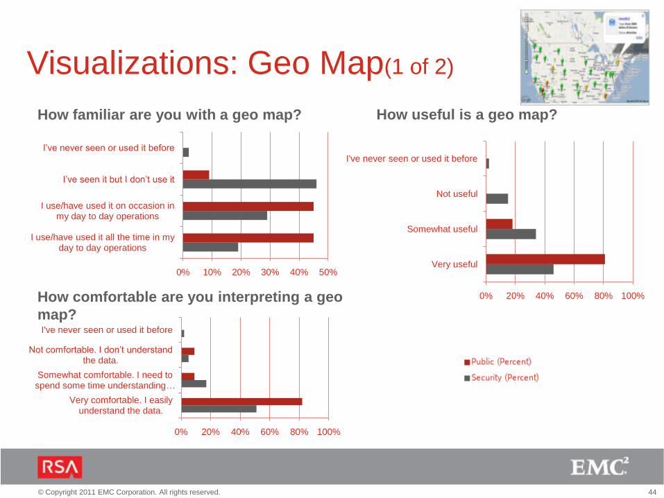
Visualizations: Geo Map(1 of 2)
How familiar are you with a geo map?
How comfortable are you interpreting a geo
map?
How useful is a geo map?

45© Copyright 2011 EMC Corporation. All rights reserved.
0% 10% 20% 30% 40% 50% 60% 70%
Daily/weekly reports that I …
Daily/weekly reports that I …
Device monitoring
Incoming alerts
Incident investigation
Network monitoring
Real-time event monitoring
I don't use it
Other
Security (%)
Security (%)
Visualizations: Geo Map (2 of 2)
For what purposes do you currently use a geo?
“Likes”• A clear location of certain data can be visualized
• great for showing to non IT people - i.e. Management
“Dislikes”• 1) Not useful if 1 data center is used\
• Useful for large deployed systems. Less useful for
systems that are localized even if they are complex.
• There can be challenges getting enough of the useful
information into the hover-bubble

46© Copyright 2011 EMC Corporation. All rights reserved.
THANK YOUTHANK YOU