data visualization workflow
TRANSCRIPT

DATA VISUALIZATION
WORKFLOWAn Introduction to the Art and Science of
Preparing Data Visualizations
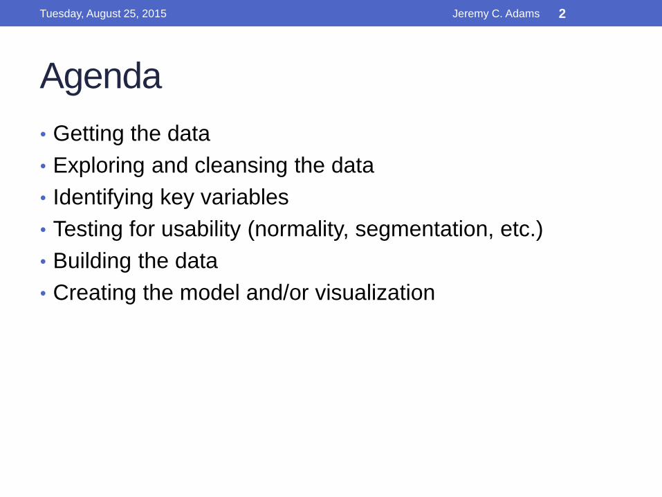
Agenda
• Getting the data
• Exploring and cleansing the data
• Identifying key variables
• Testing for usability (normality, segmentation, etc.)
• Building the data
• Creating the model and/or visualization
Tuesday, August 25, 2015 Jeremy C. Adams 2

Getting the Data
• Where is the data? Internal to your organization?
External?
• What format is the data in? Excel file(s)? CSV? Flat files?
SQL databases? More exotic formats? (SAS, R, HANA,
Hadoop, genetic sequencing data stored in a hashed
format and encrypted to prevent tampering)
• Consider handing off data mining to a more seasoned
professional than your average software developer or
database engineer.
Tuesday, August 25, 2015 Jeremy C. Adams 3

Getting the Data
• If you’re lucky enough to have metadata, use it! (It will
save you countless hours cleansing the data if you do.)
Tuesday, August 25, 2015 Jeremy C. Adams 4

Exploring and Cleansing the Data
• Look at the data. You need to know how clean individual
data fields are, and which fields tend to contain data that
can be used for the visualizations you want to build.
setwd(“/Documents/Columbus Data Visualization/2015-06-26 LTC Data/raw_data")
df <- read.csv("ProviderInfo.csv")head(df) # quick view of, by default, first 10 rows of data frame
Tuesday, August 25, 2015 Jeremy C. Adams 5

Exploring and Cleansing the Data
• It’s usually helpful to start by using 400 randomly chosen
rows from a given table of large size (10k+ rows).
rand400 <- df[sample(nrow(df), 400), ] # random sample of 400 rows from df
Tuesday, August 25, 2015 Jeremy C. Adams 6

Exploring and Cleansing the Data
• We could combine other data with our current data set,
but for the sake of example, let’s just stick with Provider
data. We could look at number of beds by a variety of
factors.
• What if we look at Resident Occupancy rate against other
factors?
Hmmm… there should not be
10x more residents than beds!
Tuesday, August 25, 2015 Jeremy C. Adams 7

Exploring and Cleansing the Data
• Let’s clean up our data (for now) by just removing data that doesn’t make sense. (In the
real world, further research would need to be done to determine how to handle this
data properly.)
Much better! And a
quick histogram reveals
what we would expect
> hist(df$RES_TO_BEDS_RATIO)
Tuesday, August 25, 2015 Jeremy C. Adams 8

Identifying key variables
• Now comes the interesting parts – identifying how we
want to visualize our data.
• What types of ways could we visualize our data?
• Which variables contain useful data?
• There can be an art to selecting variables, and it is usually
best, and easiest, to perform direct interviews of subject
matter experts to learn about which variables may be
predictive or correlated before attempting to go directly at
the data for answers.
Tuesday, August 25, 2015 Jeremy C. Adams 9

Testing for Usability
• Why test variables?
• Normality
• Segmentation (and segmentation biases)
• Trends
• Anomalies
• Unexpected data sorting problems
• Invalid values
Tuesday, August 25, 2015 Jeremy C. Adams 10
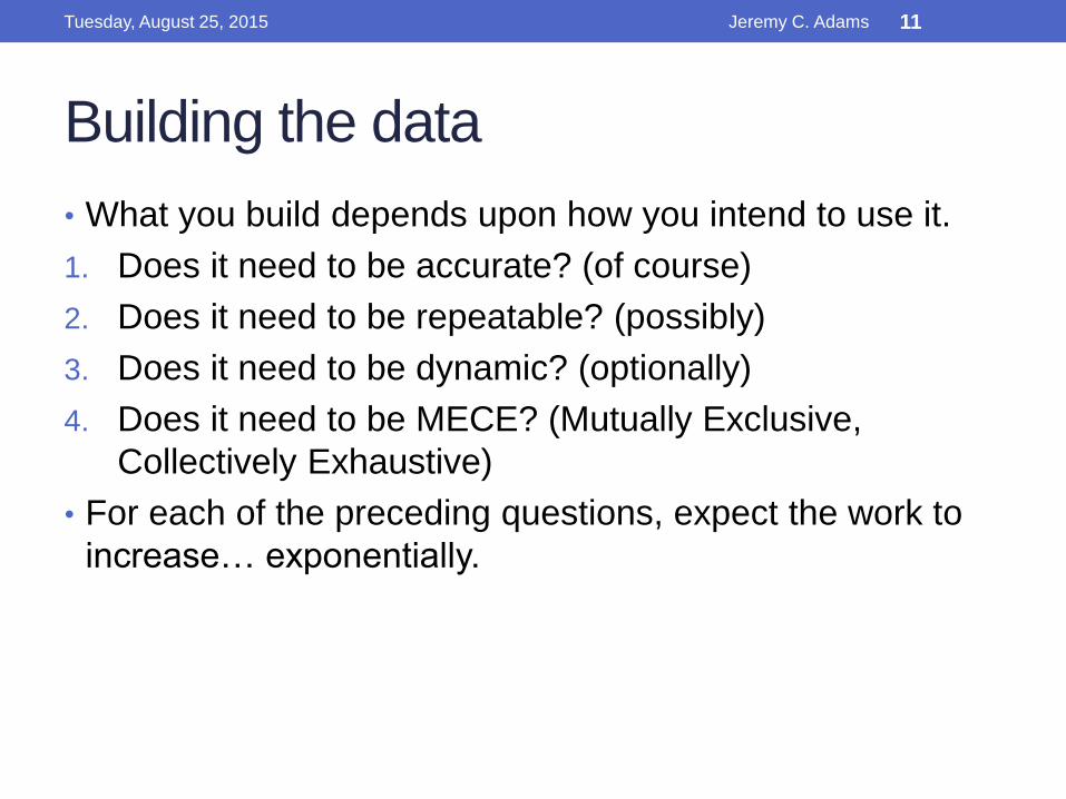
Building the data
• What you build depends upon how you intend to use it.
1. Does it need to be accurate? (of course)
2. Does it need to be repeatable? (possibly)
3. Does it need to be dynamic? (optionally)
4. Does it need to be MECE? (Mutually Exclusive,
Collectively Exhaustive)
• For each of the preceding questions, expect the work to
increase… exponentially.
Tuesday, August 25, 2015 Jeremy C. Adams 11

Creating the Model / Visualization
• Let’s review some possible examples of visualizations
based on our data
Scatter Plots
Tuesday, August 25, 2015 Jeremy C. Adams 12
Creating the Model / Visualization
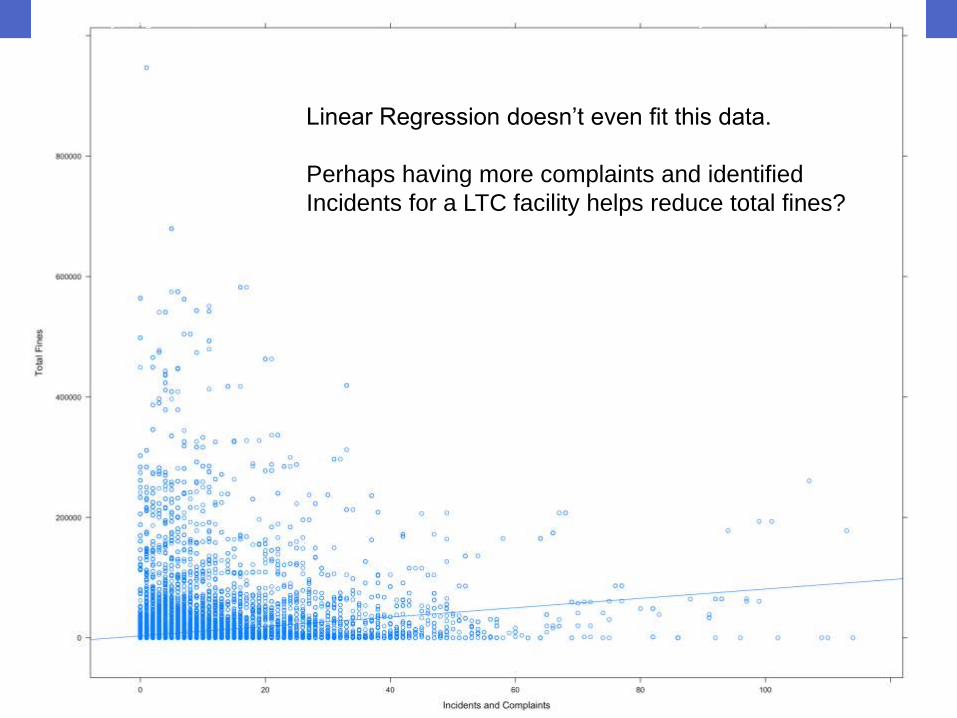
Linear Regressions
Linear Regression doesn’t even fit this data.
Perhaps having more complaints and identified
Incidents for a LTC facility helps reduce total fines?
Tuesday, August 25, 2015 Jeremy C. Adams 13

Creating the Model / Visualization
Density Plots
Barcharts
ANOVA
Heatmaps
Geographical Heatmaps
Tuesday, August 25, 2015 Jeremy C. Adams 14

Questions
Tuesday, August 25, 2015 Jeremy C. Adams 15