david stoddard's portfolio
TRANSCRIPT
David StoddardPORTFOLIO
David Stoddard435.881.0748
3886 Sage Meadow DriveSouth Jordan, UT 84009
www.davidstorytime.com
4
6
8
10
14
16
18
20
22
Table of ContentsPHONE
ADDRESS
WEBSITE
WEB PAGE MOCKUP
BROCHURE
PREZI PRESENTATION
BUSINESS IDENTITY
HTML & CSS CODING
MONTAGE
INFOGRAPHIC
PHOTODESIGN
MAGAZINE COVER
PROGRAMS
COURSES & SECTION
OBJECTIVE
PROCESS
INSTRUCTOR
DATE
Brother Stucki
Comm 130: Section 12
54
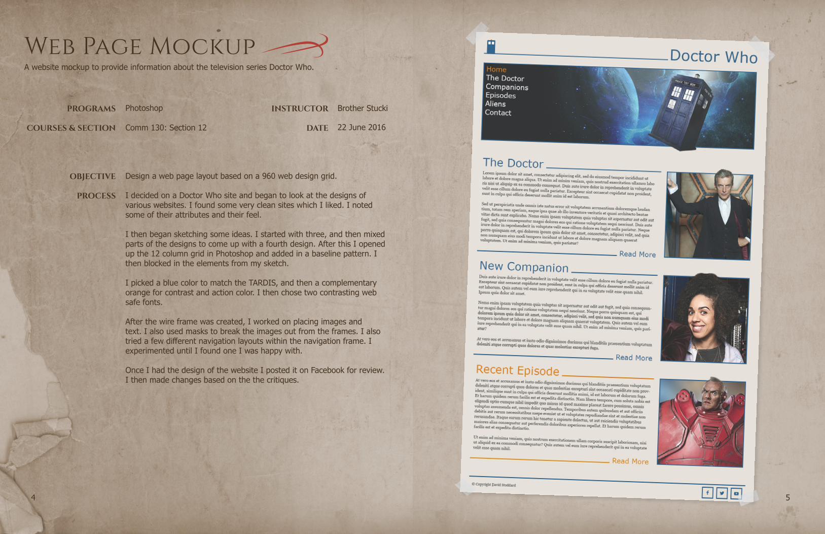
Web Page Mockup
22 June 2016
Photoshop
Design a web page layout based on a 960 web design grid.
A website mockup to provide information about the television series Doctor Who.
I decided on a Doctor Who site and began to look at the designs of various websites. I found some very clean sites which I liked. I noted some of their attributes and their feel.
I then began sketching some ideas. I started with three, and then mixed parts of the designs to come up with a fourth design. After this I opened up the 12 column grid in Photoshop and added in a baseline pattern. I then blocked in the elements from my sketch.
I picked a blue color to match the TARDIS, and then a complementary orange for contrast and action color. I then chose two contrasting web safe fonts.
After the wire frame was created, I worked on placing images and text. I also used masks to break the images out from the frames. I also tried a few different navigation layouts within the navigation frame. I experimented until I found one I was happy with.
Once I had the design of the website I posted it on Facebook for review. I then made changes based on the the critiques.
INSTRUCTOR
DATE
Brother Stucki
76
Comm 130: Section 12
OBJECTIVE
PROCESS
PROGRAMS
COURSES & SECTION
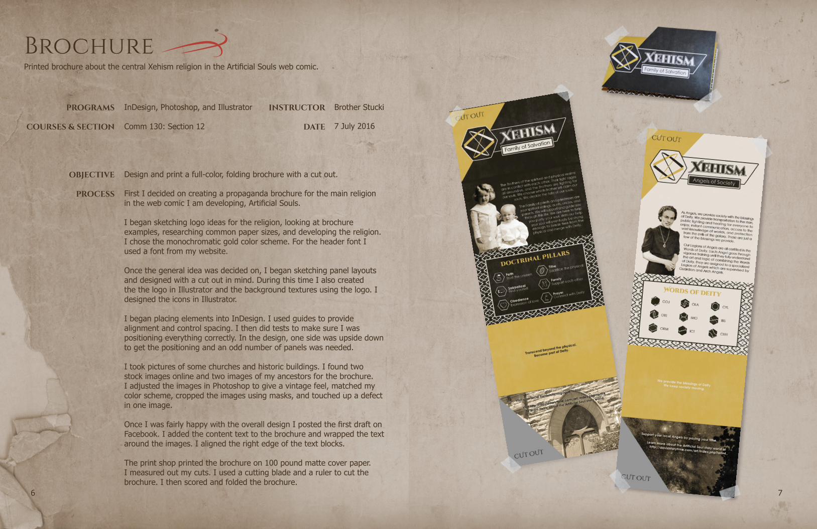
Brochure
7 July 2016
InDesign, Photoshop, and Illustrator
Design and print a full-color, folding brochure with a cut out.
First I decided on creating a propaganda brochure for the main religion in the web comic I am developing, Artificial Souls.
I began sketching logo ideas for the religion, looking at brochure examples, researching common paper sizes, and developing the religion. I chose the monochromatic gold color scheme. For the header font I used a font from my website.
Once the general idea was decided on, I began sketching panel layouts and designed with a cut out in mind. During this time I also created the the logo in Illustrator and the background textures using the logo. I designed the icons in Illustrator.
I began placing elements into InDesign. I used guides to provide alignment and control spacing. I then did tests to make sure I was positioning everything correctly. In the design, one side was upside down to get the positioning and an odd number of panels was needed.
I took pictures of some churches and historic buildings. I found two stock images online and two images of my ancestors for the brochure. I adjusted the images in Photoshop to give a vintage feel, matched my color scheme, cropped the images using masks, and touched up a defect in one image.
Once I was fairly happy with the overall design I posted the first draft on Facebook. I added the content text to the brochure and wrapped the text around the images. I aligned the right edge of the text blocks.
The print shop printed the brochure on 100 pound matte cover paper. I measured out my cuts. I used a cutting blade and a ruler to cut the brochure. I then scored and folded the brochure.
Printed brochure about the central Xehism religion in the Artificial Souls web comic.
PROGRAMS
COURSES & SECTION
OBJECTIVE
PROCESS
INSTRUCTOR
DATE
Brother Stucki
Comm 130: Section 12
98
Prezi Presentation
11 May 2016
Prezi and Photoshop
Design a creative and interesting Prezi presentation.
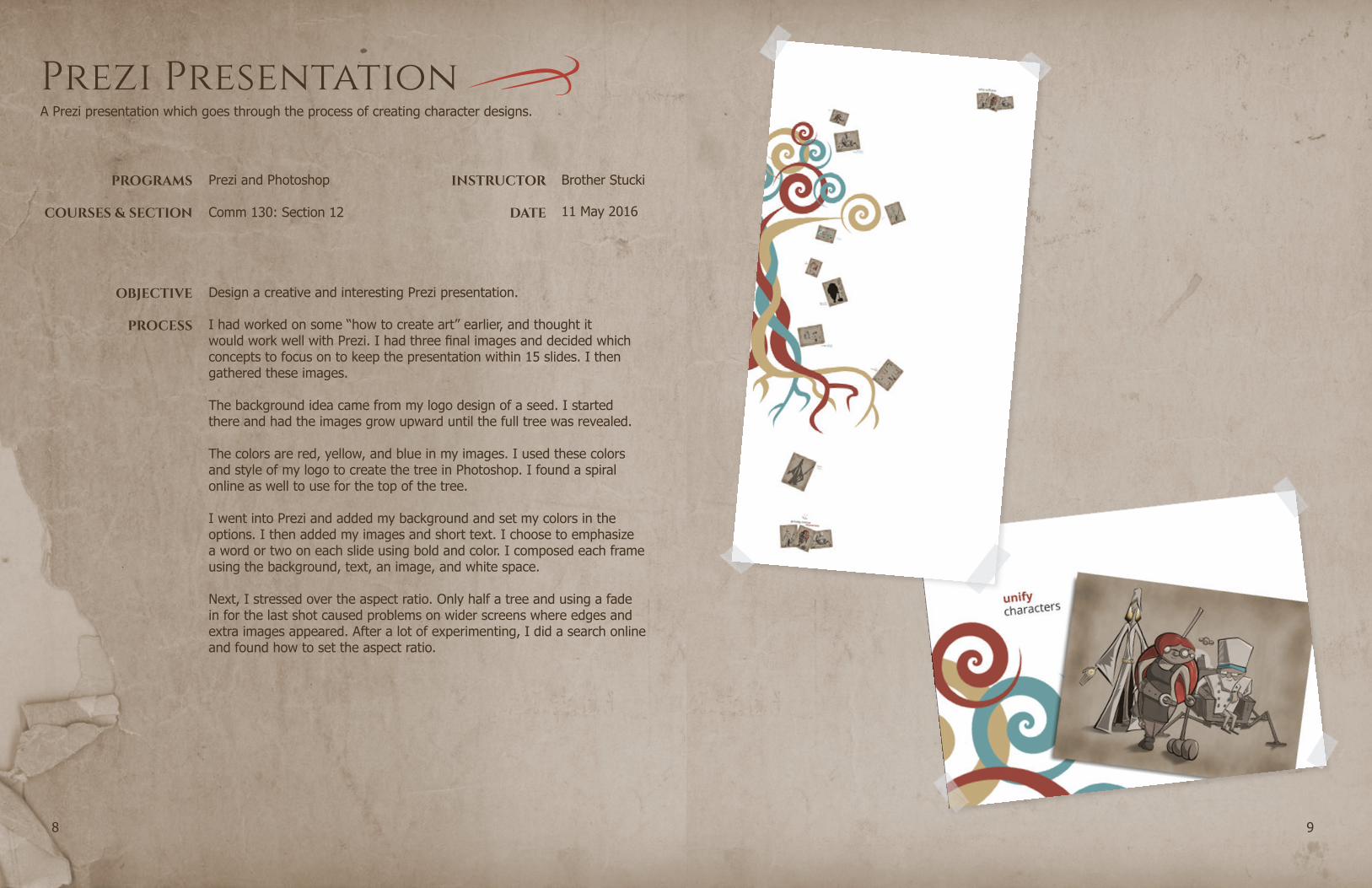
I had worked on some “how to create art” earlier, and thought it would work well with Prezi. I had three final images and decided which concepts to focus on to keep the presentation within 15 slides. I then gathered these images.
The background idea came from my logo design of a seed. I started there and had the images grow upward until the full tree was revealed.
The colors are red, yellow, and blue in my images. I used these colors and style of my logo to create the tree in Photoshop. I found a spiral online as well to use for the top of the tree.
I went into Prezi and added my background and set my colors in the options. I then added my images and short text. I choose to emphasize a word or two on each slide using bold and color. I composed each frame using the background, text, an image, and white space.
Next, I stressed over the aspect ratio. Only half a tree and using a fade in for the last shot caused problems on wider screens where edges and extra images appeared. After a lot of experimenting, I did a search online and found how to set the aspect ratio.
A Prezi presentation which goes through the process of creating character designs.

PROGRAMS
COURSES & SECTION
OBJECTIVE
PROCESS
INSTRUCTOR
DATE
Brother Stucki
Comm 130: Section 12
1110
Business Identity
1 June 2016
Illustrator and InDesign
Design a logo and establish a visual identity for a business.
I started by talking to my wife about the business she would like and its name. I then brainstormed some ideas and sketched designs on paper. I then interviewed her some more. I learned more about her idea and where the name came from. I sketched a few more ideas until I found three I was happy with.
The color scheme was chosen when I drew the design on a white board. I only had a cyan and a dark red/violet. I adjusted the colors for an exact triadic color scheme.
I designed the logos in Illustrator and saved an image to show to others.My wife and I emailed the logos to family. I showed the logo to individuals at church and posted the logos on our class’s Facebook page. In total, I received feedback from over 20 individuals. I compiled the votes and information in a spreadsheet. They were all very close, and the ip/person logo and the moon/sun logo were a tie.
I looked over the positives and negatives of each image from the feedback. I sketched some letterhead and business card ideas for the two winning options. For the ip/person logo, I saw how I could easily create math symbols using the circle and rounded rectangle. This in turn connected with the message, so I settled on the ip/person logo.
I created the different parts I would need in artboards in Illustrator, and pulled them into InDesign to create a letterhead and business card.
I received some reviews and then made corrections to create the final draft. In the end, I am happy with the design I chose. I love how different people see different parts of logo when they look at it. Some people see the two individuals, the teacher and the tutor. Others see the letter ‘i’ and the negative space ‘p’. The ‘i’ and the ‘p’ are then used in the font for the logo.
Three logos designed for a math tutoring company, and a business letterhead and a business card using the chosen logo.

1312
PROGRAMS
COURSES & SECTION
OBJECTIVE
PROCESS
INSTRUCTOR
DATE
Brother Stucki
Comm 130: Section 12
1514
HTML & CSS Coding
15 June 2016
Notepad++ and Photoshop
Code a webpage to showcase the logo from the business identity project.
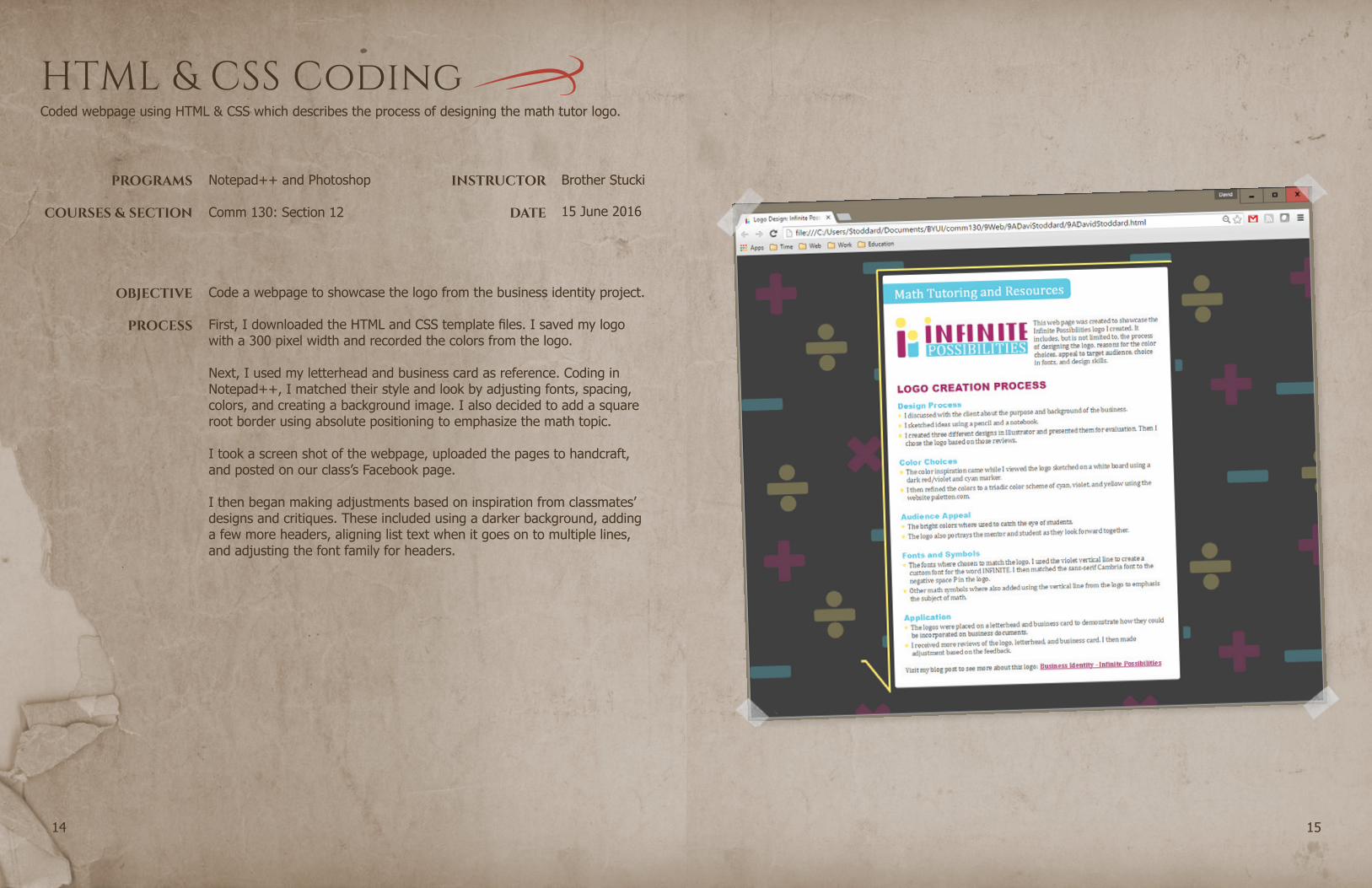
First, I downloaded the HTML and CSS template files. I saved my logo with a 300 pixel width and recorded the colors from the logo.
Next, I used my letterhead and business card as reference. Coding in Notepad++, I matched their style and look by adjusting fonts, spacing, colors, and creating a background image. I also decided to add a square root border using absolute positioning to emphasize the math topic.
I took a screen shot of the webpage, uploaded the pages to handcraft, and posted on our class’s Facebook page.
I then began making adjustments based on inspiration from classmates’ designs and critiques. These included using a darker background, adding a few more headers, aligning list text when it goes on to multiple lines, and adjusting the font family for headers.
Coded webpage using HTML & CSS which describes the process of designing the math tutor logo.
PROGRAMS
COURSES & SECTION
OBJECTIVE
PROCESS
INSTRUCTOR
DATE
Brother Stucki
Comm 130: Section 12
1716
Montage
25 May 2016
Photoshop
Create a spiritual montage poster using multiple images and masks.
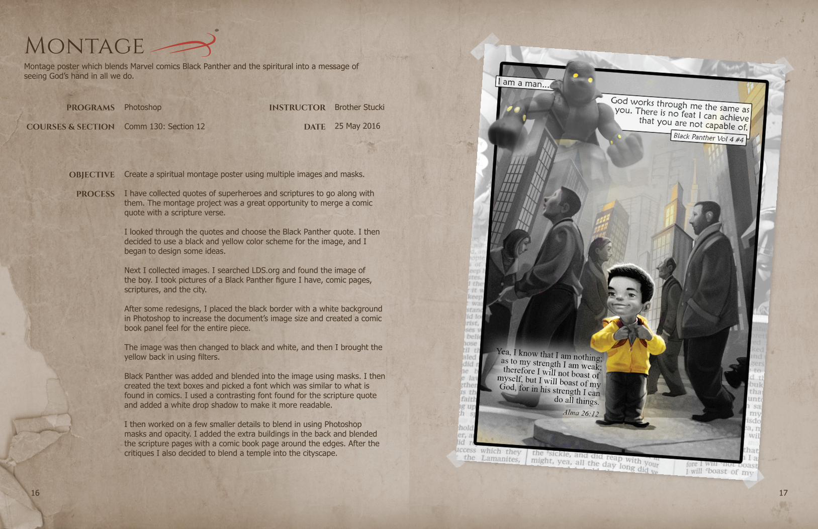
I have collected quotes of superheroes and scriptures to go along with them. The montage project was a great opportunity to merge a comic quote with a scripture verse.
I looked through the quotes and choose the Black Panther quote. I then decided to use a black and yellow color scheme for the image, and I began to design some ideas.
Next I collected images. I searched LDS.org and found the image of the boy. I took pictures of a Black Panther figure I have, comic pages, scriptures, and the city.
After some redesigns, I placed the black border with a white background in Photoshop to increase the document’s image size and created a comic book panel feel for the entire piece.
The image was then changed to black and white, and then I brought the yellow back in using filters.
Black Panther was added and blended into the image using masks. I then created the text boxes and picked a font which was similar to what is found in comics. I used a contrasting font found for the scripture quote and added a white drop shadow to make it more readable.
I then worked on a few smaller details to blend in using Photoshop masks and opacity. I added the extra buildings in the back and blended the scripture pages with a comic book page around the edges. After the critiques I also decided to blend a temple into the cityscape.
Montage poster which blends Marvel comics Black Panther and the spiritural into a message of seeing God’s hand in all we do.

PROGRAMS
COURSES & SECTION
OBJECTIVE
PROCESS
INSTRUCTOR
DATE
Brother Stucki
Comm 130: Section 12
1918
Infographic
8 June 2016
Illustrator
Gather information and create an infographic to be shared.
The first step was coming up with an idea. I thought of topics I am interested in and different from previous assignments. I decided on doing the infographic on LEGO bricks I played with when I young.
I then began researching LEGO bricks, and making sure information was available. I took note of the facts I found interesting.
At this point, I began going through the tutorials on making an infographic and looking at examples. I paid attention to which ones I liked and why, and started to conceptualize my infographic in my head. I then sketched it out. I also went to paletton.com to help me get a big split complementary color scheme.
The next step was to create the graphics in Illustrator. I started with the background, and then I made the different pieces in different art boards. I then placed the different elements in different layers.
Once I had the infographic finished, I posted it on Facebook for reviews and discussed with my wife about the project. The infographic didn’t quite seem right to me, so I made some adjustments to the colors, the title fonts, and gave the bricks a 3D look.
A LEGO infographic which provides history and information on the LEGO brick.
PROGRAMS
COURSES & SECTION
OBJECTIVE
PROCESS
INSTRUCTOR
DATE
Brother Stucki
Comm 130: Section 12
2120
Photodesign
18 May 2016
Photoshop
Use photography, color, and text to create an 8.5 by 11 photodesign.
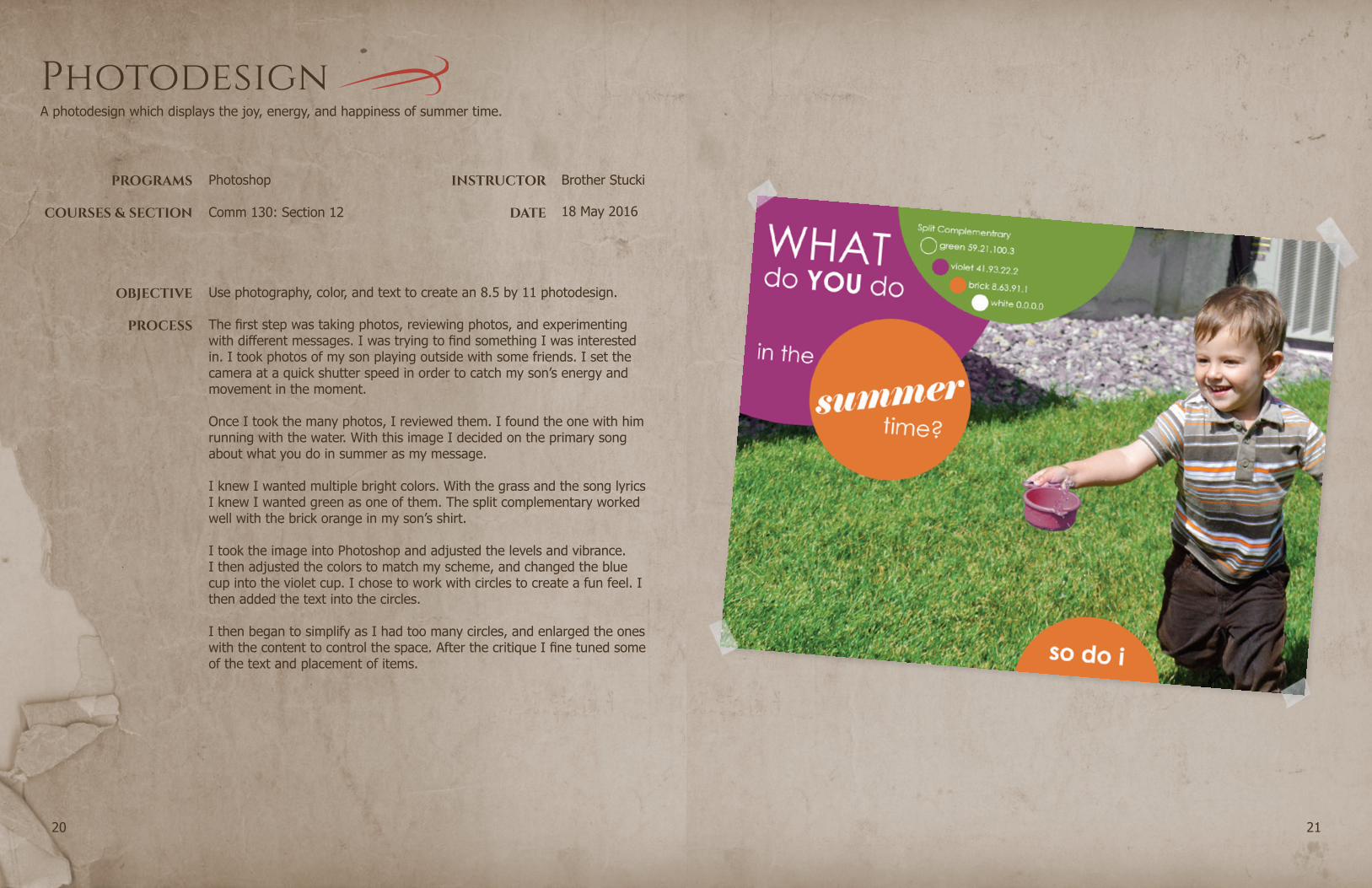
The first step was taking photos, reviewing photos, and experimenting with different messages. I was trying to find something I was interested in. I took photos of my son playing outside with some friends. I set the camera at a quick shutter speed in order to catch my son’s energy and movement in the moment.
Once I took the many photos, I reviewed them. I found the one with him running with the water. With this image I decided on the primary song about what you do in summer as my message.
I knew I wanted multiple bright colors. With the grass and the song lyrics I knew I wanted green as one of them. The split complementary worked well with the brick orange in my son’s shirt.
I took the image into Photoshop and adjusted the levels and vibrance. I then adjusted the colors to match my scheme, and changed the blue cup into the violet cup. I chose to work with circles to create a fun feel. I then added the text into the circles.
I then began to simplify as I had too many circles, and enlarged the ones with the content to control the space. After the critique I fine tuned some of the text and placement of items.
A photodesign which displays the joy, energy, and happiness of summer time.
PROGRAMS
COURSES & SECTION
OBJECTIVE
PROCESS
INSTRUCTOR
DATE
Brother Stucki
Comm 130: Section 12
2322
Magazine Cover
4 May 2016
InDesign and Photoshop
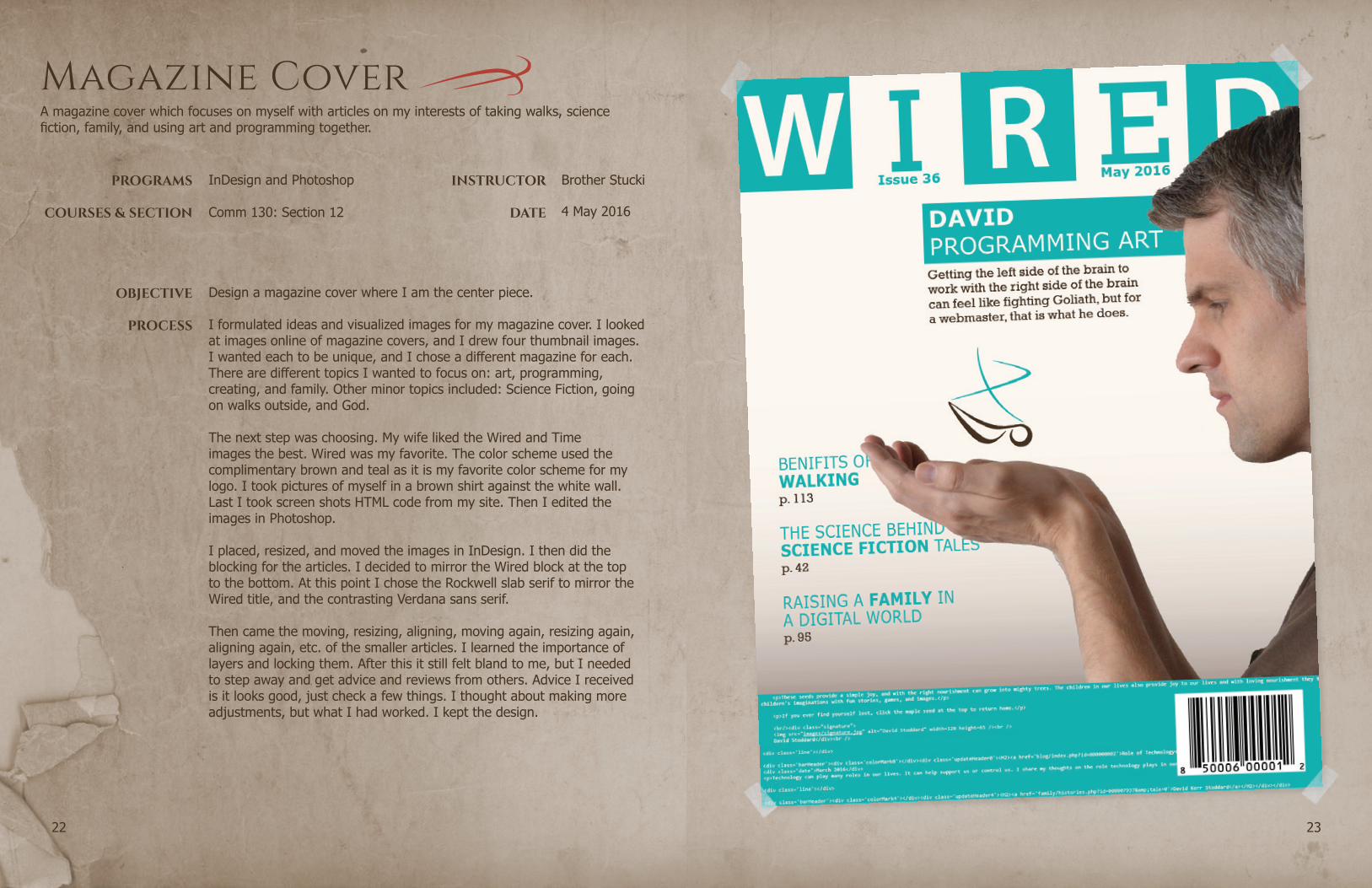
Design a magazine cover where I am the center piece.
I formulated ideas and visualized images for my magazine cover. I looked at images online of magazine covers, and I drew four thumbnail images. I wanted each to be unique, and I chose a different magazine for each. There are different topics I wanted to focus on: art, programming, creating, and family. Other minor topics included: Science Fiction, going on walks outside, and God.
The next step was choosing. My wife liked the Wired and Time images the best. Wired was my favorite. The color scheme used the complimentary brown and teal as it is my favorite color scheme for my logo. I took pictures of myself in a brown shirt against the white wall. Last I took screen shots HTML code from my site. Then I edited the images in Photoshop.
I placed, resized, and moved the images in InDesign. I then did the blocking for the articles. I decided to mirror the Wired block at the top to the bottom. At this point I chose the Rockwell slab serif to mirror the Wired title, and the contrasting Verdana sans serif.
Then came the moving, resizing, aligning, moving again, resizing again, aligning again, etc. of the smaller articles. I learned the importance of layers and locking them. After this it still felt bland to me, but I needed to step away and get advice and reviews from others. Advice I received is it looks good, just check a few things. I thought about making more adjustments, but what I had worked. I kept the design.
A magazine cover which focuses on myself with articles on my interests of taking walks, science fiction, family, and using art and programming together.