design by nature - pearsoncmg.comptgmedia.pearsoncmg.com/.../0321747763_designbynature_01rev.pdf ·...
TRANSCRIPT


Section one
memoryr e m e m B e r i n g w h at w e k now
Excerpted from Design by Nature: Using Universal Forms and Principles in Design by Maggie Macnab. Copyright © 2012. Used with permission of Pearson Education, Inc. and New Riders.


You might wonder why the opening section of a design book is
called “Memory: Remembering What We Know.” Being born
through the wisdom of nature, everyone on earth comes into the
world equipped with a toolbox of natural abilities. Some of them
are physically apparent, and some come to you as if out of the
ether. You have a brain that analyzes the world around you and
thinks inventively to create what it needs; two hands that are adept
at using and making things; an array of senses that gauge, measure,
observe, and absorb all that you interact with; and a heart that
directs you in what “feels right” for who you are.
1aesthetics
en joy the ride

KEY CONCEPTS
• Aesthetics are both relevant and necessary to effective design.
• Intuition is essential to creativity.
• Synchronicity opens possibilities that may not otherwise exist.
• Wabi-sabi is an Eastern approach to a natural, unmanaged aesthetic.
• grunge is a Western approach to a distressed, manipulated aesthetic.
• Simplicity is reduction; emptiness is expansion.
LEARNING OBJECTIVES
• Understand the relevance of aesthetics to func-tional design.
• Appreciate the relationship of simplicity and emp-tiness to elegance and multiple-use applications.
• Use your inherent creative abilities of intuition and synchronicity to support your design’s fluency and reach.
• Appreciate the creative expression inherent in the natural process of a design’s evolution in wabi-sabi and grunge.
• Understand the difference between the concepts of simplicity and emptiness.
6 secTIoN oNe Memory: Remembering What We Know
Excerpted from Design by Nature: Using Universal Forms and Principles in Design by Maggie Macnab. Copyright © 2012. Used with permission of Pearson Education, Inc. and New Riders.

Included in your innate inventory are intuitive signposts to help direct the way. Fundamental pieces of “memory” are embedded from the earliest experience of your ancestors and from your personal experiences collected during the first
years of life. These experiences join with the unique composite of your genes to give you an individual perspective of beauty, teach you how to assess and respond, and advise you on how to make decisions based on what you believe to be right or wrong. This first chapter focuses on aesthetics, or the appreciation of beauty, and how it is integrated into effective design. This chapter will help you remember what you already know.
Truth and Beauty“Who ever said that pleasure wasn’t functional?”
—Charles Eames
The appreciation of beauty is universal. There was a time in history when beauty was regarded as the highest evidence of a fundamental truth. If some-thing was sensually pleasing, it was understood to display an intrinsic quality expressed outwardly.
Think of a lovely peach fresh off the tree (Figure 1.1). At the center of this piece of fruit exists all its future generations in the compact form of a pit. The fruit is the short-term nourishment for the incubating seedling or—more likely—becomes nourishment for the lucky animal or human that happens along at the right time to eat it.
The peach is the outward expression of all the future peaches that will be pro-duced if the pit grows into a tree. The essence of the fruit provides direct energy to whoever eats it in the form of nutrition, vitamins, fiber, and sugar energy. All of its benefits are implied in the sensual perception of the fruit: its beautiful color; luxurious, fuzzy feel; delightful sweet scent; and delectable flavor. Everything about it is appealing because it is good for you.
Aesthetics have universal and personal appeal. Most people can agree on a beautiful proportion. But at the same time, one group can consider an item or a style to be beautiful while another is repulsed by it (Figure 1.2). It is not a logical choice, but rather a sense derived of diverse subtleties in personal and cultural experience and preference. Beauty is considered an emergent property—a qual-ity spontaneously generated from within, not created by external decoration or a superficial addition of some sort.
1.1 The fruit of the peach tree expresses pure goodness in the sensual experience embodied by its look, smell, feel, and taste (opposite). Visual Language, www.visuallanguage.com.
chApTeR 1 Aesthetics: Enjoy the Ride 7

Beauty Is as Beauty DoesMurray gell-Mann, the theoretical physicist who invented the term “quark” for one of the most elementary particles ever identified, sees beauty as a criterion for selecting a correct theory and discovering a universal truth. How do aesthet-ics support truth? gell-Mann explains it as an appreciation and recognition of a fundamental property that is carried from the inside out. Like successive layers of an onion, each progressing skin layer contains similarities to the one prior. Similar-ity brings fluency to information; that is, the ease with which it can be processed and understood.
1.2 In the eye of the beholder. Primitive to modern cultures have practiced various body modifications to enhance beauty that look quite bizarre to some but are consid-ered beautiful by others: neck stretching (Padaung tribe of Thailand), foot binding (Chinese), and full-body tattooing (Japanese).
zzV
ET/S
HU
TT
ERST
oC
K.C
oM
LIBR
ARY
oF
Co
Ng
RESS
, LC-
USz
62-1
0403
6
K UN
IYo
SHI 1
797–
1861
(UTA
gAW
A, J
APA
N) “
TH
E H
ERo
Ro
SHI E
NSE
I”
8 secTIoN oNe Memory: Remembering What We Know
Excerpted from Design by Nature: Using Universal Forms and Principles in Design by Maggie Macnab. Copyright © 2012. Used with permission of Pearson Education, Inc. and New Riders.

Isaac Newton used the same idea of common relationships between scales to understand how gravity functions—from why an apple falls to earth to how that same force influences planetary orbits. In Newton’s time, the idea of a principle remaining essentially the same from earthly to universal scales was such a radical notion that he felt he would be seen as an “extravagant freak” for the theory in public. This theory of “common scaling” is called self-similarity in scientific terms and has become an active area of theoretical study in recent years. The basis of a theoretical application called complexity theory, self-similarity anticipates megapatterns from initial—or beginning—conditions. Self-similarity is helpful to demonstrate everything from the most effective routes to evacuate thousands of sports stadium fans in the event of a bomb, to how ants find food individually and then cooperate as a single communal system to return it to the nest.
DID YoU KNoW? Metaphors (multidimensional meanings) are the basis of organizing conceptual thought by creating multiple relation-ships and solving many problems at once. They are as effective with visuals as they are words.
The most elegant discoveries are simple in nature because simplicity is at the heart of the complex. Complexity arises from simplicity: You were the equivalent of a tiny two-dimensional circle once upon a time. In the case of the onion, a funda-mental law of similar structure and shape is carried throughout its successive layers. This simple redundancy is displayed elegantly as the same approximate form repeating in different layers, at different scales, or in other dimensions (more on self-similarity and scaling in Chapter 9, “Messaging: A Meaningful Medium”).
Intuition and Creativity “The intuitive mind is a sacred gift, and the rational mind is a faithful servant. We have created a society that honors the servant and has forgotten the gift.”
—Albert Einstein
Intuition is an immediate insight of understanding without reflection or rational thought processing. Because it is difficult to investigate and quantify, intuition is regarded by most modern cultures as unreliable, unscientific, and irrelevant to the real world. Most educational training teaches you to override your intuition and places rational thinking (which drives materialism) in higher regard. But in
chApTeR 1 Aesthetics: Enjoy the Ride 9

many other cultures, and increasingly so in modern Western culture, intuition is regaining its status of being practical in a different way. It is the nature of intuition to spark and guide creativity, and it is an essential ingredient for anything new in the “real world” to happen at all.
As is obvious, creativity is the act of making or inventing an entity that didn’t exist before. Intuition sets the stage for the freedom of creative thought to occur; as such, it’s a good strategy to prepare for it. Creativity is a personal process, and there is no formula that can force it—by nature it is spontaneous. But that doesn’t mean you can’t encourage it with preparation. Consider a ballet dancer. The dancer must have all of the physical supports in place to execute the dance: eating right, resting well, and practicing the dance moves and timing diligently. When the sequence and timing of the movements are embedded in muscle memory, the brilliance of creativity takes over and becomes spontaneously fluid—which is best known as art. Design, like dance, is about more than mechanics (Figures 1.3 and 1.4). Although technical skills smooth the execution, intuition lubricates the flow of creativity and has equal importance to technique and skill. Clearly, skill and intuition combine to form the most creative and inspired result.
The word intuition comes from the Latin intueri, roughly translated as “the teacher inside.” Intuition, as the American architect, inventor, and futurist Buckminster Fuller said, “is having integrity with oneself.” After a difficult period in his life in the late 1920s, with no money, no job, and his daughter dying from polio, Fuller considered committing suicide at the edge of a lake. Later, he recounted a voice coming to him and saying, “You do not belong to yourself. You belong to the uni-verse.” Maybe you’ve heard this voice during a particularly critical moment in your life. There is no doubt when you hear it that it is truthful, or at least wiser, than you might be in that moment. Because Buckminster Fuller wrote a book titled Intuition in his later years, I wouldn’t doubt he knew his intuition was giving him a simple and profound instruction for his life’s path. He went on to dedicate his life to finding out what he might do to benefit humanity. In a 50-year-long experi-ment of how the universe works, Fuller developed 28 patents, authored 28 books, and received 47 honorary degrees. His most well-known invention, the geodesic dome, has been produced hundreds of thousands of times worldwide. But his true impact lives on in his continued influence upon generations of designers, architects, scientists, and artists who use his principles to approach living through design in a more graceful way.
Let’s look at a couple of personal stories of intuition and creativity.
1.3 This design was inspired by my appre-ciation of music expressed in the form of dance. The flow of the design is reminiscent of the intuitive process used to design it (as well as the subject matter), whereas the execution’s success resides in the skill of combining technique and tool, in this case, Adobe® Illustrator®.
10 secTIoN oNe Memory: Remembering What We Know
Excerpted from Design by Nature: Using Universal Forms and Principles in Design by Maggie Macnab. Copyright © 2012. Used with permission of Pearson Education, Inc. and New Riders.
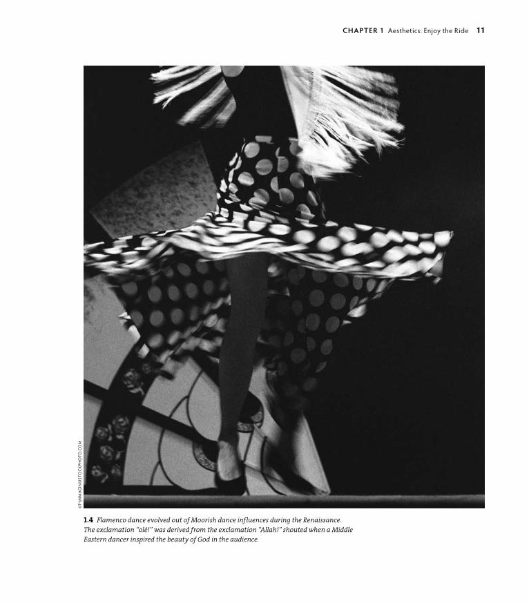
1.4 Flamenco dance evolved out of Moorish dance influences during the Renaissance. The exclamation “olé!” was derived from the exclamation “Allah!” shouted when a Middle Eastern dancer inspired the beauty of God in the audience.
©T-
IMM
Ag
INI/I
STo
CKP
Ho
To.C
oM
chApTeR 1 Aesthetics: Enjoy the Ride 11

JoeL NAkAMuRA : guesT DesIgNeR sTuDy
illUstrator : United states
Award-winning artist Joel Nakamura is known for his unique style: a blend of folk art and sophisticated iconogra-phy rendered in a neo-primitive technique. He is chosen for many of his commissions because of his knowledge of tribal art and mythology, and for his ability to convey stories and information in an intricate and engaging manner. Joel’s ability to access the mythological and convey it in universal terms is based in his intuitive access via his openness to the common human story.
A GARDEN Of EARThLY DELIGhTSA circle of white rabbits surrounds a single clown with a sinister smile (Figure 1.5). The leader of the rabbits is wearing a red vest and hat. We don’t know why this little drama is taking place. The collection doesn’t change, yet seems to be always changing, because I always seem to find some new, strange, diorama drama that is fascinating and amusing. The museum is one of my favorites in the world and is one of my muses.
I have been visiting museums since my childhood. My parents were both art educators, so our family was always off to the latest art exhibit. At first I was a reluctant participant, but I grew to truly appreciate museums. I think it’s this background in experiencing art in person that gives me a creative edge. I find myself grateful to have stood for hours in front of hieronymus Bosch’s Garden of Earthly Delights (Figure 1.6) when I was 10 years old.
As I got older, my inspirational sources moved into popular culture. I may be the only artist to quote Charles Bronson, anti-hero actor, as a creative influ-ence. In the 1970s movie The Mechanic, Bronson plays a hit man. Each time he receives his assignment, he pins up all the information about his victim on a board, puts on some classical music, and looks at his collection of Bosch paint-ings. I liked the idea of immersing oneself in information until some kind of plan or concept begins to take shape. I was only in junior high school when I saw the movie, but I would plan my homework, term papers, and projects this
1.5 Joel finds his inspiration in quirky human art and stories that are often perfectly combined in antique children’s toys. Multiple Visions: A Common Bond. Installation 9-8-Circus Scene.
gIFT o
F TH
E ALExA
ND
ER gIR
ARD
FoU
ND
ATIo
N. M
USEU
M o
F IN
TERN
ATIo
NA
L F oL K A
RT. SAN
TA FE, N
M. PH
oTo
BY: PAU
L SMU
TKo
.
12 secTIoN oNe Memory: Remembering What We Know
Excerpted from Design by Nature: Using Universal Forms and Principles in Design by Maggie Macnab. Copyright © 2012. Used with permission of Pearson Education, Inc. and New Riders.
way. Later, I would continue this process into art school and my professional career. I have an extensive library of books about art, artists, mythology, and more. Books are a great way to stimulate ideas or take me in a different direc-tion. The Internet is also a good tool, but it lacks the visceral connection I get from surrounding myself with a pile of books.
My process has also evolved. I used to edit the sketches I would send clients. Now I send everything. I’m often surprised by the direction or sketch that’s
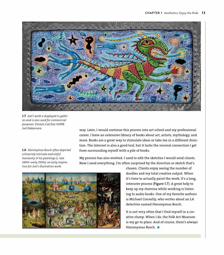
chosen. Clients enjoy seeing the number of doodles and my total creative output. When it’s time to actually paint the work, it’s a long, intensive process (Figure 1.7). A great help to keep up my stamina while working is listen-ing to audio books. One of my favorite authors is Michael Connelly, who writes about an LA detective named hieronymus Bosch.
It is not very often that I find myself in a cre-ative slump. When I do, the folk Art Museum is my go-to place. And of course, there’s always hieronymus Bosch. n
1.6 Hieronymus Bosch often depicted a bizarrely intricate and sinful humanity in his paintings (c. late 1400s–early 1500s), an early inspira-tion for Joel’s illustration work.
1.7 Joel’s work is displayed in galler-ies and is also used for commercial purposes. Dream Catcher ©1998 Joel Nakamura.
chApTeR 1 Aesthetics: Enjoy the Ride 13

sTeFAN sAgMeIsTeR : guesT DesIgNeR sTuDy
designer : United states
Stefan Sagmeister, owner of Sagmeister Inc. and author of several design books, has created graphics for clients including the Rolling Stones and Lou Reed. His work is timeless and of the moment, reflecting his intimate but thoughtful approach that inspires his intuitively creative design.
OBSESSIONS MAKE MY LIfE WORSE AND MY WORK BETTERI rarely obsess about things in my private life. I fail to care about the right shade of green for the couch, the sexual secrets of an ex-lover, or the correct temperature of the meeting room AC. I don’t think I miss much.
however, I do obsess over our firm’s work and think that a number of our better projects came out of such an obsession.
On September 13, 2008, Sagmeister Inc., began the installation of 250,000 Eurocents on Waagdragerhof Square in Amsterdam (Figure 1.8).
Over the course of eight days and with the help of more than 100 vol-unteers (Figure 1.9), the coins were sorted into four different shades and carefully placed over a 300-square meter area, according to a master plan.
After completion, the coins were left free and unguarded for the public to interact with. Less than 20 hours after the grand opening, a couple of local residents noticed a person bagging the coins and taking them away. Protective of the design piece they had watched being created, they called the police (Figure 1.10).
Spontaneously creative displays—particularly in the public realm—are often not appreciated for very long. It would seem, although loved by onlookers and participants, and appreciated by those in need of a few extra cents, the police deemed the exhibit inappropriate. n
1.9 Volunteers working on the design’s development in a public space.
14 secTIoN oNe Memory: Remembering What We Know
Excerpted from Design by Nature: Using Universal Forms and Principles in Design by Maggie Macnab. Copyright © 2012. Used with permission of Pearson Education, Inc. and New Riders.

1.8 A collaborative design of hundreds of thousands of Eurocents, addressing “obsession’s” impact on the quality of life (above). Art Direction: Stefan Sagmeis-ter; Design: Richard The, Joe Shouldice; Photography: ©2008 Jens Rehr (all images this spread).
1.10 After stopping the “criminal,” the police—in an effort to “preserve the artwork”—swept up every remaining cent and carted them away.
chApTeR 1 Aesthetics: Enjoy the Ride 15

SynchronicityA synchronicity is a meaningful coincidence. Synchronistic events manifest ideas in real-world experiences. The Swiss psychiatrist Carl Jung coined the phrase almost 100 years ago as a description of the law of attraction and manifestation. You’ve probably experienced it: You think of someone and that person calls you within minutes of the thought; you continue to see the same number or image in different situations; the funnies have a theme running through unrelated comic strips that aren’t tied to current events. These events come in all levels of relevance, from circumstances that led to a tragedy or prevented one, or from a simple curiosity to some of the most brilliant realizations that turned theories into usable practices. Maybe you’ve experienced it in the process of design. Have you ever worked on a design problem with no progress, and then something you weren’t looking for—something unexpected outside your research and in the most unlikely place—suddenly appears and either leads you to or is perfect as the solution? granted, this doesn’t happen often, but it does happen from time to time. These are the gifts of synchronicity. Pay attention to and appreciate them when they occur.
You spend a lot of time following a thread: an email conversation, a sequential line of thought, and a step-by-step task list. There’s a reason for that: It gets the job done. Tasks become more manageable when broken down into bits. Just think of the number crunching your laptop does when it’s figuring out all of the complex connections it has to make to transform your inspiration into a final piece of design.
or look at the source code on any HTML Web page, and you’ll see the framework of letters and symbols that string technology together. When programmed well, the “skin” appears fluid and effortless as a final result, due to millions of tiny con-necting configurations that are responsible for its creation. Thousands of pieces of code bring a comprehensible Web site into being or can create amazingly complex digital illustrations (Figure 1.11). Unless you’re a Web developer, you don’t delve into these details, much in the same way you don’t think about the physical organization of cells, muscles, and skeleton as the underlying structure of who you are. You take your skin at face value.
People are connected by more than physical parts, as quantum mechanics is beginning to describe. This is the difference between the machines that are designed and the amazing composite of matter and energy that people are. You can’t actually trace or find all of the bits, or understand how they connect you to the intangible that inspires you, but somehow they find each other, connect,
16 secTIoN oNe Memory: Remembering What We Know
Excerpted from Design by Nature: Using Universal Forms and Principles in Design by Maggie Macnab. Copyright © 2012. Used with permission of Pearson Education, Inc. and New Riders.

and result in something miraculous that was previously invisible. Coincidence is very much a part of everyday life, but it takes awareness to notice it. With the understanding that everything in the world is connected with varying degrees of separation, coincidence could be considered a word that simply describes a con-nection more remote than others.
When you are sensitive and proactive with synchronicities, they connect you in unexpected ways with alignments that are important to you. As designers, one of the most gratifying things you can do is apply your skills to work that is personally meaningful. In the following story, David Berman tells of how his personal family history, his passion for design and ethics, and an unexpected commemorative project in his home country of Canada came together and synchronistically com-bined circumstances in a dramatically poignant result.
1.11 The Sand Traveler is created with an open source programming language called Processing, and it is made up of 1,000 trav-eling particles, each in pursuit of another. Over time, patterns of travel are exposed as sweeping paths of color that coalesce into a synchronistic expression of organized art. Jared Tarbell, 2004.

DAvID beRMAN : guesT DesIgNeR sTuDy
designer : canada
David Berman applies strategy, design, ethics, creative branding, and communications to business problems. He has over 25 years of experience in design and strategic communications, including Web design and software interface development. As an internationally acclaimed expert speaker, facilitator, communications strate-gist, graphic designer, typographer, and ethics chair, his thought-provoking speaking and professional develop-ment engagements have brought him to over 10 countries in the past few years.
A SYNChRONISTIC PROJECTIn June 2010, I had been invited to speak at the Bauhaus School in Dessau, Germany. Erik Spiekermann had insisted that if I were ever near Berlin, I should visit him. Dessau is just over an hour from Berlin, so I called Erik from my studio in Ottawa before leaving Canada to make sure he’d be in town. Serendipitously, not only would he be in town, but I would arrive the day he was speaking at his TYPOBerlin conference. By the time I got there, they had put me on the program!
After speaking at the conference, I rented a bike to tour Berlin and see the Jewish Museum Berlin. The museum is a stunning piece of architecture by world-renowned architect Daniel Libeskind, within which is documented the very difficult history of the Jews in Germany. It was a powerful, profound, and sorrowful day: My grandparents were all European Jews, and our family tree has many severed branches.
Two months later, back in Ottawa, I discovered a heartfelt letter to the editor from Daniel Libeskind in
the Ottawa Citizen. Daniel had won the competition to design the first monument to the ill-fated passengers of the MS St. Louis. The MS St. Louis was the German ship that was turned away from North American ports in 1938, along with its cargo of 937 Jewish refugees from Nazi Germany. By sending those 937 passengers back to Germany, the Canadian government had condemned many of them to death. It’s a dark story that had never been commemorated.
I was captured by the story, which included a sketch of Daniel’s vision for the monument that would be erected at Pier 21 in halifax, Nova Scotia, where those passengers could have started new lives. After see-ing the typography, I thought that the architectural concept was brilliant, but the graphic design needed help. Inspired to act, I crafted a short email and sent it to the man designing the freedom Tower (the proposed monument to commemorate the Twin Towers in New
1.12 David chose the typeface DIN for the commemorative monument, created by the Deutsches Institut für Normung (or DIN in English: The German Institute for Standardization), for legibility and consistency in prewar Germany.
©T
REV
oR
JoH
NST
oN
/ EY
E M
EET
S W
oRL
D P
Ho
Tog
RA
PHY
18 secTIoN oNe Memory: Remembering What We Know
Excerpted from Design by Nature: Using Universal Forms and Principles in Design by Maggie Macnab. Copyright © 2012. Used with permission of Pearson Education, Inc. and New Riders.

York City) explaining my desire to donate my assistance as a designer, a typographer, a Jew, a Canadian, and a design advocate to help repair the world.
Two days later I received a call. They had checked my work and asked to meet with me. Daniel had expressed his desire to include a list of the passengers’ names on the monument. I suggested that the back of the monu-ment be filled with a typographic wheel of names. “Send sketches,” said Daniel, and so it began.
Trevor Johnston, a Pulitzer Prize-winning infographics specialist and a friend for decades, volunteered to help. My mother, a community archivist, arrived on my door-step with a stack of books for design research, includ-ing the passenger list. We set all 937 passenger names in inch-high lettering to be etched in relief on stain-less steel. That was a larger challenge than doing the graphic design for the front of the monument, because spelling precision was paramount.
I wanted to choose a typeface that was appropriate in terms of the tone of voice but would also poetically
help fulfill Daniel’s artistic vision (Figure 1.12). I chose a late 1930s German typeface—a cut of the DIN typeface usurped by the Third Reich and redrawn by Albert-Jan Pool for Erik Spiekermann’s fontShop. DIN carries con-notations of the bureaucratic machinery of the era. To further dramatize the sense of that period’s tone, the red of the Nazi party flag was used. (See more about the redrawing of this font in the “Albert-Jan Pool” sidebar.)
To honor the passenger list in a special way, I used a more humanist typeface—Erik Spiekermann’s Meta Serif (Figure 1.13). (See more about Erik’s design for Meta in Chapter 2, “Efficiency: Go with the flow.”)
On a windy January day in halifax, Trevor and I attended the unveiling of the monument at Pier 21. After the speeches, Daniel and Canada’s current Min-ister of Immigration proudly unveiled the sculpture. Dignitaries, designers, and guests gathered around the monument reading and examining. for the first time, I was able to run my hands over the lettering of the names—a very powerful experience. A woman next to me was doing the same, touching one specific name. She looked up at me and said, “You put these letters here? I came all the way from Boston. This is my uncle’s name I’m touching. Thank you.” Thank you, Bauhaus. Thank you, Erik. Thank you, Daniel. Thank you, Trevor. Thank you, Mom and Dad. Thank you, synchronicity.
Synchronicity brought me into this project by allowing my professional ability to attract an opportunity—as is so often the case when we trust our principles to align with what we care about most.
When we offer up our professional experience and abilities, guided by our principles, we attract the opportunity to be of true service. By making ourselves vulnerable, we invite synchronicity. And because we can, we must. n
1.13 An elder appreciating bittersweet memories at the commemorative memorial.©
TRE
Vo
R Jo
HN
STo
N /
EYE
MEE
TS
Wo
RLD
PH
oTo
gR
APH
Y
chApTeR 1 Aesthetics: Enjoy the Ride 19

ALbeRT-JAN pooL : guesT DesIgNeR sTuDy
tyPograPhical designer : the netherlands
Albert-Jan Pool is a Hamburg-based Dutch type designer who studied at the Royal Academy of Arts in The Hague (Netherlands), and has owned his studio, Dutch Design, since 1995. He wrote Branding with Type (Adobe Press, 1995) with Stefan Rögener and Ursula Packhäuser, and is working on a doctorate thesis on the history of con-structed sans serif typefaces in Germany. In 2011 the New York Museum of Modern Art (MoMA) extended its applied arts collection to include digital typefaces, amongst which is FF DIN.
A hISTORICAL STORY ABOuT ThE MS ST. LOuIS MONuMENT’S GERMAN TYPEfACESIn 1905, the Royal Prussian Railways defined a new master drawing for their lettering (Figure 1.14). Its original purpose was to unify the descriptions on the freight cars; soon it was adapted for all sorts of let-tering, including the names of railway stations on platforms. Its sans serif forms were drawn with lines and arcs on a simple grid. Simple letterforms like this were quite common back then. In france, Germany, and Austria, the forms were developed by teachers who trained draughtsmen, such as engravers, lithographers, and sign painters, from the 1840s forward. After WWI, the foundation of the Weimar Republic enforced the process of the unification of the patchwork of German countries into a single German state. Consequently, all state railways were merged into the Deutsche Reichs-bahn in 1920. Both the young republic and the German industry envisioned that standardizing could be an important means to revive the postwar economy. The German Institute of Standardization (DIN), founded in
1917, soon took a leading role in promoting, devising, and establishing such standards. Walter Porstmann, a DIN employee who had invented the standard series for paper sizes (A4, etc.), advocated the “single alphabet” (lowercase forms only) and envisioned the develop-ment of a universal typeface with which eventually all languages of the world could be written. In 1922, the DIN Committee of Typefaces took up its work but left Porstmann’s ideas for what they were. Mainly on behalf of Siemens and Reichsbahn representatives, it was decided that the typeface of the former Prussian Railways would become the basis of a series of easy-to-construct lettering models “for the untrained.” Not knowing that Bauhaus designers would manage to design far more elegant typefaces using grids of similar simplicity a few years later, the committee finished its DIN typefaces. Economical and political problems delayed its official release as DIN 1451 until 1936. Although the DIN 1451 typefaces have seldom been used for representative lettering, or in advertising or propaganda, they were used for general purposes, such as signposts, traffic signs, and wayfinding signage. They continue to influence the unofficial typographical identity of Germany today.
In the early 1990s, designers rediscovered the ver-nacular or “non-designed” typefaces, such as DIN 1451 (Figure 1.15). Erik Spiekermann asked me if I would do a redesign of the DIN 1451 typefaces to be issued by font-Shop as ff DIN. I carefully reworked them and turned them into a family by providing lighter and bolder weights as well as italics. n
20 secTIoN oNe Memory: Remembering What We Know
Excerpted from Design by Nature: Using Universal Forms and Principles in Design by Maggie Macnab. Copyright © 2012. Used with permission of Pearson Education, Inc. and New Riders.

1.14 The Master drawing from 1912 by the Royal Prussian Railways. The letterforms are identical to the first version from 1905. This typeface is known as the official model for DIN Engschrift, which was developed between 1926 and 1936.
1.15 A preliminary version of DIN 1451 from 1931 showing DIN Fette Engschrift (DIN medium condensed) ©DIN, Germany.
chApTeR 1 Aesthetics: Enjoy the Ride 21

Wabi-sabi and grungeWabi-sabi is a Japanese term for an aesthetic that appreciates the beauty of ordinary objects no matter how imperfect, incomplete, or humble they are (Figure 1.16). It is an acceptance of the truth of life’s impermanence. Although the idea of decay or incompletion has a negative connotation in Western culture, zen Buddhism sees this inevitable predicament as a transcendence of worldly con-cerns; therefore, it has the positive perspective of liberation. From a philosophi-cal standpoint, wabi-sabi is the recognition of worldly things exactly as they are in the present moment with no judgment or excessive thought about what they used to be or might become. It is an awareness and acceptance of life’s endings and beginnings.
This is a foreign idea to most Westerners, whose values are determined by reli-ability, predictability, and materialism. Although the Japanese version of wabi-sabi is an acceptance of irregular beauty and is a state of letting it be, the Western ver-sion comes from another perspective. A dominant cultural interpretation of the Eastern-styled wabi-sabi outlook is grunge. grunge—or messy, chaotic design—breaks the rules (Figure 1.17). It is a trend response that rebels against cultural mores when they become too restrictive. From surfer to punk, grunge design has been used as a visual antithesis to materialism and superficial values. The difference between these two cultural outlooks is significant: grunge tears down or interrupts in a reactive way, whereas wabi-sabi simply appreciates the reality of the living process. Beliefs gauge the status of internal and external values, and determine which has dominance. Modern cultural values have a tendency toward active and offensive action, whereas many traditional cultures, particularly in the Eastern hemisphere, tend toward passivity and acceptance. Both have their appropriate place. You have the ability to choose which one to use as a design aesthetic depending on the circumstances.
1.16 Wabi-sabi principles are often incorporated into freeform structures like pottery. But these principles can encom-pass anything that is human-generated and takes on a spontaneous shape; for instance, releasing leaves or petals to fall into an unplanned pattern when they land in a garden.
1.17 Northwestern United States grunge designer Art Chantry reinforces his client base of musicians and artists with funky grunge techniques and visual shock tactics (opposite). Design: Art Chantry.
22 secTIoN oNe Memory: Remembering What We Know
Excerpted from Design by Nature: Using Universal Forms and Principles in Design by Maggie Macnab. Copyright © 2012. Used with permission of Pearson Education, Inc. and New Riders.

chApTeR 1 Aesthetics: Enjoy the Ride 23

Emptiness and SimplicitySimplicity is not the goal. It is the by-product of a good idea and modest expectations. —Paul Rand
When an embryo begins its process of cellular division to create organs, a neural stem and body, it starts as a flat circle before spontaneously folding and curving into a shape best described as a container (Figures 1.18 and 1.19). Within this protective vessel, cells migrate to their appropriate positions to form the parts necessary to emerge as a new life-form. Emptiness is a requirement of life to develop.
As a human, you emerge from this container of emptiness as an impressionable, perceptive, creative, sensual, and problem-solving species. Your innate abili-ties are called emergent properties. They come into being as needed, just as your cells coalesce and transform into the necessary body parts at exactly the right time.
In emptiness, forms are born. When one becomes empty of the assumptions, inferences, and judgments he has acquired over the years, he comes close to his original nature and is capable of conceiving original ideas and reacting freshly.
—Stewart W. Holmes and Chimyo Horioka, Fifteen zen Tenets
Your given abilities are sourced within. They are already part of who you are. You can enhance these integral aspects of yourselves with training and education, but every human comes into the world equipped to exist within, expand upon, and contribute to the world just as they are. Your inherent abilities “emerge” through the experience of living and your personal interaction with nature. At their most useful, these gifts are complemented and expanded—rather than managed and compressed—by learning, beliefs, practices, and experiences. When a personal quality is complemented by an outside source, it allows you to contribute from the center of who you are by extending you into the world through your work; when managed, it becomes filtered through a perspective generated from a source outside of yourself that may or may not agree with your own.
The homogenization of individual abilities and perspectives through a com-mon filter creates redundancy and noise, because it is simplified into a singu-lar response. Instead of giving options that come from subtle and different
24 secTIoN oNe Memory: Remembering What We Know
Excerpted from Design by Nature: Using Universal Forms and Principles in Design by Maggie Macnab. Copyright © 2012. Used with permission of Pearson Education, Inc. and New Riders.

perceptions, one answer is offered. This reduces complexity but doesn’t neces-sarily provide the most effective response to a problem. The more possibilities offered, the better the chance to address the issue. When you design solutions based on a response that stems directly from the issue rather than a simplified one-size-fits-all answer, the probability exists to discover a more workable, more aesthetic, solution.
Emptiness and simplicity are related concepts that contain subtle but significant differences. In the Eastern hemisphere of the interconnected earth, the idea of emptiness is one of emergence. It is a zen concept of possibility. Its power lives in the potential of becoming. By contrast, emptiness in a Western context is per-ceived as lonely, despairing, or alienated.
Emptiness as a Philosophical and Visual Design ApplicationA perfect example of how to integrate emptiness and simplicity into design has been accomplished by Kenya Hara, author and creative director for Muji, a Japa-nese household retail company. Kenya uses the principle of emptiness in a variety of design solutions he creates for products, advertising graphics, and industrial
1.18 A fly egg showing gastrulation, an early embryonic process that takes place in most animals. This process transforms the embryo from a relatively simple shape (ball or sheet of cells) into a multilayered structure. Image recorded by Dr. Willy Supatto (Biological Imaging Center, CalTech, left and right).
1.19 The collective behavior of hundreds of cells simultaneously migrating to create a furrow that will become the container within which body parts form. The egg itself is made up of about 6,000 cells at this stage. Image recorded by Dr. Willy Supatto.
chApTeR 1 Aesthetics: Enjoy the Ride 25

applications for the company (Figure 1.20). Muji is based in Japan with stores in several other countries. The name Muji is derived from a phrase that means
“no-brand quality products.” The company’s philosophy is founded on recycling, minimal production waste and advertising, and a simple shopping experience. Muji’s philosophy is part of the developing anti-branding movement and has a subtle but significant difference to the idea of simplicity.
Hara describes Muji’s advertising as “not dispatching information from one entity to another, but facilitating the mutual exchange of information. In effect, Muji’s advertising and products offer an empty vessel for the audience to supply the meaning themselves.” With minimal branding and packaging, users provide their own interpretation, which emerges from a highly personal interaction (Figures 1.21 and 1.22). This strategy includes a range of responses from differ-ent sensibilities: old/young, male/female, professional/homemaker. As Hara says,
1.20 Using the unobstructed view of the Mongolian horizon split perfectly between heaven and earth, this Muji poster commu-nicates everywhere and all, or the recep-tivity of emptiness and equanimity, or “evenness of mind.”
Excerpted from Design by Nature: Using Universal Forms and Principles in Design by Maggie Macnab. Copyright © 2012. Used with permission of Pearson Education, Inc. and New Riders.

“Some customers buy Muji products because they like the ecological sensitivity of the company, the low cost, the urban aesthetic and simple design, or just because the products do the job described.” Muji’s philosophy includes them all. It is a philosophy that has risen out of necessity: The Japanese have long practiced a conscientious and open-design aesthetic in all they create to accommodate limited resources and space, which is reflected in Muji’s advertising design. It’s minimal, unobtrusive, and relaxed.
“Emptiness” as a design principle in Western culture is less common. Western culture is obsessed with specifics: bottom lines, literal interpretations, and hard results. Most Western commercial transactions are quite pointed in their direction—that of end purchase—and most advertisements are a gross overture to that result. But there have been instances of minimalist design that express an appreciation of the ideas of emptiness and its simplicity, such as those produced

by TBWA\Chiat\Day Los Angeles for Apple Computer. By identifying Apple’s core philosophy with the rebels and geniuses that changed the world by “thinking differently” (Figure 1.23), the campaign established Apple as the ideology of the future. Apple was perceived as saving the day by making technology accessible to anyone. This move repositioned it well above its competition and far beyond the status of “product” by connecting the user into a world of possibility.
SimplicityAlthough similar in its presentation, simplicity is a different concept than empti-ness. Simplicity reduces information rather than acting as an invitation to the viewer’s response. Simplicity distills information to its essence and provides an answer with a single conclusion. Necessarily sparse, it contrasts with emptiness by distilling information to its absolute rather than allowing for multiple interpreta-tions. Emptiness is always simple, but simplicity is not necessarily empty, in the context that it contains an expectation of response or a directive.
1.21 A Muji house ad provides a back-ground of emptiness so as not to impose the advertiser’s assumptions on the customer. It becomes a “fit” for anyone who cooks. “House” (left side, written using one Japa-nese character); MUJI (right side, written using four Japanese characters).
1.22 A Muji clothing ad. “What happens naturally” (left side, written with 11 Japanese characters); MUJI (lower-right side, written with four Japanese characters).
28 secTIoN oNe Memory: Remembering What We Know
Excerpted from Design by Nature: Using Universal Forms and Principles in Design by Maggie Macnab. Copyright © 2012. Used with permission of Pearson Education, Inc. and New Riders.

Each has a different use. When you’re driving toward road construction at 45 MPH, you don’t want to guess what to do. There isn’t time for that. A simple sign that tells you exactly what is expected of you is necessary in this situation (Figure 1.24). Road signs are simple and direct, and are specifically for the purpose of providing information quickly. They give an instant and clear answer: right, left, stop, go. A symbol is also simple (Figure 1.25), but it doesn’t direct you to a definitive answer; rather, it invites your response, so it is not necessarily an answer but a question in and of itself.
Advertising has been doing this since its inception: When you want to establish a relationship with your viewer that invites their interpretive response, use ambigu-ous, symbolic language. When you want to give viewers a directive, clearly tell them what to do. An example of this using the same product for different end means is a car advertisement that tempts you with the freedom of the open road, the sexy lines, the indulgent extras; essentially, an escape from your day-to-day. on the other side of the coin is the car commercial that pushes the discount, the low annual interest, and the fast-talking “buy, Buy, BUY RIgHT NoW before this deal is gone.” See the difference?
1.25 A symbol conveys both/and ambiva-lence to allow a personal interpretation or choice. Symbols are usually broadly understood to represent a generality just as the yin yang represents opposites while also leaving room for the viewer’s personal interpretation.
1.24 As a literal example, a sign conveys an either/or simplicity that directs a response. It is literal, direct, and can’t be mistaken for anything else.
1.23 The phenomenal success of the TBWA\Chiat\Day “Think Different” campaign (1997) turned Apple in a new direction with a brilliant example of integrating the principles of emptiness, simplicity, and aesthetic. ©Apple Inc. Use with permission. All rights reserved. Apple® and the Apple logo are registered trademarks of Apple Inc.
WW
W.JA
NEg
oo
DA
LL.o
Rg
FRA
NK
DRI
gg
S C
oLL
ECT
IoN
/gET
TY
IMA
gES
, PER
MIS
SIo
N C
oU
RTES
Y o
F T
HE
ESTA
TE
oF
BoB
DY
LAN
.
chApTeR 1 Aesthetics: Enjoy the Ride 29

Putting It into PracticeIt’s important to put your own structures into place to provide a space for creativity to occur. The following 11 supports prepare the mind for design and are general guide-lines that you can use and modify in ways that work for you.
1. accept. Accept that you can’t control everything. At best, you have a little influence, and that is all. When you release resistance, creativity is more apt to flow.
2. observe. The only way to become really aware is to really look. Creativity is a heightened sense of flow between the observer and the observed.
3. Breathe. While you’re observing, notice your breathing. Breath is your built-in equalizer. Use it to bring yourself back to center. This is a good tool for when you feel upset or off-kilter, but it is also useful to consciously connect with your perception of the external world.
4. emerge. go with your natural tendencies. Allow flow before deciding what is “right.” Don’t judge the unexpected; honor it.
5. Detach. Detach from a problem to get out of the middle of it so you can rise above it for a broader perspective.
6. perspective. The way you see a problem isn’t the only way to see it. Broaden your sights. Turn it upside down. Mirror it. Take a walk. Forget it. Remember it in a new way.
7. practice. Practice what you learn. You won’t get better at a new skill by waiting for it to improve itself, you must practice it. Skills are important supports to help funnel and focus creative flow.
8. Begin. Begin somewhere. Increments are doable. It doesn’t matter where you start. Just start.
9. Meditate. I don’t necessarily mean meditate literally. But do assess. Look back on your day and review it. Part of it worked to your advantage. Part of it didn’t. Cut yourself some slack. We’re all learning. If you didn’t figure out the most brilliant design today, revisit it tomorrow with fresh eyes. Don’t give up.
10. Live. Life is chaos. Back to Rule #1. The only constant is the moon. If there was no change, there would be no reason to learn, to love, to live.
11. enjoy. Life is short, create it lushly. Design carries into every aspect of your life. Create your life around what you bring to it. You happen to the universe; the universe doesn’t happen to you.
30 secTIoN oNe Memory: Remembering What We Know
Excerpted from Design by Nature: Using Universal Forms and Principles in Design by Maggie Macnab. Copyright © 2012. Used with permission of Pearson Education, Inc. and New Riders.

SIGN OR SYMBOL?
How might simplicity or emptiness be applied in a logo design? There are hints: one is direct, the other a suggestion. one leads you to a point, the other gives you a point to start from. Signs condense simply, whereas symbols provide the space to expand. of the logos to the left (a–e), which fall into a category of a sign type of definition, and which invite your inter-pretation like a symbol? What sorts of businesses would prefer one over the other. Why?
INTuITION AND SYNChRONISTIC DESIGN
Problems aren’t negative occurrences. They’re opportunities to flex your creativity and problem-solving skills, and to connect with the deepest parts of yourself. This exercise will bring more awareness to how you source information through and beyond yourself to come up with a solution that has the most possibility. The most important part of this exercise is to pay attention to how the inside relates to the outside.
1. Think of a design problem you’re working on or a personal issue.
2. Draw an image that helps to represent the problem for you. The image should create a relationship between you and the problem.
3. Tell yourself that you want help in finding a resolution or relationship with this issue/ project and that you are open to any ideas that will present a viable solution.
4. over the next few days, be conscious of what is around you, what comes up in dreams, or what happens in situations when you are not actively thinking about the problem. The tangible external manifestations will arise spontaneously if you take care to notice them. Par-ticularly, pay attention to anything that comes up more than once, even if it doesn’t seem to be related.
5. If an image, number or another instance of a common tangible “thing” recurs in separate and unrelated events, delve into what that relationship might be. Experience your emotions as you explore (they give clues, too). Are you anxious? Comforted? What is the relationship between the problem, you, and the recurring event or object? Is the relationship related to a past experience?
6. Understand that sometimes an unrelated issue blocks a resolution to the current one. It is particularly important that you respect whatever your subconscious reveals and try to inter-pret its relationship to the current problem.
(b)
(d)
(e)
(a)
(c)
chApTeR 1 Aesthetics: Enjoy the Ride 31

SIMPLICITY AND EMPTINESS
This exercise will help to bring the concepts of simplicity and emptiness into con-sciousness. It’s called an “exercise” because it takes a conscious intention, a practice, for awareness to occur.
1. For a day, keep a small notebook with you that is easy to carry and pull out when needed. I recommend taking the time to draw because this acquaints you in a deeper way with what you are observing. (If you must, use a phone camera or other accessible device, but the point of the exercise is depth; it is not about speed or convenience.)
2. Whenever you see a visual “bit” of information—a sign, a logo, a billboard, poster, public art piece, or some other succinct visual message—make a visual note of it. Draw it (or photograph it). Capture whatever strikes you as being the most relevant compo-nents of the message.
3. Review your work later—that evening or within the next day or two. Has this piece of information supplied you with an “answer” as a directive, or has it invited you to create your own answer? Was it based in simplicity or emptiness?
4. Do you have a preference for simplicity or emptiness—that is, does a directive work better or does the ability to have your own interpretation work better—and why? Is your preference driven by the circumstance of the message or by a personal inclination?
5. How was the piece of information appropriate (or inappropriate) to the overall message?
EYEKu: WRITE A hAIKu AND ILLuSTRATE IT
Haikus are minimalist Japanese poems that are written in the moment and about the simple wisdom in everyday occurrences. Eyeku (Figure 1.26) was a design I created when I wanted to capture the idea of a symbol and a word combined. John Lennon wrote, “Life is what happens to you while you’re busy making other plans.” Life isn’t what we expect. So? Laugh. Swear. Write a haiku. And walk on.
A haiku follows a pattern of moras. A mora is a phonetic unit that determines emphasis or timing. English translations can vary this rule, so there are loose interpretations of how to write one. The typical pattern of timing is 5 moras/7 moras/5 moras for a haiku. But there are many variances. They can be vertical (short verses in four or five lines), circular (never ending), a spiral shape, or the standard of three lines in 17 syllables. The basic guidelines include the following.
1.26 Eyeku is visual plus word in balance. Designer: Maggie Macnab.
32 secTIoN oNe Memory: Remembering What We Know
Excerpted from Design by Nature: Using Universal Forms and Principles in Design by Maggie Macnab. Copyright © 2012. Used with permission of Pearson Education, Inc. and New Riders.

1. Make it simple. Write about something anyone can relate to, something that is part of an everyday experience.
2. See something new in the simplicity. This is the aha! of a haiku.
3. Illustrate your haiku with a brush and paint or ink. Make the strokes spontaneous. You may need to do several to create one you love. That’s oK; spontaneity doesn’t come easily to most people, but practicing it can free you to be more in the moment. This is about self-trust.
4. A variation on the traditional method would be to use digital artwork and typography for a visual haiku, which is called a haiga (Figure 1.27). You can manipulate the letters, change the structure of the sentence formatting, and incor-porate photography or digital painting.
5. If you’re working in a group, pass your haiku forward and let someone else illustrate it. You illustrate someone else’s. Compare your expectation with the result.
Here are some examples:
Haiku master Matsuo Basho (1644–1694)
Falling sick on a journeymy dream goes wanderingover a field of dried grass.
(He died shortly after this; it was considered his last haiku.)
by Allen Ginsberg
I quit shavingbut the eyes that glanced at meremained in the mirror. 1.27 Haigas as vector illustrations, ©2010 Alexandre Egorov,
Switzerland.
(a) The mother and baby bears are drawn stylistically, but are clearly referencing the animal: This is a sign. (b) This logo indicates medical care for pawed animals, probably domesticated dogs or cats. This is primarily a sign, although because of the implied rather than direct reference to a spe-cific animal or treatment, it also has symbolic qualities (remember Aesop’s fable “Androcles and the Lion”? See Chapter 2, “Efficiency: go with the Flow”). (c) The visual forms the word. This is a sign, with all of the creepy-crawliness it implies. (d) Clearly a sign, with no doubt of its black-and-white intent. (e) This is an ambiguous symbol. The “h” and “p” letterforms rotate around a negative-ground plus symbol (in and of itself an ambiguous sug-gestion). You can see there is meaning to be had, but you are left to your own interpretation without more information.
chApTeR 1 Aesthetics: Enjoy the Ride 33