designed with care: design and neighbourhood healthcare ... · is being delivered ever closer to...
TRANSCRIPT

�
Designed with care:Design and neighbourhood healthcare buildings

Published in 2006 by the Commission for Architecture and the Built Environment.
Researched and written by Timothy Mason.
Graphic design by Draught Associates.Printed by White Oak Press on Starfine environmentally friendly paper.
All rights reserved. No part of this publication may be reproduced, stored in a retrieval system, copied or transmitted without the prior written consent of the publisher except that the material may be photocopied for non-commercial purposes without permission from the publisher. This document is available in alternative formats on request from the publisher.
ISBN 1-84633-006-8
CABE is the government’s advisor on architecture, urban design and public space. As a public body, we encourage policymakers to create places that work for people. We help local planners apply national design policy and offer expert advice to developers and architects. We show public sector clients how to commission buildings that meet the needs of their users. And we seek to inspire the public to demand more from their buildings and spaces. Advising, influencing and inspiring, we work to create well-designed, welcoming places.
CABE1 Kemble StreetLondon WC2B 4ANT 020 7070 6700F 020 7070 6777E [email protected]

�
Contents
Foreword 5
Building healthy neighbourhoods 6
Chiddenbrook Surgery, Crediton, Devon 10
Medical Centre, Idle, Bradford 12
Small Heath Healthcare Centre, Birmingham 16
City Road Surgery, Hulme, Manchester 18
Hove Polyclinic 20
Pulross Intermediate Healthcare Centre, London 24
St Oswald’s Children’s Hospice, Newcastle 26
Advance Dental Clinic, Chelmsford 28
Villa Street Medical Centre, London 32
Breast Care Centre, St Bartholomew’s Hospital, London 34
Brent Birth Centre, London 36
Walk-in Centre, Luton 40
Maggie’s Highlands, Inverness 44
Rutland Lodge Medical Centre, Leeds 48
Grassroots, London 50
CABE’s key elements of good healthcare buildings 55
Further reading 58

�

�
The health of all of us in this country depends not only on the care we receive from our healthcare professionals, but also on the environments in which we live, work and play.
It has been well understood for some time now that high quality healthcare buildings, from the largest hospital to the smallest GP surgery, have a positive impact on our health. Health care is being delivered ever closer to home. There is now growing understanding of the crucial ways in which the design of our neighbourhoods as a whole – our homes, our workplaces, public spaces and transport – can encourage healthy living.
The built environment can make a positive contribution to good health, and its role is particularly obvious when we are thinking about how we can prevent, rather than simply cure, health problems. Design is about how a building works, not just how it looks. The design team involved in creating a healthcare building should be as concerned with its contribution to its neighbourhood as the way its internal spaces are organised.
We are in the midst of an extensive healthcare building programme, but regardless of the scale or location of these buildings, one key principle will always apply: that each one should contribute positively to the health and well-being of the local community.
At present, however, not all the new or recent health buildings in this country demonstrate either sufficiently high design quality or engagement with the local neighbourhood. This report presents �� examples of high quality design in healthcare buildings in a neighbourhood context and is relevant to all those commissioning, designing or constructing new healthcare schemes.
We urge all those who are responsible for our healthcare buildings to place design quality high on the agenda, and keep it there.
Foreword: Health matters
Opposite: George Shaw’s ‘Home’ – a series of small paintings of domestic scenes – at the Breast Care Centre, St Bartholemew’s Hospital, London, by Greenhill Jenner Architects.

�
Buildings for healthcare are buildings for people – patients, visitors and staff. The most successful achieve an atmosphere in which patients feel more relaxed and the workforce more content. Put quite simply, in well-designed buildings, people smile more.
Already less than �0% of the ‘health events’ dealt with by the NHS are handled in acute hospitals. In a patient-centred NHS, more and more healthcare will be delivered closer to home, particularly through primary care facilities in the heart of the neighbourhood. CABE believes that the quality of the local environment can contribute to each phase of healthcare through: prevention (by providing opportunities for exercise, promoting personal safety and reducing stress), intervention (by ensuring that all health care buildings are designed around the needs of the patients and the staff, as an integral part of the therapeutic effort) and recovery (by producing high quality environments that assist and accelerate healing).’�
In the following pages you will find �� buildings that provide models of good design in the frontline of health provision at the neighbourhood level.
Some, like Grassroots in Newham and Rutland Lodge Medical Centre in Leeds, have only recently opened; others, such as the Chiddenbrook Surgery in Crediton, predate current funding initiatives but provide an opportunity to reflect on their impact over time. All show that high quality buildings for healthcare can be found throughout England and across a variety of provision, from general practice to hospices, dentistry to mental healthcare.
The government is implementing a major programme of capital development within the NHS, with expenditure rising to £� billion by 200�/07. While much of the focus of this initiative has been on the plans for what has been described as the biggest hospital building scheme in the history of the NHS, a new hierarchy of frontline care aims to relieve pressure on accident and emergency services and on hospital acute care facilities. This begins with self-help and proceeds through advice from the local pharmacist to NHS Direct, the drop-in centre to the GP, with intermediate care bridging the gap between the GP and the hospital.
As a result, funds have also been made available for smaller, but no less important, facilities delivering specialist services and meeting the everyday health needs of our changing neighbourhoods. These include new or refurbished GP surgeries, walk-in centres, one-stop facilities and diagnostic & treatment centres, as well as funding for health & safety improvements and responses to the �99� Disability Discrimination Act.
Building healthy neighbourhoods
The successful healthcare facility is a cornerstone of community health in the widest sense of the word
Above:First floor circulation at Hammersmith Bridge Road Surgery in London, by Guy Greenfield Architects.
©C
AB
E / S
chool of Architecture, P
lanning and Landscap
e, University of N
ewcastle

7
This is only a small sample of the many fine buildings that have been designed for local healthcare. Inevitably, it has been necessary to leave out a number of others which would have made equally good exemplars. Some, like Guy Greenfield Architects’ Hammersmith Bridge Road Surgery in London, a creative solution to an almost impossibly difficult site, have already been widely published. Others, like Lewisham Children and Young People’s Centre by Van Heyningen & Haward Architects, or Oxmoor Primary Care Centre by Macmon Architects, are yet to be completed and are schemes to watch with interest. Where
These developments, now supported by investment through programmes such as LIFT (Local Improvement Finance Trusts), enable smaller-scale facilities to reflect both new developments in healthcare delivery and changing attitudes to healthcare and building design. Amongst these are a renewed focus on the user; the introduction of patient choice and the resulting commissioning of services by frontline staff; an emphasis on hygiene and patient safety; the local delivery of medical services where appropriate; sustainability including energy management; and the relationship between a good environment and good health outcomes. These are all issues that the government is exploring through consultation in its Your health, your care, your say initiative.
Improvements to healthcare facilities also embrace issues that go beyond nursing and medical care, including access to transport, sustainable provision in new housing developments and, in rural areas, social change including mobility, and the changing nature of inner-city neighbourhoods. The successful healthcare facility is a cornerstone of community health in the widest sense of the word.
The case studies that follow illustrate both the wide range of facilities and the fresh approaches that are being used in the public and the private sectors to meet the ever-increasing demands and the rising expectations that are being placed on the health service as a whole. The picture that emerges is one of new or renovated buildings delivering a network of services from the beginning to the end of life. Seldom is a building �00% good or bad and all those involved, medical and nursing staff, health authorities and architects, are involved in a learning process. Some of these imperfections have been included in the spirit of constructive criticism. Anyone commissioning a new building should include amongst their number a design champion to ensure a focus on achieving the best possible design outcomes.
Above left: Green courtyard at Oxmoor Primary Care Centre in Huntingdonshire, by Macmon Architects.
Above right: Lewisham Children & Young People’s Centre, by Van Heyningen & Haward Architects.
Below:Nursing Home, Ter Reede, Vlissingen in the Netherlands, by Freek Prins and Pauline Heijmans.
©M
acmon
©M
GI
© The E
uropean H
ealth Prop
erty Netw
ork/Kaethe B
urt-O’D
ea

�
architectural practices have developed particular expertise in healthcare buildings, it has only been possible to include one example of their work.
CABE works in England from where most of these examples are drawn, the exception being the most recent Maggie’s Cancer Caring Centre in Inverness. Meanwhile, the European Health Property Network’s recent study2 comparing five projects in Finland, The Netherlands, Northern Ireland, Norway and the Republic of Ireland brings the European experience into sharp focus. The study examines the role of design in healthcare and considers what the common criteria should be for measuring and assessing the impact of design quality in healthcare in a European context. The healthcare building programme in Northern Ireland, steered by John Cole, Chief Executive of Health Estates, is producing a series of healthcare buildings of extremely high quality.
The survey began as one of small-scale healthcare buildings and many of the examples fall into that category. However, a strong hallmark of the current wave of primary care facilities is to group small
©M
orley von Sternb
erg
scale activities, perhaps previously operating entirely separately, into a single unit, for example a polyclinic or a community healthcare centre. It soon became evident that the common factor was less about scale and more about proximity to users.
The �� case studies that follow demonstrate not only how high quality healthcare facilities impact on the health of their users, but also the benefits that result from a building that contributes to its neighbourhood. Those in a position to develop, commission, design or construct new schemes must ensure that the healthcare facilities that result add to – rather than detract from – the quality of the health of their communities.
Above:Luton Walk-in Centre at night, by David Morley Architects.

Left:Finsbury Health Centre in London, by Lubetkin and Tecton, 1938.
Above:Library and rest room at the Pioneer Health Centre in Peckham, London, by Sir Evan Owen Williams, 1935.
Despite the razzmatazz of ‘super surgeries’, and the new nomenclatures (treatment centres, intermediate care and polyclinics), healthcare design remains a process of evolution rather than revolution. Seventy years ago, two pioneering initiatives in London were the forerunners of many of today’s ‘innovations’. In both cases, good design played a central role in the ethos and the function of the project.
The Pioneer Health Centre in Peckham, designed by the engineer Owen Williams, opened in �9�� as the home of the Peckham Experiment, a project led by George Scott Williamson and Innes Pearce. Williamson and Pearce, a husband and wife team, focused on preventative rather than curative healthcare, exploring the relationship between people’s social and physical environment and their state of health. This was the harbinger of today’s healthy living centres and the Department of Health’s Choosing Activity initiative.
The Peckham Experiment almost presumed a healthy community; in contrast, north of the Thames, Finsbury was one of the capital’s poorest boroughs, rife with the illnesses of poverty – rickets, tuberculosis, bronchitis, vitamin deficiency and malnutrition. Determined to improve the quality of life for the borough’s population, the Labour-controlled council commissioned the Russian emigré Berthold Lubetkin to create a new kind of health facility. It was an inspired choice, and the resulting Finsbury Health Centre (�9��), with its orderly design, easy access and a cheerful atmosphere, ideally matched Lubetkin’s architectural and political philosophies. Form and function went hand-in-hand and, like the Pioneer Health Centre, the building made the maximum use of natural light. Here was a flexible, sustainable centre dedicated to its neighbourhood. Here was the prototype polyclinic and walk-in centre.
There are echoes of both Peckham and Finsbury throughout this book, not only in the style and concept of healthcare, the relationship with the community and the importance of light and fresh air, but also in the importance of the champion and the visionary. Both Peckham and Finsbury were the result of what John Allan of Avanti Architects has described recently as ‘that rare moment of synchronicity when, under fertile conditions of committed patronage and architectural vision, a radical social programme finds its expression in a radical design solution’. While the results may not be as radical as Lubetkin in his time, many of the case studies that follow are the results of a similar concurrence of vision, dogged determination and the ability to turn an idea into reality.
9

�0
Chiddenbrook Surgery, Crediton, Devon
From town to countryWhen a four-doctor practice outgrew premises in a Georgian house in the busy centre of Crediton, Devon, they determined to build a new surgery which would be characterised by elements that were lacking in the old one – ease of access, light, tranquillity, a cheerful and welcoming atmosphere and, important for a rural practice, car-parking. After a lengthy search, they selected what has been described as an ‘architecturally challenging’ site, tucked into a south-facing hillside complete with wildflowers and crab-apple trees. Although on the edge of town, the site is close to a bus route and adjacent to the Crediton Hospital, built in �9��.
Meeting the challengeA small Bristol-based architectural practice, Smith Roberts Associates, responded enthusiastically to the opportunities the site offered. Its design philosophy coincided with the doctors’ aspirations – to create a building which was both welcoming and professional; break down the physical and psychological barriers between patients and staff (while ensuring necessary privacy); and pay careful attention to the way in which circulation of patients and staff would flow around the building. Through a series of consultative meetings, ideas were developed, dismissed and refined. As they do with all their projects, Smith Roberts found it helpful to work with a white
cardboard model which enabled ideas to be simply and flexibly illustrated in three dimensions.
Organic growthThe result is skilful. The surgery nestles into the contour of the hillside, the slope and curve of which it reflects in its external design. At the rear, two storeys mainly provide accommodation for nursing and administrative staff while, lower down the gentle slope, the single storey section contains the reception area, one of two waiting rooms – for children and their carers – and, down the short parallel corridor that seamlessly links the two parts of the building, four consulting rooms and two treatment rooms. On the ground floor, at least, there is a clear separation between patient and staff movement.
With the landscaping matured and the addition of a turreted pharmacy in �99�, the building has a fantasy quality, blending organically with its natural environment. By cleverly placing the surgery at the top of the site, space for car parking can be close to the road, thus reducing areas of paving and allowing the car park to be screened from the surgery by terraces and plants. Access from the car park is by shallow steps or a slightly steep ramp. From the back of the building, a wooden bridge leads to a wildflower garden which provides an attractive outlook from the rooms at the rear of the building.
In a country garden
Client: Drs Maycock, Kent, Shorney and Twomey
Architect: Smith Roberts Associates
Completed: �992 (Phase �) �99� (Phase 2 – pharmacy)
Cost: £���,000 (Phase �) £97,000 (Phase 2)
Top:The turreted pharmacy was added in 1996.
Above:Internal corridor lit from above.
©R
ichard Sm
ith

��
Touches of imperfectionNot everything is perfect. Hot summer days produce complaints about the effectiveness of natural ventilation. There is a shortage of storage space. Although confidential telephone calls can be taken in the back office, the deliberately open and friendly front desk makes confidential discussion difficult, a problem partially solved by the use of background music. The Disability Discrimination Act raises questions about access; concern about infection control demands a reassessment of practice, design and materials. With 2� staff, an expanding range of services available and �,900 patients now registered with the Chiddenbrook surgery, there is pressure on the building that it would have been difficult to predict �0 years ago.
Measures of successThirteen years since its opening, Chiddenbrook Surgery still fulfils the original desire of Dr Maycock and his colleagues to have a building that patients and staff feel good about. A survey of patients and practice staff produced high approval rates, particularly from patients. Staff enjoy working at the surgery and this is reflected not only in their demeanour but also in high levels of staff retention. As one patient wrote in The Architects’ Journal soon after the surgery opened, Chiddenbrook is ‘a far cry from what NHS patients are used to, and we are all extremely proud of it.’
Inside outHigh on the list of the doctor’s priorities was a building that was welcoming and friendly, in which patients could feel relaxed and where the barriers between patients and staff were reduced to a minimum. This has in part been achieved by taking full advantage of the surgery’s position, which allows views of gardens, fields and, across the jumble of roofs in the adjacent housing estate, glimpses of Devon hills. Tall windows, roof lights and the glazed corridor draw in the sunshine so that light penetrates most of the building. In the consulting rooms, the patient’s first view is of the doctor at a desk, behind whom are views of plants and sky. The examination area is in a small ‘pod’, easy to miss as the patient enters the consulting room but pushing a curved wall into the corridor to soften its lines. This is a surgery about relaxed personal consultation first, and then about examination and diagnosis.
Top tips for healthy buildings
Harmonising a building with the natural landscape can create a healthy environment
Skylights to introduce natural light create a calm and glare-free interior
Pleasant views make a positive contribution to the patient experience
Tall windows, roof lights and the glazed corridor draw in the sunshine so that light penetrates most of the building
©R
ichard Sm
ith
Above left:The main entrance to the surgery is clear and legible.
Top:The building blends organically with its natural environment.
Bottom:The approach to the surgery, showing the exterior of the turreted pharmacy.
©R
ichard Sm
ith©
Richard S
mith

�2
Far from IdleAn airy suburb of Bradford, the village of Idle is perhaps best known for its workingmen’s club, which boasts honorary members from around the world wanting to carry the membership card. There is no sign of idleness at its busy medical centre, situated on the brow of a hill with views across the Aire valley to distant moors. Almost a small polyclinic, it offers at local level an intermediate service that combines the traditional GP surgery with a range of clinics that until now had required travel to hospital.
From humble beginningsIn the early �990s, the Idle Medical Practice was inadequately housed in a huddle of temporary buildings that was incapable of meeting the hopes of patients, the needs of staff – and importantly the vision of the practice doctors. While they had no pre-conceived ideas as to the shape or style of the building they wanted, they knew it should be community-focused rather than purely functional – a neighbourhood care centre, capable of providing the practice’s ��,�00 registered patients with a menu of specialist services on their doorstep. In Vijay Taheem of VJQ Architects, the practice found an architect who could not only share their vision but also, through discussion with the client, develop it.
Medical Centre, Idle, Bradford
Community service
Client: Idle Medical Centre
Architect: VJQ Architects
Completed: �99�
Cost: £��0,000
Above:Road-side approach to the Idle Medical Centre.
Despite the constraints of the hillside site and tight finances which had to be stretched to the limit, the Idle Medical Centre was a bold interpretation of the doctors’ aspirations

��
Vision to realityDespite the constraints of the hillside site and tight finances which had to be stretched to the limit, the Idle Medical Centre was a bold interpretation of the doctors’ aspirations. While the floor-to-ceiling windows of a cantilevered waiting area provide views out across the valley, much of the public space is introverted, a landscaped atrium bordered by consulting rooms on two floors which are linked by stairs and a lift. On the upper floor, access to the GP consulting rooms is from a balcony which runs around the edge of the interior space.
Access to the upper floor is direct from the main road and close to bus stops. The main reception, designed to be ‘friendly and hotel-like’, is on this level, as are the main waiting area and the GPs’ consulting rooms. The ‘drum’ contains administrative offices
and staff rooms. A �997 extension, which can operate independently of the rest of the building, provides treatment rooms for nurses, with their own small waiting room, office accommodation for district nurses and space for minor surgery.
On the lower floor are leased consulting rooms with their own reception desk and direct entry from the car park. From the start, these have played an important role in realising and then maintaining the original polyclinic vision, while at the same time bringing in crucial income to the practice and contributing to both capital and revenue costs. The centre is now able to perform minor surgery and offer a range of by-appointment clinics (including ante-natal, diabetic, warfarin, menopause and stop smoking) as well as physiotherapy, chiropody and a weekly parentcraft group.
As one doctor in the practice said, ‘Walking into a building like this makes me feel better myself.’
Below:A bridge crosses the atrium above the lower reception area.

��
Above:View from the upper balcony showing the planted atrium.
Opposite:View across the Aire Valley from the upper waiting area.
Top tips for healthy buildings
A clear entrance and reception area mean a less stressful visit for patient and family
High quality design solutions can result from the challenges posed by a difficult site
Designing a physical distinction between public and private space aids legibility
Creating an atmosphereHere, as in other successful healthcare facilities, much effort has gone into the creation of a relaxing but efficient atmosphere. This was not achieved overnight: the staff, used to working in close proximity in the old building, found it difficult to get used to the separation from their colleagues. Time and practical experience have enabled a new style of working to emerge. VJQ’s design already clearly distinguished between public and private space. Reception is precisely that, uninterrupted by external calls and able to give full focus to the visitor. Confidential phone calls are taken away from public hearing. The staff, in simple and unobtrusive uniforms, are friendly and welcoming. The whole of the interior garden forms a waiting space where patients, carers and visitors can relax, chat, stroll or visit the pharmacy.
As the centre was being built, a few residents of the neighbouring conservation area were less than happy with its design. A local paper which took up their cause described the centre’s drum-shaped hub as a pillbox from which guns might even have been expected to be seen poking from the windows. Eleven years later, the Idle Medical Centre feels as though it has created something special in its relationship with its neighbourhood. A survey of patients and staff resulted in high approval ratings of the building. As one doctor in the practice said, ‘Walking into a building like this makes me feel better myself.’

��

��
Above:The approach to the main entrance.
Changing communities, changing demandSmall Heath is a residential area with a large Asian population, many with origins in Bangladesh or southern India. This required a particular understanding of the special health and cultural needs of the Muslim community. Neighbourhood consultation, including discussions with the local Imam, led to greater local commitment to the new centre and the incorporation of special architectural features such as a designated waiting area for women.
An open doorOn a corner site previously occupied by an old bottle works, MAAP’s L-shaped building presses close to the pavements, blocking out external sound and allowing a sheltered landscaped garden which included space for a Kabaddi court, believed to be the first in United Kingdom but sadly no longer used.
The trust wanted the different elements of the new centre to co-exist in the same building, sharing facilities where this was practical but being independent where separation was required.
The architects’ response was to create a light and airy building with one front door, used by all day visitors and outpatients, and a focal reception desk. It is this single desk, open and prominent, and the spacious waiting area behind it, that act as the building’s lynchpin, welcoming all visitors.
Joined-up thinkingAs recently as the early �990s, it was standard practice for mental health patients to be treated in an institutional environment, often a hospital. Often the last to receive attention, mental health units were frequently the Cinderellas of the health service.
The commissioning of a new family healthcare centre in the Birmingham suburb of Small Heath offered an opportunity to create a new kind of facility. This brought together – for the first time in England – a health centre, flexible space for use by other medical services, including GPs, and a community mental health facility, offering both day and residential care with �� acute beds each in single rooms.
The success of this busy centre is a victory for those who sought to break down the stigma of mental health and show that small units, close to the communities they serve, could not only operate effectively but could also offer an accessible local service in which mental and physical health were treated as equal.
Small Heath Healthcare Centre, Birmingham
Breaking the mould
Client: Northern Birmingham Mental Health NHS Trust (now Birmingham & Solihull Mental Health Trust)
Architect: MAAP Architects, London
Completed: �99�
Cost: £�.9� million
Above:The courtyard garden.
©200� M
AA
P Architects/Tushar D
esai©
20
0�
MA
AP
Architects/Tushar D
esai

�7
Around this communal reception area are many of the centre’s other shared facilities, which include meeting, interview and activity rooms, all managed through a centralised booking system. From this area lead two clearly identifiable wings. One of these contains a single-storey family health centre, used by dieticians, chiropodists and a speech therapist, and for baby and children’s clinics, family planning and, from time to time, a Citizens Advice Bureau. On a busy afternoon, the centre hums with activity and has become a valuable meeting place for mothers and children.
The second – mental health – wing, operating 2� hours a day, is on two floors with a day centre, kitchen and dining room on the ground floor and a secure residential psychiatric ward on the second. This has single rooms, some with en suite toilet facilities, for �� men, and shared common space. The centre’s main offices are also on the second floor. These include home-base offices for district nurses and health visitors, and members of the home treatment, primary care and psychological care teams.
Working togetherAs well as its deceptively seamless design, a key to the success of this building is its single management, now by the newly formed Birmingham & Solihull Mental Health Trust that in turn leases space to the family health team. This ensures
that the building is efficiently utilised and well-maintained and its shared facilities effectively managed. After �� years and three re-decorations, and operating at full capacity, the centre still looks fresh and bright, uncluttered by the plethora of scrappy notices that typifies so many NHS facilities.
The effect of good designMAAP’s solution to the challenge of bringing family and mental health together is simple and effective. In a relatively low-cost ‘design and build’ facility, space and light have been used to the full – the lofty atrium of the reception area, light drawn from above the high corridor of the family health wing, and views of the garden giving a sense of Circadian rhythm for residential patients. The transition from the reception area to medical care is smooth. The flexibility of the internal construction future-proofs the building for changing requirements for space and function. This is a functional building, but one which appears to work well and where the sharing of facilities has created a genuine community healthcare facility that gives equal concern for the health of both mind and body. Shared facilities, like those built here, represented a new way of thinking in community care, both in terms of service and funding. The mutual benefits of the combined building are considerable and have provided a local service for all, regardless of the nature of their illness.
Top tips for healthy buildings
Good design can help promote an equal and inclusive service for both mental and physical health
The particular needs of different communities can be fulfilled through the design of a local healthcare building
Ensuring that a building’s form and layout are clear makes orientation, circulation and wayfinding easier for everyone
Top:The reception desk acts as the centre’s focal point.
Bottom:A children’s play area in a corner of the waiting area.
Above left:The lofty atrium of the reception area.
©2
00
� M
AA
P A
rchitects / Tushar Desai

��
City Road Surgery, Hulme, Manchester
Country doctor, city practice
Client: Dr Mary Gibbs
Architect: Hodder Associates, Manchester
Completed: �99�
Cost: £2��,000
A long time comingEarly in the �9�0s, Dr Mary Gibbs found herself sharing an awkward surgery in inadequate premises, characterised by poor layout, lack of ventilation in summer and of heating in the winter, and difficult to clean. It took seven years before she was in a position to consider a move and a further three before she found a site, a small block of flats at the edge of the Hulme regeneration area. In June �99� she was finally able to secure the site and develop her discussions with her chosen architect, Stephen Hodder of Hodder Associates, who had been recommended to her by other GPs.
It all may have taken some time, but Dr Gibbs had learnt from her experience and she was clear what she wanted in her new surgery. Hodder had designed two other GPs’ surgeries in Manchester and so was able to bring to the discussion his own experience, especially about the sequential flow of visitors and the need to recognise the difference between the demands on reception and waiting areas and those on the consulting room.
Preparing a briefThe new surgery needed ‘light, patient-friendly yet safe’ space for two GPs, a trainee and a practice nurse. The reception area had to be welcoming and capable of overseeing the ground floor; the waiting room relaxing. Although on two floors for security reasons, the whole building should be fully accessible. Importantly there should be generous office space and room for expansion. Overall the building would need to reflect Dr Gibbs’ style – involved, committed and dedicated to her patients – ‘a village doctor in an urban setting’. Hodder’s task was to marry these requirements, and the very real concern for security, with the prescriptive requirements of the Hulme Design Guide.
An urban resolutionCity Road Surgery is a striking and distinctive building, made the more so by its undistinguished post-war neighbours. Here, form has been shaped in part by function but even more by consideration for physical security. The result is very much an urban form, somehow managing to be simultaneously welcoming and defensive. The high brick facade forms a proscenium arch which focuses attention on the main entrance, while the gull-wing roof, which helps to give the surgery its distinctive appearance, increases the distance from
City Road Surgery is a striking and distinctive building
Above:The gull-wing roof gives the front of the surgery its distinctive appearance.

�9
Top tips for healthy buildings
A health centre can add a civic presence, even in a depressed neighbourhood
The needs of security and safety can be combined with a welcoming and dignified architecture
The appearance of modern, clean-line interiors can be easily compromised by uncoordinated notices, signs and clutter
the ground to the eaves, thereby deterring rooftop intruders. Grilles, doubling as brises-soleil, protect the windows, while theoretically impenetrable glass block bricks allow natural light into the interior. Folding steel grilles protect the doors when the building is empty.
Inside, the intention is to create a relaxing atmosphere, to prepare patients for the intimacy of the consulting and treatment rooms. While the building feels small-scale, the space above the waiting room rises through the two storeys so that its ceiling is the curving inside of the monocoque roof, intended by the architect to be a serene space and indeed described by one patient as ‘like being in church’. From here orientation is simple, by means of a single corridor which runs the length of the building to the consulting rooms. A lift and staircase, close to the waiting room, provide access to offices and surgeries on the first floor. Outside the offices, a small balcony allows a watchful eye to be kept on the waiting room.
Lessons from experienceNot everything has worked out as planned. The security has been breached – a child has twice squeezed through the grilles at the top of the building; the impenetrable bricks have not lived up to their description. The roof has acted as a sound transmitter to confidential conversations, requiring the introduction of recorded music. There is a shortage of storage space, and the clutter of temporary signage is problematic.
Nine years on, though, Dr Gibbs still likes her surgery. So too do her staff: here, as elsewhere, good design is a factor in reducing staff turnover. Patient numbers have risen from �,�00 to �,000 and, although there is an annual churn of about 20%, this is primarily a reflection of the transient nature of the residents of Hulme. Patients particularly like the waiting room, watching the aquarium there and seeing the children playing in the Wendy house – all designed to put patients at ease. Certainly the surgery has found fewer outbreaks of aggressive behaviour at reception than was the case in the old.
Above right:The view from the side entrance with a glimpse of the building’s residential neighbours.
Above left:Approaching the side entrance showing the glass block bricks and ribbon windows that allow natural light into the building.

20
Planning for the futureIn �99�/9�, the South Downs Health NHS Trust commissioned Nightingale Associates to prepare a masterplan for an attractive 20-acre site on Holmes Avenue in the midst of Hove’s neat suburbs. Originally earmarked for a district general hospital for Hove, the decision to focus acute services in Brighton meant that the site was now to be used for an inventive public/private partnership. This would provide a suite of medical facilities financed in part by the sale of land for housing. The result of the Nightingale study was a series of options for the best use of the site to be judged against a number of criteria including access, potential, outlook, expansion, land sale policy and the relationship between the component parts of the site.
Besides forming a strategic shape for the site, the masterplan provided the framework for a successful planning application, while the involvement of local residents helped them to understand what was being planned.
Hove Polyclinic
Together by design
Client: South Downs Health NHS Trust and Brighton Health Care NHS Trust
Architect: Nightingale Associates
Completed: �997
Cost: £2.�� million
The client relationshipHaving worked closely with the South Downs Health Trust in producing the development control plan, Nightingales already understood the client’s philosophy when they were commissioned to design a polyclinic for the Holmes Avenue site. By now, this was a joint project in collaboration with Brighton Health Care NHS Trust, bringing together two trusts, both highly experienced in innovative commissioning. This partnership, together with a short, clearly written ‘design ethos statement’, acted as a reference point throughout the design process.
The siteIn addition to the Polyclinic, the Holmes Avenue site currently has two other health facilities – the Millview Hospital, a �0-bed acute mental health unit, and the Martlets hospice. A third – a medical centre – is now proposed. All buildings sit in a rolling landscape, filled with wild flowers in spring and summer. Below, the red roofs of new housing appear to descend the hill towards the distant sea.
Above:Glass blocks light the curving staircase that links the ground and first floors.

2�
Creating a polyclinicThe ethos statement set out nine objectives for the design of the building, including a light and airy ambience; an environment that was comfortable and welcoming as well as safe; flexibility; colour and texture integral to design; and the use of natural light.
The aim of the Polyclinic was to bring together ‘hospital and health clinics at neighbourhood level and offer a comprehensive range of complementary diagnostic and therapeutic services’. As its name suggests, the clinic would house a wide variety of healthcare services – medical and surgical outpatient clinics, an airy physiotherapy suite (a stark contrast to previous accommodation), and consultancy rooms for speech and language therapy and podiatry, ECT treatment and pain management, as well as psychiatry.
The Polyclinic would also bring together staff from a number of disparate departments previously scattered across Brighton and Hove. In order to determine their requirements and how they might function in a single building, the architects visited them in their existing facilities.
Shaping the buildingIt was evident that there was a great deal to fit onto the site. Moreover, the trusts wanted to create an environment that reduced the fear and increased the confidence of the patient.
Space and light were key ingredients in the development of the design of the new building. By cleverly taking advantage of the sloping site and cutting into contour of the ‘hillside’, the architects were able to create lower ground-floor space for storage and plant as well as space for administrative offices. This in turn enabled a spacious ground floor, with easy access from the open terrace that leads from the big turning circle for the regular bus service from Brighton and from the car park.
From its main entrance in the centre of the brick and glass-faced façade, the building exudes a quiet, controlling calm. This begins with the open reception desk, close to the entrance and, behind it, the largest of four waiting areas. As the design ethos statement had required, this space is the focal point of the clinic and includes
Above:Close to the main door, the reception desk acts as a key orientation point.
Space and light were key ingredients in the development of the design of the new building
Left:The polyclinic’s front entrance at night.
©C
harlotte Wood

22

2�
Top tips for healthy buildings
A good brief, consultation and collaboration are crucial for a successful building
Good design can successfully bring together health services not previously offered in a single building
Space and light can be used to create a calm atmosphere
a small café, run by the League of Friends, that on warm days can open onto a small, south-facing terrace. Unfortunately, the statement has had little effect in preventing a rash of scrappy notices and local signage.
This large waiting area serves the consulting suites, minor surgery and chiropody. There are two others on the ground floor, one for X-rays and physiotherapy and one, in the quietest part of the building, for audiology and speech therapy, and with each surrounding department planned to meet its particular requirements. And everywhere, quantities of natural light.
A lift or a rather elegant (though hidden) staircase, reminiscent of those at Bexhill’s De La Warr Pavilion further along the south coast, take visitors to the fourth waiting space on the first floor, for rooms occupied by the psychiatric consultants. At the centre of this floor is a small, glazed courtyard that cries out for planting.
The building’s success owes much to the fruits of long-term planning, an enlightened brief, wide consultation and careful collaboration between architect and client
Above:An atrium bring light into the first floor waiting area.
My polyclinicThe public have taken to the new building enthusiastically and the feedback is good. ‘It must be a private clinic,’ said one over-awed visitor, unable to believe that the NHS was capable of producing good-looking buildings that work. The building’s success owes much to the fruits of long-term planning, an enlightened brief, wide consultation and careful collaboration between architect and client.
Opposite:The intention to use natural light is evident in this airy, toplit corridor.

2�
Top:The double height reception area is bathed in natural light.
A new breedThe Pulross Intermediate Healthcare Centre aims to occupy a bridge between general practice care and hospital. Offering a range of care – medical, nursing, rehabilitative, palliative and respite – it fills a gap between home and hospital which otherwise might have required a hospital stay. Primary care is placed clearly within the neighbourhood, taking some pressure off hospital services, thus freeing them for work for which they are better-suited and reducing waiting lists. While nurse-led, the Centre works in close partnership with local GPs, who are on contract to pay regular visits to the centre’s short-term in-patients.
The �99� design brief given to the London-based practice of Penoyre & Prasad, which a year before had won the open design competition, therefore required a mixed-use building with 20 beds for in-patients, facilities for day care and out-patients, together with appropriate office space and catering facilities. It also looked to a building that, at times when the outpatients’ area was not in use, could offer a range of community services to a surrounding neighbourhood which had a high index of deprivation.
Pulross Intermediate Healthcare Centre, London
A cottage hospital for our times
Client: South London NHS Trust
Architect: Penoyre & Prasad, London
Completed: 2000
Cost: £2.� million
A breath of fresh airBuilt on part of the site of the former South Western Hospital in Brixton, the Pulross Centre stands at the end of a cul-de-sac, close to the heart of urban Brixton and by a busy railway line. Despite the surrounding terraced houses, the proximity of a new mental health centre at the rear of the site, and the occasional throaty roar of a passing Eurostar, there is, perhaps surprisingly, a semi-rural feeling about the centre, even in the area of harder landscaping to the front of the gently curving timber and glass facade. Behind, the spoil from the demolished Victorian hospital has been imaginatively shaped to form a raised garden which can be reached directly by metal bridges from the first floor and is well-used by both patients and staff. It seems almost as though the cottage hospital has been reinvented for our times and brought to town.
Inside, as if to echo the exterior, the two-storey building is bathed in natural light. It operates in two distinct parts. The division is smooth
Bottom:The landscaped garden to the front of the centre contributes to its semi-rural feeling.
©M
arcus Peel
©M
arcus Peel

2�
Top tips for healthy buildings
It is possible to create a robust building to hospital standards which has a humane atmosphere
Urban design is a vital component in connecting a building with the local population
There is great value in providing gardens, particularly in an urban setting
and natural. From the double-height reception and waiting area, stairs lead up to the nurses’ station, the focus for the management of the nursing services required for in-patients, including up to four people receiving respite care. Patients are cared for in small single-sex four-bed wards or single rooms, each with their views out onto the raised garden to the rear. This part of the centre is running at about ��% capacity, as busy as might be expected in a short stay facility. The first floor also contains the patients’ dining room. On this floor, as on the one below, the connecting public corridor, characterised by elegant wood and steel protection rails, follows the curve at the front of the building, enabling orientation by the front garden.
The ground floor is set aside for out-patients and contains clinics and treatment rooms for the range of services which are available to all people in Lambeth over the age of �� who registered with a local doctor. These include physiotherapy, occupational and speech & language therapy, specialist clinics and short courses.
A growing successAll this makes the centre a lively place. Indeed, activity has trebled since the building opened in October 2000. This has resulted in some recent reconfiguration of the use of space and alterations to some of the detail of the Penoyre & Prasad design.
There were originally storage places integrated with the circulation routes to allow everyday aids like wheelchairs and Zimmer frames to be tidied away easily. Demands on space have meant that some of these have been replaced with workstations thereby adding to the clutter common in healthcare buildings.
However, patients, visitors and staff gain evident pleasure from the building. ‘People love coming here,’ said an ambulance driver. ‘When it’s a first visit, they are always pleasantly surprised.’ It is the philosophy of the South London NHS Trust that health should be ‘a state of mental and social well-being, not merely the absence of infirmity’. This building, and its pioneering sibling – Edward Cullinan’s Lambeth Community Care Centre (�9��) – go some distance to meeting these ambitions.
Left:The centre’s gently curving timber and glass façade.
Above:The main entrance is open and accessible.
Top:Bridges link the raised garden and the patient rooms on the first floor.
©S
ue Barr/V
IEW
©D
ennis Gilb
ert/VIE
W

2�
Learning together‘Hospice’ is not a comfortable word; add the word ‘children’ and the mental picture becomes even stronger. However, as St Oswald’s Hospice in Gosforth, Newcastle-upon-Tyne clearly demonstrates, the reality of many hospices is far from the image. This is partly the result of the changing nature of hospice care, partly to the cheerful dedication of staff and volunteers and, in the case of St Oswald’s, partly to the design concept. When Jane Darbyshire of the Newcastle-based practice JDDK was commissioned by St Oswald’s founder, Dorothy Jameson, to design the hospice’s first building, she determined to give it a homely rather than an institutional feel. The result is reminiscent of a slightly rambling Edwardian country house, complete with fireplaces, comfy armchairs and frequent glimpses of gardens and greenery. This is even despite the dominant presence of Northern Rock’s office blocks which now occupy two sides of the St Oswald’s site.
St Oswald’s Children’s Hospice, Newcastle
Home comforts
Client: St Oswald’s Hospice
Architect: Jane Darbyshire and David Kendall Ltd (JDDK) Completed: 2002
Cost: £2.2�� million
An independent charity, St Oswald’s opened in �9�� and since then the hospice and JDDK have worked together on three extensions to Jane Darbyshire’s original building, learning from experience and developing ideas to keep pace with changing demands and practice. The adjoining Day Services wing (�997) and the Coleman Education Centre (�99�) extended the hospice’s work in adult care. The latest collaboration has been a children’s wing where, since 200�, St Oswald’s has provided a specialist short-break service to children with progressive, life-shortening conditions.
Home comfortsLike its adult counterpart, the children’s hospice has domestic character, with the external appearance of a large private house rather than a hospital. Once beyond the secure front door, the building opens up to provide accommodation for eight children (from birth to ��), with three bed-sitting rooms for parents and carers. In addition, the building contains a hydrotherapy pool and jacuzzi, a music room, a wet play area (for paints and clay), a playroom and a multi-sensory room for stimulation or relaxation.
Above:The gardens can be used by patients or offer glimpses of greening from inside the building.
The children’s hospice has domestic character, with the external appearance of a large private house rather than a hospital

27
These, together with a big kitchen and lounge area, are all shared areas, but the eight children’s bedrooms are intensely private spaces which the children are encouraged to make their own during their stays in the hospice. That might be weekly or could be only once a year. All of these rooms are on the ground floor and each shares an en-suite bathroom with a tracked hoist which can help a disabled child get from bed to bath easily. From each room there is a view of the landscaped gardens (one a sensory garden, one with a shallow stream) with access from the shared lobbies between the bedrooms. As with the adult hospice, throughout the building there are glimpses of greenery, either through windows or in glass atriums, continuing the lessons learnt from the earlier buildings on the benefits of being able to look at, and walk in, the gardens. Upstairs are the bed-sitting rooms used by carers and parents who want to be near their child but may wish for a few nights when someone else can provide the necessary care.
Building for peopleThis is a people-centred building, setting out to create a calm and tranquil environment for patients, day-care visitors and staff. From time to time, there are tensions between design proposals and clinical requirements – often simple things, like the style of beds or whether to use carpets or linoleum. This, however, is a long journey upon which client and architects have embarked together, one which requires a considerable amount of trust and collaboration. Budgets are often tight, with a requirement to fund raise for capital projects as well as for the hospice’s annual running costs of £�.� million per annum.
The value of designAgainst this background and their experience elsewhere, JDDK have developed what they have called ‘cost to value’ co-ordination. This aims to introduce a qualitative value element into any discussions about capital cost savings. Any proposed omission from the specification is analysed not just for its effect on the budget but also its impact on design, usage and running costs. This has encouraged a more rounded debate about decisions that hitherto would have been taken on purely financial grounds.
Top tips for healthy buildings
Developing a long-term relationship between architect and client can bring great benefits
Offering glimpses of greenery can be as important as providing access to gardens
It is crucial to assess designs on the basis of long-term value for all – rather than immediate costs
Above right:The multi sensory ‘snoozlum’ offers the stimulation of light, sound and textures.
This is a people-centred building, setting out to create a calm and tranquil environment for patients, day-care visitors and staff
Above left:The hydrotherapy pool provides opportunities for exercise and relaxation.

2�
Advance Dental Clinic, Chelmsford
Light sensitive
Client: Dr Andrew Moore
Architect: Richard Mitzman
Completed: 200�
Cost: £�2�,000
An awkward fillingWhen Andrew Moore was setting up his own private dental practice in Chelmsford, he purchased an awkward, long and narrow site, occupied by a small, single-storey doctor’s surgery, by then closed and dilapidated. Looking for advice on what it might be possible to achieve given the site limitations in this residential suburb, he turned to Richard Mitzman, a former dentist, now an architect specialising in distinctive dental surgeries. Moore gave Mitzman a free hand to prepare designs for a surgery that fitted the site, met the technical and hygiene requirements and made good economic sense. His first two attempts met with planning problems, with the council insisting on a single storey building, in red brick and with a pitched roof. In response, Mitzman pushed these requirements to their limits – a soaring single storey (matching the height of the neighbouring houses), a stepped, pitched roof, the minimum use of brick, and the maximum use of glass. By placing the surgeries, x-ray and consulting room between two parallel corridors, one for staff and one for patients, Mitzman was able to make full use of the site footprint.
Let there be lightThe generous use of light and glass is a distinguishing feature of Mitzman’s work and a key element in the success of this building which, given the constraints of the site, threatened to be very dark. To counter this potential problem, Mitzman gave the front of the surgery a huge glass wall, set back from the road on the established building line, and used roof-lights to top light the four surgeries, the hygiene area and public spaces, including the corridor which provides patient access to the consulting room and surgeries. Here, use was made of clerestory windows which filter light onto the opaque glass walls of the surgeries. Painted walls are all white. Even on a gloomy day, the impact on the reception and waiting area is like a shaft of light. Not surprising, perhaps, that the Advance Dental Clinic received a regional RIBA Award in 200�.
Top:A dilapidated, single-storey doctor’s surgery previously occupied the site.
Bottom:The design of the building makes the most of a tiny site in this residential suburb.
Opposite:The use of rooflights ensures that the building is full of natural light.
©A
ndrew
Moore

29
The generous use of light and glass is a distinguishing feature of Mitzman’s work and a key element in the success of this building

�0
Keep it cleanTwo other characteristics of Richard Mitzman’s work are a concern for hygiene and the advocacy of two-surgery dentistry. Core to his thinking is the elemental truth that the less there is in the surgery, the less there is to keep clean. A Mitzman-designed surgery is therefore a clutter-free space, distinguished by a double-access ‘steri-wall’, connecting the surgeries with the central sterilising area, through which clean and dirty instruments can be passed. This has the effect of significantly reducing the danger of cross-infection and, along with other procedures, greatly increasing patient confidence.
The double surgery enables a dentist to move straight from a ‘dirty’ chair to a clean one without losing clinical time. The uncluttered ‘dirty’ surgery can then be easily cleaned. Andrew Moore finds that this makes more efficient use of his time and Mitzman has calculated that an extra hour gained each day gains six weeks a year, quite quickly producing a significant return on the investment in the additional surgery.
Left:The double-access ‘steri-wall’.
Left:A concern for hygiene has led to the surgery being a clutter-free space.
After two years, Andrew Moore and his welcoming staff team remain enthusiastic about the benefits of Mitzman’s design philosophy

��
Top tips for healthy buildings
The challenges of a constrained site can be met by design
A well planned healthcare building can make good hygiene standards easier to maintain
Good design makes long term economic sense
Smiles all roundAfter two years, Andrew Moore and his welcoming staff team, which now includes two additional dentists and a hygienist, remain enthusiastic about the benefits of Mitzman’s design philosophy and its practical implementation at the Chelmsford clinic. So it appears do patients, whose numbers are growing by some �0 a month, mainly as a result of personal recommendations.
Nowhere perhaps in everyday healthcare does schwelle angst run higher than at the dentist. As one patient commented to the RIBA judges, ‘I don’t mind coming to the dentist these days.’ Perhaps it is the clean design of the building and its interior spaces, the coffee machine in the waiting area, the glimpses of sky from the dentist’s chair or the day’s newspapers. Or maybe it is just the fact that there is not a three-year-old Country Life in sight.
Right:View back to the clinic’s comfortable waiting area.
Below:Andrew Moore at work in the surgery.

�2
A long searchIn �99�, two GPs working out of a one bedroom council flat in Southwark began what was to be a long journey towards new premises for their practice in a deprived part of south London.
After two years of unsuccessful searching, the London Borough of Southwark suggested that they should look at a building at �7 Villa Street. This imposing brick and render Edwardian building was on lease to Southwark and formed part of the Church Commissioners’ Octavia Hill Estate. Once a mother and child clinic, a refuge, a depot , then a squat, the building, by then extensively fire-damaged, was in a sorry state.
The doctors and their architectural advisers, Avanti Architects, came to the conclusion that, although the building was well situated in a densely residential area, it was in such poor condition that it would be better value for money to demolish it and build a new one on the site. Even in better condition, the premises presented problems – the high ceilings in the rooms on the ground floor created large volumes but limited floor space, while the small adjoining ‘arts and crafts’ house, which formed part of the site, had different floor levels from the main building.
Southwark gave its agreement and the architects began designing a new building which would enable the
Villa Street Medical Centre, London
Restored to health
Client: The Church Commissioners
Architect: Avanti Architects
Completed: 200�
Cost: £900,000
practice to have the kind of space and facilities that they required. At the same time, the Church Commissioners’ advisers undertook their own feasibility study. This concluded that the building could be saved from demolition. Southwark reversed its earlier decision and said that the existing premises should be retained. Back to the drawing board.
A new lease of lifeEven if it had to be gutted, the fundamentals of the building were difficult to change – tall windows, high ceilings, an awkward change in height from street level to the ground floor, the characteristics of the house next door, all contributed to the internal solutions. Other factors affected the brief. With plans for growth, the doctors wanted additional consulting rooms, nurses’ treatment rooms and security that offered safety without the building becoming a fortress.
Top:The entrance to the medical centre at street level.
Bottom:The medical centre occupies a prominent position on a corner site.
Below:The main reception desk, which is the focal point of the building.

��
Living spaceThe practice has expanded. Four partners, an employed GP and a registrar now share the use of the four consulting rooms. There are two nurse treatment rooms, a meeting room and an office for the practice manager. Registered patients have grown by 2�% to �,000. Plans for the medical centre to become a GP training practice are putting pressures on available accommodation. Already, storage space is at a premium and the landlord’s insistence that plant should be housed within the usable accommodation, rather than the roof, seems unfortunate. But these are problems of success. A community has a successful new medical centre; a derelict building has been brought back to life. What more could a neighbourhood health service want?
Top tips for healthy buildings
Though restoration and refurbishment are sometimes challenging, there can be great value in bringing a derelict building back to life
Success creates new demands on space
Waiting areas make a huge contribution to the feel of a building
From council flat to villaThe refurbishment itself took longer than anyone had expected and it was not until 200� that the Villa Street Medical Centre was open for business. The result is a far cry from the surgery in the council flat and the long wait appears to have been worthwhile.Externally, the striking red and ochre building dominates the neat rows of Edwardian houses which line the surrounding streets. It is just as well; there is no evident signposting to the centre and it is modest in advertising its presence.
A gentle, glazed ramp brings patients from the street to ground floor, enabling reception staff to see all approaching visitors. From an open and welcoming reception desk, which is the focal point of the building, patients are directed either to the larger of two waiting reception areas in order to see a GP, or to the first floor, where there is another smaller waiting area with its own reception desk. Stairs and a lift connect the two floors.
Throughout the centre, the public areas are generous. The overall impression is one of lofty space. The high ceilings on the ground floor allow for an airy reception area, creating a relaxed atmosphere, despite a slightly reverberating acoustic and the unimaginative layout of the familiar black plastic seating. From the ground floor, doors lead out onto a small terrace, while light floods into the first floor reception area through three large roof lights. There is under-floor heating beneath the easy-to-clean porcelain tiles throughout the public areas.
The three-floored house, which contains the administrative offices, has been successfully married into the main building by realigning the top floors and creating a small mezzanine for access to the first.
Above:The high ceiling on the ground floor helps to give the reception a spacious, relaxed atmosphere.
Above:A gently sloping ramp from the entrance on the street takes the visitor to the ground floor.
Below:Light floods into the first floor reception area.

��
Below:The ground floor reception area with D J Simpson’s ‘Check, Double Check’, is calm, elegant and welcoming.
One of those momentsThere are times when projects begin and end just as intended; others when nothing goes as planned. And there are the unexpected – the coincidence of events and people that, like some unplanned laboratory incident, suddenly explodes into life. The redevelopment of Barts’ West Wing into the Breast Care Centre was one of these.
In �99�, before the future use of the West Wing had been decided, the London-based architects Greenhill Jenner had been engaged to manage a programme of external repairs to and the cleaning of James Gibbs’s building, completed in �7�2, now Grade I listed. At the time, the building was only partially occupied and in poor internal condition. After a series of studies about its future use, it was agreed that the West Wing should be adapted to allow the consolidation of all outpatient services associated with breast cancer. This would bring two advantages – it would create a single, multi-disciplinary centre which was truly patient-focused and it would free up other space which formed part of the major PFI project upon which Barts was about to embark. The challenge was considerable: with the demands of a Grade I listed building and challenging ‘wish-list’ for medical equipment, costs would be high – but so too was ambition. The timing
Breast Care Centre, St Bartholomew’s Hospital, London
Turning visions into reality
Client: Barts and The London NHS Trust
Architect: Greenhill Jenner Architects
Completed: 200�
Cost: £��.2 million
was right: the senior consultant was a powerful advocate, the head of fundraising was optimistic, the project manager enthusiastic, and the architects, appointed under the OJEU selection process, already knew the building well.
A human and reassuring environmentThe vision for the new centre was for a ‘multi-disciplinary one-stop breast clinic … in a human and reassuring environment in which quality is key – in terms not only of the building fabric and finishes but of providing a patient-friendly service.’ The result is exactly that – a coolly elegant building with logic, dignity and sensitivity, and an experience for patients that begins and ends with the peaceful square and its gentle fountain at the centre of the quadrangle, of which the West Wing forms one side.
In preparing the way forward and throughout the building contract, consultation was an important part of the process. A steering group, which included senior medical staff, worked closely with the full design team, while the architects also met regularly with the patient support group, often in the shell of the building. All this helped to gain real information and ideas from those who had experienced or operated the service and to encourage a sense of ownership of the project
Above:Main staircase with David Batchelor’s ‘West Wing Spectrum’ installation.
©N
igel G
reenhill©
Richard G
lover

��
as it developed. To resolve some of the more controversial design decisions, particularly that consulting rooms should not have views onto the square, a mock-up of a typical new consulting room was built. This helped to convince senior clinical staff of the benefits of what was being proposed and illustrated to English Heritage the integrity of the architectural approach to the interior.
Key to the future operation of the building was the analysis of the patient journey by RKW Healthcare Strategists. This helped to plan a pathway through the building that was not too awe-inspiring and would be easily understood, even by those for whom English was not a first language. The square with the fountain remains an orientation point throughout the patient’s visit. In the ground floor waiting area is a franchised coffee bar; chairs are arranged not as in a traditional waiting room in rows or pushed against the wall, but set out more like a hotel lounge where patients can chat with some privacy to accompanying family members or friends. Colour schemes, furniture, fabrics, carpets and fittings have been selected to give the interior an ambience of calm and comfort. All this is supported by an outstanding art programme aimed at helping to distract visitors from the anxieties which inevitably surround a visit to the centre.
the costs associated with working in a Grade I listed building, but 90% of the target had been raised by the time the building contract was completed in May 200�.
Before the building work began, one senior member of the nursing staff had envisioned ‘a light, bright, welcoming space where women will receive the best medical care’. The Breast Care Centre opened in September 200�. Already, it has been easier to recruit and retain staff; already the visitor reaction has very positive – ‘the way it’s laid out makes you think of a swish hotel’, said one. ‘It goes beyond being functional, it’s beautiful. It’s a different world from what we had before.’
Drawing in new ideasBringing breast cancer services into a single building allowed the introduction of other facilities which would have been more difficult to achieve in the dispersed service the new centre replaced. These included counselling rooms where patients can go with members of their family and hospital staff to come to terms with their diagnosis; a separate exit to enable patients given bad news to leave without facing the waiting area; a ‘boutique’, drawing on American experience, where it is possible to see, and have a fitting for, well-designed clothing, wigs and prostheses in dignified privacy; a resource centre, providing information and support; and a conference room with audio-visual facilities for use by both by the department and the hospital as a whole.
Back to the futureThere has been a hospital on the site of Barts since ��2� and Gibbs’s ��th century redevelopment was a PFI of its time. The West Wing had been built in accordance with the latest thinking about hospital design and infection control. The creation of a new centre of excellence within the framework of the Gibbs building turns the wheel full circle. There was a price to pay – £�� million – a figure which included medical equipment and
Top tips for healthy buildings
Careful use of art raises the quality of the patient’s experience
Good design helps to attract and retain good staff
Through ingenious and sensitive design, the unique character of a historic building can be retained while inserting ultra-modern medical functions
Right:The entrance to the Breast Care Centre is from a peaceful Georgian square.
Above:Windows allow natural light into the circulation space rather than the consulting rooms.
©N
igel G
reenhill
©N
igel G
reenhill

��
Meeting a needIn June 200�, the National Childbirth Trust published the results of a survey into what they described as the ‘birth environment’. Its findings suggested that much needed to be done to improve the labour rooms in hospitals throughout the country. This included providing more space, ensuring greater privacy and cleanliness, and making rooms feel more like home without prominent medical equipment. Although its publication postdates the opening of the Brent Birth Centre by almost a year, it might have formed the basis of a brief for this new development at the Central Middlesex Hospital in north west London.
Commissioned as part of a programme of improvement and rationalisation of the North West London NHS Trust’s maternity services, the antenatal clinic and birthing unit was to be built in advance of hospital’s PFI development scheme. The selected site was an awkward one, tucked away at the back of the hospital site and pressed up against a relatively busy road.
Brent Birth Centre, London
A good start
Client: North West London NHS Trust
Architect: Barbara Weiss Architects
Completed: 200�
Cost: £� million
Place of birthThere are about �0 MLBUs (Midwife-led Birthing Units) in the NHS. Usually, they are to be found embedded in the hospital itself and the Brent centre is believed to have been the first in the NHS to have been built as a free standing unit, although there are a number in the private sector. The trust’s aim was to create low-key building with a safe and relaxed environment for women who are able to choose a non-clinical delivery. This may be as a result of personal choice or, importantly in a multi-cultural area such as Brent, when women prefer their own cultural approach to childbirth, which traditionally may often involve giving birth at home. And home is the operative word – like other birth centres, Brent is a halfway house between home and hospital, where women can give birth in a relaxed domestic environment, knowing they are attended by skilled midwives.
Above:A mother and her child celebrate the centre’s first birthday with other children born there.
Opposite:A wide, naturally-lit corridor leads to the birthing rooms.
©B
arbara W
eiss

�7
The six birthing rooms are reached by an elegant corridor, reminiscent of a Dutch interior, naturally lit by vaulted roof lights

��
Home from homeThe architect commissioned to design Brent Birth Centre was Barbara Weiss Architects, a small practice based in north London. It was a bold choice – much of BWA’s experience was in designing homes rather than healthcare – but it was this perspective that is the key to the success of this much-praised building, shortlisted for the Prime Minister’s Better Public Building Award in 200�. Externally, the single storey building, with its pale yellow brick and flashes of apricot render, is subtly low-key in the way the trust wanted. It could have been different. The planners had wanted a stronger landmark building which presented a visual challenge to Avanti Architects’ £�9 million Ambulatory Care and Diagnostic building. The relic of this tussle is a squat tower, no match for the far larger ACAD drum.
Cool, calm and deliveredRight from its open reception desk, the centre is welcoming and calming. It is a building of two parts, one part about the preparation for birth – ante-natal clinics, consulting rooms and a space for pre- and post-birth training, all centred around a spacious and comfortable waiting room – the other about birth. All of this is wrapped around three sides of a walled garden where, sadly, a final shortage of money has temporarily curtailed ambition.
The large waiting area has small groups of comfortable chairs arranged round low tables. Bold paintings hang on the walls. Next to it is a wooden-floored training room, part of which was to be set aside for use by children, hence the low windows, looking out onto the piazza.
Left:The main entrance to the single-storey centre.
Above:The birthing rooms overlook the secluded walled garden.
©G
areth Gard
ner
©G
areth Gard
ner

�9
Top tips for healthy buildings
Thoughtful interior design for specific needs can create a relaxed and caring environment
Architecture can contribute to the successful development of new building types for new models of care
Close attention to storage can make a huge difference to the qualities of space and calm
The six birthing rooms are reached by an elegant corridor, reminiscent of a Dutch interior, naturally lit by vaulted roof lights and wide enough to allow mothers who wish to walk a little during labour to be able to do so with ease. All the birthing rooms are on the garden side of the corridor; on the other side are service areas which, together with the corridor itself, muffle the traffic noise from the adjacent road. Here, as elsewhere in the building, there is plenty of cupboard space, providing the ample storage that so many other projects lack.
The birthing rooms themselves are spacious, light and airy. Here, that ubiquitous calm is at its most focused – high ceilings, abundant natural light even when the blinds are drawn over the windows onto the garden, wide double-beds (rumoured to be the first for the NHS), en suite shower rooms and, as elsewhere, an attention to detail. Each of the rooms is different in its own layout and design. Two have birthing pools; one has disabled access. The medical equipment that may be required is skilfully hidden behind folding cupboard doors. These are ‘woman-centred’ rooms, but rooms in which the woman is able to be surrounded by her family or to spend her first night with her new baby and her partner.
Early daysThe Birth Centre opened in the autumn of 200�. It has yet to reach its full capacity of �00 births per year, but already the thank you cards on the corridor notice board give witness to a satisfied clientele and the centre’s staff speak enthusiastically of the practical benefits of BWA’s design. It is not flawless; overall, however, this is a highly successful building, meeting a proven need, offering staff pleasant surroundings in which to work and, above all, reaching out enthusiastically to its community.
The birthing rooms themselves are spacious, light and airy. Here that ubiquitous calm is at its most focused – high ceilings, abundant natural light and, as elsewhere, an attention to detail
Above:Each of the centre’s six birthing rooms is spacious, light and airy.
©G
areth Gard
ner

�0
Walk right inNHS Walk-in Centres are another initiative aimed at reducing the pressure on GP surgeries and Accident & Emergency departments. There are now about �0 such centres. Their shared objective is to encourage people to bring their minor illnesses and injuries for immediate, no-appointment treatment by nurses and healthcare assistants. At the same time, the walk-in centres aim to lower the threshold for entry into the NHS. This is important in an area such as Luton, where part of the population has no easy access into the healthcare system.
A prime locationEssential to the success of a walk-in centre is its accessibility. For the NHS team and David Morley Architects, getting the right location took over from the quality of the selected building. Even so, the choice of a run-down �9�0s office building, just off Luton’s main shopping street, was a challenging one. Previously occupied by an employment agency, the Chapel Street building was far from ideal – the individual floor areas were too small; the shop front was a dreary recess, set back from the street; and the building had two separate entrances – one for the ground floor and another to the three upper floors. Morley’s task was to turn this ugly duckling of a building into a swan.
Walk-in Centre, Luton
Access all areas
Client: Luton Teaching Primary Care Trust
Architect: David Morley Architects
Completed: 200�
Cost: £2.� million
In from the startPlanning was greatly helped by the fact that the centre’s designated manager was in place from the start. She had already worked at one of the pilot walk-in centres and was able to bring this experience to the planning process, working closely with the architects in the layout of the reconfigured building.
Ideally, the core healthcare work of the centre would have been on a single floor, but the footprint of the building did not allow this, requiring the remodelling of the building to give unity to all three floors to which there was to be public access. This was achieved by bringing the new glass façade of the building’s first two floors right up to the pavement; removing a front portion of the first-floor slab to create a double-height space at the front of the main waiting area and a visual link with the first-floor lobby. A new glazed lift shaft at the front of the building is used to connect all four of the building’s floors and to signal the presence of a contemporary setting for healthcare.
The result is a transformation – a dull, unmemorable building has become a bright, contemporary setting for a modern approach to primary healthcare. From the start, the public responded enthusiastically to this new facility. The first customer was queuing at the door when the building opened its doors at seven o’clock on its first morning in February 200�. By the end of the first month, 2,�00 people had used the centre’s services. This figure has now risen to �,000 per month.
Above:Right on the street, the building looks and feels accessible.
Opposite:The waiting area from the upper floor.
©M
orley von Sternb
erg

��
The result is a transformation – a dull, unmemorable building has become a bright, contemporary setting for a modern approach to primary healthcare

�2
A healthy partnershipIn a very large part, this public success is the result of partnership between imaginative architectural solutions and an efficient but sympathetic approach to healthcare. The Luton Walk-in Centre is not only accessible – equally importantly it feels accessible, although external signposting around the town could be improved. A sloping ramp leads up into the building from the automatic-opening front door to a reception desk. This is rather tucked around the corner (and is perhaps the weakest element of the design) but it overlooks the main waiting area and can thus provide valuable front-line watchful eye, backed up by a 2�-hour staffed security office with CCTV and an emergency bleeper system for all staff. The waiting area is modern, light and airy. The techno seating was designed more for public transport situations, but looks ideally suited. Patients are summoned by their name being displayed on an electronic message board. The rubberised floor is hardwearing and easy to clean.
The reception staff are trained healthcare assistants and so are able to do a preliminary assessment before patients are sent for further diagnosis and treatment. Triage and primary diagnosis and examination rooms are primarily on the ground floor, with other treatment facilities on the first. As treatment rooms are used by different nurses from 7am till �0pm every day, each is identically equipped and must be left as found. Treatment rooms are for the most part capacious, which makes them not only pleasant to work in but also accomodates the extended family groups who often accompany the patient.
On the second floor are the centre’s ‘partners’, holding a wide range of well attended clinics, aerobics classes and counselling sessions, the latter being held in a relaxed and comfortably furnished room. On the third floor are offices, meeting and seminar rooms, changing rooms and lockers for staff, and an unusually spacious room for the cleaning staff.
Above:Contemporary materials and features have helped to give the centre a modern, efficient appearance.
Below:The ground-floor waiting room viewed from above.
In a very large part, this public success is the result of partnership between imaginative architectural solutions and an efficient but sympathetic approach to healthcare
©M
orley von Sternb
erg©
Morley von S
ternberg

��
Top tips for healthy buildings
Design can create a building that is accessible and encourages use of the services within
Bringing together a team of people with experience of planning a health building can be beneficial
Good design can ensure that even a heavily-used building is easy to maintain and keep clean
People and placesParticular care has been taken in recruiting the staff for the centre. Not only must the nursing staff be highly skilled but they must also be able to take a holistic view of their patients, be good communicators and excellent team players. It took time to find the right people but, for once, the project was helped by the �0 week delay in completing the building, which gave the team extra time for induction and placements before the centre opened.
The staff’s enthusiasm for their work and for the building is self-evident. The pride in their place of work is reflected in its tidiness. This is most definitely not a place for clutter.
The centre appears to have been successful in building a strong relationship with local GPs and its staff make every effort to encourage customers to register
with a GP. At the same time, it is recognised that in a town like Luton where over 2�% of the population are black or minority ethnic, with large numbers of commuters and young people, a walk-in centre may always prove a simpler and less intimidating option.
Certainly, the growing number of customers would seem to suggest that the centre (which costs £�.2 million a year to run) has filled a gap in NHS provision. The fact that this is provided in an attractive building is an unexpected but no less valued bonus. In a town used to criticism, the walk-in centre makes people feel valued.
Above:The light and open nature of the waiting area contributes to the calm atmosphere.
©M
orley von Sternb
erg

��
Somewhere to turn toWhen the landscape designer and architect Maggie Keswick Jencks was diagnosed with cancer for the second time, in �99�, she found no shortage of medical care or advice about alternative and complementary treatments. Information was available in superabundance; what was missing was a reassuring mediator, a knowledgeable and understanding ally in a sea of confusion and uncertainty. Maggie’s Centres became just that. The first opened in Edinburgh a year after Maggie Jencks’s death in �99� but for which she had done much of the initial planning and for which she had written a blueprint. This was to be the model for the centres that, with the energetic support of her husband Charles Jencks, were to follow in Glasgow, Dundee and Oxford.
Our friends in the northMaggie’s Highlands is the fifth centre to open and the second to be in a new building – the Edinburgh centre is housed in a former stable building, skilfully converted by the Edinburgh architect Richard Murphy, while its Glasgow counterpart is in a former Victorian gatehouse. That conversion was by Page & Park and it was this Glasgow practice that was commissioned to design the Inverness centre. They are in good company. Thanks to Charles Jencks’s architectural network, a veritable pantheon of architects has been engaged
Maggie’s Highlands, Inverness
Designed with care
Client: Maggie’s Cancer Caring Centres
Architect: Page & Park, Glasgow
Completed: 200�
Cost: £��0,000
to create Maggie’s centres, including Frank Gehry (Dundee), Zaha Hadid (Fife) and Richard Rogers (London) with rumours of other stellar names to come.
Page & Park has not been daunted by its confederates. Making no concessions to its unprepossessing site, flanked by Raigmore Hospital and the Old Perth Road, the latest Maggie’s is a special kind of building and it makes its visitor feel special too. The official line is that the design of the building, and of the spiralling Jencks landscapes adjacent to it, is inspired by mitosis, the division of cells in a healthy body. But for most, the first impression will be either of a green ark or a cocoon, both perhaps fitting metaphors for the building’s function. Through the front door, the interior is welcoming, relaxed and light, both from the large window that makes up one wall of a stage-set living room, and from the glow of birch and thick birch-ply finishes. Or the zing of a stainless steel balustrade on the staircase that leads to the large administration space on the first floor, a room that still has to find its operational style.
Above:Charles Jencks’s landscapes echo the exterior design of Maggie’s Highlands .
Opposite:The kitchen table where first-time visitors and regulars meet to chat informally or to talk to members of Maggie’s staff.

��
One visitor wrote, ‘Maggie’s has made a huge difference to my quality of life over the past two and a half years. Knowing that there is somewhere you can drop into and not need to explain yourself, where staff and other users understand where you are coming from, is really important to me.’

��
A safe haven Charles Jencks has described Maggie’s Highlands as ‘a house that’s not quite a home’. On the ground floor is a kitchen with the large table, which has come to form a central feature of Maggie’s centres. Here, first-time visitors and regulars can relax with cup of tea and chat to each other or with members of the small staff at Maggie’s. There is a comfortable sitting room, a space for those attending one of a range of courses, with a sliding door that opens up much of the ground floor for larger events, a counselling room, a resource centre and a room for sitting quietly. In keeping with the general ambience, each is furnished in a modern yet relaxing style. Outside stand Charles Jencks’ two characteristic grassy mounds, each with a white gravel path that spirals upwards to a seat for rest, relaxation and contemplation.
Measures of successThis is very much what the American sociologist Ray Oldenburg calls a third place, somewhere between work and home, a place of solace, advice and support. This is reflected in the results of the annual audit that Maggie’s conducts of an admittedly small sample of the �20,000 visitors to the four centres open in 200�. Over 70% of visitors surveyed felt the support provided by Maggie’s to be excellent, the remainder describing it as good; 99% of Edinburgh visitors described the drop-in information and support as excellent. One visitor wrote, ‘Maggie’s has made a huge difference to my quality of life over the past two and a half years. Knowing that there is somewhere you can drop into and not need to explain yourself, where staff and other users understand where you are coming from, is really important to me.’
Above:The centre offers information as well as advice and support .
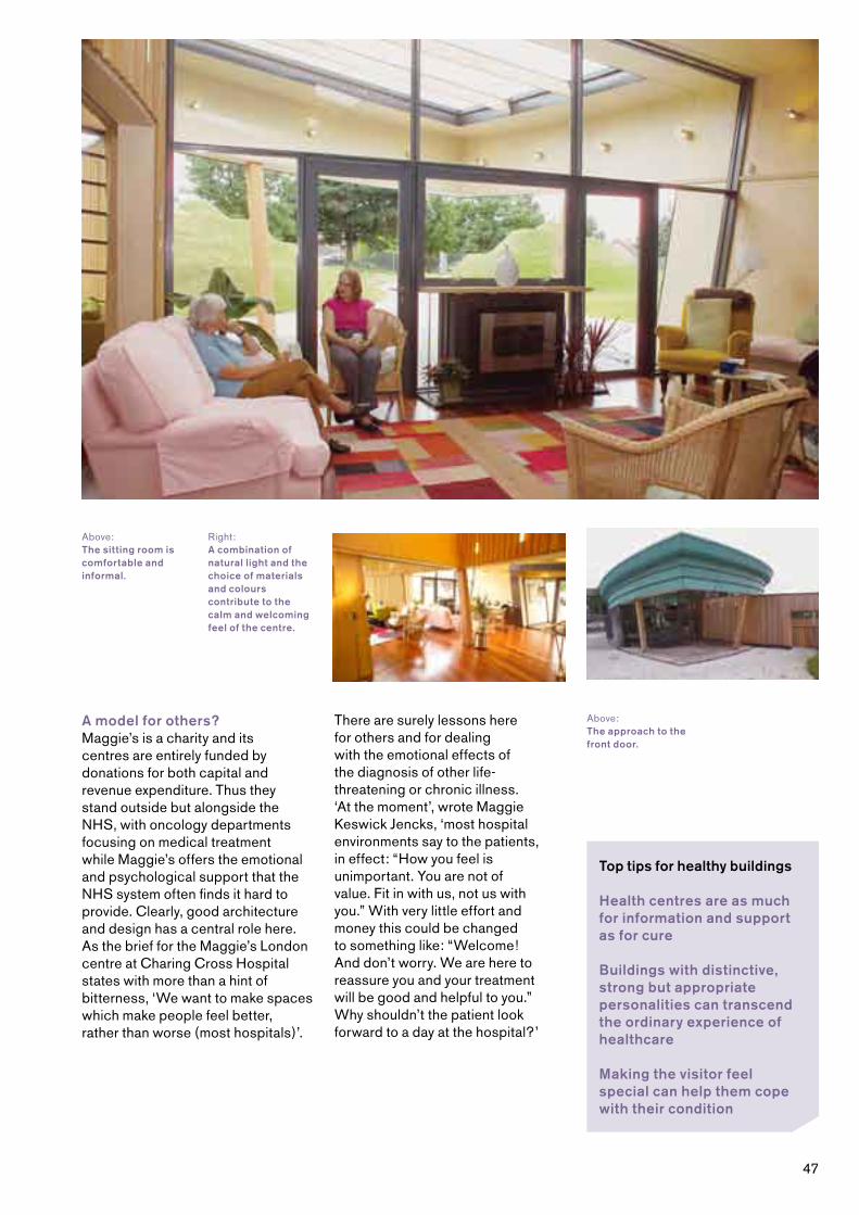
�7
Top tips for healthy buildings
Health centres are as much for information and support as for cure
Buildings with distinctive, strong but appropriate personalities can transcend the ordinary experience of healthcare
Making the visitor feel special can help them cope with their condition
A model for others?Maggie’s is a charity and its centres are entirely funded by donations for both capital and revenue expenditure. Thus they stand outside but alongside the NHS, with oncology departments focusing on medical treatment while Maggie’s offers the emotional and psychological support that the NHS system often finds it hard to provide. Clearly, good architecture and design has a central role here. As the brief for the Maggie’s London centre at Charing Cross Hospital states with more than a hint of bitterness, ‘We want to make spaces which make people feel better, rather than worse (most hospitals)’.
There are surely lessons here for others and for dealing with the emotional effects of the diagnosis of other life-threatening or chronic illness. ‘At the moment’, wrote Maggie Keswick Jencks, ‘most hospital environments say to the patients, in effect: “How you feel is unimportant. You are not of value. Fit in with us, not us with you.” With very little effort and money this could be changed to something like: “Welcome! And don’t worry. We are here to reassure you and your treatment will be good and helpful to you.” Why shouldn’t the patient look forward to a day at the hospital?’
Above:The approach to the front door.
Above:The sitting room is comfortable and informal.
Right:A combination of natural light and the choice of materials and colours contribute to the calm and welcoming feel of the centre.

��
Better practiceWhen Dr Pritlove and her partners were seeking a site for a new surgery in the Leeds suburb of Chapel Allerton, their preferred choice was occupied by the former home of a Victorian quarry owner which had been gifted to the local authority but allowed to fall into disrepair. When the city determined to dispose of the site, the partnership was outbid by McDonald’s. There was, however, strong local concern about both the potential impact on traffic flow at the busy roundabout which is close to the site and the presence of a fast food restaurant so near to the local sports centre. The city agreed to sell the site to the practice.
Rutland Lodge Medical Centre, Leeds
Environmental health
Client: Dr Pritlove and Partners
Architect: OSA Architects
Completed: 200�
Cost: £�.� million
Building to lastEncouraged and enthused by one of their colleagues and working closely with their architects and the Leeds-based environmental designers, LEDA, the partners sought to create a sustainable building which met their medical requirements and incorporated a range of environmental features. These included:
• photo-voltaic panels, converting sunlight to electricity
• rainwater recycling for flushing toilets
• solar chimneys to encourage natural ventilation
• ‘sustainable’ drainage in the car park, allowing rainwater to soak into the ground rather than run off into the city sewers
• the use of natural non-toxic materials building materials and furnishings
Partly clad in light orange tiles and with distinctive blue window frames, the building is oriented south-west. This enables it to take maximum advantage of the sun, shaded in the summer by a mature sycamore but allowing full sunlight when the tree loses its leaves in the autumn.
Above:The generous proportions of the waiting area, with its tall windows, are designed to put patients at ease before they are met by their doctor.
Right:The third floor corridors are lit from above.

�9
The reception area opens into a spacious waiting area with floor-to-ceiling windows and a double-height atrium in the centre. It is a light, bright and comfortable room, designed to put patients at ease
Outside, there are parking places for �0 cars. Combined with those by the adjacent sports centre, they give the incongruous impression of a building afloat in a small sea of car parking. Through the main entrance the reception area, with a small room behind it designated for confidential discussion, opens into a spacious waiting area with floor-to-ceiling windows and a double-height atrium in the centre. It is a light, bright and comfortable room, designed to put patients at ease before they are met by their doctor and taken to consulting rooms – which each of the practice’s five doctors is encouraged to decorate in their own way. The centre also includes minor surgery and treatment rooms and, on the first floor, along with the eye clinic, there are practice offices and a conference room which will be available for external use. With a steel frame construction and no load-bearing walls, Rutland Lodge is capable of adjusting to future needs.
The new building has quickly proved popular with both patients and staff. In the first eight months at Rutland Lodge, patient numbers have grown by about �00 to �,�00. Good relations are being established with the neighbouring Scott Hall Sports Centre. ‘In a word’, said the receptionist, ‘it’s wonderful.’
Space to growOriginally planned as a two-storey building, a third floor was added at the request of the Leeds PCT to provide office space for some of its staff and a base for community nurses, the latter requiring 2�-hour access. A designed-for-purpose and PCT-run eye clinic occupies one end of the first floor, with its own entrance at the rear of the building. There is space for a pharmacy at ground floor level. This will be run by the practice itself.
This is a comparatively large building with three floors of ��0 square metres, a far cry from the council house out of which the practice had previously operated. As a result, although the occupancy of the PCT’s busy office far exceeds the architect’s vision, the space available for the practice itself is generous.
Top tips for healthy buildings
Taking advantage of the natural environment can help create a sustainable building
Potential change can be designed into a new healthcare building
Offering advice on the management of a building once occupied will make it easier for staff to use
The medical centre, one of two surgeries operated by this practice, was financed by a bank loan and the running costs are offset by the NHS cost rent scheme and rental income from the PCT. A number of the environmental features will help to reduce running costs by cutting energy bills. Their success, however, will depend upon staff understanding how they can help to control the working environment. A Building Logbook offers a list of do’s and don’ts for the building manager and contains information on the operation of the building to be given to members of staff.
Below left:Natural, non-toxic materials and furnishings are used throughout.
Below right:The building’s colourful façade faces south-west and is shaded by a sycamore tree.
Below:The use of high quality materials and attention to detail continues in the staff accommodation.

�0
Healthy livingNot content with having one of the country’s first super-surgeries, the London Borough of Newham now has two community resource centres — with a third one planned. The first, The Hub, which was officially opened in March 200�, accommodates business start-up units, a café, pharmacy, nursery and multi-purpose community hall. Designed by Eger Architects, it was shortlisted for the Prime Minister’s Better Public Building Award in 200�.
Grassroots, in Memorial Park, also by Eger Architects, is Newham’s second community resource centre. Like The Hub, the building is part of a broad strategic programme to improve the quality of life in a historically deprived area of East London.
Grassroots has been developed on the basis that a well designed, sustainable, energy-efficient building would contribute positively to the people who use it and the wider neighbourhood. As well as a nurse-led Personal Medical Service (SPMS) and health centre, the building contains a healthy eating café, a multi-purpose hall that is available for hire, a crèche for �� children and a nursery for ��. The local community food enterprise manages the café. It also runs a very popular mobile food store,
Grassroots, London
Lessons from history
Client: West Ham & Plaistow New Deal Partnership
Architect: Eger Architects
Completed: 200�
Cost: £2.� million
selling fresh fruit and vegetables to a community historically badly supplied with sources of fresh food; its first local supermarket, Somerfield, has been open only for a matter of months. This work is complemented by the health impact team’s healthy eating programme.
The Peckham modelMost of the buildings in this book are concerned with the provision of community nursing and medical care for people who are ill – what might be described as the Finsbury model. But the pioneering work of Williamson and Pearce in Peckham has not been forgotten and their belief in preventative healthcare is also continued – in the growing number of healthy living centres which have been established throughout the United Kingdom. Thanks to the Lottery’s New Opportunities Fund, there are now over ��0; sometimes, like the first of the new wave in Bromley-by-Bow, these take the form of a building, offering a wide range of therapies and programmes designed to improve public health; sometimes they are centres ‘without walls,’ like Upstream, a project which aims to improve the well-being and quality of life for older, more isolated people in mid-Devon, an area of rural isolation with pockets of social deprivation.
Above:The majority of the building is set beneath a grass roof.
Opposite:The chef, hard at work in the Healthy Eating Café.

��

�2
Health and the community Community resource centres have gone further, integrating healthcare and healthy living into more broadly based programmes of community development and well-being. Often purpose-built, these centres can provide training, support, advice and space for community programmes, business, childcare and neighbourhood health.
Partnerships workingBoth The Hub and Grassroots have been developed as part of the Government’s New Deal for Communities (NDC) initiative, a key programme in its strategy to tackle multiple deprivation in the most deprived neighbourhoods in the country. Central tenets of this programme are partnership and community involvement, aiming to ensure a sense of ownership across stakeholders. West Ham and Plaistow NDC have developed a working partnership with the London Borough of Newham which is key to facilitating schemes such as The Hub and Grassroots. During the planning phase for The Hub, discussions were held with neighbouring local authorities, the local Sure Start programme, Newham Primary Care Trust, the Metropolitan Police and the Community Housing Association. A parallel process of public consultation has resulted in genuine community involvement in the development of the buildings. Indeed, by the time designs for Grassroots were being developed, it was local residents involved in the consultation who were demanding a high quality, landmark building.
Reclaiming a lost urban parkGrassroots stands in Memorial Park, hitherto neglected, unused and perceived as unsafe. Local residents had expressed their concern that the park was a ‘forgotten zone’, seldom used either for leisure or as an access route. Placing the building truly in the park rather than at its edge worked to draw more people through the park, thus bringing it back to life and creating a high quality public space.
The proposal to build in the park was not without its planning difficulties, but these were partially solved by setting the majority of the building under a grass roof. This ensures that visually it sits comfortably in the park and also allows visitors to walk up onto and over the roof. Solar panels on the south-facing façade provide �0% of the building’s power at full efficiency, while a rainwater harvesting system recycles water runoff from the roof and from the fountain in front of the building to irrigate the grass roof and provide grey water throughout the building. Visitors to the building can watch the performance of the building on graphic displays in the reception area – and see the solar power reading drop when the clouds move overhead. The mesh on the external façade of the front of the building means that the windows can be left open overnight so that the building can absorb cool air and, as a result, needs no air-conditioning.
Above:Inside the building, three digital panels indicate the building’s use of power and water.
Bottom:The view from the grass roof into one of the two contained play areas below.
Top:One of the enclosed children’s play spaces.

��
Top tips for healthy buildings
Health buildings can be multifunctional and open to future uses
Multiple stakeholder involvement leads to more successful outcomes
A high quality building and surroundings can contribute to local people making the most of their local healthcare facilities
Olympian idealsNew, lit pathways and step-free access, partially funded by Transport for London, have already helped to improve Memorial Park and a programme of new signage, combined with opening up selected vistas, will work towards vastly improving visual access to the park and its buildings.
The next stages of the project involve constructing a new pavilion to replace the existing building that has suffered from years of neglect and misuse, a floodlit astroturf all-weather pitch in partnership with the local rugby club, and three new play areas. The first is an informal area for teenagers, designed with pupils at Eastlea Community School. A ‘play orchard’ with natural areas and a place for story-telling will cater for children up to six years old, while a more traditional play area will follow for children from the age of six to their early teens.
The site for the 20�2 Olympics in London is next door to Memorial Park. The Greenway, one of the major pedestrian routes to the Olympic site, runs along the north edge of the park. Whilst Memorial Park may not be formally linked with the Olympics, the success of the bid gives clear opportunities to promote sporting activities in the park as well as reinforce the benefits of exercise and healthy living.
Above:Facilities at the centre include the versatile multi-purpose hall.
Left:The local community food enterprise runs the Healthy Eating Café as well as a very popular mobile food store.
Right:The solar panels on the south-facing facade provide up to 30% of the building’s power.

��

��
CABE believes that a set of key elements helps to create a good healthcare building.
CABE’s key elements of good healthcare buildings
Good integrated designDesign excellence is not just about attractive buildings. Good integrated design must also consider how a building can contribute positively to its environment. Wherever possible, in the case of neighbourhood health facilities, this should include ease of access and straightforward integration with public transport. At the Hove Polyclinic, where the whole site was the subject of a Development Control Plan, the bus from the centre of town brings patients and staff directly to the clinic’s forecourt, while buses stop outside both the Chiddenbrook and Idle surgeries.
Public open spaceA patient-centred healthcare building should extend its concern for patients beyond its walls by trying to provide well-managed public open space in which pedestrians are given priority over cars, even at rural surgeries where car parking is essential. Good use of sensitive landscaping to enhance the natural landscape can be seen at the Maggie’s Centre in Inverness, where Charles Jencks’s landscaping both startles the eye and complements the architecture
Left:An aerial view of Maggie’s Highlands in Inverness, by Page & Park.
Below:The pebbled approach to Advance Dental Clinic in Chelmsford, by Richard Mitzman.
©Inverness A
ir Am
bulance
Opposite:The entrance to Barts Breast Cancer Centre which comunicates high quality design from the moment of arrival.
or, by contrast, in the grassy undulating land which surrounds the Hove Polyclinic or the accessible inner-city gardens at Pulross.
There is an increasing body of evidence that nature can offer more than simply a pleasant setting for healthcare; it can also contribute directly to reducing stress and pain, and speeding recovery. Work led by the American academic Roger Ulrich has shown that ‘simply viewing nature’ produced ‘a constellation of positive emotional and physiological changes’ in patients. Moreover, ‘hospital gardens not only provide restorative or calming nature views but can also reduce stress and improve outcomes through other mechanisms – for instance, fostering access to social support and providing opportunities for positive escape and sense of control with respect to stressful clinical settings.’� It is a theory that St Oswald’s Hospice would endorse through long experience of the therapeutic value of plants and gardens, and one that the Brent Birth Centre has ambitions to exploit as soon as funding allows.
A clear planThe tranquil Georgian square which offers a focal point at the Barts Breast Care Centre acts as a bridge between a therapeutic urban landscape and the ordered and carefully planned internal design of the centre itself. A critical success factor of many of the case studies is their meticulous attention to the patient journey and the subsequent preparation of a clear plan.
For many patients, the experience of going to the doctor or dentist induces anxiety. The German phrase schwelle angst (a fear of the threshold) is particularly applicable in a medical environment. Good design in this context must seek to lower or even remove this psychological barrier so that patients
CABE’s 10 key elements
Good integrated design
Public open space
A clear plan
A single reception point
Circulation and waiting areas
Materials, finishes and furnishing
Natural light and ventilation
Storage
Adapting to future changes
Out of hours community use

��
reach the point of consultation feeling as calm and relaxed as can be expected. A number of factors can contribute to this end. These begin with a clear and logically placed entrance, with easy access for all visitors, including those in wheelchairs, those whose sight is impaired, and parents with small children. There should be a cheerful and welcoming atmosphere and an air of tranquillity. Throughout their visit, patients have every right to expect to be treated in privacy and with dignity.
A single reception pointReception areas and information points are key to orientation. In many of the buildings described here the tone is set by the reception and, importantly, its staff. Lubetkin’s original plans for Finsbury contained no reception desk, with its implications of supervision and control, but this proved impractical even in this most orderly of buildings. Of the examples here, only Maggie’s has no reception, choosing instead to operate in its own very personal style. Most of the others have a single reception point, offering an early welcome and a point of orientation when moving around the building. This is not always easy to get right. Sometimes it is difficult to balance openness with patient confidentiality or staff safety, but for the most part reception areas skilfully combine the friendly welcome with low-key oversight of public areas.
Circulation and waiting areasThese areas should be pleasant in their own right. Well-planned waiting rooms can help to relax patients, thereby reducing fear and increasing confidence. Where space allows, the most successful have abandoned the serried ranks of grey polypropylene chairs in favour of upholstered seating, sometimes set out in the style of a hotel foyer. This is especially valuable where the patient may be accompanied by friends or relations, such as at the Brent Birth Centre or at Barts Breast Care Centre. A number of waiting areas include toys and other distractions for children. At the Idle Medical Centre, the spacious waiting areas allows patients, carers and visitors to relax, chat, wander or simply enjoy the view of distant hills.
Above:Children are encouraged to make their bedrooms their own during their stay at St Oswald’s Hospice in Newcastle, by JDDK.
Left:The sitting room at the Maggie’s Centre in Inverness is calm and welcoming.
It is CABE’s strongly held view that space should be viewed as a resource, not a territory, allowing patterns of use to evolve over time

�7
Materials, finishes and furnishingHealthcare buildings are busy places, both in terms of footfall and hours worked. Materials, finishes and furnishing therefore need to be robust, as well as attractive. Well-selected, fit for purpose furnishings will complement a clear approach to design and there will also be on-going benefit for whole life costs as maintenance and replacement are reduced. For the Brent Birth Centre, Barbara Weiss Architects took immense care in her selection of colours to provide a relaxed environment in each of the birthing rooms while the gritty, urban feel of the waiting area at the Luton Walk-in Centre is a perfect response to this highly active facility, open for �� hours a day, ��� days a year.
Natural light and ventilationGenerous amounts of natural light and ventilation help to contribute to good and energy-efficient environmental conditions throughout. Rutland Lodge Medical Centre in Leeds
provides a good example of a building which has not only incorporated a carefully planned system of natural ventilation but has also installed a number of environmentally friendly features. It is too early to know how well these will work, but it is clear that, in a number of the case studies, natural ventilation has battled against the temperatures of a warm summer.
StorageA recurrent problem is the lack of adequate and effectively planned storage. Inevitably, the ambition of a paperless NHS will take time to filter through the system. Meanwhile there are patient records to be stored, together with publications and leaflets, equipment and supplies, even surplus chairs. Often NHS buildings also suffer from an uncontrolled rash of notices, pinned or blue-tacked to any available flat space. The principal result is an accumulation of clutter, in corners, on walls, under desks, on top of cupboards, sometimes with consequent threats to patient safety and to hygiene. First impressions count, and quality of care is expressed by the cleanliness and general management of healthcare environments. In healthcare architecture, it is key to design spaces that are not only clean and efficient but also express this. In this context, Richard Mitzman’s work at the Advance Dental Clinic provides a model worthy of consideration in other medical disciplines.
Adapting to future changesAn important inheritance from Lubetkin’s Finsbury Health Centre was the ‘recognition of the imminent and profound impact of the demand for flexibility in modern buildings.’� The rapid demand for change and for a fresh approach to the delivery of healthcare at neighbourhood level shows that little has changed and that buildings today need to have the capacity to adapt to future changes. It is CABE’s strongly held view that space should be viewed as a resource, not a territory, allowing patterns of use to evolve over time. This is easier said than done. The Breast Care Centre at St Bartholomew’s Hospital, Luton Walk-in Centre and the Villa Street Medical Centre illustrate existing buildings can with imagination be turned to a 2�st century use; others, like St Oswald’s Hospice have slowly expanded into new buildings. Some however, given the nature of their sites, find themselves bursting at the seams, often victims of the success of their new buildings in increasing the size of the patient register.
Out of hours community useFinally, the Lewisham case study urges a layout that encourages community use out of hours. In the examples examined here, the best intentions have frequently gone awry because of demands of space and time. Nevertheless, there is widespread recognition of the benefits of encouraging use of some of the easily accessible space.
Read more about CABE’s key elements of good healthcare buildings in Lewisham primary care trust’s children’s and young people’s centre: Design and innovation for primary health and social care, and Creating excellent buildings: a guide for clients.
Below:Villa Street Medical Centre in London, by Avanti Architects.

��
FURTHER READING AND RESOURCES
Advice to Trusts on the main components of the design brief for healthcare buildings, NHS Estates, 2002
A new generation of healthcare buildings: Modernising the fabric of the NHS, NHS Estates, 200�
Celebrating Achievement: Enhancing the Healing Environment Programme 2003-2005, King’s Fund, 200�
Creating excellent buildings: a guide for clients, CABE, 200�
Development of an integrated breast care centre at St Bartholomew’s Hospital, London, NHS Estates, 200�
Enhancing the Healing Environment: A Guide for NHS Trusts, King’s Fund, 200�
Lewisham primary care trust’s children’s and young people’s centre: design and innovation for primary health and social care, CABE, 200�
New primary care premises: design to support workplace health, Health Development Agency (now part of the National Institute for Health and Clinical Excellence), 200�
West Wing: Making art and architecture work for health, Barts and The London NHS Trust, 200�
Barton, H. & Tsourou, C., Healthy Urban Planning, Spon Press, 2000
Burt-O’Dea, K., The European Health Property Network Design Impact Study, The European Health Property Network (EuPHN) in collaboration with Plan & Projectpartners, September 200�
Francis, S. & Glanville, R., Building a 2020 vision: Future healthcare environments, The Stationery Office, 200�
Gordon, G., Primary Healthcare Buildings, Spon Press, 200�
Halpern, D., Mental Health and the Built Environment: More than bricks and mortar?, Taylor & Francis, �99�
Lawson, B. & Phiri, M., The Architectural Healthcare Environment and its Effects on Patient Health Outcomes, The Stationery Office, 200�
Purves, G., Healthy Living Centres: a guide to primary health care design, Architectural Press, 2002
Ulrich, R. & Zimring, C., The role of the physical environment in the hospital of the 21st century: a once-in-a-lifetime opportunity, CA: The Center for Health Design, 200�
CREDITS
Researched and written by Timothy Mason.
Advisory GroupSusan Francis, NHS ConfederationPippa Gough, King’s FundGiles Oliver, Penoyre & Prasad ArchitectsJohn Wells-Thorpe
Rachael Eaton, CABE SpacePeter Jenkins, CABEMairi Johnson, CABEKate Trant, CABEPhilippa Westbury, CABE
PHOTOGRAPHS
Unless otherwise indicated, photographs by Ashley Bingham and Mark Ellis at ICD Ltd.
With the exception of: front cover, top left © Barbara Weiss; front cover, top right © Marcus Peel; page � © Phil Sayer; page �, top left and right © Dell & Wainwright / RIBA Photographs Collection; page �7 © Gareth Gardner; page �� © Morley von Sternberg; page �� © Phil Sayer
FOOTNOTES
� Transforming Neighbourhoods, CABE 200�, p��
2 Burt-O’Dea, K., The European Health Property Network Design Impact Study, The European Health Property Network (EuPHN) in collaboration with Plan & Projectpartners, September 200�
� Ulrich, R. & Zimring, C., The role of the physical environment in the hospital of the 21st century: a once-in-a-lifetime opportunity, CA: The Center for Health Design, 200�, p22
� Allan, J., Lubetkin: architecture and the tradition of progress, RIBA Publications, �992, p��7


�0
The built environment plays a pivotal role in keeping us healthy. This is now well understood. So why are we still building health facilities that lack design quality or engagement with the local community?
Designed with care presents 15 wide-ranging case studies of new healthcare buildings that have challenged existing ways of working; responded to the needs of their neighbourhood; created a human and reassuring environment; used space and light to create a calming atmosphere and developed an inclusive design ethos from the outset.
The challenge is for others involved in future healthcare building to learn from the lessons presented in these case studies.
ISBN 1–84633–006–8