designer & analyst - product documentation -...
TRANSCRIPT

Designer & Analyst Version 16.7.0
[User Guide]
Datawatch Corporation makes no representation or warranties with respect to the contents of this manual or the associated software and especially disclaims any implied warranties of merchantability or fitness for any particular purpose. Further, Datawatch Corporation reserves the right to revise this publication and make changes from time to time to its contents without obligation to notify anyone of such revisions or changes.
Datawatch Panopticon Designer software is offered and is to be used in accordance with a SOFTWARE LICENSE AND MAINTENANCE AGREEMENT. This agreement stipulates that this software be used only in the computer system designated in that agreement. The agreement further stipulates that the customer shall not copy or alter, or permit others to copy or alter, the software or related materials in whole or in part, in any media for any purpose, except to make an archive (back-up) copy or to make a copy as an essential step in the use of the software with the customer's computer.
Datawatch Corporation hereby grants the buyer the right to reprint this documentation for internal uses only. No part of this publication may be reproduced, stored in a retrieval system, or transmitted in any form or by any means, electronic, mechanical, photocopying, recording, or otherwise, for any other purposes, without the prior written permission of Datawatch Corporation.
Datawatch Panopticon Designer and Analyst Client User Guide Version 16.7.0 Copyright © 2018 by Datawatch Corporation All rights reserved. Printed in the U.S.A. Unpublished - Rights reserved under the copyright law of the United States.
Datawatch Panopticon Designer, Panopticon Designer, Datawatch Analyst and Datawatch Panopticon Server are trademarks of Datawatch Corporation. Other products mentioned herein may be trademarks or registered trademarks of their respective owners in the United States or other countries.
For U.S. Government End Users, the software is a “Commercial Item(s),” as that term is defined at
48 C.F.R. Section 2.101, consisting of “Commercial Computer Software” and “Commercial Computer Software Documentation,” as such terms are used in 48 C.F.R. Section 12.212 or 48 C.F.R. Section 227.7202, as applicable. Consistent with 48 C.F.R. Section 12.212 or 48 C.F.R. Sections 227.7202-1 through 227.7202-4, as applicable, the Commercial Computer Software and Commercial Computer Software Documentation are being licensed to U.S. Government end users (a) only as Commercial Items and (b) with only those rights as are granted to all other end users pursuant to the Datawatch Software License and Maintenance Agreement.
DATAWATCH CORPORATION
CORPORATE HEADQUARTERS
4 Crosby Drive
Bedford, MA 01730, USA
Tel.: +1 800.445.3311
Fax: +1 978.441.1114
NEW YORK
415 Madison Avenue, Suite 1421
New York, NY 10017
Tel.: +1 800.445.3311
GREENSBORO, NC
101 S Elm #225
Greensboro, NC 27401
Tel: +1 800.445.3311
EUROPE, MIDDLE EAST, AND AFRICA
EUROPEAN HEADQUARTERS
Siena Court, Broadway
Maidenhead, Berkshire SL6 1NJ
Tel: +44 203.868.0230
DATAWATCH AB
Eriksbergsgatan 10
Stockholm, Sweden SE-114 30
Tel: +46 853.480.483
ASIA PACIFIC
MANILA
U2011 20th Flr Jollibee Plaza Condominium
F. Ortigas Jr. Rd., Ortigas Center
Pasig City 1605 PH
Tel: +63 2.633.5583

Table of Contents [1] Datawatch Panopticon Designer Workbooks ........................................................ 1
Accessing Datawatch Panopticon Designer Workbooks ....................................................... 1
Opening a Workbook ..................................................................................................... 3
Viewing Workbook History and Republishing ......................................................... 5
[2] Elements of a Workbook ...................................................................................... 7
Workbook Tabs (Dashboards) ......................................................................................... 8
Visualizations ............................................................................................................... 9
Title ................................................................................................................. 9
Visual Filter Applied ..............................................................................10
Context Sensitive Help ............................................................................10
Zoom Out .................................................................................................10
Maximize ....................................................................................................10 Shelf ...............................................................................................................11
Copying Text Labels and Titles in Visualizations ....................................................12
Visualization Variables .......................................................................................12
Changing the Selected Breakdown in a Hierarchical Data Structure .........................12
Changing the Hierarchy Ordering ........................................................................13
Changing the Visible Detail Level (Visible Depth) ..................................................13
Drilling into Hierarchical Displays ........................................................................14
Sorting a Visualization .......................................................................................14
Remove Column ...............................................................................................15
Add Column .....................................................................................................16
Interacting with Visualizations .......................................................................................17
Refresh Page ....................................................................................................17
Pause Realtime Display......................................................................................17
Rubber Band Zoom and Selection .......................................................................17
Zooming In and Out with Mouse Wheel................................................................22
Panning Around Within the Zoomed Area .............................................................23
Details Pop-Up .................................................................................................25
Context Menu ...................................................................................................26
Additional Visual Table Interactivity ....................................................................28
Hiding Dashboard Tabs and Toolbar Icons Using Input Parameter ......................................33
Parameter Setting ........................................................................................................35
Actions (Context Jump Points) .......................................................................................36
Screen Data with Filters ................................................................................................38
Visualization Filters (Dashboard Specific) .............................................................38
Filters within a Filter Box ...................................................................................40
Categorical Filters (Text Filters) ......................................................................... 41
Percentile Range Filters .................................................................................... 43
Numeric Range Filters ...................................................................................... 44
Date Range Filters ........................................................................................... 44
Time Window Filters ......................................................................................... 44
Drilling Into Visualizations ............................................................................................ 45
Data Export ................................................................................................................ 46
Morphing Visualizations .................................................................................... 47
Snapshot Time ........................................................................................................... 48
Ad Hoc PDF Report Generation ..................................................................................... 50
Legends ..................................................................................................................... 52
Icon Legend .................................................................................................... 52
Reference Line Legend...................................................................................... 52
Color Legend - Categorical Style ........................................................................ 53
Color Legend - Numeric Style ............................................................................ 53
Color Legend – Distinct Outlier .......................................................................... 54
Color Legend – Color Steps ............................................................................... 57
[3] Cross Tabbing .................................................................................................... 58
Investigation through Filtering, Drilling, and Zooming ...................................................... 61
[4] Bookmarking ...................................................................................................... 64

Designer & Analyst Client User Guide 16.7.0 1
[1] Datawatch Panopticon Designer Workbooks In this chapter, you will learn how to do the following:
access your Datawatch Designer workbooks on the web or within Datawatch Panopticon Designer (or Panopticon Designer).
open a workbook
Accessing Datawatch Panopticon Designer Workbooks The Panopticon Designer can be installed on your Windows PC and it lets you access, view, edit, and design workbooks to be published to the web or stored locally. These Designer workbooks that have been published to the web can be accessed through a web browser.
What you see on the screen, including all filters and visualizations are the same regardless of whether you are looking at the workbook on the web or within the Panopticon Designer application. However, some controls and the amount of interactivity available are not the same in the Panopticon Designer and the web such as Toggle Display Mode, Rubber Band Selection, or Copy Image. Refer to the sections below for more information.
Figure 1-1. Workbook in a Web Browser
Figure 1-2. Workbook in the Panopticon Designer Design Mode.

2 Designer & Analyst Client User Guide 16.7.0
The user experience is virtually identical for people accessing a workbook over the web or those using Panopticon Designer software installed on a Windows PC.
Over the web, workbooks can be retrieved using HTML5:
Smartphones have small screens and therefore Panopticon Designer automatically uses a special mobile format to display workbooks on such devices. The mobile format shows workbooks and constituent dashboard. However, interactivity is limited to navigating between dashboards.
This includes:
Figure 1-3. Workbook Listing (Portrait)
Figure 1-4. Workbook View (Portrait)
Figure 1-5. Workbook View (Landscape)

Designer & Analyst Client User Guide 16.7.0 3
Opening a Workbook When you first open the Datawatch Visual Data Discovery web page, there are no published workbooks displayed in the Datawatch Panopticon Server.
After publishing workbooks to a folder/sub-folder in Panopticon Designer, or uploading workbooks in Panopticon Server, the default web page for the Panopticon Server lists available folders and published and uploaded workbooks. The workbooks include their Titles and thumbnail images.
Enter text in the Filter Workbooks box to filter the workbook thumbnails.

4 Designer & Analyst Client User Guide 16.7.0
Click on the thumbnail corresponding to the workbook you want to use. The selected workbook will display full screen.
Figure 1-6. The selected workbook is displayed full screen
• Each workbook can contain several dashboards.
• Each dashboard in a workbook may contain multiple visualizations, legends, and filters.
• Each dashboard shows up as a tab at the top of the screen. Click on the dashboard tab you want to use.

Designer & Analyst Client User Guide 16.7.0 5
VIEWING WORKBOOK HISTORY AND REPUBLISHING
Aside from opening workbooks, analysts can also perform the following:
View the change history of workbooks
Republish an archived workbook to the recent version of Panopticon Server
Rename an archived workbook
Steps:
1. In the Workbooks tab, click the History button of a workbook.
The History of Workbook <Name> dialog displays:
You can sort the archival list either through the Date or User name by clicking on the
or button.
Also, move to the other pages of the list by clicking on a page or clicking the or button.
2. Click on an archived workbook in the list.

6 Designer & Analyst Client User Guide 16.7.0
Then click Republish. A notification message displays.
3. Click Yes. A notification message displays.
4. Click OK.
5. You may also opt to rename an archived workbook by entering a new one in the New
Name box and follow steps 2 to 4 to republish it.

Designer & Analyst Client User Guide 16.7.0 7
[2] Elements of a Workbook Workbooks may contain different elements depending on the design created by your administrator.
In Panopticon Designer, the workbook layout is displayed into either any of the two modes:
Design Mode
Allows you to create Panopticon Designer workbooks and add or change elements in dashboards. Panopticon Designer defaults to the Design Mode.
Figure 2-1. Elements of a workbook in Design Mode
Presentation Mode
Allows you to use your Designer workbooks and dashboards to analyze data. Essentially, Presentation Mode in Panopticon Designer is the same as accessing a published workbook
via a web browser.

8 Designer & Analyst Client User Guide 16.7.0
Figure 2-2. Elements of a Workbook in Presentation Mode or Web Client
Each of these elements are discussed as follows.
Workbook Tabs (Dashboards) Each tab or dashboard in a workbook provides a view of your data that will normally include one or more data visualizations, filters, and legends.
You can move between dashboards within the workbook by clicking the appropriate tab.
Figure 2-3. Moving to different dashboards by clicking on Tabs
Right-click on a tab to copy the image of the selected dashboard and paste it into other applications (e.g., MS PowerPoint).
Figure 2-4. Copying the image in the dashboard using the Tab context menu

Designer & Analyst Client User Guide 16.7.0 9
Visualizations Each dashboard (Tab) contains one or more data visualizations consisting of:
Title
Shelf
Visualization
Figure 2-5. Elements of a dashboard in Design Mode
TITLE
Each of these visualizations can be given a descriptive title to help users understand the
information presented. If no title is specified, the empty title is not displayed.

10 Designer & Analyst Client User Guide 16.7.0
VISUAL FILTER APPLIED
Visualizations themselves can be filters to screen the dataset. Right-clicking on data points to bring up the context menu, exposes the ability to filter in, or filter out the selected items.
Once the visualization has been filtered in this way, the filter applied icon appears on the top right of the visualization. Clicking this removes the visualization filter.
CONTEXT SENSITIVE HELP
Dashboard publishers can create Context Sensitive Help for their users. These help files are
made available by clicking the Question Mark icon at the top right of each visualization title. Click on the Help icon to display the associated Help text.
Figure 2-6. The corresponding Help is displayed after clicking the Help icon
ZOOM OUT
When a visualization is zoomed, either through using the mouse wheel, or through the rubber band zoom toolbar, the zoom out icon appears on the top right of the visualization. When
clicked, it will zoom out, and the icon will change into its inactive state.
MAXIMIZE
Each of these visualizations can be maximized to display the full dashboard area by clicking
the Maximize icon. To return to normal, click the visualization Restore icon.

Designer & Analyst Client User Guide 16.7.0 11
Figure 2-7. Before clicking Maximize
Figure 2-8. After clicking Maximize
SHELF
The Shelf contains menus for variable selection and provides control over the breakdown of the data. You can also control the level of detail within a hierarchy, as presented in the associated visualization, and also how the data is cross-tabbed.
It can be shown or hidden by right-clicking on a context menu item.
Figure 2-9. The elements of the Shelf

12 Designer & Analyst Client User Guide 16.7.0
COPYING TEXT LABELS AND TITLES IN VISUALIZATIONS
Copy Text labels and titles in visualizations by highlighting the Text and selecting Copy in the context menu that displays.
Paste it into other applications.
VISUALIZATION VARIABLES
If the variable is set up to show more than one column of data, a list box displays the available selection. Select one in the list that you want to examine and Panopticon Designer will update the visualization based on your selection.
Figure 2-10. Visualization Variables
Additionally, selected variables can be changed through the right click context menu.
Within a visualization, variables such as size and color can be changed.
Example:
CHANGING THE SELECTED BREAKDOWN IN A HIERARCHICAL DATA STRUCTURE
It is quite common for data visualizations to be set up using a hierarchical data structure. You
can use Panopticon Designer to aggregate data on the fly within the hierarchy as needed.

Designer & Analyst Client User Guide 16.7.0 13
To change the breakdown, click the down arrow and pick from the available list.
Figure 2-11. Selecting a Breakdown
CHANGING THE HIERARCHY ORDERING
The hierarchy that is selected is not fixed, but can be instead changed dynamically. You can
change the hierarchy by dragging the columns.
CHANGING THE VISIBLE DETAIL LEVEL (VISIBLE DEPTH)
The level of detail shown in visualization is called the Visible Depth.
You can change the Visible Depth by dragging the handle that appears on the right hand side of the breakdown, in the Panopticon Designer. This is the Visible Depth slider. You will see the Visible Depth tooltip display when you hover on it.
Figure 2-12. Visible Depth tooltip
In the HTML client, the Visible Depth handle is not displayed. As a substitute clicking on the
breakdown item updates the visible depth to that level.
In the following examples, we have set up a hierarchy for a set of financial information that includes: Region, Country and Company.
Figure 2-13. Show Entire Hierarchy
Leave the Visible Depth slider in place all the way to the right.
Figure 2-14. Aggregate to Countries
Move the slider to the left until only the Region and Country variables are highlighted. Panopticon Designer will automatically do all the calculations necessary to update
the associated visualization.
Figure 2-15. Aggregate to Regions
Move the slider to the left until only the Region variable is highlighted. Panopticon Designer will automatically perform the calculations to update your visualization.

14 Designer & Analyst Client User Guide 16.7.0
DRILLING INTO HIERARCHICAL DISPLAYS
Steps:
1. To drill into a hierarchical data structure, you can either:
• Click on the breakdown item to highlight, or
Figure 2-16. Drilling into hierarchical data structure
• Within the visualization, double-click on the item you wish to drill into.
2. Right-click and select the level you want to drill down into using the associated
visualization.
Selecting the drill down level:
Figure 2-17. In Panopticon Designer
Figure 2-18. In the Web Client
The selected level will appear gray.
3. Click the gray item to return to the default view that includes all categories in the data.
SORTING A VISUALIZATION
It is quite common for data visualizations to require sorting to highlight different aspects of the data.
Steps:
1. Right-click on the desired breakdown item and from the context menu, select Sort.
2. Select the desired sorting method.

Designer & Analyst Client User Guide 16.7.0 15
Figure 2-19. In Panopticon Designer
Figure 2-20. In the Web Client
Performing the action again sorts the visualization in the alternate direction; for example, ascending becomes descending.
You will be able to sort a visualization on the basis of any of the data columns used in the
visualization for Breakdown (Title), Size/Height, Color, Icon or Details.
This example shows different sorting methods for a Horizontal Bar Graph showing market performance by industry.
Figure 2-21. Sorting by Title
Figure 2-22. Sorting by Height
Figure 2-23. Sorting by Color
REMOVE COLUMN
Steps:
Right-click on a breakdown item and from the context menu, select Remove Column.
Figure 2-24. In Panopticon Designer

16 Designer & Analyst Client User Guide 16.7.0
Figure 2-25. In the Web Client
ADD COLUMN
You can also add columns in a breakdown.
Steps:
1. Right-click on a breakdown item and from the context menu, select Add Column.
Figure 2-26. In Panopticon Designer
Figure 2-27. In the Web Client
2. Select other columns in the list to add more hierarchical levels in the breakdown.

Designer & Analyst Client User Guide 16.7.0 17
Interacting with Visualizations The data visualizations in Panopticon Designer are highly interactive. Users can manipulate the various controls and filters associated with the visualizations in order to find patterns and outliers very quickly. These visualizations are not intended to be static displays but rather are exploratory tools you can use to discover and better understand the useful information buried in your data.
REFRESH PAGE
Click the Refresh icon to update the information in the workbook.
PAUSE REALTIME DISPLAY
Click Pause Real-Time icon to pause refreshing of the information in the workbook.
RUBBER BAND ZOOM AND SELECTION
In the Panopticon Designer, a workbook supports three types of interaction:
Default Input Mode
Rubber Band Selection
Rubber Band Zoom
Default Input Mode allows single items to be selected by mouse clicking upon them. Clicking again removes the selection. Multiple items can be selected by holding down the [Ctrl] key.
Rubber Band Selection allows multiple items to be selected or lassoed by defining an area with the mouse. When selected, the mouse pointer is displayed as cross hairs. Clicking and dragging the mouse defines the selected area in grey. Once confirmed the selected items are highlighted.
Before During After
18 Designer & Analyst Client User Guide 16.7.0
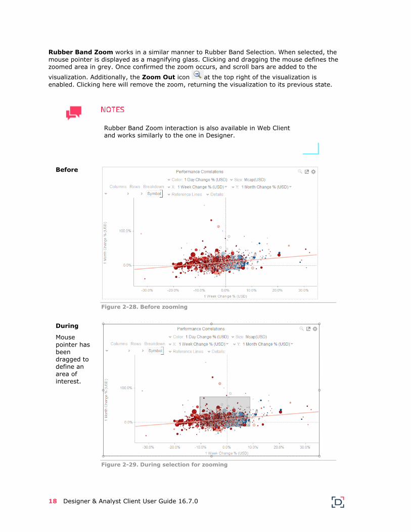
Rubber Band Zoom works in a similar manner to Rubber Band Selection. When selected, the
mouse pointer is displayed as a magnifying glass. Clicking and dragging the mouse defines the zoomed area in grey. Once confirmed the zoom occurs, and scroll bars are added to the
visualization. Additionally, the Zoom Out icon at the top right of the visualization is
enabled. Clicking here will remove the zoom, returning the visualization to its previous state.
Rubber Band Zoom interaction is also available in Web Client and works similarly to the one in Designer.
Before
Figure 2-28. Before zooming
During
Mouse
pointer has been dragged to define an area of interest.
Figure 2-29. During selection for zooming

Designer & Analyst Client User Guide 16.7.0 19
After
Visualization is zoomed into the
defined area.
Scroll bars have been added, and the Zoom Out icon
has been enabled.
Figure 2-30. After zooming
In the Web Client, Rubber Band Zoom is supported for visualizations that have:
Numeric X and Y axes
DateTime X axis and Y axis
When the cross tab consists of two Text axes, Rubber Band Zoom is not available.
To perform a Rubber Band Zoom, you can either:
Right-click on a visualization and select Zoom

20 Designer & Analyst Client User Guide 16.7.0
Click on the Rubber Band Zoom icon on the topmost right of a visualization
Both options turn the mouse pointer into a Zoom In icon.
During
Mouse pointer has been dragged to define an
area of interest.
Figure 2-31. During selection for zooming
Designer & Analyst Client User Guide 16.7.0 21
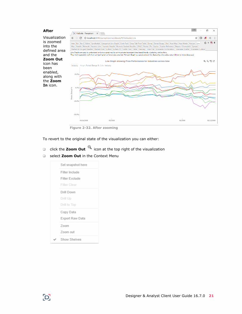
After
Visualization is zoomed into the
defined area and the Zoom Out icon has been enabled, along with
the Zoom In icon.
Figure 2-32. After zooming
To revert to the original state of the visualization you can either:
click the Zoom Out icon at the top right of the visualization
select Zoom Out in the Context Menu

22 Designer & Analyst Client User Guide 16.7.0
ZOOMING IN AND OUT WITH MOUSE WHEEL
You can use the mouse wheel to zoom in and out on visualization in the Panopticon Designer and Web Client.
Examples:
No Zoom
Figure 2-33. No zoom
Slight Zoom
One mouse wheel rotation.
Figure 2-34. Slight zoom
Designer & Analyst Client User Guide 16.7.0 23
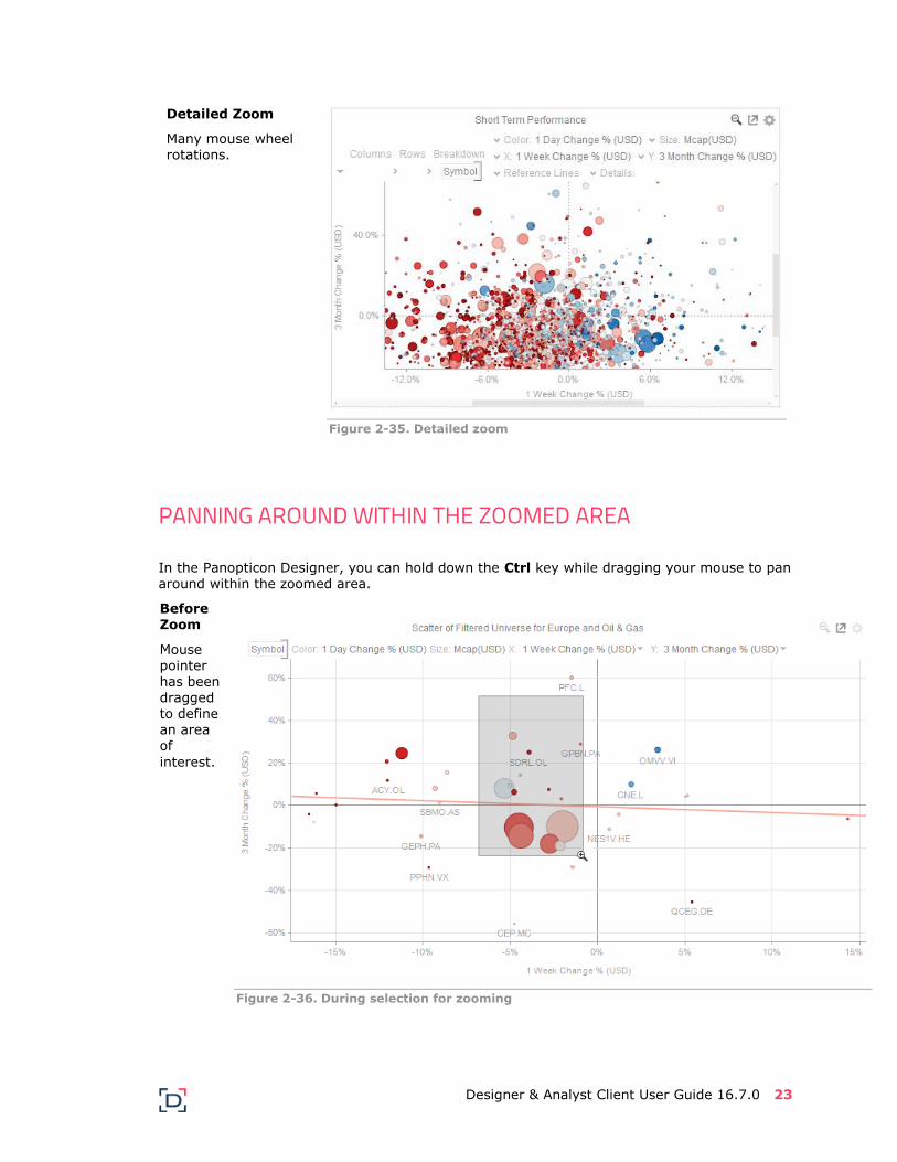
Detailed Zoom
Many mouse wheel rotations.
Figure 2-35. Detailed zoom
PANNING AROUND WITHIN THE ZOOMED AREA
In the Panopticon Designer, you can hold down the Ctrl key while dragging your mouse to pan around within the zoomed area.
Before
Zoom
Mouse pointer has been dragged to define an area of
interest.
Figure 2-36. During selection for zooming

24 Designer & Analyst Client User Guide 16.7.0
During
Zoom
Mouse pointer
has been dragged to define an area of interest.
Figure 2-37. During selection for zooming
Panning
Hold down
the Ctrl key and drag the mouse to pan around
the zoomed area. The mouse pointer turns
into a
.
Figure 2-38. Panning
Designer & Analyst Client User Guide 16.7.0 25
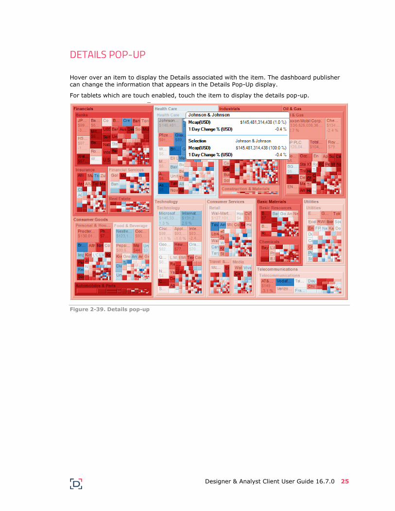
DETAILS POP-UP
Hover over an item to display the Details associated with the item. The dashboard publisher can change the information that appears in the Details Pop-Up display.
For tablets which are touch enabled, touch the item to display the details pop-up.
Figure 2-39. Details pop-up

26 Designer & Analyst Client User Guide 16.7.0
CONTEXT MENU
Panopticon Designer provides a right-click Context Menu in each visualization.
Figure 2-40. Panopticon Designer context menu
On computers supporting a right mouse button, hold your cursor over the visualization and right-click and you will see the following options:
New Action
Edit Actions
Actions
Auto-Parameterization
Set Snapshot Here (for Time series visualizations)
Visual Filtering
Hierarchical drill down
Copy Image
Copy Data
Copy Raw Data
Morph Into
Show Shelves
For tablets which are touch enabled, touching and holding will display the context menu.

Designer & Analyst Client User Guide 16.7.0 27
The context menu in the Web Browser will not display the following options:
• New Action
• Edit Action
• Morph Into

28 Designer & Analyst Client User Guide 16.7.0
ADDITIONAL VISUAL TABLE INTERACTIVITY
The Table visualization additionally supports:
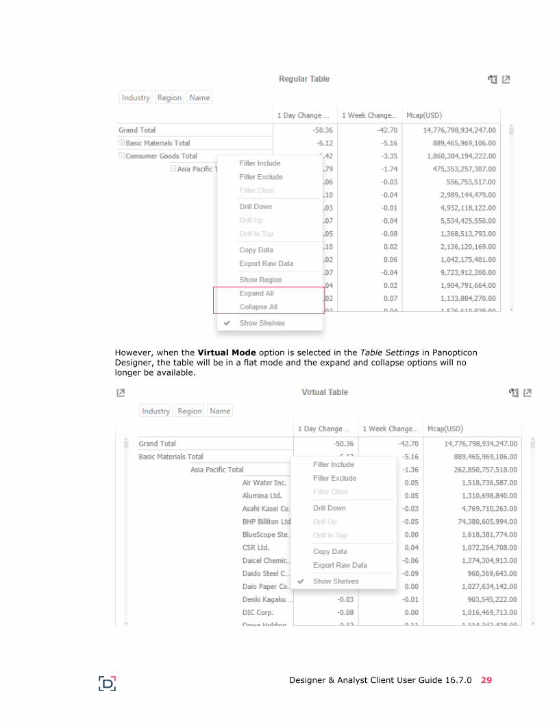
Expansion/Collapse of sections of the hierarchy by clicking on the to expand, and to collapse.
Additionally, the right click context menu includes options for Expand All and Collapse
All
Designer & Analyst Client User Guide 16.7.0 29
However, when the Virtual Mode option is selected in the Table Settings in Panopticon Designer, the table will be in a flat mode and the expand and collapse options will no longer be available.

30 Designer & Analyst Client User Guide 16.7.0
Sorting by clicking a text axis column heading (every level of hierarchy)
The text axis column headers are displayed when Show Column Labels is enabled in the Table Settings dialog.
This sorting is available on the Web Client.
Initially, click to sort in ascending order. Then click again to sort in descending order.
Sorting by clicking on the table column heading to sort

Designer & Analyst Client User Guide 16.7.0 31
Adjusting column widths, or hiding and displaying back the hidden columns through the
right click context menu.
Adjusting column widths can also be done by hovering on a column border and dragging
the Left-Right arrow to the desired width.

32 Designer & Analyst Client User Guide 16.7.0
Scrolling within the table can be through dragging the scroll bar, or moving the mouse wheel. In addition, only the data cells are scrolled, the hierarchical text axis and column headings are always displayed (subject to screen real estate).
Adjusting the width of the Text axis leaf can also be done by dragging the Left-Right
arrow that displays when hovering on the leaf border.
Adjust to the desired width.
Click on a table column heading and drag either to the left or to the left to re-arrange the order
From:
To:

Designer & Analyst Client User Guide 16.7.0 33
Hiding Dashboard Tabs and Toolbar Icons Using Input Parameter In the Web Client, you can hide the dashboard tabs and toolbar icons in single dashboard workbooks by adding a parameter in the URL.
For example, in the How to Actions workbook, there are five dashboards:
Selecting the second dashboard, Scatter of Filtered Universe will display the standard workbook app URL:
http://localhost:8080/panopticon/workbook/#/How%20To%20Actions/Scatter%
20of%20Filtered%20Universe
The dashboard tabs and toolbar icons (Refresh, Pause Real-Time, Create PDF Report, and Bookmarks Panel) are displayed.

34 Designer & Analyst Client User Guide 16.7.0
The same dashboard can be explicitly displayed by adding index.html in the URL:
http://localhost:8080/panopticon/workbook/index.html#/How%20To%20Action
s/Scatter%20of%20Filtered%20Universe
To display a single dashboard (e.g., Scatter of Filtered Universe), explicitly add single.html
in the URL:
http://localhost:8080/panopticon/workbook/single.html#/How%20To%20Actions/Scatter%20of%20Filtered%20Universe
The dashboard tabs and toolbar icons are no longer displayed as well.

Designer & Analyst Client User Guide 16.7.0 35
Consequently, single dashboard workbooks can be embedded into larger web based portals.
Parameter Setting Certain visualizations on a dashboard can be pre-filtered or parameterized to display a detailed subset of all the available information, based on pre-defined parameters.
These parameters can be set through the context menu by right-clicking on the required visualization item, and clicking the item with the blue lightning bolt.
In the example below, the selected Bar in the Bar Graph represents Financials in Asia Pacific.
Figure 2-41. Parameterized visualization in Panopticon Designer

36 Designer & Analyst Client User Guide 16.7.0
Figure 2-42. Parameterized visualization in the Web Client
By clicking on Set Region, Industry in the context menu, the two dashboard parameters are set as follows:
Industry = Financials, Region = Asia Pacific
Consequently, visualizations that use these parameters will be updated to show the appropriate detailed content.
Actions (Context Jump Points) Actions can be added to each dashboard, as defined by the dashboard publisher.
The available Actions are listed at the top of the Context Menu, with a yellow lightning bolt. Actions include:
Update visualizations on the same dashboard to show more detailed/relevant data
Jump to contextual dashboards
Jump contextually to external web pages
Run JavaScript functions
The first action can also be executed by double-clicking on an item at the bottom of a hierarchy. (Double-clicking elsewhere will cause a drill into a particular branch of the hierarchy.)
In the example below, the Actions listed include:

Designer & Analyst Client User Guide 16.7.0 37
Stock Quote from Yahoo.
Opens the Web browser at the Yahoo Finance Stock Quote for the selected company.
News on Company
Opens the web browser at the Google News page for the selected company.
Company Performance
Jumps to the Company Performance tab, pre-filtered on the selected company.
Company Ownership
Jumps to the Company Ownership tab, pre-filtered on the selected company.
The actions available in each workbook are defined by those who designed and published the
workbook.
In this case a dialog is displayed which allows you to enter data. Additionally, it lists any parameter values defined from the selected data points.

38 Designer & Analyst Client User Guide 16.7.0
Screen Data with Filters Filters let you screen the amount of data displayed in the visualizations within your workbook. You can focus on the data that is most interesting to you and filter out data that may be hiding the patterns, trends or outliers that you are trying to find.
All filters act immediately on their parent data sets and linked visualizations. As you change the settings on a filter, you see the results instantly in the associated visualization.
Filters can be applied locally to a dashboard, or be global applied across all dashboards in a workbook. If Globally applied, they are represented either to the left or the right of each
dashboard.
If locally applied, the filters are arranged within the dashboard.
VISUALIZATION FILTERS (DASHBOARD SPECIFIC)
Visualizations themselves can be filters. Right-clicking on a selection of items within the visualization will display the context menu, and support:
Filter Include – Filter the dashboard to only include this selection
Filter Exclude – Filter the dashboard to exclude this selection
Filter Clear – Removes any visual filters
When a visualization filter has been applied, a filter icon is displayed on the top right of
each visualization and the dashboard as a whole.

Designer & Analyst Client User Guide 16.7.0 39
For the example Multiple Selection filter above:
Region = Asia Pacific and North America are selected and Europe is unselected
Clicking on this icon, will remove all visual filters.

40 Designer & Analyst Client User Guide 16.7.0
FILTERS WITHIN A FILTER BOX
Filter controls are contained in one of more filter box.
When a filter is applied, a filter icon appears to the left of the filter title.
The layout of the filter box can be modified by right-clicking on the filter box to display its context menu:
Where the items correspond to:
Show Active Collapse All Expand All Reset All
Designer & Analyst Client User Guide 16.7.0 41
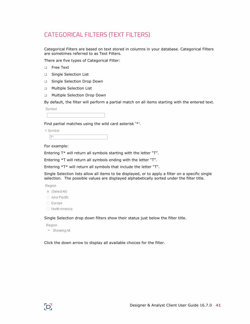
CATEGORICAL FILTERS (TEXT FILTERS)
Categorical Filters are based on text stored in columns in your database. Categorical Filters are sometimes referred to as Text Filters.
There are five types of Categorical Filter:
Free Text
Single Selection List
Single Selection Drop Down
Multiple Selection List
Multiple Selection Drop Down
By default, the filter will perform a partial match on all items starting with the entered text.
Find partial matches using the wild card asterisk ‘*’.
For example:
Entering T* will return all symbols starting with the letter “T”.
Entering *T will return all symbols ending with the letter “T”.
Entering *T* will return all symbols that include the letter “T”.
Single Selection lists allow all items to be displayed, or to apply a filter on a specific single
selection. The possible values are displayed alphabetically sorted under the filter title.
Single Selection drop down filters show their status just below the filter title.
Click the down arrow to display all available choices for the filter.

42 Designer & Analyst Client User Guide 16.7.0
You will see a set of radio buttons. As you select an item, Panopticon Designer will update the
associated visualizations to reflect your choices.
Only a single item or all items may be selected. When collapsed, it shows the summary text or the single selected item. For the example below, the region selected is Europe.
In the Web Client, the summary text is based on the generated
predicate and not on the data selected in Panopticon Designer. Therefore, if the selected item is deleted in the data source, the
summary text will still have a value in the Web Client.
Multiple selection lists, also display the list of possible values under the filter title. In this case, one or many values can be filtered. Removing the check box selection from the Select All option, will remove all the selections from every item.
Multiple selection drop down filters show their status just below the filter title. In the example
to the right, we can see that there are three possible categories to choose from.
Click the down arrow to display all available choices for the filter. You will see a set of checkboxes. You can select or deselect any of the values available in the filter. Panopticon Designer will update the associated visualization to reflect your choices.
Designer & Analyst Client User Guide 16.7.0 43
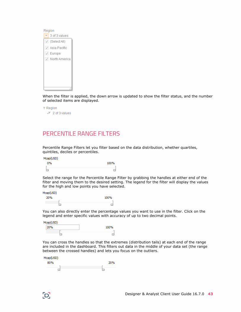
When the filter is applied, the down arrow is updated to show the filter status, and the number
of selected items are displayed.
PERCENTILE RANGE FILTERS
Percentile Range Filters let you filter based on the data distribution, whether quartiles, quintiles, deciles or percentiles.
Select the range for the Percentile Range Filter by grabbing the handles at either end of the filter and moving them to the desired setting. The legend for the filter will display the values for the high and low points you have selected.
You can also directly enter the percentage values you want to use in the filter. Click on the legend and enter specific values with accuracy of up to two decimal points.
You can cross the handles so that the extremes (distribution tails) at each end of the range are included in the dashboard. This filters out data in the middle of your data set (the range between the crossed handles) and lets you focus on the outliers.

44 Designer & Analyst Client User Guide 16.7.0
NUMERIC RANGE FILTERS
Numeric Range Filters use the absolute values contained in your database. They show the distribution curve for your data along with the range from the lowest to the highest value in your data set.
You can drag the handles at either end of the filter to isolate the region of interest. The legend shows the selected filter values in gray.
You can cross the handles so that the data at each end of the range is included. This filters out
data in the middle of your data set and lets you focus on the outliers.
DATE RANGE FILTERS
Date Range Filters use the absolute values contained in your database. They show the distribution curve for your data along with the range from the lowest to the highest value in your data set.
They operate in a similar manner to Numeric Range Filters.
TIME WINDOW FILTERS
When using a data set enabled for time series analysis, Time Window Filters allow you to both define a time window, and select the displayed time slice (Snapshot time).
As with numeric range filters the handles can be dragged to specify a time window, which will automatically filter the display of any time series visualization, and update any time window based calculations.

Designer & Analyst Client User Guide 16.7.0 45
The selected time slice shown on non-time series visualizations is displayed through the snapshot marker which itself can be dragged.
The snapshot time can also be updated by right-clicking on the time series visualization and selecting Set Snapshot here from the context menu.
A Play/Pause button can be displayed to automatically animate through the time series, and if required the time window handles can be removed from the filter.
Workbooks can be designed with time window filters so that filtering on time either:
Simply limits the time window displayed on screen
Dynamically executes a further data query to retrieve more granular data. For example: Go from minute by minute data to second by second data.
In the case of dynamically executing queries based on the time window filter, data can be
retrieved based on:
Selected start of the time window
Selected end of the time window
Selected Snapshot time
Drilling Into Visualizations Visualizations themselves can be used to drill into lower or upper details by selecting items, and right clicking to display the context menu with three options:
Drill Down – Drills down to the lower level of the selected value
Drill Up – Enabled when the lower level of the selected item is displayed. Click to drill to the upper level
Drill to Top – Drills to the top level of the selected value

46 Designer & Analyst Client User Guide 16.7.0
Data Export Both the Image and the data can be exported from a visualization, and copied to the clipboard for future use in another application. Additionally, the whole dashboard image can also be exported to the clipboard.
Visualization Level data is exported by right clicking on the visualization and selecting any of the following export options:
Copy Image
Copy Data
Copy Raw Data
The data exported will be what appears on screen, or in a linked table. Specifically, all the columns that appear in the Detail pop-up, including:
Only those items that are visible (for example, items that have not been filtered)
Same Visible detail (or depth) level displayed in the visualization.
Data for a single item can be exported by selecting the item.

Designer & Analyst Client User Guide 16.7.0 47
In the Web Client, right-clicking and selecting Copy Data copies the data to a clipboard.
You can then copy the data to other applications such as MS Excel or Notepad.
Also, right-clicking and selecting Export Raw Data exports all data from the source table and
not just the actively displayed nodes within a visualization to a .CSV file.
MORPHING VISUALIZATIONS
In Panopticon Designer, you can change visualization into any other visualization by simply right clicking and selecting Morph into, and then selecting the required resultant visualization
from the available listing.

48 Designer & Analyst Client User Guide 16.7.0
When used in combination with the Copy and Paste functionality, dashboards can be quickly
created.
When morphing between visualizations with the same variables, there is no further configuration required. For example, from a Horizontal Bar Graph to a Vertical Bar Graph.
However, when morphing between visualizations with different variables, the new visualization will need to be configured to include columns for empty variables. For example, when converting from a Pie Chart to a Scatter Plot, the X and Y axis must be defined.
Snapshot Time A time series visualization consists of a series of time slices, within a defined time window. The snapshot time identifies a particular slice which can be highlighted further in separate visualizations.
The snapshot is highlighted on the time series visualization through the aid of a vertical grid line.
The snapshot can be selected to focus on particular spikes or abnormalities in the data through either:
Moving the snapshot on the time filter
Right-clicking on the graph, and selecting Set snapshot here

Designer & Analyst Client User Guide 16.7.0 49
The snapshot will be set for the selected time. For example: 6/27/2008
Setting the snapshot can also be displayed on the associated Time Filter Box of a Timeseries visualization. For example, for 2/4/2008:

50 Designer & Analyst Client User Guide 16.7.0
You can also drag the snapshot line anywhere in the visualization. Hover your mouse on the snapshot line and move it either to the left or to the right.
Note that this is only available when the rendering mode in the Web Client is set to Client-side.
Ad Hoc PDF Report Generation PDF reports of a workbook can be produced on an on-demand basis by clicking on the PDF
icon to the right of the dashboard tabs.
Clicking this icon displays the PDF Settings dialog where you can specify the dashboards that will be included in the generated PDF:
All
Current
Selected

Designer & Analyst Client User Guide 16.7.0 51
Figure 2-43. PDF Settings in Panopticon Designer
Figure 2-44. PDF Settings in the Web Client
For Selected, check the box of the dashboards that will be included.
For visualizations that include scroll bars (commonly visual tables, and horizon graphs), specify whether to either:
Output all of the data items, producing multiple pages in the resulting PDF report
Hide scrollbars

52 Designer & Analyst Client User Guide 16.7.0
Ad hoc PDF generation in the Web Client using Google Chrome (or other browsers) may be hindered by the AdBlock Extension.
To remove the AdBlock Extension in Google Chrome, perform these steps:
1. Click the Chrome Menu icon on the browser toolbar.
2. Highlight Tools, then click Extensions from the sub-menu.
3. Click Remove in the AdBlock Plus entry (e.g., uBlockOrigin).
4. Click Remove in the confirmation message that displays.
Legends
ICON LEGEND
The Icon Legend lists all those icons displayed within the associated visualization.
REFERENCE LINE LEGEND
The Reference Line Legend lists all the reference lines used in the associated Time Series Visualization. It can be used to hide and show selected reference lines.

Designer & Analyst Client User Guide 16.7.0 53
COLOR LEGEND - CATEGORICAL STYLE
The Categorical Style Color Legend lists all the text categories and associated colors used in the associated visualization for the selected categorical color variable.
COLOR LEGEND - NUMERIC STYLE
The Numeric Style Color Legend displays the color range used within the associated
visualization for the selected numeric color variable.
Right-clicking on the Numeric Color Legend displays the list of available Color Palettes. You can select the Color Palette you like best for the associated visualization.
Clicking and changing the listed values in the Numeric Color Legend dynamically changes the
color range.

54 Designer & Analyst Client User Guide 16.7.0
Dragging the slider below the color gradient also dynamically changes the color range. This lets you focus on central ranges and outliers more easily.
COLOR LEGEND – DISTINCT OUTLIER
For Numeric color palettes, you can set Distinct Outliers. For example:
Sequential color palettes:
Diverging color palettes

Designer & Analyst Client User Guide 16.7.0 55
Right-click on the Numeric Color Legend and select Distinct Outliers. The distinct outliers are applied to the visualization associated to the Numeric Color Legend.
To disable, uncheck Distinct Outliers.

56 Designer & Analyst Client User Guide 16.7.0

Designer & Analyst Client User Guide 16.7.0 57
COLOR LEGEND – COLOR STEPS
For stepped color gradient, you can also set the number of color steps. Right-click on a Numeric Color Legend and select a value.

58 Designer & Analyst Client User Guide 16.7.0
[3] Cross Tabbing Cross tabbing produces a matrix of smaller linked visualizations, which each show a subset of the parent data set, displaying the joint distribution of two or more variables that do not exist
within a hierarchy.
Cross tabbing is also known as trellising, latticing, and small multiples, although the purpose is the same in each case. Panopticon Designer displays cross tabbed visualizations in order to allow trends and outliers to be more easily seen, by enforcing comparison of changes, similarities and differences among displays.
The following Datawatch visualizations can be cross tabbed:
• Bar Graph
• Bullet Graph
• Candlestick
• Categorical Line Graph
• Circle Pack
• Donut Chart
• Donut Gauge
• Dot Plot
• Funnel Chart
• Grouped Needle Graph
• Heat Matrix
• Horizon Graph
• Line Graph
• Needle Graph
• Numeric Needle Graph - Horizontal
• Numeric Line Graph
• Numeric Line Graph – Vertical
• Numeric Stacked Needles
• OHLC Graph
• Order Book
• Pareto Chart
• Pie Chart
• Price Band
• Scatter Plot
• Spread Graph
• Stacked Needle Graph
• Stack Graph
• Ticker Tile
• Treemap
• Timeseries Combination
• Timeseries Scatter Plot
• Waterfall Chart
Cross tabbing is controlled through the Breakdown on the Shelf above the visualization.
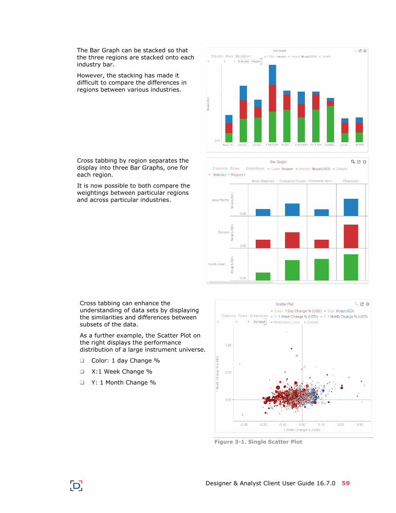
As an example, the Bar Graph on the
right shows a portfolio split into Industries and regions.
Designer & Analyst Client User Guide 16.7.0 59
The Bar Graph can be stacked so that
the three regions are stacked onto each industry bar.
However, the stacking has made it
difficult to compare the differences in regions between various industries.
Cross tabbing by region separates the
display into three Bar Graphs, one for each region.
It is now possible to both compare the weightings between particular regions and across particular industries.
Cross tabbing can enhance the understanding of data sets by displaying the similarities and differences between subsets of the data.
As a further example, the Scatter Plot on the right displays the performance distribution of a large instrument universe.
Color: 1 day Change %
X:1 Week Change %
Y: 1 Month Change %
Figure 3-1. Single Scatter Plot

60 Designer & Analyst Client User Guide 16.7.0
Cross tabbing the scatter plot by region,
allows the identification that the positive 1 day performance is primarily present in Europe.
And that the majority of the positive 1 day performance is where the 1 week performance is also positive.
Figure 3-2. Scatter Plot Cross Tabbed by Region
Cross tabbing again by industry shows that the European performance profile is driven by specific Industries:
Consumer Goods
Health Care
Telecommunications
Figure 3-3. Scatter Plot Cross Tabbed by Region & Industry
Designer & Analyst Client User Guide 16.7.0 61
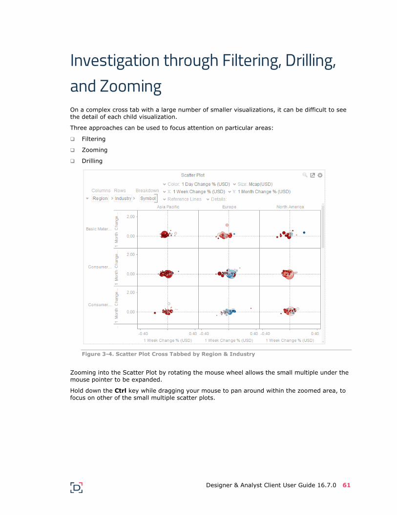
Investigation through Filtering, Drilling, and Zooming On a complex cross tab with a large number of smaller visualizations, it can be difficult to see the detail of each child visualization.
Three approaches can be used to focus attention on particular areas:
Filtering
Zooming
Drilling
Figure 3-4. Scatter Plot Cross Tabbed by Region & Industry
Zooming into the Scatter Plot by rotating the mouse wheel allows the small multiple under the mouse pointer to be expanded.
Hold down the Ctrl key while dragging your mouse to pan around within the zoomed area, to focus on other of the small multiple scatter plots.

62 Designer & Analyst Client User Guide 16.7.0
Figure 3-5. Zoomed into the Cross Tabbed Scatter Plot
Drill into the cross tab by either:
Double-clicking on a Scatter Point

Designer & Analyst Client User Guide 16.7.0 63
Right-clicking on the Cross Tab control to display the context menu, and selecting Drill.
Figure 3-6. Drilled into the Cross Tabbed Scatter Plot

64 Designer & Analyst Client User Guide 16.7.0
[4] Bookmarking Bookmarks are saved configurations of the active dashboard and workbook. A bookmark can
be added, by authenticating, and clicking on the Bookmarks Panel icon. This is enabled
when the Workbook is in Presentation Mode in Panopticon Designer.
In the Web Client, the Bookmarks panel is displayed on the right side of the Dashboard tabs.
Bookmarks are not available with anonymous access workbooks.
Bookmarks do not save data, but do save:
Selected Dashboard
Selected Parameters
Selected Filters
Selected Breakdowns, Hierarchies, Visible Depth, and Drill Level
Selected Variables (Size, Color, X, Y, etc.).
Consequently, although the underlying data may change, a specific view of that data can be specified and bookmarked for future usage.
Bookmarks can be added, and are available to all authenticated users of the workbook.
Bookmarks also generate a unique URL, which can be sent to another individual with access,
allowing them to see exactly the same view of the selected dashboard.
In the Panopticon Designer:

Designer & Analyst Client User Guide 16.7.0 65
In the Web Client:
New bookmarks can be added by clicking the New button.
Entering the Bookmark Title and clicking the Add button.
Multiple bookmarks are displayed in the listing as follows:
To rename a bookmark, click Edit.

66 Designer & Analyst Client User Guide 16.7.0
Enter the new bookmark title and click Rename.
Update a bookmark by clicking Update.
To delete, click Edit and then the Delete icon of a bookmark. A message displays.
Click OK.

© 2018 Datawatch | Datawatch Panopticon Designer and Datawatch Panopticon Server are trademarks of Datawatch Corporation. All other trademarks or registered trademarks are
properties of their respective owners.