designing perceptually optimized displaysjoonhwan/documents/joonhwan lee - proposal...
TRANSCRIPT
D i s s e r t a t i o n P r o p o s a l
Designing Perceptually Optimized Displays
Joonhwan Lee Human-Computer Interaction Institute
School of Computer Science Carnegie Mellon University
Thesis Committee
Jodi Forlizzi (co-chair), Human-Computer Interaction Institute, Carnegie Mellon University
Scott E. Hudson (co-chair), Human-Computer Interaction Institute, Carnegie Mellon University
Suguru Ishizaki, Department of English, Carnegie Mellon University
Hugh Dubberly, Dubberly Design Office

Table of Contents
Abstract ................................................................................................................................................................................................1
1. Introduction and Motivation...................................................................................................................................................2
2. Related Work ...............................................................................................................................................................................4
2.1. Cartography .......................................................................................................................................................................4
2.2. Map Reading ......................................................................................................................................................................5
2.3. Navigation ..........................................................................................................................................................................5
2.4. Prior Knowledge and Preferences .................................................................................................................................5
2.5. Human-Factors Research on Vehicular Interfaces....................................................................................................6
2.6. Dynamic Information Visualization ............................................................................................................................6
2.7. LineDrive............................................................................................................................................................................7
3. Preliminary Studies on Navigation .........................................................................................................................................8
4. Design Approach...................................................................................................................................................................... 10
4.1. Preliminary MOVE Design ......................................................................................................................................... 10
4.2. Visual Search Study ....................................................................................................................................................... 11
4.2.1. Experiment Overview ............................................................................................................................................ 12
4.2.2. Participants and Experimental Procedure......................................................................................................... 12
4.2.3. Stimuli ....................................................................................................................................................................... 13
4.2.4. Results and Discussion........................................................................................................................................... 14
4.3. Detailed Design Principles........................................................................................................................................... 17
4.3.1. Using Importance Differences............................................................................................................................. 17
4.3.2. Abstraction............................................................................................................................................................... 18
4.3.3. Dynamic Information Interaction...................................................................................................................... 20
4.4. Evaluating Effectiveness of MOVE Designs............................................................................................................ 22
i
4.4.1. Experiment Setup.................................................................................................................................................... 22
4.4.2. Participants and Procedures ................................................................................................................................. 23
4.4.3. Results and Discussion........................................................................................................................................... 24
5. Implementation of The MOVE System ............................................................................................................................. 26
5.1. Road Layout .................................................................................................................................................................... 26
5.2. Rendition Selection ....................................................................................................................................................... 29
5.3. Scoring Renditions ........................................................................................................................................................ 30
5.4. Final Placement Tuning............................................................................................................................................... 31
6. Evaluation .................................................................................................................................................................................. 33
7. Contribution............................................................................................................................................................................. 34
8. Schedule...................................................................................................................................................................................... 35
9. Acknowledgements.................................................................................................................................................................. 36
10. References .................................................................................................................................................................................. 37
ii
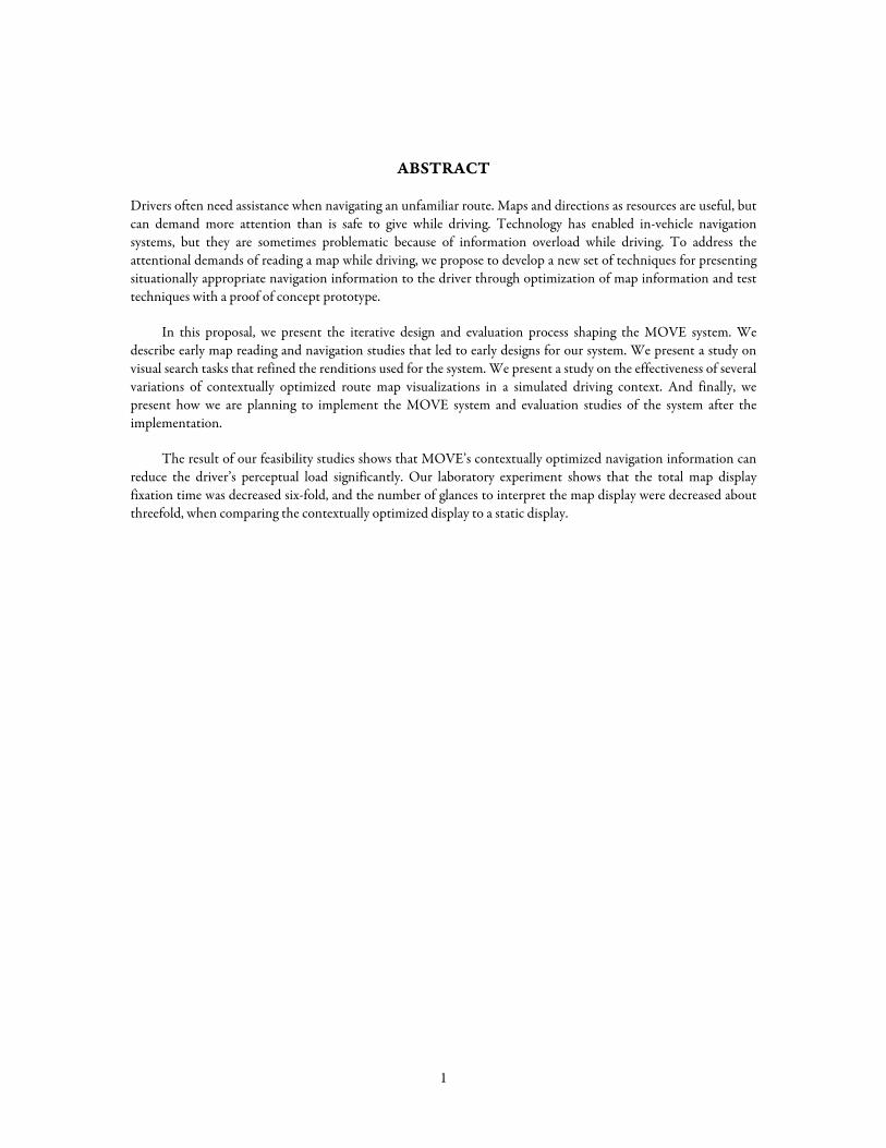
ABSTRACT
Drivers often need assistance when navigating an unfamiliar route. Maps and directions as resources are useful, but can demand more attention than is safe to give while driving. Technology has enabled in-vehicle navigation systems, but they are sometimes problematic because of information overload while driving. To address the attentional demands of reading a map while driving, we propose to develop a new set of techniques for presenting situationally appropriate navigation information to the driver through optimization of map information and test techniques with a proof of concept prototype.
In this proposal, we present the iterative design and evaluation process shaping the MOVE system. We describe early map reading and navigation studies that led to early designs for our system. We present a study on visual search tasks that refined the renditions used for the system. We present a study on the effectiveness of several variations of contextually optimized route map visualizations in a simulated driving context. And finally, we present how we are planning to implement the MOVE system and evaluation studies of the system after the implementation.
The result of our feasibility studies shows that MOVE’s contextually optimized navigation information can reduce the driver’s perceptual load significantly. Our laboratory experiment shows that the total map display fixation time was decreased six-fold, and the number of glances to interpret the map display were decreased about threefold, when comparing the contextually optimized display to a static display.
1
1. INTRODUCTION AND MOTIVATION
Many modern vehicles are equipped with in-vehicle navigation systems that utilize global positioning systems (GPS), digital maps, and automatic route calculation. The simple activity of entering a destination will typically generate an accurate route which can be displayed directly to the driver. Unlike turn-by-turn directions or traditional maps, these systems can track the vehicle’s current location on the route, and can recalculate the route if a driver fails to follow it.
However, driving requires a lot of concentration. Drivers can be easily distracted by other in-vehicle activities (such as chatting with passengers, talking over the cell phone, manipulating instrumental panels, or changing radio stations). This can sometimes increase the hazards of driving. Not surprisingly, in-vehicle navigation systems, while offering considerable advantages over, for example, paper maps, can present similar issues. In particular, current navigation systems typically do not carefully consider a driver’s cognitive load and attentional state — delivering all information in the same way regardless of context.
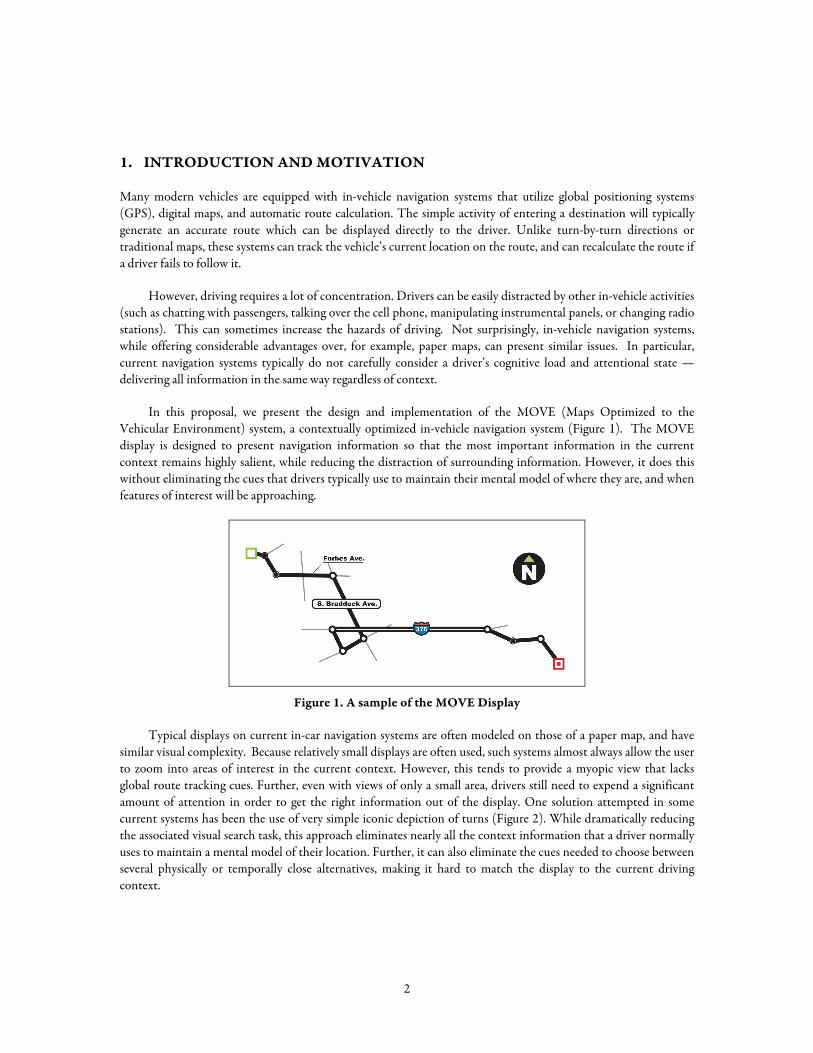
In this proposal, we present the design and implementation of the MOVE (Maps Optimized to the Vehicular Environment) system, a contextually optimized in-vehicle navigation system (Figure 1). The MOVE display is designed to present navigation information so that the most important information in the current context remains highly salient, while reducing the distraction of surrounding information. However, it does this without eliminating the cues that drivers typically use to maintain their mental model of where they are, and when features of interest will be approaching.
Figure 1. A sample of the MOVE Display
Typical displays on current in-car navigation systems are often modeled on those of a paper map, and have similar visual complexity. Because relatively small displays are often used, such systems almost always allow the user to zoom into areas of interest in the current context. However, this tends to provide a myopic view that lacks global route tracking cues. Further, even with views of only a small area, drivers still need to expend a significant amount of attention in order to get the right information out of the display. One solution attempted in some current systems has been the use of very simple iconic depiction of turns (Figure 2). While dramatically reducing the associated visual search task, this approach eliminates nearly all the context information that a driver normally uses to maintain a mental model of their location. Further, it can also eliminate the cues needed to choose between several physically or temporally close alternatives, making it hard to match the display to the current driving context.
2
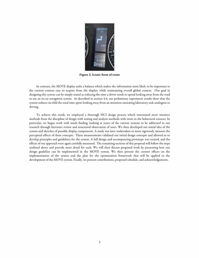
Figure 2. Iconic form of route
In contrast, the MOVE display seeks a balance which makes the information most likely to be important in the current context easy to acquire from the display, while maintaining overall global context. Our goal in designing this system can be simply stated as reducing the time a driver needs to spend looking away from the road to use an in-car navigation system. As described in section 4.4, our preliminary experiment results show that the system reduces six-fold the total time spent looking away from an attention saturating laboratory task analogous to driving.
To achieve this result, we employed a thorough HCI design process which intermixed more intuitive methods from the discipline of design with testing and analysis methods with roots in the behavioral sciences. In particular, we began work with needs finding, looking at issues of the current systems to be addressed in our research through literature review and structured observation of users. We then developed our initial idea of the system and sketches of possible display components. A study was later undertaken to more rigorously measure the perceptual effects of these concepts. These measurements validated our initial design concepts and allowed us to develop principles and guidelines for the system. A full design and accompanying prototype was created, and the effects of our approach were again carefully measured. The remaining sections of this proposal will follow the steps outlined above and provide more detail for each. We will then discuss proposed work by presenting how our design guideline can be implemented in the MOVE system. We then present the current effects on the implementation of the system and the plan for the optimization framework that will be applied to the development of the MOVE system. Finally, we present contributions, proposed schedule, and acknowledgements.
3
2. RELATED WORK
Related work can be categorized by several approaches. First, long-researched cartographic design principles and research on map reading and navigation are useful in finding representation and navigation issues that apply to the MOVE system. Second, most work on map reading and navigation has been done in the foundation of traditional cognitive science related to visual perception. So, research on visual search and visual attention can serve as a guide on how to maintain attentionally affordable visual elements in the navigation system. Third, related to this, research specifically addressing the human factors of vehicular interfaces has been done recently. The resulting data from these studies provide a series of safety guidelines which can be used when evaluating the early prototype of the MOVE system. Fourth, research on dynamic information visualization systems, for the small and limited screen real estate that considers how to visualize various types of information within a small display is also of interest for our research. Finally, the LineDrive route navigation display in particular previously explored issues similar to those in our system, although it only focuses on the route maps. Its research on automatic map generalization technique is closely related in our research.
2.1. Cartography
A map is an abstracted two-dimensional representation of a three-dimensional reality which is rich in detail. As such, all maps are based on the use of abstraction. Some forms of abstraction act by simply omitting information which is less relevant to the task at hand. Other forms of abstraction may retain (partial) information, but simplify or distort it to make it more discernable in a given task context (Monmonier, 1996).
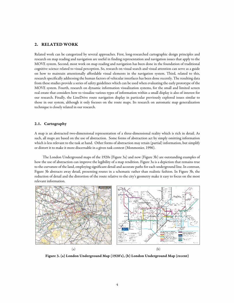
The London Underground maps of the 1920s (Figure 3a) and now (Figure 3b) are outstanding examples of how the use of abstraction can improve the legibility of a map rendition. Figure 3a is a depiction that remains true to the curvature of the land, employing significant detail and accurate paths for each underground line. In contrast, Figure 3b abstracts away detail, presenting routes in a schematic rather than realistic fashion. In Figure 3b, the reduction of detail and the distortion of the route relative to the city’s geometry make it easy to focus on the most relevant information.
(a) (b)
Figure 3. (a) London Underground Map (1920's), (b) London Underground Map (recent)
4
Abstraction techniques such as those used in the London Underground map have been used by cartographers for years. Gradual refinement of this technique has resulted in the process of map generalization. Monmonier (Monmonier, 1996) has categorized the generalization process into several steps. Our design has been guided by at least 5 of these: selection, simplification, displacement, smoothing and enhancement. Features are selected in a map to support the specific task of the map. Selected features will be more prominent than other features to draw more of the user’s attention. Simplification reduces detail from map features. For example, in the London Underground map, the angularity of lines has been reduced by removing points along the path. Displacement avoids possible graphical overlap or clutter by mediating the size and location of each feature. Smoothing also reduces detail. In contrast, enhancement adds details to the selected features to convey more information when essential to the task.
2.2. Map Reading
A map is one of many potential representations of a space that the viewer may draw upon as an aid to decision-making. A particularly valuable approach is that of MacEachren, who seeks to combine both low-level perceptual theories, such as those derived from Gestalt psychology, with higher-level cognitive processes, such as those derived from an information-processing theory of cognition, into a comprehensive theory of how maps are read and interpreted (MacEachren, 1995). These encompass both bottom-up (sensory stimulus driven) and top-down (goal or cognitively driven) approaches, although MacEachren reports a debate in the literature as to how much the bottom-up approach plays a part in map reading. MacEachren’s view of map comprehension is based on three stages of processing: a precognitive visual array, where shapes, edges, and boundaries are detected; a 2.5D sketch, or visual description, where a visual description is held in short-term memory, and the representation is initially mediated with the viewer’s existing knowledge; and finally, a representation that holds meaning and generates knowledge for the viewer.
2.3. Navigation
The goal of navigation is to achieve movement through space. It is generally assumed that mental representation of a geographical area is based on three kinds of knowledge: landmark, route, and survey (Wickens & Hollands, 2000). Landmark knowledge is a representation that includes the appearance of prominent landmarks in the region — gas stations, tall buildings, or parks. Landmark knowledge is gained by direct experience in the environment, and is highly relative to the individual viewer. Route knowledge is proceduralized knowledge about how to get from one place to another. Landmarks are usually incorporated into route knowledge. Route knowledge is also centered on the individual, but does not supply a great deal of information for learning more about the route. Survey knowledge is abstract, spatial knowledge that allows the individual to draw an accurate map of the environment. It usually represents geographical knowledge that has been generalized over many experiences, and so is more objective than either landmark or route knowledge. Individuals most commonly gain knowledge in the order of landmark, route, and finally survey information when repeatedly visiting an area.
2.4. Prior Knowledge and Preferences
As people become more familiar with an environment, they become more confident in their own cognitive representations and their dependency on external aids such as landmarks, written or verbal directions, and signage decreases.
Golledge maintains that cognitive maps, or representations of prior knowledge about a route, can be defined in two ways: as representations of analog maps that are retained in memory, or as metaphorical representations that enable a person to act as if he has access to a map (Golledge, 1999). According to Golledge, the term cognitive
5
map implies deliberate and motivated encoding of environmental information which can be used to determine where one is at any moment, where specific encoded objects are in surrounding space, how to get from one place to another, or how to communicate spatial knowledge to others.
Landmarks play an important role in cognitive maps because they might have a peculiar form, or sociocultural significance. In addition, unremarkable environmental attributes may attain salience for particular individuals, because they are tied to one’s history (for instance, a place of work or the home of a childhood friend). Landmarks are hierarchically organized in cognitive maps based on significance and location.
As people stray from their initial paths in an environment, they integrate new environmental information into the existing cognitive map and eventually progress from route-based knowledge to survey knowledge. Since certain routes are better learned than others, survey representations are often incomplete, distorted, or incorrect. However, survey knowledge has been shown to be more reliable than route knowledge.
2.5. Human-Factors Research on Vehicular Interfaces
Human factors research provides information on numbers of glances and fixation times measured in studies of a variety of driving tasks from several cultures (Kishi, Sugiura, & Kimura, 1992; Taoka, 1990; Wierwille, Antin, Dingus, & Hulse, 1988). Studies show that on average, a driver usually spends approximately 0.78 seconds (SD = 0.65) and 1.26 glances (SD = 0.40) to read a speedometer and 1.10 seconds (SD = 0.30) to check the left mirror. These research results have led to safety guidelines for the design of devices to use while driving. According to the VICS(Vehicle Information and Communication System) Promotion Council’s report, an average of 2.7 glances and a total of 4.10 seconds fixation time is the maximum safely allowed when driving at 30km/h (Council, 1993). Rockwell also noted that drivers are reluctant to go without roadway information for more than 2 seconds (and rightly so) (Rockwell, 1988). This is known as Rockwell’s 2-second rule.
Additionally, guidelines have been created for the amount of text-based information that can be safely read while driving. Ito reported that drivers can read an average of 6.2 Japanese characters per second while driving, which is the equivalent of an average of 11 Roman characters per second (Green, 1998; Ito & Miki, 1997).
Overall, human factors research and safety guidelines clearly point to the fact that only a limited amount of information can be conveyed safely to the driver. As a result, any design for a new system cannot overtax the driver perceptually. If a system can be designed that reduces the number of glances and fixation times, it may very well increase safety while driving.
2.6. Dynamic Information Visualization
While driving, it is difficult to scan a map or directions and to find needed information without taking one’s eyes off the road for periods of time. One possible remedy for this situation is to render important or complex map details at an enlarged scale within the context of the rest of the representation of the route, giving the driver only the detail that is currently needed within the context of an existing body of information. We were inspired by a body of HCI literature that examines methods for presenting information at greater detail while maintaining a sense of the surrounding information context.
Considerable prior work in information visualization has explored how detail can be rendered in context. Zoomable UIs, “magic” lenses, and fish-eye views are examples of detail-in-context visualizations which distort reality to provide detailed information without losing the context of the information(Bederson, 2000; Bederson & Hollan, 1994; Bederson, Meyer, & Good, 2000; Bier, Stone, Pier, Buxton, & DeRose, 1993; Furnas, 1986; Mackinlay, Robertson, & Card, 1991). With detail-in-context UIs, the user can access detailed information when
6
it is needed, and other contexts that are not important to the user are perceptually minimized (but not removed). All of the content is still accessible at any time.
Other research has examined dynamic information that exploits the element of time to make bodies of information accessible beyond the constraints of the display. For example, a dynamic news reader used time, combined with visual cues such as size, color, and emphasis, to present key headlines which faded in importance as time passed (Ishizaki, 1996).
2.7. LineDrive
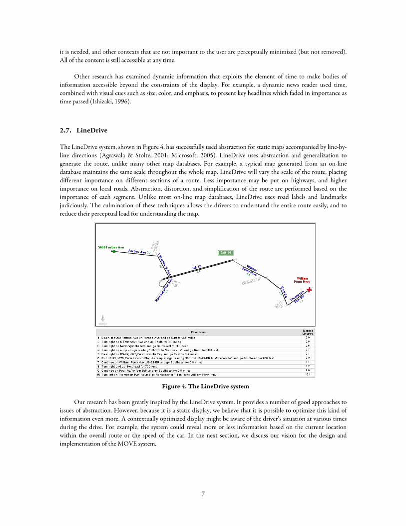
The LineDrive system, shown in Figure 4, has successfully used abstraction for static maps accompanied by line-by-line directions (Agrawala & Stolte, 2001; Microsoft, 2005). LineDrive uses abstraction and generalization to generate the route, unlike many other map databases. For example, a typical map generated from an on-line database maintains the same scale throughout the whole map. LineDrive will vary the scale of the route, placing different importance on different sections of a route. Less importance may be put on highways, and higher importance on local roads. Abstraction, distortion, and simplification of the route are performed based on the importance of each segment. Unlike most on-line map databases, LineDrive uses road labels and landmarks judiciously. The culmination of these techniques allows the drivers to understand the entire route easily, and to reduce their perceptual load for understanding the map.
Figure 4. The LineDrive system
Our research has been greatly inspired by the LineDrive system. It provides a number of good approaches to issues of abstraction. However, because it is a static display, we believe that it is possible to optimize this kind of information even more. A contextually optimized display might be aware of the driver’s situation at various times during the drive. For example, the system could reveal more or less information based on the current location within the overall route or the speed of the car. In the next section, we discuss our vision for the design and implementation of the MOVE system.
7
3. PRELIMINARY STUDIES ON NAVIGATION
In order to understand additional factors that influence a driver’s ability to navigate within a space, and more directly inspire our design process, we conducted a four-month qualitative research study. We wanted to understand how people read maps, make directions, and use directions while driving. We theorized that personal preferences for navigation, particular criteria of existing directions and maps, and prior knowledge of the route would be the most significant factors. We drew inspiration from research on navigation, on map reading, and on the role of prior knowledge in helping people find their way to a destination to provide an overarching structure for our research and to generate themes and protocols for our studies.
Fifteen participants ranging in age from 20-54 performed a series of three pilot studies on the topic of navigation. In the first study, we wanted to understand how participants give written or drawn directions to familiar, not-so-familiar, and unfamiliar places. We also wanted to understand what criteria are valued about printed maps and atlases. In the second study, we wanted to understand how generating directions differs when one is driving, navigating, or creating a route for a third party. In the third study, we wanted to understand how preference for using directions might differ when people were navigating to an unfamiliar destination on a small street as opposed to a familiar destination on a large street that transpires a number of miles. For that study, we limited the resources available to LineDrive computer-generated directions (Microsoft, 2005).
We found that drivers continually monitor their location relative to a given route, possibly involving a map or some representation of the route, and occasionally change route if circumstances warrant. Road maps can be helpful to drivers; line-by-line directions were found to be somewhat less helpful.
When navigating, we observed that drivers break the route into smaller steps, or subgoals. The steps may be as small as those in line-by-line directions, or they may be made up of schematized sections of the route that drivers already know (for example, home to the on-ramp of the nearest major highway). To find the way from goal to goal, drivers rely mostly on information about landmarks, paths (important streets), and nodes (intersections of two important streets). For a number of reasons, some landmarks are more salient than others, but they are used to guide the journey, acting as both confirmation points and ways to mark the next important turn on the route. Landmarks are also used for error prevention, and to reorient oneself to the route when lost.
When asked to create a representation of the route, participants often made two versions of maps: a version for other people driving who did not know the route (Figure 5), and a version that they would prefer to use for themselves (Figure 6). Abstracted, flattened, and simplified representations were consistently produced. When following directions, landmarks were salient in the following order: neighborhood, known (usually large) street, orientation of destination street (parallel or perpendicular to a known street), number on destination street, right or left side, and nearby landmark. We routinely observed participants seeking landmarks in such a focused way that they would miss a landmark if they had not found the prior one.
8
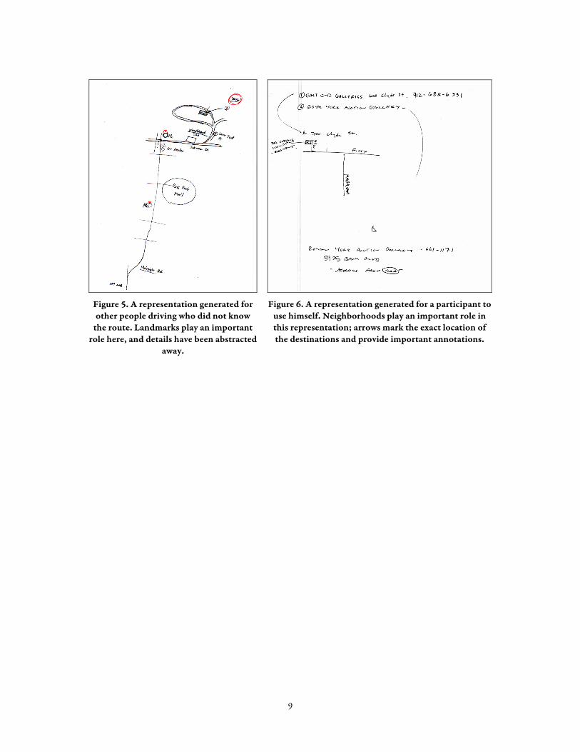
Figure 5. A representation generated for other people driving who did not know
the route. Landmarks play an important role here, and details have been abstracted
away.
Figure 6. A representation generated for a participant to use himself. Neighborhoods play an important role in this representation; arrows mark the exact location of the destinations and provide important annotations.
9
4. DESIGN APPROACH
The previous section has presented the navigation study that guided us how people navigate with various forms of navigational information. In this section, we will present our preliminary MOVE design based on the result of the navigation study, and then discuss the visual search study which was conducted to understand the perceptual effects of the renditions to be used in the design. Detailed design principles will be then presented and evaluation study of the prototype design will follow.
4.1. Preliminary MOVE Design
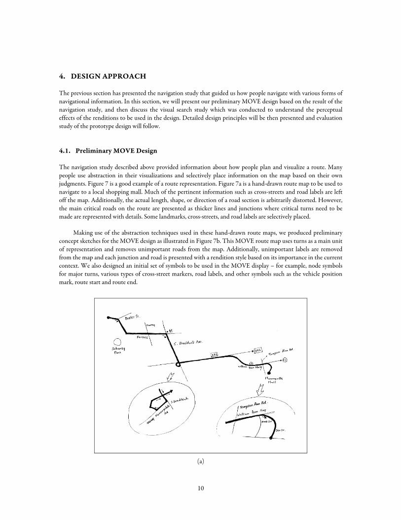
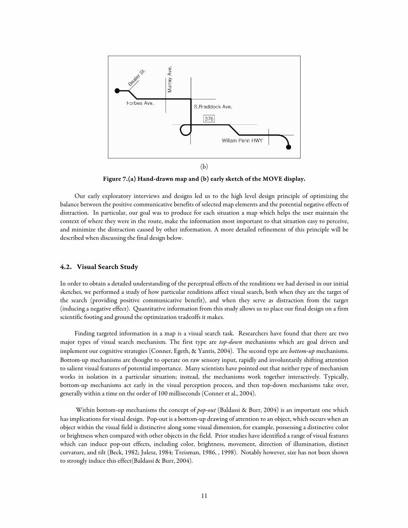
The navigation study described above provided information about how people plan and visualize a route. Many people use abstraction in their visualizations and selectively place information on the map based on their own judgments. Figure 7 is a good example of a route representation. Figure 7a is a hand-drawn route map to be used to navigate to a local shopping mall. Much of the pertinent information such as cross-streets and road labels are left off the map. Additionally, the actual length, shape, or direction of a road section is arbitrarily distorted. However, the main critical roads on the route are presented as thicker lines and junctions where critical turns need to be made are represented with details. Some landmarks, cross-streets, and road labels are selectively placed.
Making use of the abstraction techniques used in these hand-drawn route maps, we produced preliminary concept sketches for the MOVE design as illustrated in Figure 7b. This MOVE route map uses turns as a main unit of representation and removes unimportant roads from the map. Additionally, unimportant labels are removed from the map and each junction and road is presented with a rendition style based on its importance in the current context. We also designed an initial set of symbols to be used in the MOVE display – for example, node symbols for major turns, various types of cross-street markers, road labels, and other symbols such as the vehicle position mark, route start and route end.
(a)
10
(b)
Figure 7.(a) Hand-drawn map and (b) early sketch of the MOVE display.
Our early exploratory interviews and designs led us to the high level design principle of optimizing the balance between the positive communicative benefits of selected map elements and the potential negative effects of distraction. In particular, our goal was to produce for each situation a map which helps the user maintain the context of where they were in the route, make the information most important to that situation easy to perceive, and minimize the distraction caused by other information. A more detailed refinement of this principle will be described when discussing the final design below.
4.2. Visual Search Study
In order to obtain a detailed understanding of the perceptual effects of the renditions we had devised in our initial sketches, we performed a study of how particular renditions affect visual search, both when they are the target of the search (providing positive communicative benefit), and when they serve as distraction from the target (inducing a negative effect). Quantitative information from this study allows us to place our final design on a firm scientific footing and ground the optimization tradeoffs it makes.
Finding targeted information in a map is a visual search task. Researchers have found that there are two major types of visual search mechanism. The first type are top-down mechanisms which are goal driven and implement our cognitive strategies (Conner, Egeth, & Yantis, 2004). The second type are bottom-up mechanisms. Bottom-up mechanisms are thought to operate on raw sensory input, rapidly and involuntarily shifting attention to salient visual features of potential importance. Many scientists have pointed out that neither type of mechanism works in isolation in a particular situation; instead, the mechanisms work together interactively. Typically, bottom-up mechanisms act early in the visual perception process, and then top-down mechanisms take over, generally within a time on the order of 100 milliseconds (Conner et al., 2004).
Within bottom-up mechanisms the concept of pop-out (Baldassi & Burr, 2004) is an important one which has implications for visual design. Pop-out is a bottom-up drawing of attention to an object, which occurs when an object within the visual field is distinctive along some visual dimension, for example, possessing a distinctive color or brightness when compared with other objects in the field. Prior studies have identified a range of visual features which can induce pop-out effects, including color, brightness, movement, direction of illumination, distinct curvature, and tilt (Beck, 1982; Julesz, 1984; Treisman, 1986, , 1998). Notably however, size has not been shown to strongly induce this effect(Baldassi & Burr, 2004).
11
We would expect the same visual search phenomena to apply to the specific case of a map reading task. When a driver looks for a target, they will generally have in mind what they are looking for (e.g., an indication of where the next turn is, or how far from the next turn they currently are). Correspondingly, we would expect to see baseline performance effects related to goal directed top-down perception, modified when pop-out effects occur. In our case, the effect of bottom up pop-out effects will be positive for objects which are the target of the user’s search (they will tend to lead to finding the target object faster) but negative for objects which are not the target of the user’s search (which will become more distracting and slow down finding the target object). The details of how large these effects are relative to one another and which symbols induce pop-out effects in relation to others is important to determining which symbols should be selected and where they should be placed. To uncover these details, we undertook a visual search study using the specific renditions proposed for the MOVE system.
4.2.1. Experiment Overview
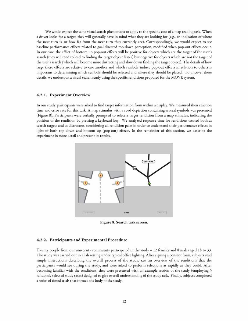
In our study, participants were asked to find target information from within a display. We measured their reaction time and error rate for this task. A map stimulus with a road depiction containing several symbols was presented (Figure 8). Participants were verbally prompted to select a target rendition from a map stimulus, indicating the position of the rendition by pressing a keyboard key. We analyzed response time for renditions treated both as search targets and as distracters, considering all rendition pairs in order to understand their performance effects in light of both top-down and bottom up (pop-out) effects. In the remainder of this section, we describe the experiment in more detail and present its results.
Figure 8. Search task screen.
4.2.2. Participants and Experimental Procedure
Twenty people from our university community participated in the study – 12 females and 8 males aged 18 to 33. The study was carried out in a lab setting under typical office lighting. After signing a consent form, subjects read simple instructions describing the overall process of the study, saw an overview of the renditions that the participants would see during the study, and were asked to perform selections as rapidly as they could. After becoming familiar with the renditions, they were presented with an example session of the study (employing 5 randomly selected study tasks) designed to give overall understanding of the study task. Finally, subjects completed a series of timed trials that formed the body of the study.
12
During the study trials, the participants were presented with a voice prompt using a pre-recorded female voice, indicating which symbol they should select. For example, before Figure 8 was presented, a participant would hear “East Avenue” while being presented with a blank screen. Immediately after the voice prompt, a visual stimulus would appear. Once the correct rendition was found, the participant indicated its position in the display by pressing 1, 2 or 3 on the keyboard. Trials were repeated until every map stimulus was presented.
To record reaction time, the experiment software started a timer when the visual stimulus was placed on the screen and stopped when a participant pressed a key. Reaction time was recorded in milliseconds. We also recorded error responses. Error rates were extremely low and do not allow any useful distinctions to be made between the renditions, and thus will not be considered further.
4.2.3. Stimuli
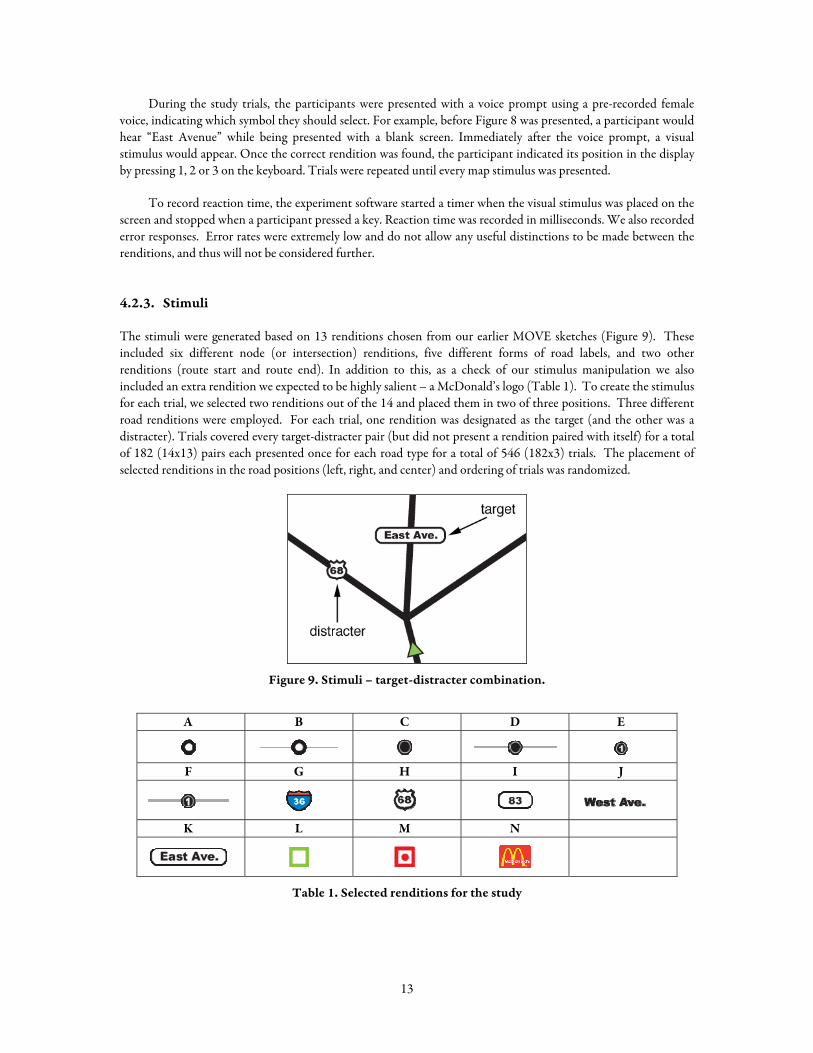
The stimuli were generated based on 13 renditions chosen from our earlier MOVE sketches (Figure 9). These included six different node (or intersection) renditions, five different forms of road labels, and two other renditions (route start and route end). In addition to this, as a check of our stimulus manipulation we also included an extra rendition we expected to be highly salient – a McDonald’s logo (Table 1). To create the stimulus for each trial, we selected two renditions out of the 14 and placed them in two of three positions. Three different road renditions were employed. For each trial, one rendition was designated as the target (and the other was a distracter). Trials covered every target-distracter pair (but did not present a rendition paired with itself) for a total of 182 (14x13) pairs each presented once for each road type for a total of 546 (182x3) trials. The placement of selected renditions in the road positions (left, right, and center) and ordering of trials was randomized.
Figure 9. Stimuli – target-distracter combination.
A B C D E
F G H I J
K L M N
Table 1. Selected renditions for the study
13
4.2.4. Results and Discussion
To understand the base salience of each rendition, we initially compared the mean reaction time for each rendition alternative when used as a target (across all distracters). As expected, the McDonalds icon was highly salient — its distinctive shape and color scheme makes it likely to induce pop-out effects when combined with the other symbols. (We have eliminated this rendition from the remainder of the analysis to avoid skew).
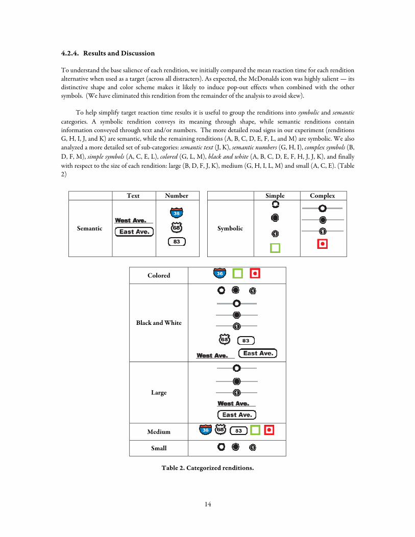
To help simplify target reaction time results it is useful to group the renditions into symbolic and semantic categories. A symbolic rendition conveys its meaning through shape, while semantic renditions contain information conveyed through text and/or numbers. The more detailed road signs in our experiment (renditions G, H, I, J, and K) are semantic, while the remaining renditions (A, B, C, D, E, F, L, and M) are symbolic. We also analyzed a more detailed set of sub-categories: semantic text (J, K), semantic numbers (G, H, I), complex symbols (B, D, F, M), simple symbols (A, C, E, L), colored (G, L, M), black and white (A, B, C, D, E, F, H, J, J, K), and finally with respect to the size of each rendition: large (B, D, F, J, K), medium (G, H, I, L, M) and small (A, C, E). (Table 2)
Text Number Simple Complex
Semantic
Symbolic
Colored
Black and White
Large
Medium
Small
Table 2. Categorized renditions.
14
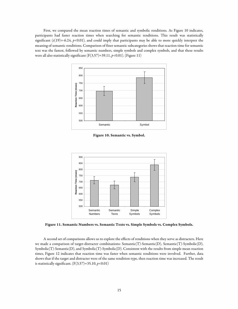
First, we compared the mean reaction times of semantic and symbolic renditions. As Figure 10 indicates, participants had faster reaction times when searching for semantic renditions. This result was statistically significant (t(19)=-6.24, p<0.01), and could imply that participants may be able to more quickly interpret the meaning of semantic renditions. Comparison of finer semantic subcategories shows that reaction time for semantic text was the fastest, followed by semantic numbers, simple symbols and complex symbols, and that these results were all also statistically significant (F(3,57)=39.11, p<0.01). (Figure 11)
500
550
600
650
700
750
800
850
Semantic Symbol
Rea
ctio
n Ti
me
(mse
c)
Figure 10. Semantic vs. Symbol.
500
550
600
650
700
750
800
850
900
SemanticNumbers
SemanticTexts
SimpleSymbols
ComplexSymbols
Rea
ctio
n Ti
me
(mse
c)
Figure 11. Semantic Numbers vs. Semantic Texts vs. Simple Symbols vs. Complex Symbols.
A second set of comparisons allows us to explore the effects of renditions when they serve as distracters. Here we made a comparison of target-distracter combinations: Semantic(T)-Semantic(D), Semantic(T)-Symbolic(D), Symbolic(T)-Semantic(D), and Symbolic(T)-Symbolic(D). Consistent with the results from simple mean reaction times, Figure 12 indicates that reaction time was faster when semantic renditions were involved. Further, data shows that if the target and distracter were of the same rendition type, then reaction time was increased. The result is statistically significant. (F(3,57)=35.10, p<0.01)
15
500
550
600
650
700
750
800
850
900
Semantic(T)-Semantic(D)
Semantic(T)-Symbolic(D)
Symbolic(T)-Semantic(D)
Symbolic(T)-Symbolic(D)
Rea
ctio
n Ti
me
(mse
c)
Figure 12. Semantic(T)-Semantic(D) vs. Semantic(T)-Symbolic(D) vs.
Symbolic(T)-Semantic(D) vs. Symbolic(T)-Symbolic(D)
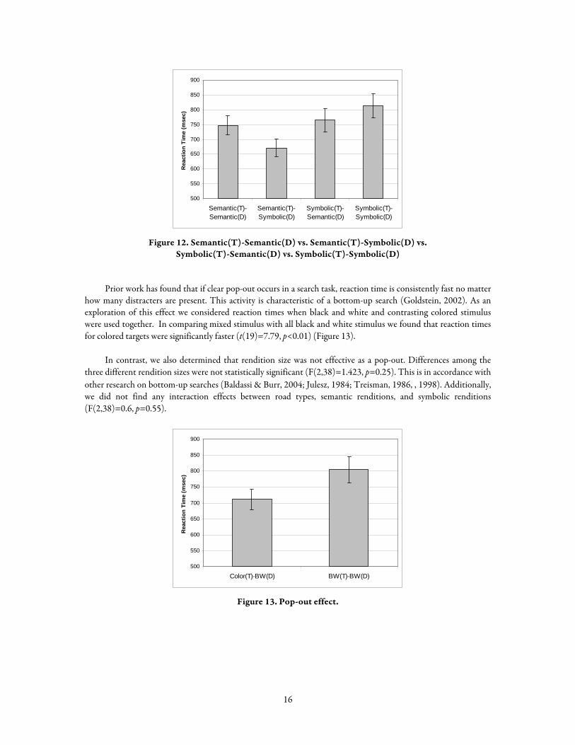
Prior work has found that if clear pop-out occurs in a search task, reaction time is consistently fast no matter how many distracters are present. This activity is characteristic of a bottom-up search (Goldstein, 2002). As an exploration of this effect we considered reaction times when black and white and contrasting colored stimulus were used together. In comparing mixed stimulus with all black and white stimulus we found that reaction times for colored targets were significantly faster (t(19)=7.79, p<0.01) (Figure 13).
In contrast, we also determined that rendition size was not effective as a pop-out. Differences among the three different rendition sizes were not statistically significant (F(2,38)=1.423, p=0.25). This is in accordance with other research on bottom-up searches (Baldassi & Burr, 2004; Julesz, 1984; Treisman, 1986, , 1998). Additionally, we did not find any interaction effects between road types, semantic renditions, and symbolic renditions (F(2,38)=0.6, p=0.55).
500
550
600
650
700
750
800
850
900
Color(T)-BW(D) BW(T)-BW(D)
Rea
ctio
n Ti
me
(mse
c)
Figure 13. Pop-out effect.
16
4.3. Detailed Design Principles
Based on our preliminary review of cartographic design, research on navigation, and research on rendition types, we generated detailed design principles for the MOVE system. The overall purpose of the system is to minimize perceptual load while driving. Three principles uphold this purpose. First, specific choices for the display should reflect the likely importance of the information in the current situation. Second, the navigational information should be presented in an abstract manner, while considering the driver’s current context. Finally, the system should present dynamically optimized information so that the driver’s direct interaction with the system can be minimized. In the next sections, we consider the specifics of each of these principles.
4.3.1. Using Importance Differences
In any given situation, not all information in the display will be of equal importance (or equally likely to be the target of a visual search). By using the most salient and attention demanding display elements only for the high importance items, while lowering the salience or even removing others, we can expect to achieve a perceptually efficient display.
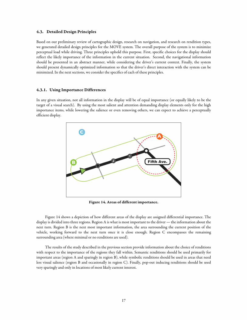
Figure 14. Areas of different importance.
Figure 14 shows a depiction of how different areas of the display are assigned differential importance. The display is divided into three regions. Region A is what is most important to the driver — the information about the next turn. Region B is the next most important information, the area surrounding the current position of the vehicle, working forward to the next turn once it is close enough. Region C encompasses the remaining surrounding area (where minimal or no renditions are used).
The results of the study described in the previous section provide information about the choice of renditions with respect to the importance of the regions they fall within. Semantic renditions should be used primarily for important areas (region A and sparingly in region B), while symbolic renditions should be used in areas that need less visual salience (region B and occasionally in region C). Finally, pop-out inducing renditions should be used very sparingly and only in locations of most likely current interest.
17
4.3.2. Abstraction
A second high level design principle involves the use of abstraction and generalization techniques. When designing MOVE, we categorized the map generalization process into the following five aspects.
4.3.2.1. Map Feature Selection
A route consists of several segments that the driver will traverse during the course of the route. Various map elements exist along the route, but not all of them can be presented on the display. Usually, drivers pay attention to the road segment they are currently traveling on. Other sections on the route or nearby, including landmarks such as rivers, parks, municipal boundaries, and other map features are not important unless they play a key role in navigating the route. For example, a gas station near the next turn becomes important as a vehicle is approaching the turn because it could be used as a landmark or a milestone. Feature selection is a process which, in a similar way, determines what features should be included on a particular map. Once selected for inclusion, a rendition for each feature is selected based on its importance (as described in the previous subsection).
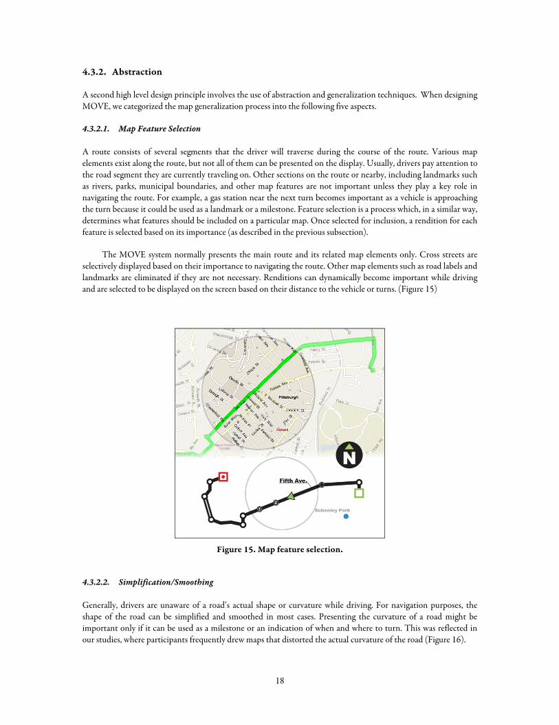
The MOVE system normally presents the main route and its related map elements only. Cross streets are selectively displayed based on their importance to navigating the route. Other map elements such as road labels and landmarks are eliminated if they are not necessary. Renditions can dynamically become important while driving and are selected to be displayed on the screen based on their distance to the vehicle or turns. (Figure 15)
Figure 15. Map feature selection.
4.3.2.2. Simplification/Smoothing
Generally, drivers are unaware of a road’s actual shape or curvature while driving. For navigation purposes, the shape of the road can be simplified and smoothed in most cases. Presenting the curvature of a road might be important only if it can be used as a milestone or an indication of when and where to turn. This was reflected in our studies, where participants frequently drew maps that distorted the actual curvature of the road (Figure 16).
18
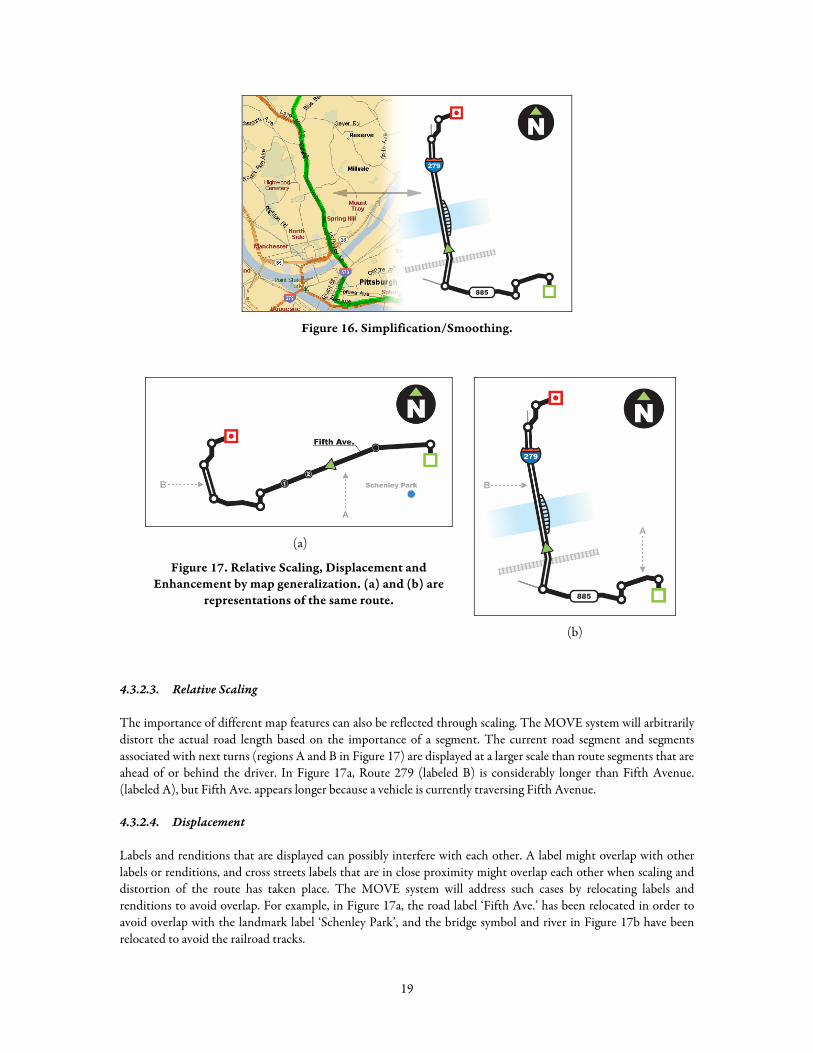
Figure 16. Simplification/Smoothing.
(a)
Figure 17. Relative Scaling, Displacement and Enhancement by map generalization. (a) and (b) are
representations of the same route.
(b)
4.3.2.3. Relative Scaling
The importance of different map features can also be reflected through scaling. The MOVE system will arbitrarily distort the actual road length based on the importance of a segment. The current road segment and segments associated with next turns (regions A and B in Figure 17) are displayed at a larger scale than route segments that are ahead of or behind the driver. In Figure 17a, Route 279 (labeled B) is considerably longer than Fifth Avenue. (labeled A), but Fifth Ave. appears longer because a vehicle is currently traversing Fifth Avenue.
4.3.2.4. Displacement
Labels and renditions that are displayed can possibly interfere with each other. A label might overlap with other labels or renditions, and cross streets labels that are in close proximity might overlap each other when scaling and distortion of the route has taken place. The MOVE system will address such cases by relocating labels and renditions to avoid overlap. For example, in Figure 17a, the road label ‘Fifth Ave.’ has been relocated in order to avoid overlap with the landmark label ‘Schenley Park’, and the bridge symbol and river in Figure 17b have been relocated to avoid the railroad tracks.
19
4.3.2.5. Enhancement
In the right places, detail can enhance navigation. Although many aspects of MOVE display abstract away detail, enhancement is used when features are important to the current driving context. More detail is applied (primarily through the use of enlarged scale and the selection of additional features) at the final destination of the route, for features associated with the next or current turn, and for features associated with the road segments between the current position and the next turn. For example, as illustrated in Figure 17a, extra cross streets are selected for display when nearing a turn, and these are enhanced with “countdown” number labels indicating how many cross streets are left to pass prior to making the turn.
4.3.3. Dynamic Information Interaction
Our final overarching design principle is dynamic information interaction. Displaying information in the vehicle will present two constraints: screen real estate, and manipulation of the display. Since there is very limited screen size, we cannot put the entire route map within a display. In a traditional in-vehicle navigation system, the driver only sees a small area of the route at once. Typically, scrollbars or navigation buttons are used to access content that is too large for the display. However, such explicit “hands on” interaction is not the most appropriate for the context of driving.
To present dynamic navigation information, MOVE accommodates navigation behavior in two ways. First, as learned in our study of navigation, drivers typically break an entire route into sub-goals, focusing on one goal at a time. Therefore MOVE uses the most detail for the road segment that the driver is currently passing over, relative to the goal within the route. Second, the system, using the speed and position of the vehicle, automatically determines which segment to be displayed with detail in context.
Automating the selection of information based on the driver’s context will reduce the total attention that the driver needs to expend on a map display. If appropriate information is presented to the driver, the driver’s cognitive and attentional loads can be significantly reduced. We can also expect that there would not be any need to physically interact with the display while driving.
To explore dynamic information presentation, we created four different visualization methods as potential candidates for the MOVE system.
4.3.3.1. Zoom in Context (ZC)
In zoom in context (Figure 18), the system automatically enlarges the road segment that the vehicle is passing over to the maximum available size. Other road segments are scaled down to fit on the screen. The advantage of this presentation style is that the driver can see the entire route at once, which is useful for getting an overview of the route. However, the vehicle’s location, indicated by a cursor, moves around the screen inconsistently, so the driver’s fixation target is constantly moving.
20
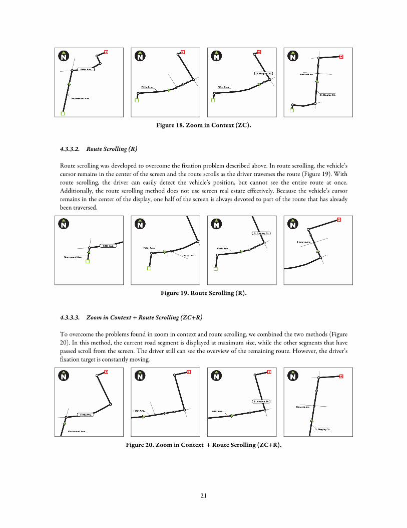
Figure 18. Zoom in Context (ZC).
4.3.3.2. Route Scrolling (R)
Route scrolling was developed to overcome the fixation problem described above. In route scrolling, the vehicle’s cursor remains in the center of the screen and the route scrolls as the driver traverses the route (Figure 19). With route scrolling, the driver can easily detect the vehicle’s position, but cannot see the entire route at once. Additionally, the route scrolling method does not use screen real estate effectively. Because the vehicle’s cursor remains in the center of the display, one half of the screen is always devoted to part of the route that has already been traversed.
Figure 19. Route Scrolling (R).
4.3.3.3. Zoom in Context + Route Scrolling (ZC+R)
To overcome the problems found in zoom in context and route scrolling, we combined the two methods (Figure 20). In this method, the current road segment is displayed at maximum size, while the other segments that have passed scroll from the screen. The driver still can see the overview of the remaining route. However, the driver’s fixation target is constantly moving.
Figure 20. Zoom in Context + Route Scrolling (ZC+R).
21
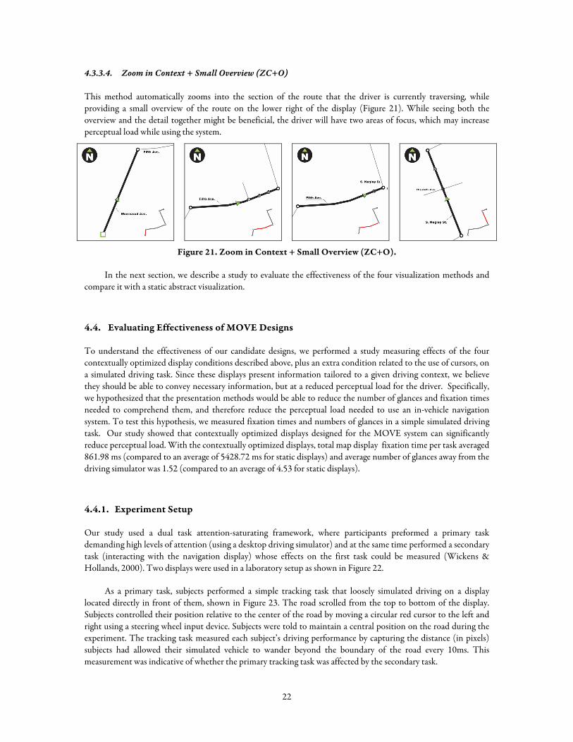
4.3.3.4. Zoom in Context + Small Overview (ZC+O)
This method automatically zooms into the section of the route that the driver is currently traversing, while providing a small overview of the route on the lower right of the display (Figure 21). While seeing both the overview and the detail together might be beneficial, the driver will have two areas of focus, which may increase perceptual load while using the system.
Figure 21. Zoom in Context + Small Overview (ZC+O).
In the next section, we describe a study to evaluate the effectiveness of the four visualization methods and compare it with a static abstract visualization.
4.4. Evaluating Effectiveness of MOVE Designs
To understand the effectiveness of our candidate designs, we performed a study measuring effects of the four contextually optimized display conditions described above, plus an extra condition related to the use of cursors, on a simulated driving task. Since these displays present information tailored to a given driving context, we believe they should be able to convey necessary information, but at a reduced perceptual load for the driver. Specifically, we hypothesized that the presentation methods would be able to reduce the number of glances and fixation times needed to comprehend them, and therefore reduce the perceptual load needed to use an in-vehicle navigation system. To test this hypothesis, we measured fixation times and numbers of glances in a simple simulated driving task. Our study showed that contextually optimized displays designed for the MOVE system can significantly reduce perceptual load. With the contextually optimized displays, total map display fixation time per task averaged 861.98 ms (compared to an average of 5428.72 ms for static displays) and average number of glances away from the driving simulator was 1.52 (compared to an average of 4.53 for static displays).
4.4.1. Experiment Setup
Our study used a dual task attention-saturating framework, where participants preformed a primary task demanding high levels of attention (using a desktop driving simulator) and at the same time performed a secondary task (interacting with the navigation display) whose effects on the first task could be measured (Wickens & Hollands, 2000). Two displays were used in a laboratory setup as shown in Figure 22.
As a primary task, subjects performed a simple tracking task that loosely simulated driving on a display located directly in front of them, shown in Figure 23. The road scrolled from the top to bottom of the display. Subjects controlled their position relative to the center of the road by moving a circular red cursor to the left and right using a steering wheel input device. Subjects were told to maintain a central position on the road during the experiment. The tracking task measured each subject’s driving performance by capturing the distance (in pixels) subjects had allowed their simulated vehicle to wander beyond the boundary of the road every 10ms. This measurement was indicative of whether the primary tracking task was affected by the secondary task.
22
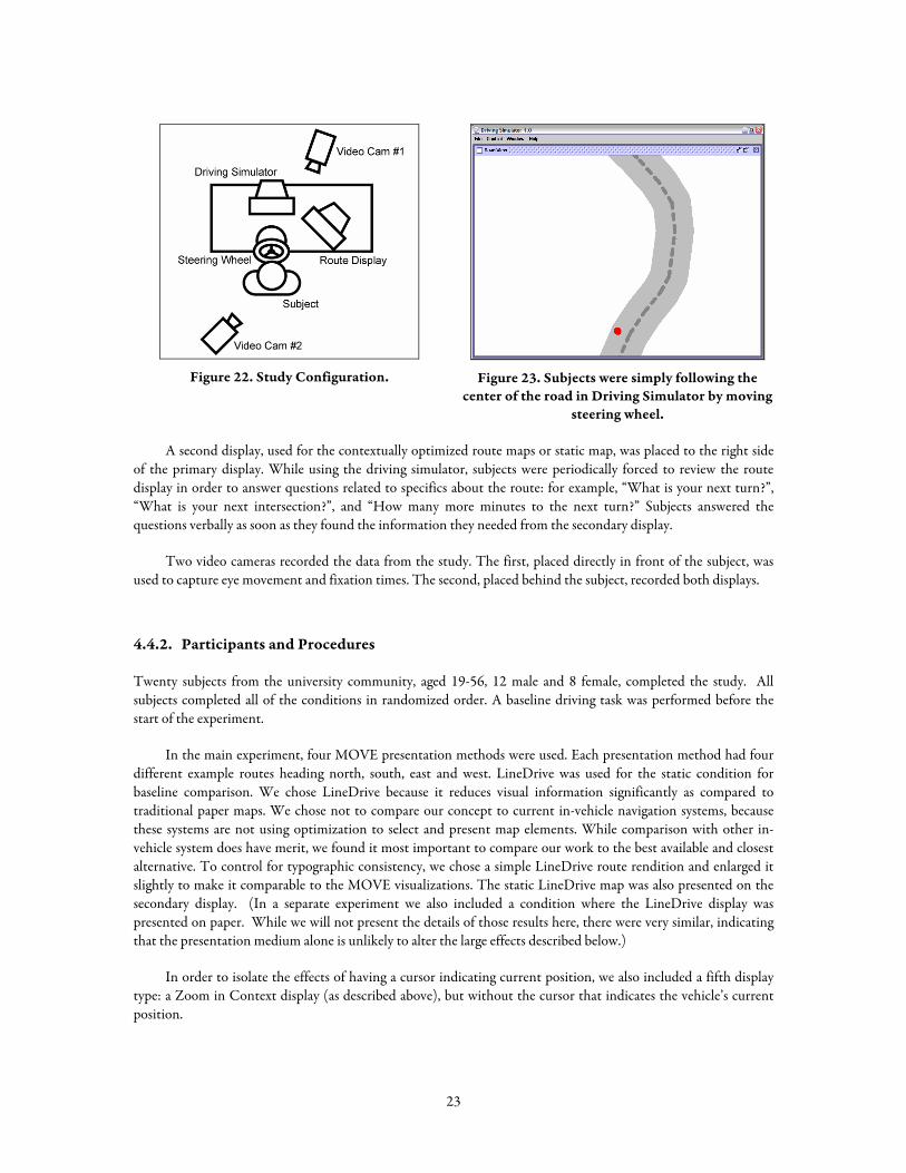
Figure 22. Study Configuration.
Figure 23. Subjects were simply following the
center of the road in Driving Simulator by moving steering wheel.
A second display, used for the contextually optimized route maps or static map, was placed to the right side of the primary display. While using the driving simulator, subjects were periodically forced to review the route display in order to answer questions related to specifics about the route: for example, “What is your next turn?”, “What is your next intersection?”, and “How many more minutes to the next turn?” Subjects answered the questions verbally as soon as they found the information they needed from the secondary display.
Two video cameras recorded the data from the study. The first, placed directly in front of the subject, was used to capture eye movement and fixation times. The second, placed behind the subject, recorded both displays.
4.4.2. Participants and Procedures
Twenty subjects from the university community, aged 19-56, 12 male and 8 female, completed the study. All subjects completed all of the conditions in randomized order. A baseline driving task was performed before the start of the experiment.
In the main experiment, four MOVE presentation methods were used. Each presentation method had four different example routes heading north, south, east and west. LineDrive was used for the static condition for baseline comparison. We chose LineDrive because it reduces visual information significantly as compared to traditional paper maps. We chose not to compare our concept to current in-vehicle navigation systems, because these systems are not using optimization to select and present map elements. While comparison with other in-vehicle system does have merit, we found it most important to compare our work to the best available and closest alternative. To control for typographic consistency, we chose a simple LineDrive route rendition and enlarged it slightly to make it comparable to the MOVE visualizations. The static LineDrive map was also presented on the secondary display. (In a separate experiment we also included a condition where the LineDrive display was presented on paper. While we will not present the details of those results here, there were very similar, indicating that the presentation medium alone is unlikely to alter the large effects described below.)
In order to isolate the effects of having a cursor indicating current position, we also included a fifth display type: a Zoom in Context display (as described above), but without the cursor that indicates the vehicle’s current position.
23
4.4.3. Results and Discussion
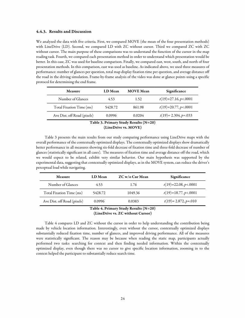
We analyzed the data with five criteria. First, we compared MOVE (the mean of the four presentation methods) with LineDrive (LD). Second, we compared LD with ZC without cursor. Third we compared ZC with ZC without cursor. The main purpose of these comparisons was to understand the function of the cursor in the map reading task. Fourth, we compared each presentation method in order to understand which presentation would be better. In this case, ZC was used for baseline comparison. Finally, we compared east, west, south, and north of four presentation methods. In this comparison, east was used as baseline. As indicated above, we used three measures of performance: number of glances per question, total map display fixation time per question, and average distance off the road in the driving simulation. Frame-by-frame analysis of the video was done at glance points using a specific protocol for determining the end frame.
Measure LD Mean MOVE Mean Significance
Number of Glances 4.53 1.52 t(19)=27.16, p<.0001
Total Fixation Time (ms) 5428.72 861.98 t(19)=20.77, p<.0001
Ave Dist. off Road (pixels) 0.0996 0.0204 t(19)= 2.304, p=.033
Table 3. Primary Study Results (N=20) (LineDrive vs. MOVE)
Table 3 presents the main results from our study comparing performance using LineDrive maps with the overall performance of the contextually optimized displays. The contextually optimized displays show dramatically better performance in all measures showing six-fold decrease of fixation time and three-fold decrease of number of glances (statistically significant in all cases). The measures of fixation time and average distance off the road, which we would expect to be related, exhibit very similar behavior. Our main hypothesis was supported by the experimental data, suggesting that contextually optimized displays, as in the MOVE system, can reduce the driver’s perceptual load while navigating.
Measure LD Mean ZC w/o Cur Mean Significance
Number of Glances 4.53 1.76 t(19)=22.08, p<.0001
Total Fixation Time (ms) 5428.72 1049.36 t(19)=18.77, p<.0001
Ave Dist. off Road (pixels) 0.0996 0.0383 t(19)= 2.872, p=.010
Table 4. Primary Study Results (N=20) (LineDrive vs. ZC without Cursor)
Table 4 compares LD and ZC without the cursor in order to help understanding the contribution being made by vehicle location information. Interestingly, even without the cursor, contextually optimized displays substantially reduced fixation time, number of glances, and improved driving performance. All of the measures were statistically significant. The reason may be because when reading the static map, participants actually performed two tasks: searching for context and then finding needed information. Within the contextually optimized display, even though there was no cursor to give specific location information, zooming in to the context helped the participant to substantially reduce search time.
24
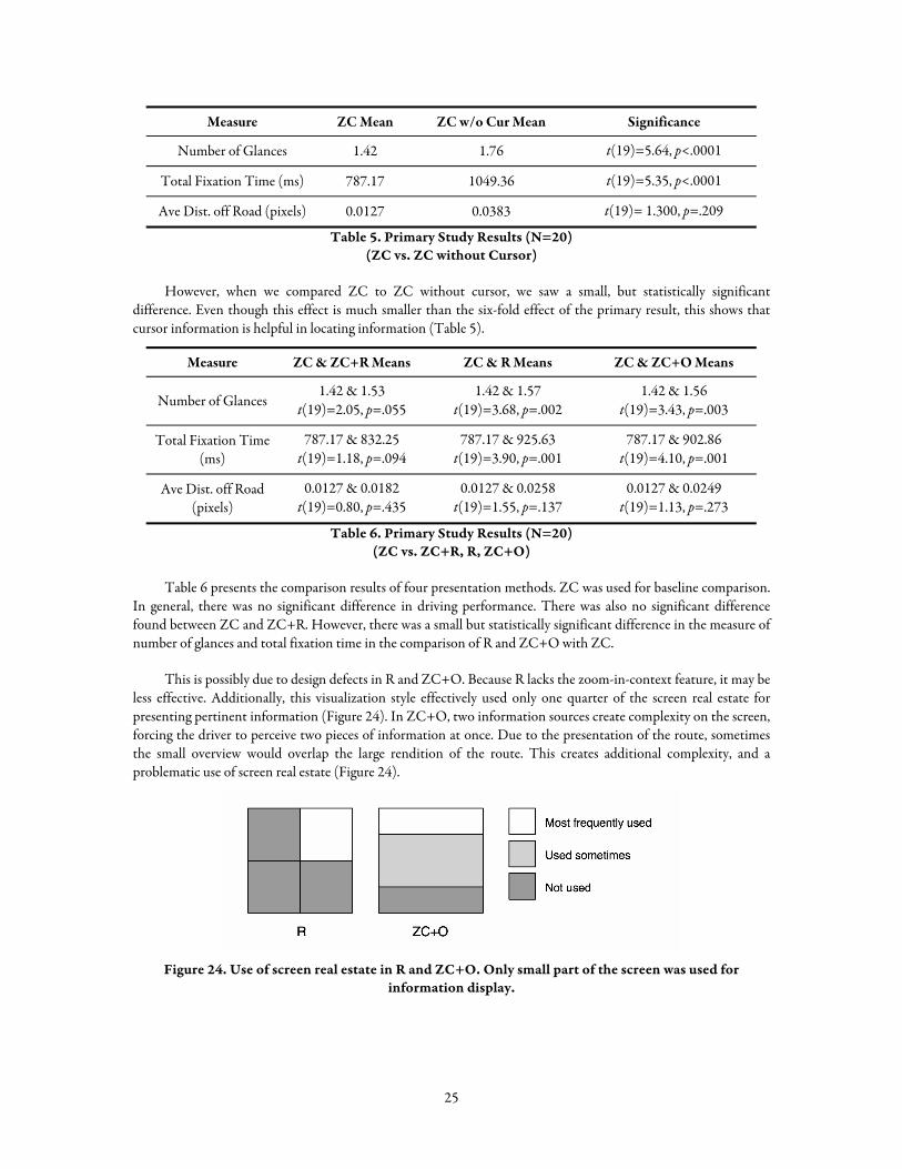
Measure ZC Mean ZC w/o Cur Mean Significance
Number of Glances 1.42 1.76 t(19)=5.64, p<.0001
Total Fixation Time (ms) 787.17 1049.36 t(19)=5.35, p<.0001
Ave Dist. off Road (pixels) 0.0127 0.0383 t(19)= 1.300, p=.209
Table 5. Primary Study Results (N=20) (ZC vs. ZC without Cursor)
However, when we compared ZC to ZC without cursor, we saw a small, but statistically significant difference. Even though this effect is much smaller than the six-fold effect of the primary result, this shows that cursor information is helpful in locating information (Table 5).
Measure ZC & ZC+R Means ZC & R Means ZC & ZC+O Means
Number of Glances 1.42 & 1.53
t(19)=2.05, p=.055 1.42 & 1.57
t(19)=3.68, p=.002 1.42 & 1.56
t(19)=3.43, p=.003
Total Fixation Time (ms)
787.17 & 832.25 t(19)=1.18, p=.094
787.17 & 925.63 t(19)=3.90, p=.001
787.17 & 902.86 t(19)=4.10, p=.001
Ave Dist. off Road (pixels)
0.0127 & 0.0182 t(19)=0.80, p=.435
0.0127 & 0.0258 t(19)=1.55, p=.137
0.0127 & 0.0249 t(19)=1.13, p=.273
Table 6. Primary Study Results (N=20) (ZC vs. ZC+R, R, ZC+O)
Table 6 presents the comparison results of four presentation methods. ZC was used for baseline comparison. In general, there was no significant difference in driving performance. There was also no significant difference found between ZC and ZC+R. However, there was a small but statistically significant difference in the measure of number of glances and total fixation time in the comparison of R and ZC+O with ZC.
This is possibly due to design defects in R and ZC+O. Because R lacks the zoom-in-context feature, it may be less effective. Additionally, this visualization style effectively used only one quarter of the screen real estate for presenting pertinent information (Figure 24). In ZC+O, two information sources create complexity on the screen, forcing the driver to perceive two pieces of information at once. Due to the presentation of the route, sometimes the small overview would overlap the large rendition of the route. This creates additional complexity, and a problematic use of screen real estate (Figure 24).
Figure 24. Use of screen real estate in R and ZC+O. Only small part of the screen was used for
information display.
25
5. IMPLEMENTATION OF THE MOVE SYSTEM
Previous sections described our preliminary work. First, the navigation study provided us an overview of how people navigate with various sources of information. Next, related work and visual search study provided guidance on the design the MOVE system. As a result of the studies, we were able to design the prototype of the MOVE system generating the two major design principles: abstraction and dynamic information interaction. Finally, our study evaluating the prototype system showed our prototype designs are promising and could address the issues in navigation systems. The remaining steps in this work are the construction of a full proof of concept prototype and its evaluation in a realistic driving simulation.
In the design process, we have identified five map generalization principles: Map Feature Selection, Simplification/Smoothing, Relative Scaling, Displacement, and Enhancement. Our implementation process for the MOVE system is planned to address those five map generalization techniques. The following sections will present how these principles will work in the implementation of the MOVE system. First, the Road Layout process will work on the principles of Simplification/Smoothing and Relative Scaling. It will make an entire route abstract, while making the most important segment salient. Second, the Rendition Selection process will work on the principle of Map Feature Selection, which is to present map features selectively to lower driver’s attention to the display by reducing the amount of information. Third, the following section of scoring renditions will discuss how we determine and assign scores for rendition features that will be used in the optimization process of the Rendition Selection. Last, the Final Placement Tuning process will discuss the intervention technique for possible conflicts and clutters within the selected renditions when presented on the display. This will work on the principle, Displacement.
5.1. Road Layout
Road Layout is a process that decides how to place a route within the space of the screen display. This process is directly related to Simplification/Smoothing and Relative Scaling. The goal of this process is to generate the entire route as simply as possible while making the important portions of the route segment salient. In the dynamically changing driving context, the system would also dynamically assign different saliency values to each segment.
The LineDrive system (Agrawala & Stolte, 2001) has demonstrated a very useful method for road layout. The LineDrive system generates a simplified route map through basic numerical optimization using simulated annealing (Cerny, 1985; Kirkpatrick, Gelatt, & Vecchi, 1983). It selects a final route layout by performing three generalizations: Length Generalization, Angle Generalization, and Shape Generalization (Agrawala & Stolte, 2001). For the Length Generalization, the LineDrive system distorts the length of each route segment in order to make the entire route fit within a screen boundary while maintaining the constraint that shorter roads remain perceptually shorter than longer roads. Angle Generalization alters the angle of each road segment to improve the clarity of the turning points as well as ensure a minimum length for shorter roads and to make room for labels. Finally Shape Generalization simplifies the road shape by removing extraneous information and places.
Adding to the generalization processes, the LineDrive system also handles some unwanted cases that could happen while distorting the original route – missing intersections and false intersections. Those cases can appear quite often during the distortion process, and could disrupt navigation significantly.
The basic idea of layout methods used in the LineDrive system is valid for our MOVE system, and we have implemented our preliminary prototype making using related methods. However, because the LineDrive system
26
only focuses on static route maps, while the MOVE system addresses dynamic information, additional layout methods are needed.
To give an example, the LineDrive system maintains the ratio of each road segment’s perceptual length consistently. But in the MOVE system, if a segment is more important than other segments, the important segment is enlarged (despite its original length) in order to ensure higher salience and more space for contextual information related to the segment. Therefore we need to develop different road layout methods for the MOVE system.
The goal of the road layout optimization process is to display the route within a given screen boundary, emphasizing the segment of interest without losing the entire context of the route. Two major sub-goals will be introduced here: First, route segment of interest should occupy most of the screen real estate. Second, the entire route should be displayed within the display boundary.
Definition of “segment of interest” could vary depending on the driver’s situation. In most cases, it could be defined as “route segment containing car”. This coincides with our earlier findings from the navigation study. When navigating, people divide the entire route into small chunks and create sub-goals based on each turn. So, basically a “segment of interest” is the road segment the driver is currently traversing. However, this idea may fail in some instances. For example, if the road segment is very short, say 100m, then the driver would encounter very sudden changes on the route display. We usually experience this situation when we get close to a destination. So, in this case, we may want to combine two or more segments together to make a “segment of interest”. This decision will be made during route initialization in the road layout optimization process.
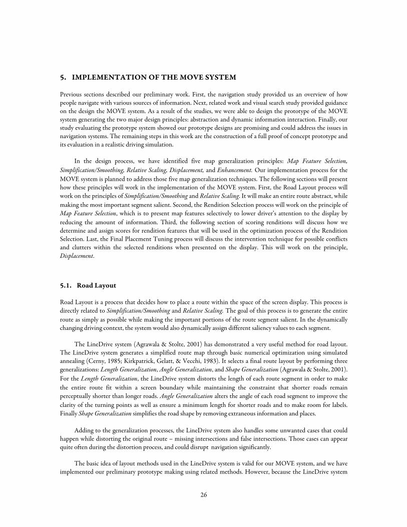
To optimize road layout for each condition, we first assign two internal areas as Figure 25 depicts: focus area and screen boundary. Focus area is the main display area for the route segment of interest and takes 80% of the entire screen display. Screen boundary is defined by offsetting by a 20 pixel, border of the entire screen display. The boundary is used to prevent any part of the route or renditions thereof from unintentionally exceeding the boundary of the screen.
Figure 25. Internal Areas: focus area and screen boundary
Our basic numerical optimization uses simulated annealing. This is parameterized by two functions: perturb() creates a new iteration (in our case, a new map design) by making changes to an existing candidate rendition and score() evaluates it with a given evaluation criteria and then returns a penalty score. The optimization process then compares the penalty score of the best previous existing iteration and the new one and takes the one with the better score.
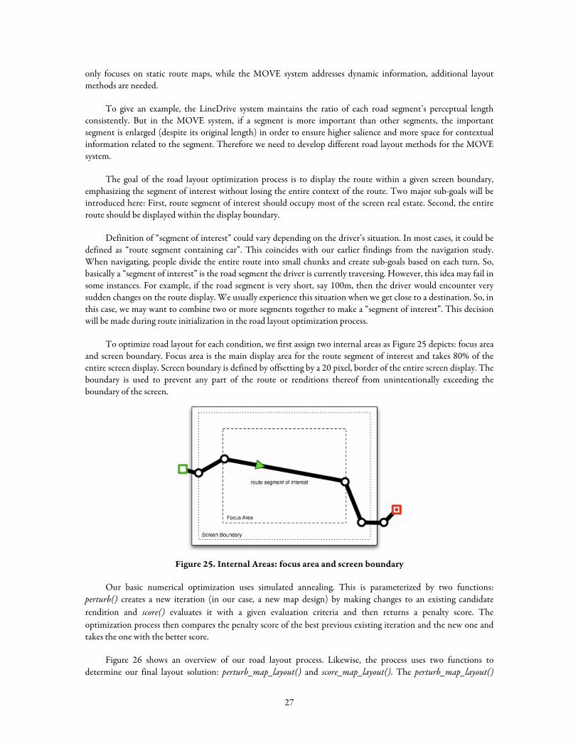
Figure 26 shows an overview of our road layout process. Likewise, the process uses two functions to determine our final layout solution: perturb_map_layout() and score_map_layout(). The perturb_map_layout()
27
randomly generates an iteration by modifying some of its values and the score_map_layout() evaluates the iteration and returns a score of the interaction as a result of the evaluation.
For example, in Figure 26, after an original route is placed on the screen, the road layout process selects a segment of interest from the original route map. In the given example figure, the third road segment is the segment of interest. And then, perturb_road_layout() randomly adjusts the length of segment of interest, the angle of the segment of interest and the length of remaining segments. The goal of adjusting the length of segment of interest and its angle is to find a route layout as long as possible while remaining within the focus area boundary. Also, by adjusting the length of the remaining segments, we can have the entire route displayed within the screen.
After each iteration generated, the score_map_layout() evaluates the iteration. The score_map_layout() examines whether the entire route is bigger or smaller than the screen boundary, the segment of interest is bigger or smaller than the focus area, and the angle of segment of interest is substantially different from the one in the original route. In case of the second picture of Figure 26, the length and the angle of segment of interest are acceptable, but the entire route is not displayed in the screen boundary. So, this iteration will be scored poorly and discarded and the perturb_map_layout() will generate another iteration. The third picture of Figure 26 is considered to satisfy the all evaluation criteria, so the optimization process will score this iteration highly and likely choose it as a final solution.
Figure 26. Overview of road layout optimization process.
28
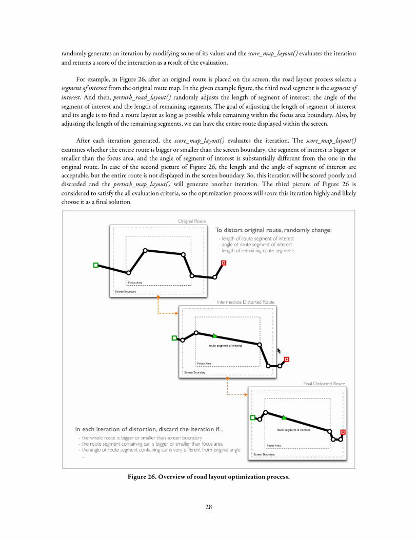
5.2. Rendition Selection
The Rendition Selection process takes the large information set of the original map and presents it in a less information demanding manner. For example, in Figure 27, the first map has many labels, intersections and landmarks. During the rendition selection process, MOVE randomly modifies its rendition choices. Each iteration will be evaluated and discarded if its overall score is not improved. So, in the final rendition selection, as seen in Figure 27, only two intersection marks are displayed: one with a crossing line and one without a crossing line. Also, the Restaurant landmark and School landmark has not been selected for display because they are not important in the current context of navigation.
Figure 27. Rendition Selection Example.
Similar to the Road Layout optimization, Rendition Selection will be also achieved through the optimization with simulated annealing (Cerny, 1985; Kirkpatrick et al., 1983). The process will use two functions to find a final solution for the rendition selection process: perturb_rendition_selection() and score_rendition_selection(). The perturb_rendition_selection() will randomly select a rendition and raise or lower its rendition choice to the one which is next higher or lower in salience. Then, the score_rendition_selection() will evaluate each iteration and eventually choose a final solution minimizing the sum of score of given rendition selection. The scoring of the rendition will be discussed more in detail in the next section.
29
The score of the current map’s rendition selection can be calculated as follows:
∑∈RouteS
SIRsC )(*)(
Where S is a route segment or feature Rs is a rendition choice for segment S C(Rs) is communicative potential score for rendition choice Rs I(S) is importance score for route segment S
5.3. Scoring Renditions
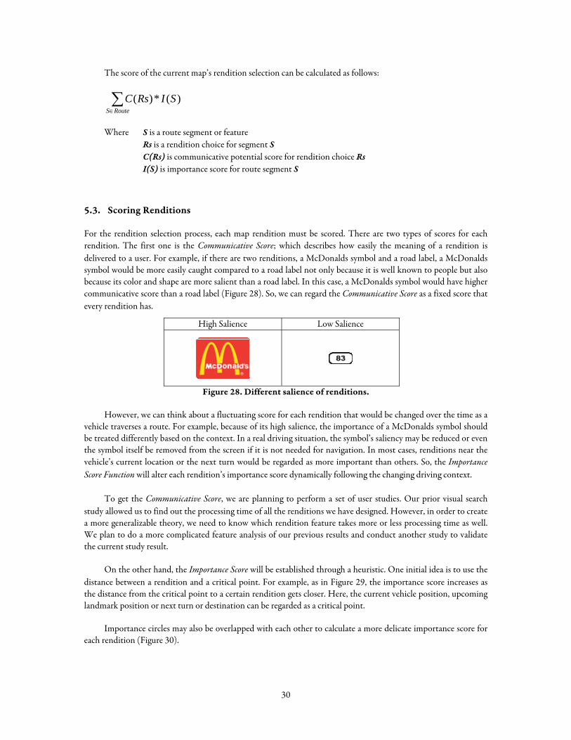
For the rendition selection process, each map rendition must be scored. There are two types of scores for each rendition. The first one is the Communicative Score; which describes how easily the meaning of a rendition is delivered to a user. For example, if there are two renditions, a McDonalds symbol and a road label, a McDonalds symbol would be more easily caught compared to a road label not only because it is well known to people but also because its color and shape are more salient than a road label. In this case, a McDonalds symbol would have higher communicative score than a road label (Figure 28). So, we can regard the Communicative Score as a fixed score that every rendition has.
High Salience Low Salience
Figure 28. Different salience of renditions.
However, we can think about a fluctuating score for each rendition that would be changed over the time as a vehicle traverses a route. For example, because of its high salience, the importance of a McDonalds symbol should be treated differently based on the context. In a real driving situation, the symbol’s saliency may be reduced or even the symbol itself be removed from the screen if it is not needed for navigation. In most cases, renditions near the vehicle’s current location or the next turn would be regarded as more important than others. So, the Importance Score Function will alter each rendition’s importance score dynamically following the changing driving context.
To get the Communicative Score, we are planning to perform a set of user studies. Our prior visual search study allowed us to find out the processing time of all the renditions we have designed. However, in order to create a more generalizable theory, we need to know which rendition feature takes more or less processing time as well. We plan to do a more complicated feature analysis of our previous results and conduct another study to validate the current study result.
On the other hand, the Importance Score will be established through a heuristic. One initial idea is to use the distance between a rendition and a critical point. For example, as in Figure 29, the importance score increases as the distance from the critical point to a certain rendition gets closer. Here, the current vehicle position, upcoming landmark position or next turn or destination can be regarded as a critical point.
Importance circles may also be overlapped with each other to calculate a more delicate importance score for each rendition (Figure 30).
30
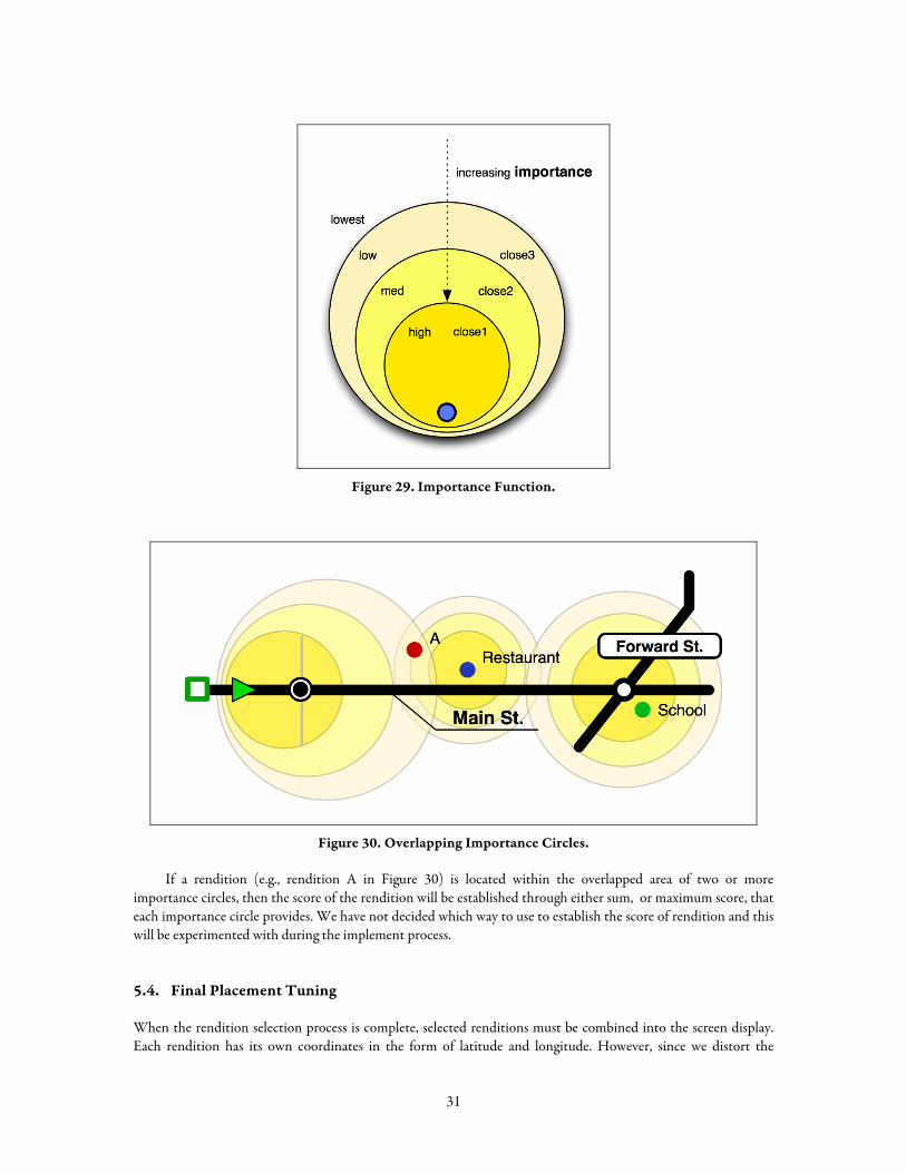
Figure 29. Importance Function.
Figure 30. Overlapping Importance Circles.
If a rendition (e.g., rendition A in Figure 30) is located within the overlapped area of two or more importance circles, then the score of the rendition will be established through either sum, or maximum score, that each importance circle provides. We have not decided which way to use to establish the score of rendition and this will be experimented with during the implement process.
5.4. Final Placement Tuning
When the rendition selection process is complete, selected renditions must be combined into the screen display. Each rendition has its own coordinates in the form of latitude and longitude. However, since we distort the
31
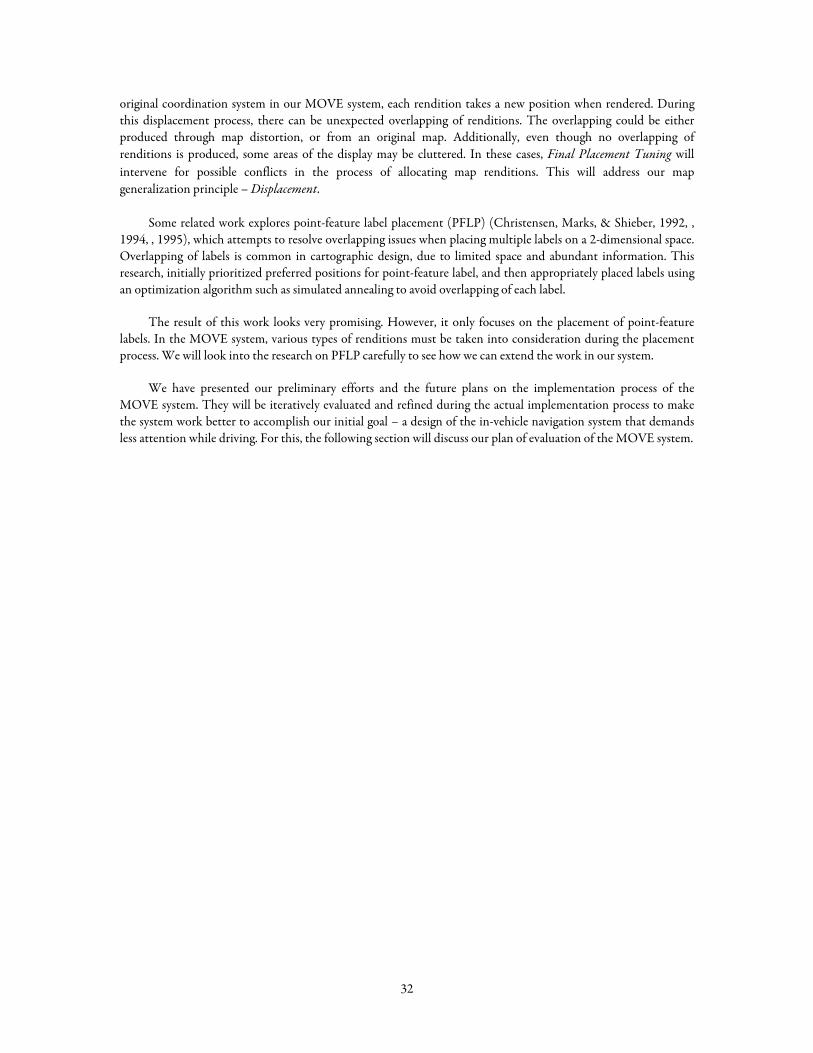
original coordination system in our MOVE system, each rendition takes a new position when rendered. During this displacement process, there can be unexpected overlapping of renditions. The overlapping could be either produced through map distortion, or from an original map. Additionally, even though no overlapping of renditions is produced, some areas of the display may be cluttered. In these cases, Final Placement Tuning will intervene for possible conflicts in the process of allocating map renditions. This will address our map generalization principle – Displacement.
Some related work explores point-feature label placement (PFLP) (Christensen, Marks, & Shieber, 1992, , 1994, , 1995), which attempts to resolve overlapping issues when placing multiple labels on a 2-dimensional space. Overlapping of labels is common in cartographic design, due to limited space and abundant information. This research, initially prioritized preferred positions for point-feature label, and then appropriately placed labels using an optimization algorithm such as simulated annealing to avoid overlapping of each label.
The result of this work looks very promising. However, it only focuses on the placement of point-feature labels. In the MOVE system, various types of renditions must be taken into consideration during the placement process. We will look into the research on PFLP carefully to see how we can extend the work in our system.
We have presented our preliminary efforts and the future plans on the implementation process of the MOVE system. They will be iteratively evaluated and refined during the actual implementation process to make the system work better to accomplish our initial goal – a design of the in-vehicle navigation system that demands less attention while driving. For this, the following section will discuss our plan of evaluation of the MOVE system.
32
6. EVALUATION
As the final step of the research, we will perform a set of evaluation study to verify whether our initial goal has been successfully achieved. This will include comparisons of the MOVE system with other in-vehicle navigation systems. Currently, we have planned two phases of evaluation of the system.
First, we would like to find out whether our algorithms used in the MOVE system are working as we intended. To verify this, we will perform a heuristic evaluation study with several interaction design experts. In this study, we will provide the designers a map with a pre-defined route and will ask them to draw abstracted route map. The designers will draw couple of abstracted maps with a given route, making certain places – where we asked – salient. And then, the designers will explain their decisions when making a route map, for example, why they choose or leave out a certain rendition from the map display.
From this we will extract evaluation criteria for our system. With these evaluation criteria, we will take a close look at the route map that the MOVE system generates. This should tell us what is missing in our optimization algorithms so that we can iteratively improve them.
Second, we will compare the MOVE system to the current in-vehicle navigation systems in both navigational performance and safety measures. The study will be conducted in a simulated driving context to avoid safety issues we may encounter in the actual driving context on a road. Similar to our earlier feasibility study, we will have a driving simulator for the primary task while presenting navigational information for the secondary task. The driving task will be much more realistic than our earlier study. Similar measurements – total fixation time, number of glances, and driving performance – will be utilized in the study. And possibly we may take advantage of more advanced measurement such as eye tracker data. We will integrate our system with a driving simulator.
33
7. CONTRIBUTION
Current navigation systems often require lots of attention when retrieving information while driving because they are not designed to provide situationally appropriate map information to a driver. The safety issue that might be caused by poorly design navigation system could be severe than any other usual information devices.
The value of information remains important and useful when it is delivered in an appropriate way. In order to present appropriate amount information with appropriate form, we first need to know which information is important to a user at certain condition. However, when designing this kind of information system, a human designer can easily make a decision through the understanding of a context, but it is not easy to do it automatically without human designer’s supervision.
The major contribution of this work will be a design of the in-vehicle navigation system that demands less attention while driving. This will reduce driver’s glance and fixation time for the navigation system. We have already proved the possibility of this in our feasibility study with the prototype design of the MOVE system and will build a system based on the prototype design.
To achieve this goal, this work will contribute a method to present situationally appropriate information. First, this work will contribute to build generalizable measures for visual renditions to be used to select optimized renditions for certain condition. The measures will include communication value, importance value and distracting cost of the renditions. Second, this work will contribute to build an algorithm to select renditions to minimize driver’s perceptual load.
This work will contribute a road layout method to present a route dynamically in an abstract manner. As we have discussed earlier, the LineDrive system provides a method that abstracts route map in a static display. This work will extend the method used in the LineDrive system to be applied in a dynamic context.
Finally, this work will contribute a method to intervention of conflict of renditions when presented on the screen display. Overlaps or clutters produced by distorted route map can cause unexpected attention and distraction of map reading. The intervention method will prevent these unexpected layout issue and also make the display look good.
34
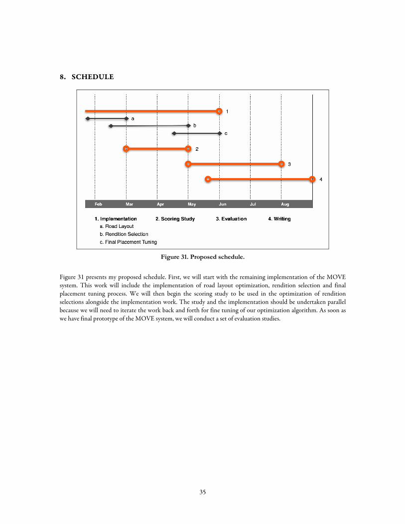
8. SCHEDULE
Figure 31. Proposed schedule.
Figure 31 presents my proposed schedule. First, we will start with the remaining implementation of the MOVE system. This work will include the implementation of road layout optimization, rendition selection and final placement tuning process. We will then begin the scoring study to be used in the optimization of rendition selections alongside the implementation work. The study and the implementation should be undertaken parallel because we will need to iterate the work back and forth for fine tuning of our optimization algorithm. As soon as we have final prototype of the MOVE system, we will conduct a set of evaluation studies.
35
9. ACKNOWLEDGEMENTS
I would like to thank to Professor Jodi Forlizzi and Professor Scott Hudson for their wisdom and insightful advice of this work. And I also would like to thank to the rest of my thesis committee for their valuable advice and feedback: Professor Suguru Ishizaki and Hugh Dubberly.
I am also incredibly grateful to my collaborators for their hard work and valuable contributions: Marisa Manheim and Erika Persson. I am thankful to all of those who have provided support and feedback on this work: James Fogarty, Daniel Avrahami, Laura Dabbish, Johnny Lee, Soojin Jun, Myungho Sohn, Yungwoo Seo, Bilge Mutlu, Ian Li, and my other colleagues. I also thank to my wife, Soojin Jun for her continual support and comments on this work.
This work was supported in part by the National Science Foundation under grants IIS-0121560 and IIS-0325351, in part by funding from the General Motors Corporation, and this material is based in part upon work supported by the Defense Advanced Research Projects Agency (DARPA) under Contract No. NBCHD030010.
36
10. REFERENCES
Agrawala, M., & Stolte, C. (2001, August 12-17). Rendering Effective Route Maps: Improving Usability through Generalization. Paper presented at the ACM SIGGRAPH 2001, Los Angeles, CA.
Baldassi, S., & Burr, D. C. (2004). "Pop-out" of targets modulated in luminance or colour: the effect of intrinsic and extrinsic uncertainty. Vision Research, 44, 1227-1233.
Beck, J. (1982). Textural segmentation. In J. Beck (Ed.), Organization and representation in perception. Hillsdale, NJ: Erlbaum.
Bederson, B. B. (2000, November 5-8). Fisheye Menus. Paper presented at the ACM UIST 2000, San Diego, CA.
Bederson, B. B., & Hollan, J. D. (1994, November 2-4). Pad++: A Zooming Graphical Interface for Exploring Alternate Interface Physics. Paper presented at the ACM UIST 1994, Marina Del Ray, CA.
Bederson, B. B., Meyer, J., & Good, L. (2000, November 5-8). Jazz: an extensible zoomable user interface graphics toolkit in Java. Paper presented at the ACM UIST 2000, San Diego, CA.
Bier, E. A., Stone, M. C., Pier, K., Buxton, W., & DeRose, T. D. (1993, August 1 - 6). Toolglass and Magic Lenses: The See-through Interface. Paper presented at the ACM SIGGRAPH 1993, Anaheim, CA.
Cerny, V. (1985). A Thermodynamical Approach to the Travelling Salesman Problem: An Efficient Simulation Algorithm. Journal of Optimization Theory and Applications, 45, 41-51.
Christensen, J., Marks, J., & Shieber, S. (1992). Labeling Point Features on Maps and Diagrams.
Christensen, J., Marks, J., & Shieber, S. (1994). Placing Text Labels on Maps and Diagrams
Christensen, J., Marks, J., & Shieber, S. (1995). An empirical study of algorithms for point-feature label placement. ACM Trans. Graph., 14(3), 203-232.
Conner, C. E., Egeth, H. E., & Yantis, S. (2004). Visual Attention: Bottom-Up Versus Top-Down. Current Biology, 14, R850-R852.
Council, V. P. (1993). VICS Promotion Council Safety Committee Report on Information Display. Tokyo, Japan: VICS Promotion Council.
Furnas, G. W. (1986, April 13-17). Generalized Fisheye Views. Paper presented at the ACM CHI 1986, Boston, MA.
Goldstein, E. B. (2002). Sensation and Perception (6th ed.). Pacific Grove, CA: Wadsworth.
Golledge, R. G. (1999). Wayfinding Behavior: Cognitive Mapping and Other Spatial Processes. Baltimore, MD: Johns Hopkins University Press.
37
Green, P. (1998). Visual and Task Demands of Driver Information Systems (No. Technical Report UMTRI-98-16). Ann Arbor, MI: The University of Michigan Transportation Research Institute.
Ishizaki, S. (1996, April 13-18). Multiagent Model of Dynamic Design: Visualization as an Emergent Behavior of Active Design Agents. Paper presented at the ACM CHI 1996, Vancouver, Canada.
Ito, T., & Miki, Y. (1997). Japan's Safety Guideline on In-Vehicle Display Systems. Paper presented at the Proceedings of the Fourth ITS World Congress, Brussels, Belgium.
Julesz, B. (1984). A brief outline of the texton theory of human vision. Trends in Neuroscience, 7, 41-45.
Kirkpatrick, S., Gelatt, C. D., & Vecchi, M. P. (1983). Optimization by Simulated Annealing. Science, Number 4598, 13 May 1983, 220, 4598, 671-680.
Kishi, H., Sugiura, S., & Kimura, K. (1992). Visibility Considerations for Automobile Navigation Displays (in Japanese). Jidosha Gijutsu (Journal of the Society of Automotive Engineers of Japan), 46(9), 61-67.
MacEachren, A. M. (1995). How Maps Work : Representation, Visualization, and Design. New York, NY: Guilford Press.
Mackinlay, J. D., Robertson, G. G., & Card, S. K. (1991, April 27 - May 2). The Perspective Wall: Detail and Context Smoothly Integrated. Paper presented at the ACM CHI 1991, New Orleans, LA.
Microsoft. (2005). MapPoint: http://mappoint.msn.com.
Monmonier, M. (1996). How to Lie with Maps (Second Edition ed.). Chicago, IL: The University of Chicago Press.
Rockwell, T. H. (1988). Spare Visual Capacity in Driving - Revisited: New Empirical Results of an Old Idea. Paper presented at the Vision in Vehicles II, Amsterdam.
Taoka, G. T. (1990). Duration of Drivers' Glances at Mirrors and Displays. Institute of Transportation Engineers Journals, 60(10), 35-39.
Treisman, A. (1986). Features and obects in visual processing. Scientific American, 255, 114B-125B.
Treisman, A. (1998). The perception of features and objects. In R. D. Wright (Ed.), Visual attention (pp. pp. 26-54). New York: Oxford University Press.
Wickens, C. D., & Hollands, J. G. (2000). Engineering Psychology and Human Performance (3rd ed.). Upper Saddle River, NJ: Prentice Hall.
Wierwille, W. W., Antin, J. F., Dingus, T. A., & Hulse, M. C. (1988). Visual Attentional Demand of an In-Car Navigation Display System. Paper presented at the Vision in Vehicles II, Amsterdam.
38