digipak model mock up
TRANSCRIPT
Digipak model

The purpose• I have decided to create a mock up of my
hand drawn digipak using images from the internet. This way, I can start to visualise what the finished product will look like and I will also gain inspiration for when I complete my photography.
• Obviously, it was difficult to find images at a train station which are the same to what I would like to produce so I have tried to find some which are similar.

The front coverALONE AT THE STATION
CATFISH AND THE BOTTLEMAN

The front cover analysisALONE AT THE STATION
CATFISH AND THE BOTTLEMAN
I chose this image because it was closest to what I envisioned. I would like my model to be in a long black dress
Instead of the forest in the background, I would like to have the train station platform as a backdrop.I chose a white sans serif font called ‘Courier New’. I chose white because this stands out against the dark colouring of the background.
For my image, I originally wanted my model to be stood slightly off-centre to the right. However, I think I will take an image of my model stood in the centre as I think this looks nice with how I have positioned the text.
Here, I have added a paternal advisory label. This is due to the nature of our song and also I imagine some of the lyrics may be explicit if I was to create a full album.

First middle slide

First middle slide analysis
This is the exact location I would like to use for the first image of the digipak. Here, I can be seen mimicking what I would like my model to do; be facing forward with her face tilted slightly down to portray the emotion of feeling alone.
This photo was taken in summer, and so the pathway behind will be more autumnal to fit my theme.
Obviously, my model will be more dressed up than I was, in her black dress.I think I will position my model to the right hand side to make the photo look more arty and better on the eye.
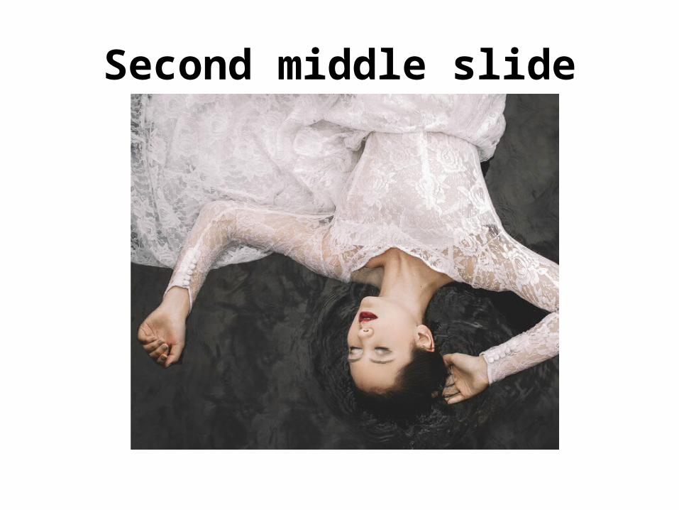
Second middle slide
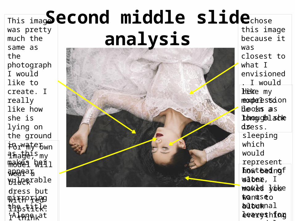
Second middle slide analysis
This image was pretty much the same as the photograph I would like to create. I really like how she is lying on the ground in water as this makes her appear vulnerable, mirroring the title ‘Alone at the Station’.
For my own image, my model will wear a black dress but with red lipstick. I think this is a really feminine look which photographs well.
I chose this image because it was closest to what I envisioned. I would like my model to be in a long black dress. Her expression looks as though she is sleeping which would represent how being alone makes you want to block everything out.
Instead of water, I would like to use autumnal leaves for my model to lie on.

Third Middle Slide

Third Middle Slide analysis
I really like how this image is in a forest, and this is something I have planned to have as a theme throughout the middle slides, right by some train tracks. I think it creates an eerie, mysterious feel to the photo.
I really like how this is a full length shot as more of the backdrop can be shown as well as the beautiful dress. I think this would be really effective as a middle part to the digipak.
Again, my model will be wearing a black dress and so my background may need to be slightly brighter, featuring orange and yellow autumnal tones for t the dress to contrast against.
I really like how the model is positioned in the centre of the image, which I something I plan to do. The way she is stood makes her look as though she is looking for something, again fitting my album title.

Fourth Middle Slide

Fourth Middle SlideI really wanted to include some close up portrait shots. I think when shot well, these photos can look beautiful as middle slides in a digipak.The purple heather in the background of this photo looks beautiful, as the model is the part of the photograph in focus. If I can use an autumnal background for my images, the black dress and dark hair o f my model with contrast really nicely.
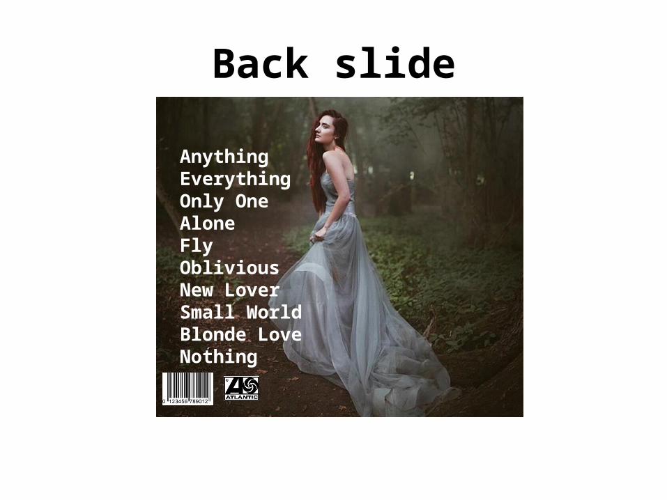
Back slide
AnythingEverythingOnly OneAloneFlyObliviousNew LoverSmall WorldBlonde LoveNothing

Back slide analysisThe back slide of my digipak will be in the same location as the cover photo at a train station, but this time she will have her back to camera. I came up with this idea because the front is an opening and the back a closure, so it’s almost metaphorical.
The titles of the songs are in the same white sans serif font as the front cover. This shows continuity throughout the album and I also plan to use this font for my magazine advert too. I like this font because it is simple and doesn’t distract away from the photograph.
I really like the stance of the model here, as her back is mainly facing away from the camera, however she is looking to the side. I think this captures a beautiful shot.
In the bottom left hand corner, I have included a barcode to enable the consumer to purchase the product, and a record label to show who the artist are with. Here, I will create my own record label logo and insert it for the actual digipak that I create.
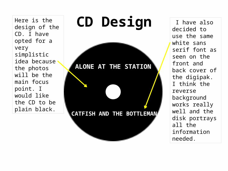
CD Design
CATFISH AND THE BOTTLEMAN
ALONE AT THE STATION
Here is the design of the CD. I have opted for a very simplistic idea because the photos will be the main focus point. I would like the CD to be plain black.
I have also decided to use the same white sans serif font as seen on the front and back cover of the digipak. I think the reverse background works really well and the disk portrays all the information needed.