digital graphic narrative
TRANSCRIPT
Digital Graphic Narrative
Development
Karim Abdalla
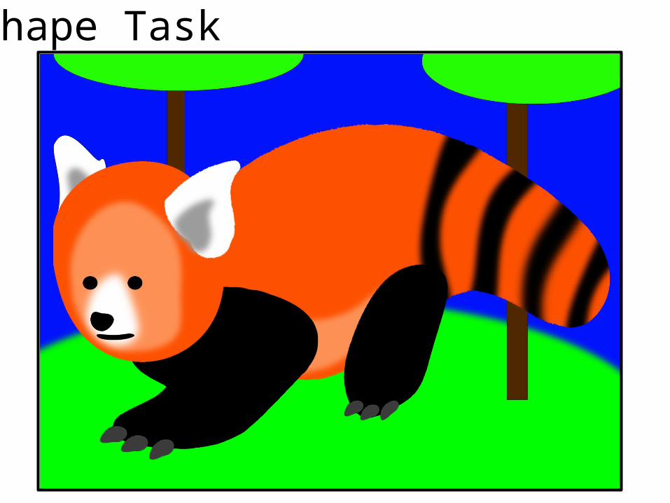
Shape Task
EvaluationWhat did you like about your image?I really like how you can instantly identify which animal it is, even though the animal I have chosen, which is a red panda, is a little obscure. This is due to the simplicity in some places of the picture, such as the main torso and legs, but complicated enough in parts like the tail giving it stripes to make it stand out and really tell you what animal it is. I also like the effects that I’ve used on the shapes to improve how the picture looks and add more detail, even though I didn’t use effects like the gradient tool which I didn’t really feel would have fit in my picture, I did use the Gaussian blur. I used this tool on the stripes on the tail, the inner face, belly and ears. I did this to simulate a fur effect and would have done it all over the panda however when I tried this I felt that it made it look like it was moving and I didn’t like this, because of this I reserved the Gaussian blur tool to parts of the panda that wasn’t on edges, and I feel the effect it made worked really well when applied this way. The next thing I like about this image is the colour scheme of the panda itself, I chose to keep it simple, only really using three colours, which are orange, a peach like colour and gray, and then black and white. Because of this it kept the picture simple but definable and looks very good as I am going for a cartoon type design, as well as this you can tell what the animal is, which is needed for an animal like a red panda which is slightly obscure.
What would you improve if you did it again?One of the biggest things in the picture that I would improve if I did it again would be the back legs, or leg in my case. I really feel like it should have had two back legs, but I couldn’t make it work due to how the panda is standing the original picture I copied the picture off not being able to see the back leg fully if at all, however I feel for my picture I should have put it in, but a mix of the panda just not looking correct and the claws not looking right on the leg meant I couldn’t make it work. Another thing I would improve if I made the picture again is the face, I feel like the face looks very emotionless and in a cartoon character this is a very bad trait due to the face being the only real part of the cartoon which shows any emotion, because of this I would change the face and make it more expressive and add more detail.
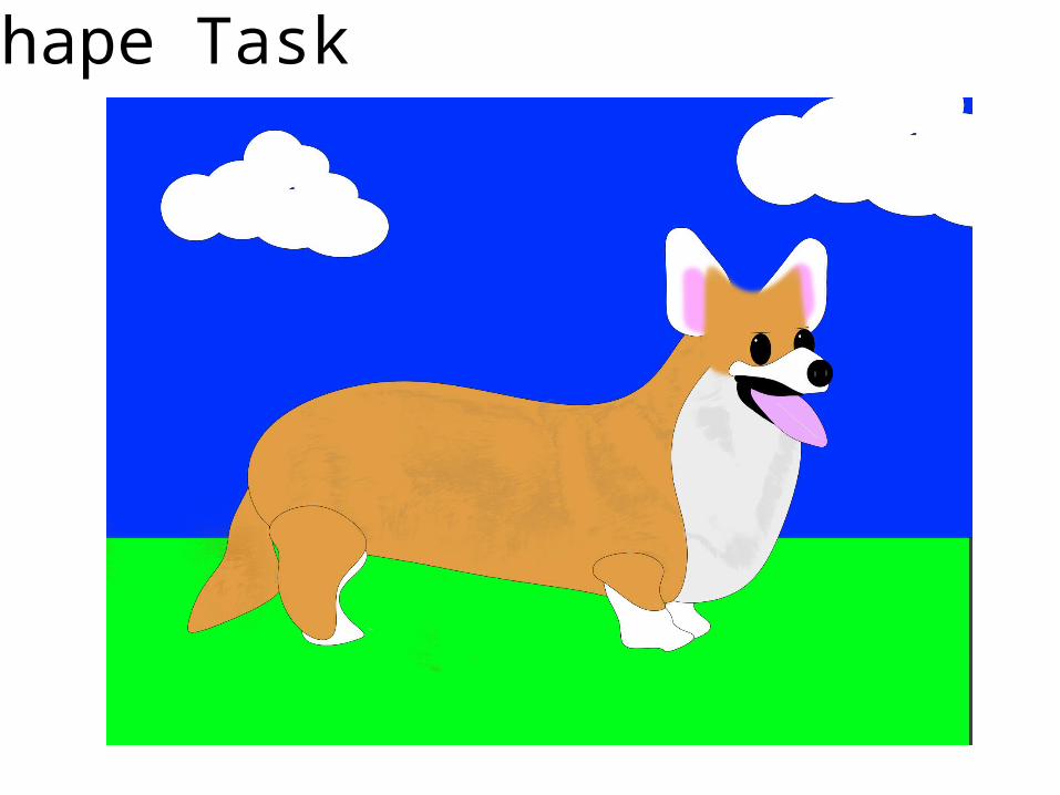
Shape Task
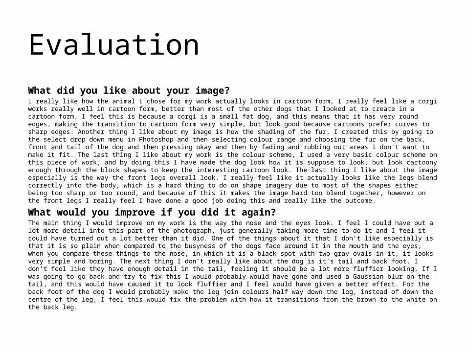
EvaluationWhat did you like about your image?I really like how the animal I chose for my work actually looks in cartoon form, I really feel like a corgi works really well in cartoon form, better than most of the other dogs that I looked at to create in a cartoon form. I feel this is because a corgi is a small fat dog, and this means that it has very round edges, making the transition to cartoon form very simple, but look good because cartoons prefer curves to sharp edges. Another thing I like about my image is how the shading of the fur, I created this by going to the select drop down menu in Photoshop and then selecting colour range and choosing the fur on the back, front and tail of the dog and then pressing okay and then by fading and rubbing out areas I don’t want to make it fit. The last thing I like about my work is the colour scheme, I used a very basic colour scheme on this piece of work, and by doing this I have made the dog look how it is suppose to look, but look cartoony enough through the block shapes to keep the interesting cartoon look. The last thing I like about the image especially is the way the front legs overall look. I really feel like it actually looks like the legs blend correctly into the body, which is a hard thing to do on shape imagery due to most of the shapes either being too sharp or too round, and because of this it makes the image hard too blend together, however on the front legs I really feel I have done a good job doing this and really like the outcome.
What would you improve if you did it again?The main thing I would improve on my work is the way the nose and the eyes look. I feel I could have put a lot more detail into this part of the photograph, just generally taking more time to do it and I feel it could have turned out a lot better than it did. One of the things about it that I don’t like especially is that it is so plain when compared to the busyness of the dogs face around it in the mouth and the eyes, when you compare these things to the nose, in which it is a black spot with two gray ovals in it, it looks very simple and boring. The next thing I don’t really like about the dog is it’s tail and back foot. I don’t feel like they have enough detail in the tail, feeling it should be a lot more fluffier looking. If I was going to go back and try to fix this I would probably would have gone and used a Gaussian blur on the tail, and this would have caused it to look fluffier and I feel would have given a better effect. For the back foot of the dog I would probably make the leg join colours half way down the leg, instead of down the centre of the leg, I feel this would fix the problem with how it transitions from the brown to the white on the back leg.
Rotoscope
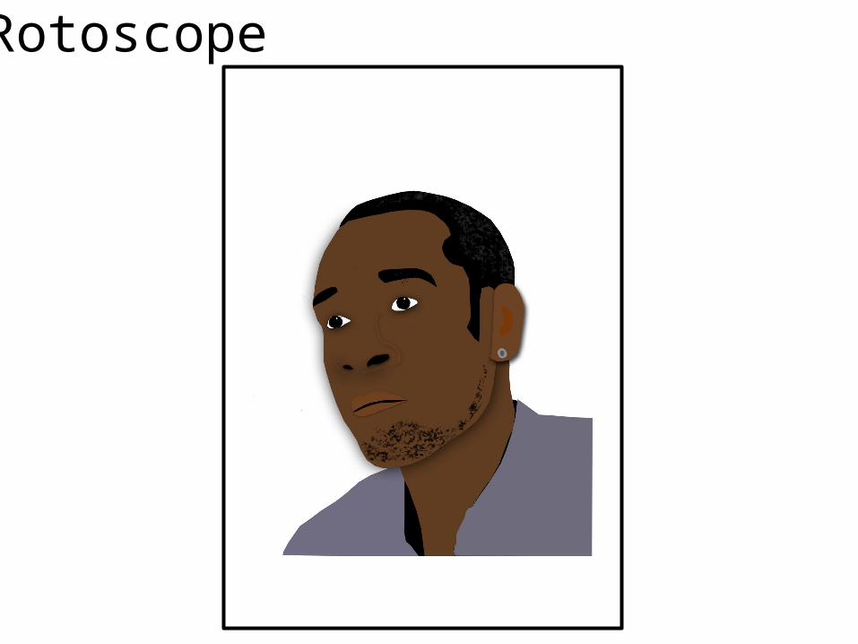
EvaluationWhat did you like about your image?The first thing I like about this image is how the I used the colour range tool to make the hair and the beard on him. I really feel this added some good depth to the picture and helped it out a lot to pop out and actually look like the person that it is actually based on, which is a common thing that doesn’t happen with rotoscoped images of people due to the images looking flat and very squared at the corners, which obviously isn’t how people really look in person. Another thing I really liked about my image is how the eyes both seem to be looking the same way and actually look to have some sort of emotion in them, they don’t just look flat. I think I achieved this by not actually putting an inner pupil into the eyes, but putting the white spots in the corner of his eyes to make it look like light are going into them and actually made the eyes be looking in the same direction, which I feel instills emotion into the rotoscoped image which is otherwise quite an emotionless art style when compared to other things you can do, such as actual photography which generally has a lot more emotion in it.
What would you improve if you did it again?The main thing I really didn't like on this image is the way the nose looks, because of the angle that the picture is taken at, the nose on the original picture was very hard to actually turn into a rotoscoped image using the techniques I generally use to actually create noses, which I do by drawing the outline of the nose and then letting the viewer of the pictures brain tell them it's a nose, like an optical illusion. However for this picture I should have maybe taken more time actually experimenting with actually drawing the nose as a separate entity, or just taken more time perfecting the optical illusion and making it work well, however I didn't get around to it and feel because of this my work suffered quite a lot on this piece of work because of this. Another thing I would do to improve this piece of work would be to add more detail to the shirt, I left the shirts on both of my rotoscopes very plain, however I feel now I am looking back on it that this was a bad idea, and I should have added more detail to this picture as I like the base image of the shirt, and the design of it, a lot more.
Rotoscope
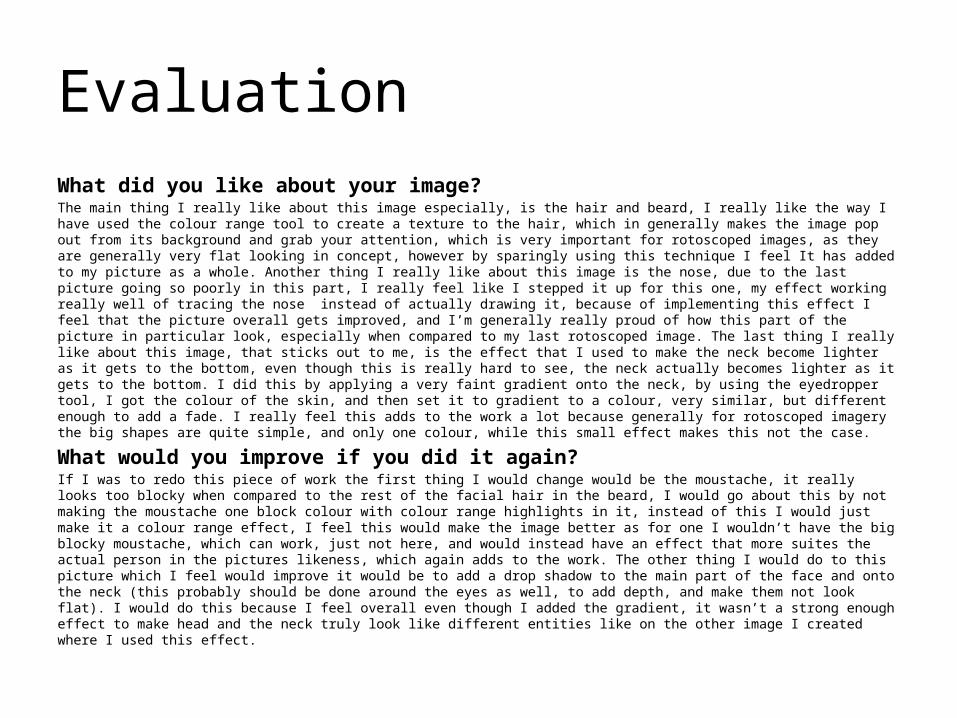
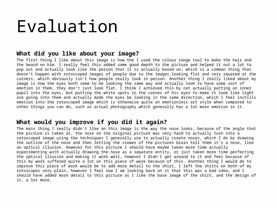
EvaluationWhat did you like about your image?The main thing I really like about this image especially, is the hair and beard, I really like the way I have used the colour range tool to create a texture to the hair, which in generally makes the image pop out from its background and grab your attention, which is very important for rotoscoped images, as they are generally very flat looking in concept, however by sparingly using this technique I feel It has added to my picture as a whole. Another thing I really like about this image is the nose, due to the last picture going so poorly in this part, I really feel like I stepped it up for this one, my effect working really well of tracing the nose instead of actually drawing it, because of implementing this effect I feel that the picture overall gets improved, and I’m generally really proud of how this part of the picture in particular look, especially when compared to my last rotoscoped image. The last thing I really like about this image, that sticks out to me, is the effect that I used to make the neck become lighter as it gets to the bottom, even though this is really hard to see, the neck actually becomes lighter as it gets to the bottom. I did this by applying a very faint gradient onto the neck, by using the eyedropper tool, I got the colour of the skin, and then set it to gradient to a colour, very similar, but different enough to add a fade. I really feel this adds to the work a lot because generally for rotoscoped imagery the big shapes are quite simple, and only one colour, while this small effect makes this not the case.
What would you improve if you did it again?If I was to redo this piece of work the first thing I would change would be the moustache, it really looks too blocky when compared to the rest of the facial hair in the beard, I would go about this by not making the moustache one block colour with colour range highlights in it, instead of this I would just make it a colour range effect, I feel this would make the image better as for one I wouldn’t have the big blocky moustache, which can work, just not here, and would instead have an effect that more suites the actual person in the pictures likeness, which again adds to the work. The other thing I would do to this picture which I feel would improve it would be to add a drop shadow to the main part of the face and onto the neck (this probably should be done around the eyes as well, to add depth, and make them not look flat). I would do this because I feel overall even though I added the gradient, it wasn’t a strong enough effect to make head and the neck truly look like different entities like on the other image I created where I used this effect.
Text Based
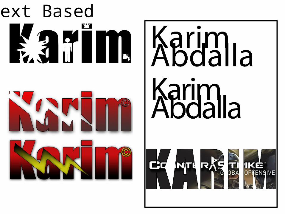
EvaluationWhat did you like about your image?The main thing I like about my images of text is the way the lightning bolt connects the first four letters of my name and then is connected to the "M" with the copyright symbol which is in the same colour. This also looks really good because of the bright yellow having the same gradient over it as the red on the text as well, however the gradient, like on the red, is very faint, and isn't the main attention grabber of the text. And also because the gradient in inverted, so for the red to black gradient on the text itself, the black is at the bottom of the gradient and the red is at the top, however on the yellow lightning bolt, the gradient is reversed, having the yellow on the bottom and the black at the top. This connects the text and the lightning bolt better and makes it stick out more, if it was black at the bottom for both of them, then the bottom of the lightning bolt and the text would blend into one, and overall not look as good. Another thing I like about my text in general is the effect I have done on the text at the bottom right with the counterstrike logo across it. This effect has been achieved by making the size of the gap in-between the text smaller and choosing a bold font which lets you get a lot of information in the text, without the bold font and the gap being made shorter, the effect wouldn't work as well, if at all. I pulled up the image I wanted behind my text, and created a clipping mask which results in the effect you can see.
What would you improve if you did it again?The main thing I feel I could improve in my text is the background image for the text at the bottom right, I should have probably picked an image with no writing on it, the reason I think this would have been a good idea because text is a lot harder to read when there is gaps in the middle of the word where it passes over to the next letter, while a picture doesn't have the same problem to as much of a degree, with your brain filling in the blanks and you can even position the picture to make it so the blanks have not a lot of the picture that's important in them, which is not really possible with text as you need every letter to help you read the word more clearly. The other big thing I would do is add a picture of the flash and use a clipping mask, make it small, put a colour overlay on it of a red and yellow gradient and put it in the bottom right of my finished text. As I have tried to give it a theme of the super hero "the flash" however, apart from the lightning bolt, you can't really tell this, I feel by adding this to the image, it would fill in the blank space in the "M" and would overall add to the theme of the text.
Comic Book 1
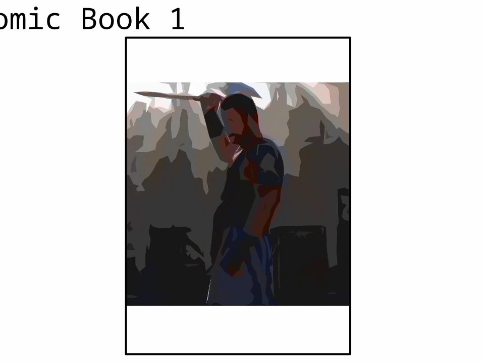
EvaluationWhat did you like about your image?For image one there are a few things I like about it. The main one being that you can still see both his arms and the light coming from the sky behind him. I found this quite difficult to do, this because it didn’t allow me to use the threshold tool which I used in my other pictures to great success due to it either making the picture too dark and you not being able to see his arms or axe, or too light into which the sky would just flood through the picture making it all white behind him, or at least too white for my liking for the type of idea I was going for with this picture. The second thing I like a lot about this picture is the way you can still faintly make most of the things that were in the original image, such as the buildings behind him, and you get a decent idea of the armour he’s wearing, this was tricky too do, however after messing with the lighting details and using the luminosity option, it gave you the glow you can see in the final picture in which the colours of his body are almost coming away from him.
What would you improve if you did it again?The main thing I would do if I was too remake the image again would be too try and actually make the axe more visible, I would go about this by trying out different styles of print mixed with this one, maybe using rotoscope and using the polygonal lasso to put the axe on a different layer and define it a lot more, making it pop out more and adding some more depth to the picture, this would also make the angles of the axe more defined and would make the head of the axe a lot easier to see, as now, unless you know what it is, it just looks like a stick, and the head of the axe is almost invisible due to the colours of the buildings behind him and the colour of his axe being a very similar colour, and this is all made worse by the sky being so white and overpowering parts of the image. The next thing I would try to improve if I did this again would be too add an eye to his head, I feel this is necessary as at the moment the body of the character in the centre is very defined however the head has nothing on it that you really want to focus on. Because of this I would go about adding an eye, I feel it would sort out this issue. I would add it by rotoscoping the base images eye and then just making it a black dot and put it on the layer above the image.
Comic Book 2
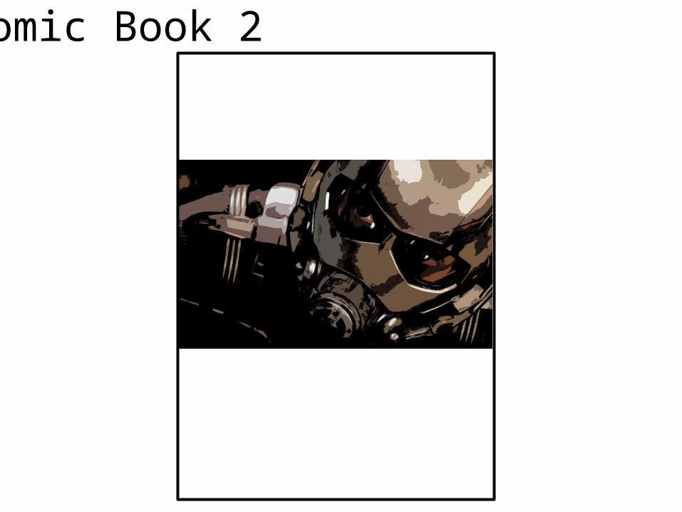
EvaluationWhat did you like about your image?Image two is honestly my favourite picture overall, probably because it’s the only comic book character I actually did to a comic book Photoshop style, and because of this I really feel it turned out great. I achieved the overall image by using a low threshold and a low filter gallery effect. This is probably the closest out of all of my work to the original picture, but this is because the original picture didn’t need a lot of editing to become a picture that looks really great. I also made this picture to show how you don’t actually have to adjust the levels of an image too much to make a big difference in the picture, when comparing it to the original image. The main place you can see this is the eyes of this picture, the eyes in the original picture where a bright orange, and while the lighting option I picked dulled down a lot of the colour on the page, the orange was strong enough to stay, but only slightly and has picked up a lot of shadow, making it look like he is looking at something incredibly intimidating and stronger than him, which is a common theme in the super hero genre. The other big thing I like about the image is how the light that was there to begin with is still there, such as on his forehead and on his shoulder, there was reflections of light, and while they are still there, they appear slightly differently when you’ve applied cut out filter gallery to it, making the reflections look harsher and stand out a lot more as a more prominent part of the image, while before it would just blend in and add subtly to the picture.
What would you improve if you did it again?The main thing I would do to this image to improve it is maybe see what the eyes would look like if the orange tint on the goggles over the eyes would look like if it was brighter, and even though I like it how it is when it comes to that aspect of the image, I can’t help but feel, because the image is not very bright while the actually super hero is bright red and silver, that adding brighter eyes by rotoscoping and selecting the outline of the eye holes and then brightening them up couldn’t hurt and would add brightness to a photo that’s otherwise very dark, adding a nice contrast where there really isn’t any in this picture. The other big thing I would do to this image would be to add some kind of light from the bottom right of the picture, this is because when you look at the picture, there is a lot of evidence of light entering this picture from that angle, such as the reflections on the top of his helmet and the shadow cast by the front of his mask, however In my picture there isn’t actually any light entering the image, and this makes it look slightly strange I would fix this by using the light effects tool under the filter menu to create a light coming in from the bottom right that is more prominent, and fixing the problem.
Comic Book 3
EvaluationWhat did you like about your image?Out of all three of the images this is by far the most striking, and different to the source material that I used and there is a good reason for this, this picture has the most editing out of the three pictures and I had to apply some interesting effects to get it where I wanted it. The big thing I did to this image was to put the threshold up incredibly high compared to my other two pictures and it created an effect where I couldn’t see a lot of the original image, however I wanted the main features of the picture to stay, these being the bow, a decent amount of his body, his quiver and arrows and his arms. I got all of these things in the picture while still using the incredibly high threshold, and because of this I feel the image has turned out really well and exactly how I wanted it. Another thing I like about this image is the way the shadows and the light in-between them actually build up the picture and work off of each other to create an image, instead of just being boring and the only real thing you can see in the image being the character itself, but happily I have also managed to keep some of the background, and even though there isn’t much, there is enough to create a scene instead of just having the character.
What would you improve if you did it again?The main thing I feel could be improved with my third picture is the hair, you really can’t see it, however when it comes to the character I have chosen, his hair is one of the most important parts of his look and is very important in his character design. Because of this I should have made it so I can see the hair more and better, with only a very small amount of the actual hair making it into my final edit. I would do this by actually taking the base image and then using the polygonal lasso to rotoscope some more of the hair into the space where his hair would actually be, this would fix the biggest and most striking issue with my image. The next thing I would do, would be again to use the polygonal lasso and actually put a white pupal into the right eye, I feel this would add more definition to the face, and because of the lack of outline on the face, and detail in general, this would help with visualising the shape of it, because of the style I have chosen while editing this image.

Photography
Evaluation
What did you like about your image?
What would you improve if you did it again?
Illustration

Evaluation
What did you like about your image?
What would you improve if you did it again?
Initial Ideas
Mood board of inspiration
Idea Generation
Mood board of chosen idea
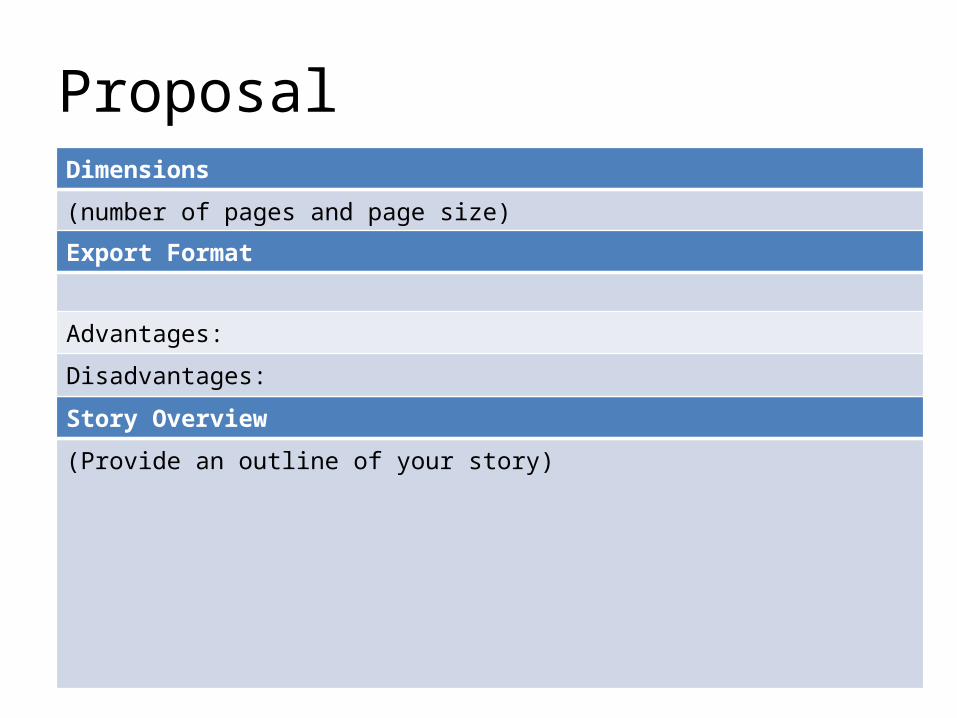
ProposalDimensions
(number of pages and page size)
Story Overview
(Provide an outline of your story)
Export Format
Advantages:
Disadvantages:
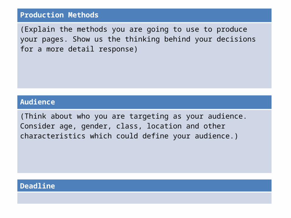
Deadline
Audience
(Think about who you are targeting as your audience. Consider age, gender, class, location and other characteristics which could define your audience.)
Production Methods
(Explain the methods you are going to use to produce your pages. Show us the thinking behind your decisions for a more detail response)

What are the strengths of the proposal? What areas of the proposal need further work?
What are the strengths of the idea generation? What areas of idea generation could have been further developed?
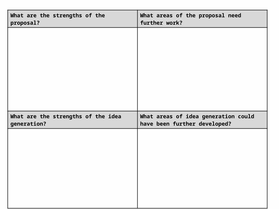
What are the strengths of the proposal? What areas of the proposal need further work?
What are the strengths of the idea generation? What areas of idea generation could have been further developed?

What are the strengths of the proposal? What areas of the proposal need further work?
What are the strengths of the idea generation? What areas of idea generation could have been further developed?
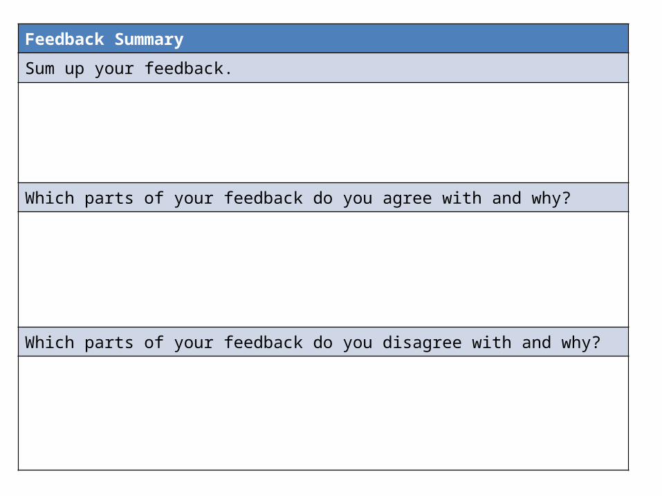
Feedback Summary
Sum up your feedback.
Which parts of your feedback do you agree with and why?
Which parts of your feedback do you disagree with and why?

Storyboards

Storyboards
Storyboards

Original Script
Original Script goes here with link to where it came from
Original Script
Original Script goes here with link to where it came from
Final Script
Final script goes here.
Digital Flat Plans