dissertation - comparative study of sentiment detection
TRANSCRIPT

Comparative Study of Sentiment Detection Techniques for Business Analytics
by
Heather Avery
A dissertation submitted to the Graduate Faculty of Auburn University
in partial fulfillment of the requirements for the Degree of
Doctor of Philosophy, Computer Science & Software Engineering
Auburn, Alabama December 12, 2015
Approved by
N. Hari Narayanan, Chair, Professor, Department of Computer Science & Software Engineering Dean Hendrix, Associate Professor, Department of Computer Science & Software Engineering
Fadel Megahed, Associate Professor, Department of Industrial & Systems Engineering Levent Yilmaz, Professor, Department of Computer Science & Software Engineering

ii
Abstract
As the amount of data proliferates, businesses are faced with a plethora of decision
support opportunities and often times lack a prescribed set of techniques to speed up or even
handle analysis opportunities. The primary purpose of this research is to identify the most
effective sentiment detection technique using an experimentation approach, involving
comparison studies. The second part of the research is to make a useful and original contribution
by developing a conceptual framework containing relevant business questions with automated
problem-solving and visualization approaches for business decision support. Implementation of
this software program includes development of a conceptual framework, containing relevant
business questions, and realizing its practical implementation for business decision support.
Based on our experience working in business analytics in the insurance industry, we selected five
questions to focus on: 1) what if any relationship exists between daily social sentiment and daily
stock price, 2) what if any relationship exists between positive social sentiment volumes and
sales volumes, 3) what if any relationship exists between negative social sentiment volumes and
sales volumes, 4) what if any relationships exist between quarterly financial results and
sentiment, and 5) what if any relationship exists between the overall state of the financial market
and stock price.
The development of a business decision support framework was accomplished by
investigating two possible approaches to designing and validating components of the proposed
framework: a system design approach or an experimentation approach. A system design

iii
approach involves making an initial, informed choice of data analysis and visualization
techniques for each question, designing and prototyping a decision support system that covers all
questions, studying the effectiveness of the system, determining any necessary modifications,
and based on the results, redesigning the system. An experimentation approach, on the other
hand, required making and testing hypothesis about appropriate data analysis and visualization
techniques for one business question at a time, developing the solutions, testing the solutions
with business analysts, and revising as necessary. Subsequent research followed the latter of
these approaches toward the goal of developing a conceptual framework and realizing its
practical implementation for business decision support.

iv
Acknowledgements
I am very grateful to several people who assisted me along the way as well as to my
dissertation committee. Dr. Narayanan oversaw my research and shared valuable advice
throughout the process that guided the initial proposal to fruition. In addition, Dr. Megahed
provided a wealth of research publications, as well as a Twitter extraction program developed by
William Murphy, under Dr. Megahed’s supervision. I am also very appreciative to William
Murphy for trouble-shooting initial challenges with the Python Twitter scraper. The support that
both Mark Allen Bair and Anna Mummert provided was crucial in establishing the sentiment
detection process. They dedicated many hours, individually and in a group setting, to manually
review Tweets on their summer semester break. Mike Booth also provided urgent, last-minute
support, to include working over the weekend. He performed an automated data type conversion
for a Tweet date field needed for the software development.
I would like to thank Aflac for supporting me through schedule flexibility to conduct this
research. Reflecting on early studies, it was Teresa White who said, “You have to finish this!
Keep going! You cannot give up!” Brian Abeyta also shared great advice and kind words that
provided continual motivation during this journey. Kevin Dunlap played a pivotal role in
accelerating the progress of the dissertation. His support and encouragement drove the
substantive progress that occurred in the final stages of the dissertation. Not only did he set the
tone for others to take on more work responsibilities, which allowed for greater dissertation
focus, he also granted leniency regarding my presence in meetings and for assignments where I
was a key contributor. Finally, I’d like to thank my family, as they motivated me from the
beginning, by fostering an environment of creativity and big-thinking – and giving me courage
and confidence to achieve any goal.

v
Biography
Heather Avery is Director of the Business Analytics department within the Center of
Excellence division at Aflac. Heather joined Aflac in 2001 and held various positions ranging
from analyst, business process consultant, management and senior management roles to her
present role. Heather worked in Policy Service, Change Management, Strategy & Planning, and
Marketing departments within Aflac; in analytical and operations research capacity. Prior to
joining Aflac, Heather was a credit manager for Wells Fargo and an auditor at Callaway
Gardens. Heather holds both a master's degree in computer science and a bachelor's degree in
psychology from Columbus State University. Heather also earned a master's degree in business
administration from Auburn University in 2010.
In her current role, Heather leads the operations of the Business Analytics department.
This department partners with the operational business areas to lead strategic initiatives, provide
actionable, knowledge-based analytics, and builds foundational capabilities that support
management of operational efficiency and service delivery. The primary focus areas of analysis
include Customer Analytics, Resource Analytics, and Analytics Oversight. Heather’s
organization relies heavily on the Cross Industry Standard Process for Data Mining (CRISP-DM)
to carry out descriptive, diagnostic, predictive, and prescriptive analytic solutions. Heather’s
goal with pursuing her PhD is that she will gain the required skill sets to advance her
organization to a future state reliant upon automated analytical techniques to efficiently exploit
the large amounts of data relevant to answering key business questions.

vi
Table of Contents
Abstract ........................................................................................................................................ ii
Acknowledgements ..................................................................................................................... iv
Biography ...................................................................................................................................... v
List of Tables ............................................................................................................................... ix
List of Figures .............................................................................................................................. x
List of Abbreviations .................................................................................................................. xi
1. Problem Statement ................................................................................................................ 13
1.1 Problem Definition .................................................................................................. 13
1.2 Problem Relevance ................................................................................................. 17
2. Literature Review .................................................................................................................. 21
2.1 Machine Learning Techniques: An Overview ........................................................ 21
2.2 Machine Learning Techniques: A Comparative Analysis ...................................... 23
2.3 Discussion of Selected Relevant Papers ................................................................. 26
3. Research Roadmap ................................................................................................................ 70
3.1 Data Understanding ................................................................................................. 70
3.2 Other Considerations .............................................................................................. 77
3.3 Anticipated Benefits ................................................................................................ 77
4. Preliminary Experimentation ................................................................................................ 79
4.1 Data Collection ....................................................................................................... 79
4.2 Method .................................................................................................................... 79
4.3 Results: Sentiment Classification ........................................................................... 80
4.4 Results: Top Twitter Contributors to Positive and Negative Sentiment ................. 86

vii
4.5 Conclusion .............................................................................................................. 91
5. Refined Experimentation ...................................................................................................... 93
5.1 Data Collection ....................................................................................................... 93
5.2 Method .................................................................................................................... 96
5.2.1 Keyword Spotter ...................................................................................... 96
5.2.2 Naïve Bayes ........................................................................................... 101
5.2.3 Maximum Entropy ................................................................................. 103
5.2.4 Decision Trees ....................................................................................... 104
5.3 Results ................................................................................................................... 105
5.3.1 Keyword Spotter .................................................................................... 106
5.3.2 Naïve Bayes ........................................................................................... 106
5.3.3 Maximum Entropy ................................................................................. 107
5.3.4 Decision Trees ....................................................................................... 108
5.4 Conclusion ............................................................................................................ 109
6. Software Design .................................................................................................................. 111
6.1 Requirements ........................................................................................................ 111
6.2 Design Representations ......................................................................................... 113
6.3 Analytical Evaluation ............................................................................................ 119
7. Software Evaluation ............................................................................................................ 121
7.1 Cognitive Walkthrough ......................................................................................... 121
7.1.1 Participants ............................................................................................. 121
7.1.2 Procedure ............................................................................................... 122
7.1.3 Results .................................................................................................... 124
viii
7.2 Changes to Design ................................................................................................ 127
7.3 Usability Test ......................................................................................................... 133
7.3.1 Participants ............................................................................................. 133
7.3.2 Procedure ............................................................................................... 136
7.3.3 Results .................................................................................................... 138
7.4 Industry Software Comparison .............................................................................. 140
8. Conclusion and Future Research ........................................................................................ 144
References ............................................................................................................................... 148
Appendix 1 .............................................................................................................................. 155
Appendix 2 .............................................................................................................................. 156

ix
List of Tables
Table 1.1 Business Questions that Arise in the Insurance Industry ........................................... 14
Table 2.1 Machine Learning Properties by Model .................................................................... 24
Table 3.1 Business Questions & Data Elements Matrix ............................................................ 71
Table 6.1 Functional Requirements ......................................................................................... 111
Table 6.2 Usability Requirements............................................................................................. 112
Table 6.3 User Experience Requirements ................................................................................. 112
Table 6.4 Essential Use Case (EUC) ....................................................................................... 116
Table 6.5 Analytical Evaluation Complexity ........................................................................... 119
Table 7.1 Task 1 Cognitive Walkthrough ................................................................................ 124
Table 7.2 Task 2 Cognitive Walkthrough ................................................................................ 125
Table 7.3 Task 3 Cognitive Walkthrough ................................................................................ 125
Table 7.4 Task 4 Cognitive Walkthrough ................................................................................ 126

x
List of Figures
Figure 2.1 Ingredients for Machine Learning Concept Document ............................................ 26
Figure 2.2 Example Illustration of a PivotGraph Output ........................................................... 50
Figure 3.1 Cross Industry Standard Process for Data Mining (CRISP-DM) ............................. 74
Figure 3.2 Example Storyboard ................................................................................................. 76
Figure 4.1 String Matching First Experiment Results ............................................................... 82
Figure 4.2 String Matching Accuracy Review of Five Samples ............................................... 84
Figure 4.3 Naïve Bayes Accuracy of Three Experiments .......................................................... 86
Figure 4.4 Aflac’s Top 10 Positive Tweet Contributors ............................................................ 87
Figure 4.5 Allstate’s Top 10 Positive Tweet Contributors ........................................................ 88
Figure 4.6 Allstate’s Top 10 Negative Tweet Contributors ....................................................... 88
Figure 4.7 Cigna’s Top 10 Positive Tweet Contributors ........................................................... 89
Figure 4.8: Colonial Life’s Top 10 Positive Tweet Contributors .............................................. 91
Figure 5.1 Microsoft Access Storage Screenshot ...................................................................... 96
Figure 5.2 Positive Sentiment Expressions ................................................................................ 98
Figure 5.3 Negative Sentiment Expressions .............................................................................. 98
Figure 5.4 One of Eight Switch Functions Used to Create the Keyword Spotter ..................... 99
Figure 5.5 Keyword Spotter Function Made Up of Eight Switch Functions ............................. 99
Figure 5.6 Sample Tweet ......................................................................................................... 100
Figure 5.7 Switch Function That Evaluated “Stupid” As Negative Sentiment ....................... 100
Figure 5.8 Keyword Spotter Sentiment Classification Accuracy by Method .......................... 106
Figure 5.9 Naïve Bayes Sentiment Classification Accuracy by Method ................................. 107
Figure 5.10 Maximum Entropy Sentiment Classification Accuracy ....................................... 108

xi
Figure 5.11 Decision Tree Sentiment Classification Accuracy ............................................... 109
Figure 6.1 Persona ................................................................................................................... 113
Figure 6.2 Scenarios by Core Task .......................................................................................... 114
Figure 6.3 Hierarchical Task Analysis (HTA) ......................................................................... 115
Figure 6.4 Sentiment Analysis Software for Business Analytics Use Case ............................ 117
Figure 6.5 Sentiment Analysis Software for Business Analytics GOMS ................................ 118
Figure 6.6 Software Architecture ............................................................................................. 120
Figure 7.1 Main Menu Screenshot Pre Cognitive Walkthrough .............................................. 128
Figure 7.2 Main Menu Screenshot Post Feedback from Cognitive Walkthrough ................... 129
Figure 7.3 Output Screenshot Pre Cognitive Walkthrough ..................................................... 131
Figure 7.4 Output Screenshot Post Cognitive Walkthrough Feedback ................................... 132
Figure 7.5 Participant Education Demographics ..................................................................... 135
Figure 7.6 Salesforce Marketing Cloud Platform Screenshot ................................................. 141

xii
List of Abbreviations
ANN Artificial Neural Networks
CRISP-DM Cross Industry Standard Process for Data Mining
EEA Estimation-Exploration Algorithm
ESSA Emotional Signals for unsupervised Sentiment Analysis
GMM Gaussian Mixture Models
kNN k Nearest-Neighbors
OLAP Online Analytical Processing
PF Peculiarity Factor
RBM Restricted Boltzmann Machine
SRS Simple Random Sampling
SVM Support Vector Machines
TIRBM Transformation Invariant Restricted Boltzmann Machine

13
Chapter 1
Problem Statement
The first section of this dissertation defines the problem being addressed in Section 1.1,
and the relevance of the problem is addressed in Section 1.2.
1.1 Problem Definition
An alarming statistic reported by IBM – that 90% of the world’s data was created in the
last two years – has been repeatedly quoted in various communication outlets (e.g. Forbes, SAP,
Yahoo) since its release in 2012. IBM explains that each day the world creates 2.5 quintillion
bytes of data. So it comes as no surprise that 94% of organizations report that they are managing
and collecting more information prior to two years ago (Oracle, 2012). With businesses facing
this explosion of data, often they are unsure of how to synthesize and derive useful insights from
their own Big Data. In reality, a framework to provide businesses’ analytical resources with
guidance in conducting complex analysis coupled with actionable insights visualized in a way
that executives expect, does not exist.
As the amount of data proliferates, businesses are faced with a plethora of decision
support opportunities and often times lack a prescribed set of techniques to speed up or even
handle analysis opportunities. The primary purpose of this research is to identify the most
effective sentiment detection technique using an experimentation approach, involving
comparison studies. The second part of the research is to make a useful and original contribution
by developing a conceptual framework containing relevant business questions with automated
problem-solving and visualization approaches for business decision support. The result should
be a unique and fully-functioning software program with the ability to process large volumes and

14
variety of data quickly validated through usability testing. Implementation of this software
program includes development of a conceptual framework, containing relevant business
questions, and realizing its practical implementation for business decision support. Below we
discuss some typical questions that arise in insurance operations as listed in Table 1.1:
Table 1.1 Business Questions that Arise in the Insurance Industry
Many of these questions contain a sentiment analysis element, which aligns with the biggest
analytical opportunity for the Financial Service Industry based on a study by IBM Global
Business Services (2012).
Question #1 pertains to discovering what if any relationship exists between daily social
sentiment and daily stock price. Stock price is considered a key performance indicator for public
companies; which means Investors/Investment brokers alike tap into as much information as
possible regarding a decision to buy, hold, or sell shares of stock. Social sentiment is
information that can provide a view into consumers’ perceptions of and experiences with a brand
1. Is there a relationship between daily social sentiment and daily stock prices for the given insurance company?
2. Is there a relationship between positive social sentiment volumes and sales volumes for the given insurance company?
3. Is there a relationship between negative social sentiment volumes and sales volumes for the given insurance company?
4. Is there a relationship between quarterly financial results and social sentiment for the given insurance company?
5. Is there a relationship between the overall state of financial market and stock price for the given insurance company?
Business Questions

15
– and for an insurance company, perception is critical. Understanding what, if any, relationship
exists between social sentiment and stock price can yield actionable insights for an insurance
company. If there is a relationship between social sentiment and stock price, then an insurance
company can look for additional detailed patterns within the sentiment to discover recurring
issues, use the detected sentiment as an opportunity to correct it, and ultimately maintain or
increase stock price. For instance, if a separate deeper-dive analysis reveals that service
turnaround for a particular service is poor; an insurance company can address the specific issue
with the goal to increase positive consumer sentiment and stock price. Data sources required to
answer the business question are publically available; which include Twitter feeds extracted via a
Twitter API and stock prices located at: http://www.nasdaq.com/quotes/historical-quotes.aspx.
Question #2 pertains to discovering what if any relationship exists between positive
social sentiment volumes and sales volumes. The volume of sales is a key performance indicator
for all businesses. Understanding what, if any, relationship exists between positive social
sentiment and sales volumes can yield actionable insights for an insurance company. If there is a
relationship between positive social sentiment and the volume of sales, then an insurance
company can look for additional detailed patterns within the sentiment to discover aspects
working well, use the detected sentiment as a model for positively impacting consumers’
sentiment, and ultimately maintain or increase future sales volumes. For instance, if a separate
deeper-dive analysis reveals that attitudes of call center representatives are caring and kind; an
insurance company may broadly reinforce this behavior internally, in hopes that positive
consumer sentiment increases and sales volumes continue to improve. Data sources required to
answer the business question are publically available; which include Twitter feeds extracted via a

16
Twitter API and sales volumes located at quarterly/annual financial briefings from the respective
insurance company’s website.
Question #3 pertains to discovering what if any relationship exists between negative
social sentiment volumes and sales volumes. The volume of sales is a key performance indicator
for all businesses. Understanding what, if any, relationship exists between negative social
sentiment and sales volumes can yield actionable insights for an insurance company. If there is a
relationship between negative social sentiment and the volume of sales, then an insurance
company can look for additional detailed patterns within the sentiment to discover aspects that
are not working well, use the detected sentiment as a model for positively impacting consumers’
sentiment, and ultimately drive improvements in future sales volumes. For example, if a
separate deeper-dive analysis reveals that the value of the insurance product is poor; an insurance
company may create a different product that provides more perceived value or determine a way
to improve the perception of the existing product, in hopes that consumer sentiment improves
and sales volumes increase. Data sources required to answer the business question are publically
available; which include Twitter feeds extracted via a Twitter API and sales volumes located at
quarterly/annual financial briefings from the respective insurance company’s website.
Question #4 pertains to discovering what if any relationships exist between quarterly
financial results and sentiment. Quarterly financial results are a key performance indicator for
all businesses. Understanding what, if any, relationship exists between financial results and
consumer sentiment can yield actionable insights for an insurance company. If there is a
relationship between financial results and sentiment, then an insurance company can analyze
other avenues to positively impact consumers’ sentiment, such as publishing materials with more
emphasis on philanthropy. Data sources required to answer the business question are publically

17
available; which include Twitter feeds extracted via a Twitter API and financial results located
quarterly/annual financial briefings from the respective insurance company’s website. For
purposes of this research, financial results are defined as earnings per share (EPS).
Question #5 pertains to discovering what if any relationship exists between the overall
state of the financial market and stock price. As mentioned earlier, stock price is considered a
key performance indicator for public companies; which means Investors/Investment brokers
alike tap into as much information as possible regarding a decision to buy, hold, or sell shares of
stock. Understanding what, if any, relationship exists between the financial market and stock
price can yield actionable insights for an insurance company. If there is a relationship between
the financial market and stock price, then an insurance company can identify additional,
controllable drivers of stock price, and place more attention to controllable drivers, in hopes of
counteracting negative impacts from a potentially unfavorable financial market state. Data
sources required to answer the business question are publically available; which include stock
prices located at: http://www.nasdaq.com/quotes/historical-quotes.aspx and overall market
results defined by the S&P 500 stock market index located at http://www.nasdaq.com/.
In this research we explore appropriate data analysis and visualization approaches to
assist human analysts answer these kinds of questions.
1.2 Problem Relevance
The world of Big Data is having a multitude of impacts on businesses around the world in
every industry. Big Data is often characterized by volume, velocity, and variety – where volume
refers to the amount of data being generated, velocity refers to the rate at which data is
processed, and variety refers to the range of data types and sources (ATKearney, 2013). SAS

18
(2013) refers to Big Data as “the exponential growth and availability of data, both structured and
unstructured.” Irrespective of definition, it is evident that more and different types of
information will require additional resources to manage.
According to a 2012 study conducted by Oracle, organizations are faced with
insurmountable increases in data volume, variety, and velocity. In fact, information technology
solutions are a key area that organizations are increasingly relying on for value-creating
opportunities. Oracle launched the 2012 survey with over 300 C-level executives in North
America. Industries surveyed included Airlines, Communications, Consumer Goods, Financial
Services, Healthcare, Life Sciences, Manufacturing, Oil and Gas, Public Sector, Retail, and
Utilities.
Key findings from this study show that businesses are not prepared for the large projected
growth of data (Oracle, 2012). Moreover, 60% of executives indicated that their lack of
preparedness is due to sizable gaps with people, processes, and tools when it comes to leveraging
data. Executives listed areas of frustration with respect to data management. The top four were
customer information, operations, sales/marketing and, most relevant to this paper, the inability
to make sense of available information and translate it into actionable insight. As a result of not
being able to fully leverage data, 93% of executives felt their organization was losing revenue to
the tune of an estimated 14% lost opportunity of annual revenue. For a $1 billion organization,
this lost opportunity translates to $130 million annually (Oracle, 2012).
From an industry perspective, the largest opportunity for leveraging data relates to
sentiment analysis and brand reputation. Opportunities to capture social information and
monitor sentiment are abundant, and brand reputation is one of the key drivers of customer

19
acquisition and retention (Oracle, 2012). In addition, advertisers and public relations industries
cite sentiment analysis as a mechanism to transform their business models and improve
performance (ATKearney, 2013). An example application of sentiment analysis on social media
is determining prospective customers’ reactions to a branding campaign. Conducting sentiment
analysis can entail converting hundreds of millions of Tweets, Facebook postings and customer
reviews, considered unstructured data, into actionable insights (McKinsey Global Institute,
2011). Machine learning and other semi-autonomous tools are mechanisms to improve
businesses’ practices for detecting and tracking public sentiment – with the intent to optimize the
customer experience.
From a data synthesis perspective, one of the biggest resources needed is people, with the
right skill sets to analyze Big Data that many companies are facing. In fact, McKinsey Global
Institute projects that by 2018, the United States alone could face a shortage of 190,000 people
having deep analytical skills (2011). In a Harvard Business Review article, Davenport & Patil
(2012), report on the Data Scientist as “the sexiest job of the 21st century”. The demand for
resources with the right skills sets is high, regardless of title (e.g. Analyst, Data Scientist) and
companies’ best advice received is to train existing resources with the skills needed to perform
the job (IBM Global Business Services, 2012). Brown & Henstorf (2014) confirm that this is the
approach many organizations are taking by focusing on internal development of big data skills.
One way to address the lack of skilled analysts is to develop semi-automated decision support
systems that leverage data analysis and visualization to aid the human analyst. Our research
makes a useful and original contribution toward this through the development of a conceptual
framework and design of a prototype decision support system.

20
The following chapter reviews literature in order to provide a glimpse into the machine
learning discipline and relevant case studies.

21
Chapter 2
Literature Review
In this chapter, a review of relevant literature is provided to further provide context to the
problem and solutions to be explored in proposed research. The first section of this chapter,
Section 2.1, provides an overview of the machine learning discipline, and Section 2.2 provides a
comparative analysis of the various machine learning techniques. These sections are based on a
Machine Learning course taught by a Stanford faculty that the author took through Coursera
(https://class.coursera.org/ml-004) and a thorough review of the book Machine Learning (Flach,
2012). The final section in this chapter, Section 2.3, will include a discussion of selected and
relevant papers, providing additional perspective regarding machine learning and visualization
techniques.
2.1 Machine Learning Techniques: An Overview
In simplest terms, the discipline of machine learning is concerned with the design of and
implementation of algorithms that use training data or past data to learn from it, and then respond
accordingly. Machine learning can be organized into three major components, or what are also
known as “ingredients”: tasks, features, and models (Flach, 2012).
Tasks are referred to as the problems that can be solved with machine learning. At a high
level these problems may include 1) binary and multi-class classification, to identify a
categorical target, 2) regression to identify a numerical target, 3) clustering to identify a hidden
target, and 4) finding underlying structure in general. Settings are also a key aspect of machine
learning tasks. These settings can be split into supervised learning and unsupervised learning for
predictive models and descriptive models. Supervised learning is the task of learning from data
22
that contains labels, while unsupervised learning is the task of learning from data that does not
contain labels. The types of predictive models for supervised learning include classification and
regression and for unsupervised learning include predictive clustering. Classification is
concerned with separating a dataset into discrete valued output, such as 1 or 0; while regression
is concerned with predicting output whether it is continuous or discrete. The types of descriptive
models for supervised learning include subgroup discovery and for unsupervised learning
include descriptive clustering and association rule discovery (Flach, 2012).
Features are referred to as the workhorses of machine learning and can be organized by
its uses, transformations, construction and selection. Features can be used as splits and as
predictors. Splits provide a deeper dive view on an area of the instance space. It can be thought
of as a zoomed-in view of the instance space. The aspect of using features as predictors means
that each feature carries some weight to the final prediction. The weighting is considered precise
and measureable. As it pertains to transformations, examples include but are not limited to: 1)
normalization and calibration which adapt the scale of quantitative features, 2) ordering, which
adds a scale to features where a scale does not exist, 3) unordering, which abstracts away from
unnecessary detail using deduction, and 4) thresholding, which introduces new information
turning quantitative features into categorical or Boolean. As it relates to construction and
selection, there are a number of ways to combine features. Some examples include formation of
a Cartesian product, and taking mathematical combinations of quantitative features. Overfitting
can prove to be an issue, so once features are constructed, it is recommended to select a subset
prior to learning to speed up the process (Flach, 2012).
Models are considered the output of machine learning and are split into three types:
probabilistic, logical, and geometric. Probabilistic models view learning as a mechanism to

23
reduce uncertainty. Major groupings of probabilistic models are discriminative; where data can
be labeled but not generated, and generative, where data can be obtained collectively with their
labels. Logical models are defined in terms of logical expressions and are usually referred to as
trees or rules. Tree-based logical models involve ranking, probability estimation, and variance
reduction. Rule-based logical models, on the other hand, involve ordered lists, unordered lists,
descriptive and first-order logics. Geometric is the third type of model that uses intuitions from
geometry. In geometric models, it is common to carry out functions like separating planes
known as hyperplanes, linear transformations, and distance metrics. Major groupings of
geometric models are linear and support vector machines (SVM). With the linear form, decision
boundaries are constructed by intersecting the line half-way between the centers of mass
considered to be positive and negative. With SVM, the decision boundary is learned from data
considered to be linearly separable while maximizing the margin (Flach, 2012).
Ultimately, a task requires a model with the appropriate mapping from data described by
features to outputs. The mapping secured from training data is what defines a learning problem
(Flach, 2012).
2.2 Machine Learning Techniques: A Comparative Analysis
The properties of machine learning models can be split into five categories showing the
extent to which they: 1) are probabilistic, logical, or geometric, 2) are grouping or grading, 3)
handle discrete and/or real-value features, 4) are used in supervised or unsupervised learning,
and 5) handle multi-class properties. There are many instances where machine learning models
hold characteristics that disallow for mutual exclusivity to strictly one type within these five

24
properties. For this reason, the following table of machine learning properties by model, adapted
from Flach (2012), illustrates the intricacies:
Table 2.1 Machine Learning Properties by Model
Note: Adapted from Flach (2012), Table 1.4, p. 39 – where 0 through 3 represent the degree that the particular feature describes the model, with 0 being no presence of the feature.
While one model in this table, SVM, is equally considered geometric and probabilistic
(or stats), the majority of the models can be grouped as mostly falling into one of the three types
of models. Within this list, there are two models that are mostly considered probabilistic: naive
Bayes and Gaussian Mixture Models (GMM). Three models within this table are considered
mostly or wholly logical: Trees, Rules, and Associations. For the third type, five models within
this table are considered mostly or wholly geometric: k Nearest-Neighbors (kNN), Linear
Classification, Linear Regression, Logistic Regression, and K-means.
Model Prob(stats)
Logic Geometric Grouping Grading Discrete Real Sup UnSup Multi‐Class
Trees 0 3 1 3 0 3 2 3 2 3
Rules 0 3 0 3 1 3 2 3 0 2
naive Bayes 3 1 1 3 1 3 1 3 0 3
kNN 1 0 3 2 2 1 3 3 0 3
Linear Classification
0 0 3 0 3 1 3 3 0 0
LinearRegression
1 0 3 0 3 0 3 3 0 1
Logistic Regression
2 0 3 0 3 1 3 3 0 0
SVM 2 0 2 0 3 2 3 3 0 0
K‐means 2 0 3 1 2 1 3 0 3 1
GMM 3 0 1 0 3 1 3 0 3 1
Associations 0 3 0 3 0 3 1 0 3 1

25
Another aspect depicted within the table is the degree to which a model is considered
grouping or grading in the way that they handle the instance space. The grouping property refers
to the division of the instance space into segments for the purpose of learning a more local
model, while the grading property forms one global model over the instance space representing
the minimalist differences between instances. Based on the table, it is clear that the majority of
the models are either mostly considered grouping or mostly considered grading with one
exception, kNN, which is equally considered grouping and grading. The models that are
considered mostly or wholly grouping include: Trees, Rules, naive Bayes, and Associations. The
models that are considered mostly or wholly grading models include: Linear Classification,
Linear Regression, Logistic Regression, K-means, SVM, and GMM.
A third property of models is the extent to which they can handle discrete and/or real
values. The models that handle discrete values to a greater extent or completely include: Trees,
Rules, Naive Bayes, and Associations. The models that handle real values to a greater extent or
completely include: kNN, Linear Classification, Linear Regression, Logistic Regression, SVM,
K-means, and GMM.
A fourth property of models is the extent to which they are used for supervised or
unsupervised learning. All but three of models are mostly or wholly used for supervised
learning. The three exceptions include: K-means, GMM, and Associations which are wholly
used for unsupervised learning.
The fifth property of models is the extent to which they can handle multi-class problems.
The three models that cannot handle multi-class problems include Linear Classification, Logistic

26
Regression, and SVM. The remaining models can handle multi-class problems to varying
degrees as reflected in the above table.
To summarize these concepts into a coherent structure, we created the following
Ingredients of Machine Learning Concept document:
Figure 2.1 Ingredients for Machine Learning Concept Document
2.3 Discussion of Selected Relevant Papers
The following discussion of selected relevant papers is organized into two parts: 1) the
ingredients that make up machine learning (i.e. tasks, features, models), and 2) the aspect of
visualization, moving from a more tactical discussion on graphs and other visualizations to
holistic storyboards. The first part of the discussion focuses on tasks.
Ingredients for Machine Learning Concept Document
1
TasksThe problems that can be solved with machine learning
ModelsThe output of machine learning
FeaturesThe workhorses of machine learning
GeometricUse intuitions from geometry such as separating (hyper-)
planes, linear transformations and distance metrics
• Linear: constructs a decision boundary by half‐way intersecting the line between the positive and negative centers of mass
• Support Vector Machine: decision boundary learned from the linearly separable data maximizes the margin
LogicalDefined in terms of logical
expressions
• Tree: decision trees, ranking and probability estimation trees, and tree learning as variance reduction (regression)
• Rule: Ordered rule lists, unordered rule sets, descriptive rule, and first‐order rule
ProbabilisticView learning as a process of
reducing uncertainty
• Discriminative:modeling of posterior probability distribution P(Y|X), where Y is the target variable and X are the features – can label but not generate data
• Generative:modeling of the joint distribution P(Y,X) of the target Y and the feature vector X – can obtain new data points together with their labels
Binary and multi‐class classification: categorical target Regression: numerical target Clustering: hidden target Finding underlying structure
Machine Learning Settings
1. Classification (discrete valued output: 1 or 0), regression (predict continuous valued output)
2. predictive clustering
1. subgroup discovery2. descriptive clustering,
association rule discovery
1. Supervised learning (right answers given)
2. Unsupervised learning
Predictive model Descriptive model
Uses
• Features as splits‐ Zooming in on a particular area of the instance space
• Features as predictors
Transformations
• Normalization and calibration adapt the scale of quantitative features
• Ordering adds a scale to features that don’t have one
• Unordering abstracts away from unnecessary detail in a deductive way
• Thresholding does so by introducing new information, turning quantitative features into Boolean or categorical
Construction and Selection
• There are many ways of combining features; such as, forming a Cartesian product, taking arithmetic or polynomial combinations of quantitative features
• Once constructed, it is often a good idea to select a subset prior to learning to speed up learning and guard against overfitting
• A task requires an appropriate mapping – a model – from data described by features to outputs• Obtaining such a mapping from training data is what constitutes a learning problem
Model Prob(stats)
Logic Geometric Grouping Grading Discrete Real Sup UnSup Multi‐Class
Trees 0 3 1 3 0 3 2 3 2 3
Rules 0 3 0 3 1 3 2 3 0 2
naive Bayes 3 1 1 3 1 3 1 3 0 3
kNN 1 0 3 2 2 1 3 3 0 3
Linear Classification
0 0 3 0 3 1 3 3 0 0
LinearRegression
1 0 3 0 3 0 3 3 0 1
Logistic Regression
2 0 3 0 3 1 3 3 0 0
SVM 2 0 2 0 3 2 3 3 0 0
K‐means 2 0 3 1 2 1 3 0 3 1
GMM 3 0 1 0 3 1 3 0 3 1
Associations 0 3 0 3 0 3 1 0 3 1
Machine Learning Properties by Model
• Organize computing clusters• Market segmentation• Social network analysis• Astronomical data analysis
• Anomaly Detection: Fraud detection, manufacturing, monitoring machines in data center vs.
• Supervised Learning: Email spam classification, weather prediction, cancer classification
In Action:

27
Data mining is the process of examining large amounts of data with the purpose to
exposing insights, and identifying patterns and relationships of large unstructured data. Data
mining enables a user to summarize, categorize and explore data on many dimensions. An
important task in data mining is preprocessing; to include, data selection, attribute selection, data
cleansing, and final dataset construction (Sridevi et al., 2010).
Five groupings of temporal data mining tasks are prediction, classification, clustering,
search and retrieval, and pattern discovery. Pattern discovery can be thought of as identification
of frequent patterns or periodic patterns, which can be split into two categories: synchronous
periodic pattern and asynchronous period pattern. Misaligned occurrences are not allowed in
synchronous periodic pattern, so asynchronous periodic pattern is used to overcome this problem
(Sridevi et al., 2010).
Sridevi et al. (2010) explore peculiarity mining and asynchronous periodic pattern mining
as a proposed method to predict time series. Peculiarity mining is the exploration of hidden
relationships or rules in a large database. The goal of this type of data mining is to focus on
unusual data to identify new and different rules. In fact, association and exception rules may fail
to find patterns that peculiarity mining identifies. Two tests using peculiarity factors (PF) can be
used to determine whether or not peculiarity data exist, threshold value and chi-square test. With
a threshold value, data is considered peculiar if the PF value is significantly greater than the
mean of a PF set. A chi-square test can be used with a reasonably large data set to eliminate
peculiar data, such that the new data set can be used for pattern discovery (Sridevi et al., 2010).
Peculiarity mining can identify periodic patterns from time series databases using a four
phase algorithm: Singular Periodic Pattern Mining (SPMiner), Multievent Periodic Pattern

28
Mining (MPMiner), Complex Periodic Pattern Mining (CPMiner), and Asynchronous Sequence
Pattern Mining (APMiner). For each single event, SPMiner identifies valid segments using two
mining strategies, potential cycle detection (PCD) and Hash-based validation (HBV). MPMiner
uses two methods to discover valid segments, Timelist-Based Enumeration (TBE) and Segment-
Based Enumeration (SBE). CPMiner takes a similar approach as SBE in MPMiner, as it
enumerates possible combinations of valid segments from the same period in depth-first order,
then identifying the existence of a complex pattern from the combinations. APMiner represents
the existence of a valid sequence with respect to a pattern (Sridevi et al., 2010).
Time-series prediction refers to forecasting values in the future based on past data.
Predictive models are required to accomplish this task, whereby past data are used to project
future values. The terms independent or explanatory variable and a dependent or target variable
are used to describe the predictor and response variables respectively. A regression equation is
formed from the relationship between the variables and sample data are used to test the equation,
producing precision-recall to measure accuracy (Sridevi et al., 2010).
Other tasks are required as various industries are exploiting insights from social media
sites, such as Twitter and Facebook, to understand social media users' opinions, called sentiment
analysis. As will be seen in Chapter 3, this is of particular relevance to our research. The realm
of emotional signals in social media increases the complexity of sentiment analysis because the
data are unstructured. Hu et al. (2013) set out to solve this challenge by developing an
unsupervised learning framework and comparing performance to other methods when applied to
Twitter datasets. Analysis of social media sentiment can be split into supervised and
unsupervised learning tasks. A sentiment classifier is trained from data labeled manually in
supervised learning. This manual process is time consuming if a new process is established

29
rather than reusing existing techniques. However, Hu et al. (2013) take a different approach
altogether through unsupervised sentiment analysis.
Lexicon-based analysis is a common unsupervised method for analyzing sentiment that
determines sentiment polarity of a particular dataset. Even this method is challenging with the
structure of social media data for a number of reasons. Some of the challenges include: 1) short
length of texts which can be insufficient to provide aggregate social sentiment, 2) new
expressions continuously evolve that are not standard like "gr8!" and "yaaaaay!", and 3) words
have different meanings depending on the domain. For instance, words like "sick", "insane", and
"wicked" have a negative connotation in terms of their literal meanings and can also be used to
communicate the exact opposite meaning when used in another context. The unstructured
existence of social data combined with the short length, fast-evolving and domain-specific nature
make for a particularly complex set of challenges (Hu et al., 2013).
Social media is populous with emotional signals. With a large proportion of
communication considered non-verbal (as high as 93% according to numerous sources), whether
it is bodily gestures, facial expressions, or other types of nonverbal signals, people are creative in
finding ways to incorporate these emotional signals into their social media communications.
Two types of emotional signals are emotion indication and emotion correlation. While emotion
indication represents the polarity of sentiment expressed in social media, emotion correlation
refers to the emotional signals that reflect the relatedness between words posted together (Hu et
al., 2013).
The two datasets used for the experiments that Hu et al. (2013) report, Stanford Twitter
Sentiment and Obama-McCain Debate, are publicly available. The standard dataset of over 40K

30
records was extracted using Twitter API and included corresponding sentiment labels. The
Obama-McCain dataset contained over 3,200 Tweets that were posted at the time of the
presidential debate. MPQA Opinion Corpus was used as a mainstream manually labeled
sentiment lexicon, which contains over 2,700 positive words and over 4,900 negative words (Hu
et al., 2013).
Hu et al. (2013) orchestrated a series of processes to verify emotion indication by
collecting groups of equal number of Tweets from each dataset and splitting them into two
categories of positive emoticons and random Tweets. Two vectors were created, one to represent
each category, along with a two-sample one-tail t-test to validate the emotional indication and
determine whether or not the evidence is significant enough to support the sentiment polarity
hypothesis. Similar verification steps were taken for negative emoticons and random Tweets.
The results show that a relationship exists between emotion indication and social media
sentiments (Hu et al., 2013).
For verifying emotion correlation Hu et al. (2013) used hypothesis testing where a
sentiment difference score was calculated for a pair of words deemed to represent sentiment
polarity. A two-sample one-tail t-test was created to asses two vectors, one consisting of words
occurring in the same post and the other consisting of the sentiment difference score. The results
of this test show that social media contains emotion correlation. Verifying the existence of
emotion indication and emotion correlation are foundational to the remaining modeling
experiments conducted in this research (Hu et al., 2013).
Hu et al. (2013) proposed Emotional Signals for unsupervised Sentiment Analysis
(ESSA) as a new and different framework to model emotional signals. To model post-level

31
emotion indication, the goal is to make sentiment polarity in alignment with emotion indication
of a post, formulated as a minimizing loss function. A penalty is incurred when there is
inconsistency between sentiment polarity and emotion indication. Because there is a positive
correlation between word-level emotion and overall sentiment of a post, it is possible to create a
model of sentiment at the word- level, which can then be translated to inference of the overall
sentiment of a post (Hu et al., 2013).
Modeling emotion correlation is also split out by post-level and word-level where a
graphing approach is used to visualize data points via nodes and correlation via edges. In post-
level emotion correlation modeling, an adjacency matrix is created which contains a variable to
represent the post itself, and another variable to represent k-nearest neighbors of the post. This
sort of design would allow one to assume that if the location of the nodes are graphed close, that
this would indicate that the associated labels are similar. As with post-level emotion correlation,
an adjacency matrix is also constructed for word-level emotion correlation. Here, one variable
represents a word and another variable represents the k-nearest neighbors of the post. Again, the
goal is to allow one to assume that if the location of the nodes are graphed close, that this would
indicate that the associated sentiment of word labels are similar (Hu et al., 2013).
In their experiment, Hu et al. (2013) used sentiment classification accuracy as the key
performance indicator in comparing ESSA, the proposed method, to traditional lexicon-based
methods, document clustering methods, and methods incorporating emotional signals. In
traditional lexicon-based methods, word-matching techniques perform unsupervised sentiment
classification. Pre-defined sentiment lexicon determines sentiment polarity of a word. The
summation of sentiment scores were used to compute the overall sentiment score. General
Inquirer (GI) and MPQA are two mainstream, manually labeled sentiment lexicons employed in

32
the experiment. In document clustering, K-Means and ONMTF were used with the number of
clusters set to two for each. Initial centroids and initial class indicator matrix were randomly
assigned, which is considered a common initialization procedure in clustering. In methods
incorporating emotional signals, MoodLens and CSMF are used. To train a naive Bayes
classifier, MoodLens uses noisy label information through emoticons. Once the naive Bayes
classifier is trained, sentiment polarity can be inferred. With CSMF, the goal is to use domain-
independent sentiment terms and domain-dependent unlabeled data to train using lexical prior
knowledge (Hu et al., 2013).
Hu et al. (2013) discovered that performance results for their proposed ESSA method
surpassed results of the three comparison methods. Hu et al. (2013) proved that sentiment
classification performance could be drastically improved by integrating emotional signals.
Document clustering resulted in the poorest performance overall, while methods that consider
emotional signals faired the best in relation to the three comparison methods.
In other modeling research, Pang et al. (2002) approach the sentiment classification
problem with various machine learning solutions. Sentiment provides an additional data point
that can be used to classify the research that it describes. Essentially any information in a natural
language format, such as free-form survey responses and user input and feedback, can be used to
categorize sentiment. Sentiment classification is a highly efficient way to streamline the process
of synthesizing information that could otherwise prove too daunting to execute. Categorizing
genres and detecting subjectivity provide a basis for the type of work that is required in
sentiment classification. For purposes of primary research, Pang et al. (2002) focused on online
movie reviews. Since movie reviews often contain a number of stars by the rater, manual data
labeling for purposes of supervised learning was not necessary for this portion of the experiment.

33
Movie review data is the focus of this research; however the experimental approaches used are
not necessarily specific to movie reviews and can be applied to other scenarios (Pang et al.,
2002).
The data source used in this research was the Internet movie database (IMDb) archive of
the rec.arts.movie.reviews newsgroup. The only data selected from the source were records that
contained a numerical rating value or an assigned number of stars to indicate the value placed by
the rater for a particular movie. The rating extraction and categorization process was automated,
such that each record was assigned a value of positive, negative, or neutral. Input by two
graduate students was used to create a proposed table of words that indicate positive or negative
sentiment. The low accuracy in the initial experiments shows that relying on prior intuition is
not the best approach against which to baseline results of future experiments (Pang et al., 2002).
Naive Bayes classification, maximum entropy classification, and SVM were the primary
algorithms used in these experiments. Each of these algorithms has proven effective in prior text
classification assignments despite their differences. With highly dependent features, naive Bayes
proved to be optimal. Maximum entropy classification is another machine learning algorithm
that has also proven effective and in some cases outperforms naive Bayes, with the exception of
interdependence between features. SVM is a high performing algorithm as it relates to text
classification, where the central theme is identification of a hyperplane to separate document
vectors across classes where the separation is as large as possible (Pang et al., 2002).
Results from the experiment conducted by Pang et al. (2002) indicate the accuracy rates
of the machine learning algorithms consistently exceeded a 50% random-choice baseline, as well
as the initial human selection process.

34
In other applications of machine learning models, Read (2005) explores the use of
different approaches for sentiment classification, citing applications to deeper dive analysis of
market trends and consumer opinions. The task is challenging for a number of reasons, for
example, developing an algorithm to detect sarcasm. Read (2005) points out that mainstream
text classification models, like naive Bayes, maximum entropy, and SVM can prove effective.
Two issues with models that the experiment attempts to address are domain and temporal
dependency. The domain dependency issue refers to the limited applicability of a classifier
trained on product reviews being used for newswires articles. The temporal dependency issue
refers to impact of time-period biases to a classifier during training data (Read, 2005).
Research by Read (2005) proposes a different source of training data based on a
combination of language and emoticons in Usenet newsgroups. While performance does not
mimic state-of-the-art, the classifier would have broader applications irrespective of topic,
domain, and time. A paired-sample t-test was used to quantify the significance of the experiment
results, using a minimum 95% confidence interval. Experiments tested the impact of topic
dependency, domain dependency, and temporal dependency (Read, 2005).
Since prior research regarding topic dependency used SVM, this was an opportunity to
use the naive Bayes machine learning approach. Subsets of a Newswire dataset relating to
finance, mergers and acquisitions, as well as a combination of both topics were used for the
study. Independent trained annotators selected articles with positive and negative sentiment.
The model was trained on one particular topic and then tested on different topics.
Unsurprisingly, when tested on a similar topic as the topic trained, results were most favorable;
however results were not different enough to report that the similar topic testing is statistically
better than testing on a different topic as the trained classifier. The greatest deterioration in

35
performance occurred when using a model trained on one topic but then tested on mixed topics
(Read, 2005).
In the domain dependency experiment, the model was trained on one domain and then
tested on another domain with results showing that the model does not perform well across
differing domains. The differences in this experiment are significant at a 99.9% confidence
interval (Read, 2005).
Timing of sentiment was also studied. In this instance a new dataset was constructed
using movie reviews as studied by Pang et al. (2002). Reviews were automatically extracted and
ratings classified as positive or negative. Read (2005) randomly selected large number of
reviews, 700 negative and 700 positive. In this experiment, the goal was to compare ratings
from the training set to the same time period and then to a different time period. Performance
results show better performance on same time period data used for training and testing.
Each of these experiments show the negative impact of the various topic, domain, and
temporal dependencies. To overcome these dependencies, Read (2005) proposes locating a
source greater in size and with diverse amounts of text. Visual cues, known as emoticons, are a
common form of communication in electronic methods. Some examples include, ":)", ":o)", and
":-)". It is feasible to train a classifier with this type of text, should one make the following types
of assumptions; that ":)" equates to positive sentiment and ":(" equates to negative sentiment.
To develop the emoticon corpus, Read (2005) collected over 700K articles from over
10M messages through an inspection of nearly 50K newsgroups. Paragraphs containing
emoticons of interest were automatically extracted. Paragraphs containing duplicate quoted text
were excluded as well as non-English text. As a result of this process, 13K articles containing
36
frown emoticons were extracted. Assessing distribution skewedness was not a purpose for this
study, so a flat 13K articles containing smile emoticons was also selected (Read, 2005).
To optimize the emoticons corpus, 2,000 articles were held back from each of the smile
and frown categories for test optimization data. An increasing number of tokens from 10 to
1,000 in increments of 10, were also extracted for each training data set. These tokens were
extracted before and within the selected emoticons. Using the naive Bayes classifier, the
performance setting was optimal at 130 tokens taken from the largest dataset of 22,000 articles.
Using the SVM classifier, the optimal performance setting was 150 tokens taken from 20,000
articles. Overall performance for the emoticon-trained classifiers was favorable. The spread of
mean accuracy between naive Bayes and SVM was 8.6 percentage points at 61.5% and 70.1%,
respectively. This spread was nearly reversed by machine learning approach when applied to
another dataset. Throughout the study, neither of the machine learning methods consistently
outperformed the other (Read, 2005).
In another study of machine learning models, Khairnar & Kinikar (2013) evaluate the
sentiment classification task using SVM as well as consider accuracy of sentiment classification
while exploring various machine learning approaches. Classification in general can be divided
into data preprocessing, feature selection and/or feature reduction, representation, classification,
and post processing. Feature selection and feature reduction are important as they attempt to
reduce the number of attributes required for consideration in the remaining steps, while the
classification phase discovers the mapping between patterns and labels. For sentiment
classification, Khairnar & Kinikar (2013) summarize key insights regarding naive Bayes,
Maximum Entropy (ME), and SVM.

37
Naive Bayes is an appropriate method of classification of inputs with high
dimensionality. Overall, naive Bayes performs very well despite its simplistic logic and is a
preferred approach when features are highly dependent. Maximum Entropy is an effective
classification technique and for standard text classification performs superior to naive Bayes.
SVM is known to outperform naive Bayes in various instances. The central focus of SVM is to
determine the most optimal surface or decision boundary to segment positive and negative
training samples (Khairnar & Kinikar, 2013).
SVM begins with learning from classified data. It assesses the closest points to one
another and derives the hyperplane which is used to separate the labels. The four performance
indicators that reflect the effectiveness of sentiment classification include- accuracy, precision,
recall, and F1-score. Accuracy is the number of true predicted instances divided by the total
number of predicted instances. Precision is the number of true predicted instances that are
positive divided by the total number of predicted instances that are positive. Recall is the
number of true predicted instances that are positive divided by the total number of actual
instances that are positive. The F1-score is the product of precision and recall divided by
precision plus recall; which is considered a harmonic average (Khairnar & Kinikar, 2013).
Work by Solan et al. (2005) demonstrates that an unsupervised algorithm they developed,
known as ADIOS, can reveal hierarchical structure in data of any sequence. The algorithm
implements structured generalization by using the statistical information that exists in raw
sequential data to identify significant segments. These segments are further distilled into
regularities that are rule like in nature, thereby supporting structured generalization. A novel
aspect of ADIOS is that the structures it learns are variable-order, hierarchically composed,

38
context dependent, supported by a statistical significance criterion, and dictated solely by the
corpus of Solan et al. (2005)
When considering a structure of sentences over a size N lexicon, the algorithm begins
with loading the corpus onto a complex graph that permits loops and many edges, known as a
directed pseudograph. In this directed pseudograph, vertices are lexicon-based and are
augmented by begin and end symbols. For every sentence there is a path starting with begin and
stopping with end over the graph. Each sentence is indexed by order of appearance and once
loaded, is post ceded by a search for significant patterns until no further significant patterns exist.
Any significant patterns identified are added as new units to the lexicon. Candidate patterns are
discovered by traversing a unique search path for each iteration. The path it absorbs during the
process is fused into a new vertex, with the graph rewired to reflect the new structure. Because
of the hierarchical process of creating patterns, the structure of each pattern is a tree. The leaves
of the tree represent original members of the lexicon and the nodes that are intermediate
represent different patterns (Solan et al., 2005).
As for the implementation, ADIOS was tested on various language data, including
artificial grammar data and natural language corpuses with success measured by strong
generativity. In essence, structural descriptions are compared across new strings and the target
grammar to measure precision and recall. Various experiments were conducted to understand
performance, including learning simple context free grammar (CFG), learning complex CFG,
structured language modeling, languages other than English, and bioinformatics. In summary,
results show that ADIOS is compatible with existing methods and can be used in a variety of
circumstances (Solan et al., 2005).

39
When working with large data, a common approach is sampling to identify regularities
with the trade-off of accuracy for efficiency. Dash & Singhania (2009) refer to simple random
sampling (SRS) as a process by which each object and subset of objects are selected by chance
during the sampling process. Various clustering and association role mining algorithms have
been credited with achieving scalability using SRS. On the other hand, there are two distinct
disadvantages for consideration. One disadvantage of SRS is random fluctuations in the
sampling process for a large database with limited memory, which occurs with small sample
ratios. Small sample ratios are to be expected when the total dataset is considered large. A
second disadvantage with SRS pertains to noise. SRS treats genuine and noisy objects similarly,
such that the proportion of each is nearly equal. SRS performance degrades in the presence of
noisy data (Dash & Singhania, 2009).
Random error or variance measured in an object can be detected and removed. These
occurrences in data are often referred to as outliers and have very little similarity with other
objects. While Dash & Singhania (2009) propose removal of this noise via a two-step process in
a new sampling algorithm called Concise, it should not be done so with the intent to exclude
insights regarding this population of the data. A publication by SAS (2013) suggests that these
anomalies in data should be approached with caution, as these “hooks” can be used to spot cases
for business improvement; for instance, unclean data may actually be indicative of claims fraud
for an insurance company.
For purposes of extrapolating assumptions from a sample to the whole dataset, a two-step
process using the existing noise detection and removal algorithm followed by SRS as well as a
new sampling algorithm, Concise, are examined. The disadvantage of the two-step process is
that it is computationally expensive and may be considered ineffective when applied to a large

40
dataset. Dash & Singhania (2009) propose Concise, a new sampling algorithm, as a
preprocessing method for two reasons: 1) it addresses the disadvantages of the two-step process
involving SRS, and 2) it properly facilitates data mining tasks, such as classification, clustering,
and association rule mining. Dash & Singhania (2009) further demonstrate the effectiveness of
Concise by comparing results to the SRS method for the three data mining tasks, with the only
negative finding for Concise being a slightly increased processing time.
Research on data mining that is relevant to proposed research can be organized into five
categories: 1) sampling for association rule mining over large data, 2) sampling for clustering
over large data, 3) sampling for classification over large data, and 4) noise removal. We discuss
these categories in the following paragraphs.
In sampling for association rule mining, algorithms require multiple passes over the given
dataset, which means that the size of data impacts the completion time. A simple random sample
is chosen to determine association rules applicable for the complete dataset and then verified
with the particular dataset. Another pass is required when a match does not occur. Dash &
Singhania (2009) review a two-phased method called FAST which addresses the efficiency
aspect by first collecting a large initial sample where supports of each individual item are
estimated quickly and accurately and then used to either exclude outlier transactions or select
transactions that are considered similar with other objects. The transactions that are considered
similar with other objects form a subset of data that are in line with the statistical characteristics
of the complete database. FAST has its own limitation in that it only considers 1-item sets. This
limitation is addressed through another method known as EASE, which halves the data to arrive
at the given sample size. Not only does EASE provide a guaranteed upper bound distance
between the initial sample data and the final subsample, but it can also process transactions on-
41
the-fly; meaning transactions only need to be looked at once. EASE is only applicable for
association rule mining, so Dash & Singhania (2009) revise the EASE method to form Concise
which can be used for classification and clustering as well.
In a review of sampling for clustering over large data, Dash & Singhania (2009) point out
that there are a number of methods that can be used, however each presents its own challenge
related to practicality for large datasets, efficiency, biasing, and expense. Instead, Dash &
Singhania (2009) propose Concise as a method to stream processing data. As it relates to
sampling for classification over large data, SVM or Bayesian kernel classifiers classify data
using the most informative data objects; as such, these machine learning algorithms are typically
working with a randomly selected training set classified in advance. Dash & Singhania (2009)
recommend an active approach to selecting objects that is illustrated further in their research.
A review of outlier detection covers distance-based, density-based, and clustering-based
techniques. The distance-based technique for outlier detection identifies an object as regular if
the number of neighbors in its proximity is higher than the threshold; otherwise, the object is
considered an outlier. Nearest neighbor sets that lie within a particular radius are constructed for
each object. Density-based outlier detection identifies outliers in datasets with varying densities
and rather than using the radius around an object, it uses a threshold number of nearest
neighbors. Cluster-based outlier detection identifies outliers by using their distance from the
corresponding cluster centroid. Small clusters that are deemed far away from regular clusters are
outliers (Dash & Singhania, 2009).
Dash & Singhania (2009) used market basket data generated from codes via an IBM
synthetic data generator known as QUEST to perform an association-rule mining experiment.

42
Both Concise and SRS were run to select samples from the dataset with the primary success
metric being accuracy of results over multiple runs of data. Standard deviation of accuracy was
also used to gauge success across the different runs to assess performance variance. For
comparison, both algorithms were run 10 times using different sampling ratios, with the results
averaged across the 10 samples for each algorithm. The ratios sampled from the whole database
were 0.1, 0.05, 0.02, 0.01, and 0.005. Regardless of success metric used, performance results are
significantly higher for Concise when compared to SRS results; particularly for smaller sample
ratios. As the sample ratio declines, the gap between accuracy of results widens. At a 0.005
sampling ratio, the accuracy for Concise is 77.3% compared to 64.3% for SRS. Even when
adding noise to the experiment, Concise results outperform SRS (Dash & Singhania, 2009).
For an assessment of performance for classification tasks, Dash & Singhania (2009) use
similar metrics to the association-rule experiment, with the exception of using noise ratios in
place of sampling ratios. For purposes of classification, small datasets taken from the UCI
machine learning repository were sufficient as the larger concern was to account for varying
levels of noise. In this study, Concise far surpasses SRS with much higher accuracy (Dash &
Singhania, 2009).
Some additional considerations of the study are that the Concise algorithm is only
applicable to binary datasets, which means binarization is a key data pre-processing function and
all of the tests in the study started with continuous data that were converted to binary form for
purpose of the experiments (Dash & Singhania, 2009).
Working with large data sets can prove quite cumbersome regardless of the industry
domain. Building predictive models via classification has proven to be expensive when the
43
labels of the input data needs to be determined, as it requires manual measurement to some
extent. Even when labels are accessible, modeling feasibility may be limited to subsets from
large data sets, which can then be used for modeling. Classification models can be created by
selecting only the informative data points used in the process of labeling. This is referred to as
selective sampling, and is considered an active learning technique. It is considered a much more
efficient option that also preserves accuracy. In research conducted by Lu et al. (2008), a large
medical data set known as the National Trauma Data Bank (NTDB) was used to illustrate an
estimation-exploration algorithm (EEA). The EEA was used as a selective sampling method,
also referred to as informative sampling. The candidate models and tests evolve iteratively as a
result of the algorithm. A data point is chosen from each round of the algorithm where there is
disagreement with the set of candidate models. If disagreement occurs, the chosen data point is
added to the training set and the candidate models refer to the updated training set for training.
This approach is very effective with large data sets, as it only requires one scan of the data set.
Informative sampling also has benefits in feature selection (Lu et al., 2008).
It is commonplace to assess algorithm performance one feature at a time. With
informative sampling, the one feature at a time approach is eliminated because it automatically
selects the important features. The EEA is made up of two phases: exploration and estimation.
Before the two phases take place, the algorithm initializes an initial population of candidate
models and candidate tests. The exploration phase assesses the level of disagreement it causes
among models and the performance on the current training set via fitness of a test and fitness of a
model, respectively. In the estimation phase the candidate models are evolved on the current
training set and a data point is added into the data set for causing the most disagreement. These
phases are repeated until performance criteria are met (Lu et al., 2008).

44
Lu et al. also explore informative sampling. Informative sampling contains a similar
structure to EEA with initialization and two phases, as well as exploration and estimation which
are also repeated until the performance goal is met. Initialization begins with randomly creating
a population of artificial neural networks (ANN) and they report that 30 were created. In the
exploration phase, a portion of the data set is passed as candidate tests. The level of
disagreement among models is then considered, and the data point causing the most
disagreement is added as part of the training set. In the estimation phase, a mutation operator is
applied to each candidate model such that the original model is replaced, if the fitness
performance is better with that of its child. The fitness function produces accurate predictions by
shaping the ANNs. As with EEA, rounds continue to run until certain criteria are satisfied.
When considering the number of misclassifications in this research, it's clear that informative
sampling yields the most favorable results compared to random and balanced sampling (Lu et al.,
2008).
In another study, Sohn & Lee (2012) present a new framework for learning
transformation-invariant features by adding linear transformations and demonstrate its
applicability to other unsupervised learning approaches, like autoencoders and sparse coding.
Performance of classification is gauged against existing leading methodologies. The linear
transformations are approximated from local transformations, which include small amounts of
translation, rotation, and scaling. These are fundamental concepts in the area of computer
graphics.
The researchers used a number of public data sets. Variations of the MNIST dataset (a
large database of handwritten digits) are used to evaluate the new method against the existing
baseline restricted Boltzmann machine in performing transformations. The new method also sets

45
out to learn features beyond those of local transformations using CIFAR-10 and STL-10 datasets.
Sohn & Lee (2012) also show that their approach has broader application in a phone
classification task using TIMIT dataset.
In the new framework based on the restricted Boltzmann machine (RBM), Sohn & Lee
(2012) propose learning invariance to a set of linear transformations. RBM is a bigraph, or graph
whose vertices can be split into two separate sets. It consists of visible and hidden layers. The
transformation operator in the new framework maps an input vector to an output vector such that
the output is composed of a linear combination of the input coordinates. Refinement to RBM,
such that invariances are learned to a set of transformations, is referred to as the transformation
invariant restricted Boltzmann machine (TIRBM). The TIRBM has the capability of learning
more diverse patterns and maintaining a small number of parameters. Pooling over local
transformations also allows for invariant representation learning. Not unlike RBM, TIRBM uses
stochastic gradient descent for training (Sohn & Lee, 2012).
As it relates to the design of the transformation matrix, one-dimensional transformations
were used for ease of presentation. Each y coordinate reflects the output of the linear
combination of x coordinate inputs. Bilinear interpolation is used to calculate the contribution of
inputs to each output for two-dimensional transformations (e.g. rotation, scaling). Sohn & Lee
(2012) also prove that their new framework extends to other methods including autoencoders and
sparse coding.
The first verification of TIRBM used a dataset containing variations of handwritten
digits. Sohn & Lee (2012) experimented on "mnist-rot" and "mnist-rot-back-image" from
MNIST variation datasets. The "mnist-rot" dataset refers to rotated digits and the "mnist-rot-

46
back-image" refers to rotated digits with background images. The training set contained 10,000
examples, the validation set contained 2,000 examples, and the test set contained 50,000
examples. In every case, TIRBM resulted in better performance than RBM for all datasets. Not
only did TIRBM learn better representation but it generated significantly lower error rates than
the best of published results at that point in time (Sohn & Lee, 2012).
In addition, Sohn & Lee (2012) considered the broader application of their framework on
phone classification using the TIMIT dataset where TIRBM showed improvement over
traditional methods. Sohn & Lee (2012) ultimately achieved their experimental goal
demonstrating that stronger classification performance can be achieved through learning
invariant features for such transformations.
In the medical field a plethora of information is collected and expected to be readily
available via computer systems throughout the doctor-patient relationship. Much of the
information is collected in a free-text format and results in mistyped or misinterpreted
translations. Lauría & March (2011) set out to solve this problem through the use of improved
machine learning techniques. The existing solution is founded on manual and onerous coding of
information with coding schemes that are actually complex rule-based systems. For instance, the
tree structure of the ICD-9-CM coding system is considered "ragged" in that there is not an
organized, systematic structure in place as it pertains to nested categories. A leaf node in one
level may appear at another level in a different scenario (Lauría & March, 2011).
Many of the automation solutions to date are based on grammar rules, which are
expensive and time-consuming. So, it seems that automation of classifying free-text is a
classical machine learning problem. The purpose of research conducted by Lauría & March

47
(2011) is to analyze performance of a shrinkage-based classifier where data quality is in
question. The natural language processing (NLP) approaches explored in this research are
grammar or rule-based and machine learning-based. The grammar or rule-based approach is
considered more formal or rule-based in nature, while the machine learning approach uses
probability or statistical underpinnings (Lauría & March, 2011).
Multinomial naive Bayes (NB) classification is used to generate a probabilistic model and
label training examples to estimate parameters of a model, where a "shrinkage" estimator is
applied to smooth estimates by shrinking the mean-squared error (MSE). Results using the
shrinkage classifier were compared to multinomial NB and SVM. In text classification tasks,
both multinomial NB and SVM are widely used and have historically produced stellar results.
Lauría & March (2011) assess classification accuracy to gauge approach effectiveness while
accounting for various levels of noise. The paired-samples t test and the Wilcoxon paired-
samples signed rank test were used to determine whether or not there was a significant difference
between the mean values of classification accuracy for the shrinkage approach compared to the
NB and SVM classification approaches (Lauría & March, 2011).
In every instance, the shrinkage algorithm surpassed performance of NB and SVM;
however, all three approaches perform very well when errors were introduced, in an increasing
amount to the size of the training set. When comparing SVM to NB, SVM is the better
performer for accuracy (Lauría & March, 2011).
The rest of this literature review focuses on the aspect of visualization, moving from a
more tactical discussion on graphs and other visualizations to holistic storyboards, as well as a
review of research focused on sentiment analysis techniques.

48
With exploratory analysis, it is not uncommon to form a hypothesis about a graphical
representation. Social networks, Markov chains and other approaches provide the context for
analyses; however making inferences can prove quite difficult depending on the structure and
size of data. One solution to help humans make inferences is visualization, which can be
represented by node-and-link diagrams, matrix views or density tables, and others. Each of these
visualizations represents a link structure of data. Properties of the individual nodes of data may
reflect various attributes that are continuous and categorical. Wattenberg (2006) suggests that a
combination of different data types for analyses can be considered multivariate.
While node-and-link diagrams and matrix views are considered visualization solutions,
there are a few limitations to consider. With node-and-link, colored diagrams are considered
poor for quantitative comparison between groups. Data representing the groups could be spread
all over a diagram, making it difficult to distinguish insights. With matrix views, the axes must
be sorted on two variables at once, which means the visualization becomes difficult to interpret
as the number of variables increases. PivotGraph is a tool that Wattenberg (2006) explores to
increase the transparency of multidimensional comparisons and could prove to be of significant
interest to the HCI community as a visualization and interaction technique, and as an effective
tool for those analyzing graphs.
In an effort to analyze multivariate graphs, Wattenberg (2006) considers Online
Analytical Processing (OLAP), roll-up and selection for multivariate graphs, and visualizing
graphs with few data dimensions. OLAP is considered a popular framework for analyzing
multivariate data using a cube structure. An example of a data cube is a collection of new
insurance policy sales by product type, geographical region, and sales agent. Roll-up and
selection are two key features of OLAP reporting. Roll-up provides summary totals while

49
selection allows the user to drill-down into further breakdowns of data. This is also known as
slicing and dicing of data. Also, this is similar to the pivot table functionality for those that work
with spreadsheets. Based on the described capabilities of OLAP, it is no surprise that synergies
exist with multivariate graphs (Wattenberg, 2006).
Roll-up and selection are applicable when one considers that each node holds a particular
value of categorical dimension, and that edges are weighted and possibly directional. The graph
applicability of the roll-up function occurs when nodes holding the same value can be
summarized or aggregated by respective dimensions. Graphs can be simplified when nodes and
edges are reduced through roll-up and selection transformation by removing dimensions from
consideration. Ultimately, PivotGraph provides a streamlined view of such a graph, while
making relationships evident (Wattenberg, 2006).
Wattenberg (2006) describes additional considerations of PivotGraph as it relates to
visualization, layout, colors, and interaction. In considering visualization, Wattenberg (2006)
depicts the social network for an anonymous company. The use of PivotGraph for this business
analysis highlights a number of trends that would otherwise be difficult to visualize. The layout
contains circles that represent each node with its circle area proportional to the size of the node
attribute. The widths of the edges between the nodes represent the respective edge weights.
Color is used to denote value of a particular attribute for nodes and edges. The values are either
measured or derived. An example of measured data is the age of an insurance policyholder
while an example of derived data would be the policyholder’s tenure with a particular insurance
company by measuring the difference between the policyholder’s application start data and the
point in time for the tenure measurement. Interaction is another consideration that allows the
user to choose from a variety of dimensions for roll-up of x- and y-axes. As options are chosen,

50
the visualization updates to reflect the updated view. The transition between views is carried out
in smooth movements so that the user can distinguish changes and maintain a sense of
orientation. Despite the smooth transitions, movement in general is considered easy to facilitate
streamlined exploration (Wattenberg, 2006). We created an example illustration of the type of
output one would expect to see from PivotGraph; which is based on a social network,
represented by gender and office location for a hypothetical business:
Figure 2.2 Example Illustration of a PivotGraph Output
Limitations of PivotGraph include preservation of various graph aspects during roll-up
and selection, imperfect results and slowness of display for large data, and limitation beyond two
dimensions for graph coordinates. However, since the purpose of the tool is to expose new
insights not otherwise known, this purpose was realized via three pilots where users expressed
value in using the tool for multivariate graphing. All of the users in the pilots indicated interest
in using the PivotGraph as a complementary product rather than a replacement (Wattenberg,
2006).
Albany, NY Location
Columbia, SC Location
Columbus, GA Location
Omaha, NE Location
Male Female
Note: Node sizes represent number of people at a location and edge sizes represent the amount of communication

51
In a paper published by Munzner (2009), four nested layers are explored for visualization
design and validation. These layers include characterization of the task and data in the
vocabulary of the problem domain, abstraction into operations and data types, design of visual
encoding and interaction techniques, and creation of algorithms to execute techniques efficiently.
While previous work exists to describe evaluation of visualization systems via a list along with
how to implement, none before Munzner's research (2009) addressed the time at which a
particular visualization evaluation would be applicable in a prescriptive and consultative manner.
The proposed model is classified as nested because the output of the top or upstream
layer is considered input into the lower or downstream layer. With this approach, any issues
upstream have consequences to downstream layers. The first step for visualization developers at
the highest level is to gain an understanding of tasks and data of target users in a given target
domain. The developer must fully understand the requirements of the users as this is a principal
component of user-centered design. The process for gathering these requirements can be
considered laborious. Allowing the user to provide introspective perspective regarding their
activities and needs does not alone meet the needs of requirements gathering. The users must be
asked a series of detailed and probing questions to get at the precise context of their needs. To
further illustrate this concept, consider the following mock scenario. An insurance company
seeks to increase its customer retention. Based on this mock insurance scenario and the
described model thus far, a high level example of the first layer would be "increase customer
retention". This example, however, is considered vague and does not address the domain
problem characterization completely. A more detailed, lower level example of the first layer
might be worded as such, "explore collection of customer data showing patterns of defection and
the relationships with various customer life cycle attributes" (Munzner, 2009).
52
While threats exist throughout the nested model there are several forms of validation to
identify the presence of each. For the domain related layer, the threat of applying an incorrect
diagnosis to the problem exists. If the user does not have the applied characterization, this would
be validated by an immediate form of validation via interview and observation with the target
audience. A more lagging form of validation would be to measure the percent of adoption by the
target audience. Inherent flaws exist with this validation, such as the existence of false positives
and false negatives; however it is still considered useful overall (Munzner, 2009).
The second layer considers operation and data type abstraction. This abstraction layer
maps problems and data to a higher level description consistent with computer science
vernacular specific to information visualization. Data in this context would come from the
vocabulary of a particular domain. The output of this layer is represented by data types and
operations, meant in more generic terms than domain specific. Data types include nominal,
ordinal, interval, and ratio. The key threat for the abstraction layer is that the data and operations
identified are inconsistent with the problem characterized. Allowing users to perform their own
work on the system versus requiring the users to perform abstract work not based on their
context is considered an immediate form of validation. Additional downstream validation is to
have a user from the target community test using the tool to determine its usefulness. To carry
this validation to a deeper level, the developer may also observe the user sampling the deployed
solution in a live setting (Munzner, 2009).
The third layer consists of two concepts, design of visual encoding and interaction
technique, which are grouped together due to their mutual interdependence. Design issues are
highlighted in a number of problem-driven visualization papers. When it comes to encoding and
interaction, the key threat is that the design does not represent the user’s desired abstraction.
53
Heuristic evaluation and expert review are methods that could be employed for immediate
validation by providing justification of the design as it relates to perceptual and cognitive
principles. Three downstream methods of validation include: design a scientific user study
carried out as a laboratory experiment, use still images or video to present and facilitate a
qualitative discussion regarding the results, and use the results created by the system to capture
quantitative results from this perspective (Munzner, 2009).
The final, most downstream layer is referred to as creation of algorithms to execute
techniques efficiently. Creation of algorithms is also considered a broader issue in the field of
computer science. Threats for algorithm design include suboptimal time or memory
performance. This can be validated immediately by analyzing the algorithm’s computational
complexity (Munzner, 2009).
Moving into a discussion regarding the end product or output of an analysis, the
following literature summary addresses the notion of storytelling. The act of storytelling is a
critical component of analysis. The process entails synthesizing data, connecting relevant
intelligence, and presenting findings to decision makers. The communication of results involves
development of stories and narratives. Data visualization is a vital part of this process;
particularly for analysts working with growing Big Data.
The usage and research for storytelling and narrative visualizations continues to increase
yet volumes of research related to Business Intelligence have not increased at the same pace.
From an output standpoint, Dashboards are considered the most popular tool in Business
Intelligence and contain visual representations of the relevant data insights within one view
(Elias et al., 2013). This single view allows analysts to slice and dice data in an efficient manner.

54
Interpretation of these views should be conducted by trained audiences, as they require synthesis
within the context of a story narrative. Elias et al. (2013) explore this topic in research that
addresses actual practices of Business Intelligence experts and effectiveness of current Business
Intelligence tools in the storytelling process, as well as possible enhancements to Business
Intelligence visual analysis tools.
Related work in this domain consists of stories in business, sense making and
visualization. Storytelling is considered an abstract representation in intelligence analysis to
synthesize trends in data and report highlights to stakeholders. In business, this is a particularly
relevant mechanism to present complex ideas, detailed information where relevant, or personal
anecdotes regarding the information. Storytelling has resulted in improvements in the following
aspects (Elias et al., 2013):
• “Organizational structure and collaborative quality
• Socialization and adaptation of new employees
• Organizational and financial success
• Innovation and new product development
• Teaching and learning”
Stories are also relevant in sense making and are considered most effective when
organized around actors, their perspectives, actions, and rationale, as well as the relationships
between each. In parallel, information should be organized around entities and contain less text.
Information can then be organized into frames through various means – like, flow charts,
decision trees, and headline style insights.

55
Data visualization is another outlet for stories. While text or audio is often used to report
the headline of a story, visualizations can provide details to support the key message. In fact,
many news organizations integrate complex visualizations into the storyline. Dashboards are the
main visualization tools in Business Intelligence that represent a single view using a variety of
several visual elements. The favorable aspect of Business Intelligence dashboards lies within the
low amount of time needed to interpret data. Sample platforms include Dundas, Oracle bi 10g,
Xcelsius, Spotfire, and Tableau (Elias et al., 2013). Despite the existence of these tools and
others to analyze complex data, the tools lack the capability to tell stories. The tools require
refinement in order to support storytelling to more effectively highlight key insights from very
large data sets (Elias et al., 2013).
Elias et al. (2013) conducted interviews with five Business Intelligence experts to gain
additional perspective regarding current practices and challenges during the venture of
storytelling. Factors such as experience, dashboard usage frequency, and interview duration
were considered. Findings from the study are applicable for all Business Intelligence (BI) tools
on the market as indicated by interviewed experts. Regarding current practices, results are
organized into four categories: BI reports, supporting material for BI storytelling, teaching BI
storytelling and collaboration in BI stories.
BI reports are used by all experts as an instrument to communicate or read their analyses.
In this study, a BI report consists of a dashboard with a number of charts and tables. The intent
of the dashboard is to provide a means for monitoring key performance indicators (KPIs) and
highlighting success or failure of business performance. In fact, the reports are used to answer
very specific questions, investigate data points, manage conflicts, interpret past data and predict
future trends – and while not mentioned in this study, prescriptive analysis is another technique

56
that aims to predict the most optimal scenario based on a given set of variables and historical
data trends. The interviewed experts revealed that their users preferred reports that contained
interactive visualizations that can be controlled by the end user with minimal text. This
interactive approach is considered “live” or dynamic in nature. Experts communicated that BI
reports are complex to build and require extensive experience so reusability is key to reporting
efficiency (Elias et al., 2013).
Supporting material for BI storytelling is relevant since reports are difficult to
understand. This can include detailed explanations from the report developer via an introduction
session with stakeholders. Topics in an introduction session shed light on the story itself,
purpose of the report, rationale for each chart/graph, and an explanation of relationships between
the various KPIs across charts/graphs. Time for questions and answers (Q&A) is also allotted.
The complete BI story consists of the visual representations, and further detailed reports with
instructions on how to interpret the visualizations. The BI story permits further exploration
while a simple, fixed presentation does not (Elias et al., 2013).
Another facet of current practices is teaching BI storytelling. Results show that each of
the inputs used to create the BI story are also used in the development of analyst resources.
According to experts, analysts will review historical BI reports and underlying details to learn
the analysis and visualization approach; which includes understanding KPI drivers. With respect
to how to read the data, the process can be considered detailed and rote, as reports are
continually re-used and adapted to new stories.
Current practices in BI storytelling also entail collaboration. The final BI report is
considered a result of extensive communication with an end user, usually the decision maker or

57
leader, who may be one of many end users. It is not uncommon for the story to evolve based on
clarifying dialogue between the report developer and the report reader. Reports can provide
answers to initial questions while also leading to tangential questions that require additional data
mining efforts (Elias et al., 2013).
As it relates to BI storytelling challenges, two themes stood out: interactivity and story
templates. While in-house reporting tools allow for interactive charts/graphs, the annotation
feature is very limited in terms of functionality and metadata and annotations are lost during the
process of extraction. An additional challenge arises when the report developer attempts to share
the report with the user. If the user does not have access to the in-house reporting tool, the
developer must create the report in PDF or some other static format which negates the benefit of
interactivity. Tactics to mitigate these challenges involve providing supplementary material and
links to interactive visualizations where internal employees have access. Unfortunately, these
tactics are time-consuming, duplicative, and restraining (Elias et al., 2013).
In the study, researchers partnered with a senior BI expert whose role involved training
other analysts – with the purpose being to design the best layout for a BI storytelling tool. The
design was laid out in a manual fashion with images, explanations and annotations. The BI
expert explained that both static images and an animated presentation are preferred for
representing a holistic story while providing context and giving the user the flexibility to display
information relevant to the user’s preference (Elias et al., 2013).
Requirements pertaining to enhancing analysis with storytelling capabilities include: fluid
transition, integration, narrative visual aids, interactive visualizations, appropriate BI story
templates, reuse, and optional playback. These capabilities exist across a collection of systems;

58
however no one system contains all of the mentioned capabilities based on the 2013 research of
Elias et al. (2013) Prototypes that depict a view of an all-inclusive capability framework are
represented by an exploration/annotation dashboard, narrative board, playback, and interactive
visualizations and explorations.
In an exploration/annotation dashboard prototype, the user would have access to a
“traditional analysis dashboard” that contains various charts/graphs representative of at least one
data set. The narrative capability would be created overlapping the dashboard in a manner that
would support annotations. Data targeted with annotations would be highlighted in a way to
indicate the number of annotations as well as a complete listing of all annotations contained
within the particular dashboard view (Elias et al., 2013).
A narrative board facilitates BI storytelling by giving users the ability to change the
shape, size, and location of entities contained within a story. Entities available on a narrative
board are categorized as information entities, relational entities, organization entities, and
emphasis entities. Information entities pertain to the visualizations, text, and annotations that are
created during the analysis. Relational entities are the connecting objects that visually define
relationships across entities; such as arrows, lines, and html links. Organizational entities refer
to the grouping characteristics of a story. This is reflected through borders, sequencing of
entities, and playback time. Lastly, emphasis entities are indicated through highlighting and
zooming features (Elias et al., 2013).
Playback is another prototype that allows the users to present their stories through a
suggested path. Three options of animated playback include: color highlight, max playback, and
fade mode. In color highlight, entities change color when in focus to get the reader’s attention.

59
Max playback takes the approach of the maximum possible zoom-in of the entity in focus;
whereas, in fade mode all entities are faded out with the exception of the entity in focus. Pausing
at any point is allowed by the reader for further exploration. Interactive visualizations and
exploration are considered live in that they are connected to a particular version of data for a
specific point in time. These snapshots of data facilitate interaction by allowing users to explore
them further and perform other actions like brushing and linking (Elias et al., 2013).
Overall, participants viewed these prototypes as favorable when it came to reading the
report and the story. Benefits to a holist BI story include: greater efficiency of report creation,
interactive story sharing, and it serves as a collaborative medium for story evolution (Elias et al.,
2013). We reviewed this latest paper on storytelling for business intelligence as part of the
visualization literature review because one goal of our research is to explore ways of presenting
patterns detected by machine learning applied to Big Data through visualizations that will help
users (analysts) easily develop narratives or storyboards to convey their insights to non-technical
and managerial audiences.
Representing words as indices in a vocabulary is a commonplace when it comes to
natural language processing systems. However, there is a deep relational structure of lexicon
that this representation approach does not fully capture. Using a vector-based model can prove
more effective in the sense by using distance encoded from continuous similarities between
words – or in high-dimensional space, using an angle between words. When it comes to tasks,
such as word sense disambiguation, named entity recognition, part of speech tagging and
document retrieval, the general approach has proven sufficient.

60
Mass, Daly, Pham, Huang, Ng, & Potts (2011) created a model to address both semantic
and sentiment similarities among words. The model uses an unsupervised probabilistic model of
documents to learn word vectors. Mass et al. (2011) found that the general model misses key
sentiment information. For instance, the general model may determine that words like
outstanding and terrific are semantically close, but not indicate the strength of the sentiment.
The purpose of the research by Mass et. al (2011) was to extend the general model to
accommodate the wide meanings of social and attitudinal aspects through supervised sentiment
analysis. In fact, vector representation was used to predict sentiment annotations on contexts in
which the words appeared. This resulted in words with similar sentiment having similar vector
representations.
The probabilistic model Mass et al. (2011) used did not require labeled data, because it
used sentiment annotations to represent words that expressed like sentiment. The tasks involved
to carry out the model included capturing semantic similarities, capturing word sentiment, and
learning. To capture semantic similarities Mass et al. (2011) directly modeled word probabilities
conditioned on a topic variable. Maximum likelihood learning is then applied to maximize the
probability of the observed data based on specified parameters. This task does not capture word
sentiment. To accomplish capturing of word sentiment, Mass et al. (2011) used a predictor
function f(x) to map a word vector to a predicted sentiment label, with logistic regression used as
a predictor. Because learning occurred over a collection of documents, the words resided in
different distances from the hyperplane. The distances of where the words resided compared to
the hyperplane are considered indicative of the average polarity of documents. In the final task,
Mass et al. (2011) introduce a weighting mechanism to mitigate the dissonant ratings that exist in
review collections via maximizing the objective function. Mass et al. (2011) used 25,000 movie

61
reviews from IMDB for their model and trained a variant of the model which used 50,000
unlabeled reviews and 25,000 labeled reviews. Overall, Mass et al. achieved better performance
when compared to other approaches.
Twitter is considered a micro-blogging tool designed to discover happenings all over the
world, real-time. The short, micro-blog messages are produced continuously, and are considered
prime candidates for knowledge discovery via data stream mining. As early as 2010, Twitter
communicated various statistics at the official Twitter Chirp developer conference, indicating
they had 106M registered users and 180M unique visitors each month. At that point, 300K new
users were creating accounts per day and 600M queries were generated via its search engine on a
daily basis. Thirty-seven percent of Twitter users considered active, used their phone to post
messages in April 2010. Because Twitter data follows the data stream model, data arrive at a
high speed requiring algorithms with the ability to mine data and predict in real-time. Time and
memory resources can prove challenging when it comes to the strict constraints of operating in
real-time. The apparatus that provides all posts from all users is referred to as the Firehose.
Bifet & Frank (2010) identify a set of problems ideal for knowledge discovery using the
Twitter data stream. These problems include: 1) measuring user influence and dynamics of
popularity, 2) community discovery and formation, and 3) social information diffusion. With
measuring user influence and dynamics of popularity, direct links are used to indicate the flow of
information and user influence; which is defined by three measures (indegree, re-Tweets, and
mentions). It should be noted that those users deemed popular and who have high indegree are
not necessarily considered influential based on re-Tweets or mentions. Rather, influence is more
so determined by those users that deliberately limit posts to a single topic. With respect to
community discovery, HyperText Induced Topic Search (HITS) and Clique Percolation Method

62
have proven successful, as well as a directed closure process for the purpose of analyzing the
formation of links on Twitter. As it pertains to social information diffusion, researchers have
studied how sampling strategies have an impact.
Twitter text mining has also been used to tackle a number of other tasks like sentiment
analysis, classification of Tweets into categories, clustering of Tweets, and trending topic
detection. Some examples of real-world, sentiment analysis application include:
• Surveys of consumer confidence and political opinion correlate with sentiment word
frequencies in Tweets, proposing text stream mining as a substitute for traditional
polling
• Micro-blogging implications for organization's marketing strategies
• Assessment of classifier accuracy using test data
The Twitter Application Programming Interface (API) provides access to Tweets through
a Streaming API and two discrete Representational State Transfer (REST) APIs. The Streaming
API allows users to extract a sample of filtered Tweets in real-time, while the REST APIs
provide users access to historical and core data (e.g. update timelines, status data, user
information).
Sentiment analysis of Twitter data presents a number of complexities, like the existence
of dissonant expressions compressed into one post, sarcasm/irony, and emoticons. Prequential
accuracy is the most common measure of predictive accuracy in data stream mining. Bifet &
Frank (2010) posit that this particular measure is only applicable when all classes have the same
number of examples and are considered balanced. With large data sets, two evaluation
techniques exist, holdout evaluation and prequential evaluation.

63
Bifet & Frank (2010) explore three machine learning methods for mining data streams:
multinomial naive Bayes, stochastic gradient descent, and the Hoeffding tree. Naive Bayes is
known for yielding favorable performance despite its ease of application. Multinomial naive
Bayes treats a document as if it were a bag-of-words by computing the probability of observing a
particular word that has been estimated from the training data. Laplace correction is often used
to avoid the zero-frequency problem. This correction process initializes all counts to a value of
one instead of zero. Stochastic gradient descension (SGD) is considered efficient in learning
classifiers, while the Hoeffding tree algorithm is well-known as a decision tree learner.
Hoeffding trees are not a typical method for document classification; however, are included in
the research of Bifet & Frank (2010) to verify the notion that the involvement of high-
dimensional feature vectors generate lower accuracy.
While typical sentiment analysis approaches focus on the lexicon of positive and negative
words to tag entries with a priori polarity, Wilson et al., (2005), also explore contextual polarity.
From a contextual polarity standpoint, the researchers considered notions such as, negation,
modality, word sense, syntactic role, and diminishing terms. They designed a two-step process
using machine learning principles to classify each phrase containing a clue as neutral or polar
and a second step taking all phrases marked as polar and disambiguating the contextual polarity
(i.e. positive, negative, both, or neutral).
Wilson et al. (2005) added contextual polarity judgments to existing annotations in the
Multi-perspective Question Answering (MPQA) Opinion Corpus to create a corpus for the
experiments. The expressions evaluated were primarily subjective in nature, meaning that they
were words or phrases used to denote an opinion, emotion, evaluation, stance, speculation, etc.,
which were used as the basis for the sentiment expressions of this research. The researchers

64
selected two annotators to manually tag 447 subjective expressions and then measured reliability
of the annotation scheme via an agreement study. The initial rate of agreement was 82%, with a
Kappa of 0.72, and at least one annotator tagging 18% of the expressions as uncertain.
Removing the expressions tagged as uncertain increased the rate of agreement to 90% with a
Kappa of 0.84.
The researchers (Wilson et al., 2005) used contextual polarity to annotate 8,984 sentences
from 15,991 subjective expressions in 425 documents. When considering the expression of the
sentences, 28% contained no subjective expression, 25% contained only one, 47% contained two
or more. Of the sentences that contained two or more, 17% contained a blend of positive and
negative expressions, and 62% were made up of a combination of neutral and polar subjective
expressions. A lexicon of over 8,000 subjectivity clues were categorized as either strongly
subjective or weakly subjective, with 92.8% of clues being tagged as either positive or negative
apriori polarity.
As an initial experiment, Wilson et al. (2005) consider the performance of the a priori
polarity classifier for identifying contextual polarity. The simple classifier resulted in 48%
accuracy with 76% of errors resulting from words with non-neutral polarity that appeared in
phrases that were in fact, neutral contextual polarity. In essence, the simple classifier over-
classified neutral expressions as either positive, negative, or both and was detailed in a depiction
referred to as a confusion matrix. For the next experiment, Wilson et al. (2005) considered
contextual polarity disambiguation in carrying out the two-step approach. In step one, they
examined whether clue instances were neutral or polar in context – and in step two, they took all
the clue instances tagged as polar from the first step and focused on identifying contextual

65
polarity. The machine learning classifiers used in both steps were developed using the
BoosTexter AdaBoost.HM.
The neutral-polar classifier uses 28 features across five categories: 1) word features, 2)
modification features, 3) structure features, 4) sentence features and 5) document features. With
word features, a priori polarity and reliability class are reflected in the lexicon, while the word
context is represented by a bag of three work tokens (i.e. the previous word, the word itself, and
the next word). Modification features are binary relationship features with the following
characteristics: there are relationships with the word occurring before or after, the preceding
word is an intensifier, and the dependency representation between two words in terms of
modifying or being modified. Structure features are binary features based on particular
relationships, words, or patterns that are identified through starting with the word instance and
climbing up the dependency parse tree toward the root. Sentence features reflect counts of
strong subject and weak subject clues in the current, previous, and next sentences as well as
binary features that indicate the existence of a pronoun, cardinal number, and a modal (other than
will) within the sentence. With document features, there is just one that characterizes the topic
of a document, belonging to one of 15 topics that range from specific to general.
Overall results from the polarity classification approach vary based on method
complexity. The two, more simplistic classifiers show accuracy at 61.7% and 63.0%, for the
word token and word plus prior polarity, respectively. The more complex 10-feature approach
yielded the highest accuracy at 65.7%.
In 2013, Ribarsky et al. (2013) explored the need for visual analytics in the realm of
social media. They captured a 1% random sample of data from Twitter for nearly two years to
66
use as the primary source for their studies. Using Latent Dirichlet Allocation (LDA), they
uncovered latent topics from large unstructured data. These latent topics were then described by
a set of keywords. The researchers made further improvements to the LDA approach to handle:
1) temporal features and structures, and 2) efficient and scalable capabilities for generating
topics. The crux of their research was based on an event, which they define as a burst of activity
occurring over a short period of time. Two major contributions resulted from this research.
They developed and successfully launched an interactive interface which serves as a way for
users to make an event selection for Tweets relating a particular topic, thereby facilitating
synthesis of results. They also created an automated mechanism to identify motivating events
based on the shape, size, and duration of the burst structure generated by the data. It is clear that
their findings have relevancy for businesses conducting competitive analysis in any industry
(Ribarsky et al., 2013).
In other related work, Mittal and Goel (2011) analyzed public sentiment and market
sentiment using machine learning techniques. Their goal was to predict public mood and use
public mood to predict movements in the stock market in order to test the Efficient Market
Hypothesis (EMH), which posits that new information drives stock market prices, following a
random walk pattern.
They collected Dow Jones Industrial Average (DJIA) stock price data, including the
open, close, high, and low values, for the period of June 2009 through December 2009, sourced
via Yahoo! Financial. More than 476 million Tweets from over 17 million users from June 2009
through December 2009 were sourced via Twitter. The raw data included timestamp, username,
and the actual Tweet text for each record extracted. This data was organized by date in order to
allow for comparison to DJIA data.
67
Their sentiment analysis methodology for Tweets consisted of four components: 1) word
list generation, 2) Tweet filtering, 3) daily score compilation, and 4) score mapping. The word
generation was based on the Profile of Mood States (POMS) questionnaire. This particular
questionnaire is a well-known psychometric tool used to gauge an individual’s mood. The
researchers took the six POMS mood words – tension, depression, anger, vigor, fatigue, and
confusion – and extended the set to 65 words by including synonyms. These were then used to
filter the large volume of Tweet data. Only Tweets that were likely expressing a feeling were
used for further analysis. A word counting algorithm to compute a score for each of the words,
and the score of each word was mapped to one of six POMS words. These were then mapped to
a smaller set of four mood states: calm, happy, alert, and kind. Granger Causality was used to
determine whether any of these moods could be used as a predictor for future stock price
movements. From the analysis, calmness and happiness were found to be the greatest predictors
of DJIA results; with the best results occurring with a three or four day lag (Mittal and Goel,
2011). This work suggests that, in addition to helping businesses conduct competitive analyses,
twitter data may also help predict their stock price movements.
Yet another benefit of mining social sentiment for businesses is that it can reveal
consumers' perceptions of their experiences with products or services. Until recent years, the
primary source of product or service information were friends, specialized magazines, or
websites. Opinion mining and sentiment analysis are emerging fields that each focus on polarity
detection and emotion recognition, respectively. A number of tools exist today to help
companies glean consumer’s opinions regarding their products or services – but these tools can
be quite expensive. In addition, the majority of the tools are based on a limited set of emotions

68
for polarity evaluation and mood classification. To date, the majority of resources developed
focus on analyses of text written in English (Cambria et al., 2013).
Typically, a sentiment lexicon is generated to determined degree of positivity or
subjectivity in some unsupervised learning methods. When it comes to opinion mining,
regression techniques can be used to predict the degree of positivity. In general the existing
approaches to analyze sentiment can be placed into four categories: 1) keyword spotting, 2)
lexical affinity, 3) statistical methods, and 4) concept-based techniques. Keyword spotting is
considered an attractive method due to its simplistic approach, but has limitations in its ability to
recognize affect-negated words and the fact that it relies on surface features. Keyword spotting
will accurately classify the following statement as being affectively positive, “this morning was
great”; however it would probably assign the same classification to the sentence, “this morning
wasn’t great at all”. A more sophisticated approach, known as lexical affinity, detects affect and
attaches a probable affinity to arbitrary words. For instance, the word “accident” might have an
assigned affinity of 75%, resulting in a negative affect. Lexical affinity outperforms keyword
spotting, despite its own limitations, which include handling of negated sentences and affinity
probability biasing toward text of a particular genre. In essence, it can be challenging to develop
a domain-independent and reusable model with these two approaches. Bayesian inference and
support vector machines are considered statistical methods for text classification and work best
with large text input (Cambria et al., 2013).
Sentiment analysis of Twitter data is growing in popularity as it is considered a window
into what people are doing and thinking in a limited amount of characters (Bifet et al., 2011).
The benefit of analyzing this data is that it is publically available, exists in a large quantity, and
has a 140-character limitation. In addition, Twitter has distinct naming conventions that can be

69
used to extrapolate further meaning. For instance, the letters “RT” are used to denote a
“retweet”, and hashtags “#” are used to denote a particular theme or subject, such that when
clicked on, return a list of other messages containing the same theme or subject (Twitter, 2011).
In 2011, Twitter posted statistics on their company blog stating that users send 1B Tweets per
week in 2011 and that users sent on average 50M Tweets per day in 2010, with this number
growing to 140M in 2011 (Twitter).
It is in this context that we have begun a research project on (1) empirically investigating
social media sentiment tracking techniques for their business analytics utility, and (2) designing a
multi-method semi-autonomous system for public sentiment tracking. As a first step, we are
experimentally comparing various sentiment analysis approaches applied to Twitter for tracking
customer sentiment on the insurance industry. In this dissertation we report on our initial
experiments addressing these research questions: What accuracy can be expected for a binary
sentiment classification (positive or negative) task using bottom-up keyword matching? How
does this compare with a machine learning approach to the same classification task? Our results
show that keyword matching performs quite well in comparison to other machine learning
approaches.

70
Chapter 3
Research Roadmap
This chapter of the dissertation contains a view into the preliminary work required prior
to experimentation. Data understanding is covered in Section 3.1, other considerations are
addressed in Section 3.2, and anticipated benefits are provided in Section 3.3.
3.1 Data Understanding
The first stage of research was a thorough review of insurance industry practices and data
sources, in order to develop a Business Questions and Data Elements Matrix containing relevant
business questions that can potentially be answered from data mining and sources of public and
private data that are available to help answer these questions. We analyzed the data requirements
for answering the questions and selected data elements pertinent to answering the questions.
Questions requiring data sources that were proprietary were eliminated from consideration. We
chose to focus on questions for which public data is available for mining. The initial matrix
contained 54 questions and 44 data sources. These questions were distilled into five categories,
previously mentioned in Chapter 1. A similar process of aggregation was applied to the data
elements. The aggregate matrix we developed as a result of this process is shown below:

71
Table 3.1 Business Questions & Data Elements Matrix
In addition, we discuss the five categories of business questions, previously mentioned in
Table 1.1, below in further detail.
For all questions, the proposed problem-solving approach will involve text classification
and correlation. Based on the question at hand, we mapped the appropriate techniques that
illustrate both grouping and grading properties in terms of how the data are processed. Text
classification via keyword spotting is a method that considers a prescribed set of words that
denote meaning or class, and correlation is a method that examines the relatedness of two
variables. As it pertains to the visualization approach, a common graphical output was chosen for
all questions. The rationale for this choice is that the type of information that will be depicted is
considered topical in nature and topical information is best depicted in the form of a graph
(Börner & Polley, 2014).

72
Question #1 pertains to discovering what if any relationship exists between daily social
sentiment and daily stock price. The sentiment data has to be first be grouped into three
categories (positive, negative, and neutral). Data preparation is also required for the daily stock
price element. This measurement for a given day is calculated by subtracting the market close
price for given day by the market open price of the same day; which ultimately reflects the stock
change performance for a particular day. Correlation will be used to determine the existence or
non-existence of a relationship between these two variables can then be identified. The graph
visualization will take the form of a Scatterplot showing the daily stock price change on one axis
and the daily net positive social media sentiment score on the opposite axis. The daily net
positive social media sentiment score is calculated by taking a sum of all Tweets classified as
positive minus the sum of all Tweets classified as negative for the particular time period in
question. We documented two needed data elements: Twitter feeds mentioning the particular
insurance company, sourced via a Twitter API and stock prices located at:
http://www.nasdaq.com/quotes/historical-quotes.aspx.
Question #2 pertains to discovering what if any relationship exists between positive,
social sentiment volumes and sales volumes. Question #3 pertains to discovering what if any
relationship exists between negative, social sentiment volumes and sales volumes. The
sentiment data considered as positive or negative in nature will be classified and then
summarized into totals which match the reporting frequency for the sales volumes. Correlation
will be used to identify any relationship between these two variables. The graph visualization
will take the form of a Scatterplot showing sales volumes and social sentiment volumes by
quarter for a given insurance company. Sales volumes are publically available on a quarterly
basis, and quarterly summarization of social sentiment volumes is required. Due to the limited

73
number of data points at the quarterly level, extreme caution should be placed on any
relationship outputs. This limitation is driven by the time period that Tweets will be collected.
Although it’s estimated that more than 12 months of Tweet data will be collected, the data points
translate to a few time periods when considering quarterly reporting. We documented two
needed data elements: positive and negative Twitter feeds mentioning the particular insurance
company, likely sourced via a Twitter API and sales volumes located at quarterly/annual
financial briefings from the respective insurance company’s website.
Question #4 pertains to discovering what if any relationships exist between quarterly
financial results and sentiment. Financial results in this instance are defined as earnings per
share (EPS). The sentiment data has to first be grouped into two categories (positive or
negative). Correlation will be used to discover the existence or non-existence of a relationship
between these two variables. The graph visualization will take the form of a Scatterplot showing
the various indicators of financial results by sentiment type. We documented two needed data
elements: Twitter feeds mentioning the particular insurance company, sourced via a Twitter API
and EPS results located quarterly/annual financial briefings from the respective insurance
company’s website. Similar to the challenge mentioned for Question #2 and Question #3,
extreme caution should be placed on any relationship outputs. This limitation is driven by the
time period that Tweets will be collected. Although it’s estimated that more than 12 months of
Tweet data will be collected, the data points translate to a few time periods when considering
quarterly reporting.
Question #5 pertains to discovering what if any relationship exists between the overall
state of the financial market and stock price. Correlation will be used to determine the existence
or non-existence of a relationship between these two variables. The graph visualization will take

the form
change re
prices an
http://ww
market cl
reflects th
overall m
W
Industry
Figure 3.
of a Scatterp
esults for a g
nd financial m
ww.nasdaq.c
lose price fo
he stock cha
market chang
We have anal
Standard Pr
.1 Cross Indu
plot showing
given insuran
market result
om/. This m
or a given da
ange perform
ge and the sto
lyzed a comm
ocess for Da
ustry Standa
g financial m
nce company
ts defined by
measurement
ay by the mar
mance for a p
ock price ch
mercial fram
ata Mining (C
ard Process f
74
market chang
y. We docu
y the S&P 50
t for a given
rket open pr
particular day
ange for a g
mework for b
CRISP-DM)
for Data Min
ge results com
umented two
00 stock ma
day is calcu
rice of the sa
y. This will
iven insuran
business data
), shown in F
ning (CRISP
mpared to st
needed data
arket index lo
ulated by sub
ame day; wh
l be carried o
nce company
a analysis – t
Figure 3.1.
P-DM)
tock price
a elements: s
ocated at
btracting the
hich ultimate
out for both t
y.
the IBM Cro
stock
ly
the
oss

75
The IBM SPSS Modeler CRISP-DM Guide (2011) is considered an industry best-practice
approach for data mining – and to assess the skills needed to handle the challenge of analyzing
Big Data, one may simply observe the CRISP-DM process model to understand that computer
science skills, and mathematical modeling skills are requisite. The output from the convergence
of these two skill sets are the basis for the data analysis and visualization solutions that are
addressed in this research. A number of CRISP-DM manuals exist; however, none to-date
provide a holistic view of the data analysis and visualization approaches by specific, complex
business questions.
We also explored ways for decision support systems to present results that could help
business analysts put together storyboards that would be more understandable to clients and
managers. This was motivated by Elias et al. (2013), who argue that the usage and research for
storytelling and narrative visualizations continues to increase. We developed a storyboard
template. Figure 3.2 shows an example storyboard constructed from the template. This effort will
help guide our future system design in that one criterion for evaluating our decision support
system will be whether it presents information that will assist analysts easily put together
storyboards of this kind.

Figure 3.
.2 Example SStoryboard
76
77
3.2 Other Considerations
The primary purpose of this research is to provide a framework containing relevant
business questions with corresponding data analysis and visualization approaches for business
decision support, and to implement and evaluate it using simulated or publicly available real data
and with human users. The next step in our research was consideration of two possible
approaches to designing and validating components of the proposed framework: a system design
approach or an experimentation approach. A system design approach involves making an initial,
informed choice of data analysis and visualization techniques for each question, designing and
prototyping a decision support system that covers all questions, studying the effectiveness of the
system, determining any necessary modifications, and based on the results, redesigning the
system. An experimentation approach, on the other hand, would require making and testing
hypothesis about appropriate data analysis and visualization techniques for one business question
at a time, developing the solutions, testing the solutions with business analysts, and revising as
necessary. Subsequent research followed the latter of these approaches toward the goal of
developing a conceptual framework and realizing its practical implementation for business
decision support.
3.3 Anticipated Benefits
The anticipated benefits from this dissertation include value creation and improved
efficiency of business data analysis. Our intent is to create an original framework and system
that differs from existing commercial solutions. From a value creation standpoint, this new
framework will provide guidance to business analysts charged with quantitatively solving
complex business challenges that require data analysis and visualization solutions. The

78
framework will create value in providing direction to solve business problems that might
otherwise remain unresolved. The new framework will be considered complimentary to the
existing CRISP-DM guide. As it pertains to improved efficiency of complex analysis involving
both humans and systems, the framework would speed up the process for analysts assigned with
similar business questions by providing a blueprint for how to carry out data analysis and
visualization solutions. As an output of the implemented framework, data manipulation
techniques, software, and algorithms developed to carry out complex analysis and visualization
will be made available. Making these tools publicly available will help to speed up a process
that would otherwise require much more time for design and implementation.

79
Chapter 4
Preliminary Experimentation
This chapter of the dissertation contains a view into the preliminary experimentation,
including data collection in Section 4.1, method in Section 4.2, results for sentiment
classification and top Twitter contributors in Sections 4.3 and 4.4, respectively, and the
conclusion in Section 4.5. Its goal was to answer two research questions: 1) What is the
accuracy that can be expected from a human-centered symbolic technique of keyword-based
sentiment detection? 2) How does its performance compare with that of a machine learning
approach?
4.1 Data Collection
For purposes of our research, we used a Twitter API to extract live data from Twitter
from August 7, 2014 through October 18, 2014, filtering for any Tweets containing the words:
'Aflac', 'ColonialLife', 'Allstate', or 'Cigna'. The Twitter API was setup to run 24 hours a day
during this time period and collected over 113 thousand Tweets.
4.2 Method
First, we explored the performance of a string matching technique based on keywords in
classifying Twitter sentiment (Avery & Narayanan, 2015). This approach relied on the meaning
of words pre-selected by us to serve as the basis for classification of Tweets as either expressing
a positive sentiment or a negative sentiment. We defined positive sentiment as any content
created with favorable implications to the subject of focus from a brand, financial performance,
or internal business performance standpoint, indicated by keywords such as good, great, caring,

80
easier, and thanks. We defined negative sentiment as any content created with unfavorable
implications to the subject of focus from a brand, financial performance, or internal business
performance standpoint, indicated by keywords such as unsatisfied, difficult, rude and stressful.
We conducted four experiments using this string matching approach. Thereafter, we evaluated
the performance of a supervised machine learning approach, a Naïve Bayes classifier using bags
of words as features (Bromberg, 2013), for the same classification task in two experiments.
In order to answer the first research question of accuracy that can be expected for a
binary sentiment classification (positive or negative) task using keyword matching, a human-
centered symbolic technique as per Li and Liu’s classification (2012), we developed a string
matching technique based on the meaning of words to serve as the classifier of Tweets. Our
approach used principles of both top-down and bottom-up design. From a top-down perspective,
we started with two lists of commonly used positive and negative connotation words. If a word
within a Tweet matched a word from either list, the Tweet would be classified as positive or
negative appropriately. To further refine the approach, we used aspects of bottom-up design.
After running the keyword classifier on Tweets, we conducted a manual review of Tweets either
not classified or incorrectly classified by the pure top-down approach. We expanded the two
keyword lists based on findings of this review. This refinement process continued for a number
of iterations until we achieved satisfactory levels of accuracy. The second research question of
comparative performance was answered by running a publicly available Naïve Bayes classifier
(Bromberg, 2013), with appropriate code modifications to work on our data, on our Tweet
collection. The following sections detail the results of these experiments (Avery & Narayanan,
2015).
4.3 Results: Sentiment Classification

81
We first discuss the results of four string matching experiments. Accuracy of sentiment
classification is used as a consistent measure of performance across all experiments, with the
percentage of unclassified Tweets used additionally to compare the results of string matching.
We explore results across variations of two approaches: string matching top-down, string
matching refined, string matching refined applied to Tweets from a different time period, and
Naïve Bayes with different parameter settings. We used accuracy of sentiment classified
(measured by comparison with manual classification) as a consistent measure of success across
all trials, with additional review of unclassified Tweets across the string matching trials (Avery
& Narayanan, 2015).
First, we conducted a top-down string matching experiment, in which we developed a set
of keywords that indicated positive or negative sentiment by reviewing a small sample of Tweets
from the full set, determining whether each was positive or negative, and looking for words in
those Tweets that aided this determination. We thus created a set of 20 keywords for positive
sentiment and a set of 20 keywords for negative sentiment. A database program was developed
to analyze each Tweet and classify it as positive if any of the positive keywords appeared in it, as
negative if any of the negative keywords appeared in it, or leave it as unclassified if none of the
keywords appeared in it or if both positive and negative keywords appeared. The initial top-
down string matching approach applied to 1,000 Tweets randomly selected from the period of
August 7, 2014 through October 18, 2014. This yielded unfavorable results, with just 12% of
1,000 Tweets being classified with a sentiment. Of those Tweets classified, only 46.2% were
accurately classified as positive or negative in terms of overall Tweet sentiment (see Figure 4.1);
which resulted in further refinements in the approach. We measured accuracy by reading each

82
classified Tweet to determine its true sentiment and comparing that with the program’s
classification of that Tweet (Avery & Narayanan, 2015).
Figure 4.1 String Matching First Experiment Results
We identified two key opportunities for improvement from this trial: 1) increase
percentage of Tweets accurately classified, and 2) decrease the percentage of unclassified
Tweets. We used findings from a deep-dive review of the top-down string matching approach to
improve accuracy. Based on a review of 59 Tweets that were inaccurately classified and of the
unclassified Tweets, we refined and expanded the positive and negative keyword list. This
refined string matching technique applied to a different set of randomly selected 1,000 Tweets
showed a significant improvement with 87.2% of Tweets being accurately classified as positive
or negative. In addition, the percentage of classified Tweets increased from 12% to 19%.
Although we considered these results as favorable, our goal remained to further increase the
accuracy of the classified Tweets and increase the rate of classified Tweets. We made additional
refinements to the keyword lists along the lines described above and applied the revisions to
113,509 Tweets captured from August 7, 2014 through October 18, 2014. The results showed
that 24% were classified. We measured accuracy of classification by selecting five random
88188%
11912% Tweets
Unclassified
TweetsClassified
55
59
5
Tweets Classified butIncomplete (should notbe classified)
Tweets InaccuratelyClassified
Tweets AccuratelyClassified
49.6%
4.2%
46.2%

83
samples of 100 Tweets each from the 27,242 classified Tweets, with the first author reading and
classifying each Tweet as reflecting a positive or negative sentiment, and comparing with the
classification produced by our program. The average accuracy across the five random samples of
100 Tweets was 87.5% (Avery & Narayanan, 2015).
Since more than 25,000 Tweets were classified this time, unlike in the previous
experiments, we could not manually verify the accuracy of each classified Tweet. Instead, we
selected five random samples of 100 Tweets from the set of classified Tweets, checked the
accuracy of classification manually for each set, and averaged accuracy across these five random
samples of 100 Tweets to arrive at the figure of 87.5%. The method of extracting five random
samples of 100, versus extracting one random sample of 500, was used as a way ensure a more
representative sample was evaluated across the time period for Tweets captured. The entire data
set was sorted in date order and divided into five sets. We extracted the samples of 100 from
these five data sets (Avery & Narayanan, 2015).
To account for any potential temporal impacts, we carried out a fourth experiment on a
new data set composed of over 160 thousand Tweets captured from October 19, 2014 through
December 28, 2014 using the keyword matcher from experiment three. Our results indicated an
increase in the proportion of Tweets classified from 24% in the third experiment to 42% in this
experiment. Additionally, we realized slight improvements in classifier accuracy, with an
average of 89.4% of Tweets being correctly classified as positive or negative across five random
samples of classified Tweets (see Figure 4.2). Accuracy for each sample of 100 Tweets ranged
from 85.9% to 91.8% (Avery & Narayanan, 2015).

84
These experiments revealed that a carefully constructed keyword-based string matching
program is able to classify less than 50% of a given set of Tweets pertaining to the insurance
industry, but with an average accuracy between 80% and 90% (Avery & Narayanan, 2015).
Figure 4.2 String Matching Accuracy Review of Five Samples
Then we ran three experiments using an existing Naïve Bayes approach developed by
another researcher (Bromberg, 2013), in which various bags of words are used as features. In
particular, this program allows the experimenter to select the best 10, 100 or 1,000 words, or all
words, as features identified from the training set to use in the subsequent classification task.
These experiments were run on Twitter data we collected from August 7, 2014 through October
18, 2014 (113,509 Tweets). In the first Naïve Bayes experiment we combined all Tweets that
were manually reviewed and classified in the previous keyword matching experiments (for
accuracy ascertaining purposes) to produce a combined training and test set of 784 positive
Tweets and 37 negative Tweets, of which 75% of each set were used to train the Naïve Bayes
classifier (Avery & Narayanan, 2015).
88 89 90 85 86
11 8 8 14 11
Round 1n=99
Round 2n=97
Round 3n=98
Round 4n=99
Round 5n=97
TWEETS ACCURATELY CLASSIFIED TWEETS INACCURATELY CLASSIFIED
11.1%
88.9%
8.2%
91.8%
8.2%
91.8% 85.9%
14.1% 11.3%
88.7%
*Note: The difference between 100 and the “n” value shown is attributed to incomplete tweets.

85
In the second Naïve Bayes experiment we trained the classifier on symmetrical data sets,
such that both positive and negative files each contained 500 records. We removed 284 Tweets
from the previous positive file and added 463 manually classified negative Tweets to the second
training file. To investigate the sensitivity of the Naïve Bayes approach to the presence of
distinct words in the positive and negative training sets, for the third Naïve Bayes experiment,
we modified the training set from the second experiment by manually inserting the word
“AnakinSkywalker” into 90% of the positively labeled Tweets the word “DarthVader” into 90%
of the negatively labeled Tweets. The purpose of this modification was to investigate whether
the accuracy of the Naïve Bayes program would change as a result distinct words appearing in
positive and negative Tweets in the training set (Avery & Narayanan, 2015).
The Naïve Bayes program allows the experimenter to change the number of words to be
used as features for classification, with the parameter values being best 10, 100 or 1000 words or
all words. We ran each experiment using each of these parameter settings. Figure 4.3 shows the
results (Avery & Narayanan, 2015).
As expected, experiment 3 artificially inflated the accuracy of the machine leaning
program (see Figure 4.3). Performance varied across experiment and by the number of words
that were considered best features. Across the first and second experiment, evaluating best 10
word features in experiment 1 yielded the highest accuracy at 94.66%. However, we feel these
results are inflated due to the asymmetric nature of the positive and negative training file sizes.
The next highest result is 92.8% accuracy in experiment 2, evaluating best 1,000 word features
(Avery & Narayanan, 2015).

86
Figure 4.3 Naïve Bayes Accuracy of Three Experiments
4.4. Top Twitter Contributors to Positive and Negative Sentiment
We now turn to exploring whether or not positive and negative sentiment contributors are
identifiable. A negative sentiment contributor is referred to as a Twitter user who posts at least
one negatively classified Tweet regarding the insurance company studied. A positive sentiment
contributor is referred to as a Twitter user who posts at least one positively classified Tweet
regarding the insurance company studied. For all four of the insurance companies selected for
review, we were able to identify top positive sentiment contributors. As it pertains to negative
contributors, we were able to identify the top ten for one of the insurance companies. Negative
sentiment volumes were too low for the other three insurance companies. This type of post-
sentiment detection analysis is helpful to businesses in customer relationship management,
allowing them to identify and possibly reach out to top contributors of positive and negative
sentiment (Avery & Narayanan, 2015).
The top ten positive contributors regarding Aflac varied in terms of user name
connotation. The highest volume of positive sentiment was generated by the Twitter user
‘ShareThis323’, which is described as an account that Tweets about how to donate to charity.
The next highest generator of positive sentiment is user ‘nevadains’, which is described as an
94.66% 89.81%80.58% 77.67%78.80%
88.80% 92.80% 91.60%74.40%
88.80% 92.80% 97.60%
Evaluating best 10 wordfeatures
Evaluating best 100 wordfeatures
Evaluating best 1000 wordfeatures
Using all words asfeatures
EXPERIMENT 1 EXPERIMENT 2 EXPERIMENT 3

87
account that Tweets about customized insurance packages. For a complete list of the top ten
contributors, reference Figure 4.4 (Avery & Narayanan, 2015).
Figure 4.4 Aflac’s Top 10 Positive Tweet Contributors
The top ten positive contributors regarding Allstate varied in terms of user name
connotation. The highest volume of positive sentiment was generated by the Twitter user
‘RichierichVish’, which is described as an account that Tweets about being the owner of a store
called ‘Gram Fam’ and CEO of several other ventures. The next two highest generators of
positive sentiment is user ‘GramFamStore’ and ‘GramFamTV’ which appear to be connected to
the top generator of positive sentiment for Allstate. Using our refined string matching technique,
we estimate that when combined, these three users (or a single user with different twitter
handles) account for 656 positive Tweets during the time period researched. For a complete list
of the top ten contributors, see Figure 4.5 (Avery & Narayanan, 2015).
25
11
9
9
8
8
8
8
7
7
0 50 100 150 200 250 300
ShareThis323
nevadains
ObamaCare2016
nkynobody
DkpBenefits
amm062
ChrisThames29
brandonsmith100
OrlandoJoe_2012
L1C4Careers

88
Figure 4.5 Allstate’s Top 10 Positive Tweet Contributors
Allstate is the only one of the four insurance companies examined that had a significant
volume of negative sentiment contributors during the time period that we covered (see Figure
4.6) (Avery & Narayanan, 2015).
Figure 4.6 Allstate’s Top 10 Negative Tweet Contributors
The top contributor of negative sentiment for Allstate during the time period was the
Twitter user ‘CancelSharkHunt’. At a glance, it is evident that a number of other Twitter users
260
224
172
133
105
89
72
66
64
63
0 50 100 150 200 250 300
RichierichVish
GramFamStore
GramFamTV
DoloresAdair
djmannings
CrowsNest74
lynzerbean
lqhi
poisonsix9
FIREKATRINA
3221109997655
CancelSharkHunt
SBarrBrisebois
whiteshark902
Death2Allstate
FinFreeThai
Seasaver
JMikeBurns
superjustin11
9af0f531e5684db
ajwkmills

89
in the top 10 negative list are potentially related to this cause (e.g. ‘whiteshark902’,
‘FinFreeThai’, ‘Seasaver’). During this time period, Allstate insurance placed their advertising
throughout a controversial program titled “Shark Hunters” on NBC. Allstate eventually pulled
their advertising during this spot. Had Allstate mined Twitter data using our refined string
matching technique combined with Twitter top contributor detection, they could have responded
sooner with pulling their advertising and avoided the media fallout (Avery & Narayanan, 2015).
The top ten positive contributors regarding Cigna varied in terms of user name
connotation. The highest volume of positive sentiment was generated by the Twitter user
‘Cigna’. This comes as no surprise as our approach identifies generators of positive and negative
sentiment including the target business. Another seemingly related top contributor of positive
sentiment in the top ten list is ‘Cignaquestions’. This same generator of positive sentiment also
appears in the very small list of top negative contributors for Cigna. After further review, it is
clear Cigna uses this account to address questions and concerns from consumers. The
description of this account states, “Official Twitter page of Cigna’s customer service team”.
During the time period monitored, this particular Twitter user generated more positive sentiment
(25 records) than negative sentiment (4 records). For a complete list of the top ten contributors
reference Figure 4.7 (Avery & Narayanan, 2015).

90
Figure 4.7 Cigna’s Top 10 Positive Tweet Contributors
The top ten positive contributors regarding Colonial Life varied in terms of user name
connotation. The highest volume of positive sentiment was generated by the Twitter user
‘cwinston75’, which is described as an account that is the social media manager for Colonial
Life. The next highest, non-null, generator of positive sentiment is user ‘GoIrmoSC’, who no
longer exists. The next three user names in the list (‘GoGreenvilleSC’, ‘GoCharlestonSC’,
‘GoLexingtonSC’) do not have a descriptive purpose, but all appear to regularly re-Tweet
Colonial Life content. For a complete list of the top ten contributors, reference Figure 4.8. It is
interesting to note that, unlike Cigna and Colonial Life, twitter accounts related to Aflac or
Allstate do not appear in their lists of top positive Tweet generators (Avery & Narayanan, 2015).
138
61
60
25
23
16
14
14
13
13
0 50 100 150 200 250 300
Cigna
VegasInvestor
Insure_NV
Cignaquestions
nettenaz
KlydeWarrenPark
BeulahMonie
TxSHRMGlobal
W4_TechJobsCT
W4_TechJobsHTF

91
Figure 4.8: Colonial Life’s Top 10 Positive Tweet Contributors
4.5. Conclusion
In this chapter we described experiments comparing a symbolic approach, keyword
matching, with a machine learning approach, Naïve Bayes. Accuracy improved with each trial,
along with effort required. Though the string matching top-down approach required minimal
manual effort, accuracy suffered at 46.2%. On the other hand, the Naïve Bayes approach yielded
the highest accuracy at 92.8%. Refined string matching required less effort than constructing
large manually labeled training sets for Naïve Bayes, but achieved a comparable accuracy of
89% (it should be noted that this is an estimate based on five random samples of 100 Tweets
each). While our refined string matching technique required a manual, time-intensive review of
Tweets to develop the set of keywords used, the third experiment applying those same keywords
to Tweets from a different time period suggests that there may not be a need to continually keep
refining the keywords.
We compared the performance of a keyword-based string matching approach and a
machine leaning approach in twitter sentiment classification applied to insurance companies. We
found that the keyword-based approach performance was not significantly lower than that of the
machine learning approach, and it was more consistent. The combined application of our refined
40
36
36
36
29
18
13
12
5
4
0 50 100 150 200 250 300
cwinston75
GoIrmoSC
GoGreenvilleSC
GoCharlestonSC
GoLexingtonSC
ColonialLifeTim
ColonialLife
Gene_Ramsay
BenefitsGuys
Wins1025

92
string matching technique with our Twitter top contributor detection program enabled us to
highlight key findings and actionable insights regarding positive and negative sentiment for
insurance companies. Our future research will empirically examine other sentiment detection
approaches and develop multi-method approaches to answering business questions related to
social sentiment and stock prices (Avery & Narayanan, 2015).

93
Chapter 5
Refined Experimentation
This chapter of the dissertation describes the next set of experiments, including data
collection in Section 5.1, method in Section 5.2, results in Sections 5.3 and the conclusion in
Section 5.4.
5.1 Data Collection
For purposes of our research, we used a Twitter API to extract live data from Twitter
from August 7, 2014 through December 28, 2014, filtering for any Tweets containing the words:
'Aflac', 'ColonialLife', 'Allstate', or 'Cigna'. The Twitter API was setup to run 24 hours a day
during this time period and collected over 270 thousand Tweets, of which we used 250 thousand
Tweets (20 thousand Tweets were discarded due to null Tweet content). Tweets for all
experiments were housed in a Microsoft Access database (see Figure 5.1). The following types
of fields were stored with each Tweet record:
Tweet Creation Date and Time (GMT)
Unique Tweet ID
User Name
User Twitter Source (e.g. Twitter for Android, Twitter for iPhone)
Tweet Place
User Enabled GEO (e.g. yes, no)
User Time Zone
User Location
User Coordinates

94
A new set of Tweets were selected for these experiments, which compared accuracy of
three different methods of the Keyword Spotter approach, as well as three machine learning
approaches. In addition, the manual classification of Tweets was carried out by a review process
by independent raters. We selected the new sample of Tweets from the total population of
Tweets extracted from August 7, 2014 through December 29, 2014 and grouped into the
following categories: 500 positive Tweets, 500 negative Tweets, and 500 neutral Tweets. The
sample served as a pool of Tweets to be manually classified by two independent raters and
assessed for agreement. Once high agreement was achieved, the Tweets were used as the basis
for assessing accuracy of the automated classification techniques throughout the experiment. At
the time of the process, the two independent raters were in their early 20’s and were full-time
undergraduate students at the University of Georgia and Columbus State University. The
independent raters were chosen based on their prior knowledge of Twitter; in that each had an
existing Twitter account and both were familiar with the Twitter vernacular (e.g. RT=re-Tweet).
For their time investment, each rater was paid a combined $150 throughout the manual
classification process. On April 16, 2015, the raters received an email containing instructions
within the body of the email, an Excel spreadsheet with a “Data Entry” tab for classifying the
1,500 Tweets, and the same instructions mentioned in the body of the email on a separate tab
labeled “Instructions”. The raters were instructed to only label the first 75 records within the
“Data Entry” tab and then email their work to the experimenter for analysis of inter-rater
agreement. Because the initial inter-rater agreement was only 56%, the experimenter planned a
training and review call for April 23, 2015 to discuss the instructions for how to classify a Tweet
as positive, negative, or neutral sentiment and also review a new set of 25 Tweets from the list of
1,500 Tweets. After reviewing the new set of 25 Tweets and achieving an inter-rater agreement

95
of 96%, we re-reviewed the first set of 75 Tweets. The conference call review of the first set of
75 Tweets yielded inter-rater agreement of 100%. With these high rates of inter-rater agreement,
we advised the independent raters to complete the process of manually classifying the remaining
1,400 Tweets. Both raters completed their review by May 21, 2015 with results showing
independent inter-rater agreement at 85.5%. When considering agreement across the two
independent raters and the primary experimenter rater, 358 Tweets were identified as not having
agreement across all three raters. A June 17, 2015 in-person review was scheduled to manually
assess sentiment as a group for the 358 Tweets. Only four of the 358 Tweets remained in a
disagreement status as a result of the in-person review. As a result, the sample of Tweets used in
the experiment was reduced from 1,500 to 1,496. In addition, the split of positive, negative, and
neutral Tweets was no longer equally distributed. The in-person review resulted in the
reclassification of sentiment for some Tweets. The revised total number of positive, negative,
and neutral Tweets was 514, 468, and 514, respectively.

96
Figure 5.1 Microsoft Access Storage Screenshot
5.2 Method
In this section of the dissertation we review the experimentation approaches for sentiment
classification, including Keyword Spotter, Naïve Bayes, Maximum Entropy, and Decision Trees.
5.2.1 Keyword Spotter
Our approach used principles of both top-down and bottom-up design. From a top-down
perspective, we started with two lists of commonly used positive and negative connotation words
collected through a brainstorming exercise. To further refine the approach, we used aspects of
bottom-up design. After running the keyword classifier on Tweets, we conducted a manual
review of Tweets either unclassified or incorrectly classified by the pure top-down approach.
We expanded the two keyword lists based on findings of this review and included additional
context considerations where appropriate. For instance, a Tweet containing the word “*good *”

97
would be considered positive if it was not equal to the text “*good luck*”, which considers
context. The asterisk characters serve a wild card purpose to allow for the identification of
phrases in any part of the Tweet. We refined the list of keywords across four distinct
experiments until we achieved satisfactory levels of accuracy. In the first experiment 119
Tweets were classified using the keyword approach on 1,000 random Tweets extracted from a
total of 47,655 Tweets captured from August 7th, 2014 through September 13th, 2014. In the
second experiment 187 Tweets were classified using the keyword approach on 1,000 random
Tweets extracted from a total of 47,655 Tweets captured from August 7th, 2014 through
September 13th, 2014. In the third experiment, 27,309 Tweets were classified using the keyword
approach – out of a total of 113,509 Tweets captured from August 7th, 2014 through October
18th, 2014. From that, we extracted five random samples of 100 Tweets to manually review
accuracy. In the fourth experiment, 93,049 Tweets were classified using the keyword approach –
out of a total of 160,177 Tweets captured from October 19th, 2014 through December 28th, 2014.
From that, we extracted five random samples of 100 Tweets to manually review accuracy.
The Switch function in Microsoft Access was the basis for the Keyword Spotter to
classify Tweet sentiment. Switch functions work by evaluating a list of expressions and
returning a corresponding value for the first expression that is evaluated as true, evaluating from
left to right. A Switch statement will return a null value if none of the expressions are evaluated
as true. The basic structure of a Switch statement is as follows:
Switch(expression1, value1,[expression2, value2], ... [expressionN, valueN])
The underlying Switch functionality for Keyword Spotter evaluated a list of positive sentiment
and negative sentiment expressions, returning the corresponding sentiment classification for the
first expression in the list evaluated as true. Because the Switch functions are limited to ten

98
expressions, four Switch functions were employed to carry out the assessment of 39 positive
sentiment expressions and four Switch functions were employed to carry out the assessment of
28 negative sentiment expressions. The actual Keyword Spotter was a Switch function made up
of the eight Switch functions required to evaluate the 39 positive sentiment expressions and 28
negative sentiment expressions. The detailed lists of positive and negative sentiment expressions
from the fourth experiment are shown in Figures 5.2 and 5.3 respectively.
Figure 5.2 Positive Sentiment Expressions
Figure 5.3 Negative Sentiment Expressions
1. *good * as long as it is not combined with any of the following: *good luck*, *bitch*, *fuck*, *ass*
2. *great *3. *wonderful *4. *satisfied *5. *nice *6. *amazing *7. *pleased *8. *helpful *9. *outstanding *10. *excellent *11. *awesome *12. *best * as long as it’s not combined with *driv*13. *better *14. *love *15. *phenomenal *16. *fave *17. *fav *18. *sweet *19. *useful *20. *fast *21. *win *
22. *scholarship *23. *free *24. *easier *25. *heroes *26. *caring *27. *cares*28. *thanks *29. * .TY *30. * TY *31. *way to go *32. *took care of me *33. *scholarships *34. *protect*35. *donate *36. *discounts *37. *beautiful *38. *sharkhunter* as long as it is combined with any of the
following: *TY*, *cares*, *thank*, *pulled*, *switch*39. *sharks* as long as it is combined with any of the
following: *TY*, *cares*, *thank*, *pulled*, *switch*
1. *bad * as long it is not combined with: *driv*2. *poor *3. *unsatisfied *4. *difficult *5. *hard *6. *rude *7. *offensive *8. *stressful *9. *terrible *10. *awful *11. *worst * as long it is not combined with: *driv*12. *worse * as long it is not combined with: *driv*13. *hate *14. *horrific *15. *horrendous *16. *sucks *17. *displeased *18. *jacked *
19. *useless *20. *slow *21. *not in good hands*22. *stupid*23. *frustrated*24. *couldn't help me*25. *unjustified*26. *suck*27. *sharkhunter* as long as it is not combined with: *TY*,
*cares*, *thank*, *pulled*, *switch*28. *sharks* as long as it is not combined with: *TY*,
*cares*, *thank*, *pulled*, *switch*

99
Figure 5.4 shows the detail for one of eight Switch functions used to create the Keyword
Spotter. Figure 5.5 shows the inner workings of the Keyword Spotter Switch function, which is
made up of eight Switch functions.
Figure 5.4 One of Eight Switch Functions Used to Create the Keyword Spotter
Figure 5.5 Keyword Spotter Function Made Up of Eight Switch Functions
The order of the eight Switch functions within the Keyword Spotter was arbitrary. In
addition, Tweets not identified by the Keyword Spotter as positive or negative sentiment were
considered neutral. As an example for how the Keyword Spotter works, the Tweet shown in

100
Figure 5.6 was classified as “Negative”, because the word “stupid” matched an expression in one
of the eight Switch functions. Figure 5.7 shows the precise Switch function that evaluated the
word “stupid” as negative sentiment.
Figure 5.6 Sample Tweet
Figure 5.7 Switch Function That Evaluated “Stupid” As Negative Sentiment
The first three methods used in the experiment were derivations of the keyword spotting
approach exploiting Microsoft Access capabilities. The first method was an exact replica of the
Keyword Spotter mentioned in Chapter 4, based on Switch statements. The second method was
founded on aspects of the first method, with the only change being that Tweets containing both

101
positive and negative sentiment were classified as Neutral. The third method was based on
conditional statements in Microsoft Access to assign sentiment based on the frequency of
positive and negative words. For the presence of each positive word in a Tweet, one point was
added to the sentiment score and for the presence of each negative word in a Tweet, one point
was subtracted from the sentiment score. If the sentiment score was greater than zero, method 3
would classify the Tweet as positive. If the sentiment score was less than zero, method 3 would
classify the Tweet was negative. If the sentiment score was equal to zero, method 3 would
classify the Tweet as Neutral. All methods processed data described in Section 5.1.
5.2.2 Naïve Bayes
Researchers Saif et al. (2012) selected Naïve Bayes to explore sentiment classification for
three Twitter data sets used in prior research: 1) Stanford Twitter Sentiment Corpus (Go et al.,
2009), 2) Health Care Reform (Speriosu et al., 2011), and 3) Obama-McCain Debate (Shamma et
al., 2009). Saif et al. (2012) provided a simple overview of the Naïve Bayes classification
process for Tweet sentiment analysis, as the assignment of a sentiment class to a given Tweet,
based on the total number of words in a Tweet and the prior probability of a Tweet appearing in
a class. For purposes of their research, they considered “Positive” and “Negative” classification
of Tweets. Saif et al. (2012) also consider the relevancy of removing stopwords during the pre-
processing step. Stopwords are common words that tend to lack meaning and can be considered
irrelevant to the sentiment classification process. However, Saif et al. (2012) find that accuracy
is a few points higher for classifiers that learned with stopwords compared to classifiers that
learned with stopwords that were removed. For example, sentiment classification accuracy using
the Health Care Reform data set was 71.1% with stopwords compared to 68.5% without
stopwords (Saif et al., 2012).

102
For the next phase of our experiments, we used three existing Naïve Bayes methods; all
of which processed data described in Section 5.1. The first method was based an existing Naïve
Bayes approach developed by another researcher (Bromberg, 2013), in which various bags of
words are used as features. In particular, this program allows the experimenter to select the best
10, 100 or 1,000 words, or all words, as features identified from the training set to use in the
subsequent classification task. Stopwords were not removed in this approach. We augmented
the first method to also classify “Neutral” sentiment Tweets, as it was originally designed to
classify “Positive” and “Negative” sentiment Tweets. We ran 15 trials with incremental training
volume thresholds ranging from 99 to 1,398. The thresholds did not round evenly due to the
fraction approach we used to divide the Tweet data into training and testing sets. All trials took
five seconds or less to run, which proved to be an efficient method.
The second method was based on an existing Naïve Bayes approach developed by
another researcher (Teixeira, 2014), that utilizes two functions to analyze results. The first
function captures all of the words in a Tweet, while the second function orders the list of Tweets
by their frequency. Teixeira (2014) then uses an initial training dataset to classify Tweets into
"Positive", "Neutral", or "Negative" categories. This dataset is then used to train a Naive Bayes
classifier that will be used to score future Tweets. Stopwords were removed during the pre-
processing phase of this approach. We ran 15 trials using this method with incremental training
volume thresholds ranging from 99 to 1,398. The thresholds did not round evenly due to the
fraction approach we used to divide the Tweet data into training and testing sets. All trials took
between one and two minutes to run, averaging one and a half minutes; which proved less
efficient when compared to method 1.

103
The third method was based an existing Naïve Bayes demo developed through a
copyrighted NLTK project by Loper (2001-2015). The algorithm first uses the Bayes rule to find
the probability of a label. It makes a “naïve” assumption, that given the label, all features are
independent. In the event the classifier comes across an input with a feature that has never been
encountered with any label, it will ignore that feature (Loper, 2001-2015). Similar to methods 1
and 2, method 3 constructs a list of classified Tweets and then splits into training and testing sets.
Method 3 also invokes a demo utility algorithm, developed by Bird & Loper (2001-2015).
Stopwords were not removed in this approach. We augmented the demo utility algorithm to also
classify “Neutral” sentiment Tweets, as it was originally designed to classify only two labeled
data sets. We then ran 15 trials using this method with incremental training volume thresholds
ranging from 99 to 1,398. The thresholds did not round evenly due to the fraction approach we
used to divide the data set into training and testing segments. All trials took 15 seconds or less to
run; which proved more efficient when compared to method 2.
5.2.3 Maximum Entropy
In general terms, Maximum Entropy can estimate any probability distribution.
According to Pang et al. (2002), Maximum Entropy classification is another machine learning
algorithm that has proven to be effective and outperforms Naïve Bayes in some cases. Khairnar
& Kinikar (2013) and Gupte et al. (2014) echo a similar notion as it relates to standard text
classification purposes. Nigam et al. (1999) research Maximum Entropy for text classification to
examine various conflicting findings of its performance. In one case, Maximum Entropy
reduced classification error by 40% compared to Naïve Bayes and in other examples Maximum
Entropy does not perform at the same level of accuracy as Naïve Bayes (Nigam et al., 1999).

104
Overall, Nigam et al. (1999) show that Maximum Entropy performs better on two of three data
sets when compared to Naïve Bayes.
In our research, we used an existing Maximum Entropy method to process data described
in Section 5.1. This method was based on an existing Maximum Entropy demo developed
through a copyrighted NLTK project by Loper & Chichkov (2001-2015). The Maximum
Entropy algorithm considers all probability distributions consistent with the training data and
then selects the distribution yielding the greatest entropy (Loper & Chichkov, 2001-2015).
Terms input-feature and joint-feature are used to refer to the property of an unlabeled token and a
labeled token, respectively. With Maximum Entropy approaches, joint-features are required to
have numeric values and each input-feature is mapped to a set of labeled-tokens, or joint-
features. Like the Naïve Bayes method 3, the Maximum Entropy method also invokes the demo
utility algorithm, developed by Bird & Loper (2001-2015). Stopwords were not removed in this
approach. We augmented the demo utility algorithm to also classify “Neutral” sentiment
Tweets, as it was originally designed to classify only two labeled data sets. We then ran 15 trials
using this method with incremental training volume thresholds ranging from 99 to 1,398. The
thresholds did not round evenly due to the fraction approach we used to divide the data set into
training and testing segments. All trials took 15 seconds or less to run.
5.2.4 Decision Trees
Decision Tree approaches are useful for structured data sets to describe a rule set in the
format of a tree structure, referred to as a set of If-Then rules (Seerat & Azam, 2012). In fact,
Jotheeswaran & Kumaraswamy (2013) tout Decision Trees as popular methods for inductive
reference and robust as it pertains to noisy data. With the Decision Tree approach, internal nodes
specify a test on particular attributes from an input feature set and each branch from a node

105
corresponds to potential feature values that are specified at the node. These tests result in the
branches of a Decision Tree (Jotheeswaran & Kumaraswamy, 2013).
In our research, we used an existing Decision Tree method to process data described in
Section 5.1. This method was based an existing Decision Tree demo developed through a
copyrighted NLTK project by Loper (2001-2015). The Decision Tree algorithm determines the
label to assign to a token based on the tree structure; whereby branches correspond to conditions
on feature values and leaves correspond to label assignments (Loper, 2001-2015). Like the
Naïve Bayes method 3 and Maximum Entropy, the Decision Tree method also invokes the demo
utility algorithm, developed by Bird & Loper (2001-2015). Stopwords were not removed in this
approach. We augmented the demo utility algorithm to also classify “Neutral” sentiment
Tweets, as it was originally designed to classify only two labeled data sets. We then ran 15 trials
using this method with incremental training volume thresholds ranging from 99 to 1,398. The
thresholds did not round evenly due to the fraction approach we used to divide the data set into
training and testing segments. All trials took 15 seconds or less to run.
5.3 Results
In this section of the dissertation we review the results for the following sentiment
classification experimentation approaches: Keyword Spotter, Naïve Bayes, Maximum Entropy,
and Decision Trees.

106
5.3.1 Keyword Spotter
Figure 5.8 shows the rate of accuracy was highest for method 1 at 84.36%, followed by
method 3 at 82.49%, and method 2 at 74.60%. The results for method 2 were surprising as
Tweets containing both positive and negative sentiment words were less likely to be considered
Neutral overall. The changes we made to method 1 to create method 2 caused a ten percentage
point erosion to accuracy.
Figure 5.8 Keyword Spotter Sentiment Classification Accuracy by Method
5.3.2 Naïve Bayes
Accuracy results for the Naïve Bayes classifier varied across method and trial. Each of
the 14 trials represented an increasing proportion of training records from 99 to 1,398 – with the
exception of trial 15, which reflected a flat proportion of training records equivalent to 75% of
the data sets. Figure 5.9 shows classification accuracy for the Naïve Bayes approach dropped as
low as 12.88% and reached as high as 78.13% using method 2. The poorest result occurred in
trial 11 of method 2 where 1,100 Tweets (or 73.53%) from the dataset of 1,496 were used for
training the classifier. The best result occurred in trial 14 of method 2 where 1,400 Tweets (or
93.58%) from the dataset of 1,496 were used for training the classifier. Overall, method 3
84.40%
74.50%
82.30%
method 1 method 2 method 3

107
yielded the least amount of variability when comparing the methods as a whole. In fact,
sentiment classification accuracy reached 66.50% early in trial 3 where a mere 300 Tweets (or
20.05%) were used to train the classifier. When considering all words as features, method 1
reached the highest accuracy rate the soonest at 69.95%, with 199 training Tweets (or 13.30%)
from the data set used to train the classifier.
Figure 5.9 Naïve Bayes Sentiment Classification Accuracy by Method
5.3.3 Maximum Entropy
Accuracy results for the Maximum Entropy classifier varied across trial. Each of the 14
trials represented an increasing proportion of training records from 99 to 1,398 – with the
exception of trial 15, which reflected a flat proportion of training records equivalent to 75% of
the data sets. Figure 5.10 shows the classification accuracy for the Maximum Entropy approach,
which dropped as low as 59.57% and reached as high as 79.38%. The poorest result occurred in
trial 1 when 100 Tweets (or 6.68%) from the dataset of 1,496 were used for training the
classifier. The best result occurred in trial 14 where 1,400 Tweets (or 93.58%) from the dataset
of 1,496 were used for training the classifier. Maximum Entropy performed consistently better
when compared to the Naïve Bayes classifier accuracy, but not as well as the Keyword Spotter
classifier.
34.26%
12.88%
59.21%69.95%
78.13% 72.16%
method 1 method 2 method 3
LowestAccuracy HighestAccuracy

108
Figure 5.10 Maximum Entropy Sentiment Classification Accuracy
5.3.4 Decision Trees
Accuracy results for the Decision Tree classifier varied across trial. Each of the 14 trials
represented an increasing proportion of training records from 99 to 1,398 – with the exception of
trial 15, which reflected a flat proportion of training records equivalent to 75% of the data sets.
Figure 5.11 shows classification accuracy for the Decision Tree approach, which dropped to
48.86% and reached as high as 74.23%. The poorest result occurred in trial 1 of where 100
Tweets (or 6.68%) from the dataset of 1,496 were used for training the classifier. The best result
occurred in trial 14 where 1,400 Tweets (or 93.58%) from the dataset of 1,496 were used for
training the classifier. The Decision Tree classifier performed consistently poorer when
compared to the Maximum Entropy classifier accuracy and the best performing Naïve Bayes
approach, method 3.
59.57%
79.38%
Lowest Accuracy Highest Accuracy

109
Figure 5.11 Decision Tree Sentiment Classification Accuracy
5.4 Conclusion
In this section of the dissertation we provided a summary of the experimentation
approaches we used for sentiment classification, including Keyword Spotter, Naïve Bayes,
Maximum Entropy, and Decision Trees.
Overall performance was better using the Keyword Spotter. In fact, even the lowest
performing Keyword Spotter method was on par with some of the higher accuracy rates yielded
by the machine learning approaches. For these reasons, the Keyword Spotter (Method 1) was
chosen for sentiment analysis in our software design.
Other machine learning methods such as SVM were not evaluated though it is known to
be a high performing algorithm, where the central theme is identification of a hyperplane to
separate document vectors across classes where the separation is as large as possible (Pang et al.,
2002). In essence, the SVM approach works best when the decision boundary is as far away
from both classes as possible. This separation is difficult when there is a great deal of ambiguity,
particularly in Tweet data; so much so that human raters often have trouble distinguishing
between “Positive”, “Negative”, and “Neutral” polarity (Moore, 2003). SVM approaches also
48.86%
74.23%
Lowest Accuracy Highest Accuracy

110
tend to require longer training periods and more processing time overall, and results are less
transparent when compared to other machine learning algorithms (Auria & Moro, 2008). In
addition, our research focused on supervised machine learning approaches for Tweet sentiment
analysis. Unsupervised machine learning approaches were not explored due to historically
poorer performance in the form of longer training durations and lower accuracy results (Turney,
2002).

111
Chapter 6
Software Design
This chapter of the dissertation provides details on the process of designing Sentiment
Analysis Software for Business Analytics.
6.1 Requirements
Tables 6.1 through 6.3 below portray the functional, usability, and user experience
requirements for the Sentiment Analysis Software for Business Analytics, developed based on
our insurance industry expertise.
Table 6.1 Functional Requirements
Functional Requirement
Justification/Source Assumption/Claim Complexity/Importance (High, Medium, Low)
Users should be able to select a date range for the analysis.
This is a requirement for understanding
historical performance.
Users must have the ability to provide
sentiment performance to stakeholders for
specified time periods.
L/H
Users should be able to view overall
sentiment results.
This is a key function in conducting
sentiment analysis.
Users must have visibility into overall sentiment
results by sentiment type.
M/H
Users should be able to view top
sentiment results by respective business
question
This is a key function in understanding deeper trends of overall sentiment
results.
Users must have the capability to understand trends of sentiment results by business
question.
M/M
Users should be able to view a detailed list of Tweet data with sentiment
labels.
This is a requirement for
compiling results to show examples
based on the results of the analysis.
Users must have visibility into the raw data for example Tweets
requested by sentiment type.
L/H

112
Table 6.2 Usability Requirements
Usability Requirement
Justification/Source Assumption/Claim Complexity/Importance (High, Medium, Low)
Users should find the application efficient to use.
Sentiment analysis can be costly to
implement if carried out manually, so the Sentiment Analysis tool should make the process more efficient
than manually reviewing sentiment and analyzing results.
Users must find the application more
efficient than manually reviewing sentiment
where results are keyed into a spreadsheet and
the analyst is responsible for slicing and dicing results.
M/H
Users should find the application design simple in
nature.
Keeping the functions of the application
simple is a design best practice.
Users must find the application design
simple from a usability perspective.
M/H
Table 6.3 User Experience Requirements Table
User Experience Requirement
Justification/Source Assumption/Claim Complexity/Importance (High, Medium, Low)
Users should view their experience as
easy.
If the application is not intuitive, the
application will not be used.
Users must find that their experience with the Sentiment Analysis tool is easy, else they
would continue manually classifying
sentiment.
M/H
Users should find their experience as more desirable to manually classifying
sentiment and analyzing results.
If the user does not find the application desirable, the user
would return to using the method they
know.
Users must find their experience as more desirable when using the application versus
using manual classification and slicing and dicing data with
spreadsheets.
M/H

113
6.2 Design Representations
We created a persona along with a scenario, a hierarchical task analysis (HTA), and an
essential use case (EUC) for each core task to depict the design representations for our research.
Figures 6.1, 6.2, 6.3, and Table 6.4 below illustrate these concepts below, respectively.
Figure 6.1 Persona

114
Figure 6.2 Scenarios by Core Task

115
Figure 6.3 Hierarchical Task Analysis (HTA)

116
Table 6.4 Essential Use Case (EUC)
User Intention System Responsibility
Key a start date into the Begin Date field Provide a text box field with a guide for how to key date
Key an end date into the End Date field Provide a text box field with a guide for how to key date
Click the corresponding button to view overall results
Provide a button next to the label: View Overall Results
Click the corresponding button for the applicable segment
Provide a button next to each of the 5 business question labels – that when pressed displays the appropriate analytical output
Click the "Show all Tweets!" button Display a “Show all Tweets!” button – that when pressed displays a table of all Tweets matching the inputted date range with the raw Tweet data and sentiment classification The table can be copied out of the system and pasted into other applications as needed
We developed a Use Case and a GOMS analysis to illustrate the design of the Sentiment
Analysis Software for Business Analytics software. Reference the following Figures 6.4 and 6.5
for a depiction of each:

117
Figure 6.4 Sentiment Analysis Software for Business Analytics Use Case

118
Figure 6.5 Sentiment Analysis Software for Business Analytics GOMS

119
6.3 Analytical Evaluation
In terms of the theoretical complexity of the design, Table 6.5 reflects a relatively
straightforward and simple design based on the total number of user actions in the use case and
the GOMS model assessment.
Table 6.5 Analytical Evaluation Complexity
Core Task Total # of User Actions in the Use Case
GOMS Model Complexity
Enter a Date Range 2 user actions required in the use case
This core task is of low complexity as the user keys in the To and From dates using the “hint” guide for format.
Conduct a Sentiment Analysis Up to 5 user actions required in the use case
This core task is of low complexity as the user merely selects appropriate analyze
buttons.
View a detailed list of Tweets 1 user action required in the use case
This core task is of low complexity as the user selects the Show me all the details button once and the task is completed; unless the user needs to copy the table into
another system.

120
The underlying software architecture to support the software design is depicted in Figure
6.6:
Figure 6.6 Software Architecture

121
Chapter 7
Software Evaluation
This chapter of the dissertation provides details on the process for evaluating the
Sentiment Analysis Software for Business Analytics.
7.1 Cognitive Walkthrough
The Cognitive Walkthrough (Preece et al., 2007) is a qualitative human-computer
interaction technique that is widely used to elicit user feedback and identify features in need of
improvement in prototypes of user interfaces. We carried out a Cognitive Walkthrough of the
Sentiment Analysis Software for Business Analytics.
7.1.1 Participants
Two participants were approached by the primary researcher and asked if they would like
to participate in a study to review the software, and if so, whether they had time on October 8,
2015. The participants stated they would like to participate and that they had time on the
specified date. The day of the study, another data strategy consultant on the business analytics
team was passing by and joined an unplanned, pre-meeting discussion with the primary
researcher and participants. This data strategy consultant expressed interest in the study and was
invited to attend the scheduled study if he had time. He ultimately joined the study as a third
participant. The purpose of the pre-meeting discussion was to set expectations for the upcoming
Cognitive Walkthrough.
In terms of participant demographics, all participants were male between the ages of 25
and 34. Two indicated they had a bachelor degree as their highest degree and one indicated a
graduate degree as their highest degree. In terms of years of experience analyzing data
(including running reports and summarizing data), one participant had between two and four

122
years of experience, another participant had between five and ten years of experience, and a third
participant had more than ten years of experience. One participant was a manager of an analytics
team and the other two participants were data strategy consultants on analytics teams for a
financial service company. Regarding their professional involvement with analysis, two of the
participants analyze and interpret data, as well as use analyses and interpretations produced by
others, while one of the participants only analyze and interpret data. It was determined, based on
these demographics, that these three participants had the requisite level of domain knowledge to
carry out a Cognitive Walkthrough of the Sentiment Analysis Software for Business Analytics as
expert users.
7.1.2 Procedure
The day of the cognitive walkthrough, the primary researcher connected a laptop to a
screen projector in a conference room to display the Sentiment Analysis Software for Business
Analytics on a large screen. The primary researcher also laid out three copies of a screenshot of
the main menu for the software, as well as a brief list of instructions for the Cognitive
Walkthrough tasks. The primary researcher level-set the meeting by requesting that the
participant group provide any type of formatting or functionality feedback along the way, and to
direct her as a group on completing the tasks. During and at the end of each task, the researcher
asked the participant group if the actions were clear and made sense, in addition to the questions
shown in the results tables of Section 7.1.3.
The participant group was asked to complete a series of four tasks in the Sentiment
Analysis Software for Business Analytics. Each task required the participant group to follow a
series of steps. For the first task, the researcher asked the user group if they knew what to do to
carry out each of the following steps: 1) key in a start date into “ENTER A START DATE”

123
field, and 2) key in an end date into “ENTER AN END DATE” field. The user group responded
that they would know what to do but would not know what type of format to use to key the dates.
They requested a guide as an example for how to key the dates, as it would be confusing to an
actual user without this information. For the second task, in order to view the overall results, the
participant group was informed that they could: 1) click the button labeled “SHOW OVERALL
SENTIMENT RESULTS” to show the Overall Sentiment results in a doughnut chart with raw
data values and percent distributions for each segment. The user group was also shown that they
could click the “PERFORM ANOTHER ANALYSIS” button from the system. The researcher
asked if the functions made sense, and they stated “yes”.
For the third task the user group had the option to conduct various sentiment analyses
depending on the business question at hand. The primary researcher clicked on the different
buttons to demo the output and then the user group directed the researcher to click on other
buttons to view the output. The user group used verbal commands like, “go back to the main
screen”, “click the button next to question 2”, and “go back to the option to click the first overall
chart”. The user group had the option to either keep the existing dates keyed in from a prior
function or key in new start and end dates. The questions visible during the third task include the
following: 1) Is there a relationship between daily social media sentiment and daily stock price
for a given insurance company, 2) Is there a relationship between positive social sentiment
volumes and sales volumes for a given insurance company, 3) Is there a relationship between
negative social sentiment volumes and sales volumes for a given insurance company, 4) Is there
a relationship between quarterly financial results and social sentiment for a given insurance
company, and 5) Is there a relationship between the overall state of the financial market and
stock price for a given insurance company.

124
The user group was allowed to perform a fourth task to view all detailed Tweet results by
instructing the researcher to click the button near the bottom of the interface labeled, “SHOW
ALL TWEETS!”. The system returned a datasheet view of the records within the date range
specified on the Main Menu screen, in a format that could be copied into another system. The
user group requested that the researcher scroll through the output so that they could see the
sentiment that was assigned by the software to various Tweets.
7.1.3 Results
Overall, the user group expressed that the software functionality made sense, but they
requested several changes to improve the user experience. The results of the Cognitive
Walkthrough are shown in the following Tables 7.1 through 7.4:
Table 7.1 Task 1 Cognitive Walkthrough
Task 1: Input Date Range Yes/No Additional comments – or if no, explain the problem and
a redesign to fix it
Will the user know what to do? Yes
Will the user know how to do it on the interface?
No Add format guide for entering dates
Will the user be able to interpret the system feedback to determine if the action produced the desired effect or not?
Yes
Does the user have any suggestions for improving the interface or functionality for this task?
Yes Add drop‐down to select company to analyze
Edit the overall task name from Input Date Range to Enter Applicable Criteria

125
Table 7.2 Task 2 Cognitive Walkthrough
Task 2: View Overall Sentiment Results
Yes/No Additional comments – or if no, explain the problem and
a redesign to fix it
Will the user know what to do? Yes
Will the user know how to do it on the interface?
No Add a “RUN” label above the area where the buttons are located (since the buttons are rounded versus typically squared buttons
Will the user be able to interpret the system feedback to determine if the action produced the desired effect or not?
Yes
Does the user have any suggestions for improving the interface or functionality for this task?
Yes Add commas to raw number values on the chart
Copy the inputted date range and selected company name over to the system output that shows the analysis results
Table 7.3 Task 3 Cognitive Walkthrough
Task 3: Analyze Sentiment by Business Question
Yes/No Additional comments – or if no, explain the problem and
a redesign to fix it
Will the user know what to do? Yes
Will the user know how to do it on the interface?
Yes
Will the user be able to interpret the system feedback to determine if the action produced the desired effect or not?
Yes
Does the user have any suggestions for improving the interface or functionality for this task?
Yes Copy the inputted date range and selected company name over to the system output that shows the analysis results

126
Table 7.4 Task 4 Cognitive Walkthrough
Task 4: View Detailed List of Tweets Yes/No Additional comments – or if no, explain the problem and
a redesign to fix it
Will the user know what to do? Yes
Will the user know how to do it on the interface?
Yes
Will the user be able to interpret the system feedback to determine if the action produced the desired effect or not?
Yes
Does the user have any suggestions for improving the interface or functionality for this task?
Yes Users agreed with adding the drop‐down to select all, positive, negative, or neutral Tweets
Additional suggestions received from the Cognitive Walkthrough participants to improve
the overall user interface were:
Rearrange the overall flow of the main menu so that the flow of functions are grouped,
with inputs remaining at the top and the overall sentiment results and more detailed
results positioned below the five business questions section. They expressed that the
current layout could be confusing to end users.
Change the text within the overall sentiment results and detailed results buttons to match
how the text flows on the five business questions section. The user group felt the tasks
should have a consistent look and feel.
Include a “Run” header over the buttons of the five business questions section and the
reorganized bottom section of the user interface. This feedback was driven based on the
shape of the button next to the question. Instead of changing the shape of the buttons to
traditional squares, the user group directed the researcher to add a “Run” header over the
button section.

127
Move the overall sentiment results function in the same section of the software as the
button with the detailed result and apply the same type of verbiage formatting as with the
five business questions.
Create a header over the newly added section at the bottom section of the interface, along
with adding a “Run” header over the area where the buttons for the additional options
section.
Remove dotted border lines separating sections.
7.2 Changes to Design
A number of changes were made to the design of the Sentiment Analysis Software for
Business Analytics based on the feedback from the Cognitive Walkthrough. Before changes
were made at the task level, we addressed the overarching main menu structure first. The
participants from the Cognitive Walkthrough requested the use of fewer lines as borders,
reordering the content, adding a “Run” header to buttons, and using section text labels as
separation between the different functions of the software. Figures 7.1 and 7.2 illustrate the
before and after screenshots of the main menu.

128
Figure 7.1 Main Menu Screenshot Pre Cognitive Walkthrough

129
Figure 7.2 Main Menu Screenshot Post Feedback from Cognitive Walkthrough
When comparing Figures 7.1 and 7.2, the original four tasks are condensed into three.
The four tasks from the Cognitive Walkthrough included: 1) input date range, 2) view overall
sentiment results, 3) analyze sentiment by business question, and 4) view detailed list of Tweets.
130
These four tasks were distilled into the following three tasks: 1) input selection criteria, 2)
perform an analysis, and 3) select additional options – based on feedback from the Cognitive
Walkthrough. In addition, the ability to select a company to analyze via a drop-down menu was
added to the criteria selection area, and a drop-down menu to filter type of Tweet sentiment was
added to the additional options area. We also added a formatting guide for dates in the criteria
selection area of the main menu, as requested in the Cognitive Walkthrough. The last main
menu change was the addition of a note specifying that the end user should leave the drop-down
menu blank to view all Tweets, regardless of sentiment type.
In terms of the output for all of the tasks, the common feedback was to add the company
name and date range being queried in the software. The rationale from the Cognitive
Walkthrough participants for adding this text was to remind the user of the criteria that the output
was generated from and so that it would be present in the event the user prints the output.
Figures 7.3 and 7.4 depict the before and after view of this change.

131
Figure 7.3 Output Screenshot Pre Cognitive Walkthrough

132
Figure 7.4 Output Screenshot Post Cognitive Walkthrough Feedback
One change we collected from the Cognitive Walkthrough that we were unable to carry-out was
the request to add a comma to the raw number value displayed on the doughnut chart of the
overall sentiment results function. Due to a limitation with Microsoft Access, we were unable to
133
make the formatting change to the chart since we had both raw number and percent distribution
values present on the chart.
Outside of the feedback from the Cognitive Walkthrough, we made an additional
formatting change to the correlation coefficient result from two decimal places to four decimal
places, as there was an instance where the result show as a weak negative relationship, while the
value displayed as 0.00. In this particular instance, the value was actually a tenth of a decimal
place, but because the formatting was only displaying two decimal places, the correlation
instance interpretation of weak negative relationship was not in alignment of the correlation
value being displayed as 0.00. Once we made the formatting adjustment, the thousandth decimal
place was visible and coincided with the correlation instance interpretation.
7.3 Usability Test
The Usability Test (Preece et al., 2007) is a widely used human-computer interaction
technique to elicit quantitative and qualitative user feedback to pinpoint aspects of the product in
need of improvement, commonly measured via time and number, in terms of the time that it
takes end users to complete a task and the number of errors that a participant makes. We carried
out a Usability Experiment of the Sentiment Analysis Software for Business Analytics.
7.3.1 Participants
Three days before the event, a division head at a financial services company solicited
analyst and leader participants for the usability testing. To reach the desired number of greater
than ten participants, the primary researcher also reached out to senior management in other
departments to solicit additional participants. The key stipulation for participants was that they
had experience with running reports, analyzing data – or as leaders, that they received reports or

134
analyses. Of the 20 candidates invited to participate in the usability testing, 14 or 70% attended
the session.
In terms of demographics, 21% of participants were between the ages of 25 and 34, 36%
of participants were between the ages of 35 and 44, 36% of participants were between the ages of
45 and 54, and 7% of participants were between the ages of 55 and 64. A large proportion or
86% of participants were female, while just 14% were male. The high proportion of females to
males reflects the overall gender distribution for this particular financial services company.
When it comes to participants’ educational levels, more than one-third, or 36% of participants
held a graduate degree. Another 36% of participants indicated that their highest education level
was either a high school diploma or some college but no degree. 21% of participants indicated
their highest education level was an associate degree, while 7% indicated their highest level of
education was a bachelor degree. The detailed breakout of results can be found in Figure 7.5.

135
Figure 7.5 Participant Education Demographics
Regarding the years of experience analyzing data, to include running reports and
summarizing data, 21% of participants indicated they had more than ten years, 57% of
participants had between five and ten years, 7% of participants had between two and four years,
and 14% of participants had less than two years of experience. Despite two management level
employees participating in the testing, 0% of participants indicated they had no experience with
analyzing data. Participants holding a management role and a consultant role each made up
14.29% of the population. One participant or 7.14% of the population clarified using the
136
comment box that their role was an auditor. The remaining 64.29% of participants felt that the
level “analyst” best described their role.
We explored further demographic information to record the function that best describes
the participant’s involvement with analysis. The highest proportion of participants at 54%
indicated they analyzed and interpreted data, as well as used analyses and interpretations
produced by others. The next highest distribution or 38% indicated they analyzed or interpreted
data, while nearly 8% only used data analyses and interpretations produced by others.
Demographic information was captured using a Software Design & Functionality Survey
administered at the conclusion of the usability testing session, the details of which are described
in the subsequent section.
7.3.2 Procedure
The morning of the usability testing, the Sentiment Analysis Software for Business
Analytics and Stopwatch application were installed on 16 user desktop computers and one
instructor desktop computer. The instructor desktop computer was located at the front of the
room and connected to a projector for demonstration purposes. Upon entering the room, a co-
facilitator provided participants with a Usability Output Questionnaire (see Appendix 1), a
unique ID, a small sheet of paper to write their first and last name on, and instructions to login to
the desktop computer of their choice. The co-facilitator was a volunteer data strategy consultant
at the same company as the participants, and was recruited by the primary researcher based on
his years of analytical and training facilitation experience. The role of the co-facilitator was to
pass out usability testing artifacts and assist with answering questions during the set-up and
testing phases of the session. Once all of the participants arrived, informed consent was
addressed verbally and was previously addressed with the participants’ respective leadership
137
prior to the session. The primary researcher described the intent of the study, provided a high
level overview of expectations for the session – and thanked everyone for their participation, as it
was voluntary. Participants were asked to write their first and last name on the small sheet of
paper for entry into a random drawing for a $15 gift card at the conclusion of the session.
Snacks and drinks were also provided during the session.
Before usability testing commenced, the primary researcher guided the participants in
opening the Sentiment Analysis Software for Business Analytics and Stopwatch application with
the following instructions: 1) open the C:\drive, 2) open the folder called Study, 3) open both MS
Access databases in the folder, 4) click OK for the credentials prompt, 5) resize the files so that
both are visible on the same screen, and 6) click Enable Content. During this set-up process, it
was discovered that three of the desktop computers were not working properly. Because there
were only 14 participants and 17 desktop computers, including one at the instructor’s station, all
participants had a desktop computer for the session.
In addition, the primary researcher conducted a demo of how to use the two systems for
one analysis, using a different set of selection criteria than what was called for on the Usability
Output Questionnaire. The intent was also to display a more detailed set of instructions on the
projector since the instructor’s machine was being used by a participant. The detailed
instructions were only displayed for a short period before testing launched. At the start and
throughout testing, participants were advised to please let the primary researcher or co-facilitator
know if they had any questions during testing. The participants were also prompted to complete
a Software Design & Functionality survey via a link emailed to them just before the usability
testing session or a link provided to them during the session. The co-facilitator collected the
small sheets of paper with participant’s names and their completed Usability Output

138
Questionnaires, when participants indicated they were ready for these artifacts to be collected.
Once all of the small sheets of paper with participant’s names were collected, they were folded,
dropped into a bag, and shaken. The co-facilitator withdrew three names, one at a time, for the
random drawing of the $15 gift cards.
7.3.3 Results
In line with industry practice, both quantitative and qualitative performance measures
were captured for the usability testing. We captured two quantitative components pertaining to
time and volume. As it pertains to time, the average time to complete the perform analysis task
for all five questions combined was nearly 28 seconds. There were questions that took
significantly less time than others for the system to process. For instance, Question #5 dealt with
the relationship between company stock data and overall market stock data. Because this
question did not require use of the 700K+ Tweet data set, the run-time was significantly lower
than the average run-time for Questions #1 through #4. The average run-time for question #5
was 8 seconds or a quarter of the average run-time of 32 seconds for Questions #1 through #4.
With respect to the select additional options task, viewing overall sentiment results took an
average of 17 seconds, while viewing a detailed list of Tweets for the selection criteria inputted
took an average of 7 seconds. In terms of volume, we asked for the participants to record the
correlation coefficient generated for the output of the assigned task. These correlation values
were used to report the volume of participants that generated a response matching the correct
answer for the analysis across the five business questions. All of the participants generated
responses that matched the guide responses 100% of the time. The Usability Output Screenshot
Guide (reference Appendix 2) was a document we created to validate the consistency of
responses generated from the software and documented across participants.

139
Qualitative results of the usability testing were generally favorable across the questions
on the Software Design and Functionality Survey. When asked overall, how easy was it to
perform the various functions in the Sentiment Analysis Software for Business Analytics, 93%
said it was very easy and 7% said it was easy. When the participants were asked if all the fields
and functions performed as expected when using the software, 100% stated yes. Regarding the
overall layout and design, 100% of participants stated the software was organized well, and
provided the following supplementary comments: “Very attractive layout” and “Incredibly
simple to use”. Another comment pertaining to the organization read, “May help to put the stop
watch in on the same screen so if time studies are required in the future it will all be in one area.”
While this feedback would be relevant for a usability study, we chose not to incorporate into the
design, as time study functionality is not the intent of the Sentiment Analysis for Business
Analytics. All of the participants agreed that the software would save time in analyzing social
media sentiment, with some adding commentary. The commentary regarding the time savings
aspect included, “Having the ability to review and analyze that amount of data with the click of a
button is phenomenal” and “absolutely would save time”.
The time savings aspect was explored further with question that probed at whether or not
the software appeared to perform within the timeframe experienced with other analytical tools
(e.g. Business Objects, Cognos, Oracle Business Intelligence), given the amount of information
and type of analysis being performed. Nearly 79% stated that the tool performed within the
timeframe experienced with other analytical tools, while slightly more that 21% indicated “No”
for the question. When reviewing the commentary, the three respondents that indicated “No”,
stated that the software performed faster than what they experienced with other analytical tools.
In fact, this question generated the most open-ended feedback, with 50% of respondents

140
providing positive commentary that indicated the software was faster than other analytical tools,
regardless of whether or not they answered “Yes” or “No” to the questions. Some of the
participants commented, “Actually in many instances it's faster”, “It is much faster and able to
pull a lot of data at one time”, “It actually performed slightly faster than other programs that I
have used”, and “This database runs much quicker than BO - even when the data volumes are
smaller in BO”. Regarding the last comment, BO is used to refer to Business Objects.
7.4 Industry Software Comparison
In this section, we review a tool used in the insurance industry to measure social media,
known as Radian6. Radian6 has been touted as the “social pioneer” software that allows its
users to quickly and efficiently track, monitor, and respond to social communication as it
happens. Radian6 accesses a number of social media platforms, including Twitter, Facebook,
YouTube, blogs, news, and more, to listen for insight and/or follow-up. Radian6 was purchased
by Salesforce.com in 2011, and is now part of a larger conglomerate of social marketing
solutions (e.g. Buddy Media, Social.com). These social marketing solutions together form a
digital marketing platform referred to as Salesforce Marketing Cloud. Figure 7.6 provides a
glimpse into the interface:

141
Figure 7.6 Salesforce Marketing Cloud Platform Screenshot
According to a 2012 Community Ebook published in partnership by Salesforce and
Radian6, five steps to effectively measure social media include the following:
1. Align objectives with metrics
2. Measure awareness, attention, and reach
3. Measure conversions and sales
4. Track and measure social media leads
5. Measure cost savings
Radian6 touts Peter Druker’s SMART methodology as an effective way to achieve their first step
to align objectives with metrics (2012). The acronym SMART refers to goals being specific,
measurable, actionable, realistic, and timed. According to Lawlor & Hornyak (2012), Druker
never made a direct reference to SMART as an acronym. While Drucker’s publications hinted at
certain aspects, the SMART acronym emerged organically over time and is not credited to any

142
one person (Lawlor & Hornyak, 2012). Radian6 indicates that this principle is foundational to
their measurement practices. With the second step pertaining to measuring awareness, attention,
and reach, Radian6 proposes studying social media conversations for key words using a high-
level process and comparing the percent or share of social media conversations that also mention
the brand name in question (2012). This process uses a keyword search approach similar to our
Keyword Spotter technique.
The third step of effective social media measurement pertains to measurement of
conversions and sales, which uses attribution, correlation, value of Facebook likes, conversion
rates, and direct-response sales. Correlation is the feature most similar to capabilities that exist
within our Sentiment Analysis Software for Business Analytics. Radian6 (2012) uses correlation
analyses to measure relationships between a company’s sales volumes and online activity of
social media initiatives. Other features like conversion rates and direct-response sales should be
approached with caution depending on the industry. For instance, with supplemental insurance,
product interest initiated by the consumer may be an indicator of adverse selection. Therefore,
this type of insurance business typically markets to employers rather than directly to the
consumer. Correlation can be a powerful tool and while Radian6 (2012) recognizes the
importance of defining relationships between social media and sales volumes, they do not touch
on correlation of social media trends and other financial metrics like earnings per share. This
type of capability along with company stock performance comparisons to the overall stock
market performance exist within the Sentiment Analysis Software for Business Analytics.
The fourth step pertains to tracking and measuring social media leads, which includes
capturing of information like leads that come from a direct source, referral traffic to your site
from social networks, and tracking requests for content downloads from email signups. This

143
type of information can be useful for generating key stats (e.g. number of leads generated
monthly from social media). Radian6 (2012) discusses measurement of cost savings as their
fifth step to effectively measure social media. They recommend metrics, such as: 1) cost per
issue resolution, 2) training, idea generation, and employee educations, and 3) cost per dollar
raised as methods for saving time and money, while collecting supporting metrics.
Radian6 is absent from the list of seven intelligent social analytics tools for the new age
(Lalwani, 2015), as the market has evolved beyond monitoring to providing deeper intelligence
to their clients. The top seven tools listed along with their value include: 1) Dataminr for news,
market, and public sector news, 2) Frrole for consumer insights, 3) Banjo for location specific
trends, 4) Spredfast for real-time audience interactions, 5) Datasift for Facebook topical insights,
6) Crimson Hexagon for on demand context analysis, and 7) IBM Watson for predictive
analytics (Lalwani, 2015). While each of these tools provide their own unique value based on
the need of the end client, there does not appear to be one tool that offers an end-to-end solution.
This is a clear benefit of our Sentiment Analysis Software for Business Analytics, as it could be
tailored over time to meet a variety of needs as an all in one solution versus requiring a client to
purchase numerous tools to meet their need. This issue is explored further in Chapter 8.
144
Chapter 8
Conclusion and Future Research
This chapter of the dissertation provides a summary of our research as well as insights
into future research. Our primary goal was to identify the most effective sentiment detection
technique using an experimentation approach involving comparison studies. We created an
approach to sentiment detection, the Keyword Spotter – and we tested its effectiveness against
machine learning approaches. In every instance, with reasonable consideration of run variables,
the Keyword Spotter outperformed other methods on our Tweet data set. In addition, we set out
to make a useful and original contribution by developing a conceptual framework containing
relevant business questions with automated problem-solving and visualization approaches for
business decision support. The result was a unique and fully-functioning software program with
the ability to process large volumes and variety of data quickly. We performed usability testing
on the Keyword Spotter and automatic processing of business questions. The results were
favorable on every aspect based on feedback from experienced analyst users and consumers of
analysis. Some of our test participants stated that the software ran faster than their traditional
analytical tools given the amount of data analyzed.
Despite the positive outcome of our research, the following are descriptions of its
limitations: 1) manual effort required refine the Keyword Spotter, 2) limited number of historical
data points when analyzing sentiment quarterly, 3) emoticons were not considered for sentiment
detection, 4) sentiment detection was confined to the English language, and 5) sentiment
detection was constrained to sentiment expressed on Twitter. Although editable, the Keyword
Spotter requires manual refinement should the user notice a shift in how sentiment is expressed

145
regarding the topic of focus. The process of identifying and executing changes to the Keyword
Spotter would be manually performed by the user, albeit requiring minimal effort. As it pertains
to the sentiment analysis function within the software, quarterly frequency comparisons would
require several years’ worth of sentiment tracking to attain a meaningful volume of data points.
This limitation would be marginalized by converting the quarterly frequency comparisons to
daily, where data are sourced internally to an organization. Disregarding emoticons to analyze
sentiment could have an impact to an organization’s sentiments insights, depending on the
proportion and variability of sentiment expressed via emoticons versus sentiment expressed with
text. These same aspects, proportion and variability of sentiment, are also factors to consider for
the limitations pertaining to English as the sole language and Twitter as the soles source of
sentiment data for sentiment detection.
In terms of future research, we propose comparisons of additional machine learning
approaches from the literature to our keyword spotting approach, and incorporation of any that
perform better into our analytics software. We plan to explore the possibility of having a one-
stop analysis and visualization system that will aid business analysts. While there are many tools
on the market for sentiment analysis, there is not one tool that meets the holistic sentiment
analysis needs of the business. In fact, while many tools on the market may be customizable,
that flexibility only goes so far. With our software, the user has the freedom to develop new
capabilities on-the-fly because its architecture and code are not proprietary. Although creation of
analytical approaches would take additional time on the front-end, this feature is available with
our software. We also incorporated additional variables along the way that could prove useful in
answering more business questions in the future. These variables are geographical location and
time zone of the Twitter user that posted a Tweet, Twitter user name, and the Twitter user’s

146
device (e.g. Twitter for iPhone, Twitter for Android, Twitter for iPad). These variables could be
used to understand trends by segment that could prove actionable to a business that is looking to
adjust their marketing strategy to certain types of consumers.
Other potential extensions of this work include an examination of social media
contributors to pinpoint context regarding the contributor’s communication. Concepts could be
measured by the contributor’s: 1) status as a “follower” or “non-follower” of the entity, 2)
employment affiliation with the entity, and 3) status as a customer with actual experience with
the entity or consumer with general knowledge of the entity. This type of information could
yield refined service or revenue generation opportunities for a company to delegate handling to
appropriate areas of control. For instance, examining social media communication based on
whether or not a user “follows” an entity, could allow a company to establish proactive and
relevant engagement opportunities to grow organically. Categorizing social media mentions of a
company by follower versus non-follower would require data structure considerations and
application of pre-processing techniques (i.e. data joining).
Understanding the employment affiliation of the user could allow a company to carve out
sentiment generated by those employed by the entity to narrow focus in understanding what is
working well or what is not working well as expressed by customers and consumers.
Employment affiliation of the user could possibly be gathered by collecting various social media
profile components, such as biographical information or associated website using keyword
matching techniques. Finally, information related to the status of the user as either a customer
with actual experience or a consumer with general knowledge of the entity would enable a
company to correct an experience or acknowledge topics expressed via social sentiment
communications to strengthen existing relationships and/or establish new relationships to create

147
value for the user – and ultimately increase reach. Machine learning solutions could be
employed to analyze this aspect of social media contributors.

148
References
ATKearney. (2013). Big data and the creative destruction of today’s business models. Retrieved
September 19, 2013, from http://www.slideshare.net/mciobo/big-data-and-the-creative-
destruction-of-todays-business-models.
Auria, L., & Moro, R. (2008). Support Vector Machines (SVM) as a Technique for Solvency
Analysis. German Institute for Economic Research, 1-16.
Avery, H., & Narayanan, N. (2015). Sentiment Analysis Solutions for Insurance Business
Decision Support. Proceedings of the 2015 Industrial and Systems Engineering Research
Conference, (Nashville, Tennessee, May 30-June 2, 2015). 527-535.
Bifet, A., Holmes, G., & Pfahringer, B. (2011). Detecting Sentiment Change in Twitter
Streaming Data. JMLR: Workshop and Conference Proceedings - 2nd Workshop on
Applications of Pattern Analysis, (CIEM, Castro Urdiales, Spain, October 19-21, 2011).
WAPA’11. Microtome Publishing, Brookline, Massachusetts, 17, 5-11.
Bifet, A., & Frank, E. (2010). Sentiment knowledge discovery in twitter streaming data.
Proceedings of the 13th International Conference on Discovery Science.
Bird, S., & Loper, E. (2001-2015). NLTK Project. DOI= http://nltk.org/.
Börner, K. & Polley, D.E. (2014). Visual insights: A practical guide to making sense of data.
The MIT Press: Cambridge, Massachusetts.
Bromberg, A. 2013. Second Try: Sentiment Analysis in Python. DOI=
http://andybromberg.com/sentiment-analysis-python/.
Brown, B. & Henstorf, B. Make the most of scarce data-mining talent (2014, January 17).
Message posted to http://blogs.hbr.org/2014/01/make-the-most-of-scarce-data-mining-talent/

149
Cambria, E., Schuller, B., Xia, Y., & Havasi, C. (2013). New Avenues in Opinion Mining and
Sentiment Analysis, IEEE Intelligent Systems, (March/April 2013), 15-21.
Dash, M., & Singhania, A. (2009). Mining in large noisy domains. ACM Journal of Data and
Information Quality, 1(2), 8-8:30.
Davenport, T.H. & Patil, D.J. (2012). Data scientist: The sexiest job of the 21st century. Harvard
Business Review, 1-8.
Drucker, P. (1954). The Practice of Management. Harper & Row, Publishers, Inc.: New York.
Elias, M., Aufaure, M., & Bezerianos, A. (2013). Storytelling in visual analytics tools for
business intelligence. INTERACT 2013 – 14th IFIP TC13 Conference on Human-Computer
Interaction 8119, 280-297.
Flach, P. (2012). Machine learning: The art and science of algorithms that make sense of data.
Cambridge University Press: New York.
Go, A., Bhayani, R., & Huang, L. (2009). Twitter sentiment classification using distant
supervision. Technical report, Stanford Digital Library Technologies Project.
Gupte, A., Joshi, S., Gadgul, P., & Kadam, A. (2014). Comparative Study of Classification
Algorithms used in Sentiment Analysis. International Journal of Computer Science and
Information Technologies, 5(5), 6261-6264.
Hu, X., Tang, J., Gao, H., & Liu, H. (2013). Unsupervised sentiment analysis with emotional
signals. Rio de Janeiro, Brazil: World Wide Web Conference Committee (IW3C2). Retrieved
from http://www.public.asu.edu/~xiahu/papers/www13.pdf
IBM. (2011). IBM SPSS Modeler CRISP-DM guide. Retrieved April 15, 2014, from
ftp://public.dhe.ibm.com/software/analytics/spss/documentation/modeler/14.2/en/CRISP_D
M.pdf.

150
IBM. What is big data? (2012). Retrieved January 25, 2014, from http://www-
01.ibm.com/software/data/bigdata/what-is-big-data.html
IBM Global Business Services. (2012, October). Analytics: The real-world use of big data.
http://www-
935.ibm.com/services/multimedia/Analytics_The_real_world_use_of_big_data_in_Financial
_services_Mai_2013.pdf
Jotheeswaran, J., & Kumaraswamy, Y.S. (2013). Opinion Mining Using Decision Tree Based
Feature Selection Through Manhattan Hierarchical Cluster Measure. Journal of Theoretical
and Applied Information Technology, 58(1), 72-80.
Lalwani, V. (2015). 7 intelligent social analytics tools for the new age. Retrieved October 12,
2015, from http://thenextweb.com/socialmedia/2015/10/07/7-intelligent-social-analytics-
tools-for-the-new-age/.
Lauría, E. J., & March, A. D. (2011). Combining bayesian text classification and shrinkage to
automate healthcare coding: A Data Quality Analysis. ACM Journal of Data and Information
Quality, 2(3), 13-13:22.
Lawler, K. B., & Hornyak, M. J. (2012). SMART Goals: How the application of SMART goals
can contribute to achievement of student learning outcomes. Developments in Business
Simulation and Experiential Learning, 39, 259-267.
Li, G. & Liu, F. (2012). Application of a clustering method on sentiment analysis. Journal of
Information Science. 38(2): 127-137.
Loper, E. (2001-2015). NLTK Project. DOI= http://nltk.org/.
Loper, E. & Chichkov, D. (2001-2015). NLTK Project. DOI= http://nltk.org/.

151
Lu, Z., Rughani, A. I., Tranmer, B. I., & Bongard, J. (2008, July 12-16). Informative sampling
for large unbalanced data sets. Genetic and Evolutionary Computation Conference
(GECCO), Atlanta, Georgia, USA: ACM, 2047-2053.
Maas, A.L., Daly, R.E., Pham, P.T., Huang, D., Ng, A.Y., & Potts, C. (2011). Learning Word
Vectors for Sentiment Analysis. HLT '11 Proceedings of the 49th Annual Meeting of the
Association for Computational Linguistics: Human Language Technologies, 1, 142-150.
McKinsey Global Institute. (2011). Big data: The next frontier for innovation, competition, and
productivity. Retrieved April 21, 2014, from
http://www.mckinsey.com/~/media/McKinsey/dotcom/Insights%20and%20pubs/MGI/Resea
rch/Technology%20and%20Innovation/Big%20Data/MGI_big_data_full_report.ashx
Mittal, A., & Goel, A. (2011). “Stock Prediction Using Twitter Sentiment Analysis,” Final
Project, Stanford University, DOI= http://cs229.stanford.edu/proj2011/GoelMittal-
StockMarketPredictionUsing TwitterSentimentAnalysis.pdf.
Moore, A. (2003). Support Vector Machines [PowerPoint lecture slides]. Carnegie Mellon
University, Pittsburgh, PA: School of Computer Science. Retrieved from Web site:
https://www.cs.cmu.edu/~cga/ai-course/svm.pdf.
Munzner, T. (2009). A nested model for visualization design and validation. IEEE Transactions
on Visualization and Computer Graphics, 15(6), 921-928.
Murphy, W., & Megahed, F. (2014). TwitterScrapping [Python script file]. Auburn University,
Auburn, AL: Social Media Analytics Group, Department of Industrial and Systems
Engineering.
Ng, A. (2013). Machine Learning [Video Lectures, PowerPoint slides, and .pdf files]. Retrieved
from Web site: https://class.coursera.org/ml-004

152
O’Connor, B., Balasubramanyan R., Routledge B., & Smith, N. (2010). From Tweets to Polls:
Linking text sentiment to public opinion time series. Proceedings of the Fourth International
AAAI Conference on Weblogs and Social Media, (Washington, DC, United States, May 23-
26, 2010). AAAI’10. Association for the Advancement of Artificial Intelligence, Palo Alto,
California, 122-129.
Oracle. (2012, July 17). From overload to impact: An industry scorecard on big data business
challenges. Retrieved September 19, 2013, from http://www.oracle.com/us/industries/oracle-
industries-scorecard-1692968.pdf
Pang, B., Lee, L., & Vaithyananthan, S. (2002). Thumbs up? Sentiment classification using
machine learning techniques. Proceedings of Empirical Methods in Natural Language
Processing (EMNLP).
Preece J., Rogers Y., Sharp H. (2007). Interaction Design: beyond human-computer interaction.
John Wiley & Sons, Ltd: New Jersey, 592, 646.
Radian6. (2012). 5 Steps to Effective Social Media Measurement. Retrieved October 12, 2015,
from http://igo2group.com/wp-
content/uploads/2012/11/ebook_EffectiveSocialMediaMeasurement_SalesforceRadian6.pdf.
Radian6. (2015). Listen with Radian6. Retrieved October 12, 2015, from
http://www.exacttarget.com/products/social-media-marketing/radian6.
Read, J. (2005). Using emoticons to reduce dependency in machine learning techniques for
sentiment classification. Proceedings of the ACL Student Research Workshop, Ann Arbor,
Michigan. 43-48.
Ribarsky, W., Wang, D.X., & Dou, W. (2013). Social Media Analytics for Competitive
Advantages, Computer & Graphics, 38, 328-331.

153
Saif, H., He, Y., Alani, H. (2012). Semantic sentiment analysis of twitter. Proceedings of the 11th
international conference on The Semantic Web, Boston, Massachusetts.
SAS. (2013). How to use an uncommon-sense approach to big data quality: Insights from a
webinar in the Applying Business Analytics webinar series. Retrieved September 19, 2013,
from http://resources.idgenterprise.com/original/AST-
0100331_HowToUseAnUncommon.pdf
Seerat, B., & Azam, F. (2012). Opinion Mining: Issues and Challenges (A survey). International
Journal of Computer Applications, 49(9), 42-51.
Shamma, D., Kennedy, L., & Churchill, E. (2009). Tweet the debates: understanding community
annotation of uncollected sources. Proceedings of the first SIGMM workshop on Social
media, ACM, 3-10.
Signorini, A., Segre A.M., & Polgreen, P.M. (2011). The Use of Twitter to Track Levels of
Disease Activity and Public Concern in the U.S. During the Influenza A H1N1 Pandemic.
PLoS One, 6, 5 (May. 2011).
Sohn, K., & Lee. H. (2012). Learning invariant representations with local transformations.
Proceedings of the 29th International Conference on Machine Learning, Edinburgh, Scotland,
UK.
Solan, Z., Horn, D., Ruppin, E., & Edelman, S. (2005). Unsupervised learning of natural
languages. Proceedings of the National Academy of Sciences in the United States of
America (PNAS), 102(33), 11629-11634.
Speriosu, M., Sudan, N., Upadhyay, S., Baldridge, J. (2011). Twitter polarity classification with
label propagation over lexical links and the follower graph. Proceedings of the EMNLP First
workshop on Unsupervised Learning in NLP, 53-63.

154
Sridevi, S., Rajaram, S., & Swadhikar, C., (2010, December 28-30). An intelligent prediction
system for time series data using periodic pattern mining in temporal databases. Intelligent
Interactive Technologies and Multimedia Conference (IITM), Allahabad, Uttar Pradesh,
India: ACM, 163-171.
Teixeira, C. 2014. Sentiment Analysis using Python and NLTK. DOI=
http://www.feasibleanalytics.com/2014/03/sentiment-analysis-using-python-and-nltk.html.
Turney, P. (2002, July). Thumbs Up or Thumbs Down? Semantic Orientation Applied to
Unsupervised Classification of Reviews. Proceedings of the 40th Annual Meeting of the
Association for Computational Linguistics (ACL), Philadelphia, 417-424.
Twitter. (2011). #numbers. DOI= https://blog.twitter.com/2011/numbers.
Wattenberg, M. (2006, April 22-28). Visual exploration of multivariate graphs. CHI 2006
Proceedings, Montreal, Quebec, Canada: ACM, 811-819.
Wilson, T., Wiebe, J., & Hoffman, P. (2005). Recognizing Contextual Polarity in Phrase-Level
Sentiment Analysis. Proceedings of Human Language Technology Conference and
Conference on Empirical Methods in Natural Language Processing (HLT/EMNLP), 347-354.
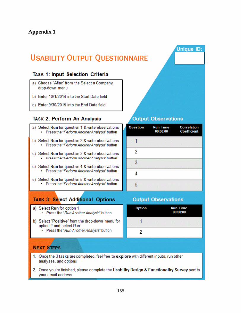
155
Appendix 1

156
Appendix 2