distance between kohonen classes: visualisation of data...
TRANSCRIPT

Distance between Kohonen classes:
Visualisation of data set structure with Self Organising Map
Patrick Rousseta*, Christiane Guinotb
a CEREQ, 10 place de la Joliette, 13474 Marseille cedex, France
b CE.R.I.E.S., 20 rue Victor Noir, 92521 Neuilly sur Seine cedex, France
Acknowledgements
The authors wish to thank the CE.R.I.E.S. team for the important contribution to the data,
and Ms Julie Latreille from the CE.R.I.E.S. and Mrs Annie Bouder from the CEREQ for their
technical assistance. The CE.R.I.E.S. is a research centre on healthy skin funded by CHANEL.
* Corresponding author.
E-mail address: [email protected] (P. Rousset)
Running title: Chart of SOM classes distance
Preferred section: Technology and Applications

P. Rousset et al
2
Abstract
Self Organising Map (SOM) is an often-used clustering method that mirrors the topology
between classes with a map. Many tools superimpose on this map endogenous or exogenous
information in order to integrate this topology in the data analysis. A new tool, that we present
here, displays the results of the computation of the distances between all centroids, which
simplifies the distance-matrix contents by managing the redundancy. Therefore, this tool allows
an interpretation in the input space by visualising the intrinsic structure of the data. The SOM
becomes then an efficient non-linear multidimensional data analysis method including graphical
representations. As an application, the Kohonen map is used to chart any classification in the
input space. This method is particularly well adapted when the intrinsic structure of the data is
not linear at all, and can eventually supply classical linear techniques. Furthermore, SOM can be
perceived as a technique of data set adjustment with a surface including its own graphical
representation.
Keywords: Classification, Data set representation, Kohonen maps, Multivariate data analysis,
Neural networks, SOM.
P. Rousset et al
3
1. Introduction
Representation of information given by clustering methods is of little satisfaction. Some
tools able to localise classes into the input space are expected in order to provide a good visual
support to the analysis of classification results. Actually, clusters are often visualised with the
planes produced by factor analysis (Wong, 1982; Lebart, Morineau & Piron, 1995). These
representations are sometimes unsatisfying, for example when the intrinsic structure of the data
is not at all linear or when the compression phenomenon generated by projections on factorial
planes is very important. In the family of clustering methods, the Kohonen algorithm has the
originality to organise classes considering the neighbourhood structure between them (Kohonen,
1993; Kohonen, 1995; Cottrell, Fort & Pagès, 1998). Many transcriptions in graphical displays
have been conceived to optimise the visual exploitation of this neighbourhood structure (Cottrell
& al., 1999; Rousset, 1999). Each one helps the interpretation in a particular context, they are
twinned to the Kohonen algorithm and called Kohonen maps. For example, one used in the
following helps the interpretation of the classification from an exogenous or endogenous
qualitative variable. Unfortunately, no one allows for a visualisation of the data set structure in
the input space. This is very regrettable when the Kohonen map makes such a folder that two
classes close to each other in the input space seem to be far on the map. A tool that visualises
distances between all classes (not only neighbouring classes) can detect some eventual folders.
More generally, it gives a representation of the classification structure in the input space. Such a
tool is proposed in the following. Two populations close in the input space but separated in
different clusters are called locally distant. As on the one hand the Kohonen algorithm has the

P. Rousset et al
4
property to reveal effects of local distances, and, on the other hand the new tool is able to control
large distances, this clustering method has now a large field of exploitation. When the previous
Kohonen map charts the neighbourhood organisation between classes, this tool localises
centroids in the input space, and then visualises the data set structure.
In the context of multidimensional analysis, the graphical display of all distances between
classes transforms the Kohonen algorithm from a clustering technique summarising information
into a data analysis and data set representing method (Blayo & Demartines, 1991; Cottrell &
Ibbou, 1995; Wong, 1982). Its approach can be compared with factor analysis. In particular it
can be used to study the result of any classification c (not only the Kohonen one). To avoid any
confusion, in this paper the prefix k refers to the Kohonen algorithm and c or nothing refer to
other classifications. As the distance chosen for the k-algorithm and for the c-classification are
in coherence (Euclidean one for both, χ² for both, etc.), it is probable that any difference between
individuals able to generate a c-class would also create a k-class. In that situation, the Kohonen
map is probably more adapted to visualise some local distance influences than projections on
planes that are more sensitive to large distances. This noticed property would reduce the very
well known risk of compression induced by the association between the clustering method and a
factor data analysis. The new technique is also presented as the approximation of the data set by
a non-linear surface. One can use for example a Multilayer Perceptron to do it but in that case it
is not very easy to interpret the model. At the contrary, the tool that charts the surface structure
simplifies the interpretation and makes this method an easy one to use.

P. Rousset et al
5
In the following the Kohonen map is used first as a method of classification which takes
into account both proximity and remoteness. In a second time it is applied as a method of data
analysis to represent the data set itself or one of its summaries such as the example of any other
classification result. To illustrate the possibilities of this technique, we use the example of a data
set concerning human healthy skin quality and resulting from a study performed by the
C.E.R.I.E.S. The purpose of this study is to search for a typology of the human healthy skin out
of several pertinent visual or tactile criteria. The data set consists in 17 criteria, assessed using
ordinal scales, collected on a sample of 212 volunteer women. Some analyses have already been
done on these data, each one corresponding to a different approach translated by adapted
distance or referring method (Chavent, et al., 1999; Guinot, et al., 1997). As the assessment of
the intensity of a skin feature is subjective, we decided to dichotomise each variable and to
estimate the intensity from the frequency of the skin feature in each class. The underlying
justification is the following: a cluster that contains a mixed population is considered well
represented by an individual whose skin feature intensity corresponds to the percentage of this
feature in this cluster, in a scale from 0 to 1. Therefore, the Euclidian metric was used to
compute distances. First, the Kohonen algorithm with Euclidean distance is applied to classify
individuals, then is used to represent in the input space the result of a hierarchical classification
using the Ward distance.
2. Representation of individuals with the couple classification-factorial analysis

P. Rousset et al
6
A classical method to visualise classification results consists in using factor analysis. All
individuals are projected on the principal planes, their projections are pointed with a mark
corresponding to their own class. The properties of this very common method are strongly
linked to projections ones. In particular, it describes the clusters from a vectorial space smaller
than the one that builds them. This implies to consider the problem of the projection
representativity. For example, it is common that the projections of two classes populations are
mixed in such a way that one cannot attribute a connected area of the plane to each class. In fact,
this kind of representation is more pertinent to show effects of large distances between
individuals than small distances. It is as well effective to reveal one criterion influence as it
contributes to any class build but it is less sensitive when this influence is restricted to
discriminate specifically two close classes. To generalise these remarks, we can say that this
method is more adapted to visualise effects of global distances than of local ones.
To illustrate these phenomena, individuals belonging to the data set sample of the skin
quality have been classified with a hierarchical clustering method using the Ward distance and
projected on the first principal plane as in figure 1.a. The first component globally corresponded
to features associated with vascular system of the skin, which we will refer to as "vascular
profile" of the skin, and the second component corresponded to features associated with
"oiliness" of the skin. Following clustering analysis, six clusters were identified from these
principal components. We notice that classes 2 # and 6 % are separated from the others by the
first principal axis towards negative values but we can notice that their projections are mixed
(figure 1.b). The second axis divides classes 1 ) and 5 +. Class 3 ' is partially mixed with

P. Rousset et al
7
classes 1 ) and 2 #. One needs to be reminded that if classes 1 ) and 6 % are far from the rest on
the plane this does not necessarily mean that they keep this property in the complete space.
[add fig. 1. a and fig.1. b]
3. The Kohonen classification and its associated map
In this chapter, the Kohonen algorithm is considered only as a clustering method adapted
to any distance and is particularly interesting when local distances have to be taken into account.
In the following, a class issued from a Kohonen classification is called k-class in order to
exclude any confusion with a class issued from another technique. The Kohonen network
presented here is a two-dimensional grid with n by n units, but the method allows the choice of
any topological organisation of the network. We name U=n×n the number of units. After the
learning, the weight vectors Gu, called code vectors, represent in the input space their
corresponding unit u. The delicate problem of the learning is not addressed here, it is supposed
to be successfully realised. Each individual is associated to the code vector, which is the closest
in the input space. In this way, two individuals associated to the same code vector Gu are
assigned to the same class ku. U k-classes ku are defined in such a way. They are represented by
their corresponding code vector Gu in the input space and unit u on the network. This
classification has the particularity to organise units on a chart called Kohonen map such as units
neighbouring on the map correspond to code vectors that are close in the input space.
Consequently, two individuals that belong to classes referring to neighbouring units are close in
the input space. On the contrary, to be far on the chart does not mean anything concerning the
P. Rousset et al
8
proximity. In the following, the neighbourhood notion refers to the map localisation. The boxes
organisation of figure 2 is a traditional representation of the Kohonen map in the case of a grid.
The unit u0 neighbours for the rays 0, 9 and 25 are respectively the unit u0 itself, any unit of the
square of 9 units centred on u0 and any unit of the square of 25 units centred on u0. As an
example: at ray 1, unit 11 neighbours are units 3, 4, 5, 10, 11, 12, 17, 18, 19.
The Kohonen map allows a representation of some characteristics of a k-class and the
generalisation to its neighbours. For example, the effect of an endogenous or exogenous
qualitative variable Q can be visualised by including into each unit a pie reflecting the proportion
of one modality occurrence in the class population, as shown in figure 2. The pie slice angle is
k
ik
nn
.2 π× , where nik is the number of individuals classified in the k-class k for which Q takes the i
modality and n.k is the number of individuals affected to the class k. Figure 2 represents one
endogenous criterion effect, “the skin is yellow or not”. The Q variable is then the criterion
corresponding variable. Two areas of neighbouring units are emerging, one is composed of units
1, 2, 8 and the other one of units 28, 34, 35, 41, 42, 48, 49. Moreover another area grouping
mixed population is located in the 7, 14, 21 units area. Each skin feature can be plotted
similarly.
[add fig. 2.]
The main problem of such a representation is that units are localised on the map at equal
distance from their neighbours while their respective code vectors are not at equal distances in
the input space. In this way, the intrinsic data set structure in the input space is omitted. In the
P. Rousset et al
9
skin quality sample, this expresses the visual impossibility to conclude if the “yellow skin”
feature is present in two separated areas of the data set input space or only in one. The problem
of the graphical display of the data set in the input space is the aim of the following section
where the proposed solutions are expected to allow the choice of one area or two.
4. Representation of distances between all classes and visualisation of the intrinsic data set
structure in the input space
In order to give an idea of the data set structure in the input space, one first modest idea
has already been proposed in (Cottrell & Rousset, 1997) to visualise the importance of the
proximity between k-classes by grouping code vectors with a new classification on these U
vectors, for example the hierarchical clustering method using the Ward distance. A colour is
associated to each new class called in the following macro-class. It is used for example to
colour the background in each unit cell as shown in figure 3. In practice, this technique groups
more often code vectors located on connected areas of the map which confirms the neighbouring
topology. This method applied to the quality skin sample leads to the figure 3 where 6 macro-
classes determine 6 connected areas of the map. The upper-left corner macro-class (cyan
coloured) groups a number of k-classes (4) twice smaller than the down-left corner one (magenta
coloured)(8). Moreover, code vectors can belong to two different macro-classes and be close in
the input space at the same time. This remark implies that this technique does not allow the
visualisation of proximity in the input space between the corner upper-left and bottom-right. So,
the macro-classes use increases our knowledge of the map structure in the data set input space,
P. Rousset et al
10
but it is necessary to visualise distances between code vectors to be more precise in the
description.
[add fig. 3.]
A first way to represent the distance between code vectors of neighbouring classes has
already been proposed in (Cottrell & de Bodt, 1996). The concept consists in separating two
neighbouring units borders with a space which width is in proportion with the distance between
their corresponding code vectors, as in figure 4. This method allows a distinction between a
population large enough to generate two macro-classes and two different populations’
separation. But the information on distance is restricted to neighbouring classes, in particular the
distance between two macro-classes centroids is not discerned. Moreover it is usual that largest
distances separate some borders of macro classes but also some k-classes of the same macro-
class. This technique applied to the skin quality sample leads to figure 4. It shows that the right
border of the map (units 6, 7, 13, 14, 20, 21, 27, 28, 34, 35, 41, 42, 48, 49) is separated from the
large area of the rest. But it is very difficult to see the structure of this large area as the aspect of
uniformity is probably wrong. To illustrate a previous remark, one can notice that the distance
between neighbouring classes 35 and 41 is one of the largest while they belong to the same
macro-class. Moreover it is still impossible to conclude in favour of proximity or remoteness
between individuals affected in both map opposite corners upper-left and bottom-right. In
conclusion, this method is a simple way to give a first aspect of distances between classes but
must be completed with a tool that represents any distance between two centroids in order to
have a complete information on the input space structure.
[add fig. 4.]

P. Rousset et al
11
Now the necessity is fit to represent distances between any classes, which constitutes U²
values. U² is usually a very large number and this values representation has to use the
neighbourhood organisation in order to group the redundant information. This condition is
necessary to obtain a result that can be exploited. The natural way is to describe these distances
with a new Kohonen map divided in U boxes of U divisions. The principal consists in assigning
on the map a colour to each couple of k-classes (u, u’) in such a way that the colour of the
division u’ of the uth box indicates the size of the distance d(u, u’). This visualisation is a
pertinent tool to understand the data set structure. Figure 5 is the map of distances applied to the
skin quality sample. Four colours are used, the darker the colour is as the corresponding distance
is large. The first grid (upper-left) which represents distance between unit 1 and any else shows
that the light units are on the upper-left corner area (its own macro class units 2, 8 and 9) or on
the bottom-right one (42 and 49). Now we can conclude that the two opposite corners of the
map upper-left and bottom-right are close on the input space and so any individuals whose skin
has the criterion yellow skin are in the same space area. This last conclusion is impossible from
any of the previous representations and show the power of this new tool. Moreover the
properties revealed by the previous distance maps are still appearing. As example, we have
previously notice that the right border is rather far from the rest, this property still appears in grid
27 and 28. But this time, the exception of the bottom-right corner which is far from the middle
of the map but close to the corner upper-left is emerging. Moreover, this new map allows for an
understanding of the large rest area structure (all map except the left border one). For example,
with grids 10 and 31 we can see the opposition between the upper and bottom borders of the
map. As both previous techniques are simple and give a good idea of the local structure, this

P. Rousset et al
12
new map is more complex to read but is more precise, gives a more complete visualisation of the
data set structure, represents small and big distances and gives more security to the
interpretation.
[add fig. 5.]
5. Any classification representation with a Kohonen map
In this section, the Kohonen algorithm result is perceived as a summary of the input data
set in U points of this space and the different maps presented in sections 2 and 3 as a
visualisation of the input data set structure. It is so natural in order to solve the initial goal to use
these maps to represent any clustering method result and not the only Kohonen one. The
distance choice is free which allows the use of one in coherency with the classification one. A
qualitative variable Q is defined in order to affect to any individuals the index of its own class.
This Q variable cartography done as in section 2 (figure 2) allows for the characterisation of any
part of the input space from the clusters. A similar map can be build to localise any modality of
the Q variable, and so any class, in the input space. Instead of the pie of figure 2, a bar chart
represents the proportion between the contingency nik of the population composed of individuals
that belong to the class k and have the modality i and the contingency ni. of the population that
has the modality i as common characteristic. As the angle of the pie is k
ik
nn
.
2 π× , the size of the
bar chart is .i
ik
nn
. Figure 7 is the result of this graphical technique applied to a classification in 6
classes. By cumulating contingency representation (figures 6 and 7) and distance maps
information (figure 4 and 5), it is possible to have a large idea of the clusters repartition in the

P. Rousset et al
13
input space. On the figure 6 we can see that class 1 (pink circles) is a major component of a
macro-class (pink rectangle), class 4 (grey circles) is almost totally included in an other macro-
class (green rectangle), and class 5 (blue circles) is constitutive of a third macro-class (yellow
rectangle). By contrast, class 3 (yellow circles) is spread into two macro-classes (blue and grey
rectangles) and class 2 into four macro-classes. Similarly, the macro-class represented by the
grey rectangles is composed of class 6 (green circles), a part of class 3 (yellow circles) and a part
of class 2 (dark blue circles).
[add fig. 6.]
This method can be applied to the example of the healthy human skin quality to illustrate
its possibilities to visualise for example the 6 grouping obtained at level 6 classes of a
hierarchical classification using the Ward distance. Figures 7 and 5 show that individuals of
classes 2 and 6 are in the right border and so far from the rest of the population. Class 6 is close
from class 3 as it is located in the corner bottom-right. This class 3 is also present in the upper-
left corner that is remained to be close from the bottom-right corner in the input space. Classes
1, 4 and 5 are constituting the main area of the map, the middle and the left side map except the
upper-left corner. It looks as a large uniform population where classes 1 (bottom side) and 5
(upper side) are opposite and class 4 (middle) is the medium population. Moreover, class 3 is
close from classes 1, 4, 5 and as well than from class 6 and appears also as a medium class for
the data set.
[add fig. 7.]
6. Perspective

P. Rousset et al
14
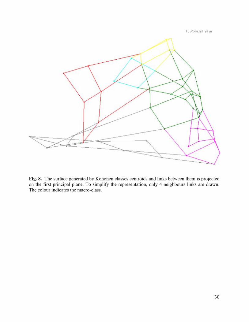
While code vectors are projected on a factorial plane and neighbouring unit ones are
linked together, the representation obtained is the kind of figure 8. The colour indicates the
macro-class. The links determine triangles that generate a surface. This surface adjusts the data
set by joining any U code vector to its neighbours as in figure 9, except that in order to simplify
the representation only 4 neighbours links are drawn. The data set representation with map
previously presented in section 2, 3 and 4 can be considered as a graphical display of this surface
and as well of any surface that adjusts the data set tying neighbouring code vectors. We have
then on the one hand a way to summarise the data set structure with a surface and on the other
hand some tools very well adapted to non-linear structure to visualise this surface.
[add fig. 8 and 9.]
7. Conclusion
We have presented a method to visualise the input data set structure with the Kohonen
maps that is able to substitute linear graphical displays when these one are unsatisfying. While
the Kohonen map reefers to the neighbourhood structure between the k-classes produced by this
algorithm, a new tool that represents any distance between k-classes centroids allows for some of
properties in the input space. This new technique can be applied to a larger domain than the
interpretation of the k-classes. In particular in data analysis, it looks very well adapted to some
applications such as the visualisation of any c-clustering result. In that context, the many charts
associated to the Kohonen algorithm became also graphical displays of the data set or the c-
clusters properties. For example, the one of figure 2 shows at the same time effects of any

P. Rousset et al
15
qualitative variable on the k-classification and on any clustering result. As a perspective, it can
probably be used to visualise some adjustment of the data set with non-linear surfaces.

P. Rousset et al
16
References Blayo, F. & Demartines, P. (1991). Data analysis: how to compare Kohonen neural networks to
other techniques? In Proceedings of IWANN’91, (pp. 469-476), Berlin: Springer-Verlag.
Chavent, M., Guinot, C., Lechevallier, Y. & Tenenhaus, M. (1999). Méthodes divisives de
classification et segmentation non supervisée : Recherche d’une typologie de la peau humaine
saine. Revue de Statistique Appliquée, XLVII, 87-99.
Cottrell, M. & Ibbou, S. (1995). Multiple Correspondence Analysis of a crosstabulations matrix
using the Kohonen algorithm. In Proceedings of ESANN’95, (pp. 27-32), D Facto. Bruxelles: M.
Verleysen (Eds).
Cottrell, M. & de Bodt, E. (1996). A Kohonen Map Representations to Avoid Misleading
Interpretations. In Proceedings of ESANN’96, (pp. 103-110), D Facto, Bruxelles: M. Verleysen
(Eds).
Cottrell, M. & Rousset, P. (1997). A powerful Tool for Analysing and Representing
Multidimensional Quantitative and Qualitative Data. In Proceedings of IWANN'97, (pp. 861-
871), Berlin :Springer Verlag.
Cottrell, M., Fort, J.C. & Pagès, G. (1998). Theoretical aspects of the SOM algorithm. Neuro
Computing, 21, 119-138.
Cottrell M., Gaubert P., Letremy P. & Rousset P. (1999). Analyzing and representing
multidimensional quantitative and qualitative data: Demographic study of the Rhône valley. The
domestic consumption of the Canadian families. E. Oja and S. Kaski (Eds), (pp. 1-14),
Amsterdam: Elsevier.

P. Rousset et al
17
Guinot, C, Tenenhaus, M., Dubourgeat, M., Le Fur, I., Morizot, F. & Tschachler, E. (1997).
Recherche d’une classification de la peau humaine saine : méthode de classification et méthode
de segmentation. In : Les actes des XXIXe Journées de Statistique, (pp. 429-432). Carcassonne,
France.
Kohonen, T. (1993). Self-organization and Associative Memory. 3°ed., Berlin: Springer-Verlag.
Kohonen, T. (1995). Self-Organizing Maps. Springer Series in Information Sciences Vol 30.
Berlin : Springer-Verlag.
Lebart, L., Morineau, A., Wardwick K.M. (1984). Multivariate Descriptive Statistical Analysis.
New-York: John Wiley and Sons.
Rousset, P. (1999). Application des algorithmes d’auto-organisation à la classification et à la
prévision. Thesis of doctorat (pp.41-68). University Paris I, Paris, France
Wong M.A. (1982). A hybrid clustering method for identifying high density clusters. Journal of
the American Statistician Association, 77, 841-847.
P. Rousset et al
18
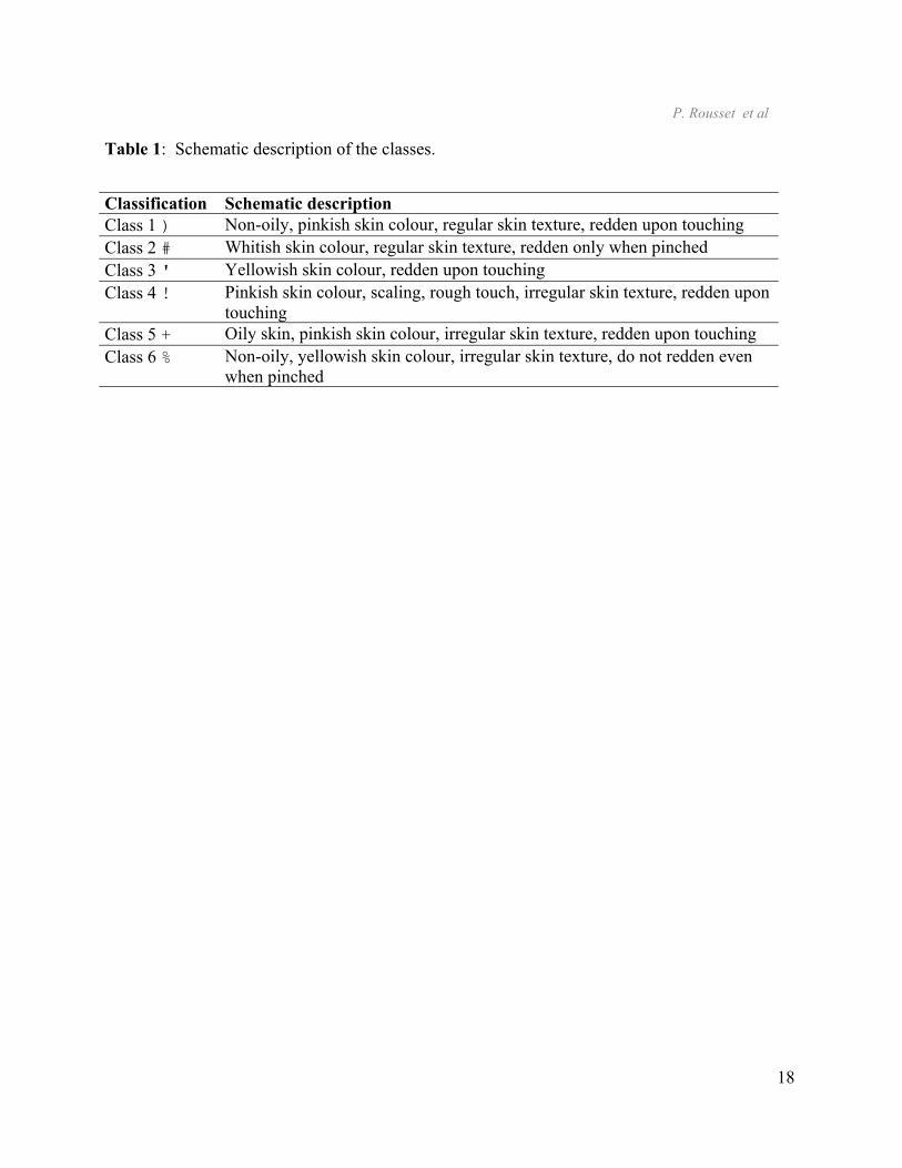
Table 1: Schematic description of the classes. Classification Schematic description Class 1 ) Non-oily, pinkish skin colour, regular skin texture, redden upon touching Class 2 # Whitish skin colour, regular skin texture, redden only when pinched Class 3 ' Yellowish skin colour, redden upon touching Class 4 ! Pinkish skin colour, scaling, rough touch, irregular skin texture, redden upon
touching Class 5 + Oily skin, pinkish skin colour, irregular skin texture, redden upon touching Class 6 % Non-oily, yellowish skin colour, irregular skin texture, do not redden even
when pinched

P. Rousset et al
19
Fig. 1. Combination between a principal component analysis and a hierarchical classification
with the Ward distance.
a. Individuals are pointed by their own class mark (class 1 ); class 2 #; class 3 '; class 4!;
class 5 +; class 6 %).
a. The plane is split according to the schematic description of the axes and the classes
repartition.
Fig. 2. Kohonen classification characterisation with a qualitative endogenous or exogenous
variable, numeration is going from upper-left to bottom-right. Frequency of individuals where
the criterion “yellow skin” is present or not corresponding to blue sector and pink sector,
respectively.
Example: 33% individuals of this class have a “yellow skin”.
Fig. 3. Macro-classes representation is added to the map of the criterion “yellow skin”, (the 6-
level groups of a hierarchical classification on the 49 code vectors realised with the Ward
distance).
Macro-classes colour code.
Fig. 4. Representation of distance between neighbouring classes centroids.
P. Rousset et al
20
Fig. 5. Representation of any distance between centroids, grids and divisions has the same
organisation than any previous Kohonen map.
Colour code which represents distances.
Fig. 6. The k-classes obtained with the Kohonen algorithm are crossed with a hierarchical
classification using Ward distance, they are both applied to the same data set. The contingency
resulting is represented with the Kohonen map in order to integrate the associated topology. The
contingency is measured in proportion of the k-classes individuals number and represented by
the slice:
Fig. 7. The k-classes obtained with the Kohonen algorithm are crossed with a hierarchical
c-classification using Ward distance, they are both applied to the same data set. The contingency
resulting is represented with the Kohonen map in order to integrate the associated topology. The
contingency is measured in proportion of the c-classes individuals number and represented by
the bar size.
P. Rousset et al
21
Fig. 8. The surface generated by Kohonen classes centroids and links between them is projected
on the first principal plane. To simplify the representation, only 4 neighbours links are drawn.
The colour indicates the macro-class.
Fig. 9. The surface generated by Kohonen classes centroids and links between them is projected
on a plane. To simplify representation, only 4 neighbours links are drawn: Map brim is
overdrawn (the stippled design corresponds to the back part of the surface).

P. Rousset et al
22
Fig. 1. Combination between a principal component analysis and a hierarchical classification
with the Ward distance.
b. Individuals are pointed by their own class mark (class 1 ); class 2 #; class 3 '; class 4!; class 5 +; class 6 %).
Oiliness
Non-OilyNon vascular profile Vascular profile
Class 1
Class 4
Class 5Class 3
Class 2Class 6

P. Rousset et al
23
c. The plane is split according to the schematic description of the axes and the classes repartition on the plane.

P. Rousset et al
24
Fig. 2. Kohonen classification characterisation with a qualitative endogenous or exogenous variable, numeration is going from upper-left to bottom-right. Frequency of individuals where the criterion “yellow skin” is present or not corresponding to blue sector and pink sector, respectively.
Example: 33% individuals of this class have a “yellow skin”.

P. Rousset et al
25
Fig. 3. Macro-classes representation is added to the map of the criterion “yellow skin”, (the 6-level groups of a hierarchical classification on the 49 code vectors realised with the Ward distance).
Macro-classes colour code.

P. Rousset et al
26
Fig. 4. Representation of distance between neighbouring classes centroids.

P. Rousset et al
27
Fig. 5. Representation of any distance between centroids, grids and divisions has the same organisation than any previous Kohonen map.
Colour code which represents distances.

P. Rousset et al
28
Fig. 6. The k-classes obtained with the Kohonen algorithm are crossed with a hierarchical classification using Ward distance, they are both applied to the same data set. The contingency resulting is represented with the Kohonen map in order to integrate the associated topology. The contingency is measured in proportion of the k-classes individuals number and represented by the slice:

P. Rousset et al
29
Fig. 7. The k-classes obtained with the Kohonen algorithm are crossed with a hierarchical c-classification using Ward distance, they are both applied to the same data set. The contingency resulting is represented with the Kohonen map in order to integrate the associated topology. The contingency is measured in proportion of the c-classes individuals number and represented by the bar size.
P. Rousset et al
30
Fig. 8. The surface generated by Kohonen classes centroids and links between them is projected on the first principal plane. To simplify the representation, only 4 neighbours links are drawn. The colour indicates the macro-class.

P. Rousset et al
31
Fig. 9. The surface generated by Kohonen classes centroids and links between them is projected on a plane. To simplify representation, only 4 neighbours links are drawn: Map brim is overdrawn (the stippled design corresponds to the back part of the surface).