
1
CS101 Introduction to Computing
Lecture 25Web Design for Usability

2
During the last lecture …
• We looked at the role of heuristics in architectural (or high-level) design
• We also became familiar with a few popular design heuristics

3
Heuristic
Rule of thumb learned through trial & error
Common sense lesson drawn from experience

4
CautionCaution!!CautionCaution!! Heuristics don’t always lead to the best results
At times they even lead to the wrong ones, but mostly to results that are good-enough

5
Given many parts of a system to be designed/built,
do the hard part 1st1st

6
Today’s Goal:Web Design for Usability
• To become able to appreciate the role of usability in Web design
• To become able to identify some of the factors affecting the usability of a Web page
7
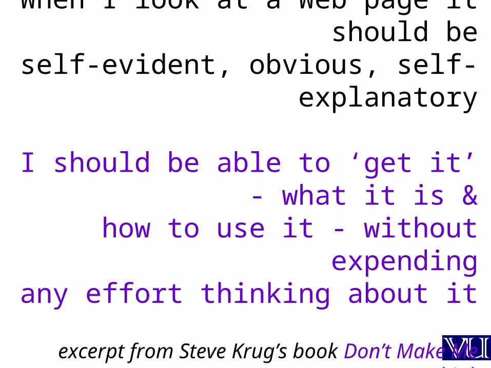
When I look at a Web page it should beself-evident, obvious, self-explanatory
I should be able to ‘get it’ - what it is &how to use it - without expending
any effort thinking about it
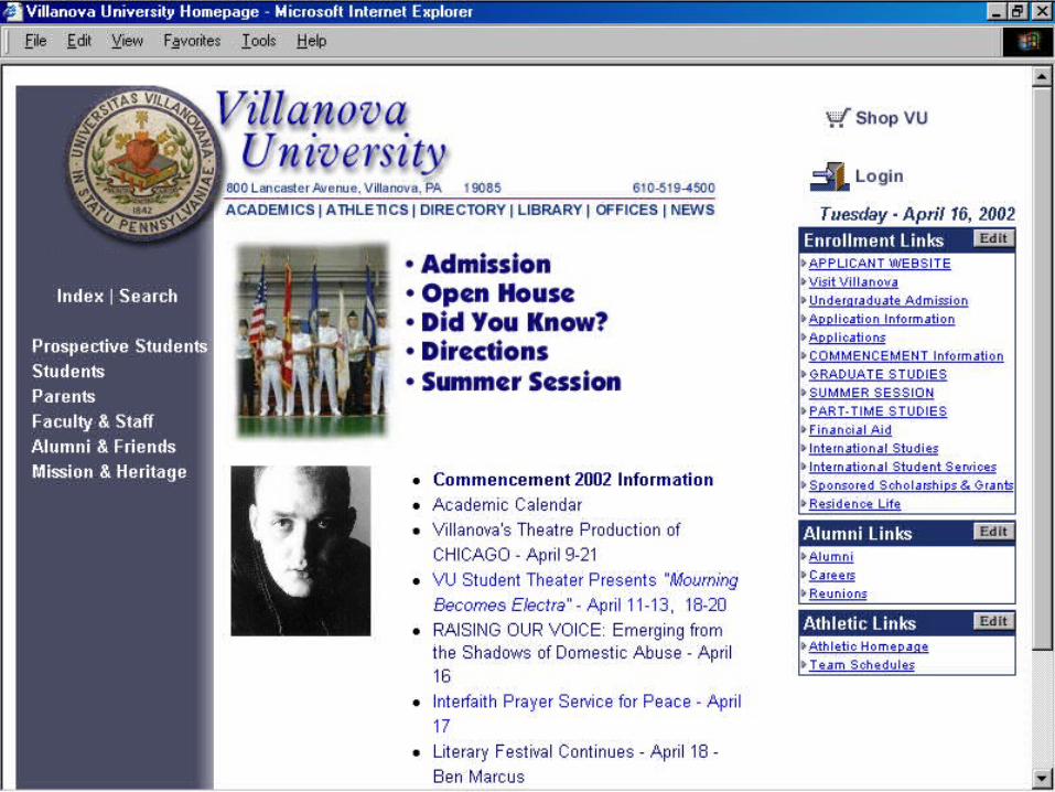
excerpt from Steve Krug’s book Don’t Make Me Think

8
don’t make me think!

9
Usability!
10
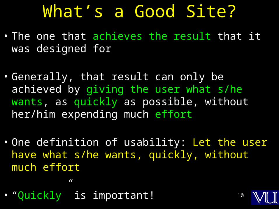
What’s a Good Site?
• The one that achieves the result that it was designed for
• Generally, that result can only be achieved by giving the user what s/he wants, as quickly as possible, without her/him expending much effort
• One definition of usability: Let the user have what s/he wants, quickly, without much effort
• “Quickly” is important!

11
speed!
12
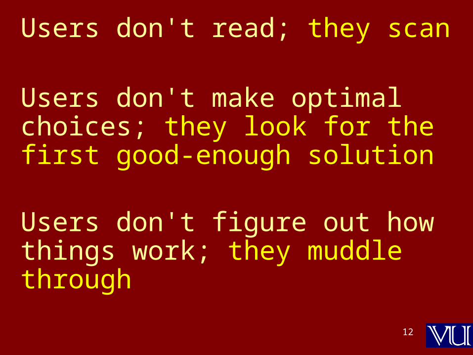
Users don't read; they scan
Users don't make optimal choices; they look for the first good-enough solution
Users don't figure out how things work; they muddle through
13

14
think roadside billboard
rather than Dewan-e-Ghalib

15
Design is Important!
• 62% of shoppers gave up looking for the item they wanted to buy online (Zona Research)
• 40% visitors don’t return to a site if their first visit was a -ive experience (Forrester Research)
• 83% of users have left sites in frustration due to poor navigation, slowness (NetSmart Research)
• Simple designs have greater impact: they can be understood immediately! (Mullet/Sano)

16
Simplify, simplify, simplify!

17
Designs should be
consistent &
predictable (unified)

18

19

20
Elements of Website Design
1. Navigation scheme
2. Layout of information
3. Overall look and feel
21
Website Navigation
• The interface/controls that a Website provides to the user for accessing various parts of the Website
• It probably is the most important aspect of the design of a Website

22
A Few Navigation Design Heuristics
1. Put the main navigation on the left of the page
2. It should be ‘invisible’ until it is wanted
3. It should require an economy of action & time
4. It should remain consistent
5. Use text for navigation labels. If you must use icons, put a description underneath each icon
23
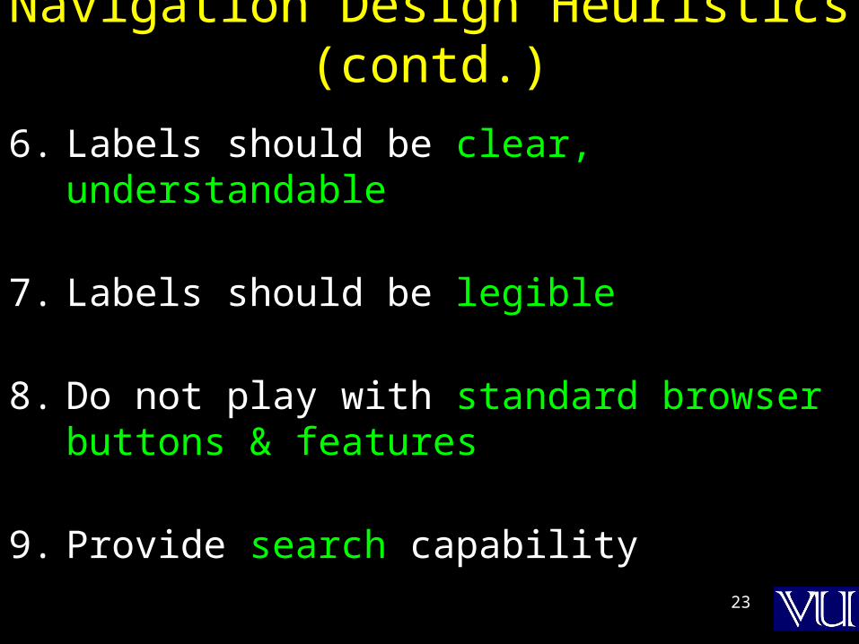
Navigation Design Heuristics (contd.)
6. Labels should be clear, understandable
7. Labels should be legible
8. Do not play with standard browser buttons & features
9. Provide search capability
24
11- click- click navigationnavigation??
25
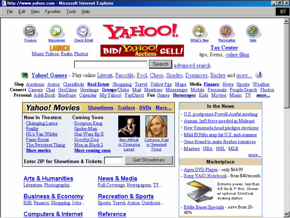
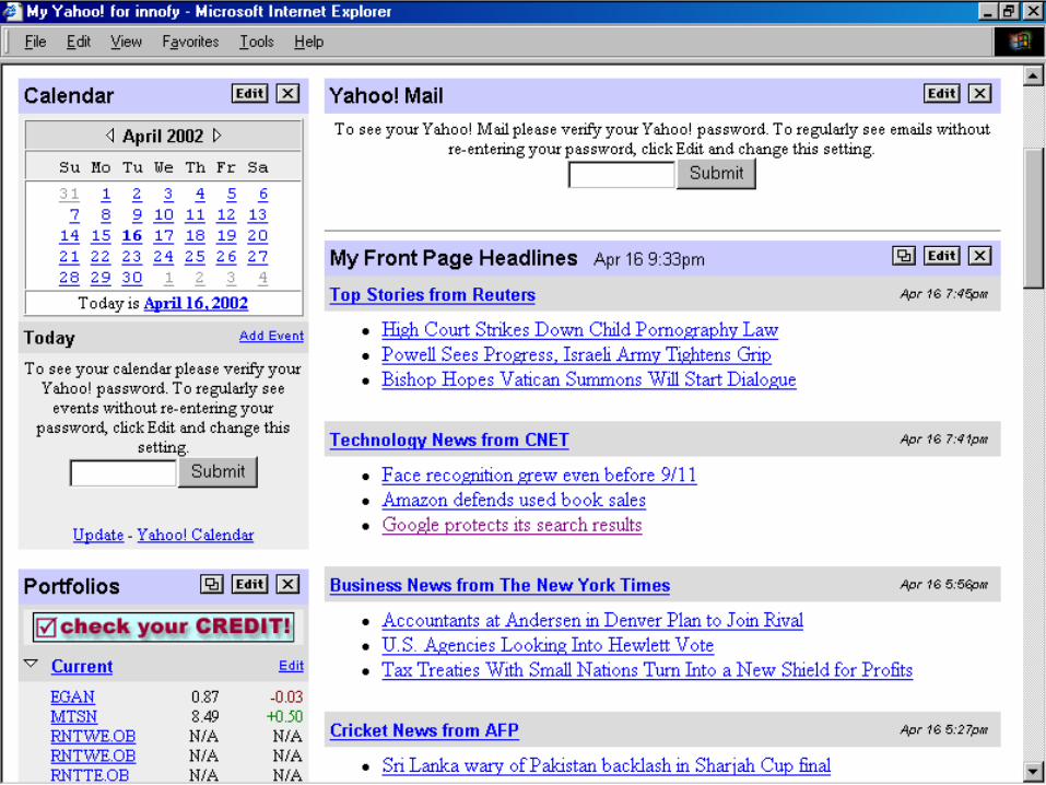
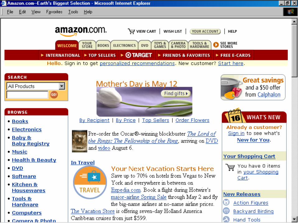
Now, let’s take a look ata few good designs …

26

27
A good solution to a problem
somehow looks nice & elegant
28
29
30
31
32
Good designs assist the user in recovering from errors
33
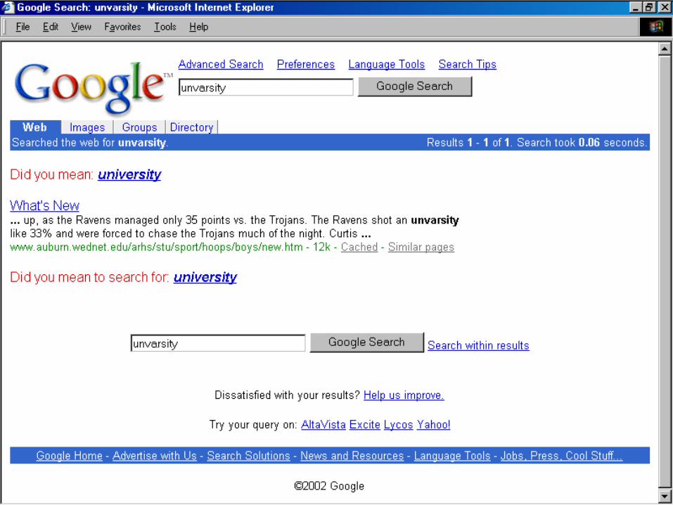
Assisting the User Recover from Errors
• Location, post code mismatch
• Credit card number errors
• Phone numbers
• Spelling errors
34

35
A few constructive recommendations
Let’s look at a few Web sites and see how we can improve their usability
36

37
Enter
Dragon’s Lair
All rights reserved, 2002.

38
39

40
WW WW WW
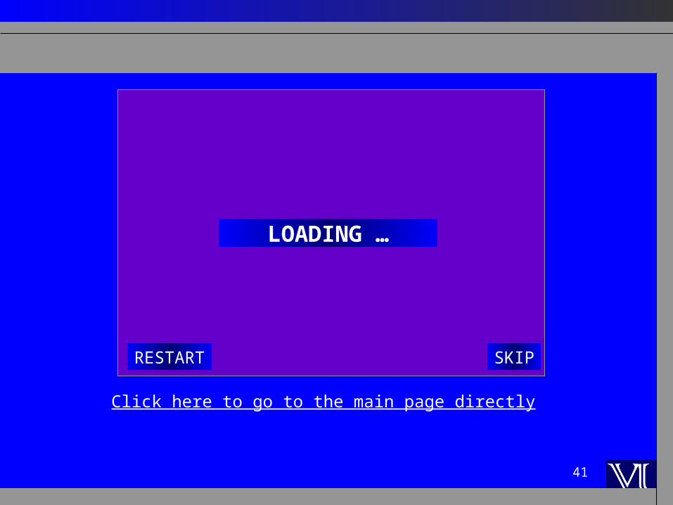
41
SKIPRESTART
LOADING …
Click here to go to the main page directly

42

43
A few more Web design heuristics
44
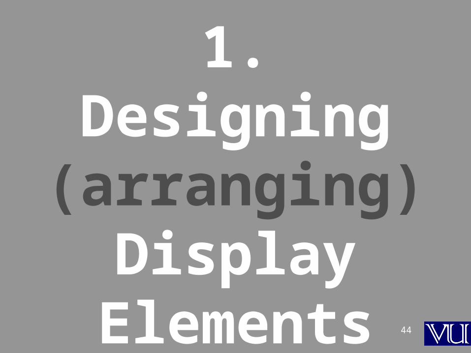
1. Designing (arranging)
Display Elements

45
Making Display Elements Legible
1. Elements must be large enough tobe processed visually
2. Elements must contrast sufficiently with their backgrounds
46
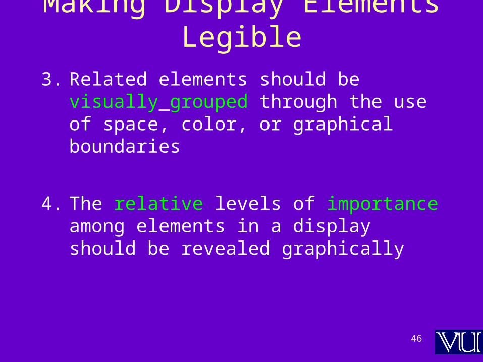
Making Display Elements Legible
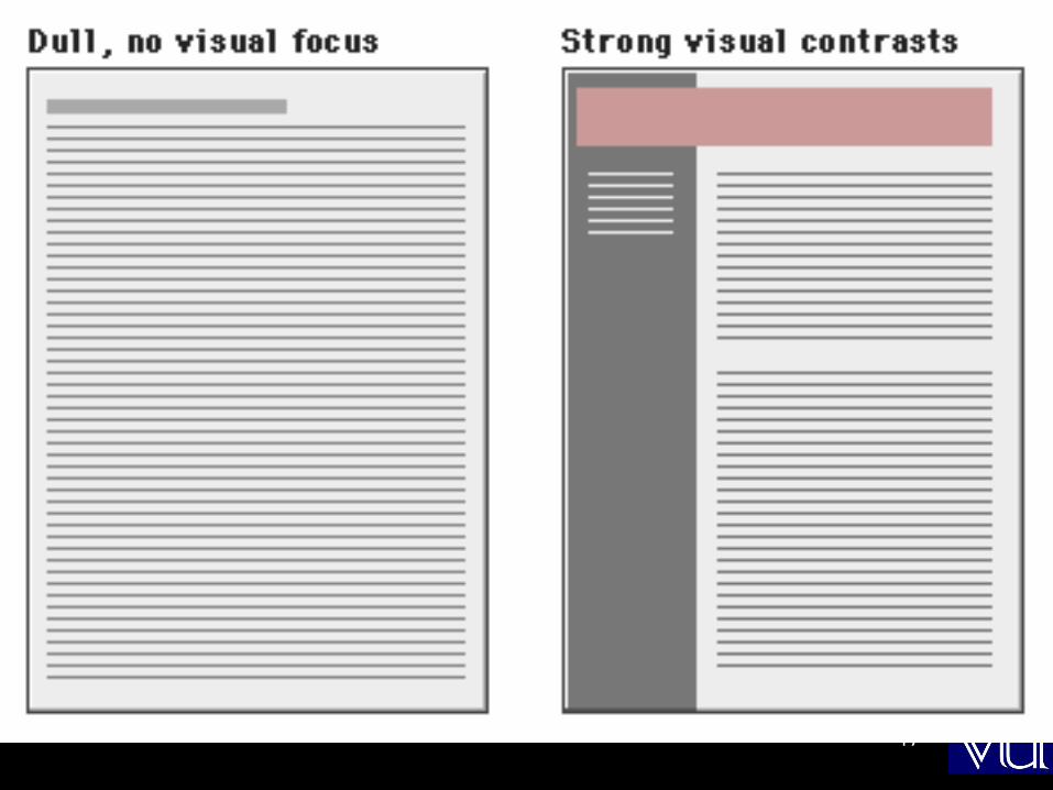
3. Related elements should be visually grouped through the use of space, color, or graphical boundaries
4. The relative levels of importance among elements in a display should be revealed graphically
47
48
2. Ensuring Text is
Readable
49
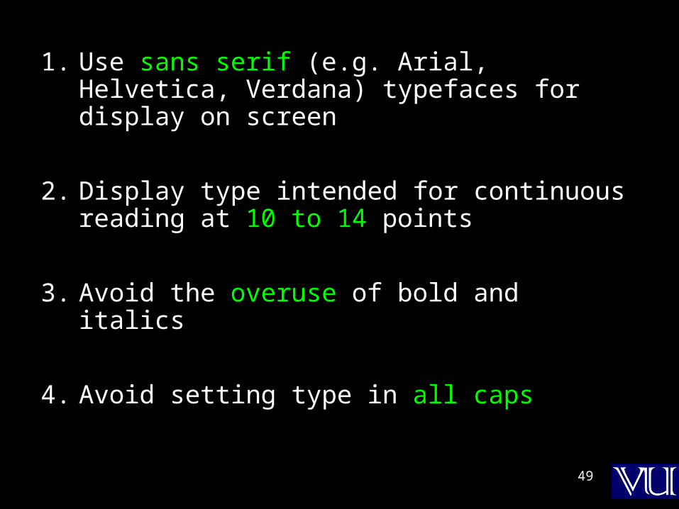
1. Use sans serif (e.g. Arial, Helvetica, Verdana) typefaces for display on screen
2. Display type intended for continuous reading at 10 to 14 points
3. Avoid the overuse of bold and italics
4. Avoid setting type in all caps

50

51

52
5. Arrange type intended for extended reading flush left, ragged right
6. Avoid lines of type shorter than 40 characters and longer than 60 characters

53
7. Mark the boundaries between paragraphs with blank lines rather than indentation
8. Use headings and subheadings to visually reveal the relationships among text elements they label – paragraphs after paragraphs of text do not work that well on the Web
54
3. Using Pictures &
Illustrations

55
Avoid using pictures that are strictly decorative

56
4. Using Motion

57
1. Use motion to attract the viewer’s attention
2. Avoid the use of motion for “cosmetic” purposes
58
Success is defined by the user, notnot the builder

59
In Today’s Lecture
• We looked at the role of usability in Web site design
• We identified some of the factors affecting the usability of a Web page
60
Reading Assignment
www.useit.com

61
Next Lecture:Computer Networks
• We will become able to appreciate the role of networks in computing
• We will familiarize ourselves with various networking topologies and protocols


