

Use device independent event handlers or
combine mouse (e.g, onmouseover) and keyboard (e.g, onkeypress) dependent event
handlers
Device Independence

Ensure Interactive Elements are Links or
Form Controlsor...
make non-focusable elements focusable with tabindex

Avoid Tabindex
... unless you're sure you know what you're doing.
If the default tab order is not logical, fix your source code order.

tabindex="1+" defines an explicit tab order
tabindex="0" allows things besides links and form elements to receive keyboard focus.
tabindex="-1" allows things besides links and form elements to receive programmatic
focus (by scripting, links, etc.)
Avoid this

<div tabindex=”0” onclick=”submitForm()”>Submit
Search</div>

<a onclick=”submitForm()”>Submit Search</a>
is better, but
<input type=”submit” value=”Submit Search”>
or
<button onclick=”submitForm()”>Submit Search</button>
are best!

Click events do not always trigger via keyboard for things other than links or form controls...
... even with tabindex=”0”
WARNING!

if(event.keyCode==13 || event.keyCode==32) { doStuff(); }
Attach an onkeyup event and then check for Enter (13) and Space (32) key presses:

function a11yClick(event){ if(event.type === 'click'){ return true; } else if(event.type === 'keypress'){ var code = event.charCode || event.keyCode; if((code === 32)|| (code === 13)){ return true; } } else{ return false; } } ***** $('#fake-button').on('click keypress', function(event){ if(a11yClick(event) === true){ // do stuff } });
http://www.karlgroves.com/2014/11/24/ridiculously-easy-trick-for-keyboard-accessibility/

• Allows non-focusable elements to receive programmatic focus (by scripting, links, etc.)
• Necessary for focusing dialog boxes, error messages, etc.
• WARNING: This removes the element from the default tab order.
tabindex=”-1”

Review• Ensure all interactive elements are links or
form controls, or make them focusable with tabindex=”0”.
• If using tabindex, detect Enter and Space key events.
• Ensure non-focusable elements (such as dialog windows) have tabindex=”-1” before focusing them programmatically.

Dialogs

DialogsMaintains
keyboard focus if modal
Closes with ESC key
Returns focus when dismissed
tabindex=”-1” then set focus to dialog (or focus a control inside the dialog)
Link, button, or tabindex=”0” with
aria-haspopup=”true”

“Freak-out” Mode
When the currently focused element disappears or is significantly modified
Avoid it or address it with focus();
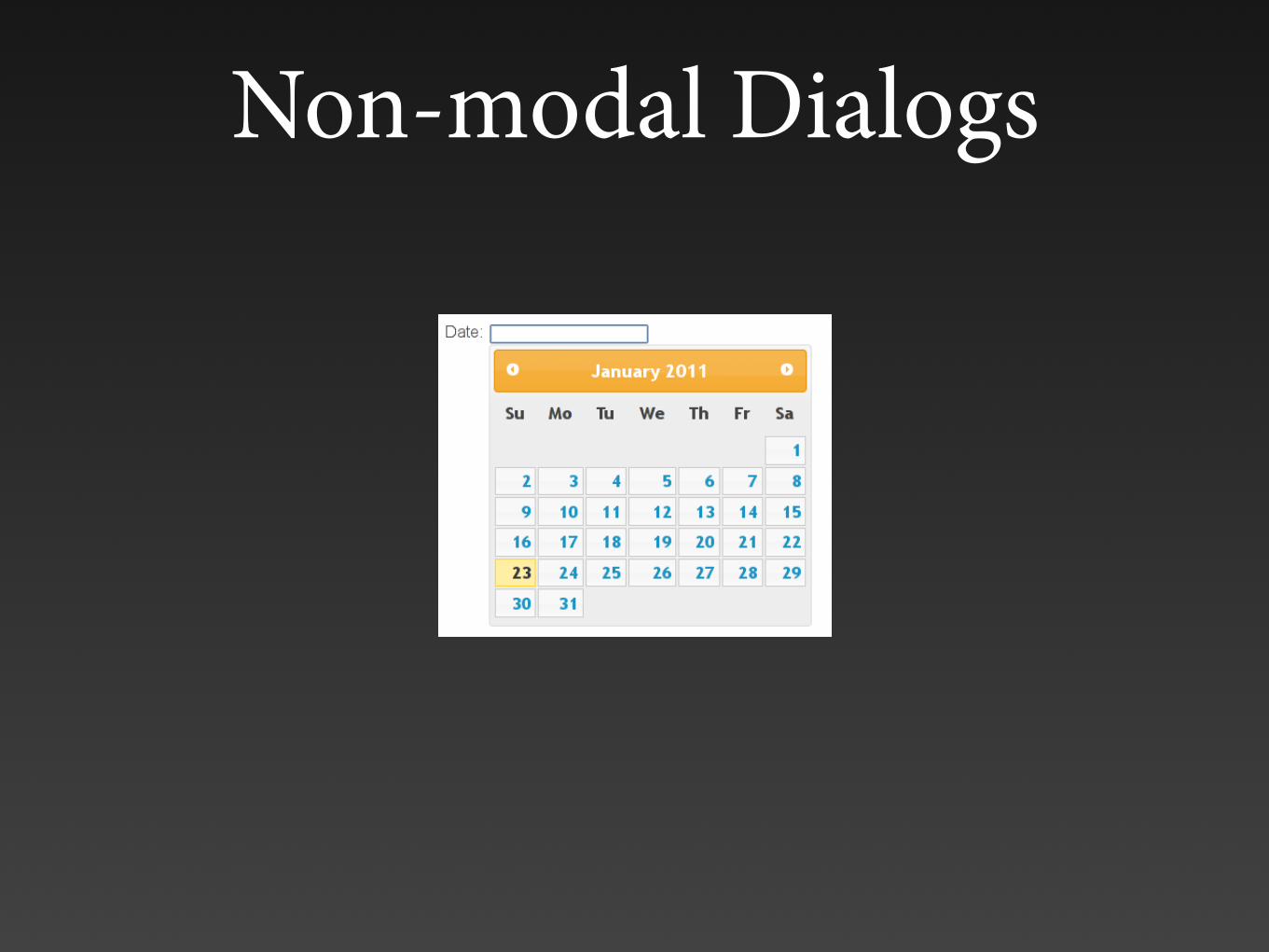
Non-modal Dialogs

Carousels


Q&A by .net magazine
http://www.netmagazine.com/news/accessibility-expert-warns-stop-using-carousels-132875

An anti-carousel carousel featured in a carousel


Carousel Issues
• Automated carousels violate WCAG 2.0 Success Criteria 2.2.2 (Level A) - Pause, Stop, Hide
• Distracting and confusing
• Difficult interaction model
• No relationship between controls and content
• “Freak-out mode” when carousel changes
• Allow poor content decisions

Carousel Accessibility Solutions?
• Avoid auto-playing (optimal) or include a visible pause button (preferably) before the carousel
• Pause carousel on mouse hover and on keyboard focus
• Ensure focused items do not disappear, or manage focus when they do
• Provide context for controls • Descriptive text • ARIA tab panel?
• Ensure accessible content

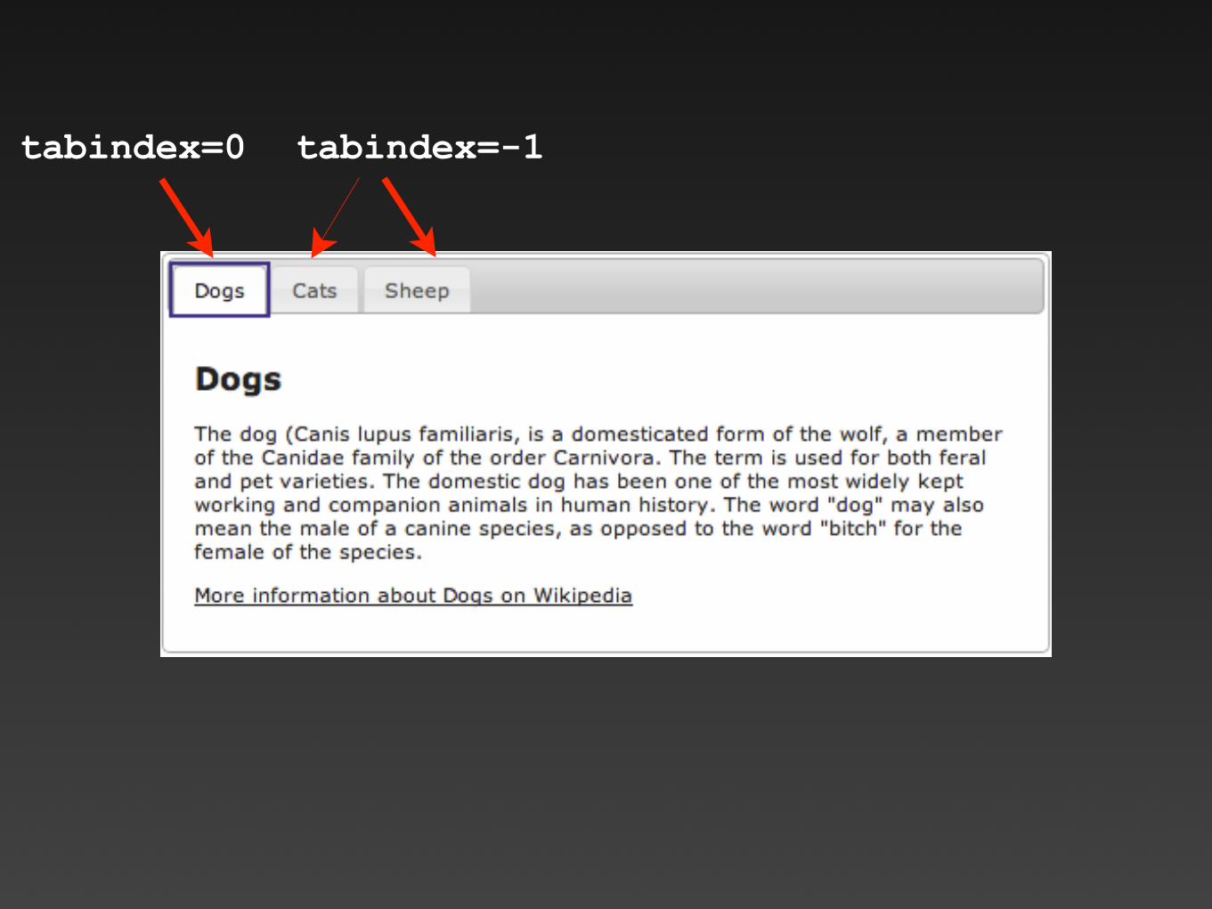
Roving tabindex• Useful for controlling focus within interactive widgets
(menus, tab panels, tree widgets, etc.).
• Set tabindex=”0” on currently active item. This places it in the tab order.
• Set tabindex=”-1” on all other items. This removes them from the tab order and makes them focusable with scripting.
• Use focus() to set focus as user navigates within widget (arrow keys, etc.).
• tabindex=”0” roves or follows the active item allowing users to return directly to it later.

http://hanshillen.github.io/jqtest/#goto_tabs

In an ARIA tab panel, the entire tab group functions as one tab stop, then arrow keys are used to select the active tab.
1
3
2
tabindex=0 tabindex=-1

tabindex=0
tabindex=-1 tabindex=-1
Press to select the next tab

tabindex=0
If you tab away from the tab panel and later return, “Cats” remains the active and focused tab because it has tabindex=0.

[tabindex=0] { background:#fff;
border-color:#ddd; border-bottom:none;
}
Focus on semantics and let CSS do the heavy lifting

HTML5
• Adds new features - primarily for application development and enhanced semantics
• Maintains backward compatibility (mostly)
• Defines error handling for browsers
• Drops all most presentational markup

Principles of HTML5
Why make authors do something the browser can do for them?
Things that actually work matter most.

HTML5 DOCTYPE
• The last DOCTYPE you’ll ever use?
• HTML versions vs. HTML the “living standard”
• HTML5 is very much still in progress
<!DOCTYPE html>

HTML5 Simplifications
<html xmlns="http://www.w3.org/1999/xhtml" xml:lang="en" lang="en" >
vs<html lang="en">
<meta http-equiv="Content-Type" content="text/html; charset=utf-8">
vs <meta charset="utf-8">

HTML5 Simplifications<link rel="stylesheet" href="styles.css"
type="text/css" /> vs
<link rel="stylesheet" href="styles.css" />
<script type="text/javascript"> vs
<script>
<style type="text/css"> vs
<style>

The Smallest Valid Accessible HTML5 Document
<!doctype html> <html lang=en> <meta charset=utf-8> <title>blah</title> <p>I'm the content
HTML5 allows browsers to do much of the work.
Just because you can, doesn’t mean you should.
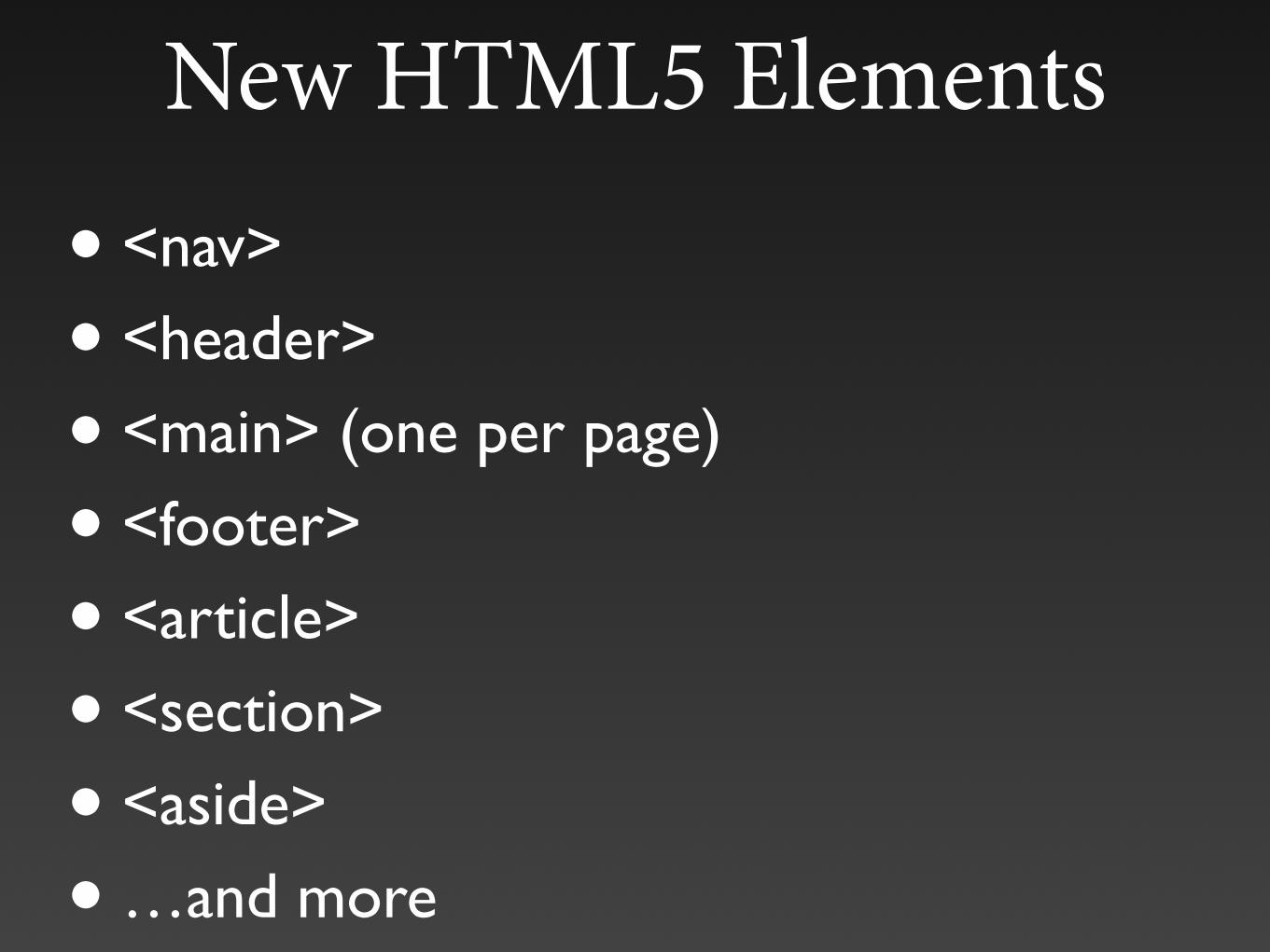
New HTML5 Elements
• <nav>
• <header>
• <main> (one per page)
• <footer>
• <article>
• <section>
• <aside>
• …and more

HTML5 Sectioning Elements
• <section>, <article>, <aside> and <nav>
• Each should generally begin with a heading that describes that section
• <article> is self-contained, syndicatable
• HTML5 outlining algorithm is not supported (and may be removed), so do not rely on it. Use proper heading levels!

HTML5 Accessibility Changes
• alt attribute is optional when <figcaption> presents an equivalent alternative for an image within a <figure>
• Dropped, then reintroduced, longdesc (subject to change?)
• Dropped table summary
• Use <abbr>, not <acronym>.
• ARIA markup is valid

HTML5 <video> and <audio>• Native video and captioning support
• WebVTT captioning format
• Accessible (???) browser controls or you can build your own.
<video id="video" controls preload="metadata"> <source src="myvid.mp4" type="video/mp4"> <source src="myvid.webm" type="video/webm">
<track label="English" kind="captions" srclang="en" src=“mycap-en.vtt" default>
<track label="Deutsch" kind="captions" srclang="de" src="mycap-de.vtt">
<track label="Español" kind="captions" srclang="es" src="mycap-es.vtt">
</video>

New HTML5 Input Types
• search, number, range, color, url, email, tel, date, month, week, time, datetime, datetime-local
• The browser can (or, more accurately, hopefully will) provide a natively accessible control/interface
• New form attributes - required, pattern, autocomplete, placeholder, autofocus, etc.

When should I start using or transition to HTML5?

Widget Accessibility Questions

What is this thing and what does it do?

Can I interact with it? How?
Is the interaction standardized?

Does it change dynamically?

Is it compatible with the user agent and technologies I’m using?

ARIA

ARIA
• Accessible Rich Internet Applications
• W3C Recommendations

ARIA Paves the Cow Paths
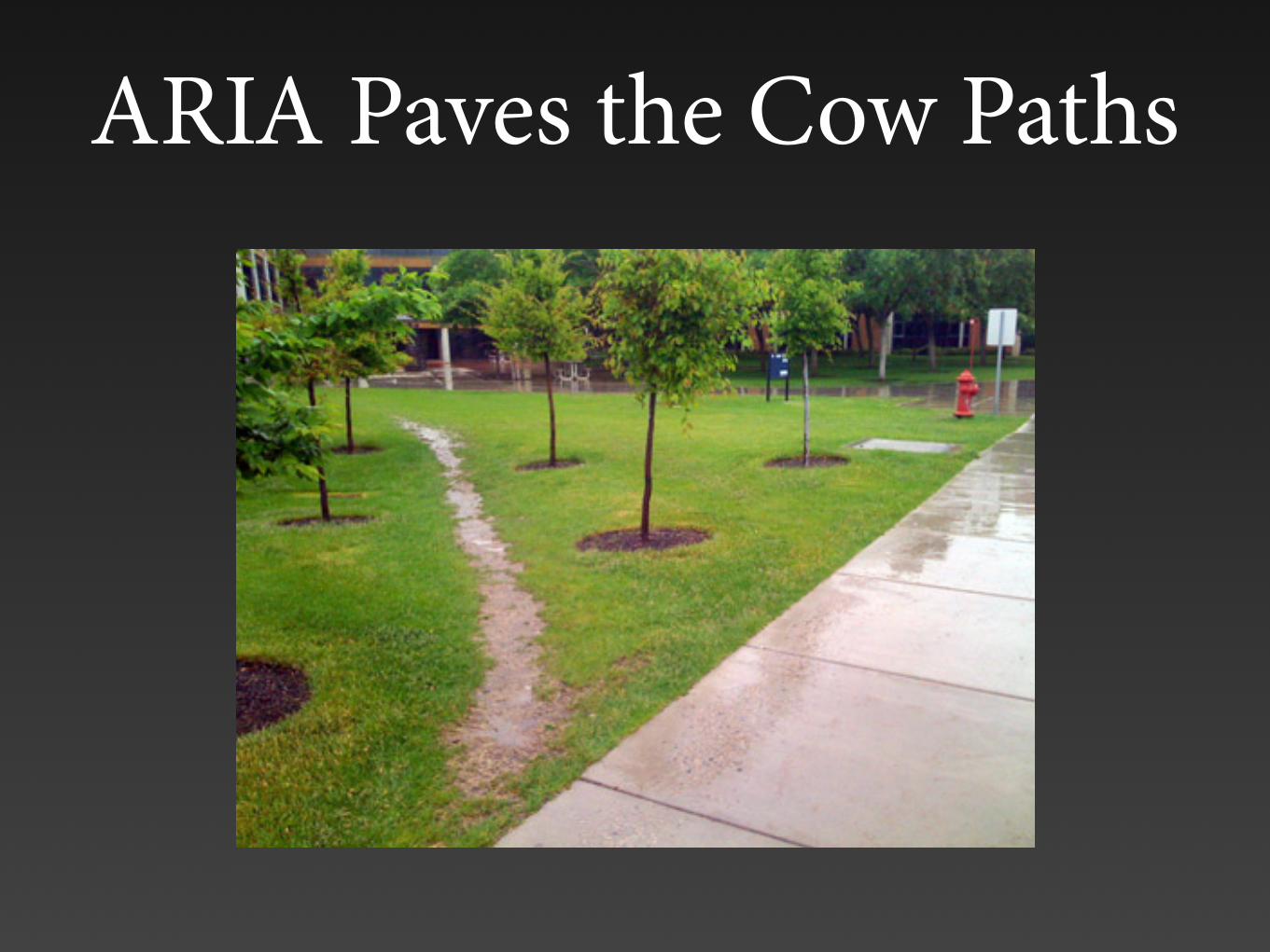
ARIA Paves the Cow Paths

ARIA Paves the Cow Paths

ARIA Paves the Cow Paths

ARIA Paves the Cow Paths

You can only make things more accessible by
implementing ARIA now
… if you do it correctly

Rule #1 of ARIA: Don’t use ARIA

Accessibility APIs
• Role
• Name
• Description
• Value
• State
• etc.

Accessibility APIs
Search
• Role=button (or pushbutton, etc.) • Name=Search • Description= • Value= • State=default, focusable

Accessibility APIs
Subscribe?
• Role=checkbox (or checkbutton, etc.) • Name=Subscribe? • Description= • Value=subscribe • State=checkable, checked
<input type=“checkbox” value=“subscribe” id=“sub”><label for=“sub”>Subscribe?</label>

ARIA and Code Validation
If your (X)HTML is valid and your ARIA is valid... valid + valid = ???

ARIA Roles
Enhance or change default roles to expand the vocabulary of HTML to include
standard API values which screen readers already understand.
<slider>???

ARIA Roles
• Avoid duplicating default roles (<button role=“button”>)
• ARIA roles override HTML native roles, but do NOT change functionality.
• Be very careful! You can destroy accessibility by adding one attribute.
<input type=“checkbox” role=“radio”>

ARIA Landmark Roles• banner, complementary, contentinfo, main,
navigation, and search
• Allows easy access to major page components
•The end of "skip" links? Oh yeah... browser keyboard accessibility still sucks.
• Called “regions” in JAWS (press R to navigate them)


Landmark Roles
<div role="navigation" aria-label="Main navigation">
<div role="main">
<form role="search">
You can add aria-label to differentiate multiple landmarks of the same type.

HTML5 and Landmark Roles Mapping
<main> - role="main" <article> - role="article"
<footer> - role="contentinfo" <header> - role="banner" <nav> - role="navigation"
<aside> - role="complementary"
Can combine both for older browsers…
<footer role="contentinfo">

Modifying and Enhancing Roles
Bad:<img src="submit.jpg" onclick=...>
OK:<a onclick="..."><img src="submit.jpg"...
Better:<a role="button" onclick="..."> <img src="submit.jpg"...
Best:<button onclick="...">

ARIA States and Properties
• Always start with “aria-”
• State = current condition. Usually change dynamically
• Properties are usually static
<input aria-checked="true">
<a aria-expanded="false">View details</a>
<a aria-haspopup="true">Open dialog</a>
<input aria-labelledby="foo">
<div role=slider aria-valuemin=0 aria-valuemax=100 aria-valuenow=10>

ARIA States and Properties
• ARIA states and properties should not override HTML properties if there’s a conflict.
• Be very careful!
<input type=“checkbox” aria-checked=“false”>

Labelled Links
• Role=link • Name=PDF file • Description= • Value= • State=linked
<a href=“application.pdf” aria-label=“PDF file”> Download the employment application</a>
Screen reader reads “link PDF file”! Link text is lost.

href-less Links
• Role=text • Name= • Description= • Value= • State=
<a id=“applink”>Download the employment application</a>
Treated identical to a <span>. No keyboard interactivity.

role="application"
... disables standard A.T. keystrokes to allow the page to function like a desktop application
Be very careful with <body role="application">
Some ARIA elements (tree view, slider, table, tabs, dialog, toolbar, menus, etc.) have an assumed
application role.
role="document" enables reading mode.

role="presentation"
<ul role="presentation"> <li>menu item</li>
...
Hides native roles of elements (and all required descendants) from assistive
technology. Useful on layout tables, lists, etc.
Is ignored if the element is navigable(e.g., links and controls).

aria-hidden="true"
You can't unhide a child element.
Ignored on navigable elements.
Use ARIA attributes to control visual appearance: [aria-hidden=true] {display:none;}

Dynamic Content
• When possible, give users control over content updates
• Avoid updates on focused element or handle “freak-out” with focus().
• Determine the “intrusiveness” of content updates with ARIA live regions or roles.
• Consider the amount and importance of content updates. Can the screen reader keep up?

ARIA Live Regions•aria-live=assertive - read now•aria-live=polite - read at a pause•aria-live=off - read when the user encounters it.
•aria-busy•aria-atomic - read the entire region or only what has
changed•aria-relevant - additions, removals, text, or all•aria-controls• Special live regions: alert (important), status (not
important), timer (always changing), marquee(same as aria-live="polite"), and log (updates added to the bottom)

Alert Role
<div role=“alert” aria-live=“assertive”>Read me
right now</div>
Element must be present in the DOM at page load, then updated.
Also role=“alertdialog”

Odds & Ends<div role="list" aria-describedby="listheader"> <div role="listitem">
<p id="question">What is the air-speed velocity...</p> <div role="radiogroup" aria-labelledby="question">
<a aria-haspopup="true">Open dialog</a>
<a aria-expanded="false">View details</a>

Odds & Ends
<ul role=“menu”>
<div role=“tablist | tab | tabpanel”>
<table role=“grid”>
etc.

ARIA Design PatternsARIA slider design pattern:
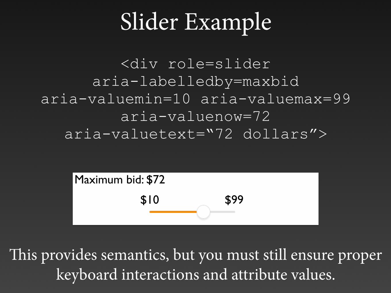
Slider Example<div role=slider
aria-labelledby=maxbid aria-valuemin=10 aria-valuemax=99
aria-valuenow=72 aria-valuetext=“72 dollars”>
$10 $99
Maximum bid: $72
This provides semantics, but you must still ensure proper keyboard interactions and attribute values.
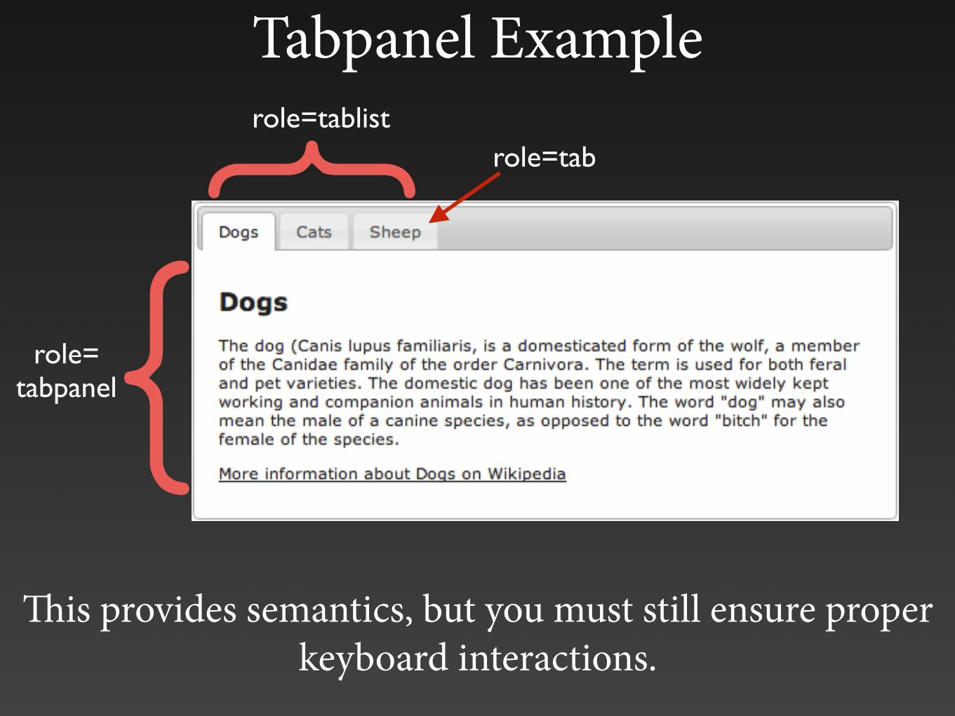
Tabpanel Example
Maximum bid: $72
This provides semantics, but you must still ensure proper keyboard interactions.
}role=tablistrole=tab
{role=tabpanel

Single Page Apps
• Document structure
• Use structural elements (<main>) for content updates
• Update page titles to reflect content/state
• Keyboard navigation
• Ensure only visible elements are navigable
• Set focus() when necessary•$('main').attr("tabIndex", -1) .focus();
• Use live regions for messaging, if necessary


