BRANDING IMPORTANCE IN MUNICIPALITIES:
REBRANDING THE CITY OF SAN MARCOS,TEXAS
by
Kelley McCall Harber
A thesis submitted to the Graduate Council of Texas State University in partial fulfillment
of the requirements for the degree of Master of Fine Arts
with a Major in Communication Design May 2014
Committee Members:
Grayson Lawrence, Chair Jeffrey Davis
William Meek
COPYRIGHT
by
Kelley McCall Harber
2014
FAIR USE & AUTHOR’S PERMISSION STATEMENT
Fair Use
This work is protected by the Copyright Laws of the United States (Public Law 94-553, section 107). Consistent with fair use as defined in the Copyright Laws, brief quotations from this material are allowed with proper acknowledgment. Use of this material for financial gain without the author’s express written permission is not allowed.
Duplication Permission
As the copyright holder of this work I, Kelley McCall Harber, refuse permission to copy in excess of the “Fair Use” examption without my written permission.
DEDICATION
This thesis is dedicated to all the people who have believed in me and supported
me throughout my graduate education: my husband, Matthew, who helped me stay sane
while managing work, school and life; my sister, Casey, who has been my constant
cheerleader; my parents, Bill and Cathy, who instilled a strong work ethic and will to
succeed; and my friends, mentors, and colleagues from the MFA program who made this
an amazing and unforgettable journey.
v
ACKNOWLEDGEMENTS
I would like to thank my thesis committee members, Grayson Lawrence, Jeffrey
Davis, and William Meek, for the knowledge and wisdom they shared with me, as well as
for their continuous support throughout this process. I would also like to thank all of the
professors of the MFA program for all of their time and commitment to the program as
well as their unwavering dedication to not only the program, but to the students.
I would especially like to thank Claudia Roeschmann for her friendship and
guidance through the program, and Christine Haney, who watches over all of us and
keeps the program running as smoothly as it does.
vi
TABLE OF CONTENTS
Page
ACKNOWLEDGEMENTS .................................................................................................v
ABSTRACT ..................................................................................................................... viii
CHAPTER
I. INTRODUCTION ................................................................................................1
Statement Of The Problem .................................................................................1 Defining Brand Identity .....................................................................................2 City Branding .....................................................................................................3 San Marcos, TX .................................................................................................4
Population ....................................................................................................5 Economy ......................................................................................................5 Education .....................................................................................................5 Employment .................................................................................................5
Target Audience For Rebrand ............................................................................6 Residents ......................................................................................................6 Business Investors ........................................................................................7 Tourists ........................................................................................................8
Current Brand Identity .......................................................................................9 Goal Of The New Identity ...............................................................................10 Case Studies Of Similar Brands And Successful Implementation ..................10
McKinney, Texas .......................................................................................11 Wollongong, New South Wales, Australia ................................................11
II. PRELIMINARY RESEARCH ..........................................................................13
Phase One: City Research ................................................................................13 Phase Two: Photographic Documentation .......................................................14 Phase Three: Existing Brand Audit ..................................................................15 Phase Four: SWOT Analysis ...........................................................................16
Strenths ......................................................................................................16 Weaknesses ................................................................................................17 Opportunites ...............................................................................................19 Threats ........................................................................................................19
Phase Five: Zag Analysis .................................................................................20
vii
A Strong Tie To Nature .............................................................................21 A Small Town Experience .........................................................................21 A Large University System ........................................................................22
III. STATEMENT OF THE PROBLEM ...............................................................23
IV. METHODS ......................................................................................................26
Word List .........................................................................................................26 Icons .................................................................................................................26 Sketches And Roughts .....................................................................................27
V. OUTCOMES .....................................................................................................29
New Logo And Brand Identity ........................................................................29 Color ................................................................................................................30 Typography ......................................................................................................32 Icon Suite .........................................................................................................33 Taglines ............................................................................................................33 Grid System .....................................................................................................34
VI. DELIVERABLES ............................................................................................36
Corporate Marketing Materials ........................................................................36 Web-Based Consumer Communication ...........................................................37
Website ......................................................................................................37 Social Media ..............................................................................................39 Twitter ........................................................................................................39 Facebook ....................................................................................................41
Direct Mail Promotion .....................................................................................42 Environmental Graphics ..................................................................................42 Promotional Items ............................................................................................43
VII. CONCLUSION ..............................................................................................45
ILLUSTRATION ...............................................................................................................46
REFERENCES ................................................................................................................114

viii
ABSTRACT
The global population is continually growing with increasing numbers of
families moving into metropolitan areas both large and small. As populations increase
and uninhabited land decreases, competition between cities becomes more aggressive in
order to attract potential investment and to increase population size. In this competitive
dynamic, a strong brand presence is critical. And as a result of this, an increased need for
city branding has developed.
In July of 2009, the city council of San Marcos began work on a project to
rebrand the city. The goal of the rebrand was to increase investment and development
within the city, attract more tourism, and to create a consistent brand identity and
messaging platform. The city released a request for proposals to design agencies that
identified the goals of the rebrand as needing to develop a unique and consistent identity
for the city in order to successfully attract inward investment to the city.
Through the research, process, design, and implementation outlined in this
thesis, a new brand identity for the city of San Marcos, Texas is created. The new city
brand and identity is an example of consistent brand implementation across multiple
marketing mediums including marketing materials, environmental signage, promotional
items, and online sites. The brand messaging is implemented through several tactics to
increase brand awareness and to attract the target investment groups. This rebranding
project additionally supports the need for small municipalities to implement city branding
strategies in order to attract its target investment groups. The thesis is followed by a

ix
brand process book outlining the process of the new brand creation and its
implementation.
1
CHAPTER I
INTRODUCTION
This body of research explores the rebranding project for the city of San Marcos,
Texas and addresses the need for small municipitalities to implement city branding
strategies in order to attract stakeholders. Teemu Moilanen and Seppo Rainisto, place
branding experts from Finland, describe the goals of these strategies as: to attract
companies and investments, promote growth in the tourist industry, strengthen the local
citizens’ identity, and attract potential new residents (2009, p. 1). The following thesis
outlines the preliminary research, methods, outcomes, and deliverables from the
rebranding project for San Marcos, Texas.
Statement Of The Problem
The global population is continually growing. Keith Dinnie, an academic scholar
and author of City branding: Theory and cases, reports that in 1925, 25% of the world’s
population lived in cities, and that by 2025, that number will be closer to 75%. As
populations increase and unihabited land decreases, competition between cities becomes
more aggressive in order to attract potential investment and to increase population size. In
this competitive dynamic, brand reputation is critical (2011, p. 15).
The United States Census Bureau reports that from 2010 to 2012 the population
of the state of Texas increased by 3.6%; more than double that of the national average of
1.7% (“State and county quickfacts: Texas,” 2013). Michael Evamy, a renowned
copywriter who writes for many well-respected brands and businessses in Europe (i.e.,
B&W Loudspeakers, Burberry, and National Railway) states, “we’re living through a
pandemic of place branding…Thriving in a world of international city-on-city
2
competition, urban regeneration and unprecedented growths in travel, tourism, and
relocation” (2012, p. 59). Because of the rapid growth within the state of Texas and the
increase of competition between cities, an increased need for city branding has
developed.
In July of 2009, the city council of San Marcos began work on a project to
rebrand the city. The city released a request for proposals for branding services to design
agencies that identified the goals of the rebrand as needing to “clarify San Marcos’
unique identity and develop consistent, clear and positive messages as a way to help the
City and community organizations engage in successful recruitment and marketing of
San Marcos, Texas” (“Request for proposals,” 2009). The following project outlines a
rebranding project conducted for the city of San Marcos in response to the request for
proposals.
Defining Brand Identity
A brand is defined as “an impression percieved in a client’s mind of a product or
a service. It is the sum of all tangible and intangible elements, which makes the selection
unique” (Moilanen & Rainisto, 2009, p. 6). Alina Wheeler, author of Designing brand
identity, defines brand identity as the promise that any product, corporation, or entity
promises to uphold and deliver upon and will reside in the mindset of all individuals who
interact with the brand. A brand identity typically consists minimally of a logo, basic
implementation, and a slogan (e.g., tagline). However, a complete brand identity also
includes many touch points that act to promote and strengthen the brand. These
touchpoints include but are not limited to: printed collateral and digital marketing
3
materials, user experience (both web-based and social media) advertising, environmental
graphics, direct marketing, and an online presense (2006, p. 4).
City Branding
Brand identity is historically used to promote a corporation or a product. G. J.
Ashworth, a professor at the University of Groningen in the Netherlands, and Dr. Mihalis
Kavaratzis, a lecturer at the University of Leicester in the United Kingdom, stated that
cities cannot be marketed in the same fashion as products or businesses. Due to this
restriction, a unique type of branding is required (2009, p. 525). In a world with hundreds
of cities and a total population well over one million, competition between cities grow as
each one strives to be the most appealing (Moilanen & Rainisto, 2009, p. 3). In order for
cities to differentiate themselves from others, the practice of place branding is needed.
María Isabel Míguez González, a faculty member of Universidade de Vigo,
defined place branding as a mode to create value between a geographical area and an
individual by building a comprehensive image of the economic, social, and historical
aspects of the place to create a positive image of the location (2011, pp. 297-298).
Veronika Koller, a senior lecturer of Linguistics and English Language at Lancaster
University stated that city branding follows these same guidelines, but demonstrates a
shift from “material to semiotic cognitive production” (2008, p. 431). This notion is
further supported by Jørgen Stigel and Søren Frimann, professors of Communication and
Informatics at Aalborg University, who observed that a city is similar to a person in that
it has a unique identity and a set of personal values that are held dear (2006, p. 248).
The ultimate goal of city branding is to create “preference and loyalty to the city
among the various segments which cities serve” (Dinnie, 2011, p. 9). Milton Glaser, one
4
of the most celebrated graphic designers in the United States, designed the iconic brand
of New York City, New York (see illustration section, p. 49). This brand identity
encapsulated the unique sense of the city and is an early example of place branding as
defined today. The design was immediately implemented across a multitude of marketing
materials and functioned to attract non-locals to a city that previously held a reputation of
bankruptcy and crime. The logo still generates $30 million every year for the state of
New York from mechandise sales (Evamy, 2012).
The goal of rebranding the city of San Marcos was to deliver a consistent
message through promotion of the brand to three target audiences: residents, business
investors, and tourists. Through the development of successful city branding, San Marcos
will differentiate itself and stand out in a cluttered marketplace full of competition.
Successful implementation will result in increased revenues from tourism, attract
investments from businesses, and propogate and retain a qualified workforce (Koller,
2008).
San Marcos, Texas
San Marcos, Texas is a small city located in the central Texas hill country and is
one of the oldest continually inhabited areas of the Northern hemisphere. The city is
located on Interstate Highway 35 between two larger metropolitan areas: San Antonio
and Austin (“Historic Downtown,” 2014). In 2012, the United States Census Bureau
released an article stating that Austin, San Antonio and San Marcos are three of the
fastest-growing cities in the nation, and that San Marcos has “the highest rate of growth
among all U.S. cities and towns with at least 50,000 people” (“Texas cities lead nation,”
2013). Due to rapid growth in San Marcos as well as the surrounding cities of Austin and
5
San Antonio, the immediate need for strong city branding is very timely in order to
continue growth in the city and attract the target audiences.
Population. The United States Census Bureau reports that in 2012 , San Marcos
had an estimated population of 50,001 residents. Of that population, the majority were
females, ages 20-24, and of Latino ethnicity. There were also a total of 18,169 housing
units within the city limits of which over 50% were renter-occupied with an average
number of 2.31 individuals living in each household (“State and County Quickfacts: San
Marcos,” 2013) (see illustration section, pp. 51-52).
Economy. The economy of San Marcos is primarily supported through
education, retail business, and tourism. These three areas of the economy are stimulated
primarily by Texas State University, Premium Outlets, Tanger Outlets, the Edward’s
Aquifer, and Spring Lake at Aquarena Springs with support of the local tourist industry
(“Community Demographics,” 2009).
Education. San Marcos’ population continues to grow largely due to Texas
State University and the large student population it generates. Enrollment for the Fall
2011 semester at Texas State University reported 34,113 students (“Texas State,” 2011).
To supplement the large student work force, the majority of job options in San Marcos
are part-time positions in fields of retail and service industry. Historically, these job
options are not considered as long-term career opportunities that will persuade college
students to become permanent residents after graduation, or attract new residents to move
to the city.
Employment. The largest employers and manufacturers in the city were Texas
State University with 2,780 employees, Premium Outlets with 2,100 employees, Tanger
6
Outlets with 1,540 employees, the San Marcos Independent School District with 1,114
employees, Hunter Industries with 650 employees, HEB Distribution Center with 578
employees, Philips with 333 employees, and C-FAN with 319 employees (“Community
demographics,” 2009).
Target Audience For Rebrand
City branding cannot effectively appeal to every audience in the exact same
way, nor can it be expected to attract all consumers equally. Sucessful city branding
initiatives are directed at a group of defined audiences, communicate varying messages to
each group, and remain true to the brand identity as a whole.
In order to attract investment to San Marcos, a unified brand identity and
message will be developed to appeal to the three defined target audiences of investment
groups: residents, business investors, and tourists. Dinnie (2011) writes that the challenge
for any city brand is to determine how to develop a “strong umbrella brand that is
coherent across a range of different areas of activity with different target audiences,
whilst at the same time enabling sector-specific brand communication to be created” (p.
5). In an interview regarding the rebranding project of San Marcos, Mayor Susan Narvaiz
stated that “every group in San Marcos has their own tagline” (Mester, 2009, para. 7).
This demonstrates how the city attempts to appeal to every target audience without
having one strong overarching brand identity present.
Residents. The first target investment group the rebrand of the city of San
Marcos will attract are residents. Dinnie (2011) writes that “residents embody a city’s
local culture, own and operate local businesses, and represent the personality of the
place” (p. 14). Stephen Green, a lecturer of design at Brunel University, explains that the
7
brand of a city is a collaborative design that involves “many heterogeneous stakeholders
who must collaborate in order to achieve a sucessful outcome” (2005, p. 277).
As stated previously, the population of San Marcos is predominantly comprised
of college-aged students between the ages of 20-24. This age group is significantly
younger than the state average and contributes to the city’s student population being
significantly higher than the state average (“San Marcos, Texas” 2013). Most commonly,
college-aged students rent property, live with roommates, and hold jobs in the service
industry or retail sales jobs. This demographic does not contribute to growth of single
family homes or corporate business development, and is generally regarded to be
uninvolved in the local community. Due to the current lack of corporate or large business
employment, the majority of college-aged students move away from San Marcos after
graduation. Thus, the city is not able to take advantage of the majority of educated Texas
State University graduates for its workforce.
The rebrand of San Marcos will focus on attracting young families, working
professionals, and graduates of Texas State University. This will encourage businesses to
establish a residence in the city. This demographic will additionally stimulate the
economy by investing in real estate, regularly purchase home supplies from local
businesses, and help strengthen the community with more active participation and
involvement.
Business Investors. The second target investment group the rebrand of the city
of San Marcos will attract are business investors. Dinne (2011) states that “investment
creates jobs, expands the tax base, helps manage budgets and credit ratings, and funds
education, infrastructure, and services” (p. 18).
8
As stated previously, the business landscape in San Marcos is predominantly
focused on education, retail, and manufacturing (see illustration section, p. 53). These
industries provide opportunities to the local work force and maintain the unemployment
level at 5.6% which is below the 6.7% Texas State level (“San Marcos, Texas” 2013).
However, this does not provide many opportunities for long-term career paths or
employee advancement.
The rebrand of San Marcos will focus on attracting more professional, scientific,
and technical industries. Bringing these types of industries will stimulate the economy by
attracting business professionals to the area, create long-term career path jobs, and entice
graduating college students to stay in the community due to more diverse and readily
available job opportunities.
Tourists. The third target investment group the rebrand of the city of San
Marcos will attract are tourists. The Webster Dictionary defines tourism as “traveling for
pleasure and the economic activities related to it” (Morehead & Morehead, 1995). It
involves traveling in search of images and experiences that are not found at home
(Dinnie, 2011, p. 28). Tourism brings income into a city from external sources it
otherwise would not have access to. It not only brings new consumers into a city, it
promotes increased spending within the city, creates jobs in leisure and hospitality, and
helps a city differentiate itself from others.
The San Marcos department of tourism focuses on the many natural areas of the
city and the easily accessible San Marcos River (“Attractions,” 2014). This focus is
geared toward attracting tourists intested in outdoor activities, as well as providing year-
round areas of recreational activities for local residents.

9
Tourism in a city is commonly thought of as an activity that a visitor will
participate in while being guest of the city. However, tourism can also be used to
introduce a place to a consumer. By providing a pleasing tourist experience to an
individual, that experience will resonate after the visit is over, and hopefully later
persuade that individual to become a permanent resident.
The rebrand of San Marcos will focus on attracting more families and leisure
and hospitality businesses to the area. Attracting these types of tourist groups will aid the
economy by introducing the city to prospective residents looking for affordable real
estate and a community focused on education, as well as business investors looking to
capitalize on a growing tourist industry.
Current Brand Identity
City branding initiatives often adopt and implement only a few pieces of brand
identity and messaging. Many times this is due to budgetary restraints, a lack of dedicated
resources, and minimal knowledge of the importance of brand identity. The brand pieces
implemented typically include a logo, tagline, and a few pieces of promotional material.
Ashworth and Kavaratzis (2009) believes that in order to create a sucessful city brand,
the identity must be a continuous process that interacts with all marketing efforts. Wayne
Curtis, a contributing editor for Preservation Magazine, agrees it is not enough for a city
to simply have a brand that sits upon historical information; it also needs a strategy of
implementation (2006).
The previous brand identity of San Marcos included several logo variations,
inconsistent marketing materials, and assorted signage that all lack visual consistency

10
between them. This creates a conflicting and unsuccessful distribution of brand
messaging to the target audience (see illustration section, pp. 59-61).
Liping Cai, William Gartner, and Ana Munar, editors of Tourism Branding:
Communities in Action, writes that for a brand to be sucessful and raise positive
awareness, it needs to be consistent in the eyes of the consumer. Inconsistent branding
leads to incoherent and fragmented marketing which relays an unclear message to the
consumer (2009, p. 31)
Goal Of The New Identity
In order to meet the goals of attracting residents, investors, and tourists, the new
brand identity will demonstrate differentiation from surrounding cities, display a
consistent marketing message to build a positive image aimed at the target audiences, and
gain market share by increasing economic growth and urban development.
Case Studies Of Similar Brands And Successful Implementation
City branding is becoming one of the primary functions of city management.
Cities of all sizes use multiple methods in order to raise awareness and promote
themselves to their target audiences (Ashworth & Kavaratzis, 2009, p. 520). For smaller
municipitalities that are typically limited on resources and funds, city branding is vital for
them to predominently positition themselves in the competitive marketplace.
To better understand commonalities in city branding among cities, a comparison
study is created to research branding strategies and outline the success of the rebrand.
This comparison study proves commonalities in the primary target audiences of city
branding through differentiation, increasing awareness, and overcoming negative
perceptions.
11
McKinney, Texas. Differentiation and awareness are key ingredients to a
successful brand identity. McKinney, Texas is located on the outskirts of the Dallas/Fort
Worth metroplex, one of the largest cities in Texas. McKinney struggled to compete with
such a large city in attracting residents and business investors. As a result of this, the city
launched a new branding campaign that focused on differentiation with the help of North
Star Branding, an advertising agency specializing in city branding. Through the city
branding campaign, McKinney marketed its close proximity to Dallas, but focused on its
ample green space as an opportunity for residential spaces and business investment. The
tagline, “Unique by Nature” (see illustration section, p. 49) identifies the city as an
alternative to Dallas, providing a natural surrounding that cannot be found in the large
metroplex.
Results of city branding can be difficult to quantify due to a lack of
understanding of the role of city branding, a diverse and complex stakeholder group, and
the difficulty of delivering quantifiable results (Green, 2005, p. 279). In the case of
McKinney, the city rated the success of the rebrand with quantitative data reporting an
increase in hotel/motel tax of 22%, an increase in city sales tax of 17%, and an overall
population growth of 120% (“Results,” 2006). This data indicates the rebranding of
McKinney, Texas was sucessful in attracting residents and business investments.
Wallongong, New South Wales, Australia. Overcoming a negative brand
image is a challenge for city branding. Consumers are often influenced by media sources
and can form a negative perception of a place without ever physically visiting.
Wollongong, in New South Wales, was the subject of many negative stories reported by
the local media. Dinne (2011) explains that the negative publicity the city received from
12
the media regarding crime, heavy industry, and pollution detracted potential investors
from the city. In order to reverse the negative imagery, Wallongong rebranded itself as a
“city of innovation” based on its historic achievements in steel production (see
illustration section, p. 49). The rebrand campaign included extensive advertising, media,
and public relation campaigns to communicate the new image to the public (Dinnie, p.
214).
The Wollongong rebranding campaign redefined the negative public image of
the city. The success of the campaign was not measured by quantitative data as the
success of McKinney was, but instead by an image study conducted before and after the
rebrand by the Illawarra Regional Information Service. The study found that the number
of people who felt that Wollongong offered “beautiful, unspoiled natural attractions” had
increased from 49% pre-branding, to 73% post-brand implementation (Dinnie, p. 219).
This data provided evidence that the rebranding of Wollongong was sucessful in
changing negative perceptions about itself and communicating a positive perception
through the media.
13
CHAPTER II
PRELIMINARY RESEARCH
For any design assignment, many different research strategies are available and
can be utilized in order to achieve one final design solution. Sam Jacob, a columnist for
Art Review, descibes these methodologies of design as “conceived of as an ecology; the
design process breeds a host of solutions; and each of these is tested within the
conceptual environment” (2012, p. 60). In the following study, the five phases of
preliminary research chosen for the San Marcos rebranding project include: city research,
photographic documentation, an existing brand audit, strengths, weaknesses,
opportunities, and threats (SWOT), and zag analysis.
Phase One: City Research
San Marcos, Texas is defined by its chamber of commerce as a “thriving city
that welcomes new employers and has the resources to help new and expanding
businesses succeed” (“Community demographics,” 2009). The city has a population
density of 2,746 per square mile and an average commute time of 20.5 minutes which
makes it attractive for all target segments. Additionally, the city’s crime rate over the last
10 years has been below that of the U.S. average by 10% (“San Marcos, Texas” 2013).
For potential residents of the city, career opportunities are found both within and
outside the city limits. Within the city, the top employers are Texas State University with
2,780 employees, Premium Outlets with 2,100 employees, Tanger Factory Outlet Center
with 1,540 employees, and the San Marcos Independent School District with 1,114
employees (“Community demographics,” 2009). Addionally, the city is located 30 miles
south of Austin, Texas on Interstate Highway 35. Austin is saturated with many diverse
14
tech career opportunites that are attractive to college graduates. San Marcos’ close
proximity to Austin provides a short work communte to one of the largest growing cities
in the state.
For business investors, San Marcos has a very competitive utility and property
tax rate for not only residential, but also commercial and industrial industries.
Additionally, for businesses that requires importing and exporting of parts and products,
the Union Pacific Railroad service in San Marcos averages 20 trains entering and exiting
the city every day (“Community demographics,” 2009).
For tourists, San Marcos offers an array of outdoor activities. The city is home
to one of the nation’s largest wooden playscapes, as well as nine city parks and Wonder
World Caverns which provides a guided tour underneath the surface of the city. The San
Marcos River provides many activities including tubing, fishing, canoeing, and scuba
diving. Additionally, the Premium Outlets and Tanger Outlets offer year-round shopping
to both residents and visitors of the city.
Phase Two: Photographic Documentation
Phase two of the preliminary research is the photographic documentation of the
city of San Marcos. This documentation includes a collection of photographs from the
city and surrounding areas (see illustration section, p. 54-58). The collection of these
photographs will aid in the formation of a visual representation of the city that will be
incorporated into the final brand identity.
The primary areas of photographic research are local flora and fauna, industry,
and recreation. Many consistent themes become evident as a result of the photographic
documentation. These photographs show an abundance of plants and animals that live in
15
and around the San Marcos River. Through these visual representations, consistent
themes appear in the construct of basic organic shapes, as well as a color palette of earth
tones including muted blues, greens, and greys.
Findings from the photographic documentation direct the visual formation of the
San Marcos brand and identity that is later used in the final logo design. By constructing
elements based on the organic shapes and colors found in nature, the viewer
subconsciously identifies with these constructs and in turn relates the identity of San
Marcos to the concept of nature. John Rossiter and Steve Bellman, two notable authors
on marketing and communication, call this sort of attachment emotional branding. They
state, “emotional branding is defined here as the consumer’s attachment of a strong,
specific, usage-relevant emotion–such as Bonding, Companionship, or Love–to the
brand” (Rossiter & Bellman, 2012, p. 291).
Phase Three: Existing Brand Audit
Phase three of the preliminary research is an audit of the existing brand. This
strategy helps to identify the existing successes and failures of the current brand.
Ashworth and Kavaratzis (2009) writes, “too often cities adopt only a part of the
branding process, namely the development of a catchy slogan and/or the design of a new
logo to be attached in promotional material” (p. 522). A survey of the existing brand of
San Marcos uncoveres a lack of continuity and cohesiveness (see illustration section, pp.
59-61). There are multiple executions of the city’s logo, as well as many inconsistent uses
of the logo in the city’s media and print collateral, which fail to successfully
communicate a single brand identity. Marty Neumier, a noted author of brand and
advertising books, states in ZAG: The #1 strategy of high-performace brands that the
16
average consumer is subjected to over 3,000 marketing messages every day. Inconsistent
branding causes confusion as well as heightened skepticism in the reliability or credibility
of the brand (Neumier, 2007, p. 7). Kevin Roberts, CEO Worldwide of Saatchi &
Saatchi, a global advertising agency headquartered in New York, states that, “brands
were developed to create differences for products that were in danger of becoming as
hard to tell apart as chunks of gravel” (Roberts, 2005, p. 30).
To successfully implement awareness of the new brand identity for the city, a
consistent approach in the distribution of the brand needs to be formulated and
maintained. Ashworth and Kavaratzis (2009) believes that successful branding cannot be
obtained by inconsistent marketing messages, but instead needs to be “thought of as a
complete and continuous process interlinked with all other marketing efforts” (p. 522).
Phase Four: SWOT Analysis
Phase four of the preliminary research involves setting up a SWOT analysis.
The SWOT analysis technique is a strategic planning method used to evaluate the
strengths, weaknesses, opportunities, and threats involved in a project or business venture
(see illustration section, pp. 63-64). The strengths and weaknesses are typically defined
internally by the organization, and the opportunities and threats are external factors. By
evaluating these categories, a plan of action can be formed that will be implemented in
order to position the brand favorably in the marketplace.
Strengths. The strengths of a city include any factors that position it as valuable
above its competition. By evaluating the strengths of San Marcos, many elements are
identified as positive attributes for the city.
17
The first strength identified is the easily accessible natural areas in and around
the city. Nearby cities of Austin and San Antonio are very densly populated and do not
have vast areas of nature that are easily accessible to all residents. In San Marcos, many
geographical areas, including the San Marcos River and the surrounding Hill Country, are
readily accessible. These are identified as strengths that San Marcos owns which help to
differentiate itself from nearby cities. In addition to this strength, these accessible areas
are promoted by an abundance of recreational activities in and around the city. The river
affords many water activities and the local greenbelt provides many appealing areas ideal
for hiking, biking and camping.
The second strength found is the city’s low population density. In Austin and
San Antonio, larger populations results in a higher crime rate, higher property taxes, and
longer driving work commute times due to traffic. This strength differentiates San
Marcos and provides light traffic levels, less crime, and relatively inexpensive cost of
land for commercial or residential investment.
The third strength is the close proximity of the city to two large metropolitan
areas of Texas: Austin and San Antonio. This close distance and short travel time allows
residents to have convenient access to the benefits of larger cities while retaining
residence in a smaller city, as well as provides local business investors an extended
market for which to promote business and gain clientele.
Weaknesses. Weaknesses of a city include factors that make the city vulnerable
to competition. By evaluating the weaknesses of the city, many factors are found that
may cause negative perceptions of the city. Deborah Peel and M. Greg Lloyd, chairs of
Architecture and Planning at the University of Dundee, writes that if a city’s brand has a
18
negative image, this will adversely affect goals of economic development and attracting
external investments. In order for a city to obtain economic performance and growth, the
brand must overcome any perceived negative image (Peel & Lloyd, 2008, p. 509).
The first weaknesses of the city is the lack of large professional corporations in
San Marcos. The Premium Outlets Mall are one of the largest suppliers of job positions in
San Marcos. However, the jobs offer primarily hourly salaries in retail or fast food that
do not offer long-term career paths or many opportunities for professional development.
The second weakness of the city is the inconsistent manner in which its brand
identity and messaging is delivered to consumers. The brand exhibits an inconsistent
execution across many marketing platforms. This can cause confusion and doubts to
consumers in regard to the brand. This is a common weakness in cities and is typically
caused by a limitation of resources. Dinne (2011) describes a common problem that city
branding faces as a combination of “overstretched and inadequate facilities, as well as
limited financial resources” (p. 93).
The third weakness of the city is a lack of awareness in the marketplace.
Areavibes (“Find the best,” 2014), a website that rates the top places to live in United
States, lists areas based on cost of living, crime rates, tax rates, and many other factors.
The site identifies the top 100 places to live in Texas and San Marcos does not populate
as an option, though Buda and Wimberley, two nearby citys, are identified in the list.
Because of San Marcos’ small size and limited resources to market itself to consumers,
increasing awareness is difficult. This is a common weakness among small citys due to
small marketing budgets.

19
Opportunities. Opportunities of a city are typically areas where improvement
can be gained to better compete in the marketplace. The largest opportunites for San
Marcos are more community involvement from residents and college students, more
outward promotion of the brand, and more direct marketing of the benefits of investing in
San Marcos.
The first opportunity is to promote the college-aged population of the city in
order to attract business investments. Dinnie (2011) discusses how Toronto, Canada
sucessfully promotes itself as an attractive city for investors. The primary reason is that it
has a large population of working-age individuals, as well as a very well-educated
population. This is due to the large universities and student populations it produces (p.
22). San Marcos is similar to Toronto with a large population of working-age, well-
educated students of Texas State.
The second opportunity is the low utility and property tax rate in the city. By
actively promoting this benefit, the city can attract both potential residents and business
investments when looking for a destination to relocate to.
A third opportunity is to increase involvement in the natural areas of the city.
Initiating community involvement and local programs to promote these areas will help to
build awareness of the natural geographical areas of the city, and promote more tourism
opportunities.
Threats. Threats to a city are external factors that could potentially become
obstacles for sucessfully attracting consumers. Dinnie (2011) discusses that cities are
becoming the primary differentiator between different geographical regions. Competition
to position themselves as the optimal choice for prospective residents, tourists, and
20
investors will only intensify as they focus on how to effectively convey their brand and
significant benefits of it (p. xiii).
The first threat is the growing competition of other citys in near proximity to
San Marcos. These citys have similar goals to attract residents, business investors, and
tourists. Austin, Texas is a short drive north of San Marcos and has a many more
employment opportunites for college graduates that want to go into the scientific or
technology fields. San Antonio, Texas is south of San Marcos and has a rich cultural
heritage that stimulates a booming tourism business. Buda and Wimberley, as previously
discussed, are smaller citys that share many of San Marcos’ strengths, but are increasing
their awareness in areas of online advertising and marketing.
The second threat is the large student population that migrates annually out of
the city in search of better job opportunities. There are no incentive to keep these students
as residents after they graduate, so they choose relocate to another city. As students
continue to move away from San Marcos after graduation, the city will struggle to attract
businesses to relocate to San Marcos due to lack of an educated, working-aged
population.
Phase Five: Zag Analysis
Phase five of the preliminary research is zag analysis. Marty Neumeier (2007)
defines zag as the radical differentiation that is the number one strategy of high-
performance brands. We no longer live in a world of simply faster, but rather a world of
more clutter. A sucessful brand needs to be able to cut through the clutter and be
memorable to the viewer (Neumeier, 2007, p. 26-27). When there are too many
conflicting identities and messages for one brand in the marketplace, it creates confusion

21
and doubt for the consumer. Creating a consistent identity and messaging for a brand
helps to solidify its awareness to the consumer as well as differentiate itself from its
competitors.
Zag analysis, as defined by Neumeier, consists of a series of 17 questions that
are asked about the existing brand. The answers to these questions serve to identify and
formulate tactics to differentiate a brand in a competitive market (see illustration section,
pp. 65-66). The findings from the zag analysis questions for the city of San Marcos
connotes three major themes of differentiation that the city should promote: a strong tie to
nature, a small town experience, and the presence of a large university system.
A Strong Tie To Nature. San Marcos can differentiate itself by promoting its
strong involvement with nature and embracing a positive green living stance. This was
accomplished by promoting the San Marcos River and the many outdoor activites it
affords. This will help the city position itself to the target investment group of tourists.
The ease of accessing outdoor activities will attract individuals looking for optimal
vacation or excursion areas.
A Small Town Experience. Because of the small size of San Marcos, residents
are fortunate to enjoy a low population density and resulting shorter average commute
time. In addition, property, utility, and tax rates in the city are lower than average, as is
the crime rate. With the added benefit of being close to larger metropolitan areas for
individuals who need to commute to work in a larger city, or just desire the offerings of a
larger city without the hassles of living in one, this can help to attract the target
investment group of residents to the city.
22
A Larger University System. As stated previously, the total population count
of the city is 50,001 with a student population of 34,113, and 2,780 employees of the
University. The student population is more than half the entire city population and the
University employs almost 6% of the population. In addition, every year the university
graduates a large group of young working-aged individuals that are qualified to enter the
work force. This is an attribute that many other similar surrounding citys do not offer. By
promoting this asset to the target investment group of businesses, the city can effectively
recruit businesses to relocate or expand into the city to take advantage of the eligible
working population.
23
CHAPTER III
STATEMENT OF THE PROBLEM
As city populations continue to grow, there becomes an increased competition
between cities to attract stakeholders, which are defined as investors (i.e., business
owners), residents and tourists. In order for San Marcos to effectively attract these target
investment groups regardless of growing competition, it needs to effectively
communicate its brand identity and messaging to the target audiences. The findings of the
preliminary research discussed in the previous chapter help to identify the existing
problem areas within the city and the negative effect these areas have on attracting the
target investment groups.
The SWOT analysis indicated the primary weaknesses of the city are: a lack of
large professional corporations, inconsistent brand identity and messaging, and a lack of
awareness in the marketplace. Additionally, the SWOT analysis indicated the primary
threats to the city are: growing competition of other citys in near proximity to San
Marcos and the large student population that migrates annually out of the city in search of
better job opportunities.
By studying the weaknesses and threats identified, it is evident that the current
inconsistent brand and messaging for the city is causing a lack of awareness in the
marketplace to its target audiences. Because of this lack of awareness, the growing
competition from nearby cities receive the majority of attention from the target audiences
when they are searching for potential relocation. This lack of aknowledgement in the city
is evident each year when the University graduates a group of young, working-aged
professionals who leave the city in search of better career opportunities and larger
24
corporations to work for. This exodus negatively impacts the city’s attempts to attract
larger corporations and businesses.
The SWOT analysis also indicated the primary strengths of the city as: having
easily accessible natural areas, a low population density, and a close proximity to other
larger metropolitan areas. Additionally, the SWOT analysis indicated the primary
opportunities for the city are: increased promotion of the college-aged population of the
city to attract business investments, increased promotion of the low utility and property
tax rate in the city, and more community involvement in the natural areas of the city.
By taking the current strengths, and combining them with the current
opportunities, the city can begin working to more effectively attract its target audiences.
More outward promotion of the easily accessible natural areas will attract more tourists to
the area and increase awareness of the city outside of its geographical boundaries. The
low population density of the city combined with the low utility and property tax rates
will attract residents to the area who are seeking relocation. Finally, the city’s close
proximity to larger metropolitan areas as well as its yearly graduating class of young
professionals can help to attract larger corporations from Austin and San Antonio to
expand and build additional locations in San Marcos with employment positions filled by
the large population of working-aged individuals and recent graduates.
The zag analysis identified the primary areas of differentiation that the city
should focus on is to increase its awareness in the competitive market of city branding. In
order to begin effectively marketing the city, a consistent brand identity and message
needs to be developed to promote the city and begin increasing awareness in the
marketplace. The main areas of differentiation the city should focus on for its new brand
25
identity are: its strong tie to nature, its small town experience, and its large university
system.
The problems and opportinities identified by the SWOT and zag analysis will
help to build an effective brand identity and successful marketing solution to increase
awareness in the marketplace and to attract the target investment groups.
26
CHAPTER IV
METHODS
The outcomes of the preliminary research result in consistent themes that are
identified and extended into a complete brand identity. The next two phases are methods
and outcomes.
In the methods phase, the different strategies used are basic word listing, hand
sketching, and formation of a final design solution. Mike McAuley, a senior lecturer and
director of illustration at the Massey University School of Design, states the key
conceptual thinking skill in successful illustration is in the translation of the written word
to a visual design, or rather the ability to interpret written text (McAuley, 2010, p. 112).
By beginning with word listing, the written word begins to change form and shift to a
final design outcome, or illustration.
Word List
A word list is a collection of words or phrases that represent specific topics (see
illustration section, pp. 68-69). Once the list is complete, identification of key words that
best connote the desired message of the brand are chosen. Additionally, relevent words
originating from the wordlist were incorporated into the new SM tagline (i.e., slogan).
The next step of the process involves taking these words and forming simple graphical
representations of the words into iconography.
Icons
Icons are defined through an explanation of semiotics. João F. D. Figueiredo and
Denis A. Coelho, from the Technological Industrial Design program of Universidade da
Beira Interior in Portugal, writes that by human nature, we assign a symbolic connotation
27
to objects beyond their preceived explicit meaning. Thus, the product of design is not
always methodical, but rather intuitive (Figueiredo & Coelho, 2010, p. 334). Humans see
common shapes and symbols and make automatic connections to different meanings and
feelings based on this predisposition. These signs can be as straightforward as Morse
code or as simple as a swift facial expression. Sean Hall, the leader of Contextual studies
at the Goldsmith University of London, explains “signing is vital to human existence
because it underlies all forms of communication” (Hall, 2007, p. 5).
From the results of the word list, an icon study is developed. This study includes
taking various words that accurately represent the intended message of the brand, and
then studying existing iconic representations of those words through logo usage. One of
the strengths identified by the SWOT analysis was the many easily accessible natural
areas in San Marcos. Due to this, the following specific words are chosen: river, nature,
mall, and university. The findings illustrate many common themes focusing on shape
formation and color combinations. These themes are explored further with conceptual
sketches and roughs (see illustration section, pp. 70-73).
Sketches And Roughs
The outcomes of the word list and results of the icon study are followed by the
development of initial sketches and then roughs of iconographic treatments that will be
used for the new identity of San Marcos.
These initial sketches and roughs are vital to the process of design as they allow
for exploration of different variations on multiple themes (see illustration section, pp. 74-
77). Ron Dulaney Jr., an assistant professor of Interior Design at West Virginia
University, and Francis Lyn, a coordinator for the School of Architecture at Florida

28
Atlantic University, writes that “hand drawing, particularly free-hand sketching, is highly
valued and practiced among both academics and practicioners” (Dulaney & Lyn, 2010, p.
285). Through this process the final logo design and identity is created.
29
CHAPTER V
OUTCOMES
In the outcomes phase, the results of the previously described methods
formulated a new brand and identity for San Marcos. The outcomes included many
attributes of the new logo and brand identity including a color and type palette, an icon
suite, taglines, and a grid system for future deliverables to follow. Rob Wallace, a global
design and brand strategy consultant stated, “visual language is far more eloquent than
verbal communication” (Wallace, 2008, para. 18). Dinne (2011) expanded on this by
advising that, “in order to develop a strong brand, policy makers need to identify a clear
set of brand attributes that the city possesses and which can form the basis for
engendering positive perception of the city across multiple audiences” (p. 5). By creating
a suite of brand images, messaging, and standards to follow when communicating the
brand, the city will be able to effectively communicate a consistent brand message across
all platforms.
New Logo And Brand Identity
A trademark and logo are defined as a “patented name or visual mark attached to
[a] product” (Morehead & Morehead, 1995). The logo is the external face of any
company or product and serves to represent the product and all that it stands for. In order
to be successful, the logo needs to be recognizeable, as well as memorable. Jay Doblin,
known internationally for trademark design, stated that a successful logo can be an
enormously valuable business asset and can create a following of individuals who
become promoters of the brand (Doblin, 1967, p. 180).
30
Leslie Savan, an author of graphic design literature, in discussing a proposed
graphic system to be implemented on an international level stated that “symbol signs are
simple silhouetted pictures that act as signs: a knife and fork will mean restaurant, a
question mark, an information booth” (Savan, 1976, p. 258). Wallace (2008) described
that humans respond to preset levels of visual hierarchy in communications: color, shape,
numbers, and words. While the color and shapes of the logo were designed to symbolize
icons of nature and growth, the typeface served to communicate a friendly and
approachable personality (see illustration section, pp. 79-80).
As discussed previously from the findings of the SWOT and zag analysis, the
city of San Marcos had a very strong tie to nature and a strong relationship with the
university. To communicate these assets, a typeface execution was needed that was both
organic and inviting, but also modern and sophisticated. Thus, the resulting colors and
typeface chosen for the primary brand identity were green and blue, and Gotham
Rounded.
Color
Color is defined as, “any of the hues of the rainbow and any tint or shade made
by mixing those hues” (Morehead & Morehead, 1995, p. 141). Jim Krause, an author on
color theory, wrote that color is not a singular form but rather the creation by many
elements that result in our perception of it. When color is used in branding an identity or
logo, the primary function is to evoke a feeling or perception from the viewer. Color and
combinations of colors can persuade, arouse, challenge, and inspire the viewer. Though
all individuals may interpret different thoughts or feelings in reaction to a color, there is a
common majority who share the same reaction (Krause, 2002, p. 8).
31
“Color is used to evoke emotion, express personality, and stimulate brand
association” (Wheeler, 2006, p. 110) In an empirical study by Niki Hynes, a lecturer at
the University or Strathclyde in Glasgow, a relationship was found between color
meaning and logo design that contributes to building a consistent corporate image.
“Logos add value by stakeholders seeing and remembering the logo (i.e., recognition) but
to be effective, the logo must serve as a signature of he company, by cleary linking the
shape, design or color to the organization it represents” (Hynes, 2008, p. 545). The results
of the study showed that the color green had a common association to the following
words: stability, contemplative, prestigious, security, dynamic, and growth. The results of
the study also showed that the color blue had a common association to the following
words: dependable, warm, protective, stability, reliable, and trustworthy.
The results from Hynes’ research, as well as from the icon study from the San
Marcos preliminary research, concluded the color selection of green and blue for the new
San Marcos logo. The colors were chosen to visually to express a city of stability,
growth, dependability, and reliability. Alvin Lustig, a teacher and lecturer of typography
at Yale University, stated that “design is related in some way to the world, the society
that creates it… People will respond most warmly and directly to those designs which
express their feelings and their tastes” (Lustig, 1954, p. 106).
In addition to the primary colors of the logo, a secondary color palette was
created as a second color resource for alternative marketing materials that support the
brand identity of San Marcos. The primary color palette consisted of the green and blue
from the logo, and the secondary palette consisted of a wide range of earth tones and
natural hues (see illustration section, pp. 81-82).
32
Typography
Typography is defined as “the art or work of setting type in the style of printed
matter” (Morehead & Morehead, 1995). In disciplines of graphic design and brand
identity, typography is used to create a unique perception of a brand or company. In our
everyday lives, we are continually surrounded by type and typograpic systems. These
systems are used to direct, instruct, engage, and persuade the audience. Charlotte Rivers,
a freelance writer of graphic design, wrote that “type’s central function is to communicate
a message in such a way that firstly, the intellectual content is understood, and secondly,
it is given a unique voice” (Rivers, 2005, p. 7).
The goal of the new brand identity as defined by the SWOT and zag analysis
was to attract the city’s target investment groups by promoting its desireable assets and
by differentiating itself from its competition. The typeface chosen for the San Marcos
logo was Gotham Rounded. Gotham Rounded is part of the Gotham type family designed
by Johnathan Hoefler and Tobias Frere-Jones in 2000. Gotham was originally inspired by
signs on buildings and was designed as a workmanlike alphabet. Gotham Rounded is an
extension of Gotham that retains the more technical design, though has a more friendly
and amusing aspect to it (“Gotham rounded,” 2013). This typeface offered many varying
cuts that could be applied across different mediums in marketing materials. It also
appropriately conveyed the differentiators of the zag analysis and suits the logotype of
San Marcos by conveying a friendly attitude that is supported by the small town
experience, but also retaining a modern and high-tech feel that appealed to the desire to
attract larger corporations to the city. This typeface was used in the logotype for San
33
Marcos as well as the additional marketing and promotional materials that were created
(see illustration section, pp. 83-84).
Chalk Duster Regular was chosen as a secondary typeface to work in
conjunction with Gotham Rounded. Texas State University students comprised over half
of the population of the city, and Texas State University and San Marcos Consolidated
Independent School District were two of the largest employers in the city. To address this
in the brand identity, the typeface Chalk Duster Regular was chosen. Chalk Duster
Regular acted as a supporting typeface to be used in marketing materials. The typeface
was published by Apple Computer Inc. in 2008. This hand-written font mimiced the look
of chalk on a chalkboard which is a common symbol for education (see illustration
section, p. 84).
Icon Suite
One of the weaknesses identified in the SWOT analysis was an inconsistency in
brand messaging. To create a consistent theme of iconographic information, an icon suite
was developed to support cohesiveness and brand consistency across all platforms. The
icon suite for San Marcos was based on the forms and typography used in the new logo.
The icons were used to indicate different areas of activities on marketing materials (see
illustration section, pp. 85-86).
Taglines
Debra Traverso, a faculty member at Harvard University, wrote that “a tagline is
a slogan, clarifier, mantra, company statement or guiding principle that describes,
synopsizes or helps create an interest” (Traverso, 2000. p. 147). Taglines are used to
evoke a feeling, thought, or response from the audience. To appeal to the consumer, it

34
must be “valid, believable, simple, appealing, and distinctive” (Peel & Lloyd, 2008, p.
509). The tagline can be as simple as one word, or more complex as a phrase or sentence
structure, but ultimately must give a brief summation of values that the brand emphasizes
in regard to the consumer (Stigel & Frimann, 2006, p. 251). For the San Marcos
indentity, a combination of taglines were chosen.
In order to effectively speak to the different target audiences (i.e., residents,
business investors, and tourists), a combination of taglines were chosen to convey
different messages when speaking to diverse audiences, but to also coexist under the
brand umbrella. To accomplish this, the taglines followed a fill-in-the-blank format. By
doing so, the tagline could be altered to effectively communicate to its target audience
(see illustration section, pp. 87-88).
The branding strategies and methodologies discussed were used to create a
single and identifiable brand identity for San Marcos. The logo, color and type palette,
icon suite and taglines became the visual foundation of the San Marcos brand. “Look and
feel is the visual language that makes a system proprietary and immediately
recognizable” (Wheeler, 2006, p. 68). By keeping one consistent look and feel for the
brand of San Marcos, the consumers who interact with the brand would have a higher
recall on the brand messaging and view it as authentic and reliable.
Grid System
A grid system creates a field of regularity that permits viewers to anticipate
where to locate information. An effective grid system is defined by its ability to achieve
coherency in organizing a layout so that the viewer can easily follow and understand
what is showed in a timely and predictable manner. The grid system is the logical
35
juncture of horizontal and vertical divisions acting as guides for locating that information.
This system is used throughout the printed marketing materials to create a visual
continuity (see illustration section, pp. 89-90).
A successfull grid design needs to achieve coherency in organizing a space so
that the viewer can easily follow and understand what is shown in a timely and
predictable manner. Timothy Samara, a graphic designer and educator based in New
York City, stated that “the grid renders the elements it controls into a neutral spatial field
of regularity that permits accessibility” (Samara, 2002, p. 9). The grid system applied to
the new logo for San Marcos contained simple, organic shapes and typography. The logo
consisted of two shapes that are circular on three sides and had a 90 degree angle
protruding from the fourth. These organic shapes mimiced two elements from nature that
defined San Marcos: a leaf and a water droplet. The shape on the left was two thirds the
height and width of the shape to the right of it. The baseline of the text sat directly on the
vertical center height of the logo. This grid layout upheld a visual continuity in the logo
as well as implemented a standard layout formula for additional marketing.

36
CHAPTER VI
DELIVERABLES
From the previous SWOT analysis, three of the weaknesses of the current brand
were identified as a minimal presense of professional corporations, an inconsistent
promotion of brand identity due to a limitation of resources, and a lack of general
awareness of the city. The deliverables of the San Marcos rebrand will strive to eliminate
these weaknesses.
Corporate Marketing Materials
Corporate branding is a way of managing consumer expectations. It begins by
generating expectations to an audience, and then ensuring that they are met (Ashworth &
Kavaratzis, 2009, p. 528). To uphold these expectations, the brand needs consistent
delivery on every communication. To do so, there must be alignment and consistency of
all marketing materials and messages. City branding can be approached the same way.
The business card design for San Marcos provided all city employees with one
standard form of business identification to be used in face-to-face communications. The
busines card incorporated the set grid system previously discussed and the primary colors
and type palette of the logo (see illustration section, p. 93).
For external communications, the same grid and color format was used for the
stationary set. The front of the letterhead provided ample white space for any size or
length of communication. The back of the letterhead is fully colored in the shade of green
from the logo. The envelope and stamp provided for postal communications followed the
design of the letterhead with a clear white front and fully collored flap on the back side.

37
All paper products were designed to be environmentally sustainable and created from
recycled materials (see illustration section, pp. 92-95).
Web-Based Consumer Communications
In the last decade there has been a powerful emergence of web-based
applications, online media, and social interaction. The need for any city to own a
presence online is apparent. Dinnie (2011) stated, “websites are the primary, the most
popular, and nowadays obligatory tool in branding places” (p. 84). Consumers are faced
with an endless number of options when making a purchasing decision, and commonly
use the Internet to gather information on these options and evaluate the choices. Deborah
Kania, author of Branding.com, discussed the ease and accessibility of the Internet and
how it provides an effective platform for consumers to base their decisions upon (Kania,
2001, p. 219-220). Michael A. Stelzner, author of the 2011 Social Media Industry
Marketing Report, reported that the majority of small business owners state that social
media is important to their business and that almost 90% report increased exposure of
their business as a result of social media (p. 11).
Often times, small municipitalities struggle to choose effective marketing tactics
due to a limitation of financial resources and facilities. One benefit of using social media
as a marketing tactic lies in the minimal cost of using it. Most cities have an existing
website that contains information regarding the city, economy, tourism, and many other
areas of information. Social media sites can be set up quickly, managed cost-efficiently
and used in conjuction with the existing websites the city may already have operational.
Website. One of the major weaknesses of San Marcos defined by the SWOT
analysis was the lack of awareness in the marketplace. Veronika Koller (2008) stated
38
that, “city branding is the local expression of a global trend which sees cities throughout
the world in increasing competition with each other to generate revenues from tourism, to
secure investment and to attract and retain a qualified workforce” (p. 432). To compete
on the global level, the brand also needed a stronger and more consistent presense on the
web and in social media. This would allow for consumers to gather information on the
city from all areas of the globe, as well as utilize social media devices like Twitter and
Facebook. This would allow for more consumer participation and user-generated content
to promote the brand.
More consistent and outward promotion of the brand will help increase
awareness in the market. Dinnie (2011) identified the two primary functions of a city’s
website as the “promotion and communication of the brand values, identity and
personality; and second, the creation of online communities associated with the brand”
(p. 82). Kania (2012) supported this by stating that the information on the website not
only represents the brand, but how it is communicated, becomes the brand (p. 220). Kania
believed the keys to web brand loyalty were: an easy-to-use navigation, fast response
time, a feeling of familiarity with the site, and displaying only relevant and accurate
information. These elements will work simultaneously to communicate the brand
messages, and create a brand loyalty to the website” (2012, p. 212).
The new website design for San Marcos allowed for all target audiences to
quickly and easily access information and material specific to their interests. The primary
links at the top of the home page quickly directed consumers to appropriate areas of the
site to avoid having to sort through information that does not relate to their needs (see
illustration section, p. 97).
39
Social Media. Joel Comm, the author of Twitter Power, wrote that in regard to
social media sites, a simplistic view is that each site is a list of people. However, these
lists are specific in nature and the types of people that are members (Comm, 2009, p. 5).
In June of 2013, Facebook reported 1.15 billion users of which over 50% are aged 18-34
(“Facebook statistics,” 2013). This indicated the majority of Facebook members are
college-aged individuals. By using social media sites, San Marcos could actively
communicate to the community, particularly the large student population. This addresses
one of the opportunites from SWOT to promote the college-aged population. This would
attract businesses to relocate to the area to take advantage of the young, educated
workforce.
Twitter. The simplest way to define Twitter is as a micro-blogging tool.
Through Twitter people connect with others, swap stories and advice, network, and
converse with each other. Twitter should not be thought of as a direct sales tool, but
instead a means to create dialog and friendships with users. Since consumers are more
likely to do business with a brand or product they know and trust, Twitter provides that
connection and works to strengthen the bond between the product and the consumer
(Comm, 2009, p. xix).
An examination of the current Twitter feed for San Marcos
(https://twitter.com/CityofSanMarcos) showed the account is utilized on an irregular
schedule. Tweets were posted anywhere from one to five times a day, to five to six days a
week. The content of the postings lacked personality or authenticity. This form of posting
did not promote active engagement from the followers.
40
As an extension of the brand identity, the city’s account was revised in the
following ways: a standard tweet schedule of three to four tweets per day was set up for
every day of the week, and each specific day of the week would feature content from a
different department within the city to actively engage the followers to respond to the
tweets. Additionally, postings were written in a genuine tone of voice, and all tweets
received by followers were immediately followed up on (see illustration section, p. 98).
The zag analysis identified the small town experience of San Marcos as one of its
primary differentiators. This Twitter schedule and protocol would aid in supporting that
differentiator by connoting a genuine sentiment to its followers that would not be
expected in a much larger city.
As a way to increase Twitter followers, once a week a re-tweet contest would be
held on the city of San Marcos Twitter account. This contest instructed followers to re-
tweet content from the city’s twitter feed and as a result those who re-tweeted would be
entered into a drawing. The winner of the weekly drawing would win a prize from a local
San Marcos business or attraction. This tactic would encourage engagement from the
community, and also widen the spread of city information to followers outside of the city
who otherwise may not be familiar with it.
Britt Klontz, a digital content strategist at an online marketing company, wrote
about a successful Twitter campaign that Monterey County, California implemented. In
order to attract new visitors to the city, Monterey County ran a Twitter contest asking
residents to share what they feel the most endearing qualities of the community are. The
gathered photographs and commentary from residents appeared in the twitter feeds of
residents, and in turn the feeds of their followers who may not have been familiar with
41
Monterey County. This provided a cost effective and simple tactic to spread the Monterey
County brand beyond the city’s geographical borders (Klontz, 2013).
Facebook. Justin Levy, a Director of Business Development, Marketing, and
Client Relations of a new media marketing agency, stated that corporate and city brands
continue to benefit from integrating their marketing into social networks. It allows them
to humanize themselves (Levy, 2010, p. 3). Because of this, it is becoming more common
for cities to have Facebook pages. Often times though, larger cities struggle to keep the
humanized feeling to their Facebook page. Due to the large amount of content posted and
the frequency, many times individual user comments are either ignored or answered to
with a pre-scripted responce. Facebook pages that continue to be successful and keep
their following must continually engage their audience. An example of a successful
Facebook page is that of the actor Vin Deisel (https://www.facebook.com/VinDiesel ).
Vin Diesel utilized his Facebook page sucessfully by remainging actively
engaged and retaining his humanism. By consistenly posting a few times a day, or every
other day, he retained an active following. Additionally, by sharing different behind-the-
scenes photos of himself on movie sets, his social community was encouraged to return
to view the new and exciting content. Perhaps the most important factor that makes Vin’s
Diesel’s page so sucessful is that he was actually the one posting the content (Levy, p.
168).
Because of San Marcos’ small size and initial following on Facebook, the city
can have a more engaging and humanistic connection with the audience. The new
Facebook page focused on generating conversations with its followers, providing
42
information and increasing awareness of the city, and increasing its following (see
illustration section, p. 99).
Direct Mail Promotion
Another marketing tactic aimed at increasing awareness is direct mail
marketing. Direct mail is a traditional format for spreading a brand message directly to
consumers. However, the cost of print and postage can make direct mail a cost
prohibitive tactic for small cities with limited financial resources. The direct mail
campaign component of the San Marcos rebrand would gather funding from both the city
and local businesses, therefore reducing costs and increasing effectiveness. The city
benefited from this tactic by communicating the brand message in an authentic medium.
The local businesses benefited from specific advertising and promotion of themselves.
The direct mail program was targeted at the three investment groups the city is working
to attract (see illustration section, pp. 100-103).
Environmental Graphics
Environmental graphics used in city branding helped the city to identify and
differentiate itself from other cities or areas. This was an important aspect of wayfinding.
Craig Berger, author of Wayfinding: Designing and Implementing Graphic Navigational
Systems, stated that wayfinding is “the act of finding your way to a destination…and by
extension, is the art of helping people find their way” (Berger, 2009, p. 6).
The current signage system of San Marcos was a mix of generic street and
highway signage that was used across the state of Texas, as well as multiple designs of
street banners throughout the city. There was no consistency in the signage, which caused
difficulty for individuals to navigate through the city.
43
The environmental graphics designed for the rebrand of San Marcos adhered to
the color palette and typography associated with the brand identity and messaging. The
street banners implemented full color imagery of the city, a stylized logo adaptation, and
the city taglines. The different versions of the street banners utilized imagery and taglines
that speak to the target investment groups (see illustration section, p. 105). The street
directional signage was created specifically for the city and uses the icons to visually
depict the type of activity the wayfinding sign was directing to. Visitors using a map of
the city would be able to correlate different areas with different activity types (see
illustration section, p. 106).
Promotional Items
Ashworth and Kavaratzis (2009) described how branding is an ongoing process
that links all marketing efforts. These efforts include city events, promotional activites,
and materials (p. 522). Promotional items provide ongoing positive reinforcement for the
brand. For city officials or employees, wearing apparel that promotes the brand helps to
create awareness in or outside of the community.
The shirts and baseball caps for San Marcos were screen-printed on durable pre-
shrunk cotton incorporating the new San Marcos logo. One shirt and cap was provided to
every city official and employee free of charge upon initial hiring. Additional shirts and
caps could be purchased at city hall, or online through the city website. Coffee mugs
were embelished with the city logo and utilize the brand color palette. The coffee mugs
would be available for purchase at every local coffee shop in the city, as well as online
through the city website. The reuseable shopping bags had the city logo screen-printed on
them and were available in multiple color options. These bags were available for

44
purchase at all grocery stores and retail locations within the city limits. Promoting use of
reuseable shopping bags cuts down on the production of paper and plastic bags that
require costly recycling efforts (see illustration section, pp. 108-112).
45
CHAPTER VII
CONCLUSION
Through the research, process, design, and implementation outlined in this
thesis, a new brand identity for the city of San Marcos, Texas was created. The new city
brand and identity is an example of consistent brand implementation across multiple
marketing mediums including marketing materials, environmental signage, promotional
items, and online sites. The brand messaging is implemented through several tactics to
increase brand awareness and to attract the target investment groups.
This rebranding project additionlly explains the need for small municipitalities
to implement city branding strategies in order to attract its target investment groups. As
proven in the comparison study to McKinney, Texas and Wollongong, New South Wales,
Australia, through differentiation, awareness, and by overcoming negative perceptions of
the city, improvement in local economy and public perception can be achieved. The
following process book outlines the process of the new brand’s creation and
implementation.

46
ILLUSTRATION
47
48
49
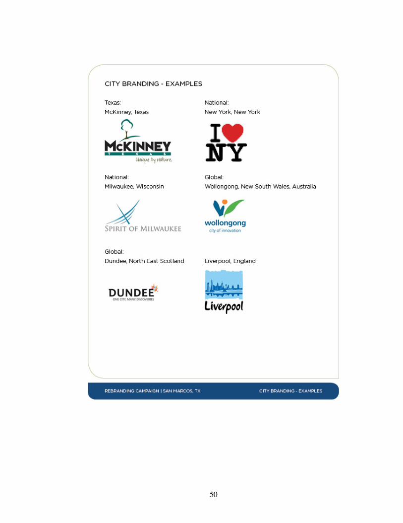
50
51

52
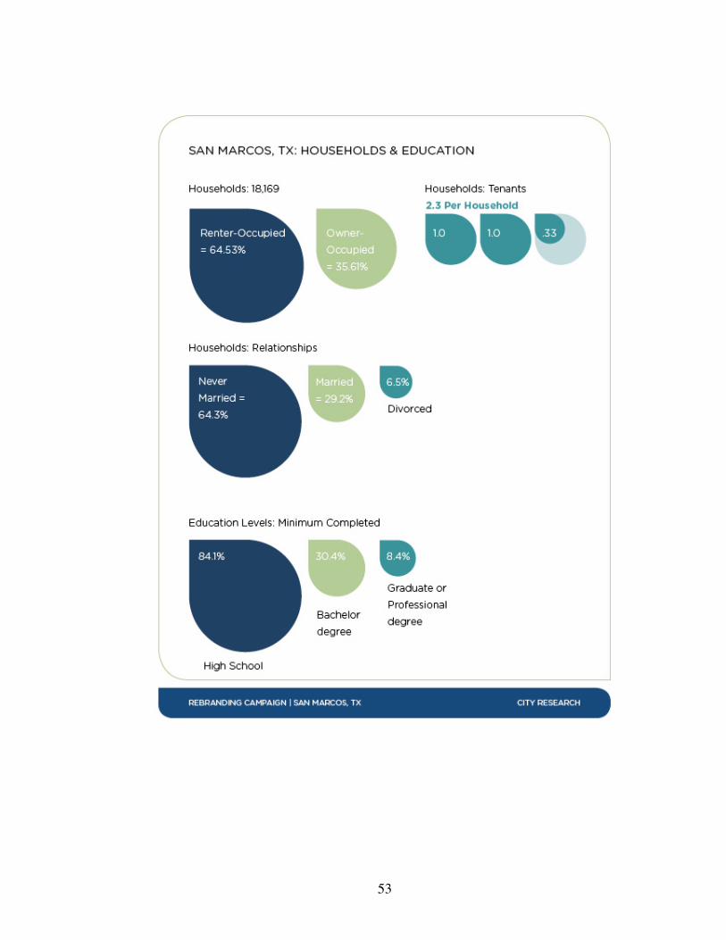
53
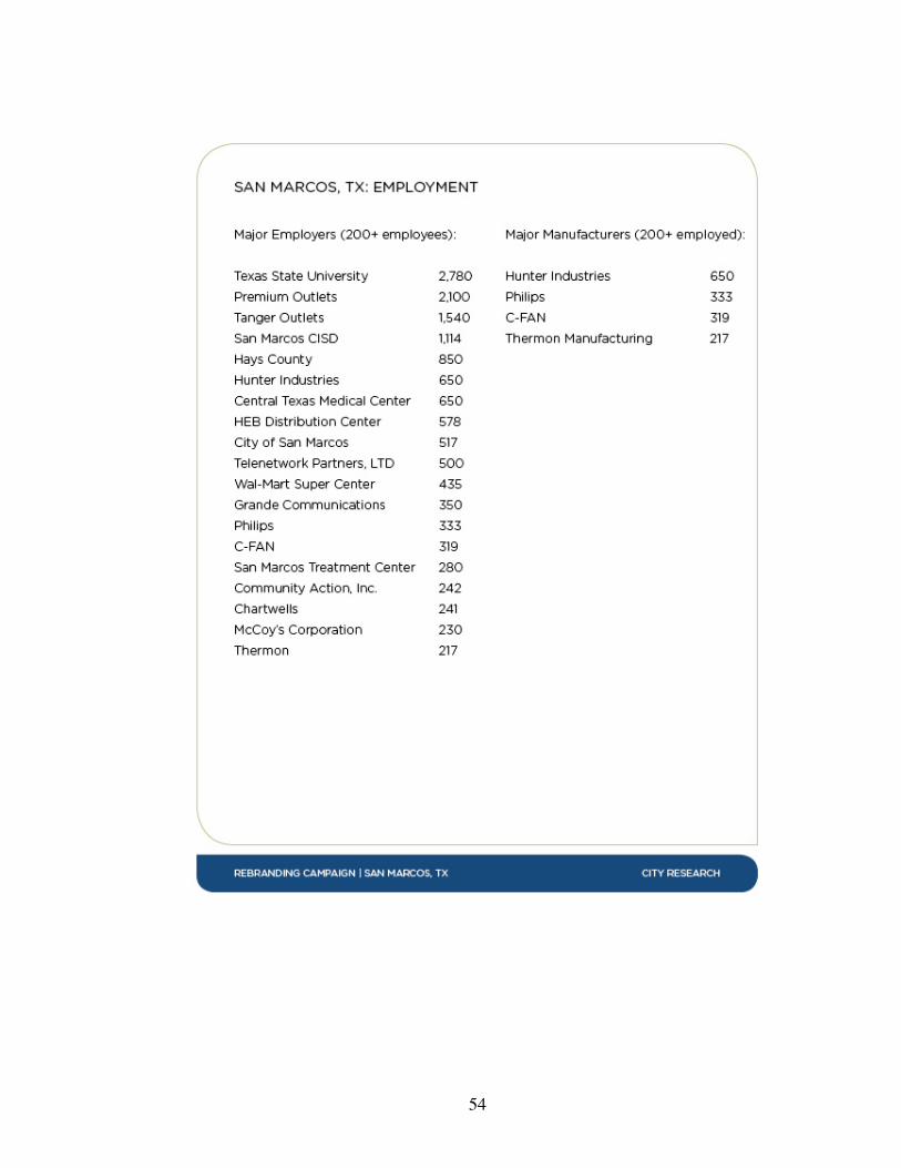
54

55
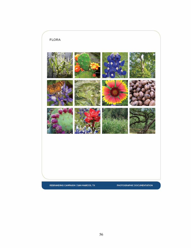
56
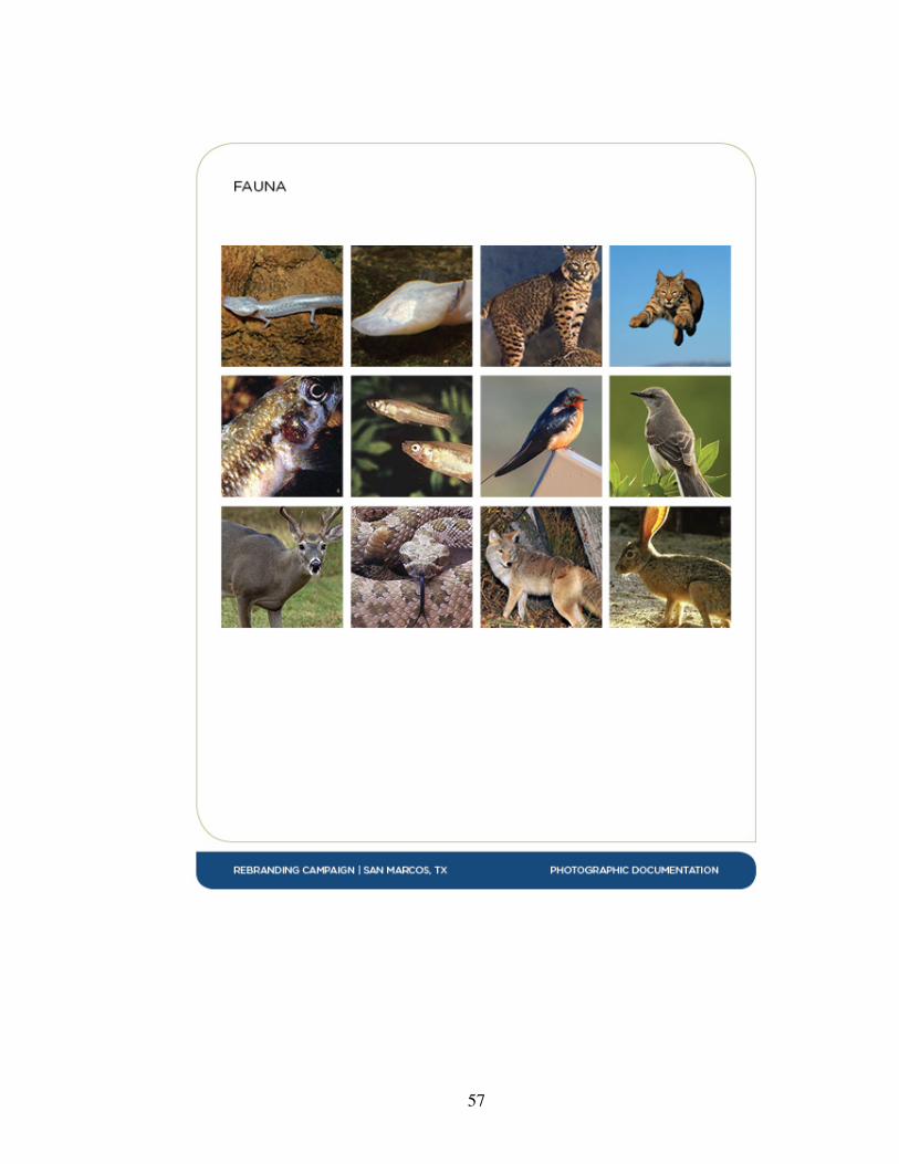
57
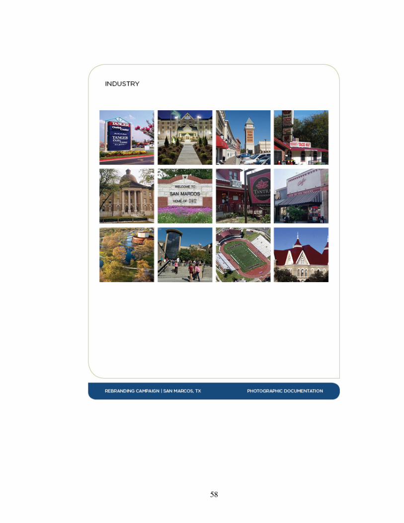
58
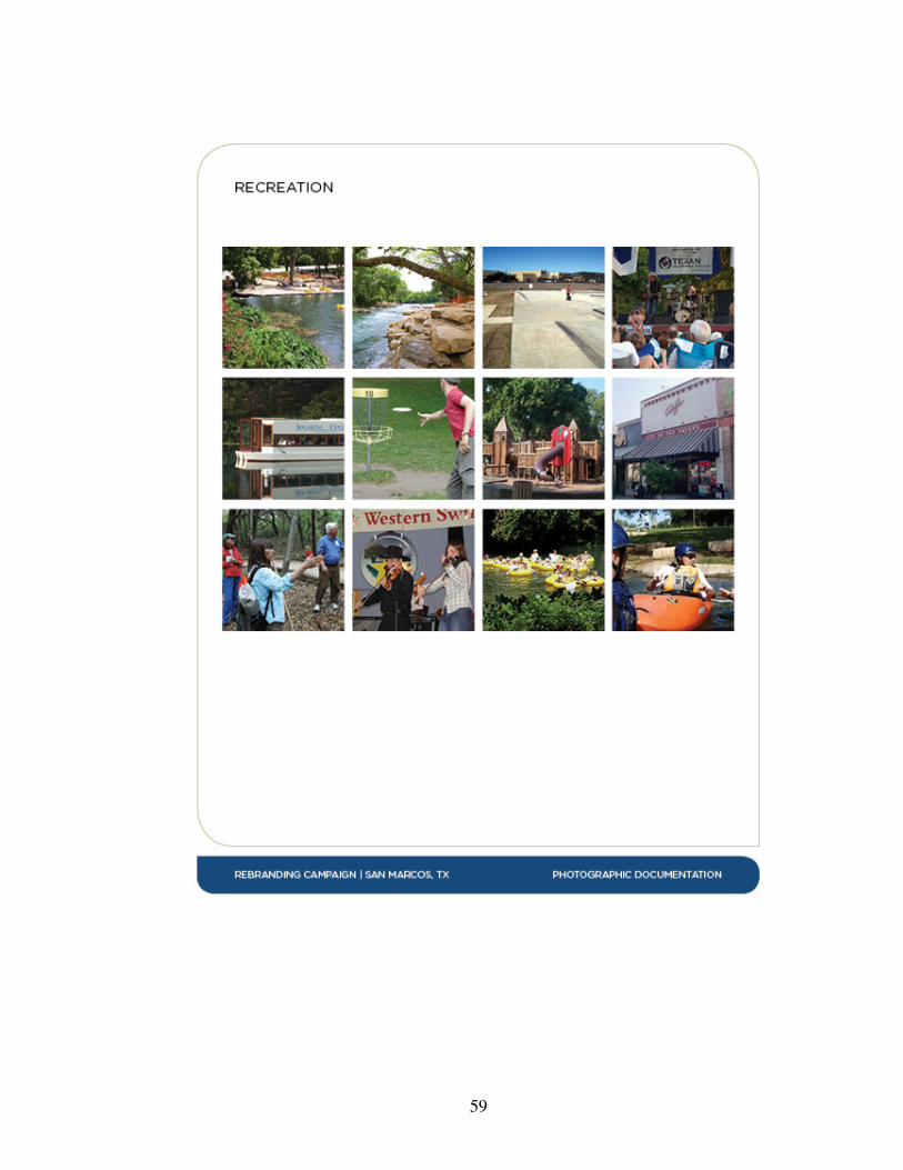
59
60
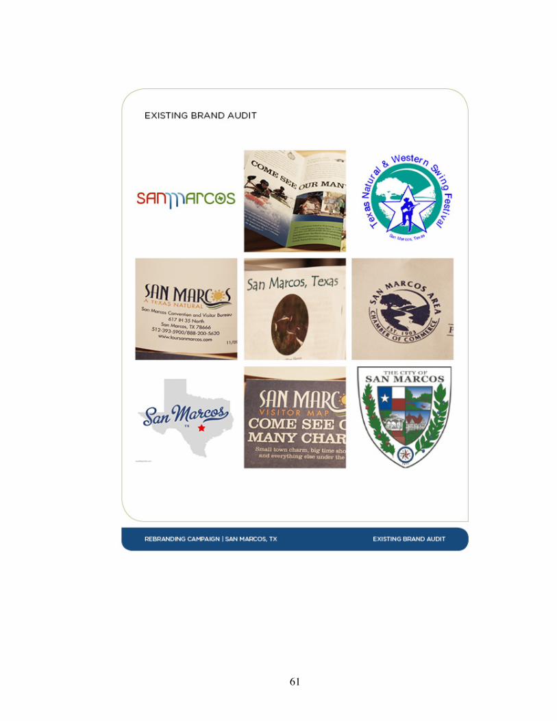
61
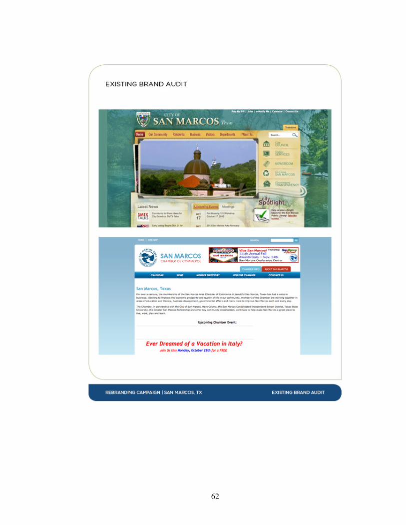
62
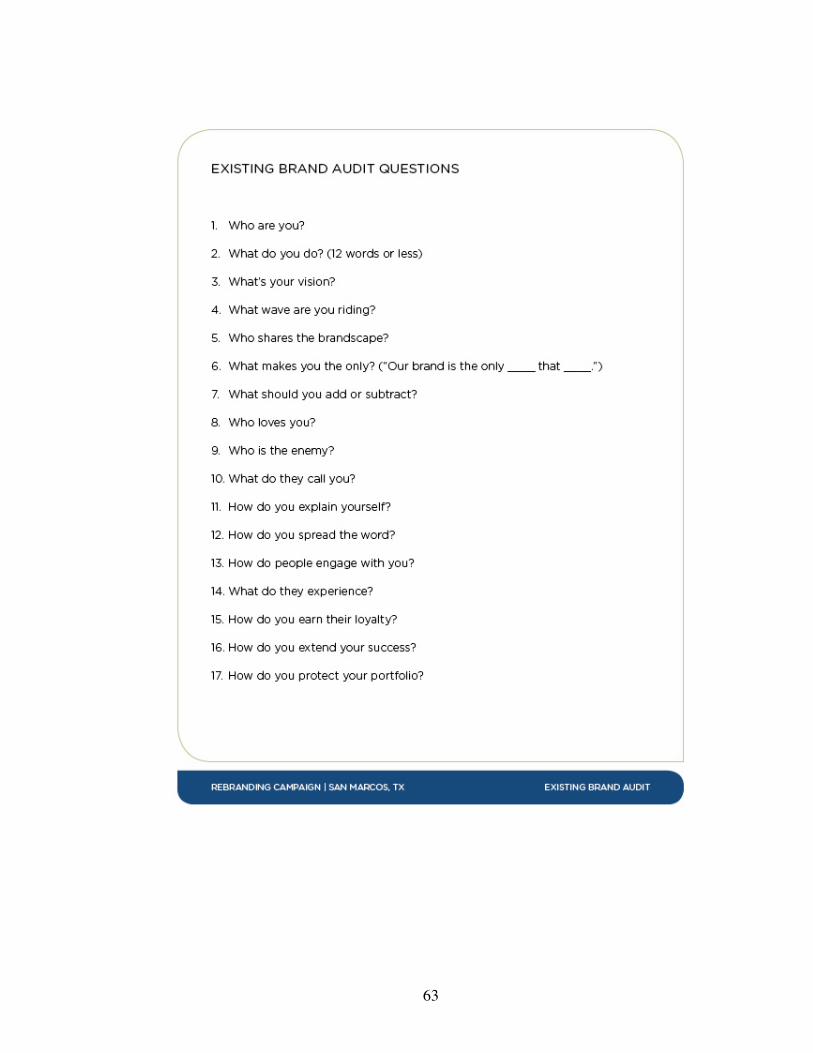
63
64
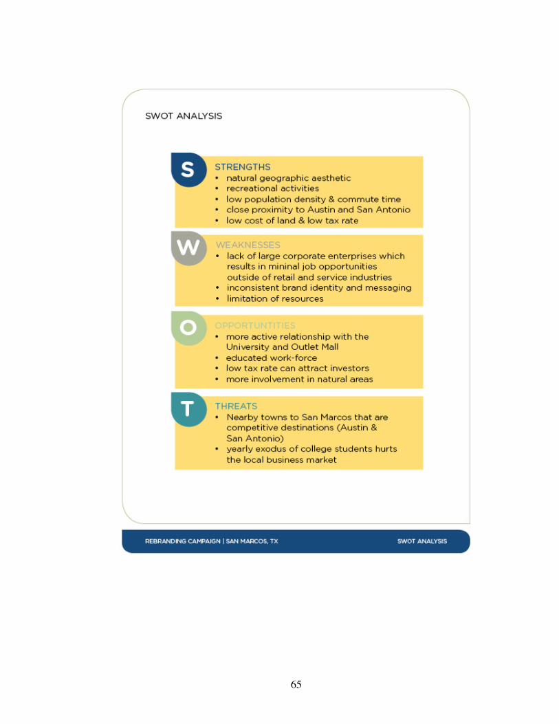
65
66
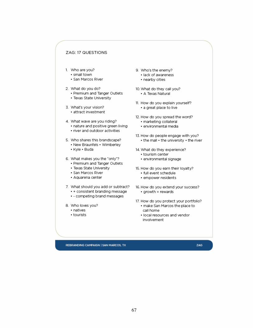
67

68

69
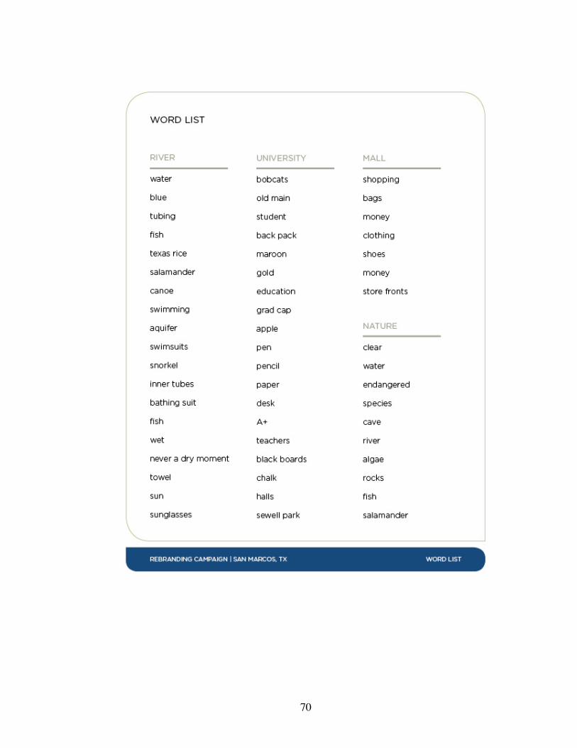
70
71
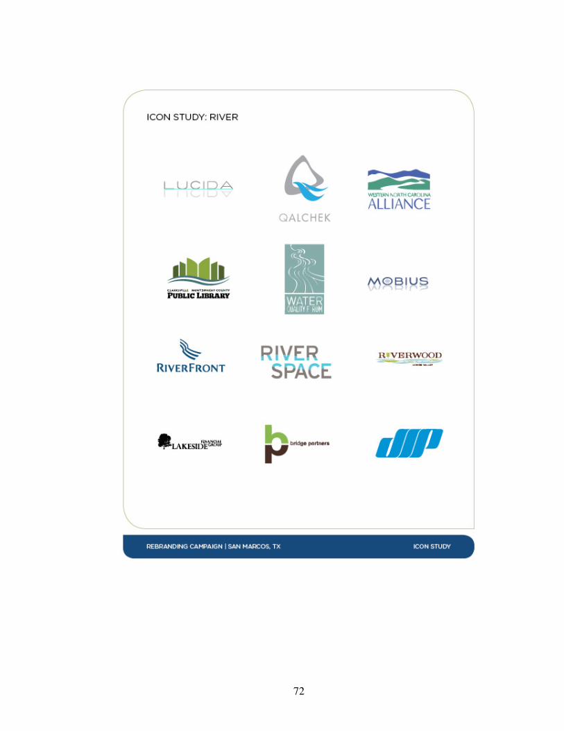
72
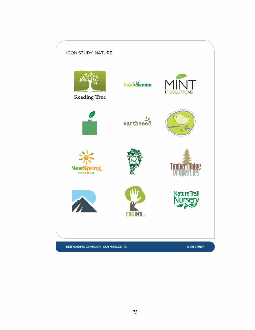
73
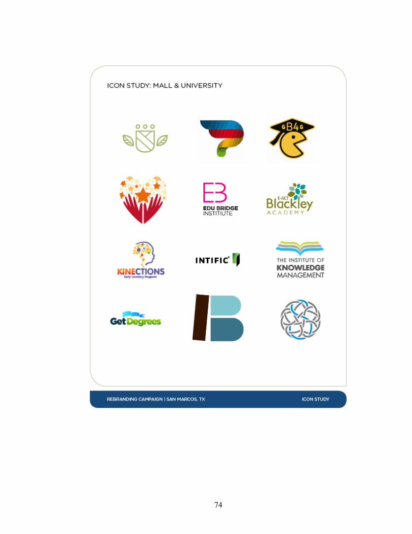
74
75
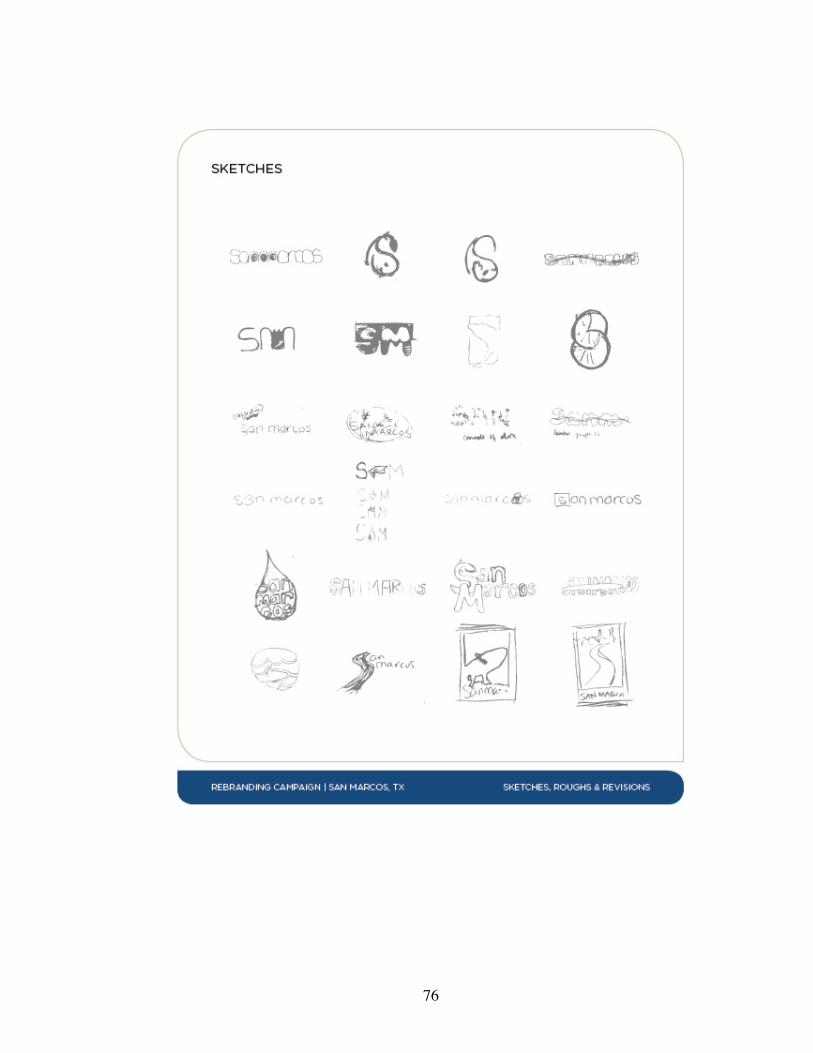
76
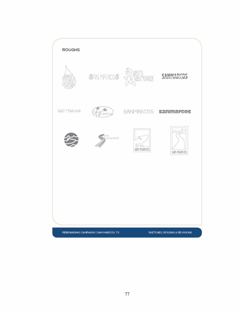
77

78

79

80

81
82
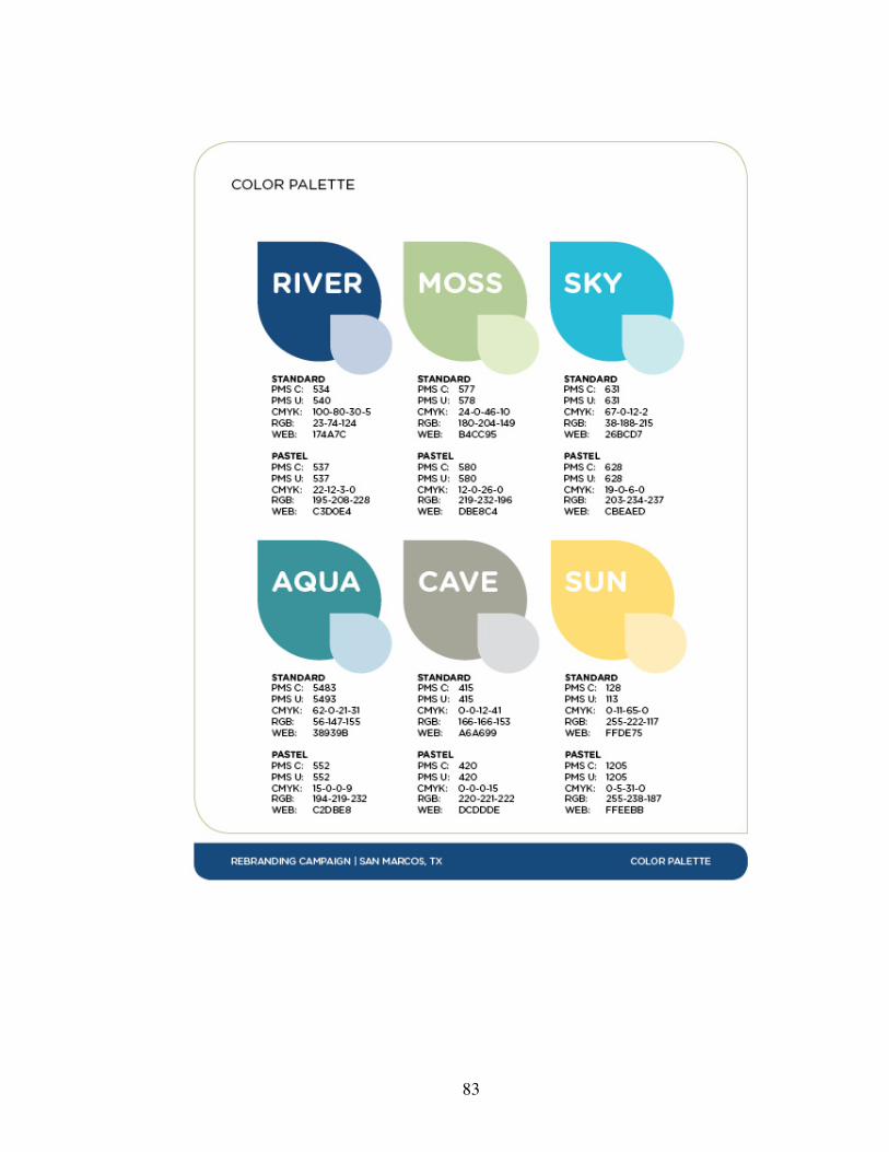
83
84
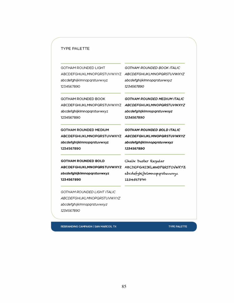
85
86
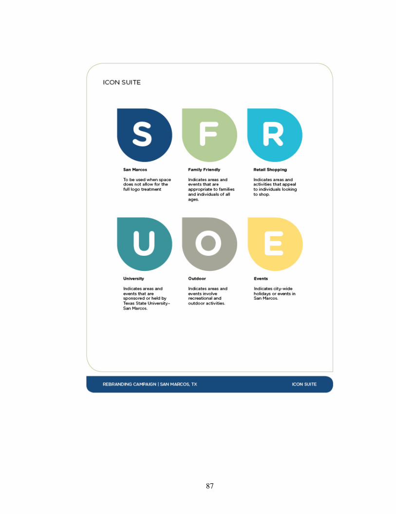
87

88
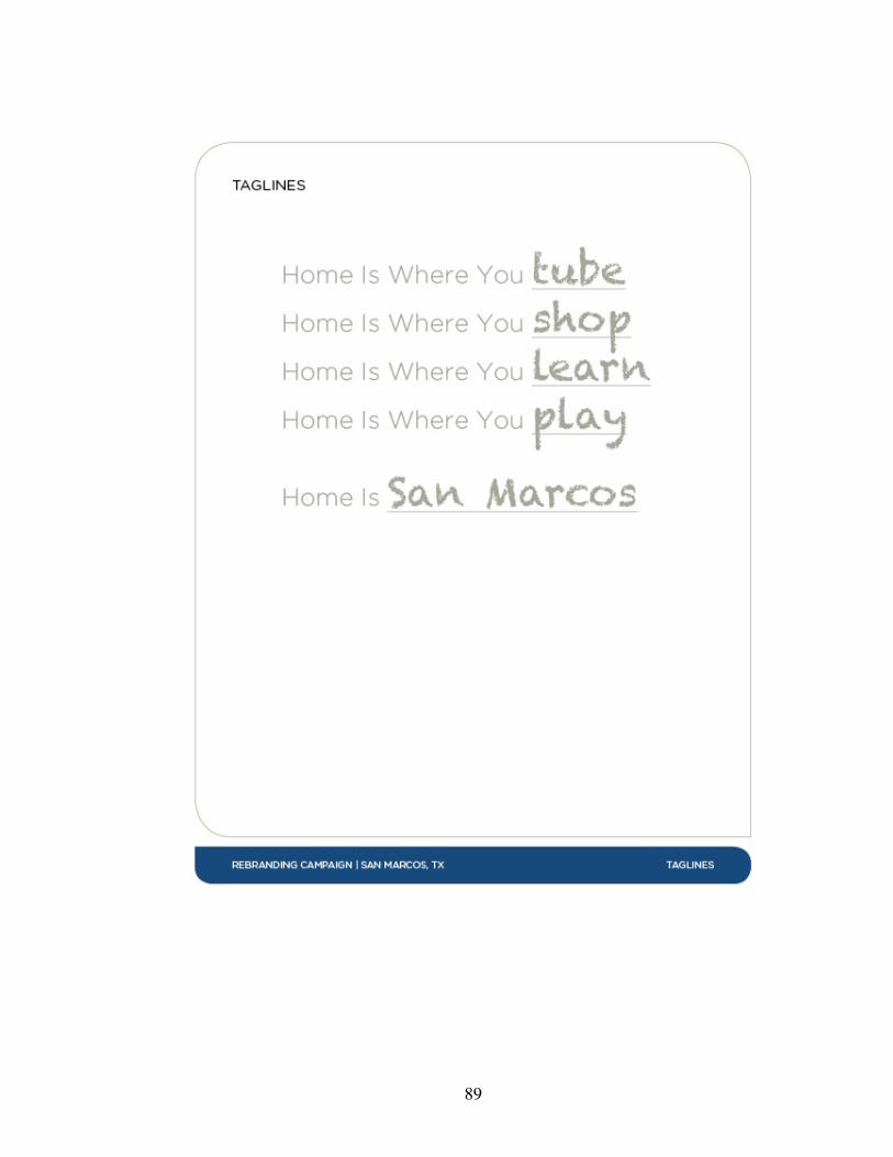
89
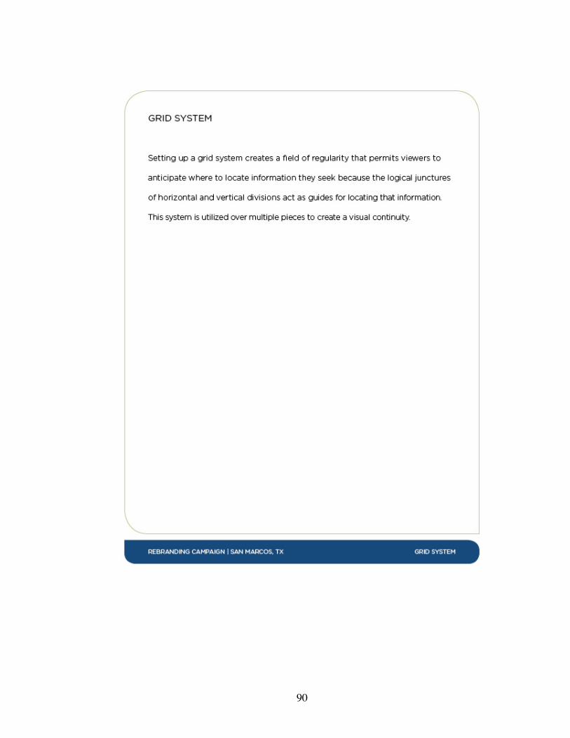
90
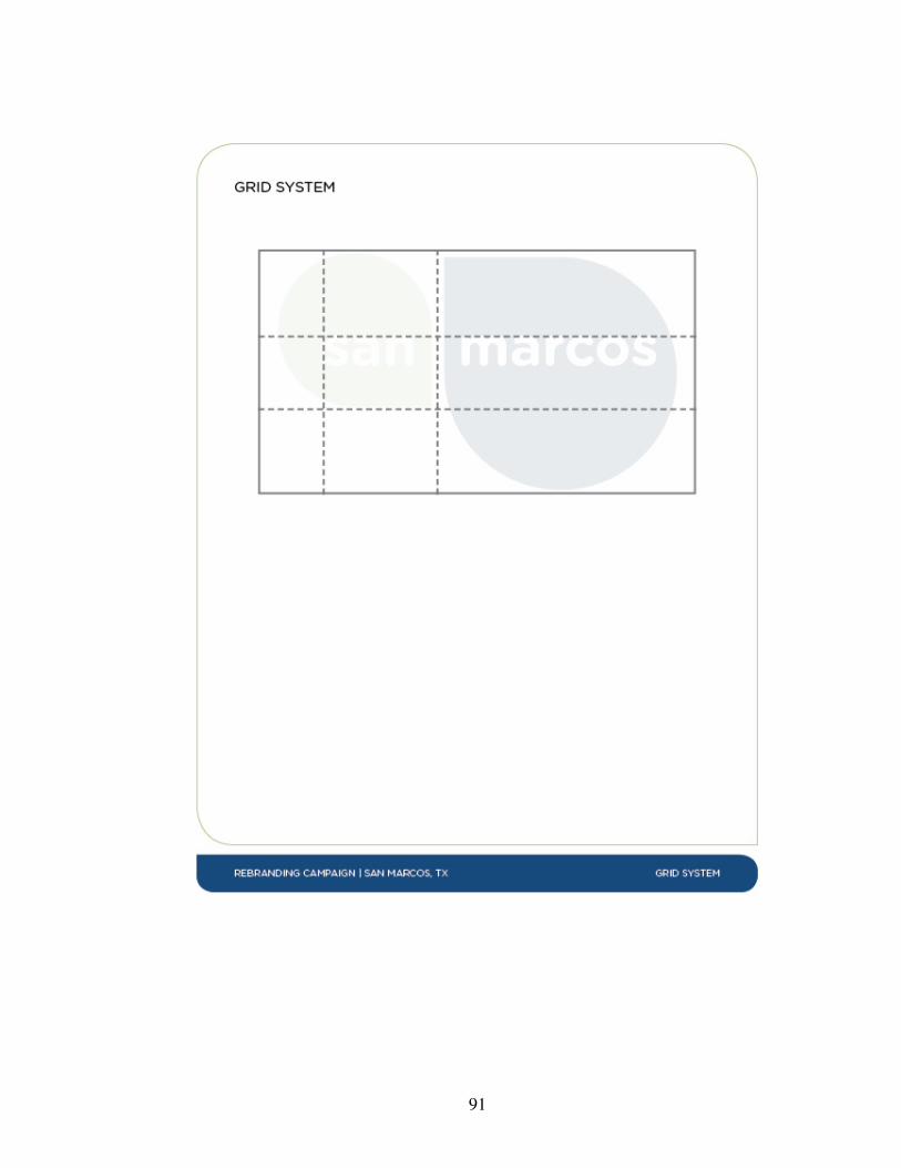
91

92

93
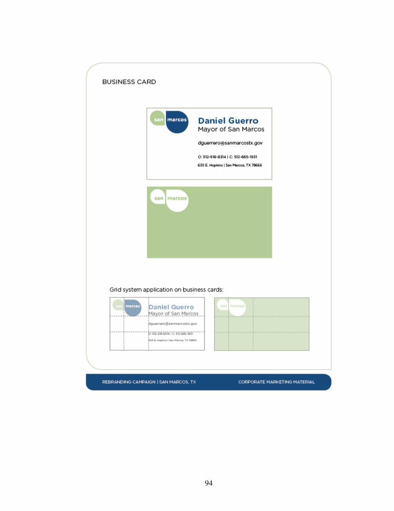
94
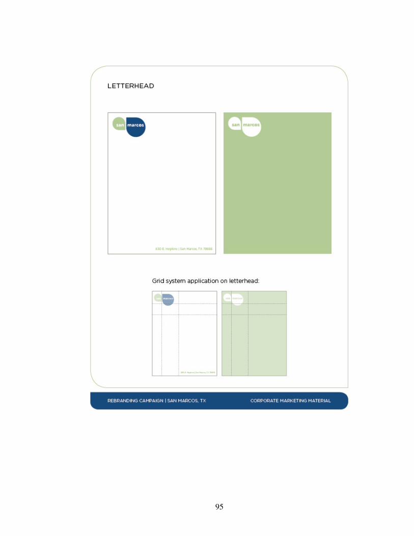
95
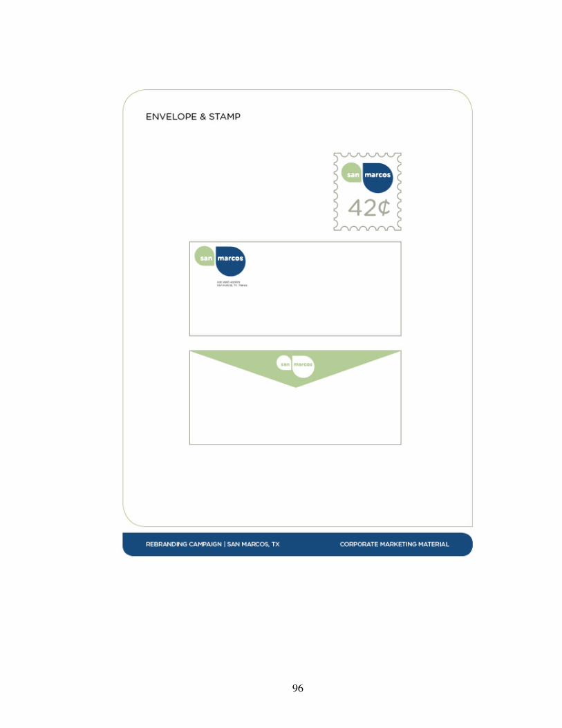
96
97
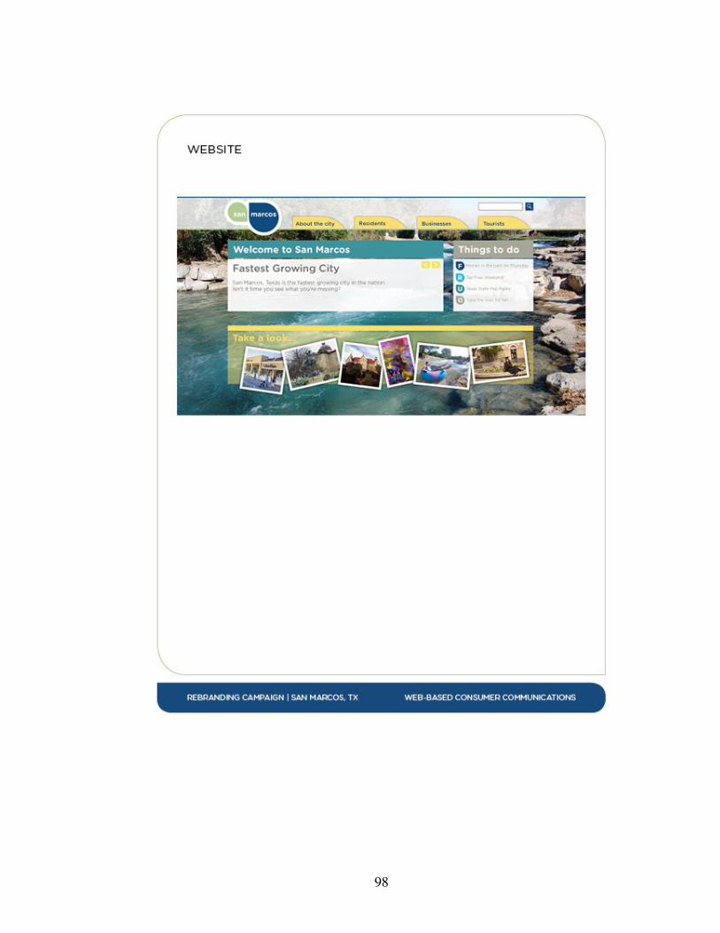
98
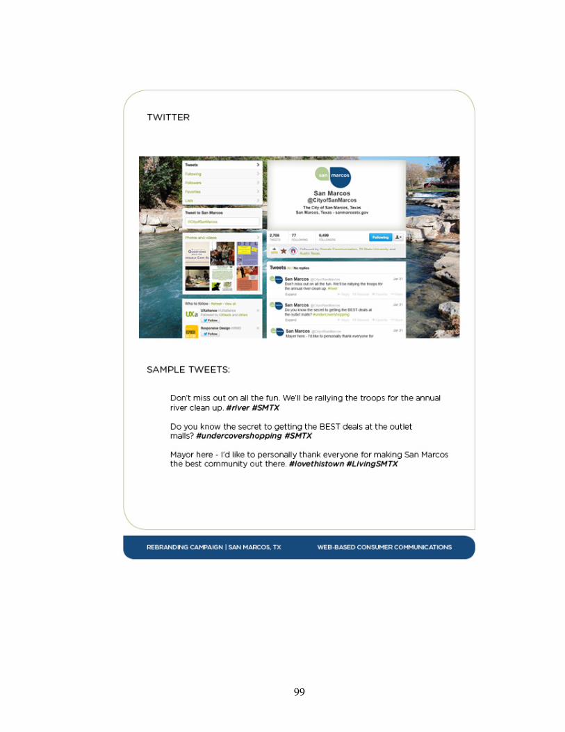
99
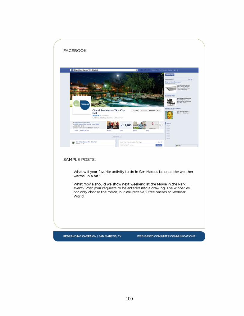
100
101
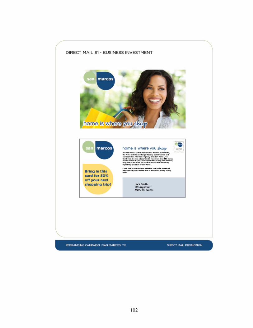
102

103
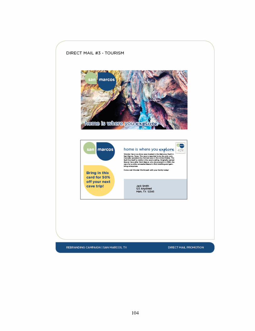
104
105
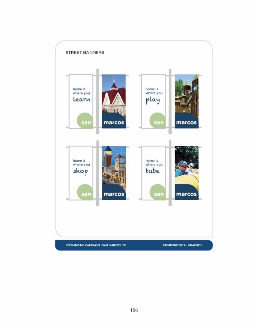
106
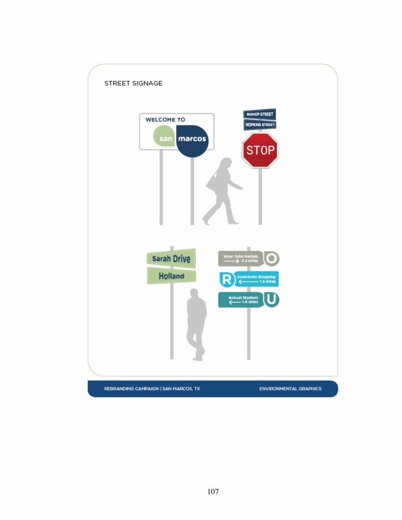
107
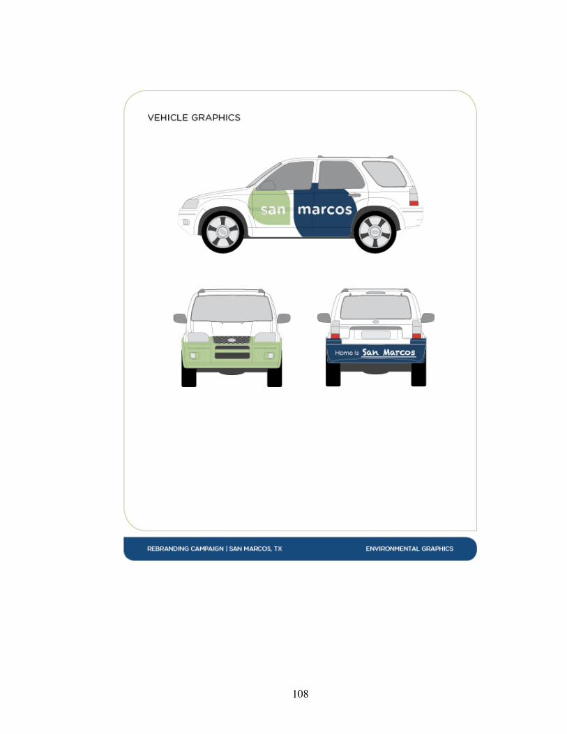
108

109

110
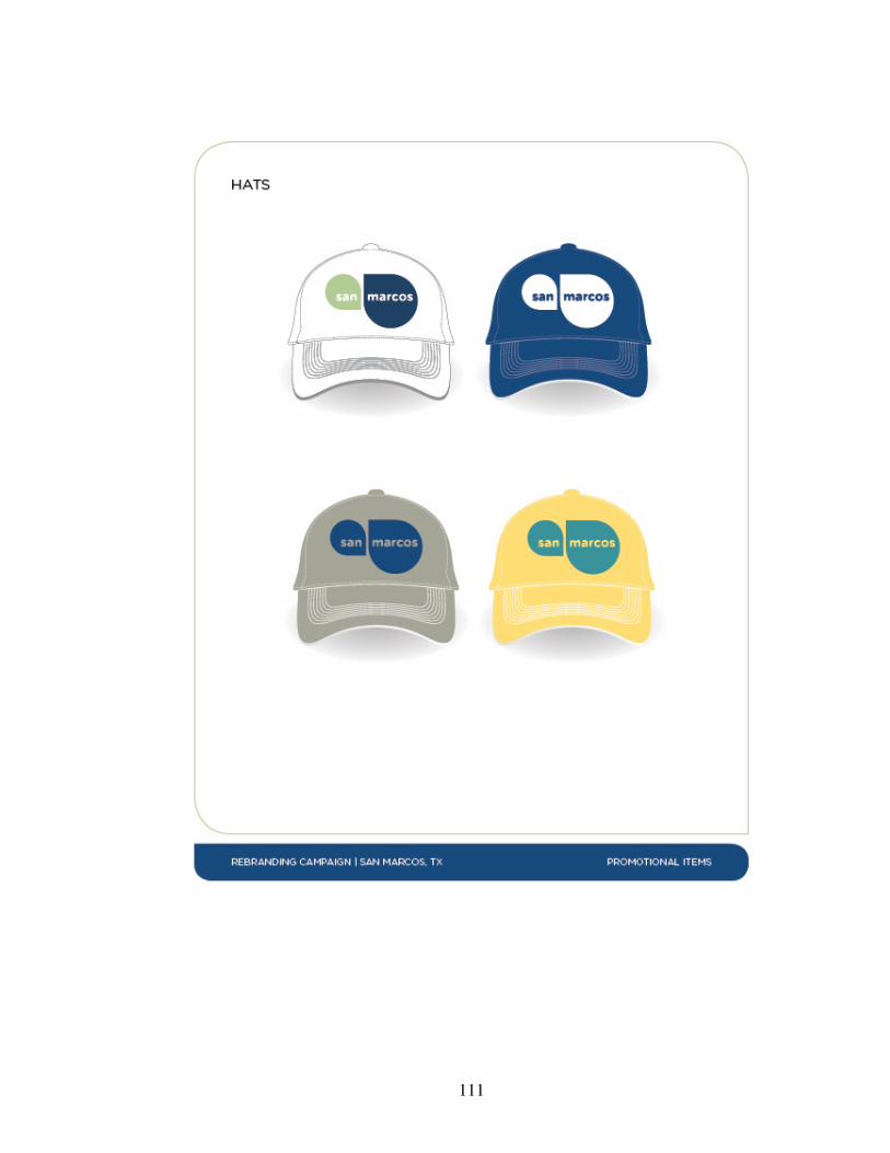
111
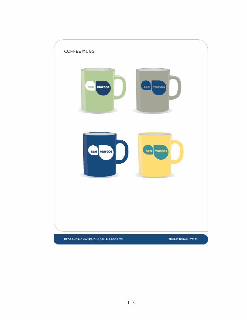
112
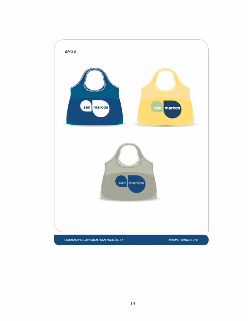
113
114
REFERENCES
Ashwhorth, G., & Kavaratzis, M. (2009). Beyond the logo: Brand management for cities.
Journal of Brand Management, 16, 520-531. doi: 10.1057/palgrave.bm.2550133
Attractions. (2014). Retrieved January 5, 2014, from
http://www.toursanmarcos.com/attractions/index.html
Berger, C. (2009). Wayfinding: Designing and implementing graphic navigational
systems. Switzerland: Rotovision.
Cai, L., Gartner, W., & Munar, A. (2009). Bridging tourism theory and practice (Vol. 1)
Bingley: Emerald Group Publishing.
Comm, J. (2009). Twitter power: How to dominate your market one tweet at a time.
Hoboken, NJ: John Wiley & Sons, Inc.
Community demographics. (2009). Retrieved January 5, 2014, from
http://www.sanmarcostexas.com/about-san-marcos/community-demographics
Curtis, W. (2006). Brand-new cities. American Scholar, 75(1), 113-116. Retrieved from
http://theamericanscholar.org/brand-new-cities
Dinnie, K. (Ed.). (2011). City branding: Theory and cases. New York: Palgrave
Macmillan.
Doblin, J. (1967). Trademark design. In M. Bierut, J. Helfand, S. Heller, & R. Poynor
(Eds.), Looking closer 3: Classic writings on graphic design (pp. 180-186). New
York: Allworth Press.
115
Dulaney, R., & Lyn, F. (2010). Representational craft and production: Comparison of the
value of hand drawing and digital media in architectural academies and practices.
Design Principles and Practices: An International Journal, 4(1), 281-290.
Retrieved from http://www.Design-Journal.com
Evamy, M. (2012). A real sense of the place. Creative Review, 32(9), 59. Retrieved from
http://ehis.ebscohost.com
Facebook statistics. (2013). Retrieved October 26, 2013, from
http://www.statisticbrain.com/facebook-statistics/
Figueiredo, J., & Coelho, D. (2010). Semiotic analysis in perspective: A frame of
reference to inform industrial design practice. Design Principles & Practice: An
International Journal, 4(1), 333-346. Retrieved from http://ehis.ebscohost.com
Find the best places to live. (2014). Retrieved January 4, 2014, from http://
www.areavibes.com
González, M. (2011). Websites and place branding for seven galician cities: An
exploratory study. Catalan Journal of Communication & Cultural Studies, 3(2),
297-304. doi: 10.1386/cjcs.3.2.297_7
Gotham rounded. (2013). Retrieved October 26, 2013, from
http://www.typography.com/fonts/gotham-rounded/overview/
Green, S. (2005). Defining west london: A case study of the initial stages of strategic
place branding exercise [Electronic version]. CoDesign, 1(4), 277-287. doi:
10.1080/15710880500478486
Hall, S. (2007). This means this, that means that: A user’s guide to semiotics. London:
Laurence King Publishing Ltd.

116
Historic downtown. (2014). Retrieved January 4, 2014, from http://www.ci.san-
marcos.tx.us/index.aspx?page=208
Hynes, N. (2008). Colour and meaning in corporate logos: An empirical study. Journal of
Brand Management, 16(18), 545-555. doi:10.1057/bm.2008.5
Jacob, S. (2012). Design is now an ‘evolutionary process’? Really? Let’s go to bed and
find out, says a designer. Art Review, (57), 60. Retrieved from
http://ehis.ebscohost.com
Kania, D. (2001). Branding.com. Chicago, IL: NTC Business Books.
Klontz, B. (2013). Small business and Twitter: How 4 small businesses are rocking social
today. Retrieved on September 27, 2013, from
http://venturebeat.com/2013/09/27/small-business-and-twitter-how-4-small-
businesses-are-rocking-social-today/
Koller, V. (2008). “The world in one city”: Semiotic and cognitive aspects of city
branding. Journal of Language and Politics, 7(3), 431-450. doi:
10.1075/jlp.7.3.05kol
Krause, J. (2002). Color index. Cincinnati, OH: HOW Design Book.
Levy, J. (2010). Facebook marketing: Designing your next marketing campaign.
Indianapolis, IN: Que Publishing.
Lustig, A. (1954). What is a designer? In M. Bierut, J. Helfand, S. Heller, & R. Poynor
(Eds.), Looking closer 3: Classic writings on graphic design (pp. 106-108). New
York: Allworth Press.
Mester, Christine. (2009, November 19). Council looking to rebrand city. The University
Star. Retrieved from http://vega.tr.txstate.edu/node/1450
117
McAuley, M. (2010). A design education perspective on the process of interpreting
words into pictures. Art, Design & Communication in Higher Education, 9(2),
111-133. doi: 10.1386/adch.9.2.111_1
Moilanen, T., & Rainisto, S. (2009). How to brand nations, cities and destinations: A
planning book for place branding. New York: Palgrave Macmillan.
Morehead, A., & Morehead, L. (Ed.). (1995). The penguin webster handy college
dictionary (3rd ed.). New York: Penguin Books.
Neumeier, M. (2007). ZAG: The #1 strategy of high-performace brands. California: New
Riders.
Peel, D., & Lloyd, G. (2008). New communicative challenges: Dundee, place branding
and the reconstruction of a city image. TPR: Town Planning Review, 79(5), 507-
532. Retrieved from http://ehis.ebscohost.com
Request for proposals: Branding services RFP 209-043. (2009). Retrieved February 1,
2013, from www.texasbidsystem.como/closed-bids/City-of-San-
Marcos/Branding-Services.asp?tn=107049
Results. (2006). Retrieved January 5, 2014, from
http://www.northstarideas.com/community/c-mckinney.htm
Rivers, C. (2005). Type specific: Designing custom fonts for function and identity.
Switzerland: Rotovision.
Roberts, K. (2005). Lovemarks: The future beyond brands. New York: Powerhouse
Books.
118
Rossiter, J. & Bellman, S. (2012) Emotional branding pays off: How brands meet share
of requirements through bonding, companionship, and love. Journal of
Advertising Research, 52(3), 291-296. doi: 10.2501/JAR-52-3-291-296
Samara, T. (2002). Making and breaking the grid: A graphic design layout workshop.
Beverly, MA: Rockport Publishers.
San Marcos, Texas. (2013). Retrieved October 26, 2013, from http://www.city-
data.com/city/San-Marcos-Texas.html
Savan, L. (1976). This typeface is changing your life. In M. Bierut, J. Helfand, S. Heller,
& R. Poynor (Eds.), Looking closer 3: Classic writings on graphic design (pp.
256-259). New York: Allworth Press.
Stelzner, M. (2011). 2011 Social media marketing industry report. Retrieved October 5,
2013, from http://www.socialmediaexaminer.com/social-media-marketing-
industry-report-2011/
Stigel, J. & Frimann, S. (2006). City branding – All smoke, no fire?. Nordicom Review
27(2), 245-268. Retrieved from
http://www.nordicom.gu.se/common/publ_pdf/242_stigel_frimann.pdf
Texas cities lead nation in population growth, census bureau reports. (2013). Retrieved
February 2, 2014, from
http://www.census.gov/newsroom/releases/archives/population/cb13-94.html
Texas state sets new fall enrollment record. (2011). Retrieved January 5, 2014, from
http://www.txstate.edu/news/news_releases/news_archive/2011/September-
2011/FallEnrollment092211.html
119
Traverso, D. (2000). Outsmarting Goliath: How to achieve equal footing with companies
that are bigger, richer, older, and better known. Princeton, NJ: Bloomberg Press.
U.S. Census Bureau. (2014, January 7). State and county quickfacts: San Marcos, Texas.
Retrieved March 16, 2014, from
http://quickfacts.census.gov/qfd/states/48/4865600.html
U.S. Census Bureau. (2014, January 6). State and county quickfacts: Texas. Retrieved
March 16, 2014, from http://quickfacts.census.gov/qfd/states/48000.html
Wallace, R. (2008, June 19). Blood, sweat and tiers: Building optimal brand identity
architectures. Voice: AIGA journal of design. Retrieved October 26, 2013, from
http://www.aiga.org/blood-sweat-and-tiers-building-optimal-brand-identity-arch/
Wheeler, A. (2006). Designing brand identity: A complete guide to creating, building,
and maintaining strong brands. Hoboken, NJ: Wiley.


