HOW TO COLLECT AND USE
DATA IN EXCEL
Brendon Riggs
Texas Juvenile Probation Commission
Data Coordinators’ Conference 2008

Goals
To be able to gather and organize information in
Excel
To be able to perform basic analysis of data in
Excel
To be able to effectively present information in
charts
Why Use Excel
Most computers have Microsoft Office
Excel is capable of managing a relatively large
amount of information which should be suitable
for most departments
It is fairly easy to perform basic analysis using
Excel

Managing Information
Extract from Caseworker
Entering by hand

Extracting from Caseworker
Create Output File
Sneak-a-Peek results saved to a text file can be
pulled into an Excel table. Run a Sneak-a-Peek report.
At the Results Screen, select Create Output File. This will
open the Save As box.
Name the file, and save it as a txt file. The default is to
save the file on the Local Disk (C:)
Open Microsoft Excel.
Click File. Click Open.
Open the .txt file. When looking for the txt file, make sure
to include All Files in the Files of Type box.
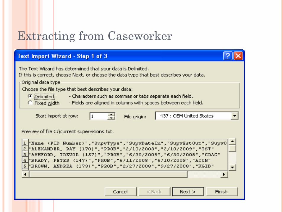
The Text Import Wizard will open. Ensure that Delimited is checked and click Next
Extracting from Caseworker

Extracting from Caseworker

Extracting from Caseworker
The data in this txt file is separated by commas, therefore,
change the Delimiters from Tab to Comma and click Next.
At the last screen of the Text Import Wizard, click Finish to
import the information into the table.
Once the data is in the table, click the empty box in the
upper left corner to highlight the entire table.
Double click the line between two of the columns (A and B).
This will automatically format the width of each column.
When saving this file, change the extension from .txt to .xls.

Input by hand
You can also choose to input information yourself
You would do this if you were interested in
tracking information that may not be kept in
Caseworker
This would also be useful if you would like to
keep a readily accessible source of information

Managing Information
Use the List function for easy sorting
Go to the Insert menu on the menu bar and select
List
If you have already created your file check that the
data source for the list is an existing Excel file and
select the entire active section of the worksheet as
the source
Select a new worksheet as the destination page
You can change both the source data and the list
location in the list wizard after a list has been
created
The list function allows for easy sorting of
information
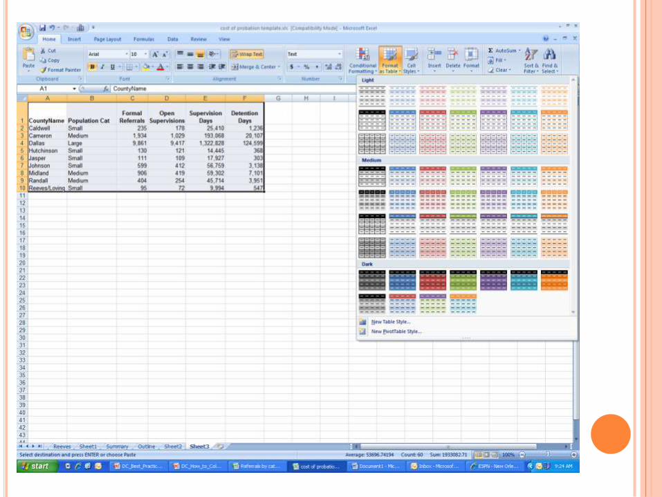
FORMAT AS TABLE
With Excel 2007, Format as Table is an easy way
to manage data
Highlight the cells that you would like to manage
Click the Format as Table button
Select the type of display for the table

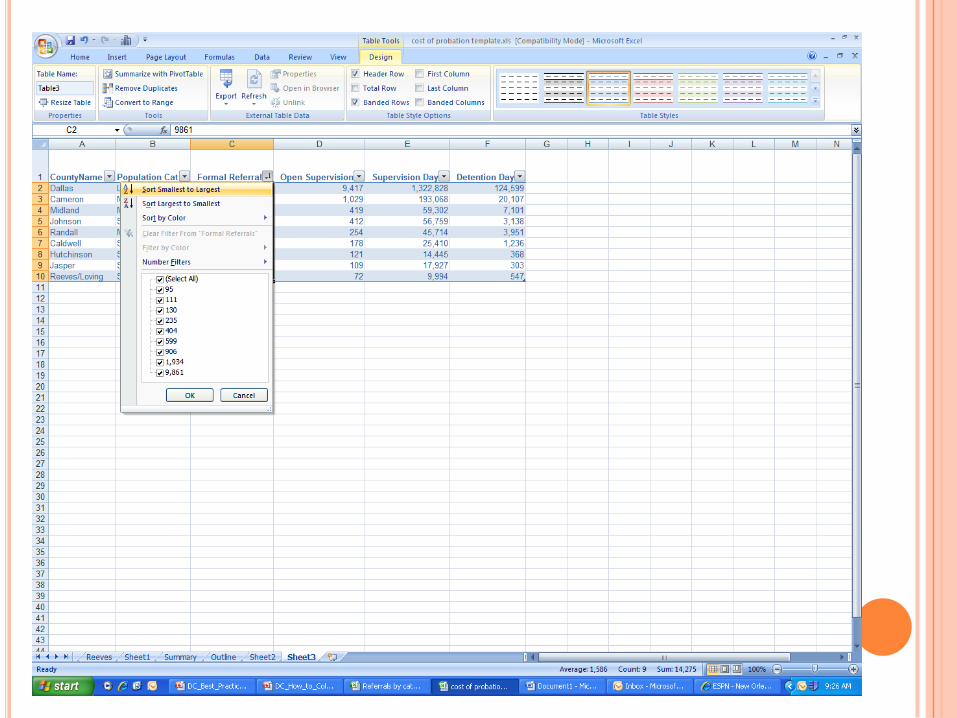
MANAGING DATA
You can sort by column, either numerically or
alphabetically
You can filter out specific values
For example, you could select to view only small
counties, or all counties except midsize counties

Common Functions
=Average(C2:C10)
Average of all values in column C, rows two through ten
=Median(C2:C10)
Median of all values in column C, rows two through ten
=Sum(C2:C10)
Sum of all values in column C, rows two through ten
=Max(C2:C10)
Maximum value in column C, rows two through ten
=Min(C2:C10)
Minimum value in column C, rows two through ten
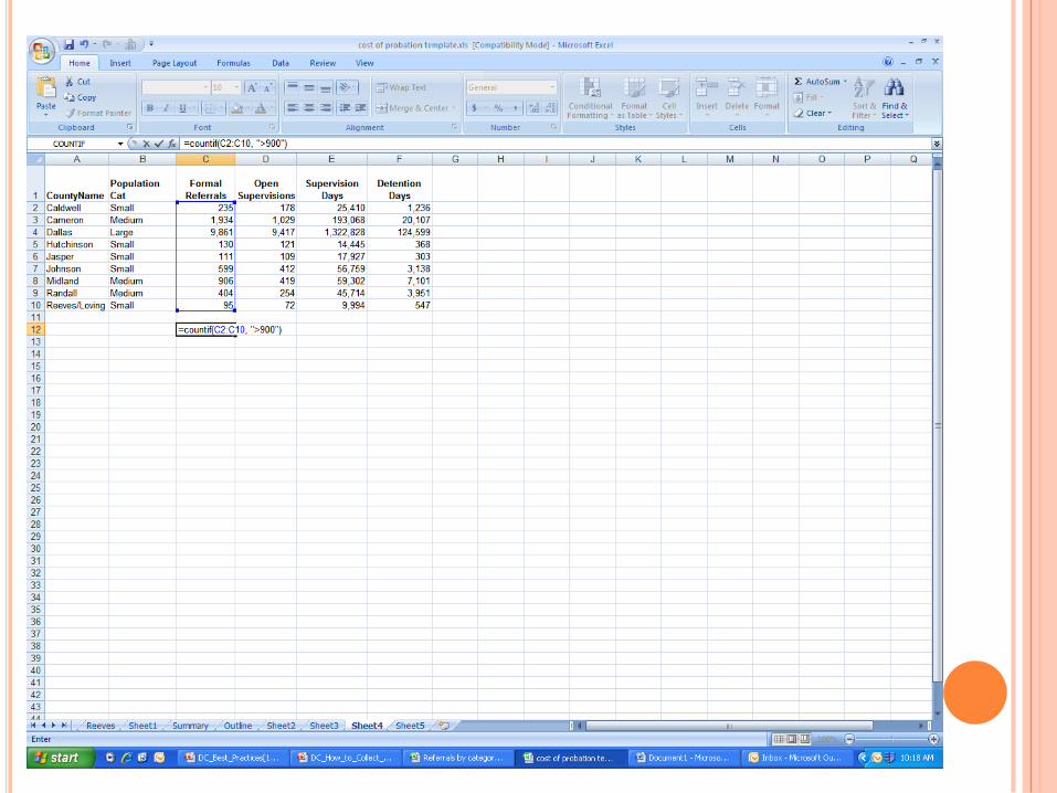
=Countif(C2:C10,">900")
Counts the number of times the value of a cell in column C,
rows two through ten is greater than 900

Charts
Different charts serve different needs
Pie charts – Shows the share of the total population
of various subgroups
Column Charts – Compare within groups at a
particular point in time
Line Charts – Shows continuous changes over time

PIE CHARTS
Highlight the area that you would like to be the
source data
From the Insert menu, select chart
In Excel 2007 press the button that corresponds with
the desired chart
In older versions of Excel select the chart type from
the menu that corresponds with the desired chart
Click the pie chart area and select format data
labels
Select the values that you wish to display

PIE CHART
COLUMN CHART
Highlight the area that you would like to be the
source data
From the Insert menu, select chart
In Excel 2007 press the button that corresponds with
the desired chart
In older versions of Excel select the chart type from
the menu that corresponds with the desired chart

COLUMN CHART
Click the column chart area and select “select
data”
This will allow you to alter how the information is
displayed
The current setting will compare referral rates of the
different race/ethnic groups within each year
Selecting Switch Row/Column will adjust the chart so that
it compares referral rates of each race/ethnic group with
itself in a given year

COLUMN CHART

LINE GRAPH
Highlight the cells that you would like to serve as
source data
From the Insert menu, select chart
In Excel 2007 press the button that corresponds with
the desired chart
In older versions of Excel select the chart type from
the menu that corresponds with the desired chart

LINE GRAPH

LINE GRAPH
To change the labels on the horizontal axis click
the edit button under the Horizontal (Category)
Axis Label
Drag over the cells or enter in the range
manually that you would like to be the axis label
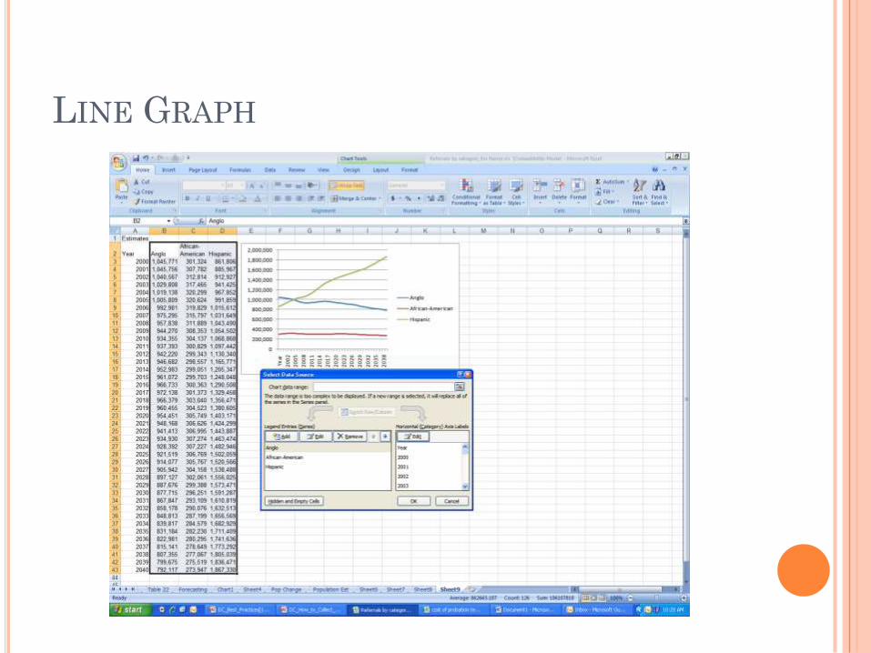
LINE GRAPH

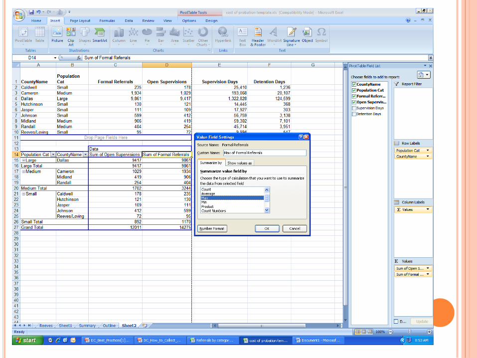
Using Pivot Tables
From the Insert menu, select Pivot Table
Click Select Table or Range and choose the active
dataset as source data
Select the desired location for the Pivot Table and
click okay


USING PIVOT TABLES
Select the variable that you want to be the row
label
If you select multiple variables to be row labels, the
top variable will be the main heading and the
subsequent variables will be subheadings
Drag the variables that you want to summarize
in the columns to the ∑ values box


USING PIVOT TABLES
You can change the type of information presented
in the columns by double-clicking the column
header and selecting the type of calculation that
you’d like to use
You can click the + or – button in front of the row
header to either show or hide the subheadings