Download - IsabelMeirelles DDJ IASK
Theories & best practices behind effective information visualizations
Isabel MeirellesAssociate Professor, Graphic DesignNortheastern University, Boston, MA, USA
Innovative Approaches to Turn Statistics into KnowledgeSession 3 - Data JournalismDecember 3, 2013
Five lessons
1. Context is key to understanding
2. There is not a single answer to a given problem
3. Solving a design problem requires finding the right representation
4. Thought accessibility is a continuum, not a dichotomy
5. External aids enhance our cognitive abilities
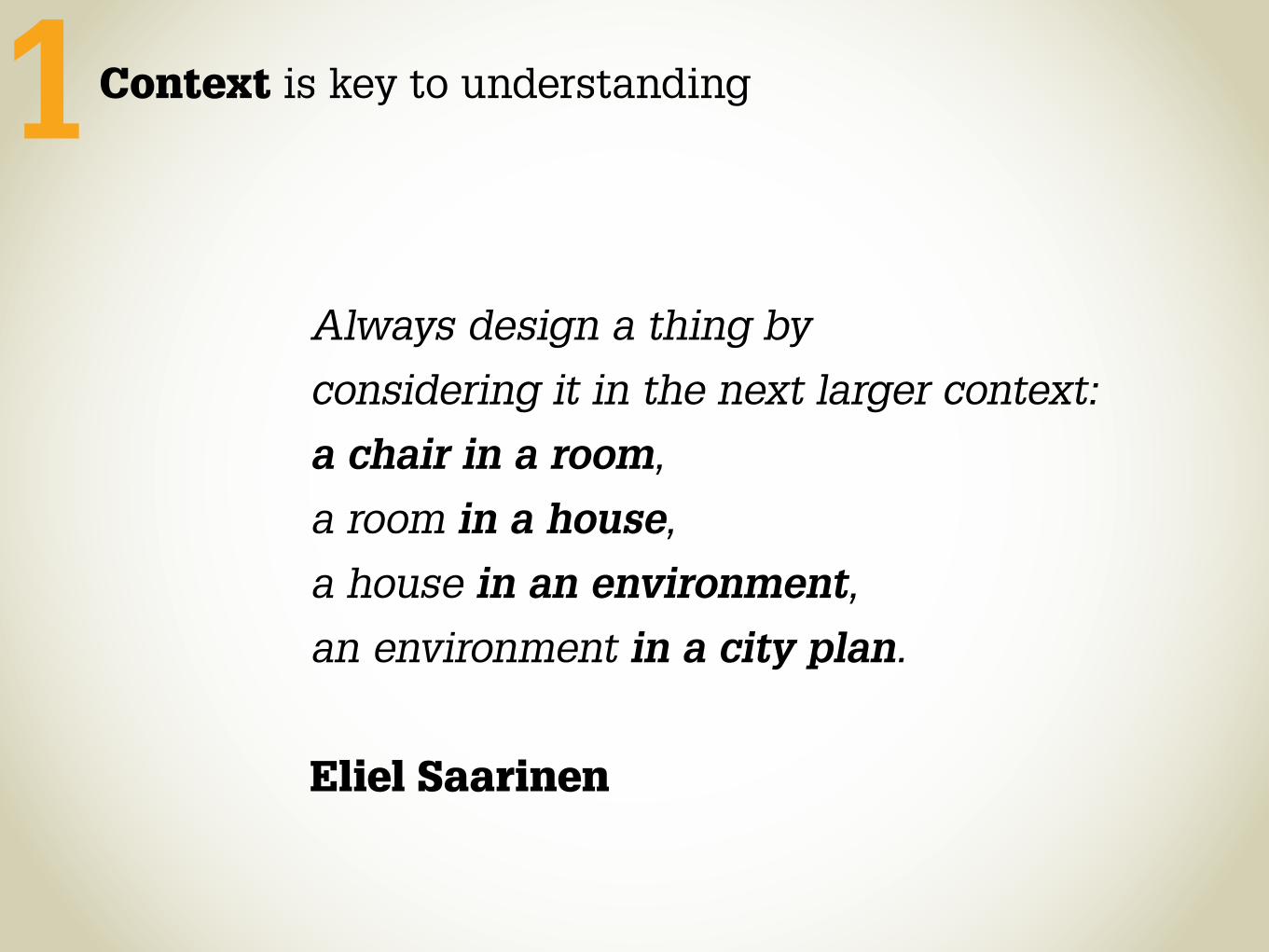
Always design a thing by considering it in the next larger context:a chair in a room,a room in a house,a house in an environment,an environment in a city plan.
Eliel Saarinen
Context is key to understanding1
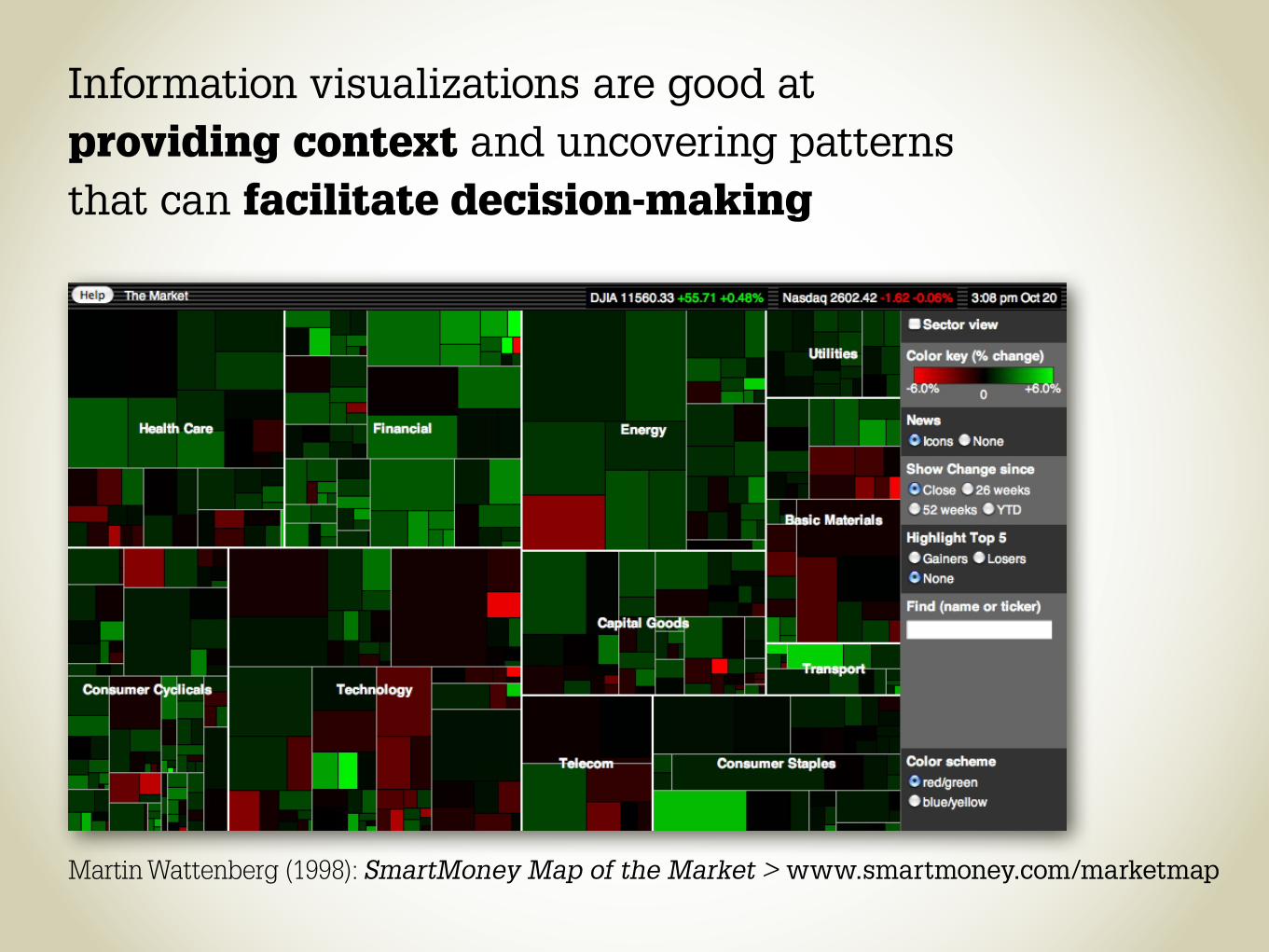
Martin Wattenberg (1998): SmartMoney Map of the Market > www.smartmoney.com/marketmap
Information visualizations are good at providing context and uncovering patterns that can facilitate decision-making

Treemaps are good at providing context within a container, but not good for comparisons between containers
100% all sectors 100% Health Care 100% Pharmaceuticals
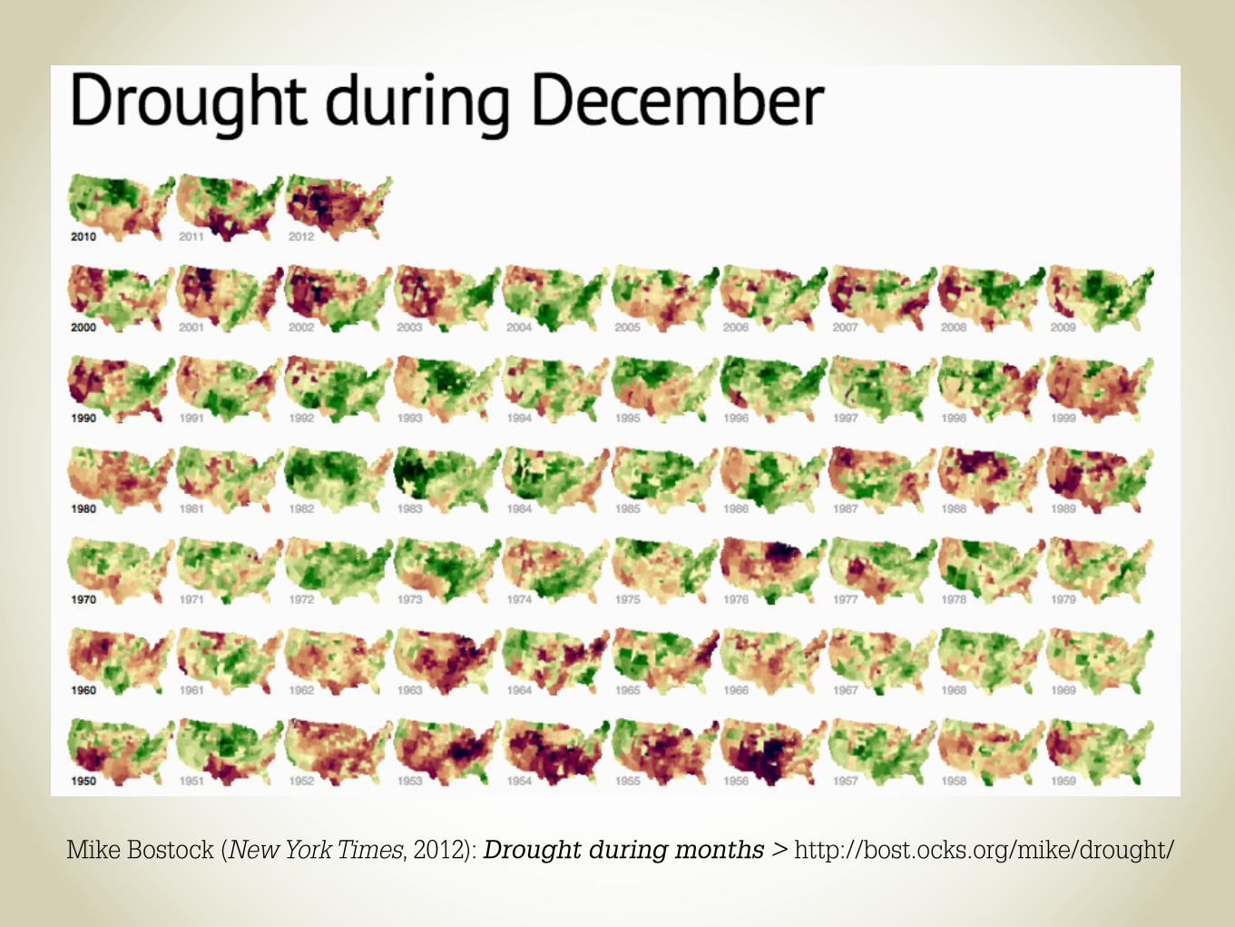
Mike Bostock (New York Times, 2012): Drought during months > http://bost.ocks.org/mike/drought/

Stamen Design & CNN (2010): Home and Away > www.cnn.com/SPECIALS/war.casualties
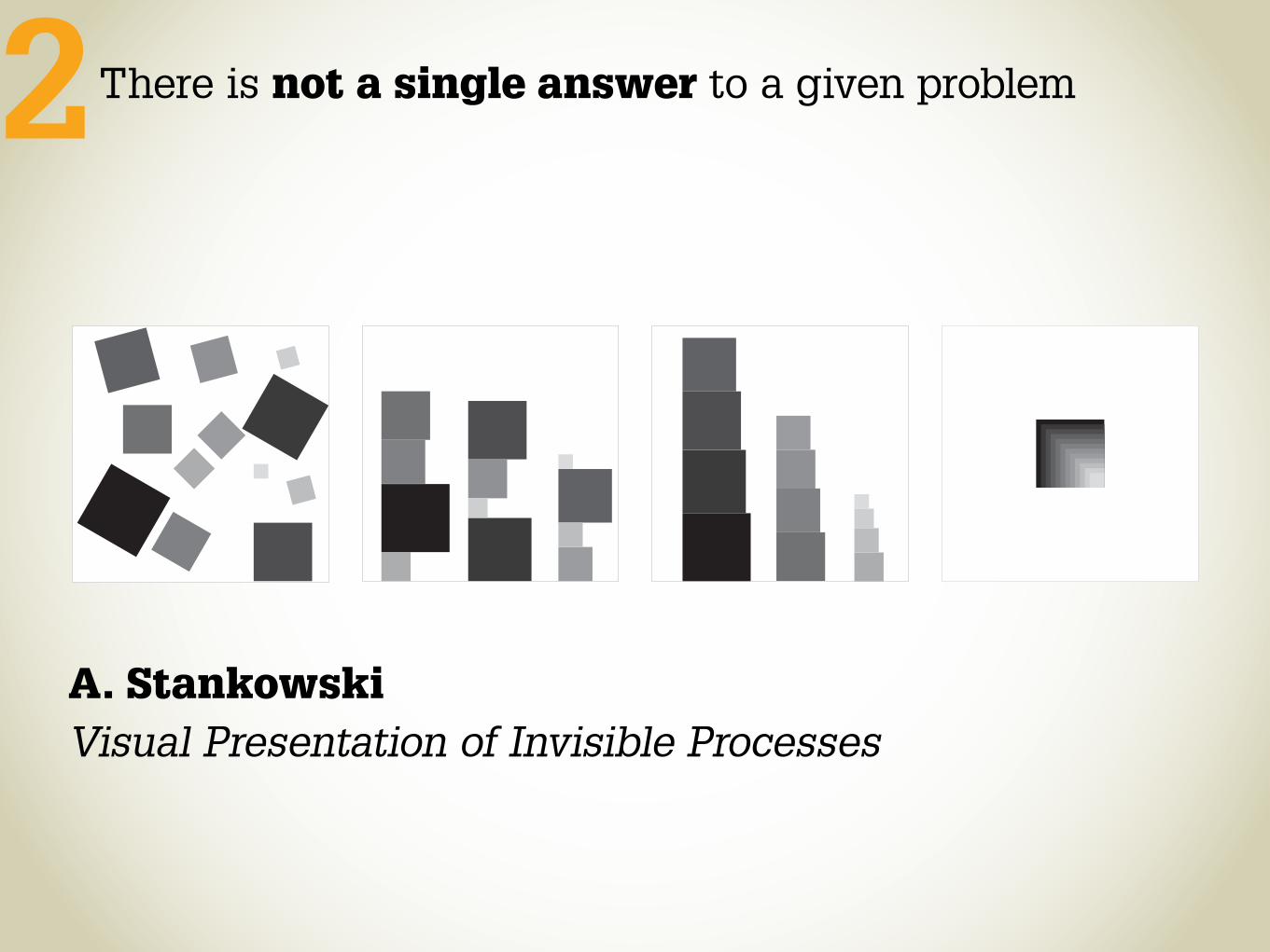
There is not a single answer to a given problem
A. Stankowski Visual Presentation of Invisible Processes
2
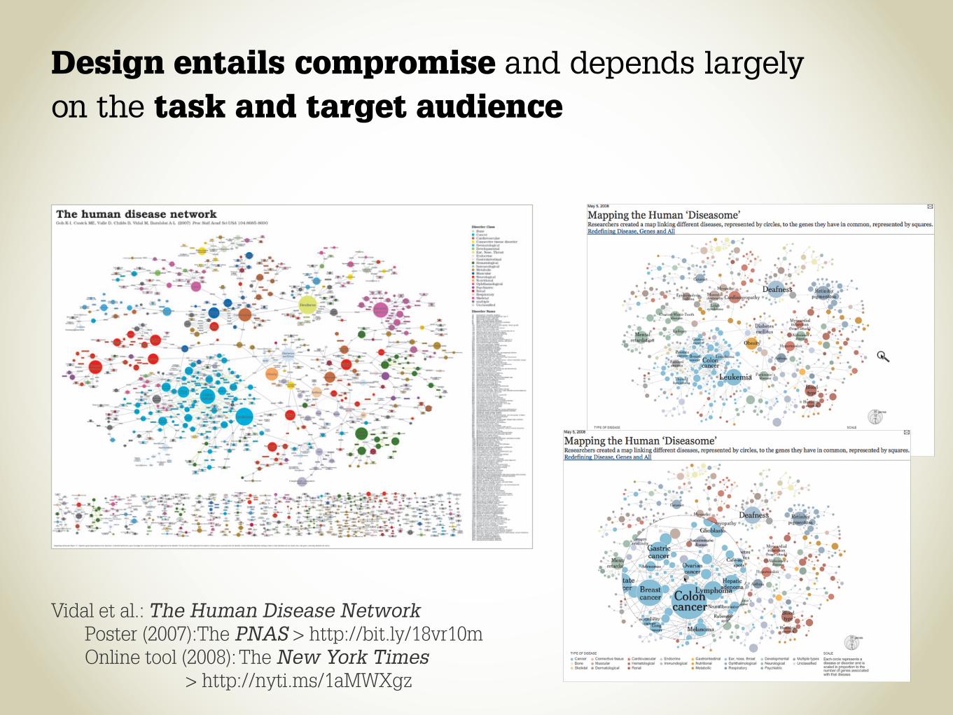
Design entails compromise and depends largely on the task and target audience
Vidal et al.: The Human Disease Network Poster (2007):The PNAS > http://bit.ly/18vr10m Online tool (2008): The New York Times > http://nyti.ms/1aMWXgz
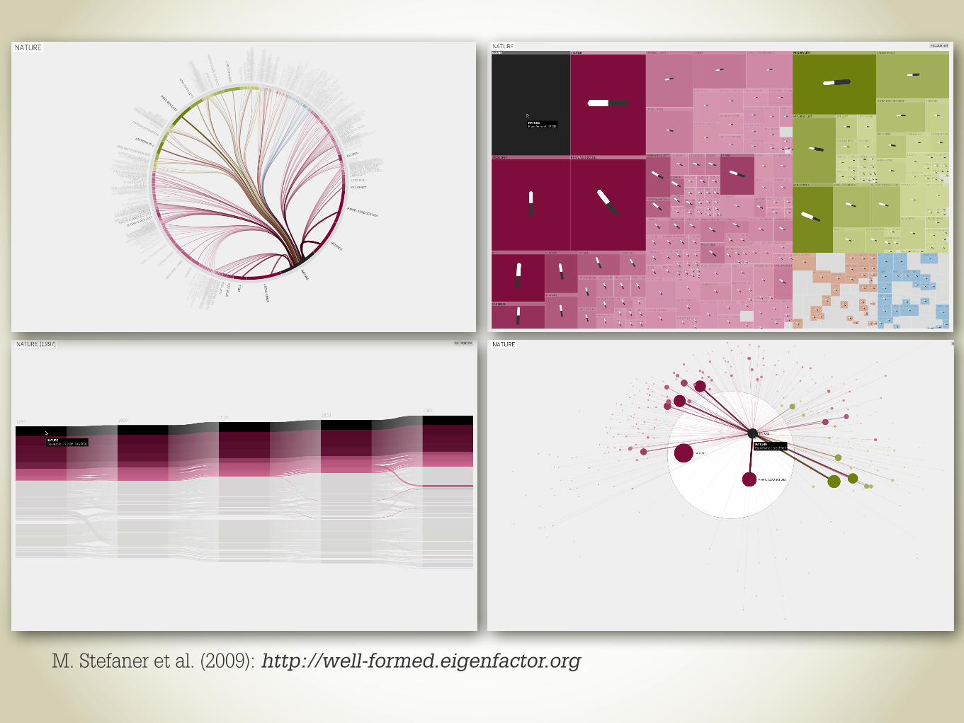
M. Stefaner et al. (2009): http://well-formed.eigenfactor.org

Solving a problem requires finding the right representation3
The brain is a powerful pattern-finding engine… If we can transform data into the appropriate visual representation, its structure may be revealed.
Colin Ware
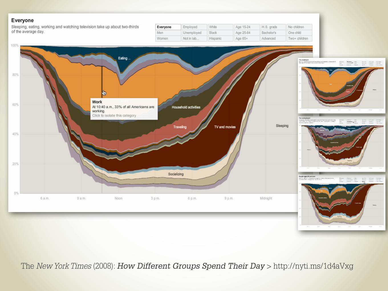
The New York Times (2008): How Different Groups Spend Their Day > http://nyti.ms/1d4aVxg
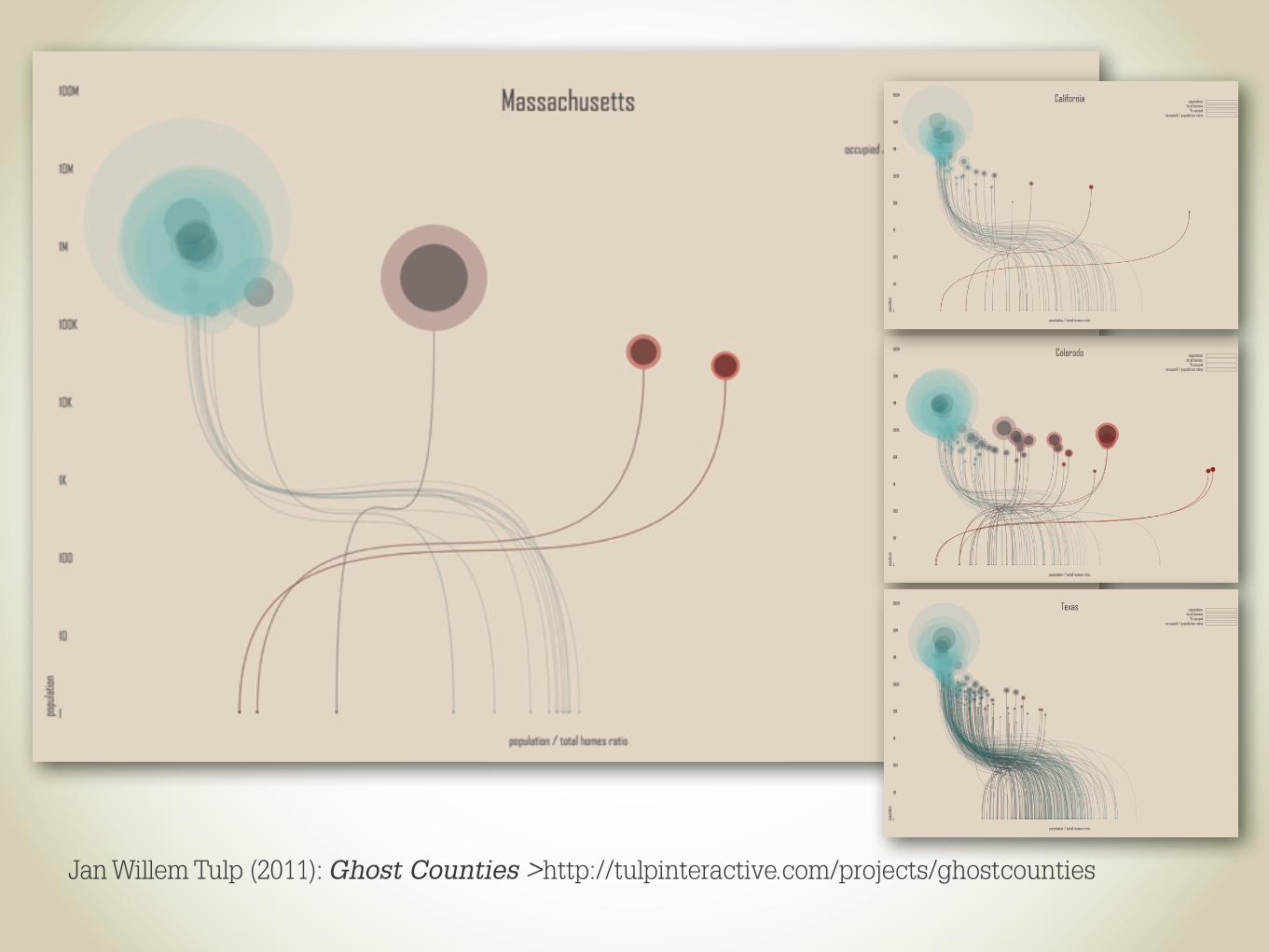
Jan Willem Tulp (2011): Ghost Counties >http://tulpinteractive.com/projects/ghostcounties

Thought accessibility is a continuum, not a dichotomy4 The acquisition of skill selectively increases the accessibility of useful responses and of productive ways to organize information. The master chess player does not see the same board as the novice, and the skill of visualizing the tower that could be built from an array of blocks could surely be improved by prolonged practice.
Daniel Kahneman
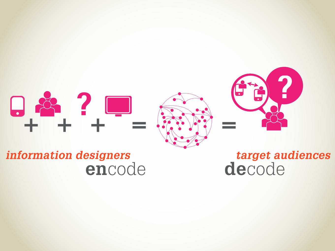
encode decodeinformation designers target audiences
+ + + =?
=?

Constraints imposed by data types
Nominal: A, B, C are distinguishable
Ordinal: B is between A and C
Quantitative: BC is twice as long as AB
A B C

J. Bertin (1967): Sémiologie Graphique
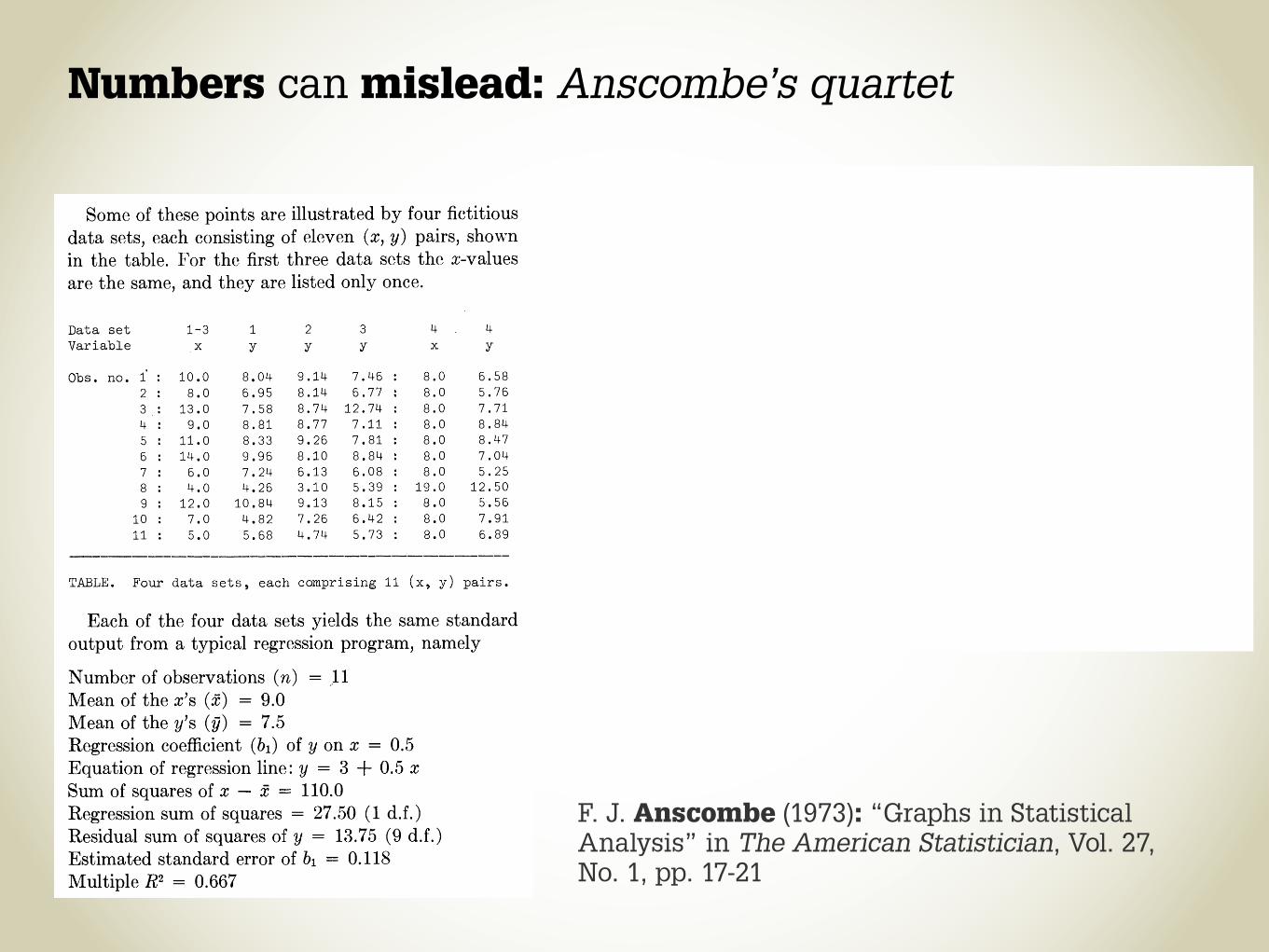
Numbers can mislead: Anscombe’s quartet
F. J. Anscombe (1973): “Graphs in Statistical Analysis” in The American Statistician, Vol. 27, No. 1, pp. 17-21
�
�
�
�
�
�
�
�
1.5. Show The Data 7
Anscombe’s Quartet: Raw DataI II III IV
x y x y x y x y
10.0 8.04 10.0 9.14 10.0 7.46 8.0 6.588.0 6.95 8.0 8.14 8.0 6.77 8.0 5.76
13.0 7.58 13.0 8.74 13.0 12.74 8.0 7.719.0 8.81 9.0 8.77 9.0 7.11 8.0 8.84
11.0 8.33 11.0 9.26 11.0 7.81 8.0 8.4714.0 9.96 14.0 8.10 14.0 8.84 8.0 7.046.0 7.24 6.0 6.13 6.0 6.08 8.0 5.254.0 4.26 4.0 3.10 4.0 5.39 19.0 12.50
12.0 10.84 12.0 9.13 12.0 8.15 8.0 5.567.0 4.82 7.0 7.26 7.0 6.42 8.0 7.915.0 5.68 5.0 4.74 5.0 5.73 8.0 6.89
mean 9.0 7.5 9.0 7.5 9.0 7.5 9.0 7.5var. 10.0 3.75 10.0 3.75 10.0 3.75 10.0 3.75corr. 0.816 0.816 0.816 0.816
Figure 1.1: Anscombe’s Quartet is four datasets with identical simple sta-tistical properties: mean, variance, correlation, and linear regression line.However, visual inspection immediately shows how their structures arequite different [Anscombe 73].
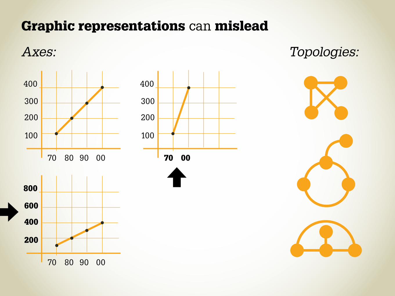
Graphic representations can mislead
Axes: Topologies:
70
70
70
100
200
100
200
400
200
300
600
300
400
800
400
80
80
0090
90
00
00
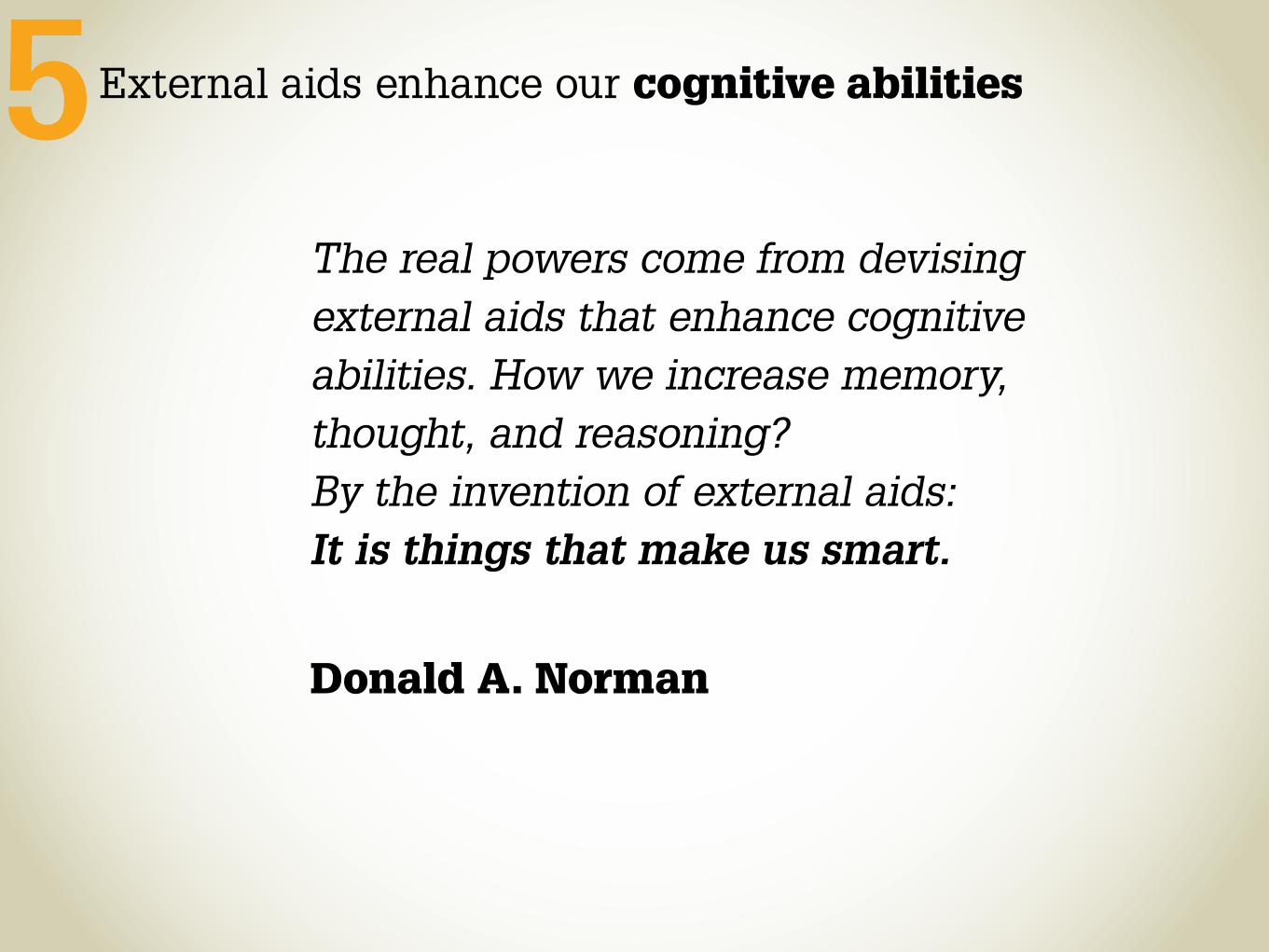
The real powers come from devising external aids that enhance cognitive abilities. How we increase memory, thought, and reasoning? By the invention of external aids: It is things that make us smart.
Donald A. Norman
External aids enhance our cognitive abilities5
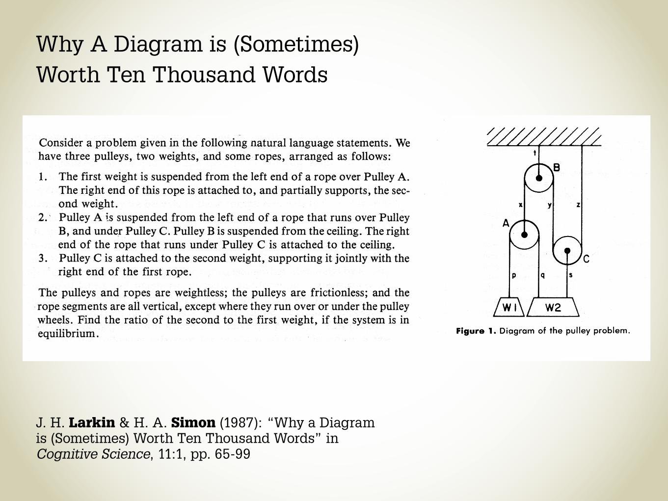
Why A Diagram is (Sometimes) Worth Ten Thousand Words
J. H. Larkin & H. A. Simon (1987): “Why a Diagram is (Sometimes) Worth Ten Thousand Words” in Cognitive Science, 11:1, pp. 65-99

Ebstorf World Map


