Download - Masthead font styles marked

OCR Media Studies – AS Level
Unit G321: Advanced Portfolio
Name: Hannah HughesCandidate Number: 4067Center Name: St. Andrew’s Catholic SchoolCenter Number: 64135
Music Magazine –
Masthead Font Styles
Masthead Font Styles
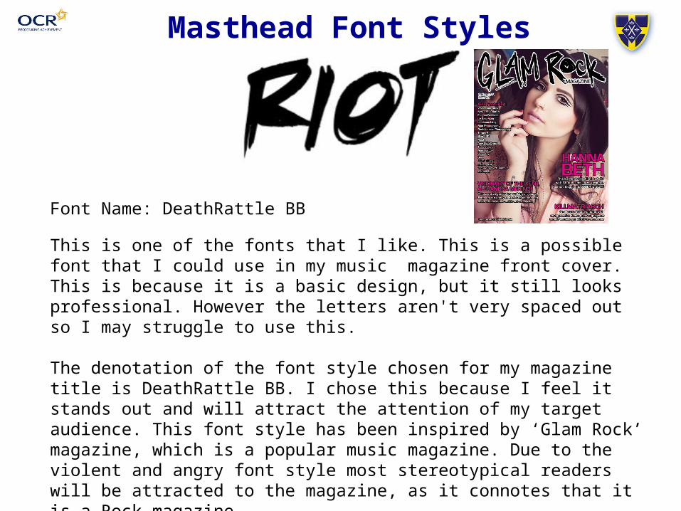
Font Name: DeathRattle BB
This is one of the fonts that I like. This is a possible font that I could use in my music magazine front cover. This is because it is a basic design, but it still looks professional. However the letters aren't very spaced out so I may struggle to use this.
The denotation of the font style chosen for my magazine title is DeathRattle BB. I chose this because I feel it stands out and will attract the attention of my target audience. This font style has been inspired by ‘Glam Rock’ magazine, which is a popular music magazine. Due to the violent and angry font style most stereotypical readers will be attracted to the magazine, as it connotes that it is a Rock magazine.
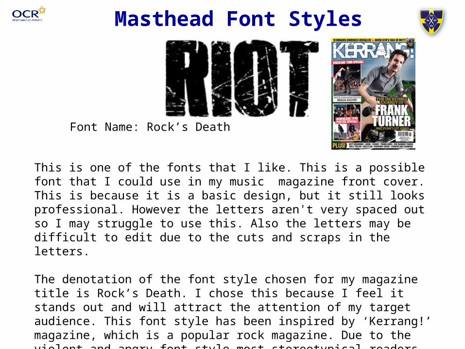
Font Name: Rock’s Death
Masthead Font Styles
This is one of the fonts that I like. This is a possible font that I could use in my music magazine front cover. This is because it is a basic design, but it still looks professional. However the letters aren't very spaced out so I may struggle to use this. Also the letters may be difficult to edit due to the cuts and scraps in the letters.
The denotation of the font style chosen for my magazine title is Rock’s Death. I chose this because I feel it stands out and will attract the attention of my target audience. This font style has been inspired by ‘Kerrang!’ magazine, which is a popular rock magazine. Due to the violent and angry font style most stereotypical readers will be attracted to the magazine, as it connotes that it is a Rock magazine.
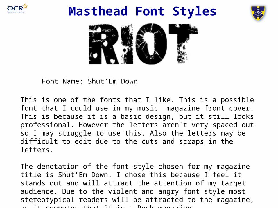
Font Name: Shut’Em Down
Masthead Font Styles
This is one of the fonts that I like. This is a possible font that I could use in my music magazine front cover. This is because it is a basic design, but it still looks professional. However the letters aren't very spaced out so I may struggle to use this. Also the letters may be difficult to edit due to the cuts and scraps in the letters.
The denotation of the font style chosen for my magazine title is Shut’Em Down. I chose this because I feel it stands out and will attract the attention of my target audience. Due to the violent and angry font style most stereotypical readers will be attracted to the magazine, as it connotes that it is a Rock magazine.
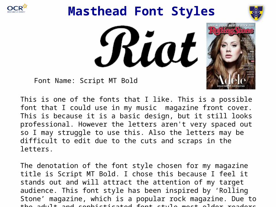
Font Name: Script MT Bold
Masthead Font Styles
This is one of the fonts that I like. This is a possible font that I could use in my music magazine front cover. This is because it is a basic design, but it still looks professional. However the letters aren't very spaced out so I may struggle to use this. Also the letters may be difficult to edit due to the cuts and scraps in the letters.
The denotation of the font style chosen for my magazine title is Script MT Bold. I chose this because I feel it stands out and will attract the attention of my target audience. This font style has been inspired by ‘Rolling Stone’ magazine, which is a popular rock magazine. Due to the adult and sophisticated font style most older readers will be attracted to the magazine, as it connotes that it is a Rock magazine.
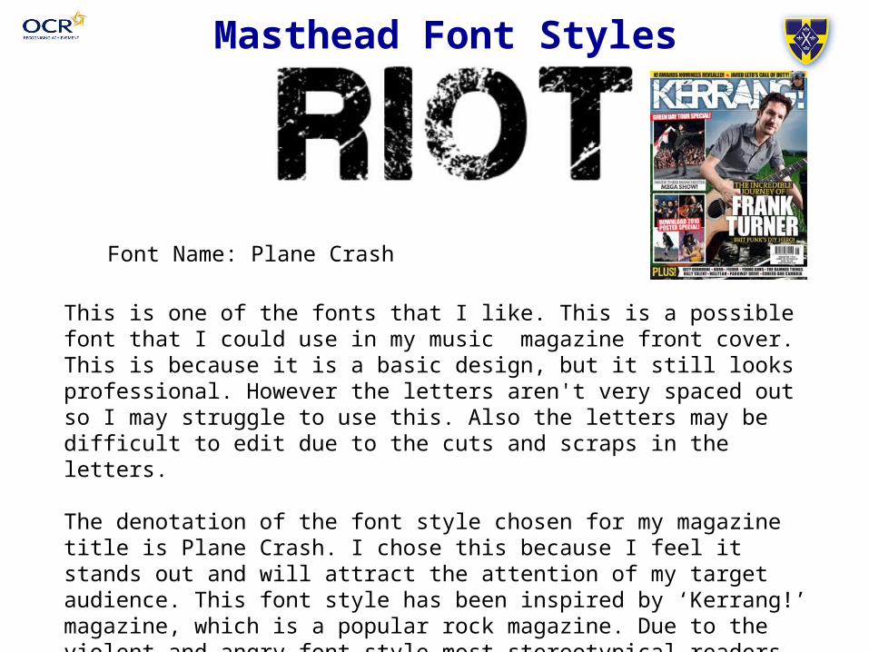
Masthead Font Styles
Font Name: Plane Crash
This is one of the fonts that I like. This is a possible font that I could use in my music magazine front cover. This is because it is a basic design, but it still looks professional. However the letters aren't very spaced out so I may struggle to use this. Also the letters may be difficult to edit due to the cuts and scraps in the letters.
The denotation of the font style chosen for my magazine title is Plane Crash. I chose this because I feel it stands out and will attract the attention of my target audience. This font style has been inspired by ‘Kerrang!’ magazine, which is a popular rock magazine. Due to the violent and angry font style most stereotypical readers will be attracted to the magazine, as it connotes that it is a Rock magazine.

I have decided to go with the font ‘Plane Crash’. I have chosen this font because it is very bold which will draw people to the magazine which will broaden the potential buyers. After giving out my questionnaire I have discovered that most people are most attracted to a colourless colour scheme, therefore I am going to make sure all font is black or white to fit in with my simplistic colourless theme. This font also connotes a professional magazine so they will be entitled to buy it. This font is also similar to the font that Kerrang! magazine uses for their masthead, and as this is my magazine of inspiration I am going for fonts that are remotely similar to it.
Masthead Font Styles


