Download - Nobody's perfect - Michael Friendly

Nobody’s perfect
Michael Friendly, York Universityand Howard Wainer, NationalBoard of Medical ExaminersOne of the great advantages of thegraphical depiction of information isthe vast flexibility of graphical formats.The same format can be used for manydifferent purposes. Nevertheless, linecharts, bar charts and pie charts seemto be most frequently used for presen-tation of quantitative information in thepopular media, whereas the scatter-plot’s principal home is on the pages ofmore technical outlets. But although itsfame may be a bit circumscribed, thescatterplot’s value within science isfully appreciated. Friendly & Denis(1984) described it as the most versa-tile, polymorphic, and generally usefulinvention in the entire history of statis-tical graphics.
In view of the division between typ-ical audiences of these two classes ofdisplays (scatterplots vs. everythingelse) it should not be surprising thatthere were two different inventors. Theiconoclastic Scot William Playfair(1759-1823), is generally credited withthe invention of the pie chart, bar chartand line chart (Funkhouser & Walker,1935; Funkhouser, 1937), whereas theBritish astronomer John FrederickWilliam Herschel (1792-1871) is the
VISUALREVELATIONS
Howard Wainer,Column Editor
Column Editor: Howard Wainer,Distinguished Research Scientist,National Board of MedicalExaminers, 3750 Market Street,Philadelphia, Pennsylvania 19104;[email protected].
most likely candidate as the inventor ofthe scatterplot (Friendly & Denis,2004). Herschel’s use of the scatterplot occurs in his “investigation of theorbits of revolving double stars,” whichhe read to the Royal AstronomicalSociety on January 13, 1832 and pub-lished a year later. The term “scatter-plot” appeared somewhat later; Moore(1911) credits it to Karl Pearson.
But why didn’t Playfair invent thescatter plot? He did such a marvelousjob inventing so many graphical tools,how could he have missed this one?Could it be because the data of greatestinterest to him would not have yieldeddeeper insights as a scatterplot?Playfair’s initial plots (in his 1786 Atlas)were almost all line graphs. He wasinterested in showing trends in thecommerce between England and itsvarious trading partners. Hence linegraphs of imports and exports over timewere the logical design of choice. Hewould also shade the area between thetwo resulting curves to indicate the bal-ance of trade, and label this space asbalance in favor or against England asthe case might be. Such time seriesdata are not a fertile field from whichmight grow a scatterplot.
Playfair did not have Scotland’strade data for more than a single year(1780-1781). Thus the time-line plotwas not suitable. So instead, he depict-ed Scotland’s trade with its eighteenpartners as a bar chart (Figure 1). Hecomplained about the insufficiency ofthe data, but note how well he used theform: he paired imports and exportstogether for each of Scotland’s tradingpartners for easy comparison (he couldhave made two separate charts), heplaced the bars horizontally to makereading of the labels easier, and he
CHANCE 51
ordered the countries by the total valueof each country’s trade with Scotland.Let us emphasize the insight that thislast aspect represents. It is easy toimagine someone of lesser insight suc-cumbing to “America first” and order-ing the bars alphabetically. The result-ing figure would be much the worse(see Figure 2).
Playfair invented so many graphicalforms, and because his taste wasalmost always impeccable, it is shock-ing to find one that has serious flaws.In his Letter on our agricultural dis-tresses, their causes and remedies;accompanied with tables and copper-plate charts shewing and comparingthe prices of wheat, bread and labour,from 1565 to 1821 , he produced anapparently breathtaking figure (Figure3) showing three parallel time-series:the price of a quarter of wheat, theweekly wages of a ‘good mechanic’, andwho was the reigning monarch duringeach of the time periods shown.
His use of the line graph for suchtime series data was natural given howsuccessful he had been in the past withsimilar data. But the inferences hewished to draw from this data set weresubtly different than the ones he hadmade before. Previously the questionsposed were “How have England’sexports to X changed over the past 200years?” Or “what has been the charac-ter of England’s debt over the past 200years?” Sometimes, when a second par-allel data set was also included on theplot a new, but parallel, question per-taining to it was posed “How haveEngland’s imports from X changed overthe past 200 years?” And then naturalcomparisons between the two dataseries were made – When were exportsgreater than imports?

Figure 2. The imports (cross-hatched lines) and exports (solid lines) to and from Scotland in 1781 for 18 countries, orderedalphabetically.
Figure 1. The imports (cross-hatched lines) and exports (solid lines) to and from Scotland in 1781 for 18 countries, ordered bythe total volume of trade.
52 VOL. 17, NO. 2, 2004
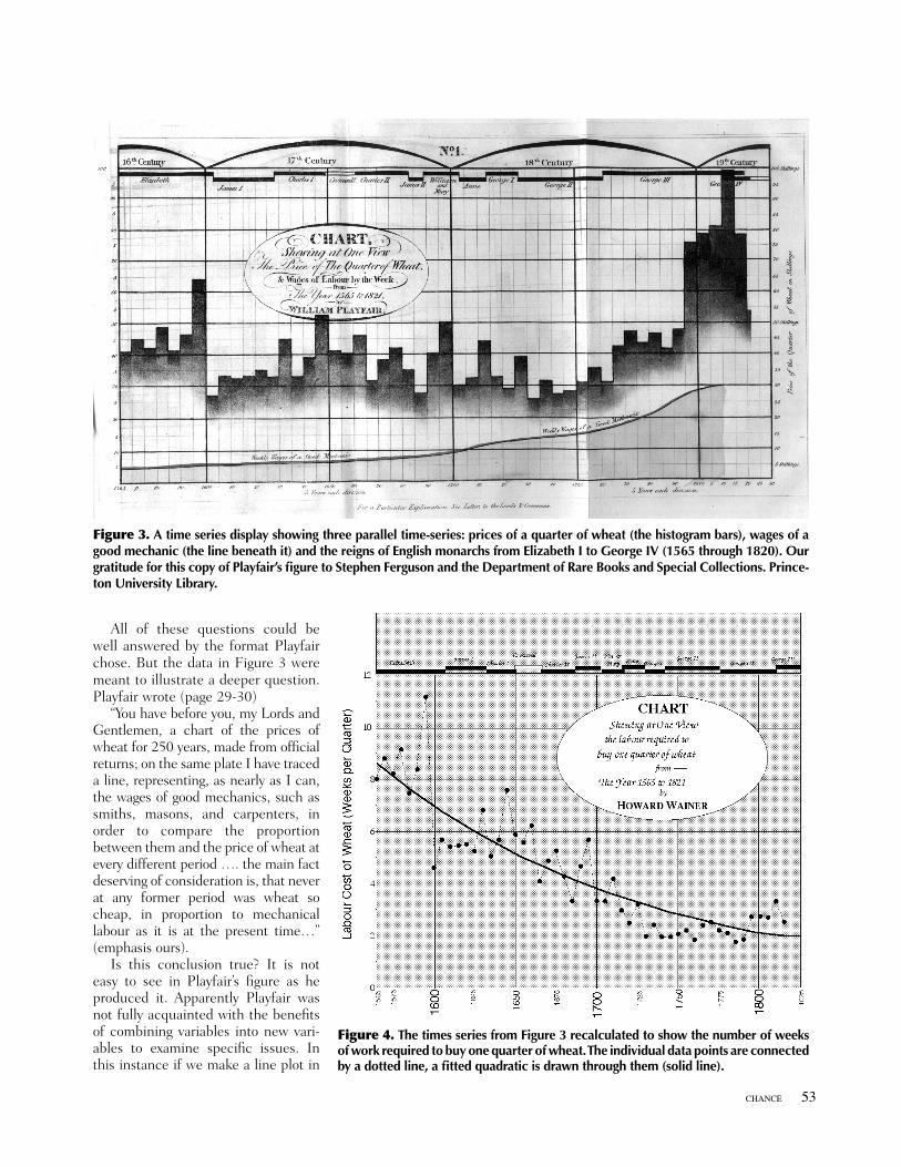
All of these questions could bewell answered by the format Playfairchose. But the data in Figure 3 weremeant to illustrate a deeper question.Playfair wrote (page 29-30)
“You have before you, my Lords andGentlemen, a chart of the prices ofwheat for 250 years, made from officialreturns; on the same plate I have traceda line, representing, as nearly as I can,the wages of good mechanics, such assmiths, masons, and carpenters, inorder to compare the proportionbetween them and the price of wheat atevery different period …. the main factdeserving of consideration is, that neverat any former period was wheat socheap, in proportion to mechanicallabour as it is at the present time…”(emphasis ours).
Is this conclusion true? It is noteasy to see in Playfair’s figure as heproduced it. Apparently Playfair wasnot fully acquainted with the benefitsof combining variables into new vari-ables to examine specific issues. Inthis instance if we make a line plot in
CHANCE 53
Figure 4. The times series from Figure 3 recalculated to show the number of weeksof work required to buy one quarter of wheat. The individual data points are connectedby a dotted line, a fitted quadratic is drawn through them (solid line).
Figure 3. A time series display showing three parallel time-series: prices of a quarter of wheat (the histogram bars), wages of agood mechanic (the line beneath it) and the reigns of English monarchs from Elizabeth I to George IV (1565 through 1820). Ourgratitude for this copy of Playfair’s figure to Stephen Ferguson and the Department of Rare Books and Special Collections. Prince-ton University Library.

54 VOL. 17, NO. 2, 2004
(1935). Playfair and his charts,Economic History, 3, 103-109.
Funkhouser, H. G. (1937). Historicaldevelopment of the graphic repre-sentation of statistical data. Osiris,3, 269-404.
Herschel, J. F. W. (1833). On theinvestigation of the orbits of revolv-ing double stars. Memoirs of theRoyal Astronomical Society, 5, 171-222.
Moore, H. L. (1911). Laws of Wages:An Essay in Statistical Economics,New York: The Macmillan Co.Reprinted in 1967 by Augustus M.Kelley: New York.
which the variable being displayed isthe ratio “Labor cost of wheat(weeks/quarter)” the truth of Playfair’sconclusion is evident.
Another way to look at the relation-ship between the cost of wheat and theamount of wages directly might be ascatter plot. But to construct a scatterplot that provides such an insight (seeFigure 5) takes a lot of work, and someexperience in peering at them. Playfairmight have considered a scatter plot,and rejected it as worthless – or at leastas worthless for the sorts of time seriesdata that he was primarily concernedwith. Of course, had Playfair beeninterested in the relationship between
parent’s and children’s heights he mighthave scooped Galton. But he wasn’tand he didn’t. Nobody’s perfect.
References
Cleveland, W. S., & McGill, R.(1984). Graphical perception:Theory, Experimentation, andapplication to the development ofgraphical methods. Journal of theAmerican Statistical Association,79, 531-554.
Friendly, M. & Denis, D. (2004). Whoinvented the scatterplot? Manuscriptsubmitted for publication..
Funkhouser, H. G. & Walker, H. M.
Figure 5. A scatterplot of Wheat price (on the horizontal axis) vs. Wages (on the vertical axis). The diagonal line represents theaverage ratio between the two over the 255 years depicted. Data points for three different eras are indicated.


