drafts (2)
TRANSCRIPT
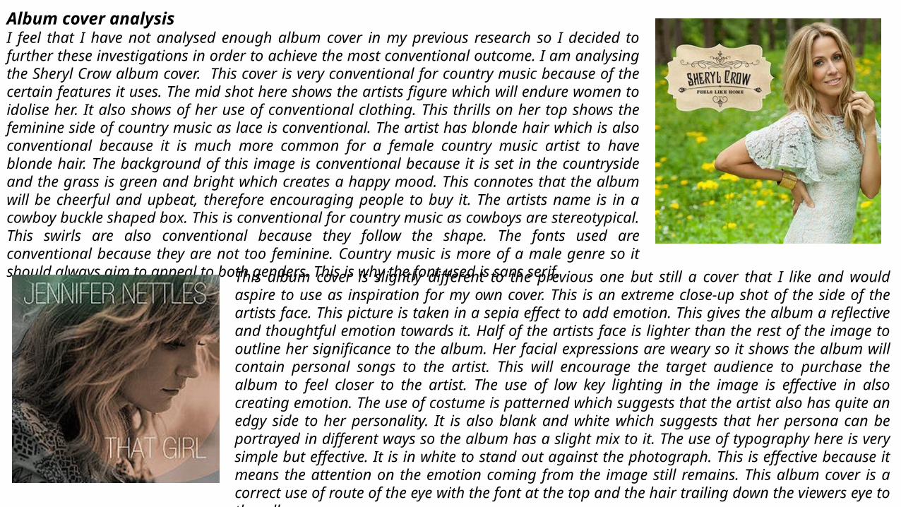
Album cover analysisI feel that I have not analysed enough album cover in my previous research so I decided to further these investigations in order to achieve the most conventional outcome. I am analysing the Sheryl Crow album cover. This cover is very conventional for country music because of the certain features it uses. The mid shot here shows the artists figure which will endure women to idolise her. It also shows of her use of conventional clothing. This thrills on her top shows the feminine side of country music as lace is conventional. The artist has blonde hair which is also conventional because it is much more common for a female country music artist to have blonde hair. The background of this image is conventional because it is set in the countryside and the grass is green and bright which creates a happy mood. This connotes that the album will be cheerful and upbeat, therefore encouraging people to buy it. The artists name is in a cowboy buckle shaped box. This is conventional for country music as cowboys are stereotypical. This swirls are also conventional because they follow the shape. The fonts used are conventional because they are not too feminine. Country music is more of a male genre so it should always aim to appeal to both genders. This is why the font used is sans serif.
This album cover is slightly different to the previous one but still a cover that I like and would aspire to use as inspiration for my own cover. This is an extreme close-up shot of the side of the artists face. This picture is taken in a sepia effect to add emotion. This gives the album a reflective and thoughtful emotion towards it. Half of the artists face is lighter than the rest of the image to outline her significance to the album. Her facial expressions are weary so it shows the album will contain personal songs to the artist. This will encourage the target audience to purchase the album to feel closer to the artist. The use of low key lighting in the image is effective in also creating emotion. The use of costume is patterned which suggests that the artist also has quite an edgy side to her personality. It is also blank and white which suggests that her persona can be portrayed in different ways so the album has a slight mix to it. The use of typography here is very simple but effective. It is in white to stand out against the photograph. This is effective because it means the attention on the emotion coming from the image still remains. This album cover is a correct use of route of the eye with the font at the top and the hair trailing down the viewers eye to the album name.
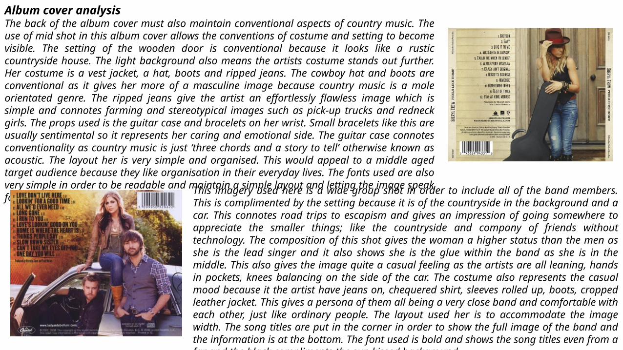
Album cover analysisThe back of the album cover must also maintain conventional aspects of country music. The use of mid shot in this album cover allows the conventions of costume and setting to become visible. The setting of the wooden door is conventional because it looks like a rustic countryside house. The light background also means the artists costume stands out further. Her costume is a vest jacket, a hat, boots and ripped jeans. The cowboy hat and boots are conventional as it gives her more of a masculine image because country music is a male orientated genre. The ripped jeans give the artist an effortlessly flawless image which is simple and connotes farming and stereotypical images such as pick-up trucks and redneck girls. The props used is the guitar case and bracelets on her wrist. Small bracelets like this are usually sentimental so it represents her caring and emotional side. The guitar case connotes conventionality as country music is just ‘three chords and a story to tell’ otherwise known as acoustic. The layout her is very simple and organised. This would appeal to a middle aged target audience because they like organisation in their everyday lives. The fonts used are also very simple in order to be readable and maintain a simple layout and letting the image speak for itself.
This imagery used here is a wide group shot in order to include all of the band members. This is complimented by the setting because it is of the countryside in the background and a car. This connotes road trips to escapism and gives an impression of going somewhere to appreciate the smaller things; like the countryside and company of friends without technology. The composition of this shot gives the woman a higher status than the men as she is the lead singer and it also shows she is the glue within the band as she is in the middle. This also gives the image quite a casual feeling as the artists are all leaning, hands in pockets, knees balancing on the side of the car. The costume also represents the casual mood because it the artist have jeans on, chequered shirt, sleeves rolled up, boots, cropped leather jacket. This gives a persona of them all being a very close band and comfortable with each other, just like ordinary people. The layout used her is to accommodate the image width. The song titles are put in the corner in order to show the full image of the band and the information is at the bottom. The font used is bold and shows the song titles even from a far and the black compliments the sun kissed background.
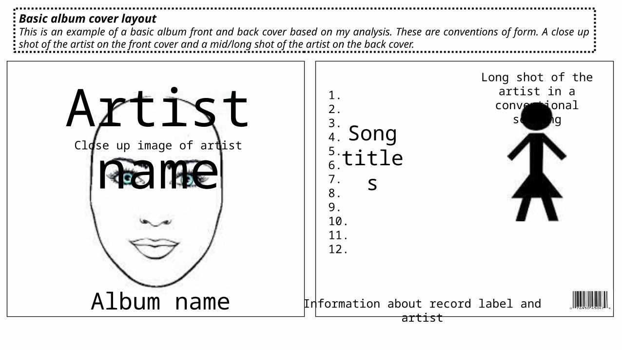
Basic album cover layoutThis is an example of a basic album front and back cover based on my analysis. These are conventions of form. A close up shot of the artist on the front cover and a mid/long shot of the artist on the back cover.
Artist name
Album name
1.2.3.4.5.6.7.8.9.10.11.12.
Song titles
Close up image of artist
Information about record label and artist
Long shot of the artist in a conventional setting
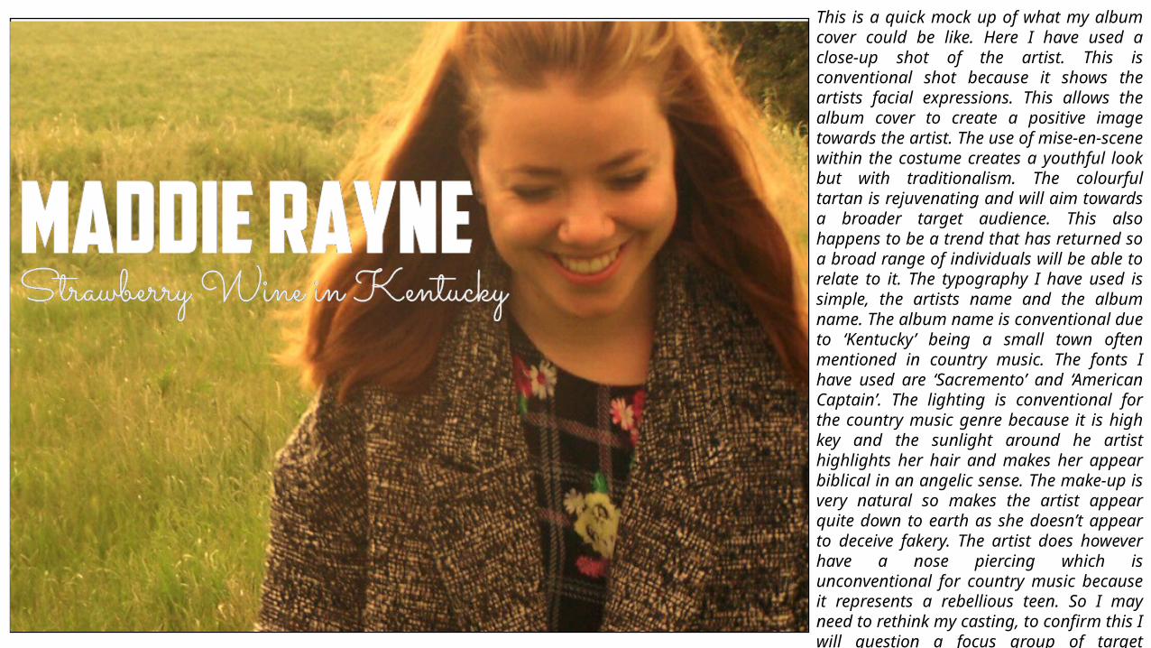
This is a quick mock up of what my album cover could be like. Here I have used a close-up shot of the artist. This is conventional shot because it shows the artists facial expressions. This allows the album cover to create a positive image towards the artist. The use of mise-en-scene within the costume creates a youthful look but with traditionalism. The colourful tartan is rejuvenating and will aim towards a broader target audience. This also happens to be a trend that has returned so a broad range of individuals will be able to relate to it. The typography I have used is simple, the artists name and the album name. The album name is conventional due to ‘Kentucky’ being a small town often mentioned in country music. The fonts I have used are ‘Sacremento’ and ‘American Captain’. The lighting is conventional for the country music genre because it is high key and the sunlight around he artist highlights her hair and makes her appear biblical in an angelic sense. The make-up is very natural so makes the artist appear quite down to earth as she doesn’t appear to deceive fakery. The artist does however have a nose piercing which is unconventional for country music because it represents a rebellious teen. So I may need to rethink my casting, to confirm this I will question a focus group of target audience to see whether this would discourage them to buy the album and support the artist.
1. Follow your arrow
2. Strawberry wine in Kentucky
3. Alabama blues f.t. The Band
Perry4. I’ve seen the
sunset dance (over sunset
avenue)5. Only the rolling
stones knows6. High on rock ‘n’
roll
7. At the end of the day8. Pills
9. Loosing myself in you10. Leaving
love in Nashville
11. Love the way you love
me12. (Bonus
Track) Crazy ain’t original
these days f.t. Sheryl Crow
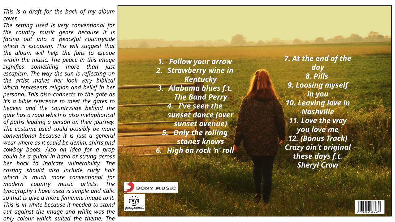
This is a draft for the back of my album cover.The setting used is very conventional for the country music genre because it is facing out into a peaceful countryside which is escapism. This will suggest that the album will help the fans to escape within the music. The peace in this image signifies something more than just escapism. The way the sun is reflecting on the artist makes her look very biblical which represents religion and belief in her persona. This also connects to the gate as it’s a bible reference to meet the gates to heaven and the countryside behind the gate has a road which is also metaphorical of paths leading a person on their journey. The costume used could possibly be more conventional because it is just a general wear where as it could be denim, shirts and cowboy boots. Also an idea for a prop could be a guitar in hand or strung across her back to indicate vulnerability. The casting should also include curly hair which is much more conventional for modern country music artists. The typography I have used is simple and italic so that is give a more feminine image to it. This is in white because it needed to stand out against the image and white was the only colour which suited the theme. The song titles are conventional as they all have a relation to country music genres like love, heartache, surroundings and drinking.
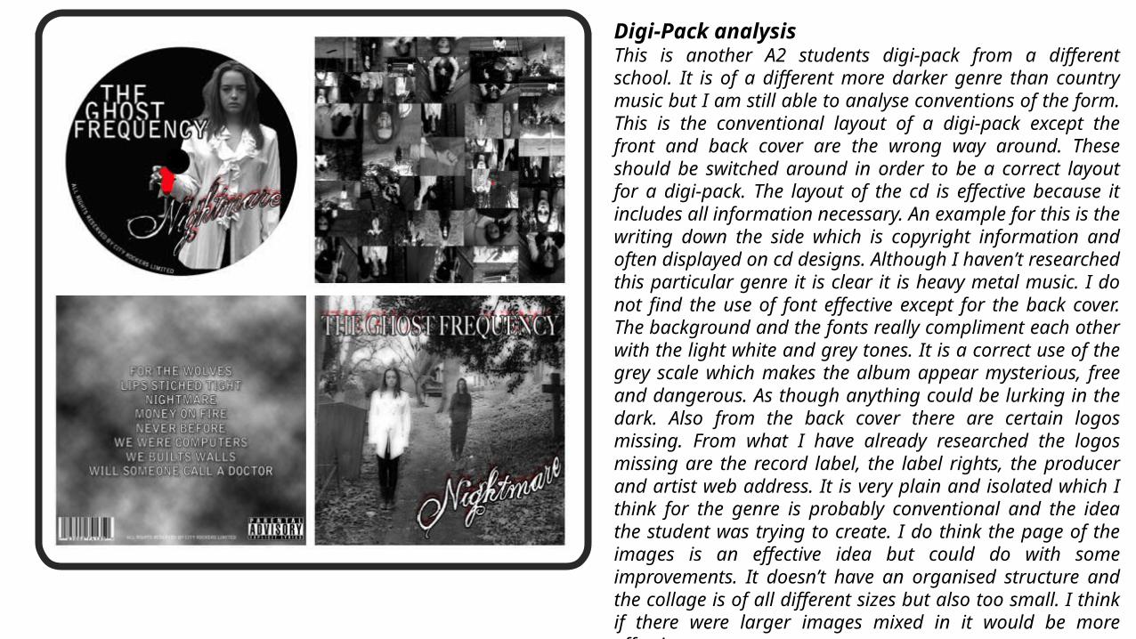
Digi-Pack analysis This is another A2 students digi-pack from a different school. It is of a different more darker genre than country music but I am still able to analyse conventions of the form. This is the conventional layout of a digi-pack except the front and back cover are the wrong way around. These should be switched around in order to be a correct layout for a digi-pack. The layout of the cd is effective because it includes all information necessary. An example for this is the writing down the side which is copyright information and often displayed on cd designs. Although I haven’t researched this particular genre it is clear it is heavy metal music. I do not find the use of font effective except for the back cover. The background and the fonts really compliment each other with the light white and grey tones. It is a correct use of the grey scale which makes the album appear mysterious, free and dangerous. As though anything could be lurking in the dark. Also from the back cover there are certain logos missing. From what I have already researched the logos missing are the record label, the label rights, the producer and artist web address. It is very plain and isolated which I think for the genre is probably conventional and the idea the student was trying to create. I do think the page of the images is an effective idea but could do with some improvements. It doesn’t have an organised structure and the collage is of all different sizes but also too small. I think if there were larger images mixed in it would be more effective.
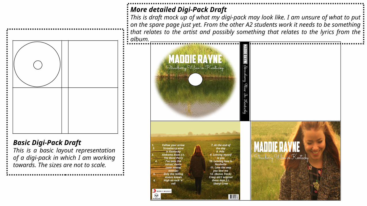
Basic Digi-Pack DraftThis is a basic layout representation of a digi-pack in which I am working towards. The sizes are not to scale.
More detailed Digi-Pack DraftThis is draft mock up of what my digi-pack may look like. I am unsure of what to put on the spare page just yet. From the other A2 students work it needs to be something that relates to the artist and possibly something that relates to the lyrics from the album.
1. Follow your arrow
2. Strawberry wine in
Kentucky3. Alabama blues
f.t. The Band Perry
4. I’ve seen the sunset dance (over sunset
avenue)5. Only the
rolling stones knows
6. High on rock ‘n’ roll
7. At the end of the day8. Pills
9. Loosing myself in you10. Leaving
love in Nashville
11. Love the way you love
me12. (Bonus
Track) Crazy ain’t original
these days f.t. Sheryl Crow
This font is very fright and engaging but also give a childlike image which could misconstrue the image of the artist.
The swirls in the second font is really complimented by the bold font above. It is a mixture of serif and sans serif which would show a serious but also feminine side.
These fonts used are very bold and give quite a statement and the crispiness in the font gives it a mystical edge but with that strength from such bold edges.
I like the second font here even though it may be slightly unreadable its very feminine and compliments the simple font.
This font is a very signature part of the cover as the swirls completely dominate the image. The heart at the top of the ‘I’ also signifies that her music would be about love. The spread out font at the bottom is small so spread out to cover more of the image and draw the eye along.
This font is very conventional as it is quite harp and rounded but mixed with the cowboy like font at the bottom and the swirls create a mixed medium that aims to female and male audience.
This font is simple but this could work with some album covers as its easily read.The rustic effect to this font creates a wooden image. This mixed with the sepia image behind it creates a conventional ranch and pub type image which could be related to country music related pubs with cowboys. This font is bold and readable but it is see through enough to see the image behind it.
This font is very conventional as it is quite harp and rounded but mixed with the cowboy like font at the bottom and the swirls create a mixed medium that aims to female and male audience.
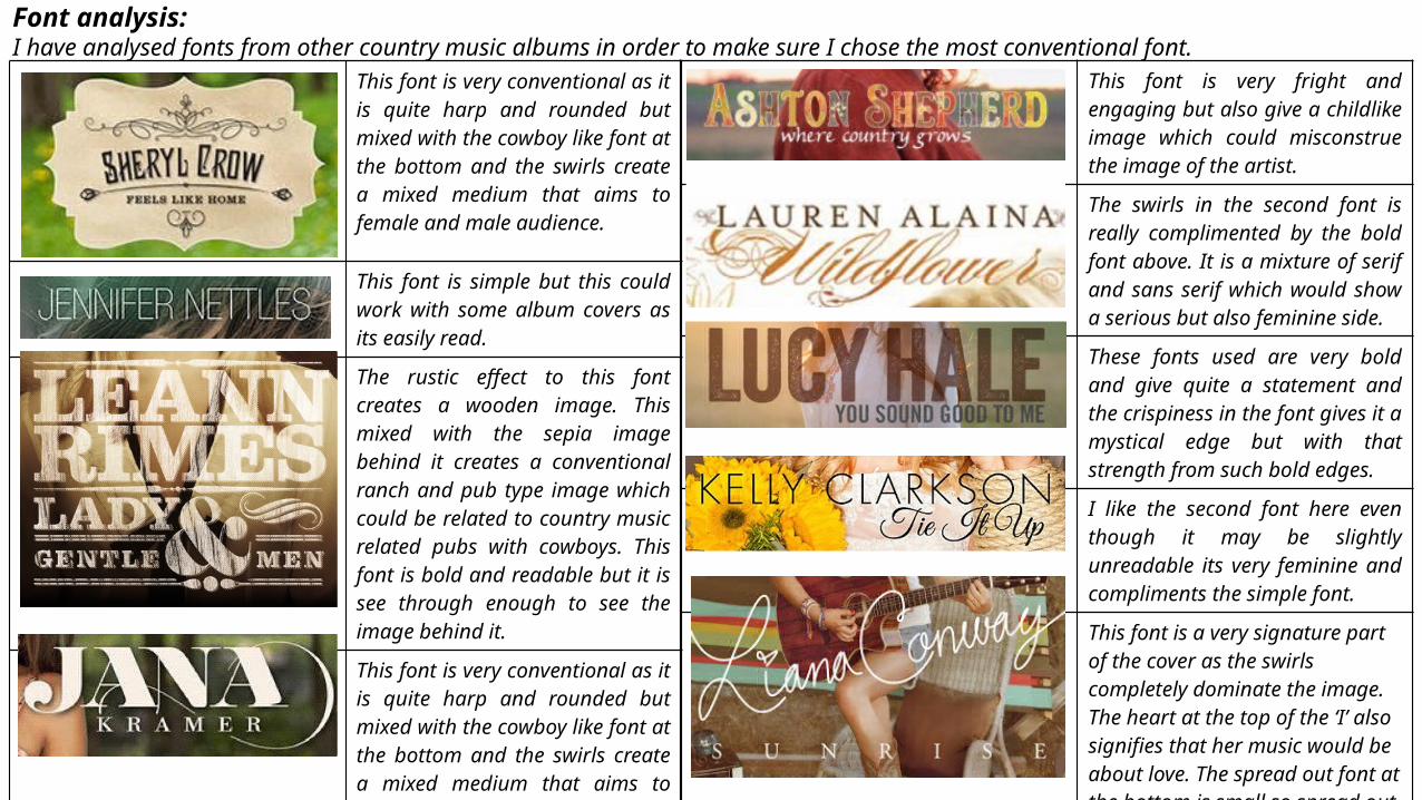
Font analysis:I have analysed fonts from other country music albums in order to make sure I chose the most conventional font.
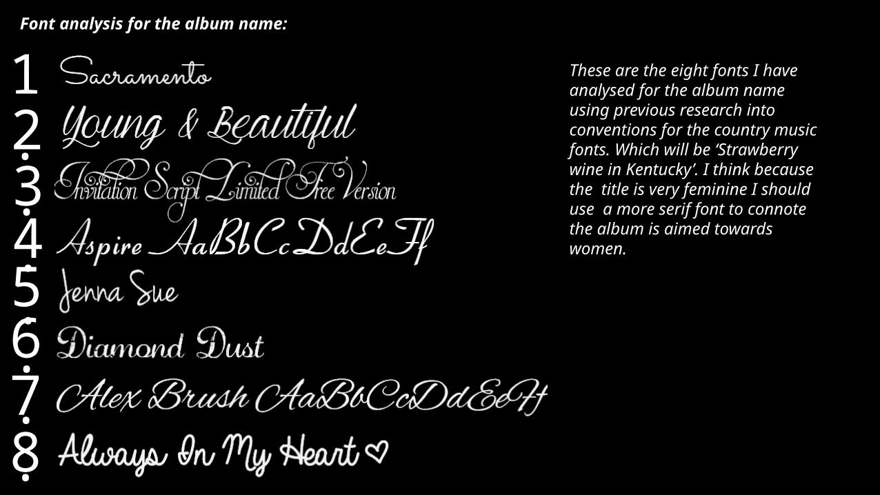
Font analysis for the album name:
1.2.3.4.5.6.7.8.
These are the eight fonts I have analysed for the album name using previous research into conventions for the country music fonts. Which will be ‘Strawberry wine in Kentucky’. I think because the title is very feminine I should use a more serif font to connote the album is aimed towards women.
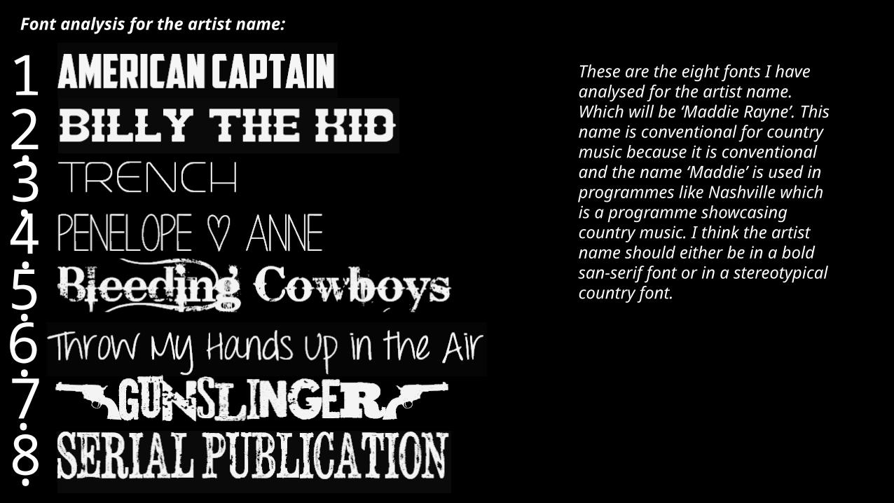
Font analysis for the artist name:
1.2.3.4.5.6.7.8.
These are the eight fonts I have analysed for the artist name. Which will be ‘Maddie Rayne’. This name is conventional for country music because it is conventional and the name ‘Maddie’ is used in programmes like Nashville which is a programme showcasing country music. I think the artist name should either be in a bold san-serif font or in a stereotypical country font.
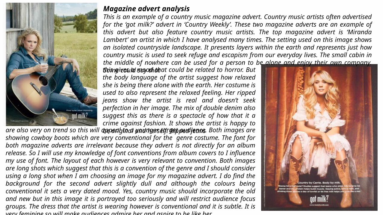
Magazine advert analysisThis is an example of a country music magazine advert. Country music artists often advertised for the ‘got milk?’ advert in ‘Country Weekly’. These two magazine adverts are an example of this advert but also feature country music artists. The top magazine advert is ‘Miranda Lambert’ an artist in which I have analysed many times. The setting used on this image shows an isolated countryside landscape. It presents layers within the earth and represents just how country music is used to seek refuge and escapism from our everyday lives. The small cabin in the middle of nowhere can be used for a person to be alone and enjoy their own company. Some could say thatthis gives a mood that could be related to horror. But the body language of the artist suggest how relaxed she is being there alone with the earth. Her costume is used to also represent the relaxed feeling. Her ripped jeans show the artist is real and doesn’t seek perfection in her image. The mix of double denim also suggest this as there is a spectacle of how that it a crime against fashion. It shows the artist is happy to be original and herself. Ripped jeans
are also very on trend so this will appeal to a younger target audience. Both images are showing cowboy boots which are very conventional for the genre costume. The font for both magazine adverts are irrelevant because they advert is not directly for an album release. So I will use my knowledge of font conventions from album covers to I influence my use of font. The layout of each however is very relevant to convention. Both images are long shots which suggest that this is a convention of the genre and I should consider using a long shot when I am choosing an image for my magazine advert. I do find the background for the second advert slightly dull and although the colours being conventional it sets a very dated mood. Yes, country music should incorporate the old and new but in this image it is portrayed too seriously and will restrict audience focus groups. The dress that the artist is wearing however is conventional and it is subtle. It is very feminine so will make audiences admire her and aspire to be like her.
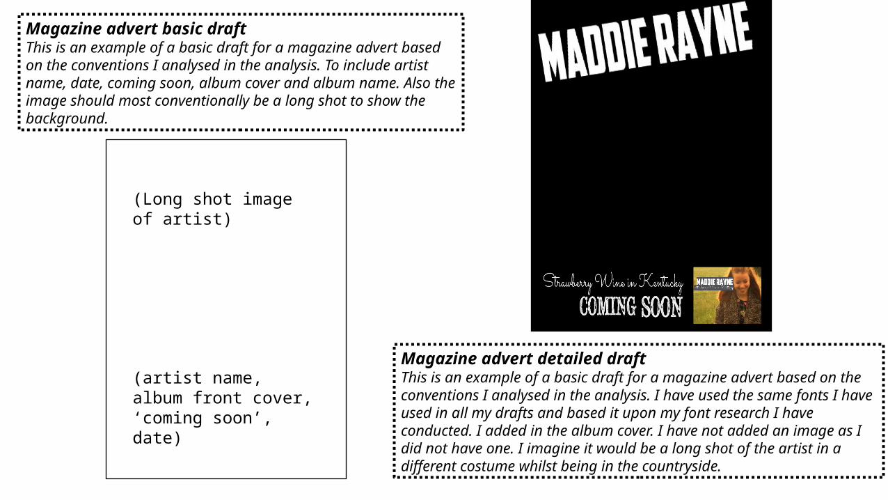
Magazine advert basic draftThis is an example of a basic draft for a magazine advert based on the conventions I analysed in the analysis. To include artist name, date, coming soon, album cover and album name. Also the image should most conventionally be a long shot to show the background.
Magazine advert detailed draft This is an example of a basic draft for a magazine advert based on the conventions I analysed in the analysis. I have used the same fonts I have used in all my drafts and based it upon my font research I have conducted. I added in the album cover. I have not added an image as I did not have one. I imagine it would be a long shot of the artist in a different costume whilst being in the countryside.
(Long shot image of artist)
(artist name, album front cover, ‘coming soon’, date)