draw #13
DESCRIPTION
Eisner Award-nominated DRAW! magazine, the top step-by-step magazine on drawing for comics and animation, returns with another stellar selection of today’s working professional cartoonists and animators! Each artist invites us into their studio to reveal their working methods and tricks of the trade, and this issue features: A step-by-step demo of painting methods by cover artist Alex HORLEY (Heavy Metal, Vertigo, DC, Wizards of the Coast)! Part 2 of our in-depth interview with Kyle BAKER! Plus, interviews and demos by Banana Sundays’ Colleen COOVER, behind-the-scenes on Adult Swim’s Minoriteam, regular features on drawing by Bret BLEVINS and editor Mike MANLEY, links, a color section, and more! Includes a free preview of ROUGH STUFF #3!TRANSCRIPT

AALLEEXXHHOORRLLEEYYPPAAIINNTTIINNGG DDEEMMOO && IINNTTEERRVVIIEEWW
$6.95IN THE U.S.A.
NUMBER 13WINTER 2006
THE PROFFESSIONAL “HOW-TO” MAGAZINE ON
COMICS AND CARTOONING
AALLEEXXHHOORRLLEEYYPPAAIINNTTIINNGG DDEEMMOO && IINNTTEERRVVIIEEWW
THE PROFFESSIONAL “HOW-TO” MAGAZINE ON
COMICS AND CARTOONING
CCOOLLLLEEEENN CCOOOOVVEERR
CCRREEAATTOORR OOFF BBAANNAANNAA SSUUNNDDAAYYSSCCOOLLLLEEEENN CCOOOOVVEERR
CCRREEAATTOORR OOFF BBAANNAANNAA SSUUNNDDAAYYSS
KKYYLLEE BBAAKKEERR
PPAARRTT TTWWOO OOFF OOUURRIINN--DDEEPPTTHH IINNTTEERRVVIIEEWW
KKYYLLEE BBAAKKEERR
PPAARRTT TTWWOO OOFF OOUURRIINN--DDEEPPTTHH IINNTTEERRVVIIEEWW
PLUS!BEHIND THE SCENES WITH
AADDUULLTT SSWWIIMM’’SS MMIINNOORRIITTEEAAMMTUTORIAL BY
BBRREETT BBLLEEVVIINNSS && MMIIKKEE MMAANNLLEEYY!!
PLUS!BEHIND THE SCENES WITH
AADDUULLTT SSWWIIMM’’SS MMIINNOORRIITTEEAAMMTUTORIAL BY
BBRREETT BBLLEEVVIINNSS && MMIIKKEE MMAANNLLEEYY!!
COMING SOON FROM TWOMORROWS!
1 82658 27764 2
64

WINTER 2006 • VOL. 1, NO. 13
THE PROFESSIONAL“HOW-TO” MAGAZINE ONCOMICS & CARTOONING
Editor-in Chief • Michael ManleyDesigner • Eric Nolen-WeathingtonPublisher • John MorrowLogo Design • John CostanzaProofreaders • Eric Nolen-Weathington,Donna Nolen-Weathington, and Chris Irving
Transcription • Steven Tice
FEATURES
For more great information on cartooning and animation,visit our website at: www.drawmagazine.com
SUBSCRIBE TO DRAW! Four quarterly issues:$24 US Standard Mail, $36 US First Class Mail
($44 Canada, Elsewhere: $48 Surface, $64 Airmail).We accept US check, money order, Visa and Mastercard atTwoMorrows, 10407 Bedfordtown Dr., Raleigh, NC 27614,
(919) 449-0344, E-mail: [email protected]
ADVERTISE IN DRAW! See page 2 for ad rates and specifications.
DRAW! Winter 2006, Vol. 1, No. 13 was produced by Action Planet Inc.and published by TwoMorrows Publishing. Michael Manley, Editor, JohnMorrow, Publisher. Editorial Address is PO Box 2129, Upper Darby, PA 19082.Subscription Address: TwoMorrows Publishing, 10407 Bedfordtown Dr., Raleigh,NC 27614. DRAW! and its logo are trademarks of Action Planet Inc. All contribu-tions herein are copyright 2006 by their respective contributors. Action PlanetInc. and TwoMorrows Publishing accept no responsibility for unsolicited submis-sions. All artwork herein is copyright the year of production, its creator (if work-for-hire, the entity which contracted said artwork); the characters featured in saidartwork are trademarks or registered trademarks of their respective owners; andsaid artwork or other trademarked material is printed in these pages with theconsent of the copyright holder and/or for journalistic, educational and historicalpurposes with no infringement intended or implied. Batman, Blue Devil, Lobo,Lois Lane, Maxima, Spawn of Frankenstein, Superman ™ & © 2006 DC Comics• Avengers, Colossus, Inhumans, Kang, Modok, Silver Surfer, Sleepwalker,Spider-Ham, Spider-Man, Thing ™ & © 2006 Marvel Characters, Inc. • DonaldDuck, Pirates of the Caribbean ™ & © 2006 Disney Enterprises, Inc. • DaffyDuck, Porky Pig ™ & © 2006 Warner Bros. • Big Bird, Ernie ™ & © 2006 TheJim Henson Co. • Dick Tracy ™ & © 2006 Tribune Media Services, Inc. • ScorchySmith ™ & © 2006 Associated Press • Cryptid ™ & © 2006 Michael Todd • TheSpirit ™ & © 2006 Estate of Will Eisner • Banana Sunday ™ & © 2006 RootNibot & Colleen Coover • Small Favors ™ & © 2006 Colleen Coover • FreckledFace ™ & © 2006 Paul Tobin & Colleen Coover • The Stranger ™ & © 2006 TheStranger/Index Publishing • Minoriteam ™ & © 2006 Cartoon Network • AlSpace, The Bakers, Cowboy Wally, Holmes & Watson, Nat Turner, Why I HateSaturn ™ & © 2006 Kyle Baker • Madman ™ & © 2006 Mike Allred • Star Wars™ & © 2006 Lucasfilm LTD • John Carter ™ & © 2006 ERB, Inc. • Nightbreed ™& © 2006 Clive Barker • Creepy ™ & © 2006 Jim Warren • This entire issue is ©2006 Action Planet Inc. and TwoMorrows Publishing and may not be reprinted orretransmitted without written permission of the copyright holders. Printed inCanada. FIRST PRINTING • ISSN 1932-6882
COVER STORYINTERVIEW WITH
ALEX HORLEY
3
Front Cover Illustration byAlex Horley
BEHIND MINORITEAMAN INTERVIEW WITH THE SERIES CREATOR
TODD JAMES
COMIC ART BOOTCAMPCOMPOSITION
BY BRET BLEVINS & MIKE MANLEY
And don’t miss the FREE PREVIEW of oursister magazine ROUGH STUFF #3, on page 79!
INDY COMICSBANANA SUNDAY AND SMALL FAVORS ARTISTCOLLEEN COOVER
55
23
12
WWW.DRAWMAGAZINE.COM
KYLE BAKERPART 2 OF OUR INTERVIEWCONTINUED FROM LAST ISSUE
33

DRAW! • WINTER 2006 3
DRAW!: Did you attend art school or get any formal training?
ALEX HORLEY: I did go to art college first, and then to theAcademy of Fine Arts in Milan, and although I learned a lotabout art in general, there wasn’t much to learn there for thekind of art I was really interested in.
DRAW!: At this time, who were your favorite artists?
AH: I was heavily into Richard Corben’s art at that time, whichwas the reason I chose to study sculpture as well, to get a betterfeel for 3-D and to be able to apply that to my 2-D work, tomake even the most incredible creatures look “real.” Then Idiscovered the work of Simon Bisley, which basically summedup all the artists I liked the most: Frazetta, Corben, andSienkiewicz. He was one of the artists who had the most influ-ence on me back then.
DRAW!:What time period was this?
AH: That was the early ’90s. I remember that my favorite
comic then was “The Melting Pot,” by Bisley and Eastman. Thestory was a bit psychedelic, but I loved the art. There was a sur-real feel to the whole thing. I also remember being blown awayby the first Hellboy mini series. I’m totally self-taught. What Ilearned was from studying the art of my favorite artists and tryingto figure out how they did it. If I had someone pointing me inthe right direction right away it would have saved me sometime, maybe a lot, but I’m glad I went through all that experi-mentation; it was fun to make all those mistakes....
DRAW!: So was the art school an art high school?
Interviewed by Mike ManleyTranscribed by Steven Tice
Born in the outskirts of Milan, Italy,in 1970, Alex Horley (neeAlessandro Orlandelli) has becomeone of the foremost painters in thecomics and sci-fi/fantasy fields.Though heavily influenced by FrankFrazetta and Simon Bisley in hisearly years, Alex has since gone onto develop a style uniquely his own.DRAW! editor, Mike Manley, caughtup with Alex to gain some insightinto his background and currentworking methods.
TM&©2006
ALEXHORLEY

the book How to Draw Comicsthe Marvel Way, and I foundthat many things they wereteaching, I learned on my ownlooking at Kirby’s work. Then,with Frazetta, I started havingto deal with another problem:color! I slowly started to real-ize how the values work, howto achieve the illusion of depth.That later led me to studypainters like Caravaggio,Rembrandt, and Vermeer. It’s anever-ending learning process!
DRAW!: Can you explain to usa bit on your thoughts on color,your approach to using it andwhat you learned from studyingthe Masters and artists likeFrazetta and Corben?
AH: From Frazetta I learnedmostly that, before coloring,you need to have a strong com-position, lights and shadowsand values figured out. Thenyou can move to coloring....Some of his paintings are mostlytonal renderings in sepia orumber with just a hint of colorand they’re perfect like that! Ofcourse the choice of those fewcolors and the subtleties hemanages to obtain—you haveto see his originals!!—are partof his genius.From Corben I learned the
use of warm light-cool light—or I should say warm light-coolshadows and vice versa—andhow to use it to emphasize vol-umes and shapes with color.Color is also mostly based
on an artist’s personality andhow one deals with each subject matter. There are some rulesthat you learn along the way, and there are endless methods tocoloring, but in the end what you want to achieve is to lead theviewer’s eye where you want and suggest the “emotions” youwant them to feel through the colors you use.
DRAW!: I agree with what you say as far as color beingemotional and very personal. It’s such a reflection of the artist’semotions, his or her emotional expression toward a subject.When you get an assignment, say a cover or an illustra-
tion—a single piece as opposed to a comic story—what is yourapproach, the way you go about tackling the assignment? Doyou do thumbnails, small layouts, etc.?
AH:With a cover you have to suggest a story—or part of it—with just one picture, and at the same time try to capture thereader’s attention with it, make them go “Hey, what’s going onhere?” and pick up the book. So, compared to the panels from acomic book, a cover—or any single illustration, like gamingcards—has to be more “complete”.I always do thumbnails, whether for covers, cards, or comic
book pages. It’s so much easier to block down compositions at asmall size. Then I blow them up to the size I need with a photo-copy or with a projector. I have to do pretty detailed sketches toget approved first, but I don’t like to do super-detailed drawings;I like to leave some spontaneity to the painting stage. If I plantoo much, then it becomes sort of like painting-by-numbers. If Iknow exactly where I’m going, it gets kind of boring.
DRAW! • WINTER 2006 5
ALEX HORLEYCOMICS
AVENGERS,KANGTM&©2006
MARVELCHARACTERS,INC.

At times I do small colored sketches—or color comps, which Isuggest to do in general, in order to solve problems before youmove on to a bigger surface—but I never have time now. At timesI do “painted sketches” for myself, just for fun. To me those arereal finished paintings; it’s all there, the energy, the spontaneity—but, you know, everybody wants “detail”! Sometimes I wish I hadthe guts to say, “This is my final piece!” but I like to eat, so....
DRAW!: How often do you use photos or models, and do youshoot them yourself?
AH: I use photos very rarely. I actu-ally use photos only when I do coversfor Heavy Metal magazine, forwhich I work with Stacy Walker, myone and only model. But even inthose circumstances, I never startdrawing from a photo. I always startwith my own drawing, then I shootthe pictures—usually you have totake many different ones to “fit”your layout—and finally I “squeeze”the photo references into my drawing.But I’d say that 90-95% of my workis without references.
DRAW!: How do you try and setyourself out front, separate yourselffrom the pack as it were, as one ofmany artists working in the illustra-tion, fantasy, sci-fi, and comicsfield, which—let’s face it—is reallygoing through a rough time in manyways?
AH: Good question.... how? I triedto figure that out for years, but inthe end I just settled with myinstincts. I’ve been lucky enough tokeep almost constantly busy since Istarted working in this field. Themarket goes through trends and fla-vors; I just stuck with what I likedoing and what I have fun doing. Ofcourse, having the chance to choosethe right projects helps. Some kidsat conventions will often ask me“How do I find my style?” or“What style do you think I shoulduse?” I don’t have an answer to that.I can only say that it better be a wayof working that you really enjoybecause you’ll have to spend a lotof time doing it.
DRAW!:What’s your studio set-uplike? I know you travel back andforth between the States and Italy;do you have similar studios in bothcountries?
AH: Heh! “Studio” is a big word. In Italy, I work in a formerbedroom, turned into a comic book warehouse, turned into studio.When I’m in the US, I work in the living room, but I don’tpaint huge canvases—for now!—so I’m fine with that. Both“studios” look like an art store just exploded, taking down theaction figures section of a Toys ’R’ Us....
DRAW!:What about digital media; do you use Painter orPhotoshop at all in your process?
6 DRAW! • WINTER 2006
CRYPTID™&©2006
MICHAELTO
DD.
ALEX HORLEY COMICS

AH:My very first published work wasfor some local fanzines, then I did someinteriors and a couple of covers for anItalian RPG magazine whose art directorput me in touch with Dave Elliott, who,at the time, was editor of UK’s Tundraline and Atomika’s beautiful black-&-white anthology, A-1. I flew to Londonand met him; he was working on a newseries with characters created by SimonBisley and asked me right away to dosome pin-ups of those characters. I wasin seventh heaven! Even if the line wasended before my art could be published, Iconsider that my “big break.” After that,one thing led to another, my art startedbeing seen around, and eventually I wascontacted by DC to work on Lobo, one ofmy favorite characters ever. I startedgoing to conventions to bug editors andartists which I learned is fundamental ifyou want your work to be noticed.
DRAW!: So Lobo was your first workfor the American market?
AH:Yes, it was my favorite character atthe time, and still is one of my favoritestoday. I had a ball anytime I worked onhim.
DRAW!: Now, so far we’ve been talk-ing about mostly your painting work,but I’d also like to talk about your workdrawing comics. Do you have any phi-losophy in regards to page layouts, orpreferences in plot vs. full script?
AH: I usually prefer a plot where I havea little freedom to work with, but I workwith full scripts as well and, in those cir-cumstances, the challenge is to make it“your own” even when followingdetailed directions.
DRAW!: It’s a different mindset to do comic storytelling, sowould you say you are more in the school of the “nice drawing”which would be more like Adams, Wrightson, or Frazetta’scomics work—even Raymond and Foster—or the “Storytellingschool” which I always think of more in the vein of Kubert orEisner, and which is more cinematic, more design-oriented inthe use of layout?
AH: I tend to prefer rather “simple” layouts over too fancypage settings. My storytelling bible has been John Buscema’sSilver Surfer and Thor runs—and Jack Kirby, of course. To me,the story has to be easy to read primarily, and, like in thosecomics, the pages were following almost some sort of grid, butit was what was going on inside the panels that was incredi-
ble—the camera movements, the posing of figures, thedynamism, and the overall page’s balance of light and shadow.If a page is full of beautifully rendered drawings, but you can’ttell which panel comes first, then I think you missed the targetanyway. I think a comic book artist is the closest thing to amovie director, where you “shoot” the scenes, “direct” the char-acters, and edit your own work.... In short, you have to tell thestory, first.
DRAW!: I saw on your website that you like to also playaround with styles, you had some very animated-lookingsketches and some Kirby-esque looking ones as well.
AH: I’m a huge fan of Bruce Timm’s work; I just love hisapproach, which is both classical and stylized at the same time.
8 DRAW! • WINTER 2006
ABOVE: Alex prefers storytelling over the “nice drawing” as illustrated by Will Eisner, among others.NEXT PAGE: Alex enjoys working in the “Bruce Timm style” for fun.
THESPIRIT
™&©2006
WILLEISNERESTATE.
ALEX HORLEY COMICS

A few years ago, I tried to work in that style, just for fun, and gothooked by it. For someone like me, who’s used to rendering everyshadow of every shape and muscle in a sort of “realistic” way,plus color, it was very refreshing to approach figures using onlyessential black lines. The Kirby-esque ones were just me goingback to my roots, when I used to want to be Kirby (silly kid!).
DRAW!: Do you do any drawing or sketching outside of work?Do you do landscapes and keep sketchbooks, attend life-draw-ing classes?
AH: No, but I really wish I could. Isuggest to anybody, no matter whatstyle you want to work with, try to dolife drawings as often as possible. It’svery useful to improve your under-standing of the figure. Take art classesor draw your sleeping grandpa, itdoesn’t matter. I don’t care much forlandscapes, but I’m planning to dolife “paintings,” meaning doing quickfigure studies directly in oils. I’vewanted to do this for a long time, andI’m determined to find the time soon.I have to!
DRAW!:What’s the best piece ofadvice you’ve ever received?
AH: “Never give up!”
DRAW!:What’s the worst?
AH: “Never give up!” [laughter] No,seriously, determination, in my opinion,is even more important than raw talent.I’ve seen many talented artists givingup within their first year and less tal-ented ones, who were more “driven,”ending up with professional success.I’ve spoken with many artists, and
I mean also some of my “art heroes,”and there’s something to learn fromevery single one, but also you can’t letsomeone else’s opinion or taste makeyou go in the wrong direction. On theother hand, there’s also people whodon’t have a clue, they draw stick fig-ures and can’t tell the difference froma real pro’s work....
DRAW!:Were you influenced in yourcomic approach by any of the greatEuropean artists, especially the artistsfrom Spain or Italy?
AH: The Italian artist I studied themost is Tanino (or Gaetano)Liberatore, the artist who drawsRanxerox. His approach to figures and
anatomy in general was nothing short than Michelangelo-esque.Few artists managed to render the “fleshiness” of their charactersas he did. Other European artists that I haven’t been influencedby, but I greatly admire, are Jordi Bernet and Moebius (especiallyhis early “Arzach” stories!).
DRAW!:What type of pens and brushes do you use in yourcomic work? What tools do you use; do you use blue pencils torough out, etc.?
DRAW! • WINTER 2006 9
LOIS LANE, SUPERMAN ™ & ©2006 DC COMICS.
ALEX HORLEYCOMICS
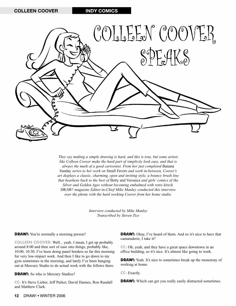
DRAW!:You’re normally a morning person?
COLLEEN COOVER:Well... yeah. I mean, I get up probablyaround 8:00 and then sort of ease into things, probably like,10:00, 10:30. I’ve been doing panel borders so far this morningfor very low-impact work. And then I like to go down to mygym sometimes in the morning, and lately I’ve been hangingout at Mercury Studio to do actual work with the fellows there.
DRAW!: So who is Mercury Studios?
CC: It’s Steve Lieber, Jeff Parker, David Hannes, Ron Randalland Matthew Clark.
DRAW!: Okay, I’ve heard of them. And so it’s nice to have thatcamaraderie, I take it?
CC: Oh, yeah, and they have a great space downtown in anoffice building, so it’s nice. It’s almost like going to work.
DRAW!:Yeah. It’s nice to sometimes break up the monotony ofworking at home.
CC: Exactly.
DRAW!:Which can get you really easily distracted sometimes.
12 DRAW! • WINTER 2006
COLLEEN COOVER INDY COMICS
They say making a simple drawing is hard, and this is true, but some artistslike Colleen Coover make the hard part of simplicity look easy, and that isalways the mark of a good cartoonist. From her just completed BananaSunday series to her work on Small Favors and work in-between, Coover’sart displays a classic, charming, open and inviting style, a bouncy brush linethat hearkens back to the best of Betty and Veronica and girls’ comics of theSilver and Golden Ages without becoming embalmed with retro kitsch.DRAW! magazine Editor-in-Chief Mike Manley conducted this interviewover the phone with the hard working Coover from her home studio.
Interview conducted by Mike ManleyTranscribed by Steven Tice

CC:Yeah, or lazy, which is the other word for it.
DRAW!:Well, you know, there’s that laundry thatneeds to be done, that pile of mail that needs to begone through.
CC:Yeah. And also I’ve found that if I go with alimited scope of what I can do, like if I don’t packmy inking stuff and I just pack some stuff to be pen-ciled, then I’ll do more penciling. I’ll actually getmore penciling work done than I would ordinarily,because sometimes, if I’m just doing whatever athome, I’ll pencil something halfway, and then I’ll getbored of penciling, so I’ll start inking it before it’sreally ready.
DRAW!: Right. So you have a setup at home, yourhome studio, and then you have, I guess, like a spacethat you rent with the guys?
CC: Actually, I just sort of squat on whatever table isfree.
DRAW!: So you don’t have another mini-setup thereso you don’t have to haul stuff back and forth?
CC: I’ve got the girlfriend drawer, you know? I’vegot a box that’s really filling up. I’ve got a bottle ofink and a brush that’s sort of just staying there now.
DRAW!: “I guess we can clear some of these actionfigures off to let you have some space for your girlstuff.”
CC:Yeah, nothing official. Some of the people whoactually pay rent there never go there, and there arestill tables from former artists who used to go there.
DRAW!: So they’re the mystery artists?
CC:Yeah, I don’t think they still are actually payingrent on the place, but they still have all their stuffthere. It’s a very easygoing kind of studio space.
DRAW!: I was very interested in interviewing you,because in the comics industry there seem to befewer women, and in the animation business thereare a lot of women in various positions—animators or back-ground painters, even character designs—but in comics, at leastin the mainstream, it’s like, four or five women in total. I maybe stretching a bit, but I always see, it seems, the usual suspects.And in the alternative comics crowd, there’s a lot more women.
CC: Right. I have my theories, but they’re all sort of conjec-tures about that. I think a lot of it has to do with the same sortof family dynamics that have made women historically lesspowerful in other industries, where, y’know, if you have a babyor something, that’s going to take time away from your art. AndI think if you’re working for yourself, that’s not as much of animpact. So, if you are, say, Carla Speed McNeil, and you’reworking for yourself and you set your own schedule, then you
don’t have to worry about doing all-nighters when you’vealready had to deal with your family as well. Whereas in theother industries, historically, it’s more acceptable for a fellow togo do an overnighter at a studio or whatever and leave the familybehind for a few hours, y’know?
DRAW!: So you think it’s more that than maybe the material insome respects?
CC: I also think it’s the material. I don’t think it’s necessarilybecause the genres are less appealing, although, now that I’vesaid that, I want to contradict myself.
DRAW!:Well, I mean, another reason I ask this is, it’s alwaysfascinating for me to go into the comic book shop with my girl-
COLLEEN COOVERINDY COMICS
DRAW! • WINTER 2006 13
ABOVE: Layouts from Banana Sunday.
BANANASUNDAY
™&©2006
ROOTNIBOT&COLLEENCOOVER.

DRAW!: Okay, define fast. Are you a page a day, twopages a week?
CC: Right now, on the graphic novel I’m working on,I’m striving for four pages a week.
DRAW!: And that’s pencils and inks, or just pencils?
CC: That’s a whole page, pencils and inks. But I’ve metthat goal once, so....
DRAW!: And now, how many hours a day are youputting into that in order to get that done?
CC: I’m estimating six or seven.
DRAW!: Okay, so you’re not grinding yourself downworking 16 hours a day?
CC: Right. I’m also doing some illustration work, as well.
DRAW!:Yeah, and I was going to touch on that, aswell. So I guess, going back to what we were talkingabout....
CC: So, yeah, for Banana Sunday it’s actually gonethrough a lot of incarnations, because we sort ofcame up with the idea years ago, and it got sort ofback shelved while I was honing my skills withSmall Favors. And it was only after I had doneenough work on Small Favors that I really felt likeI had the discipline and the skill to do a largerstory, something that had a complete story arcover, what would that be 80-some pages, I guess.
DRAW!: As opposed to doing eight- to ten-pagestories?
CC: Exactly, which is—I mean, Small Favors startedout with one ten-page story and a bunch of one-pagers, orsomething like that, and it was very much “do a story of Xnumber of pages and then figure out how to sell each individualissue with other pages or pin-ups or whatever.”
DRAW!:Which, you know, in a way, is traditionally how thebusiness used to be.
CC: Sure.
DRAW!:When you started out, you’d get an eight-, ten-pagestory. Even the old Warren magazines, those were eight- orten-page stories. DC had their anthology books like House ofSecrets. They don’t really have books like that anymore.
CC: The entire Golden Age was like that, too.
DRAW!: Right, so you couldn’t start out and do an eight-page
story and then kind of work your way up to get a main feature.They’d throw you, basically, right in the deep end of the pooland see if you can do 22 laps a month.
CC: I probably would have had a nervous breakdown if I hadhad to do an entire story arc right off the bat, because just thepressure of getting that much done and having the end of theproject that far away would have been really intimidating to me.Small Favors really gave me that confidence, y’know, I cancomplete eight issues, or whatever, of material over X amountof time.
DRAW!: Now, while you were doing that, obviously you had tohave another source of income. So were you also working afull-time job, or were you doing illustration on the side?
CC:When I was doing Small Favors, I was working retail at thecomic shop, and before that at a coffee shop, so that was—up
16 DRAW! • WINTER 2006
RIGHT ANDNEXT PAGE: More Banana Sunday from layout tofinished page. Notice the change in panel 2, which puts more empha-sis on the missing chunk of wall.
COLLEEN COOVER INDY COMICS
BANANASUNDAY
™&©2006
ROOTNIBOT&COLLEENCOOVER.

until two years ago, I was doing retail full-time and then cominghome at night and working for a couple of hours.
DRAW!: And now you’re able to make your living completelyoff of your artwork?
CC: I would call it making an income.
DRAW!: Okay. Again, see, this is another important piece ofinformation. I think, something that is very fascinating andimportant for the up-and-coming artists, readers of the magazine,people trying to break into the business—because there definitelyis economy of scale between the mainstream and the indepen-dent, the people that basically do non-superhero material—andnobody seems to talk much about this—the monetary end of it.
“Is it a living?” versus “Is it a hobby?”.
CC: Right. I don’t know any other independentpeople who don’t have a job outside of theirprojects, other than Clowes or Charles Burns,and they do illustration work. I talked to Seth ata convention once, and he said he spends 80%of his time doing illustration work, and only20% of the time doing comics, which explainswhy his stuff comes out so slowly.
DRAW!:Well, again, that’s one of the thingsthat becomes very clear when you start to talkto more people who do the indy, non-main-stream. We have to come up with a better namefor that because it just seems sort of dumb now.
CC:Yeah, and it overlaps a lot more than itoriginally did. If I go into a shop and there’s theMarvel stuff, the DC stuff, and then everythingelse, the “everything else” includes everythingfrom Dark Horse to mini-comics, and it justdoesn’t seem appropriate.
DRAW!: Right. And that represents somethinglike, what, 14% to 15% of the business, but Ithink that 14% or 15% of the business has 95%of the variety.
CC: Right.
DRAW!: So that’s very interesting to hear. Myassistant, she’s trying to break into the businessdoing work on her own, and it’s much tougherto develop yourself as an author doing indepen-dent comics, as opposed to trying to get yourwork accepted by Marvel, DC, or somebodywho’s actually going to give you a $150 to $200page rate. In the short term, it’s harder becauseit’s harder to connect with the audience, but Ithink, in the long term, if you have a body ofwork—you have Banana Sunday and then tenyears from now, you have five or six or sevenother properties, books, things that you own thatyou can control—I think you’re better off.Because, in the long run, working for Marvel or
DC is great—I’ve done it for over 20 years—but I don’t ownanything. And I don’t control anything. I don’t control whetherthey reprint it in Brazil, whether they reprint it in Russia,whether they decide “We’re not going to pay you for any moreroyalties or reprints.” And, y’know, it’s not going to pay for myapplesauce when I’m 80.
CC: Right. Exactly. It’s frustrating not to be able to get paid foryour work right away on the one hand, but then, a comic bookis a really good way to show people in the rest of the graphicart world that you can get the work done. It’s led to a lot ofillustration work for me, and illustration work is a really niceway to supplement my comics work. I’ve been doing a lot ofillustration work for The Stranger Weekly in Seattle.
ABOVE ANDNEXT PAGE: More layouts from Banana Sunday.
18 DRAW! • WINTER 2006
COLLEEN COOVER INDY COMICSBANANASUNDAY
™&©2006
ROOTNIBOT&COLLEENCOOVER.
DRAW!:Where did you grow up?
TODD JAMES: NewYork City.
DRAW!: Did you go to art school?
TJ: I went to the High School of Art and Design, which is notthe same as Art Music and Art, the school Fame was based on.Art and Design was more for commercial art and had somecartooning classes. By the time I was in 11th grade they had cutall that stuff and I dropped out. Art and Design was a hugetraining ground for graffiti writers and comic book kids. So inthat way it was great and like nowhere else.
DRAW!:You dropped out of art school and high school both?
TJ: It was an art high school.
DRAW!:While you were there did you have any teachers ofnote? Any famous cartoonists?
TJ: The one teacher I can remember was a guy named Mr.Pacter; he’d talk with a microphone. He’d tell everyone to stopwatching TV and practice drawing or they’d end up as garbagemen. I remember stopping for a week. I might have actuallyended up doing something I didn’t like if it wasn’t for TV.Thanks, G-Force.
TODD JAMES presents...
the SECRET ORIGIN of
Interviewed by Mike ManleyTranscribed by Steven Tice
What would a smash-up between those old limited animation Marvel cartoons,Jack Kirby, racist stereotypes, Cartoon Network’s Adult Swim, and part of theteam behind Comedy Central’s Crank Yankers look like? The result is thedisturbingly funny and un-PC Minoriteam. DRAW! Editor Mike Manley wasasked early on to contribute to the look of the show by inking the storyboardart to look very “Kirbyesque.” So sit back and enjoy this look behind the
scenes on one of Adult Swim’s newest hits—Minoriteam!
DRAW! • WINTER 2006 23
MINORITEAM ™ & ©2006 CARTOON NETWORK

DRAW!: Did you attend college or take any more art classes tocontinue your education?
TJ: I took some night classes at The School for Visual Arts(SVA) with Don Duga and a class at Parsons in comic book artwith a teacher named Ken Lendgrath—I think that’s his lastname. He was a good teacher. He was very into reference files,and that was before the Internet, so having your own library ofimages was important.
DRAW!: Do you continue any classes now or go and do weeklyfigure drawing, etc.?
TJ: No, but I draw a lot.
DRAW!:Are you NewYork-based,or did you move to LA for theshow since the offices for thecompany, Funny Garbage,are in LA?
TJ: I live in NYC but was out in LAmost of last year working. Peter and
Adam, my partners on the show, both live there.
DRAW!: So I take it you were a big MarvelComics fan growing up?
TJ: I had a big phase around the age of 12 to 14; itwas when John Byrne was doing the X-Menand they had those issues with the Sentinels.When I left Art and Design I was at thisschool called City which was internship-based, and I interned at Marvel and then got
hired for a summer job. I read mail, Xeroxedcomic art for editors, I sat in the bullpen. I loved
reading fan mail because it was usually nuts. I was17 and wasn’t as big a comic fan then. I waswrapped up in Graffiti and Tex Avery cartoons,but it was a very fun job.
DRAW!:What other cartoonists wereyou into?
TJ:Well I actually didn’tknow the names of thedesigners, the directors hadthe credit at the beginning.But I loved the art.
ABOVE: The clean-up pencils of the character ElYo from the storyboard rough at right, for theepisode “El Dia Gigante.”
TODD JAMES ANIMATION
24 DRAW! • WINTER 2006
MINORITEAM ™ & ©2006 CARTOON NETWORK

DRAW!:When you first got the idea to pitch the show to Adult Swim, were youalready planning the show to be done in the style that is both largely based onJack Kirby, but also the limited animation of the Marvel Super Heroes cartoons ofthe ’60s?
TJ:Yeah. Adam, Peter, and I all love that stuff. We love cheap stuff. I’m a huge fanof Roger Ramjet and Rocky and Bullwinkle as well. When you can get a pointacross simply, it’s a thing of beauty. The great thing about deciding to doMinoriteam like those shows was we knew no one else would really do thatnow. It’s the type of show people joke about doing.
DRAW!:Were you a big fan of those old cartoons? I know I was; I watched themeveryday after school. They had great voices and very cool canned music, too.
TJ: I watched them and loved the theme songsand the characters, but even as a very young
kid I could tell the animation was really low-end. I loved the Hulk [cartoon] and thosewere my introduction to comic art, actually.Now I love the Thor series and Loki’svoice was my inspiration for theCorporate Ladder’s voice.
I read in a KirbyCollector that theyactually bought anexpensive Xerox
machine to makethose cartoons and Disney owned theonly other machine. I think it Xeroxed
onto cells. It’s funny that such a high-tech, expensive piece of equip-ment was used on those shows, because they looked like they justcut drawings out of a comic and moved them around.
DRAW!: Did you have any trouble getting that idea across to thenetwork? In other words, did they get it? Were they familiar with theMarvel cartoons?
TJ: They knew exactly what we were talking about. Mike Lazzo knowscartoons, and Nick Wiedenfeld loves that kind of stuff.
DRAW!: Do you feel your audience, most of whomare in their early 20s will “get it,” get Kirby aswell, or is that not as important asthem just liking the show overall?
TJ: I doubt that younger peopleknow those shows but the styleof Minoriteam fits in withAdult Swim. The audiencedoesn’t need to know the refer-ence, it’s just an added bonus tothose who do. Also about Kirby’sstuff, it’s so influential that even ifyou don’t know him, you know his work. For instance, Igrew up on John Byrne, who later on I could see was very muchinfluenced by Kirby. Kirby created a ripple effect so everyone’simitated him, most comics are based on Kirby. For a show likethis, the posing needs to be an easy read to help tell the story.He’s the master of layout.
TODD JAMESANIMATION
DRAW! • WINTER 2006 25
TOP: Kirbyesque Zombie pilgrimsABOVE: Cleaned up pencils of an Indian chief.
MINORITEAM ™ & ©2006 CARTOON NETWORK

TODD JAMESANIMATION
DRAW! • WINTER 2006 29
Steve just had a kid, so all the best to himand his wife. Dell Barras also worked with us.He’s amazing; he is super-fast andsuper-good. Adam saw himdrawing one day andsaid, “Don’t you gettired?” Dell replied,“I make the penciltired.” Dell drew a lotof the art on “Fasto inViking Heaven” and it’s reallywell done. He’s a greatsinger, as well, and got every-one to go to Stargazers in theValley to do karaoke. I justspoke to him the other day; he’s areal pleasure to work with. I wantto just also mention our in-betweeners, George Lowery andNick Jeong, as well. We had a friendly,unique group and it made a fun environment towork in.
DRAW!: How long did it take to do an averageepisode? From script to the final cut of the show?
TJ: Two months.
DRAW!:What would you do on those days when themagic seemed to be hard to come by, when you get thatrough patch and the drawings don’t seem to flow?Does working in a studio help that at all?
TJ: The magic was all ways there. Adam is a
LEFT: A final inked drawing ofJewcano.RIGHT: El Hefe inked.BELOW: Cleaned up Figure of ElHefe ready for inks.
MINORITEAM ™ & ©2006 CARTOON NETWORK

DRAW! • WINTER 2006 33
DRAW!: So who are you reading today? What gets Kyle Bakerexcited when he goes into a book store or a comic book store?
KB: I’m waiting for the Victor Moscoso book. I’m very upsetthat it’s late.
DRAW!: Really?
KB: Yeah! I’ve been waiting for that Victor Moscoso book for,like, the last five years. He’s been promising it on his website.Fantagraphics, they were supposed to put it out in June, and itdidn’t happen. I also really look forward to everything JoeKubert does.
DRAW!: Talking about another guy who is one of the smartestguys in comics.
KB: Yeah. Eisner’s dead, but I used to look forward to his stuff.Frank Miller. And that’s about it. I like Sergio Aragonés. Hedoesn’t seem to be working as much these days. I mean, he stilldoes his two pages in Mad, but I’m not going to buy a whole
Mad issue just for two pages of Sergio. I don’t like anythingelse in there. I like Bill Wray in Mad, but I’m not going to buyMad just to read “Monroe” and Sergio’s two pages. My favoritestuff is really the funny stuff, and nobody anywhere is doingfunny stuff right now. [laughs] I still read For Better or ForWorse. I still like that one.
DRAW!: So you still read newspaper strips?
KB: I only read For Better or For Worse, and I like Dilbert,and that’s about it. I think the rest of them are pretty rotten.
DRAW!: Are you reading them online, or will you buy thepaper?
KB: No, there’s usually a newspaper at the place I get my cof-fee on Sunday, so usually I just pick up the newspaper, read thefunnies, and put it back.
DRAW!: And what about animation, TV, do you watch anycartoons on TV? Are you a fan of any of that stuff?
KYLE BAKERCOMICS
The Artist, Kyle Baker,the Comic Book Maker
This interview is continued from DRAW! #12,where DRAW! Editor Mike Manley had caught upwith the busy artist as he was in full production onthe second issue of his slavery epic, Nat Turner.
Part Deux
THE BAKERS ©2006 KYLE BAKER.

KB: Um, I like what Genndy Tartakovsky does, and I like whatCraig McCracken does. I don’t have TV, so I usually see every-thing about five years after everybody else. It has to come outon DVD so there can be bootlegs, so I can download it. Like, Ijust finally got around to seeing the Justice League.
DRAW!: Oh, okay. [laughs] So you’re going on KaZaa orwhatever and downloading stuff?
KB: Yeah. Yeah, that’s where I see—it depends on what it is. Alot of times, if I like the show, once I see it, then I’ll go out andbuy it. But 99% of the time, the stuff’s not very good.
SKETCHBOOKS
DRAW!: And what about drawing and sketching on your own?Do you do a lot of that just to keep the sketchbooks going?
KB: Sort of. I always write down ideas, and a lot of them arevisual ideas. If I think of a funny picture, I usually write itdown. I try to write everything down just so I don’t forget it,because I’m usually in the middle of something. Like, if I have
a funny idea about my kids this week, I’m inthe middle of Nat Turner, so I’m not goingto be able to work on the kid idea, so I justrough it out into some kind of a sketch-book. I’ve got, like, two or three, or maybefour or five, sketchbooks around here. Lessfor practicing technique, they’re more forkeeping track of ideas, because I forgetstuff. And usually when it comes time to
draw, I usually have a lot of ideas. If I’mworking on Nat Turner it’s going to take meaway on that this week, away from Plastic
Man jokes, because that’s my next job. So whenit comes time to put the plan together, it’s often amatter of just going through my lists and finding 22pages worth of jokes. Like, when it comes down todo the next Bakers book. The next book I’m doing is
titled The Important Literary Journal, which is just abunch of gag cartoons. I’ve decided that I’m nevergoing to do a second issue of any book that I publish.
FAN’S TASTES ANDCROSSOVERS
DRAW!: So in the future you look to publish just all-new,unique, standalone books?
KB: The first Cartoonist book did so well that I immediatelyrushed out a second book. And the second book, in my opinion,is superior, because I had figured out the formula. Like, thefirst book, I didn’t know what the hell I was doing, but the sec-ond one, I put in more of what everybody liked and got rid ofall the features everybody hated. So it was a better book, butsold worse. And the only thing I can think of was that it was a#2, because I’m still getting orders for #1!
DRAW!: Again, it’s one of those mysteries that seems unsolv-able despite even some publishers overshipping second issues inthe direct market, is you could sell 5000 copies of #1; #2, every-body immediately slashes all their orders on it; and then, maybewith issue #4 or 3, they’re ordering based upon what they knowthey actually sold of the first issue. It’s just infuriating. It justdoesn’t make any sense. But again, if they can stick your #2 upon the wall, because there were less copies of it, for moremoney, then it would make everybody want to “order more KyleBaker, because that stuff’s really hot!” “Let’s slab it!” [laughs]
KB: Who knows? This is such a weird market. But in that audi-ence, there are subsections. And most of the people I meet, wholike my non-super-hero stuff, tend to be Dan Clowes andHernandez Brothers fans. Y’know, they’ll say, “Oh, yes, I lovedWhy I Hate Saturn,” and what have you, “and I buy Drawn &Quarterly comics, and Chester Brown,” and whatnot. And thenthere’s the guys who like Captain America and only buy mysuper-hero stuff, and they want to know if I’m going to do anoth-er Batman story. And there’s not much crossover. But that othersection, that Fantagraphics crowd, it’s a significant portion.They’re not driving the market, but they are—I’d say they’re 10
KYLE BAKER COMICS
34 DRAW! • WINTER 2006
AL SPACE AND ALL ARTWORK©2006 KYLE BAKER.

MAXIMA,SUPERMAN™&©2006
DCCOMICS.
40 DRAW! • WINTER 2006
ABOVE AND NEXT PAGE: Maxima triumphant! Alex Horley’s rough pencil sketch and thefinal painting for a Superman trading card.


44 DRAW! • WINTER 2006
ALEX HORLEY COMICS
UNDER THE COVER:Here we go, Alex Horley’s cover tothis issue! We start with Alex’spencil sketch. Next is his initialunderpainting (above) to establishthe tones of the painting. The nextunderpainting (left) adds detail,color, and lighting. And finally weend up with the finished painting(next page).
ARTWORK©2006
ALEXHORLEY.

DRAW!: Oh, right, yeah. The red book? He has, like, the redbook, the yellow book, and the brown book.
CC: I think it’s the red book. I love that book. And also, wecollect original art from all time periods, so we have a bunchof Golden Age original art and independent original art fromcontemporary stuff, so I can look at an original GilbertHernandez, or an original Wally Wood. I’ve got an originalSeth above my desk that I look at all the time; I can learn alot just by looking at those and sort of analyzing, just figuringout what design went into this, and what kind of mechanicswent into the drawing of it. Because when you see somethingprinted it’s done, it’s flat, it’s two-dimensional. When you seean original....
DRAW!: “The veil is lifted.”
CC:Yeah.
DRAW!: I agree. I learned a lot when I shared Al Williamson’sstudio, and he has this amazing collection.
CC: Oh, sure, yeah.
DRAW! • WINTER 2006 47
TOP OF PAGE: Two pages from Small Favors.ABOVE: Go-go raids the fridge in this nice watercolor illustration ofone of the featured monkeys from Banana Sunday.
CONTINUED FROM PAGE 21
COLLEEN COOVERINDY COMICS
BANANASUNDAY
™&©2006
ROOTNIBOT&COLLEENCOOVER.
SMALL
FAVORS™&©2006
COLLEENCOOVER.

It starts with a rough sketch in a sketchbook (above).Once a the basic composition comes together it’s timefor a more detailed pencil drawing (right). After somefine tuning, it’s on to the watercolors (below), andBaba Yaga springs out of the Russian fairy tales tochase down her runaway hut.
COLLEEN COOVER INDY COMICS
48 DRAW! • WINTER 2006
ARTWORK™&©2006
COLLEENCOOVER.

elcome to the second installment of our continu-ing series, “Comic Art Bootcamp,” which is adirect response to many of you regular readers ofDRAW! who asked for us to give more tutorials
covering some of the basics of drawing for comics and anima-tion and its various disciplines.This time around Bret and I decided to cover what may be the
most important element of any drawing—the bedrock or founda-tion, if you will—the “Big C”: Composition! Now, we have cov-ered the subject a bit before in previous issues of DRAW!, but asBret and I discussed what we feel are the universal issues withmany of the examples we both have seen, critiqued, and continueto see from aspiring artists, we both came to composition as thebiggest issue we see artists struggle with. Composition is oftenan artist’s weakest skill, and it hurts so many artists’ work. Theiruse of composition often weakens, clutters, or confuses thedesign, and therefore the impact and the success of their drawing.It is also the one big problem most students I teach struggle themost with, and like building a house, if the soil is weak and theplans poorly designed, the house will fall down no matter howbeautiful it looks or expensive and detailed the wallpaper. Detailand rendering can’t save a bad composition. Cartoonists, comicartists, and storyboard artists are required to draw dozens anddozens, sometimes even hundreds of compositions in the serviceof telling stories, so you can see how vitally important composi-tion is. If the average 22-page comic has six panels on a page,that is an average of 132 compositions per issue!
What is composition, you ask, and just why is it so vitallyimportant? Well we are glad you asked. Simply put, composi-tion is how a picture is built—the plan, the design. It is theorganization of shape, line, texture, value, color, as well as pat-tern arranged in an appealing design or arrangement that usesthe design principles of dominance, subordination, balance, har-mony, and rhythm, to focus the eye where we, the artist, wantthe eye to go in a drawing or painting.
Poor planning—meaning poor design—means poor compo-sition, which weakens the effect we artists want to give our pic-tures and stories. In a good, strong composition all the piecesare in the right place; moving one element or placing it in thewrong spot or arrangement would seriously weaken or destroythe design and thus the effect we want the composition to have.Compositions also have emotional impact and the arrangementsof the elements in a design contribute to the emotional meaningof the design—happy, sad, danger, peace, power, etc.
Over the course of teaching and reviewing many, many port-folios I have come up with a checklist to help you troubleshootyour compositions to see if they pass the test. What test, youask? Well, the clarity and design test. Put simply, does yourcomposition work to tell the story in the best fashion?
COMPOSITION
By Bret Blevins and Mike Manley
COMPOSITION:A Simple List of Do’s and Don’ts
DO: make a clear pleasing composition.DON’T: crop important storytelling elements.DON’T: have bad, lazy staging.DO: when planning out a panel or drawing,draw a frame around it. You’d be surprisedhow many artists try and design a composi-tion without defining its proportions, bydrawing a border around it. Without a bor-der the elements of design wander and floataway across the paper like cows out of thebarn.
� Is this layout/composition clear? Can youlook at it in a second and tell what’s goingon?� Are the gestures of the characters clearand strong shapes or silhouettes?� Can you push the design more? Createmore contrast in shape and size relation-ships?� Did you explore more than one possibilityto solve the design problem? Did you tryanother angle, another composition?
If your drawings don’t pass these tests—START OVER! No matter how well you draw,you can’t save a bad composition with lots ofdetail and rendering.
W
DRAW! • WINTER 2006 55
Does Your Drawing Pass the Test?

In the disciplines of cartooning, illustration and animation,good pictorial composition is an arrangement of shapes thatconvey the subject with visually appealing clarity. Line, tone,color, gradation, or modeling of form and space can strengthenclear composition, but the flat contours of the shapes that createyour pictures are the strongest, most fundamentally effectivemeans of controlling the impact of your images.
Control is the basic requirement of composition. Good com-position is intentional—you design the edges and placement ofeach shape of every element to create effective relationshipsthat clearly communicate your intent. Choice and discernmentare essential—subconscious, instinctive composition can beexcellent, but good accidental compositions are as rare as acci-dentally successful surgery or tightrope walking. If you don’t
have or develop a strongunderstanding of visualclarity and techniques forcomposing it, your pictureswill always be weaker thanthey can be, either in vari-ety or effect.There are basic visual
principles that will bedescribed on the followingpages, but it’s also impor-tant to realize that compo-sition is as personal andparticular to each artist asany other facet of picturemaking; subject, rendering,color choices, idiosyncrat-ic accents, or distortions ofform, storytelling rhythm,mood, and pace, all theseelements are supported anddefined by the composi-tions devised to presentthem. In essence an artist’s“style” is a direct expres-sion of his taste, inclina-tions and skill in composi-tion.
The contrast betweenthese two depictions of thesame character byMoebius and Jack Kirby ismore than a difference inrendering—the essence ofeach artist’s personalityinforms every choice ofshape and its placement,which in turn creates andreveals their individual“style.” In each case theircomposition choices arethe ones that most effec-tively convey their ideasand preferences.
SILVERSURFER,THING™&©2006
MARVELCHARACTERS,INC.
56 DRAW! • WINTER 2006
COMIC ART BOOT CAMP COMPOSITION

58 DRAW! • WINTER 2006
Before we explore the basic principles of good design and composition, I must mention animportant but elusive, mostly subconscious aspect of composition that is very difficult toexplain with rules or simple, inclusive directives. In our endeavor of creating narrative story-telling artwork, most effective compositions emerge from a personal “sense of drama”—aninstinctive identification with the heights and shallows of the subject, story, characters and situ-ations we are visualizing. I’m not sure this sensitivity can be taught, though it can certainly beenriched and deepened into greater subtlety and strength through effort and experience.As you continue to make images, you will find a particular sensibility of effect emerging in
your “sense of composition” that becomes a characteristic mark of your “style.” Notice andnurture it by experiment and exploration—as with other tenets of making pictures, it’s easy tobecome complacent and fall into the habit of repeating formulas that work, which dulls yourcapacity to express. Don’t settle for automatic thoughtless solutions to every composition prob-lem—it thins your art into a predictable shallowness.There are two main challenges to manipulate in a typical composition: the relationship of
shapes, rhythm and contour within the content (subject matter) of the image; and the relation-ships of these to the containing border—the limits of your picture area. A vignette is a border-less variation, but the chief interior elements of any good composition should also be able tostand alone without a border.
©2006 RESPECTIVE OWNER
The ability of the foreground figure to stand alone as astrong clear vignetted design is not an accident. Everyelement of Rockwell’s compositions can be extractedthis way and function beautifully.
©2006
RESPECTIVEOWNER.
COMIC ART BOOT CAMP COMPOSITION

A pleasing space division ofany containing shape can befound by dividing the heightand breadth into fifths andplacing your center of interestnear an intersection two-fifthsin from each border. This is aratio dating back at least tothe ancient Greek principle ofthe Golden Mean, the conceptof proportion that informsmost of the world’s greatarchitecture and art.
DRAW! • WINTER 2006 59
Awareness of the borders of the confining shape youmust compose in is the essential starting point. In storytellingfor film or video game this shape is set by the aspect ratio ofthe various screens used for different mediums, but in comicart or illustration the possibilities are endless. There is anoptically mathematical proportion guideline that is useful forany border shape and dimension, though (see right).
You can see in charts 1, 2, 3, and 4 how the use of this principle “breaks up” the space in a visual-ly balanced and pleasing way. In charts 5 and 6 the division of space feels awkward, unbalancedand cramped. Chart 7 is fine for an emblem or signpost, but placing your subject dead center cre-ates a static quality that “freezes” the picture into immobility. All of these effects are there to beexploited, of course—just make sure you are doing so intentionally.
1
2 3 4
5 6 7
COMIC ART BOOT CAMPCOMPOSITION

68 DRAW! • WINTER 2006
STAR WARS ™& ©2006 LUCASFILM LTD.
COMIC ART BOOT CAMP COMPOSITION
The Leia image is avery straightforwardcomposition, intendedto echo a simple old-fashioned “pulp”feel—Leia’s curvingforms are set againstthe rigid lines of therails and post behindher, to accent hergraceful forward thrustby contrasting curvesagainst straights. Theother elements (R2D2,the fallen soldier, theray blasts and impactbursts) are rathermethodically placed tooptically “push or pull”Leia forward, accentedby the spear she holdsand the contour of thesand dune background.The two black cablessweeping down nudgethe eye back towardher face as the viewer’sglance circles thecomposition.
Bending the perspective to arc the ground plane into a swell that then dropsquickly away from us allowed me to “drape” Chewie over the rise andsteeply tilt the buildings and background figures down sharply—somehowthis optically adds weight to the axe head, making it seem deadly heavy. Thejet trails of the closer flying platform subtly convey the swing-path of theaxe, coming to a point directly aimed at Chewie’s head. Most of the direc-tional lines of the background figures and moons lead toward the axeman’shead, while the main lines of the buildings point downward toward Chewie’shead, creating a double (but balanced) center(s) of interest. This image is agood example of arriving at compositional ideas through the process of solv-ing storytelling problems—trying to clearly convey particular informationusing particular subject matter within particular restrictions can lead tounanticipated arrangements that will surprise you. Finding successful resultsis where you also discover your “style” of composing.

70 DRAW! • WINTER 2006
©20
06R
ES
PE
CT
IVE
OW
NE
R.
©20
06R
ES
PE
CT
IVE
OW
NE
R.
COMIC ART BOOT CAMP COMPOSITION
The clashing diagonals of these football playerscreate a powerful dynamic interplay of jaggedshapes, yet the composition has a very appealinggrace, too. In the diagram notice how deftly theeye is led upward from the lower left, along theshadow of the tackler’s right leg, across his torsoand sharply up along his right arm, arcing quicklyback up the top edge of the runner’s body, downacross his shoulders, arm, and the shadowbetween his legs to join the top of the tackler’shelmet, swoop around, down his back to thelower left border, where the trip starts over again!This piece is typical of McClelland Barclay’smastery—his compositions are always strong.
The stalking scarecrow illustration hasbeen reduced to a very simple schematicchart of its directional structure andrhythm—note how the majority of lineslead the eye to the center of interest, thegirl in the loft door. She forms a crossshape, one of the strongest (and oldest)eye-catching design motifs, strengthenedhere by the added tonal contrast ofwhite against black.
DRAW! #13Step-by-step demo of painting methods by cover artist ALEXHORLEY (Heavy Metal, Vertigo, DC, Wizards of the Coast), plusinterviews and demos by Banana Sundays’ COLLEEN COOVER,behind-the-scenes on Adult Swim’s MINORITEAM, regular fea-tures on drawing by BRET BLEVINS and MIKE MANLEY, links,color section and more, plus a FREE ROUGH STUFF #3 PREVIEW!
(88-page magazine with COLOR) $6.95 (Digital Edition) $3.95
http://twomorrows.com/index.php?main_page=product_info&cPath=98_59&products_id=383
IF YOU ENJOYED THIS PREVIEW,CLICK THE LINK TO ORDER THIS
ISSUE IN PRINT OR DIGITAL FORMAT!