draw #22
DESCRIPTION
Draw! #22 (84 pages with COLOR, $7.95) presents an in-depth interview with one of the top inkers of the modern age, SCOTT WILLIAMS! From his days at Marvel and Image, to his work with JIM LEE on such pivotal series as "Batman: Hush", Scott discusses his working process with editor Mike Manley, and shows he's an accomplished solo artist in his own right (as evidenced by this issue's striking cover). Then, Danny Fingeroth interviews superstar writer/artist FRANK MILLER about his career and working methods, including samples of Miller and KLAUS JANSON's working process, showing examples of their work from thumbnails and pencils to finished inks. Plus, there's another installment of MIKE MANLEY and BRET BLEVINS’ “Comic Art Bootcamp”, a “Rough Critique” of a newcomer’s work by BOB McLEOD, product and art supply reviews by "Crusty Critic" JAMAR NICHOLAS, and more!TRANSCRIPT
SCOTTWILLIAMS
JAMAR NICHOLAS
BOB McLEOD
PLUS:
18265827764
2
01
Batman
TM &
©20
12 D
C Com
ics.
FRANKMILLER
MILLER &KLAUS
JANSON
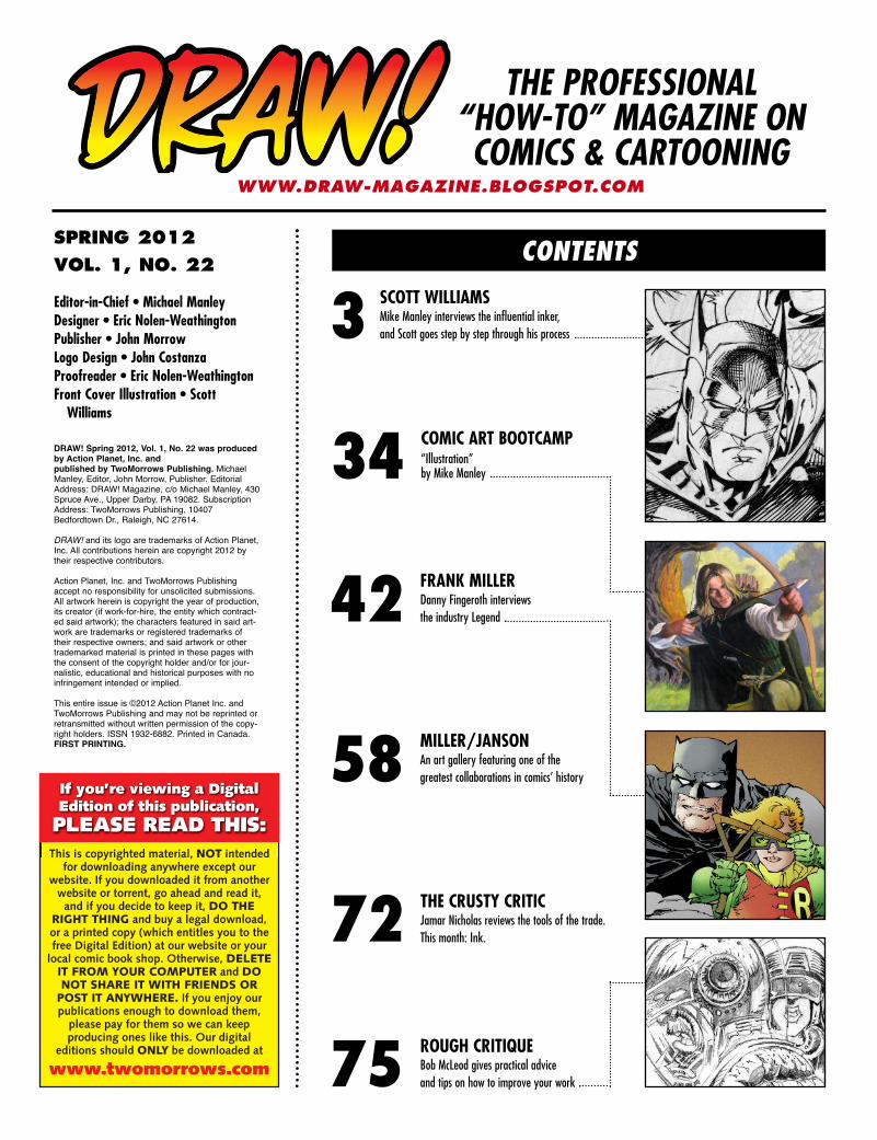
SPRING 2012
VOL. 1, NO. 22
THE PROFESSIONAL“HOW-TO” MAGAZINE ONCOMICS & CARTOONING
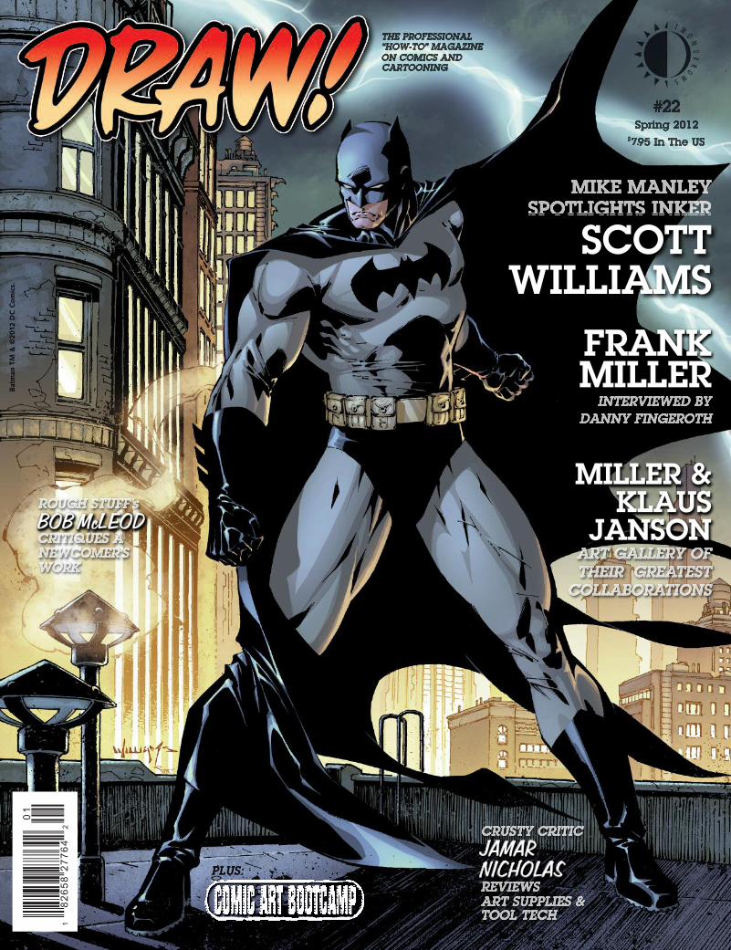
Editor-in-Chief • Michael ManleyDesigner • Eric Nolen-WeathingtonPublisher • John MorrowLogo Design • John CostanzaProofreader • Eric Nolen-WeathingtonFront Cover Illustration • Scott Williams
CONTENTS
SCOTT WILLIAMS Mike Manley interviews the influential inker,and Scott goes step by step through his process3
COMIC ART BOOTCAMP “Illustration” by Mike Manley34
THE CRUSTY CRITICJamar Nicholas reviews the tools of the trade. This month: Ink.72
FRANK MILLERDanny Fingeroth interviews the industry Legend42
MILLER/JANSONAn art gallery featuring one of thegreatest collaborations in comics’ history58
WWW.DRAW-MAGAZINE.BLOGSPOT.COM
ROUGH CRITIQUEBob McLeod gives practical advice and tips on how to improve your work75
DRAW! Spring 2012, Vol. 1, No. 22 was producedby Action Planet, Inc. and published by TwoMorrows Publishing. MichaelManley, Editor, John Morrow, Publisher. EditorialAddress: DRAW! Magazine, c/o Michael Manley, 430Spruce Ave., Upper Darby, PA 19082. SubscriptionAddress: TwoMorrows Publishing, 10407Bedfordtown Dr., Raleigh, NC 27614.
DRAW! and its logo are trademarks of Action Planet,Inc. All contributions herein are copyright 2012 bytheir respective contributors.
Action Planet, Inc. and TwoMorrows Publishingaccept no responsibility for unsolicited submissions.All artwork herein is copyright the year of production,its creator (if work-for-hire, the entity which contract-ed said artwork); the characters featured in said art-work are trademarks or registered trademarks oftheir respective owners; and said artwork or othertrademarked material is printed in these pages withthe consent of the copyright holder and/or for jour-nalistic, educational and historical purposes with noinfringement intended or implied.
This entire issue is ©2012 Action Planet Inc. andTwoMorrows Publishing and may not be reprinted orretransmitted without written permission of the copy-right holders. ISSN 1932-6882. Printed in Canada.FIRST PRINTING.
If you’re viewing a DigitalEdition of this publication,PLEASE READ THIS:This is copyrighted material, NOT intended
for downloading anywhere except our website. If you downloaded it from anotherwebsite or torrent, go ahead and read it,and if you decide to keep it, DO THE
RIGHT THING and buy a legal download,or a printed copy (which entitles you to thefree Digital Edition) at our website or yourlocal comic book shop. Otherwise, DELETE
IT FROM YOUR COMPUTER and DONOT SHARE IT WITH FRIENDS OR
POST IT ANYWHERE. If you enjoy ourpublications enough to download them,please pay for them so we can keep producing ones like this. Our digital
editions should ONLY be downloaded at
www.twomorrows.com
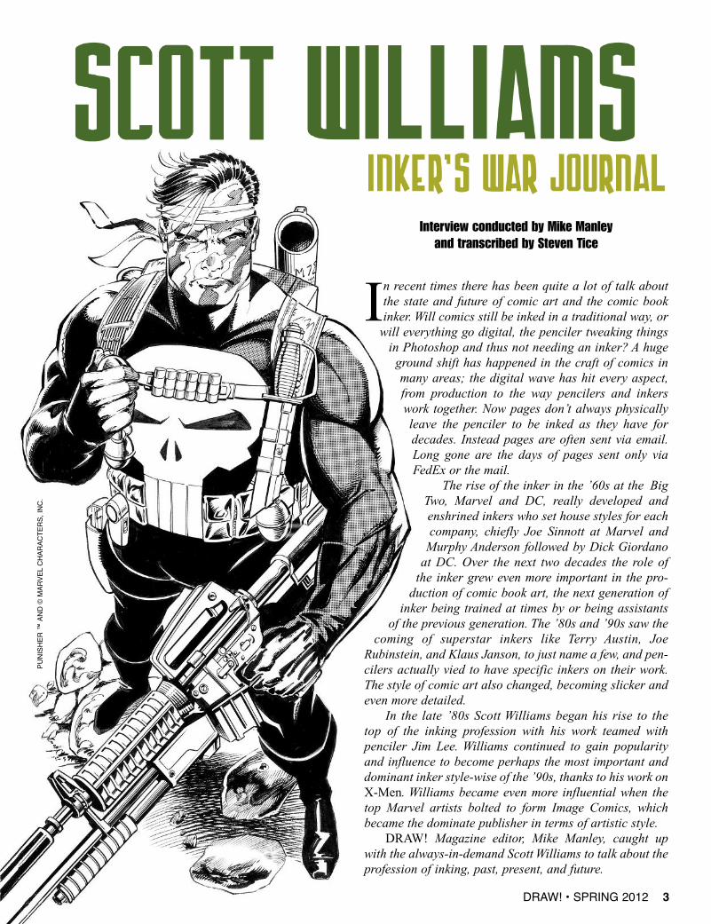
Interview conducted by Mike Manleyand transcribed by Steven Tice
In recent times there has been quite a lot of talk aboutthe state and future of comic art and the comic bookinker. Will comics still be inked in a traditional way, orwill everything go digital, the penciler tweaking thingsin Photoshop and thus not needing an inker? A hugeground shift has happened in the craft of comics inmany areas; the digital wave has hit every aspect,from production to the way pencilers and inkerswork together. Now pages don’t always physicallyleave the penciler to be inked as they have fordecades. Instead pages are often sent via email.Long gone are the days of pages sent only viaFedEx or the mail.
The rise of the inker in the ’60s at the BigTwo, Marvel and DC, really developed andenshrined inkers who set house styles for eachcompany, chiefly Joe Sinnott at Marvel andMurphy Anderson followed by Dick Giordanoat DC. Over the next two decades the role ofthe inker grew even more important in the pro-duction of comic book art, the next generation ofinker being trained at times by or being assistants
of the previous generation. The ’80s and ’90s saw thecoming of superstar inkers like Terry Austin, Joe
Rubinstein, and Klaus Janson, to just name a few, and pen-cilers actually vied to have specific inkers on their work.The style of comic art also changed, becoming slicker andeven more detailed.
In the late ’80s Scott Williams began his rise to thetop of the inking profession with his work teamed with penciler Jim Lee. Williams continued to gain popularityand influence to become perhaps the most important anddominant inker style-wise of the ’90s, thanks to his work onX-Men. Williams became even more influential when thetop Marvel artists bolted to form Image Comics, whichbecame the dominate publisher in terms of artistic style.
DRAW! Magazine editor, Mike Manley, caught upwith the always-in-demand Scott Williams to talk about theprofession of inking, past, present, and future.
DRAW! • SPRING 2012 3
PUNI
SHER
™ A
ND ©
MAR
VEL
CHAR
ACTE
RS, I
NC.
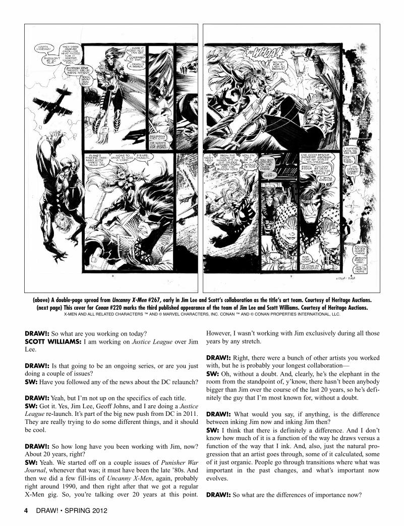
(above) A double-page spread from Uncanny X-Men #267, early in Jim Lee and Scott’s collaboration as the title’s art team. Courtesy of Heritage Auctions.(next page) This cover for Conan #220 marks the third published appearance of the team of Jim Lee and Scott Williams. Courtesy of Heritage Auctions.
X-MEN AND ALL RELATED CHARACTERS ™ AND © MARVEL CHARACTERS, INC. CONAN ™ AND © CONAN PROPERTIES INTERNATIONAL, LLC.
DRAW!: So what are you working on today?SCOTT WILLIAMS: I am working on Justice League over JimLee.
DRAW!: Is that going to be an ongoing series, or are you justdoing a couple of issues?SW: Have you followed any of the news about the DC relaunch?
DRAW!:Yeah, but I’m not up on the specifics of each title.SW: Got it. Yes, Jim Lee, Geoff Johns, and I are doing a JusticeLeague re-launch. It’s part of the big new push from DC in 2011.They are really trying to do some different things, and it shouldbe cool.
DRAW!: So how long have you been working with Jim, now?About 20 years, right?SW: Yeah. We started off on a couple issues of Punisher WarJournal, whenever that was; it must have been the late ’80s. Andthen we did a few fill-ins of Uncanny X-Men, again, probablyright around 1990, and then right after that we got a regular X-Men gig. So, you’re talking over 20 years at this point.
However, I wasn’t working with Jim exclusively during all thoseyears by any stretch.
DRAW!: Right, there were a bunch of other artists you workedwith, but he is probably your longest collaboration—SW: Oh, without a doubt. And, clearly, he’s the elephant in theroom from the standpoint of, y’know, there hasn’t been anybodybigger than Jim over the course of the last 20 years, so he’s defi-nitely the guy that I’m most known for, without a doubt.
DRAW!: What would you say, if anything, is the differencebetween inking Jim now and inking Jim then?SW: I think that there is definitely a difference. And I don’tknow how much of it is a function of the way he draws versus afunction of the way that I ink. And, also, just the natural pro-gression that an artist goes through, some of it calculated, someof it just organic. People go through transitions where what wasimportant in the past changes, and what’s important nowevolves.
DRAW!: So what are the differences of importance now?
4 DRAW! • SPRING 2012
SW: Right, and I think that’s why I gravitated toward Klaus, and still do,because what he would do is he would have those really bold, brush-chunky,think strokes, à la old school, whether it was Sinnott or what have you, but thenhe would mix in a lot fine line pen lines. He had both, and I still to this day doboth. I really shoot for a very bold, lay it down with one stroke, almost Japanesebrush inking style, and then, next to it, sort of have some fine line rendering,perhaps, or fine detail, and I like the mix. I like the mishmash of thin and thick,light and dark. To me, the stuff that bores me is when everything is the same,when all the line weights are the same and everything has the same texture.Now, I can easily contradict myself on that. It doesn’t hold true 100% of thetime. There have been times where guys like Kevin Nowlan will go in with,basically, spotted blacks, and then a very dead weight line, sort of like his Alex-Tothian masterpiece, that Batman/Manbat Secret Origins story. And then hewould mix things up a little bit by adding some zip-a-tone, perhaps, but for themost part it wasn’t a huge variation in line weight. So I understand that there areexceptions to every rule, but, as a rule, I’ve always gravitated towards guys thathad a real wide variety and range of lines all sitting right next to each other onthe same page. It may not necessarily always read immediately and instantly, butit appeals to my particular sensibilities. An emphasis on varied and lively lines.
DRAW!:When you were coming up, did you study formally? How did youpick up the techniques?SW: I got a degree in Fine Art Drawing and Painting from the University ofHawaii, which is where I grew up. It was a way to learn how to draw, as I neverhad any intention of getting into comics as an inker per se. I was looking to getinto comics as an artist. I knew from a very young age that I wanted to be intocomics. But at the start of my career, inking just sort of fell into my lap. Therewas an opportunity to do it before a serious penciling gig appeared. I took theopportunity to get my foot in the door, and just sort of stuck. Inking has its ownchallenges, but it doesn’t start with the most fundamental challenge, which isstarting with a blank sheet of paper. But I don’t think I got into it because itwas easier. I got into it due to opportunity and a particular aptitude, and it wasa logical and productive way for me to best utilize my talents. And the fact thatI seem to be lucky enough to keep getting paired up with quality artists witheach successive gig helped a lot. If I somehow had just been unfortunateenough to work with pencilers whose drawing skills or sensibilities didn’tmatch with my own, I think it really would have pushed me much moretowards penciling. I sort of had it in the back of my mind that the inking wasa temporary gig, and eventually I’d just keep learning the ropes and wouldeventually start penciling full-time. I just kept getting better and better oppor-tunities as an inker, and being a full-time penciler did not materialize.
TOOLSDRAW!: How did you pick up which tools to use? Which tools did you usethen?SW: Well, at some point I became exposed to the How to Draw Comics theMarvel Way book by Stan Lee and John Buscema. There weren’t a lot of textbooks on making comics, and this book might not have been the perfect learn-ing tool for an up-and-coming inker, but it did provide a peek behind the curtain.
DRAW!: Though it was pretty light on inking.SW: Right. There wasn’t a lot there, but it gave you some fundamentals. Imean, it showed you the crow quill, it showed you what a brush was, it showedyou how to rule a line, it showed you the different highlighted textures and sen-sibilities to inking. I never thought inking was particularly complicated. It’scertainly difficult to master, and it takes a certain craft and facility and, yes,talent to manipulate the tools, and there’s a lot of trial and error, but, obvious-ly, once you get certain tool fundaments, like which tools to use—don’t use aball-point pen, and, generally, don’t use Rapidographs. I mean, shoot, you can
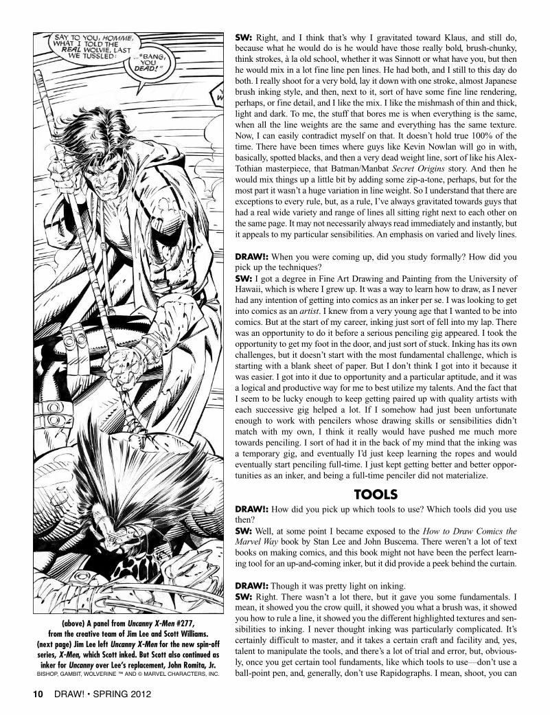
(above) A panel from Uncanny X-Men #277, from the creative team of Jim Lee and Scott Williams.
(next page) Jim Lee left Uncanny X-Men for the new spin-offseries, X-Men, which Scott inked. But Scott also continued asinker for Uncanny over Lee’s replacement, John Romita, Jr.
BISHOP, GAMBIT, WOLVERINE ™ AND © MARVEL CHARACTERS, INC.
10 DRAW! • SPRING 2012
use a rusty nail if you want, if it’ll give you the line that you want,but generally there’re a few certai n tools that you can use that’llput you on the right path.
DRAW!: I believe Terry Austin used to ink everything with aRapidograph when he was starting.SW: Yeah, I know, so that’s why I’m saying every rule has anexception, and inking is no different. But the point is that, really,once you kind of understand which tools to use, then it reallycomes back down to your drawing skills, your drawing sensibili-ties, and practice, and trial and error. I think the drawing skills arefirst and foremost, by far. I think even an artist who has a scratchy,ugly line, if his drawing is sound, I’ll like it. It doesn’t have to be aclean, slick, polished line, Of course not having a nice line mighthinder your acceptance in being hired by a given editor, that’s true,but in terms of appeal to me and putting you on the right path, thequality of the line is not the important part. The solidity of thedrawing and the understanding of fundamentals is the most impor-tant part. And that’s what I’ve always focused on.
DRAW!: Oh, I 100% agree, because, basically, all of the bestinkers were guys who drew well, and maybe they weren’t all asdynamic as a Buscema or Kirby in the old days, but they knewhow to draw a hand, they knew how to draw faces, so they didn’tdestroy shapes, form, they didn’t flatten out somebody’s features.
SW: Yeah, and that still holds true today. And there are inkerswhose work has a nice line who I, frankly, am not particularlyimpressed with, because I sort of sense that they’re at the mercyof the penciler. They can’t fill in the gaps. They can’t interpret. Ifyou give them a nice, completed pencil line, then they’ll be ableto pull something out, but if you give them anything that’s vague,or anything that requires a certain level of drafting skill, that’swhere, I think, their limitations begin to show.
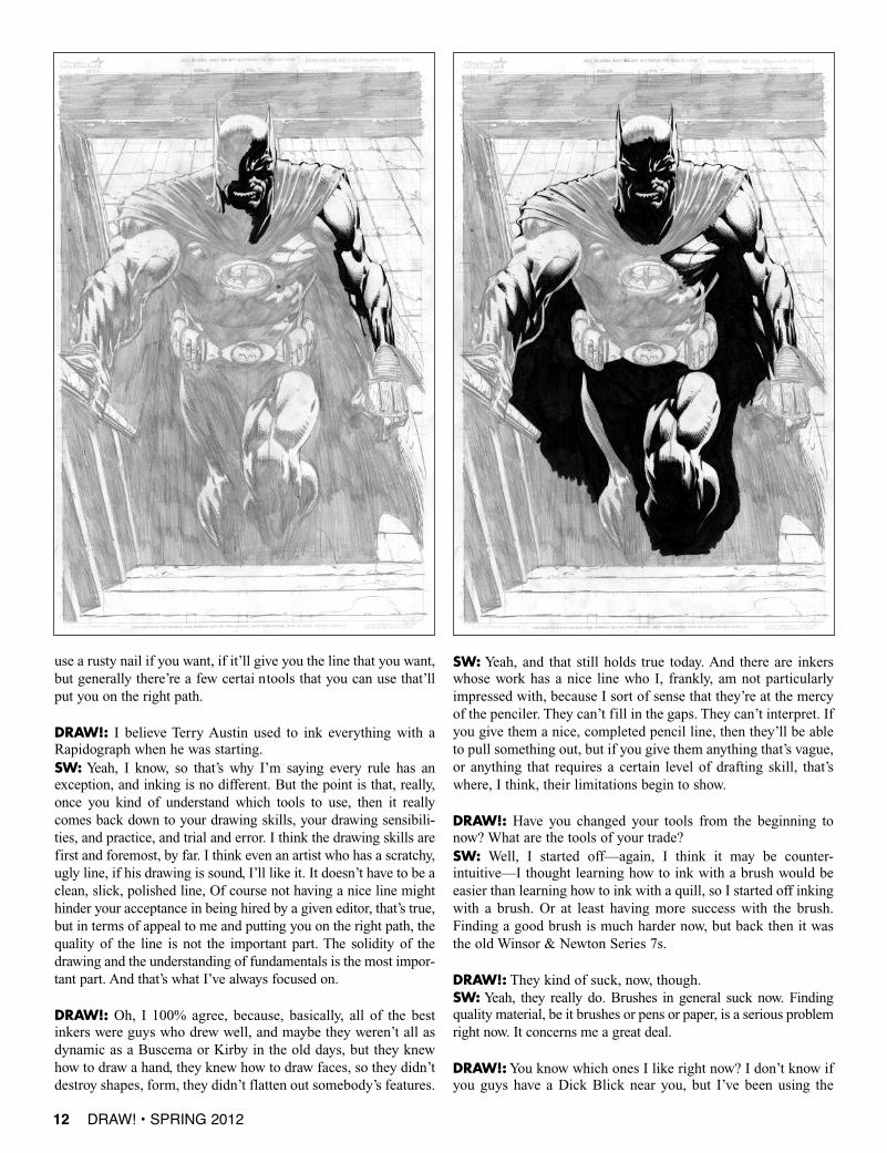
DRAW!: Have you changed your tools from the beginning tonow? What are the tools of your trade?SW: Well, I started off—again, I think it may be counter-intuitive—I thought learning how to ink with a brush would beeasier than learning how to ink with a quill, so I started off inkingwith a brush. Or at least having more success with the brush.Finding a good brush is much harder now, but back then it wasthe old Winsor & Newton Series 7s.
DRAW!: They kind of suck, now, though.SW: Yeah, they really do. Brushes in general suck now. Findingquality material, be it brushes or pens or paper, is a serious problemright now. It concerns me a great deal.
DRAW!:You know which ones I like right now? I don’t know ifyou guys have a Dick Blick near you, but I’ve been using the
12 DRAW! • SPRING 2012
DRAW! • SPRING 2012 13
Dick Blick Series #4, and they’re actuallybetter than—SW: Raphael’s?
DRAW!: No, they have a store brand.Even with the real expensive brands, itreally depends upon the brush you get,because the quality is all over the place.SW: Oh, without a doubt. That’s why Iwas saying that finding quality materials istough right now.
DRAW!: But the Blick brushes are cheapand decent.SW: I abandoned the Winsor & NewtonSeries 7s years and years and years ago andfound that the Raphael 8404, the 8408,were great. But even in the early days,you’d only get a certain percentage of themthat were serviceable. If you bought ten ata time, maybe seven or eight of them wouldbe real solid. Now if I get ten, dependingon which batch I get them from, they mayall blow. I can’t use any of them. Or maybeonly two or three are any good, and whenyou’re talking brushes that are 20 bucks apop, there’s a realization that you’re justsort of spitting into the wind.
DRAW!: That’s why I was saying I wasusing those Dick Blick Studio brushes,because I found those to be....SW: Consistent quality?
DRAW!: Yeah! I mean, I like them. Youhave to pick them—you know, spit testthem in the store—but I find they do well.For the money, if you blow through one a week or month, whatthe heck. It’s, like, eight bucks or something like that. So, I takeit you were using, what, a crow quill pen?SW:Yeah, yeah. Getting back to the question, I started off doingmore brushwork and then realized that, just to get some versatilelines and some different types of lines, I had to figure out how touse the crow quill, and that takes a little longer getting used to,understanding the angle that you have to hold the sucker at. AndI had to figure out why, when you buy them by the gross, or bythe box, or whatever, some of them are split down the middle, andsometimes the tong isn’t split down the middle. You pull out onepen nib and it makes a reasonably decent line, then you pull thenext one in the box, and it either won’t make a line or it makes a
crappy line or digs into the paper or you have wash the oil off. Youknow, all the little tricks of the trade that you start figuring out.
DRAW!: Or they explode on you when you’re inking. [laughs]SW: They explode. Especially when you’re in a groove, whenyou get a really nice one and the metal gives a little bit, it’s nice,and you’re just ripping along and making big, fat lines as well asthin, little fine lines, and then they just blow up, and you hope toGod a piece doesn’t fly into your eye or whatnot. Yeah, I’ve hadmultiple exploding episodes.
So I started off my career doing a lot of brushwork, but veryquickly went into probably an 80/20 split, with crow quill being 80and the brush being 20. I usually used a Hunt 102, and then a little
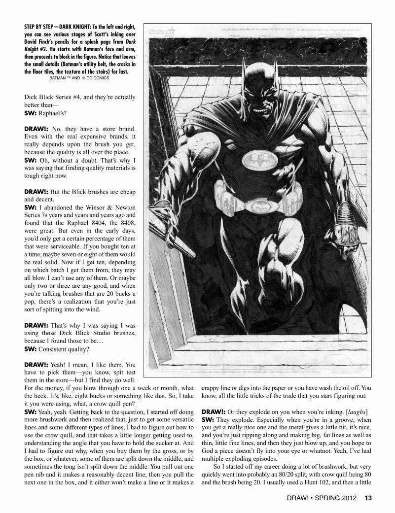
STEP BY STEP—DARK KNIGHT: To the left and right,you can see various stages of Scott’s inking overDavid Finch’s pencils for a splash page from DarkKnight #2. He starts with Batman’s face and arm,then proceeds to block in the figure. Notice that leavesthe small details (Batman’s utility belt, the cracks inthe floor tiles, the texture of the stairs) for last.
BATMAN ™ AND © DC COMICS.
DRAW! • SPRING 2012 15
bit later on the Gillott 850 and the 659, and used those through thebulk of the X-Men years and the early WildC.A.T.s and Image typestuff, and then eventually coming back to the 102. However, Ialmost completely dropped all my pen work in favor of a brushwhen I started my DC work and “Hush” in particular. It sort ofreintroduced my love affair with brush inking and opened the doorto a fresh look at my work. More experimentation, though notwithout a cost. A lot of the “Hush” stuff, which by all reasonablemeasures should have been inked with a crow quill or some otherfine line tool, was brushwork and was done so because I had redis-covered this old, great toy, and probably gave me carpal tunnel ornerve damage or whatever, because it was just insane some of thestuff I was trying to do with a brush. Types of things that didn’treally lend itself to brush. It was a challenge that I really wanted toattempt at that point in my career—a different look in my work, amore organic look, or a little more fluid look, but still recognizableas my work—and doing it with the brush just blew through thatcreative door. As a result I’m now mostly a brush guy again.
Although, having said that, a lot of the stuff I’m doing onJustice League right now is back to quill. Part of that it is becauseI kind of get bored a little bit too easily. I kind of get with a tool,or get with an approach, for a period of time, and then I get boredwith it and just want to change things up for reasons that only,
probably, my shrink would be able to tell you. I don’t know whyexactly it is. I think everybody gets bored doing the same thing,and there’s a certain tactile quality to inking, and I think after Iwhile I just get bored with that same feel, that same motion, andthe sameness of the line. Then the pages start to blur from one tothe next a little bit, I realize I’m using the same techniques and thesame tools over and over and over again, and it creates a samenessthat I think, “Well, if I’m bored, then the people who are readingthe stuff are probably bored, too, at least the ones that are tuned into something as subtle as the ink line.” So I kind of start changingthings up. Now I’m at a point where I flip it on and off like aswitch, back and forth, back and forth. I used to feel very—I thinkinkers in general have a bit of an anal retentive quality in that I feltlike if I inked Batman’s cape with a brush, I had to be consistentthroughout, and there had to be a consistency in the visual lan-guage of the ink line. There is a logic to that thinking. But nowI’m like, no. One page I’ll do it in brush, the next page I’ll do itwith a pen, and the variation in line and line quality—if it doesn’tmake sense in a logical way, I don’t care. [laughter]
DRAW!: So today what are you using, a 102?SW: Today I’m just using a 102, yeah. And in an hour, I’ll bustout the brush again. Very consistent, yes?
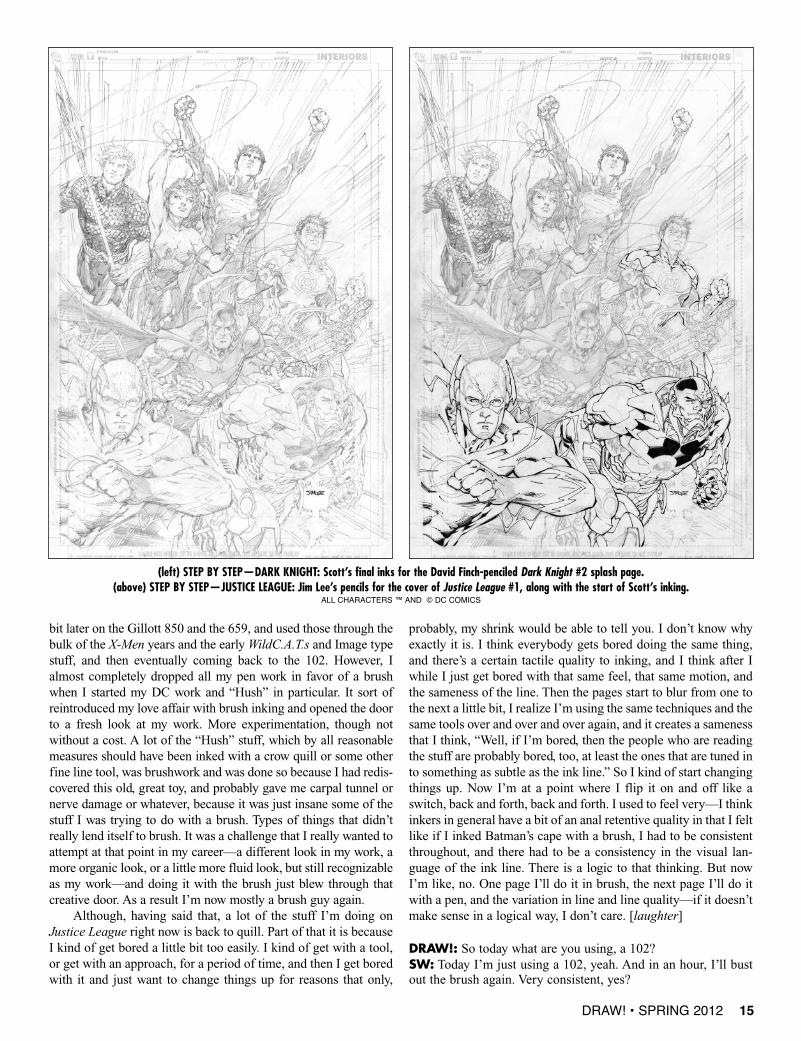
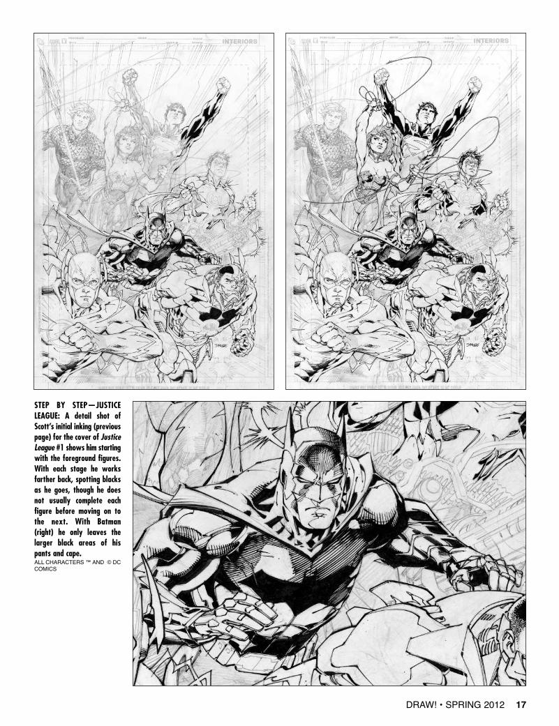
(left) STEP BY STEP—DARK KNIGHT: Scott’s final inks for the David Finch-penciled Dark Knight #2 splash page.(above) STEP BY STEP—JUSTICE LEAGUE: Jim Lee’s pencils for the cover of Justice League #1, along with the start of Scott’s inking.
ALL CHARACTERS ™ AND © DC COMICS
DRAW! • SPRING 2012 17
STEP BY STEP—JUSTICELEAGUE: A detail shot ofScott’s initial inking (previouspage) for the cover of JusticeLeague #1 shows him startingwith the foreground figures.With each stage he worksfarther back, spotting blacksas he goes, though he doesnot usually complete eachfigure before moving on tothe next. With Batman(right) he only leaves thelarger black areas of hispants and cape.ALL CHARACTERS ™ AND © DCCOMICS
26 DRAW! • SPRING 2012
DRAW!: Every inker has their bucket list—the people that youwish you could have inked, but who have passed on into theGreat Art House in the sky. And now you’re inking Neal Adams,though I assume by now you’re probably done with inking NealAdams on the Batman: Odyssey.SW:Yeah, that was a big one I got to cross off the bucket list.
DRAW!: So who are the top five pencilers that you haven’tinked, that you would love to ink?SW: Most of them are probably still around, though they areguys who usually ink their own work. I’ve never inked a FrankMiller job, would love to. Probably not a surprise knowing whatbig Klaus guy I was, but having said that, there are a lot of FrankMiller jobs of Frank inking himself that I like even better thanwhat Klaus was doing. A little bit of apples and oranges. I thinkthe line that Frank used over the years was a lot different than theline that Klaus used. I thought that Klaus, as an inker, did aremarkable job of interpreting Frank during the period of timethat they worked together. Having said that, I thought Frank’s lineon a lot of the work he did was great, where he was experiment-ing through Ronin, and through the Elektra graphic novel, andeven from 300, on The Dark Knight Returns, and some of thecovers that he did for Lone Wolf and Cub. A lot of that stuff isvery appealing. I always thought that I was so tuned into thatstuff that I could do a good job on Frank. Whether he wouldagree, or anyone else would agree, is subject for debate, andsomething that is open for interpretation. And, actually, a coupleyears ago I did a Frank Miller piece in a sketchbook that was aDark Knight Batman and Robin statue sketch that he did mid- tolate ’80s. I inked that in a much sleeker line than maybe I wouldhave if I’d have been actually inking a gig for Frank. If he said,“Scott, I’m doing such-and-such. I’d like you to ink me. Show mewhat you would do,” I don’t think I would have done it in theslicker style that I did the Dark Knight piece. But that was for adifferent audience and with a different sensibility. But that was alot of fun to do. And so he would be one of those guys.
I would love to have a chance to work on Mike Mignola’sstuff, but, again, he inks his own work. Let’s see.... There are cer-tain guys I would never in a million years ink. I would never inkKevin Nowlan, and he would never have me. I would never inkBernie Wrightson. These are some of my favorite artists, but Iwould just ruin them. There are certain guys that just have theirown line and their own sensibility. At one point, when I wasdoing that sketchbook of inking different artists in differentstyles, there were certain guys that I thought that I could handle,and certain guys that I thought would be almost impossible tohandle. The Wrightsons of the world, he’s got such a line that Ijust can’t imagine—I could do no justice to it. There would benothing on the horizon but failure trying to approach somethinglike that. I just think guys like Wrightson, or guys like Nowlan,who have such a distinctive style, I just don’t see any upside todoing any of that stuff.
I’m trying to think if there’s anybody else. Yeah, I really wishJohn Buscema was still around. I think I could do some interest-ing stuff with John. I wouldn’t be scared of it, because I think hisstyle lends itself to a lot of different approaches.
DRAW!:Yeah, I still wish he was around, too. I was always veryenvious that Jerry Ordway got to ink him. He’s one of the guys I
would have loved to ink. It’s like, when I got to ink Steve Ditkoon that one Marvel job, I felt like, “I’m a real cartoonist now! I’ma real inker now!”SW:Yeah! And, one way or another, I mean, I’ve inked a lot ofguys that I’m not particularly recognized for, but I’ve gotten todo something with them. I think everybody from Jack Kirby, toSimonson, to John Byrne, to Michael Golden, to Rick Leonardi,to Todd McFarlane, and Barry Windsor-Smith, and now NealAdams.... There are a lot of guys that I’ve inked professionally—
DRAW!: Did you ever ink Gene Colan?SW: No, I’ve never inked Gene Colan. He would be hard. Hewould be hard. Trying to interpret the grays and graduated tones?I would be better suited for it now than I was years ago, withouta doubt, but I think he would be hard. I think I could do some-thing that might work, but that’s tough.
DRAW!: Because Janson did a good job on him.SW: Yeah, Klaus did a good job. I think the only guy that I’veever seen Klaus do that probably wasn’t appropriate was when heinked John Byrne. And the inks were actually beautiful. They
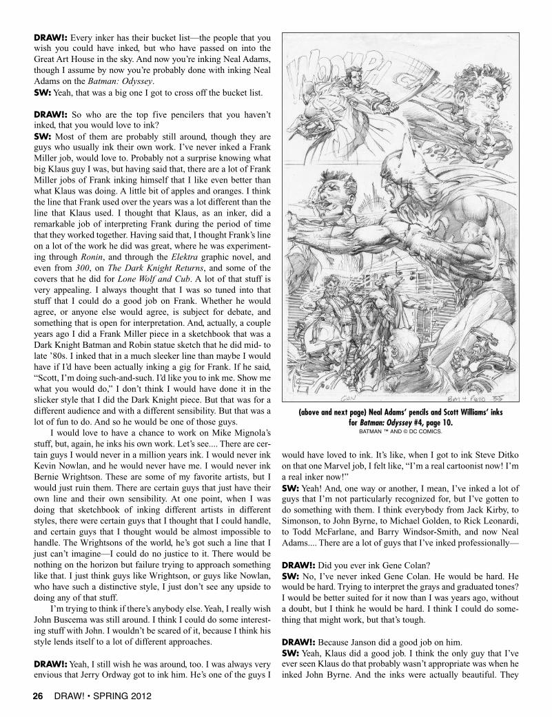
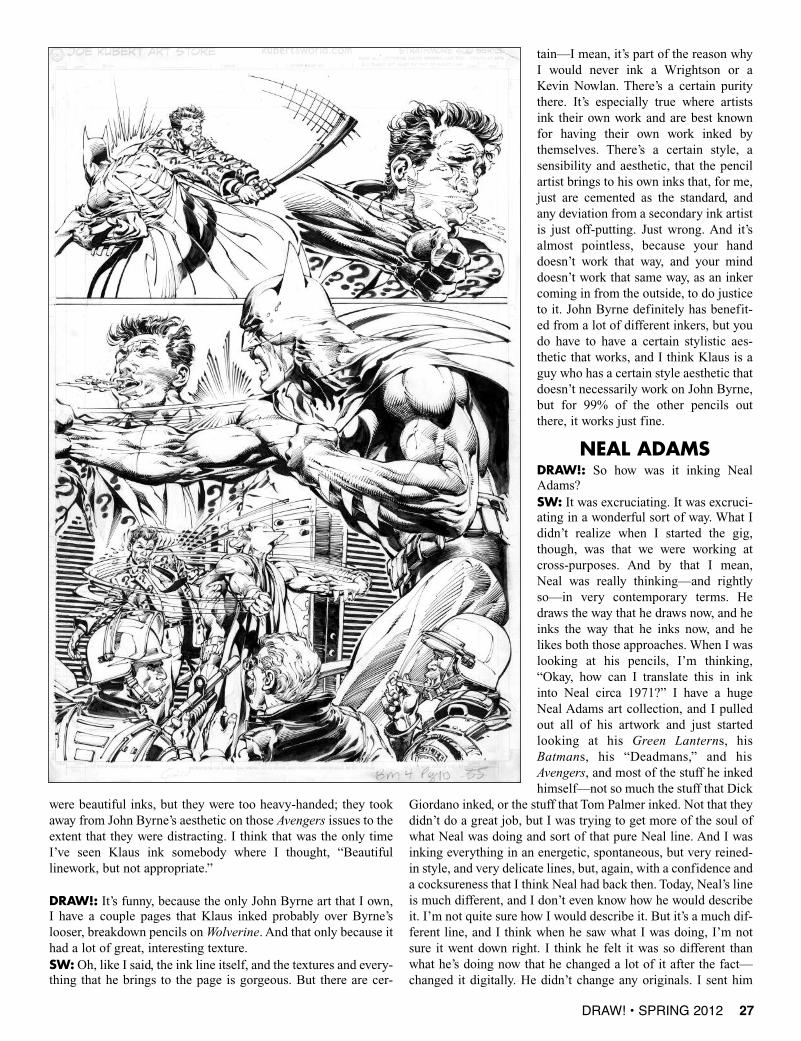
(above and next page) Neal Adams’ pencils and Scott Williams’ inks for Batman: Odyssey #4, page 10.
BATMAN ™ AND © DC COMICS.
DRAW! • SPRING 2012 27
were beautiful inks, but they were too heavy-handed; they tookaway from John Byrne’s aesthetic on those Avengers issues to theextent that they were distracting. I think that was the only timeI’ve seen Klaus ink somebody where I thought, “Beautifullinework, but not appropriate.”
DRAW!: It’s funny, because the only John Byrne art that I own,I have a couple pages that Klaus inked probably over Byrne’slooser, breakdown pencils on Wolverine. And that only because ithad a lot of great, interesting texture.SW: Oh, like I said, the ink line itself, and the textures and every-thing that he brings to the page is gorgeous. But there are cer-
tain—I mean, it’s part of the reason whyI would never ink a Wrightson or aKevin Nowlan. There’s a certain puritythere. It’s especially true where artistsink their own work and are best knownfor having their own work inked bythemselves. There’s a certain style, asensibility and aesthetic, that the pencilartist brings to his own inks that, for me,just are cemented as the standard, andany deviation from a secondary ink artistis just off-putting. Just wrong. And it’salmost pointless, because your handdoesn’t work that way, and your minddoesn’t work that same way, as an inkercoming in from the outside, to do justiceto it. John Byrne definitely has benefit-ed from a lot of different inkers, but youdo have to have a certain stylistic aes-thetic that works, and I think Klaus is aguy who has a certain style aesthetic thatdoesn’t necessarily work on John Byrne,but for 99% of the other pencils outthere, it works just fine.
NEAL ADAMSDRAW!: So how was it inking NealAdams?SW: It was excruciating. It was excruci-ating in a wonderful sort of way. What Ididn’t realize when I started the gig,though, was that we were working atcross-purposes. And by that I mean,Neal was really thinking—and rightlyso—in very contemporary terms. Hedraws the way that he draws now, and heinks the way that he inks now, and helikes both those approaches. When I waslooking at his pencils, I’m thinking,“Okay, how can I translate this in inkinto Neal circa 1971?” I have a hugeNeal Adams art collection, and I pulledout all of his artwork and just startedlooking at his Green Lanterns, hisBatmans, his “Deadmans,” and hisAvengers, and most of the stuff he inkedhimself—not so much the stuff that Dick
Giordano inked, or the stuff that Tom Palmer inked. Not that theydidn’t do a great job, but I was trying to get more of the soul ofwhat Neal was doing and sort of that pure Neal line. And I wasinking everything in an energetic, spontaneous, but very reined-in style, and very delicate lines, but, again, with a confidence anda cocksureness that I think Neal had back then. Today, Neal’s lineis much different, and I don’t even know how he would describeit. I’m not quite sure how I would describe it. But it’s a much dif-ferent line, and I think when he saw what I was doing, I’m notsure it went down right. I think he felt it was so different thanwhat he’s doing now that he changed a lot of it after the fact—changed it digitally. He didn’t change any originals. I sent him
34 DRAW! • SPRING 2012
DRAW! • SPRING 2012 35
This time out with “Comic Book Bootcamp” we are goingto delve into the emerald realm of Sherwood Forest andthe world of illustration. In the last year I have had the
opportunity to illustrate two book covers featuring Robin Hoodfor the fine folks at Airship 27. I have alwaysloved illustration, specifically the golden ageof American Illustration. Norman Rockwell,Dean Cornwell, and N.C. Wyeth are three ofmy favorite artists in any field. I have alwaysthought of illustration as a sister field forcomic artists and cartoonists to work in, and infact many of the best and most famous car-toonists moved into illustration from comics,like Frank Frazetta, Mort Künstler, and FrankGodwin (Connie, Rusty Riley) to name just afew. Hal Foster of Prince Valiant fame startedas an illustrator and moved into comic strips,first with Tarzan and then with his mostfamous creation, Prince Valiant.
Foster employed the same skills he usedin doing realistic and researched illustrationsfor magazines like Popular Mechanics andbrought them to bear in the comic strips, ush-ering in a sense of realism and believabilityand setting a level of craftsmanship to which other cartoonistsand illustrators strived. In the ’50s, when the comics industrywent through its first big downturn, many cartoonists left comicsfor the much more lucrative field of illustration. Some, like
Frazetta, never came back. Frazetta himself went on to greatfame and fortune as a fantasy and paperback cover artist.
As a teenager I used to haunt many local used bookstoreson the search for his paperback covers, and along the way I dis-
covered a lot of great illustrators, from JohnBerkey to Frank McCarthy and James Bama.I collected old Saturday Evening Post maga-zines for covers by Norman Rockwell andillustrations by many artists of the goldenage of illustration, such as Dean Cornwell,Mead Schaeffer, Albert Dorne, and more.All throughout my career as a comic guy, Ihave continued my interest and passion forillustration.
A little over a year ago I met Ron Fortiervia Facebook after he left a nice comment onone of my fine art paintings I had posted. Inshort order this lead to Ron offering me anopportunity to illustrate a cover for one ofAirship 27 and Cornerstone Publishing’supcoming books, Robin Hood: King ofSherwood, by I.A. Watson, a new book tellingthe stories of Robin Hood.
In this article I will focus mainly on thesecond of the two book covers I painted for the series. The firstcover of the series garnered me the Pulp Factory “Best Cover”Award. When Ron emailed me about the second book in theseries I was pumped to get started on it.
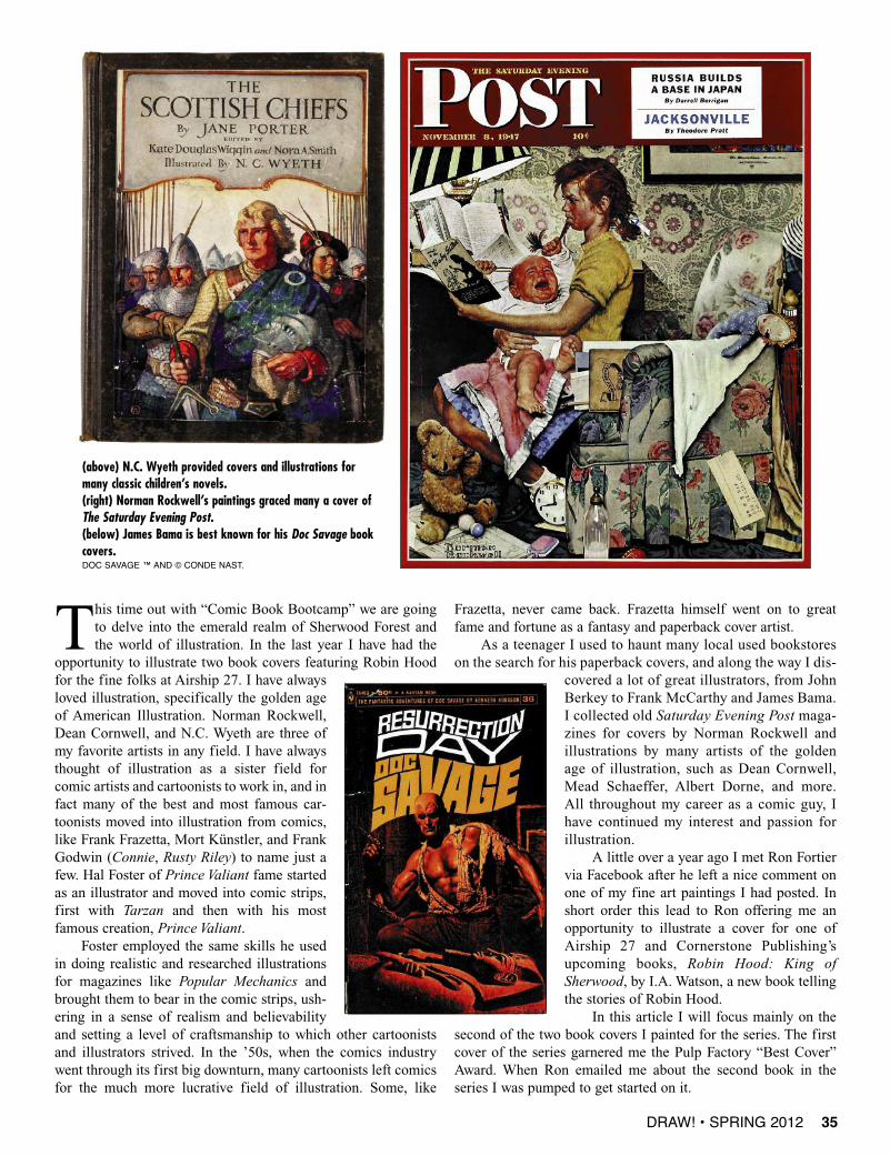
(above) N.C. Wyeth provided covers and illustrations formany classic children’s novels.(right) Norman Rockwell’s paintings graced many a cover ofThe Saturday Evening Post.(below) James Bama is best known for his Doc Savage bookcovers.DOC SAVAGE ™ AND © CONDE NAST.
36 DRAW! • SPRING 2012
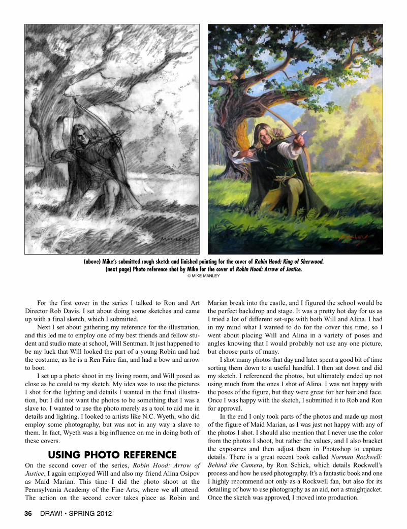
For the first cover in the series I talked to Ron and ArtDirector Rob Davis. I set about doing some sketches and cameup with a final sketch, which I submitted.
Next I set about gathering my reference for the illustration,and this led me to employ one of my best friends and fellow stu-dent and studio mate at school, Will Sentman. It just happened tobe my luck that Will looked the part of a young Robin and hadthe costume, as he is a Ren Faire fan, and had a bow and arrowto boot.
I set up a photo shoot in my living room, and Will posed asclose as he could to my sketch. My idea was to use the picturesI shot for the lighting and details I wanted in the final illustra-tion, but I did not want the photos to be something that I was aslave to. I wanted to use the photo merely as a tool to aid me indetails and lighting. I looked to artists like N.C. Wyeth, who didemploy some photography, but was not in any way a slave tothem. In fact, Wyeth was a big influence on me in doing both ofthese covers.
USING PHOTO REFERENCEOn the second cover of the series, Robin Hood: Arrow ofJustice, I again employed Will and also my friend Alina Osipovas Maid Marian. This time I did the photo shoot at thePennsylvania Academy of the Fine Arts, where we all attend.The action on the second cover takes place as Robin and
Marian break into the castle, and I figured the school would bethe perfect backdrop and stage. It was a pretty hot day for us asI tried a lot of different set-ups with both Will and Alina. I hadin my mind what I wanted to do for the cover this time, so Iwent about placing Will and Alina in a variety of poses andangles knowing that I would probably not use any one picture,but choose parts of many.
I shot many photos that day and later spent a good bit of timesorting them down to a useful handful. I then sat down and didmy sketch. I referenced the photos, but ultimately ended up notusing much from the ones I shot of Alina. I was not happy withthe poses of the figure, but they were great for her hair and face.Once I was happy with the sketch, I submitted it to Rob and Ronfor approval.
In the end I only took parts of the photos and made up mostof the figure of Maid Marian, as I was just not happy with any ofthe photos I shot. I should also mention that I never use the colorfrom the photos I shoot, but rather the values, and I also bracketthe exposures and then adjust them in Photoshop to capturedetails. There is a great recent book called Norman Rockwell:Behind the Camera, by Ron Schick, which details Rockwell’sprocess and how he used photography. It’s a fantastic book and oneI highly recommend not only as a Rockwell fan, but also for itsdetailing of how to use photography as an aid, not a straightjacket.Once the sketch was approved, I moved into production.
(above) Mike’s submitted rough sketch and finished painting for the cover of Robin Hood: King of Sherwood.(next page) Photo reference shot by Mike for the cover of Robin Hood: Arrow of Justice.
© MIkE MANLEy
42 DRAW! • SPRING 2012
Interview conducted via phone by Danny Fingeroth transcribed by Steven Ticeand copyedited by Danny Fingeroth and Frank Miller
SPOTLIGHT
Hardboiled Hero
(above) Miller’s cover contribution to ’Mazing Man #12.(righ) Prelims and final art from
Frank’s “Sin City” book The Big Fat Kill #2.BATMAN AND ROBIN,
’MAzING MAN ™ AND © DC COMICS. SIN CITy ™ AND © fRANk MILLER.
FRANK MILLER
DANNY FINGEROTH: Did you always want to write your own comics,Frank? You came to Marvel drawing other people’s stuff. Was writing alwaysyour ambition?FRANK MILLER: It always was, because I always saw the two crafts as onething. I grew up drawing my comics on a piece of typing paper folded in half,showing my mom and saying, “I’m doing this for the rest of my life!”
DF:What did she say when you said that?FM: She said, and I quote, “You can do anything if you set your mind to it.”
DF:Who are your influences in writing and art? Who got you excited aboutwanting to do comics professionally?FM:Well, the first two would be a guy by the name of Curt Swan, and thenJim Shooter. I grew up reading superheroes. Later I fell in love with the workof Steve Ditko and Stan Lee, and Jack Kirby and Stan Lee. Then years andyears went by, and I discovered Will Eisner and fell madly in love with hiscombination of words and pictures.
DF:Where did you discover him, in the Warren Spirit reprints?FM: Yup! I was bicycling, as I always did, from Montpelier, Vermont, toBarre, Vermont, two towns that are very close together, and came across thisoversized, weird-looking comic book and thought, “Who is this new guy?He’s amazing!” Then, of course, I saw the copyright and it said “1942.”
DF: Had you read the Jules Feiffer’s The Great Comic Book Heroes, whichintroduced Eisner to a new generation?FM: I had read the Feiffer book and seen Steranko’s Eisner tribute in hisHistory of Comics, but it wasn’t until I sat down and read the Spirit story“Sand Serif ” that I realized what Eisner really did.
DF:What was it about that story that got to you?FM: It broke my heart. It showed me that comic books could break my heart.Beyond showing guys walking in shadows along waterfronts and all that won-derful imagery, it showed a hero facing a moral challenge, and addressing it.
DF:A deeper moral challenge than the Marvel heroes of the day were facing?FM: I thought so, because he had that classic line, which I kept in the Spiritmovie, “I’ve got to find Sand Serif and bring her in.” Which I, of course, stolewhen I did Elektra. I just changed the lingo. I had Daredevil say, “I’ve got tofind Elektra and bring her to justice.” But, come on, it was a cold rip-off.
DF: It would be like Superman saying, “I’ve got to find Lois Lane and bringher in.”FM:Yeah. And I think we all have a Sand Serif back there somewhere.
DF: At least one.FM:Well, yeah. If we’re lucky, it’s more than one. But there’s always that one.It’s your Bobby McGee. It’s the one you’ll never forget.
DRAW! • SPRING 2012 43
RANK MILLER changed the way comics are done, starting with Daredevil and moving on to re-envision Batman in The Dark Knight Returns. Other triumphs for the
writer-artist included Martha Washington, 300, and, of course, Sin City, which was turnedinto a sleeper-hit movie which he co-directed. Frank also wrote and directed The Spirit,based on Will Eisner’s classic character. His recent work includes Holy Terror, and theupcoming sequel to 300, Xerxes.
I spoke with Frank via phone on March 11, 2010, and he answered some follow-upquestions via email in November, 2011.
F
(above) Frank’s poster art for The Spirit.(below) Frank Miller’s Daredevil via Will Eisner.
THE SPIRIT ™ AND © THE WILL EISNER ESTATE. DAREDEVIL ™ AND © MARVEL CHARACTERS, INC.
DF: Most people’s first memory of your work is on Daredevil.But where did you first break in?FM: There’s no way to explain this without prefacing it. I both-ered Neal Adams a lot, and he kept on letting me come to his stu-dio. And he hated my work.
DF:Why did he hate it?FM: He just told me it was terrible. And I went on from him toJoe Orlando at DC Comics, who also hated my work, and various other people who hated my work. And eventually Ishowed something to Neal that impressed him enough where hesaid, “The guy can’t draw, we all know that. But his storytellingis budding.” He gave me my first job at Gold Key Comics doingTwilight Zone. I did a few Twilight Zones, and then I got down toDC Comics, and eventually Paul Levitz offered me Claw theUnconquered. And I went to Jim Shooter and I said, “I’d ratherdo something for Marvel. Can you guarantee me regular work?”And he said, “I can only make you a personal promise. You willwork regularly here.” So I got to draw things like “CaptainMarvel” and so on. And then I had the utter audacity to requestDaredevil. Gene Colan had just quit, and Frank Robbins hadtaken it over, but it was an issue-by-issue thing. And I applied forthe job and got it.
DF: Did you go to art school?FM: No. I only learned by practicing at home, ripping off every-body from Barry Smith to Neal Adams, and then learning direct-ly from masters like Al Williamson and Neal Adams.
DF: From copying their work, you mean?FM: No, I mean from invading their studios. [laughter] And hav-ing them show me how bad my work was.
DF: What made you think you could just go knock on theirdoors? Was it naiveté?FM: It was a combination of naiveté, and also—Danny, I gotfired off every job I ever had. I couldn’t make it as a truck driver.I couldn’t make it as a bus driver. I couldn’t make it as a janitor.For me, it was do or die.
DF: Did you have art teachers in high school who encouragedyou?FM:Yeah. I had one art teacher in particular, Bruce Brooks, whowas a wonderful teacher, and he encouraged me. And I had a bril-liant teacher, Jeff Danziger, who’s actually now a renowned car-toonist, who encouraged me to write. He said that my talentswere more in the writing sector. Now he and I are good friends,
44 DRAW! • SPRING 2012
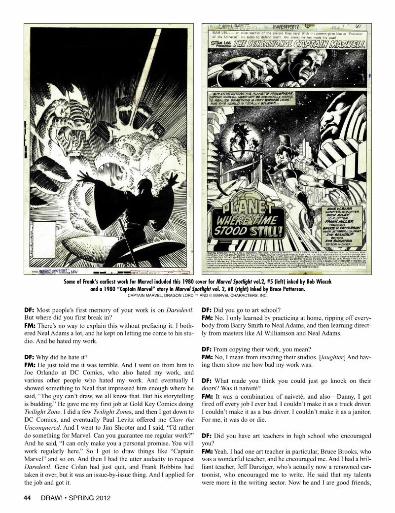
Some of Frank’s earliest work for Marvel included this 1980 cover for Marvel Spotlight vol.2, #5 (left) inked by Bob Wiacek and a 1980 “Captain Marvel” story in Marvel Spotlight vol. 2, #8 (right) inked by Bruce Patterson.
CAPTAIN MARVEL, DRAGON LORD ™ AND © MARVEL CHARACTERS, INC.
and we’re both almost the same age. But when he was inhis 20s, he thought I’d make a better writer than an artist.
DF: Did you write as a teenager?FM: Oh, yeah, yeah. I wrote all my own stuff. Whoelse was going to do it?
DF: I mean did you write prose—short stories, ordetective fiction, anything like that?FM:Yes, I did. I did it very badly.
DF: Has that material ever been published anywhere?FM: If it had been, I wouldn’t tell you.
DF: So Shooter gives you the shot on Daredevil. Iguess technically the editor was Al Milgrom?FM: That was Al Milgrom. I worked with Al Milgromand Jo Duffy.
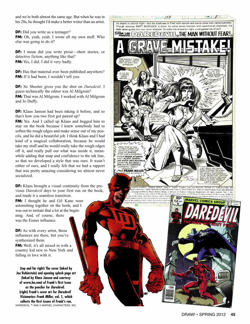
DF: Klaus Janson had been inking it before, and sothat’s how you two first got paired up?FM: Yes. And I called up Klaus and begged him tostay on the book because I knew somebody had tosoften the rough edges and make sense out of my pen-cils, and he did a beautiful job. I think Klaus and I hadkind of a magical collaboration, because he wouldtake my stuff and he would really take the rough edgesoff it, and really pull out what was inside it, mean-while adding that snap and confidence to the ink line,so that we developed a style that was ours. It wasn’teither of ours, and I really felt that we had a rapportthat was pretty amazing considering we almost neversocialized.
DF: Klaus brought a visual continuity from the pre-vious Daredevil days to your first run on the book,and made it a seamless transition.FM: I thought he and Gil Kane wereastonishing together on the book, and Iwas out to imitate that a lot at the begin-ning. And, of course, therewas the Eisner influence.
DF: As with every artist, thoseinfluences are there, but you’vesynthesized them.FM:Well, it’s all mixed in with acountry kid new to New York andfalling in love with it.
DRAW! • SPRING 2012 45
(top and far right) The cover (inked by Joe Rubinstein) and opening splash page art
(inked by Klaus Janson and courtesy of www.ha.com) of Frank’s first issue
as the penciler for Daredevil.(right) Frank’s cover art for DaredevilVisionaries: Frank Miller, vol. 1, which collects the first issues of Frank’s run.
DAREDEVIL ™ AND © MARVEL CHARACTERS, INC.
girls and sharp cars and guys in trench coats. I was first intro-duced to the 300 story when I was about seven years old, andthere was a clunky old Universal movie called The 300 Spartansthat I spent too much of my adult life thinking how much I want-ed to adapt the story, until finally I turned somewhere around 40and I said, “I’d better do this thing with 300 while I can.” That hasled to a much greater exploration of the Greek material, and amuch greater realization of how important it is, how compellingit is, how moral it is.
DF: With the story arc “Born Again,” you came back toDaredevil after doing the landmark Batman stuff. Why did youcome back, and what was different about the character when youreturned to him?FM:Well, I got offered the job, and the story presented itself. I hadjust moved to California and it was much more expensive than I
thought it would be, and so I was in financial straits, and there’s asense, when you’re all of a sudden in financial trouble, of yourwhole world falling apart, and I thought, why not put Matt throughthat? And from that came the business of bringing in Karen Pagevastly transformed, and the Kingpin discovering Daredevil’s secretidentity and dismantling his life. So it was kind of like vanity, butit was also a way for me to break the character down to his absolutecore and get rid of all the stuff I didn’t like about him. One of thereasons that I kept him out of his costume so much in the serieswas that I wanted him to come back fresh and new.
DF:What made you decide to just write it, and not draw it?FM: David Mazzucchelli was available, and I was really, reallybusy. It was the same time I was doing Dark Knight, and Elektra:Assassin, and God knows what else. And I thought that it’d bereally fun to see it through somebody else’s eyes.
52 DRAW! • SPRING 2012
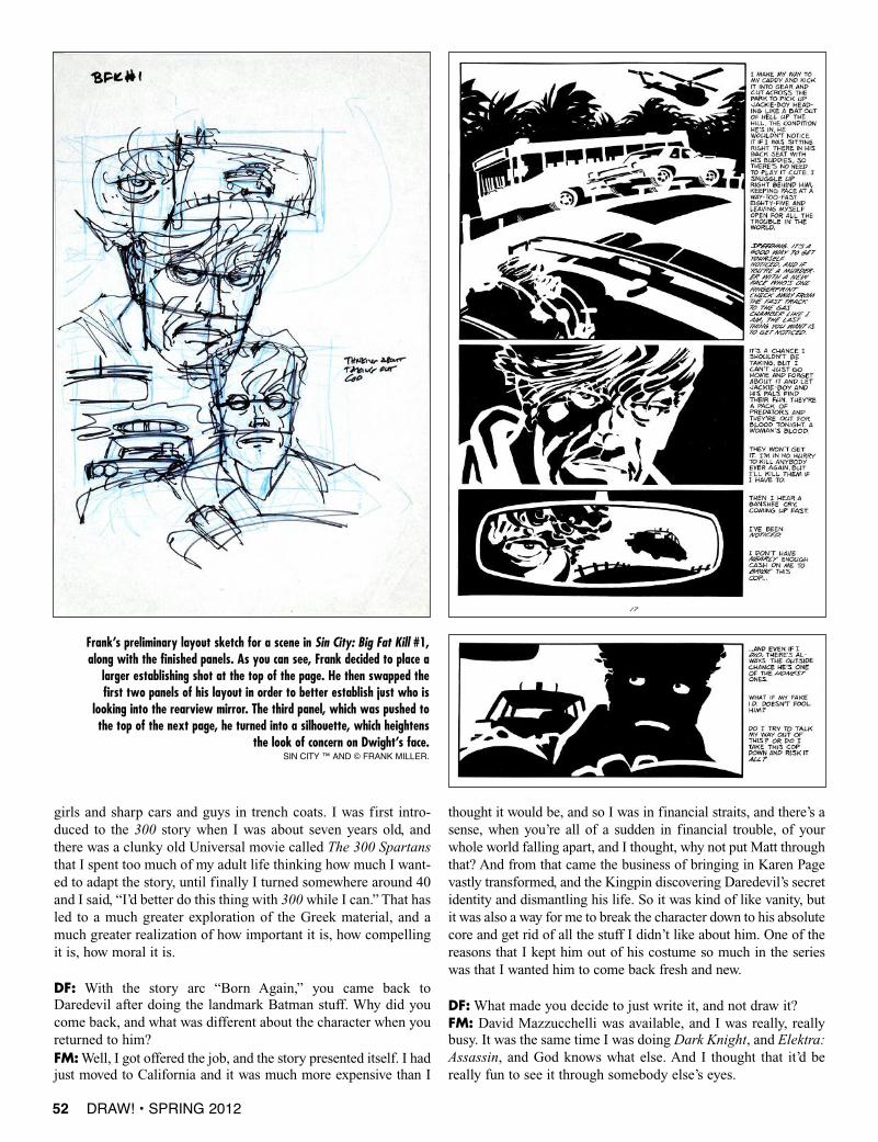
Frank’s preliminary layout sketch for a scene in Sin City: Big Fat Kill #1,along with the finished panels. As you can see, Frank decided to place a
larger establishing shot at the top of the page. He then swapped thefirst two panels of his layout in order to better establish just who is
looking into the rearview mirror. The third panel, which was pushed tothe top of the next page, he turned into a silhouette, which heightens
the look of concern on Dwight’s face.SIN CITy ™ AND © fRANk MILLER.
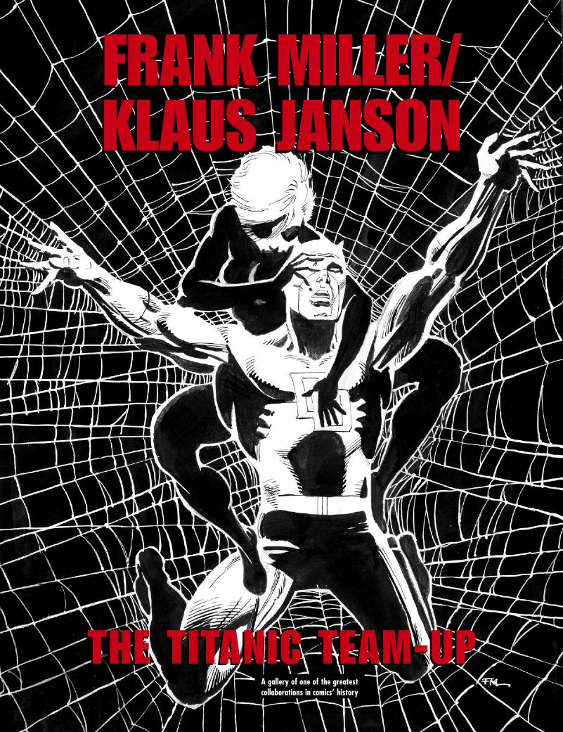
FRANK MILLER/KLAUS JANSONFRANK MILLER/KLAUS JANSON
THE TITANIC TEAM-UPTHE TITANIC TEAM-UPA gallery of one of the greatest collaborations in comics’ history
66 DRAW! • SPRING 2012
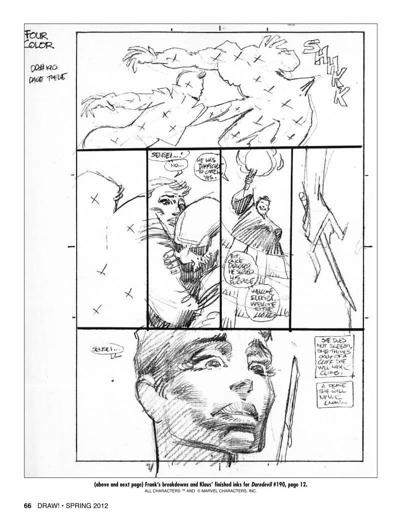
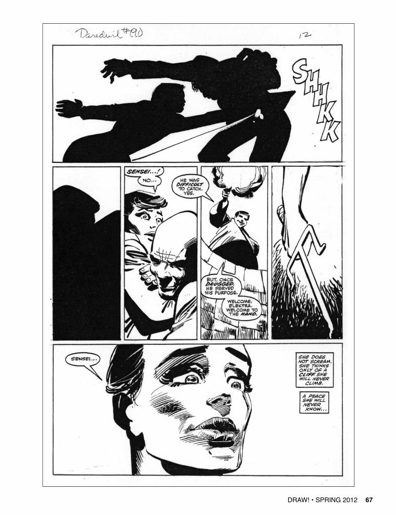
(above and next page) Frank’s breakdowns and Klaus’ finished inks for Daredevil #190, page 12.ALL CHARACTERS ™ AND © MARVEL CHARACTERS, INC.
DRAW! • SPRING 2012 67
72 DRAW! • SPRING 2012
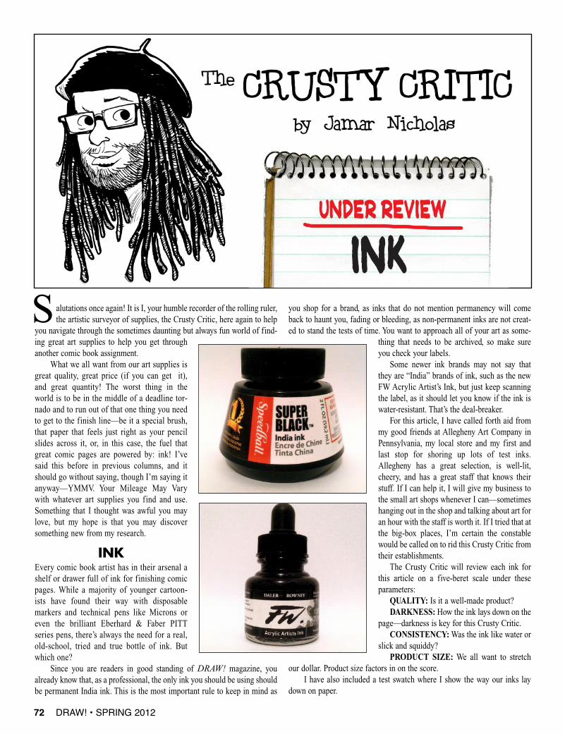
alutations once again! It is I, your humble recorder of the rolling ruler,the artistic surveyor of supplies, the Crusty Critic, here again to help
you navigate through the sometimes daunting but always fun world of find-ing great art supplies to help you get throughanother comic book assignment.
What we all want from our art supplies isgreat quality, great price (if you can get it),and great quantity! The worst thing in theworld is to be in the middle of a deadline tor-nado and to run out of that one thing you needto get to the finish line—be it a special brush,that paper that feels just right as your pencilslides across it, or, in this case, the fuel thatgreat comic pages are powered by: ink! I’vesaid this before in previous columns, and itshould go without saying, though I’m saying itanyway—YMMV. Your Mileage May Varywith whatever art supplies you find and use.Something that I thought was awful you maylove, but my hope is that you may discoversomething new from my research.
INKEvery comic book artist has in their arsenal ashelf or drawer full of ink for finishing comicpages. While a majority of younger cartoon-ists have found their way with disposablemarkers and technical pens like Microns oreven the brilliant Eberhard & Faber PITTseries pens, there’s always the need for a real,old-school, tried and true bottle of ink. Butwhich one?
Since you are readers in good standing of DRAW! magazine, youalready know that, as a professional, the only ink you should be using shouldbe permanent India ink. This is the most important rule to keep in mind as
you shop for a brand, as inks that do not mention permanency will comeback to haunt you, fading or bleeding, as non-permanent inks are not creat-ed to stand the tests of time. You want to approach all of your art as some-
thing that needs to be archived, so make sureyou check your labels.
Some newer ink brands may not say thatthey are “India” brands of ink, such as the newFW Acrylic Artist’s Ink, but just keep scanningthe label, as it should let you know if the ink iswater-resistant. That’s the deal-breaker.
For this article, I have called forth aid frommy good friends at Allegheny Art Company inPennsylvania, my local store and my first andlast stop for shoring up lots of test inks.Allegheny has a great selection, is well-lit,cheery, and has a great staff that knows theirstuff. If I can help it, I will give my business tothe small art shops whenever I can—sometimeshanging out in the shop and talking about art foran hour with the staff is worth it. If I tried that atthe big-box places, I’m certain the constablewould be called on to rid this Crusty Critic fromtheir establishments.
The Crusty Critic will review each ink forthis article on a five-beret scale under theseparameters:
QUALITY: Is it a well-made product? DARKNESS: How the ink lays down on the
page—darkness is key for this Crusty Critic.CONSISTENCY:Was the ink like water or
slick and squiddy?PRODUCT SIZE: We all want to stretch
our dollar. Product size factors in on the score.I have also included a test swatch where I show the way our inks lay
down on paper.
S
DRAW! • SPRING 2012 75
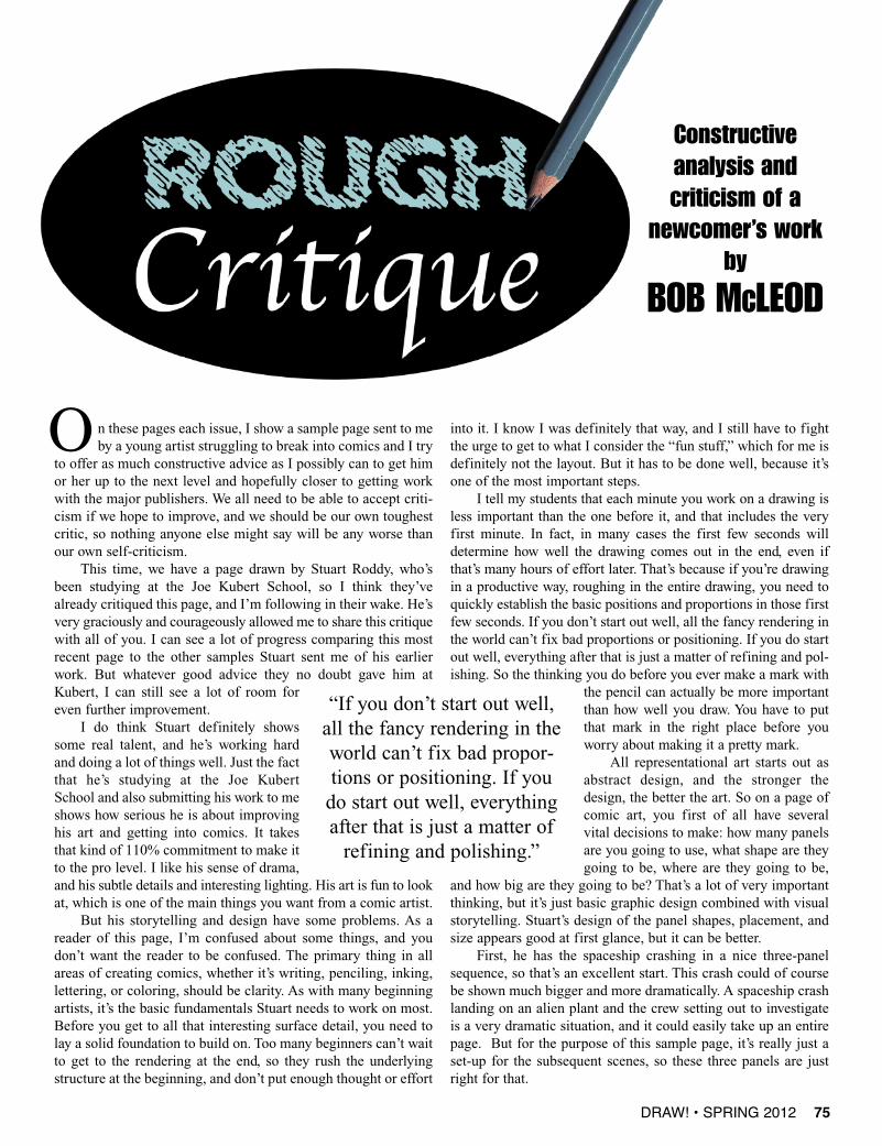
n these pages each issue, I show a sample page sent to meby a young artist struggling to break into comics and I try
to offer as much constructive advice as I possibly can to get himor her up to the next level and hopefully closer to getting workwith the major publishers. We all need to be able to accept criti-cism if we hope to improve, and we should be our own toughestcritic, so nothing anyone else might say will be any worse thanour own self-criticism.
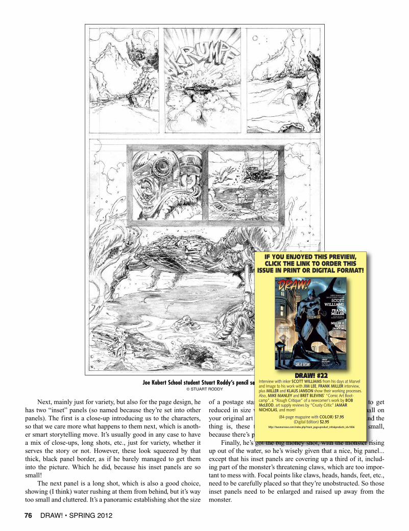
This time, we have a page drawn by Stuart Roddy, who’sbeen studying at the Joe Kubert School, so I think they’vealready critiqued this page, and I’m following in their wake. He’svery graciously and courageously allowed me to share this critiquewith all of you. I can see a lot of progress comparing this mostrecent page to the other samples Stuart sent me of his earlierwork. But whatever good advice they no doubt gave him atKubert, I can still see a lot of room foreven further improvement.
I do think Stuart definitely showssome real talent, and he’s working hardand doing a lot of things well. Just the factthat he’s studying at the Joe KubertSchool and also submitting his work to meshows how serious he is about improvinghis art and getting into comics. It takesthat kind of 110% commitment to make itto the pro level. I like his sense of drama,and his subtle details and interesting lighting. His art is fun to lookat, which is one of the main things you want from a comic artist.
But his storytelling and design have some problems. As areader of this page, I’m confused about some things, and youdon’t want the reader to be confused. The primary thing in allareas of creating comics, whether it’s writing, penciling, inking,lettering, or coloring, should be clarity. As with many beginningartists, it’s the basic fundamentals Stuart needs to work on most.Before you get to all that interesting surface detail, you need tolay a solid foundation to build on. Too many beginners can’t waitto get to the rendering at the end, so they rush the underlyingstructure at the beginning, and don’t put enough thought or effort
into it. I know I was definitely that way, and I still have to fightthe urge to get to what I consider the “fun stuff,” which for me isdefinitely not the layout. But it has to be done well, because it’sone of the most important steps.
I tell my students that each minute you work on a drawing isless important than the one before it, and that includes the veryfirst minute. In fact, in many cases the first few seconds willdetermine how well the drawing comes out in the end, even ifthat’s many hours of effort later. That’s because if you’re drawingin a productive way, roughing in the entire drawing, you need toquickly establish the basic positions and proportions in those firstfew seconds. If you don’t start out well, all the fancy rendering inthe world can’t fix bad proportions or positioning. If you do startout well, everything after that is just a matter of refining and pol-ishing. So the thinking you do before you ever make a mark with
the pencil can actually be more importantthan how well you draw. You have to putthat mark in the right place before youworry about making it a pretty mark.
All representational art starts out asabstract design, and the stronger thedesign, the better the art. So on a page ofcomic art, you first of all have severalvital decisions to make: how many panelsare you going to use, what shape are theygoing to be, where are they going to be,
and how big are they going to be? That’s a lot of very importantthinking, but it’s just basic graphic design combined with visualstorytelling. Stuart’s design of the panel shapes, placement, andsize appears good at first glance, but it can be better.
First, he has the spaceship crashing in a nice three-panelsequence, so that’s an excellent start. This crash could of coursebe shown much bigger and more dramatically. A spaceship crashlanding on an alien plant and the crew setting out to investigateis a very dramatic situation, and it could easily take up an entirepage. But for the purpose of this sample page, it’s really just aset-up for the subsequent scenes, so these three panels are justright for that.
Constructive analysis and criticism of a
newcomer’s workby
BOB MCLEOD
“If you don’t start out well,all the fancy rendering in theworld can’t fix bad propor-tions or positioning. If youdo start out well, everythingafter that is just a matter ofrefining and polishing.”
O
76 DRAW! • SPRING 2012
Next, mainly just for variety, but also for the page design, hehas two “inset” panels (so named because they’re set into otherpanels). The first is a close-up introducing us to the characters,so that we care more what happens to them next, which is anoth-er smart storytelling move. It’s usually good in any case to havea mix of close-ups, long shots, etc., just for variety, whether itserves the story or not. However, these look squeezed by thatthick, black panel border, as if he barely managed to get theminto the picture. Which he did, because his inset panels are sosmall!
The next panel is a long shot, which is also a good choice,showing (I think) water rushing at them from behind, but it’s waytoo small and cluttered. It’s a panoramic establishing shot the size
of a postage stamp. Remember that your page is going to getreduced in size when printed in a comic, so anything small onyour original art is going to be 1/3 smaller in the comic! And thething is, these two panels didn’t even need to be so small,because there’s plenty of room around and above them.
Finally, he’s got the big money shot, with the monster risingup out of the water, so he’s wisely given that a nice, big panel...except that his inset panels are covering up a third of it, includ-ing part of the monster’s threatening claws, which are too impor-tant to mess with. Focal points like claws, heads, hands, feet, etc.,need to be carefully placed so that they’re unobstructed. So thoseinset panels need to be enlarged and raised up away from themonster.
Joe Kubert School student Stuart Roddy’s pencil sample.© STUART RODDY
DRAW! #22Interview with inker SCOTT WILLIAMS from his days at Marveland Image to his work with JIM LEE, FRANK MILLER interview,plus MILLER and KLAUS JANSON show their working processes.Also, MIKE MANLEY and BRET BLEVINS’ “Comic Art Boot-camp”, a “Rough Critique” of a newcomer’s work by BOBMcLEOD, art supply reviews by “Crusty Critic” JAMARNICHOLAS, and more!
(84-page magazine with COLOR) $7.95(Digital Edition) $2.95
http://twomorrows.com/index.php?main_page=product_info&products_id=1006
IF YOU ENJOYED THIS PREVIEW,CLICK THE LINK TO ORDER THIS
ISSUE IN PRINT OR DIGITAL FORMAT!