easy does it: six ways content can reduce effort for your online users
TRANSCRIPT
Easy does it: six ways content can reduce effort for youronline users
The perception of ease, of low effort, is a powerful nudge to engagement and even conversion.
As a poorly organised gift-buyer, I am often to be found a day or two before my wife's birthdaydesperately scouring the internet for an acceptable item of clothing that (a) can be delivered fastand (b) will succeed in masking my utter lack of taste or discrimination in such matters.
As you'd expect (a) is rarely a problem, but it turns out (b) frequently is, and so I spend a lot of mytime looking at the instructions on ecommerce sites about how to return unwanted items.
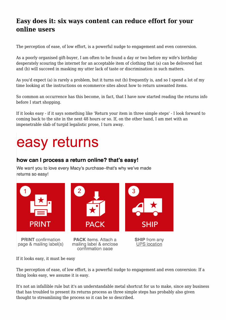
So common an occurrence has this become, in fact, that I have now started reading the returns infobefore I start shopping.
If it looks easy - if it says something like 'Return your item in three simple steps' - I look forward tocoming back to the site in the next 48 hours or so. If, on the other hand, I am met with animpenetrable slab of turgid legalistic prose, I turn away.
If it looks easy, it must be easy
The perception of ease, of low effort, is a powerful nudge to engagement and even conversion: If athing looks easy, we assume it is easy.
It's not an infallible rule but it's an understandable metal shortcut for us to make, since any businessthat has troubled to present its returns process as three simple steps has probably also giventhought to streamlining the process so it can be so described.
Steve Jobs called it 'elegant simplicity': we put in the hard work so the user gets an experience thatfeels easy. Or: 'Easy reading is damn hard writing,' said Hawthorne, or Hemingway, or someone
Steve Krug, in the appositely titled Don't Make Me Think, writes:
Making every page or screen self-evident is like having good lighting in a store: it just makeseverything seem better. Using a site that doesn't make us think unimportant things feels effortless,whereas puzzling over things that don't matter to us tends to sap our energy and enthusiasm - andtime.
Whenever we look at a web page or an email newsletter or a piece of DM, we automatically performa rapid cost-benefit analysis: Is the perceived effort of consuming this content worth the likely gain?So making content look easy to consume is not just good usability - it's also good marketing.
Here, then, are five ways to make life easier for users with your content...
1. Format your content for the scan reader
Online users are just looking for the bit of your content they care about. You may have thought longand hard about the different elements of your web page, but your audience is just flitting through arange of stuff, looking for the one bit that seems closest to the question or keyword that's front oftheir mind.
Reading word for word online is hard work. We resist doing it till we're sure we're in the right place.
So to make your content look easy for the scan reader:
Do the squint test. Does your text breathe, does it offer the visual balm of a little white space in andaround the words, does it offer more than a single entry point - or is irretrievably slabby?
Hold your text at arms' length, screw up your eyes, look at it as a visual block - and ask yourself:Could I actually bear to read this?
Edit tightly, breaking up content into shorter paras and shorter sentences. Use cat-sat-on-the-matsyntax and no more semi-colons!
Add lots of signposting. Make sure your Ronseal-like headlines are supported by informativestandfirsts (which can double up as promos and meta descriptions), subheads, captions and links.For your headlines/titles, choose words that someone might actually put into Google if they werelooking for whatever your content has got to offer them.
Break up your content with lots of subheads, bullets and (where you can) numbered paragraphs.Don't be afraid to nest headings within headings, so long as the visual/informational hierarchy isclear. (In-line headings can work well too.)
Sprinkle your copy liberally with phrases highlighted in bold, edited so they could stand alone out ofcontext and when read together quickly give the user the gist of the whole piece.
2. Structure your content according to type
When writing and editing online, you can support scannability by laying your words out so that the
user gets an instant idea of the kind of content they're looking at.
Certain ways of laying out content, such as recipes and CVs, do such a good job of marrying formand function in this way that people can recognise the content type even when the words arereplaced with gobbledygook.
So before you write any individual piece of content, think of a format you can follow that will helpmake its structure - and therefore its purpose - immediately explicit to the user. FAQs, quote forms,Top Tips etc - there are all sorts of content types which are designed to do just this. Econsultancyhas a great list of ways to structure/format a blog post in the report, 100+ Practical ContentMarketing Tips
But you can take this further. The demands of seo, UX, accessibility and scannability (not to mentionCompliance...) present certain creative constraints on what we can do with our words online. Butform is where you can start to think a bit more laterally.
That destination guide to Riga - could it be restructured as '24 hours in Riga'? That guide to the newISA arrangements - could it become a listicle ('5 things you need to know about...')?
Could we turn our dull old company history page into a more visually appealing, snippetty timeline?That email invite to the Industry Awards do - could we not structure the whole piece as a menu andmake it look a bit more, actually inviting? And so on.
Content formats are especially useful when you have lots of different examples of the same type ofcontent, such as product pages, destination guides, video tutorials, case studies, opinion pieces, jobads etc. For each type, you can devise a standard way of structuring and presenting the content. It'san approach which brings many benefits:
Users can see at a glance what kind of content they're getting. A timeline immediately alerts me to achronological treatment, for instance.
You encourage deeper content discovery, since users quickly see they're looking at one of a series ofitems, and can compare between examples, eg to look for a specific piece of information that theycan now expect to always find in the same place -- like the expert verdict in AutoTrader's carreviews. (In the same way, we look for our favourite column or section in a paper or magazine weregularly read, knowing it's always in the same reassuring spot.)
You streamline production. For each content type, you can develop detailed execution guidelines andbest-practice examples, to make life easier for those who commission, author or review suchcontent.
You cover off SEO. Content formats typically include lots of subheads, which give you lots ofopportunities to work in seo keywords unobtrusively.
You support idea generation and content sustainability. It's much easier to brainstorm ideas to addto an existing content format series rather than have to come up with completely new ideas fromscratch every time.
3. Avoid nerdview
When we're talking among ourselves at work, we naturally start to use internal language, industry
shorthand, handy acronyms and the like since our daily communications would otherwise becomeabsurdly unwieldy.
But too often, when we're speaking to people outside of our organisation, we forget that they won'talways know our words for things. Unexplained abbreviations, company phraseology and jargon canquickly add to their processing load.
This phenomenon of internal language served up to external audiences has been labelled 'nerdview'by linguist Geoff Pullum. Pullum cites the example of a car hire company which threw up the errormessage: 'Please select a valid pick up date (DD/MM/YY) greater than today.'
Have you ever heard anyone say: 'I can meet you later today - only it can't be greater than 3pm asI've got another call then.'
Every industry has its funny little words for things. Staying with travel, what does 'minimum boardoccupancy' actually mean? What exactly is 'through-tagged' baggage?
And why do airlines insist on talking about 'boarding the aircraft'? ('Can't stop - I've got an aircraftto board - need to leave no greater than NOW!').
For more such fun, see also Econsultancy's own list of banned words
4. Scope out how much there is to come
Online, where a page redesigns itself every time you scroll, it can often be hard to see where a pieceof content begins and ends. So users are always grateful when you find a way to give them a sense ofthe scope of the content item you're looking at.
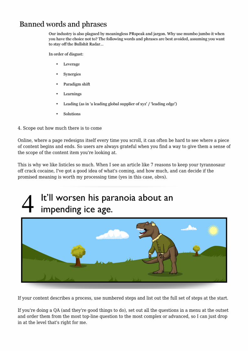
This is why we like listicles so much. When I see an article like 7 reasons to keep your tyrannosauroff crack cocaine, I've got a good idea of what's coming, and how much, and can decide if thepromised meaning is worth my processing time (yes in this case, obvs).
If your content describes a process, use numbered steps and list out the full set of steps at the start.
If you're doing a QA (and they're good things to do), set out all the questions in a menu at the outsetand order them from the most top-line question to the most complex or advanced, so I can just dropin at the level that's right for me.
5. Tell people what they need up front
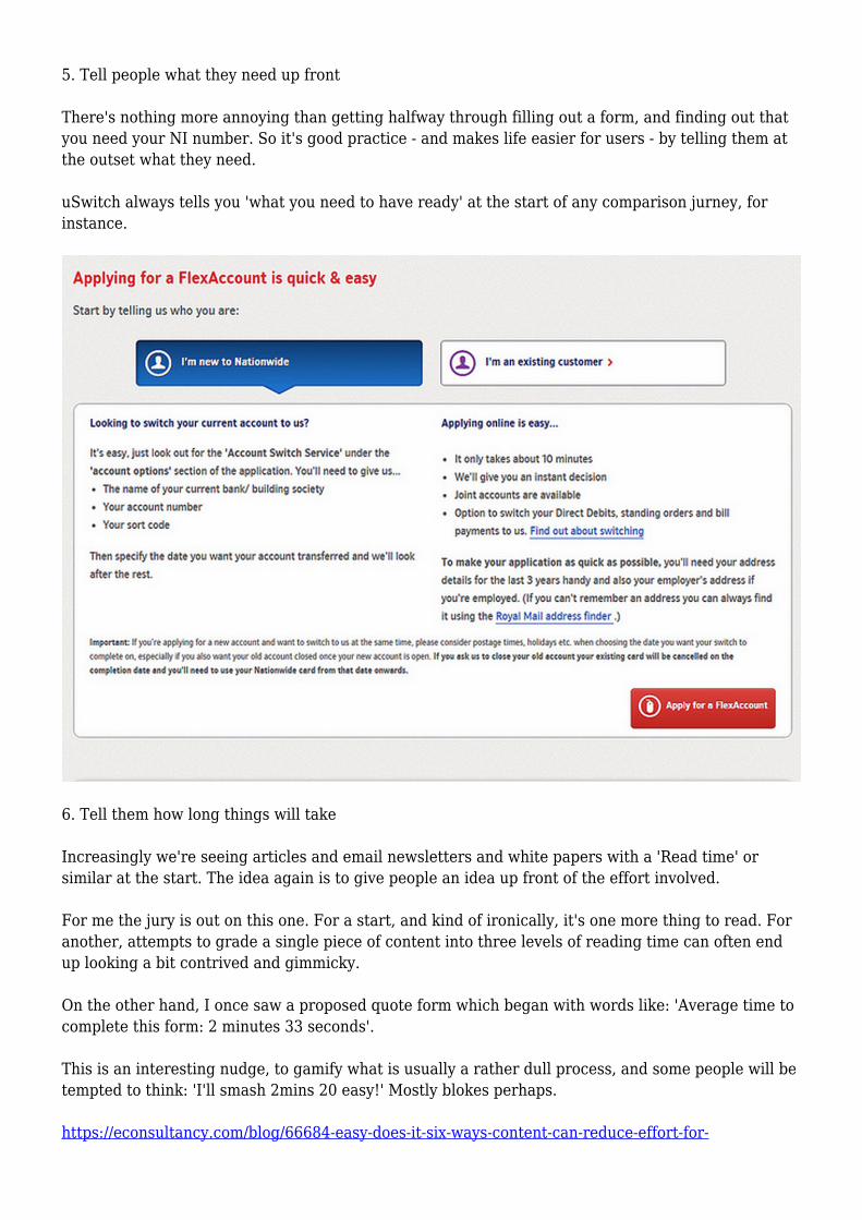
There's nothing more annoying than getting halfway through filling out a form, and finding out thatyou need your NI number. So it's good practice - and makes life easier for users - by telling them atthe outset what they need.
uSwitch always tells you 'what you need to have ready' at the start of any comparison jurney, forinstance.
6. Tell them how long things will take
Increasingly we're seeing articles and email newsletters and white papers with a 'Read time' orsimilar at the start. The idea again is to give people an idea up front of the effort involved.
For me the jury is out on this one. For a start, and kind of ironically, it's one more thing to read. Foranother, attempts to grade a single piece of content into three levels of reading time can often endup looking a bit contrived and gimmicky.
On the other hand, I once saw a proposed quote form which began with words like: 'Average time tocomplete this form: 2 minutes 33 seconds'.
This is an interesting nudge, to gamify what is usually a rather dull process, and some people will betempted to think: 'I'll smash 2mins 20 easy!' Mostly blokes perhaps.
https://econsultancy.com/blog/66684-easy-does-it-six-ways-content-can-reduce-effort-for-

your-online-users/?utm_medium=feeds&utm_source=blog