economic development, government policies and food consumption
TRANSCRIPT
Economic Development, Government Policies and Food Consumption
William A. Masters
Contact address, effective July 1, 2010:
Friedman School of Nutrition Science and Policy, Tufts University
150 Harrison Avenue, Room 140
Boston, MA 02111, USA
Ph.: 617.636.3751
Forthcoming in 2011 as Chapter 14 in the
Oxford Handbook on the Economics of Food Consumption and Policy
Jayson L. Lusk, Jutta Roosen and Jason F. Shogren, editors
Final version revised July 8, 2010

Page 1 of 33
Economic Development, Government Policies and Food Consumption
Introduction
This chapter addresses the influence of economic development and government policies on food
consumption around the world. By economic development, we mean long-run changes in economic
activity; these are heavily influenced by government policies, which also mediate the links from
development to footest consumption outcomes, with feedback loops from food consumption
outcomes back to policymakers and the economic development process itself. The process we seek to
describe is illustrated by Figure 1, showing how changes in food consumption might be driven by an
underlying process of economic development and policy change. An improvement (or worsening) in
any part of this engine of growth might influence its performance, as each gear is enmeshed with the
others.
re
Figure 1. Food consumption changes as an outcome of economic development policies

Page 2 of 33
The interacting influence of economic development and government policies on food consumption
outcomes is obvious to any observer (e.g. Manzel and D’Alusio 2005). Even comparing regions with
similar physical climate, South Americans are known for their grass-fed beef asados and
Southeastern Africans for their white maize porridge. Both preferences owe something to peoples’
income level and employment options which are generally more limited in Southern Africa, but also
to government interventions that have long kept grazing land for cattle relatively abundant in South
America, and made processed white maize relatively cheap in Southern Africa. These kinds of forces
help explain differences across countries and also changes over time, and may point to opportunities
for policy change to mediate more effectively between the forces of economic development and
peoples’ food consumption outcomes.
Our task in this chapter is to analyze the interacting influences illustrated in Figure 1, in a unified
framework that could help explain the diversities and similarities we observe around the world. The
facts we seek to explain are summarized elsewhere in this Handbook. Most notably, the chapter by
Fabiosa (2010) describes how consumption patterns have been ‘trading up’ over time and converging
across countries, as part of economic globalization, while Albisu, Gracia and Sanjuan (2010)
describe these changes in terms of demographic change. Focusing on recent events, von Braun
(2010) shows how price spikes in a shared world market are experienced very differently by different
countries, due to differences in initial conditions and policy responses. Finally, government efforts to
protect food consumers from income and price shocks are described in the chapters by Wilde (2010)
and Abdulai and Kuhlgatz (2010), addressing more and less affluent countries respectively.
To help make sense of the diverse literature and disparate facts about food consumption changes and
differences across countries, the first section of this chapter offers a series of thought experiments
about individual decision-making in economic development. How might a hypothetical person or
Page 3 of 33
household, armed only with native intelligence and ability to learn from others, respond to changes in
circumstances? Pursuing that question reveals what standard economic models can – and can’t –
explain about changes in food consumption during economic development, including the puzzle of
why governments act as they do. Readers who are very familiar with economics will recognize the
approach, and might appreciate the novelty of how it is presented – or might choose to skip that part
of the chapter, and move directly to the evidence presented on food prices as influenced by
government policies, and on households’ actual food consumption choices.
1. Food consumption decisions in economic development
The economics approach to food consumption aims to explain our diverse choices in terms of a
common decision-making process, by which every person has compared their options and chosen the
ones they prefer. Mathematically, this choice can be represented as having optimized some unknown
mathematical function, subject to various constraints. Such optimization models only approximate
the actual decision-making process, and optimization itself is only a metaphor for what people
actually do, but the optimization framework allows us to construct thought-experiments of surprising
subtlety and explanatory power. In this section we trace the major steps needed to explain food
consumption changes in terms of individual optimization. Each step is represented graphically, to
communicate ideas that could also be presented using calculus (Varian 2009) or more generally using
real analysis (Mas-Colell et al. 1995).
1.1 Food consumption decisions as optimal choices
The basic thought-experiment used in economics to explain food consumption is shown in Figure 2,
adapted from similar diagrams in Norton, Alwang and Masters (2010) and many other textbooks.
The axes shows quantities consumed. They are labeled with food on the horizontal axis and other

Page 4 of 33
goods on the vertical axis, but every step of the following thought-experiments would be identical if
we relabeled these axes with anything that people want or need. By definition, however, quantities
should be recorded so that more is better, and any undesirable ‘bads’ should be recorded as their
inverse. Any unit of measure can be used. As it happens, the data presented at the end of this chapter
are expressed first for all foods in calories per person per day, and then for cereal grains in millions
of metric tons per region per year.
To begin, consider what is even possible for a person to obtain. Their income, purchasing power or
other entitlements can be represented graphically as straight lines, showing the combinations of food
and other goods that could possibly be acquired at a given rate of barter exchange between them.
Consumption below or to the left of each line would be possible, but by definition goods are recorded
so that consumption above or to the right is preferable, and the dashed lines represent a preferred
level of entitlement. The slope (rise/run) of this income constraint is the quantity of other goods that
can be exchanged for a unit of food, which in price terms would be the price of food divided by the
price of other goods, so that the steeper lines represent more expensive food. For now, both income
and prices are simply accounting constraints, drawn arbitrarily on Figure 2; later we will try to
explain them as well.

Page 5 of 33
Figure 2. Optimization in food consumption
Consumer choices are captured in Figure 2 by the shape of the two curves, with each curve defined
as all combinations of the two goods that would be equally satisfactory. By definition, the dashed
curve offers a higher level of ‘welfare’. Optimization enters here, in that a mathematical consequence
of consumers having chosen what they prefer is that, around any observed consumption choice, these
indifference curves must be flat or convex as shown on Figure 2. This shape arises because, after
consumers have chosen their preferred quantities, any further substitution of one good for the other
must offer diminishing marginal benefits – hence their indifference curves must be increasingly flat
to the right of any chosen point, and increasingly steep to the left of it. Other curvature is possible
elsewhere along the indifference curve, but an optimizing consumer would exploit all such
opportunities for increasing marginal benefits until diminishing returns has set in.
Our first thought experiment using Figure 2 asks how optimizing people will adjust to a change in
their income constraint, as might occur during economic development or as a result of policy change.
If we were to observe them consuming at the diamond or square-shaped points, for example, how
would they react if food became cheaper and more abundant? Intuitively we might expect them to
consume more food – and to prefer the lower price – and Figure 2 shows that is usually but not
Quantity of food consumed
Quantity of other goods
consumed
Higher incomes would allow higher level of welfare, with high food prices orwith low food prices
Consumption choices offer the highest attainable welfare, with low food prices or with high food prices

Page 6 of 33
always optimal. The reduction in food prices flattens the income constraint, so optimizing consumers
at any given welfare level will choose to consume more food and less of other goods. But the change
in food prices will also change their income level, shown for example as a shift between the solid and
the dashed curves. Most people are food buyers, so that the reduction in food price raises the income
they have left to buy other things. They might move from the diamond to the triangle, with an
increase in consumption of both goods. But farmers might be food sellers, so the price reduction
would lower their income. Such people might move from the square to the pentagon, and actually
reduce food intake. Our thought experiment tells us that adjustments involve both a substitution
effect at a given level of welfare, and an income effect from a shift in welfare levels, both of which
must be taken into account to explain food consumption.
The framework illustrated in Figure 2 is built from the assumption that consumers have a known
product available to buy at the prices shown. This begs the question of how markets arise to provide
known goods at fixed prices. The growth of markets is a result as well as a cause of economic
development; it may occur spontaneously between buyers and sellers when product characteristics
are known (e.g. Fafchamps and Minten 2001), but as shown by Akerlof (1970) products of unknown
quality may remain off the market entirely until collective action provides quality assurance (e.g.
Masters and Sanogo 2002).
The framework of Figure 2 also begs the question of what determines incomes, which we will
address below. But even before that, thinking about consumption as an optimization decision
provides immediate insight into observed dietary patterns and changes. The economics approach
suggests that otherwise identical people will choose different foods if they have different incomes
and face different prices – and that their diets will become more similar if their incomes and prices
converge. This view helps to explain differences in food culture and dietary habits, as consequences

Page 7 of 33
as much as causes of differences in food consumption choices. Note that “convergence” here does
not mean uniformity: as documented by Ruel (2003) for low-income countries, and by Thiele and
Weiss (2003) for a high-income country, many people exhibit a strong preference for dietary
diversity, so that higher incomes and more similar relative prices unleash ever-greater variety in the
diet at each location, as people become able to acquire more foods that were previously unaffordable.
1.2 Constraints on food consumption: incomes, prices and market participation
To take the analysis one step further, we ask what determines prices and the consumers’ income
level. The optimization approach to this question is shown in Figure 3, by which prices and incomes
depend fundamentally on the physical production possibilities available at a particular place and
time. That production possibilities frontier defines the limit of what can be created by a farm
household, village, country or other decision-making group, given their resources, technology and
environment. Here, the key implication of optimization is that, around any observed production
choice, these production possibility frontiers are bowed outwards, with diminishing marginal returns
in production as resources are shifted from food to other goods. As with the indifference curves,
opportunities for increasing marginal returns may arise but will be exploited by optimizing
producers, so observed points arise where there are diminishing returns. In this case, the location and
curvature of the frontier has been drawn to explain the dashed lines from the previous figure, as the
highest possible income and welfare attainable at any given relative prices.

Page 8 of 33
Figure 3. A household model of the gains from specialization
One thought experiment we can conduct with this model is to compare optimal choices at the given
relative prices, along the dashed lines, with the choices that would be available if this decision-maker
were required to be self-sufficient. The highest welfare level attainable in self-sufficiency is shown
by the solid indifference curve. The solid dot shows the point of self-sufficiency, where production
equals consumption. Relative prices in self-sufficiency are given by the slope of the production
possibilities frontier and the solid indifference curve at that point.
An astonishing fact about the results of Figure 3 is that accepting market prices would be preferred to
the price seen with self-sufficiency at all market prices, no matter what is bought or sold. Market
prices are shown by the slope of the dashed lines, whose rise over run is the quantity of other goods
that can be traded for a unit of food. If the market places a higher value on food than would hold in
self-sufficiency, then the dashed line is relatively steep and the household can raise its welfare by
becoming a net food seller. They would specialize in producing food (at the solid triangle), some of
which they would sell to buy more non-food items (at the open triangle). The diagram has been
drawn so that the exact same level of welfare can be attained in the opposite case, when the market
Quantity of food produced & consumed
Quantity of other goods produced &
consumed
Highest attainable welfare in self-sufficiency
Highest attainable welfare when prices lead farm household to become a net food seller (squares) or net food buyer (triangles)
Production Possibilities Frontier

Page 9 of 33
price of food is low so the exact same household would respond by becoming a net food buyer,
producing more of the other goods (as the solid square) for sale to consume more food (at the open
square). The fact that the two dashed lines happen to reach the same dashed curve and hence the
same welfare level is a coincidence: the general conclusion is that any dashed line will allow the
household to reach some dashed curve that offers a higher level of welfare than self-sufficiency,
simply because market exchange with a larger group of other people helps overcome each producer
and consumer’s own local diminishing returns.
The optimization framework provides remarkable insight into how economic development and
government policies can lift food consumption through the growth of markets, as otherwise self-
sufficient households find attractive opportunities to sell some goods they produce in exchange for
others they prefer to consume. Each of these market opportunities is valuable in itself, allowing a
higher level of consumption for a given set of productive resources. More profoundly, the
development of markets in general permits an endless sequence of steps towards increased
specialization, and hence sustained growth in consumption and production over time. Ridley (2010)
argues that specialization for trade is the distinctive human trait that accounts for our biological
success relative to other species. Once production is uncoupled from consumption, people can save
and invest in specialized efforts to serve others, which in turn creates opportunities for others to do
likewise. Each step of market expansion helps people overcome the diminishing returns that each
individual, household, village or other group would otherwise face, and allows each individual or
group to benefit from and contribute to the lives of an ever-larger number of others.
Figure 3 is a geometric demonstration that explains why households, villages, and countries choose
to trade with people elsewhere, rather than remain self-sufficient. It is not a demonstration of
economic development as such, because households are not actually ‘initially’ self-sufficient: there is

Page 10 of 33
ample archeological evidence that, in reality, even the earliest known human settlements engaged in
trade (Dillian and White 2010) . What changes over time and differs across households is the extent
of access to markets, as new opportunities for profitable trade are developed over time and attract a
larger and larger fraction of total activity. In today’s highest-income countries, the same goods
change hands so often that the annual volume of trade far exceeds the annual value of production.
The ratio is smaller in lower-income countries, and among the world’s poorest people most
production is destined for home consumption as illustrated in Figure 3.
A household’s degree of market access depends strongly on their spatial location, and is closely tied
to their consumption and production levels (e.g. Kanbur and Venables 2005, Minten and Stifel 2008).
A common explanation is that limited market participation causes low productivity, but it is equally
possible that low productivity forces households into greater self-sufficiency. Both directions of
causality could coexist, but they have very different implications for development policy
(Barrett 2008). Rios, Shively and Masters (2009) test the two hypotheses using a large sample of
households from Guatemala, Vietnam and Tanzania, and find that increases in farm productivity
consistently drive higher market participation much more consistently than the other way around.
This result is independent of what products are sold: some farmers turn out to have relatively high
productivity in food production and are net food sellers, whereas others have high productivity in
other things and are net food buyers.
1.3 Constraints on market participation: productivity and the gains from specialization
The link between productivity and gains from specialization is illustrated in Figure 4. The thought
experiment shown here demonstrates how, relative to the exact same ‘initial’ point of self-sufficiency
as Figure 3, a more constrained production possibilities frontier (shown as the dark curve) makes for

Page 11 of 33
limited market exchange opportunities and a lower welfare level, with lower quantities of both food
and other goods consumed at the same market prices as Figure 3.
Figure 4. The household model with constrained production possibilities
Development policies can help households lift the production constraints illustrated in Figure 4,
principally through R&D and technology dissemination to help farmers do more with the resources
they have. As documented by Alston et al. (2000), the payoff to these projects is typically much
larger than the returns to other investments, indicating persistent under-spending on that kind of
public good. Why might governments under-invest in productivity enhancement? One explanation is
that those gains are widely spread over many years and many people, so that beneficiaries remain
unaware, unable or unwilling to organize politically in pursuit of increased spending. As discussed
later in this chapter in the context of food price policy, governments tend to choose interventions that
deliver concentrated benefits to influential groups, while spreading costs in ways that avoid
provoking resistance. McMillan and Masters (2003) show how many but not all African governments
have chosen both low R&D levels and price policies that limit economic growth, which is consistent
with more recent evidence from price policies around the world presented in section 2 of this chapter.
Quantity of food produced & consumed
ConstrainedProduction Possibilities Frontier
Quantity of other goods produced &
consumed
Constraints on production adjustments limit gains from specialization at each price, whether the farm household is a net food seller (squares) or a net food buyer (triangles)

Page 12 of 33
1.4 Consequences of market participation: food prices and consumption choices
Figure 5 shows how higher food prices influences farm households, in the same framework as
Figures 3 and 4. For a farmer who already faces high enough food prices to justify producing (at the
solid square) more food than she consumes (at the open square), a further increase in food prices
raises food production and allows more consumption of both goods along a higher welfare level. In
contrast, farmers who face relatively low food prices and therefore specialize in producing other
things (at the solid triangle) which she sells to buy more food (at the open triangle), the increase in
food prices sharply lowers food consumption and welfare to the lower of the two dashed curves.
Figure 5. The household model with higher food prices
The main point of the thought-experiment in Figure 5 is to emphasize that a rise in food prices raises
food production among both buyers and sellers – but those farm households who are net food buyers
suffer surprisingly large losses in welfare, because they not only pay more for food but are also
forced to be more self-sufficient, removing their earlier gains from trade.
Quantity of food produced & consumed
Quantity of other goods produced &
consumed
The production increase from higher food prices faces diminishing returns
Food price rises improve welfare for a net food seller (squares) but worsen welfare for a net food buyer (triangles)
Production Possibilities Frontier

Page 13 of 33
1.5 Investment and scale effects
In our analysis so far, food consumption has been explained solely by prices and productivity. A
crucial extension is to consider the effect of additional investment which might allow food producers
to overcome diminishing returns. Figure 6 provides a general illustration of production response from
increments of investment in additional inputs. The solid line shows the output level achievable at
each level of input use. Starting from zero, output might remain low until a critical mass of
investment is achieved, above which output offers increasing returns to additional size. The dashed
lines show net income levels: as before, the line’s rise over run in quantity terms is fixed by market
prices, as the price of inputs divided by the price of the output. At a high enough price ratio (the
steepest dashed line), inputs do not produce enough output to justify their use in production, so
quantities chosen are zero. It is only when relative prices improve, as shown by a flatter dashed line,
that it becomes worthwhile for production to begin with a jump from zero to the minimum size of
operation shown by the solid square. Further price changes lead to diminishing returns, for example
up to the open square, but notice that other indivisible investments might lead to a second threshold
of size and eventual jump up to the solid triangle. This is the same process by which optimization
leads to production and consumption being observed only in regions of diminishing returns, but in
Figure 6 the unobserved regions are shown explicitly in between the dot and the solid square, and
then in between the open square and the solid triangle.

Page 14 of 33
Figure 6. Investment and scale effects in production
Figure 6 illustrates how investment levels and the exploitation of scale economies depend on
technological opportunities that offer increasing returns, combined with relative-price changes that
make it worthwhile to invest in them. The most common source of increasing returns is machinery,
buildings and equipment, whose throughput often rises with volume while costs rise with surface
area. The result is the two-thirds rule of engineering, by which costs rise by (roughly) two-thirds of
capacity. As materials improve to hold things together there is no intrinsic limit to these cost
reductions. The two-thirds rule could lead to ever-larger production units, except that actual
production costs depend on much more than the cost of machines, buildings and equipment.
For food production, increased farmland or farm animals can be added at a roughly constant cost for
each additional unit, but more remote acreage imposes additional transport costs and crowding
imposes additional costs of congestion. Furthermore, additional workers can be added at roughly
constant cost of labor, but only if they are self-motivated. As documented by Allen and Lueck
(2003), for example, the transaction and supervision costs of employing hired workers in most field
crop operations ensure that self-motivated family members can operate farms at lower unit costs than
Quantity of input invested
Quantity of output
produced
Indivisible opportunities to expand lead to increasing returns and jumps in activity, with diminishing returns from further expansion
Page 15 of 33
employees. The vast majority of farming observed in the world is family-operated. The exceptional
cases of successful employee-operated, investor-owned agriculture occur principally where
production costs involve a lot of industrial-type processing, as in a tea or sugar plantation, or where
labor supervision costs are kept low by spatial concentration and non-seasonality, such as confined
animal operations or some horticultural production.
The relationships illustrated by Figure 6 provide a striking explanation for why we observe roughly
similar farm sizes within regions, and very different farm sizes across them. For example, one place
might have farm sizes shown by the squares, while another will have larger farm sizes shown by the
triangles. This leads to one more thought experiment: would moving from the squares to the
triangles be desirable? It turns out that larger farm sizes offer higher incomes only when the
appropriate technology is available and relative prices justify its use, as shown by the dashed line
being as flat or flatter than the long light-colored segment, and the dashed curve turning up in its
light-colored segment. In any given region, acreage per farm is similar because farmers’ optimization
has already occurred, adjusting farm sizes to provide a farm family’s workers with just enough
income to justify staying on the farm -- as opposed to migrating for work elsewhere. Allowing farm
sizes to adjust in this way has been an important feature of successful development policies (Tomich,
Kilby and Johnston 1995), accommodating the rise and then fall in each country’s number of farm
families that is associated with population growth and structural transformation (Timmer 2009).
1.6 Supply, demand and government policies
So far we have taken market prices as given, but in practice they are variables that depend on
production, consumption and government choices. Our final thought experiment captures the role of
government in Figure 7, which has the same horizontal axis as Figures 2-5 but has the price of food
relative to other things on the vertical axis. The upward sloping line shows quantity produced at each
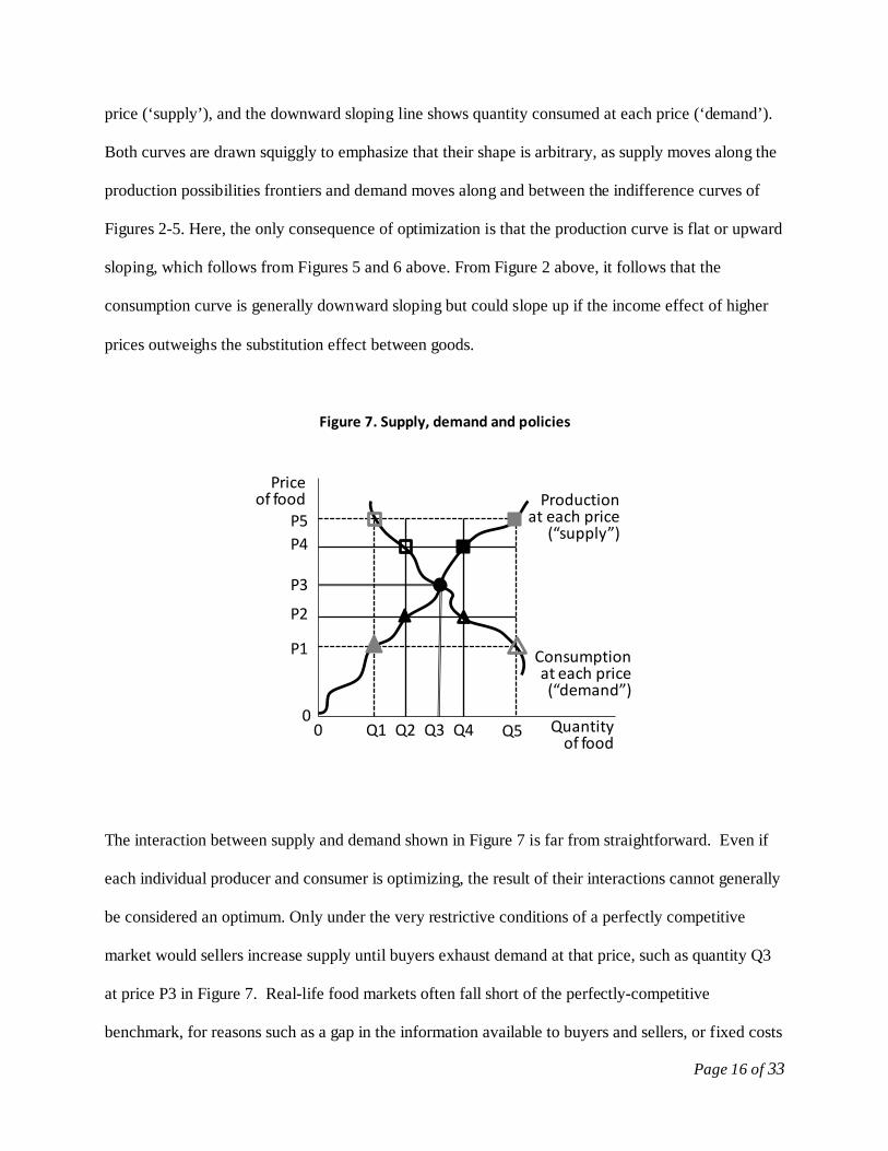
Page 16 of 33
price (‘supply’), and the downward sloping line shows quantity consumed at each price (‘demand’).
Both curves are drawn squiggly to emphasize that their shape is arbitrary, as supply moves along the
production possibilities frontiers and demand moves along and between the indifference curves of
Figures 2-5. Here, the only consequence of optimization is that the production curve is flat or upward
sloping, which follows from Figures 5 and 6 above. From Figure 2 above, it follows that the
consumption curve is generally downward sloping but could slope up if the income effect of higher
prices outweighs the substitution effect between goods.
Figure 7. Supply, demand and policies
The interaction between supply and demand shown in Figure 7 is far from straightforward. Even if
each individual producer and consumer is optimizing, the result of their interactions cannot generally
be considered an optimum. Only under the very restrictive conditions of a perfectly competitive
market would sellers increase supply until buyers exhaust demand at that price, such as quantity Q3
at price P3 in Figure 7. Real-life food markets often fall short of the perfectly-competitive
benchmark, for reasons such as a gap in the information available to buyers and sellers, or fixed costs
Quantity of food
Priceof food
Q1 Q4Q2 Q3
P1
P2
P3
P4P5
Q5
Productionat each price
(“supply”)
Consumption at each price (“demand”)
00

Page 17 of 33
and scale effects that offer incumbent buyers or sellers an entry barrier against potential competitors.
Such market failures limit the extent of the market, leaving unexploited opportunities for trades
whose marginal benefits would exceed their costs. A classic example that affects many food markets
involves information gaps as described by Akerlof (1970), who showed that even high-quality goods
cannot be sold if buyers do not trust sellers. Food markets are also affected by scale effects and
barriers to entry, often because consumption and production occur at the household scale, while
transport and processing can be done at lower cost in larger-scale enterprises so that a multitude of
consumers and of farm households are served by a handful of suppliers and middlemen whose
pricing decisions depend on the threat of entry by competitors. Production and consumption
decisions may also affect third parties through non-market mechanisms such as disease transmission
or environmental pollution. In all of these cases, government interventions could improve
consumption by overcoming the market failure, helping buyers and sellers move closer to the
perfectly-competitive benchmark where marginal costs just equal marginal benefits. A central
determinant of consumer well-being is the extent to which governments actually accomplish this
task, offsetting market failures to help consumers specialize and trade with each other. In practice,
governments often pursue other goals, and their active “policy failures” may limit consumption as
much as their inactivity in the face of “market failure.”
To trace the link between prices and consumption choices, one useful thought experiment using
Figure 7 is simply to retrace the steps taken earlier using Figures 2-6. When prices rise from P1 to
P2, for example, we recreate the triangles shown in Figure 4, with an increase in production from Q1
to Q2, a decline in consumption from Q5 to Q4, and a shrinkage in net buying from Q5-Q1 to Q4-
Q2. As we know from the indifference curves of Figure 4, such a change must reduce welfare. How
does that loss appear in this figure? Here, the corresponding measure of welfare effects is known as
economic surplus, whose change is defined as the area between the two price levels traced from zero

Page 18 of 33
out to the supply curve (for change in economic surplus from production), or to the demand curve
(for change in economic surplus from consumption). The slopes of the supply and demand curves
ensure that the loss due to reduced consumption from the vertical axis out to the hollow triangles is
larger than from the gain from increased production out to the solid triangles.
The thought-experiment just conducted simply retraces the logic of Figure 4. The losses from
restricting trade become larger as quantities approach self-sufficiency, and are largest when
production equals consumption at Q3, the solid dot where price is P3. At prices above P3, production
would be larger than consumption, so we would observe net selling. To limit visual clutter we have
drawn the resulting squares at previously labeled quantities: at P4 and P5, consumption falls to Q2
and Q1, while production rises to Q4 and Q5. These could correspond to the squares in Figure 4,
except that the new supply-demand diagrams lack any mechanism to show whether the increased
income from more production is spent on consumption of this as opposed to other goods. In Figure 4,
a higher price of food caused that particular food seller to consume more of it, as the income effect
from greater sales outweighed the substitution effect from higher prices. The accounting for income
effects was achieved through the income constraint, which ensured that all earnings from the sale of
one thing was spent on the other. Figure 7 has no such general equilibrium feedback. The resulting
partial-equilibrium economic surplus measures can be useful when the product in question accounts
for a small share of total income, even though a complete accounting for income effects would be
needed to obtain exact measurements of welfare changes.
The main advantage of Figure 7 over previous diagrams is that, by separating production from
consumption, we gain insight into the role of government. Our final thought experiment considers
why national governments, as opposed to individual consumers and producers, often forego the gains

Page 19 of 33
from specialization and trade in favor of greater self-sufficiency. Why might governments reduce
total economic surplus by restricting trade?
Figure 7 reveals who gains and who loses from trade restrictions. If foreigners offered to sell food at
P1, the highest level of welfare would be reached by producing Q1, consuming Q5, and using free
trade to import the difference. Restricting these imports would raise local prices (for example, to P2)
which would generate a small increase in economic surplus from more production (from Q1 to Q2) at
the cost of a much larger decrease in economic surplus from less consumption (from Q5 to Q4). An
exactly symmetrical experience arises with exports, if foreigners offer to buy at P5, restricting
exports would reduce the price (for example, to P4) and generate an increase in local consumption
(again, from Q1 to Q2) at the cost of a decrease in production (from Q5 to Q4).
Restricting trade in either direction makes it profitable to engage in trade itself, as opposed to
production: in the case of imports, the remaining quantity traded (Q4-Q2) can be bought from
foreigners at P1 and sold to locals at P2, for a profit of P2-P1 on every unit imported. Likewise for
exports, the profit is P5-P4 on every unit exported. That profit can be taken by government through
an import tariff or export tax, or it can given to political favorites as rents on an import quota or
export license. But the larger effect of trade restrictions is to transfer economic surplus between
producers and consumers. In the case of import restriction, the economic surplus gain from increased
production (which is P2-P1 out to the supply curve ) will benefit producers in proportion to their
market share, while the burden of economic surplus loss (P2-P1 out to the demand curve) is borne by
consumers in proportion to consumption. Likewise for export restrictions, the large cost from
reduced production (P5-P4 out to the supply curve) is shared among producers, while consumers
benefit in proportion to how much they use.

Page 20 of 33
To explain policy choices in terms of individuals’ decision-making, our thought experiment
compares peoples’ incentives to pursue public-policy goals as opposed to their own private activity.
So far, our analysis has placed equal weight on each dollar earned or spent by individual producers,
consumers or traders. If economic interests were all equally influential in politics, political bodies
would choose free trade in private goods, while using taxes and regulations to provide public goods
such as quality assurance, infrastructure or productivity enhancements in order to maximize national
income. But political organization could be easier for some interests than others, leading real-life
governments to favor those interest groups over the nation as a whole.
Paarlberg (2010) provides a broad overview of food policy choices in the development process. To
explain how some groups can consistently gain disproportionate influence, Downs (1957)
emphasized the threshold cost of becoming informed and engaged in political action, which would
lead individuals to remain ‘rationally ignorant’ and inactive about interests that are low priority for
them. Olson (1965) emphasized marginal costs and benefits, which give individuals a greater
incentive to be ‘free riders’ about interests that they share with a larger group. Both rational
ignorance and free-ridership limit the power of widely-spread interests, allowing smaller but highly
motivated interest groups to have disproportionate political influence.
Changes in food consumption during economic development offer an extreme example of asymmetry
in how concentrated or diffuse a given economic interest can be. In a poor country with limited
specialization, food production is spread among a majority of the population, many of whom are
actually net food buyers. A minority of the population have non-farm jobs, but still spend a relatively
large fraction of their income buying the food they need, and a few of them also buy non-food
agricultural products for processing or export. Our thought experiment predicts that, in this setting,
political processes will favor the buyers’ interest in low prices for agricultural products, using export

Page 21 of 33
restrictions and other interventions to transfer funds from production to consumption despite the
resulting damage to the economy as a whole. From that point forward, if economic development
proceeds despite these interventions, then a shrinking fraction of the population will become
increasingly specialized farmers. Each farmer will produce an ever-larger quantity of a few products,
while food expenditure becomes an ever-smaller share of consumers’ budgets. Our thought
experiment predicts that governments will then switch sides to favor high farm prices. Anderson
(1995) provides a more complete analysis of this switch, but some back-of-the-envelope arithmetic
illustrates how economic development changes farmers’ political leverage: a typical high-income
country has one food producer for every twenty consumers, so a dollar of transfer to each producer
costs each consumer only five cents. Import restrictions and other measures can readily transfer to
each farmer an amount equal to the country’s per-capita national income, at a modest cost to each
consumer. As transfers grow they eventually become so costly as to push the issue higher on
policymakers’ agenda, but some transfer of this type is to be expected when producers are highly
motivated to invest heavily in political activity on this one issue, while consumers remain unaware of
the transfer or have other concerns of greater political relevance.
The thought-experiments presented in section 1 of this chapter trace the implications of individuals’
optimization to generate a surprisingly rich set of predictions about how food consumption is linked
to economic development and government policies. Individuals may not always make optimal
choices, but to the extent that they do, we find that reaching the highest available level of
consumption requires specialization for the market. Those opportunities are constrained not only by
market prices, but also by production possibilities in each potential area of specialization.
Governments can act to expand households’ opportunities, but they face strong political pressures to
restrict trade and also to under-invest in productivity enhancement, in part because political processes
favor actions that produce narrowly-targeted gains at the expense of diffuse losses. Aggregate
Page 22 of 33
improvements in total consumption depend on social institutions that help government promote
specialization and market development through the provision of public goods and other collective
actions. Many such opportunities are detailed elsewhere in this handbook in areas such as food safety
and quality certification, or broader interventions in public health, infrastructure, research and
education where public investments can enhance economic productivity. Trade restrictions are
unlikely to accomplish that result, but our thought experiments suggest they are likely to be
widespread in the direction of helping consumption at the expense of production in poor countries,
and vice-versa in rich ones.
2. Empirical evidence on price policy and market outcomes in economic development
Having established a framework for interpretation we now turn to some of the available data, starting
with government interventions that drive food prices along the lines of Figure 7, and then considering
aggregate production and consumption choices along the lines of Figures 2-6, so as to form a more
complete picture of the interrelationships sketched in Figure 1.
2.1 Food policy in economic development
By far the largest and most comprehensive effort to measure the price effects of government
intervention in food markets is provided in the online dataset of Anderson and Valenzuela (2009),
from a World Bank project involving over 100 researchers writing case studies for 68 countries over
more than 40 years, covering a total of 77 major food products and agricultural commodities. The
resulting dataset provides over 25,000 pairs of prices, such as P1-P2 or P4-P5 in Figure 7, along with
the appropriate quantities such as Q1-Q2 and Q4-Q5. The resulting estimate of total economic-
surplus transfers is provided in Figure 8, for five-year averages over all available years, after
conversion of local currencies into constant US dollars in purchasing-power parity terms. As

Page 23 of 33
predicted, the world’s higher-income countries (in dark bars) consistently intervene to favor
production over consumption, while lower-income countries (in white bars) at first did the reverse
but switched in the 1990s as their incomes grew.
Figure 8. Total trade-policy transfers through agricultural markets, by region
Interestingly, total transfers in industrialized countries has declined since the 1990s, suggesting that
the magnitude of transfer had become large enough for the issue to generate counter-pressures among
consumers and taxpayers, as well as among government officials concerned with aggregate national
income. The institutional structures through which farm supports have been disciplined include the
inclusion of agriculture in international treaties such as the WTO, NAFTA or the EU, as well as
unilateral moves through national policy-making processes.
Cons
tant
200
0 U
S$ (b
illio
ns)
Source: Author’s adaption, from data in Anderson, K., ed. (2009), Distortions to Agricultural Incentives: A Global Perspective. London: Palgrave Macmillan and Washington DC: World Bank.

Page 24 of 33
Masters and Garcia (2009) use the individual observations underlying Figure 8 in a series of
econometric tests, finding strong support for many but not all of the hypotheses about government
intervention found in the literature. Most importantly, the data are clearly consistent with the rational
ignorance hypothesis of Downs (1957), as interventions have indeed been larger in markets where
the benefits are concentrated among a few while costs are dispersed among many. Overall, the link to
economic development is illustrated in Figure 9, which shows a smoothed regression line through all
2,520 individual observations for the price effect of government intervention in a particular
commodity market, country and year, as a function of the average per-capita annual income in that
country and year. The regression line shows the mean level of intervention at each income level,
surrounded by its 95% confidence interval, for all farm products on the left panel, and then separately
for imported and exported products on the right panel.
Figure 9. Tariff-equivalent trade policy transfers as a function of per-capita income
(≈$22,000/yr)(≈$400/yr) (≈$3,000/yr)
≈$5,000/yr-50%
+50%
+100%
Free trade
-100%

Page 25 of 33
In the left panel of Figure 9 there is an interesting nonlinearity, as poor countries subsidize
consumption at the expense of production at a moderate rate up to about US$5,000 per year of per-
capita income, after which increased income is associated with a sharp rise in production subsidies at
the expense of consumption. One source of nonlinearity is the absence of any upper bound on the
subsidies whose average level can easily reach +100% (a doubling of producer revenue), whereas
government’s ability to tax production is limited by the ability of low-income farmers to withdraw
into self-sufficiency if their market participation is too heavily taxed.
The right panel of Figure 9 contrasts imports with exports, revealing that even in poor countries there
are consistent import restrictions that favor producers over consumers (e.g. a rise from P1 to P2 in
Figure 6), but these are more than offset by export restrictions that have the opposite effect (e.g. a fall
from P5 to P4). The statistical tests in Masters and Garcia (2009) associate some of this anti-trade
bias with a revenue-seeking effect, by which developing-country governments with fewer alternative
sources of revenue use both import tariffs and export taxes to help fund the public sector, while more
developed countries can tax a wider range of recorded activity using income or property and sales
taxes, or value-added taxes.
In summary, observed patterns of price intervention are consistent with the predictions of our
analytical framework, as government interventions tend to create concentrated benefits that mobilize
supporters, at the expense of diffuse costs that provoke little resistance. At some point the costs
Source: Author’s adaptation, from W.A. Masters and Andres F. Garcia (2009), “Agricultural Price Distortion and Stabilization: Stylized Facts and Hypothesis Tests”, in Kym Anderson (ed.), Political Economy of Distortions to Agricultural Incentives. Washington, DC: The World Bank. Each line shows data from 66 countries in each year from 1961 to 2005 (n=2520), smoothed with confidence intervals using Stata’s lpolyci at bandwidth 1 and degree 4. Income per capita is expressed in US$ at 2000 PPP prices.
Page 26 of 33
become so politically conspicuous that they can longer be ignored, and support levels no longer rise
with economic development. In poorer countries the same mechanism leads to taxation of production
to benefit consumption, supplemented by a revenue motive due to limited ability to enforce other
kinds of taxes.
2.2 Food consumption and production in economic development
Having tested our framework against government choices that drive prices, we turn now to evidence
on the resulting quantities consumed and produced. A wide variety of data sources could be
exploited, many of which are used in other chapters of this Handbook. For this section, we focus on
just one kind of data, namely Food Balance Sheet (FBS) estimates of the Food and Agriculture
Organization (FAO). The FAO Food Balance Sheets attempt the heroic task of reconciling national
statistics from every country in the world, to produce national, regional and global estimates of
quantities produced, traded and consumed for every possible food commodity. Jacobs and Sumner
(2002) provide an independent review of FBS data: the underlying observations are of very limited
accuracy and the results should be viewed with a wide margin of error, but no other data source even
comes close to the comprehensive coverage attempted by the FBS.
In Table 1, we show the first and last available years of FBS data, summarizing food consumption in
terms of total energy intake per capita per day, by type of food, for the world as a whole and for
selected low-income regions. Although food quantities are poorly measured and their conversion to
calories is rough at best, the resulting picture is quite clear. Total calorie consumption has risen
sharply in all regions but especially in Southeast Asia and in China, whose per-capita energy intake is
now estimated to exceed the world average. On average South Asians continue to consume fewer
total calories than Africans. In the poorest regions most calories continue to be sourced from cereal
grains, with energy from animal products remaining under 10%. Starchy roots are of continued

Page 27 of 33
importance mainly in Africa, having fallen sharply in importance for the Chinese. Use of vegetable
oils has risen quickly everywhere, and are generally larger as a source of dietary energy than fruits
and vegetables combined, or sugars and sweeteners. For the world as a whole, alcoholic beverages
are about as large a source of calories as vegetables.
Table 1. FAO FBS estimates of per-capita food consumption by source and region, 1961 and 2007
World
South Asia
Africa
S E Asia
China
1961 2007
1961 2007
1961 2007
1961 2007
1961 2007
Total (kcal/day) 2,195 2,796
1,990 2,370
2,027 2,455
1,803 2,586
1,469 2,981
Cereals 49% 46%
64% 60%
50% 50%
65% 59%
57% 49%
Animal Products 15% 17%
6% 9%
8% 8%
6% 11%
4% 21%
Starchy Roots 8% 5%
1% 2%
16% 14%
10% 4%
20% 5%
Vegetable Oils 5% 10%
4% 8%
6% 8%
4% 7%
2% 8%
Vegetables 2% 3%
1% 2%
2% 2%
1% 2%
4% 6%
Fruits 2% 3%
2% 3%
4% 4%
3% 3%
0% 2%
Sugars/Sweeteners 9% 8%
9% 8%
5% 6%
5% 7%
2% 3%
Alcoholic Bev. 2% 3%
0% 0%
2% 2%
0% 1%
1% 3%
All other sources 7% 5%
12% 8%
8% 7%
6% 6%
10% 3%
Source: Calculated from FAOStat (2010), Food Balance Sheet dataset, version of June 2nd, 2010.
Available online at http://faostat.fao.org.
Table 2 offers the same data broken down by energy in the form of carbohydrates, protein or fats.
Again the breakdown is a rough approximation but quite striking insofar as the protein share of
global diets has changed relatively little. The principal change has been increased consumption of

Page 28 of 33
fats. The main sources of protein are still cereal grains, and the main source of fats is oilseeds and
other crops, although animal sources now exceed 20% of protein consumed even in Africa, and
consumption of animal fats had been low but is now high in China and Southeast Asia.
Table 2. FAO estimates of food consumption by macronutrient category, 1961 and 2007
World
South Asia
Africa
S E Asia
China
1961 2007
1961 2007
1961 2007
1961 2007
1961 2007
Total energy 2,195 2,796
1,990 2,370
2,027 2,455
1,803 2,586
1,469 2,981
Carbohydr. 70% 64%
77% 72%
72% 71%
79% 71%
80% 61%
Protein 11% 11%
10% 10%
10% 10%
8% 10%
11% 12%
Fats 19% 25%
13% 19%
17% 19%
13% 19%
9% 27%
Protein by source:
Cereals 44% 42%
58% 57%
52% 52%
61% 50%
48% 40%
Other
25% 21%
28% 22%
29% 27%
18% 18%
45% 23%
Animals 31% 38%
14% 21%
9% 21%
21% 32%
8% 38%
Fats by source:
Cereals 11% 6%
21% 10%
18% 16%
15% 9%
20% 7%
Other
38% 49%
52% 59%
56% 61%
58% 53%
53% 36%
Animals 51% 44%
28% 31%
26% 24%
27% 38%
27% 57%
Source: Calculated from FAOStat (2010), Food Balance Sheet dataset, version of June 2nd, 2010.
Available online at http://faostat.fao.org.
Table 3 focuses just on cereal grains, which are sufficiently homogeneous in nutrient density that we
can compare production, consumption and net trade data in quantity terms. To smooth out annual
fluctuations, the data shown here are period averages for the 1960s (actually 1961-69) and the 2000s
(actually 2000-07). Total cereals output has more than doubled in all regions shown except Africa,
which almost doubled. In developing countries, most of the cereals produced are estimated to have
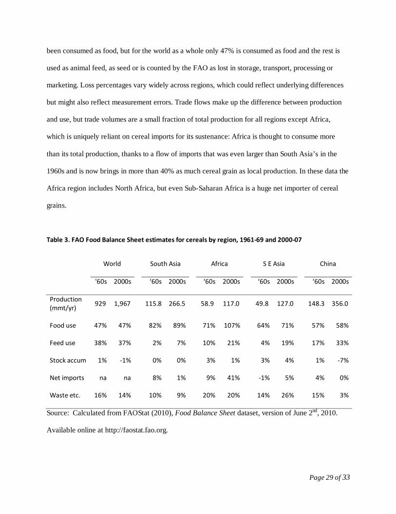
Page 29 of 33
been consumed as food, but for the world as a whole only 47% is consumed as food and the rest is
used as animal feed, as seed or is counted by the FAO as lost in storage, transport, processing or
marketing. Loss percentages vary widely across regions, which could reflect underlying differences
but might also reflect measurement errors. Trade flows make up the difference between production
and use, but trade volumes are a small fraction of total production for all regions except Africa,
which is uniquely reliant on cereal imports for its sustenance: Africa is thought to consume more
than its total production, thanks to a flow of imports that was even larger than South Asia’s in the
1960s and is now brings in more than 40% as much cereal grain as local production. In these data the
Africa region includes North Africa, but even Sub-Saharan Africa is a huge net importer of cereal
grains.
Table 3. FAO Food Balance Sheet estimates for cereals by region, 1961-69 and 2000-07
World
South Asia
Africa
S E Asia
China
'60s 2000s
‘60s 2000s
‘60s 2000s
‘60s 2000s
‘60s 2000s
Production (mmt/yr)
929 1,967
115.8 266.5
58.9 117.0
49.8 127.0
148.3 356.0
Food use 47% 47%
82% 89%
71% 107%
64% 71%
57% 58%
Feed use 38% 37%
2% 7%
10% 21%
4% 19%
17% 33%
Stock accum 1% -1%
0% 0%
3% 1%
3% 4%
1% -7%
Net imports na na
8% 1%
9% 41%
-1% 5%
4% 0%
Waste etc. 16% 14%
10% 9%
20% 20%
14% 26%
15% 3%
Source: Calculated from FAOStat (2010), Food Balance Sheet dataset, version of June 2nd, 2010.
Available online at http://faostat.fao.org.

Page 30 of 33
3. Conclusions
This chapter summarizes the economics approach to explaining food consumption decisions during
economic development, focusing particularly on the role of local food production, market exchange,
and government interventions that influence food prices. Food cultures clearly differ widely across
countries and over time. These differences reveal consistent patterns of change in food consumption
associated with economic development, and strong regularities in government interventions as well.
Our analysis focuses on these patterns, aiming to sketch an underlying structure that can help explain
at least some of the differences and similarities in food consumption choices observed around the
world, and help readers assess the likely impacts of alternative government interventions.
The economics approach explains individual decisions as the result of optimization, which generates
a number of remarkable predictions that we explore in a series of thought experiments about
consumption, production and market exchange. Our first result is that consumption levels are highest
when individuals exploit opportunities for trade with others, as specialization and investment lead to
greater purchasing power and access to a larger quantity of more diverse foods. The resulting market
outcomes cannot themselves be characterized as an optimum, however, except under the extreme
conditions of perfectly competitive markets. Real markets may fall short of the perfectly-competitive
benchmark for many reasons, such as limited information, transaction costs, entry barriers and other
causes of market failure. Government interventions can improve consumption by overcoming these
constraints to make markets work more effectively, but policy-making processes are subject to
constraints of their own. Most notably, we find that governments often restrict trade and under-invest
in productive public goods, which we explain in part by asymmetries in political influence between
those who benefit from and those who pay the cost of these choices. Despite these limitations most of
Page 31 of 33
the world has seen marked expansion in food consumption and living standards, continuing the long
history of nutritional change documented by Fogel (2004).
References cited
Abdulai, A. and C. Kuhlgatz (2010), chapter 16 in this volume Akerlof, G.A. (1970), "The Market for 'Lemons': Quality Uncertainty and the Market Mechanism". Quarterly Journal of Economics 84 (3): 488–500. Albisu, L.M., A. Gracia and A.I. Sanjuan (2010), chapter 31 in this volume Allen, Douglas W. and Dean Lueck (2003), The Nature of the Farm: Contracts, Risk, and Organization in Agriculture. Cambridge, MA: MIT Press. Alston, Julian M.., Michele C. Marra, Philip G. Pardey and T. J. Wyatt (2000), “Research returns redux: a meta-analysis of the returns to agricultural R&D.” Australian Journal of Agricultural and Resource Economics, 44 (2): 185-215. Anderson, K. (1995), “Lobbying Incentives and the Pattern of Protection in Rich and Poor Countries.” Economic Development and Cultural Change 43(2, January): 401-423. Anderson, K., ed. (2009), Distortions to Agricultural Incentives: A Global Perspective. London: Palgrave Macmillan and Washington DC: World Bank. Anderson, K. and W.A. Masters, eds. (2009), Distortions to Agricultural Incentives in Africa. Washington, DC: The World Bank. Anderson, K. and E. Valenzuela (2009), “Estimates of Global Distortions to Agricultural Incentives, 1955 to 2007", World Bank, Washington DC. Database online at www.worldbank.org/agdistortions. Barrett, C.B. (2008), “Smallholder Market Participation: Concepts and Evidence from Eastern and Southern Africa.” Food Policy 33(4):299-317. Dillian, C.D. and C.L. White (2010), Trade and Exchange: Archaeological Studies from History and Prehistory. New York: Springer. Downs, A. (1957), “An Economic Theory of Political Action in a Democracy.” Journal of Political Economy 65(2): 135-50. Fabiosa, J. (2010), chapter 23 in this volume Fafchamps, M. and B. Minten (2001), “Property Rights in a Flea Market Economy.” Economic Development and Cultural Change, 49(2): 229-67.
Page 32 of 33
Fogel, R.W. (2004), The Escape from Hunger and Premature Death, 1700-2100. New York: Cambridge University Press. Jacobs, K.L. and D.A. Sumner (2002), “The Food Balance Sheets of the Food and Agriculture Organization: A Review of Potential Ways to Broaden the Appropriate Uses of the Data.” Available online at http://faostat.fao.org/abcdq/docs/FBS_Review.pdf. Kanbur, R. and A.F. Venables, eds. (2005), Spatial Inequality and Development. New York: Oxford University Press. Manzel, P. and F. D’Alusio (2008), Hungry Planet: What the World Eats. Berkeley: Tricycle Press. Mas-Colell, A., M. Whinston, and J. Green (1995), Microeconomic Theory. New York: Oxford University Press. Masters, W.A. and A.F. Garcia (2009), “Agricultural Price Distortion and Stabilization: Stylized Facts and Hypothesis Tests”, in Kym Anderson (ed.), Political Economy of Distortions to Agricultural Incentives. Washington, DC: The World Bank. Masters, W.A. and D. Sanogo (2002), “Welfare Gains from Quality Certification of Infant Foods: Results from a Market Experiment in Mali,” American Journal of Agricultural Economics, 84(4): 974-989. McMillan, M.S. and W.A. Masters (2003), “An African Growth Trap: Production Technology and the Time-Consistency of Agricultural Taxation, R&D and Investment”, Review of Development Economics 7(2): 179–91. Minten, B. and D.C. Stifel (2008), “Isolation and Agricultural Productivity.” Agricultural Economics, 39(1): 1-15. Olson, M. (1965), The Logic of Collective Action, Cambridge MA: Harvard University Press. Paarlberg, R. (2010), Food Politics. New York: Oxford University Press. Ridley, M. (2010), The Rational Optimist: How Prosperity Evolves. New York: Harper. Rios, A.R., G.E. Shively, and W.A. Masters (2009), “Farm Productivity and Household Market Participation: Evidence from LSMS Data.” Contributed Paper presentated at the IAAE Conference in Beijing, China, August 16-22, 2009. Available online at http://purl.umn.edu/51031. Ruel, M.T. (2003), “Operationalizing dietary diversity: a review of measurement issues and research priorities.” Journal of Nutrition 133(11):3911S-3926S. Timmer, C.P. (2009), A World without Agriculture: The Structural Transformation in Historical Perspective. Washington, DC: AEI Press.

Page 33 of 33
Thiele, S. and C. Weiss (2003), “Consumer demand for food diversity: Evidence for Germany.” Food Policy, 28(2): 99-115. Tomich, T.P., P. Kilby, and B.F. Johnston (1995), Transforming Agrarian Economies: Opportunities Seized, Opportunities Missed. Ithaca NY: Cornell University Press. Varian, H.R. (2009), Intermediate Microeconomics: A Modern Approach. 8th ed. New York: Norton. von Braun, J. (2010), chapter 24 in this volume Wilde, P. (2010), chapter 15 in this volume